
13
Visualization with Matplotlib, Pandas, and Seaborn
Introduction
Visualization is a critical component in exploratory data analysis, as well as presentations and applications. During exploratory data analysis, you are usually working alone or in small groups and need to create plots quickly to help you better understand your data. It can help you identify outliers and missing data, or it can spark other questions of interest that will lead to further analysis and more visualizations. This type of visualization is usually not done with the end user in mind. It is strictly to help you better your current understanding. The plots do not have to be perfect.
When preparing visualizations for a report or application, a different approach must be used. You should pay attention to small details. Also, you usually will have to narrow down all possible visualizations to only the select few that best represent your data. Good data visualizations have the viewer enjoying the experience of extracting information. Almost like movies that make viewers get lost in them, good visualizations will have lots of information that really sparks interest.
The primary data visualization library in Python is matplotlib, a project begun in the early 2000s, that was built to mimic the plotting capabilities from Matlab. Matplotlib is enormously capable of plotting most things you can imagine, and it gives its users tremendous power to control every aspect of the plotting surface.
That said, it is not the friendliest library for beginners to grasp. Thankfully, pandas makes visualizing data very easy for us and usually plots what we want with a single call to the plot method. pandas does no plotting on its own. It internally calls matplotlib functions to create the plots.
Seaborn is also a visualization library that wraps matplotlib and does not do any actual plotting itself. Seaborn makes beautiful plots and has many types of plots that are not available from matplotlib or pandas. Seaborn works with tidy (long) data, while pandas works best with aggregated (wide) data. Seaborn also accepts pandas DataFrame objects in its plotting functions.
Although it is possible to create plots without ever running any matplotlib code, from time to time, it will be necessary to use it to tweak finer plot details manually. For this reason, the first two recipes will cover some basics of matplotlib that will come in handy if you need to use it. Other than the first two recipes, all plotting examples will use pandas or seaborn.
Visualization in Python does not have to rely on matplotlib. Bokeh is quickly becoming a very popular interactive visualization library targeted for the web. It is completely independent of matplotlib, and it's capable of producing entire applications. There are other plotting libraries as well and future versions of pandas will probably have the capability to use plotting engines other than matplotlib.
Getting started with matplotlib
For many data scientists, the vast majority of their plotting commands will use pandas or seaborn, both rely on matplotlib to do the plotting. However, neither pandas nor seaborn offers a complete replacement for matplotlib, and occasionally you will need to use matplotlib. For this reason, this recipe will offer a short introduction to the most crucial aspects of matplotlib.
One thing to be aware if you are a Jupyter user. You will want to include the:
>>> %matplotlib inline
directive in your notebook. This tells matplotlib to render plots in the notebook.
Let's begin our introduction with a look at the anatomy of a matplotlib plot in the following figure:

Matplotlib hierarchy
Matplotlib uses a hierarchy of objects to display all of its plotting items in the output. This hierarchy is key to understanding everything about matplotlib. Note that these terms are referring to matplotlib and not pandas objects with the same (perhaps confusing) name. The Figure and Axes objects are the two main components of the hierarchy. The Figure object is at the top of the hierarchy. It is the container for everything that will be plotted. Contained within the Figure is one or more Axes object(s). The Axes is the primary object that you will interact with when using matplotlib and can be thought of as the plotting surface. The Axes contains an x-axis, a y-axis, points, lines, markers, labels, legends, and any other useful item that is plotted.
A distinction needs to be made between an Axes and an axis. They are completely separate objects. An Axes object, using matplotlib terminology, is not the plural of axis but instead, as mentioned earlier, the object that creates and controls most of the useful plotting elements. An axis refers to the x or y (or even z) axis of a plot.
All of these useful plotting elements created by an Axes object are called artists. Even the Figure and the Axes objects themselves are artists. This distinction for artists won't be critical to this recipe but will be useful when doing more advanced matplotlib plotting and especially when reading through the documentation.
Object-oriented guide to matplotlib
Matplotlib provides two distinct interfaces for users. The stateful interface makes all of its calls with the pyplot module. This interface is called stateful because matplotlib keeps track internally of the current state of the plotting environment. Whenever a plot is created in the stateful interface, matplotlib finds the current figure or current axes and makes changes to it. This approach is fine to plot a few things quickly but can become unwieldy when dealing with multiple figures and axes.
Matplotlib also offers a stateless, or object-oriented, interface in which you explicitly use variables that reference specific plotting objects. Each variable can then be used to change some property of the plot. The object-oriented approach is explicit, and you are always aware of exactly what object is being modified.
Unfortunately, having both options can lead to lots of confusion, and matplotlib has a reputation for being difficult to learn. The documentation has examples using both approaches. In practice, I find it most useful to combine them. I use the subplots function from pyplot to create a figure and axes, and then use the methods on those objects.
If you are new to matplotlib, you might not know how to recognize the difference between each approach. With the stateful interface, all commands are functions called on the pyplot module, which is usually aliased plt. Making a line plot and adding some labels to each axis would look like this:
>>> import matplotlib.pyplot as plt
>>> x = [-3, 5, 7]
>>> y = [10, 2, 5]
>>> fig = plt.figure(figsize=(15,3))
>>> plt.plot(x, y)
>>> plt.xlim(0, 10)
>>> plt.ylim(-3, 8)
>>> plt.xlabel('X Axis')
>>> plt.ylabel('Y axis')
>>> plt.title('Line Plot')
>>> plt.suptitle('Figure Title', size=20, y=1.03)
>>> fig.savefig('c13-fig1.png', dpi=300, bbox_inches='tight')

Basic plot using Matlab-like interface
The object-oriented approach is shown as follows:
>>> from matplotlib.figure import Figure
>>> from matplotlib.backends.backend_agg import FigureCanvasAgg as FigureCanvas
>>> from IPython.core.display import display
>>> fig = Figure(figsize=(15, 3))
>>> FigureCanvas(fig)
>>> ax = fig.add_subplot(111)
>>> ax.plot(x, y)
>>> ax.set_xlim(0, 10)
>>> ax.set_ylim(-3, 8)
>>> ax.set_xlabel('X axis')
>>> ax.set_ylabel('Y axis')
>>> ax.set_title('Line Plot')
>>> fig.suptitle('Figure Title', size=20, y=1.03)
>>> display(fig)
>>> fig.savefig('c13-fig2.png', dpi=300, bbox_inches='tight')

Basic plot created with object oriented interface
In practice, I combine the two approaches and my code would look like this:
>>> fig, ax = plt.subplots(figsize=(15,3))
>>> ax.plot(x, y)
>>> ax.set(xlim=(0, 10), ylim=(-3, 8),
...     xlabel='X axis', ylabel='Y axis',
...     title='Line Plot')
>>> fig.suptitle('Figure Title', size=20, y=1.03)
>>> fig.savefig('c13-fig3.png', dpi=300, bbox_inches='tight')
Basic plot created using call to Matlab interface to create figure and axes, then using method calls
In this example, we use only two objects, the Figure, and Axes, but in general, plots can have many hundreds of objects; each one can be used to make modifications in an extremely finely-tuned manner, not easily doable with the stateful interface. In this chapter, we build an empty plot and modify several of its basic properties using the object-oriented interface.
How to do it…
- To get started with matplotlib using the object-oriented approach, you will need to import the
pyplotmodule and aliasplt:>>> import matplotlib.pyplot as plt - Typically, when using the object-oriented approach, we will create a Figure and one or more Axes objects. Let's use the
subplotsfunction to create a figure with a single axes:>>> fig, ax = plt.subplots(nrows=1, ncols=1) >>> fig.savefig('c13-step2.png', dpi=300)
Plot of a figure
- The
subplotsfunction returns a two-item tuple object containing the Figure and one or more Axes objects (here it is just one), which is unpacked into the variablesfigandax. From here on out, we will use these objects by calling methods in a normal object-oriented approach:>>> type(fig) matplotlib.figure.Figure >>> type(ax) matplotlib.axes._subplots.AxesSubplot - Although you will be calling more axes than figure methods, you might still need to interact with the figure. Let's find the size of the figure and then enlarge it:
>>> fig.get_size_inches()
array([ 6.,  4.])
>>> fig.set_size_inches(14, 4)
>>> fig.savefig('c13-step4.png', dpi=300)
>>> fig
Changing figure size
- Before we start plotting, let's examine the
matplotlibhierarchy. You can collect all the axes of the figure with the.axesattribute:>>> fig.axes [<matplotlib.axes._subplots.AxesSubplot at 0x112705ba8>] - The previous command returns a list of all the Axes objects. However, we already have our Axes object stored in the
axvariable. Let's verify that they are the same object:>>> fig.axes[0] is ax True - To help differentiate the Figure from the Axes, we can give each one a unique facecolor. Matplotlib accepts a variety of different input types for color. Approximately 140 HTML colors are supported by their string name (see this list: http://bit.ly/2y52UtO). You may also use a string containing a float from zero to one to represent shades of gray:
>>> fig.set_facecolor('.7')
>>> ax.set_facecolor('.5')
>>> fig.savefig('c13-step7.png', dpi=300, facecolor='.7')
>>> fig
Setting the face color
- Now that we have differentiated between the Figure and the Axes, let's take a look at all of the immediate children of the Axes with the
.get_childrenmethod:>>> ax_children = ax.get_children() >>> ax_children [<matplotlib.spines.Spine at 0x11145b358>, <matplotlib.spines.Spine at 0x11145b0f0>, <matplotlib.spines.Spine at 0x11145ae80>, <matplotlib.spines.Spine at 0x11145ac50>, <matplotlib.axis.XAxis at 0x11145aa90>, <matplotlib.axis.YAxis at 0x110fa8d30>, ...] - Most plots have four spines and two axis objects. The spines represent the data boundaries and are the four physical lines that you see bordering the darker gray rectangle (the axes). The x and y axis objects contain more plotting objects such as the ticks and their labels and the label of the entire axis. We can select the spines from the result of the
.get_childrenmethod, but it is easier to access them with the.spinesattribute:>>> spines = ax.spines >>> spines OrderedDict([('left', <matplotlib.spines.Spine at 0x11279e320>), ('right', <matplotlib.spines.Spine at 0x11279e0b8>), ('bottom', <matplotlib.spines.Spine at 0x11279e048>), ('top', <matplotlib.spines.Spine at 0x1127eb5c0>)]) - The spines are contained in an ordered dictionary. Let's select the left spine and change its position and width so that it is more prominent and also make the bottom spine invisible:
>>> spine_left = spines['left']
>>> spine_left.set_position(('outward', -100))
>>> spine_left.set_linewidth(5)
>>> spine_bottom = spines['bottom']
>>> spine_bottom.set_visible(False)
>>> fig.savefig('c13-step10.png', dpi=300, facecolor='.7')
>>> fig
Plot with spines moved or removed
- Now, let's focus on the axis objects. We can access each axis through the
.xaxisand.yaxisattributes. Some axis properties are also available with the Axes object. In this step, we change some properties of each axis in both manners:>>> ax.xaxis.grid(True, which='major', linewidth=2, ... color='black', linestyle='--') >>> ax.xaxis.set_ticks([.2, .4, .55, .93]) >>> ax.xaxis.set_label_text('X Axis', family='Verdana', ... fontsize=15) >>> ax.set_ylabel('Y Axis', family='Gotham', fontsize=20) >>> ax.set_yticks([.1, .9]) >>> ax.set_yticklabels(['point 1', 'point 9'], rotation=45) >>> fig.savefig('c13-step11.png', dpi=300, facecolor='.7')

Plot with labels
How it works…
One of the crucial ideas to grasp with the object-oriented approach is that each plotting element has both getter and setter methods. The getter methods all begin with get_. For instance, ax.get_yscale() retrieves the type of scale that the y-axis is plotted with as a string (default is linear), while ax.get_xticklabels() retrieves a list of matplotlib text objects that each have their own getter and setter methods. Setter methods modify a specific property or an entire group of objects. A lot of matplotlib boils down to latching onto a specific plotting element and then examining and modifying it via the getter and setter methods.
The easiest way to start using matplotlib is with the pyplot module, which is commonly aliased plt, as done in step 1. Step 2 shows one method to initiate the object-oriented approach. The plt.subplots function creates a single Figure, along with a grid of Axes objects. The first two parameters, nrows and ncols, define a uniform grid of Axes objects. For example, plt.subplots(2,4) creates eight total Axes objects of the same size inside one Figure.
The plt.subplots returns a tuple. The first element is the Figure, and the second element is the Axes object. This tuple gets unpacked as two variables, fig and ax. If you are not accustomed to tuple unpacking, it may help to see step 2 written like this:
>>> plot_objects = plt.subplots(nrows=1, ncols=1)
>>> type(plot_objects)
tuple
>>> fig = plot_objects[0]
>>> ax = plot_objects[1]
>>> fig.savefig('c13-1-works1.png', dpi=300)
Blot with a single axes
If you create more than one Axes with plt.subplots, then the second item in the tuple is a NumPy array containing all the Axes. Let's demonstrate that here:
>>> fig, axs = plt.subplots(2, 4)
>>> fig.savefig('c13-1-works2.png', dpi=300)

Plot with a grid of axes
The axs variable is a NumPy array containing a Figure as its first element and a NumPy array as its second:
>>> axs
array([[<matplotlib.axes._subplots.AxesSubplot object at 0x126820668>,
        <matplotlib.axes._subplots.AxesSubplot object at 0x126844ba8>,
        <matplotlib.axes._subplots.AxesSubplot object at 0x126ad1160>,
        <matplotlib.axes._subplots.AxesSubplot object at 0x126afa6d8>],
       [<matplotlib.axes._subplots.AxesSubplot object at 0x126b21c50>,
        <matplotlib.axes._subplots.AxesSubplot object at 0x126b52208>,
        <matplotlib.axes._subplots.AxesSubplot object at 0x11f695588>,
        <matplotlib.axes._subplots.AxesSubplot object at 0x11f6b3b38>]],
      dtype=object)
Step 3 verifies that we indeed have Figure and Axes objects referenced by the appropriate variables. In step 4, we come across the first example of getter and setter methods. Matplotlib defaults all figures to 6 inches in width by 4 inches in height, which is not the actual size of it on the screen, but would be the exact size if you saved the Figure to a file (with a dpi of 100 pixels per inch).
Step 5 shows that, in addition to the getter method, you can sometimes access another plotting object by its attribute. Often, there exist both an attribute and a getter method to retrieve the same object. For instance, look at these examples:
>>> ax = axs[0][0]
>>> fig.axes == fig.get_axes()
True
>>> ax.xaxis == ax.get_xaxis()
True
>>> ax.yaxis == ax.get_yaxis()
True
Many artists have a .facecolor property that can be set to cover the entire surface one particular color, as in step 7. In step 8, the .get_children method can be used to get a better understanding of the object hierarchy. A list of all the objects directly below the axes is returned. It is possible to select all of the objects from this list and start using the setter methods to modify properties, but this isn't customary. We usually collect our objects from the attributes or getter methods.
Often, when retrieving a plotting object, they will be returned in a container like a list or a dictionary. This is what happens when collecting the spines in step 9. You will have to select the individual objects from their respective containers to use the getter or setter methods on them, as done in step 10. It is also common to use a for loop to iterate through each of them one at a time.
Step 11 adds grid lines in a peculiar way. We would expect there to be a .get_grid and .set_grid method, but instead, there is just a .grid method, which accepts a Boolean as the first argument to turn on and off the grid lines. Each axis has both major and minor ticks, though by default the minor ticks are turned off. The which parameter is used to select which type of tick has a grid line.
Notice that the first three lines of step 11 select the .xaxis attribute and call methods from it, while the last three lines call equivalent methods from the Axes object itself. This second set of methods is a convenience provided by matplotlib to save a few keystrokes. Normally, most objects can only set their own properties, not those of their children. Many of the axis-level properties are not able to be set from the Axes, but in this step, some are. Either method is acceptable.
When adding the grid lines with the first line in step 11, we set the properties .linewidth, .color, and .linestyle. These are all properties of a matplotlib line, formally a Line2D object. The .set_ticks method accepts a sequence of floats and draws tick marks for only those locations. Using an empty list will completely remove all ticks.
Each axis may be labeled with some text, for which matplotlib uses a Text object. Only a few of all the available text properties are changed. The .set_yticklabels Axes method takes in a list of strings to use as the labels for each of the ticks. You may set any number of text properties along with it.
There's more…
To help find all the possible properties of each of your plotting objects, make a call to the .properties method, which displays all of them as a dictionary. Let's see a curated list of the properties of an axis object:
>>> ax.xaxis.properties()
{'alpha': None,
'gridlines': <a list of 4 Line2D gridline objects>,
'label': Text(0.5,22.2,'X Axis'),
'label_position': 'bottom',
'label_text': 'X Axis',
'tick_padding': 3.5,
'tick_space': 26,
'ticklabels': <a list of 4 Text major ticklabel objects>,
'ticklocs': array([ 0.2 , 0.4 , 0.55, 0.93]),
'ticks_position': 'bottom',
'visible': True}
Visualizing data with matplotlib
Matplotlib has a few dozen plotting methods that make nearly any kind of plot imaginable. Line, bar, histogram, scatter, box, violin, contour, pie, and many more plots are available as methods on the Axes object. It was only in version 1.5 (released in 2015) that matplotlib began accepting data from pandas DataFrames. Before this, data had to be passed to it from NumPy arrays or Python lists.
In this section, we will plot the annual snow levels for the Alta ski resort. The plots in this example were inspired by Trud Antzee (@Antzee_) who created similar plots of snow levels in Norway.
How to do it…
- Now that we know how to create axes and change their attributes, let's start visualizing data. We will read snowfall data from the Alta ski resort in Utah and visualize how much snow fell in each season:
>>> import pandas as pd >>> import numpy as np >>> alta = pd.read_csv('data/alta-noaa-1980-2019.csv') >>> alta STATION NAME LATITUDE ... WT05 WT06 WT11 0 USC00420072 ALTA, UT US 40.5905 ... NaN NaN NaN 1 USC00420072 ALTA, UT US 40.5905 ... NaN NaN NaN 2 USC00420072 ALTA, UT US 40.5905 ... NaN NaN NaN 3 USC00420072 ALTA, UT US 40.5905 ... NaN NaN NaN 4 USC00420072 ALTA, UT US 40.5905 ... NaN NaN NaN ... ... ... ... ... ... ... ... 14155 USC00420072 ALTA, UT US 40.5905 ... NaN NaN NaN 14156 USC00420072 ALTA, UT US 40.5905 ... NaN NaN NaN 14157 USC00420072 ALTA, UT US 40.5905 ... NaN NaN NaN 14158 USC00420072 ALTA, UT US 40.5905 ... NaN NaN NaN 14159 USC00420072 ALTA, UT US 40.5905 ... NaN NaN NaN - Get the data for the 2018-2019 season:
>>> data = (alta ... .assign(DATE=pd.to_datetime(alta.DATE)) ... .set_index('DATE') ... .loc['2018-09':'2019-08'] ... .SNWD ... ) >>> data DATE 2018-09-01 0.0 2018-09-02 0.0 2018-09-03 0.0 2018-09-04 0.0 2018-09-05 0.0 ... 2019-08-27 0.0 2019-08-28 0.0 2019-08-29 0.0 2019-08-30 0.0 2019-08-31 0.0 Name: SNWD, Length: 364, dtype: float64 - Use matplotlib to visualize this data. We could use the default plot, but we will adjust the look of this plot. (Note that we need to specify
facecolorwhen calling.savefigor the exported image will have a white facecolor):>>> blue = '#99ddee' >>> white = '#ffffff' >>> fig, ax = plt.subplots(figsize=(12,4), ... linewidth=5, facecolor=blue) >>> ax.set_facecolor(blue) >>> ax.spines['top'].set_visible(False) >>> ax.spines['right'].set_visible(False) >>> ax.spines['bottom'].set_visible(False) >>> ax.spines['left'].set_visible(False) >>> ax.tick_params(axis='x', colors=white) >>> ax.tick_params(axis='y', colors=white) >>> ax.set_ylabel('Snow Depth (in)', color=white) >>> ax.set_title('2009-2010', color=white, fontweight='bold') >>> ax.fill_between(data.index, data, color=white) >>> fig.savefig('c13-alta1.png', dpi=300, facecolor=blue)
Alta snow level plot for 2009-2010 season
- Any number of plots may be put on a single figure. Let's refactor to a
plot_yearfunction and plot many years:>>> import matplotlib.dates as mdt >>> blue = '#99ddee' >>> white = '#ffffff' >>> def plot_year(ax, data, years): ... ax.set_facecolor(blue) ... ax.spines['top'].set_visible(False) ... ax.spines['right'].set_visible(False) ... ax.spines['bottom'].set_visible(False) ... ax.spines['left'].set_visible(False) ... ax.tick_params(axis='x', colors=white) ... ax.tick_params(axis='y', colors=white) ... ax.set_ylabel('Snow Depth (in)', color=white) ... ax.set_title(years, color=white, fontweight='bold') ... ax.fill_between(data.index, data, color=white) >>> years = range(2009, 2019) >>> fig, axs = plt.subplots(ncols=2, nrows=int(len(years)/2), ... figsize=(16, 10), linewidth=5, facecolor=blue) >>> axs = axs.flatten() >>> max_val = None >>> max_data = None >>> max_ax = None >>> for i,y in enumerate(years): ... ax = axs[i] ... data = (alta ... .assign(DATE=pd.to_datetime(alta.DATE)) ... .set_index('DATE') ... .loc[f'{y}-09':f'{y+1}-08'] ... .SNWD ... ) ... if max_val is None or max_val < data.max(): ... max_val = data.max() ... max_data = data ... max_ax = ax ... ax.set_ylim(0, 180) ... years = f'{y}-{y+1}' ... plot_year(ax, data, years) >>> max_ax.annotate(f'Max Snow {max_val}', ... xy=(mdt.date2num(max_data.idxmax()), max_val), ... color=white) >>> fig.suptitle('Alta Snowfall', color=white, fontweight='bold') >>> fig.tight_layout(rect=[0, 0.03, 1, 0.95]) >>> fig.savefig('c13-alta2.png', dpi=300, facecolor=blue)

Alta snow level plot for many seasons
How it works…
We load the NOAA data in step 1. In step 2, we use various pandas tricks to convert the DATE column from a string into a date. Then we set the index to the DATE column so we can slice off a year-long period starting from September. Finally, we pull out the SNWD (the snow depth) column to get a pandas Series.
In step 3, we pull out all of the stops. We use the subplots function to create a figure and an axes. We set the facecolor of both the axes and the figure to a light blue color. We also remove the spines and set the label colors to white. Finally, we use the .fill_between plot function to create a plot that is filled in. This plot (inspired by Trud) shows something that I like to emphasize with matplotlib. In matplotlib, you can change almost any aspect of the plot. Using Jupyter in combination with matplotlib allows you to try out tweaks to plots.
In step 4, we refactor step 3 into a function and then plot a decade of plots in a grid. While we are looping over the year data, we also keep track of the maximum value. This allows us to annotate the axis that had the maximum show depth with the .annotate method.
There's more…
When I'm teaching visualization, I always mention that our brains are not optimized for looking at tables of data. However, visualizing said data can give us insights into the data. In this case, it is clear that there is data that is missing, hence the gaps in the plots. In this case, I'm going to clean up the gaps using the .interpolate method:
>>> years = range(2009, 2019)
>>> fig, axs = plt.subplots(ncols=2, nrows=int(len(years)/2),
...     figsize=(16, 10), linewidth=5, facecolor=blue)
>>> axs = axs.flatten()
>>> max_val = None
>>> max_data = None
>>> max_ax = None
>>> for i,y in enumerate(years):
...     ax = axs[i]
...     data = (alta.assign(DATE=pd.to_datetime(alta.DATE))
...        .set_index('DATE')
...        .loc[f'{y}-09':f'{y+1}-08']
...        .SNWD
...        .interpolate()
...     )
...     if max_val is None or max_val < data.max():
...         max_val = data.max()
...         max_data = data
...         max_ax = ax
...     ax.set_ylim(0, 180)
...     years = f'{y}-{y+1}'
...     plot_year(ax, data, years)
>>> max_ax.annotate(f'Max Snow {max_val}',
...    xy=(mdt.date2num(max_data.idxmax()), max_val),
...    color=white)
>>> fig.suptitle('Alta Snowfall', color=white, fontweight='bold')
>>> fig.tight_layout(rect=[0, 0.03, 1, 0.95])
>>> fig.savefig('c13-alta3.png', dpi=300, facecolor=blue)

Alta plot plot
Even this plot still has issues. Let's dig in a little more. It looks like there are points during the winter season when the snow level drops off too much. Let's use some pandas to find where the absolute differences between subsequent entries is greater than some value, say 50:
>>> (alta
...     .assign(DATE=pd.to_datetime(alta.DATE))
...     .set_index('DATE')
...     .SNWD
...     .to_frame()
...     .assign(next=lambda df_:df_.SNWD.shift(-1),
...             snwd_diff=lambda df_:df_.next-df_.SNWD)
...     .pipe(lambda df_: df_[df_.snwd_diff.abs() > 50])
... )
            SNWD   next  snwd_diff
DATE
1989-11-27  60.0    0.0      -60.0
2007-02-28  87.0    9.0      -78.0
2008-05-22  62.0    0.0      -62.0
2008-05-23   0.0   66.0       66.0
2009-01-16  76.0    0.0      -76.0
...          ...    ...        ...
2011-05-18   0.0  136.0      136.0
2012-02-09  58.0    0.0      -58.0
2012-02-10   0.0   56.0       56.0
2013-03-01  75.0    0.0      -75.0
2013-03-02   0.0   78.0       78.0
It looks like the data has some issues. There are spots when the data goes to zero (actually 0 and not np.nan) during the middle of the season. Let's make a fix_gaps function that we can use with the .pipe method to clean them up:
>>> def fix_gaps(ser, threshold=50):
...     'Replace values where the shift is > threshold with nan'
...     mask = (ser
...        .to_frame()
...        .assign(next=lambda df_:df_.SNWD.shift(-1),
...                snwd_diff=lambda df_:df_.next-df_.SNWD)
...        .pipe(lambda df_: df_.snwd_diff.abs() > threshold)
...     )
...     return ser.where(~mask, np.nan)
>>> years = range(2009, 2019)
>>> fig, axs = plt.subplots(ncols=2, nrows=int(len(years)/2),
...     figsize=(16, 10), linewidth=5, facecolor=blue)
>>> axs = axs.flatten()
>>> max_val = None
>>> max_data = None
>>> max_ax = None
>>> for i,y in enumerate(years):
...     ax = axs[i]
...     data = (alta.assign(DATE=pd.to_datetime(alta.DATE))
...        .set_index('DATE')
...        .loc[f'{y}-09':f'{y+1}-08']
...        .SNWD
...        .pipe(fix_gaps)
...        .interpolate()
...     )
...     if max_val is None or max_val < data.max():
...         max_val = data.max()
...         max_data = data
...         max_ax = ax
...     ax.set_ylim(0, 180)
...     years = f'{y}-{y+1}'
...     plot_year(ax, data, years)
>>> max_ax.annotate(f'Max Snow {max_val}',
...    xy=(mdt.date2num(max_data.idxmax()), max_val),
...    color=white)
>>> fig.suptitle('Alta Snowfall', color=white, fontweight='bold')
>>> fig.tight_layout(rect=[0, 0.03, 1, 0.95])
>>> fig.savefig('c13-alta4.png', dpi=300, facecolor=blue)

Alta plot
Plotting basics with pandas
pandas makes plotting quite easy by automating much of the procedure for you. Plotting is handled internally by matplotlib and is publicly accessed through the DataFrame or Series .plot attribute (which also acts as a method, but we will use the attribute for plotting). When you create a plot in pandas, you will be returned a matplotlib Axes or Figure. You can then use the full power of matplotlib to tweak this plot to your heart's delight.
pandas is only able to produce a small subset of the plots available with matplotlib, such as line, bar, box, and scatter plots, along with kernel density estimates (KDEs), and histograms. I find that pandas makes it so easy to plot, that I generally prefer the pandas interface, as it is usually just a single line of code.
One of the keys to understanding plotting in pandas is to know where the x and y-axis come from. The default plot, a line plot, will plot the index in the x-axis and each column in the y-axis. For a scatter plot, we need to specify the columns to use for the x and y-axis. A histogram, boxplot, and KDE plot ignore the index and plot the distribution for each column.
This section will show various examples of plotting with pandas.
How to do it…
- Create a small DataFrame with a meaningful index:
>>> df = pd.DataFrame(index=['Atiya', 'Abbas', 'Cornelia', ... 'Stephanie', 'Monte'], ... data={'Apples':[20, 10, 40, 20, 50], ... 'Oranges':[35, 40, 25, 19, 33]}) >>> df Apples Oranges Atiya 20 35 Abbas 10 40 Cornelia 40 25 Stephanie 20 19 Monte 50 33 - Bar plots use the index as the labels for the x-axis and the column values as the bar heights. Use the
.plotattribute with the.barmethod:>>> color = ['.2', '.7'] >>> ax = df.plot.bar(color=color, figsize=(16,4)) >>> ax.get_figure().savefig('c13-pdemo-bar1.png')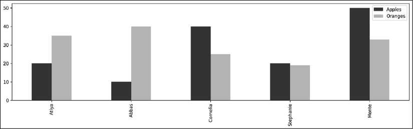
pandas bar plot
- A KDE plot ignores the index and uses the column names along the x-axis and uses the column values to calculate a probability density along the
yvalues:>>> ax = df.plot.kde(color=color, figsize=(16,4)) >>> ax.get_figure().savefig('c13-pdemo-kde1.png')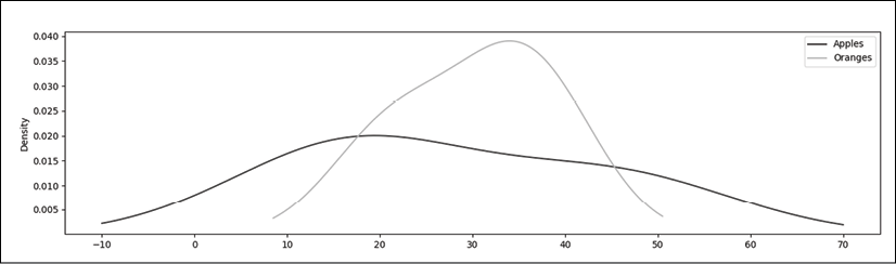
pandas KDE plot
- Let's plot a line plot, scatter plot, and a bar plot in a single figure. The scatter plot is the only one that requires you to specify columns for the
xandyvalues. If you wish to use the index for a scatter plot, you will have to use the.reset_indexmethod to make it a column. The other two plots use the index for the x-axis and make a new set of lines or bars for every single numeric column:>>> fig, (ax1, ax2, ax3) = plt.subplots(1, 3, figsize=(16,4)) >>> fig.suptitle('Two Variable Plots', size=20, y=1.02) >>> df.plot.line(ax=ax1, title='Line plot') >>> df.plot.scatter(x='Apples', y='Oranges', ... ax=ax2, title='Scatterplot') >>> df.plot.bar(color=color, ax=ax3, title='Bar plot') >>> fig.savefig('c13-pdemo-scat.png')
Using pandas to plot multiple charts on a single figure
- Let's put a KDE, boxplot, and histogram in the same figure as well. These plots are used to visualize the distribution of a column:
>>> fig, (ax1, ax2, ax3) = plt.subplots(1, 3, figsize=(16,4))
>>> fig.suptitle('One Variable Plots', size=20, y=1.02)
>>> df.plot.kde(color=color, ax=ax1, title='KDE plot')
>>> df.plot.box(ax=ax2, title='Boxplot')
>>> df.plot.hist(color=color, ax=ax3, title='Histogram')
>>> fig.savefig('c13-pdemo-kde2.png')

Using pandas to plot a KDE, boxplot, and histogram
How it works…
Step 1 creates a small sample DataFrame that will help us illustrate the differences between two and one-variable plotting with pandas. By default, pandas will use each numeric column of the DataFrame to make a new set of bars, lines, KDEs, boxplots, or histograms and use the index as the x values when it is a two-variable plot. One of the exceptions is the scatter plot, which must be explicitly given a single column for the x and y values.
The pandas .plot attribute has various plotting methods with a large number of parameters that allow you to customize the result to your liking. For instance, you can set the figure size, turn the gridlines on and off, set the range of the x and y-axis, color the plot, rotate the tick marks, and much more.
You can also use any of the arguments available to the specific matplotlib plotting method. The extra arguments will be collected by the **kwds parameter from the plot method and correctly passed to the underlying matplotlib function. For example, in step 2, we create a bar plot. This means that we can use all of the parameters available in the matplotlib bar function as well as the ones available in the pandas plotting method.
In step 3, we create a single-variable KDE plot, which creates a density estimate for each numeric column in the DataFrame. Step 4 places all the two-variable plots in the same figure. Likewise, step 5 places all the one-variable plots together.
Each of steps 4 and 5 creates a figure with three Axes objects. The code plt.subplots(1, 3) creates a figure with three Axes spread over a single row and three columns. It returns a two-item tuple consisting of the figure and a one-dimensional NumPy array containing the Axes. The first item of the tuple is unpacked into the variable fig. The second item of the tuple is unpacked into three more variables, one for each Axes. The pandas plotting methods come with an ax parameter, allowing us to place the result of the plot into a specific Axes in the figure.
There's more…
With the exception of the scatter plot, none of the plots specified the columns to be used. pandas defaulted to plotting every numeric column, as well as the index in the case of two-variable plots. You can, of course, specify the exact columns that you would like to use for each x or y value:
>>> fig, (ax1, ax2, ax3) = plt.subplots(1, 3, figsize=(16,4))
>>> df.sort_values('Apples').plot.line(x='Apples', y='Oranges',
...       ax=ax1)
>>> df.plot.bar(x='Apples', y='Oranges', ax=ax2)
>>> df.plot.kde(x='Apples', ax=ax3)
>>> fig.savefig('c13-pdemo-kde3.png')
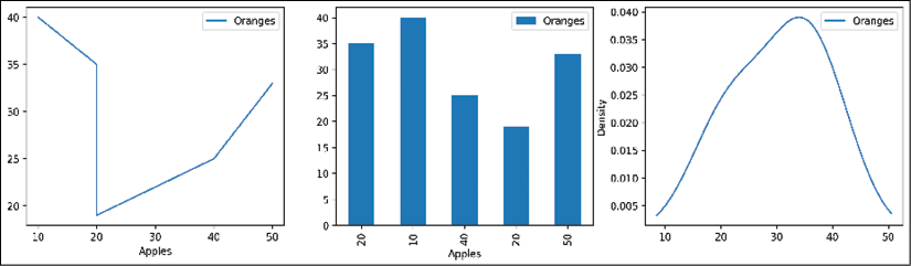
pandas KDE plot
Visualizing the flights dataset
Exploratory data analysis can be guided by visualizations, and pandas provides a great interface for quickly and effortlessly creating them. One strategy when looking at a new dataset is to create some univariate plots. These include bar charts for categorical data (usually strings) and histograms, boxplots, or KDEs for continuous data (always numeric).
In this recipe, we do some basic exploratory data analysis on the flights dataset by creating univariate and multivariate plots with pandas.
How to do it…
- Read in the flights dataset:
>>> flights = pd.read_csv('data/flights.csv') >>> flights MONTH DAY WEEKDAY ... ARR_DELAY DIVERTED CANCELLED 0 1 1 4 ... 65.0 0 0 1 1 1 4 ... -13.0 0 0 2 1 1 4 ... 35.0 0 0 3 1 1 4 ... -7.0 0 0 4 1 1 4 ... 39.0 0 0 ... ... ... ... ... ... ... ... 58487 12 31 4 ... -19.0 0 0 58488 12 31 4 ... 4.0 0 0 58489 12 31 4 ... -5.0 0 0 58490 12 31 4 ... 34.0 0 0 58491 12 31 4 ... -1.0 0 0 - Before we start plotting, let's calculate the number of diverted, canceled, delayed, and ontime flights. We already have binary columns for
DIVERTEDandCANCELLED. Flights are considered delayed whenever they arrive 15 minutes or more later than scheduled. Let's create two new binary columns to track delayed and on-time arrivals:>>> cols = ['DIVERTED', 'CANCELLED', 'DELAYED'] >>> (flights ... .assign(DELAYED=flights['ARR_DELAY'].ge(15).astype(int), ... ON_TIME=lambda df_:1 - df_[cols].any(axis=1)) ... .select_dtypes(int) ... .sum() ... ) MONTH 363858 DAY 918447 WEEKDAY 229690 SCHED_DEP 81186009 DIST 51057671 SCHED_ARR 90627495 DIVERTED 137 CANCELLED 881 DELAYED 11685 ON_TIME 45789 dtype: int64 - Let's now make several plots on the same figure for both categorical and continuous columns:
>>> fig, ax_array = plt.subplots(2, 3, figsize=(18,8))
>>> (ax1, ax2, ax3), (ax4, ax5, ax6) = ax_array
>>> fig.suptitle('2015 US Flights - Univariate Summary', size=20)
>>> ac = flights['AIRLINE'].value_counts()
>>> ac.plot.barh(ax=ax1, title='Airline')
>>> (flights
...     ['ORG_AIR']
...     .value_counts()
...     .plot.bar(ax=ax2, rot=0, title='Origin City')
... )
>>> (flights
...     ['DEST_AIR']
...     .value_counts()
...     .head(10)
...     .plot.bar(ax=ax3, rot=0, title='Destination City')
... )
>>> (flights
...     .assign(DELAYED=flights['ARR_DELAY'].ge(15).astype(int),
...             ON_TIME=lambda df_:1 - df_[cols].any(axis=1))
...     [['DIVERTED', 'CANCELLED', 'DELAYED', 'ON_TIME']]
...     .sum()
...     .plot.bar(ax=ax4, rot=0,
...          log=True, title='Flight Status')
... )
>>> flights['DIST'].plot.kde(ax=ax5, xlim=(0, 3000),
...     title='Distance KDE')
>>> flights['ARR_DELAY'].plot.hist(ax=ax6,
...     title='Arrival Delay',
...     range=(0,200)
... )
>>> fig.savefig('c13-uni1.png')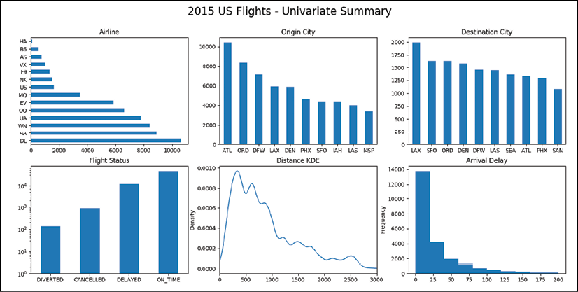
pandas univariate plots
- This is not an exhaustive look at all the univariate statistics but gives us a good amount of detail on some of the variables. Before we move on to multivariate plots, let's plot the number of flights per week. This is the right situation to use a time series plot with the dates on the x-axis. Unfortunately, we don't have pandas Timestamps in any of the columns, but we do have the month and day. The
to_datetimefunction has a nifty trick that identifies column names that match Timestamp components. For instance, if you have a DataFrame with exactly three columns titled year, month, and day, then passing this DataFrame to theto_datetimefunction will return a sequence of Timestamps. To prepare our current DataFrame, we need to add a column for the year and use the scheduled departure time to get the hour and minute:>>> df_date = (flights ... [['MONTH', 'DAY']] ... .assign(YEAR=2015, ... HOUR=flights['SCHED_DEP'] // 100, ... MINUTE=flights['SCHED_DEP'] % 100) ... ) >>> df_date MONTH DAY YEAR HOUR MINUTE 0 1 1 2015 16 25 1 1 1 2015 8 23 2 1 1 2015 13 5 3 1 1 2015 15 55 4 1 1 2015 17 20 ... ... ... ... ... ... 58487 12 31 2015 5 15 58488 12 31 2015 19 10 58489 12 31 2015 18 46 58490 12 31 2015 5 25 58491 12 31 2015 8 59 - Then, almost by magic, we can turn this DataFrame into a proper Series of Timestamps with the
to_datetimefunction:>>> flight_dep = pd.to_datetime(df_date) >>> flight_dep 0 2015-01-01 16:25:00 1 2015-01-01 08:23:00 2 2015-01-01 13:05:00 3 2015-01-01 15:55:00 4 2015-01-01 17:20:00 ... 58487 2015-12-31 05:15:00 58488 2015-12-31 19:10:00 58489 2015-12-31 18:46:00 58490 2015-12-31 05:25:00 58491 2015-12-31 08:59:00 Length: 58492, dtype: datetime64[ns] - Let's use this result as our new index and then find the count of flights per week with the
.resamplemethod:>>> flights.index = flight_dep >>> fc = flights.resample('W').size() >>> fc.plot.line(figsize=(12,3), title='Flights per Week', grid=True) >>> fig.savefig('c13-ts1.png')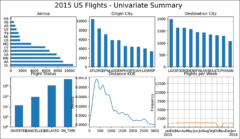
pandas timeseries plot
- This plot is quite revealing. It appears that we have no data for the month of October. Due to this missing data, it's quite difficult to analyze any trend visually, if one exists. The first and last weeks are also lower than normal, likely because there isn't a full week of data for them. Let's make any week of data with fewer than 600 flights missing. Then, we can use the interpolate method to fill in this missing data:
>>> def interp_lt_n(df_, n=600):
...     return (df_
...         .where(df_ > n)
...         .interpolate(limit_direction='both')
... )
>>> fig, ax = plt.subplots(figsize=(16,4))
>>> data = (flights
...     .resample('W')
...     .size()
... )
>>> (data
...     .pipe(interp_lt_n)
...     .iloc[1:-1]
...     .plot.line(color='black', ax=ax)
... )
>>> mask = data<600
>>> (data
...      .pipe(interp_lt_n)
...      [mask]
...      .plot.line(color='.8', linewidth=10)
... )
>>> ax.annotate(xy=(.8, .55), xytext=(.8, .77),
...             xycoords='axes fraction', s='missing data',
...             ha='center', size=20, arrowprops=dict())
>>> ax.set_title('Flights per Week (Interpolated Missing Data)')
>>> fig.savefig('c13-ts2.png')
pandas timeseries plot
- Let's change directions and focus on multivariable plotting. Let's find the 10 airports that:
- Have the longest average distance traveled for inbound flights
- Have a minimum of 100 total flights
>>> fig, ax = plt.subplots(figsize=(16,4))
>>> (flights
...     .groupby('DEST_AIR')
...     ['DIST']
...     .agg(['mean', 'count'])
...     .query('count > 100')
...     .sort_values('mean')
...     .tail(10)
...     .plot.bar(y='mean', rot=0, legend=False, ax=ax,
...         title='Average Distance per Destination')
... )
>>> fig.savefig('c13-bar1.png')
pandas bar plot
- It's no surprise that the top two destination airports are in Hawaii. Now let's analyze two variables at the same time by making a scatter plot between distance and airtime for all flights under 2,000 miles:
>>> fig, ax = plt.subplots(figsize=(8,6))
>>> (flights
...     .reset_index(drop=True)
...     [['DIST', 'AIR_TIME']]
...     .query('DIST <= 2000')
...     .dropna()
...     .plot.scatter(x='DIST', y='AIR_TIME', ax=ax, alpha=.1, s=1)
... )
>>> fig.savefig('c13-scat1.png')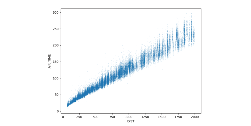
pandas scatter plot
- As expected, a tight linear relationship exists between distance and airtime, though the variance seems to increase as the number of miles increases. Let's look at the correlation:
flights[['DIST', 'AIR_TIME']].corr() - Back to the plot. There are a few flights that are quite far outside the trendline. Let's try and identify them. A linear regression model may be used to formally identify them, but as pandas doesn't support linear regression, we will take a more manual approach. Let's use the
cutfunction to place the flight distances into one of eight groups:>>> (flights ... .reset_index(drop=True) ... [['DIST', 'AIR_TIME']] ... .query('DIST <= 2000') ... .dropna() ... .pipe(lambda df_:pd.cut(df_.DIST, ... bins=range(0, 2001, 250))) ... .value_counts() ... .sort_index() ... ) (0, 250] 6529 (250, 500] 12631 (500, 750] 11506 (750, 1000] 8832 (1000, 1250] 5071 (1250, 1500] 3198 (1500, 1750] 3885 (1750, 2000] 1815 Name: DIST, dtype: int64 - We will assume that all flights within each group should have similar flight times, and thus calculate for each flight the number of standard deviations that the flight time deviates from the mean of that group:
>>> zscore = lambda x: (x - x.mean()) / x.std() >>> short = (flights ... [['DIST', 'AIR_TIME']] ... .query('DIST <= 2000') ... .dropna() ... .reset_index(drop=True) ... .assign(BIN=lambda df_:pd.cut(df_.DIST, ... bins=range(0, 2001, 250))) ... ) >>> scores = (short ... .groupby('BIN') ... ['AIR_TIME'] ... .transform(zscore) ... ) >>> (short.assign(SCORE=scores)) DIST AIR_TIME BIN SCORE 0 590 94.0 (500, 750] 0.490966 1 1452 154.0 (1250, 1500] -1.267551 2 641 85.0 (500, 750] -0.296749 3 1192 126.0 (1000, 1250] -1.211020 4 1363 166.0 (1250, 1500] -0.521999 ... ... ... ... ... 53462 1464 166.0 (1250, 1500] -0.521999 53463 414 71.0 (250, 500] 1.376879 53464 262 46.0 (250, 500] -1.255719 53465 907 124.0 (750, 1000] 0.495005 53466 522 73.0 (500, 750] -1.347036 - We now need a way to discover the outliers. A box plot provides a visual for detecting outliers (beyond 1.5 times the inner quartile range). To create a boxplot for each bin, we need the bin names in the column names. We can use the
.pivotmethod to do this:>>> fig, ax = plt.subplots(figsize=(10,6)) >>> (short.assign(SCORE=scores) ... .pivot(columns='BIN') ... ['SCORE'] ... .plot.box(ax=ax) ... ) >>> ax.set_title('Z-Scores for Distance Groups') >>> fig.savefig('c13-box2.png')
pandas box plot
- Let's examine the points that are greater than six standard deviations away from the mean. Because we reset the index in the flights DataFrame in step 9, we can use it to identify each unique row in the flights DataFrame. Let's create a separate DataFrame with just the outliers:
>>> mask = (short ... .assign(SCORE=scores) ... .pipe(lambda df_:df_.SCORE.abs() >6) ... ) >>> outliers = (flights ... [['DIST', 'AIR_TIME']] ... .query('DIST <= 2000') ... .dropna() ... .reset_index(drop=True) ... [mask] ... .assign(PLOT_NUM=lambda df_:range(1, len(df_)+1)) ... ) >>> outliers DIST AIR_TIME PLOT_NUM 14972 373 121.0 1 22507 907 199.0 2 40768 643 176.0 3 50141 651 164.0 4 52699 802 210.0 5 - We can use this table to identify the outliers on the plot from step 9. pandas also provides a way to attach tables to the bottom of the graph if we use the
tablesparameter:>>> fig, ax = plt.subplots(figsize=(8,6)) >>> (short ... .assign(SCORE=scores) ... .plot.scatter(x='DIST', y='AIR_TIME', ... alpha=.1, s=1, ax=ax, ... table=outliers) ... ) >>> outliers.plot.scatter(x='DIST', y='AIR_TIME', ... s=25, ax=ax, grid=True) >>> outs = outliers[['AIR_TIME', 'DIST', 'PLOT_NUM']] >>> for t, d, n in outs.itertuples(index=False): ... ax.text(d + 5, t + 5, str(n)) >>> plt.setp(ax.get_xticklabels(), y=.1) >>> plt.setp(ax.get_xticklines(), visible=False) >>> ax.set_xlabel('') >>> ax.set_title('Flight Time vs Distance with Outliers') >>> fig.savefig('c13-scat3.png', dpi=300, bbox_inches='tight')
pandas scatter plot
How it works…
After reading in our data in step 1 and calculating columns for delayed and on-time flights, we are ready to begin making univariate plots. The call to the subplots function in step 3 creates a 2 x 3 grid of equal-sized Axes. We unpack each Axes into its own variable to reference it. Each of the calls to the plotting methods references the specific Axes in the figure with the ax parameter. The .value_counts method is used to create the three Series that form the plots in the top row. The rot parameter rotates the tick labels to the given angle.
The plot in the bottom left-hand corner uses a logarithmic scale for the y-axis, as the number of on-time flights is about two orders of magnitude greater than the number of canceled flights. Without the log scale, the left two bars would be difficult to see. By default, KDE plots may result in positive areas for impossible values, such as negative miles in the plot on the bottom row. For this reason, we limit the range of the x values with the xlim parameter.
The histogram created in the bottom right-hand corner on arrival delays was passed the range parameter. This is not part of the method signature of the pandas .plot.hist method. Instead, this parameter gets collected by the **kwds argument and then passed along to the matplotlib hist function. Using xlim as done in the previous plot would not work in this case. The plot would be cropped without recalculating the new bin widths for just that portion of the graph. The range parameter, however, both limits the x-axis and calculates the bin widths for just that range.
Step 4 creates a special extra DataFrame to hold columns with only datetime components so that we can instantly turn each row into a Timestamp with the to_datetime function in step 5.
In step 6 we use the .resample method. This method uses the index to form groups based on the date offset alias passed. We return the number of flights per week (W) as a Series and then call the .plot.line method on it, which formats the index as the x-axis. A glaring hole for the month of October appears.
To fill this hole, we use the .where method to set only values less than 600 to missing in step 7. We then fill in the missing data through linear interpolation. By default, the .interpolate method only interpolates in a forward direction, so any missing values at the start of the DataFrame will remain. By setting the limit_direction parameter to both, we ensure that there are no missing values.
The new data is plotted. To show the missing data more clearly, we select the points that were missing from the original and make a line plot on the same Axes on top of the previous line. Typically, when we annotate the plot, we can use the data coordinates, but in this instance, it isn't obvious what the coordinates of the x-axis are. To use the Axes coordinate system (the one that ranges from (0,0), to (1,1)), the xycoords parameter is set to axes fraction. This new plot now excludes the erroneous data and it makes it is much easier to spot a trend. The summer months have much more air traffic than any other time of the year.
In step 8, we use a long chain of methods to group by each destination airport and apply two functions, mean and count, to the DIST column. The .query method works well in a method for simple filtering. We have two columns in our DataFrame when we get to the .plot.bar method, which, by default, would make a bar plot for each column. We are not interested in the count column and therefore select only the mean column to form the bars. Also, when plotting with a DataFrame, each column name appears in the legend. This would put the word mean in the legend, which would not be useful, so we remove it by setting the legend parameter to False.
Step 9 starts to look at the relationship between distance traveled and flight airtime. Due to the huge number of points, we shrink their size with the s parameter. We also use the alpha parameter to reveal overlapping points.
We see a correlation and quantify that value in step 10.
To find the flights that took much longer on average to reach their destination, we group each flight into 250-mile chunks in step 11 and find the number of standard deviations from their group mean in step 12.
In step 13, a new box plot is created in the same Axes for every unique value of the BIN.
In step 14, the current DataFrame, short, contains the information we need to find the slowest flights, but it does not possess all of the original data that we might want to investigate further. Because we reset the index of short in step 12, we can use it to identify the same row from the original. We also give each of the outlier rows a unique integer, PLOT_NUM, to identify it later on when plotting.
In step 15, we begin with the same scatter plot as in step 9 but use the table parameter to append the outlier table to the bottom of the plot. We then plot our outliers as a scatter plot on top and ensure that their points are larger to identify them easily. The .itertuples method loops through each DataFrame row and returns its values as a tuple. We unpack the corresponding x and y values for our plot and label it with the number we assigned to it.
As the table is placed underneath of the plot, it interferes with the plotting objects on the x-axis. We move the tick labels to the inside of the axis and remove the tick lines and axis label. This table provides information about outlying events.
Stacking area charts to discover emerging trends
Stacked area charts are great visualizations to discover emerging trends, especially in the marketplace. It is a common choice to show the percentage of the market share for things such as internet browsers, cell phones, or vehicles.
In this recipe, we will use data gathered from the popular website meetup.com. Using a stacked area chart, we will show membership distribution between five data science-related meetup groups.
How to do it…
- Read in the meetup dataset, convert the
join_datecolumn into a Timestamp, and set it as the index:>>> meetup = pd.read_csv('data/meetup_groups.csv', ... parse_dates=['join_date'], ... index_col='join_date') >>> meetup group ... country join_date ... 2016-11-18 02:41:29 houston machine learning ... us 2017-05-09 14:16:37 houston machine learning ... us 2016-12-30 02:34:16 houston machine learning ... us 2016-07-18 00:48:17 houston machine learning ... us 2017-05-25 12:58:16 houston machine learning ... us ... ... ... ... 2017-10-07 18:05:24 houston data visualization ... us 2017-06-24 14:06:26 houston data visualization ... us 2015-10-05 17:08:40 houston data visualization ... us 2016-11-04 22:36:24 houston data visualization ... us 2016-08-02 17:47:29 houston data visualization ... us - Let's get the number of people who joined each group each week:
>>> (meetup ... .groupby([pd.Grouper(freq='W'), 'group']) ... .size() ... ) join_date group 2010-11-07 houstonr 5 2010-11-14 houstonr 11 2010-11-21 houstonr 2 2010-12-05 houstonr 1 2011-01-16 houstonr 2 .. 2017-10-15 houston data science 14 houston data visualization 13 houston energy data science 9 houston machine learning 11 houstonr 2 Length: 763, dtype: int64 - Unstack the group level so that each meetup group has its own column of data:
>>> (meetup ... .groupby([pd.Grouper(freq='W'), 'group']) ... .size() ... .unstack('group', fill_value=0) ... ) group houston data science ... houstonr join_date ... 2010-11-07 0 ... 5 2010-11-14 0 ... 11 2010-11-21 0 ... 2 2010-12-05 0 ... 1 2011-01-16 0 ... 2 ... ... ... ... 2017-09-17 16 ... 0 2017-09-24 19 ... 7 2017-10-01 20 ... 1 2017-10-08 22 ... 2 2017-10-15 14 ... 2 - This data represents the number of members who joined that particular week. Let's take the cumulative sum of each column to get the grand total number of members:
>>> (meetup ... .groupby([pd.Grouper(freq='W'), 'group']) ... .size() ... .unstack('group', fill_value=0) ... .cumsum() ... ) group houston data science ... houstonr join_date ... 2010-11-07 0 ... 5 2010-11-14 0 ... 16 2010-11-21 0 ... 18 2010-12-05 0 ... 19 2011-01-16 0 ... 21 ... ... ... ... 2017-09-17 2105 ... 1056 2017-09-24 2124 ... 1063 2017-10-01 2144 ... 1064 2017-10-08 2166 ... 1066 2017-10-15 2180 ... 1068 - Many stacked area charts use the percentage of the total so that each row always adds up to 1. Let's divide each row by the row total to find the relative number:
>>> (meetup ... .groupby([pd.Grouper(freq='W'), 'group']) ... .size() ... .unstack('group', fill_value=0) ... .cumsum() ... .pipe(lambda df_: df_.div( ... df_.sum(axis='columns'), axis='index')) ... ) group houston data science ... houstonr join_date ... 2010-11-07 0.000000 ... 1.000000 2010-11-14 0.000000 ... 1.000000 2010-11-21 0.000000 ... 1.000000 2010-12-05 0.000000 ... 1.000000 2011-01-16 0.000000 ... 1.000000 ... ... ... ... 2017-09-17 0.282058 ... 0.141498 2017-09-24 0.282409 ... 0.141338 2017-10-01 0.283074 ... 0.140481 2017-10-08 0.284177 ... 0.139858 2017-10-15 0.284187 ... 0.139226 - We can now create our stacked area plot, which will continually accumulate the columns, one on top of the other:
>>> fig, ax = plt.subplots(figsize=(18,6))
>>> (meetup
...     .groupby([pd.Grouper(freq='W'), 'group'])
...     .size()
...     .unstack('group', fill_value=0)
...     .cumsum()
...     .pipe(lambda df_: df_.div(
...           df_.sum(axis='columns'), axis='index'))
...     .plot.area(ax=ax,
...           cmap='Greys', xlim=('2013-6', None),
...           ylim=(0, 1), legend=False)
... )
 >>> ax.figure.suptitle('Houston Meetup Groups', size=25)
 >>> ax.set_xlabel('')
 >>> ax.yaxis.tick_right()
 >>> kwargs = {'xycoords':'axes fraction', 'size':15}
 >>> ax.annotate(xy=(.1, .7), s='R Users',
 ...     color='w', **kwargs)
 >>> ax.annotate(xy=(.25, .16), s='Data Visualization',
 ...     color='k', **kwargs)
 >>> ax.annotate(xy=(.5, .55), s='Energy Data Science',
 ...     color='k', **kwargs)
 >>> ax.annotate(xy=(.83, .07), s='Data Science',
 ...     color='k', **kwargs)
 >>> ax.annotate(xy=(.86, .78), s='Machine Learning',
 ...     color='w', **kwargs)
 >>> fig.savefig('c13-stacked1.png')
Stacked plot of meetup group distribution
How it works…
Our goal is to determine the distribution of members among the five largest data science meetup groups in Houston over time. To do this, we need to find the total membership at every point in time since each group began.
In step 2, we group by each week (offset alias W) and meetup group and return the number of sign-ups for that week with the .size method.
The resulting Series is not suitable to make plots with pandas. Each meetup group needs its own column, so we reshape the group index level as columns. We set the option fill_value to zero so that groups with no memberships during a particular week will not have missing values.
We are in need of the total number of members each week. The .cumsum method in step 4 provides this for us. We could create our stacked area plot after this step, which would be a nice way to visualize the raw total membership.
In step 5, we find the distribution of each group as a fraction of the total members in all groups by dividing each value by its row total. By default, pandas automatically aligns objects by their columns, so we cannot use the division operator. Instead, we must use the .div method and use the axis parameter with a value of index.
The data is now ready for a stacked area plot, which we create in step 6. Notice that pandas allows you to set the axis limits with a datetime string. This will not work if done in matplotlib using the ax.set_xlim method. The starting date for the plot is moved up a couple years because the Houston R Users group began much earlier than any of the other groups.
Understanding the differences between seaborn and pandas
The seaborn library is a popular Python library for creating visualizations. Like pandas, it does not do any actual plotting itself and is a wrapper around matplotlib. Seaborn plotting functions work with pandas DataFrames to create aesthetically pleasing visualizations.
While seaborn and pandas both reduce the overhead of matplotlib, the way they approach data is completely different. Nearly all of the seaborn plotting functions require tidy (or long) data.
Processing tidy data during data analysis often creates aggregated or wide data. This data, in wide format, is what pandas uses to make its plots.
In this recipe, we will build similar plots with both seaborn and pandas to show the types of data (tidy versus wide) that they accept.
How to do it…
- Read in the employee dataset:
>>> employee = pd.read_csv('data/employee.csv', ... parse_dates=['HIRE_DATE', 'JOB_DATE']) >>> employee UNIQUE_ID POSITION_TITLE DEPARTMENT ... 0 0 ASSISTAN... Municipa... ... 1 1 LIBRARY ... Library ... 2 2 POLICE O... Houston ... ... 3 3 ENGINEER... Houston ... ... 4 4 ELECTRICIAN General ... ... ... ... ... ... ... 1995 1995 POLICE O... Houston ... ... 1996 1996 COMMUNIC... Houston ... ... 1997 1997 POLICE O... Houston ... ... 1998 1998 POLICE O... Houston ... ... 1999 1999 FIRE FIG... Houston ... ... [2000 rows x 10 columns] - Import the seaborn library, and alias it as
sns:>>> import seaborn as sns - Let's make a bar chart of the count of each department with seaborn:
>>> fig, ax = plt.subplots(figsize=(8, 6))
>>> sns.countplot(y='DEPARTMENT', data=employee, ax=ax)
>>> fig.savefig('c13-sns1.png', dpi=300, bbox_inches='tight')
Seaborn bar plot
- To reproduce this plot with pandas, we will need to aggregate the data beforehand:
>>> fig, ax = plt.subplots(figsize=(8, 6))
>>> (employee
...     ['DEPARTMENT']
...     .value_counts()
...     .plot.barh(ax=ax)
... )
>>> fig.savefig('c13-sns2.png', dpi=300, bbox_inches='tight')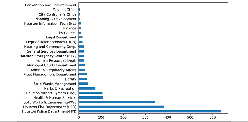
pandas bar plot
- Now, let's find the average salary for each race with seaborn:
>>> fig, ax = plt.subplots(figsize=(8, 6))
>>> sns.barplot(y='RACE', x='BASE_SALARY', data=employee, ax=ax)
>>> fig.savefig('c13-sns3.png', dpi=300, bbox_inches='tight')
Seaborn bar plot
- To replicate this with pandas, we will need to group by
RACEfirst:>>> fig, ax = plt.subplots(figsize=(8, 6)) >>> (employee ... .groupby('RACE', sort=False) ... ['BASE_SALARY'] ... .mean() ... .plot.barh(rot=0, width=.8, ax=ax) ... ) >>> ax.set_xlabel('Mean Salary') >>> fig.savefig('c13-sns4.png', dpi=300, bbox_inches='tight')
pandas bar plot
- Seaborn also has the ability to distinguish groups within the data through a third variable,
hue, in most of its plotting functions. Let's find the mean salary byRACEandGENDER:>>> fig, ax = plt.subplots(figsize=(18, 6)) >>> sns.barplot(x='RACE', y='BASE_SALARY', hue='GENDER', ... ax=ax, data=employee, palette='Greys', ... order=['Hispanic/Latino', ... 'Black or African American', ... 'American Indian or Alaskan Native', ... 'Asian/Pacific Islander', 'Others', ... 'White']) >>> fig.savefig('c13-sns5.png', dpi=300, bbox_inches='tight')
Seaborn bar plot
- With pandas, we will have to group by both
RACEandGENDERand then unstack the genders as column names:>>> fig, ax = plt.subplots(figsize=(18, 6)) >>> (employee ... .groupby(['RACE', 'GENDER'], sort=False) ... ['BASE_SALARY'] ... .mean() ... .unstack('GENDER') ... .sort_values('Female') ... .plot.bar(rot=0, ax=ax, ... width=.8, cmap='viridis') ... ) >>> fig.savefig('c13-sns6.png', dpi=300, bbox_inches='tight')
pandas bar plot
- A box plot is another plot that both seaborn and pandas have in common. Let's create a box plot of salary by
RACEandGENDERwith seaborn:>>> fig, ax = plt.subplots(figsize=(8, 6)) >>> sns.boxplot(x='GENDER', y='BASE_SALARY', data=employee, ... hue='RACE', palette='Greys', ax=ax) >>> fig.savefig('c13-sns7.png', dpi=300, bbox_inches='tight')

Seaborn box plot
- pandas is not easily able to produce an exact replication for this box plot. It can create two separate Axes for gender and then make box plots of salaries by race:
>>> fig, axs = plt.subplots(1, 2, figsize=(12, 6), sharey=True)
>>> for g, ax in zip(['Female', 'Male'], axs):
...     (employee
...         .query('GENDER == @g')
...         .assign(RACE=lambda df_:df_.RACE.fillna('NA'))
...         .pivot(columns='RACE')
...         ['BASE_SALARY']
...         .plot.box(ax=ax, rot=30)
...     )
...     ax.set_title(g + ' Salary')
...     ax.set_xlabel('')
>>> fig.savefig('c13-sns8.png', bbox_inches='tight')
pandas box plot
How it works…
Importing seaborn in step 2 changes many of the default properties of matplotlib. There are about 300 default plotting parameters that can be accessed within the dictionary-like object plt.rcParams. To restore the matplotlib defaults, call the plt.rcdefaults function with no arguments.
The style of pandas plots will also be affected when importing seaborn. Our employee dataset meets the requirements for tidy data and thus makes it perfect to use for nearly all seaborn's plotting functions.
Seaborn will do all the aggregation; you just need to supply your DataFrame to the data parameter and refer to the columns with their string names. For instance, in step 3, the countplot function effortlessly counts each occurrence of a DEPARTMENT to create a bar chart. Most seaborn plotting functions have x and y parameters. We could have made a vertical bar plot by switching the values for x and y. pandas forces you to do a bit more work to get the same plot. In step 4, we must precalculate the height of the bins using the .value_counts method.
Seaborn is able to do more complex aggregations, as seen in steps 5 and 7, with the barplot function. The hue parameter further splits each of the groups on the x-axis. pandas is capable of nearly replicating these plots by grouping by the x and hue variables in steps 6 and 8.
Box plots are available in both seaborn and pandas and can be plotted with tidy data without any aggregation. Even though no aggregation is necessary, seaborn still has the upper hand, as it can split data neatly into separate groups using the hue parameter. pandas cannot easily replicate this function from seaborn, as seen in step 10. Each group needs to be split with the .query method and plotted on its own Axes.
Multivariate analysis with seaborn Grids
Seaborn has the ability to facet multiple plots in a grid. Certain functions in seaborn do not work at the matplotlib axis level, but rather at the figure level. These include catplot, lmplot, pairplot, jointplot, and clustermap.
The figure or grid functions, for the most part, use the axes functions to build the grid. The final objects returned from the grid functions are of grid type, of which there are four different kinds. Advanced use cases necessitate the use of grid types, but the vast majority of the time, you will call the underlying grid functions to produce the actual Grid and not the constructor itself.
In this recipe, we will examine the relationship between years of experience and salary by gender and race. We will begin by creating a regression plot with a seaborn Axes function and then add more dimensions to the plot with grid functions.
How to do it…
- Read in the employee dataset, and create a column for years of experience:
>>> emp = pd.read_csv('data/employee.csv', ... parse_dates=['HIRE_DATE', 'JOB_DATE']) >>> def yrs_exp(df_): ... days_hired = pd.to_datetime('12-1-2016') - df_.HIRE_DATE ... return days_hired.dt.days / 365.25 >>> emp = (emp ... .assign(YEARS_EXPERIENCE=yrs_exp) ... ) >>> emp[['HIRE_DATE', 'YEARS_EXPERIENCE']] HIRE_DATE YEARS_EXPERIENCE 0 2006-06-12 10.472494 1 2000-07-19 16.369946 2 2015-02-03 1.826184 3 1982-02-08 34.812488 4 1989-06-19 27.452994 ... ... ... 1995 2014-06-09 2.480544 1996 2003-09-02 13.248732 1997 2014-10-13 2.135567 1998 2009-01-20 7.863269 1999 2009-01-12 7.885172 - Let's create a scatter plot with a fitted regression line to represent the relationship between years of experience and salary:
>>> fig, ax = plt.subplots(figsize=(8, 6))
>>> sns.regplot(x='YEARS_EXPERIENCE', y='BASE_SALARY',
...     data=emp, ax=ax)
>>> fig.savefig('c13-scat4.png', dpi=300, bbox_inches='tight')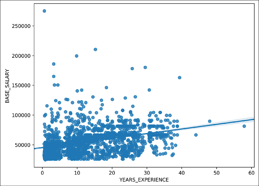
Seaborn scatter plot
- The
regplotfunction cannot plot multiple regression lines for different columns. Let's use thelmplotfunction to plot a seaborngridthat adds regression lines for males and females:>>> grid = sns.lmplot(x='YEARS_EXPERIENCE', y='BASE_SALARY', ... hue='GENDER', palette='Greys', ... scatter_kws={'s':10}, data=emp) >>> grid.fig.set_size_inches(8, 6) >>> grid.fig.savefig('c13-scat5.png', dpi=300, bbox_inches='tight')
Seaborn scatter plot
- The real power of the seaborn
gridfunctions is their ability to add more Axes based on another variable. Thelmplotfunction has thecolandrowparameters available to divide the data further into different groups. For instance, we can create a separate plot for each unique race in the dataset and still fit the regression lines by gender:>>> grid = sns.lmplot(x='YEARS_EXPERIENCE', y='BASE_SALARY', ... hue='GENDER', col='RACE', col_wrap=3, ... palette='Greys', sharex=False, ... line_kws = {'linewidth':5}, ... data=emp) >>> grid.set(ylim=(20000, 120000)) >>> grid.fig.savefig('c13-scat6.png', dpi=300, bbox_inches='tight')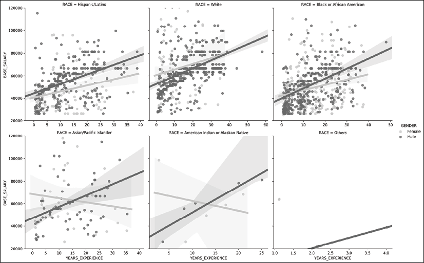
Seaborn scatter plot
How it works…
In step 1, we create another continuous variable by using pandas date functionality. This data was collected from the city of Houston on December 1, 2016. We use this date to determine how long each employee has worked for the city. When we subtract dates, as done in the second line of code, we are returned a Timedelta object whose largest unit is days. We divided the days of this result by 365.25 to calculate the years of experience.
Step 2 uses the regplot function to create a scatter plot with the estimated regression line. It returns a matplotlib Axes, which we use to change the size of the figure. To create two separate regression lines for each gender, we must use the lmplot function, which returns a seaborn FacetGrid. This function has a hue parameter, which overlays a new regression line of distinct color for each unique value of that column.
The seaborn FacetGrid is essentially a wrapper around the matplotlib Figure, with a few convenience methods to alter its elements. You can access the underlying matplotlib Figure with their.fig attribute. Step 4 shows a common use-case for seaborn functions that return FacetGrids, which is to create multiple plots based on a third or even fourth variable. We set the col parameter to RACE. Six regression plots are created for each of the six unique races in the RACE column. Normally, this would return a grid consisting of one row and six columns, but we use the col_wrap parameter to wrap the row after three columns.
There are other parameters to control aspects of the Grid. It is possible to use parameters from the underlying line and scatter plot functions from matplotlib. To do so, set the scatter_kws or the line_kws parameters to a dictionary that has the matplotlib parameter as a key paired with the value.
There's more…
We can do a similar type of analysis when we have categorical features. First, let's reduce the number of levels in the categorical variables RACE and DEPARTMENT to the top two and three most common, respectively:
>>> deps = emp['DEPARTMENT'].value_counts().index[:2]
>>> races = emp['RACE'].value_counts().index[:3]
>>> is_dep = emp['DEPARTMENT'].isin(deps)
>>> is_race = emp['RACE'].isin(races)
>>> emp2 = (emp
...     [is_dep & is_race]
...     .assign(DEPARTMENT=lambda df_:
...             df_['DEPARTMENT'].str.extract('(HPD|HFD)',
...                                     expand=True))
... )
>>> emp2.shape
(968, 11)
>>> emp2['DEPARTMENT'].value_counts()
HPD    591
HFD    377
Name: DEPARTMENT, dtype: int64
>>> emp2['RACE'].value_counts()
White                        478
Hispanic/Latino              250
Black or African American    240
Name: RACE, dtype: int64
Let's use one of the simpler Axes-level functions, such as violinplot to view the distribution of years of experience by gender:
>>> common_depts = (emp
...     .groupby('DEPARTMENT')
...     .filter(lambda group: len(group) > 50)
... )
>>> fig, ax = plt.subplots(figsize=(8, 6))
>>> sns.violinplot(x='YEARS_EXPERIENCE', y='GENDER',
...     data=common_depts)
>>> fig.savefig('c13-vio1.png', dpi=300, bbox_inches='tight')

Seaborn violin plot
We can then use the catplot to add a violin plot for each unique combination of department and race with the col and row parameters:
>>> grid = sns.catplot(x='YEARS_EXPERIENCE', y='GENDER',
...                       col='RACE', row='DEPARTMENT',
...                       height=3, aspect=2,
...                       data=emp2, kind='violin')
>>> grid.fig.savefig('c13-vio2.png', dpi=300, bbox_inches='tight')
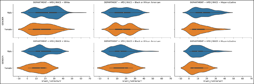
Seaborn violin plot
Uncovering Simpson's Paradox in the diamonds dataset with seaborn
It is unfortunately quite easy to report erroneous results when doing data analysis. Simpson's Paradox is one of the more common phenomena that can appear. It occurs when one group shows a higher result than another group, when all the data is aggregated, but it shows the opposite when the data is subdivided into different segments. For instance, let's say we have two students, A and B, who have each been given a test with 100 questions on it. Student A answers 50% of the questions correct, while Student B gets 80% correct. This obviously suggests Student B has greater aptitude:
| Student | Raw Score | Percent Correct |
|
A |
50/100 |
50 |
|
B |
80/100 |
80 |
Let's say that the two tests were very different. Student A's test consisted of 95 problems that were difficult and only five that were easy. Student B was given a test with the exact opposite ratio:
| Student | Difficult | Easy | Difficult Percent | Easy Percent | Percent |
|
A |
45/95 |
5/5 |
47 |
100 |
50 |
|
B |
2/5 |
78/95 |
40 |
82 |
80 |
This paints a completely different picture. Student A now has a higher percentage of both the difficult and easy problems but has a much lower percentage as a whole. This is a quintessential example of Simpson's Paradox. The aggregated whole shows the opposite of each individual segment.
In this recipe, we will first reach a perplexing result that appears to suggest that higher quality diamonds are worth less than lower quality ones. We uncover Simpson's Paradox by taking more finely grained glimpses into the data that suggest the opposite is true.
How to do it…
- Read in the diamonds dataset:
>>> dia = pd.read_csv('data/diamonds.csv') >>> dia carat cut color ... x y z 0 0.23 Ideal E ... 3.95 3.98 2.43 1 0.21 Premium E ... 3.89 3.84 2.31 2 0.23 Good E ... 4.05 4.07 2.31 3 0.29 Premium I ... 4.20 4.23 2.63 4 0.31 Good J ... 4.34 4.35 2.75 ... ... ... ... ... ... ... ... 53935 0.72 Ideal D ... 5.75 5.76 3.50 53936 0.72 Good D ... 5.69 5.75 3.61 53937 0.70 Very Good D ... 5.66 5.68 3.56 53938 0.86 Premium H ... 6.15 6.12 3.74 53939 0.75 Ideal D ... 5.83 5.87 3.64 - Before we begin analysis, let's change the
cut,color, andclaritycolumns into ordered categorical variables:>>> cut_cats = ['Fair', 'Good', 'Very Good', 'Premium', 'Ideal'] >>> color_cats = ['J', 'I', 'H', 'G', 'F', 'E', 'D'] >>> clarity_cats = ['I1', 'SI2', 'SI1', 'VS2', ... 'VS1', 'VVS2', 'VVS1', 'IF'] >>> dia2 = (dia ... .assign(cut=pd.Categorical(dia['cut'], ... categories=cut_cats, ... ordered=True), ... color=pd.Categorical(dia['color'], ... categories=color_cats, ... ordered=True), ... clarity=pd.Categorical(dia['clarity'], ... categories=clarity_cats, ... ordered=True)) ... ) >>> dia2 carat cut color ... x y z 0 0.23 Ideal E ... 3.95 3.98 2.43 1 0.21 Premium E ... 3.89 3.84 2.31 2 0.23 Good E ... 4.05 4.07 2.31 3 0.29 Premium I ... 4.20 4.23 2.63 4 0.31 Good J ... 4.34 4.35 2.75 ... ... ... ... ... ... ... ... 53935 0.72 Ideal D ... 5.75 5.76 3.50 53936 0.72 Good D ... 5.69 5.75 3.61 53937 0.70 Very Good D ... 5.66 5.68 3.56 53938 0.86 Premium H ... 6.15 6.12 3.74 53939 0.75 Ideal D ... 5.83 5.87 3.64 - Seaborn uses category orders for its plots. Let's make a bar plot of the mean price for each level of the
cut,color, andclaritycolumns:>>> import seaborn as sns >>> fig, (ax1, ax2, ax3) = plt.subplots(1, 3, figsize=(14,4)) >>> sns.barplot(x='color', y='price', data=dia2, ax=ax1) >>> sns.barplot(x='cut', y='price', data=dia2, ax=ax2) >>> sns.barplot(x='clarity', y='price', data=dia2, ax=ax3) >>> fig.suptitle('Price Decreasing with Increasing Quality?') >>> fig.savefig('c13-bar4.png', dpi=300, bbox_inches='tight')
Seaborn bar plot
- There seems to be a decreasing trend for color and price. The highest quality cut and clarity levels also have low prices. How can this be? Let's dig a little deeper and plot the price for each diamond color again, but make a new plot for each level of the
claritycolumn:>>> grid = sns.catplot(x='color', y='price', col='clarity', ... col_wrap=4, data=dia2, kind='bar') >>> grid.fig.savefig('c13-bar5.png', dpi=300, bbox_inches='tight')
Seaborn bar plot
- This plot is a little more revealing. Although price appears to decrease as the quality of color increases, it does not do so when clarity is at its highest level. There is a substantial increase in price. We have yet to look at just the price of the diamond without paying any attention to its size. Let's recreate the plot from step 3 but use the carat size in place of price:
>>> fig, (ax1, ax2, ax3) = plt.subplots(1, 3, figsize=(14,4))
>>> sns.barplot(x='color', y='carat', data=dia2, ax=ax1)
>>> sns.barplot(x='cut', y='carat', data=dia2, ax=ax2)
>>> sns.barplot(x='clarity', y='carat', data=dia2, ax=ax3)
>>> fig.suptitle('Diamond size decreases with quality')
>>> fig.savefig('c13-bar6.png', dpi=300, bbox_inches='tight')
Seaborn bar plot
- Now our story is starting to make a bit more sense. Higher quality diamonds appear to be smaller in size, which intuitively makes sense. Let's create a new variable that segments the carat values into five distinct sections, and then create a point plot. The plot that follows reveals that higher quality diamonds do, in fact, cost more money when they are segmented based on size:
>>> dia2 = (dia2
...     .assign(carat_category=pd.qcut(dia2.carat, 5))
... )
>>> from matplotlib.cm import Greys
>>> greys = Greys(np.arange(50,250,40))
>>> grid = sns.catplot(x='clarity', y='price', data=dia2,
...    hue='carat_category', col='color',
...    col_wrap=4, kind='point', palette=greys)
>>> grid.fig.suptitle('Diamond price by size, color and clarity',
...    y=1.02, size=20)
>>> grid.fig.savefig('c13-bar7.png', dpi=300, bbox_inches='tight')
Seaborn point plot
How it works…
In this recipe, it is important to create categorical columns, as they are allowed to be ordered. Seaborn uses this ordering to place the labels on the plot. Steps 3 and 4 show what appears to be a downward trend for increasing diamond quality. This is where Simpson's paradox takes center stage. This aggregated result of the whole is being confounded by other variables not yet examined.
The key to uncovering this paradox is to focus on carat size. Step 5 reveals to us that carat size is also decreasing with increasing quality. To account for this fact, we cut the diamond size into five equally-sized bins with the qcut function. By default, this function cuts the variable into discrete categories based on the given quantiles. By passing it an integer, as was done in this step, it creates equally-spaced quantiles. You also have the option of passing it a sequence of explicit non-regular quantiles.
With this new variable, we can make a plot of the mean price per diamond size per group, as done in step 6. The point plot in seaborn creates a line plot connecting the means of each category. The vertical bar at each point is the standard deviation for that group. This plot confirms that diamonds do indeed become more expensive as their quality increases, as long as we hold the carat size as the constant.
There's more…
The bar plots in steps 3 and 5 could have been created with the more advanced seaborn PairGrid constructor, which can plot a bivariate relationship. Using a PairGrid is a two-step process. The first step is to call the constructor and alert it to which variables will be x and which will be y. The second step calls the .map method to apply a plot to all of the combinations of x and y columns:
>>> g = sns.PairGrid(dia2, height=5,
...     x_vars=["color", "cut", "clarity"],
...     y_vars=["price"])
>>> g.map(sns.barplot)
>>> g.fig.suptitle('Replication of Step 3 with PairGrid', y=1.02)
>>> g.fig.savefig('c13-bar8.png', dpi=300, bbox_inches='tight')

Seaborn bar plot