
When designing user interfaces in any technology, you ideally want to encapsulate the look and behavior of commonly used user interface elements into a reusable component that you can use elsewhere in your application or even in other applications. Creating custom controls also reduces the amount of code required in the code-behind, simplifies the XAML in your views, and helps maintain a consistency in your user interface.
We already have a wide range of controls available to use from the core Silverlight control set, the Silverlight Toolkit, and open source controls on CodePlex. Plus, there are many more in the form of third-party controls (from companies such as Telerik, ComponentOne, and Infragistics). Occasionally however, you will find that you have specific requirements that no existing control currently provides. It's at this point that you should consider creating your own control for that purpose.
There are two ways to do create a reusable user interface component in Silverlight, as a user control or as a custom control. User controls generally combine multiple existing controls into a single component, while you will usually start from scratch with custom controls and provide the look and behavior yourself. In this chapter, we will look at creating and using both of these types of components. Some implementation details (such as exposing properties and events) are much the same between the two types of components, but then, other details and capabilities differ greatly (particularly when it comes to styling and templating). However, let's start by simply extending an existing control to add additional behavior to it, before continuing on to focusing on how to create and use user controls and custom controls.
If you simply want to add behavior to an existing control, then you can inherit from that control (rather than creating a whole new control from scratch). For example, let's say you want the text in a TextBox control to automatically be selected when the control gains the focus, enabling the user to easy overwrite the existing text (instead of the default behavior where the cursor is simply placed at the end of the existing text).
There are two options to achieve this behavior:
The first option is to create an action (as described back in Chapter 10, "Advanced XAML and Data Binding"), which is triggered when the control gets the focus and selects the text as required (or alternatively you could create a behavior instead). You can then apply that to each control that should implement that behavior. However, this requires the designer/developer to remember to apply that behavior to each control and adds to the complexity of the XAML in your views.
If the behavior is a common requirement for the control in your project, another option is to inherit from that control, adding the behavior to it, and using the inherited control in its place.
Using our example of a TextBox that automatically selects all the text when it receives the focus, we can create a new class called CustomTextBox, inherit from TextBox, and add the behavior:
public class CustomTextBox : TextBox
{
    protected override void OnGotFocus(RoutedEventArgs e)
    {
        base.OnGotFocus(e);
        this.SelectAll();
    }
}
By default, the new control (CustomTextBox) will continue to use the default control template that the control it inherits from uses (TextBox). So for our CustomTextBox control, it will continue to use the TextBox's default control template. If you want to use a different default control template, simply assign the control's type to the DefaultStyleKey property and define a corresponding style resource in the generic.xaml file.
DefaultStyleKey = typeof(CustomTextBox);
Note
There are a number of primitive controls that don't appear in the Toolbox, but you may wish to inherit from them. These primitive controls form the base of many other controls. For example, the Selector primitive control forms the base for the ListBox and the ComboBox controls. You will find these primitive controls in the System.Windows.Controls.Primitives namespace, with controls including ButtonBase, Popup, RangeBase, RepeatButton, ScrollBar, Selector, Thumb, and ToggleButton.
User controls enable you to build a user interface component that leverages one or more existing controls, combining them together to form a single unit. Creating a user control is as simple as adding a new Silverlight User Control item to your project and adding controls to it using the XAML designer (designing it as you would a view). In fact, as you discovered back in Chapter 4, "The Navigation Framework," the MainPage class itself is a user control. It then appears in the Toolbox, where you can drag and drop it into your views as required. You can also define properties and events in its code behind, which can be used by the views that consume the user control.
Let's create a simple user control that includes a label and a text box together as a single component. Add a new item to your project using the Silverlight User Control item template, named FormField.xaml. Lay it out with a Label control and a TextBox control in a Grid, like so:
<Grid x:Name="LayoutRoot" Background="White">
    <Grid.ColumnDefinitions>
        <ColumnDefinition Width="120" />
        <ColumnDefinition Width="180" />
    </Grid.ColumnDefinitions>
    <sdk:Label Name="dataLabel" Padding="0,0,5,0"
               HorizontalAlignment="Right" HorizontalContentAlignment="Left"
               Target="{Binding ElementName=dataField}" />
    <TextBox Name="dataField" HorizontalAlignment="Left" VerticalAlignment="Center"
             Grid.Column="1" Width="170" />
</Grid>
Note
You will need to declare the sdk namespace prefix (for the http://schemas.microsoft.com/winfx/2006/xaml/presentation/sdk namespace) in the root element of your XAML file.
This and setting the size of the user control (Width = 300, Height = 30) results in the designer output shown in Figure 11-1.

If you compile your project now and open the MainPage.xaml file in the designer, you will find that your FormField user control appears in the Toolbox. You can now drag it from the Toolbox and onto the design surface of the MainPage view, just as you would any other control.
Note
The MoXAML Power Toys described back in Chapter 10, "Advanced XAML and Data Binding," provides a feature where you can select some XAML (from the XAML view in the designer) and extract it to a user control, which can help you refactor elements of your views into a separate reusable user control. If you are working in Expression Blend, you can select the elements in the designer, right-click, and select Make Control from the context menu.
For simple user controls that may simply display a static layout (such as some text) or consume and display some data via their DataContext property, you may not need to provide any sort of additional interactivity with the view that consumes this control (by exposing properties, methods, and events). This sort of scenario will only apply to the simplest of controls, so let's look at exposing some properties from our FormField user control.
When you dropped the FormField control onto the design surface of your view, there was no way to get/set the text in the label or text box, but we can expose some properties from the user control to enable this now.
There are two ways to expose a property from a user control:
As a standard property
As a dependency property
Both of these are implemented differently. In most cases, you should implement each property as a dependency property (so you can assign a binding or other markup expression to it), but let's look at the simpler task of implementing standard properties first.
In Chapter 7, "Building Data Entry Forms," we discussed the need to implement full properties with a backing store in your entity/object classes (i.e., not the automatically implemented properties), so that we could raise the PropertyChanged event when the property values were updated (as expected when implementing the INotifyPropertyChanged interface). As you will recall, implementing the INotifyPropertyChanged interface enables control property bindings to be aware that the bound property's value has changed and to update the property on the control accordingly. It's recommended that your user control implements the INotifyPropertyChanged interface, and any standard property you create on your user control raises the PropertyChanged event in its setter.
Let's expose a Label property (to get and set the text displayed in the Label control) and a Value property (to get and set the text in the TextBox control). Implement the INotifyPropertyChanged interface in the user control's code-behind (as detailed in Chapter 7), and add the following code:
private string label;
private string value;

public string Label
{
    get { return label; }
    set
    {
        label = value;
        OnPropertyChanged("Label");
    }
}

public string Value
{
    get { return value; }
    set
{
this.value = value;
OnPropertyChanged("Value");
}
}
public event PropertyChangedEventHandler PropertyChanged;
protected void OnPropertyChanged(string propertyName)
{
if (PropertyChanged != null)
PropertyChanged(this, new PropertyChangedEventArgs(propertyName));
}If you compile your project and return to the MainPage.xaml file in the designer, you will find that these two properties appear in the XAML IntelliSense and in the Properties window, enabling you to get and set their values. Of course, they don't actually do anything as yet, because they actually need to be dependency properties to bind control properties to them. Therefore, let's take a look now at how to implement dependency properties.
When WPF was being created, the team decided that standard CLR properties didn't fully meet the requirements for the new presentation technology they were developing. The standard properties didn't automatically notify any associated bindings when their value was changed (you needed to implement the INotifyPropertyChanged interface to do so), and more importantly, they needed properties that could self-compute or resolve their value based on a number of external sources (provided by an expression or value precedence criteria, such as a data binding expression). To achieve these requirements, the WPF team came up with the concept of dependency properties, which have also been adapted to Silverlight (albeit in a limited capacity).
Note
They are named dependency properties because the property's value depends on external sources, such as data binding or resources.
Dependency properties are possibly one of the most complex aspects of Silverlight to get your head around, but they are also a fundamental concept that you should understand, even if you aren't planning on creating your own custom controls.
Implementing standard properties on your controls may be acceptable for some properties, but as soon as you need to assign a markup expression to one, you will find that doing so throws an exception when you run your application. You may recall from Chapter 3, "An Introduction to XAML," that any property you assign a markup extension (such as a data binding expression) must be a dependency property. Markup expressions are evaluated at runtime, so the property needs to recognize that it has been assigned a markup expression and evaluate it. Assigning a binding markup extension (for example) to a standard property will result in the XAML engine attempting to assign the binding object to the property, which will usually result in an exception as it tries (and fails) to convert a binding object to the property's type (such as a string, integer, or Boolean). This is one of the more common scenarios where dependency properties are required.
To declare a dependency property on a class, the first thing you need to ensure is that the class inherits from the DependencyObject class. The features of dependency properties that were previously listed are actually provided by this class (storing and calculating values), and thus your control needs to inherit from it to enable them. As it is, the classes you will inherit from for your control (such as UserControl, Control, and ContentControl) have already inherited from the DependencyObject class (usually a few generations back), and you should not need to inherit from the DependencyObject class directly.
The next step is to register your dependency property with the dependency system, using the DependencyProperty.Register method, as demonstrated here:
public static readonly DependencyProperty ValueProperty =
    DependencyProperty.Register("Value", typeof(string), typeof(FormField), null);
As you can see, this looks nothing like a standard CLR property definition. This syntax seems (and is) rather complicated and somewhat scary when you first look at it, so let's break it down into its component parts so we can make some more sense of it. In this example, we are registering a dependency property named Value on the class. Let's look at the first part:
public static readonly DependencyProperty ValueProperty;
As you can see, we are declaring a field (known as a dependency property identifier) of type DependencyProperty, which we are naming ValueProperty. This field will be used to reference the property when getting and setting its value. The convention when declaring dependency properties is to suffix the dependency property identifier's name with "Property". So for a dependency property named Value, you should have a corresponding dependency property identifier named ValueProperty. Note that this field is marked public, static, and readonly, which is required for dependency property declarations.
Let's now take a look at what is being assigned to the ValueProperty dependency property identifier:
DependencyProperty.Register("Value", typeof(string), typeof(FormField), null);The static Register method on the DependencyProperty class registers the dependency property with the dependency system, returning a DependencyProperty object that we then assign to ValueProperty. To this method we are passing (in order):
The name of the dependency property:
"Value"The dependency property's type:
typeof(string)The type of the class hosting the dependency property (i.e., the name of the user control):
typeof(FormField)Property metadata, in the form of a
PropertyMetadataobject: In our example, we are simply passing that parameter a value ofnull(as property metadata will be discussed further shortly).
You may be wondering how this property actually works, since it's declared as a static readonly field. It doesn't actually store the value of the property; the DependencyObject object stores and calculates it instead (as previously indicated). When you register the dependency property with the dependency system, you pass it the method the type of class to host it (the third parameter, typeof(FormField)). The dependency system registers the dependency property with the dependency object, which maintains the value of each dependency property (in a Dictionary).
To actually get or set the value of the dependency property, you need to use the GetValue or SetValue method provided by the DependencyObject class, passing it the dependency property identifier to get or set the corresponding value for.
For example, to get the value of the ValueProperty dependency property, you would use the following code:
string value = GetValue(ValueProperty).ToString();
Note
The GetValue method returns the value as an object, and you therefore need to cast it to the required type.
And to set the value of the ValueProperty dependency property, you would use this code (where value is a variable containing the value to assign to the dependency property):
SetValue(ValueProperty, value);
Note
The GetValue and SetValue methods inherited from the DependencyObject class are public methods, and thus can be called from both within and outside of the class.
Whether you want to get or set the value of a dependency property from inside or outside the confines of the class, calling the GetValue and SetValue methods on the class is hardly the friendliest means of accessing the property. They're certainly not as friendly as working with standard CLR properties. That's why, when you see a dependency property declared on a class, you will generally see a corresponding (and somewhat friendlier) standard CLR property wrapping these methods and simplifying their access, like so:
public string Value
{
    get { return (string)GetValue(ValueProperty); }
    set { SetValue(ValueProperty, value); }
}
Note
The XAML parser expects these CLR properties for dependency properties that you want to assign values to in XAML, even if it doesn't always use them (as will be explained shortly). You should use the same name for the standard CLR property as the name that you registered the dependency property with.
Therefore, to assign a value to the dependency property, you can use
valueField.Value = newValue;
instead of
valueField.SetValue(FormField.ValueProperty, newValue);
And to obtain the value of a dependency property, you can use
currentValue = valueField.Value;
instead of
currentValue = valueField.GetValue(FormField.ValueProperty).ToString();
Note
There is no need to raise the PropertyChanged event from the INotifyPropertyChanged interface in your CLR property wrapper when the value of the dependency property is updated. As previously stated, one of the benefits of dependency properties is that they automatically support value change notifications, so there is no need to raise this event when the property is maintained as a dependency property.
There is a very important point to note when creating standard CLR property wrappers for your dependency properties. You should never add any logic to the getters or setters of these properties, as there is no guarantee that this logic will be executed. For example, when you assign a markup extension to a dependency property, the CLR property wrapper getter and setter are not called. Instead, the runtime interacts directly with the dependency property (via the GetValue/SetValue methods on the class) without the involvement of the standard CLR property wrapper. If you need to perform some logic when the value of the property is modified, you should provide a method to call when the property's value is modified in the dependency property's metadata. You can then add your logic to that method, as described in the next section.
In our earlier example, we kept things simple when demonstrating how to register a dependency property and simply passed null to the DependencyProperty.Register method's parameter that you could use to configure the property's metadata. In Silverlight, the property metadata you can configure includes the following:
These are assigned to a PropertyMetadata object, which is then passed to the DependencyProperty.Register method. The constructor of the PropertyMetadata class has a number of overloads, enabling you to either or both these values. For the purpose of these examples, we'll just look at the overloads where each metadata item is passed alone to the constructor.
As a general rule, you shouldn't set the default value of a dependency property in the control's constructor. Instead, you can provide a default value for a dependency property by assigning it in the property's metadata. The code below demonstrates setting a default value of "default" to the property via the PropertyMetadata's constructor (as a parameter):
public static readonly DependencyProperty ValueProperty =
    DependencyProperty.Register("MyProperty", typeof(string), typeof(FormField),
                                new PropertyMetadata("default"));
Note
When creating custom controls (discussed later in this chapter), another alternative means of setting the default value of the dependency property is to assign it a value in the style for the control in the generic.xaml file.
To be notified when the value of the dependency property has changed, pass a callback method to the PropertyMetadata's constructor, like so:
public static readonly DependencyProperty ValueProperty =
    DependencyProperty.Register("Value", typeof(string), typeof(FormField),
           new PropertyMetadata(ValuePropertyChanged));
and define a corresponding method to be called:
private static void ValuePropertyChanged(DependencyObject d,
                                         DependencyPropertyChangedEventArgs e)
{
    // Insert value changed logic here
}
As you can see, two parameters are passed into this method:
d: The instance of the object for whom the property's value has changede: ADependencyPropertyChangedEventArgsobject containing additional information about the value modification
The DependencyPropertyChangedEventArgs object has three properties, NewValue, OldValue, and Property. The NewValue and OldValue properties are fairly self-explanatory, and the Property property passes the dependency property identifier whose value has changed.
Note
You may have noticed that this method is static. Therefore, rather than executing the value changed logic in this method (where you have to qualify any member, property, or method access with the object instance passed into the method, it may be worthwhile to call a nonstatic method on the object instance from this method that implements the logic instead.
If you want to obtain the default value of a dependency property, you can get it from the metadata using the GetMetadata method on the dependency property identifier and passing it the type of the control hosting it, for example:
PropertyMetadata metadata = ValueProperty.GetMetadata(typeof(FormField));
string defaultValue = metadata.DefaultValue.ToString();
As discussed earlier, the core nature of a dependency property is that its value depends on a number of external sources, and these sources may each have a different value. Therefore, the dependency property needs to determine its value by placing an order of importance on each source, and using the one with the highest importance that also has a value. This order of importance is known as value precedence and is ordered as follows (from highest importance to lowest):
- Animation:
If an animation provides the dependency property with a value, it takes precedence over all sources.
- Local value:
A specific value has been assigned to a dependency property.
- Template:
A control template has been applied to the control and assigns the dependency property a value.
- Style:
A style has been applied to the control and assigns the dependency property a value.
- Default value:
If none of the preceding sources provide the dependency property with a value, its default value will prevail.
As you can see from this discussion about dependency properties, a reasonable amount of code is required to create a dependency property, and initially, attempting to create them can be quite daunting. There is help at hand however, in the form of property snippets. Visual Studio has the propdp snippet that you can use, although it was designed for use with WPF. The only change you need to make is to change UIPropertyMetadata to PropertyMetadata. If you're not happy doing so, you can modify the snippet yourself, or you can download and use the Silverlight-specific snippets created by Robby Ingebretsen at http://blog.nerdplusart.com/archives/silverlight-code-snippets. You can use the sldp snippet or the sldpc snippet from his snippet library in place of the propdp snippet. A number of additional Silverlight-specific snippets are included in the library that you may also find useful (such as slvc for creating a value converter and slevent for creating an event).
As per the value precedence order, a local value assigned to a dependency property has a high level of important in the determination of the dependency property's value. You can use the ReadLocalValue method to determine whether the dependency property has a local value assigned. As opposed to the GetValue method (which gets the value of the dependency property based on all its sources and the value precedence), the ReadLocalValue method returns a value only when a local value has been assigned. If no local value is assigned, it will return a value of DependencyProperty.UnsetValue:
object localValue = ReadLocalValue(ValueProperty);

if (localValue == DependencyProperty.UnsetValue)
{
    // No local value has been assigned to this dependency property
    // and it gets its value from other sources
}
else
{
    // This dependency property has a local value
}At times, you don't want to assign the dependency property a new value but simply want to clear the specific value that you have assigned to it (known as a local value). This enables it to return to resolving its value from its other sources (template, style, or default) as per the value precedence order. You can use the ClearValue method (provided by the DependencyObject class) to clear its value, passing it the dependency property identifier of the dependency property to clear, like so:
ClearValue(ValueProperty);
Dependency properties can be a difficult topic to grasp initially, so here are some of the most important points you need to remember about them:
Dependency properties are just like other standard CLR properties that you declare on your classes, but they have additional features that extend their utility in the Silverlight environment (or more specifically cater to XAML's demands).
Dependency properties are needed to support some of Silverlight's advanced features, such as data binding and animation.
The most important features they support include evaluating markup extension expressions at runtime and automatically notifying bound controls when their value changes.
Although dependency properties are declared as static properties, their values are maintained per object instance, just like standard CLR properties. When you call the
GetValueorSetValuemethods, you are calling them on an object instance; therefore, the dependency system knows which object instance the value relates to and can get or set the corresponding value accordingly.Dependency properties and their values are managed by the dependency system. Therefore, the developer does not need to create a member variable to maintain the property value for the class. Instead, the dependency system maintains these values in a hash table, and you ask it to get or set a property value using the
GetValueorSetValuemethods.Even though it isn't required, dependency properties are generally wrapped in standard CLR properties (which call the
GetValueandSetValuemethods) to more simply get or set their values in code.These standard CLR property wrappers should not have any logic in their getters and setters.
Now that you've created your properties as either standard CLR properties or (preferably) dependency properties, it's time to actually wire them up so that the label displays the string assigned to the Label property, and the text box displays the value assigned to the Value property.
Throughout this book we've discussed the push and pull mechanisms for populating views with data. Using the push-based model, the code supporting the views needs to know about the view itself and its contents and have control of the view. By implementing a pull-based model (taking advantage of XAML's powerful binding features), you enable the code to take a back seat, simply acting as a provider to the view. The view can then take charge of how it's populated, providing a cleaner model where the code-behind simply serves the needs of the view, without actually needing to know anything about the view itself. This concept also applies to creating controls and is especially applicable to creating custom controls (as you'll discover later in this chapter, where there is a wider separation between the XAML and the code than for user controls).
Note
Although your initial urge will probably be to push the data into the control from the code-behind, implementing the pull model will enable a cleaner separation of presentation from behavior and improve the testability of the control.
Using our FormField control as an example, we have exposed two properties publicly in the code-behind, Label and Value (preferably as dependency properties). This enables the view hosting the control to set the label of the control, and get or set its value (i.e., the text in the text box). We can then pull the data into the Label and TextBox controls in our user control by simply binding their Content and Text properties to the corresponding properties in the code-behind, using the techniques described in Chapter 10, "Advanced XAML and Data Binding" (see the section titled "Binding to a Property in the View's Code-Behind").
Note
The way you bind to the properties in the code for a user control is quite different than the way you do so with custom controls, as you will find later in this chapter.
Unfortunately (and rather frustratingly), there are design-time issues when configuring the user control's DataContext property to bind to the user control object itself (such that we can bind the properties of the controls within the user control to the properties exposed by the user control object). In the previous chapter (Chapter 10, "Advanced XAML and Data Binding"), we discussed two techniques for doing this, and these will work at runtime but won't work at design time.
For example, say you have a property that you have created in the code-behind of the user control called Value, and you want to bind the Text property of a TextBox control (within the user control) to it. To be able to bind to the user control itself, you would set the DataContext property of the user control to "{Binding RelativeSource={RelativeSource Self}}" (using one of the techniques from Chapter 10). You can then set the TextBox's Text property's binding to "{Binding Path=Value, Mode=TwoWay}" to bind to the Value property defined in the code-behind. This will work perfectly at runtime, with the text box displaying whatever value is assigned to the user control's Value property as expected.
However, at design time, nothing will be displayed in the text box in the user control. The DataContext property's binding returns null at design time, so the text box has no source to bind to (resulting in the text box's binding failing). In some circumstances, this may not be an issue, because design time support is not considered a priority.
If design time support is required however, there are some ways to get around the issue. One solution is to, rather than having the controls pull the data from the user control's properties, push the data into the controls from the code-behind instead, for example:
dataField.Text = "Value";
Alternatively, you can create the control properties bindings in the code-behind, assigning the current user control instance to their Source property, for example:
dataField.SetBinding(TextBox.TextProperty,
                     new Binding("Value") { Source = this,
                                            Mode = BindingMode.TwoWay });
Neither of these solutions is particularly elegant, but they do work. However, once again, they require the code-behind to have knowledge of the controls defined in the XAML and their bindings. However, if you want design-time support with user controls, you will unfortunately need to make that trade-off.
When you assign the value of a property in XAML, whatever value you give it, you are simply providing that value as a string. When you run your application, before it can assign the specified value to the property, the XAML parser needs to convert the value from the string that you provided to the property's type.
For a predefined subset of property types (string, integer, Boolean, and so on), this conversion is handled automatically by the XAML parser, and you will be immediately able to set the values of those properties in XAML when you consume the user control in a view. However, only a very limited number of types are actually supported natively by the XAML parser and assigning a value to a property whose type isn't supported will result in an exception similar to the following:
Failed to create a 'System.Decimal' from the text '42'.
If you need to expose a property from your control as a type not supported by the XAML parser (such as Decimal or DateTime), and you want to enable that value to be assigned in XAML, you will need to implement a type converter. A type converter (as its name suggests) is used to provide the logic for converting one type to another.
To create a type converter, you will need to create a new class that inherits from TypeConverter (from the System.ComponentModel namespace) and override its methods (CanConvertFrom, ConvertFrom, CanConvertTo, ConvertTo), providing them with the appropriate logic.
Note
In the previous chapter, we discussed value converters. Value converters can be used as part of the data binding process to completely change the source value to that to be used by the destination according to a set of rules determined by the source value. Type converters are quite similar in nature to value converters, but their role is (generally) only to translate the string values defined in the XAML file to the type of the control/object properties they are being assigned to, with this logic defined by the source and destination types rather than the values themselves.
Let's take a look at the implementation of a simple type converter for the Decimal type:
public class DecimalTypeConverter : TypeConverter
{
    public override bool CanConvertFrom(ITypeDescriptorContext context,
                                         Type sourceType)
    {
        return sourceType == typeof(string);
    }

    public override bool CanConvertTo(ITypeDescriptorContext context,
                                       Type destinationType)
    {
        return destinationType == typeof(string);
    }

    public override object ConvertFrom(ITypeDescriptorContext context,
                                        System.Globalization.CultureInfo culture,
                                        object value)
    {
        return Convert.ToDecimal(value);
    }

    public override object ConvertTo(ITypeDescriptorContext context,
                                      System.Globalization.CultureInfo culture,
                                      object value, Type destinationType)
    {
        return value.ToString();
    }
}
As you can see, very little logic is actually required, with each method only requiring a single line of code to implement. The CanConvertFrom and CanConvertTo methods determine whether this converter can actually convert between the type being represented (a decimal) and a given type (note that they don't actually check whether the value itself can be converted). This type will always be a string (when solving the problem of converting the value assigned in XAML), so we only need to support a source/destination type of string. Then in the ConvertFrom and ConvertTo methods, you can perform the actual conversion of the given value to and from a string.
Note
You can find a DateTimeTypeConverter and a TimeTypeConverter in the source code for the Silverlight Toolkit. Rather than creating a type converter for each type, another option is provided by Anthony Jones, who has an implementation of a generic type converter that you may wish to use, which you can obtain at http://geekswithblogs.net/codingbloke/archive/2010/05/14/silverlight-iconvertible-typeconverter.aspx.
To use our type converter, you need to decorate the property in your user control with the TypeConverter attribute, passing it your converter as a parameter, for example:
[TypeConverter(typeof(DecimalTypeConverter))]
public decimal TotalCost { get; set; }
Note
XAML has built-in support for enumeration types, so you don't need to implement a type converter for each of those types.
If you have logic that is executed when the value of a property is changed, often you won't want this logic to actually be implemented on your user control when initializing its property values until all the initial values have been assigned. This is particularly important when you have properties that are dependent on one another or whose values need to be set in order, or related properties whose values need to be applied as a batch.
This is where the ISupportInitialize interface (from the System.ComponentModel namespace) can help. It includes two methods, BeginInit and EndInit, which are called before and after (respectively) the initial values are assigned to the properties from the XAML. This enables you to set a flag (using a member variable) when the BeginInit method is called, and if that flag is set, you skip any logic in your property setters. You can then reset the flag in the EndInit method and execute any logic at that point as required.
You expose a method from your user control in exactly the same way as you would expose a method publicly from a class, for example:
public void DoSomething()
{
    // Do something here
}Back in Chapter 3, "An Introduction to XAML," you learned about the concepts of direct events and routed events in Silverlight. Direct events only raise the event on their source, while routed events bubble up the event along the object hierarchy until the root visual is reached or a control marks the event as handled.
Note
There is no concept of tunneled events in Silverlight as there is in WPF.
Defining a direct event is done in exactly the same way as you would in any standard C# application. Simply choose an existing delegate to use (such as the standard or generic EventHandler delegate) or create your own, and define your event. The following example demonstrates creating an event named ValueChanged, which simply makes use of the standard EventHandler delegate:
public event EventHandler ValueChanged;
It's recommended, when implementing events in your custom controls, that you raise your events from a protected virtual method, enabling any controls that inherit from your control to suppress that event (and handle it differently). The convention is to name the method with the same name as your event but prefixed with "On," for example:
protected virtual void OnValueChanged()
{
    if (ValueChanged != null)
        ValueChanged(this, new EventArgs());
}
When you want to raise the corresponding event, simply call this method.
Note
Remember to always check for any listeners to your event before attempting to raise it (by checking if it's null, as demonstrated). Otherwise, an exception will be raised if you attempt to raise it but no-one is listening for it.
Unfortunately, you cannot create your own routed events in Silverlight. If you want to provide a routed event on your control, you may wish to take a look at the custom implementation provided in the project found here at http://sl3routedevents.codeplex.com/.
One thing that you may not have realized is that when you are viewing the control in the Visual Studio or Expression Blend designer, the control (including its code-behind) is actually being executed from the latest compiled version of your project. This is why you need to compile your project after creating the control in order for it to appear in the Toolbox so you can use it. However, sometimes you need to implement a behavior in your control that should be executed at run-time, but not at design-time (such as communicating with a web service to retrieve data for display, for example).
To determine whether your control is being executed in a designer, you can simply check the value of the IsInDesignTool property of the DesignerProperties class (found in the System.ComponentModel namespace). When true, the control is executing in the Visual Studio or Expression Blend designer, and when false, it is executing at runtime within your application.
if (DesignerProperties.IsInDesignTool)
    MessageBox.Show("Is in design-time mode");
else
MessageBox.Show("Is in run-time mode");If you want your user control to have a fixed size, handle its SizeChanged event, and set its width and height as required in the handler, for example:
private void UserControl_SizeChanged(object sender, SizeChangedEventArgs e)
{
    this.Width = 300;
    this.Height = 30;
}An alternative way of creating a reusable control is by creating a custom control. Custom controls are structured quite differently to user controls, requiring a much stricter separation of their look (defined in the XAML), and their behavior (defined in code). This strict separation between the control's look and behavior enables the controls to be retemplated (have their look completely redefined) when they are used. To enable a custom control to be retemplated, you need to provide a formal contract between them using the parts and states model (discussed back in Chapter 9, "Styling Your Application").
When you should create a custom control instead of a user control is a difficult line to define. One of the advantages of a custom control is that they are templatable (unlike user controls). User controls are typically used simply to bring a number of controls together into a single reusable component, and thus are not intended to be templated in the same way as custom controls are. Being less structured than custom controls, user controls are easier to create.
Essentially, if you are simply encapsulating some common functionality that is more or less specific to a single project, combining that functionality into a user control is the most appropriate strategy. However, if you want to create a very generic control that could be used in any project then a custom control is your best choice.
Note
As a general rule, third-party controls are always custom controls.
Let's take a look at creating a control that will display an animation while something is happening in the background, named WaitIndicator (which you can use as an alternative to the BusyIndicator control discussed back in Chapter 6, "Implementing Summary Lists"). A still from the animation is displayed in Figure 11-2.
Note
The Silverlight Toolkit is a great resource for helping you understand how to write Silverlight custom controls. It can even provide a great starting point when creating your own controls.
Generally, when you create custom controls, you will want to maintain them in a separate project from your main project as a control library (making it easier to reuse the controls).
Start by creating a new Silverlight Class Library project named MyControlLibrary in your solution. Delete the default Class1.cs file so that the project is empty. Now, add a new item to your project using the Silverlight Templated Control item template (as opposed to the Silverlight User Control we used earlier to create a user control), and name it WaitIndicator.
This will create a WaitIndicator.cs file, and it will also automatically create a Themes folder, containing a resource dictionary file named generic.xaml (as you can see in Figure 10-3).

Note
There is no XAML file corresponding to the custom control's code file like there is with user controls. Instead, the default control template (i.e., the XAML defining its default look) is defined in the generic.xaml file.
Let's take a closer look at the files that were created for us. First, we have the WaitIndicator.cs file, which defines the control and its associated behavior:
public class WaitIndicator : Control
{
    public WaitIndicator()
    {
        this.DefaultStyleKey = typeof(WaitIndicator);
    }
}
Note that the WaitIndicator class inherits from Control (instead of UserControl as the user control did). In its constructor, it sets the DefaultStyleKey property in order to link the control's behavior (defined in this class) to its look. How this works will be discussed shortly.
Whereas user controls define their look in a .xaml file (which holds the presentation template for just that control), custom controls define their look in the generic.xaml resource dictionary file (in the project's Themes folder) as a control template. This generic.xaml file holds the control templates for all the custom controls in that assembly, each as a separate style resource.
The Silverlight Templated Control item template created this generic.xaml file for us, and defined an empty control template for our control:
<ResourceDictionary
    xmlns="http://schemas.microsoft.com/winfx/2006/xaml/presentation"
    xmlns:x="http://schemas.microsoft.com/winfx/2006/xaml"
    xmlns:local="clr-namespace:MyControlLibrary">

    <Style TargetType="local:WaitIndicator">
        <Setter Property="Template">
            <Setter.Value>
                <ControlTemplate TargetType="local:WaitIndicator">
                    <Border Background="{TemplateBinding Background}"
BorderBrush="{TemplateBinding BorderBrush}"
BorderThickness="{TemplateBinding BorderThickness}">
</Border>
</ControlTemplate>
</Setter.Value>
</Setter>
</Style>
</ResourceDictionary>You can then define the look of your control in the control template defined in this style. By default, the control template simply incorporates a border around your control.
Note
An important aspect to recognize and understand about the structure of control templates when designing custom controls is that the behavior (i.e., code) is the control itself. The control template defines the visual characteristics of the control, but it can be replaced and switched, with alternative templates applied interchangeably as required. The structure of custom controls promotes a strict separation between its look and its behavior, with a contract on the control itself defining the interface that a control template must adhere to. The result of this structure is that the behavior will have no knowledge of the contents of the control template (apart from what it expects to be available, as defined in its contract). The control templates, however, will know about the control, its contract, and the properties that it exposes. It's this structure that enables a custom control to be retemplated.
When you use a control in your project, it needs to determine what template to use. If one has not been explicitly specified when it is used, it will need to use its default template (if one has been defined). Custom controls know to always look in the generic.xaml file under the Themes folder for their default control template, and find the correct control template by matching the type applied to the DefaultStyleKey property (which should be set in the control's constructor, as previously demonstrated) to the type assigned to a style resource's TargetType property.
Back in Chapter 9, "Styling Your Application," we discussed how you can retemplate a custom control to give it a completely new look, and you learned about the parts and states model for controls in Silverlight with the VisualStateManager. You learned that the structure of a control template includes:
States
State transitions
State groups
Template parts
You use that same breakdown when creating your control template, except you won't have an existing template to work from as you did then (since we are now creating the template from scratch). Therefore, we need to break up the visual aspects of our control in order to define each of these in its control template.
Note
By structuring your control's default template properly and keeping a strict separation between its look and behavior, you will make it possible for your control to be completely retemplated when it is being used (as was demonstrated in Chapter 9, "Styling Your Application").
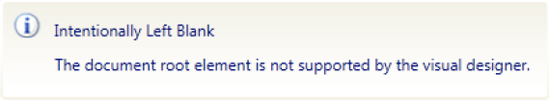
The easiest way to create a control template is in Expression Blend. Visual Studio doesn't enable you to modify (or even view) control templates defined in the generic.xaml file in the designer, instead only displaying the message shown in Figure 11-4.
Therefore, unless you are happy writing all the XAML by hand you are better off working in Blend instead. We won't be discussing how to use Expression Blend to create control templates in any depth here, but let's take a brief look at the basics of getting started doing so.
When you open the generic.xaml file in Expression Blend, you will get a message stating that the file cannot be edited in design view. However, if you open the Resources tab and expand generic.xaml entry, you will see a list of the style resources in the file, and you can click the Edit Resource button next to one in order to view the control template defined in it. To be able to modify this control template, right-click the control in the design view, and select Edit Template
The best place to start when creating a control template is to simply define the base state for our control, and work from there. This state is technically not a state at all but defines all the visual elements of the control that will be used by each of the states. You should add this to the control template that was created for you in the generic.xaml file, as demonstrated in the following XAML:
<ControlTemplate TargetType="local:WaitIndicator">
    <Border Background="{TemplateBinding Background}"
                            BorderBrush="{TemplateBinding BorderBrush}"
                            BorderThickness="{TemplateBinding BorderThickness}">
        <Canvas x:Name="LayoutRoot" Opacity="0">
            <Ellipse x:Name="Ellipse1" Fill="#1E777777"
Canvas.Left="0" Canvas.Top="11" Height="8" Width="8"/><Ellipse x:Name="Ellipse2" Fill="#1E777777"Canvas.Left="3" Canvas.Top="3" Height="8" Width="8"/><Ellipse x:Name="Ellipse3" Fill="#1E777777"Canvas.Left="11" Canvas.Top="0" Height="8" Width="8"/><Ellipse x:Name="Ellipse4" Fill="#2E777777"Canvas.Left="19" Canvas.Top="3" Height="8" Width="8"/><Ellipse x:Name="Ellipse5" Fill="#3E777777"Canvas.Left="22" Canvas.Top="11" Height="8" Width="8"/><Ellipse x:Name="Ellipse6" Fill="#6D777777"Canvas.Left="19" Canvas.Top="19" Height="8" Width="8"/><Ellipse x:Name="Ellipse7" Fill="#9C777777"Canvas.Left="11" Canvas.Top="22" Height="8" Width="8"/><Ellipse x:Name="Ellipse8" Fill="#CC777777"Canvas.Left="3" Canvas.Top="19" Height="8" Width="8"/></Canvas></Border> </ControlTemplate>
This XAML defines eight ellipses arranged in a circle (as shown in Figure 11-2), each with a base color of #777777 (a gray color) but with varying degrees of alpha channel applied in the fill to lighten this color. It's the animation of this Fill property (specifically the alpha value) that will make the wait indicator "spin."
Ideally (and as a standard practice), the XAML you define here should define the layout and look of the control in its initial (otherwise, Normal) state. Any elements/controls that should not be visible in this initial state should have their Visibility property set to Collapsed, or their Opacity property set to 0 (which makes it invisible, but it will still consume its given area). Note that the Canvas in this XAML has its Opacity property set to 0 accordingly, as the control is to be invisible by default.
As you learned in Chapter 9, "Styling Your Application," each state defines an alternative appearance of your control that visually represents the current condition that it's in, and in particular, the changes required to the base visual appearance of the control (defined as an animation) to indicate that state.
For the simplest controls, you may need to only support a single state (in which case this can be your base state, and you won't need to define any state groups or states in its default control template). However, in most cases your custom control will need to support multiple states, and at times be in more than one state simultaneously.
Therefore, the next step when creating your control is to identify what states your control needs to support, and whether the control can exist in multiple states simultaneously. Let's use the CheckBox control as an example. A check box has the following states:
As you may be able to tell, some of these states are mutually exclusive (such as the checked and unchecked states), whereas others (such as the checked state and the focused state) could be simultaneously (but independently) be applied to the control.
If you find there needs to be support for the control to be in more than one state simultaneously, you will need to group the states into sets where all the states in each set are mutually exclusive and give each grouping a name. The CheckBox's states are grouped as follows:
CommonStates:Normal, MouseOver, Pressed, andDisabledCheckStates:Checked, Unchecked, andIndeterminateFocusStates:FocusedandUnfocusedValidationStates:ValidandInvalid
Note
In the actual implementation of the CheckBox control, the Invalid state is actually split into InvalidFocused and InvalidUnfocused. However, we'll disregard this for the purposes of simplicity in this discussion.
The control will always exist in only one of these states from each group. However, it can only exist in one state from each of these groups simultaneously. Hence it can only be in the Focused or the Unfocused state (never both at the same time), but it can be simultaneously in the Normal, Checked, Focused, and Valid states (for example). This is why we have visual state groups.
Each state group can only contain mutually exclusive states. Before your control transitions to a new state, the visual state manager will first automatically transition the control away from any existing state that it is in within that same state group.
Note
Even if you've determined that all the control's states are mutually exclusive, and the control does not need to exist in multiple states simultaneously, you still need to define one state group that will contain the various states you define. In other words, all states must exist within a state group.
Our WaitIndicator control is actually very simple when it comes to its states. Our control will simply display an animation that can be turned on and off, so with no user interaction or input involved, there is no need for focus states, mouse over states, or validation states. This means that the control will need two primary states for use at runtime, which we'll call
Inactive(invisible and not animating)Active(visible and animated)
We'll also include an additional state named Static, which we'll only use when the control is being displayed in the designer (so that the control is visible but not animated, to avoid distracting the designer).
Since each of these states is mutually exclusive, we only need a single state group, which we will call CommonStates (convention when defining custom control templates is to have the core control states in a state group with this name). We can define this state group and its related states in the control template like so:
<ControlTemplate TargetType="local:WaitIndicator">
    <Border Background="{TemplateBinding Background}"
                        BorderBrush="{TemplateBinding BorderBrush}"
                        BorderThickness="{TemplateBinding BorderThickness}">
        <VisualStateManager.VisualStateGroups>
            <VisualStateGroup x:Name="CommonStates">
                <VisualState x:Name="Inactive" />
                <VisualState x:Name="Static" />
                <VisualState x:Name="Active" />
            </VisualStateGroup>
        </VisualStateManager.VisualStateGroups>
        <!--XAML for the default/base state of this control goes here-->
        <!--as defined earlier. Removed for brevity purposes-->
    </Border>
</ControlTemplate>We've now defined these states, but they don't actually do anything yet. Each state now needs to define how the base state will be transformed to visually indicate that the custom control is in that state. This is transformation is handled via an animation that is defined as a part of each state.
As a general rule, you should define an initial state in each state group, which will be empty (i.e., no modifications to the base state). This will provide a starting point for the control that you can then return to. The initial state for our WaitIndicator control is the Inactive state, so the base state will be configured as per the requirements for the Inactive state (recall that we set the Opacity property of the LayoutRoot to 0 when defining the base state earlier, making the contents of the control invisible), and we'll therefore make no changes to the base state in the definition for the Inactive state.
The next state we need to implement is the Static state. This will make the ellipses in the wait indicator visible, although we won't animate them in this state. In the base state, we had set the Opacity property of the LayoutRoot to 0, so to make it visible, we need to animate this property to change its value from 0 to 1 over a duration of 0 seconds (resulting in it immediately becoming visible when we transition to that state). Therefore, we need to expand its state definition in the control template from
<VisualState x:Name="Static" />
to
<VisualState x:Name="Static">
    <Storyboard>
        <DoubleAnimation Duration="0" To="1"
                         Storyboard.TargetProperty="(UIElement.Opacity)"
                         Storyboard.TargetName="LayoutRoot" />
    </Storyboard>
</VisualState>
As you can see, we use an animation to change the value of the Opacity property of the element named LayoutRoot to 1 (via a combination of the Storyboard.TargetName, Storyboard.TargetProperty, and the To property of a DoubleAnimation object). The Duration property for this animation is set to 0 (seconds), so the value of the LayoutRoot's Opacity property will change from 0 (its base value) to 1 (as per the animation) immediately. Extending this duration from 0 seconds will result in the LayoutRoot object fading into view (as the value of its Opacity property will change linearly from 0 to 1 over the given duration). You could also specify an easing function such that the value changes nonlinearly if you wish.
Note
All animations are defined within a Storyboard (as you can see from the XAML). Creating these animations (and the corresponding XAML) is a relatively simple and quick process using Expression Blend.
The final state that we need to implement for our WaitIndicator control is the Active state. Like the Static state, we need to make the ellipses visible, but we also need to implement a repeating in-state animation.
While this in-state animation is running, it decrements the alpha value of the ellipse's Fill property every 0.15 seconds and repeating itself every 1.2 seconds. Each ellipse is 0.15 seconds out of phase, which gives the visual illusion of rotation. There are nine values for each ellipse's alpha value, with the first and the last alpha values being the same.
The XAML defining this animation is quite lengthy, so it won't be included here in its entirety, but here is a snippet of the animation for two of the ellipses (with its color being animated). Note how the RepeatBehavior property of the ColorAnimationUsingKeyFrames object is set to Forever, meaning that once complete it will restart continually until the control transitions away from the Active state:
<ColorAnimationUsingKeyFrames
        Storyboard.TargetName="Ellipse1"
        Storyboard.TargetProperty="(Fill).(SolidBrush.Color)"
        BeginTime="0" RepeatBehavior="Forever">

    <LinearColorKeyFrame Value="#CC777777" KeyTime="00:00:00" />
    <LinearColorKeyFrame Value="#9C777777" KeyTime="00:00:00.15" />
    <LinearColorKeyFrame Value="#6D777777" KeyTime="00:00:00.3" />
    <LinearColorKeyFrame Value="#3E777777" KeyTime="00:00:00.45" />
    <LinearColorKeyFrame Value="#2E777777" KeyTime="00:00:00.60" />
    <LinearColorKeyFrame Value="#1E777777" KeyTime="00:00:00.75" />
    <LinearColorKeyFrame Value="#1E777777" KeyTime="00:00:00.90" />
    <LinearColorKeyFrame Value="#1E777777" KeyTime="00:00:01.05" />
    <LinearColorKeyFrame Value="#CC777777" KeyTime="00:00:01.20" />
</ColorAnimationUsingKeyFrames>
<ColorAnimationUsingKeyFrames
Storyboard.TargetName="Ellipse2"
Storyboard.TargetProperty="(Fill).(SolidBrush.Color)"
BeginTime="0" RepeatBehavior="Forever">
<LinearColorKeyFrame Value="#1E777777" KeyTime="00:00:00" />
<LinearColorKeyFrame Value="#CC777777" KeyTime="00:00:00.15" />
<LinearColorKeyFrame Value="#9C777777" KeyTime="00:00:00.3" />
<LinearColorKeyFrame Value="#6D777777" KeyTime="00:00:00.45" />
<LinearColorKeyFrame Value="#3E777777" KeyTime="00:00:00.60" />
<LinearColorKeyFrame Value="#2E777777" KeyTime="00:00:00.75" />
<LinearColorKeyFrame Value="#1E777777" KeyTime="00:00:00.90" />
<LinearColorKeyFrame Value="#1E777777" KeyTime="00:00:01.05" />
<LinearColorKeyFrame Value="#1E777777" KeyTime="00:00:01.20" />
</ColorAnimationUsingKeyFrames>You can download the full code for this control from the book's web site.
Note
When you run the control, it won't actually be in one of the states you have defined. Instead, it will be in its base state. Ideally, you want it to be in one of your defined states, so immediately after applying the control template to the control (in the OnApplyTemplate method, described shortly), you should tell the VisualStateManager to go to the initial state within each state group.
When you transition from one state to another, you may wish to ease the visual impact of jumping between the states by using a transition animation. Using the VisualTransition object, you can specify an animation for how the control should transition between two given states, from any state to a given state or from a given state to any other state.
There are two ways that you can implement a transition. The first is to let the VisualStateManager determine how it should transition between the two states. You simply specify the duration for the transition and the states you want it to go to and from, and it will work out how to transition between those states smoothly over the given duration (such as changing colors, opacity, and control positions). In the following example, a VisualTransition is defined, specifying that the transition between the Inactive and Active states should be smoothly animated between over the duration of two seconds.
<VisualStateGroup x:Name="CommonStates">
    <VisualStateGroup.Transitions>
        <VisualTransition GeneratedDuration="0:0:2" From="Inactive" To="Active" />
    </VisualStateGroup.Transitions>
    <!--Visual State definitions removed for brevity-->
</VisualStateGroup>
Note
You can omit assigning a state to the From property a value if you want the transition to apply whenever to are transitioning to the state assigned to the To property (regardless of what state the control was previously in). Alternatively, you can omit assigning a state to the To property a value if you want the transition to apply whenever to are transitioning from the state assigned to the From property (regardless of what state the control is changing to).
Alternatively, we can explicitly define our own animation by adding a Storyboard to the VisualTransition with the animation. For example, this transition defines an animation that will fade in the LayoutRoot by changing the value of its Opacity property from 0 to 1 over a period of two seconds when transitioning from the Inactive to the Active state:
<VisualTransition GeneratedDuration="0:0:2" From="Inactive" To="Active">
    <Storyboard>
        <DoubleAnimation From="0" To="1"
                         Storyboard.TargetProperty="(UIElement.Opacity)"
                         Storyboard.TargetName="LayoutRoot" />
    </Storyboard>
</VisualTransition>
A state transition may seem like the best place to define the changes that should be made to the base state to define what the control looks like when it transitions to a given state, but this is not the case. For example, when our WaitIndicator control transitions to the Static or Active states, the LayoutRoot element needs to become visible (i.e., the value of its Opacity property needs to be set to 1). However, a transition is not the place to define the animation to do this, for a number of reasons. Transition animations can be skipped when moving from one state to another, so there's no guarantee that the animation will be executed. More importantly however is the fact that any changes made to the control's element's properties are only applied for the duration of the transition. If for example you define an animation as per the previous example where we make the LayoutRoot element visible, as soon as the transition animation is complete the control will enter the destination state, and the VisualStateManager will apply that state's changes to the base state - not to the changes that were made during the transition. Therefore, unless you set the LayoutRoot element to be visible within the state itself, it will return to being invisible as soon as it enters that state. Therefore, the rule is that all changes to the base state required by a state should be defined in the state itself.
Our WaitIndicator control has no need to transition between states, so we won't define any state transitions for it.
You may recall from Chapter 9, "Styling Your Application," that template parts are used to define elements within your control template that you need to reference and interact with from code. Because of the strict separation between the files defining the look and the behavior of the control, the code (i.e., behavior) knows nothing about the control template. Each control that's given a name in the XAML for a user control has a corresponding member variable created in the code-behind (or a code-generated partial class extending the code-behind to be more exact) that the code-behind can use to reference and interact with those controls. However, this is not possible, since there is no coupling between the look and the behavior of custom controls. Instead, a custom control needs to define a contract specifying what elements it needs to reference from the code, and hence expects to find in the control template.
Determining what template parts are required in the control template is really dependent on the needs of the code for the custom control, and thus don't need to be identified until you start defining the control's behavior. Once it identifies the template parts that it requires in its contract, however, you will need to conform to it by ensuring that there are corresponding controls defined in the control template and given the expected names.
When a template part is defined in the control's contract, it essentially states that "an element of this type with this name must be present in the control template." We'll look at defining this contract shortly, but for the time being, we simply need to ensure that we conform to that contract (if it exists as yet) and make the required elements available accordingly.
For example, let's say the contract defines a template part, expecting an element of type Ellipse with a name of Ellipse1 (how it does so will be discussed shortly). Therefore, we simply need to ensure that we have an Ellipse with a name of Ellipse1 in our base state:
<Ellipse x:Name="Ellipse1" Fill="#1E777777" Canvas.Left="0" Canvas.Top="11"
         Height="8" Width="8"/>
In our WaitIndicator control, as we do not actually need to interact with any of the elements in the control template from the code, we therefore have no need to define template parts.
Earlier in this chapter, we discussed consuming properties defined on a user control in its XAML by binding to them. Binding to the control's properties in the control template for a custom control, however, requires you to bind to them using a different method. Rather than using the standard bindings, you will need to create a one-way binding by using the TemplateBinding markup extension, or a two-way binding by using the RelativeSource markup extension. Let's look at both of these methods now.
You can create a one-way binding in your control template that binds to the control object using the TemplateBinding markup extension. This binding will automatically find the templated control and bind to the specified property on it. For example, if your custom control defines a property named HeaderText, you can bind the Text property of a TextBlock control to it like so:
<TextBlock Text="{TemplateBinding HeaderText}" />Note
This is where the pull-based model discussed earlier in relation to user controls comes in again, enabling the code to take a back seat, simply acting as a provider to the view. Although as mentioned earlier, the code/behavior has no knowledge of the control template (apart from what it defines in its contract), you should note that the control template does know about the behavior—hence this scenario is ideal for implementing the pull-based model. To implement a push-based model, you would have to define the TextBlock control as a template part so that you could refer to it in the control's code; therefore, the pull-based model is a much better way.
The TemplateBinding markup extension is a OneWay binding only, and it has no Mode property to alter this like other binding types. Therefore, if you need the control that you are binding to in order to update the property that it is bound to (which requires a TwoWay binding), you will not be able to use the TemplateBinding markup extension for this purpose.
For example, say the TextBlock control from the previous example was actually a TextBox (where the user could modify the bound value). The TemplateBinding markup extension would be of no use here, as it would not enable the bound value to be updated according to the user's input.
To enable the bound property to be updated, you can use a combination of the Binding markup extension and the RelativeSource markup extension (as detailed in Chapter 10, "Advanced XAML and Data Binding") to bind to the property instead. The Binding markup extension will enable you to set up a TwoWay binding, and the RelativeSource markup extension will enable you to bind to the templated parent.
This binding is equivalent to the TemplateBinding example we used earlier, except this enables the binding to be TwoWay:
<TextBox Text="{Binding HeaderText, Mode=TwoWay,
RelativeSource={RelativeSource TemplatedParent}}" />When you start adding additional controls to your control library, you will start to find that the generic.xaml file starts to become unwieldy and hard to navigate. Each control template can become quite large, compounding the problem even further. You may wish to consider defining your control templates in separate resource dictionary files (one control template per file), and merge those into the generic.xaml file using the techniques described back in Chapter 3, "An Introduction to XAML." Note, however, that you can't use a relative path when setting the Source property of the ResourceDictionary entry that points to the XAML resource file to merge in the generic.xaml file. Instead, you must use the full path to the XAML resource file, including the assembly name. For example, to merge the contents of the WaitIndicator.xaml file that's under the Themes folder of the MyControlLibrary assembly, you would use the following XAML:
<ResourceDictionary.MergedDictionaries>
    <ResourceDictionary
        Source="/MyControlLibrary;component/Themes/WaitIndicator.xaml" />
</ResourceDictionary.MergedDictionaries>
This will make your generic.xaml file much more manageable and make it easier to modify the control templates for your custom controls when necessary.
In the control's behavior, you will define and expose properties (generally as dependency properties), methods, and events, just as you did with the user control. Where it will differ, however, is when you actually need to interact with elements defined in the control's template. Because of the strict separation between the control's look and its behavior, and because the control knows nothing about the template that has been applied to it, this presents a problem.
This is where the control needs to identify the parts and states that it needs to reference and interact with in the control template, in the form of a contract. When the control is used, the Silverlight runtime will apply the corresponding control template to it (which will either be explicitly specified when the control is used or, otherwise, the default control template), and notify the control when it has done so (by calling the OnApplyTemplate method on the control). It's up to the control in this method to get a reference to all the parts it requires (as defined by the contract) and store these references in member variables, which it can use to refer to them when required.
Let's take a deeper look at implementing the contract and behavior for a custom control.
If you want to interact with anything in the control template from the control's code, you should define a contract (by decorating the control's class with attributes), specifying the parts and states that the control expects to exist in the control template.
Note
It's not essential to define this contract on the control, but it is recommended as it formalizes the requirements of the control from its template and provides benefits when retemplating the control in Expression Blend.
To define a state, you decorate the class with the TemplateVisualState attribute, setting its Name and GroupName properties (using named parameters) according to the corresponding state that it expects to be defined in the control template. For example, this attribute defines that the control expects a visual state named Inactive to be exist in the control template, under the CommonStates state group:
[TemplateVisualState(Name = "Inactive", GroupName = "CommonStates")]
When you need to refer to a named element within the control template, you should define a template part in the control's contract denoting that requirement, using the TemplatePart attribute. Using named parameters, you specify the name that you expect an element in the control template to have and the type of control it should be. For example, this attribute defines that the control expects a template part named Ellipse1 to exist in the control template, of type Ellipse:
[TemplatePart(Name = "Ellipse1", Type = typeof(Ellipse))]
Ideally, you should define as few template parts as possible, because each template part places additional restrictions and constraints on the freedom of the control template designer and adds coupling points between the control and its template. Therefore, only define a template part if you really need access to it from the code, and see if you can expose a property that the element can bind to in order to implement the requirement instead. For example, instead of specifying a TextBlock as a template part so that you can set its Text property from the control's code, expose the text to be display via a property (with a scope of internal) on the control that the Text property of the TextBlock can bind to.
You may have noticed that when defining the visual states and the template parts on the control, these were defined as strings. Magic string values are never a good idea (especially when they need to be used in multiple locations within the code), so it's generally better to define them as constants on the class. The name of each state, state group, and template part should be defined as a constant within the control's class, and you can then use them instead of the magic strings. For example, StateInactive, StateGroupCommon, and PartEllipse1 in the following example are all string constants that are defined in the control's class and used in place of the magic strings from the previous examples:
[TemplateVisualState(Name = StateInactive, GroupName = StateGroupCommon)]
[TemplatePart(Name = PartEllipse1, Type = typeof(Ellipse))]
When a control is initialized, the Silverlight runtime will automatically determine what template it should use (either its default template from the generic.xaml file or the template provided by the consuming view) and apply it to the control. Once it's done that, it will call the OnApplyTemplate method in the control's code. This is defined in the base Control class, and you will need to override it to be notified that the template has been applied.
public override void OnApplyTemplate()
{
    base.OnApplyTemplate();
}
Once the template has been applied, you should get a reference to all the elements required by the control (as defined as template parts in the contract) from that control template and store these references in member variables that the control can use when it needs to interact with them. To get a reference to these elements, use the GetTemplateChild method (which is defined in the base Control class). Pass the method the name of the element that you want to get a reference to from the control template, and it will return the instance of that element (or null if it's not found).
Ellipse1 = GetTemplateChild("Ellipse1") as Ellipse;Note
The variable Ellipse1 is a member variable that we've previously defined in the control's class of type Ellipse.
You should get a reference to each element in the control template that's defined as a template part like this and assign them to member variables in the OnApplyTemplate method of the control's class. You can do this for each template part explicitly, or you could use reflection to do it automatically for you. Assuming you have defined all your required template parts in the control's contract and have a corresponding member variable of the correct type and with a name matching that of the template part, you could use the following code to automatically get a reference to each element in the control template that is defined as a template part and assign them to a corresponding member variable in the control's class with the same name:
public override void OnApplyTemplate()
{
    base.OnApplyTemplate();
// Get all the attributes on this class that are of type TemplatePartAttribute
object[] templateParts =
this.GetType().GetCustomAttributes(typeof(TemplatePartAttribute), true);
// Loop through each of these attributes, get the member variable with the same
// name as the template part, get the template part, and assign it to the
// member variable
foreach (TemplatePartAttribute attribute in templateParts)
{
FieldInfo field = this.GetType().GetField(attribute.Name,
BindingFlags.Instance | BindingFlags.NonPublic | BindingFlags.Public);
field.SetValue(this, GetTemplateChild(attribute.Name));
}
}Once you've done this, you can interact with each of the elements via the corresponding member variable that you've assigned its reference to throughout the control's code, for example:
Ellipse1.Fill = new SolidColorBrush(Colors.LightGray);
If a template part defined in the contract doesn't actually exist in the control template, the GetTemplateChild method will return null. You will need to decide how you want to handle this scenario. You can choose to continue without this part or throw an exception. If you decide to continue without the template part, you will need to check if it's null each time before you try to use it in the code.
Note
Be sure not to try interacting with any of the elements defined as template parts before the control template has been applied and references to the elements have been obtained. For example, let's say you want to set a property on an element defined as a template part when the value of a property on the control itself is changed. If the control's property is assigned a value in the XAML when it's being used, that property will actually be assigned the value before the OnApplyTemplate method is called. Therefore, you won't have a reference to the element as yet, which will cause problems. This is one of the reasons why you should use template parts as sparsely as possible, and look at binding the properties of the corresponding element to properties exposed by the control instead (where possible).
If you need to handle events raised by elements in your control's template, you will need to first ensure that those elements are defined as template parts and that you get a reference to them in the control's OnApplyTemplate method. Once you've gained a reference to the element in this method, add the required event handlers that you need:
Ellipse1.MouseEnter += new MouseEventHandler(Ellipse1_MouseEnter);
You can then respond accordingly to the events in the event handlers that you've defined (which may involve accordingly raising an event on the control itself to notifying the consuming view of that event).
To transition from one state to another in your control, you can use the GoToState method of the VisualStateManager class, passing it the control to change the state for, the name of the state to transition to, and whether or not to display any transition animation defined between those states. The VisualStateManager will then handle the transition to that state accordingly. The following example demonstrates transitioning to the state named Active on the current control, with transition animations turned on:
VisualStateManager.GoToState(this, "Active", true);
Note
If the state that you are attempting to transition to does not exist in the control template, this method will fail silently. It does, however, return a Boolean value that specifies whether or not it failed.
The behavior for our WaitIndicator control is actually very simple. We have no need to define template parts in the control's contract, although we do have three states that we need to define:
[TemplateVisualState(Name = StateInactive, GroupName = StateGroupCommon)]
[TemplateVisualState(Name = StateActive, GroupName = StateGroupCommon)]
[TemplateVisualState(Name = StateStatic, GroupName = StateGroupCommon)]
So that we didn't need to use magic strings in the contract's attributes, we defined the state names and state group name as constants:
private const string StateActive = "Active";
private const string StateInactive = "Inactive";
private const string StateStatic = "Static";
private const string StateGroupCommon = "CommonStates";
We then override the OnApplyTemplate method. We have no template parts that we need to obtain a reference to, so this is quite minimal in its implementation. We do, however, get it to transition from its base state at this point to the state that it should currently be in (by calling the SetVisualState method, that we are about to define).
public override void OnApplyTemplate()
{
    base.OnApplyTemplate();
    SetVisualState();
}
We'll now create a method named SetVisualState that defines the logic determining what state the control should be in and goes to that state accordingly:
private void SetVisualState()
{
    if (DesignerProperties.IsInDesignTool)
        VisualStateManager.GoToState(this, StateStatic, true);
    else
        VisualStateManager.GoToState(this, IsBusy ? StateActive : StateInactive,
                                     true);
}
Finally, we define a dependency property that will be used to control what state the control should be in (busy [animated] or not busy [invisible]). This is a simple Boolean property, and when its value is changed, it will call the SetVisualState method that will update its current state accordingly:
public static readonly DependencyProperty IsBusyProperty =
   DependencyProperty.Register("IsBusy", typeof(bool), typeof(WaitIndicator),
   new PropertyMetadata(false, IsBusyPropertyChanged));

public bool IsBusy
{
    get { return (bool)GetValue(IsBusyProperty); }
    set { SetValue(IsBusyProperty, value); }
}

private static void IsBusyPropertyChanged(DependencyObject d,
                                          DependencyPropertyChangedEventArgs e)
{
    ((WaitIndicator)d).SetVisualState();
}Now that the control is complete, you can test it. Start by compiling the MyControlLibrary project, as the control will actually be executing when displayed in the designer.
Assuming the MyControlLibrary project and the Silverlight test project are in the same solution, you will find that when you open a view in your Silverlight test project that the control will automatically appear in your Toolbox (as shown in Figure 11-5).
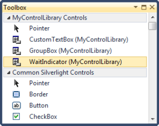
Note
If the MyControlLibrary project and the Silverlight test projects are not in the same solution, right-click the Toolbox, select Choose Items from the context menu, navigate to the compiled MyControlLibrary assembly, and add the control(s) from that assembly to the Toolbox.
Now, you can simply drag the control onto the design surface. Using the Properties window, set its IsBusy property to True. When you run your project, the control will be visible and animate.
Sometimes, you want to create a control that can contain some custom content. The Button control is a good example, enabling you to customize what is displayed within the button (enabling you to add an image, etc.). The Button control can only contain a single control as its content but other content controls such as the Grid control can contain multiple controls as its content. Let's take a look at how you can create a custom content control that can contain either a single control as its content or multiple controls.
The Button control is a content control, and you can make your own control a content control by inheriting from ContentControl (instead of Control). This will expose a Content property on your control, which another control can be assigned to when the control is being consumed in a view (using content element syntax, as described in Chapter 3, "An Introduction to XAML").
To display a control assigned to the control's Content property, you need to include a ContentPresenter in your control template, specifying where that control should be displayed within the bigger picture of your control template. Think of a ContentPresenter as being a placeholder for the content of the control (provided by the consumer). Let's create a GroupBox control to demonstrate this concept. This control will be a content control that has a header and display some arbitrary content below it (as provided by the consuming view). Figure 11-6 demonstrates the final result.

As you can see, we only want the content to be displayed below the header. Therefore, we position the ContentPresenter in our control template in the location where the content should be displayed. In the control template's XAML, which follows, you can see that we are positioning the ContentPresenter in the second row of the Grid (with the header taking the first row):
<Style TargetType="local:GroupBox">
    <Setter Property="BorderThickness" Value="1" />
    <Setter Property="BorderBrush" Value="Gainsboro" />
    <Setter Property="Template">
        <Setter.Value>
            <ControlTemplate TargetType="local:GroupBox">
                <Border BorderBrush="{TemplateBinding BorderBrush}"
                        BorderThickness="{TemplateBinding BorderThickness}">
                    <Grid Background="{TemplateBinding Background}">
                        <Grid.RowDefinitions>
                            <RowDefinition Height="25" />
                            <RowDefinition />
                        </Grid.RowDefinitions>

                        <Rectangle Fill="{TemplateBinding BorderBrush}" />
                        <TextBlock Text="{TemplateBinding HeaderText}"
                                   Foreground="{TemplateBinding Foreground}"
                                   VerticalAlignment="Center" Margin="2" />

                        <ContentPresenter Grid.Row="1" Margin="2" />
                    </Grid>
                </Border>
            </ControlTemplate>
        </Setter.Value>
    </Setter>
</Style>
The ContentPresenter's default control template automatically binds its Content property to the control's Content property and its ContentTemplate property to the control's ContentTemplate property, and it will handle displaying whatever control is assigned to the control's Content property within itself.
The corresponding code for this control is minimal, simply setting the DefaultStyleKey property for the control and defining a HeaderText dependency property (which you will see was bound to using the TemplateBinding markup extension in the control's template):
public class GroupBox : ContentControl
{
public GroupBox()
{
DefaultStyleKey = typeof(GroupBox);
}
public static readonly DependencyProperty HeaderTextProperty =
DependencyProperty.Register("HeaderText", typeof(string),
typeof(GroupBox), null);
public string HeaderText
{
get { return (string)GetValue(HeaderTextProperty); }
set { SetValue(HeaderTextProperty, value); }
}
}You can now assign a control as content to this control using content element syntax, like so:
<my:GroupBox Height="120" Width="250" HeaderText="GroupBox Header">
    <TextBlock Text="[Some content]"
               VerticalAlignment="Center" HorizontalAlignment="Center" />
</my:GroupBox>
Note
You may recall from Chapter 3, "An Introduction to XAML," that in order to be able to assign a value to a property on a control using content element syntax, that property must be defined as the content property for the control. To set a property as the content property, you need to decorate the control's class with the ContentProperty attribute, passing it the name of the property to automatically be assigned the control's content (i.e., the XAML between the control's beginning and end tags). This enables you to avoid using property element syntax (which requires you to explicitly specify which property you are assigning the value to) and simplifies the XAML when the control is being consumed in a view. When you inherit from ContentControl, the ContentControl class already has the ContentProperty attribute applied, specifying that the Content property is to be automatically assigned the control's content. Therefore, you do not need to worry about decorating your control's class with this property (unless you wish to specify a different property to be automatically assigned the control's content).
One of the limitations of our current GroupBox control is that it allows you to directly assign only a single control as its content. The Content property is of type Object, and attempting to assign multiple controls to the Content property in XAML will result in an error stating, "The property 'Content' is set more than once." If you want to be able to assign multiple controls using content element syntax on a custom control, you will need to specify a different property as the control's content property, and that property must be a collection type.
Note
There are a number of examples of controls that accept more than one control, such as the Grid, Canvas, and StackPanel controls. These controls inherit from Panel (instead of ContentControl, as this control does), whose content property is its Children property. We'll create a similar property with the same name on our GroupBox custom control and set it to be our content property for the control.
Start by defining a property on your control that will maintain a collection of the content controls. For this purpose, we'll create a property named Children, of type ObservableCollection<UIElement>.
public static readonly DependencyProperty ChildrenProperty =
    DependencyProperty.Register("Children", typeof(ObservableCollection<UIElement>),
     typeof(GroupBox), new PropertyMetadata(new ObservableCollection<UIElement>()));

public ObservableCollection<UIElement> Children
{
    get { return (ObservableCollection<UIElement>)GetValue(ChildrenProperty); }
    set { SetValue(ChildrenProperty, value); }
}
We now need to define the new Children property as our content property, by decorating the control's class with the ContentProperty, like so:
[ContentProperty("Children")]
public class GroupBox : ContentControl
You will now be able to assign multiple controls to the Children property using content element syntax, like so:
<my:GroupBox HeaderText="GroupBox Header" Height="90" Width="200">
    <TextBlock Text="Child 1" />
    <TextBlock Text="Child 2" />
    <TextBlock Text="Child 3" />
    <TextBlock Text="Child 4" />
</my:GroupBox>
Note that none of the TextBlock controls will actually be displayed in the GroupBox's content area as yet. All we are doing is adding these controls to the collection exposed by the Children property. The ContentPresenter in the control template is still bound to the control's Content property, so we'll need to change this to display the controls added to the Children collection.
How you will arrange these controls within the content area of the GroupBox control when you do display them is the next question. For the purpose of this example, let's divide the content area of the control into a two-by-two grid and display the first four controls assigned to the Children collection, one in each cell. There are a number of ways you could implement this, and we won't cover any of these ways in depth, but the basic concept is as follows. Each cell in the grid will contain a ContentPresenter. The Children property on the control is of type ObservableCollection, meaning that we can handle the CollectionChanged event that it exposes, which will be raised when an item is added or removed from this collection. In this event handler, you can then assign each item in the collection to a ContentPresenter in the control template. This will result in the output shown in Figure 11-7.
Back in Chapter 3, "An Introduction to XAML," we discussed the concept of attached properties. In summary, these are properties that are registered on a control, but are then able to be used by any control. You can define your own attached properties, either with or without a backing dependency property.
Let's say you want to define an attached property named ContentArea on your control (which you could define on the GroupBox control, enabling the controls assigned to its Children property to specify which cell in the two-by-two grid they should appear in). To define ContentArea as an attached property (of type integer) requires two static methods to be defined on the control, one named GetContentArea and the other named SetContentArea, each with the following signatures:
public static int GetContentArea(DependencyObject obj)
{

}

public static void SetContentArea(DependencyObject obj, int value)
{

}
By following this convention (of both the method names and their corresponding signatures), the Silverlight runtime will recognize these two methods combined as defining an attached property of type integer, named ContentArea. For example, you can now assign the ContentArea attached property a value on another control, like so:
<TextBlock Text="Child 1" my:GroupBox.ContentArea="1" />
Whenever a control assigns a value to the ContentArea attached property on another control, the SetContentArea method will be called. A reference to the control that assigned the value will be passed into the method as the first parameter, and the value that has been assigned to the attached property will be passed in as the second parameter. You then need to store this value along with the corresponding control that it was defined on. When you need to get the value for the attached property as assigned on a given control, you can then call the GetContentArea method, passing a reference to the given control into the method as its parameter.
Note
If you want to limit the type of controls that the attached property can be assigned a value on, change the type of the first parameter as per the example above from DependencyObject to the type of the control that it should be limited to.
One of the issues of defining an attached property like this (without a backing dependency property) is that you'll need to maintain your own repository (within the custom control that defines the attached property), which stores the value assigned to this property for each control that does so. Another issue is that you can't assign the attached property a binding. Therefore, you will usually see attached properties defined with a corresponding dependency property that will store that value.
When registering the backing dependency property, instead of calling the normal Register method to register the dependency property, call the RegisterAttached method instead if it is an attached property, for example:
public static readonly DependencyProperty ContentAreaProperty =
    DependencyProperty.RegisterAttached("ContentArea", typeof(int),
    typeof(GroupBox), null);
You will then be able to use this as the store for the values, like so:
public static int GetContentArea(DependencyObject obj)
{
    return (int)obj.GetValue(ContentAreaProperty);
}

public static void SetContentArea(DependencyObject obj, int value)
{
    obj.SetValue(ContentAreaProperty, value);
}
Note
The propdp snippet was discussed earlier in this chapter as helping make defining dependency properties quick and easy. Visual Studio also has a built-in snippet to help in creating attached properties too, named propa. Like the propdp snippet, it too was designed for WPF and will require the reference to UIPropertyMetadata to be changed to PropertyMetadata when using it in Silverlight projects.
In this chapter, you learned about each of the methods you can create reusable controls for use in your application. Which method you should use really depends on what you are trying to achieve:
Inherit from an existing control if you simply want to add your own additional behavior to it.
User controls are best for encapsulating some common functionality that is more or less specific to a single project.
Custom controls are best when you want to create a more generic control that could be used in other projects and be able to retemplate them when they are used.
Content controls enable your control to act as a container for other controls.