
Summary lists (see Figure 6-1) are designed to enable users to quickly locate and identify a record (of a given type) among the existing data in the system. Once they have found the record, they can then drill down to the record to view it in detail (and potentially edit it).
Instead of requiring the full record for each item in the list to be sent back to the client, summary lists should only request and display enough data from the server to enable the user to identify the record they wish to view/edit. Once the user has selected the record, the application will go back to the server and retrieve the remaining data for that record (and any associated/supporting data) to populate a details screen or data entry form. This is a common strategy for working with data in business applications, which minimizes the amount of data being sent to the client from the server, and facilitates a drill-down approach for interacting with the detailed data.
In this chapter we'll expose a collection of summary data for products from the server, which will then be used to populate a DataGrid or a ListBox on the client. The user will then be able to manipulate the data in the list to suit their needs (with the actual manipulation of the data taking place on the server), and drill down on a particular item (such that they can view and edit its details).
In most cases, you will want to return your summary list data as a collection of presentation model objects (a concept discussed in Chapter 5). The benefits of specifically using presentation model objects in this scenario is that they
Allow you to specify just the particular properties you want passed back from the server
Combine data from multiple entities (from your entity model) into the one object
Summarize/total related data
Denormalize the data suitable for display to the user
All of these benefits will be demonstrated in the example we'll work through in this section. In this example we will return a summary list of product records that will:
Return a key that will be used to drill down on the record
Return various properties of the product record (name, number, etc.)
Return an thumbnail image of the product (which is obtained from a different entity in the entity model on the server than the core
Productentity, hence demonstrating combining data from multiple entities into the one object)Return the total quantity of that product available from all the inventory locations (demonstrating summarizing/totaling related data)
Return the denormalized descriptions of the product's category, subcategory, and model (which are each stored in their own table, and referred to by a foreign key on the
Productentity)
Create a presentation model class in the Models folder in your web project named ProductSummary that will be used to return this data to the client (note that, as a general rule, we'll suffix the name of the summary classes with Summary).
public partial class ProductSummary
{
    [Key]
    [Editable(false)]
    public int       ID                { get; set; }
    public string    Name              { get; set; }
    public string    Number            { get; set; }
    public decimal   ListPrice         { get; set; }
    public byte[]    ThumbNailPhoto    { get; set; }
    public int?      QuantityAvailable { get; set; }
    public string    Category          { get; set; }
    public string    SubCategory       { get; set; }
    public string    Model             { get; set; }
    public bool      MakeFlag          { get; set; }
}
Note
You will need a using directive to System.ComponentModel.DataAnnotations at the top of this file.
Once you have created the presentation model class (with the required properties and metadata attributes) you will need to create a domain operation to return a populated collection of those objects. This primarily consists of writing a LINQ query to collate and summarize the required data from the entity model into a single summary object, and using this to populate the collection.
Note
When creating the presentation model class, remember that at least one property must be decorated with the Key attribute; otherwise, you will receive a compilation error.
Ideally, you should return the results from a domain operation as an IQueryable expression, which will project data from the Entity Framework model onto a collection of the presentation model objects and return the results. As described in Chapter 5, returning an IQueryable expression enables the client to request the results to be filtered/sorted/grouped/paged, with these criteria being added to the IQueryable expression before executing it. In other words, the client can query the entire collection being exposed by the domain operation, with the query being run on the server, and only the results returned to the client (reducing unnecessary data traffic between the server and the client). Here is the code to populate and return an IQueryable expression that will populate our ProductSummary objects with data from the entity model:
public IQueryable<ProductSummary> GetProductSummaryList()
{
    return from p in this.ObjectContext.Products
           select new ProductSummary()
           {
               ID = p.ProductID,
               Name = p.Name,
               Number = p.ProductNumber,
               ListPrice = p.ListPrice,
               ThumbnailPhoto = p.ProductProductPhotos.FirstOrDefault().
                                                ProductPhoto.ThumbNailPhoto,
               QuantityAvailable = p.ProductInventory.Sum(pi => pi.Quantity),
               Category = p.ProductSubcategory.ProductCategory.Name,
               Subcategory = p.ProductSubcategory.Name,
               Model = p.ProductModel.Name,
               MakeFlag = p.MakeFlag
           };
}
Note
Depending on your architecture, you may like to create a standalone domain service to host this domain operation, or otherwise simply add it to the same service that contains the product-related CRUD operations.
Note that we're returning an image from the database in the ThumbnailPhoto property of the ProductSummary object. Returning an image from the database for each item to display in a summary list results in increased network and bandwidth usage, so it's recommended to only return images if they add value to your application, and make sure that they are small (preferably less than 2KB each).
Since the data being exposed from the server is a collection of objects, we should take a look at the support Silverlight has for collections and working with them.
Silverlight supports many of the common generic collection types you may be used to from the full .NET Framework, including List, Dictionary, LinkedList, Stack, and Queue. Other nongeneric collections such as the ArrayList and Hashtable aren't implemented in Silverlight, but you should be able to find an appropriate alternative among the generic collections.
Silverlight has some additional types of its own, however, which we'll discuss here.
An important collection type unique to Silverlight and WPF is ObservableCollection. This is a generic collection type that implements the INotifyPropertyChanged interface (exposing a CollectionChanged event), which is raised when items are added or removed from the collection. Bound user interface controls automatically handle this event and update themselves when the collection has changed. One of the biggest benefits obtained from this feature is that you can update the collection in the code-behind (or in a ViewModel, as discussed in Chapter 12), and the changes will be automatically propagated to the user interface. In essence, the code that is modifying this collection doesn't need to know anything about the user interface, or that the collection is even bound to a user interface that needs updating. This feature makes the ObservableCollection type a key part of Silverlight's data binding ecosystem.
Another important data binding concept related to collections is that of views. Views enable collections to be manipulated in the user interface, but without altering the underlying collection. Typical view manipulations you might want to perform include filtering, sorting, grouping, and paging the collection's items. For example, you might want to bind a collection to a ListBox, and enable the user to filter the items by entering some text into a TextBox. Instead of adding/removing items from the bound collection, you can simply filter the view of that collection. Alternatively, the control itself may manipulate its view of the collection. A good example of this is the DataGrid control—it allows you to sort its rows by clicking a column header, and it does this without modifying the bound collection—simply by manipulating its view.
Whenever you bind a collection to the property of a user interface control, a view is automatically wrapped around that collection (internally within the control) and bound to the property instead. Alternatively, if you want control over the view, you can create it yourself, manipulate the data in the view, and bind to that instead. There are three primary types of views that you will deal with in Silverlight: the CollectionViewSource, the PagedCollectionView, and the DomainDataSourceView.
The CollectionViewSource isn't actually a view as such, but a view proxy. You assign a collection to its Source property, and it will provide you a corresponding view from its View property (as a ListCollectionView). You can then manipulate the view as you see fit, via properties such as Filter, GroupDescriptions, and SortDescriptions. For example, the following code creates a view of a collection called productCollection, sorts the items by their Name property, and assigns the view to the ItemsSource property of a ListBox control named ProductListBox:
CollectionViewSource view = new CollectionViewSource();
view.Source = productCollection;
SortDescription sortBy = new SortDescription("Name", ListSortDirection.Ascending);
view.SortDescriptions.Add(sortBy);
ProductListBox.ItemsSource = view.View;Unlike the CollectionViewSource, the PagedCollectionView is an actual view, and can be created directly (rather than via a proxy like the CollectionViewSource, which then exposes a ListCollectionView). It has all the features of the CollectionViewSource, but also enables you to page the data (which the ListCollectionView has no support for). If you want to manually create a view, this is probably your best choice. The following example is similar to the preceding one, but uses the PagedCollectionView instead:
PagedCollectionView view = new PagedCollectionView(productCollection);
SortDescription sortBy = new SortDescription("Name", ListSortDirection.Ascending);
view.SortDescriptions.Add(sortBy);
ProductListBox.ItemsSource = view;
Note
Later in this chapter (in the "Manipulating the Summary List" section), we'll look at how to use the various features of the PagedCollectionView to manipulate the view of a collection.
As with the ListCollectionView, you can't create an instance of a DomainDataSourceView object in your code. Instead, this is a view exposed by the DomainDataSource control (discussed shortly) by its DataView property, enabling you to manipulate the underlying collection that it manages. Generally, you will use this view when manipulating the contents of the collection managed by the DomainDataSource control in code.
Now that we have exposed a collection of summary objects from the server, we can request this data and consume it in our Silverlight application. The key component to retrieving the data from the server is the domain context, so we'll take a look at how that operates first. Then we'll look at the two approaches of interacting with the domain context (using either a XAML-based approach or a code-based approach), and discuss when it is most appropriate to use each one.
As discussed in discussed in Chapter 5 (in the "Inspecting the Generated Code in the Silverlight Project" section), a domain context class is automatically generated in the Silverlight project by RIA Services for each domain service in the web project. Your code interacts with it, and it talks to the server (via the DomainClient class). In other words, it essentially acts as a proxy to facilitate communication with the domain service from the client. However, the way it is structured can be a little confusing. Query operations on the domain service are exposed on the corresponding domain context object as methods (their name suffixed with Query) that simply return an EntityQuery object.
For example, the domain operation we created on our ProductService domain service called GetProductSummaryList will have a corresponding method on the domain context called GetProductSummaryListQuery on the domain context object. However, this method doesn't actually initiate the request to the server. Instead, it returns an EntityQuery object that represents the domain service query. How you actually initiate the server request now depends on which of the two approaches (XAML based or code based) you decide to take to interact with the domain context in your application—so let's take a look at each of these now.
Note
The concept of obtaining an EntityQuery object in order to query the server probably seems a little strange, but it makes more sense when you want to refine the query in order to have the data filtered/sorted/grouped/paged on the server before it is returned to the client. We will look at this feature later in this chapter in the "Manipulating the Summary List" section; however, until then we will simply work with the query as it is—essentially requesting the full collection from the server.
The key component in the XAML-based approach is the DomainDataSource control. The DomainDataSource control is a part of the RIA Services framework, and provides a bridge that enables you to declaratively interact with a domain context in XAML. You configure it by assigning it a domain context (which handles the communication with the server) and providing it the method on this domain context that returns the domain operation query you want to call. You can then consume the data from the server by binding the DataContext or ItemsSource property of controls in your view to the Data property of the DomainDataSource control.
Although you could drag and drop a DomainDataSource control from the toolbox (or write the XAML by hand) and configure it manually, the easiest way to set up and configure one is to enlist the Data Sources window to help you. When you open the Data Sources window in Visual Studio, you will find that a data source has already been created for each domain context created by RIA Services in the Silverlight project, with the entities that they expose beneath them (as shown in Figure 6-2). Dragging and dropping one of these onto your design surface will create both a DomainDataSource control and a bound control to display the data.

Note
The icon next to the entity in the Data Sources window will indicate the type of control that will be created when the entity is dragged and dropped onto the design surface. You can change the type of control created by selecting the entity, clicking the drop-down button that appears (as you'll note in Figure 6-2), and selecting an alternative control type or layout format from the menu.
For the time being, ignore the control that will be created and bound for you. Drag the entity (in this case the ProductSummary entity) from the Data Sources window and drop it onto the design surface. This will result in the following XAML:
<riaControls:DomainDataSource AutoLoad="True"
                      d:DesignData="{d:DesignInstance my1:ProductSummary,
                                    CreateList=true}"
                      Height="0" Width="0"
                      LoadedData="productSummaryDDS_LoadedData"
                      Name="productSummaryDDS"
                      QueryName="GetProductSummaryListQuery">
    <riaControls:DomainDataSource.DomainContext>
        <my:ProductContext />
    </riaControls:DomainDataSource.DomainContext>
</riaControls:DomainDataSource>
Let's take a quick walkthrough of the important aspects of this XAML:
The
AutoLoadproperty is set toTrue, meaning that the call to the server will be made as soon as the view is loaded.An event handler is assigned to handle the
LoadedDataevent. The event handler contains code to display a message box if an error occurs while attempting to retrieve the data. This will be discussed further in the "Handling Errors" section later in this chapter.The
QueryNameproperty is set to the name of the query domain operation that you want to call on the domain service. Note that we didn't need to select in the Data Sources window which method on the domain context should be used—instead, the Data Sources window was able to infer the correct one, as (in most cases) there will be only one query domain operation on a domain service that returns the selected entity. However, if you do happen to have two or more query domain operations on a domain service that return the entity (or collection of entities) that you want to bind to, you can select which domain operation you want to be called by selecting the entity in the Data Sources window, clicking the drop-down button, and selecting the required domain operation from the menu.The
DomainContextproperty is assigned an instance of the domain context that will handle obtaining the entity collection from the server. Themynamespace prefix is automatically defined for the namespace that the domain context can be found in if it isn't already defined.
These are the core requirements for configuring a DomainDataSource control, and once these properties are configured, your user interface controls can consume the data retrieved from the server by binding their DataContext or ItemsSource property to its Data property.
Whereas a XAML-based approach using the DomainDataSource control implicitly implements a pulling strategy to populating the user interface with data, taking a code-based approach enables you to decide whether you push or pull data into the user interface.
Back in Chapter 3, we discussed how XAML's powerful binding capabilities enable the user interface to take a controlling role by pulling data into itself. Whereas a push approach involves the code-behind handling the request to the server and assigning the results once they are retrieved to a control property in the user interface (usually the DataContext or ItemsSource property of a control), a pull approach involves binding that control property in XAML to a property defined in either your code-behind class or on a separate class (where that class automatically requests data from the server and assigns the results to that property).
The pull approach is commonly used in conjunction with a ViewModel (part of the MVVM pattern), and requires knowledge of some advanced binding concepts that haven't been covered as yet in this book. I'll cover these binding concepts in Chapter 10. However, the techniques shown in this section to retrieve data from the server using a code-based approach are equally applicable to both strategies.
The following code demonstrates calling the GetProductSummaryList operation on our ProductService domain service. Start by adding the following using statement to the top of your class:
using System.ServiceModel.DomainServices.Client;
The next step is to instantiate the corresponding ProductContext domain context object, and request the EntityQuery object that represents the domain operation you want to call:
ProductContext context = new ProductContext();
EntityQuery<ProductSummary> qry = context.GetProductSummaryListQuery();
The EntityQuery object (qry) is then passed to the Load method on the domain context, which initiates the server request for the data:
LoadOperation<ProductSummary> operation = context.Load(qry);
Note that the Load method doesn't actually return you the data. Instead, it returns a LoadOperation object that contains an Entities property (consisting of a collection of the requested objects); however, this collection will currently be empty. As with calling standard WCF services in Silverlight, all calls to domain services using the RIA Services framework are asynchronous; therefore, the Load method will not wait for the data to be returned before returning control back to your code. The collection will remain empty until the data is returned from the server, at which stage the collection will be populated with the data.
The LoadOperation object has a Completed event, which it raises when the data has been retrieved from the server, or if an error has occurred that has prevented the successful retrieval of the data. Although you can wait to do something with the collection returned by the Entities property on the LoadOperation object until the Completed event is raised, there's nothing stopping you from immediately assigning the collection to the DataContext or ItemsSource property of a control, which will bind to and display the data in your user interface (assuming you choose to push the data into the user interface). The collection inherits from the generic ObservableCollection type (discussed earlier in this chapter), which raises an event when items are added or removed from the collection that can be handled by any bound user interface controls (hence enabling them to update themselves accordingly). Therefore, despite initially being currently empty, the collection will be automatically populated once the data is retrieved from the server, at which stage the user interface will know to update itself.
Putting all this together (using the default query to return all the products from the server) and assigning the results to the ItemsSource property of a DataGrid control called productsDataGrid results in the following code:
ProductContext context = new ProductContext();
EntityQuery<ProductSummary> qry = context.GetProductSummaryListQuery();
LoadOperation<ProductSummary> operation = context.Load(qry);
productsDataGrid.ItemsSource = operation.Entities;
This whole process may all seem an overly convoluted means of obtaining data from the server, and it is in a way, but it is actually quite an elegant way of both supporting custom queries and handling the asynchronous nature of server communication when requesting data from the server.
With two approaches available to choose from, you may be wondering how to decide which approach you should use. This is a controversial topic that a number of developers have strong opinions about, and can lead to much debate.
Data source controls provide a quick-and-easy means to populate your user interface with data. Being a declarative data-pull mechanism, a data source control requires no code. Also, as was demonstrated, the Data Sources window makes configuring a data source control and a form to consume data from the server even easier. The XAML-based approach is often used in presentations for this very reason; however, in practical applications, this approach has its drawbacks.
The biggest concerns come from a design/architectural perspective. The use of data source controls leads to a tightly coupled application, where you are mixing the user interface definition and data access logic. Any form of tight coupling in software is generally considered bad practice, and something to be avoided in your design. Data source controls also lead to a loss of control over the process of retrieving/saving data, and also make any issues you have in communicating with the server difficult to debug.
The XAML-based approach is also not compatible with the MVVM design pattern popularly used in Silverlight applications (discussed further in Chapter 12). Therefore, if you are following this design pattern, using the DomainDataSource control isn't really applicable in any case.
In summary, use caution when deciding to take a XAML-based approach and using the DomainDataSource control to declaratively consume data in your user interface—it may be quick and easy, but there may also be hidden dangers to deal with. It will provide an easy way to get started with RIA Services, but in practice you would be better off taking a code-based approach in conjunction with using the MVVM design.
Note that in neither approach did we explicitly specify the URI to the domain service, and you will find that there is no configuration file in the project where these can be configured (as you would find for referenced WCF services). Fortunately, in the standard scenario, where the site of origin for the Silverlight application also hosts the domain services, this is already taken care of for you. The domain context assumes that you will be communicating with a domain service from the site of origin (i.e., the web site that the Silverlight application was downloaded from), and automatically determines the correct address of the domain service to communicate with. This means that you don't need to worry about manually reconfiguring the domain service addresses each time you deploy the application to a different host—the client will always look to the server from which it was obtained for the services.
However, it is possible to override this behavior by explicitly specifying an alternate URI to locate the services. If you have a scenario where the application should communicate with domain services located on a different host from where your application was downloaded, you can specify the address of the corresponding domain service by passing in the new URI as a constructor parameter when instantiating the domain context. Assuming that any cross-domain issues have been taken care of with a client access policy file on that server (which will be discussed in Chapter 8), the domain context will communicate with the domain service at the specified URI instead. Note that unfortunately, specifying a domain service address is only possible with the code-based approach—this option is not available when using the DomainDataSource control.
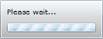
It's always a good idea to let the user know that the application is retrieving (or submitting) data. Usually, you can do this by providing an animation that runs while the communication is being completed. You can design your own animation or take advantage of the BusyIndicator control (a part of the Silverlight Toolkit), which provides a simple message and animation for you (as shown in Figure 6-3). This control (in source form) has already been included in your project by the Silverlight Business Application project template, and is implemented in the user login and registration functions.
The key property on the BusyIndicator control is the IsBusy property. Setting this to True will show the animation, and setting it to False will hide the animation. If you decide to take the XAML-based approach to consuming the data and use the DomainDataSource control in your view, you can simply bind the IsBusy property of the BusyIndicator control to the IsBusy property of the DomainDataSource control (which will be set to True when the DomainDataSource control is waiting for the server request to complete) using ElementName binding. ElementName binding will be covered properly in Chapter 10, but in summary it binds the value of one control's property to the value of another control's property. When the property value is changed on the source control, the bound property's value will be changed accordingly. Here we want the IsBusy property of the BusyIndicator control to have the same value as the IsBusy property of the DomainDataSource control, so we bind the two control properties using the following binding syntax:
<controlsToolkit:BusyIndicator
    IsBusy="{Binding ElementName=productSummaryDDS, Path=IsBusy}" />
If you are taking a code-based approach instead, you can manually set the IsBusy property of the BusyIndicator control to True when you initiate the server request in your code, handle the LoadOperation's Completed event, and set the property value back to False. Alternatively, you can bind the IsBusy property of the BusyIndicator control to a property in your code-behind, and change that property's value instead.
Note
You can determine whether the DomainDataSource control is loading data or submitting changes by its IsLoadingData and IsSubmittingChanges properties, which you can use to alter the message displayed in the BusyIndicator control accordingly.
By default, the text reads "Please wait . . ." but you can change that to something more meaningful by assigning the text you want displayed to the BusyContent property:
<controlsToolkit:BusyIndicator BusyContent="Retrieving products..." />
The BusyContent property is actually a content property, and can accept any control as its value (using the content element syntax, as discussed in Chapter 3). Therefore, this provides you with a simple means to customize the layout of the BusyIndicator control to your liking. For example, you may wish to add a button to cancel the communication, or add your own animation.
However, one thing may get in the way of you laying out the contents of the BusyIndicator control completely the way you want it: the animated bar. The animated bar is not affected by setting the content of the BusyContent property, and remains where it is. This bar is actually just a progress bar, and its style is exposed to you by the ProgressBarStyle property on the control. This means you can assign a style to modify its properties, including its Visibility property. Therefore, you can set its value to Collapsed and hide it completely if you so wish:
<controlsToolkit:BusyIndicator.ProgressBarStyle>
    <Style TargetType="ProgressBar">
        <Setter Property="Visibility" Value="Collapsed"/>
    </Style>
</controlsToolkit:BusyIndicator.ProgressBarStyle>
Note
Rather than just modifying the content of the BusyIndicator control, you can completely change its look (including changing the gray gradient background) by assigning it a new control template. Control templates are covered in Chapter 9.
In addition to displaying an animation to let the user know something is happening, the BusyIndicator control can also be used to automatically disable an area of your user interface while the server communication is taking place. The BusyIndicator control inherits from ContentControl, and therefore has a Content property that can contain other controls in the same way as the Grid or the Canvas controls can. These content controls (and any other controls within the area consumed by the control) will be disabled when the IsBusy property is set to True. It disables the controls by overlaying a semitransparent Rectangle control over its area so that they cannot be clicked. Note that if used in a Grid, the BusyIndicator control actually fills the area of its cell, and just shows the indicator in the middle. Hence the overlay will fill the entire grid cell, overlaying any other controls within that same cell. You can modify the properties of this Rectangle control via the OverlayStyle property on the BusyIndicator control.
Note
Disabling user interface controls is not so important when retrieving data for summary lists, but can be useful when you have a data entry form to stop the user from attempting to resubmit or alter the changes they've made while communicating with the server.
To stop the BusyIndicator control from flashing on and off when a very short server call is made, or when multiple server calls are made in succession, you can control how long the control should be in the busy state before actually displaying the indicator to the user with the DisplayAfter property. By default it's set to 0.1 seconds, but you can change this as required.
Now that we have the mechanisms in place to actually consume the data in our view, it's time to display that data. The most commonly used controls to present a summary list to the user are the DataGrid control and the ListBox control, so we will investigate how to populate both these controls with data, and compare and contrast the two so you can determine the most appropriate control to use for your purposes.
Both the DataGrid control and the ListBox control essentially contain a list of items, and both have an ItemsSource property that can be used to populate the list. This actually means that populating both controls is done in the same way—by assigning a collection of objects to their ItemsSource property. How you do so depends on whether you have decided to take a XAML-based approach to consuming the data, or a code-based approach.
If you have chosen a XAML-based approach, you would bind the ItemsSource property of the given control to the Data property of the DomainDataSource control using ElementName binding (as covered briefly in the "Using the BusyIndicator Control" section of this chapter, and will cover be fully in Chapter 10). For example, this XAML data binds the ItemsSource property of a ListBox control to the Data property of a DomainDataSource control called productSummaryDDS:
<ListBox ItemsSource="{Binding ElementName=productSummaryDDS, Path=Data}" />If you have chosen to take a code-based approach, you can simply assign a collection to the control's ItemsSource property in code, like so (where operation is a LoadOperation object returned by a call to the Load method on a domain context object):
productsDataGrid.ItemsSource = operation.Entities;
Alternatively, you could use the more MVVM-friendly method of binding the ItemsSource property of the given control to a property in the ViewModel (or the code-behind).
Note
As discussed in the "Data Binding" section of Chapter 3, if you have a scenario where you want to bind the ItemsSource property to the control's DataContext property (which may have been inherited down the control hierarchy), you can do so by assigning {Binding} to the control's ItemsSource property.
Although you populate the DataGrid and ListBox controls in the same manner, the ways you configure and customize them to display the data are quite different. Let's take a look at how to do so for each of these controls now.
Configuring a DataGrid control essentially involves setting up the columns to be displayed. If you happen to have presentation layer information (using the Display attribute) in the metadata of the entity being displayed, then simply assigning the collection to the ItemsSource property of the DataGrid and setting the AutoGenerateColumns property to True is all that is necessary. However, assuming that you don't have this metadata available (as having presentation layer information in the middle tier isn't generally recommended), you will need to manually configure the columns to be displayed. Let's look at how to produce the output shown in Figure 6-4 using a DataGrid control.

Note
If you want to use a DataGrid in your application, but the native DataGrid doesn't serve your needs, there a number of third-party DataGrids available that you could use instead, from vendors such as Telerik, ComponentOne, Infragistics, ComponentArt, DevExpress, and Syncfusion.
Each column will need to be defined on the Columns property of the DataGrid.
There are three different column types available for the DataGrid control in Silverlight:
DataGridTextColumn: This is the most commonly used column type in summary list scenarios. In read-only mode it shows the bound property value in a TextBlock, and in edit mode it shows it in a TextBox.DataGridCheckBoxColumn: This column type is used for showing Boolean values. It displays the bound property value in a CheckBox in both read-only and edit modes (it simply disables it when it's in read-only mode).DataGridTemplateColumn: This column type is for use when neither of the other two column types are appropriate. Essentially, you can configure this column to work the way you want by defining a cell template for the column (providing theCellTemplateproperty with a data template), and if you wish, an alternative cell-editing template (providing theCellEditingTemplateproperty with a data template). In other words, you can define two templates for a column—one for read-only scenarios, and one for editing scenarios. If only one of these templates is provided, then it will be used in both scenarios. In these cell templates you can define the control(s) that you want displayed (and their layout if required), providing practically limitless possibilities for the cell contents.
Note
Data templates were defined and briefly described back in Chapter 3.
The following example XAML demonstrates a simple DataGrid configuration with three columns, each demonstrating one of the preceding column types. Each column has a binding (to a property on the entity), and assigns the text to be displayed in the column header. Note that both a cell template and an edit template are being defined for the quantityAvailableColumn column—using a TextBlock control to display the data for read-only scenarios, and a NumericUpDown control to enable the value to be altered in edit mode:
<sdk:DataGrid AutoGenerateColumns="False">
    <sdk:DataGrid.Columns>
        <sdk:DataGridTextColumn Binding="{Binding Path=Name}" Header="Name" />

        <sdk:DataGridTemplateColumn Header="Qty Available">
            <sdk:DataGridTemplateColumn.CellTemplate>
                <DataTemplate>
                    <TextBlock Text="{Binding Path=QuantityAvailable}" />
                </DataTemplate>
            </sdk:DataGridTemplateColumn.CellTemplate>
            <sdk:DataGridTemplateColumn.CellEditingTemplate>
                <DataTemplate>
                    <toolkit:NumericUpDown
                        Value="{Binding Path=QuantityAvailable, Mode=TwoWay}" />
                </DataTemplate>
            </sdk:DataGridTemplateColumn.CellEditingTemplate>
        </sdk:DataGridTemplateColumn>
<sdk:DataGridCheckBoxColumn Binding="{Binding Path=MakeFlag}"
Header="Made In-House" />
</sdk:DataGrid.Columns>
</sdk:DataGrid>There is a trick that can save you time when manually configuring the columns of a DataGrid control. Even if you have chosen not to take the XAML-based approach to consuming data in the view, use the method described to get started with this approach (ensure the DataGrid control is selected for the given entity in the Data Sources window, and then drag and drop it onto the design surface). This will automatically define a column in the DataGrid's Column property for each property in the entity, and bind it to that property. You can then customize and reorganize/delete the columns that it defined for you to your heart's content, saving you from having to configure each of these manually.
In addition, this method can save you a lot of time when you are using template columns to display/edit various properties on the entity (where the control to display/edit the value isn't available as a part of a standard DataGrid column—i.e., DataGridTextColumn or DataGridCheckBoxColumn). For example, you may want a numeric property to be able to be edited using a NumericUpDown control instead of a plain-old TextBox control. Select the control that should be used to edit the data for a property in the Data Sources window from the drop-down menu that appears when the property is selected. If the control doesn't appear in the list, click the Customize menu item and select the control from the list of all available controls. Remember to also select the data type that the control should appear for! Selecting this control type for a property will automatically create a template column for that property in the DataGrid that is created, with a preconfigured cell template containing that control bound to the property.
Now, if you aren't using the XAML-based approach, once you've dropped the entity onto the design surface, you can simply delete the DomainDataSource control that was created, and delete the binding that was created on the ItemsSource property of the DataGrid.
Note
Often, you will want the last column in the DataGrid to simply fill the remaining space (especially in summary list–type scenarios). You can achieve this by simply setting the Width property of the column to *.
We'd also like to display an image of each product against the corresponding item in the DataGrid. This is another scenario where a template column can be used, with a bound Image control in the cell template. However, properties that expose images on your entity will in most cases be represented by a simple byte array (byte[]). Unfortunately, the Image control cannot accept a byte array, and cannot be bound to it. The Image control can accept a BitmapImage, so we need to find a way to convert the byte array to a BitmapImage so it can be bound. There are a number of ways to achieve this, including
Defining a partial class for your entity, and creating a property that converts and exposes the byte array as a
BitmapImage(which you can bind to)Creating your own image control that can accept an image as a byte array
Creating a value converter that can be used as a part of a binding to convert the bound value before it is applied to the property of the control
All of these are viable solutions, and have their own pros and cons. As a general rule, using a value converter is the better option. Value converters are a powerful feature of the binding mechanism in Silverlight, enabling the properties of two objects to be bound together, even if their types don't match. The value converter sits in the middle of the binding, translating the value of the source property and returning the result so that it can be applied to the destination property (and vice versa). You simply design a class that implements the IValueConverter interface, and insert the logic to translate one value to another—in this case a byte array to a BitmapImage. Value converters will be covered in full in Chapter 10, so I won't go into details here—but in summary we'll use a value converter to convert the byte array to a BitmapImage (which the Image control can understand) so that it can display a thumbnail image for the product.
Note
When it comes to exposing images from the AdventureWorks2008 database, unfortunately we hit a bit of a hurdle. The images are stored in the database as GIFs—an image format not actually supported by Silverlight. Therefore, we need to either convert them to an image format Silverlight supports on the server before sending them to the client (such as PNG or JPG), or find a way to do so on the client. Converting images for each item on the server when the client requests a summary list would put an excessive load on the server and reduce the scalability of your application—therefore, it would be better to try to leave that task to the clients. Luckily, there is a CodePlex project called ImageTools for Silverlight (http://imagetools.codeplex.com) that provides a GIF decoder that you can use. This library is used in the sample project by calling it in our value converter (used when binding the image property to an Image control in XAML) to convert the byte array returned from the server to a BitmapImage. The GIF decoder from the library is used to decode the byte array from the GIF format, which is then reencoded using the PNG encoder from the library to a BitmapImage (which can then be bound to an Image control). This conversion process will be performed in the value converter, which will read in the byte array, convert the image to a PNG, and then assign it to a BitmapImage (which it will then return). However, I won't go into details of the conversion process here.
The following code demonstrates defining a template column containing an Image control whose Source property is bound to the ThumbnailPhoto property of the ProductSummary object. Note how the Converter property of the binding is assigned a custom value converter called GifConverter (which is defined as a resource higher up in the object hierarchy). This is the converter being used to handle the translation of a GIF image in a byte array to a PNG image in a BitmapImage object.
<sdk:DataGridTemplateColumn>
    <sdk:DataGridTemplateColumn.CellTemplate>
        <DataTemplate>
            <Image Margin="2"
                   Source="{Binding ThumbnailPhoto,
                                    Converter={StaticResource GifConverter}}" />
        </DataTemplate>
    </sdk:DataGridTemplateColumn.CellTemplate>
</sdk:DataGridTemplateColumn>Note that you can use the same value converter technique to implement a calculated column. Bind the property to your whole object (so that the whole object is passed into the value converter), and then you can calculate a value to display in that column from the property values on the object (e.g., total amount = quantity × price, where total amount is the calculated value, and the quantity and price values are retrieved from the object). However, in this particular case you are probably best off defining a partial class for that object and creating a property to bind to that performs the calculation in that instead.
The DataGrid control is primarily designed for editing data, and thus grid cells are in edit mode by default; however, you can disable the editing behavior to use the control more like a list by setting the IsReadOnly property of the DataGrid to True.
Note
Being primarily designed for editing data, by default the DataGrid control uses a cell selection–type behavior, whereas in a summary list–type scenario, you really want the selection behavior to involve the full row. You'll find that when a cell is selected, the full row does have a selected appearance, but the cell has an additional (and quite prominent) selection square around it. There is no easy way to hide this, unfortunately, but you can use Silverlight's styling support to hide it yourself. This process involves applying a custom style to the CellStyle property of the DataGrid and retemplating the DataGridCell control to hide the Rectangle (named "FocusVisual") that it incorporates. Retemplating a control using a control template will be covered in Chapter 9.
When you use the DataGrid, you get a lot of additional built in features and behaviors "for free," which is one of the primary reasons that the DataGrid control has such a wide appeal to many developers. Some of these features are listed in the following subsections.
Sorting
Simply click the header of a column to sort the DataGrid by its values, and click it again to reverse the sorting. This feature is automatically turned on, but can be turned off by setting the CanUserSortColumns property of the DataGrid to False. It can also be toggled off/on selectively by setting the appropriate value to the CanUserSort property of a column.
Grouping
One of the most powerful features of Silverlight's DataGrid control is its ability to display grouped data. Most summary lists in business applications have the need to group data, and the DataGrid control has the ability to display grouped data (as configured on a collection view) built in. This feature alone makes Silverlight's DataGrid more powerful and functional than that available natively in any other Microsoft platform. Multiple levels of grouping can be displayed, meaning that you can group items by category, and then subcategory, for example.
Note that grouping cannot actually be configured directly on the DataGrid control itself. Instead, you must bind it to a view and configure the grouping on it instead. This will be discussed further in the "Grouping the Summary List" section later in this chapter.
Resizing of Columns
Users can increase or decrease the size of a column by clicking and dragging the right edge of the column header to the size they want. They can also double-click the right edge of the column header to make the column automatically size itself to a width at which all its content is visible. This feature is automatically turned on, but can be turned off by setting the CanUserResizeColumns property of the DataGrid to False. It can also be toggled off/on selectively by setting the appropriate value to the CanUserResize property of a column.
Reordering of Columns
Users can rearrange the columns to their liking by dragging a column header to a new position. This feature is automatically turned on, but can be turned off by setting the CanUserReorderColumns property of the DataGrid to False. It can also be toggled off/on selectively by setting the appropriate value to the CanUserReorder property of a column.
Displaying Additional Row Details
The DataGrid has a RowDetailsTemplate property that enables you to define a data template containing a layout of additional details you want to display about a row beneath the main row. For example, you may want to display only some of the details on the entity in the columns, and then display more details when the row is selected. You can even have quite a complex layout where selecting a row displays another DataGrid below it showing a list of related items (e.g., the line items on an invoice). You can choose to have the row details displayed for each row automatically, only display the details for a row when it is selected, or only display them manually (via the RowDetailsVisibilityMode property on the DataGrid).
Validation Support
When the DataGrid is in edit mode, any validation rules you've defined in your entity's metadata will be run over the entered values, and a validation rule failure message will appear so the user knows what the problem is so that they can fix the issue.
DomainDataSource Integration
A big advantage of the DataGrid control is that it integrates particularly well with the DomainDataSource control (if you have decided to take a XAML-based approach to consuming the data). Often various data manipulations (covered later in this chapter) require the manipulation to be performed on the server and the list to be repopulated with the results. In collaboration with the DomainDataSource control, the DataGrid handles all of this for you, with no code required.
One of the big advantages of using a ListBox control (over a DataGrid) is its flexibility. By default, a ListBox simply displays a line of text for each item in the list, as shown in Figure 6-5.

However, the ListBox control is actually quite a versatile control, with a lot more potential than you may initially assume. Let's take a look at the techniques you can use to customize the ListBox control to your needs.
You can define a data template that will be applied to each item, enabling you to completely customize the appearance of items in the list. To do this, simply define a data template and assign it to the ItemTemplate property of the ListBox. For example, take the following data template:
<DataTemplate>
    <Grid Height="50">
        <Grid.ColumnDefinitions>
            <ColumnDefinition Width="100" />
            <ColumnDefinition />
        </Grid.ColumnDefinitions>
        <Grid.RowDefinitions>
            <RowDefinition />
            <RowDefinition />
        </Grid.RowDefinitions>

        <Image Margin="2"
               Source="{Binding ThumbnailPhoto,
                                Converter={StaticResource GifConverter}}"
               Grid.RowSpan="2" />
        <TextBlock Name="NameField" Text="{Binding Name}" Margin="2"
                   Grid.Row="0" Grid.Column="1" FontWeight="Bold" FontSize="12" />

        <StackPanel Orientation="Horizontal" Grid.Row="1" Grid.Column="1">
            <TextBlock Text="Number:" Margin="2"  />
            <TextBlock Text="{Binding Number}" Margin="2"  />
            <TextBlock Text="| Available:" Margin="2"  />
            <TextBlock Text="{Binding QuantityAvailable}" Margin="2"  />
<TextBlock Text="| Price:" Margin="2" />
<TextBlock Text="{Binding ListPrice, StringFormat=C}" Margin="2" />
</StackPanel>
</Grid>
</DataTemplate>Applying this data template to the ItemTemplate property of the ListBox results in the output shown in Figure 6-6.

Items don't have to appear vertically in a list when using the ListBox. For example, you may choose to have items appear in a horizontal layout instead, or implement a thumbnail for each item in the list (as you find in Windows Explorer), or even display items in the form of contact cards. These effects can be achieved by assigning a new items panel template to the ItemsPanel property of the ListBox. This property enables you to customize how the items are laid out in the ListBox.
Let's take a look at how to implement the contact card–type layout. For this scenario we want the items to stack horizontally until they reach the right-hand edge of the ListBox, at which point they should wrap around to the next line. This is a scenario that the WrapPanel control from the Silverlight Toolkit is ideally suited for, as it was designed specifically to achieve this effect. All you need to do is assign this to the ItemsPanelTemplate property of the ListBox's ItemsPanel property. For example, applying this template to the ItemsPanel property of the ListBox:
<ItemsPanelTemplate>
    <controlsToolkit:WrapPanel />
</ItemsPanelTemplate>
and then applying this data template to the ItemTemplate property:
<DataTemplate>
    <Grid Width="270" Margin="5">
        <Grid.ColumnDefinitions>
            <ColumnDefinition Width="100" />
            <ColumnDefinition />
        </Grid.ColumnDefinitions>
<Grid.RowDefinitions>
<RowDefinition Height="Auto" />
<RowDefinition Height="Auto" />
<RowDefinition Height="Auto" />
<RowDefinition Height="Auto" />
<RowDefinition Height="Auto" />
</Grid.RowDefinitions>
<Rectangle Stroke="Black" RadiusX="3" RadiusY="3"
Grid.RowSpan="5" Grid.ColumnSpan="2">
<Rectangle.Fill>
<LinearGradientBrush StartPoint="0,0" EndPoint="0,1">
<GradientStop Color="White" Offset="0" />
<GradientStop Color="#6D6D6D" Offset="1" />
</LinearGradientBrush>
</Rectangle.Fill>
<Rectangle.Effect>
<DropShadowEffect ShadowDepth="2" />
</Rectangle.Effect>
</Rectangle>
<Border BorderBrush="Black" Background="White" Margin="8" Height="70"
VerticalAlignment="Top" CornerRadius="3" Grid.RowSpan="5">
<Border.Effect>
<DropShadowEffect ShadowDepth="2" />
</Border.Effect>
<Image Source="{Binding ThumbnailPhoto,
Converter={StaticResource GifConverter}}"
VerticalAlignment="Center" HorizontalAlignment="Center" />
</Border>
<TextBlock Name="NameField" Text="{Binding Name}" Margin="2,8,2,2"
Grid.Row="0" Grid.Column="1" FontWeight="Bold" FontSize="12" />
<StackPanel Orientation="Horizontal" Grid.Row="1" Grid.Column="1">
<TextBlock Text="Number:" Margin="2" />
<TextBlock Text="{Binding Number}" Margin="2" />
</StackPanel>
<StackPanel Orientation="Horizontal" Grid.Row="2" Grid.Column="1">
<TextBlock Text="Available:" Margin="2" />
<TextBlock Text="{Binding QuantityAvailable}" Margin="2" />
</StackPanel>
<StackPanel Orientation="Horizontal" Grid.Row="3" Grid.Column="1">
<TextBlock Text="Price:" Margin="2" />
<TextBlock Text="{Binding ListPrice, StringFormat=C}" Margin="2" />
</StackPanel>
</Grid>
</DataTemplate>and then setting the ScrollViewer.HorizontalScrollBarVisibility property on the ListBox to Disabled (disabling its horizontal scroll bar so that the items will wrap) results in the output shown in Figure 6-7.

Despite all its flexibility, the ListBox control does have its limitations. One big issue comes when you want to group the items in the list (which is covered later in this chapter). Unlike the DataGrid control, the ListBox unfortunately doesn't have any built-in grouping functionality. Data can be grouped within the ListBox; however, there is no support for displaying group headers. You could attempt to implement group headers yourself, but this would require quite a bit of code and could become a messy solution. If you require grouping in your summary list, then you could potentially add some custom styling and behavior to the TreeView control (to make it look and behave like a list), as it is fundamentally designed to support hierarchical data (which grouped data could be considered to be). However, a fair amount of manual effort is still required to achieve the correct effect. Therefore, if you need to display grouped data beneath headers in your summary list, then the DataGrid control may be your best option.
Note
The ListBox control has both an Items and an ItemsSource property. You can't assign a collection to the Items property (it is read-only), but you can add/remove items to/from it. The ItemsSource property enables you to assign an entire collection to it, and hence it can be bound to another control or source of data. You cannot bind the Items property, and hence the ItemsSource property is more commonly used. Also note that if you assign a value to the ItemsSource property, you cannot add or remove items from the collection exposed by the Items property.
With these two controls in Silverlight suitable for displaying summary lists, you are left with the potentially difficult decision of which one you should use.
The DataGrid is a powerful and versatile control, revered by developers but detested by most user experience designers. Developers tend to like to use the DataGrid, as it provides a lot of functionality out of the box, with little work required to enable it. Hence, developers treat it like a "god" control that can do everything and make their lives easier. By simply binding a collection to the DataGrid control, you get display and editing behavior, sorting, header resizing, header reordering, multilevel grouping, data validation, and more—all with little or no work required on the part of the developer. However, because of this, it is sometimes overused (e.g., implemented in scenarios where a ListBox would be a more appropriate choice), and often at the expense of the application's user experience and user interface design.
Note
Ease of implementation should not provide the basis for your decision on which control you should use. Your decision should solely be based upon what will provide the best experience for the user, and often you will find that the easiest-to-use control (for the developer) is not always the easiest to use (or understand) for the user. Keep this in mind when making your choice.
The manner in which the DataGrid has its columns spread out over its width (and beyond) is not always the most efficient way to display the data—especially when the columns extend beyond the width of the DataGrid (where horizontal scrolling would be required). It's important to design your user interface based upon the needs of the user—not simply using what a control provides you.
As a general rule, the DataGrid control is best suited to data entry scenarios; but again, it should be selected with care for use in these scenarios too. Generally, you would use the DataGrid (as opposed to something like the DataForm control) for data entry purposes when the user needs to enter the details for a number of records associated with a parent record. For example, the DataGrid is very useful for enabling users to enter line items in an invoice, since there are typically only a few fields required for each invoice line item. However, for general data entry purposes, laying out controls in a form may be more appropriate. (This topic will be discussed further in Chapter 7.)
While the ListBox control is row driven by design, the DataGrid is primarily cell driven, which becomes an issue when using it to display a summary list. The purpose of a summary list is to locate and drill down on the data, and as a general rule the user will use it to drill down upon the data at the row level (not the cell level). Therefore, cell selection behavior in this scenario can be somewhat confusing to the user. If you do use the DataGrid for displaying summary lists, it is recommended that you change the default cell style to remove the selection rectangle from around the selected cell (hence, the cell won't appear selected, but instead the whole row will, as it already exhibits highlighting behavior).
As discussed earlier, the DataGrid does have a big advantage over the ListBox (excluding data entry scenarios) when you need to implement grouping in a summary list, as the ListBox simply doesn't have that capability. Implementing grouping in a DataGrid will be discussed later in this chapter in the "Grouping the Summary List" section.
One of the reasons why few developers tend to use the ListBox control is simply because they don't realize the possibilities opened by templating its items; or if they do, then they think it's too much work. You may have to design a data template first to lay out any data to be displayed that involves more than one field.
Ultimately, the most appropriate control for displaying summary lists is the ListBox, even if it does require a little more work to lay out and to implement various behaviors that are built into the DataGrid (such as sorting the list). It's much more lightweight than the DataGrid, and it's very flexible when templated. The DataGrid does have its place, but should be used only when the user experience design calls for it.
Displaying a summary list is one thing, but it only partly fulfills the objective of helping the user find the record(s) that they are after. This is particularly relevant when the list contains many items, especially if they aren't sorted in such a manner to help the user in this task. Therefore, summary lists typically provide a number of data manipulation actions that the user can apply to the list in order to browse it more efficiently, including
Filtering
Sorting
Grouping
Paging
In this section I will detail how to implement each of these data manipulation actions when you are using the DomainDataSource control to consume data, when you are working directly with the domain context object in code to consume data, and when you simply have the data in a collection on the client (using a PagedCollectionView).
Note
Both the DomainDataSource and domain context methods detailed here request the data manipulation to be performed on the server, while the PagedCollectionView method uses a client-based means of manipulating the data. Performing the data manipulation on the server is extremely useful when you don't have (or don't want) the entire summary list returned to the client (such as when you want to page the list). Only perform the action on the server if you don't have all the data on the client, as otherwise you will be making the server do unnecessary work (by transferring the entire list back to the client again). When binding actions (filtering/sorting/grouping/paging) directly to the DomainDataSource control, you are asking it to perform those actions on the server—which is not the most efficient implementation if you are already transferring all the data to the client anyway. If you are already transferring the entire list to the client and then want to perform an action on it, handle the action manually using the PagedCollectionView method instead.
When the entire summary list is sent to the client, then filtering/sorting/grouping/paging can be performed on the client. However, when the client has only a part of the full list (such as when paging is implemented), any filtering/sorting/grouping will need to be performed on the server. This is so that the given action can be applied to the entire list, as it will often affect which records the client will have.
Passing additional clauses to the server to be appended to the database query is generally a messy process to implement with standard web services. Often you need to add additional parameters to the query operations to accept the clauses, and then manually append these clauses to the main query to be run before returning the results to the client.
This is where the ability for a domain operation to return an IQueryable expression (enabled by using RIA Services in conjunction with the Entity Framework) comes in handy. This enables us to easily query the exposed collection from the client without needing to manually accept and apply the additional clauses that the client is requesting to the main database query. Instead, RIA Services automatically handles transferring any query clauses requested by the client and applies them to the IQueryable expression returned by the domain operation on the server. Assuming the IQueryable expression was in the form of a LINQ to Entities query, these additional clauses will be appended to that query and included when it is actually executed against the database. Nothing is required on your part on the server to enable this feature, except to return an IQueryable expression—making it one of the most powerful benefits of using RIA Services (you can also find a similar feature in WCF Data Services).
Note
The ability to specify additional query clauses from the client does not allow the client to circumvent any filters you may have applied at the server on your query (e.g., if you've applied a Where clause to filter out data that the user does not have permission to access). This feature does not open you up to SQL injection type attacks in any way.
From the client side, the DomainDataSource control contains the functionality to enable each of the data manipulation actions listed earlier to be applied to any data that it is configured to consume. This is achieved by defining descriptors on the DomainDataSource for these actions. These actions can be defined either declaratively at design time (in XAML) or at runtime (in code). This makes performing those actions easy when using a XAML-based approach to consuming data. (Implementing these actions will be detailed throughout this section.)
However, if you are using a code-based approach to consuming data from the server, then this client-side functionality needs to be implemented manually. Let's take a look at how you can add clauses to a query domain operation call when using the code-based approach.
Until now, the code-based approach examples have simply accepted the entire collection returned by the domain operation. However, the EntityQueryable object provides you with a number of extension methods enabling you to append clauses to be added to the query to be run on the server. The methods it gives you are
OrderBy: Orders the results, with the records sorted by the given property in ascending orderOrderByDescending: Orders the results, with the records sorted by the given property in descending orderSelect: Does nothing; only empty selections are acceptedSkip: Usually used when paging data to skip a given number of records before "taking" a given numberTake: Usually used to limit the maximum number of records to be returned, or when paging data to return a given number of records after skipping a given numberThenBy: Adds an additional clause to order the records, with the records sorted by the given property in ascending orderThenByDescending: Adds an additional clause to order the records, with the records sorted by the given property in descending orderWhere: Used when filtering to restrict the records being returned based upon given criteria
Note
There is no GroupBy method on the EntityQueryable object. Grouping in the context of returning data to display is actually a type of data sorting, so you would use the OrderBy and ThenBy methods instead.
Using the code from a previous example:
ProductContext context = new ProductContext();
EntityQuery<ProductSummary> qry = context.GetProductSummaryListQuery();
LoadOperation<ProductSummary> operation = context.Load(qry);
productsDataGrid.ItemsSource = operation.Entities;
let's add a simple Where clause to the query to limit the results being returned from the server. This process is the same as appending additional clauses to a LINQ to Entities query (using lambda expressions). You simply add additional clauses to the EntityQuery object returned from the query method on the domain context before passing it to the Load method:
ProductContext context = new ProductContext();
EntityQuery<ProductSummary> qry = context.GetProductSummaryListQuery();
qry = qry.Where(p => p.QuantityAvailable == 0);
LoadOperation<ProductSummary> operation = context.Load(qry);
operation.Completed += new EventHandler(operation_Completed);
Note
If you don't see the query methods on the EntityQuery object, make sure you have a using statement in your code file referencing System.ServiceModel.DomainServices.Client.
Various combinations of these clauses can be appended one after the other in a fluent manner using the standard query operators and lambda expressions to achieve the results that you require. For example:
qry = qry.Where(p => p.QuantityAvailable == 0).OrderBy(p => p.Name);
Alternatively, rather than using this fluent syntax, you can write a declarative query expression against the query method, like so:
EntityQuery<ProductSummary> qry = from p in context.GetProductSummaryListQuery()
                                  where p.QuantityAvailable == 0
                                  select p;
Now when you run this query from the client, the clauses you added will be automatically applied to the query on the server and included in the SQL query to the database that returns the results.
Note
You can easily prove that a query has been built using the clauses provided by the client and run against your database on the server (and see the query that was generated) using SQL Profiler. Simply monitor SQL queries against your database and make a request for data (with additional clauses applied) from the client—the resulting SQL statement will be displayed in the profiler. If you don't have the full version of SQL Server, you can use a free tool with similar functionality to the SQL Profiler called SQL Server Express Profiler, created by AnjLab. You can download this tool from here: http://sites.google.com/site/sqlprofiler.
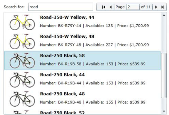
Let's enable the user to filter the summary list by product name (as shown in Figure 6-8). Add a TextBox control to the view into which the user can enter some text to filter the list, and set its name to SearchTextBox:
<TextBox Name="SearchTextBox" Width="100" />
We'll implement this feature such that as the user types the text, the list will automatically filter the list's contents, displaying only the products whose name contains the text that the user has entered into the text box.

The FilterDescriptors property on the DomainDataSource control enables you to add a new FilterDescriptor object specifying the property to filter the list by (PropertyPath), bind to the Text property of a TextBox containing the search text (Value), and provide an operator for how the comparison will be performed (Operator).
<riaControls:DomainDataSource AutoLoad="True" Height="0" Width="0"
                              LoadedData="productSummaryDDS_LoadedData"
                              Name="productSummaryDDS"
                              QueryName="GetProductSummaryListQuery">
    <riaControls:DomainDataSource.DomainContext>
        <my:ProductContext />
    </riaControls:DomainDataSource.DomainContext>

    <riaControls:DomainDataSource.FilterDescriptors>
        <riaControls:FilterDescriptor PropertyPath="Name"
                        Operator="Contains"
                        Value="{Binding ElementName=SearchTextBox, Path=Text}" />
    </riaControls:DomainDataSource.FilterDescriptors>
</riaControls:DomainDataSource>
Alternatively, you can add filter descriptors in the code-behind like so:
FilterDescriptor descriptor = new FilterDescriptor("Name", FilterOperator.Contains,
                                                   "Road");
productSummaryDDS.FilterDescriptors.Add(descriptor);
Note
In this example we are using the Contains operator, such that the query will match on any part of the product name, with the user not needing to know the entire name of the product in order to get a match. This is great for the user, but doesn't allow the database engine on the server to make use of the column index (if it has one) to perform the search. If you find that your database is struggling, you may be better off using the StartsWith operator instead, which will be able to use the index. However, this will only return products whose name starts with the given search text.
Simply add an event handler to the TextBox's TextChanged event (which will be raised whenever the user changes the text in the TextBox), and in the event handler add the code that requeries the server, adding a Where clause to the default query like so:
private void SearchTextBox_TextChanged(object sender, TextChangedEventArgs e)
{
    EntityQuery<ProductSummary> qry = context.GetProductSummaryListQuery();
// Add a Where clause to filter the results
qry = qry.Where(p => p.Name.Contains(SearchTextBox.Text));
LoadOperation<ProductSummary> operation = context.Load(qry);
operation.Completed += new EventHandler(operation_Completed);
}Note
We aren't creating a new instance of the domain context here. When implementing filtering in this manner, you should declare your domain context at the class level and use it instead of instantiating a new one in the TextBox's TextChanged event. Otherwise, each time the user presses a key in the TextBox, a new domain context instance will be created, and an additional call to the server will be made—potentially resulting in multiple queries being active with the server simultaneously. This way, if an existing call is in process, it will be cancelled as the next one is made, leaving only one call in progress at a time.
To filter the items in a PagedCollectionView, you can simply apply a lambda expression to its Filter property. For example, use the following code to limit the view to only items that contain "Road" in their name:
PagedCollectionView view = new PagedCollectionView(op.Entities);
view.Filter = p => ((ProductSummary)p).Name.Contains("Road");
Note
You have to cast the function argument (p) to the type of object contained in the collection, as the PagedCollectionView collection is not restricted to your object type (i.e., any type of object can be added to the collection), so the argument being passed in (p) is of type object, not ProductSummary.
You can also build a more complex filter by simply appending additional conditions to the lambda expression.
If you are using the DataGrid to display the summary list, note that it contains its own action to enable the user to initiate a sorting action (i.e., clicking a column header). It also sorts its contents accordingly with no code required, including automatically refreshing its data from the server when bound to a DomainDataSource control. If you are using a different control to display the data (such as a ListBox), you will need to implement your own mechanism to enable the user to specify how they want the list to be sorted. Let's take a look at how to sort the list (regardless of how the user will initiate the sort).
The SortDescriptors property on the DomainDataSource control enables you to add a new SortDescriptor object specifying the property to sort the list by (PropertyPath) and the direction to sort by (Direction):
<riaControls:DomainDataSource AutoLoad="True" Height="0" Width="0"
                              LoadedData="productSummaryDDS_LoadedData"
                              Name="productSummaryDDS"
                              QueryName="GetProductSummaryListQuery">
    <riaControls:DomainDataSource.DomainContext>
        <my:ProductContext />
    </riaControls:DomainDataSource.DomainContext>

    <riaControls:DomainDataSource.SortDescriptors>
        <riaControls:SortDescriptor PropertyPath="Name" Direction="Ascending" />
    </riaControls:DomainDataSource.SortDescriptors>
</riaControls:DomainDataSource>
Alternatively, you can add sort descriptors to a DomainDataSource control programmatically like so:
SortDescriptor descriptor = new SortDescriptor("Name", ListSortDirection.Ascending);
productSummaryDDS.SortDescriptors.Add(descriptor);
Note
If you bind a DataGrid to the DomainDataSource control, whenever the user clicks a column header in the DataGrid it will automatically update the sort descriptors on the DomainDataSource control to sort by that column and requery the server for the reordered list. The reason why it requires the server to be requeried is that if the results are paged, then the results to be displayed in the page will be (more than likely) different to the current set of items. Therefore, the sort operation must be performed on the server against the entire set of results, before returning the new results for the current page.
To sort the summary list when using the domain context method, simply add an OrderBy or OrderByDescending clause to the default query like so:
ProductContext context = new ProductContext();
EntityQuery<ProductSummary> qry = context.GetProductSummaryListQuery();

// Order the list by the product name
qry = qry.OrderBy(p => p.Name);

LoadOperation<ProductSummary> operation = context.Load(qry);
operation.Completed += new EventHandler(operation_Completed);
You can sort by multiple properties if you wish, simply by appending additional ThenBy/ThenByDescending clauses to the query:
qry = qry.OrderBy(p => p.Model).ThenBy(p => p.Name);
If you are using the domain context method of loading a sorted collection from the server and populating a DataGrid control with the results, when the user clicks a column header it will only automatically perform client-side sorting of the list. However, if you have paged results and need the sorting to be done on the server, you will have to capture this event yourself and requery the server (and then repopulate the DataGrid with the results).
That said, you will find that there is no event on the DataGrid that enables you to catch this action. Instead, you need to
The CollectionChanged event will be raised when the user clicks a column header in the DataGrid (the Action passed in on the event arguments object will have a value of Reset), and in the event handler you can requery the server—being sure to manually apply the same sort descriptions that are now on the PagedCollectionView collection to the EntityQuery object that you are passing to the domain context's Load method).
To sort the items in a PagedCollectionView, simply instantiate a SortDescription (passing it the property to sort the collection by and a sort direction), and then add it to the PagedCollectionView's SortDescriptions collection property. For example, use the following code to sort the collection by the item's Name property (in ascending order):
PagedCollectionView view = new PagedCollectionView(productCollection);
SortDescription sortBy = new SortDescription("Name", ListSortDirection.Ascending);
view.SortDescriptions.Add(sortBy);
Multiple sort descriptors can be added as required. If you bind the view collection to a DataGrid, clicking a column header in the DataGrid will automatically update the sort descriptions in this underlying collection view accordingly.
Grouping is a feature often requested in business applications. It essentially enables you to group related data together and display that data under a heading in the list. Often this extends beyond a single level of grouping to two or even more levels. As discussed earlier in this chapter, the DataGrid has built-in grouping functionality (as shown in Figure 6-9), but the ListBox has none at all. Data can be sorted in the ListBox, but not under headers separating record groups, so the ListBox isn't really applicable in this scenario.

The GroupDescriptors property on the DomainDataSource control enables you to add a new GroupDescriptor object specifying the property to group the list by (PropertyPath):
<riaControls:DomainDataSource AutoLoad="True" Height="0" Width="0"
                              LoadedData="productSummaryDS_LoadedData"
                              Name="productSummaryDDS"
                              QueryName="GetProductSummaryListQuery">
    <riaControls:DomainDataSource.DomainContext>
        <my:ProductContext />
    </riaControls:DomainDataSource.DomainContext>

    <riaControls:DomainDataSource.GroupDescriptors>
        <riaControls:GroupDescriptor PropertyPath="Model" />
    </riaControls:DomainDataSource.GroupDescriptors>
</riaControls:DomainDataSource>
You can create multiple levels of groupings by adding additional GroupDescriptor objects to the DomainDataSource control's GroupDescriptors property as required. For example:
<riaControls:DomainDataSource.GroupDescriptors>
    <riaControls:GroupDescriptor PropertyPath="Model" />
    <riaControls:GroupDescriptor PropertyPath="Category" />
    <riaControls:GroupDescriptor PropertyPath="Subcategory" />
</riaControls:DomainDataSource.GroupDescriptors>
Alternatively, you can add group descriptors to a DomainDataSource control programmatically like so:
GroupDescriptor descriptor = new GroupDescriptor("Model");
productSummaryDDS.GroupDescriptors.Add(descriptor);As mentioned earlier, grouping is primarily a presentation issue—the underlying collection only needs to be sorted in order to support it. Strangely, however, despite the fact that the DataGrid has built-in support for grouping similar rows under headers, there is no property on the DataGrid itself to configure the grouping. However, it can be configured by using a PagedCollectionView (as will be demonstrated in the next section) on the data once it has been retrieved from the server. Once the data is returned from the server, instantiate a PagedCollectionView (passing in the collection to the constructor) and configure the grouping on that in the handler for the Completed event of the LoadOperation (returned from the Load method on the domain context).
If the data being returned from the server is being paged, however, you will need to sort the data appropriately on the server so that the items will be grouped list-wide (rather than just within the page itself). Therefore, you will need to sort the data by the properties to be grouped first, and then add any additional sorting criteria for how you want the data to be sorted within these groups. For example, if you wanted to group products by category and subcategory and sort them by name, you would actually add sort criteria for these grouped properties to your server query like so:
ProductContext context = new ProductContext();
EntityQuery<ProductSummary> qry = context.GetProductSummaryListQuery();

// Order the list by the product category, subcategory, and name
qry = qry.OrderBy(p => p.Category)
         .ThenBy(p => p.Subcategory)
         .ThenBy(p => p.Name);

LoadOperation<ProductSummary> operation = context.Load(qry);
operation.Completed += new EventHandler(operation_Completed);
Note
The sort clauses for the properties to group by have precedence over those defining how the items are sorted within those groups.
Then you can use the PagedCollectionView to specify the grouping that should be applied in the DataGrid once the results have been returned from the server.
To group the items in a PagedCollectionView, simply instantiate a PropertyGroupDescription (passing it the property to group the collection by), and then add it to the PagedCollectionView's GroupDescriptions collection property. For example, use the following code to group the collection by the item's Category property:
PagedCollectionView view = new PagedCollectionView(productCollection);
PropertyGroupDescription groupBy = new PropertyGroupDescription("Category");
view.GroupDescriptions.Add(groupBy);
Multiple group descriptors can be added as required.
Note that you can also supply a value converter as a parameter to the constructor of the PropertyGroupDescription object to convert the property value before it is grouped. This is particularly useful in scenarios where you want to group by a property that is a foreign key to data located elsewhere (such as in another collection). For example, say you want to group the products by category, but the product object only contains an ID representing the category, not its name. You could group it by ID, but the ID would appear in the group header instead of the category name. You would generally also want the groups sorted alphabetically by category name rather than category ID. This feature enables you to write a value converter that converts the category ID into a category name (assuming you have a collection of category names and their corresponding IDs on the client), and use the output value of this converter as the value to display as the item's group.
Note
Value converters will be discussed in Chapter 10.
When you have hundreds or even thousands of records on the server, generally you don't want to transfer all of them to the client. Not only does it overwhelm and confuse the user, but it also consumes excessive network traffic and requires the user to wait for it all to be downloaded from the server (making your application appear slow). If you have (or may have in the future) a large number of records returned from the server, then paging the list will help solve these issues. Paging data essentially returns only a small subset of the full list, and with each additional "page" that the user wants to view, the application will query the server again to request the data for that page. Alternatively, if all the data is located on the client, you can page the list to simply avoid overwhelming the user with a huge list.
To help implement this feature, Silverlight has a DataPager control (as shown in Figure 6-10) that keeps track of the current page number, and provides an interface to enable the user to navigate backward and forward through the pages. Declaring a DataPager control in XAML is as simple as
<sdk:DataPager PageSize="30" />
and binding its Source property to the collection to be paged. Note that we set the PageSize property to the number of items/rows to appear in each page. The control handles the rest.
The DataPager supports different display modes (with options such as a page number button for each page, first and last buttons plus page number buttons, first/previous/next/last buttons, etc.), which you can specify using its DisplayMode property. It also has an IsTotalItemCountFixed property that if set to true will stop the user from navigating beyond the calculated number of pages (by disabling the Next button). If set to false, it will keep the Next button enabled even when the last page is reached (useful when the list may have an uncertain or rapidly changing size).
Note
When querying the server for paged data, the data must be sorted (with an OrderBy clause in the query) in order to be paged. Otherwise, you will get an error message stating that "The method 'Skip' is only supported for sorted input in LINQ to Entities" once you attempt to load any pages after the first.

The DomainDataSource integrates very nicely with the DataPager control to provide server-based paging to the summary list. In fact, paging isn't even configured on the DomainDataSource control itself—instead you simply bind the Source property of the DataPager control to the DomainDataSource control's Data property and set its PageSize property, and the DomainDataSource control will automatically implement the paging behavior accordingly.
<sdk:DataPager PageSize="30"
                Source="{Binding Data, ElementName=productSummaryDDS}" />
The DataPager provides you with another feature when used with the DomainDataSource control—setting a different number of items to be retrieved from the server than what's actually displayed in the list. For example, if users are regularly navigating through pages, then it can be useful to retrieve more data from the server in a single call than is displayed in a single page. For example, you may only want to display 20 items/rows to the user at a time, but load 5 pages worth (100 items/rows) to save the user from waiting for the server to return the data for each page as they navigate through the list. The (optional) LoadSize property on the DomainDataSource control enables you to set the number of items/rows that should be retrieved from the server at a time. The PageSize property will continue to define how many items/rows are presented to the user at the one time on the client, with the additional items/rows remaining cached in the background. The DomainDataSource control will then automatically go back to the server to retrieve the next set of results when the user attempts to view a page whose items have not been retrieved yet.
When breaking a list up, paging is implemented by taking the whole list, ignoring all the items/rows for the previous pages (i.e., skipping them), and then returning the following number of items/rows until the page size has been reached. Let's say you have 100 items/rows in your list and a page size of 10 items/rows. Getting the first page is easy—you simply take the first 10 items/rows from the list, and ignore the rest. When getting subsequent pages, however, you need to skip as many items/rows as the page size multiplied by the page number, take the number of items/rows up to your page size, and then ignore the rest.
Say you have a DataPager control in your view named ListPager. To page the summary list when using the domain context method, you will need to add a Skip clause and then a Take clause to the default query, like so:
ProductContext context = new ProductContext();
EntityQuery<ProductSummary> qry = context.GetProductSummaryListQuery();

// Get the items/rows for the given page
qry = qry.OrderBy(p => p.Name)
         .Skip(ListPager.PageSize * ListPager.PageIndex)
         .Take(ListPager.PageSize);

qry.IncludeTotalCount = true;

LoadOperation<ProductSummary> operation = context.Load(qry);
operation.Completed += new EventHandler(operation_Completed);
Note that we are supplying an OrderBy clause (which as mentioned earlier is mandatory in order to enable paging—although it can be done either on the client or the server). Also note that we are setting the IncludeTotalCount property of the EntityQuery object to true. In order to show the user how many pages of items/rows there are in the list, we need to know the total number of items/rows that there are (since we only have a small subset of the full list). This number can then be used to calculate how many pages there will be. Setting the IncludeTotalCount property of the EntityQuery object to true means that the server will return the total count of items/rows in the list, along with the page of items/rows requested.
The total entity count can be obtained from the LoadOperation object passed into its Completed event handler:
LoadOperation<ProductSummary> op = sender as LoadOperation<ProductSummary>;
int itemCount = op.TotalEntityCount;
The problem that you will encounter is that the DataPager control's ItemCount property (which this value needs to be assigned to) is actually read-only. It needs this value so it can calculate the total number of pages, but it obtains the value from a property on the source that it binds to (if that source implements the IPagedCollectionView interface). The DomainDataSource control returns a DomainDataSourceView, which implements this interface and enables the correct paging behavior:
Handling requerying the server as the user navigates between pages
Caching the paged results so that once retrieved they don't need to be requested from the server again
Exposing the total number of items from its
ItemCountproperty so that the DataPager control can handle the page navigation (even though it doesn't have all the items currently available client side)
However, this is all done within the DomainDataSource control—the domain context (which we are using directly) simply returns a collection (instead of a view), and the DomainDataSource control wraps that collection in a DomainDataSourceView itself.
Unfortunately, we can't make use of the DomainDataSourceView ourselves, as its constructor scope is marked as internal (so we can't create an instance of it). You can't use the PagedCollectionView either, as its ItemCount property is read-only, too. Instead, you will have to create your own view that implements from the IPagedCollectionView interface, and implement the same behavior provided by the DomainDataSourceView yourself.
You will then be able to assign the collection returned from the server to the ItemsSource property of the DataGrid/ListBox, and assign the same collection to the Source property of the DataPager.
Paging the items/rows in a PagedCollectionView requires no work on your part when using the DataPager control. Simply assign the view to both your DataGrid/ListBox and your DataPager, and the DataPager will manage what items should appear in the list.
If you aren't using the DataPager control, note that the PagedCollectionView has a PageSize and a PageIndex property, along with the following methods to navigate between pages:
MoveToFirstPageMoveToLastPageMoveToNextPageMoveToPreviousPageMoveToPage
Summary lists are generally used as a means to find and drill down on a record to get more details and/or edit the record. There are a number of methods you can use to implement this type of behavior, including
Which method you choose really depends on the scenario you are implementing. Each has its own pros and cons, and your choice will largely depend upon the user experience design for your application. In this section we will take a look at each of these methods and how to implement them.
How to implement this behavior isn't particularly straightforward, however. You have probably implemented this type of behavior in the past by having the user double-click an item in the list, but there are no DoubleClick events in Silverlight. In fact, there's no RowClick event on the DataGrid either, nor is there an ItemClick event on the ListBox. So how can you enable the user to drill down on a record? Let's take a look at some approaches you might like to take.
Note
If you still want to use a double-click behavior, you can implement it yourself using a behavior or a trigger. You can also find various double-click behaviors/triggers already created by other developers with a quick search on the Web. Behaviors will be covered in Chapter 10.
If you are using a DataGrid, then you can use a template column and add a control such as a Button or HyperlinkButton to it that the user can click to navigate to the details view. Alternatively, if you are using a ListBox, then you can simply include one of these controls in your item template.
Unfortunately (as was detailed in Chapter 4), the navigation framework doesn't allow you to pass complex objects between views. Therefore, in order to enable the details view to know which record it should load and display, you will need to pass a unique identifier to that view as a query string parameter. You could use the HyperlinkButton control (which can be configured to automatically navigate to the details view with no code required); however, it unfortunately does not have the ability to automatically include the unique identifier of the record as a parameter in the URI to navigate to the details view. Your options in this case are to either handle the HyperlinkButton's Click event in the code-behind and build the URI to navigate to manually prior to initiating the navigation, or to bind the NavigateUri property of the HyperlinkButton to the property representing the unique identifier on the bound object and use a value converter to build the full URI. The value converter approach is probably the most appropriate choice (especially if you are using the MVVM design pattern); however, it does not apply if you are using a Button control (as the Button control has no NavigateUri property). Therefore, we'll focus on the code-behind approach here instead, which you can use with either a HyperlinkButton control or a Button control.
The following XAML demonstrates the definition of a HyperlinkButton control (which can be added to the cell template of a DataGrid template column or to a ListBox item template) that displays the name of the product as its text, has a Click event handler, and binds the whole ProductSummary object to its Tag property (which it does by assigning {Binding} to its property value):
<HyperlinkButton Content="{Binding Name}" Tag="{Binding}"
                 Click="NameButton_Click" />
Now, in the Click event handler for the HyperlinkButton, we can get the HyperlinkButton that raised the event (which is passed into the event handler as the sender parameter), and then get the ProductSummary object corresponding to its summary list item/row from its Tag property. The structure of this URI will depend on how your URI mapping has been configured (see Chapter 4 for more information on URI mapping). The following example demonstrates building a URI that navigates to the product details view, and passes it the ID of the product to display (which it can obtain from the query string and retrieve the corresponding details from the server for).
private void NameButton_Click(object sender, System.Windows.RoutedEventArgs e)
{
    HyperlinkButton button = sender as HyperlinkButton;
    ProductSummary productSummary = button.Tag as ProductSummary;

    Uri detailsUri = new Uri("ProductDetails/" + productSummary.ID.ToString(),
                             UriKind.Relative);
    NavigationService.Navigate(detailsUri);
}
Note
You should also handle the KeyDown event of the control to capture the Enter key being pressed, and navigating to the details view corresponding to the selected item/row. This helps enable users to use the keyboard to navigate around the application instead of having to switch between using the keyboard and the mouse.
Silverlight has a neat class built in called ChildWindow that enables you to display a modal pop-up window with content that you define. This makes it perfect for use in scenarios in which you want the user to be able to select a record in a summary list, and display the related details in a pop-up window.
To implement a child window, add a new item to your project and select the Silverlight Child Window item template from the dialog. This will create a new XAML file (and corresponding code-behind class) inheriting from the ChildWindow class. As shown in Figure 6-11, you have a nice window-type layout (which you can style to suit your user interface design if necessary) already set up with OK/Cancel buttons, which you can add your own control layout to so that the user can view and edit the details of the selected record in the summary list.

Once you have defined the layout of the child window, you now need to be able to display it when the user clicks a record in the summary list. Using the methods described in the previous section, instead of navigating to a new view you can simply handle the Click event of the hyperlink or button defined for an item/row and display the child window. All that is required to display a child window is to instantiate the class and call the Show method, like so:
ProductDetailsWindow window = new ProductDetailsWindow();
window.Show();
Note
While the child window is displayed modally, unlike displaying modal windows in Windows Forms or WPF, the method returns immediately (instead of waiting for the window to be closed). If you need to perform an action (such as updating the summary list) once the window is closed, you will need to handle either the Closing or Closed event of the child window and put your logic to do so in there.
However, in this scenario, where we want to show the details of the selected record in the summary list, we need to pass in an identifier or an object so it knows what data to load and display. Unlike the previous method of navigating to a new view where we could only pass a simple string to the new view to tell it which record to load, we can actually pass complex objects into a child window by modifying the constructor of the class to accept a simple type or object with the required details as a parameter. For example, change the constructor to
public ProductDetailsWindow(ProductSummary productSummary)
{
    InitializeComponent();

    // Logic to load product data corresponding to
    // the passed-in productSummary object can go here
}
You can now pass it the selected object in the summary list when instantiating the window, like so:
HyperlinkButton button = sender as HyperlinkButton;
ProductSummary productSummary = button.Tag as ProductSummary;

ProductDetailsWindow window = new ProductDetailsWindow(productSummary);
window.Show();
Figure 6-12 demonstrates displaying the details of a product in a child window.

Note
The ChildWindow class only supports being displayed modally, but the source code for this class can be found in the Silverlight Toolkit, so you can modify its behavior by modifying the source code if you wish. The modality of the child window is provided by applying a semitransparent Rectangle control overlaying the application's user interface, positioning the child window control on top of this, and disabling the root visual. Therefore, any mouse clicks outside the child window will be ignored, effectively providing a modal behavior. With slight modifications to the code you can enable multiple child windows to be displayed simultaneously. Microsoft Silverlight program manager Tim Heuer has actually already done this with a control called the FloatableWindow, which includes additional behavior such as the ability for it to be resized by the user. It is available on CodePlex here: http://floatablewindow.codeplex.com.
The row details feature in the DataGrid enables you to display additional data related to a row in the DataGrid—useful when you only want to show limited details from the bound object in the main row, and display additional details in an area below it (as demonstrated in Figure 6-13). This is especially useful when you want to show additional details about a row without displaying them in a pop-up window or navigating away from the summary list view.
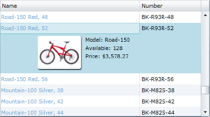
This is achieved by assigning a data template defining the layout of the row details area to the RowDetailsTemplate property of the DataGrid. For example:
<sdk:DataGrid>
    <sdk:DataGrid.RowDetailsTemplate>
        <DataTemplate>
            <!-- Row details layout goes here -->
        </DataTemplate>
    </sdk:DataGrid.RowDetailsTemplate>
</sdk:DataGrid>
You can assign a value to the RowDetailsVisibilityMode property to specify whether the row details are displayed only when the row is selected (VisibleWhenSelected), displayed for every row in the DataGrid (Visible), or never displayed (Collapsed). You can use the RowDetailsVisibilityChanged event to handle when the row details are shown/hidden, enabling you to implement behaviors such as loading related data from the server into the row details when the row is selected and the row details section is displayed.
By default, if the DataGrid has columns extending beyond the width of the DataGrid, its horizontal scrolling functionality will also allow horizontal scrolling of the row details area. However, you can freeze the row details such that they remain fixed in position regardless of any horizontal scrolling motion by setting the AreRowDetailsFrozen property to True.
The master/details view is a relatively common user interface pattern in which the summary list (acting as the master) occupies one part of the view, and when the user selects an item from the list, the associated records (acting as the details) are displayed in another part of the view. For example, you may have a list of invoices (i.e., the master), and when the user selects an invoice from this list, the line items associated with the selected invoice (i.e., the details) will be displayed in another list.
Alternatively, you may have a list of records that when selected will immediately populate a data entry form in another part of the view with the details of that record for editing. For example, let's say you have a list of products. When the user selects a product from the list, they can then edit that record in a data entry form in another part of the view (modifying the same object as being displayed in the list). This is actually quite easy to implement, thanks to Silverlight's binding functionality, and no code is actually required. Let's say you are using a DomainDataSource control in your view that retrieves the list of products (as has already been demonstrated) and displays them in a list (using either a DataGrid or a ListBox bound to the DomainDataSource control). Since building data entry forms won't be discussed until the next chapter, we'll simply bind a TextBox in a manner to display the name of the selected product in the list and enable you to edit it. Add a TextBlock control to your view and bind its DataContext property to the DomainDataSource's Data property (as the DataGrid/ListBox does). Now bind its Text property to the Name property of the bound object.
<TextBlock DataContext="{Binding ElementName=productSummaryDDS, Path=Data}"
           Text="{Binding Name}" />
Now run your project. When you select a product in the list, note how the text in the TextBlock automatically changes to display the corresponding name of that product. Considering that the TextBlock isn't even bound to the list, how does it know what item has been selected? This is because the DomainDataSource control returns a DomainDataSourceView from its Data property (which the TextBox control is binding to). In addition to filtering/sorting/grouping functions (which it enables without the underlying collection needing to be modified), this view also contains current record management functions (including properties such as CurrentItem and CurrentPosition, and methods such as MoveCurrentToNext and MoveCurrentToPosition). This current record view can then be used by other associated data bindings.
Because of the asynchronous nature of calls to the server in Silverlight, handling errors that are raised when a call to the server fails is a somewhat different process than you may be used to. For example, if you are using the code-based approach to consuming the data, you will find that putting try/catch blocks around a call to the server are of little use, as those calls immediately return control back to your code while the call happens on a background thread. Therefore, any errors that are raised on the server or in communicating with the server will not be caught by these exception handlers.
To actually catch these errors, you need to handle the event that is normally raised when the server communication is complete. When using the XAML-based approach, you will need to handle the DomainDataSource control's LoadedData event, and when using the code-based approach, you will need to handle the LoadOperation's Completed event.
As mentioned earlier in the chapter, if you drag and drop an entity from the Data Sources window onto the design surface, the DomainDataSource control that is created will already handle the LoadedData event and check whether an exception occurred:
private void productSummaryDDS_LoadedData(object sender, LoadedDataEventArgs e)
{
    if (e.HasError)
    {
        System.Windows.MessageBox.Show(e.Error.ToString(), "Load Error",
                                       System.Windows.MessageBoxButton.OK);
        e.MarkErrorAsHandled();
    }
}
Note
Simply dropping a DomainDataSource control from the toolbox will not automatically create an event handler to handle its LoadedData event. Only using the method of dropping an entity from the Data Sources window onto the design surface will do so.
If you are using the code-based approach, handling the LoadOperation's Completed event is very similar to handling the DomainDataSource's LoadedData event, except you need to cast the sender parameter to a generic LoadOperation object:
private void loadOperation_Completed(object sender, EventArgs e)
{
    LoadOperation<ProductSummary> op = sender as LoadOperation<ProductSummary>;

    if (op.HasError)
    {
        System.Windows.MessageBox.Show(op.Error.ToString(), "Load Error",
                                       System.Windows.MessageBoxButton.OK);
        op.MarkErrorAsHandled();
    }
}
Note how in both cases we are calling the MarkErrorAsHandled method. If you don't call this method, the domain context will throw the exception (which will become an unhandled exception). Unhandled exceptions are caught by the Application_UnhandledException event handler method in the App class and handled there (showing a pop-up error window displaying the details of the error) in order to prevent your application from crashing.
You can check the exception to find out what type of exception occurred and handle it accordingly. The exception is returned simply as an Exception type, but you can cast it to a DomainOperationException to get more useful information about it. Of most interest is the Status property that it exposes. This will tell you what type of exception occurred (using the OperationErrorStatus enumeration) so you can handle it accordingly. The values in this enumeration of most interest when loading data are
ServerError: An exception was raised on the server, or the application could not reach the server.Unauthorized: The user does not have permission to perform the operation. Restricting access to domain operations based upon the user's role is discussed in Chapter 8.
Therefore, you can check this value to determine the category of the error, and handle it accordingly. The following example demonstrates a structure for handling the errors in the LoadedData event handler of the DomainDataSource control (change e to the instance of the LoadOperation if using the domain context method):
if (e.HasError)
{
    DomainOperationException error = e.Error as DomainOperationException;

    switch (error.Status)
    {
        case OperationErrorStatus.ServerError:
            // Handle server errors
            break;
        case OperationErrorStatus.Unauthorized:
            // Handle unauthorized domain operation access
            break;
    }
}
Note
Alternatively, if you are using the code-based approach but don't want an exception to be thrown when an error occurs, use one of the overloads of the domain context's Load method that accepts the throwOnError parameter, and set it to false.
You can test your exception handler by throwing an exception in your query domain operation on the domain context. For example, add the following code to the domain operation method (before returning the query results) to see the effect of that exception in your Silverlight application:
throw new Exception("Text exception handling exception!");You should now have the ability to retrieve data from the server (using RIA Services), and the knowledge to choose the most appropriate approach to take in doing so. You should also be able to apply this knowledge to retrieve and display a summary list, and enable users to manipulate it to suit their requirements and drill down upon a record. In the next chapter, we'll look at enabling users to edit the details of a record and submit the changes back to the server.