
Now that you've learned how to retrieve data from the server and display it in the form of a read-only list, you need to learn how to display the data in a form such that the user can modify it and submit the changes back to the server. This chapter will take you through creating a data entry form that enables the user to add, edit, and delete records from the system, and submit the changes back to the server.
A typical data entry form consists of a number of editable fields—such as text boxes, drop-down lists, and check boxes, each with a corresponding label displaying the name of that field, and a tab order assigned such that users can tab between fields in a logical fashion. Ideally, the users should be able to enter data into the form and submit it without ever having to use the mouse (i.e., completely keyboard driven), making the data entry process smoother and more efficient. Most developers have created countless data entry forms in their careers, although not all fulfill these requirements. Let's take a look at how to create a data entry form that achieves these goals in Silverlight, and then move on to refine its functionality.
In the past, you may have been used to laying out data entry forms using fixed positioning, with each control assigned a Left and a Top value. Although you can do this in Silverlight (by laying out the controls on a canvas), it's usually better to create a flexible layout using the Grid control and lay out the controls in the Grid's cells. This helps you keep the controls aligned, and enables you to have the controls dynamically resize according to the size of the application's window.
There are actually a number of different methods you can use to create a data entry form. Although you can lay out the form yourself (manually), there are a couple of time-saving means available to help you create a data entry form from the object that it will be bound to. Let's take a look at those now.
As shown in the previous chapter, you can open the Data Sources tool window in Visual Studio 2010, and drag an entity that is exposed from a domain service from this window onto your design surface. A DataGrid will be created in the view, with a column defined for each property on the entity.
Instead of creating a DataGrid, you can select Details from the drop-down menu when you select the entity in the Data Sources window (as shown in Figure 7-1) before dragging it onto the design surface.

Now when you drag the entity onto the design surface, a field and corresponding label will be created for each property on the entity, laid out using a Grid control (as shown in Figure 7-2), with the field's binding to the source property already configured.

The control created for each property will default to the one best suited to the property's type (i.e., TextBox for strings, CheckBox for Booleans, DatePicker for dates, etc.), but you can change these as required by expanding the entity in the Data Sources window and selecting different control types for the properties that you want to change (as shown in Figure 7-3). The labels will contain the name of the property, but with some spaces intelligently inserted into the name, and a colon appended.

Note
Unfortunately, there is no way to order the properties of an entity in the Data Sources window before dragging it onto the view. This means that the fields will be created on the form in alphabetical order rather than the actual logical order that you want for them. Therefore, you will need to reorder the fields once they have been created in the form, assigning the fields to the actual grid row in which you want them to appear.
A DomainDataSource control will be automatically configured for you (if one doesn't already exist in the view), and the DataContext property of the Grid control that is created will be bound to it (and will be inherited and available to all the controls within the Grid).
This is an easy way of creating the fields required for a data entry form (you will generally need to rearrange them to form a logical layout); however, it's not the only (or best) way, as you'll soon find.
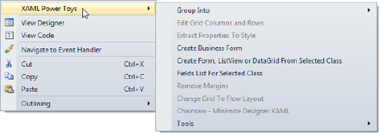
Another method you can use to create a data entry form is to use the XAML Power Toys add-in for Visual Studio 2010, created by Karl Shifflet. After you download and install this add-in (from http://karlshifflett.wordpress.com/xaml-power-toys), it will add a new submenu to your right-click context menus in the XAML and code editors (as shown in Figure 7-4).
Note
The context menu doesn't appear in the right-click context menu in the XAML designer view—it only appears in the XAML editor view.
Right-click in the XAML editor, and select the Create Form, ListView, or DataGrid From Selected Class menu item from the XAML Power Toys submenu.
From the dialog that appears, select the object that you want to create the data entry form from (i.e., the object that the form will bind to), and click the Next button. The screen shown in Figure 7-5 will be displayed.

Start by ensuring that the Select Object To Create drop-down box at the top left of the dialog is set to Business Form. Now you can drag and drop properties that you want to create as fields in the form from the Class Properties section on the left side of the screen into the right side. You can then set any of the given properties for that field as required, including
The type of control
Its display format, maximum length, and width
Its binding mode (which needs to be set to
TwoWayin order for the updated value to be propagated back to the bound object, as discussed back in Chapter 3)Its label
Note how the tool splits the property name into separate words for the label by inserting a space before each capital letter in the property name, which (assuming the text to be displayed is similar to the property name) should save you time in renaming many of the labels. You can also reorder the fields if required by simply clicking and dragging the item up and down to a new position in the list.
There are numerous other features that I won't go into here, but essentially this method enables you to have a lot more control over the configuration of the data entry form before creating it than the previous method described.
Once you've completed configuring your form, you can click the Create button. However, this won't actually insert anything into your XAML as yet. The XAML that was generated has been copied to the clipboard and is ready for you to paste in the appropriate location in your XAML file. Place the cursor at the position in the XAML file to insert the form, and paste the contents of the clipboard to that location (press Ctrl+V). Your data entry form has now been created, and you can modify the XAML further as required. Note that you may have to declare various namespace prefixes used in the generated XAML—these are included when you paste the XAML into the XAML editor in commented-out form. You can then add them to your root element if they aren't already declared.
You can also configure other default property values to apply to each control in the form by selecting the XAML Power Toys
Note
There are a number of other useful features included in XAML Power Toys that you will probably find useful when working with XAML (in both Silverlight and WPF). The source code is also available for download, enabling you to make modifications and add additional features that will help you create data entry forms faster.
In addition to the previous two methods shown, there is another (and arguably better) method to create a data entry form, and that's using the DataForm control.
The DataForm control is a part of the Silverlight Toolkit, and provides a couple of different ways to create data entry forms. The first method is simply to let it do all the work in creating the data entry form for you at runtime. All you need to do is to drop a DataForm control onto the design surface, and bind the object for the user to edit to its CurrentItem property (or a collection of objects to its ItemsSource property if you want the user to be able to edit multiple objects). For example, the XAML to create a DataForm and bind it to a DomainDataSource control (which retrieves the collection to be modified from the server) is
<riaControls:DomainDataSource AutoLoad="True" QueryName="GetProducts"
                              LoadedData="productDomainDataSource_LoadedData"
                              Name="productDomainDataSource" Height="0" Width="0">
    <riaControls:DomainDataSource.DomainContext>
        <my:ProductContext />
    </riaControls:DomainDataSource.DomainContext>
</riaControls:DomainDataSource>

<toolkit:DataForm Header="Product Data Entry"
        ItemsSource="{Binding ElementName=productDomainDataSource, Path=Data}" />
The drag-and-drop approach will declare the toolkit namespace prefix for you if it hasn't already been defined:
xmlns:toolkit="http://schemas.microsoft.com/winfx/2006/xaml/presentation/toolkit"
This will generate a data entry form similar to that shown in Figure 7-6.

Note
This data entry form is generated at runtime, so none of these fields will appear at design time unless you bind it to sample data (as discussed in Chapter 10).
Note that the fields are created in alphabetical order (of bound property name) rather than the required logical order, using the property names as their labels. In addition, a field will be created for all the properties on the object, and these fields won't necessarily generate the control that you want to be used for editing the property value.
This automatically generated form doesn't create a particularly satisfactory user experience in its current form, but there is a way you can have more control over the process and customize it to your needs.
In Chapter 5, you learned how to decorate the properties of your entities/objects with attributes—either directly or via metadata classes. You can use the Display attribute that was described to control the generation of the corresponding fields in the DataForm control. For example:
[Display(Name="Product Number:", Order=3)]
public string ProductNumber;
When the corresponding field for the ProductNumber property is generated in the data entry form, its label will have the text that is assigned to the Name property of the Display attribute, and will appear third in the list of fields, based on the value assigned to the Order property. Other useful properties of the Display attribute that you can use to control the field generation include AutoGenerateField (which can be used to stop a field from being generated for the property) and Description (which can be used to assign a tooltip description to the field, as will be described shortly). In scenarios where your application will be localized for different languages, instead of hard-coding these strings you can use the ResourceType property of the Display attribute and assign it the type created for the resources file (.resx) where the resources can be found. Then assign the name of the string resources to use to their corresponding properties, like so:
[Display(ResourceType = typeof(ProductResources), Name="ProductNumberLabel",
         Description="ProductNumberDescription")]
public string ProductNumber;
Note
You will need to add a link in your Silverlight project to the resource file in your web project so the resources can be used on the client side. If you are using the RIA Services class libraries for your middle tier, then the resource file should be linked between the server and client-side class library projects instead.
Now when the fields are generated at runtime in the DataForm, they will use this metadata and be laid out accordingly. However, there are some issues with generating the data entry form in this manner. The first is the still-limited control you have over how the data entry form is generated. For simple forms, this won't be too much of a problem; however, for more complex forms where you need to use other controls such as ComboBoxes, assign custom properties to each field control, or have less of a structured layout (e.g., with multiple fields in a single row), then this method really isn't satisfactory. Some of these issues can be worked around by handling the DataForm control's AutoGeneratingField event (which is raised when each field is being created, enabling you to make changes to the field being generated).
The most important issue, however, is really conceptual. Decorating your entities/objects with presentation-related attributes violates the separation-of-concerns principle. How the data entry form is laid out is a presentation tier/layer issue, not a middle tier/layer issue (where the entities/objects exist). By decorating your entities/objects with presentation-related attributes, you are creating a murky boundary between the two tiers/layers, which is against good design principles. Therefore, it's highly recommended that you avoid using this method when creating your data entry forms, and explicitly lay out the data entry form using the method described next instead.
Note
If you are binding the DataForm control to a ViewModel (a concept from the MVVM design pattern, which will be discussed in Chapter 12) and decorate its properties with the Display attribute instead, then the use of the Display attribute is more acceptable (with a ViewModel being a presentation-related object). However, even in this case it's recommended that you explicitly lay out the data entry form using the method that will now be described.
Instead of having the fields in the data entry form dynamically generated at runtime as per the previous method, you can instead explicitly define the fields within the DataForm control in XAML instead. You'll then have complete control over the DataForm's fields, and will be able to lay out the fields exactly as required. However, what then can the DataForm control offer you over the previous two methods?
The ability to display a icon (next to the field) that will show a description for that field in a tooltip when the user hovers their mouse over it. This uses the DescriptionViewer control from the Silverlight Toolkit (and can be used outside of the DataForm control if you wish).
The ability to navigate through each entity (if bound to a collection) without needing to leave the view or implement another control (such as a List or a DataGrid) to select the current item. In the header of the control are navigation buttons that you can use for this purpose. In conjunction with RIA Services, the user can modify various entities and add entities to the collection. Also, when the user sends the changes back to the server (as will be discussed later in this chapter), only the entities that have changed or been added server will be sent.
The ability to add a new item or delete the current item if bound to a collection.
Support for objects that implement the
IEditableObjectinterface (discussed later in this chapter) to enable changes to an entity to be committed, or cancelled with the bound properties reverted to their original values.A summary of all the validation errors on the bound entity automatically displayed at the bottom of the control.
The DataForm control already containing a ScrollViewer, so that if the fields extend past the area of the data entry form, then a scroll bar will automatically be displayed.
The ability to define a different data template for each state that the DataForm control can be in. There are three data templates that you can define:
ReadOnlyTemplate: Used when the DataForm control is in read-only mode. This will be the default mode when the DataForm control is displayed and itsAutoEditproperty is set toFalse, and it will also be used whenever the DataForm control'sIsReadOnlyproperty is set toTrue.EditTemplate:Usedwhen the DataForm control is in edit mode. This will be the mode when the DataForm control'sAutoEditproperty is set toTrue(and the user hasn't clicked the Edit button for the current item), and when itsIsReadOnlyproperty is set toFalse.NewItemTemplate:Used when adding a new item to the bound collection.
You might notice some similarities between the structure of the DataForm control and the FormView/DetailsView controls in ASP.NET (with different templates for different modes, etc.). With these controls in ASP.NET, you could simply bind them to an ObjectDataSource control at design time, and the control would automatically generate the HTML for all the fields for you.
Unfortunately, the DataForm control does not have this same feature. The XAML for the fields in a DataForm control is a little different than what we used earlier, and there is also unfortunately no option in the Data Sources window to create the XAML for a data entry form from an object using the DataForm control. However, the XAML Power Toys add-in does have this ability, so you can use the method described in the previous section to create a data entry form, but with one difference. Instead of selecting Business Form from the Select Object To Create drop-down box at the top of the dialog, select Silverlight Data Form. This will create the XAML required for a data entry form using a DataForm control (which you can then bind to a data source such as the DomainDataSource control), and will save you a lot of time over building it manually.
Note
You'll also need to declare the toolkit namespace prefix when using this method (as defined earlier in this section).
As mentioned, the XAML for the fields in a DataForm control needs to conform to the DataForm's requirements, so let's take a look at how it is structured. We'll take a look at a very simple example of the XAML required to configure two fields in the EditTemplate of a DataForm control:
<toolkit:DataForm AutoGenerateFields="False" Header="Product Data Entry">
    <toolkit:DataForm.EditTemplate>
        <DataTemplate>
            <Grid>
                <Grid.RowDefinitions>
                    <RowDefinition Height="Auto" />
                    <RowDefinition Height="Auto" />
                </Grid.RowDefinitions>
                <Grid.ColumnDefinitions>
                    <ColumnDefinition />
                </Grid.ColumnDefinitions>

                <toolkit:DataField Grid.Row="0" Grid.Column="0"
                                   Label="Name:" LabelPosition="Auto">
                    <TextBox Text="{Binding Path=Name, Mode=TwoWay}"
Name="NameTextBox"
HorizontalAlignment="Stretch" VerticalAlignment="Top" />
</toolkit:DataField>
<toolkit:DataField Grid.Row="1" Grid.Column="0"
Label="Product Number:"
LabelPosition="Auto">
<TextBox Text="{Binding Path=ProductNumber, Mode=TwoWay}"
HorizontalAlignment="Stretch" VerticalAlignment="Top" />
</toolkit:DataField>
</Grid>
</DataTemplate>
</toolkit:DataForm.EditTemplate>
</toolkit:DataForm>Note the following from this XAML:
The fields are laid out in a Grid, but there is only a single column defined in the Grid (yet the DataForm control ensures that they will remain aligned regardless of the differing lengths of the labels).
There is no Label or TextBlock control defined for each field to display the field label. Instead, each field is defined using a DataField control, to which you assign the input control as its content. The DataField control is then assigned to a cell in the Grid, and the text to use as its label is assigned to its
Labelproperty. If you wish, you can assign a string to the DataField control'sDescriptionproperty to display an icon next to the field that shows the string when the user hovers their mouse over it.
When the DataForm control in the preceding XAML is bound to an entity or collection of entities, the output shown in Figure 7-7 will be produced.

Note that the labels for the fields in Figure 7-7 are bold, indicating to the user that these fields require a value. This is because the bound properties are decorated with the Required validation attribute.
Although labels are by default positioned to the left of the fields, you can also position them above the fields by setting the DataForm control's LabelPosition property to Top. Top-aligned labels require less horizontal space, and some research has suggested that they enable users to complete forms faster because they can see both the label and the field together as they scan the form. In addition, you don't have to worry so much about how much room the label requires when a form is to be localized. Figure 7-8 demonstrates top-aligned labels.

More information on this can be found at these two URLs:
www.uxmatters.com/mt/archives/2006/07/label-placement-in-forms.phpwww.lukew.com/ff/entry.asp?504
You may have noticed that a Cancel button has also been automatically been created at the bottom of the data entry form. This is because the bound object implements the IEditableObject interface (as do all entities/objects exposed by a domain service with RIA Services), and enables any changes made to the class to be committed or rolled back. If the bound object does not implement this interface, then the Cancel button will remain disabled. The IEditableObject interface will be discussed in more detail later in this chapter.
Note
You can use the CancelButtonContent and CancelButtonStyle properties to customize the Cancel button if required.
You can make the editing of a record more explicit by turning off the automatic edit feature of the DataForm (set its AutoEdit property to False), and by turning off the feature that automatically commits the changes to the bound entity/object when moving to another record (set its AutoCommit property to False). Turning off the automatic edit feature means that whenever the user navigates to a record, it will be in read-only mode (and use the read-only template, if defined). A pencil icon is added to the header of the DataForm control, which will put it in edit mode when clicked. Turning off the automatic commit feature will add an OK button to the bottom of the DataForm control (next to the Cancel button). The user will not be able to navigate to another record (or add/delete a record) once they are in edit mode (and have started making changes to the data) until they've committed the changes (by clicking the OK button) or cancelled them (by clicking the Cancel button).
If the DataForm control's header doesn't suit the look of your application, you can retemplate it by assigning a new data template to its HeaderTemplate property, or remove it completely by changing its HeaderVisibility property to Collapsed. If you do hide the header, you can still invoke the corresponding functions using the DataForm's methods. For example, it has the following methods:
AddNewItem: Adds a new item to the bound collection and navigates to itDeleteItem: Deletes the current item from the bound collectionBeginEdit: Changes the mode to edit modeCommitEdit: Commits the current changes to the entityCancelEdit: Cancels the changes made since the editing began and restores the original property values of the control to what they were whenBeginEditwas called
The DataForm control also raises events when the user invokes one of its functions (such as when an item is added or deleted, or a new item is navigated to), which you can handle if required in your code.
You may have noticed that there were no methods to navigate through the items in the bound collection. You can, however, use the CurrentIndex property for this purpose, incrementing and decrementing it to move to the next and previous items, setting it to 0 to move to the first item in the collection, or setting it to the item count minus one to move to the last item in the collection. You can also choose which buttons you want to appear in the header. The DataForm control's CommandButtonsVisibility property can be used for this purpose, accepting an integer value that can be calculated by ORing the required values from the DataFormCommandButtonsVisibility enumeration together (in code), or simply including all the values separated by a comma in XAML. The available values are
None: Don't show any buttons.Add: Show the Add button.Delete: Show the Delete button.Edit: Show the Edit button.Navigation: Show the first/previous/next/last item buttons.Commit: Show the OK button (at the bottom of the DataForm control).Cancel: Show the Cancel button (at the bottom of the DataForm control).All: Show all the buttons (as appropriate).
For example, here's how to show only the Add and Delete buttons (in code):
ProductsDataForm.CommandButtonsVisibility = DataFormCommandButtonsVisibility.Add |
                                            DataFormCommandButtonsVisibility.Delete;
And here's how to do the same in XAML:
CommandButtonsVisibility="Add,Delete"
Note
The DataForm control is designed to be bound to an object. For simple unbound data entry scenarios (such as a login window), it's best not to use the DataForm control—simply lay out standard controls in a Grid instead.
It's extremely important that you create data entry forms in your applications that are easy to navigate and use. You want to minimize the amount of work that the user has to do to enter the data, and preferably enable power users to not have to even take their hands off the keyboard (increasing their productivity). In this section, we'll look at the most popular data input controls available in Silverlight, and tips for making it easier for the user to enter data into the application.
There are many data input controls available in Silverlight and the Silverlight Toolkit that you can use in your data entry forms. You can actually use any control you like in a DataForm control (including third-party controls), so you can choose the most appropriate controls for your needs. Let's take a brief look at some of the more common data input controls that you may wish to use.
The TextBox control enables users to enter free-form text (as shown in Figure 7-9).
You can get/set the text in the TextBox via its Text property:
<TextBox Text="{Binding Path=Name, Mode=TwoWay}" />Thanks to a new binding feature in Silverlight 4, you can format the bound value before displaying it. This is very useful when binding to a non-string property (such as a DateTime or a decimal). Use the StringFormat property on the binding to set the format (using the same types of formatting strings you would use if you were to format the value using its ToString method in code (using either standard or custom formats). For example, the following binding displays the value formatted as currency (as shown in Figure 7-10):
<TextBox Text="{Binding TotalCost, Mode=TwoWay, StringFormat=C}" />
Note
You will find more information about the available standard formatting strings and creating custom formatting strings at the following MSDN page (and in related topics): http://msdn.microsoft.com/en-us/library/26etazsy.aspx. If you need to perform a more complex value format or conversion, then you may be better off using a value converter, as will be discussed in Chapter 10.
Unfortunately, the TextBox control doesn't have any masked edit functionality to restrict the input into the TextBox from the user. There are a number of third-party masked edit controls, as well as an open source one on CodePlex, which you can get here: http://sivlerlightinputctrl.codeplex.com (note the misspelling of Silverlight in the URL name).
Alternatively, you can assign a behavior that adds masked edit functionality to a text box. For example, you will find one (written by Jim Fisher) in the Microsoft Expression Gallery, here: http://gallery.expression.microsoft.com/en-us/CMEditMaskBehavior. How to use behaviors will be discussed in Chapter 10.
You can set the maximum number of characters accepted by the TextBox control using its MaxLength property.
If you want to stop the user from being able to enter text into the TextBox control (but still be able to select and copy the text, which can't be done when the TextBox control is disabled), you can set its IsReadOnly property to True. Doing so will change the background of the TextBox control to a light gray to indicate it cannot be edited.
You can horizontally align the text in the TextBox control using its TextAlignment property. You can left-align the text (the default), right-align it, or center it. Note that although Justify appears in IntelliSense and the Properties window as an alignment option, it will throw an exception when used.
By default, when more text is entered into the TextBox control than it can display, the text will remain on a single line and the beginning of the text will disappear off the TextBox's left edge. However, if you make your text box tall enough to display multiple lines, then you can get the text to wrap onto the next line by setting the TextBox control's TextWrapping property to Wrap (the default being NoWrap). If you want the user to be able to start new lines in the text box by pressing the Return/Enter key, then you will need to set the TextBox control's AcceptsReturn property to True.
By default, the vertical and horizontal scroll bars in the TextBox are hidden/disabled. You can enable them via the VerticalScrollBarVisibility and HorizontalScrollBarVisibility properties. Setting their value to Auto will cause the scroll bars to display only when the text exceeds the corresponding dimension of the text box, and setting them to Visible will cause them to display them regardless of whether they're required.
Note
Setting the horizontal scroll bar to visible will disable text wrapping.
The CheckBox control enables the user to enter a True or False value (or a null value in the case of a three-state check box), as shown in Figure 7-11. You can get/set the value of the check box via its IsChecked property, and set its label using its Content property:
<CheckBox IsChecked="{Binding FinishedGoodsFlag, Mode=TwoWay}"
          Content="Is Finished Goods" />
You can turn it into a three-state check box by setting its IsThreeState property to True. This enables an additional state (with a value of null) for the check box, which you may use to indicate that a value has not been set. Figure 7-12 shows what the third state looks like.
Radio buttons (also known as option buttons) enable the user to select one option from a number of options, as shown in Figure 7-13.

Much like the CheckBox control, you can get/set the value of a radio button via its IsChecked property, and set its label using its Content property:
<RadioButton Content="Option 1" IsChecked="{Binding Option1, Mode=TwoWay}" />To bind the radio buttons to an object/entity, you will need to have each option exposed as a separate Boolean property on the object/entity that you are binding to, and bind each radio button to the property representing its corresponding option. Alternatively, you could create a value converter (discussed in Chapter 10) that compares the value of a property with a given value, returning True if the values match and False if they don't.
All radio buttons are implicitly "linked," such that when you select one radio button, any currently selected radio button will be deselected. If you want to have multiple groups of radio buttons in you view that you don't want to interact, then you can separate them by assigning each radio button to a group via their GroupName property. You can give each group whatever name you wish, and only the radio buttons with the same group name will interact. When you group radio buttons, ensure that they are visually separated also in the view so that the user recognizes which options belong to which groups.
The ComboBox control in Silverlight is not strictly a combo box as such, but a drop-down list (proper ComboBox controls accept text entry, where the Silverlight ComboBox does not). You can bind its ItemsSource property to a collection of objects to display (in much the same way as the List control), or declare the items in XAML using the Items property. You can then get/set the selected item using its SelectedItem property.
The following XAML demonstrates creating a ComboBox in XAML, with the items to be displayed in the list also declared in XAML. This gives the output shown in Figure 7-14.
<ComboBox>
    <ComboBox.Items>
        <ComboBoxItem Content="Option 1" />
        <ComboBoxItem Content="Option 2" />
        <ComboBoxItem Content="Option 3" />
        <ComboBoxItem Content="Option 4" />
    </ComboBox.Items>
</ComboBox>
Prior to Silverlight 4, data binding to a ComboBox control was a rather painful experience, as the control didn't have a SelectedValue, SelectedValuePath, or DisplayMemberPath property—all of which are needed when binding a property of the selected object to your entities/objects. Luckily, these properties are finally here for us to use. Say, for example, that we have a Product entity with a property named ModelID, and also a collection of Model objects, each with a ModelID and a ModelName property. What we want to do is to enable the user to select the model of the product from a drop-down list, assigning the ModelID of the selected Model to the ModelID property of the Product entity. However, in the list, we want to display the names of the models, not their IDs. For this scenario, we can bind the collection of Model objects to the ComboBox's ItemsSource property, set its SelectedValuePath to ModelID, and set its DisplayMemberPath to ModelName. The ComboBox will then be bound to our collection of Model objects, so we just need to bind its SelectedValue property to our Product's ModelID property (so that the ModelID property of the selected item in the ComboBox is assigned to the Product's ModelID property, and vice versa):
<ComboBox ItemsSource="{StaticResource modelsResource}" SelectedValuePath="ModelID"
DisplayMemberPath="ModelName" SelectedValue="{Binding ModelID}" />You've already seen how to use the List control to display a summary list and enable the user to drill down on a record in the previous chapter. You could also use it in a data entry scenario in much the same way as described for the ComboBox control—enabling the user to select an item from a collection. Another common use for the List control in a data entry scenario is to have two lists, with the user able to move items from one list to another (via dragging and dropping an item between lists, or simply selecting an item and clicking a button to move that item to the other list).
There are two controls for entering/selecting dates in the Silverlight SDK: the Calendar control and the DatePicker control.
The Calendar Control
The Calendar control (shown in Figure 7-15) enables the user to select a date from a calendar. You can get this selected date from the Calendar control's SelectedDate property:
<sdk:Calendar SelectedDate="{Binding StartDate, Mode=TwoWay}"/>You can also allow the user to select a range of dates by changing the control's SelectionMode property from SingleDate to SingleRange or MultipleRange. You can then get the selected dates from the control's SelectedDates property. Alternatively, you can use the Calendar control for display purposes only by setting its SelectionMode property.

You can narrow down the range of the date(s) that can be selected by assigning a start date for the range to the DisplayDateStart property, and the end date for the range to the DisplayDateEnd property. All dates outside this range will be blanked out and nonselectable. You can also use the BlackoutDates property to set additional dates that the user cannot select. Instead of being blanked out, these dates will display a gray cross over them. This feature can be used to prevent a weekend or a public holiday from being selected. To assign dates to the BlackoutDates property, you will need to add CalendarDateRange objects to the collection (with a from and to date), or bind the property to a collection of these objects in XAML.
By default, the current date is always highlighted in the calendar. You can disable this by setting the IsTodayHighlighted property to False. You can change the first day of the week using the FirstDayOfWeek property.
The month view isn't the only type of view supported by the Calendar control. Using the control's DisplayMode property, you change the mode between Month, Year, and Decade.
The DatePicker control has a lot of features in common with the Calendar control (as shown in Figure 7-16). Clicking the button next to the text box (or pressing Ctrl+down arrow when the text box has focus) will pop up a calendar that the user can select the date from. Unlike the Calendar control, only a single date can be entered into/selected from the DatePicker control. However, you can still restrict the date entered to be within a range like the Calendar control, and black out various date ranges. It does have one additional property: the SelectedDateFormat property. Instead of using the default short date format used, you can change the date format to the long date format via that property.
<sdk:DatePicker SelectedDate="{Binding StartDate, Mode=TwoWay}" />
In addition to the date data input controls in the Silverlight SDK, there are two controls for entering times in the Silverlight Toolkit: the TimeUpDown control and the TimePicker control.
The TimeUpDown Control
The TimeUpDown control (shown in Figure 7-17) lets the user either enter a time or select one using the up/down buttons. The control enables the user to enter a part of the time, and guesses the rest of it when the user tabs away (e.g., the user can simply enter 9, and the control will fill in 9:00 AM). The user can also select a particular part of the time (hour, minute, etc.) and use the up/down buttons to change it accordingly.
You can get/set the time via its Value property:
<toolkit:TimeUpDown Value="{Binding StartTime, Mode=TwoWay}" />You can change the format of the time using the TimeUpDown control's Format property, using the standard or custom date formatting strings. For example, you could specify HH:mm:ss as the format, which uses 24-hour time and includes the seconds.
You can force the user to only enter the time via the up/down buttons by setting its IsEditable property to False. You can also stop the user from going past 11:59 p.m. or before 12:00 a.m. (and cycling through this period) by setting the IsCyclic property to False.
The TimePicker control is similar to the TimeUpDown control, except it also has a drop-down list that the user can select a time from, as shown in Figure 7-18.
<toolkit:TimePicker Value="{Binding StartTime, Mode=TwoWay}" />
By default, the drop-down list contains an item for every half-hour, but you could change this to every quarter of an hour, for example, by setting PopupMinutesInterval to 15.
You've seen how the TimeUpDown and TimePicker controls have up/down buttons to enable the user to modify the time using only the mouse. There are also two other controls in the Silverlight Toolkit that implement this same feature for other data types: the NumericUpDown control (for numbers) and the DomainUpDown control (for selecting an item from a collection).
The NumericUpDown control only allows the entry of numbers—attempting to enter a nonnumeric value will result in the value being reverted to its original value when the field loses the focus. You can set the number of decimal places that are displayed via the DecimalPlaces property, and how much the value will increment/decrement when using the up/down buttons with the Increment property. You can get/set the value via its Value property. The following code demonstrates creating a NumericUpDown control in XAML, and Figure 7-19 shows the result:
<toolkit:NumericUpDown DecimalPlaces="2" Increment="0.5"
                       Value="{Binding ListPrice, Mode=TwoWay}" />
The DomainUpDown control is a bit like the ComboBox control in that it enables you to enter or select an item from a list of items (using the up/down buttons). You bind a list of items to the ItemsSource property to select from, which could be an array of strings or a collection of objects. The user is constrained to only entering values from that collection. You can choose from one of two options as to what happens if the value entered by the user does not match an item in the list via the InvalidInputAction property. The UseFallbackItem option will result in the value being reverted to the value of the FallBackItem property when the field loses the focus. If a value for the FallBackItem property has not been specified, then entering a value not in the list will result in the previous value being reinstated when the field loses the focus. Alternatively, the TextBoxCannotLoseFocus option forces the user to enter/select a valid item from the list before they can move on.
When binding the ItemsSource property to a collection of objects, you can use either the ValueMemberPath property or the ValueMemberBinding property on the DomainUpDown control to specify the property on the objects that will be displayed in the control. Generally, you will use the ValueMemberPath property, to which you simply assign the name of the property identifying that item. Alternatively, you can use the ValueMemberBinding property, to which you can assign a binding expression pointing to the property to use instead. This enables you to specify a value converter as a part of the binding if necessary. As an example, you might have a collection of objects representing US states, each with two properties: one for the name of the state, and one for its short code (e.g., NY) You can display the name of the state in the control (I'll discuss how to do this shortly), but set the ValueMemberPath property to the name of the short code property. If you do this, when the user edits the value of the field, they can enter the short code for the state, and upon tabbing away the corresponding state name will be displayed instead.
Unfortunately, unlike the ComboBox control, the DomainUpDown control has no DisplayMemberPath or SelectedValuePath property (nor does it have a SelectedValue property). When binding to a collection of objects (which aren't strings), the DomainUpDown control will simply call the ToString method on the object to get the text to display. Unless you have overridden the ToString method in your classes, you will therefore need to create a data template and assign it to the control's ItemTemplate property to customize what is displayed in the control. This also means that you can create a somewhat more complex custom layout to display in the control for each item if you wish.
The index of the currently selected item in the bound collection can be obtained via the CurrentIndex property. Much like the TimeUpDown control, this control also has IsCyclic and IsEditable properties.
The following code demonstrates creating a simple DomainUpDown control in XAML, and Figure 7-20 shows the result:
<toolkit:DomainUpDown ItemsSource="{StaticResource StatesResource}" />
The AutoCompleteBox control can be used to enable the user to start typing a value to filter a list of items (appearing below the control when they begin to type), and select an item from the filtered list to complete that field's data input (as shown in Figure 7-21). Under the covers, configuring the AutoCompleteBox control is similar to the DomainUpDown control. You bind its ItemsSource property to a collection that will used to populate the list of potential values. Usually this will be a collection of strings, but you can also bind it to a collection of objects and specify the property on these objects to be displayed using the control's ValueMemberPath/ValueMemberBinding property (in the same way as you do for the DomainUpDown control). You can also assign a data template to the AutoCompleteBox control's ItemTemplate property to customize how items appear in the list.

Note
You may wish to use this control in some instances instead of a ComboBox control to speed up data input for power users. Note, however, that this control does not restrict you from entering a value not in the bound collection.
By default, items only appear in the list that start with the entered text. However, you can alter this behavior using the Filter property. There are a number of different options, but the ones you will generally use are the StartsWith option (the default) and the Contains option. Alternatively, you could use the Custom option and create your own item or text filter, assigning it to the ItemFilter/TextFilter property accordingly. Further discussion of custom filters, however, is beyond the scope of this book.
You can have the text in the text box part of the control automatically complete with the first matching entry. Rather than having the user get partway through entering the value and then selecting an item from the list (which requires further effort), you can set the IsTextCompletionEnabled property to True to have the first matching item in the list already populate the text box (although the user can still keep typing to further refine the results). When the item within the text box is the one the user is after, they can simply press Tab to move to the next field.
The list of matches appears as soon as the user enters the first character, but if you have a very long list of items being filtered, then it may be best to increase the MinimumPrefixLength property, which specifies the number of characters that the user has to enter in order for the drop-down list to appear with the matching filtered items. Alternatively (or in addition), you could assign a value to the MinimumPopulateDelay property, which specifies a period of time (in milliseconds) to wait before populating this list.
A very simple example of using the AutoCompleteBox control in XAML is provided here:
<sdk:AutoCompleteBox ItemsSource="{StaticResource StatesResource}" />Although it's not a data input control as such, the Label control has been designed for use alongside data input controls. You set some text to display (a label for a field) via its Content property, and then associate it with a data input control via its Target property (using ElementName binding, discussed in Chapter 10). By associating it with a data input control, when the data entered into that control is invalid, the label will turn red to indicate that the field has an error. In addition, if the data input control is bound to a property marked as Required (using the validation attributes), then the label will use bold text. The following XAML demonstrates associating a Label control with a TextBox control named ProductNameTextBox:
<sdk:Label Content="Name:" Target="{Binding ElementName=ProductNameTextBox}" />In order for the user to navigate between the data input controls using the Tab key (and Shift+Tab to move back to the previous control) in a logical fashion, you should set the tab order for each data input control in the user interface. You do this by assigning a numeric value to each control's TabIndex property. When the user tabs away from a control, the control with the same or next highest TabIndex value will receive the focus. The values do not have to be sequential, so it is a good idea to separate TabIndex values in increments of five or ten (so that you can change the tab order of a control and insert it between two other controls without having to update the tab order of all the other controls).
You can prevent a control from getting the focus when the user is tabbing between controls by settings its IsTabStop property to False.
You can also customize the scope and behavior of tabbing using the TabNavigation property. The default value is Local, which tabs through all the data input fields, and then the controls outside the current view, the browser's address bar, and, so on, before coming back to tab through the controls again. If you change this property at the container level (such as the view/page level) to Cycle, then the focus will cycle between the controls in that container only (enabling you to restrict tab stops to only the data input controls in the data entry form). If you set this property to Once, the container and all its data input controls will only be able to be tabbed to once.
In addition to enabling the user to logically tab between the controls in your data entry form, you'll want to set the initial focus to a given data input control when a record is loaded. You will need to do this by handling the ContentLoaded event on the DataForm, as the edit template is not instated in the DataForm control until the data is bound to it. The next issue is that even though you give a data input control a name in XAML (within the DataForm control), it won't have a corresponding variable in the code-behind. This is because the control is within a data template, which can be repeated. Because this template (and its content) can be repeated, to avoid possible name collisions, each data template is created in its own namescope (a concept discussed back in Chapter 3). If you were to refer to a control within a data template in code, it wouldn't know which instance to use. Since a variable is not created for the control in the code-behind, you will need to search for it inside the data template. The DataForm control actually makes this procedure easier by providing a FindNameInContent method. Pass it the name of the control and it will return you its current instance. You can then set the focus to this control, as demonstrated here:
private void dataForm_ContentLoaded(object sender, DataFormContentLoadEventArgs e)
{
    TextBox NameTextBox = ((DataForm)sender).FindNameInContent("NameTextBox")
                                                                        as TextBox;
    NameTextBox.Focus();
}
Note
At the time of writing, this method of setting focus to the first field only works properly when binding the DataForm control to a single object. When attempting to use it when binding to a collection, it will work for the first record, but subsequent attempts to navigate between the objects in the collection will fail. The ContentLoaded event will be raised in response to the navigation; however, for some reason, setting the focus in the event handler for this event prevents the current item being changed (and the CurrentItemChanged event is consequently never raised). Hopefully this problem will be fixed in a future version of the DataForm control.
You can obtain a reference to the control that currently has the focus by using the FocusManager object (which you can find in the System.Windows.Input namespace):
object element = FocusManager.GetFocusedElement();
It's generally a good idea to notify the user if they are navigating away from a data entry form where data has been entered or modified, but has not been saved (to prevent them from accidentally losing changes to the data). This is often referred to as checking whether the data is "dirty." If the data is dirty, you can then prompt the user to save or discard their changes.
If the data entry form has been configured to enable only a single item to be edited, and you are using the DataForm control as the container, then you should be able to check its IsItemChanged property to see if any changes have been made to the current item. However, this doesn't appear to work at the time of writing (only ever returning false). Alternatively, if your bound object was retrieved from the server via RIA Services, then you can cast the CurrentItem property of the DataForm control to a type of Entity and check its HasChanges property, like so:
bool hasChanges = ((Entity)ProductsDataForm.CurrentItem).HasChanges;
If the user can edit multiple items in the data entry form, then you will need to check whether the collection has changes. If the collection was returned from the server via RIA Services, then you can simply use the HasChanges property of the domain context instance that returned the collection to find out whether unsaved changes have been made to the collection.
In some scenarios, it can be useful to use the DataGrid control for data entry purposes instead of using a form-based layout. As described in the previous chapter, the DataGrid is more suited for data entry purposes than simply displaying data (in which a List control would typically be more appropriate). It's best used when multiple objects in a collection need to be added or maintained, each of these objects relate to the parent entity, and there are few fields to be displayed/modified.
One good example of when to use the DataGrid is when creating a data entry form for an invoice, for displaying and modifying the related invoice lines. In this scenario, there are multiple lines to be entered/displayed, all relating to the same invoice, and typically few fields involved (e.g., description, quantity, unit cost, tax, and line total). These features make this an ideal scenario for using a DataGrid control.
Configuring and customizing a DataGrid control was discussed in the previous chapter; however, in this scenario you should set the IsReadOnly property of the DataGrid to False. As was also discussed in the previous chapter, you can customize the types of input control used for each field (using the DataGridTextColumn, DataGridCheckBoxColumn, or DataGridTemplateColumn column types). Note that when you assign bindings to the DataGridTextColumn and DataGridCheckBoxColumn types, the bindings for the corresponding input controls that the DataGrid creates (when a row is in edit mode) will automatically use the TwoWay binding mode (regardless of the mode assigned to a column's binding). Input controls in a DataGridTemplateColumn column will, however, need their binding mode explicitly set to TwoWay as usual.
How you handle adding/deleting of rows really depends on your requirements. Note that there are no AddRow or DeleteRow methods (or similar) on the DataGrid—instead, you will need to work directly with the underlying bound collection.
The simplest way to implement this behavior (although not particularly the most user-friendly) is to simply add a button to your view that adds (or inserts) a new item into the collection that the DataGrid is bound to. If you have a reference to the bound collection (or can cast the value of the DataGrid's ItemsSource property to that type), then you should be able to simply call its Add or Insert method. However, if the DataGrid control is bound to a DomainDataSource control, then you will need to cast the value of the DataGrid's ItemsSource property to a DomainDataSourceView (similar to the collection views discussed in the previous chapter). For example:
DomainDataSourceView view = productDataGrid.ItemsSource as DomainDataSourceView;
Product newProduct = new Product();
view.Add(newProduct);

// Scroll the first cell of the new row into view and start editing
productDataGrid.Focus();
productDataGrid.SelectedItem = newProduct;
productDataGrid.CurrentColumn = productDataGrid.Columns[0];
productDataGrid.ScrollIntoView(productDataGrid.SelectedItem,
                               productDataGrid.CurrentColumn);
productDataGrid.BeginEdit();
This code will add a new item to the collection, select this item in the DataGrid, scroll the item into view, and put the first cell of the item's row in edit mode.
Note
If any of the properties have default values that fail one or more validation rules, the validation summary will be automatically displayed at the bottom of the DataGrid as soon as the user starts editing a row, which isn't a particularly nice user experience. This is unfortunately the case with all the methods of adding items to the DataGrid described here. Rather annoyingly, the validation summary often covers the row being edited—hopefully this issue will be resolved in the near future. You can avoid this problem by assigning default values to the new object that will pass the validation rules.
Unfortunately, the DomainDataSourceView class doesn't have an Insert method, but if you have a reference to the bound collection that does support this method (such as an ObservableCollection) and want to insert a new row after the currently selected row, you can use the following code:
ObservableCollection<Product> collection =
    productDataGrid.ItemsSource as ObservableCollection<Product>;

int insertIndex = productDataGrid.SelectedIndex + 1;

// To counter some strange behavior by the DataGrid when the
// first row is selected, but not reported as such by the
// SelectedIndex property (right after the DataGrid is populated)
if (productDataGrid.SelectedIndex == −1 && collection.Count != 0)
    insertIndex = 1;

collection.Insert(insertIndex, new Product());

// Select and scroll the first cell of the new row into view and start editing
productDataGrid.SelectedIndex = insertIndex;
productDataGrid.CurrentColumn = productDataGrid.Columns[0];
productDataGrid.ScrollIntoView(productDataGrid.SelectedItem,
                               productDataGrid.CurrentColumn);
productDataGrid.BeginEdit();Another way to let the user enter multiple rows in a spreadsheet-like fashion is to populate the bound collection with items, and remove the unused items from the collection before submitting the data back to the server. This is useful when you have a maximum number of rows that you will support. However, when the number of rows is undetermined, setting a fixed maximum number of rows isn't an ideal solution.
The final (and generally most user-friendly) method is to automatically maintain an empty row as the last row in the DataGrid. The user can enter data for a new item in this row, and the DataGrid should automatically add a new empty row once they do. Sadly, there is no built-in feature like this in the core Silverlight DataGrid. You could add it yourself (all the source code for the DataGrid control is available in the Silverlight Toolkit), but it's not a great idea, as you'd be tying yourself to that particular version of the DataGrid control, and wouldn't be able to (easily) take advantage of new features and bug fixes in future releases of Silverlight and the Silverlight Toolkit. You can, however, handle a number of events raised by the DataGrid control and manage this automatically. The steps are as follows:
Maintain a class-level variable that will reference the new item object:
private object addRowBoundItem = null;
Add a new item to the bound collection before (or shortly after) binding, and assign this item to the class-level variable. If binding the DataGrid directly to a DomainDataSource control, you would do this in the
LoadedDataevent of the DomainDataSource control, like so:DomainDataSourceView view = productDataGrid.ItemsSource as DomainDataSourceView; addRowBoundItem = new Product(); view.Add(addRowBoundItem);
Handle the
RowEditEndedevent of the DataGrid control. If the row being committed is the empty row item that was edited (you can get the item in the collection that it is bound to from theDataContextproperty of the row), then it's time to add a new item to the end of the bound collection, ensure it is visible, select it, and put it in edit mode. For example:private void productDataGrid_RowEditEnded(object sender, DataGridRowEditEndedEventArgs e) { if (e.EditAction == DataGridEditAction.Commit) { if (e.Row.DataContext == addRowBoundItem) { DomainDataSourceView view = productDataGrid.ItemsSource as DomainDataSourceView; addRowBoundItem = new Product(); view.Add(addRowBoundItem); productDataGrid.SelectedItem = addRowBoundItem;productDataGrid.CurrentColumn = productDataGrid.Columns[0]; productDataGrid.ScrollIntoView(addRowBoundItem, productDataGrid.CurrentColumn); productDataGrid.BeginEdit(); } } }Remember to always delete the last item in the collection before submitting the changes back to the server (as it will always be the item representing the new row):
DomainDataSourceView view = productDataGrid.ItemsSource as DomainDataSourceView;
view.Remove(addRowBoundItem);
Deleting the selected row(s) requires you to get the bound collection or collection view and enumerate through the SelectedItems property of the DataGrid, removing the corresponding item from the bound collection/collection view. This is can be somewhat of a messy process due to removing items in an enumerated collection, but the use of LINQ can simplify the code somewhat:
ObservableCollection<Product> collection =
    productDataGrid.ItemsSource as ObservableCollection<Product>;

// Convert the SelectedItems property to an array so its enumerator won't be
// affected by deleting items from the source collection
// Note that this line requires the System.Linq namespace to be declared
var removeItems = productDataGrid.SelectedItems.Cast<Product>().ToArray();

foreach (Product product in removeItems)
    collection.Remove(product);
Note
At the top of your file, you'll need to have a using directive to the System.Linq namespace to be able to use the Cast<T> method in this code.
Alternatively, you can force only one row to be selected at a time in the DataGrid by setting its SelectionMode property to Single (rather than the default value of Extended), meaning that you only need to worry about removing a single selected item. In this case, the following code would suffice:
ObservableCollection<Product> collection =
    productDataGrid.ItemsSource as ObservableCollection<Product>;

collection.Remove(productDataGrid.SelectedItem as Product);
Adding a delete button to each row is reasonably easy. Simply use a template column and define a data template for the cell containing a button:
<sdk:DataGridTemplateColumn Width="80">
    <sdk:DataGridTemplateColumn.CellTemplate>
        <DataTemplate>
            <Button Content="Delete" Click="DeleteButton_Click" />
        </DataTemplate>
    </sdk:DataGridTemplateColumn.CellTemplate>
</sdk:DataGridTemplateColumn>
Now handle the Click event of the button in code to delete the corresponding item. The bound item in the collection is assigned to the data context of the row, and this is inherited down the hierarchy to the cell and then the button. Therefore, you can get the object/entity that the row is bound to from the Button control's DataContext property, and remove it from the collection/view that the DataGrid is bound to:
private void DeleteButton_Click(object sender, RoutedEventArgs e)
{
    DomainDataSourceView view = productDataGrid.ItemsSource as DomainDataSourceView;
    view.Remove(((FrameworkElement)sender).DataContext);
}
Note
This delete button is generally more attractive and less intrusive if you retemplate the button to simply contain an image (such as a red cross).
In order to create effective data entry forms, there are a few things you should do to make your objects friendlier to the user interface controls that will bind to them. RIA Services entities automatically implement these features by default, but if you are binding to objects whose classes are defined on the client (such as a ViewModel when using the MVVM design pattern, as discussed in Chapter 12), or you're simply not using RIA Services at all, then you will need to implement these features manually. Let's take a look at the most important features you should add to your objects for the benefit of the user interface.
One of the key interfaces that your objects should implement is the INotifyPropertyChanged interface (found in the System.ComponentModel namespace). This is a simple interface, requiring your class to implement a single event named PropertyChanged. Bindings automatically listen for this event, and when it is raised, any binding associated with that property will update itself accordingly (and hence the control associated with that binding will be updated as well).
To notify listeners of this event that a property value has been updated, you simply raise the PropertyChanged event, passing it a PropertyChangedEventArgs object that has the name of the property being updated. The following example demonstrates the code that you would use to notify the user interface that the value of a property named Name has changed:
if (PropertyChanged != null)
    PropertyChanged(this, new PropertyChangedEventArgs("Name"));
One thing that you must be aware of is that the PropertyChanged event is never raised when you use automatically implemented properties. For example, properties implemented in the following fashion:
public string Name { get; set; }do not raise the PropertyChanged event on the object, even when that object implements the INotifyPropertyChanged interface. Therefore, the user interface will not be aware of any changes to the value of that property (that it did not make itself), and will not be updated when the underlying property value is changed. This unfortunately means that you must implement the getter and setter for the property, and maintain the property's value in a member variable. You can then raise the PropertyChanged event in the setter as required:
private string name = "";

public string Name
{
    get { return name; }
    set
    {
        name = value;

        if (PropertyChanged != null)
            PropertyChanged(this, new PropertyChangedEventArgs("Name"));
    }
}
Note
Unfortunately, this means additional code (and hence additional work). Some Visual Studio extensions enable you to easily turn an automatically implemented property into a property with a backing store (i.e., a member variable that maintains the property's value), and raise the PropertyChanged event for that property. This is one option to save you from having to hand-code the getters and setters. Alternatively, try searching the Web for "INotifyPropertyChanged snippets," and you will find a multitude of snippets that will help you create your properties accordingly (and that you can customize to suit your needs).
The INotifyPropertyChanged interface is very commonly used, and many developers add an OnPropertyChanged (or similarly named) method that raises the PropertyChanged event (rather than actually raising the event in the property setters). This simplifies the property setters, as you do not have to check that the PropertyChanged event is not null (which it will be if nothing is handling the event) before calling it.
protected void OnPropertyChanged(string propertyName)
{
    if (PropertyChanged != null)
        PropertyChanged(this, new PropertyChangedEventArgs(propertyName));
}
In the property setter now, you can simply use a single line of code to raise the event:
OnPropertyChanged("Name");This makes your property setters somewhat neater, although there is still the unfortunate requirement to pass the method the name of the property as a string. This is very open to issues in which the property name is different from the string. For example, the string may misspell the property name, or the property name may have been refactored but the string was not updated accordingly. These issues can lead to particularly difficult bugs to identify and track down. Let's look at some other alternatives that can avoid this issue. Which you should choose really comes down to personal taste.
You can use reflection to get the name of the property in its setter (ignoring the first four characters, set_) and pass that to the OnPropertyChanged method:
OnPropertyChanged(MethodBase.GetCurrentMethod().Name.Substring(4));
Note
You will need a using directive to the System.Reflection namespace at the top of your file in order for this code to compile.
Alternatively, you may wish to continue with hard-coding the property name as a string, and check in your OnPropertyChanged method that the property exists. The best idea is to perform this check in a separate method (and call that method from the OnPropertyChanged method), as you can then decorate it with the Conditional attribute, and only have it run when in debug mode:
[Conditional("DEBUG")]
private void EnsurePropertyExists(string propertyName)
{
    PropertyInfo propInfo = this.GetType().GetProperty(propertyName);
    Debug.Assert(propInfo != null, "The property " + propertyName + " does not " +
                                   "exist on this class");
}Yet another method is to use a lambda expression to specify the property name (instead of a string), and extract the name of the property from that. This is a popular method, is faster than reflection, and is refactoring-safe (no magic strings). Start by adding the following using directive to the top of your class:
using System.Linq.Expressions;
Now define the following method in your class (or a base class):
private string GetPropertyName<T>(Expression<Func<T>> property)
{
    MemberExpression expression = property.Body as MemberExpression;
    return expression.Member.Name;
}
Note
Generally, you would put this method in your base class. Alternatively, you might like to define it as an extension method, as described by Jeremy Likeness here: http://csharperimage.jeremylikness.com/2010/06/tips-and-tricks-for-inotifypropertychan.html.
You can then call the OnPropertyChanged method from your property's setter using the following code:
OnPropertyChanged(GetPropertyName(() => Name));
where Name is the name of the property. Emiel Jongerius has written up some other alternatives (including another way of implementing this method that also sets the property's value), and how they compare (performance-wise) here: www.pochet.net/blog/2010/06/25/inotifypropertychanged-implementations-an-overview. Einar Ingebrigtsen also has a blog post with an extended version of this code that provides additional functionality, here: www.ingebrigtsen.info/post/2008/12/11/INotifyPropertyChanged-revisited.aspx.
Note
Oren Eini has another interesting method of handling the INotifyPropertyChanged problem that you may like, where he has created an Observable<T> class. He has blogged about it here: http://ayende.com/Blog/archive/2009/08/08/an-easier-way-to-manage-inotifypropertychanged.aspx. Justin Angel has yet another interesting method where he automatically implements INotifyPropertyChanged using Mono.Cecil and PostSharp.
IEditableObject is another useful interface to implement in your objects (also found in the System.ComponentModel namespace). It is designed to enable any changes made to an object to be able to be cancelled and rolled back (essentially an undo action). Any changes made to the object are tracked using a start/complete-type transaction that can be cancelled, any changes made to the object since the beginning of the transaction are rolled back, and the object's original state is reinstated.
Implementing the IEditableObject interface requires your class to implement three methods: BeginEdit, EndEdit, and CancelEdit. The BeginEdit method should be called before any changes are made to the object (generally via a data entry form), and the EndEdit method should be called once those changes have been made and are to be committed.
In the BeginEdit method you will need to write code to capture the state of the object at that time (i.e., generally all the property values). The easiest way to implement this is using the MemberwiseClone method on the object to take a shallow copy of the state of the object:
private Product originalState = null; // Member variable
public void BeginEdit()
{
    originalState = this.MemberwiseClone() as Product;
}You can then discard this state in the EndEdit method, because any changes made to the object since the BeginEdit method was called will have been accepted (i.e., committed):
public void EndEdit()
{
    originalState = null;
}In the CancelEdit method, you need to restore the original state of the object as it was taken when the BeginEdit method was called, copying that state back to the current instance of the object. You can implement this method in one of two ways—either by manually assigning the values from the "backup" object or by using reflection.
Note
The reflection method is more reusable, as it takes a more generic approach, but it is slower to execute.
You can have full control over what property values are reinstated by assigning the values back to the object's properties manually, via the property setters (which will execute any code within that setter, including the property-changed notifications and validation rules—behavior you may or may not want), or directly to each member variable backing the corresponding property being reinstated.
public void CancelEdit()
{
    if (originalState != null)
    {
        Name = originalState.Name;
        ProductNumber = originalState.ProductNumber;
        // Etc...

        originalState = null;
    }
}
Note
If you choose to bypass the property setters, you may need to revalidate your object after reinstating the property values (validation is discussed later in this chapter).
Alternatively, you can use a generic method that copies the values of all the public properties on the originalState object back to the current instance using reflection:
public void CancelEdit()
{
    if (originalState != null)
    {
        PropertyInfo[] objectProperties =
            this.GetType().GetProperties(BindingFlags.Public |
                                         BindingFlags.Instance);

        foreach (PropertyInfo propInfo in objectProperties)
        {
            object originalValue = propInfo.GetValue(originalState, null);
            propInfo.SetValue(this, originalValue, null);
        }

        originalState = null;
    }
}Both the DataForm and DataGrid have built-in support for calling the BeginEdit/EndEdit/CancelEdit methods on bound objects that implement the IEditableObject interface.
The DataForm control will call the BeginEdit method when changes are first made to the bound object via the bound controls, and commit them by calling the EndEdit method when the user navigates away from the current object, or when they user explicitly commits the changes (by clicking the OK button when the DataForm's AutoCommit property is set to False). As discussed earlier in the chapter, when a DataForm control is bound to an object that implements the IEditableObject interface, a Cancel button will appear in the data entry form. Clicking this Cancel button will call the CancelEdit method on the object to return it to its original state.
The DataGrid also calls the BeginEdit method when changes are first made to a row, and commits them by calling the EndEdit method when the user navigates away from the current row. Pressing the Esc key when editing a row will call the CancelEdit method on the object to return it to the state it was in prior to its being edited.
Often you may wish to display a calculated value in your user interface based upon the values of properties on an object. For example, you may have an object/entity representing an invoice line and want to display the total amount of that line (quantity × unit price). Alternatively, you may wish to have a property that displays the full name of a person, built by concatenating their first name and surname (with a separating space).
If you have created the class on the client side (such as a ViewModel), then you can simply add a new property to the class that performs the calculation that your user interface controls can bind to and display the calculated value.
public decimal LineTotal
{
    get
    {
        return quantity * unitPrice;
        OnPropertyChanged("LineTotal");
    }
}
This example uses the previously described method of notifying any bindings that the property's value has been updated (by implementing the INotifyPropertyChanged interface), so the user interface can update itself accordingly and display its current value. Of course, when you update the values of the properties that represent the quantity or unit price, and notify their bindings that they have changed, the user interface will not know that the value of the LineTotal property has also changed accordingly. Therefore, you should also raise the PropertyChanged event for the LineTotal property in the setters for both the properties representing the line's quantity and unit price.
If you are binding directly to entities exposed from the server via RIA Services, then you can add calculated properties to these entities too. You should never modify the code generated by RIA Services, but each of the generated entities is a partial class, so you can simply create a corresponding partial of your own (in the client-side project) that extends the entity and adds the required calculated properties in the same way as was previously demonstrated. Unfortunately, there is still a problem. If you shouldn't modify the code generated by RIA Services (which is where you will find the source properties for the calculation), how will you notify the bindings that the value of the calculated property will have also changed? There are a number of options, but the best method is to extend one of the two partial methods created in an entity for each property (which are called before and after the value of the corresponding property has changed). For example, a UnitPrice property on an entity will have two corresponding methods: OnUnitPriceChanging (called before the value has changed) and OnUnitPriceChanged (called after the value has changed). You can extend the Changed method and notify the bindings of the property value change like so:
partial void OnListPriceChanged()
{
    OnPropertyChanged(new PropertyChangedEventArgs("LineTotal"));
}
Note
Alternatively, you may wish to consider the more elegant method that Emiel Jongerius has written up for managing dependent properties here: www.pochet.net/blog/2010/07/02/inotifypropertychanged-automatic-dependent-property-and-nested-object-support.
One of the most important roles in a typical data entry form is to notify the user of any problems with the data that they have entered. Invalid data in a business system can have major consequences for the business, so effective validation of data is vital to reduce the number of data entry mistakes that make it into the system (it's impossible to catch all errors, but you want to minimize the number of them as much as possible), and ensure that almost all the data entered into the system is correct and accurate. In Chapter 5, we looked at decorating entities and their properties exposed by RIA Services with validation attributes, which are replicated by the RIA Services code generator on the corresponding client-side entities that it creates. However, we need to execute these rules as the data is being entered into the data entry form, and notify the user of any invalid data that they've entered (before submitting the data back to the server).
In this section we'll revisit implementing validation via validation attributes (from a client-side perspective this time), and then look at the means to expose validation errors publicly from your objects and notify the user interface of the errors accordingly. First, however, we'll take a look at the support that Silverlight has for displaying data validation errors to the user.
Data entry forms require a friendly and nonintrusive way to notify users when they've entered invalid data, including the reason why the data is invalid (so they can fix it accordingly). Silverlight has very strong support for displaying validation errors, without much work required on the part of the developer to implement it.
Data entry controls can be notified by their bindings of any problems with their bound properties, and will automatically restyle themselves accordingly (adding a red border) to notify the user as such. In addition, a red tooltip will appear next to the control, displaying the validation error message so that the user knows what the problem is. If a label control is bound to a data entry control that has a validation error, then it will also turn red. Figure 7-22 demonstrates what happens when the user enters invalid data into a TextBox control.
Note
You can modify how validation errors are displayed by restyling the control's template. Customizing control templates is discussed in Chapter 9.
In order for the control to be notified of related validation errors by its bindings, the bindings need to be configured to listen for and handle validation errors. The appropriate property depends on the method you are using to expose the validation errors to the user interface, and will be discussed later in this chapter as we detail these methods.
Note
If you are binding directly to entities exposed by RIA Services, the method used to notify the user interface of validation errors is already configured by the bindings to listen for and handle these validation errors, reducing the configuration required when creating the binding.
The ValidationSummary control can be used to display a list of all the data validation errors associated with an object. It does so automatically via its DataContext property (which is inherited from its container), meaning that you can in many cases simply place it in a view like so:
<sdk:ValidationSummary />
and it will automatically display any validation errors on the object inherited by its DataContext property, as shown in Figure 7-23.

Note
The ValidationSummary control remains hidden until it has validation errors to show, and returns to the hidden state when the errors are fixed.
If you want to take a more manual approach to assigning errors for it to display, you can also manually assign errors to its Errors property in the code-behind (or bind this property to a collection of validation errors that you maintain), like so:
var error = new ValidationSummaryItem("The Name field is required", "Name",
                                      ValidationSummaryItemType.PropertyError,
                                      null, null);
validationSummary.Errors.Add(error);
The DataForm control has a built-in ValidationSummary control in addition to its standard validation error notification behavior. The ValidationSummary control will automatically appear at the bottom of the DataForm control when the bound object reports any data validation errors (as shown in Figure 7-24). The DataForm control also automatically validates the bound entity/object (at both the property and object level) before committing the changes, preventing the user from committing the changes or moving away from the record until the validation errors have been resolved.

Like the DataForm control, the DataGrid control also has a ValidationSummary control built in, which appears when the current row has validation errors reported by the bound entity/object. Validation errors will result in the background color of the row changing to a light red. Also, cells with associated validation errors will display a red border and a tooltip explaining the reason for the validation error, when they have the focus (as shown in Figure 7-25).

Note
Until all validation errors are fixed on a row, the user will not be able to modify/add any other rows. If the bound object implements the IEditableObject interface, then the user can press the Esc key (twice if a field is currently in edit mode, otherwise once) to cancel the changes. The DataGrid control will respond by calling the CancelEdit method on that object, and return the object to its state before editing began.
There are three types of data validation that you usually need to perform in business applications:
Property-level validation, in which there are one or more validation rules associated with a property. Property-level validation rules are generally confined to validating the value of a single property, without being reliant on the values of other properties on the object. For example, a typical property-level validation rule may ensure that a numeric value assigned to a property is within a given range. Property-level validation is performed whenever the value of a property is updated (in its setter), and when validating the object as a whole.
Object-level validation, in which each validation rule generally relates to the values of multiple properties on a single object. For example, a typical object-level validation rule may ensure that the end date is after the start date. Object-level validation is performed when committing all the changes to the object (generally calling the
EndEditmethod after implementing theIEditableObjectinterface).Domain-level validation, in which a full object hierarchy is validated as a whole against a set of validation rules, with validation rules spanning across multiple objects. For example, a typical domain-level validation rule may ensure that when an order is placed, there are enough items in stock to fulfill the order. Domain-level validation is usually performed when committing changes back to the server, and often on the server itself.
We'll primarily be focusing on implementing property- and object-level validation here.
When you expose entities/objects from the server via RIA Services, you define the property- and object-level validation rules on your server-based entities/objects using validation attributes (as described in Chapter 5), and these are then replicated on the corresponding entities created on the client (by the RIA Services code generator).
The validation rules are replicated on the client such that the data can be validated on the client during data entry, and will be run again on the server when the data is submitted.
When exposing entities from RIA Services, you will generally use validation attributes to specify property- and object-level validation rules, but you can also use these attributes in your own client-side classes (such as your ViewModels, when using the MVVM design pattern discussed in Chapter 12). Simply add a using directive to the System.ComponentModel.DataAnnotations namespace, and you can use the validation attributes described in Chapter 5 (e.g., Required, StringLength, Range, RegularExpression, etc.) in exactly the same manner. For example:
[Required]
[StringLength(50)]
[RegularExpression(@"(?<user>[^@]+)@(?<host>.+)")]
public string EmailAddress;

[Range(0, 150)]
public int Age;
Note that the predefined validation attributes are all property-level rules. To define object-level validation rules, you will need to create a custom validation attribute that inherits from the base ValidationAttribute class (in the same way as was demonstrated in Chapter 5). Repeating that same example, here is a custom validation rule for ensuring that the sell finish date on a product is later than the sell start date:
public class SellDatesValidationAttribute : ValidationAttribute
{
    protected override ValidationResult IsValid(object value,
                                        ValidationContext validationContext)
    {
        Product product = value as Product;
        return product.SellEndDate > product.SellStartDate ?
            ValidationResult.Success : new ValidationResult(
                "The sell end date must be greater than the sell start date");
    }
}
You can then apply the validation rule to your class like so:
[SellDatesValidation]
public class Product
Of course, you can also create custom property-level validation attributes in exactly the same way (as was also demonstrated in Chapter 5).
Note
Using validation attributes is not the only way of implementing validation rules in Silverlight. They are the means provided by RIA Services; however, you can also manually implement validation rules in the property setters (for property-level validation rules), and in the object's EndEdit method for object-level validation rules (assuming you implement the IEditableObject interface), and then expose them to the user interface using the means discussed in the next section.
There are actually several means of reporting data validation errors from your entities/objects in Silverlight. Validation errors can be exposed by the following:
Throwing exceptions
Implementing the
IDataErrorInfointerfaceImplementing the
INotifyDataErrorInfointerface
We'll take a look at each of these in turn, primarily focusing on using them for exposing property-level validation errors (I'll also discuss additional issues you need to be aware of when exposing object-level validation errors).
Note
Entities exposed from the server via RIA Services are automatically configured to report both property- and object-level validation errors to the user interface. These entities inherit from the Entity class, which automatically implements the INotifyDataErrorInfo interface (described shortly), and reports any data validation errors identified by the validation attributes when properties are updated to the bindings via the means provided by that interface. Therefore, the methods described here are primarily included to demonstrate the different methods that Silverlight 4 provides to enable the user interface to be aware of data validation errors, so you can understand how data validation works behind the scenes, and how to implement data validation in your own client-side classes (such as your ViewModels, when using the MVVM design pattern discussed in Chapter 12).
Prior to Silverlight 4, the only means of notifying the user interface of property-level data validation errors was to throw an exception in the setter of a property. The ValidationException exception (found in the System.ComponentModel.DataAnnotations namespace) was generally used for this purpose. An example of validating a property value and notifying the user interface of a data validation error using the exception method is demonstrated here:
public string Name
{
    get { return name; }
    set
    {
        name = value;

        // Check validation rule
        if (string.IsNullOrEmpty(value))
            throw new ValidationException("You must enter a name for the product");
    }
}
If you set the ValidatesOnExceptions property on the binding to True, then any exception that was thrown when assigning a value to a property via a control will be treated by the binding as a validation error (i.e., when an exception is thrown in the property setter, or when a type converter throws an exception converting the user input before assigning a value to the bound property). As shown earlier, many controls in Silverlight have excellent support for notifying the user of data validation errors, which you can see by setting the ValidatesOnExceptions property on the binding to True (its default value is False) and raising an exception assigning in the bound property's setter. The result will be that the control is restyled appropriately to notify the user that a validation error has been encountered.
Note
You don't need to worry about setting the ValidatesOnExceptions property to True when the bindings are within a DataForm control—they will still be restyled and the validation summary will appear accordingly when there are validation errors on the bound object.
In order to deal with the validation error in code, the NotifyOnValidationError property on the binding must have a value of True (which is its default value), and the ValidatesOnExceptions property on the binding must be explicitly set to True. This will cause the BindingValidationError event to be raised on the bound control, which you can then handle. A typical binding for this scenario is demonstrated here:
<TextBox Text="{Binding Path=Name, Mode=TwoWay, NotifyOnValidationError=True,
                        ValidatesOnExceptions=True}"
         BindingValidationError="NameTextBox_BindingValidationError" />
You can then handle the BindingValidationError event on the bound control like so:
private void NameTextBox_BindingValidationError(object sender,
ValidationErrorEventArgs e)
{
    if (e.Action == ValidationErrorEventAction.Added)
    {
        // Do something with the error
        string errorMessage = e.Error.ErrorContent.ToString();
    }
}Historically, the process of throwing data validation errors as exceptions has never been popular with most developers, as conceptually data validation errors are not "exceptional" scenarios—and exceptions should be confined to only being used when something unexpected occurs. Additionally, in the past when debugging your application, every time an exception was thrown due to a data validation error, the execution of the application would break and throw you back into Visual Studio. You could still continue running the application, but it was a frustrating development experience (unless you opened the Exceptions window from the Debug menu in Visual Studio and specified that the application should not break when a ValidationException exception is raised). This method was also a problem when populating an entity with data, as exceptions could be raised when a value was assigned to a property that may have been invalid at the time (due to a validation rule that compares the values of two properties), but would become valid as further properties were assigned their values.
WPF provided a better way of handling data validation, in which you could implement the IDataErrorInfo interface on your entity, exposing validation errors for an entity/object via two properties, Error and Item, without requiring exceptions to be thrown. In addition, these properties could report all the validation errors on an entity/object instead of just that of the property being updated—a big advantage, especially when updating one property invalidates one or more other properties. Silverlight 4 introduced the IDataErrorInfo interface from WPF, which we can now use instead of throwing exceptions. The Error property exposes a string identifying the validation status of the entity/object as a whole (i.e., a single validation error message). The Item property accepts the name of a property as a parameter, and returns any validation error as a string relating to that property. The following code snippet demonstrates implementing the IDataErrorInfo interface in a simple class:
public class Product : IDataErrorInfo , INotifyPropertyChanged
{
    private string name;
    private Dictionary<string, string> validationErrors =
        new Dictionary<string, string>();

    public string Name
    {
        get { return name; }
set
{
name = value;
// Check validation rule
if (string.IsNullOrEmpty(value))
{
validationErrors["Name"] =
"You must enter a name for the product";
}
else
{
if (validationErrors.ContainsKey("Name"))
validationErrors.Remove("Name");
}
RaisePropertyChanged("Name");
}
}
public string Error
{
get
{
string error = "";
if (validationErrors.Count != 0)
error = "This object is invalid";
return error;
}
}
public string this[string columnName]
{
get
{
string error = "";
if (validationErrors.ContainsKey(columnName))
error = validationErrors[columnName];
return error;
}
}
private void RaisePropertyChanged(string propertyName)
{
if (PropertyChanged != null)
PropertyChanged(this, new PropertyChangedEventArgs(propertyName));
}public event PropertyChangedEventHandler PropertyChanged; }
There is no event included in the IDataErrorInfo interface to raise when there is a data validation error, so you may be wondering how the user interface is automatically aware of data validation errors on a bound entity/object. When using the exception method of raising data validation errors, the user interface would be immediately notified of a validation error by the "bubbling up" nature of exceptions. Instead, with this new method, the user interface becomes aware of data validation errors by handling the PropertyChanged event on the bound entity/object if it implements the INotifyPropertyChanged interface (as was demonstrated in the code snippet). When the value of a property is changed, the entity/object implementing this interface should raise the PropertyChanged event, and any bindings to this entity/object will handle this event and be notified of the change accordingly. If the entity/object also implements the IDataErrorInfo interface, then the bindings will check the Error/Item properties for any data validation errors corresponding to their bound property, and handle them appropriately.
In conjunction with the new IDataErrorInfo interface, bindings now have a new property called ValidatesOnDataErrors (whose default value is False), which will treat any errors exposed by the IDataErrorInfo interface as data validation errors. You must set this to True on your bindings (even in the DataForm control), or else the controls will not look for validation errors associated with their bound properties (and thus will be unaware of them, and won't restyle themselves accordingly).
<TextBox Text="{Binding Path=Name, Mode=TwoWay, ValidatesOnDataErrors=True}" />If the NotifyOnValidationError property on the binding is set to True (in addition to ValidatesOnDataErrors being set to True), then the BindingValidationError event will be raised on any controls bound to the property being updated if that property has a validation error associated with it (which is implemented in the same way as demonstrated for validation exceptions).
Note
If the entity does not implement the INotifyPropertyChanged interface, then when using this validation method, the user interface will not know about any validation errors relating to properties that have just been updated. Therefore, controls will not display their current validation state, and the BindingValidationError event will not be raised on the bound controls.
However, not only do we now have the IDataErrorInfo interface, but we also have a new interface in Silverlight 4 called INotifyDataErrorInfo (which WPF doesn't have). This interface enables data validation to be performed asynchronously (such as on the server), notifying the user interface of any data validation errors by raising an event. The IDataErrorInfo interface exposes one method (GetErrors, which returns a collection of all the errors related to a given property), one property (HasErrors, which returns a Boolean value indicating whether the entity/object has any errors), and one event (ErrorsChanged, which is raised when an error is encountered). When using this interface for validation purposes, instead of checking for a data validation error when the PropertyChanged event on the bound entity/object is raised, bindings will wait for the ErrorsChanged event to be raised on the bound entity/object to check for data validation errors (using the GetErrors method) relating to their bound property. In order for the bindings to listen for the ErrorsChanged event, they have a property called ValidatesOnNotifyDataErrors (whose default value is True), which will treat any errors exposed by the INotifyDataErrorInfo interface as data validation errors.
<TextBox Text="{Binding Path=Name, Mode=TwoWay, ValidatesOnNotifyDataErrors=True}"/>Note
The bindings treat this method of validation differently from the other methods described. With those methods, for the bound controls to be aware of validation errors, you have to explicitly set the value of the ValidatesOnExceptions and ValidatesOnDataErrors properties on the associated bindings to True. With this method, the default value of the binding's ValidatesOnNotifyDataErrors property is already True, meaning that there is no need to explicitly assign the value this property for the bound controls to be aware of validation errors.
If the NotifyOnValidationError property on the binding is set to True (assuming ValidatesOnNotifyDataErrors still has its default value of True), then the BindingValidationError event will be raised on any controls bound to the property being updated if that property has a validation error associated with it (which is implemented in the same way as demonstrated for validation exceptions).
The following code snippet demonstrates implementing the INotifyDataErrorInfo interface in a simple class:
public class Product : INotifyDataErrorInfo
{
    private string name;
    private Dictionary<string, List<string>> validationErrors =
        new Dictionary<string, List<string>>();

    public string Name
    {
        get { return name; }
        set
        {
            name = value;

            // Check validation rule
            if (string.IsNullOrEmpty(value))
            {
                validationErrors["Name"] = new List<string>();
                validationErrors["Name"].Add(
                    "You must enter a name for the product");
            }
            else
            {
                if (validationErrors.ContainsKey("Name"))
                    validationErrors.Remove("Name");
            }

            RaiseErrorsChanged("Name");
        }
    }
private void RaiseErrorsChanged(string propertyName)
{
if (ErrorsChanged != null)
ErrorsChanged(this, new DataErrorsChangedEventArgs(propertyName));
}
public event EventHandler<DataErrorsChangedEventArgs> ErrorsChanged;
public System.Collections.IEnumerable GetErrors(string propertyName)
{
List<string> errors = null;
if (validationErrors.ContainsKey(propertyName))
errors = validationErrors[propertyName];
return errors;
}
public bool HasErrors
{
get { return validationErrors.Count != 0; }
}
}As you can see, there are now three different methods for exposing data validation errors from your entities/objects, any of which the validation attributes can take advantage of (as will be demonstrated shortly). I've already discussed the major disadvantages of using the exception-based method of data validation, but you may be wondering which of the other two methods (the IDataErrorInfo interface or the INotifyDataErrorInfo interface) you should use. In general, you are better off implementing the INotifyDataErrorInfo interface, as it can handle asynchronous validation, and you can also store multiple validation errors for each property. Although you could technically use all three methods together, it is best to standardize on a single method for data validation to avoid confusion.
Similar techniques to implementing property-level validation can also be used for implementing object-level validation (where you want to define a validation rule that encompasses multiple properties on an object). However, instead of executing the validation rules in property setters (as you do for property-level validation), you need to create a method in your class that will execute all the object-level validation rules and report any failures to the user interface. This method is usually best called in the EndEdit method in your class (assuming you implement the IEditableObject interface).
The EndEdit method is automatically called by the DataForm and DataGrid controls when attempting to commit the changes to the object, and you can use this opportunity to validate the object as a whole. You can execute the rules to validate the object, and then add these failed object validation rules to the list of failed property rules that you are maintaining (and exposing via the means provided when implementing the IDataErrorInfo or INotifyDataErrorInfo interface).
When returning these object-level validation errors via the means provided by the interfaces, even though the validations are at the object level, you still need to associate the validation errors with properties on the object; otherwise, the errors will not be displayed in the user interface. Controls only display validation errors for properties that they are bound to, and the ValidationSummary control (discussed earlier) only displays property- and object-level validation errors for the object assigned to (or inherited by) its DataContext property.
Therefore, you should either associate any object-level validation error with all the properties that the rule involves, or simply assign the validation error to one of them instead. Once you've done so, you will also have to notify the user interface of these validation errors. When implementing the IDataErrorInfo interface, you will need to raise the PropertyChanged event (available by implementing the INotifyPropertyChanged interface) for each property involved in the object-level validation rule. When implementing the INotifyDataErrorInfo interface, you will need to raise the ErrorsChanged event for each property involved in the object-level validation rule.
Note
Neither the DataForm nor DataGrid controls display validation errors for properties on bound objects that their fields/columns do not bind to, even when exposed via the means provided by the IDataErrorInfo or INotifyDataErrorInfo interface after the object is validated. However, these controls do display validation errors for properties they do not bind to if the corresponding validation rules are implemented as validation attributes.
Let's take a look at how to validate an entity/object according to its validation attributes. If you create a new class, apply validation attributes to its properties, and then bind it to a DataForm control, when you edit the bound fields, they will not be validated until you attempt to commit the changes to the object. However, entities exposed from the server via RIA Services will validate immediately when data is entered in the DataForm fields. The reason is that the attributes are simply metadata, and you need to actually execute the validation rule(s) relating to a property in its setter, and notify the user interface yourself if any rules are broken.
As previously noted, entities exposed from the server via RIA Services inherit from the Entity class. This class automatically executes any validation rules corresponding to a property when it is updated (i.e., in its setter), and reports any validation errors to the bindings via the INotifyDataErrorInfo interface. However, when you decorate your own class's properties with validation attributes, you will need to perform this task yourself—simply decorating the properties with the validation rules is not enough.
To implement the same behavior as the RIA Services entities in your own client-side objects, you need to use the Validator class (which you will find in the System.ComponentModel.DataAnnotations namespace) to explicitly execute the validation rule attributes decorating a property or an object. The Validator class is a static class, with a number of methods that you can use to validate properties and objects decorated with validation attributes.
To implement interactive validation behavior on your own client-side objects, you need to use the methods on this class to validate the new value of a property (in its setter), and to validate the object as a whole in its EndEdit method (when implementing the IEditableObject interface).
Note
The reason that the bound fields in a DataForm control are validated when you attempt to commit the changes is that the DataForm control actually ensures the bound entity/object is valid before calling its EndEdit method (if it implements the IEditableObject interface), using the methods that will be discussed shortly to ensure that the object is valid. It doesn't automatically execute the property-level validation rule attributes, however (their validation rules must be executed within the property setters, as described following). Somewhat inconsistently, however, the DataGrid does automatically execute these validation rules.
To validate the new value for a property (in its setter), you can use either the ValidateProperty method or the TryValidateProperty method. When you call the ValidateProperty method, if the given value for a property fails a validation rule, then it will raise a ValidationException exception. When you call the TryValidateProperty method, it will simply return a Boolean value (indicating whether the new value will be valid) and a collection of the failed rules (i.e., it won't raise an exception). This is the preferred method, as it then allows you to handle the validation errors using the means provided by implementing either the IDataErrorInfo or INotifyDataErrorInfo interface in your class.
Here's the process to use the property validation methods on the Validator object:
Create a
ValidationContextobject (whose constructor you pass the object to validate, any services required by the validators, and any other validation state information that you want to pass to them).Assign it the name of the property/member to be validated on the object to validate.
Pass the
ValidationContextobject to the appropriate method (ValidatePropertyorTryValidateProperty) on theValidatorobject, along with the value you are validating (plus an empty collection that the method will put the results of the failed validation rules in if you are calling theTryValidatePropertymethod).
Note
As you may have noticed from the example of creating a custom validation attribute earlier in this chapter, the ValidationContext object will be passed into each validation attribute on the property, which the validation attributes can then use as they see fit.
An example of this process is demonstrated following:
[Required]
public string Name
{
    get { return name; }
    set
{
name = value;
List<ValidationResult> validationResults = new List<ValidationResult>();
ValidationContext validationContext = new ValidationContext(this, null, null);
validationContext.MemberName = "Name";
bool isValid = Validator.TryValidateProperty(value, validationContext,
validationResults);
if (isValid)
{
// Remove any validation errors associated with this property
// (depending on which interface you are implementing)
}
else
{
// Add the errors in the validationResults variable to your list
// of errors (depending on which interface you are implementing)
}
if (PropertyChanged != null)
PropertyChanged(this, new PropertyChangedEventArgs("Name"));
Raise any other required events (e.g., ErrorsChanged)
}
}You can also use the Validator class to validate the object as a whole, based upon its validation attributes using the ValidateObject or TryValidateObject method (these methods are fairly similar to their property validation counterparts). These methods validate the object using the validation attributes applied to the object itself, and check that any properties with the Required attribute have a value. You'll generally validate the object in its EndEdit method (when implementing the IEditableObject interface).
Note that by default, the ValidateObject and TryValidateObject methods do not validate the object based upon any of its property-level validation attributes other than the Required attribute (i.e., StringLength, Range, etc.). To include these property-level validations in the object-level validation, you will need to use the overload of the ValidateObject and TryValidateObject methods that includes the validateAllProperties parameter (which you should set to True, as demonstrated in the example following).
An example of performing object-level validation that also validates all of the properties on the object is demonstrated following:
List<ValidationResult> validationResults = new List<ValidationResult>(); ValidationContext validationContext = new ValidationContext(this, null, null);
bool isValid = Validator.TryValidateObject(this, validationContext,
validationResults, true);Worth noting is that the default error messages for validation errors are not always particularly user-friendly when specifying the validation rules using validation attributes. By default, they refer to the property that fails the validation rule by name, which will often be different from the label corresponding to that field in the user interface (especially if the application is localized). If you decorate the property with the Display attribute, assigning a friendly name to its Name property, then the validation error message will use the value of that property instead of the property name.
Alternatively, you can assign a completely different validation error message by assigning a value to the ErrorMessage property of the validation attribute, like so:
[Required(ErrorMessage="Please enter a name for the product")]
public string Name;
If you are storing your strings in resource files, you can use those instead by setting the ResourceType and ResourceName properties on the validation attributes instead. For example:
[Required(ResourceType=typeof(ProductResources), Name="ProductNameRequiredError")]
public string Name;
Throughout this chapter you've learned how to create data entry forms to enable the user to edit data, in addition to adding items to and deleting items from a collection. Eventually, you'll want to send any changes made to this data (usually by the user via the data entry forms) back to the server again. Let's take a look at how to do this using RIA Services.
When you retrieve a collection from the server via RIA Services, changes made to that collection (add/edit/delete) will automatically be tracked by the instance of the domain context that was used to retrieve the data (as a changeset). Therefore, when you submit the collection back to the server, only the entities that were changed will be sent (reducing the amount of data traffic sent from the client to the server, and ensuring that unchanged entities will not raise concurrency conflicts).
In order to enable change-tracking, you must retain the instance of the domain context object that was used to retrieve the data from the server, and use that same instance to submit the changes back to the server. The DomainDataSource control manages this, but it's something to remember if you are interacting directly with the domain context in code.
Note
You can get the domain context used by a DomainDataSource control from its DomainContext property.
You can get an EntityChangeSet object for a domain context, containing separate collections for the added entities, modified entities, and the removed entities. The following code demonstrates getting the changeset from a domain context named productDomainContext:
EntityChangeSet changeset = productDomainContext.EntityContainer.GetChanges();
Submitting changes to data retrieved using a DomainDataSource control is simply a case of calling the DomainDataSource control's SubmitChanges method. Unfortunately, despite everything demonstrated thus far with regard to the DomainDataSource control's ability to be performed declaratively, you need to turn to code in order to call this method.
Note
You could implement a behavior to call this method in a more declarative fashion. Behaviors will be discussed in Chapter 10.
As discussed back in Chapter 5, that there are no insert/update/delete domain operations created on the domain context—instead, you simply call the SubmitChanges method on the domain context, which passes the changeset back to the server. RIA Services will then automatically handle calling the appropriate insert/update/delete domain operations on your domain service.
The SubmittingChanges event on the DomainDataSource control is raised before the changes are submitted (giving you the chance to cancel the operation), and the SubmittedChanges event is raised once the action has been performed on the server (where you can find the results).
Submitting the changes to data retrieved directly using a domain context is much the same as doing so on the DomainDataSource control. The domain context also has a SubmitChanges method, which passes the changeset associated with the domain context back to the server.
However, the domain context doesn't have a SubmittingChanges or a SubmittedChanges event. Instead, calling the SubmitChanges method returns a SubmitOperation object, which has a Completed event. The following code demonstrates calling the SubmitChanges method on a domain context instance (which, as discussed, should have been instantiated earlier to load the data—let's say it was named productDataContext), and handles the Completed event that will be raised when the operation is complete:
SubmitOperation submitOperation = productDataContext.SubmitChanges();
submitOperation.Completed += new EventHandler(ProductSubmitOperation_Completed);
You can then handle the Completed event and check/act upon the results of the operation:
private void ProductSubmitOperation_Completed(object sender, EventArgs e)
{
    SubmitOperation submitOperation = sender as SubmitOperation;
    // Use submitOperation object to check results of submit operation
}If any exceptions are thrown on the server when submitting data, or the client cannot reach the server at all, then these will automatically be thrown as exceptions on the client. You can determine on the client whether any errors occurred when submitting the changes (and prevent the exceptions from actually being thrown) by handling the SubmittedChanged event (if using a DomainDataSource control), or by handling the Completed event of a SubmitOperation object (if submitting via a domain context). You can then insert your own behavior for how errors should be handled. Both use a slightly different means of passing you the results of the operation, so we'll take a look at them separately.
As discussed previously, when you submit changes via the DomainDataSource control, you have a SubmittedChanges event that you can handle. The event handler method has a SubmittedChangesEventArgs object passed in as a parameter that enables you to check the results of the operation. This object has a HasError property whose value will be true when an exception is thrown on the server. You can get the error message that was thrown from the Error property, which is also on this object.
bool hasError = e.HasError;
Exception error = e.Error;
To prevent the exception being thrown on the client (and consequently bubbling up to be caught by the event handler for the UnhandledException event on the App object, which you'll find in the App.xaml.cs file in your project), you can simply call the MarkErrorAsHandled method on the SubmittedChangesEventArgs object, like so:
e.MarkErrorAsHandled();
When you submit changes via a domain context, however, the Completed event of the SubmitOperation object does not use the same SubmittedChangesEventArgs object as the DomainDataSource control's SubmittedChanges event did. Instead, it passes in the SubmitOperation object via the sender parameter (as was demonstrated earlier), which you can get the results of the operation from when you cast it to a SubmitOperation. The SubmitOperation object also has a HasError property and an Error property to provide information as to anything that went wrong when submitting the changes, plus it has a MarkErrorAsHandled method that you can call to prevent an exception from being thrown.
SubmitOperation submitOperation = sender as SubmitOperation;

if (submitOperation.HasError)
{
// Do something with the error, such as notify the user
submitOperation.MarkErrorAsHandled();
}The exception is returned simply as an Exception type, but you can cast it to a DomainOperationException to get more useful information about the exception. Of most interest is the Status property that it exposes. This will tell you what type of exception occurred (using the OperationErrorStatus enumeration) so you can handle it accordingly. The values in this enumeration of most interest are:
ServerError: An exception was raised on the server, or the application could not reach the server.ValidationFailed: The data sent to the server has failed the validation rules (which are rerun on the server).Conflicts: The data being updated/deleted has been changed on the server since it was originally retrieved, causing a concurrency violation). This is discussed in the next section.Unauthorized: The user does not have permission to perform the operation. (Restricting access to domain operations based upon the user's role is discussed in Chapter 8.)
You can check this value to determine the category of the error and handle it accordingly. The following example demonstrates a structure for handling the errors in the Submitted event handler of the DomainDataSource control (change e to the instance of the SubmitOperation if using the domain context method):
if (e.HasError)
{
    DomainOperationException error = e.Error as DomainOperationException;

    switch (error.Status)
    {
        case OperationErrorStatus.Conflicts:
            // Handle concurrency violations
            break;
        case OperationErrorStatus.ServerError:
            // Handle server errors
            break;
        case OperationErrorStatus.Unauthorized:
            // Handle unauthorized domain operation access
            break;
        case OperationErrorStatus.ValidationFailed:
            // Handle validation rule failures
            break;
        default:
            // Handle other possible statuses
            break;
    }
}In Chapter 5, we looked at how to check for concurrency violations when performing update/delete operations. As shown in the previous section, you are notified of concurrency violations found on the server when you handle the Submitted/Completed event (depending on whether you are using a DomainDataSource control or the domain context directly) and check for an exception representing a concurrency conflict in the results. This exception will be a DomainOperationException with a status of Conflicts (as shown previously).
If conflicts have been reported, you can find out which entities failed the concurrency check from the EntitiesInError property of the SubmittedChangesEventArgs/SubmitOperation object (that was passed into the Submitted/Completed event). You can then compare the different versions of each of these entities (the current, original, and store versions) that you can get from the entity's EntityConflict property, and handle the conflict accordingly.
Options you have for handling a concurrency conflict include
Discarding the user's update and getting them to reenter the data (an easy solution, but not very user-friendly)
Simply overwriting the values on the server with the user's update in a last-update-wins strategy (potentially resulting in lost data)
Displaying both the current version (i.e., the version that was sent to the server by the user) and the store version (i.e., the version in the database) to the user and getting them to manually merge the changes
Attempting to automatically merge the changes programmatically
The names of the properties that failed the concurrency checks are available from the PropertyNames property of the EntityConflict object.
The following example demonstrates a structure for automatically handling the conflicts in the Submitted event handler of the DomainDataSource control (change e to the instance of the SubmitOperation if using the domain context method):
if (e.HasError)
{
    DomainOperationException error = e.Error as DomainOperationException;

    if (error.Status == OperationErrorStatus.Conflicts)
    {
        // Loop through the entities with concurrency violations
        foreach (Product product in e.EntitiesInError)
        {
            EntityConflict conflictinfo = product.EntityConflict;
            Product currentProduct = conflictinfo.CurrentEntity as Product;
            Product originalProduct = conflictinfo.OriginalEntity as Product;
            Product storeProduct = conflictinfo.StoreEntity as Product;
// Handle any conflicts automatically (if you wish)
// You can get the names of the properties whose value has changed
// from the conflictinfo.PropertyNames property
// Force this user's version to overwrite the version on the server
product.EntityConflict.Resolve();
}
}
}After resolving the changes, remember to resubmit them back to the server.
Note
Instead of handling the conflicts manually, you may like to take a look at using the generic method Sergey Klementiev created for handling concurrency errors via RIA Services, which he blogged about here: http://sklementiev.blogspot.com/2010/03/wcf-ria-and-concurrency.html.
We've now completed the round-trip of data—with data exposed by the server (covered in Chapter 5), consumed by the Silverlight client (covered in Chapter 6), and modified with the changes submitted back to the server (covered in this chapter). We now have essentially developed an end-to-end Silverlight application. We will build upon this core functionality and add supporting features in the upcoming chapters, including securing our application and styling it to make it more presentable.