
Throughout this book, you've learned how to work with and write XAML, and you've also learned how to bind to data. By structuring your application well and using the available binding mechanisms effectively, you can reduce the amount of code required in the code-behind (which can be difficult to test) and have the XAML take control of displaying the appropriate data and letting the user interact with it. However, at times, you will probably come up against difficult scenarios when trying to achieve this outcome, whose solution may not be immediately obvious. In this chapter, we will take a deep dive into the more advanced features of XAML and data binding in Silverlight and provide you with the tips, tricks, and techniques to harness the full power of XAML and the data binding engine.
We covered the basics of XAML back in Chapter 3, "An Introduction to XAML," and expanded on most of those concepts through the following chapters. Let's now look at a few handy advanced features of XAML that you will find very useful when building your user interfaces.
You can use the standard XML tags (which are incidentally the same as HTML's) for inserting comments into your XAML. Begin the comment with <!--, and end it with -->, for example:
<!-- A XAML comment -->
At times, you might also want to comment out some XAML (instead of deleting it), for example:
<!-- <TextBlock Text="{Binding Path=Name}" /> -->Note, however, that you can't nest comments. For example, attempting to comment out the following XAML (which already contains a comment)
<Grid>
    <!-- <TextBlock Text="{Binding Path=Name}" /> -->
</Grid>
will result in invalid XAML, as the end comment of the comment currently in the XAML will cause the outer comment to end too early. Therefore, you will need to remove (or comment out) any comments currently in the XAML first. MoXAML Power Toys (discussed later in this chapter) has a solution for this however.
Back in Chapter 9, "Styling Your Application," we briefly discussed defining constants in XAML, such as brush resources. In Chapter 3, "An Introduction to XAML," I also mentioned that strings could potentially be defined as resources, but we didn't investigate the topic further at the time. Let's look at how we can define strings and other types (such as integers and doubles) as constants in XAML now. This technique can be particularly useful for maintaining common values in a theme file (for example), and supporting localization in your application by maintaining a set of strings in resource dictionaries (where the appropriate resource dictionary can be merged in with your application's resources).
Note
Only a limited number of types from the System namespace can actually be declared in XAML. For example, you cannot define a DateTime using this method.
The first step is to declare a namespace prefix to the System namespace in the root element of your XAML file where the constant is to be defined, like so:
xmlns:sys="clr-namespace:System;assembly=mscorlib"
You can then declare the constants (as resources) using the types in that namespace:
<sys:String x:Key="OKText">OK</sys:String>
Note
You can declare these constants as you would any other resources, to the Resources property of any element in the object hierarchy. The constant can then be used by any control below that element in the object hierarchy. Alternatively, you can define the constants in a resource dictionary and merge it into the object hierarchy where required.
You can then use the StaticResource markup extension (as you would with any resource) to make use of the constant:
<Button Content="{StaticResource OKText}" />Note
When assigning the constant to a content property (such as in the preceding example), you must use attribute syntax rather than content element syntax (as discussed in Chapter 3, "An Introduction to XAML").
Let's put it all together in a simple example:
<UserControl x:Class="Chapter12Sample.Views.ConstantsExample"
           xmlns="http://schemas.microsoft.com/winfx/2006/xaml/presentation"
           xmlns:x="http://schemas.microsoft.com/winfx/2006/xaml"
           xmlns:sys="clr-namespace:System;assembly=mscorlib">
    <UserControl.Resources>
        <sys:String x:Key="OKText">OK</sys:String>
    </UserControl.Resources>
    <Grid x:Name="LayoutRoot">
        <Button Content="{StaticResource OKText}" />
    </Grid>
</UserControl>Sometimes, you find that you need to use OR to join together a number of values from an enumeration and assign the result to a property in XAML. The CommandButtonsVisibility property on the DataForm control is a perfect example of this. As was demonstrated in Chapter 7, "Building Data Entry Forms," this property determines what command buttons should be displayed in the form by using OR to bring together the corresponding values from the DataFormCommandButtonsVisibility enumeration. Whereas you might do the following in code
ProductsDataForm.CommandButtonsVisibility = DataFormCommandButtonsVisibility.Add |
                                            DataFormCommandButtonsVisibility.Delete;
you can do the same in XAML by simply concatenating the value names together, separated by commas:
CommandButtonsVisibility="Add,Delete"
Note
This only works on control properties that accept a combination of enumeration values. Most control properties will tend to only accept a single value from a set of enumerated values.
Ideally, we want as little code as necessary to be put in the code-behind in a view. Designers especially don't want to have to write and edit code to perform simple tasks. Instead, they want to define as much of the behavior of the user interface as possible by simple drag, drop, and set property operations in the Expression Blend designer (with that behavior defined declaratively in XAML). However, to implement simple actions, you will often find that you need to turn to the code-behind.
What's more, most of these behaviors are fairly generic, often following a common pattern and implemented regularly. Take this scenario, for example: Let's say you have a Save button, and when the button is clicked, you want to call the SubmitChanges method on a DomainDataSource control. As discussed back in Chapter 7, "Building Data Entry Forms," despite being able to retrieve and display data declaratively via the DomainDataSource control, when it comes to submitting those changes, you need to turn to the code-behind to call that method. You need to handle the Click event of the button, and in the event handler in the code-behind, you call the SubmitChanges method on that DomainDataSource control. As you can imagine, for projects that use the DomainDataSource control to request data from and submit it to the server, implementing this type of behavior is a regular task. However, there is an alternative to performing the steps listed earlier, by using a combination of a trigger and an action instead—features provided by the Expression Blend Interactivity library.
A trigger waits for something to happen (usually by listening for a control event to be raised), and when that event is raised, it invokes one or more actions (which do something in response). Unlike WPF, Silverlight doesn't (for the most part) have a concept of triggers and actions. The EventTrigger is the only trigger available, and it will only respond to the Loaded event of a control and start an animation, meaning that it has limited use (and any use of it is generally discouraged). Because of this lack of triggers and actions in Silverlight (and due to the inability to extend WPF's triggers and actions), the Expression Blend team created its own triggers and actions implementation (in addition to another concept called behaviors, discussed shortly).
Although designed for use with Expression Blend, you can also use any of the predefined triggers, actions, and behaviors based on this implementation in Visual Studio (although there will be no designer support like there is in Expression Blend). In addition, you can write your own triggers, actions, and behaviors.
To use (and create) triggers, actions, and behaviors, you will need to start by adding a reference to the System.Windows.Interactivity.dll assembly to your project. Note that this isn't a part of the Silverlight SDK but is instead installed as a part of Expression Blend.
Note
If you don't have Expression Blend, you can get this assembly by downloading the Expression Blend SDK for free from the Microsoft web site at www.microsoft.com/downloads/details.aspx?displaylang=en&FamilyID=75e13d71-7c53-4382-9592-6c07c6a00207.
Depending on whether you have installed it as part of Expression Blend or its SDK, you should find it under the Silverlightv4.0Libraries path of the corresponding product.
Let's consider the scenario previously described (clicking a button calls the SubmitChanges method on a given DomainDataSource control) and how we can implement it using triggers and actions. Start by breaking this scenario down:
The trigger will be the button being clicked, so to capture this, we'll need to use a trigger that can listen for an event raised by a control.
In response to the trigger, the action will call the
SubmitChangesmethod on a DomainDataSource control, so we'll need to use an action that can call a method on a given control.
Note that both the trigger and the action that we've extracted from this scenario are very generic. You can keep it at this very generic level if you wish, which has the advantage that you can simply use the predefined generic trigger and action that fill these requirements (no need to write your own). However, being so generic has the disadvantage that each time you want to implement the scenario, you will need to configure both the trigger and the action to perform their tasks (you will need to assign the event to listen for on the trigger, and you will need to assign the method to call on the target control for the action). Thus you may wish to create a custom trigger and action to provide a more targeted solution to the problem and reduce the configuration burden on the developer/designer.
Note
You can find a range of generic triggers, actions, and behaviors in the Microsoft.Expression.Interactions.dll assembly. This (like the System.Windows.Interactivity.dll assembly) is installed with Expression Blend (and the Expression Blend SDK), so you can add a reference to it in your project to use the triggers/actions/behaviors that it provides. For example, in this assembly, you will find triggers such as KeyTrigger, DataTrigger, PropertyChangedTrigger, and TimerTrigger (you will actually find EventTrigger in System.Windows.Interactivity.dll). In the Microsoft.Expression.Interactions.dll assembly, You will also find actions such as HyperlinkAction, ChangePropertyAction, and CallMethodAction. There are also plenty of sources of triggers, actions, and behaviors available on the Web. The best places to start finding predefined triggers/actions/behaviors would be http://expressionblend.codeplex.com and http://gallery.expression.microsoft.com.
Let's start by looking at how to implement the generic solution first and then move onto writing and implementing a custom trigger and action to create a more targeted solution.
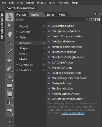
The easiest way to configure triggers and actions by far is via Expression Blend. Triggers and actions (and behaviors) were specifically designed for use by designers so that they didn't need to write and edit code, and thus Expression Blend has extensive support for them. In Expression Blend, you can simply drag an action from the asset library (you'll find them in the Behaviors category, as shown in Figure 10-1) and drop it on a control.
Blend will automatically create a trigger and assign the action to it. You can then configure the trigger and action via the Properties window. Visual Studio unfortunately doesn't have this level of support built in; instead, you must manually define the trigger and action in XAML by hand (although you can configure the trigger and the action once you've created them via the Properties window).
If you plan to leverage triggers and actions extensively in your application, using the Expression Blend designer (instead of Visual Studio's) will make the whole process much easier and faster.
Note
Coverage of Expression Blend is beyond the scope of this book. However, Kirupa Chinnathambi has a great blog post on using behaviors in Expression Blend at http://blog.kirupa.com/?p=351. You assign triggers and actions to controls in Expression Blend in much the same way as he demonstrates with behaviors. In addition, an article on the SilverlightShow.net web site by Andrej Tozon also walks you through using behaviors with Expression Blend; see www.silverlightshow.net/items/Exploring-Silverlight-behaviors-look-Ma-no-code.aspx.
Start by adding references to the Microsoft.Expression.Interactions.dll and System.Windows.Interactivity.dll assemblies to your project (as described earlier) if you haven't already done this. The next step to implementing a trigger or action is to define the interactivity and interactions namespace prefixes in your XAML file:
xmlns:i="http://schemas.microsoft.com/expression/2010/interactivity"
xmlns:ei="http://schemas.microsoft.com/expression/2010/interactions"
The first is for the core Expression Blend interactivity functions (from which you'll primarily use the EventTrigger), and the second is for the additional predefined interactions from the Microsoft.Expression.Interactions.dll assembly (e.g., PropertyChangedTrigger, ChangePropertyAction).
Now, find the Save button in the XAML, define the Interaction.Triggers attached property on the button, and add an EventTrigger trigger to it, specifying that it should listen for the Click event on the control it is attached to:
<Button Content="Save" Height="23" Width="75">
    <i:Interaction.Triggers>
        <i:EventTrigger EventName="Click">
            <!--Assign action(s) here-->
        </i:EventTrigger>
    </i:Interaction.Triggers>
</Button>
Note
The control that triggers will listen to events on defaults to the control on which you define the Interaction.Triggers attached property. You can listen for events raised on a different control instead if you wish by binding the SourceObject property of the trigger to that control (using ElementName binding, as discussed later in this chapter).
Now that you've configured your trigger, you need to assign one or more actions to it (in place of the "Assign action(s) here" comment) for it to invoke. Here, we are calling the SubmitChanges method on a given DomainDataSource control.
<ei:CallMethodAction TargetObject="{Binding ElementName=productsDDS}"
                     MethodName="SubmitChanges"/>
Note
The TargetObject property of the action is used to specify upon which you want the action to act. If the action does not have this property set, the action will act upon the control that it is attached to.
Now, run your application. You will find that pressing the button will call the SubmitChanges method on the DomainDataSource control—all implemented declaratively, with no code necessary.
As you can see, this is a useful feature for both designers and developers alike. However, it is very generic and thus, accordingly, requires additional configuration (setting the event to listen for on the trigger and the method to call on the action) to what may be required by a custom and more targeted solution. Let's now try to reduce the amount of configuration required by creating a custom trigger and action.
Let's start by creating a custom trigger. When writing custom triggers (and this applies to actions and behaviors too), you are encapsulating a piece of logic in a reusable interaction component that you can attach to a control. Although you are writing these components in code, (in essence) you are writing this code in a reusable componentized fashion to save you from writing code when it comes to actually applying the logic to elements in your user interface (where you can then apply and configure this logic declaratively in XAML).
Let's create a trigger that will invoke the associated action(s) when the Click event is raised on the Button control it is attached to. Add a new class to your project called ButtonClickTrigger. This class should inherit from either TriggerBase or TriggerBase<T> (from the System.Windows.Interactivity namespace). By having it inherit from TriggerBase<T>, you are able to constrain the trigger to only applying to a given control type. For this example, it will inherit from TriggerBase<Button>.
The next step is to override the OnAttached and OnDetaching methods and handle any events on the attached control that will be used to trigger the corresponding action(s) (including removing those event handlers when detaching). In our trigger, we want to handle the Click event of the button, so we handle that event on the control exposed by the AssociatedObject property on the base class.
The final step is to invoke the actions that have been associated with the trigger, by calling the InvokeActions method on the base class. This takes a parameter that allows an object to be passed to the actions, but we can assign it to null because we have nothing to pass.
The code for the trigger follows; as you can see, it is very simple:
public class ButtonClickTrigger : TriggerBase<Button>
{
    protected override void OnAttached()
    {
        base.OnAttached();

        AssociatedObject.Click += new RoutedEventHandler(AssociatedObject_Click);
    }

    protected override void OnDetaching()
    {
        base.OnDetaching();

        AssociatedObject.Click -= new RoutedEventHandler(AssociatedObject_Click);
    }

    private void AssociatedObject_Click(object sender, RoutedEventArgs e)
    {
        InvokeActions(null);
    }
}
You can now use this in place of the more generic EventTrigger trigger, without the need for configuring the event name. Note that, of course, you will have to assign a namespace prefix to its namespace in your XAML file in order to be able to use it:
xmlns:b="clr-namespace:AdventureWorksLOB.Behaviors"
<Button Content="Save" Height="23" Width="75">
    <i:Interaction.Triggers>
        <b:ButtonClickTrigger>
            <!--Assign action(s) here-->
        </b:ButtonClickTrigger >
    </i:Interaction.Triggers>
</Button>
Note
For more complex triggers, you can add properties to the class to enable them to be configured when they are used and use those values in your logic. This also applies to actions and behaviors. You can implement them as standard CLR properties, but before you are able to bind to them, they will need to be dependency properties. Implementing dependency properties is discussed in Chapter 11, "Creating Custom Controls."
Let's create a custom action that will be performed in response to a trigger. This action will call the SubmitChanges event on the target DomainDataSource control. Add a new class to your project called SubmitChangesAction. This class should inherit from TriggerAction, TargetedTriggerAction, or their generic counter parts (from the System.Windows.Interactivity namespace).
Note
The difference between TriggerAction and TargetedTriggerAction is that TriggerAction acts on the control to which the action is assigned, while the TargetedTriggerAction acts on a different control (as specified by the designer/developer).
For this example, the control we are attaching the action to is a button, but we actually need to act on a DomainDataSource control. Therefore, we'll inherit from TargetedTriggerAction<DomainDataSource>.
Note
Something to be aware of is that the generic parameter <T> for the TriggerAction<T> action is used to specify the type of control that it can be attached to (and will designate the type of the AssociatedObject property on the base class), while the generic parameter <T> for the TargetedTriggerAction<T> action is used instead to specify the type of control that it can target (and will designate the type of the Target property on the base class). If you need to constrain what type of control that a TargetedTriggerAction action is attached to, you can decorate the class with the TypeConstraint attribute, passing this attribute the type of control it can be attached to as a parameter.
The next step is to override the Invoke method. You can now implement your action's logic in this method. Note that this method has a single parameter, which will pass into the method whatever object was passed to the parameter of the trigger's InvokeActions method. The following code is for an action that calls the SubmitChanges method on the target control when it is invoked:
public class SubmitChangesAction : TargetedTriggerAction<DomainDataSource>
{
    protected override void Invoke(object parameter)
    {
        Target.SubmitChanges();
    }
}
Note
There are additional methods from the base class that you can override if you require. All the trigger base classes have an OnAttached and OnDetaching method that you can override (as is available when creating your own triggers), and if you are inheriting from TargetedTriggerAction (or its generic counterpart), you can also override its OnTargetChanged method.
Assigning it as an action to be invoked by our ButtonClickTrigger trigger, our final trigger/action declaration to implement the scenario in XAML is
<Button Content="Save" Width="75">
   <i:Interaction.Triggers>
      <b:ButtonClickTrigger>
         <b:SubmitChangesAction TargetObject="{Binding ElementName=productsDDS}" />
      </b:ButtonClickTrigger>
   </i:Interaction.Triggers>
</Button>
To make this trigger/action pair even easier to use in Expression Blend, you can specify a default trigger that the action will be assigned to when it is dropped onto a control. Our SubmitChangesAction action has been designed for use in conjunction with a ButtonClickTrigger trigger, so ideally, when the action is dropped onto a control, a ButtonClickTrigger trigger should be created automatically for the SubmitChangesAction action to be assigned to. We can tell Expression Blend which trigger the action should use by default by decorating the action class with the DefaultTrigger attribute, like so:
[DefaultTrigger(typeof(Button), typeof(ButtonClickTrigger))]
The first parameter specifies the type of control that the action is attached to, and the second parameter specifies the type of trigger to use when attached to a control of that type. For example, in the preceding example, we are specifying that when the action is attached to a Button control, it should use the ButtonClickTrigger trigger by default. You can apply this attribute multiple times to the class if you wish, enabling you to specify a different default trigger for each type of control the action is attached to. You can also pass additional values to be assigned to the trigger by passing additional parameters to the DefaultTrigger attribute.
Note
Generally, if a trigger and an action are tightly coupled, it's often better to use a behavior instead.
This is a very simple action that we've created, but you can create much more complex actions depending on the needs of your user interface. However, they are discrete atomic blocks of interaction logic only; they do something and then exit (you can think of them as being much like a method in code). Actions cannot wait for another event to be raised, nor can they preserve their state between trigger invocations. If you need to provide a more persistent interaction, implementing behaviors may be a more suitable alternative.
Triggers and actions often come under the banner of behaviors, so when you read about behaviors, often you will find that the author is actually referring to triggers and actions rather than behaviors (which can make the concept somewhat confusing). Even Expression Blend includes actions in the Behaviors category in the Asset Library.
A behavior is actually a different concept than triggers and actions (although they do share some similarities). Whereas triggers and actions are defined separately (and can be mixed and matched), behaviors combine these two concepts into a single component, tightly coupling the trigger and the action. Behaviors are attached and detached from a control in the same way as triggers are (and thus are alive for the lifetime of the control they are attached to). However, unlike a trigger, which expects to have one or more associated actions to perform the interaction logic, the behavior handles all the interaction logic internally.
At a conceptual level, you can think of a behavior as being designed to add additional functionality to the control that it is attached to. This may be a simple trigger/action combination or may implement a more involved interaction such as a drag-and-drop type operation.
Behaviors inherit from either the Behavior class or the generic Behavior<T> class and are found in the System.Windows.Interactivity namespace.
One of the big advantages of combining triggers and actions into a single component is that it enables a preservation of state between the "trigger" events. A typical scenario where you might want to maintain state between events is implementing a drag-and-drop operation. To implement this type of operation, you need to handle multiple events (including the MouseDown, MouseMove, and MouseUp events), and maintain the state of the drag-and-drop operation between them.
Behaviors typically define additional behavior and logic for the control that they are attached to as opposed to interacting with other controls (unlike the custom action we created that interacts with a DomainDataSource control when a button is clicked).
For example, a typical behavior to add to a text box might be one that automatically selects all the text when the text box gets the focus. This behavior entirely revolves around the text box it is attached to only, without interacting with any other controls.
However, there's nothing stopping you from adding the ability to interact with other controls in a behavior; there's simply no built-in provision for it (i.e., there's no TargetedBehavior base class provided like there is a TargetedTriggerAction base class).
Let's revisit our previous example of calling the SubmitChanges method on a DomainDataSource control when a button is clicked, but this time, we will implement it as a behavior:
public class SubmitChangesBehavior : Behavior<Button>
{
[CustomPropertyValueEditor(CustomPropertyValueEditor.ElementBinding)]
public DomainDataSource Target
{
get { return (DomainDataSource)GetValue(TargetProperty); }
set { SetValue(TargetProperty, value); }
}
public static readonly DependencyProperty TargetProperty =
DependencyProperty.Register("Target", typeof(DomainDataSource),
typeof(SubmitChangesBehavior), null);
protected override void OnAttached()
{
base.OnAttached();
AssociatedObject.Click += new RoutedEventHandler(AssociatedObject_Click);
}
protected override void OnDetaching()
{
base.OnDetaching();
AssociatedObject.Click -= new RoutedEventHandler(AssociatedObject_Click);
}
private void AssociatedObject_Click(object sender, RoutedEventArgs e)
{
Target.SubmitChanges();
}
}Note
Comparing this code to that of the custom trigger and action that we created, you'll notice that the behavior essentially just brings the trigger's and action's code together into a single component. Because there is no target concept in a behavior, we needed to implement a property that the designer/developer could assign the DomainDataSource control to act upon. So the designer/developer could bind this property to a DomainDataSource control, we needed to make it a dependency property, which will be explained further in Chapter 11, "Creating Custom Controls."
You can now implement this behavior in XAML like so:
<Button Content="Save" Width="75">
   <i:Interaction.Behaviors>
      <b:SubmitChangesBehavior Target="{Binding ElementName=productsDDS}" />
   </i:Interaction.Behaviors>
</Button>The big question you probably want an answer to is when should you use a behavior over a trigger/action combination? Ultimately, there are no fixed rules, and in some cases, there is a bit of overlap where either means is appropriate (as was demonstrated with our button click/submit changes example).
If the trigger and action are intrinsically tied together and you want to minimize the amount of configuration necessary when using them, then a behavior is probably the ideal candidate to implement the interaction logic. If you have complex interaction logic where state needs to be preserved between event handlers (such as a drag and drop operation), then a behavior is essentially your only choice.
However, if you want to provide a more flexible use story and have interaction logic that could be triggered by different types of controls (and/or in different types of ways), then implementing a separate trigger and action may be a better plan of action.
The possibilities are endless with triggers, actions, and behaviors, and going back through the examples provided throughout this book until now, you could replace almost all of the code-behind that we used with a trigger/action combination or a behavior. Now that you understand these concepts, every time you consider adding code to the code-behind, first consider whether encapsulating the logic in a trigger/action pair or a behavior might be a better alternative.
Triggers, actions, and behaviors are a very powerful tool at your disposal, promoting both code reuse and interaction logic modularization/encapsulation. They are testable, and (arguably) the biggest advantage is that they reduce/remove the need for designers to write interaction logic code.
To be able to effectively design your application's user interface, designers often like to know the shape of the data that they are binding to (enabling them to take full advantage of the Expression Blend or Visual Studio XAML designer without resorting to editing the XAML directly). This allows them to see what fields are available in the data, and bind to them as required.
It can also be beneficial to be able to populate a view with data at design time to view the resulting output of its design as the user would see it (instead of having to constantly compile and run the application to do so).
These features make the process of designing user interfaces more interactive, and are known as blendability. As you may have guessed from the name, this concept primarily relates to user interface design in Expression Blend, but we can also harness these design time features in the Visual Studio XAML designer via the same underlying mechanism (although with less support than provided by Expression Blend).
As you may recall from Chapter 3, "An Introduction to XAML," the design time data mechanisms can be found in the Expression Blend 2008 namespace (http://schemas.microsoft.com/expression/blend/2008), which is automatically declared in your XAML files with a prefix of d. In this namespace, you will find the following data-related attached properties:
DataContextDesignDataDesignSource
You will also find the DesignData and DesignInstance markup extensions. We'll be using these to provide the blendability features in the XAML designer.
Let's start by defining the type of data that we will bind to, so that the data binding expression builder (discussed later in this chapter) knows the structure of the data that we are binding to. Back in Chapter 6, "Implementing Summary Lists," you may have noticed that when you drag an entity (returned from the server via RIA Services) from the Data Sources window and drop it onto the design surface, the DomainDataSource control that's created for you has a design time data property already applied:
<riaControls:DomainDataSource AutoLoad="True"
                      d:DesignData="{d:DesignInstance my1:ProductSummary,
                                    CreateList=true}"
                      Height="0" Width="0"
                      LoadedData="productSummaryDDS_LoadedData"
                      Name="productSummaryDDS"
                      QueryName="GetProductSummaryListQuery">
    <riaControls:DomainDataSource.DomainContext>
        <my:ProductsContext />
    </riaControls:DomainDataSource.DomainContext>
</riaControls:DomainDataSource>
The rather confusingly named d:DesignData design time attached property (it has nothing to do with the d:DesignData markup extension, discussed shortly) is used to define the type of data that is served by a data source control (via its Data property). Hence, this property can only be applied to data sources (such as the DomainDataSource control). The benefit of applying this design-time property to the DomainDataSource control is that you will now be able to select the properties to bind to in the data binding expression builder (on the specified entity) when binding to data that it returns (as you'll see in Figure 10-5 later in this chapter).
To configure this property, we assign it a d:DesignInstance markup extension. This markup extension is primarily used to return an object of a given type (or a collection of objects of that type). The default property on this markup extension is the Type property. You'll note from our example that it specifies that the DomainDataSource control will be returning ProductSummary entities. You will also note that the CreateList property of this markup extension is set to true. This is used to indicate whether the d:DesignInstance markup extension should return a collection of the given object type or a single instance of the object type.
By default, the d:DesignInstance markup extension reflects over the given object type and creates and returns a corresponding substitute design time type (or an empty collection of that type if the CreateList property is set to true), which the XAML designer can use where required. However, it also has an IsDesignTimeCreatable property, which, when set to true, will actually instantiate and return an object of the given type (which is only of use when the CreateList property is set to false). Once you assign values to that object's properties in its constructor, these values will appear in the XAML designer—essentially populating it with data at design time.
You can also assign the d:DesignInstance markup extension to the d:DataContext design time attached property. Whereas the d:DesignData property could only be applied to data source controls (which serve up data), the d:DataContext property is designed to be applied to controls that will bind to data via their DataContext property. Like data assigned to the DataContext property of a control, the value assigned to the d:DesignContext property will be inherited down the object hierarchy. For example, setting the d:DataContext property on a Grid (as demonstrated by the TextBlock control in the following example) will enable the data binding expression builder to display the available properties that the controls within the Grid can be bound to.
<Grid d:DataContext="{d:DesignInstance Type=my1:ProductSummary}">
    <TextBlock Text="{Binding Path=Name}" />
</Grid>We've made the designer much friendlier for creating bindings, so let's now look at populating it with some sample data at design time. Although we can populate a single instance of an object with data in its constructor and set the IsDesignTimeCreatable property on the d:DesignInstance markup extension to true to populate the XAML designer with some data (as was previously demonstrated), it is hardly an ideal means for doing so. The design-time data has to be hard-coded in the class (not a good idea), and this method is only suitable when binding to a single object (rather than a collection of objects). There is another option however, and that's using the d:DesignData markup extension (in place of the d:DesignInstance markup extension).
The d:DesignData markup extension has only a single property, named Source (which is, therefore, its default property). The design-time data needs to be defined in a separate XAML file, and you simply point the Source property to a XAML file that defines the design-time data, and that data will then be displayed in the XAML designer. The easiest way to create this XAML file and populate it with data is from within Expression Blend; there, you can import some sample data from XML, create random data conforming to the structure of a given class, or simply create your own structure before populating it with random data as required. Explaining how to create sample data files is beyond the scope of this book, but you can find more information on doing so in Expression Blend in the Expression Blend help or manually in Visual Studio at this MSDN page: http://msdn.microsoft.com/en-us/library/ff602279(VS.95).aspx. The sample data XAML files should have a Build Action of either DesignData (where a substitute design-time type will be generated and used in place of the objects that the sample data is populating), or DesignDataWithDesignTimeCreatableTypes (where the actual objects the sample data is populating are instantiated and used at design time). You can then use the d:DesignData markup extension to point to the sample data XAML file and assign it to the d:DataContext attached property as required:
d:DataContext="{d:DesignData Source=/SampleData/ProductSampleData.xaml}"Back in Chapter 3, "An Introduction to XAML," we briefly discussed the concept of consolidated namespaces, where multiple namespaces could be combined into a single namespace declaration. This enables you to use the one namespace prefix covering multiple namespaces and/or assemblies, instead of declaring separate prefixes for each of these individually. You can recognize a consolidated namespace, as it has a URI namespace instead of a CLR namespace. The default and the XAML namespaces that you find declared in all XAML files are examples of consolidated namespaces, as is the SDK namespace:
xmlns:sdk="http://schemas.microsoft.com/winfx/2006/xaml/presentation/sdk"
These consolidated namespaces are predefined for you, but it is entirely possible for you to create your own if you wish using the XmlnsDefininition attribute (assuming that there is no overlap between the class names in each separate namespace/assembly that you wish to include as a part of the consolidation).
There are a number of reasons why you might like to do so. One is to reduce the number of namespace prefix declarations you need to add to each XAML file. Another is to ensure consistency of the prefixes defined for each namespace across XAML files—different developers on a project using different prefixes will make maintaining the application a painful chore. An additional advantage is that the developers don't need to know or worry about which namespace a particular class or control is in to use it.
Let's take a look at creating a consolidated namespace to consolidate a number of namespaces in your Silverlight project. In the AssemblyInfo.cs file in your project (which you can find under the Properties folder), start by adding a using directive to the System.Windows.Markup namespace. Now, you need to come up with a URI to refer to the consolidated namespace you are about to create. A rough standard for doing so is something along these lines:
"http://schemas.yourbusinessurl.com/XAML"
Now, simply add attributes to your assembly that each associate a CLR namespace with this consolidated namespace URI:
[assembly: XmlnsDefinition("http://schemas.yourbusinessurl.com/XAML",
                           "AdventureWorksLOB.Purchasing")]
[assembly: XmlnsDefinition("http://schemas.yourbusinessurl.com/XAML",
                           "AdventureWorksLOB.ViewModels.Production")]
[assembly: XmlnsDefinition("http://schemas.yourbusinessurl.com/XAML",
                           "AdventureWorksLOB.ViewModels.Sales")]
Next, you can declare a namespace prefix in a XAML file to this consolidated namespace URI, and then all the classes or controls across the combined CLR namespaces will be accessible via that prefix:
xmlns:vm="http://schemas.yourbusinessurl.com/XAML"
If you wish, you can define a default prefix for that consolidated namespace using the XmlnsPrefix attribute:
[assembly: XmlnsPrefix("http://schemas.yourbusinessurl.com/XAML", "vm")]This prefix will be used by Visual Studio and Expression Blend to define the corresponding namespace prefix in the XAML file (if necessary) when you drag a control (whose namespace is included in a consolidated namespace) from the toolbox onto the designer surface.
Note
In the next chapter, we discuss creating custom controls, and you may also find this technique useful when creating custom control libraries in order to consolidate all the controls from different namespaces within that library assembly into a single URI namespace (which you define within that library assembly).
MoXAML Power Toys is a handy open source Visual Studio add-in by Pete O'Hanlon, providing a number of XAML and code helper functions for both Silverlight and WPF developers, which you can download at http://peteohanlon.wordpress.com/moxaml-power-toys/.
Some of the most useful features include the following:
It includes a commenting helper. If you try to comment out XAML in the normal fashion previously described and that XAML already contains comments, you will end up with invalid XAML. This function handles this scenario by first modifying the existing comment markers within the selected XAML, resulting in valid XAML instead.
A scrubber feature that cleans and formats the XAML in a file according to given options, such as converting tabs to spaces, putting attributes on their own line, and so on.
You are able to create a user control from the selected XAML using the Extract User Control feature.
As described in Chapter 3, "An Introduction to XAML," by default all member variables created for controls are scoped as public. The Add
FieldModifierfunction in MoXAML Power Toys goes through a XAML file and sets theFieldModiferproperty of each control with a name to"private".As discussed in Chapter 7, "Building Data Entry Forms," for bindings to be aware when the bound property's value has changed, the bound object needs to implement the
INotifyPropertyChangedinterface and raise itsPropertyChangedevent when each property's value is changed. This requires a backing member variable and additional code—automatically implemented properties do not implement this behavior. To simplify the task of creating properties that implement this behavior, the Notify Properties feature in MoXAML Power Toys enables you to right-click an automatically implemented property and select the Notify Property menu item from the MoXAML Power Toys submenu (in the context menu), and it will turn the property into a fully implemented property, with a backing member variable, and raise thePropertyChangedevent.Creating dependency properties (discussed properly in Chapter 11, "Creating Custom Controls") can be rather complex task. The Create Dependency Property feature pops up a window that will help you create a dependency property with the options that you specify.
You can get help for how to use these functions from the MoXAML Power Toys web site.
So far in this book, you've learned how to bind your user interface controls to objects such that the user can view and edit data exposed by these objects. Instead of data being pushed into these controls, the extensive data binding support provided by XAML enables them to pull the data in instead (in other words they are essentially controlling the process of consuming the data). You've learned that
The object assigned to the
DataContextproperty of a control is inherited down the object hierarchy.There are three different binding modes:
OneTime, OneWay, andTwoWay(discussed in Chapter 3, "An Introduction to XAML"). You need to set the mode toTwoWayin order to be able to update the bound object property via a control in the user interface.You can notify the bindings when bound property values on an object have changed (using the
INotifyPropertyChangedinterface, discussed in Chapter 7, "Building Data Entry Forms").You can notify the bindings when bound property values (or the bound object itself) are invalid (by throwing exceptions, implementing the
IDataErrorInfointerface, or by implementing theINotifyDataErrorInfointerface, as discussed in Chapter 7, "Building Data Entry Forms").The
ObservableCollectiongeneric type can be used to maintain items in your collections, which will notify the bound user interface controls when items have been added or removed from the collection so they can update themselves accordingly (as discussed in Chapter 6, "Implementing Summary Lists"). Alternatively, you can implement theINotifyCollectionChangedinterface in your own collection classes to enable them to exhibit the same behavior.You can create a "view" of a collection by wrapping it in a collection view, enabling the data in the collection to be manipulated (e.g., filtering, sorting, grouping, and paging) without actually modifying the underlying collection. Collection views also provide a current record pointer (that tracks the current item in the collection), enabling multiple controls bound to the same collection view to be kept synchronized. They also provide the ability to move this pointer and navigate through the items in the collection.
In this section, we'll discuss some of the more advanced data binding features supported by Silverlight.
When we first discussed data binding back in Chapter 3, "An Introduction to XAML," you learned that a binding has both a source and a target, with the binding source obtained from the bound control's DataContext property. The object assigned to the DataContext property is inherited down through the object hierarchy, so an object assigned to the DataContext property of a Grid control for example would automatically be available to all the controls contained within that Grid via their own DataContext property.
However, what if you wanted a property on a control to bind to something other than the control's DataContext property (such as a resource, or a property on another control)? Let's take a look at the different means available to achieve this in Silverlight.
If you set the Source property of the binding, it will use the given object as the binding source instead of the object assigned to the DataContext property of the control. If you're assigning this property in XAML, you will most likely be binding it to a resource (using the StaticResource markup extension).
For example, let's say you have a Product object that is defined as a resource (with productResource as its key) somewhere up the object hierarchy (defining and instantiating a class as a resource for binding to will be discussed later in this chapter). The standard way of binding to this resource is by assigning it to the DataContext property of the target control using the StaticResource markup extension. For example, binding the Name property of the Product object to the Text property of a TextBox control, you would use the following XAML:
<TextBox DataContext="{StaticResource productResource}" Text="{Binding Name}" />Using the Source property, the following binding expression will provide the same results as the previous one:
<TextBox Text="{Binding Name, Source={StaticResource productResource}}" />The Source property provides you with an advantage in the situation where you want to bind a control's property to a given source, without altering the inherited data context for its child controls (where that data context has been set somewhere further up the hierarchy) or altering the binding source for its other properties.
Note
Alternatively, if you are creating the data binding in code (which will be discussed later in this chapter), you can assign any object to this property to act as the source of the binding.
In Chapters 6 and 7, we were binding the ItemsSource property of various controls to the Data property of a DomainDataSource control but didn't go into depth on how this was achieved. The DomainDataSource control was retrieving data from the server and exposing that data publicly via its Data property. We then consumed that data by binding the ItemsSource property of our ListBox/DataGrid/DataForm control to the DomainDataSource control's Data property. To bind a control's property to the property of another (named) control in the view like this, we needed to use a special kind of binding called ElementName binding. Using the ElementName property on a binding, you could provide it the name of a control (within the same name scope) that would act as the source for the binding (instead of the object assigned to the control's DataContext property). Let's take a look at some examples of employing ElementName binding to bind the properties of two controls together in XAML.
A very simple example is to link the Text property of two TextBox controls. When you modify the text in one text box, the second text box's text will update automatically:
<StackPanel>
    <TextBox Name="FirstTextBox" />
    <TextBox Name="SecondTextBox" Text="{Binding Text, ElementName=FirstTextBox}" />
</StackPanel>
Note
If you change the mode of the second text box's binding to TwoWay, modifying the second text box's text will also update the first text box. That said, in this direction the first text box will only be updated once the second text box loses focus.
Similarly, we can display the current value of a Slider control in a text block by binding the Slider control's Value property to the TextBlock control's Text property:
<TextBlock Text="{Binding ElementName=sourceSlider, Path=Value}" />The following XAML demonstrates taking the ItemsSource property of a ListBox control (acting as the target), and binding it to the Data property of a DomainDataSource control:
<ListBox ItemsSource="{Binding ElementName=productSummaryDDS, Path=Data}" />This example demonstrates binding the IsBusy property of the BusyIndicator control to the IsBusy property of a DomainDataSource control (which will display the BusyIndicator control when the IsBusy property of the DomainDataSource control is true):
<controlsToolkit:BusyIndicator
    IsBusy="{Binding ElementName=productSummaryDDS, Path=IsBusy}" />
In this final example, we are binding the Target property of the Label control to a text box. Note that by not specifying a path for the binding, we are binding the Target property to the text box itself, not a property on that text box:
<sdk:Label Content="Name:" Target="{Binding ElementName=ProductNameTextBox}" />You may have noticed that there is a RelativeSource property on the Binding markup extension. This enables you to bind to a source relative to the target. To obtain a reference to the source to assign to this property, you need to use the RelativeSource markup extension RelativeSource markup extension. Somewhat limited in comparison to the corresponding markup extension in WPF (which can search for an ancestor of a particular type), the RelativeSource markup extension only supports two modes: Self and TemplatedParent.
The Self mode returns the target control and is useful for binding together two properties on the same control. This is generally most useful when you have attached properties on a control that you want to bind to properties on the control itself. For example, perhaps you want to display a tooltip when the user hovers over a text box, displaying the full contents of that text box in the tooltip (where perhaps it doesn't all fit in the confines of the text box). Here, we'll use the ToolTipService.ToolTip attached property (which you may remember being demonstrated back in Chapter 3, "An Introduction to XAML"), and bind it to the Text property of the text box using the Self mode of the RelativeSource markup extension:
<TextBox Text="{Binding Path=CurrentItem}"
                        ToolTipService.ToolTip="{Binding Text,
                                          RelativeSource={RelativeSource Self}}" />
The TemplatedParent mode is only applicable when the control is contained within a control template or a data template. It returns the templated item and enables the target property to be bound to a property on that item. When used inside a data template (such as the data template for a ListBox item), the TemplatedParent mode will return the content presenter for that templated item. Note that it doesn't actually return the ListBoxItem; the data template is actually being applied to the content presenter of the item, so it's the content presenter that will be returned (unlike when using a control template to template the ListBoxItem, where the TemplatedParent mode will return the ListBoxItem itself).
For example, the following binding expression in a data template will get the actual height of the content presenter:
"{Binding RelativeSource={RelativeSource TemplatedParent}, Path=ActualHeight}"Another scenario where this binding may be useful in a data template is when you want to get the data context of the templated item. The data context is still inherited down the hierarchy in to data templates, but if you assign a different data context on a control in the data template (such as a Grid for example), you could use this method to obtain and bind to the original data context for the item again.
Note
Used in a control template, the binding expression "{Binding RelativeSource={RelativeSource TemplatedParent}}" is the equivalent of the "{TemplateBinding}" markup extension. Unlike the TemplateBinding markup extension however (which is only supports a one way binding), the RelativeSource markup extension can be used as a two way binding, which can be very useful in some scenarios when creating control templates for custom controls. This will be discussed further in Chapter 11, "Creating Custom Controls."
You can bind a property of a control to the binding source assigned to its DataContext property (either assigned directly to the property on the control or inherited down the object hierarchy), by simply setting its value to "{Binding}". This is a common scenario when binding a number of controls to the same inherited data context (e.g., the data context of a Grid control is bound to a collection, and multiple controls within that Grid inherit that data context and use it as their binding source). To bind the ItemsSource property of a ListBox control in the Grid to the collection, you can set its binding expression to "{Binding}".
Note
The "{Binding}" binding expression is equivalent to {Binding Path=.}, which is also the same as {Binding Path=}.
You've seen how you can bind to a property on bound objects, resources, and other controls in the view, but what if the source of the property you want to bind to is actually the view's code-behind class? There's two ways you can go about this. The first is to bind the DataContext property of the root element in your XAML file to itself using the RelativeSource binding, like so:
DataContext="{Binding RelativeSource={RelativeSource Self}}"This will get a reference to the code-behind class for the XAML file and bind the DataContext property to it, which will then be inherited down the object hierarchy. Any controls within that object hierarchy will therefore automatically use the code-behind class as their binding source. For example, if you have a property named UserName in the code-behind, displaying the value of that property in a TextBlock control within the view would therefore simply require the following XAML:
<TextBlock Text="{Binding UserName}" />However, this method does have the pitfall of requiring that no controls further up in the object hierarchy have been assigned a different data context (overriding our RelativeSource binding with a different binding). If this is the case, there is another method you can use instead. Start by giving the root element in your XAML file a name (via its Name property). In this example we have named it ControlRoot. Now, you can simply use ElementName binding to assign that element as its binding source:
<TextBlock Text="{Binding UserName, ElementName=ControlRoot}" />Note
This technique is particularly useful when creating user controls that expose properties to the host. The properties are defined in the code-behind; the host sets their values; and the XAML can consume those values directly via these bindings (without requiring the intervention of the code-behind apart from getting or setting the property values). However, custom controls have a slightly different means of handling this type of scenario, as will be discussed in the next chapter.
Throughout this book so far, most of the data bindings that we have implemented have obtained their source data either from a DomainDataSource control (via ElementName binding, using a pull-type mechanism) or by assigning the source data to either the DataContext property or the ItemsSource property of a control from the code-behind (using a push-type mechanism). As has been discussed along the way (with the pros and cons of each discussed back in Chapter 6, "Implementing Summary Lists"), the ability for controls to request data using a pull-type mechanism so that they can populate themselves is generally the better approach. However, by using a DomainDataSource control to enable the pulling of data, we are effectively tightly coupling our user interface and data access logic, which isn't ideal.
In Chapter 12, "The Model-View-ViewModel (MVVM) Design Pattern," we'll look at implementing a design pattern that enables a pull type approach to data binding (with the XAML in charge of instantiating the source object and binding to it), but without the tight coupling provided by the DomainDataSource control.
However, let's take the first few steps into implementing a part of that design pattern, by exposing data from a custom data class (which is known in the MVVM design pattern as a ViewModel), defining and instantiating it as a resource in a XAML file, and then binding the controls to its properties.
Note
We are using aspects of the ViewModel concept from the MVVM pattern for this example, but you don't need to be using the full MVVM design pattern in order to take advantage of the techniques demonstrated here. There are many other reasons and uses why you would want to define and instantiate objects as resources and bind to them.
Start by creating the class that we will use as our binding source (generally you will have a ViewModels folder in your project for these classes), and name it ProductViewModel. Add some properties to it that we will bind to in the XAML (eg. Name, ProductNumber, etc):
public class ProductViewModel
{
    public string Name { get; set; }
    public string ProductNumber { get; set; }
}
For the purposes of experimentation, simply assign some hard-coded data to the properties on the class in the class's constructor. Alternatively, you can set the property values in the XAML when defining and instantiating it as a resource.
Note
The class must have a default constructor (i.e., a constructor without any parameters). If you do not define any constructors, a default constructor will be created for you, but otherwise, you will need to ensure that there is one added to the class.
Now, declare a namespace prefix in your XAML file for the namespace where the class can be found:
xmlns:vm="clr-namespace:AdventureWorksLOB.ViewModels"
The next step is to define and instantiate the class as a resource:
<vm:ProductViewModel x:Key="productResource" />
You can also assign values to the properties on the class at this stage if required:
<vm:ProductViewModel x:Key="productResource" Name="Bike" ProductNumber="B001" />
Note
Only a few data types are supported to be assigned natively in XAML (such as strings, Booleans, ints, and doubles). Other more complex types (such as Decimals and DateTimes) require type converters to be applied to their properties in order to handle the conversion. Creating and using type converters will be discussed in Chapter 11, "Creating Custom Controls."
Now, you can bind to this object resource (using the StaticResource markup extension to reference it) however you wish:
<TextBox Text="{Binding Name, Source={StaticResource productResource}}" />Note
Any data that you've hard-coded in the class or assigned via the resource's properties will appear at design time in the bound controls.
Now that you've seen the manual way of defining the resource and creating controls that bind to it, there is a somewhat easier method to have these done automatically. Back in Chapter 6 - Implementing Summary Lists, you saw how to drag an entity (returned from the server via RIA Services) from the Data Sources window and onto the design surface, with that action automatically creating a DomainDataSource control to retrieve the data from the server and controls to display and edit the entity.
Although you won't find the class that you created listed in the Data Sources window, you can add it (via the Add New Data Source button) and then drag and drop it onto the design surface. A resource will be created (although it will be a CollectionViewSource wrapping a collection of the given objects, slightly different from what was demonstrated earlier), and controls will be created to bind to it. This method expects the source of the CollectionViewSource to be set in the code-behind, and you will find that by dragging the class from the Data Sources window onto the design surface automatically adds some (commented out) code to the code-behind demonstrating how to do so.
Back in Chapter 8, "Securing Your Application," we discussed how the WebContext object (generated and used by RIA Services) was added to the application's resources when the application starts up. This resource will be available application-wide, enabling all the views in the application to bind to it.
If you open up the App.xaml.cs file and find the Application_Startup event handler method, you will find this line (well, at least in Silverlight projects that were created using the Silverlight Business Application project template that is):
this.Resources.Add("WebContext", WebContext.Current);As you can see, it simply specified the element to which the resource was to be added (i.e., the Application object), provided it with a key (WebContext), and passed it the object to be added as a resource (WebContext.Current). You can then bind to this in XAML as you would any other resource:
<Button Content="Click Me!"
        IsEnabled="{Binding Path=User.IsAuthenticated,
                            Source={StaticResource WebContext}}" />
Note
This is binding via nested properties (User.IsAuthenticated), which will be discussed further in the next section.
This actually demonstrates a useful technique that you may like to use yourself. Instead of instantiating objects as resources in XAML, you can alternatively instantiate them and add them as resources from the code-behind (applying any additional configuration to the object as required).
Generally, when creating a binding, you'll be binding to a single property on the source object. For example, the DataContext property of a TextBox control might be assigned a Person object, and you might bind to the FirstName property on that object (with the FirstName property returning a string):
<TextBox DataContext="{StaticResource personResource}" Text="{Binding FirstName}" />However, what if the Person object doesn't have a FirstName property but instead has a Name property that returns a PersonName object, and it's this object that has the FirstName property (so you're effectively dealing with nested properties). How do you handle that sort of binding? This is possible by using the same style of dot notation you use in C# code to traverse down the object hierarchy:
<TextBox DataContext="{StaticResource personResource}"
         Text="{Binding Name.FirstName}" />
You can traverse down multiple levels of the object hierarchy for as far as you need.
In addition to binding to nested properties, it's also possible to bind to indexed properties (with both integer and string indexes). The index selection syntax is much the same as it is in C#, simply append the index to the name of the property returning the collection surrounded by square brackets. For example, if a Person object had an Addresses property that returned a collection of Address objects, you could bind to the first Address object using the integer index syntax:
<TextBox DataContext="{StaticResource personResource}"
         Text="{Binding Address[0].AddressLine1}" />
If the collection has string indexes (such as a Dictionary<string, string>), you can refer to the item using the string index syntax, like so:
<TextBox DataContext="{StaticResource personResource}"
         Text="{Binding Address[HOME].AddressLine1}" />
where HOME is the string index of the Address object to return.
If the given index is not found, the binding will silently fail (although an error will be written to the Output window in Visual Studio, as will be discussed later in this chapter when discussing debugging data bindings).
As you've already seen, collection views are used to wrap a collection, enabling the data in the collection to be manipulated (e.g., filtered, sorted, grouped, and paged) without actually modifying the underlying collection. When you bind to a collection, some controls that manipulate the data for display internally wrap that collection in a collection view themselves (such as the DataGrid, which enables the data to be sorted). You can, however, pass the control a collection view instead in order to share the state of the data in that control externally (such as the sorting and selected item).
For example, the DomainDataSource control returns data from its Data property wrapped in a PagedEntityCollectionView view, and data from its DataView property wrapped in a DomainDataSourceView view. You can also wrap a collection in a collection view yourself if you wish (either using a PagedCollectionView or obtaining one via the CollectionViewSource view proxy).
Back in Chapter 6, "Implementing Summary Lists," we discussed how to manipulate the data in a collection using a collection view to control how that data was displayed in a control bound to it. We also briefly discussed in that chapter how collection views provide a current record pointer (that tracks the current item in the collection) and exposes a number of methods and properties that you can use to move this pointer and navigate through the items in the collection.
The primary benefit of this feature is to enable multiple controls that are bound to the same collection view to be kept synchronized, and it's this ability that we'll be focusing on here.
Let's now take a deeper look at this synchronization behavior, and some not so obvious implementation details for binding to collection views.
In this example, we'll bind to the objects contained within a PagedCollectionView collection view.
Note
For the discussion here, the PagedEntityCollectionView collection view and the DomainDataSourceView collection view have the same binding and synchronization behavior as the PagedCollectionView collection view. Therefore, we will focus on the behavior of the PagedCollectionView collection view here, but the content applies equally to those other types of collection views.
For this example, we will have a collection of Person objects, which are to be displayed in a ListBox control. We also have a TextBox control and want to show the name of the selected person in the list box in it (with the text changing in the text box whenever a new item is selected in the list box). Figure 10-2 demonstrates the final output.

Note
Admittedly, for this particular example, you could just as easily (if not more easily) use ElementName binding (binding the Text property of the TextBox control to the SelectedItem property of the ListBox control), but it's useful to look at how this scenario can be implemented using a collection view that they both bind to (with the collection view tracking the current item). One of the advantages of using a collection view for this task (over ElementName binding) is that it enables you to track and manage the current item from a bound class (such as a ViewModel, when using the MVVM design pattern), without actually needing to know anything about the control in the bound view that is binding to it. For example, say you have a ViewModel class that exposes a collection view containing a number of items, which a ListBox in the view binds to. The ViewModel class can find out which item is selected in that ListBox from the collection view itself, without knowing what type of control is binding to it, or having to directly reference that bound control.
The first step is to create a class to represent a person (which we'll name Person and create in the Models folder in the project). For the purposes of this example, we'll simply have a single Name property on the object:
public class Person
{
    public string Name { get; set; }
}
Note
Of course, you could use a collection of strings for a simple example like this instead, but binding to a collection of objects is the common scenario that we want to demonstrate.
Now, create a class that populates and returns a collection of Person objects that we can bind to, wrapped in a PagedCollectionView. The following SampleData class creates a collection of strings (populated with some names of a popular animated family), wraps the collection in a PagedCollectionView, and exposes this view publicly:
public class SampleData
{
    public PagedCollectionView PeopleView { get; set; }

    public SampleData()
    {
        List<Person> people = new List<Person>();
        people.Add(new Person() { Name = "Homer" });
        people.Add(new Person() { Name = "Marge" });
        people.Add(new Person() { Name = "Bart" });
        people.Add(new Person() { Name = "Lisa" });
        people.Add(new Person() { Name = "Maggie" });
        PeopleView = new PagedCollectionView(people);
    }
}
It's a good idea to compile your application at this stage, because you will be able to see the data that you've added to the collection in the constructor of the class in the XAML designer.
Go to the XAML designer, and define the class as a resource (you will also have to declare the models namespace prefix):
<models:SampleData x:Key="sampleDataResource" />
Now, add a ListBox control and a TextBox control to a StackPanel. Bind the StackPanel's DataContext property to the PeopleView property on the resource you created, and then bind the ListBox control's ItemsSource to its DataContext property, and bind the TextBox control's Text property to the Name property on the Person object:
<StackPanel DataContext="{Binding Path=PeopleView,
                                  Source={StaticResource sampleDataResource}}">
    <ListBox ItemsSource="{Binding}" DisplayMemberPath="Name"
Height="120" Width="120" />
<TextBox Text="{Binding Name}" Width="120" />
</StackPanel>Note
You may (understandably) find the TextBox control's binding in the preceding example a little confusing. Although the data context being inherited is a collection view, we are binding directly to a property on the view's current item object (which returns a Person object). So what is going on here? In this type of scenario, the data binding engine recognizes that the binding source is a collection view and assumes that you don't actually want to bind to the collection view itself. It, therefore, drills down to the view's CurrentItem property and binds to the given property on that instead. If you wish, you can use "{Binding CurrentItem.Name}" as the binding expression instead (with exactly the same results), but explicitly drilling down to the CurrentItem property on the collection view isn't actually necessary (unless you have a property on the object you want to bind to that has the same name as a property on the collection view object, such as Count).
You'll note that the designer populates the controls automatically with the data you defined in the class, with the ListBox control displaying the strings and the TextBox control displaying the selected string. If you now run your project, you will find that the text in the text box changes accordingly as you select different items in the list box.
The reason this example works is that, when the ListBox control is bound to a collection view (and you will see this behavior with other controls that bind to a collection of items, such as the ComboBox, DataGrid, and DataForm), it automatically (by default) synchronizes the CurrentItem property of the collection view with its selected item. When you select a different item in one of those controls, they update the CurrentItem property of the collection view to the newly selected item, such that any controls bound to that property will have their binding source changed accordingly.
Although most of the time, this is the behavior that you will want, sometimes you may wish to have more control over the process. You will find that some of these controls (such as the ListBox control) have an IsSynchronizedWithCurrentItem property, whose default value is null. You can't actually set this property to true (it will throw an exception if you try), as it depends on whether or not the binding source is a collection view for whether synchronization with the current item is possible. If the binding source is a collection view, current item synchronization will automatically be turned on, although you can explicitly turn it off if you wish by setting the property to false. If you do so, you can control what item is the current item in the collection view manually (in code), using the record navigation methods (such as MoveCurrentToNext and MoveCurrentToPosition).
Note
As an experiment, try simply binding both controls directly to the collection (i.e., without it being wrapped in a collection view), and observe the result. You'll find that the items still appear in the ListBox control, but the TextBox control is now trying to bind to a Name property on the collection itself (rather than an object in the collection), which doesn't exist, and thus that binding will fail.
In the last example, we implemented a collection view using a PagedCollectionView collection view, but this time we will use a CollectionViewSource view proxy instead. You may remember (from Chapter 6 - Implementing Summary Lists) that unlike the PagedCollectionView (which is a collection view), the CollectionViewSource isn't actually a view as such, but a view proxy. You assign a collection to its Source property, and it provides a corresponding collection view from its View property (in the form of a ListCollectionView). Let's return a CollectionViewSource view proxy from our SampleData class now instead of a PagedCollectionView collection view:
public class SampleData
{
public CollectionViewSource PeopleViewSource { get; set; }
public SampleData()
{
List<Person> people = new List<Person>();
people.Add(new Person() { Name = "Homer" });
people.Add(new Person() { Name = "Marge" });
people.Add(new Person() { Name = "Bart" });
people.Add(new Person() { Name = "Lisa" });
people.Add(new Person() { Name = "Maggie" });
PeopleViewSource = new CollectionViewSource();
PeopleViewSource.Source = people; }
}You can still bind to the objects exposed by this collection view proxy in exactly the same way as we did with the PagedCollectionView collection view:
<StackPanel DataContext="{Binding Path=PeopleViewSource,
Source={StaticResource sampleDataResource}}">
<ListBox ItemsSource="{Binding}" DisplayMemberPath="Name"
Height="120" Width="120" />
    <TextBox Text="{Binding Name}" Width="120" />
</StackPanel>However, once again, you probably will find this binding somewhat confusing (as it was when binding to the PagedCollectionView collection view), but this time for a different reason. Unlike the PagedCollectionView, which is itself a collection view, the CollectionViewSource is not a collection view - it is a collection view proxy. To get to the view itself, we should have to go via its View property (for the ListBox binding), and to get to the current item we should have to access its View.CurrentItem property! However, we are doing neither in the XAML above!
So once again, you may be wondering what's going on here, but you will find that that answer is pretty much the same. This time, the binding engine recognizes that it is binding to a CollectionViewSource, and assumes that it's not the CollectionViewSource itself that you want to bind to, so it automatically drills down to its View property to get to the collection view to bind to (for the ListBox binding), and automatically drills down to its View.CurrentItem property to get to the object to bind to (for the TextBox binding). The CollectionViewSource essentially becomes transparent when binding to it, such that you are binding to the collection view that it exposes, rather than the CollectionViewSource itself.
Note
You can turn off this View property drilling behavior for the CollectionViewSource by setting the BindsDirectlyToSource property on the property bindings to true. You may wish to do this if (for example) you wanted to bind to the Source property of the CollectionViewSource instead of its View property, in which case you will need to explicitly define the full path for the binding from the CollectionViewSource level.
Binding to a collection view, and particularly binding to a CollectionViewSource can be a confusing concept, but once you understand it, it makes the binding process simpler and more succinct.
Note
One of the benefits of binding to a CollectionViewSource is that the collection view doesn't need to be defined in code. Instead, you can define a CollectionViewSource as a resource in XAML if you wish, like so:
<models:SampleData x:Key="sampleDataResource" />
<CollectionViewSource x:Key="peopleViewSource"
  Source="{Binding PeopleCollection, Source={StaticResource sampleDataResource}}" />
where PeopleCollection is a property on the SampleData class listed earlier in place of the PeopleViewSource property, returning the collection as a List<Person> (instead of a CollectionViewSource).
The Binding class has a number of properties that you can use to further configure a data binding rather than simply connecting the value of the target property directly to the source property. These properties are the keys to enabling the power and flexibility of Silverlight's data binding capabilities, so let's take a look at them now.
Back in Chapter 7, "Building Data Entry Forms," we covered the ability for formatting a bound property's value using the StringFormat property of the binding before it is passed to the target control to be consumed. As a recap, this can be a very useful feature when binding to a nonstring property (such as a DateTime, or a decimal). You can use the StringFormat property on the binding to set the format (using the same types of formatting strings as you would use if you were to format the value using its ToString method in code (using either standard or custom formats). For example, the following binding uses a standard formatting string to display the bound property's value in the text box formatted as currency:
<TextBox Text="{Binding TotalCost, Mode=TwoWay, StringFormat=C />Or you can format a date as a long date (e.g., Sunday, May 16, 2010) using a standard formatting string:
<TextBox Text="{Binding StartDate, Mode=TwoWay, StringFormat=D />format a date as a custom format (e.g., 2010-05-16) using a custom formatting string:
<TextBox Text="{Binding StartDate, Mode=TwoWay, StringFormat=yyyy-MM-dd />You can also format a decimal, single, double, or float to a given number of decimal places (e.g., 3.14) using a custom formatting string:
<TextBox Text="{Binding PI, Mode=TwoWay, StringFormat=0.00 />If you want to include commas or other special characters in your string format, enclose the formatting string within apostrophes (not quotes, as they are used to delimit the whole property assignment):
<TextBox Text="{Binding StartDate, Mode=TwoWay, StringFormat='MMM dd, yyyy' />Alternatively, you can simply escape them by inserting a backslash () prior to the special character:
<TextBox Text="{Binding StartDate, Mode=TwoWay, StringFormat=MMM dd, yyyy />Note
The available standard formatting strings and custom format specifiers that can be used for formatting strings are detailed in the following MSDN topic (and its related topics): http://msdn.microsoft.com/en-us/library/26etazsy.aspx. Another source with examples can be found in the Visual Studio 2010 data binding expression builder (discussed later in this chapter).
If the value of a property being bound to is null, you can specify an alternate value to use instead using the TargetNullValue property of the binding. This is a useful feature when you are binding to a nullable type and want to provide a default value when one isn't provided, for example:
<TextBlock Text="{Binding TotalAmount, TargetNullValue=0 />If the source of the binding is null (i.e., the value of both the DataContext property of the control and the Source property of the binding are null), or the property being bound to does not exist on the object assigned as the source of the binding, you can specify an alternative value to use instead using the FallbackValue property of the binding. For example, this binding will display "Oops!" if the binding source is null:
<TextBox Text="{Binding Name, Mode=TwoWay, FallbackValue=Oops! />Back in Chapter 7, "Building Data Entry Forms," we discussed implementing the IEditableObject interface to add transaction type behavior to our classes (begin, accept, or cancel changes). However, you may not have the luxury of implementing this interface in the classes that you bind to, so rather than rolling back unwanted changes (the behavior that the IEditableObject interface enables), you could alternatively prevent changes being made to the object until you explicitly commit them (such as when the user clicks the OK button). This behavior can be enabled using the UpdateSourceTrigger property of the bindings. This property has an enumeration type with two possible values: Default and Explicit. Default (obviously) is the default value, where the source property of the binding is updated automatically by the binding when it has been changed via the user interface (usually once the control loses the focus). However, assigning Explicit as the value of this property means that in order for the source property of the binding to be updated, you must manually initiate the update.
Let's look at a simple example of enabling the user to update the name of a product via a text box:
<TextBox Name="NameTextBox" Text="{Binding Name, Mode=TwoWay}" />By default, as soon as this text box loses the focus, the Name property on the bound object will be updated with the text entered in the text box accordingly. However, you can prevent this behavior by setting the UpdateSourceTrigger property of the binding to Explicit:
<TextBox Name="NameTextBox"
         Text="{Binding Name, Mode=TwoWay, UpdateSourceTrigger=Explicit}" />
Now, when the text box loses the focus, the bound value will not be updated. Say you have an OK button in the view, and you want to commit the changes made to the field back to the bound object when the button is clicked. To do so, you can handle the button's Click event in the code-behind and get the binding expression for the text box's Text property (using the GetBindingExpression method on the text box, which returns a BindingExpression object). You can then explicitly force the bound property of the binding to be updated using the UpdateSource method on the BindingExpression object, like so:
BindingExpression expr = NameTextBox.GetBindingExpression(TextBox.TextProperty);
expr.UpdateSource();
We've seen how you can format the bound value (using the StringFormat property of a binding) before passing it onto the target control, but what if you want to convert the value to a completely different value (given some predefined rules) instead? A perfect example is attempting to bind a Boolean value to the Visibility property of a control. This is not possible, because the Visibility property only accepts values from the Visibility enumeration (Visible or Collapsed). You could modify the property on the object that you are binding to in order to return a value from the Visibility enumeration instead, but this is not always possible (or ideal). There is, however, a way we can transform the Boolean value to a Visibility enumeration as a part of the binding process, and that's using a value converter.
A value converter is a class that implements the IValueConverter interface (from the System.Windows.Data namespace), which has two methods:
The
Convertmethod is passed (as a parameter) the value of the property on the source object of the binding, and you can implement the required logic to convert it to the value to be assigned to the target property (returned as the result of the method).The
ConvertBackmethod is used in two-way bindings to convert the target value (modified in the user interface, and passed into the method as a parameter) back to a value to be assigned to the bound property.
Let's take a look at implementing a simple value converter to convert a Boolean value to a Visibility enumeration:
public class BoolToVisibilityValueConverter : IValueConverter
{
    public object Convert(object value, Type targetType, object parameter,
                            System.Globalization.CultureInfo culture)
    {
        return (bool)value ? Visibility.Visible : Visibility.Collapsed;
    }

    public object ConvertBack(object value, Type targetType, object parameter,
                                System.Globalization.CultureInfo culture)
    {
        throw new NotImplementedException();
    }
}
Note that we didn't bother implementing any logic for the ConvertBack method, as bindings to the Visibility property of a control will only ever need to be one-time or one-way bindings (it doesn't expose user input). Therefore, this method will never be used and hence isn't worth implementing. However, for other types of conversions where you will want to convert the user's input back to something else, you will actually need to implement the logic to do so in this method.
Note
If you used the Silverlight Business Application project template as the basis for your application, you will find that there are a few value converters already in your project (in the Helpers folder) that you can take a look at, such as the NotOperatorValueConverter value converter that converts true values to false, and false values to true.
Once you've created your value converter, you need to instantiate it in the resources somewhere in your object hierarchy. This will probably be in the resources of a page / user control, but you could also assign it to the resources of the Application object (in the App.xaml file) in order to use the value converter application-wide. First, declare a namespace prefix to the namespace where your value converter can be found, for example:
xmlns:vc="clr-namespace:AdventureWorksLOB.ValueConverters"
Next, instantiate the value converter in the resources of a control in the object hierarchy:
<vc:BoolToVisibilityValueConverter x:Key="VisibilityConverter" />
Now, you can use this value converter by assigning it to the Converter property of the data binding (using the StaticResource markup extension to obtain a reference to it). The following example demonstrates hiding a Save button if the value of the IsDirty property of a bound object being edited (the object being inherited down the object hierarchy to the save button's DataContext property) is true:
<Button Content="Save" Height="23" Width="75"
Visibility="{Binding IsDirty, Converter={StaticResource VisibilityConverter}}" />Sometimes you find that your need to pass additional information to the value converter in order to perform its task. You can pass the value converter an additional value (defined in XAML) using the ConverterParameter property of the binding.
Prior to Silverlight 4 (when support for the StringFormat property of the binding was added), value converters were commonly used to format the bound property value. The ConverterParameter property enabled generic formatting value converters to be created, with the actual string format to use passed to the converter using this property. Of course, this scenario is no longer necessary, but there are still plenty of other scenarios where this feature can be used.
A different scenario is one mentioned when discussing binding to RadioButton controls in Chapter 7, "Building Data Entry Forms," where you want to bind each of the RadioButton controls to a single property on the bound object exposing an enumeration type, with each RadioButton control representing a different enumeration value. As was discussed in that chapter, this is not a scenario that you can implement using standard data binding, but using a value converter in the binding and passing it a parameter makes this possible. The following value converter demonstrates creating a generic enumeration-to-Boolean value converter that compares the passed in value with the parameter passed in, returning true if they match, false if they don't:
public class EnumEqualityValueConverter : IValueConverter
{
    public object Convert(object value, Type targetType, object parameter,
                            System.Globalization.CultureInfo culture)
    {
        return value.ToString() == parameter.ToString();
    }

    public object ConvertBack(object value, Type targetType, object parameter,
                                System.Globalization.CultureInfo culture)
    {
        return Enum.Parse(targetType, parameter.ToString(), true);
    }
}
Note
In this scenario, we have a TwoWay binding (the user can select an alternative age bracket via the radio buttons), so we need to be able to convert the selected radio button back to the enumeration value that it represents via the value converter. Therefore, you'll note that we needed to actually implement the ConvertBack method for this converter.
Now, to use this value converter (assuming you have already declared a namespace prefix and instantiated it as a resource), simply assign the value converter to the Converter property of the RadioButton control's bindings and assign the enumeration value that each RadioButton control represents to the ConverterParameter property of the binding (which will be compared to the bound property's value by the value converter and will return true if they match):
<RadioButton Content="< 20" IsChecked="{Binding AgeBracket, Mode=TwoWay,
Converter={StaticResource EnumConverter}, ConverterParameter=BelowTwenty}" />
<RadioButton Content="20 to 29" IsChecked="{Binding AgeBracket, Mode=TwoWay,
Converter={StaticResource EnumConverter}, ConverterParameter=Twenties}" />
<RadioButton Content="30 to 39" IsChecked="{Binding AgeBracket, Mode=TwoWay,
Converter={StaticResource EnumConverter}, ConverterParameter=Thirties}" />
<RadioButton Content="40 Plus" IsChecked="{Binding AgeBracket, Mode=TwoWay,
Converter={StaticResource EnumConverter}, ConverterParameter=FourtyPlus}" />There is also a CultureInfo object passed into the value converter methods as a parameter. This can be used when displaying data that needs to be formatted according to a given culture.
By default, the language-culture passed into the value converter is obtained from the Language property assigned to the control (using the standard language-culture strings, such as en-US, denoting English language with US culture). This value is inherited down the object hierarchy, so if you assign a culture to this property on the root node in your XAML file, all the controls in that XAML file will also inherit that value. If a culture is not explicitly assigned via this property, then it will default to US English (en-US). You can explicitly pass a specific language-culture to a value converter using the ConverterCulture property on the binding. Any language-culture that you specify here will be passed into the value converter via the culture parameter.
If you want to use multiple properties of the source object in the converter to produce a single output (such as combining the first name and surname properties into a single string for display), this is possible using a value converter too. Bind directly to the object itself in the binding (instead of a property on the object), and the entire object will be passed into the Convert method of the value converter via the value parameter. You can then cast it to the object type, get the first name and surname property values, combine them into a single string, and return that string as the result of the method, as demonstrated in the following code:
public class FullNameValueConverter : IValueConverter
{
    public object Convert(object value, Type targetType, object parameter,
System.Globalization.CultureInfo culture)
{ Person person = value as Person;
return person.FirstName + " " + person.Surname;
}
public object ConvertBack(object value, Type targetType, object parameter,
System.Globalization.CultureInfo culture)
{
throw new NotImplementedException();
}
}Note
For this type of scenario, you would usually be better adding a FullName property to your ViewModel (when using the Model-View-ViewModel (MVVM) design pattern, as discussed in Chapter 12) and binding to that instead. However, if you are not implementing the MVVM pattern, then this provides an alternative to having to modify the objects you are binding to in order to suit the requirements of the user interface.
At times, you may find that you need to bind the property of a control in the code-behind. This is possible using the GetBindingExpression and SetBinding methods on the control.
To create a new binding and assign it to a control property, simply instantiate a Binding object (found in the System.Windows.Data namespace), assign the binding configuration to its properties as required, and apply the binding to the target control property using the control's SetBinding method. The SetBinding method requires you to pass it the Binding object, and the dependency property identifier associated with the property to bind to on the target control (remembering that you can only assign data bindings to dependency properties).
For example, let's bind the Name property of a Product entity to the Text property of a TextBox control named NameTextBox:
Binding binding = new Binding("Name");
binding.Mode = BindingMode.TwoWay;
NameTextBox.SetBinding(TextBox.TextProperty, binding);
This is a simply example of creating a binding in code, but of course, you can assign values to all the other binding properties that we have previously discussed, such as StringFormat, TargetNullValue, FallbackValue, and Source.
You can obtain the binding assigned to a control's property using the GetBindingExpression method on the control (which we discussed earlier).
BindingExpression expr = NameTextBox.GetBindingExpression(TextBox.TextProperty);
As its name suggests, this method does not actually return a Binding object but returns a BindingExpression object instead. The BindingExpression class has two properties: ParentBinding and DataItem (in addition to the UpdateSource method discussed earlier). The ParentBinding property provides the Binding object assigned to the control property, and the DataItem property provides the object acting as the source for the binding.
Although it's a somewhat different topic to data binding, getting and setting the value of an attached property on a control is similar to getting and setting bindings. Use the GetValue method of a control (passing it the dependency property corresponding to the attached property) to get the given attached property's value for that control. For example, to get which grid row a text box control named NameTextBox is in (hence, get the value of the Grid.Row attached property on the text box):
int row = (int)NameTextBox.GetValue(Grid.RowProperty);
You can then assign a different value to that attached property if you wish, using the SetValue method of the control, and passing it the corresponding dependency property and the new value to assign to it:
NameTextBox.SetValue(Grid.RowProperty, row);
Let's take a look at some additional miscellaneous data binding tips that you may find useful when binding to data.
As mentioned back in Chapter 3, "An Introduction to XAML," Visual Studio 2010 provides a data binding expression builder (from the Properties window), which can be of help when learning how to write data binding expressions. This data binding expression builder will lead you through the process of creating a data binding expression.
Select the target control in the designer, find the target property that you want to bind to in the Properties window, and click the Advanced Properties icon next to its name. Select the Apply Data Binding menu item from the popup menu (as shown in Figure 10-3).

This will open the data binding expression builder as a pop-up window (as shown in Figure 10-4). Note that the builder has an accordion style layout, where you click each header to open the corresponding pane and select the options. The first step is to select a source for the binding.
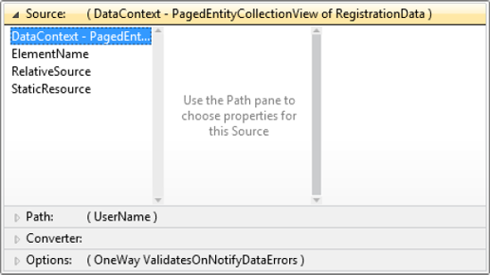
The next step is to select a path for the binding (as shown in Figure 10-5).

Note
The properties of the binding source aren't displayed in this pane unless the builder actually knows what type of object is being bound to. As you can see from Figures 10-4 and 10-5, it knows that the binding source is a PagedEntityCollectionView that wraps RegistrationData objects. It knows this because the source of the data being inherited by the data context of the control being bound is the Data property of a DomainDataSource control, which uses the design-time data properties (discussed earlier in the chapter) to define the type of data that the DomainDataSource control will return. Alternatively, if you are binding to a class that is defined and instantiated in the XAML file as a resource, the builder will also be able to determine the properties available on the binding source to display here. If you are binding to another control in the view, again the builder will know what properties are available to bind to. However, in scenarios where it isn't able to determine what type of object the binding source is (which would be the case when you are assigning the data to bind to in the code-behind but haven't used the design-time data properties to specify the type of the data that will be bound to), then you won't be able to use the builder to select the source property to bind to unless you've provided design-time data definitions for the source data that will be bound to. The only other alternative is to manually assign the data binding expression to the target property in the XAML.
If you wish, you can select a value converter to use in the binding, as shown in Figure 10-6.

Note
Once the converter has been created as a resource (which you can do by clicking the Create New button in the Resources list), a parameter field will appear in the list where you can specify a parameter for the converter if you wish.
The final step is to select any additional options that should be applied to the binding, as shown in Figure 10-7.

After selecting the options, simply clicking somewhere outside the data binding expression builder pop-up will close it and apply the generated binding string to the control property.
It is very easy to make a mistake (such as misspelling a property name in the path of the binding) when creating a binding or break a working binding when you refactor a class that acts as a binding source (such as renaming a property). At other times, bindings simply don't work in the way you would expect.
These types of data binding errors can be particularly hard to track down at times (and it can be hard to even recognize that they exist), as when bindings fail, they fail silently without throwing an exception in the application. There are, however, some techniques you can use to help you identify and track down data binding errors, which we'll take a look at here.
The first method is to simply take a look at the Output window in Visual Studio (select View ~TRA Output from the main menu if you can't find it). Binding errors are logged to the Output window when the application is being debugged, with a corresponding error message, the binding source object and property, and the binding target control and property. For example, by setting the binding path to the Nam (a misspelling) property instead of Name, will result in the following error being logged to the Output window:
System.Windows.Data Error: BindingExpression path error: 'Nam' property not found on 'AdventureWorksLOB.Models.Product' 'AdventureWorksLOB.Models.Product' (HashCode=29083993). BindingExpression: Path='Nam' DataItem='AdventureWorksLOB.Models.Product' (HashCode=29083993); target element is 'System.Windows.Controls.TextBox' (Name='NameTextBox'), target property is 'Text' (type 'System.String')..
This provides you with a fair amount of information about the error, which, in most cases, will help you track it down.
Unfortunately, in nondebugging scenarios, you cannot use this technique. An option is to assign a value to the FallbackValue property of the binding. Although it doesn't tell you why the binding failed, it can help prove that the binding did fail:
<TextBox Text="{Binding Name, Mode=TwoWay, FallbackValue=Binding failed!}" />You could alternatively use the helper created by Karl Shifflett (creator of the XAML Power Toys, detailed back in Chapter 7, "Building Data Entry Forms") which he has called Glimpse. One of its features is displaying bindings that have no source. You can get more details about Glimpse and download it at http://karlshifflett.wordpress.com/2009/06/08/glimpse-for-silverlight-viewing-exceptions-and-binding-errors/.
Another trick you might like to try is to add a value converter to your binding and put a breakpoint in its Convert and ConvertBack methods. This will enable you to hook into the binding process and perhaps help you identify the issue that you are having with that binding.
Even if your bindings are hooked up correctly, they may fail for many other reasons. Here are just a few troubleshooting tips you may wish to check:
If the bound control property isn't being updated accordingly when the underlying source property value is updated, ensure that the binding mode isn't set to
OneTime. Next, check that the property setter is raising thePropertyChangedevent (implemented by theINotifyPropertyChangedinterface), and check that the property name being passed to that event actually matches that property's name.If the source property isn't being updated when its value is changed via the user interface (such as entering a different value into a text box), start by ensuring that you've set the binding mode to
TwoWay. Also, check that theUpdateSourceTriggerproperty of the binding isn't set toExplicit, and if it is, ensure that theUpdateSourcemethod of the binding is called in the code-behind.
You can actually specify bindings using property element syntax. The following example demonstrates binding to a property named Name using property element syntax:
<TextBox>
    <TextBox.Text>
        <Binding Path="Name" />
    </TextBox.Text>
</TextBox>At times, you want to bind a control property to multiple properties on the binding source object, taking each of those property values and merging them into a single value to be consumed by the target. This is known in WPF as a MultiBinding, but this feature is not available in Silverlight. Earlier in this chapter, we discussed combining the values of multiple properties together while data binding using a value converter, which is a way to get around this omission. That said, this method isn't that different to using a MultiBinding in WPF, as it requires the use of a value converter too. MultiBinding does have the advantage of being a slightly more generic solution (although you could make the value converter solution a little more generic by passing the names of the source properties to use in the converter parameter). Colin Eberhardt has created a means for implementing MultiBindings in Silverlight, which you can obtain at www.scottlogic.co.uk/blog/colin/2010/05/silverlight-multibinding-solution-for-silverlight-4/.
Note
If you are using the Model-View-ViewModel (MVVM) design pattern (discussed in Chapter 12), then MultiBinding isn't particularly necessary, because you can simply add new properties (which expose the combined property values) to your ViewModel that the value converter requires.
In this chapter, you've seen a number of advanced tips and techniques that you can use when writing XAML and binding to data. Some of these you will use regularly, and others somewhat rarely, but either way, having them in your toolkit and at your disposal will greatly add to your ability to solve difficult problems in implementing your Silverlight business applications.