
New Visual Elements in Windows 8
Windows 8 includes quite a number of new elements. In this section, you'll look at the new elements you are most likely to need early in your Windows 8 app development.
AppBar
Earlier, you learned how Windows 8 allows an app bar to slide into your application from the bottom, and a nav bar to slide in from the top. By convention, these bars hold user actions and navigation options, as discussed in the UI conventions earlier.
Both of these visual elements are constructed from the same XAML element: the AppBar. This same element can be used in two different places.
You also learned how the root visual element for parts of your app will usually be the Page control or one of its subclasses. Page has two properties for specifying app bars: Page.BottomAppBar for the app bar, and Page.TopAppBar for the nav bar.
Both of these properties take an AppBar element. AppBar is just a container. You can think of it as a content control. The AppBar class just provides a surface to show when the user makes the proper gestures. All of the appearance and functionality inside the AppBar is up to you.
Constructing a Bottom App Bar
An app bar can have any elements on it. For simple app bars, the recommended arrangement of elements features two sets of buttons, one on the left side of the app bar, and one on the right. The left side is for operations or actions specific to an item currently shown in the view. The right side is for operations that apply to the application as a whole. Figure 13.3 shows an app bar with such an arrangement.
Figure 13.3 An app bar appears on a swipe from the bottom of the screen. Item-specific buttons should be on the left, and general app action buttons on the right.
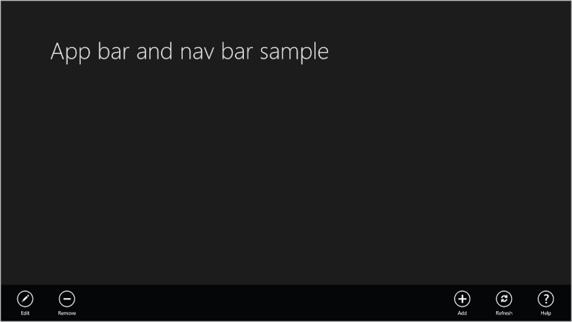
One XAML layout that will give you such an arrangement is to make the root element inside the app bar a Grid with two equal columns. Place a horizontal StackPanel in each column of the Grid, with the one in the first column aligned to the left, and the one in the second column aligned to the right. Then put appropriate buttons in each StackPanel.
The XAML for the app bar shown in Figure 13.3 follows this pattern, and looks like this (code file: BottomAppBar.xaml):
<Page.BottomAppBar>
    <AppBar>
        <Grid>
            <Grid.ColumnDefinitions>
                <ColumnDefinition />
                <ColumnDefinition />
            </Grid.ColumnDefinitions>
            <!--StackPanel on the left for item-specific buttons-->
            <StackPanel Orientation="Horizontal"
                        HorizontalAlignment="Left">
                <Button Name="AppBarEditButton"
                        Style="{StaticResource EditAppBarButtonStyle}"
                    />
                <Button Name="AppBarDeleteButton"
                        Style="{StaticResource RemoveAppBarButtonStyle}"
                />
            </StackPanel>
           <!--StackPanel on the right for general app buttons-->
            <StackPanel Orientation="Horizontal" Grid.Column="1"
                        HorizontalAlignment="Right">
                <Button Name="AppBarAddButton"
                    Style="{StaticResource AddAppBarButtonStyle}"
                        />
                <Button Name="AppBarRefreshButton"
                        Style="{StaticResource RefreshAppBarButtonStyle}"
                />
                <Button Name="AppBarHelpButton"
                        Style="{StaticResource HelpAppBarButtonStyle}"
                        />
            </StackPanel>
        </Grid>
    </AppBar>
</Page.BottomAppBar>
Notice that the buttons in the app bar are all created using styles. Even the icon inside each button is part of the style.
It isn't necessary for you to write the styles needed for common app bar buttons. A set of 62 styles is available to you in a XAML file called StandardStyles.xaml. However, they are commented out in the file, because it doesn't make sense to load all of them if they are not needed. So you must uncomment the ones you need. For the sample, all the styles referred to in the XAML snippet above were uncommented.
App bars can contain a lot more than buttons, and can be as complex as needed for your app. They don't have a specific size either—an app bar will be automatically sized to hold whatever is placed in it. All the layout techniques covered in Chapter 12 are at your disposal to create a richer app bar, and you can place any elements you need in the app bar.
Constructing a Top Nav Bar
The process for creating a nav bar is the same as that for creating an app bar, except that you use the Page.TopAppBar property instead of Page.BottomAppBar. However, where typical app bars often generally look the same, there is no consistent layout for a nav bar.
A common use of a nav bar is to allow the user to navigate to open items. In this case, some kind of ItemControl is often used to hold the available items in a horizontal orientation. Here is an example, with some fudged-up items for demonstration. This example uses a ListView to hold several items, and the ListView control will be covered in detail later in this section (code file: TopAppBar.xaml):
<Page.TopAppBar>
    <AppBar>
        <StackPanel Orientation="Horizontal" Height="250">
            <ListView Margin="20">
                <ListView.ItemsPanel>
                    <ItemsPanelTemplate>
                        <VirtualizingStackPanel Orientation="Horizontal" />
                    </ItemsPanelTemplate>
                </ListView.ItemsPanel>
                <ListViewItem>
                    <Border Width="120" Height="160"
                            BorderBrush="LightGray"
                            Background="DarkGray" BorderThickness="3">
                        <TextBlock Margin="4" FontSize="20"
                                   Text="An active item"
                                   TextWrapping="Wrap" />
                    </Border>
                </ListViewItem>
                <ListViewItem>
                    <Border Width="120" Height="160"
                            BorderBrush="LightGray"
                            Background="DarkGray" BorderThickness="3">
                        <TextBlock Margin="4" FontSize="20"
                                   Text="The second active item"
                                   TextWrapping="Wrap" />
                    </Border>
                </ListViewItem>
                <ListViewItem>
                    <Border Width="120" Height="160"
                            BorderBrush="LightGray"
                            Background="DarkGray"  BorderThickness="3">
                        <TextBlock Margin="4" FontSize="20"
                                   Text="Another active item"
                                   TextWrapping="Wrap" />
                    </Border>
                </ListViewItem>
                <ListViewItem>
                    <Border Width="120" Height="160"
                            BorderBrush="LightGray"
                            Background="DarkGray" BorderThickness="3">
                        <TextBlock Margin="4" FontSize="20"
                                   Text="Yet another active item"
                                   TextWrapping="Wrap" />
                    </Border>
                </ListViewItem>
                <ListViewItem>
                    <Border Width="120" Height="160"
                            BorderBrush="LightGray"
                            Background="DarkGray" BorderThickness="3">
                        <TextBlock Margin="4" FontSize="20"
                                   Text="The last active item"
                                   TextWrapping="Wrap" />
                    </Border>
                </ListViewItem>
            </ListView>
            <Button Margin="20" Content="A button for something" FontSize="20" />
        </StackPanel>
    </AppBar>
</Page.TopAppBar>
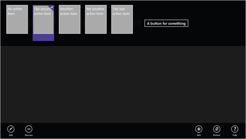
The resulting nav bar is shown in Figure 13.4, with the second item selected by the user. Note that since the app now has both an app bar and nav bar, both are shown when the top nav bar is brought into view.
Figure 13.4 A nav bar appears on a swipe from the top of the screen. The app bar (bottom) also appears when the nav bar is called into view.
ListView, GridView, and FlipView Controls
In earlier XAML platforms, the ListBox was a commonly used control to show lists of data items. The ListBox is one of a general category of XAML controls called ItemControls. As seen in Chapter 12, ItemControls have an ItemsSource property to point to the list of data items to be displayed, and an ItemTemplate property to point to a data template used to format individual items for display.
In Windows 8, ListBox is used less, and its niche is occupied by two other ItemControls: GridView and ListView. ListView is very much like a ListBox, but has some added capabilities. GridView offers a different arrangement of the displayed items. Let's look at ListView and GridView individually, with visual examples to show how they work. These examples will also be used to show some of the conventions and styles you'll typically use in a Windows 8 app.
FlipView is another ItemsControl that is new to Windows 8. As an ItemsControl, it shares a fair amount of syntax with ListView and GridView, but the navigation between items is completely new. FlipView allows one item at a time to take over the entire control, and supports touch and mouse gestures to “flip” between the data items.
Sample Data for Examples of ItemControls
Before you can look at the new ItemControls in Windows 8 XAML, there's a bit of prep work required. Seeing these ItemControls in operation requires sample data, so you need to construct it.
The sample data is constructed by first creating data object classes, and then declaring some instances of those classes in XAML.
About Data Models
There are a wide variety of ways to access and package data in Visual Basic. This chapter will not go into detail about that; Chapters 9, 10, and 11 discuss some of the details.
Since this chapter is not primarily about data, the data models used in examples are about as simple as it is possible to make them. The overall schema is an expansion of the Customer record model used in Chapter 12. It adds contact records, and each Customer includes a collection of contacts.
The classes used will include:
- Customer—a data object for a single customer
- Customers—a collection of Customer data objects
- Contact—a data object for a single contact record
- Contacts—a collection of Contact data objects
These models are simpler than the sample data models used in the application templates in Windows 8 XAML. Those models add additional features to support a code organization pattern that some developers like to use in their data models, which is called Model-View-ViewModel, commonly abbreviated MVVM. Since MVVM isn't required to do Windows 8 apps, and since there are many resources that go into intricate detail on MVVM, it is not discussed further in this chapter.
Technical Notes for the Customer/Contact Sample Data Model
The classes for Customer and Contact records, and their respective collection classes, must satisfy a couple of important capabilities to work well in Windows 8 XAML. The data records (Customer and Contact) must have property change notification. That simply means they implement an interface called INotifyPropertyChanged. That allows properties to raise an event called PropertyChanged, which is monitored by the data binding system so that bindings are updated when properties are changed. Your implementation of INotifyPropertyChanged will be minimal, because best practices for data classes are beyond the scope of this chapter.
The collection classes must be of a type that has events when items are added to or removed from the collection. The class used for that will be familiar to experienced XAML developers. It is a generic collection class called ObservableCollection(of T).
The code for the data model is included in the code download for the chapter. However, for reference, the code listings are included here as well.
Here are code listings for the Contact and Contacts classes (code file: ContactClasses.vb):
Public Class Contact
    Implements INotifyPropertyChanged

    Private _ContactName As String
    Public Property ContactName() As String
        Get
            Return _ContactName
        End Get
        Set(ByVal value As String)
            If _ContactName <> value Then
                _ContactName = value
                NotifyPropertyChanged("ContactName")
            End If
        End Set
    End Property

    Private _Phone As String
    Public Property Phone() As String
        Get
            Return _Phone
        End Get
        Set(ByVal value As String)
            If _Phone <> value Then
                _Phone = value
                NotifyPropertyChanged("Phone")
            End If
        End Set
    End Property

    Public Event PropertyChanged(ByVal sender As Object,
           ByVal e As System.ComponentModel.PropertyChangedEventArgs)
           Implements
           System.ComponentModel.INotifyPropertyChanged.PropertyChanged

    Private Sub NotifyPropertyChanged(ByVal PropertyName As String)
        Dim eNew As New PropertyChangedEventArgs(PropertyName)
        RaiseEvent PropertyChanged(Me, eNew)
    End Sub

End Class

Public Class Contacts
    Inherits ObservableCollection(Of Contact)

End Class
Here are code listings for the Customer and Customers classes (code file: CustomerClasses.vb):
Public Class Customer
    Implements INotifyPropertyChanged

    Public Sub New()
        _Contacts = New Contacts
    End Sub

    Private _CustomerName As String
    Public Property CustomerName() As String
        Get
            Return _CustomerName
        End Get
        Set(ByVal value As String)
            If _CustomerName <> value Then
                _CustomerName = value
                NotifyPropertyChanged("Name")
            End If
        End Set
    End Property

    Public Event PropertyChanged(ByVal sender As Object,
        ByVal e As System.ComponentModel.PropertyChangedEventArgs)
        Implements System.ComponentModel.INotifyPropertyChanged.PropertyChanged

    Private Sub NotifyPropertyChanged(ByVal PropertyName As String)
        Dim eNew As New PropertyChangedEventArgs(PropertyName)
        RaiseEvent PropertyChanged(Me, eNew)
    End Sub

    Private _Active As Boolean
    Public Property Active() As Boolean
        Get
            Return _Active
        End Get
        Set(ByVal value As Boolean)
            If _Active <> value Then
                _Active = value
                NotifyPropertyChanged("Active")
            End If
        End Set
    End Property

    Private _Contacts As Contacts
    Public Property Contacts() As Contacts
        Get
            Return _Contacts
        End Get
        Set(ByVal value As Contacts)
            If _Contacts IsNot value Then
                _Contacts = value
                NotifyPropertyChanged("ContactName")
            End If
        End Set
    End Property

    Private _Phone As String
    Public Property Phone() As String
        Get
            Return _Phone
        End Get
        Set(ByVal value As String)
            If _Phone <> value Then
                _Phone = value
                NotifyPropertyChanged("Phone")
            End If
        End Set
    End Property

    Private _Logo As String
    Public Property Logo() As String
        Get
            Return _Logo
        End Get
        Set(ByVal value As String)
            If _Logo <> value Then
                _Logo = value
                NotifyPropertyChanged("Logo")
            End If
        End Set
    End Property

End Class

Public Class Customers
    Inherits ObservableCollection(Of Customer)

End Class
Finally, here is the XAML that is used to declare a set of five customer objects, each with a Contacts collection. This resource, named CustomerList, is then used as the ItemsSource for various ItemControls in the examples (code file: SampleCustomerList.xaml):
<local:Customers x:Key="CustomerList">
    <local:Customer CustomerName="BigBux, Inc."
                    Active="True"
                    Phone="223-555-1234"
                    Logo="http://billyhollis.com/Logos/BigBuxLogo.png" >
        <local:Customer.Contacts>
            <local:Contact ContactName="Sherlock Holmes" Phone="212-555-1234" />
            <local:Contact ContactName="John Watson" Phone="212-555-3456" />
            <local:Contact ContactName="Mycroft Holmes" Phone="212-555-6789" />
        </local:Customer.Contacts>
    </local:Customer>
    <local:Customer CustomerName="SmallPotatoes, Ltd."
                    Active="False"
                    Phone="212-555-1234"
                    Logo="http://billyhollis.com/Logos/SmallPotatoesLogo.png">
        <local:Customer.Contacts>
            <local:Contact ContactName="Oliver Twist" Phone="414-555-1234" />
        </local:Customer.Contacts>

    </local:Customer>
    <local:Customer CustomerName="Medium Enterprises, Inc."
                    Active="True"
                    Phone="313-555-1234"
                    Logo="http://billyhollis.com/Logos/MediumEnterprisesLogo.png" >
        <local:Customer.Contacts>
            <local:Contact ContactName="Elizabeth Bennet" Phone="313-555-1234" />
            <local:Contact ContactName="John Darcy" Phone="313-555-3456" />
            <local:Contact ContactName="Charlotte Lucas" Phone="313-555-6789" />
        </local:Customer.Contacts>

    </local:Customer>
    <local:Customer CustomerName="Globe Theatre"
                    Active="False"
                    Phone="515-555-1234"
                    Logo="http://billyhollis.com/Logos/GlobeTheatreLogo.png">
        <local:Customer.Contacts>
            <local:Contact ContactName="Romeo Montague" Phone="505-555-1234" />
            <local:Contact ContactName="Othello Jones" Phone="505-555-3456" />
            <local:Contact ContactName="Juliet Capulet" Phone="505-555-6789" />
        </local:Customer.Contacts>

    </local:Customer>
    <local:Customer CustomerName="Global Traders"
                Active="True"
                Phone="616-555-1234"
                Logo="http://billyhollis.com/Logos/GlobalTradersLogo.png">
        <local:Customer.Contacts>
            <local:Contact ContactName="Silas Marner" Phone="707-555-1234" />
        </local:Customer.Contacts>

    </local:Customer>
</local:Customers>
For all the examples in this section, you should assume that the four classes above are part of the project, and that the XAML declaring CustomerList has been placed in the Resources section of App.xaml.
ListView
ListView is so similar to ListBox that in many cases you can easily change your old ListBox XAML to use a ListView instead. Unless you're doing something fancy with the ListBox, you can just change the tag from ListBox to ListView, and the XAML will work.
The main advantage of ListView over ListBox is that is has better touch functionality, and works more transparently with standard Windows 8 gestures. For example, if you are swiping through a list (which is often called panning), then when you raise your finger the list shows inertia. It continues moving while it decelerates to a stop. This generates a more natural interaction pattern, because that's the way things act in the real world.
Using the sample customer data defined earlier, let's look at the XAML for a ListView example, including a data template that will format Customer data records. To construct the example, just create a new Blank App and replace the Grid element in MainPage with the following XAML (code file:CustomerDataTemplate.xaml):
<Page.Resources>
    <DataTemplate x:Key="Standard250x250ItemTemplate">
        <Grid HorizontalAlignment="Left" Width="250" Height="250"
              Background="{StaticResource
ListViewItemPlaceholderBackgroundThemeBrush}">

            <StackPanel Margin="4" VerticalAlignment="Top"
                   Background="{StaticResource
ListViewItemOverlayBackgroundThemeBrush}">
                <TextBlock LineHeight="28" FontSize="24"
                           Text="{Binding CustomerName}"
                   Foreground="{StaticResource
ListViewItemOverlayForegroundThemeBrush}"

                   Style="{StaticResource TitleTextStyle}" Margin="15,0,15,0"/>
                <TextBlock LineHeight="24" FontSize="18" Text="{Binding Phone}"
                   Foreground="{StaticResource
ListViewItemOverlayForegroundThemeBrush}"

                   Style="{StaticResource TitleTextStyle}" Margin="15,0,15,0"/>
                <Image Source="{Binding Logo}" MaxWidth="120"
                       HorizontalAlignment="Center" Margin="20"/>
            </StackPanel>
        </Grid>
    </DataTemplate>


</Page.Resources>

<Grid Background="{StaticResource ApplicationPageBackgroundThemeBrush}">
    <Grid.RowDefinitions>
        <RowDefinition Height="140"/>
        <RowDefinition Height="*"/>
    </Grid.RowDefinitions>
    <TextBlock x:Name="pageTitle" Grid.Column="1" Text="ListView Example"
               Margin="120,0,0,0" Style="{StaticResource PageHeaderTextStyle}"/>
    <ListView Grid.Row="1" Margin="120,0,0,0"
              ItemTemplate="{StaticResource Standard250x250ItemTemplate}"
              ItemsSource="{StaticResource CustomerList}" />
</Grid>
The data template is one of the standard sizes used in Windows 8, and the resource name indicates that. In fact, it was created by copying the resource of the same name out of StandardStyles.xaml.
Notice that the layout of the Page containing the ListView satisfies simple Windows 8 conventions. The top header area, which often contains the application name, is 140 pixels high, and both the header area and the ListView have a left margin of 120 pixels. For vertically scrolling content, the bottom margin is often zero, and the ListView does vertical scrolling by default (though it has an ItemsPanel property to change that, just as a ListBox does).
If this XAML is placed in a Blank App project that has your earlier Customer/Contact data model incorporated, then the running application will look like Figure 13.5.
Figure 13.5 A ListView provides a touch-friendly, vertically scrolling list of data items. The second item has been selected by the user.
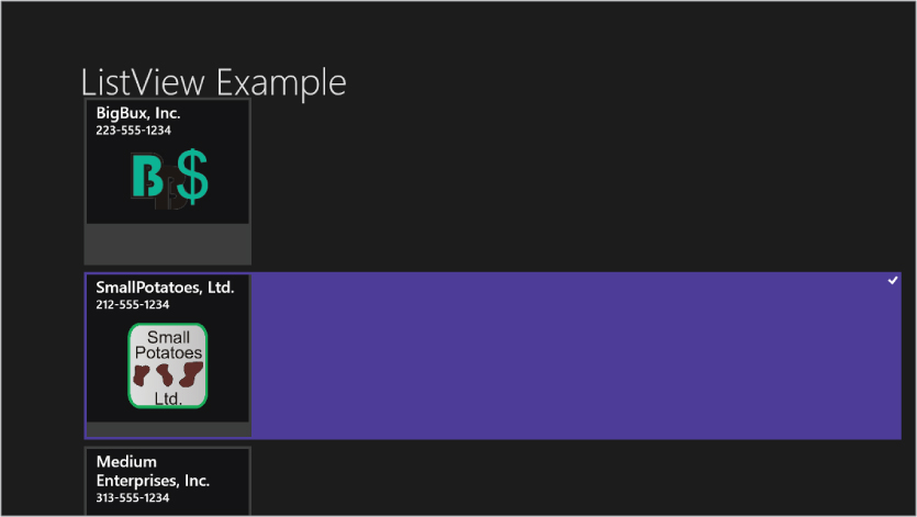
Just as the items in a ListBox are ListBoxItem instances, the items in a ListView are ListViewItem instances. These can be created manually instead of being manufactured from data, as the example in Figure 13.4 above showed. This is rarely used for line-of-business applications.
GridView
GridView is very similar to ListView with the following exceptions:
- The default arrangement of data items is wrapped, similar to a WrapPanel in earlier XAML platforms.
- The default scrolling of items is horizontal instead of vertical.
- The items in a GridView are GridViewItem instances.
The syntax is so similar that if you simply change the ListView tag to a GridView tag in the XAML shown above, it will work fine, and you'll get a running program that looks like Figure 13.6.
Figure 13.6 A GridView provides a touch-friendly, horizontally scrolling list of data items, wrapped into columns. The third item has been selected by the user.
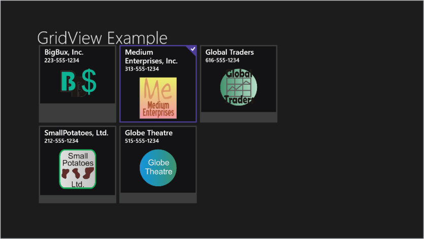
Like ListView, GridView is nicely optimized for touch interaction. In fact, both ListView and GridView inherit from a class named ListViewBase, where much of that touch interaction functionality is implemented.
Grouping in ListView and GridView
Some data models include data items grouped by some factor, usually a property value. For example, Customer data items might be grouped by the state in which the customer is located, or by whether or not the Customer is active.
If you are familiar with XAML in WPF, you may know about grouping in the ListBox control, using a CollectionViewSource to obtain a collection view, and then altering its GroupDescriptions property. Grouping is also available in the ListView and GridView controls in Windows 8, and the grouping still involves a CollectionViewSource. However, the underlying mechanisms are different. Windows 8 grouping depends on a data model that implement groups, instead of having groups automatically created via a CollectionView.
To see grouping in action in a GridView, you'll need to do some changes to your default data model. The CustomerGroups class will serve as the container of your groups of customer objects, and it will hold a collection of instances of the Customers class.
You've already seen the Customers class, and how it holds a collection of Customer objects. However, it does need one additional property to describe the particular group of Customers in an instance. That simply means that the following line needs to be added to the Customers class:
Public Property GroupName As String
Here is the rather simple code for the CustomerGroups class that holds a collection of instances of Customers collections:
Public Class CustomerGroups
    Inherits ObservableCollection(Of Customers)

End Class
With these data classes in place, you change the way your sample data is declared to create a sample data source holding groups of customers instead of just customer objects. Here is that XAML, which is placed in the App.xaml resources area (code file: GroupedCustomers.xaml):
<local:CustomerGroups x:Key="GroupedCustomers">
    <local:Customers GroupName="Active Customers">
        <local:Customer CustomerName="BigBux, Inc."
                Active="True" Special="True"
                Phone="223-555-1234"
                Logo=" http://billyhollis.com/Logos/BigBuxLogo.png" >
            <local:Customer.Contacts>
                <local:Contact ContactName="Sherlock Holmes"
                               Phone="212-555-1234" />
                <local:Contact ContactName="John Watson" Phone="212-555-3456" />
                <local:Contact ContactName="Mycroft Holmes" Phone="212-555-6789" />
            </local:Customer.Contacts>
        </local:Customer>
        <local:Customer CustomerName="Medium Enterprises, Inc."
                Active="True"
                Phone="313-555-1234"
                Logo=" http://billyhollis.com/Logos/MediumEnterprisesLogo.png" >
            <local:Customer.Contacts>
                <local:Contact ContactName="Elizabeth Bennet"
                               Phone="313-555-1234" />
                <local:Contact ContactName="John Darcy" Phone="313-555-3456" />
                <local:Contact ContactName="Charlotte Lucas"
                               Phone="313-555-6789" />
            </local:Customer.Contacts>

        </local:Customer>
        <local:Customer CustomerName="Global Traders"
            Active="True"
            Phone="616-555-1234"
            Logo=" http://billyhollis.com/Logos/GlobalTradersLogo.png">
            <local:Customer.Contacts>
                <local:Contact ContactName="Silas Marner" Phone="707-555-1234" />
            </local:Customer.Contacts>

        </local:Customer>
    </local:Customers>

    <local:Customers GroupName="Inactive Customers">
        <local:Customer CustomerName="SmallPotatoes, Ltd."
                Active="False"
                Phone="212-555-1234"
                Logo=" http://billyhollis.com/Logos/SmallPotatoesLogo.png">
            <local:Customer.Contacts>
                <local:Contact ContactName="Oliver Twist" Phone="414-555-1234" />
            </local:Customer.Contacts>

        </local:Customer>
        <local:Customer CustomerName="Globe Theatre"
                Active="False"
                Phone="515-555-1234"
                Logo=" http://billyhollis.com/Logos/GlobeTheatreLogo.png">
            <local:Customer.Contacts>
                <local:Contact ContactName="Romeo Montague" Phone="505-555-1234" />
                <local:Contact ContactName="Othello Jones" Phone="505-555-3456" />
                <local:Contact ContactName="Juliet Capulet" Phone="505-555-6789" />
            </local:Customer.Contacts>

        </local:Customer>
    </local:Customers>

</local:CustomerGroups>
With this sample data, a CollectionViewSource can be declared to use in your GridView. It is declared in the Resources for the Page, and looks like this:
<CollectionViewSource x:Key="GroupedCustomersSource"
                 Source="{StaticResource GroupedCustomers}"
                 IsSourceGrouped="True"  />
To make the GridView display groups, two changes are essential. First, the ItemsSource must be changed to become the CollectionViewSource that holds the groups instead of being a simple list of customers. Second, the GridView must have a GroupStyle defined, so that the GridView knows how to display the head for groups and, optionally, how data items in groups will be arranged. Taking all that into account, the GridView XAML definition needs to look something like this (code file: GridViewExample.xaml):
<GridView Margin="120,133,0,7" Name="MainGridView"
                  ItemsSource="{Binding Source={StaticResource
GroupedCustomersSource}}"
                 ItemTemplate="{StaticResource Standard250x250ItemTemplate}"
                 Grid.RowSpan="2" >
    <GridView.GroupStyle>
        <GroupStyle>
            <GroupStyle.HeaderTemplate>
                <DataTemplate>
                    <TextBlock Text="{Binding GroupName}"
                               Style="{StaticResource SubheaderTextStyle}"
                               Margin="5,15" />
                </DataTemplate>
            </GroupStyle.HeaderTemplate>
            <GroupStyle.Panel>
                <ItemsPanelTemplate>
                    <VariableSizedWrapGrid Orientation="Vertical"
Margin="0,0,80,0"/>
                </ItemsPanelTemplate>
            </GroupStyle.Panel>
        </GroupStyle>
    </GridView.GroupStyle>

</GridView>
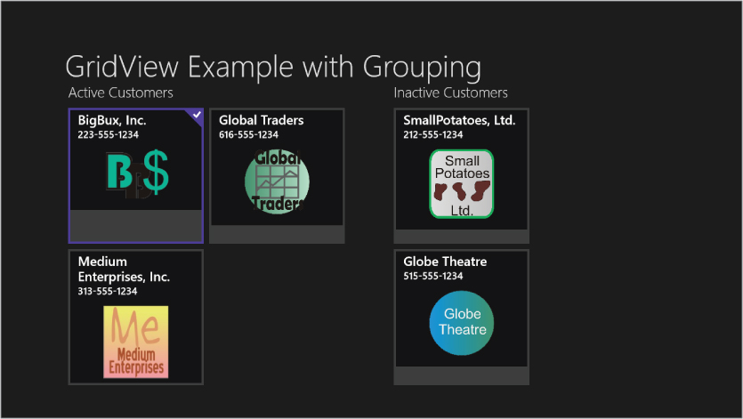
If you make these changes to the earlier GridView example and run the program, you'll get a sample screen that looks something like Figure 13.7.
Figure 13.7 A GridView with grouped customer items
The amount of work involved to create a data model for a grouped data source is not trivial, but if your users need to look at data in groups, GridView and ListView can easily show them. In many cases, you will find it easier to use LINQ in code to produce your groups.
FlipView
FlipView is another touch-optimized ItemControl. However, while the XAML FlipView strongly resembles that for ListView or GridView, its navigation/interaction pattern is quite distinct from other ItemControls.
Like all ItemControls, FlipView includes a collection of items in a list. The item type is FlipViewItem.
However, unlike all the other ItemControls you've likely seen, FlipView only shows one item at a time. The entire area of the FlipView is available to show a data item. The FlipView then offers gestures to move between items, which is sometimes called “flipping.”
The touch gesture to flip between items is a horizontal swipe. A swipe to the left brings up the next item, while a swipe to the right goes back to the previous item in the list.
To allow equivalent interaction with a mouse, when a mouse moves over a FlipView, navigation buttons fade in on the sides to provide a place to click and navigate. A button is present only if navigation is possible in that direction. That is, when you are on the last item in the list, the button on the right does not appear. Likewise, the left button is absent in you are on the first item in the list.
If you would like the items to be a “ring” in which navigating from the last item loops back to the first item, then set the TabNavigation property to “Cycle.” If you are familiar with Windows Phone development, you may have used the Panorama control. A FlipView with TabNavigation set to Cycle provides similar functionality, though the small part of the next record that shows on the right side in the Panorama is not present.
In the first ListView XAML example, if the tags are changed to a FlipView, then you'll see a screen similar to Figure 13.8. Since the data template wasn't changed, the single data item shown is much smaller than the screen, and isn't centered. In a real app, you'll rarely use a FlipView unless you need room for a larger data item, and centering the item is almost always appropriate.
Figure 13.8 A FlipView showing the first record in your sample data

Touch gestures and mouse gestures are active for navigation at this point. If you move the mouse over the FlipView, the navigation buttons will show, as in Figure 13.9.
Figure 13.9 A FlipView showing the second record in your sample data, after a mouse has been moved over it. Note the navigation buttons to the left and right.
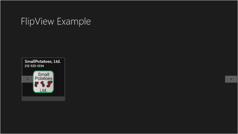
Figure 13.9 shows that the navigation buttons are inside the FlipView, and will be on top of a data item if necessary. In many cases, when using a FlipView, you will want the FlipView control to be as wide as the whole view, and set up the data template to be centered and to allow space on the sides for the navigation buttons to appear.
DataTemplateSelector
In Chapter 12, data templates were discussed in detail. In all those examples, an ItemsControl used a data template by setting the ItemTemplate property to a data template.
WPF developers may be familiar with a different way to determine the data templates used in an ItemsControl—a data template selector. This is an object that inherits from the DataTemplateSelector class, and contains logic to examine each data item and decide which template should be used to render that item.
GridView, ListView, and FlipView can all use a data template selector in Windows 8. The way the class is constructed is slightly different from WPF. Instead of overriding the SelectTemplate method, as in WPF, the SelectTemplateCore method is overridden instead.
The class for a data template selector usually has some properties to hold the templates that are being used to render various data items. In your example below, you will construct a CustomerDataTemplateSelector, and give it properties for ActiveCustomerTemplate and InactiveCustomerTemplate.
Typically, an instance of the DataTemplateSelector is created in a project as a resource, and the ItemTemplateSelector of a GridView, ListView, or FlipView is set to that resource. For an example, you'll modify the earlier GridView example to add the data template selector.
The code download for the chapter includes that example. The data template selector is a class named CustomerDataTemplateSelector. Here is the code for that class (code file: CustomerDataTemplateSelector.vb):
Public Class CustomerDataTemplateSelector
    Inherits Controls.DataTemplateSelector

    Public Property ActiveCustomerTemplate As DataTemplate
    Public Property InactiveCustomerTemplate As DataTemplate

    Protected Overrides Function SelectTemplateCore(item As Object,
                                                    container As
                                                    DependencyObject)
                                                    As DataTemplate

        Dim c As Customer
        c = CType(item, Customer)
        If c.Active Then
            Return ActiveCustomerTemplate
        Else
            Return InactiveCustomerTemplate
        End If

    End Function

End Class
As you can see, in the example, the data template used is determined by the Active property of the customer record.
Then a new data template was added to the resources collection, using the key InactiveCustomerTemplate. The XAML is similar to the data template used earlier in the ListView example, except that the Image control is removed and text elements get a gray foreground (code file: InactiveCustomerTemplate.xaml):
<DataTemplate x:Key="InactiveCustomerTemplate">
    <Grid HorizontalAlignment="Left" Width="250" Height="250"
          Background="{StaticResource
ListViewItemPlaceholderBackgroundThemeBrush}">

        <StackPanel Margin="4" VerticalAlignment="Top"
               Background="{StaticResource
ListViewItemOverlayBackgroundThemeBrush}">
            <TextBlock LineHeight="28" FontSize="24"
                       Text="{Binding CustomerName}"
                       Foreground="Gray"
                       Style="{StaticResource TitleTextStyle}"
                       Margin="15,0,15,0"/>
            <TextBlock LineHeight="24" FontSize="18"
                       Text="{Binding Phone}"
                       Foreground="Gray"
                       Style="{StaticResource TitleTextStyle}"
                       Margin="15,0,15,0"/>
            <TextBlock LineHeight="28" FontSize="24"
                       Text="Inactive" FontStyle="Italic"
                       Foreground="Gray"
                       Style="{StaticResource TitleTextStyle}"
                       Margin="15,20,15,20"/>
        </StackPanel>
    </Grid>
</DataTemplate>
Then an instance of the CustomerDataTemplateSelector was added to the resource collection, with a key of MyCustomerTemplateSelector:
<local:CustomerDataTemplateSelector x:Key="MyCustomerTemplateSelector"
            ActiveCustomerTemplate="{StaticResource Standard250x250ItemTemplate}"
            InactiveCustomerTemplate="{StaticResource InactiveCustomerTemplate}" />
Notice how the templates to be used are assigned to the ActiveCustomerTemplate and InactiveCustomerTemplate properties, based on the resources that are already in the XAML.
The final step is to change the GridView XAML to remove the ItemTemplate property setting, and set the ItemTemplateSelector property to the MyCustomerTemplateSelector resource:
<GridView Grid.Row="1" Margin="120,0,0,0"
          ItemTemplateSelector="{StaticResource MyCustomerTemplateSelector}"
          ItemsSource="{StaticResource CustomerList}" />
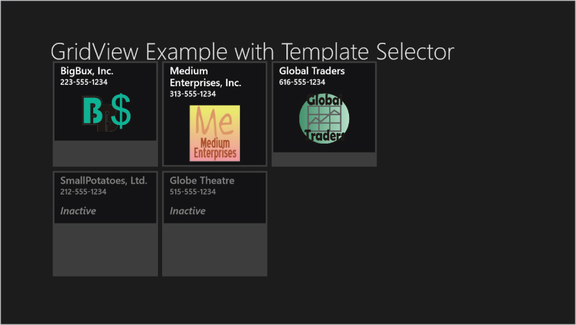
The resulting program will yield a screen much like Figure 13.10.
Figure 13.10 The earlier GridView example has been modified to use a data template selector. Inactive customers are rendered in a different template from active customers.
Pickers
In earlier versions of XAML, as well as other UI technologies such as Windows Forms, getting access to the file system was done via a set of common dialogues. The classes were actually thin wrappers over parts of the Windows API, with the wrappers serving to make the dialogues object-oriented.
In Windows 8, the native API is object-oriented. Therefore no wrappers are needed. Accessing the file system dialogues means calling the corresponding API objects. Instead of being called common dialogues, they are called pickers.
Since these are native API objects, they don't reside in any of the XAML related namespaces. Pickers and their associated helper classes are in the Windows.Storage.Pickers namespace.
The calling conventions are also different. Windows 8 apps are required to do just about everything asynchronously, which lets apps be suspended, hibernated, switched out, etc., more easily. So whereas common dialogues are modal, pickers are required to be asynchronous.
Chapter 5 discussed asynchronous syntax for Visual Basic, and you'll need that syntax to work with pickers. Here is an example routine that could be place behind a button to access the FolderPicker, which is the object used to choose a folder object and returns an object of type StorageFolder (code file: FolderPickerExample.vb):
Private Async Sub Button_Click_1(sender As Object, e As RoutedEventArgs)
    Dim fp As New Windows.Storage.Pickers.FolderPicker
    fp.SuggestedStartLocation =
          Windows.Storage.Pickers.PickerLocationId.DocumentsLibrary
    fp.FileTypeFilter.Add(".docx")

    Dim PickedFolder As Windows.Storage.StorageFolder
    PickedFolder = Await fp.PickSingleFolderAsync
    If PickedFolder Is Nothing Then
        ' User did not choose a folder
    Else
        ' PickedFolder contains the folder chosen by the user
        Dim md As New MessageDialog("The user chose " & PickedFolder.DisplayName)
        Await md.ShowAsync()

    End If

End Sub
Notice that the click event handler is declared with the Async keyword, and that the Await keyword is used before the FolderPicker method call, which is PickSingleFolderAsync. The MessageDialog showing the result is also used asynchronously.
ProgressRing
Previous XAML platforms has a ProgressBar control to indicate progress on an operation. Windows 8 has such an element, but it also has a complementary ProgressRing control.
When you use ProgressBar, you are responsible for giving it periodic updates as to the completion percentage. With ProgressRing, that's not necessary. It just continually displays an animation indicating that an operation is ongoing. No progress value is involved.
All you do to make a ProgressRing active is to set the IsActive property to True. The ProgressRing will show and animate until IsActive is changed to False. It's common to do this in code, but for simplicity, the example below will bind IsActive to another control, which is a ToggleSwitch.
Since the example for ProgressRing uses ToggleSwitch, let's cover that first and then look at the XAML example for both of them.
ToggleSwitch
In earlier XAML platforms, CheckBox was the usual way to indicate a true/false selection. In Windows 8 XAML, CheckBox is still present, but should be used much more sparingly. If the user needs to turn settings on or off, or turn on actions, the ToggleSwitch is preferred because it is designed to fit well into the Windows 8 UI standards.
CheckBox uses the IsChecked property to expose a true/false or on/off status. The corresponding property for ToggleSwitch is named IsOn, which also exposes a Boolean.
CheckBox is a ContentControl, and simply displays a single piece of static content. ToggleSwitch is not a ContentControl. Instead, it has three properties that allow content:
Let's look at an example in which a ToggleSwitch is used to turn a ProgressRing on and off:
<Grid Background="{StaticResource ApplicationPageBackgroundThemeBrush}">
    <StackPanel Orientation="Horizontal">
        <ToggleSwitch   Name="ProgressToggleSwitch" FontSize="28"
                        Header="ToggleSwitch and ProgressRing Example"
                        OffContent="Idle" OnContent="Working" />
        <ProgressRing Height="60" Width="60"
                      Foreground="Aquamarine"
                      IsActive="{Binding ElementName=ProgressToggleSwitch,
Path=IsOn}"/>
    </StackPanel>

</Grid>
This XAML can be placed in a new Blank App, and when the ToggleSwitch is turned out, the screen will look like Figure 13.11.
Figure 13.11 The ToggleSwitch on the left controls the ProgressRing, which animates the dots in a circle.

Other New Elements
There are several other new controls and elements, but in this brief introduction to Windows 8 XAML, you can't cover them all. Most of them are straightforward, and should be easy to learn when you need them. Here are some of the more notable new controls and elements that you will be omitting:
- WebView—used to show HTML content
- RichTextBlock—displays rich content, including embedded images and other advanced layout
- RichEditBox—displays rich content, including embedded images and other advanced layout, and allows the user to edit the content
Old Elements with New Usage
In general, Windows 8 XAML does a pretty good job of keeping down confusion between XAML platforms. You've seen that it has a number of its own elements that are optimized to Windows 8 purposes, such as RichEditBox. Since it has a different name from the RichTextBox control in earlier XAML platforms, it's much less likely for you to get their functionality mixed up.
However, there are two elements that have exactly the same name in Windows 8, but have some critical differences you should know about. They are Frame and Popup.
Frame
The Frame control existed in WPF and Silverlight versions of XAML, but it had different capabilities in each. The Silverlight version of Frame, for example, had integration with the browser's address bar.
The Frame in Windows 8 has its own differences. For that reason, Chapter 12 didn't discuss the Frame. Here are the basics of the Frame in Windows 8 XAML.
The Frame is used most often as a host for a Page, or more rarely, a UserControl element. Frame has a Navigate method to place a Page in the Frame. Note that this is different from the NavigateURI used in Silverlight's Frame. Instead of using a URI for navigation, in Windows 8 XAML, most navigation is done by navigating to a new instance of a type.
You can place a Frame in a XAML surface, and use it as a host for part of your view. Frame is also commonly used as the root ContentControl for an entire application, with the Navigate method of the Frame used to transfer application control to entirely different views.
Frame's Navigate method has two overloads. If your Frame is named MyFrame, and you want to navigate it to a new view of type CustomerPage, then the two overloads look like this:
MyFrame.Navigate(CustomerPage)

MyFrame.Navigate(CustomerPage, ParameterObject)
In the second overload, ParameterObject can be an object of any type. Normally, you would construct such an object that held the information which needed to be transferred to the new instance of the CustomerPage.
The reason Page is most often used as the navigation target is that Page has an OnNavigatedTo method that is fired when the Page is activated by navigation. The parameter object in the second overload above is available in the arguments for that method. The most common pattern, then, is to look at the parameter object, and take whatever steps are appropriate to configure the target Page. For example, the parameter object might include a database ID, and the ID could be used to set the DataContext for the Page.
You will examples of Frame usage, including the Navigate method, in the section below on the standard application templates used by Visual Studio to produce a new application.
PopUp
The PopUp element is familiar to most XAML developers. It provides a surface that is guaranteed to float on top of a view. Some internal controls, such as ComboBox, use PopUp internally. In the case of ComboBox, the items that appear when the ComboBox is opened are on a PopUp element.
In Windows 8, the PopUp is used for similar purposes as earlier versions of XAML, but it has some missing capabilities compared to earlier versions. In particular, whereas the WPF and Silverlight PopUp elements know how to position themselves relative to another element on a page, the Windows 8 PopUp does not. It has HorizontalOffset and VerticalOffset properties to position the PopUp on the entire visual surface, but it is your responsibility to calculate those offsets and configure the PopUp before showing it.
As with older versions of PopUp, the interior of the PopUp is determined by setting the Child property of the PopUp. It's common for the Child to be set to a Grid, UserControl, or other container, and that becomes the design surface for the visuals that will display in the PopUp.
After a PopUp is configured, it is brought into view by setting the IsOpen property to True. Then, when it's finished, IsOpen should be set to False. Usually various touch and mouse events are detected to indicate that the user is no longer interested in the PopUp, and then the PopUp is closed in the code for those events.