Styles
Developers of business applications might be a bit wary of becoming an expert in styling. Windows Forms had no such capability, and web applications often have specialists that do the styling.
However, styles in XAML are quite a bit more flexible than styles in earlier technologies, and address functionality that's not strictly cosmetic. That means developers need to understand styles, too.
What Is a Style?
At the most basic level, a Style in XAML is simply a way to set several property values for an element at one time. In syntactical terms, a Style is a collection of Setter objects, and each Setter object knows how to set a particular property to a particular value.
Here is a simple Style for a Button element (code file: SimpleStyle.xaml):
<Style x:Key="ButtonStyle" TargetType="Button">
    <Setter Property="Margin" Value="4" />
    <Setter Property="FontSize" Value="22"/>
    <Setter Property="FontStyle" Value="Italic" />
    <Setter Property="Foreground" >
        <Setter.Value>
            <LinearGradientBrush
                EndPoint="0.8,0.8"
                StartPoint="0.2,0.2">
                <GradientStop Color="DarkBlue" Offset="0"/>
                <GradientStop Color="ForestGreen" Offset="1"/>
            </LinearGradientBrush>
        </Setter.Value>
    </Setter>
</Style>
In this case, the Style is declared as a resource, and so has an x:Key attribute. That's the common case. There are a few scenarios where a Style is not used as a resource, and in fact you will see one a bit further on. However, normally the power of a Style is to apply it widely through much or all of an application, and as a resource it gains that kind of accessibility.
The Style also has a TargetType. There are limited scenarios in which this property of a Style does not need to be declared, but the common case is to declare a TargetType, and all the Style examples in this chapter will do so.
The Style then contains a collection of Setter objects. The first Setter object sets the Margin style to a Value of 4.
Many Setter objects will set simple values, but sometimes the value needed can't be expressed in a simple string. This is another case where element-based syntax is necessary to set the property. The Setter for the Foreground property shows an example. The Foreground is set to a linear gradient brush, and that requires additional lines of XAML between the <Setter.Value> and </Setter.Value> element tags.
To apply this style to an individual Button, the Style property of the Button should point to the Style resource. Here's an example:
<Button Content="Press me"
        Style="{StaticResource ButtonStyle}" />
Determining the Scope of a Style
In the discussion on Resources, it was noted that an individual resource is visible to all the elements further down in the element tree from the resource's location. When a Style is defined as a resource, the same principle applies. An individual element can use only a style that is defined for itself or one of its ancestors.
That means a Style can be replaced at any level in the application, simply by defining a style at that level with the same resource key. It's common to place a default Style at the application level, and then replace that style in individual XAML pages if that page requires a different Style.
Implicit Styles
As you saw previously, an element can apply a Style by setting the element's Style property to a resource. It's also possible to put a Style directly in a property for an element, without using a resource, and the following section on ItemContainerStyle has an example.
However, the real power of XAML styling is founded on the ability for styles to be automatically applied to elements. That type of Style is called an implicit Style. It's quite simple to create an implicit Style. Just put the Style in the resources area, the same as you saw earlier, but leave off the x:Key attribute.
You might expect that to cause a syntax error, since every resource in a resource dictionary must have a key. The reason it works is that the XAML parser has a special consideration for styles. If no key is present, the XAML parser creates a key out of the TargetType.
This allows the rendering engine to check for an implicit style for any type of visual element. If one is found anywhere in the ancestor tree, that style is applied automatically to the element.
If an implicit style exists for an element, but the Style property is set to a different Style manually, the locally declared value of the Style property takes precedence. That means the implicit style can be overridden for individual elements as necessary.
BasedOn Styles
It's not uncommon to have a “standard” style for an element type, and also need to have some minor variations on it. While it's possible to simply copy the whole standard Style object to another Style and make changes, it's better for maintenance if the Style with minor variations can “inherit” from the standard style.
That is done in XAML with the BasedOn property. The BasedOn property for a Style can point to a Style resource already defined. That immediately makes all the Setter objects in the base Style available. The new Style can then add new Setter objects, or replace Setter objects in the base style with different Setter objects in the new style.
Here is an example of a Style that is based on the ButtonStyle resource created earlier (code file: BasedOnStyle.xaml):
<Style x:Key="ExtraStuff" TargetType="Button"
       BasedOn="{StaticResource ButtonStyle}">
    <Setter Property="FontSize" Value="14"/>
    <Setter Property="FontWeight" Value="Bold" />
</Style>
This Style replaces the original FontSize of 22 with a new FontSize of 14, and adds a Setter that sets FontWeight to Bold.
ItemContainerStyle
The previous examples show Styles as resources. That's the most common use of Styles by far. However, there are a few scenarios where it is desirable to place a Style directly in the definition of an element. The one you will likely encounter first is setting the ItemContainerStyle of a ListBox.
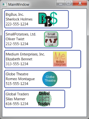
In the data template examples, something must tell the item to stretch to the full width of the ListBox. Otherwise, the ListBoxItem elements will be of different widths, and the overall list of items will look ragged. Figure 12.17 shows such a ListBox.
Figure 12.17 A ListBox in which the items are ragged
In WPF, this is easy to remedy. Just set the HorizontalContentAlignment of the ListBox to Stretch. However, for Silverlight and Windows 8 XAML, that technique will not work.
The difficulty in this situation is that the ListBoxItem elements that need to be stretched are not created until runtime. Therefore, there is no place in XAML to set the HorizontalContentAlignment for them.
This is just one example of a scenario in which it's desirable to affect the ListBoxItems that will be created at runtime. To provide that capability, the ListBox includes a property named ItemContainerStyle. That property holds a Style with any number of Setter objects, and the Style is automatically applied to all ListBoxItem elements that are created at runtime.
The ItemContainerStyle that will make ListBoxItem elements stretched looks like this:
<ListBox.ItemContainerStyle>
    <Style TargetType="ListBoxItem">
        <Setter Property="HorizontalContentAlignment" Value="Stretch" />
    </Style>
</ListBox.ItemContainerStyle>