
Chapter 30. Business Intelligence in SharePoint 2013 with PerformancePoint Services
In This Chapter
![]() PerformancePoint Services Overview
PerformancePoint Services Overview
![]() What’s New in PerformancePoint 2013
What’s New in PerformancePoint 2013
![]() Getting Started with a PerformancePoint Service Application
Getting Started with a PerformancePoint Service Application
![]() Understanding Dashboard Designer
Understanding Dashboard Designer
![]() Creating Dashboards in Dashboard Designer
Creating Dashboards in Dashboard Designer
Business intelligence (BI) can be thought of in broad terms as the key pieces of information that are used to support business decisions. BI can take many forms—analytical, measurable data, anecdotal information, or factual details. It can be used by people at many different levels of an organization. Senior executives may use high-level analytical sales data to make key decisions about hiring. Mid-level managers may make budget allocation decisions based on available budget and departmental objectives. And project managers may shift project resources based on project-specific factors. Different types of decisions can be made at many distinct times. Regional sales information may be used mid-year to support an increase or decrease in advertising dollars for a particular region. Year-end performance metrics can be used to justify disbursements of end-of-year bonuses. And a customer service agent may utilize customer or product history information during a customer service call.
For information consumers to make the correct decisions, the information they utilize must fulfill three criteria. First, it must be the correct information. Second, it must be current information. Having either inaccurate or out-of-date information leads to bad decisions. Third, it must be available to the people who need the information.
In short, the making of informed decisions is all about the right information being available to the right people at the right time. While a number of systems exist to produce, store, consolidate, or aggregate data, the set of tools available for “surfacing” the information—making it readily available to the information consumer—are historically lacking. SharePoint provides a rich suite of tools whose intended purposes are to bring the information out of their discrete systems and into the hands of the decision makers.
The next two chapters focus on two key BI components of SharePoint 2013. PerformancePoint Services is intended more for top-down views of information; it starts with high-level enterprise metrics, but provides the ability to break numbers down by region, county, product line, time period, and other key dimensions. Tools are provided for building dashboards, scorecards, and key performance indicators (KPIs). Business Connectivity Services, which is covered in the next chapter, is intended for bottom-up views of information, such as details on a product or an order.
PerformancePoint Services Overview
The 2010 version of SharePoint was the first to include PerformancePoint Services as a base part of the installation. The product was born from a merger of Microsoft’s Business Scorecard Manager and products acquired from ProClarity. The first version of PerformancePoint was launched in 2007 and was initially sold under a separate license.
In early 2009, Microsoft announced plans to roll it into the SharePoint product. Effective in 2009, owners of the SharePoint Enterprise Client Access License (CAL) became licensed for PerformancePoint; however, it remained a separate installation file. With SharePoint 2010 and now SharePoint 2013, PerformancePoint Services is rolled into the SharePoint 2010 Enterprise installation.
PerformancePoint Services helps provide key decision makers with the ability to measure business performance in real time. This is due primarily to its ability to place rich report creation capabilities into the hands of power users. Users who are interested in seeing real-time analytical metrics will be able to create reports that they can see updated whenever the data changes. No longer will they have to wait on a reporting tool or another department to generate a monthly or quarterly report. In addition, some reports provide interaction for report consumers, which allows them to more deeply analyze specific metrics that are of greater interest. Therefore, they are no longer limited to the information they can glean from predefined report formats. Following are three example scenarios:
![]() A company’s advertising department is trying to target their advertising based on a number of factors. One objective is to help the company achieve its regional and product sales goals. At the same time, a limited advertising budget requires them to make appropriate decisions on where to place advertisements. Every month, advertising dollars are designated to specific television spots with all the major networks. To make the right decisions, the brand managers need to be able to determine which product lines are on track to sell above their target levels and which ones are falling short. By having sales data available immediately, they can make more rapid decisions about where to and how often to place advertisements.
A company’s advertising department is trying to target their advertising based on a number of factors. One objective is to help the company achieve its regional and product sales goals. At the same time, a limited advertising budget requires them to make appropriate decisions on where to place advertisements. Every month, advertising dollars are designated to specific television spots with all the major networks. To make the right decisions, the brand managers need to be able to determine which product lines are on track to sell above their target levels and which ones are falling short. By having sales data available immediately, they can make more rapid decisions about where to and how often to place advertisements.
![]() A sales executive is reviewing sales data for the last quarter. In reviewing a graph of sales, he notices that one product line had lower sales during the period. With one click of the mouse, he can re-form the chart by drilling down into that one product line to view individual products within the product line. He then notices that sales of most products within the product line remained steady during the quarter; however, one specific stock-keeping unit (SKU) underperformed. He could also see how the same data looks on a regional basis. With no individual region standing out as a problem area, he can return to the previous graph. From there, he can once again drill down to see sales for the one product, broken down by monthly or weekly timely periods. Having this power to regenerate graphs on demand will allow people to isolate a problem area, which in turn will let them make the decisions necessary to correct the problem.
A sales executive is reviewing sales data for the last quarter. In reviewing a graph of sales, he notices that one product line had lower sales during the period. With one click of the mouse, he can re-form the chart by drilling down into that one product line to view individual products within the product line. He then notices that sales of most products within the product line remained steady during the quarter; however, one specific stock-keeping unit (SKU) underperformed. He could also see how the same data looks on a regional basis. With no individual region standing out as a problem area, he can return to the previous graph. From there, he can once again drill down to see sales for the one product, broken down by monthly or weekly timely periods. Having this power to regenerate graphs on demand will allow people to isolate a problem area, which in turn will let them make the decisions necessary to correct the problem.
![]() A product manufacturing company has several plants that have been producing below target levels. Several factors could help drive this, including frequency of safety incidents, capacity utilization, availability of just-in-time materials, and several other components. At the same time, other plants may be producing above their target levels. By having the appropriate metrics available to them, executives can strategically shift resources as appropriate to help the plants that are underachieving.
A product manufacturing company has several plants that have been producing below target levels. Several factors could help drive this, including frequency of safety incidents, capacity utilization, availability of just-in-time materials, and several other components. At the same time, other plants may be producing above their target levels. By having the appropriate metrics available to them, executives can strategically shift resources as appropriate to help the plants that are underachieving.
In the coming sections of this chapter, we look at some examples of how the various reports are built and distributed to help drive some of these decisions. We also explore examples of the types of dashboards users might create with the tools available.
What’s New in PerformancePoint 2013
The core functionality of PerformancePoint hasn’t changed significantly since the 2010 version, but a number of improvements are important to call out because they can affect the implementation and adoption process. The key improvements are as follows:
![]() Dashboard migration: This was a challenge in the 2010 product line, which many organizations complained about. With the 2013 product line, users with sufficient rights can copy complete dashboards and dependencies to other site collections or servers from the SharePoint ribbon. This helps address some of the challenges of moving content from development environments, to staging/quality assurance (QA) or production tiers.
Dashboard migration: This was a challenge in the 2010 product line, which many organizations complained about. With the 2013 product line, users with sufficient rights can copy complete dashboards and dependencies to other site collections or servers from the SharePoint ribbon. This helps address some of the challenges of moving content from development environments, to staging/quality assurance (QA) or production tiers.
![]() Filter enhancements: Filters are critical in allowing designers and users to change the scope of the data displayed. PerformancePoint 2013 contains new filters, including: show subselections in tree filters, dynamically size the tree filter height, create a filter based off a measure, select different tree filter actions by selecting all, clearing all, and other options.
Filter enhancements: Filters are critical in allowing designers and users to change the scope of the data displayed. PerformancePoint 2013 contains new filters, including: show subselections in tree filters, dynamically size the tree filter height, create a filter based off a measure, select different tree filter actions by selecting all, clearing all, and other options.
![]() Filter search: Filter search enables the user to search among filter members. For example, a user can search within certain tree filters, search Analysis Services and PowerPivot data sources, as well as certain other filters.
Filter search: Filter search enables the user to search among filter members. For example, a user can search within certain tree filters, search Analysis Services and PowerPivot data sources, as well as certain other filters.
![]() New and improved themes: Since one of the primary goals of using a BI tool is to communicate information effectively, the overall look and feel of the pages needs to be “cutting edge.” Improvements in this area enable more contemporary and dramatic use of SharePoint 2013 themes and branding.
New and improved themes: Since one of the primary goals of using a BI tool is to communicate information effectively, the overall look and feel of the pages needs to be “cutting edge.” Improvements in this area enable more contemporary and dramatic use of SharePoint 2013 themes and branding.
![]() EffectiveUsername: PerformancePoint can now be configured to use the EffectiveUsername property and will add it to the connection string that is passed to analysis services, and the data that is returned is security trimmed to that user. Previously, Kerberos constrained delegation would need to be set up, so this is a welcome feature.
EffectiveUsername: PerformancePoint can now be configured to use the EffectiveUsername property and will add it to the connection string that is passed to analysis services, and the data that is returned is security trimmed to that user. Previously, Kerberos constrained delegation would need to be set up, so this is a welcome feature.
![]() New BI Center site: The look and feel of the BI Center site is updated and simplified, and dashboard components such as PowerPivot and Excel Services are highlighted.
New BI Center site: The look and feel of the BI Center site is updated and simplified, and dashboard components such as PowerPivot and Excel Services are highlighted.
Getting Started with a PerformancePoint Service Application
Before building a PerformancePoint service application, you need to complete a few initial setup steps. The first step of setting up is to configure the web application to use PerformancePoint Services. SharePoint Central Administration utilizes the service-oriented architecture, where service applications can be shared across multiple web applications. One of these service applications is PerformancePoint Services.
Note
To configure a PerformancePoint service application, you must have SharePoint Server 2013 Enterprise installed and configured. Neither SharePoint Foundation 2013 nor SharePoint Server 2013 Standard offers the PerformancePoint service application.
Before getting started with a PerformancePoint Services site, you need to have a service established for PerformancePoint Services. It is recommended that a new service application be created for testing purposes, which is done by following these steps:
1. Open SharePoint Central Administration by opening the Start menu and typing SharePoint. Click the SharePoint 2013 Central Administration tile.
2. Under Application Management, click Manage Service Applications.
3. In the Service Applications ribbon, select New and then PerformancePoint Service Application from the list. The New PerformancePoint Service Application dialog opens.
4. Enter a name for the service application, which is the name of the PerformancePoint service application itself and needs to be unique. It is helpful to start the name with PerformancePoint so that it appears at a logical place in the list of other service applications on the ServiceApplications.aspx page and it is immediately clear what the purpose of this service application is in the future. Figure 30.1 shows a dialog box example.

You can optionally choose to make this service application part of the Default settings for all future web applications. If you later create additional SharePoint web applications on your SharePoint farm—for example, for additional URLs, such as http://external.mycompany.com and http://projects.mycompany.com—the default set of service applications can be shared among those web applications.
5. Next, enter a database name. The database name will default to have a prefix of PerformancePoint Service Application_, with a unique globally unique identifier (GUID) appended to the end. It is recommended that spaces be removed from the database name and the GUID be replaced with a friendlier name or removed.
6. After you configure the database settings, a reminder indicates that a Secure Store Service application and proxy is also required, as is an unattended service account for the PerformancePoint service application.
7. Choose to use an existing application pool or create a new one. A general best practice is to create a new application pool, bearing in mind that server performance can degrade if there are too many application pools running at once. Then, determine whether to use one of the existing managed accounts or register a new managed account.
8. After applying all the settings, click Create to create the new service application.
The next step is to create a new Secure Store service application, as follows:
1. From Central Administration, on the Manage Service Applications page, on the Service Applications ribbon, click New and select Secure Store Service.
2. Give the new service application a name, such as Secure Store Service. Figure 30.2 shows the dialog box for creating a new Secure Store Service application.

3. The default database name will include a GUID appended to the end of the name, which is recommended to be removed or replaced with a friendlier distinction.
4. Create a new application pool for the service application or use an existing application pool. Remember that too many application pools running simultaneously can degrade server performance significantly. Choose an existing managed account, or register a new managed account.
5. Click OK to create the service application.
6. After the service application has successfully created, refresh the Manage Service Applications page and click the name of the Secure Store Service application that was just created. A message appears: Before creating a new Secure Store Target Application, you must first generate a new key for this Secure Store Service Application from the ribbon.
7. On the Edit ribbon, click Generate New Key.
8. Enter a passphrase for database encryption. This passphrase will be required when adding new Secure Store Service servers and restoring backed-up Secure Store databases. However, this passphrase will not be recorded by SharePoint, so save the passphrase in a safe location for future reference.
9. Click OK to generate a new key.
To configure PerformancePoint and its unattended service account, follow these steps:
1. On the Manage Service Application page, click the name of the PerformancePoint service application. Alternatively, select the PerformancePoint service application item and click Manage on the Service Applications ribbon.
2. Click PerformancePoint Service Application Settings.
3. The Secure Store Service Application field should automatically recognize the Secure Store Service application on the server. Input the credentials to be used for the unattended service account and click OK to finish.
Following completion of the service application creation and configuration, create a new site collection using the BI Center site template. To do so, follow these steps:
1. On the SharePoint 2013 server, return to the home page of Central Administration.
2. Under the Application Management section, click Create Site Collections.
3. On the Create Site Collection page, verify that the web application is the one where you want your PerformancePoint site to be located. Any existing web application can be used. If the desired one is not already selected, click the down arrow in the Web Application box and select Change Web Application. Then change the web application to the correct one.
4. In the Title box of the Create Site Collection page, enter PPS Sample Site.
5. In the URL section, select the /sites/ option in the drop-down box, and enter PPSSample in the text box.
6. In the Template Selection section, select 2013 under Select Experience Version.
7. In the Template Selection section, click the Enterprise tab, and choose the Business Intelligence Center site template, as shown in Figure 30.3.

8. Enter one or two login accounts to serve as the site collection administrators.
9. Select No Quota in the Quota Template section, because this is for testing purposes.
10. Click OK to create the site collection.
After creating this site, you can begin building a PerformancePoint Services dashboard.
Understanding Dashboard Designer
A key to understanding PerformancePoint Services (PPS) is to know how to use Dashboard Designer. Dashboard Designer is the client interface for building PerformancePoint reports and scorecards. It provides a drag-and-drop interface for creating the dashboards, scorecards, reports, and KPIs that bring a company’s BI and analytical metrics to life. Equally significant is that it allows business users to build reports without having to do any programming.
Many veterans of SharePoint are familiar with SharePoint Designer as one of the tools that allow power users to create SharePoint sites. Dashboard Designer can be thought of as the SharePoint Designer of the PerformancePoint world. However, unlike SharePoint Designer, which is not required for creating and setting up SharePoint sites, Dashboard Designer is a necessary component to creating PerformancePoint dashboards.
Dashboard Designer can be launched as follows:
1. On the SharePoint server, go to the SharePoint site built from the BI Center site template in the previous section. The URL should be http://servername:portnumber/sites/PPSSample/.
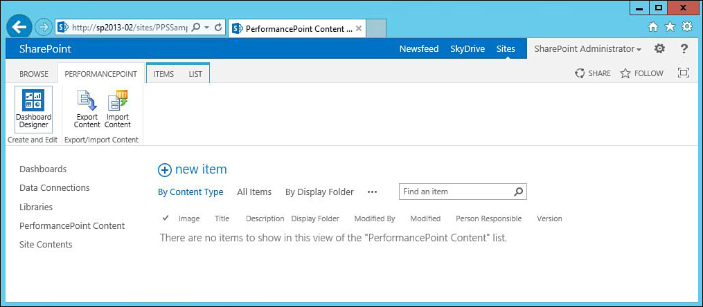
2. Click the PerformancePoint Content link on the left sidebar.
3. From this page, click the PerformancePoint ribbon, shown in Figure 30.4, and then click the Dashboard Designer icon. When prompted, click the button to run the executable. The executable downloads and runs.
After running Dashboard Designer for the first time, a menu option for PerformancePoint Dashboard Designer is added to the Programs menu on the local desktop, in a Programs group called SharePoint. So, all future designing sessions can be launched from the desktop. However, note that no application is actually stored on the desktop, as the shortcut that is added to the Programs menu actually points to the executable that lives on the SharePoint 2013 server.
It is helpful to understand the four main components of Dashboard Designer, which are the Office button, the Office ribbon, the workspace browser, and the working area as shown in Figure 30.5:
![]() Office button: Just like the other products in the Office suites, Dashboard Designer contains the Office button in the upper left. This button contains the usual menu options for New, Open, Save, and Close. There is also a button at the bottom to set specific Designer options.
Office button: Just like the other products in the Office suites, Dashboard Designer contains the Office button in the upper left. This button contains the usual menu options for New, Open, Save, and Close. There is also a button at the bottom to set specific Designer options.
![]() Dashboard Designer ribbon: Also like all other Office products, Dashboard Designer contains the ribbon interface across the top, as shown in Figure 30.5. Ribbon options include Home, Edit, and Create.
Dashboard Designer ribbon: Also like all other Office products, Dashboard Designer contains the ribbon interface across the top, as shown in Figure 30.5. Ribbon options include Home, Edit, and Create.
The Home ribbon allows for operations such as cut/copy/paste, adding items and lists from the SharePoint server to the workspace, and a Delete button to remove items from the server and workspace. There are also a few buttons for comparing server and workspace versions of components. The Home ribbon also contains an Import button that allows for pulling items from one workspace into a new SharePoint site.
The Edit ribbon provides the ability to apply bulk changes to several items simultaneously.
The Create ribbon contains icons to instantiate each of the different PPS components that make up a PerformancePoint dashboard. Each of these components is discussed in more detail later.

![]() Workspace browser: The workspace browser, displayed along the left sidebar of Dashboard Designer, shows all the components in use in the current workspace. The workspace browser is divided into two groupings. In the Data Connections grouping are the different sources of data that determine how the visuals are displayed. PerformancePoint Content, the second grouping, lists the various visual elements that are being used by the workspace.
Workspace browser: The workspace browser, displayed along the left sidebar of Dashboard Designer, shows all the components in use in the current workspace. The workspace browser is divided into two groupings. In the Data Connections grouping are the different sources of data that determine how the visuals are displayed. PerformancePoint Content, the second grouping, lists the various visual elements that are being used by the workspace.
![]() Working area: The last section of Dashboard Designer is the working area, which consumes the majority of the Dashboard Designer window. The working area displays two different views: SharePoint and Workspace. As you create new components, copies are stored on both the local computer and the SharePoint Server.
Working area: The last section of Dashboard Designer is the working area, which consumes the majority of the Dashboard Designer window. The working area displays two different views: SharePoint and Workspace. As you create new components, copies are stored on both the local computer and the SharePoint Server.
The local, or workspace, versions are bundled together and saved to a local file with a .ddwx extension. The server components are stored in a SharePoint site in a list called PerformancePoint Content.
As you browse through Dashboard Designer, notice a pair of tabs in the PerformancePoint Content section labeled SharePoint and Workspace, as shown in Figure 30.6. The SharePoint tab lists all the content currently stored in the linked SharePoint site. The Workspace tab shows the items that are utilized in the current workspace.

The reason for having both a local and a server copy of the various PPS components is that multiple individuals or departments may use some common KPIs but would be interested in seeing the data grouped together in many different ways. This fits into the notion of PerformancePoint Server providing a framework where individuals and teams can easily build the reports that are of interest to them.
Consider, for example, shoe sales based on both brand and region, where there are four different geographic regions and six unique brands. Factoring in both brand and region, there are 24 unique combinations of measurements. A brand manager may be interested in seeing just the four KPIs derived from his brand. The manager of the East region, however, may be interested in all six brands, but only how they sold within the East region. While the same figures are being measured, they each have their own set of measurements that they want to monitor. Having the components stored on the server enables reuse of commonly used items, while having the workspace copies for individuals to consume prevents the clutter of unwanted components.
In addition, storing PerformancePoint content in a central SharePoint list allows for many of the same benefits offered by other SharePoint lists. Approval routing, categorization based on metadata, and the application of security to various components are all standard functionality provided to PerformancePoint content.
If there is a server component, such as a KPI, that you want to include in your workspace, simply locate it under the Server tab and double-click it. Switch back to the Workspace tab, and you will notice that it has been added to the workspace components. This saves the designer the time of having to otherwise re-create an existing component.
Creating Dashboards in Dashboard Designer
When you have loaded Dashboard Designer, as described in the previous section, you are ready to start creating dashboards in your local workspace.
To begin adding components to be stored on the SharePoint server, a connection to a specific SharePoint site needs to be established. To do so, follow these steps:
1. Click the Office button, and then click the Designer Options button.
2. In the Options dialog box, click the tab for Server.
3. The Server settings tab prompts for a URL, as shown in Figure 30.7. Enter the URL of the SharePoint site where you intend to store your dashboard components.

The SharePoint site to which you connect does not necessarily have to be based on the BI Center site template. As long as the site to which you connect has the feature titled PerformancePoint Services Site Features activated, you can use this site in the SharePoint URL box of Dashboard Designer.
In the coming sections, you learn about the different components available to create dashboards.
Data Connections Defined
The first thing to design and plan out when building dashboards in PerformancePoint is which data connections to use. The data connections are links to any externally generated and maintained set of data on which the dashboard components will be based. Data can come from any of the following types of sources:
![]() SQL Server Analysis Services
SQL Server Analysis Services
![]() Excel components from either Excel Services or Excel Workbooks
Excel components from either Excel Services or Excel Workbooks
![]() SharePoint lists
SharePoint lists
![]() SQL Server tables
SQL Server tables
Recall that BI in SharePoint is not about creating data or determining how to organize it. SharePoint’s focal point is about surfacing the data—making it available, presentable, and consumable for those who need to make key business decisions. Therefore, a key pre-requisite to doing anything with PerformancePoint Services is to have the right data repositories already in place.
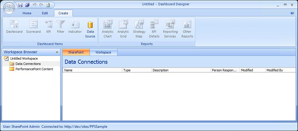
In Dashboard Designer, you can create all new components from either of two places. The Create ribbon contains a series of icons for the various components. In addition, from the workspace browser, you can right-click the Data Connections grouping and select the appropriate option.
Key Performance Indicators (KPIs)
A KPI is a measurement against a specific, measurable objective. It is one specific numeric measurement, comparing an actual result to a target result.
When creating a new KPI, the subsequent KPI Details screen presents two rows—an actual and a target value. Both fields can be input manually in this screen. Alternatively, the values for these items will come from one or more of the predefined external data sources.
For example, consider a multidimensional data source Annual Shoe Sales. The data source may have dimensions for product line, region, and size, as well as measures for dollar sales and unit sales. Results from this data source can be used as the actual value.
Consider also a SharePoint list that contains a set of target values for each product line in the various regions. Each KPI can be configured to point to items in the SharePoint list as their target values.
As either the target or the actual value changes in the data source, the resulting KPI is automatically updated.
Indicators
KPIs are usually presented in a graphical fashion, using visual indicators. An indicator can be any type of visual display that represents the degree to which the target measurement has been achieved or exceeded. Examples of indicators include fuel gauges, thermometers, stop lights, and many others.
Each indicator is divided into multiple levels, each of which displays differently. A stop-light indicator, for example, might have three indicators—red, yellow, and green. A green level would visually demonstrate that the target measurement has been achieved or exceeded. A yellow indicator would show that the actual result is slightly off-target. And a red indicator would mean that the actual is farther off-target.
They say a picture is worth a thousand words, and KPIs make this adage a reality. When viewing multiple KPIs on a single scorecard, a manager can very quickly scan through the KPIs to quickly identify and root out those that are off-target, and focus on those that warrant additional investigation.
When creating a new indicator, a number of different visual indicators are available, as shown in Figure 30.8.

Different indicators serve different purposes and visually convey different messages. For example:
![]() The various “trending” indicators display arrows in various colors: red, yellow, and green—and pointing in various directions. These indicators would be useful for KPIs that compare the results of a previous period to the current one.
The various “trending” indicators display arrows in various colors: red, yellow, and green—and pointing in various directions. These indicators would be useful for KPIs that compare the results of a previous period to the current one.
![]() Some indicators—Stoplights and Smiley Faces, for example—are helpful in demonstrating targets versus actuals at the end of a measurable period of time. Use these indicators to show how sales figures at the end of a year or quarter compare to their corresponding target measurements.
Some indicators—Stoplights and Smiley Faces, for example—are helpful in demonstrating targets versus actuals at the end of a measurable period of time. Use these indicators to show how sales figures at the end of a year or quarter compare to their corresponding target measurements.
![]() The set of Bar, Cylinder, Gradient, and Gauge indicators might be appropriate for showing progress during the middle of a measurable period of time. They might be appropriate in scenarios where you want to present things like amount of budget exhausted, month-to-date or year-to-date figures versus the corresponding targets for the month or year. Because the measure would continue to change over the course of the measurable period, this set of indicators would convey the amount of progress toward a specific goal. Halfway through the month or quarter, you would expect to see progress of halfway (or better) toward the goal.
The set of Bar, Cylinder, Gradient, and Gauge indicators might be appropriate for showing progress during the middle of a measurable period of time. They might be appropriate in scenarios where you want to present things like amount of budget exhausted, month-to-date or year-to-date figures versus the corresponding targets for the month or year. Because the measure would continue to change over the course of the measurable period, this set of indicators would convey the amount of progress toward a specific goal. Halfway through the month or quarter, you would expect to see progress of halfway (or better) toward the goal.
Besides the display style for indicators, there are a couple of other settings that you can apply to make the indicator set unique. KPIs can have both positive and negative measurements. With targets such as sales volumes, the more the better. Thus, with a positive KPI, exceeding the target result is good. However, for a measurement such as number of safety incidents, the fewer the better. Thus, staying at or below the target level is preferable. When defining indicators, designers can specify whether more is better or less is better.
In addition, for each level within a set of indicators, you can specify the percentage toward the actual goal that applies to each level. For some goals, 75% of the total may be considered “slightly off target,” whereas for other measurements, 75% would be considered “way off target.”
Scorecards
KPIs are the individual measurable goals. A number of KPIs are grouped together to form a scorecard. For example, on a Capacity Utilization scorecard, each factory could represent a unique KPI. All the company’s factories could be grouped together to display a single scorecard. In this example, a similar measurement would show in each KPI on the scorecard, where only the dimension changes in each row. Another type of scorecard might focus on different measurements for the same dimension. For example, a scorecard for a single factory could have KPIs for number of safety incidents in the current and recent quarters, total amount of down time per time period, and units produced per time period.
A scorecard is an example of a report about the achievement of measurable goals. The scorecard will show a series of measurements, along with the target amount, and the degree to which the target has been reached. The scorecard can provide either a visual or numeric indication to show to what degree the goal has been attained.
In the PerformancePoint world, a scorecard represents the same thing: a set of measurable goals and their corresponding levels to which those goals have been attained. Ultimately, a scorecard is displayed as a web part on a SharePoint page.
Each scorecard will contain a set of KPIs. Scorecard examples include the following:
![]() Sales volumes, with specific KPIs for each region
Sales volumes, with specific KPIs for each region
![]() Capacity utilization, with factories making up the individual KPIs
Capacity utilization, with factories making up the individual KPIs
![]() Number of safety incidents, with per-plant line items
Number of safety incidents, with per-plant line items
![]() Customer service complaints, based on product line
Customer service complaints, based on product line
Alternatively, a plant manager’s scorecard might show a number of disparate measurements that demonstrate the overall performance of his plant. The following KPIs, when grouped together on a scorecard, might be useful in determining the plant manager’s compensation:
![]() Number of safety incidents
Number of safety incidents
![]() Capacity utilization
Capacity utilization
![]() Units manufactured
Units manufactured
When provisioning a new scorecard, you have three categories of scorecards from which to choose, as follows:
![]() Microsoft: This category allows for a scorecard based on Analysis Services, which requires that you have a corresponding data source based on SQL Server Analysis Services.
Microsoft: This category allows for a scorecard based on Analysis Services, which requires that you have a corresponding data source based on SQL Server Analysis Services.
![]() Standard: This category allows you to create either a blank or fixed value scorecard. These two options allow you to add KPIs created and manually added to your workspace.
Standard: This category allows you to create either a blank or fixed value scorecard. These two options allow you to add KPIs created and manually added to your workspace.
![]() Tabular: This category contains several options for creating KPIs based on various table-centric data sources. Like the Analysis Services scorecard, selection of any of the scorecards in this category requires you to have a data source based on the corresponding KPI type.
Tabular: This category contains several options for creating KPIs based on various table-centric data sources. Like the Analysis Services scorecard, selection of any of the scorecards in this category requires you to have a data source based on the corresponding KPI type.
Some of the scorecard types allow you to define additional KPI measurements as part of the creation process. In addition, when the scorecard is created, you can drag additional KPIs onto the scorecard.
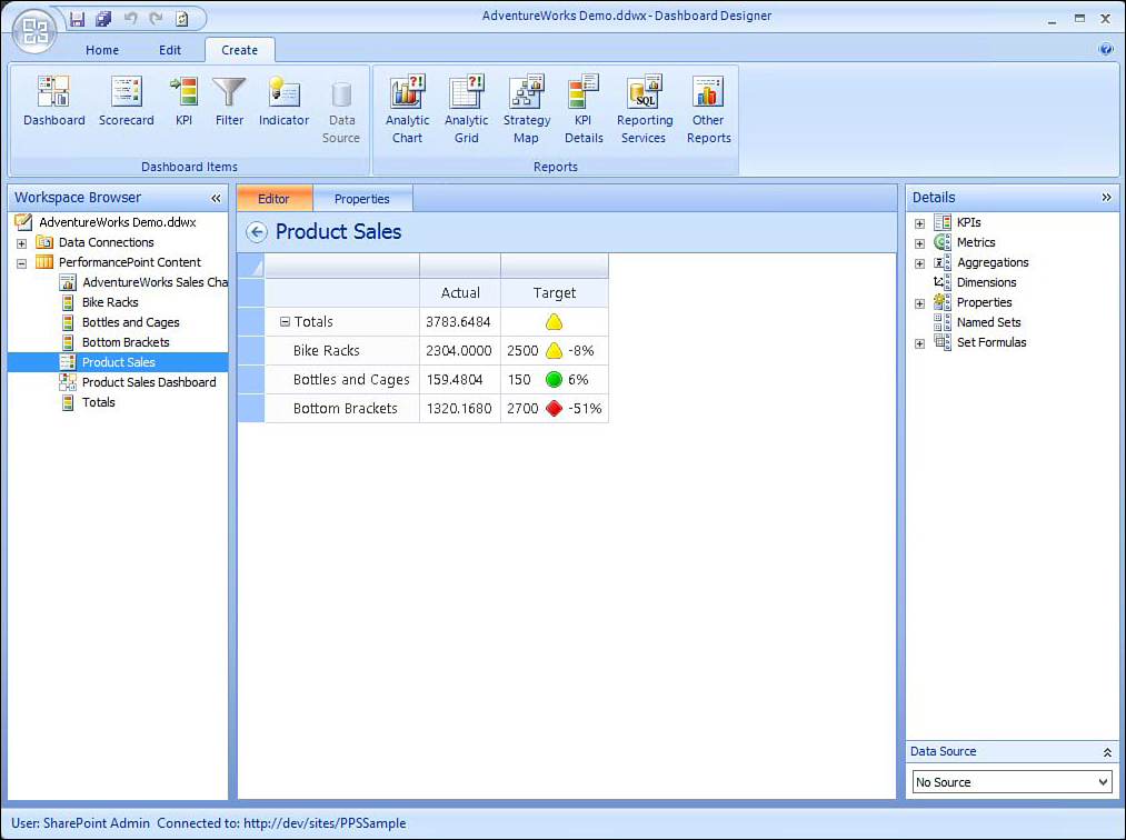
Figure 30.9 shows a scorecard for sales per product line. Notice that some KPIs are on-target, while one is slightly off-target. Notice also that KPIs on a scorecard can be rolled up into a parent KPI (All Products), to show how the grouping as a whole is performing.
Reports
Like scorecards, reports in PerformancePoint are ultimately displayed as a web part on a SharePoint page. Reports can be of several different varieties, each of which requires you to have a corresponding data source of the same type:
![]() Analytic Chart: Interactive charts, based on online analytical processing (OLAP) cube data, such as SQL Server Analysis Services, can be in bar, line, and pie chart format
Analytic Chart: Interactive charts, based on online analytical processing (OLAP) cube data, such as SQL Server Analysis Services, can be in bar, line, and pie chart format
![]() Analytic Grid: Also based on data from OLAP cubes, analytic grids display rows and columns of processed data
Analytic Grid: Also based on data from OLAP cubes, analytic grids display rows and columns of processed data
![]() Excel Services: Allows for views of any components from Excel Services
Excel Services: Allows for views of any components from Excel Services
![]() KPI Details: View detailed information about any KPI line item
KPI Details: View detailed information about any KPI line item
![]() Reporting Services: Display an existing SQL Services Reporting Services report
Reporting Services: Display an existing SQL Services Reporting Services report
![]() Strategy Map: Visually connect shapes from a Microsoft Visio diagram to a scorecard
Strategy Map: Visually connect shapes from a Microsoft Visio diagram to a scorecard
![]() Web Page: Reference an existing web page
Web Page: Reference an existing web page
One popular report type is the Strategy Map, which allows dashboard designers to create heat maps, such as a map of the United States, where individual states change colors based on performance.
Of all the report types, the Analytic Chart is one of the most interesting and most often used by organizations. When connecting to a well-defined Analysis Services OLAP data source, you can drag any combination of relevant measures and dimensions to the series and Axis sections to quickly spin up various charts.
Even more interesting, however, is the ability to click any data point within the chart and drill down to see how the chart changes based on the selected factor. Imagine the power of an executive viewing corporate sales data to be able to re-create the chart, on-the-fly, based on any of the following:
![]() Salesperson
Salesperson
![]() Region
Region
![]() Product line
Product line
![]() Year, month, quarter, week, or day
Year, month, quarter, week, or day
![]() Customer
Customer
Figure 30.10 shows a simple report showing the progression of sales on a quarterly basis. Notice that the user, when viewing the chart, has several options. He can drill down to view the chart based on one of the other dimensions. In addition, he can sort, filter, pivot, and perform a number of other additional actions.

Dashboards
A dashboard is loosely defined as having a lot of visual information, displayed in a number of different ways, on a screen for a user to quickly assess the current state of affairs. A car’s dashboard, for example, provides the driver with important information about the current state of the car—how fast the car is going, the current engine temperature, the amount of fuel in the tank, and many other things.
Similarly, a web dashboard provides a manager with several key pieces of information about the current state of affairs. The previous sections discussed how reports and scorecards are ultimately displayed as web parts on SharePoint pages. In the SharePoint and PerformancePoint world, a dashboard can also be thought of as a web part page. In fact, when creating a new dashboard in PerformancePoint Server, a new page is added to the SharePoint Pages library, which, when published, can be viewed by authorized users.
Like all the other PerformancePoint components discussed previously, a new dashboard page can be created from one of two places: the Create ribbon or the workspace browser. If you’re accustomed to creating new pages in SharePoint from the various layout pages available, the first screen of the New Dashboard interface should be pretty familiar. On this screen, you are presented with a set of dashboard page templates, each of which provides a unique combination of web part zones. Select the zone that is right for you for the data you want to display.
Note
Users are not ultimately tied to the page layout that was initially selected. If the user right-clicks any existing dashboard page zone, she can add new zones, split a zone into two, delete the zone, or change the existing zone’s settings. Using these options, she can essentially change the whole layout of the page she started with.
After selecting a template, a Details pane is displayed on the right side of Dashboard Designer (as shown in Figure 30.10). As you create scorecards and reports, or grab existing ones from your SharePoint site, those elements become available for you to drag—essentially as web parts—onto your dashboard page. Simply drag the appropriate ones to the various zones available.
Building a Dashboard
Now that each of the components of Dashboard Designer has been presented, we’re ready to walk through setting up a dashboard. The first step in this exercise is to download and install the AdventureWorks sample databases, as follows:
Note
You need a server running SQL Server 2012 and SQL Server Analysis Services to proceed with this exercise.
1. To get started, you need a couple of data sources to work with. Download and install the AdventureWorks sample databases from CodePlex.
2. Click Download the SQL Server 2012 DW and SQL Server 2012 LT product sample databases from http://msftdbprodsamples.codeplex.com/releases/view/55330. Save the file to a machine running SQL Server 2012.
3. When the files have finished downloading, extract the files.
4. Attach the databases to SQL Server 2012 Database Engine.
Preparing the Data Sources
Next, compile and build the AdventureWorks data warehouse by completing the following steps:
1. On the SQL Server 2012 machine, download AdventureWorks Multidimensional Models for SQL Server 2012 from http://msftdbprodsamples.codeplex.com/downloads/get/258486.
2. Unzip the file and double-click AdventureWorksDW2012Multidimensional-EE.sln from the Enterprise folder. Open the solution file with Visual Studio 2012.
3. From the Solutions Explorer, right-click the solution name and select Deploy.
Next, create a new view in the AdventureWorksLT database, as follows:
1. Launch SQL Server Management Studio from the Programs area.
2. Connect to the SQL Server instance where you installed the AdventureWorksLT2012 database.
3. In the Object Explorer, expand the databases node, and then the AdventureWorksLT2012 node.
4. Right-click the Views node and select New View.
5. Close the Add Table dialog box, and enter the following directly in the text box, as shown in Figure 30.11:
SELECT PC.Name AS ProductCategory, SOD.UnitPrice, SOD.OrderQty, SOD.UnitPrice
* SOD.OrderQty as TotalSales, SOH.OrderDate
FROM SalesLT.SalesOrderDetail AS SOD
INNER JOIN SalesLT.Product AS P ON SOD.ProductID = P.ProductID
INNER JOIN SalesLT.ProductCategory AS PC ON PC.ProductCategoryID =
P.ProductCategoryID
Inner JOIN SalesLT.SalesOrderHeader SOH on SOH.SalesOrderID = SOD.SalesOrderID

6. Save the view with the name vw_ProductCategorySales.
Creating Data Connections
At this point, a lot of the initial plumbing is in place, and you are ready to start building a dashboard.
Start by creating at least two data sources to be used by the PerformancePoint Content. To create these, follow these steps:
1. In the Workspace Browser of Dashboard Designer, click Data Connections.
2. On the Create ribbon, click Data Source, as shown in Figure 30.12. Note that when Data Connections is selected in the workspace browser on the left pane, Data Source is enabled and all other items disabled. When PerformancePoint Content is selected, Data Source is disabled, and all other items enabled.
3. In the Select a Data Source Template dialog box, select SQL Server table and click OK.
4. In the Editor tab of the data source settings, configure the data source. In the Server text box, enter the name of your SQL Server instance where you installed the AdventureWorksLT database, as shown in Figure 30.13. For example, enter sql2012-02.

5. After you enter the server name, the Databases list box is enabled. Click the down arrow for the Databases list box. A list of databases on the server loads. Select AdventureWorksLT2012.
6. Click the down arrow for the Tables list box. Note that both SQL Server tables and views appear in this list, sorted alphabetically. Select dbo.vw_ProductCategorySales.
7. Click the Test Data Source Connection button.
8. Switch to the Properties tab in Dashboard Designer, and change the Name of the Data Source to AdventureWorks Product Sales. Click the Save icon (located in the top-left corner of Dashboard Designer, next to the Office button) to add the new data source to your SharePoint site.
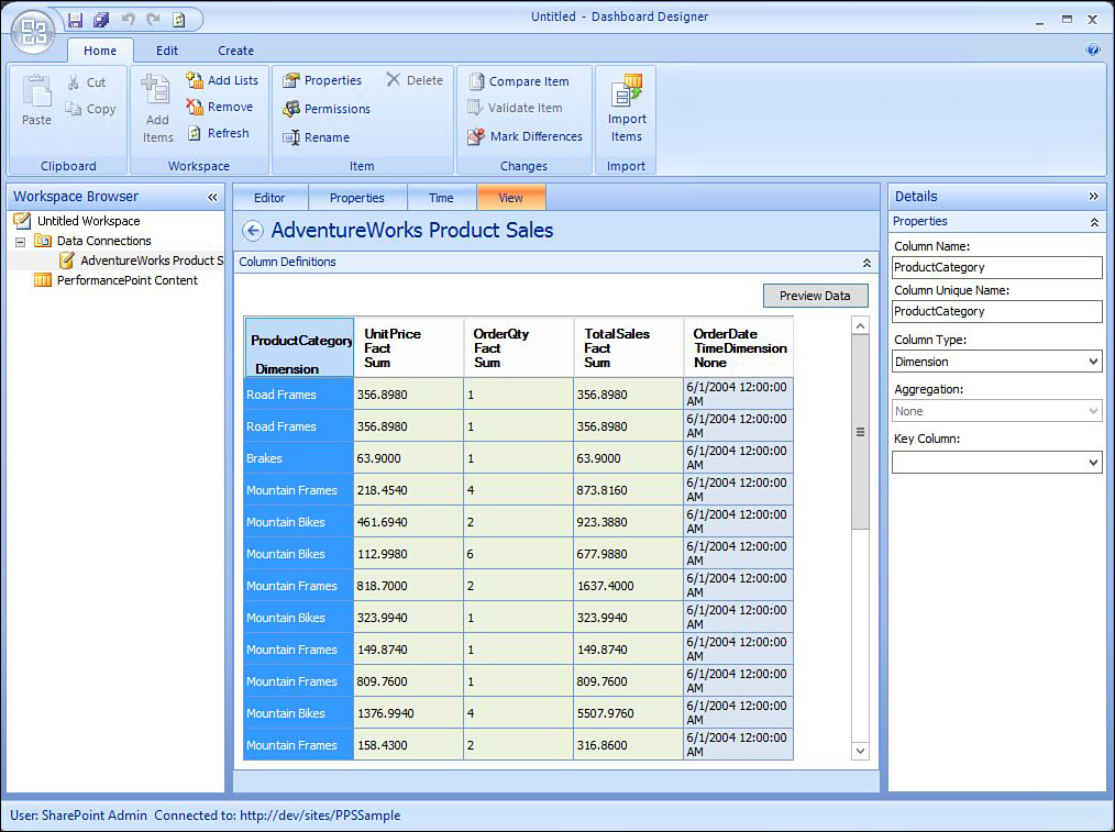
9. Preview the data by selecting the View tab of the data source properties, as shown in Figure 30.14. Click the Preview Data button, and the data loads in five columns: ProductCategory, Unit Price, OrderQty, TotalSales, and OrderDate.
Next, you need to create a second data source, this time connecting to an SQL Server Analysis Services data cube. To do so, follow these steps:
1. On the Create ribbon, click the Data Source icon.
2. In the Select a Data Source Template dialog box, this time select Analysis Services.
3. In the connection settings, in the Server text box, enter the name of the SQL Server Analysis Services server where you installed the AdventureWorks DW cube, as shown in Figure 30.15. In this example, the database server is SQL2012-02.

4. In the Database list box, select AdventureWorksDW2012Multidimensional-EE.
5. In the Cube list box, select Sales Summary.
6. Click the Properties tab, and change the Name to Adventure Works Data Cube.
Creating KPIs
Now that the data connections are in place, the next step is to begin creating a few KPIs. To do so, follow these steps:
1. In the Workspace Browser, click PerformancePoint Content.
2. On the Create ribbon, click KPI.
3. In the Select a KPI Template dialog box, select Blank KPI and click OK.
4. In the Workspace Browser, rename the KPI to Bike Racks.
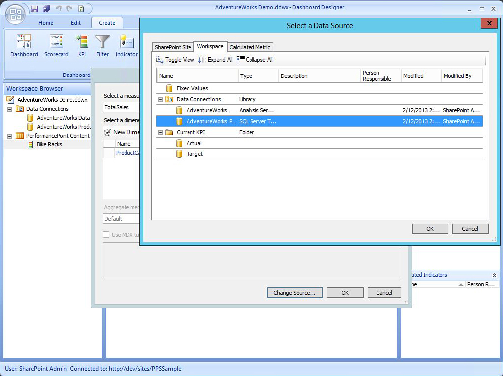
5. Next, configure the actual value for the KPI to use the database. In the Actual row, click 1 (Fixed Values) under the Data Mappings column. In the Dimensional Data Source Mappings dialog box, click the Change Source button. In the Select a Data Source dialog box shown in Figure 30.16, click AdventureWorks Product Sales, and then click OK.
6. In the Dimensional Data Source Mapping dialog box, click the arrow for the Select a Measure list box and select TotalSales.
7. In the Select a Dimension section, click the New Dimension Filter icon.
8. In the Select a Dimension dialog box, select ProductCategory and click OK.
9. In the Default column, click the Default link, and select Bike Racks in the Select Members dialog box. Click OK.
10. Next, configure the target value against which the KPI will be measured. In the Target row for the KPI, click 1 (Fixed Values), enter 2500 for the Value, and click OK. When complete, your KPI settings should look like Figure 30.17.

11. When selecting the Target row of the KPI settings, in the bottom half of the KPI settings, you can optionally select a different indicator by clicking on the Set Scoring Pattern and Indicator button. Step through the wizard, but do not make any changes.
12. Repeat steps 1 through 10 for a second KPI. For the KPI name, use Bottles and Cages. For the KPI Actual value, again use Bottles and Cages as the selected member in the dimension filter. For the target value, use 150.
13. Repeat steps 1 through 10 for a third KPI. For the KPI name and for the dimension filter select member, use Bottom Brackets. For the target value, use 2700.
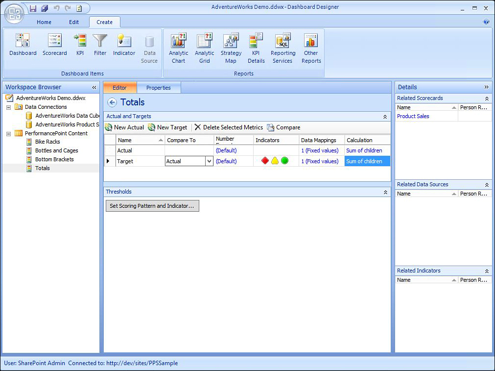
Lastly, you need to create a rollup KPI, which will use the aggregate of the three previous KPIs by following these steps:
1. Create a new KPI, but this time in the Select a KPI Template dialog box, select Objective.
2. Rename the KPI to Totals.
3. In the Calculation column of the KPI settings for Actual and Target rows, click No Value.
4. Select the Sum of Children option. Apply this setting for both the Target and the Actual values. Figure 30.18 shows the Totals KPI.
Creating a Scorecard
Now that the KPIs have all been created, you can combine them into a single scorecard. To do so, follow these steps:
1. On the Create ribbon of Dashboard Designer, click Scorecard.
2. In the Select a Scorecard Template dialog box, select the Standard category, and select Blank Scorecard.
3. Click the Properties tab, and change the name for the scorecard to Product Sales.
4. In the Details pane on the right side of Dashboard Designer, expand KPI, and expand PerformancePoint Content.
5. Drag the Totals KPI to the left working pane over the Drop Items Here label.
6. Drag the Bike Racks KPI to the working pane. While holding the left mouse key, drag the Bike Racks KPI to the right edge of the label for the Totals label. You should see the Total KPI highlighted, with gray borders on the left, top, and bottom edges. The right edge of the Totals KPI should be blue. In addition, a blue arrow should be pointing at the right edge of the Totals KPI. Release the mouse key, and the Bike Racks KPI should display beneath the Totals KPI, slightly indented. This is shown in Figure 30.19.

7. Repeat step 6 for the Bottles and Cages KPI, and again for the Bottom Brackets KPI. Bike Racks, Bottles and Cages, and Bottom Brackets should all display on the scorecard beneath the Totals KPI, and all three should be indented.
Creating a Report
Reports are the life blood of many companies, and Dashboard Designer provides a variety of chart options to facilitate the process. The following steps walk through the process of creating an analytic chart:
1. On the Create ribbon, select Analytic Chart.
2. In the Select a Data Source dialog box, select AdventureWorks Data Cube.
3. In the workspace browser, the new report is selected, with the name highlighted. Change the name to Adventure Works Sales Chart. Alternatively, you can change the name by clicking the Properties tab in the working area.
4. The report Details pane loads on the right side of Dashboard Designer. Expand the Measure grouping, and drag Sales Amount to the Series pane.
5. Expand the Dimensions grouping, the Date subgrouping, and the Calendar subgrouping. Drag the Calendar Quarter of Year dimension to the Bottom Axis section.
6. Expand the Named Sets grouping and the Sets subgrouping. Drag the Core Product Group Named Set to the Bottom Axis section. The report should look like Figure 30.20.

7. Click the Save All icon (or press Ctrl+Shift+S) to save all items.
Creating a Dashboard
The previous sections walked through the process of creating KPIs, scorecards, and reports. As noted earlier in the chapter, scorecards and reports are examples of web parts that appear on dashboard web pages. The final steps of the process demonstrate how to make these contents viewable on dashboard pages in SharePoint:
1. On the Create ribbon, select Dashboard. You can select any of the dashboard page templates.
2. In the Workspace Browser, rename the dashboard to Product Sales Dashboard.
3. In the Pages section of the working area, click Page 1, and rename it to Product Sales.
4. In the Details pane, expand Scorecards, and expand PerformancePoint Content. Drag the Product Sales scorecard into one of the dashboard zones.
5. In the Details pane, expand Reports, and expand PerformancePoint Content. Drag AdventureWorks Sales Chart onto the other zone.
6. In the Workspace Browser, right-click Product Sales Dashboard and select Deploy to SharePoint.
7. Select one of the master page options and click OK.
8. After the deployment is complete, the dashboard page launches in Internet Explorer, as shown in Figure 30.21.

Summary
The age of waiting for periodic reports to be generated by IT is over. The day has arrived where reports no longer need to be predefined and preformatted before delivering them to the person who needs to see them. With PerformancePoint Services, included in the Enterprise version of SharePoint Server 2010, and in particular with the power of the analytical reports, the right BI is truly placed in the hands of the right people at the right time.
This chapter walked through the process of configuring a PerformancePoint service application, working with Dashboard Designer and creating a dashboard, using data connections, KPIs, indicators, scorecards, reports, and dashboards. It also walked through the process of creating a dashboard so that the PerformancePoint tools are no longer mysterious and the process of creating a dashboard is less intimidating.
Best Practices
The following are best practices from this chapter:
![]() Review the new features in PerformancePoint 2013 to see how they can enhance preexisting dashboards and the user experience. Of particular interest is the ability to move any or all of your PerformancePoint content from one site or one server to another.
Review the new features in PerformancePoint 2013 to see how they can enhance preexisting dashboards and the user experience. Of particular interest is the ability to move any or all of your PerformancePoint content from one site or one server to another.
![]() When connecting to a data source, use the Unattended Service Account option for authentication. If using the Per-User Identity option, you might find that the dashboard components that utilize the data source load when you log in but fail to connect for other users visiting your page.
When connecting to a data source, use the Unattended Service Account option for authentication. If using the Per-User Identity option, you might find that the dashboard components that utilize the data source load when you log in but fail to connect for other users visiting your page.
![]() With PerformancePoint Services, the quality of the dashboard is all about the data. To that end, some additional planning needs to go into the types of data sources you want to leverage. Well-designed transactional databases and data cubes are key to a successful BI implementation.
With PerformancePoint Services, the quality of the dashboard is all about the data. To that end, some additional planning needs to go into the types of data sources you want to leverage. Well-designed transactional databases and data cubes are key to a successful BI implementation.
![]() Give some thought to which indicator sets you want to use for each KPI. Different image sets convey different messages. Comparisons of metrics from one time period to those from another warrant use of one of the trending indicators. Some indicators are appropriate to show at the end of a measurable time period, whereas others make more sense in the middle of a measurable time period.
Give some thought to which indicator sets you want to use for each KPI. Different image sets convey different messages. Comparisons of metrics from one time period to those from another warrant use of one of the trending indicators. Some indicators are appropriate to show at the end of a measurable time period, whereas others make more sense in the middle of a measurable time period.
![]() If starting a new Dashboard Designer workspace, check the SharePoint tab of Dashboard Designer to see which dashboard components have already been defined. If one exists that you want to utilize, simply double-click the component to include it in your workspace.
If starting a new Dashboard Designer workspace, check the SharePoint tab of Dashboard Designer to see which dashboard components have already been defined. If one exists that you want to utilize, simply double-click the component to include it in your workspace.
![]() It is not necessary to create a site using the BI Center site template to use PerformancePoint Services. Just activating the feature PerformancePoint Site Features will suffice.
It is not necessary to create a site using the BI Center site template to use PerformancePoint Services. Just activating the feature PerformancePoint Site Features will suffice.