Formatting a Chart
You can set overall chart options or format specific objects in a chart. Microsoft Graph offers detailed precision in chart creation and the opportunity to make numerous formatting changes. Before making major changes to the chart default, be sure to carefully consider your reason for customizing. Different isn't always better, unless it adds value or clarity to your chart.
Note
If the chart isn't active, you won't see the chart menu and toolbar options. Double-click the chart to select it and display the appropriate options.
Setting Overall Chart Options
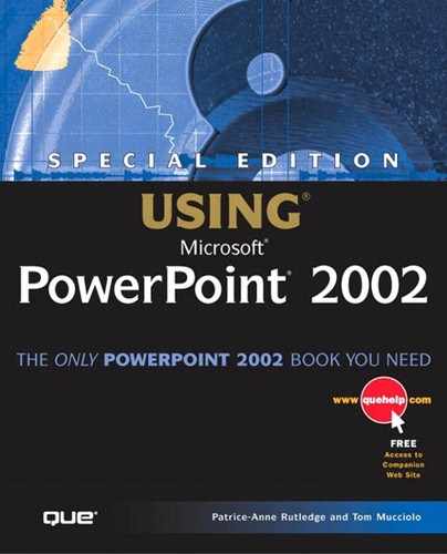
You can set overall chart options for the chart type you selected in the Chart Options dialog box. In Microsoft Graph, choose Chart, Chart Options to display this dialog box, shown in Figure 11.17.
We'll use the clustered 3D columnar chart type as an example as we explore the tabs of this dialog box. Remember, however, that if you select a different chart type (such as a pie), the options and tabs may differ slightly.
Make any necessary changes within the tabs of this dialog box, and then click OK to apply them to your presentation.
Figure 11.17. Set a variety of chart-formatting options in this dialog box.

Entering Chart Titles
On the Titles tab, you can enter titles for the overall chart and the available axes such as category, value, or series. The sample to the right previews these changes in your chart.
Caution
The chart title isn't the same as a slide title. If you create a chart title, your chart will have two separate titles—one for the slide and one for the chart.
Formatting Axes
On the Axes tab, shown in Figure 11.18, you can choose whether or not to display category, series, and value axes. If a particular axis isn't available, you won't be able to choose it. In this example, the category axis displays the data you entered in the first row of cells in your datasheet. The value axis displays a numerical series based on the values you entered in the datasheet.
Figure 11.18. Specify whether or not to display a particular axis.
Formatting Gridlines
In the Gridlines tab (see Figure 11.19), you can choose whether or not to display major and minor gridlines for all available axes.
Figure 11.19. Major gridlines, selected by default, can make values easier to read.

Note
Pie and doughnut charts don't have gridlines.
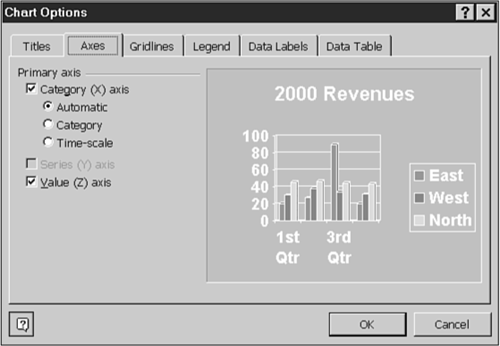
Displaying a Legend
On the Legend tab, shown in Figure 11.20, you can choose to display a legend by selecting the Show Legend check box.
Placement options include placing your legend at the bottom, corner, top, right, or left of your chart.
Figure 11.20. A legend makes a chart easier to understand.
Note
After you place a legend on your chart, you can select it and drag it with the mouse to a new location.
Displaying Data Labels
A data label makes data in your chart easier to identify. You can display a value, percent, text label, text label and percent, a bubble size, or no label at all. Figure 11.21 shows the Data Labels tab.
Figure 11.21. Data labels are optional means of identifying chart information.

Note
Depending on the chart type you select, not all data label options are available.
If you do choose to display a data label, the Legend Key check box appears. Check this box if you want to display a color-coded box next to the data label to associate it with the legend.
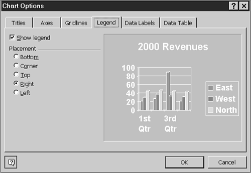
Displaying a Data Table
If you want to include a table with all your datasheet data in your chart, you can choose the Show Data Table check box in the Data Table tab (see Figure 11.22).
Figure 11.22. If your chart contains complex numerical data, a data table can make this information more meaningful.
If you do select this option, you also have the choice to Show Legend Keys if you want to display a color-coded box in the table columns to associate them with the legend.
Formatting Chart Objects
You can format individual chart objects, such as the chart area, axes, series, legend, and grid lines. To format a specific chart object, select it from the Chart Objects drop-down list on the Standard toolbar, and then click the Format button to the right of the drop-down list. A Format dialog box customized for the type of object you select appears. For example, you might see the Format Axis dialog box or the Format Data Series dialog box, depending on the selected chart object. If the Format button isn't available, no formatting options exist for the selected chart object.
You can modify a multitude of formatting options from the Format dialog box, including pattern, font, placement, scale, alignment, and shape. Remember, though, that numerous changes don't always enhance a chart and you might want to make only a small number of formatting enhancements on a regular basis.
→ To learn more about the available options in this dialog box, see “Using the Format Dialog Box” in Chapter 14.
Some things you may want to consider changing include the following:
Apply a different color to the data series fill areas. To do this, select the data series you want to modify from the Chart Objects drop-down list and click the Format button. Figure 11.23 illustrates the Format Data Series dialog box.
Figure 11.23. Change fill color in this dialog box.

Choose a new color from the Area group box and click OK. PowerPoint updates the color in the presentation.
Increase or decrease font size to make text more readable or to make it fit a specific area. For example, to change the font size of the legend, select the legend in the Chart Objects drop-down list and click the Format Legend button to display the dialog box of the same name (see Figure 11.24).
Figure 11.24. Adjusting font size is a common formatting change.
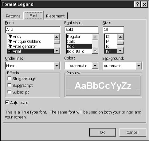
From the Font tab, you can increase or decrease the font size as needed.
Adjust the value axis scale. To do this, select the value axis from the Chart Objects drop-down list and click the Format Axis button. Figure 11.25 shows the Scale tab in the Format Axis dialog box.
Figure 11.25. You can adjust the axes and gridlines in the Format Axis dialog box.

You can change the minimum and maximum values or the major and minor gridline units on the Scale tab. For example, you could change the minimum value from 0 to 100 if all the values in your chart are more than 100 and you want to see the variations in the existing values more clearly. PowerPoint updates the presentation, making the differences between the three data series much more apparent.
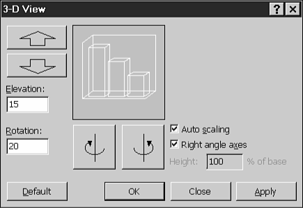
Formatting 3D View
If you choose a 3D chart type, you can format 3D viewing options such as elevation, rotation, height, and perspective. Table 11.3 explains each of these options.
To format these options, follow these steps:
In Microsoft Graph, choose Chart, 3-D View to open the 3-D View dialog box, as shown in Figure 11.26.
Figure 11.26. Modify the way your chart displays 3D objects in this dialog box.
Caution
Again, the default settings for 3D options are designed to work with this chart. Carefully consider any changes you make. Major modifications to a chart's elevation, rotation, height, or perspective can make it unreadable.
→ To learn more about 3D, see “Adding Shadow and 3D Effects” in Chapter 14.
Enter a new elevation in the Elevation field or click the up and down arrow buttons above this field to adjust elevation. The box to the right displays an example of what the selected change looks like.
Enter a new rotation or click the left and right arrow buttons to the right of the field to change the rotation. The sample box previews this change.
Click the Auto Scaling check box to automatically scale the chart to fit the slide.
If you remove the check mark from the Auto Scaling check box, the Height field appears. In it, you can set height as a specific percentage of the base.
If you remove the check mark from the Right Angle Axes check box, the Perspective field appears. Set the perspective manually or use the buttons to modify perspective.
Click the Apply button to view the effects of potential changes to chart.
Click the Default button to set the changes you've made as your new default.
Click OK to apply the changes and return to your presentation.
Tip from
If you make a mistake, click Close to exit the dialog box without saving changes.