
10. Testing Differences Between Means: The Analysis of Variance
Chapter 8, “Testing Differences Between Means: The Basics,” and Chapter 9, “Testing Differences Between Means: Further Issues,” went into some detail about how to use z-tests and t-tests to determine the probability that two group means come from the same population. Chapter 10 tries to convince you to use a different method when you’re interested in three means or more.
The need to test whether three or more means come from different populations comes up frequently. There are more than two major political organizations to pay attention to. Medical research is not limited to a comparison between a treatment and a no-treatment control group, but often compares two or more treatment arms to a control arm. There are more than two brands of car that might earn different ratings for safety, mileage, and owner satisfaction. Any one of several different strains of wheat might produce the best crop under given conditions.
Why Not t-Tests?
If you wanted to use statistical inference to test whether or not more than two sample means are likely to have different population values, it’s natural to think of repeated t-tests. You could use one t-test to compare GM with Ford, another to compare GM with Toyota, and yet another to compare Ford with Toyota.
The problem is that if you do so, you’re taking unfair advantage of the probabilities. The t-test was designed to compare two group means, not three, not four or more. If you run multiple t-tests on three or more means, you inflate the apparent alpha rate. That is, you might set .05 (beforehand) as the acceptable risk of rejecting a true null hypothesis, and then do so because two sample means were improbably far apart when they really come from the same population. You might think your risk of being misled by sampling error is only .05, but it’s higher than that if you use several t-tests to compare more than two means.
As it happens, multiple t-tests can inflate your nominal alpha level from, say, .05 to .40. A fuller explanation will have to wait until a few relevant concepts have been discussed, but Figure 10.1 gives you the basic idea.
Figure 10.1. With every additional t-test, the cumulative probability of rejecting a true null hypothesis increases.

Suppose you have five means to compare. There are ten ways to make pairwise comparisons in a set of five means. (If J is the number of means, the general formula is J (J−1)/2.) If you set alpha at .05, then that nominal alpha rate is the actual alpha rate for one t-test.
But if you run another t-test, you have 95% of the original probability space remaining (5% is taken up by the alpha you used for the first t-test). Setting the nominal alpha to .05 for the second t-test means that the probability rejecting a true null hypothesis in either of the t-tests is .05 + (.05 × .95), or .098 (cell C3 in Figure 10.1).
Here is perhaps a more intuitive way of looking at it. Suppose you have run an experiment that collects the means of five groups on some outcome measure following treatments. You see that the largest and smallest means are improbably far apart—at any rate, far apart given the null hypothesis that the treatments had no differential effects. You choose to run a t-test on the largest and smallest means and find that so large a difference would occur less than 1% of the time if the means came from the same population.
The problem is that you have cherry-picked the two groups with the largest difference in their means, without also picking groups that may contribute substantially to the variability of the outcome measure. If you think back to Chapter 9, you’ll recall that you run a t-test by dividing a mean difference by a factor that depends on the amount of variability in the groups tested. If you run an experiment that returns five means, and you compare the largest and the smallest while ignoring the others, you have stacked the deck in favor of differences in means without also allowing for possibly greater variability within groups. What you are doing is sometimes called “capitalizing on chance.”
The recommended approach when your research involves more than two groups is to use the analysis of variance, or ANOVA. This approach tests all your means simultaneously, taking into account all the Within Groups variability, and lets you know whether there is a reliable difference anywhere in the set of means—including complex comparisons such as the mean of two groups compared to the mean of two other groups.
If the data passes that initial test, you can use follow-up procedures called multiple comparisons to pinpoint the source, or sources, of the significant difference that ANOVA alerted you to.
The Logic of ANOVA
The thinking behind ANOVA begins with a way of expressing each observation in each group by means of three parts:
• The grand mean of all the observations
• The mean of each group, and how far each group mean differs from the grand mean
• Each observation in each group, and how far each observation differs from the group mean
ANOVA uses these components to develop two estimates of the population variance. One is based entirely on the variability of observations within each group. One is based entirely on the variability of group means around the grand mean. If those two estimates are very different from one another, that’s evidence that the groups came from different populations—populations that have different means.
Partitioning the Scores
Suppose you have three groups of people, and each group will take a different pill: a new cholesterol medication, an existing medication, or a placebo. Figure 10.2 shows how the grand mean, the mean of each group, and each person’s deviation from the group mean combine to express each person’s measured HDL level.
Figure 10.2. This model is the basis for many advanced statistical methods from ANOVA to logistic regression.

In practice, you seldom have reason to express each subject’s score in this way—as a combination of the grand mean, the deviation of each group mean from the grand mean, and the subject’s deviation from the group mean. But viewing the scores in this way helps lay the groundwork for the analysis.
The objective is to analyze the total variability of all the scores into two sets: variability due to individual subject scores and variability due to the differences in group means. By analyzing the variability in this way, you can come to a conclusion about the likelihood that chance caused the differences in group means. (This is the same objective that t-tests have, but ANOVA normally assesses three or more means. In fact, if there are just two groups, the F statistic you get from ANOVA is identical to the square of the ratio you get from a t-test.)
Figure 10.2 shows how the variation due to individual observations is separated from variation due to differences between group means. As you’ll see shortly, this separation puts you in a position to evaluate the distance between means in light of the distance between the individuals that make up the means.
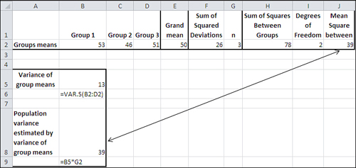
Figure 10.3 shows the two very different paths to estimating the variability in the data set. Row 2 contains the group means, and the differences between these means lead to the sum of squares between, in cell M2. Row 4 contains not group means but the sums of the squared deviations within each group, which lead to the sum of squares within, in cell M4.
Figure 10.3. This figure just shows the mechanics of the analysis. You don’t usually manage them yourself, but turn them over to, for example, the Data Analysis add-in.

Figure 10.3 shows how the overall sum of squares is allocated to either individual variation or to variation between the group means.
Sum of Squares Between Groups
In Figure 10.3, the formulas themselves appear in the range H9:M13. The results of those formulas appear in the range H2:M6.
The range H2:M2 in Figure 10.3 shows how the sum of squares between group means is calculated. Each group mean appears in H2:J2 (compare with the cells C2, C5, and C8 in Figure 10.2).
Cell K2 contains the sum of the squared deviations of each group mean from the grand mean. This figure is returned using the worksheet function DEVSQ(), as shown in cell K9. The result in K2 must be multiplied by the number of individual observations in each group. Because each group has the same number of observations, this can be done by multiplying the total in K2 by 3, each group’s sample size (typically represented by the letter n). The result, usually labeled Sum of Squares Between, appears in cell M2. Here are the specifics:
SSb = 3*((53−50)∧2 + (46−50)∧2 + (51−50)∧2)
SSb = 3*(9 + 16 + 1)
SSb = 78
Note that SSb is the conventional notation for Sum of Squares Between.
Sum of Squares Within Groups
The range H4:M4 in Figure 10.3 shows how the sum of squares within groups is calculated. The function DEVSQ() is used in H4:J4 to get the sum of the squared deviations within each group from that group’s mean. The range references—for example, =DEVSQ(D2:D4) in cell H4—are to cells shown in Figure 10.2.
The DEVSQ(D2:D4) function in cell H4 subtracts the mean of the values in D2:D4 from each of the values themselves, squares the differences, and sums the squared differences. Here are the specifics:
SSw1 = (55−53)2 + (50−53)2 + (54−53)2
SSw1 = 4 + 9 + 1
SSw1 = 14
SSw is the conventional notation for sum of squares within, and the numeral 1 in the subscript indicates that the formula is dealing with the first group.
After the sum of squared deviations is obtained for each of the three groups, in cells H4:J4, the sums are totaled in cell K4 and that total is carried over into cell M4. No weighting is needed as it is in M2, where the total of the squared deviations is multiplied by the sample size of three per group. The proof of this appears in a worksheet titled “MSB proof” in the workbook for Chapter 10, which you can download from the book’s website at www.informit.com/title/9780789747204.
Note
Each group in this basic example has the same number of subjects. The analysis of variance handles different numbers of subjects or observations per group quite easily—automatically, in fact, if you use tools such as the Data Analysis add-in’s single-factor ANOVA tool. (In this example, the type of medication taken is a factor. If the example also tested for differences in outcomes according to the subject’s sex, that would also be termed a factor.)
You often encounter two-factor, three-factor, or more complex designs, and the issue of equal group sizes then becomes more difficult to manage. Chapter 11, “Analysis of Variance: Further Issues,” explores this problem in greater detail.
With this data set, the sum of squares between groups is 78, in cell M2 of Figure 10.3, and the sum of squares within groups is 34, in cell M4. Those two sums of squares total to 112, which is also the value you get using the DEVSQ() function on the full data set, as in cell M6.
Comparing Variances
What we have done here—and what every standard analysis of variance does—is break down, or partition, the total variation that is calculated by summing the squared deviations of every score from the grand mean. Once that’s done, we can create two different, independent estimates of the total variance.
Variance Based on Sums of Squares Within Groups
Recall from Chapter 3, “Variability: How Values Disperse,” that a variance is simply the sum of the squared deviations of scores from their mean, divided by the degrees of freedom. You have the sum of squares, based on variability within groups, in cell E2 of Figure 10.4. You arrive at 34 by totaling the sum of squares within each group, just as described in the prior section.
Figure 10.4. How the sums of squares within groups are accumulated.

Each group has 2 degrees of freedom: there are three observations per group, and you lose one degree of freedom per group because each group mean is fixed. (Chapter 3 provides the rationale for this adjustment.)
You can divide each group’s sum of squares by 2 to get the variance for each group. This is done in cells B5:D5 of Figure 10.4. Each of those three variances is an estimate of the variability in the population from which the samples were drawn to create the three groups. Taking the average of the three variances in cell E5 provides an even more efficient estimate of the population variance.
A mathematically equivalent way to arrive at the total within group variance is to divide the total of the within group sums of squares by the total number of subjects less the number of groups. The total within group sum of squares is shown in cell G5 of Figure 10.4.
When the number of subjects is the same in each group, you get the total degrees of freedom for within group variation by means of N−J, where J is the number of groups and N is the total number of subjects. (The formula is easily adjusted when the groups have different numbers of subjects.) The number of subjects less the number of groups, in cell H5, is divided into the total within group sum of squares to produce the total within group variance in cell I5.
ANOVA terms this quantity “mean square within,” often abbreviated as MSw. Notice that it is identical to the average within group variance in cell E5.
Under the null hypothesis, all three groups were drawn from the same population. In that case, there is only one population mean, and any differences between the three groups’ means is due to sampling error.
Therefore—still assuming that the null hypothesis is true—any differences in the within group variances are also due to sampling error: In other words, each group variance (and the average of the groups’ variances) is an estimate of the variance in the population. When there is only one population mean for the scores to vary around, the three within group variances are each an estimate of the same population variance, the parameter σ2.
Notice also—and this is important—that the estimate of the within group variation is unaffected by the distance between the group means. The within group sum of squares (and therefore the within group variance) accumulates the squared deviations of each score from its own group mean. The three group means could be 1, 2, and 3; or they could be 0, 98.6, and 100,000. It doesn’t matter: The within group variation is affected only by the distances of the individual scores from the mean of their group, and therefore is unaffected by the distances between the group means.
Why is that important? Because we are about to create another estimate of the population variance that is based on the differences between the group means. Then we’ll be able to compare an estimate based on the differences between means with an estimate that’s not based on the differences between means. If the two estimates are very different, then there’s reason to believe that the three groups are not samples from the same population, but from different populations with different means.
And that, in one paragraph, is what the logic of the analysis of variance is all about.
Variance Based on Sums of Squares Between Groups
Figure 10.5 shows how you might calculate what ANOVA calls Mean Square Between, or MSb. Cells B2:D2 contain the means of the three groups, and the grand mean is in cell E2. The sum of the squared deviations of the group means (53, 46, and 51) from the grand mean (50) is in cell F2. That figure, 26, is reached with =DEVSQ(B2:D2).
Figure 10.5. The population variance as estimated from the differences between the means and the group sizes.
To get from the sum of the squared deviations in F2 to the Sum of Squares Between in H2, multiply F2 by G2, the number of subjects per group. The reason that this is done for the between groups variation, when it is not done for the within groups variation, is as follows.
You will find a proof of this in the workbook for Chapter 10, which can be downloaded from the book’s website at www.informit.com/title/9780789747204. Activate the worksheet titled “MSB proof.” The proof reaches the following equation as its next-to-last step:
![]()
What happens next often puzzles students, and so it deserves more explanation than it gets in the accompanying, and somewhat terse, proof. The expression to the left of the equals sign is the sum of the squared deviations of each individual score from the grand mean. Divided by its degrees of freedom, J * (n − 1), or 6 in this case, it equals the total variance in all three groups.
It also equals the total of these two terms on the right side of the equals sign:
• The sum of the squared deviations of the group means from the grand mean:
![]()
• The sum of the squared deviations of each score from the mean of its own group:
![]()
Notice in the latter summation that it occurs once for each individual record, as the i index runs from 1 to 3 in each of the j = 1 to 3 groups.
However, there is no i index within the parentheses in the former summation, which operates only with the mean of each group and its deviation from the grand mean. Nevertheless, the summation sign that runs i from 1 to 3 must take effect, so the grand mean is subtracted from a group mean, the result squared, and the squared deviation is added, not just once but once for each observation in the group. And that is managed by changing
![]()
to this:
![]()
Or more generally from
![]()
to this:
![]()
In words, the total sum of squares is made up of two parts: the squared differences of individual scores around their own group means, and the squared differences of the group means around the grand mean. The variability within a group takes account of each individual deviation because each individual score’s deviation is squared and added.
The variability between groups must also take account of each individual score’s deviation from the grand mean, but that is a function of the group’s deviation from the grand mean. Therefore, the group’s deviation is calculated, squared, and then multiplied by the number of scores represented by its mean.
Another way of putting this notion is to go back to the standard error of the mean, introduced in Chapter 7, “Using Excel with the Normal Distribution,” in the section titled “Constructing a Confidence Interval.” There, I pointed out that the standard error of the mean (that is, the standard deviation calculated using means as individual observations) can be estimated by dividing the variance of the individual scores in one sample by the sample size and then taking the square root:
![]()
The variance error of the mean is just the square of the standard error of the mean:
![]()
But in an ANOVA context, you have found the variance error of the mean directly, because you have two or (usually) more group means and can therefore calculate their variance. This has been done in Figure 10.5, in cell B5, giving 13 as the variance of 53, 46, and 51. Cell B6 shows the formula in cell B5: =VAR.S(B2:D2).
Rearranging the prior equation to solve for s2, we have the following:
![]()
Thus, using the figures in the present example, we have
s2 = 3 × 13
s2 = 39
which is the same figure returned as MSb in cell J2 of Figure 10.5, and, as you’ll see, in cell D18 of Figure 10.7.
The F Test
To recap, in MSw and MSb we have two separate and independent estimates of the population variance. One, MSw, is unrelated to the differences between the group means, and depends entirely on the differences between individual observations and the means of the groups they belong to.
The other estimate, MSb, is unrelated to the differences between individual observations and group means. It depends entirely on the differences between group means and the grand mean, and the number of individual observations in each group.
Suppose that the null hypothesis is true: that the three groups are not sampled from different populations—populations that might differ because they received different medications that have different effects—but instead are sampled from one population, because the different medications do not have differential effects on those who take them. In that case, the observed differences in the sample means would be due to sampling error, not to any intrinsic difference in the medications that expresses itself reliably in an outcome measure.
If that’s the case, we would expect a ratio of the two variance estimates to be 1.0. We would have two estimates of the same quantity—the population variance—and in the long run we would expect the ratio of the population variance to itself to equal 1.0. This, despite the fact that we go about estimating that variance in two different ways—one in the ratio’s numerator and one in its denominator.
But what if the variance based on differences between group means is large relative to the variance based on deviations within groups? Then there must be something other than sampling error that’s pushing the group means apart. In that case, our estimate of the population variance that we arrived at by calculating the differences between group means has been increased beyond what we would expect if the three groups were really just manifestations of the same population.
We would then have to reject the null hypothesis of no difference between the groups, and conclude that they came from at least two different populations—populations that have different means.
How large must the ratio of the two variances be before we can believe that it’s due to something systematic rather than simple sampling error? The answer to that lies in the F distribution.
When you form a ratio of two variances—in the simplest ANOVA designs, it is the ratio of MSb to MSw—you form what’s called an F ratio, just as you calculate a t-statistic by dividing a mean difference by the standard error of the mean. And just as with a t-statistic, you compare the calculated F ratio with an F distribution. Supplied with the value of the calculated F ratio and its degrees of freedom, the F distribution will tell you how likely your F ratio is if there is no difference in the population means.
Figure 10.7 pulls all this discussion together into one report, created by Excel’s Data Analysis add-in. First, though, you have to run the ANOVA: Single Factor tool. Choose Data Analysis in the Analysis group on the Ribbon’s Data tab. Select ANOVA: Single Factor from the list of tools to get the dialog box shown in Figure 10.6. (There are three ANOVA tools in the Data Analysis add-in. All the tools are available to you after you have installed the add-in as described in Chapter 4’s section titled “Using the Analysis Tools.”)
Figure 10.6. If your data is in Excel’s list or table format, with headers as labels in the first row, use the Grouped By Columns option.

Some comments about Figure 10.7 are in order before we get to the F ratio.
Figure 10.7. Notice that the raw data is laid out in A1:C4 so that each group occupies a different column.
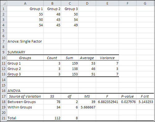
The user supplied the data in cells A1:C4. The Data Analysis add-in’s ANOVA: Single Factor tool was used to create the analysis in cells A7:G21.
The Source of Variation label in cell A17 indicates that the subsequent labels—in A18 and A19 here—tell you whether a particular row describes variability between or within groups. More advanced analyses call out other sources of variation. In some research reports you’ll see Source of Variation abbreviated as SV. Here are the other abbreviations Excel uses:
• SS, in cell B17, stands for Sum of Squares.
• df, in cell C17, stands for degrees of freedom.
• MS, in cell D17, stands for Mean Square.
The values for sums of squares, degrees of freedom, and mean squares are as discussed in earlier sections of this chapter. For example, each mean square is the result of dividing a sum of squares by its associated degrees of freedom.
The F ratio in cell E18 is not associated specifically with the Between Groups source of variation, even though it is traditionally found in that row. It is the ratio of MSb to MSw and is therefore associated with both sources of variation, Between and Within.
However, the F ratio is traditionally shown on the row that belongs to the source of variation that’s being tested. Here, the source is the between groups effect. In a more complicated design, you might have not just one factor (here, medication) but two or more—perhaps both medication and sex. Then you would have two effects to test, and you would find an F ratio on the row for medication and another F ratio on the row for sex.
In Figure 10.7, the F ratio reported in E18 is large enough that it is said to be significant at less than the .05 level. There are two ways to determine this from the ANOVA table, comparing the calculated F to the critical F, and calculating alpha from the critical F.
Comparing the Calculated F to the Critical F
The calculated F ratio, 6.88, is larger than the value 5.14 that’s labeled “F crit” and found in cell G18. The F crit value is the critical value in the F distribution with the given degrees of freedom that cuts off the area that represents alpha, the probability of rejecting a true null hypothesis. If, as here, the calculated F is greater than the critical F, you know that the calculated F is improbable if the null hypothesis is true. This is just like you know that a calculated t-ratio, one that’s greater than a critical t-ratio, is improbable if the null hypothesis is true.
Calculating Alpha
The problem with comparing the calculated and the critical F ratios is that the ANOVA report presented by the Data Analysis add-in doesn’t remind you what alpha level you chose.
Conceptually, this issue is the same as is discussed in Chapters 8 and 9, where the relationships between decision rules, alpha, and calculated-versus-critical t-ratios were covered. The two differences here are that we’re looking at more than just two means, and that we’re using an F distribution rather than a normal distribution or a t-distribution.
Figure 10.8, coming up in the next section, shows a shaded area in the right tail of the curve. This is the area that represents alpha. The curve shows the relative frequency with which you will obtain different values of the F ratio assuming that the null hypothesis is true. Most of the time when the null is true you would get F ratios less than 5.143 based on repeated samples from the same population (the critical F ratio shown in Figure 10.7). Some of the time, due to sampling error, you’ll get a larger F ratio even though the null hypothesis is true. That’s alpha, the percent of possible samples that cause you to reject a true null hypothesis.
Figure 10.8. Like the t-distribution, the F distribution has one mode. Unlike the t-distribution, it is asymmetric.

Just looking at the ANOVA report in Figure 10.7, you can see that the F ratios, calculated and critical, tell you to reject the null hypothesis. You have calculated an F ratio that is larger than the critical F. You are in the region where a calculated F is large enough to be improbable if the null hypothesis is true.
But how improbable is it? You know the answer to that only if you know the value of alpha. If you adopted an alpha of .05, you get a particular critical F value that cuts off the rightmost 5% of the area under the curve. If you instead adopt something such as .01 as the error rate, you’ll get a larger critical F value, one that cuts off just the rightmost 1% of the area under the curve.
It’s ridiculous that the Data Analysis add-in doesn’t tell you what level of alpha was adopted to arrive at the critical F value. You’re in good shape if you remember what alpha you chose when you were setting up the analysis in the ANOVA dialog box, but what if you don’t remember? Then you need to bring out the functions that Excel provides for F ratios.
Using Excel’s F Worksheet Functions
Excel provides two types of worksheet functions that pertain to the F distribution itself: the F.DIST() functions and the F.INV() functions. As with T.DIST and T.INV(), the .DIST functions return the size of the area under the curve, given an F ratio as an argument. The .INV functions return an F ratio, given the size of the area under the curve.
Using F.DIST() and F.DIST.RT()
You can use the F.DIST() function (or, in versions prior to Excel 2010, the FDIST() function) to tell you at what alpha level the F crit value is critical. The F.DIST() function is analogous to the T.DIST() function discussed in Chapters 8 and 9: You supply an F ratio and degrees of freedom, and the function returns the amount of the curve that’s cut off by that ratio. Using the data as laid out in Figure 10.7, you could enter the following function in some empty cell on that worksheet:
=1-F.DIST(G18,C18,C19,TRUE)
The formula requires some comments. To begin, here are the first three arguments that F.DIST() requires:
• The F ratio itself—In this example, that’s the F crit value found in cell G18.
• The degrees of freedom for the numerator of the F ratio—That’s found in cell C18. The numerator is MSb.
• The degrees of freedom for the denominator—That’s found in cell C19. The denominator is MSw.
The fourth argument, whose value is given as TRUE in the current example, specifies whether you want the cumulative area to the left of the F ratio you supply (TRUE) or the probability associated with that specific point (FALSE). The TRUE value is used here because we want to begin by getting the entire area under the curve that’s to the left of the F ratio.
The F.DIST() function, as given in the current example, returns the value .95. That’s because 95% of the F distribution, with two and six degrees of freedom, lies to the left of an F ratio of 5.143. However, we’re interested in the amount that lies to the right, not the left. Therefore, we subtract it from 1.
Another approach you could use is this:
=F.DIST.RT(G18,C18,C19)
The F.DIST.RT() function returns the right end of the distribution instead of the left, so there’s no need to subtract its result from 1. I tend not to use this approach, though, because it has no fourth argument. That forces me to remember which function uses which arguments, and I’d rather spend my energy thinking about what a function’s result means than remembering its syntax.
Using F.INV() and FINV()
The F.INV() function (or, in versions prior to Excel 2010, the FINV() function) returns a value for the F ratio when you supply an area under the curve, plus the number of degrees of freedom for the numerator and denominator that define the distribution.
The traditional approach has been to obtain a critical F value early on in an experiment. The researcher knows how many groups would be involved, and would have at least a good idea of how many individual observations would be available at the conclusion of the experiment. And, of course, alpha is chosen before any outcome data is available. Suppose that a researcher was testing four groups consisting of ten people each, and that the .05 alpha level was selected. Then an F value could be looked up in the appendix to a statistics textbook; or, since Excel became available, the following formula could be used to determine the critical F value:
=F.INV(.95,3,36)
Alternatively, prior to Excel 2010, you would use this one:
=FINV(.05,3,36)
These two formulas return the same value, 2.867. The older, FINV() function returns the F value that cuts off the rightmost 5% of the distribution; the newer F.INV() function returns the F value that cuts off the leftmost 95% of the distribution. Clearly, Excel has inadvertently set a trap for you. If you’re used to FINV() and are converting to F.INV(), you must be careful to use the structure
=F.INV(.95,3,36)
and not the structure
=F.INV(.05,3,36)
which follows the older conventions, because if you do, you’ll get the F value that cuts off the leftmost 5% of the distribution instead of the leftmost 95% of the distribution.
Back to our fictional researcher. A critical F value has been found, and the ANOVA test can now be completed using the actual data—just as is shown in Figure 10.7. The calculated F (in cell E18 of Figure 10.7) is compared to the critical F, and if the calculated F is greater than the critical F, the null hypothesis is rejected.
This sequence of events is probably helpful because, if followed, the researcher can point to it as evidence that the decision rules were adopted prior to seeing any outcome measures. Notice in Figure 10.7 that a “P-value” is reported by the Data Analysis add-in in cell F18. It is the probability, calculated from FDIST() or F.DIST(), of obtaining the calculated F if the null hypothesis is true. There is a strong temptation, then, for the researcher to say, “We can reject the null not only at the .05 level, but at the .03 level.”
But there are at least two reasons not to succumb to that temptation. First, and most important, is that to do so implies that you have altered the decision rule after the data has come in—and that leads to capitalizing on chance.
Second, to claim a 3% level of significance instead of the a priori 5% level is to attribute more importance to a 2% difference than exists. There are, as pointed out in Chapter 6, “Telling the Truth with Statistics,” many threats to the validity of an experiment, and statistical chance—including sampling error—is only one of them. Given that context, to make an issue of an apparent 2% difference in alpha level is straining at gnats.
The F Distribution
Just as there is a different t-distribution for every number of degrees of freedom in the sample or samples, there is a different F distribution for every combination of degrees of freedom for MSb and MSw. Figure 10.8 shows an example using dfb = 3 and dfw = 16.
The chart in Figure 10.8 shows an F distribution for 3 and 16 degrees of freedom. The curve is drawn using Excel’s F.DIST() function. For example, the height of the curve at the point where the F ratio is 1.0 is given by
=F.DIST(1,3,16,FALSE)
where the first argument, 1, is the F ratio for that point on the curve; 3 is the degrees of freedom for the numerator; 16 is the degrees of freedom for the denominator; and FALSE indicates that Excel should return the probability density function (the height of the curve at that point) rather than the cumulative density (the total probability for all F ratios from 0 through the value of the function’s first argument—here, that’s 1). Notice that the pattern of the arguments is similar to the pattern of the arguments for the T.DIST() function, discussed in detail in Chapter 9.
The shaded area in the right tail of the curve represents alpha, the probability of rejecting a true null hypothesis. It has been set here to .05. The curve you see assumes that the variances based on MSb and MSw are the same in the population, as is the case when the null hypothesis is true. Still, sampling error can cause you to get an F ratio as large as the one in this chapter’s example; Figure 10.7 shows that the obtained F ratio is 6.88 (cell E18) and fully 5% of the F ratios in Figure 10.8 are greater than 3.2. (However, the distribution in Figure 10.8 is based on different degrees of freedom than the example in Figure 10.7. The change was made to provide a more informative visual example of the F distribution in Figure 10.8.)
The F distribution describes the relative frequency of occurrence of ratios of variances, and is used to determine the likelihood of observing a given ratio under the assumption that the ratio of one variance to another is 1 in the population. (George Snedecor named the F distribution in honor of Sir Ronald Fisher, a British statistician who was responsible for the development of the analysis of variance, explaining the interaction of factors—see Chapter 11—and a variety of other statistical concepts and techniques that were the cutting edge of theory in the early twentieth century.) To describe a t-distribution requires you to specify just one number of degrees of freedom, but to describe an F distribution you must specify the number of degrees of freedom for the variance in the numerator and the number of degrees of freedom for the variance in the denominator.
Unequal Group Sizes
From time to time you may find that you have a different number of subjects in some groups than in others. This situation does not necessarily pose a problem in the single-factor ANOVA, although it might do so, and you need to understand the implications if it happens to you.
Consider first the possibility that a differential dropout rate has had an effect on your results. This is particularly likely to pose a problem if you arranged for equal group sizes, or even roughly equal group sizes, and at the end of your experiment you find that you have very unequal group sizes. There are at least two reasons that this might occur:
• You used convenience or “grab” samples. That is, your groups consist of preexisting sets of people or plants or other responsive beings. There might well be something about the reasons for those groupings that caused some subjects to be missing at the end of the experiment. Because the groupings preceded the treatment you’re investigating, you might inadvertently wind up assigning an outcome to a treatment when it had to do not with the treatment but with the nonrandom grouping.
• You randomly assigned subjects to groups but there is something about the nature of the treatments that causes them to drop out of one treatment at a greater rate than from other treatments. You may need to examine the nature of the treatments more closely if you did not anticipate differential dropout rates.
In either case, you should be careful of the logic of any conclusions you reach, quite apart from the statistics involved. Still, it can happen that even with random assignment, and treatments that do not cause subjects to drop out, you wind up with different group sizes. For example, if you are conducting an experiment that takes days or weeks to complete, you find people moving, forgetting to show up, getting ill, or being absent for any of a variety of reasons unrelated to the experiment. Even then, this can cause you a problem with the statistical analysis. As you will see in the next chapter, the problem is different and more difficult to manage when you simultaneously analyze two factors.
In a single-factor ANOVA, the issue pertains to the relationship between group sizes and within group variances. Several assumptions are made by the mathematics that underlie ANOVA, but just as is true with t-tests, not all the assumptions must be met for the analysis to be accurate.
One of the assumptions is that observations be independent of one another. If the fact that an observation is in Group 1 has any effect on the likelihood that another observation is in Group 1, or that it’s in Group 2, the observations aren’t independent. If the value of one observation depends in some way on the value of another observation, they are not independent. In that case there are consequences for the probability statements made by ANOVA, and those consequences can’t be quantified. Independence of observations is an assumption that must be met.
Note
An important exception is the t-test for dependent groups and the analysis of covariance (discussed in Chapter 14, “Analysis of Covariance: The Basics”). In those cases, the dependency is deliberate and can be measured and accounted for.
Another important assumption is that the within group variances are equal. But unlike lack of independence, violating the equal variance assumption is not fatal to the validity of the analysis. Long experience and much research leads to these three general statements:
• When different within group variances exist, equal sample sizes mean that the effect on the probability statements is negligible. There are limits to this protection, though: If one within group variance is ten times the size of another, serious distortions of alpha can occur.
• If sample sizes are different and the larger samples have the smaller variances, the actual alpha is greater than the nominal alpha. You might start out by setting alpha at .05 but your chance of making a Type I error is actually, say, .09. The effect is to shift the F distribution to the right, so that the critical F value cuts off not 5% of the area under the curve but, say, 9%. Statisticians say that in this case the F test is liberal.
• If sample sizes are different and the larger samples have the larger variances, the opposite effect takes place. Your nominal alpha might be .05 but in actuality it is something such as .03. The F distribution has been shifted to the left and the critical F ratio cuts off only 3% of the distribution. Statisticians term this a conservative F test.
There is no practical way to correct this problem, other than to arrange for equal group sizes. Nor is there a practical way to calculate the actual alpha level. The best solution is to be aware of the effect (which is sometimes termed the Behrens-Fisher problem) and adjust your conclusions accordingly. Bear in mind that the smaller the differences between the group variances, the smaller the effect on the nominal alpha level.
Multiple Comparison Procedures
The F test is sometimes termed an omnibus test: That is, it tests simultaneously whether there is at least one reliable difference between any of the group means (or linear combinations of group means) that are being tested. By itself, it doesn’t pinpoint which mean differences are responsible for an improbably large F ratio. Suppose you test four group means, which are 100, 90, 70, and 60, and get an F ratio that’s larger than the critical F ratio for the alpha level you adopted. Probably (not necessarily, but probably) the mean of 100 is significantly different from the mean of 60—they are the highest and lowest means in an experiment that resulted in a significant F ratio. But what about 100 and 70? Is that a significant difference in this experiment? How about 90 and 60? You need to conduct multiple comparisons to make those decisions.
Unfortunately, things start to get complicated at this point. There are roughly (depending on your point of view) nine multiple comparison procedures that you can choose from. They differ on characteristics such as the following:
• Planned versus unplanned comparisons
• Distribution used (normally t, F, or q)
• Error rate (alpha) per comparison or per set of comparisons
• Simple comparisons only (that is, one group mean vs. another group mean) or complex comparisons (for example, the mean of two groups vs. the mean of two other groups)
There are other issues to consider, too, including the statistical sensitivity or power of the procedure.
For good or ill, Excel simplifies your decision because it does not always support the required statistical distribution. For example, two well regarded multiple comparison procedures are the Tukey and the Newman-Keuls. Both these procedures rely on a distribution called the studentized range statistic, usually referred to as q. Excel does not support that statistic: It does not have, for example, a Q.INV() or a Q.DIST() function.
Other methods employ modifications of, for example, the t-distribution. Dunnett’s procedure modifies the t-distribution to produce a different critical value when you compare one, two, three, or more means with a control group mean. Excel does not support that sort of comparison except in the limiting case where there are only two groups. Dunn’s procedure employs the t-distribution, but only for planned comparisons involving two means. When the comparisons involve more than two means, the Dunn procedure uses a modification of the t-distribution. The Dunn procedure has only slightly more statistical power than the Scheffé (see the next paragraph), which does not require planned contrasts.
Fortunately (if it was by design, I’ll eat my keyboard) Excel does support two multiple-comparison procedures: planned orthogonal contrasts and the Scheffé method. The former is the most powerful of the various multiple comparison procedures (and also the most restrictive). The latter is the least powerful procedure (and gives you the most leeway in your analysis). However, you have to piece the analyses together using the available worksheet functions. The remainder of this chapter shows you how to do that.
Speaking generally, the Newman-Keuls is probably the best choice for a multiple comparison test of simple contrasts (Mean 1 vs. Mean 3, Mean 1 vs. Mean 4, Mean 2 vs. Mean 3, and so on) when you want to keep your error rate to a per-comparison basis (rather than to a per-family basis—that’s much more conservative and you’ll probably miss some genuine differences). The Newman-Keuls test, as mentioned previously, uses the q or studentized range distribution. You can find tables of those values in many intermediate statistical texts, and some websites offer you free lookups.
I suggest that you consider running your ANOVA in Excel using the Data Analysis add-in, particularly if your experimental design includes just one factor or two factors with equal group sizes. Take the output to a general statistics text and use it in conjunction with the tables you find there to complete your multiple comparisons.
Note
You could also use the freeware statistical program R if you must, but after a couple of years of using R, I find I spend more time dealing with its user interface and idiosyncratic layouts than I gain from having the occasional need for analyses that I can’t do completely in Excel.
If you want to stay within what Excel has to offer, you can get just as much statistical power from planned orthogonal contrasts, which are discussed next, as from Newman-Keuls. And you can do plenty of data-snooping without planning a thing beforehand if you use Excel to run your Scheffé comparisons.
The Scheffé Procedure
The Scheffé is the most flexible of the available multiple comparison procedures. You can make as many comparisons as you want, and they need not be simply one mean compared to another. If you had five groups, for example, you could use the Scheffé procedure to compare the mean of two groups with the mean of the remaining three groups. It might make no sense to do so in the context of your experiment, but the Scheffé procedure allows it. You can also use the Scheffé with unequal group sizes, although that topic is deferred until Chapter 12, “Multiple Regression Analysis and Effect Coding: The Basics.”
Furthermore, in the Scheffé procedure, alpha is shared among all the comparisons you make. If you make just one comparison and have set alpha to .05, you have a 5% chance of concluding that the difference you calculate is a reliable one, when in fact it is not. Or, if you make 20 comparisons and have set alpha to .05, then you have a 5% chance of rejecting a true null hypothesis somewhere in the 20 comparisons. This is very different, and much more conservative, than running a 5% chance of rejecting a true null in each of the comparisons.
Figure 10.9 shows how the Scheffé multiple comparison procedure might work in an experiment with two treatment groups and a control group.
Figure 10.9. The Data Analysis add-in provides the preliminary ANOVA in A9:G20.
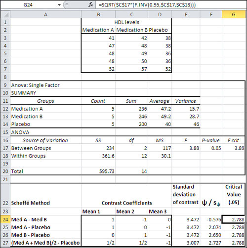
With the raw data laid out as shown in cells B2:D7 in Figure 10.9, you can run the ANOVA: Single Factor tool in the Data Analysis add-in to create the report shown in A9:G20. These steps will take care of it:
- With the Data Analysis add-in installed as described in Chapter 4, “How Variables Move Jointly: Correlation,” click Data Analysis in the Ribbon’s Analysis group. Select ANOVA: Single Factor from the list box and click OK. The dialog box shown earlier in Figure 10.6 appears.
- With the flashing I-bar in the Input Range edit box, drag through the range B2:D7 so that its address appears in the edit box.
- Be sure the Columns option is chosen. (Because of the way Excel’s list and table structures operate, it is very seldom that you’ll want to group the data so that each group occupies a different row. But if you do, that’s what the Rows option is for.)
- If you included column labels in the input range, as suggested in step 2, fill the Labels check box.
- Enter an alpha value in the Alpha edit box, or accept the default value. Excel uses .05 if you leave the Alpha edit box blank.
- Click the Output Range option button. When you do so—in fact, whenever you choose a different Output option button—the add-in gives the Input Range box the focus, and whatever you type or select next overwrites what you have already put in the Input Range edit box. Be sure to click in the Output Range edit box after choosing the Output Range option button.
- Click a cell on the worksheet where you want the output to start. In Figure 10.9, that’s cell A9.
- Click OK. The report shown in cells A9:G20 in Figure 10.9 appears.
(To get all the data to fit in Figure 10.9, I have deleted a couple of empty rows.)
A significant result at the .05 level from the ANOVA, which you verify from cell F17 of Figure 10.9, tells you that there is a reliable difference somewhere in the data. To find it, you can proceed to one or more multiple comparisons among the means using the Scheffé method. This method is not supported directly by Excel, even with the Data Analysis add-in. In fact, no multiple comparison method is directly supported in Excel. But you can perform a Scheffé analysis by entering the formulas and functions described in this section.
The Scheffé method, along with several other approaches to multiple comparisons, begins in Excel by setting up a range of cells that define how the group means are to be combined (that is, the contrasts you look for among the means). In Figure 10.9, that range of cells is B24:D27.
The first contrast is defined by the difference between the mean for Medication A and the mean for Medication B. The mean for Medication A will be multiplied by 1; the mean for Medication B will be multiplied by −1; the mean for the Placebo will be multiplied by 0. The results are summed.
The 1’s and the 0’s and, if used, the fractions that are multiplied by the means are called contrast coefficients. The coefficients tell you whether a group mean is involved in the contrast (1), omitted from the contrast (0), or involved in a combination with other means (a coefficient such as .33 or .5). Of course, the use of these coefficients is a longwinded way of saying, for example, that the mean of Medication B is subtracted from the mean of Medication A, but there are good reasons to be verbose about it.
The first reason is that you need to calculate the standard error of the contrast. You will divide the standard error into the result of combining the means using the contrast coefficients. The general formula for the standard error of a contrast is
![]()
where MSe is the mean square error from the ANOVA table (cell D18 in Figure 10.9) and each n is the sample size of each group.
So the standard error for the first contrast in Figure 10.9, in cell E24, is calculated with this formula:
=SQRT($D$18*(B24∧2/$B$12+C24∧2/$B$13+D24∧2/$B$14))
Note
The mean square error just mentioned is, in the simpler ANOVA designs, the same as the within group variance you’ve seen so far in this chapter. There are times when you do not divide an MSb value by an MSw value to arrive at an F. Instead, you divide by a value that is more generally known as MSe because the proper divisor is not a within groups variance. The proper divisor is sometimes an interaction term (see Chapter 11). The MSe designation is just a more general way to identify the divisor than is MSw. In the single-factor and fully crossed multiple-factor designs covered in this book, you can be sure that MSw and MSe mean the same thing: within group variance.
In words, this means you square each contrast coefficient and divide the result by the group’s sample size. Total the results. Multiply by the MSe, and take the square root. The conventional way to symbolize the standard error of the contrast is sψ, where ψ represents the contrast. (The Greek symbol ψ is represented in English as psi, and pronounced “sigh.”)
The prior formula makes the reference to D18 absolute by means of the dollar signs: $D$18. Doing so means that you can copy and paste the formula into cells E25:E27 and keep intact the reference to D18, with its MSe value. The same is true of the references to cells B12, B13, and B14: Each standard error in E24:E27 uses the same values for the group sizes, so $B$12, $B$13, and $B$14 are used to make the references absolute. The references to B24, C24, and D24 are left relative because you want them to adjust to the different contrast coefficients as you copy and paste the formula into E25:E27.
The contrast divided by its standard error is represented as follows:
![]()
The first ratio is calculated using this formula in cell F24:
=($D$12*B24+$D$13*C24+$D$14*D24)/E24
The formula multiplies the mean of each group (in D12, D13, and D14) by the contrast coefficient for that group in the current contrast (in B24, C24 and D24), and then divides by the standard error of the contrast (in E24). The formula is copied and pasted into F25:F27. Therefore, the cell addresses of the means in D12, D13, and D14 are made absolute: Each mean is used in each contrast. The contrast coefficients change from contrast to contrast, and their cells use the relative addresses B24, C24, and D24. This allows the coefficient addresses to adjust as the formula is pasted into different rows. The relative addressing also allows the reference to E24 to change to E25, E26 and E27 as the formula is copied and pasted into F25:F27.
The sum of the means times their coefficients is divided by the standard errors of the contrasts in F24:F27. The result of that division is compared to the critical value shown in G24:G27 (it’s the same critical value for each contrast in the case of the Scheffé procedure).
Note
The prior formula includes a term that sums the products of the groups’ means and their contrast coefficients. It does so explicitly by the use of multiplication symbols, addition symbols, and individual cell addresses. Excel provides two worksheet functions, SUMPRODUCT() and MMULT(), that sum the products of their arguments and would be possible to use here. However, SUMPRODUCT() requires that the two ranges be oriented in the same way (in columns or in rows) and so to use it here would mean reorienting a range on the worksheet or using the TRANSPOSE() function. MMULT() requires that you array-enter it, but with this worksheet layout it works fine. If you prefer, you can array-enter (using Ctrl+Shift+Enter) this formula
=MMULT(B24:D24,$D$12:$D$14)/E24
into F24, and then copy and paste it into F25:F27.
Once you have the ratios of the contrasts to the standard errors of the contrasts, you’re ready to make the comparisons that tell you whether a contrast is unlikely given the alpha level you selected. You use the same critical value to test each of the ratios. Here’s the general formula:
![]()
In words, find the F value for the degrees of freedom between and the degrees of freedom within. Those degrees of freedom will always appear in the ANOVA table. Use the F for the alpha level you have chosen. For example, if you have set alpha at .05, you could use either the function
=F.INV(0.95,C17,C18)
in Figure 10.9 or this one:
=F.INV.RT(0.05,C17,C18)
Cells C17 and C18 contain the degrees of freedom between groups and within groups, respectively. If you use F.INV() with .95, you get the F value given that 95% of the area under the curve is to the value’s left. If you use F.INV.RT() with .05, you get the same F value—you’re just saying that you want to specify it such that 5% of the area is to its right. It comes to the same thing, and it’s just a matter of personal preference which you use.
With that F value in hand, multiply it by the degrees of freedom between groups (cell C17 in Figure 10.9) and take the square root. Here’s the Excel formula in cells G24:G27 in Figure 10.9:
=SQRT($C$17*(F.INV(0.95,$C$17,$C$18)))
This critical value can be used for any contrast you might be interested in, no matter how many means are involved in the contrast, so long as the contrast coefficients sum to zero—as they do in each contrast in Figure 10.9. (You would have difficulty coming up with a set of coefficients that do not sum to zero and that result in a meaningful contrast.)
In this case, none of the tested contrasts results in a ratio that’s larger than the critical value. The Scheffé procedure is the most conservative of the multiple comparison procedures, in large part because it allows you to make any contrast you want, after you’ve seen the results of the descriptive analysis (so you know which groups have the largest differences in mean values) and the inferential analysis (the ANOVA’s F test tells you whether there’s a significant difference somewhere). The tradeoff is of statistical power for flexibility. The Scheffé procedure is not a powerful method: It’s conservative, and it fails to regard these contrasts as significant at the .05 level. However, it gives you great leeway in deciding how to follow up on a significant F test.
Note
The second and third comparisons are so close to significance at the .05 level that I would definitely replicate the experiment, particularly given that the omnibus F test returned a probability of .05.
Planned Orthogonal Contrasts
The other approach to multiple comparisons that this chapter discusses is planned orthogonal contrasts, which sounds a lot more intimidating than it is.
Planned Contrasts
The planned part just means that you promise to decide, in advance of seeing any results, which group means, or sets of group means, you want to compare. Sometimes you don’t know how to sharpen your focus until you’ve seen some preliminary results, and in that situation you can use one of the after-the-fact methods, such as the Scheffé procedure. But particularly in an era when very expensive medical and drug research takes place, it’s not at all unusual to plan the contrasts of interest long before the treatment has been administered.
Orthogonal Contrasts
The orthogonal part means that the contrasts you make do not employ redundant information. You would be employing redundant information if, for example, one contrast subtracted the mean of a Group 3 from the mean of Group 1, and another contrast subtracted the mean of Group 3 from the mean of Group 2. Because the two contrasts both subtract Group 3’s mean from that of another group, the information is redundant.
There’s a simple way to determine whether comparisons are orthogonal if the groups have equal sample sizes. See Figure 10.10.
Figure 10.10. The products of a group’s contrast coefficients must sum to zero for two contrasts to be orthogonal.

Figure 10.10 shows the same contrast coefficients as were used in Figure 10.9 for the Scheffé illustration. The coefficients sum to zero within a comparison. But imposing the condition that different contrasts be orthogonal means that the sum of the products of the coefficients for two contrasts also sum to zero. That’s easier to see than it is to read.
Look at cell E9 in Figure 10.10. It contains 1, the sum of the numbers in B9:D9. Those three numbers are the products of contrast coefficients. Row 9 combines the contrast coefficients for contrasts 1 and 2, so cell B9 contains the product of cells B3 and B4. Similarly, cell C9 contains the product of cells C3 and C4, and D9 contains the product of D3 and D4. Summing cells B9:D9 into E9 results in 1. That means that contrasts 1 and 2 are not orthogonal to one another. Also, the mean of Group 1 is part of both those contrasts—that’s redundant information, so contrasts 1 and 2 aren’t orthogonal.
It’s a similar situation in Row 10, which tests whether the contrasts in rows 3 and 5 are orthogonal. The mean of Group 2 appears in both contrasts (the fact that it is subtracted in one contrast but not in the other makes no difference), and as a result the total of the products is nonzero. Contrast 1 and Contrast 3 are not orthogonal.
Row 11 tests the contrasts in rows 3 and 6, and here we have a pair of orthogonal contrasts. The products of the contrast coefficients in row 3 and row 6 are shown in B11:D11 and are totaled in E11, where you see a 0. That tells you that the contrasts defined in rows 3 and 6 are orthogonal, and you can proceed with contrasts 1 and 4: the mean of Group 1 versus the mean of Group 2, and the mean of Groups 1 and 2 taken together versus the mean of Group 3. Notice that none of the three means appears in its entirety in both contrast 1 and contrast 4.
The general rule is that if you have K means, only K − 1 contrasts that can be made from those means are orthogonal. Here, there are three means, so only two contrasts are orthogonal.
Evaluating Planned Orthogonal Contrasts
The contrasts that you calculate, the ones that are both planned and orthogonal, are calculated exactly as you calculated the contrasts for the Scheffé procedure. The numerator and denominator of the ratio, the ψ and the sψ, are calculated in the same way and have the same values—and therefore so do the ratios. Compare the ratios in cells F24 and F25 in Figure 10.11 with those in cells F24 and F27 in Figure 10.9.
Figure 10.11. Only two contrasts are orthogonal to one another, so only those two appear in rows 24 and 25.

The ratio of a contrast to its standard error is referred to as ψ / sψ by the Scheffé procedure, but it’s referred to as a t-ratio in planned orthogonal contrasts. The differences between the two procedures discussed so far have to do solely with when you plan the contrasts and whether they are orthogonal.
We now arrive at the point that causes the two procedures to differ statistically. You compare the t-ratios (shown in cells F24 and F25 in Figure 10.11) to the t-distribution with the same number of degrees of freedom as is associated with the MSe in the ANOVA table; Figure 10.11 shows that to be 12 (see cell C18) for this data set. To get the critical t value with an alpha of .05 for a nondirectional comparison, you would use this formula as it’s used in cell G24 of Figure 10.11:
=T.INV.2T(.05,$C$18)
Note
If you use any of the T.DIST functions, it’s a good idea to insert the ABS function into the formula: for example, T.DIST(ABS(F24), $C$18). This is so that the t-ratio will be converted to its absolute value (a positive number) if the direction of the subtraction that the contrast coefficients call for results in a negative number. The T.DIST(), T.DIST.2T(), and T.DIST.RT() functions do not allow the first argument to be negative. This is another indication of the degree of thought that went into the design of the Excel 2010 consistency functions.
Notice that the average of Med A and Med B produces a significant result against the placebo using planned orthogonal contrasts, whereas it was not significant at the .05 level using the Scheffé procedure. This is an example of how the Scheffé procedure is more conservative and the planned orthogonal contrasts procedure is more powerful statistically. However, you can’t use planned orthogonal contrasts to do what many texts call “data-snooping.” That sort of after-the-fact exploration of a data set is contrary to the entire idea behind planned contrasts.
Chapter 11, coming up next, continues the discussion of how to use Excel to perform the analysis of variance, and it gets into an area that makes ANOVA an even more powerful technique: two- and three-factor analyses.