
Overview
In this chapter, you will be introduced to regression. Regression comes in handy when you are trying to predict future variables using historical data. You will learn various regression techniques such as linear regression with single and multiple variables, along with polynomial and Support Vector Regression (SVR). You will use these techniques to predict future stock prices from a stock price data. By the end of this chapter, you will be comfortable using regression techniques to solve practical problems in a variety of fields.
Introduction
In the previous chapter, you were introduced to the fundamentals of Artificial Intelligence (AI), which helped you create the game Tic-Tac-Toe. In this chapter, we will be looking at regression, which is a machine learning algorithm that can be used to measure how closely related independent variable(s), called features, relate to a dependent variable called a label.
Linear regression is a concept with many applications a variety of fields, ranging from finance (predicting the price of an asset) to business (predicting the sales of a product) and even the economy (predicting economy growth).
Most of this chapter will deal with different forms of linear regression, including linear regression with one variable, linear regression with multiple variables, polynomial regression with one variable, and polynomial regression with multiple variables. Python provides lots of forms of support for performing regression operations and we will also be looking at these later on in this chapter.
We will also use an alternative regression model, called Support Vector Regression (SVR), with different forms of linear regression. Throughout this chapter, we will be using a few sample datasets along with the stock price data loaded from the Quandl Python library to predict future prices using different types of regression.
Note
Although it is not recommended that you use the models in this chapter to provide trading or investment advice, this is a very exciting and interesting journey that explains the fundamentals of regression.
Linear Regression with One Variable
A general regression problem can be defined with the following example. Suppose we have a set of data points and we need to figure out the best fit curve to approximately fit the given data points. This curve will describe the relationship between our input variable, x, which is the data point, and the output variable, y, which is the curve.
Remember, in real life, we often have more than one input variable determining the output variable. However, linear regression with one variable will help us to understand how the input variable impacts the output variable.
Types of Regression
In this chapter, we will work with regression on the two-dimensional plane. This means that our data points are two-dimensional, and we are looking for a curve to approximate how to calculate one variable from another.
We will come across the following types of regression in this chapter:
- Linear regression with one variable using a polynomial of degree 1: This is the most basic form of regression, where a straight line approximates the trajectory of future data.
- Linear regression with multiple variables using a polynomial of degree 1: We will be using equations of degree 1, but we will also allow multiple input variables, called features.
- Polynomial regression with one variable: This is a generic form of the linear regression of one variable. As the polynomial used to approximate the relationship between the input and the output is of an arbitrary degree, we can create curves that fit the data points better than a straight line. The regression is still linear – not because the polynomial is linear, but because the regression problem can be modeled using linear algebra.
- Polynomial regression with multiple variables: This is the most generic regression problem, using higher degree polynomials and multiple features to predict the future.
- SVR: This form of regression uses Support Vector Machines (SVMs) to predict data points. This type of regression is included to explain SVR's usage compared to the other four regression types.
Now we will deal with the first type of linear regression: we will use one variable, and the polynomial of the regression will describe a straight line.
On the two-dimensional plane, we will use the Déscartes coordinate system, more commonly known as the Cartesian coordinate system. We have an x and a y-axis, and the intersection of these two axes is the origin. We denote points by their x and y coordinates.
For instance, point (2, 1) corresponds to the black point on the following coordinate system:
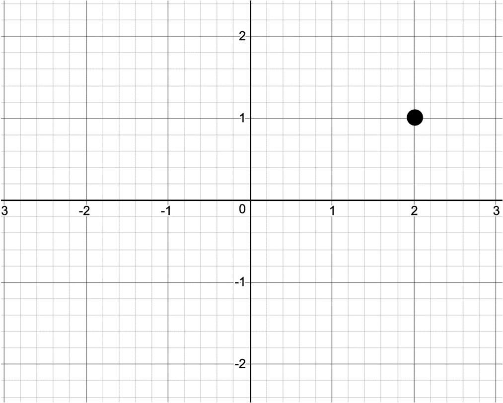
Figure 2.1: Representation of point (2,1) on the coordinate system
A straight line can be described with the equation y = a*x + b, where a is the slope of the equation, determining how steeply the equation climbs up, and b is a constant determining where the line intersects the y-axis.
In Figure 2.2, you can see three equations:
- The straight line is described with the equation y = 2*x + 1.
- The dashed line is described with the equation y = x + 1.
- The dotted line is described with the equation y = 0.5*x + 1.
You can see that all three equations intersect the y-axis at 1, and their slope is determined by the factor by which we multiply x.
If you know x, you can solve y. Similarly, if you know y, you can solve x. This equation is a polynomial equation of degree 1, which is the base of linear regression with one variable:

Figure 2.2: Representation of the equations y = 2*x + 1, y = x + 1, and y = 0.5*x + 1 on the coordinate system
We can describe curves instead of straight lines using polynomial equations; for example, the polynomial equation 4x4-3x3-x2-3x+3 will result in Figure 2.3. This type of equation is the base of polynomial regression with one variable:

Figure 2.3: Representation of the polynomial equation
Note
If you would like to experiment further with the Cartesian coordinate system, you can use the following plotter: https://s3-us-west-2.amazonaws.com/oerfiles/College+Algebra/calculator.html.
Features and Labels
In machine learning, we differentiate between features and labels. Features are considered our input variables, and labels are our output variables.
When talking about regression, the possible value of the labels is a continuous set of rational numbers. Think of features as the values on the x-axis and labels as the values on the y-axis.
The task of regression is to predict label values based on feature values.
We often create a label by projecting the values of a feature in the future.
For instance, if we would like to predict the price of a stock for next month using historical monthly data, we would create the label by shifting the stock price feature one month into the future:
- For each stock price feature, the label would be the stock price feature of the next month.
- For the last month, prediction data would not be available, so these values are all NaN (Not a Number).
Let's say we have data for the months of January, February, and March, and we want to predict the price for April. Our feature for each month will be the current monthly price and the label will be the price of the next month.
For instance, take a look at the following table:

Figure 2.4: Example of a feature and a label
This means that the label for January is the price of February and that the label for February is actually the price of March. The label for March is unknown (NaN) as this is the value we are trying to predict.
Feature Scaling
At times, we have multiple features (inputs) that may have values within completely different ranges. Imagine comparing micrometers on a map to kilometers in the real world. They won't be easy to handle because of the difference in magnitude of nine zeros.
A less dramatic difference is the difference between imperial and metric data. For instance, pounds and kilograms, and centimeters and inches, do not compare that well.
Therefore, we often scale our features to normalized values that are easier to handle, as we can compare the values of these ranges more easily.
We will demonstrate two types of scaling:
- Min-max normalization
- Mean normalization
Min-max normalization is calculated as follows:

Here, XMIN is the minimum value of the feature and XMAX is the maximum value.
The feature-scaled values will be within the range of [0;1].
Mean normalization is calculated as follows:

Here, AVG is the average.
The feature-scaled values will be within the range of [-1;1].
Here's an example of both normalizations applied on the first 13 numbers of the Fibonacci sequence.
We begin with finding the min-max normalization:
fibonacci = [0, 1, 1, 2, 3, 5, 8, 13, 21, 34, 55, 89, 144]
# Min-Max normalization:
[(float(i)-min(fibonacci))/(max(fibonacci)-min(fibonacci))
for i in fibonacci]
The expected output is this:
[0.0,
0.006944444444444444,
0.006944444444444444,
0.013888888888888888,
0.020833333333333332,
0.034722222222222224,
0.05555555555555555,
0.09027777777777778,
0.14583333333333334,
0.2361111111111111,
0.3819444444444444,
0.6180555555555556,
1.0]
Now, take a look at the following code snippet to find the mean normalization:
# Mean normalization:
avg = sum(fibonacci) / len(fibonacci)
# 28.923076923076923
[(float(i)-avg)/(max(fibonacci)-min(fibonacci))
for i in fibonacci]
The expected output is this:
[-0.20085470085470086,
-0.19391025641025642,
-0.19391025641025642,
-0.18696581196581197,
-0.18002136752136752,
-0.16613247863247863,
-0.1452991452991453,
-0.11057692307692307,
-0.05502136752136752,
0.035256410256410256,
0.18108974358974358,
0.4172008547008547,
0.7991452991452992]
Note
Scaling could add to the processing time, but, often, it is an important step to add.
In the scikit-learn library, we have access to the preprocessing.scale function, which scales NumPy arrays:
import numpy as np
from sklearn import preprocessing
preprocessing.scale(fibonacci)
The expected output is this:
array([-0.6925069 , -0.66856384, -0.66856384, -0.64462079,
-0.62067773-0.57279161, -0.50096244, -0.38124715,
-0.18970269, 0.12155706, 0.62436127, 1.43842524,
2.75529341]
The scale method performs a standardization, which is another type of normalization. Notice that the result is a NumPy array.
Splitting Data into Training and Testing
Now that we have learned how to normalize our dataset, we need to learn about the training-testing split. In order to measure how well our model can generalize its predictive performance, we need to split our dataset into a training set and a testing set. The training set is used by the model to learn from so that it can build predictions. Then, the model will use the testing set to evaluate the performance of its prediction.
When we split the dataset, we first need to shuffle it to ensure that our testing set will be a generic representation of our dataset. The split is usually 90% for the training set and 10% for the testing set.
With training and testing, we can measure whether our model is overfitting or underfitting.
Overfitting occurs when the trained model fits the training dataset too well. The model will be very accurate on the training data, but it will not be usable in real life, as its accuracy will decrease when used on any other data. The model adjusts to the random noise in the training data and assumes patterns on this noise that yield false predictions.
Underfitting occurs when the trained model does not fit the training data well enough to recognize important patterns in the data. As a result, it cannot make accurate predictions on new data. One example of this is when we attempt to do linear regression on a dataset that is not linear. For example, the Fibonacci sequence is not linear; therefore, a model on a Fibonacci-like sequence cannot be linear either.
We can do the training-testing split using the model_selection library of scikit- learn.
Suppose, in our example, that we have scaled the Fibonacci data and defined its indices as labels:
features = preprocessing.scale(fibonacci)
label = np.array(range(13))
Now, let's use 10% of the data as test data, test_size=0.1, and specify random_state parameter in order to get the exact same split every time we run the code:
from sklearn import model_selection
(x_train, x_test, y_train, y_test) =
model_selection.train_test_split(features,
label, test_size=0.1,
random_state=8)
Our dataset has been split into test and training sets for our features (x_train and x_test) and for our labels (y_train and y_test).
Finally, let's check each set, beginning with the x_train feature:
x_train
The expected output is this:
array([ 1.43842524, -0.18970269, -0.50096244, 2.75529341,
-0.6925069 , -0.66856384, -0.57279161, 0.12155706,
-0.66856384, -0.62067773, -0.64462079])
Next, we check for x_test:
x_test
The expected output is this:
array([-0.38124715, 0.62436127])
Then, we check for y_train:
y_train
The expected output is this:
array([11, 8, 6, 12, 0, 2, 5, 9, 1, 4, 3])
Next, we check for y_test:
y_test
The expected output is this:
array([7, 10])
In the preceding output, we can see that our split has been properly executed; for instance, our label has been split into y_test, which contains the 7 and 10 indexes, and y_train which contains the remaining 11 indexes. The same logic has been applied to our features and we have 2 values in x_test and 11 values in x_train.
Note
If you remember the Cartesian coordinate system, you know that the horizontal axis is the x-axis and that the vertical axis is the y-axis. Our features are on the x-axis, while our labels are on the y-axis. Therefore, we use features and x as synonyms, while labels are often denoted by y. Therefore, x_test denotes feature test data, x_train denotes feature training data, y_test denotes label test data, and y_train denotes label training data.
Fitting a Model on Data with scikit-learn
We are now going to illustrate the process of regression on an example where we only have one feature and minimal data.
As we only have one feature, we have to format x_train by reshaping it with x_train.reshape (-1,1) to a NumPy array containing one feature.
Therefore, before executing the code on fitting the best line, execute the following code:
x_train = x_train.reshape(-1, 1)
x_test = x_test.reshape(-1, 1)
We can fit a linear regression model on our data with the following code:
from sklearn import linear_model
linear_regression = linear_model.LinearRegression()
model = linear_regression.fit(x_train, y_train)
model.predict(x_test)
The expected output is this:
array([4.46396931, 7.49212796])
We can also calculate the score associated with the model:
model.score(x_test, y_test)
The expected output is this:
-1.8268608450379087
This score represents the accuracy of the model and is defined as the R2 or coefficient of determination. It represents how well we can predict the features from the labels.
In our example, an R2 of -1.8268 indicates a very bad model as the best possible score is 1. A score of 0 can be achieved if we constantly predict the labels by using the average value of the features.
Note
We will omit the mathematical background of this score in this book.
Our model does not perform well for two reasons:
- If we check our previous Fibonacci sequence, 11 training data points and 2 testing data points are simply not enough to perform a proper predictive analysis.
- Even if we ignore the number of points, the Fibonacci sequence does not describe a linear relationship between x and y. Approximating a nonlinear function with a line is only useful if we are looking at two very close data points.
Linear Regression Using NumPy Arrays
One reason why NumPy arrays are handier than Python lists is that they can be treated as vectors. There are a few operations defined on vectors that can simplify our calculations. We can perform operations on vectors of similar lengths.
Let's take, for example, two vectors, V1 and V2, with three coordinates each:
V1 = (a, b, c) with a=1, b=2, and c=3
V2 = (d, e, f) with d=2, e=0, and f=2
The addition of these two vectors will be this:
V1 + V2 = (a+d, b+e, c+f) = (1+2, 2+0, 3+2) = (3,2,5)
The product of these two vectors will be this:
V1 + V2 = (a*d, b*e, c*f) = (1*2, 2*0, 3*2) = (2,0,6)
You can think of each vector as our datasets with, for example, the first vector as our features set and the second vector as our labels set. With Python being able to do vector calculations, this will greatly simplify the calculations required for our linear regression models.
Now, let's build a linear regression using NumPy in the following example.
Suppose we have two sets of data with 13 data points each; we want to build a linear regression that best fits all the data points for each set.
Our first set is defined as follows:
[2, 8, 8, 18, 25, 21, 32, 44, 32, 48, 61, 45, 62]
If we plot this dataset with the values (2,8,8,18,25,21,32,44,32,48,61,45,62) as the y-axis, and the index of each value (1,2,3,4,5,6,7,8,9,10,11,12,13) as the x-axis, we will get the following plot:

Figure 2.5: Plotted graph of the first dataset
We can see that this dataset's distribution seems linear in nature, and if we wanted to draw a line that was as close as possible to each dot, it wouldn't be too hard. A simple linear regression appears appropriate in this case.
Our second set is the first 13 values scaled in the Fibonacci sequence that we saw earlier in the Feature Scaling section:
[-0.6925069, -0.66856384, -0.66856384, -0.64462079, -0.62067773, -0.57279161, -0.50096244, -0.38124715, -0.18970269, 0.12155706, 0.62436127, 1.43842524, 2.75529341]
If we plot this dataset with the values as the y-axis and the index of each value as the x-axis, we will get the following plot:

Figure 2.6: Plotted graph of the second dataset
We can see that this dataset's distribution doesn't appear to be linear, and if we wanted to draw a line that was as close as possible to each dot, our line would miss quite a lot of dots. A simple linear regression will probably struggle in this situation.
We know that the equation of a straight line is ![]() .
.
In this equation, ![]() is the slope, and
is the slope, and ![]() is the y intercept. To find the line of best fit, we must find the coefficients of
is the y intercept. To find the line of best fit, we must find the coefficients of ![]() and
and ![]() .
.
In order to do this, we will use the least-squares method, which can be achieved by completing the following steps:
- For each data point, calculate x2 and xy.
Sum all of x, y, x2, and x * y, which gives us

- Calculate the slope,
 , as
, as  with N as the total number of data points.
 - Calculate the y intercept,
 , as
, as 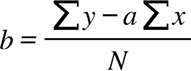 .
.
Now, let's apply these steps using NumPy as an example for the first dataset in the following code.
Let's take a look at the first step:
import numpy as np
x = np.array(range(1, 14))
y = np.array([2, 8, 8, 18, 25, 21, 32, 44, 32, 48, 61, 45, 62])
x_2 = x**2
xy = x*y
For x_2, the output will be this:
array([ 1, 4, 9, 16, 25, 36, 49, 64, 81,
100, 121, 144, 169], dtype=int32)
For xy, the output will be this:
array([2, 16, 24, 72, 125, 126, 224,
352, 288, 480, 671, 540, 806])
Now, let's move on to the next step:
sum_x = sum(x)
sum_y = sum(y)
sum_x_2 = sum(x_2)
sum_xy = sum(xy)
For sum_x, the output will be this:
91
For sum_y, the output will be this:
406
For sum_x_2, the output will be this:
819
For sum_xy, the output will be this:
3726
Now, let's move on to the next step:
N = len(x)
a = (N*sum_xy - (sum_x*sum_y))/(N*sum_x_2-(sum_x)**2)
For N, the output will be this:
13
For a, the output will be this:
4.857142857142857
Now, let's move on to the final step:
b = (sum_y - a*sum_x)/N
For b, the output will be this:
-2.7692307692307647
Once we plot the line ![]() with the preceding coefficients, we get the following graph:
with the preceding coefficients, we get the following graph:

Figure 2.7: Plotted graph of the linear regression for the first dataset
As you can see, our linear regression model works quite well on this dataset, which has a linear distribution.
Note
You can find a linear regression calculator at http://www.endmemo.com/statistics/lr.php. You can also check the calculator to get an idea of what lines of best fit look like on a given dataset.
We will now repeat the exact same steps for the second dataset:
import numpy as np
x = np.array(range(1, 14))
y = np.array([-0.6925069, -0.66856384, -0.66856384,
-0.64462079, -0.62067773, -0.57279161,
-0.50096244, -0.38124715, -0.18970269,
0.12155706, 0.62436127, 1.43842524, 2.75529341])
x_2 = x**2
xy = x*y
sum_x = sum(x)
sum_y = sum(y)
sum_x_2 = sum(x_2)
sum_xy = sum(xy)
N = len(x)
a = (N*sum_xy - (sum_x*sum_y))/(N*sum_x_2-(sum_x)**2)
b = (sum_y - a*sum_x)/N
For a, the output will be this:
0.21838173510989017
For b, the output will be this:
-1.528672146538462
Once we plot the line ![]() with the preceding coefficients, we get the following graph:
with the preceding coefficients, we get the following graph:

Figure 2.8: Plotted graph of the linear regression for the second dataset
Clearly, with a nonlinear distribution, our linear regression model struggles to fit the data.
Note
We don't have to use this method to perform linear regression. Many libraries, including scikit-learn, will help us to automate this process. Once we perform linear regression with multiple variables, we are better off using a library to perform the regression for us.
Fitting a Model Using NumPy Polyfit
NumPy Polyfit can also be used to create a line of best fit for linear regression with one variable.
Recall the calculation for the line of best fit:
import numpy as np
x = np.array(range(1, 14))
y = np.array([2, 8, 8, 18, 25, 21, 32, 44, 32, 48, 61, 45, 62])
x_2 = x**2
xy = x*y
sum_x = sum(x)
sum_y = sum(y)
sum_x_2 = sum(x_2)
sum_xy = sum(xy)
N = len(x)
a = (N*sum_xy - (sum_x*sum_y))/(N*sum_x_2-(sum_x)**2)
b = (sum_y - a*sum_x)/N
The equation for finding the coefficients ![]() and
and ![]() is quite long. Fortunately, numpy.polyfit in Python performs these calculations to find the coefficients of the line of best fit. The polyfit function accepts three arguments: the array of x values, the array of y values, and the degree of polynomial to look for. As we are looking for a straight line, the highest power of x is 1 in the polynomial:
is quite long. Fortunately, numpy.polyfit in Python performs these calculations to find the coefficients of the line of best fit. The polyfit function accepts three arguments: the array of x values, the array of y values, and the degree of polynomial to look for. As we are looking for a straight line, the highest power of x is 1 in the polynomial:
import numpy as np
x = np.array(range(1, 14))
y = np.array([2, 8, 8, 18, 25, 21, 32, 44, 32, 48, 61, 45, 62])
[a,b] = np.polyfit(x, y, 1)
For [a,b], the output will be this:
[4.857142857142858, -2.769230769230769]
Plotting the Results in Python
Suppose you have a set of data points and a regression line; our task is to plot the points and the line together so that we can see the results with our eyes.
We will use the matplotlib.pyplot library for this. This library has two important functions:
- scatter: This displays scattered points on the plane, defined by a list of x coordinates and a list of y coordinates.
- plot: Along with two arguments, this function plots a segment defined by two points or a sequence of segments defined by multiple points. A plot is like a scatter, except that instead of displaying the points, they are connected by lines.
A plot with three arguments plots a segment and/or two points formatted according to the third argument.
A segment is defined by two points. As x ranges between 1 and 13 (remember the dataset contains 13 data points), it makes sense to display a segment between 0 and 15. We must substitute the value of x in the equation ![]() to get the corresponding y values:
to get the corresponding y values:
import numpy as np
import matplotlib.pyplot as plot
x = np.array(range(1, 14))
y = np.array([2, 8, 8, 18, 25, 21, 32, 44, 32, 48, 61, 45, 62])
x_2 = x**2
xy = x*y
sum_x = sum(x)
sum_y = sum(y)
sum_x_2 = sum(x_2)
sum_xy = sum(xy)
N = len(x)
a = (N*sum_xy - (sum_x*sum_y))/(N*sum_x_2-(sum_x)**2)
b = (sum_y - a*sum_x)/N
# Plotting the points
plot.scatter(x, y)
# Plotting the line
plot.plot([0, 15], [b, 15*a+b])
plot.show()
The output is as follows:

Figure 2.9: Plotted graph of the linear regression for the first dataset using matplotlib
The regression line and the scattered data points are displayed as expected.
However, the plot has an advanced signature. You can use plot to draw scattered dots, lines, and any curves on this figure. These variables are interpreted in groups of three:
- x values
- y values
- Formatting options in the form of a string
Let's create a function for deriving an array of approximated y values from an array of approximated x values:
def fitY( arr ):
return [4.857142857142859 * x - 2.7692307692307843 for x in arr]
We will use the fit function to plot the values:
plot.plot(x, y, 'go',x, fitY(x), 'r--o')
Every third argument handles formatting. The letter g stands for green, while the letter r stands for red. You could have used b for blue and y for yellow, among other examples. In the absence of a color, each triple value will be displayed using a different color. The o character symbolizes that we want to display a dot where each data point lies. Therefore, go has nothing to do with movement – it requests the plotter to plot green dots. The - characters are responsible for displaying a dashed line. If you just use -1, a straight line appears instead of the dashed line.
The output is as follows:

Figure 2.10: Graph for the plot function using the fit function
The Python plotter library offers a simple solution for most of your graphing problems. You can draw as many lines, dots, and curves as you want on this graph.
When displaying curves, the plotter connects the dots with segments. Also, bear in mind that even a complex sequence of curves is an approximation that connects the dots. For instance, if you execute the code from https://gist.github.com/traeblain/1487795, you will recognize the segments of the batman function as connected lines:

Figure 2.11: Graph for the batman function
There is a large variety of ways to plot curves. We have seen that the polyfit method of the NumPy library returns an array of coefficients to describe a linear equation:
import numpy as np
x = np.array(range(1, 14))
y = np.array([2, 8, 8, 18, 25, 21, 32, 44, 32, 48, 61, 45, 62])
np.polyfit(x, y, 1)
Here the output is as follows:
[4.857142857142857, -2.769230769230768]
This array describes the equation 4.85714286 * x - 2.76923077.
Suppose we now want to plot a curve, ![]() . This quadratic equation is described by the coefficient array [-1, 3, -2] as
. This quadratic equation is described by the coefficient array [-1, 3, -2] as ![]() . We could write our own function to calculate the y values belonging to x values. However, the NumPy library already has a feature that can do this work for us – np.poly1d:
. We could write our own function to calculate the y values belonging to x values. However, the NumPy library already has a feature that can do this work for us – np.poly1d:
import numpy as np
x = np.array(range( -10, 10, 1 ))
f = np.poly1d([-1,3,-2])
The f function that's created by the poly1d call not only works with single values but also with lists or NumPy arrays:
f(5)
The expected output is this:
-12
Similarly, for f(x):
f(x)
The output will be:
array ([-132. -110, -90, -72, -56, -42, -30, -20, -12, -6, -2,
0, 0, -2, -6, -12, -20, -30, -42, -56])
We can now use these values to plot a nonlinear curve:
import matplotlib.pyplot as plot
plot.plot(x, f(x))
The output is as follows:

Figure 2.12: Graph for a nonlinear curve
As you can see, we can use the pyplot library to easily create the plot of a nonlinear curve.
Predicting Values with Linear Regression
Suppose we are interested in the y value belonging to the x coordinate 20. Based on the linear regression model, all we need to do is substitute the value of 20 in the place of x on the previously used code:
x = np.array(range(1, 14))
y = np.array([2, 8, 8, 18, 25, 21, 32, 44, 32, 48, 61, 45, 62])
# Plotting the points
plot.scatter(x, y)
# Plotting the prediction belonging to x = 20
plot.scatter(20, a * 20 + b, color='red')
# Plotting the line
plot.plot([0, 25], [b, 25*a+b])
The output is as follows:

Figure 2.13: Graph showing the predicted value using linear regression
Here, we denoted the predicted value with red. This red point is on the best line of fit.
Let's look at next exercise where we will be predicting populations based on linear regression.
Exercise 2.01: Predicting the Student Capacity of an Elementary School
In this exercise, you will be trying to forecast the need for elementary school capacity. Your task is to figure out 2025 and 2030 predictions for the number of children starting elementary school.
Note
The data is contained inside the population.csv file, which you can find on our GitHub repository: https://packt.live/2YYlPoj.
The following steps will help you to complete this exercise:
- Open a new Jupyter Notebook file.
- Import pandas and numpy:
import pandas as pd
import numpy as np
import matplotlib.pyplot as plot
- Next, load the CSV file as a DataFrame on the Notebook and read the CSV file:
Note
Watch out for the slashes in the string below. Remember that the backslashes ( ) are used to split the code across multiple lines, while the forward slashes ( / ) are part of the URL.
file_url = 'https://raw.githubusercontent.com/'
'PacktWorkshops/The-Applied-Artificial-'
'Intelligence-Workshop/master/Datasets/'
'population.csv'
df = pd.read_csv(file_url)
df
The expected output is this:

Figure 2.14: Reading the CSV file
- Now, convert the DataFrame into two NumPy arrays. For simplicity, we can indicate that the year feature, which is from 2001 to 2018, is the same as 1 to 18:
x = np.array(range(1, 19))
y = np.array(df['population'])
The x output will be:
array([1, 2, 3, 4, 5, 6, 7, 8, 9, 10, 11, 12, 13, 14, 15, 16, 17, 18])
The y output will be:
array([147026, 144272, 140020, 143801, 146233,
144539, 141273, 135389, 142500, 139452,
139722, 135300, 137289, 136511, 132884,
125683, 127255, 124275], dtype=int64)
- Now, with the two NumPy arrays, use the polyfit method (with a degree of 1 as we only have one feature) to determine the coefficients of the regression line:
[a, b] = np.polyfit(x, y, 1)
The output for [a, b] will be:
[-1142.0557275541803, 148817.5294117647]
- Now, plot the results using matplotlib.pyplot and predict the future until 2030:
plot.scatter( x, y )
plot.plot( [0, 30], [b, 30*a+b] )
plot.show()
The expected output is this:

Figure 2.15: Plot showing the future for 2030
As you can see, the data appears linear and our model seems to be a good fit.
- Finally, predict the population for 2025 and 2030:
population_2025 = 25*a+b
population_2030 = 30*a+b
The output for population_2025 will be:
120266.1362229102
The output for population_2030 will be:
114555.85758513928
Note
To access the source code for this specific section, please refer to https://packt.live/31dvuKt.
You can also run this example online at https://packt.live/317qeIc. You must execute the entire Notebook in order to get the desired result.
By completing this exercise, we can now conclude that the population of children starting elementary school is going to decrease in the future and that there is no need to increase the elementary school capacity if we are currently meeting the needs.
Linear Regression with Multiple Variables
In the previous section, we dealt with linear regression with one variable. Now we will learn an extended version of linear regression, where we will use multiple input variables to predict the output.
Multiple Linear Regression
If you recall the formula for the line of best fit in linear regression, it was defined as ![]() , where
, where ![]() is the slope of the line,
is the slope of the line, ![]() is the y intercept of the line, x is the feature value, and y is the calculated label value.
is the y intercept of the line, x is the feature value, and y is the calculated label value.
In multiple regression, we have multiple features and one label. If we have three features, x1, x2, and x3, our model changes to ![]() .
.
In NumPy array format, we can write this equation as follows:
y = np.dot(np.array([a1, a2, a3]), np.array([x1, x2, x3])) + b
For convenience, it makes sense to define the whole equation in a vector multiplication format. The coefficient of ![]() is going to be 1:
is going to be 1:
y = np.dot(np.array([b, a1, a2, a3]) * np.array([1, x1, x2, x3]))
Multiple linear regression is a simple scalar product of two vectors, where the coefficients ![]() ,
, ![]() ,
, ![]() , and
, and ![]() determine the best fit equation in a four-dimensional space.
determine the best fit equation in a four-dimensional space.
To understand the formula of multiple linear regression, you will need the scalar product of two vectors. As the other name for a scalar product is a dot product, the NumPy function performing this operation is called dot:
import numpy as np
v1 = [1, 2, 3]
v2 = [4, 5, 6]
np.dot(v1, v2)
The output will be 32 as np.dot(v1, v2)= 1 * 4 + 2 * 5 + 3 * 6 = 32.
We simply sum the product of each respective coordinate.
We can determine these coefficients by minimizing the error between the data points and the nearest points described by the equation. For simplicity, we will omit the mathematical solution of the best-fit equation and use scikit-learn instead.
Note
In n-dimensional spaces, where n is greater than 3, the number of dimensions determines the different variables that are in our model. In the preceding example, we have three features (x1, x2, and x3) and one label, y. This yields four dimensions. If you want to imagine a four-dimensional space, you can imagine a three-dimensional space with a fourth dimension of time. A five-dimensional space can be imagined as a four-dimensional space, where each point in time has a temperature. Dimensions are just features (and labels); they do not necessarily correlate with our concept of three-dimensional space.
The Process of Linear Regression
We will follow the following simple steps to solve linear regression problems:
- Load data from the data sources.
- Prepare data for prediction. Data is prepared in this (normalize, format, and filter) format.
- Compute the parameters of the regression line. Regardless of whether we use linear regression with one variable or with multiple variables, we will follow these steps.
Importing Data from Data Sources
There are multiple libraries that can provide us with access to data sources. As we will be working with stock data, let's cover two examples that are geared toward retrieving financial data: Quandl and Yahoo Finance. Take a look at these important points before moving ahead:
- Scikit-learn comes with a few datasets that can be used for practicing your skills.
- https://www.quandl.com provides you with free and paid financial datasets.
- https://pandas.pydata.org/ helps you load any CSV, Excel, JSON, or SQL data.
- Yahoo Finance provides you with financial datasets.
Loading Stock Prices with Yahoo Finance
The process of loading stock data with Yahoo Finance is straightforward. All you need to do is install the yfinance package using the following command in Jupyter Notebook:
!pip install yfinance
We will download a dataset that has an open price, high price, low price, close price, adjusted close price, and volume values of the S&P 500 index starting from 2015 to January 1, 2020. The S&P 500 index is the stock market index that measures the stock performance of 500 large companies listed in the United States:
import yfinance as yahoo
spx_data_frame = yahoo.download(“^GSPC”, “2015-01-01”, “2020-01-01”)
Note
The dataset file can also be found in our GitHub repository: https://packt.live/3fRI5Hk.
The original dataset can be found here: https://github.com/ranaroussi/yfinance.
That's all you need to do. The DataFrame containing the S&P 500 index is ready.
You can plot the index closing prices using the plot method:
spx_data_frame.Close.plot()
The output is as follows:

Figure 2.16: Graph showing the S&P 500 index closing price since 2015
The data does not appear to be linear; a polynomial regression might be a better model for this dataset.
It is also possible to save data to a CSV file using the following code:
spx_data_frame.to_csv(“yahoo_spx.csv”)
Note
https://www.quandl.com is a reliable source of financial and economic datasets that we will be using in this chapter.
Exercise 2.02: Using Quandl to Load Stock Prices
The goal of this exercise is to download data from the Quandl package and load it into a DataFrame like we previously did with Yahoo Finance.
The following steps will help you to complete the exercise:
- Open a new Jupyter Notebook file.
- Install Quandl using the following command:
!pip install quandl
- Download the data into a DataFrame using Quandl for the S&P 500. Its ticker is “YALE/SPCOMP”:
import quandl
data_frame = quandl.get(“YALE/SPCOMP”)
- Use the DataFrame head() method to inspect the first five rows of data in your DataFrame:
data_frame.head()
The output is as follows:

Figure 2.17: Dataset displayed as the output
Note
To access the source code for this specific section, please refer to https://packt.live/3dwDUz6.
You can also run this example online at https://packt.live/31812B6. You must execute the entire Notebook in order to get the desired result.
By completing this exercise, we have learned how to download an external dataset in CSV format and import it as a DataFrame. We also learned about the .head() method, which provides a quick view of the first five rows of your DataFrame.
In the next section, we will be moving on to prepare the dataset to perform multiple linear regression.
Preparing Data for Prediction
Before we perform multiple linear regression on our dataset, we must choose the relevant features and the data range on which we will perform the regression.
Preparing the data for prediction is the second step in the regression process. This step also has several sub-steps. We will go through these sub-steps in the following exercise.
Exercise 2.03: Preparing the Quandl Data for Prediction
The goal of this exercise is to download an external dataset from the Quandl library and then prepare it so that it is ready for use in our linear regression models.
The following steps will help you to complete this exercise:
- Open a new Jupyter Notebook file.
Note
If the Qaundl library is not installed on your system, remember to run the command !pip install quandl.
- Next, download the data into a DataFrame using Quandl for the S&P 500 between 1950 and 2019. Its ticker is “YALE/SPCOMP”:
import quandl
import numpy as np
from sklearn import preprocessing
from sklearn import model_selection
data_frame = quandl.get(“YALE/SPCOMP”,
start_date=”1950-01-01”,
end_date=”2019-12-31”)
- Use the head() method to visualize the columns inside the data_frame.head() DataFrame:
data_frame.head()
The output is as follows:

Figure 2.18: Dataset displayed as the output
A few features seem to highly correlate with each other. For instance, the Real Dividend column grows proportionally with Real Price. The ratio between them is not always similar, but they do correlate.
As regression is not about detecting the correlation between features, we would rather get rid of the features that we know are correlated and perform regression on the features that are non-correlated. In this case, we will keep the Long Interest Rate, Real Price, and Real Dividend columns.
- Keep only the relevant columns in the Long Interest Rate, Real Price, and Real Dividend DataFrames:
data_frame = data_frame[['Long Interest Rate',
'Real Price', 'Real Dividend']]
data_frame
The output is as follows:

Figure 2.19: Dataset showing only the relevant columns
You can see that the DataFrame contains a few missing values NaN. As regression doesn't work with missing values, we need to either replace them or delete them. In the real world, we will usually choose to replace them. In this case, we will replace the missing values by the preceding values using a method called forward filling.
- We can replace the missing values with a forward filling as shown in the following code snippet:
data_frame.fillna(method='ffill', inplace=True)
data_frame
The output is as follows:

Figure 2.20: Missing values have been replaced
Now that we have cleaned the missing data, we need to create our label. We want to predict the Real Price column 3 months in advance using the current Real Price, Long Interest Rate, and Real Dividend columns. In order to create our label, we need to shift the Real Price values up by three units and call it Real Price Label.
- Create the Real Price Label label by shifting Real Price by 3 months as shown in the following code:
data_frame['Real Price Label'] = data_frame['Real Price'].shift(-3)
data_frame
The output is as follows:

Figure 2.21: New labels have been created
The side effect of shifting these values is that missing values will appear in the last three rows for Real Price Label, so we need to remove the last three rows of data. However, before that, we need to convert the features into a NumPy array and scale it. We can use the drop method of the DataFrame to remove the label column and the preprocessing function from sklearn to scale the features.
- Create a NumPy array for the features and scale it in the following code:
features = np.array(data_frame.drop('Real Price Label', 1))
scaled_features = preprocessing.scale(features)
scaled_features
The output is as follows:
array([[-1.14839975, -1.13009904, -1.19222544],
[-1.14114523, -1.12483455, -1.18037146],
[-1.13389072, -1.12377394, -1.17439424],
...,
[-1.360812 , 2.9384288 , 3.65260385],
[-1.32599032, 3.12619329, 3.65260385],
[-1.29116864, 3.30013894, 3.65260385]])
The 1 in the second argument specifies that we are dropping columns. As the original DataFrame was not modified, the label can be directly extracted from it. Now that the features are scaled, we need to remove the last three values of the features as they are the features of the missing values in the label column. We will save them for later in the prediction part.
- Remove the last three values of the features array and save them into another array using the following code:
scaled_features_latest_3 = scaled_features[-3:]
scaled_features = scaled_features[:-3]
scaled_features
The output for scaled_features is as follows:
array([[-1.14839975, -1.13009904, -1.19222544],
[-1.14114523, -1.12483455, -1.18037146],
[-1.13389072, -1.12377394, -1.17439424],
...,
[-1.38866935, 2.97846643, 3.57443947],
[-1.38866935, 2.83458633, 3.6161088 ],
[-1.36429417, 2.95488131, 3.65260385]])
The scaled_features variable doesn't contain the three data points anymore as they are now in scaled_features_latest_3. Now we can remove the last three rows with missing data from the DataFrame, then convert the label into a NumPy array using sklearn.
- Remove the rows with missing data in the following code:
data_frame.dropna(inplace=True)
data_frame
The output for data_frame is as follows:
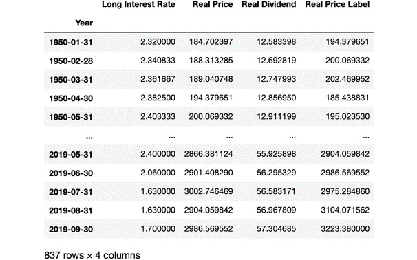
Figure 2.22: Dataset updated with the removal of missing values
As you can see, the last three rows were also removed from the DataFrame.
- Now let's see if we have accurately created our label. Go ahead and run the following code:
label = np.array(data_frame['Real Price Label'])
label
The output for the label is as follows:

Figure 2.23: Output showing the expected labels
Our variable contains all the labels and is exactly the same as the Real Price Label column in the DataFrame.
Our next task is to separate the training and testing data from each other. As we saw in the Splitting Data into Training and Testing section, we will use 90% of the data as the training data and the remaining 10% as the test data.
- Split the features data into training and test sets using sklearn with the following code:
from sklearn import model_selection
(features_train, features_test,
label_train, label_test) = model_selection
.train_test_split(scaled_features,
label, test_size=0.1,
random_state=8)
The train_test_split function shuffles the lines of our data, keeps the correspondence, and puts approximately 10% of all data in the test variables, keeping 90% for the training variables. We also use random_state=8 in order to reproduce the results. Our data is now ready to be used for the multiple linear regression model.
Note
To access the source code for this specific section, please refer to https://packt.live/2zZssOG.
You can also run this example online at https://packt.live/2zW8WCH. You must execute the entire Notebook in order to get the desired result.
By completing this exercise, we have learned all the required steps for data preparation before performing a regression.
Performing and Validating Linear Regression
Now that our data has been prepared, we can perform our linear regression. After that, we will measure our model performance and see how well it performs.
We can now create the linear regression model based on the training data:
from sklearn import linear_model
model = linear_model.LinearRegression()
model.fit(features_train, label_train)
Once the model is ready, we can use it to predict the labels belonging to the test feature values and use the score method from the model to see how accurate it is:
label_predicted = model.predict(features_test)
model.score(features_test, label_test)
The output is as follows:
0.9847223874806746
With a score or R2 of 0.985, we can conclude that the model is very accurate. This is not a surprise since the financial market grows at around 6-7% a year. This is linear growth, and the model essentially predicts that the markets will continue growing at a linear rate. Concluding that markets tend to increase in the long run is not rocket science.
Predicting the Future
Now that our model has been trained, we can use it to predict future values. We will use the scaled_features_latest_3 variable that we created by taking the last three values of the features NumPy array and using it to predict the index price of the next three months in the following code:
label_predicted = model.predict(scaled_features_latest_3)
The output is as follows:
array ([3046.2347327, 3171.47495182, 3287.48258298])
By looking at the output, you might think it seems easy to forecast the value of the S&P 500 and use it to earn money by investing in it. Unfortunately, in practice, using this model for making money by betting on the forecast is by no means better than gambling in a casino. This is just an example to illustrate prediction; it is not enough to be used for short-term or long-term speculation on market prices. In addition to this, stock prices are sensitive to many external factors, such as economic recession and government policy. This means that past patterns do not necessarily reflect any patterns in the future.
Polynomial and Support Vector Regression
When performing a polynomial regression, the relationship between x and y, or using their other names, features, and labels, is not a linear equation, but a polynomial equation. This means that instead of the ![]() equation, we can have multiple coefficients and multiple powers of x in the equation.
equation, we can have multiple coefficients and multiple powers of x in the equation.
To make matters even more complicated, we can perform polynomial regression using multiple variables, where each feature may have coefficients multiplying different powers of the feature.
Our task is to find a curve that best fits our dataset. Once polynomial regression is extended to multiple variables, we will learn the SVM model to perform polynomial regression.
Polynomial Regression with One Variable
As a recap, we have performed two types of regression so far:
- Simple linear regression:

- Multiple linear regression:

We will now learn how to do polynomial linear regression with one variable. The equation for polynomial linear regression is ![]() .
.
Polynomial linear regression has a vector of coefficients, ![]() , multiplying a vector of degrees of x in the polynomial,
, multiplying a vector of degrees of x in the polynomial, ![]() .
.
At times, polynomial regression works better than linear regression. If the relationship between labels and features can be described using a linear equation, then using a linear equation makes perfect sense. If we have a nonlinear growth, polynomial regression tends to approximate the relationship between features and labels better.
The simplest implementation of linear regression with one variable was the polyfit method of the NumPy library. In the next exercise, we will perform multiple polynomial linear regression with degrees of 2 and 3.
Note
Even though our polynomial regression has an equation containing coefficients of xn, this equation is still referred to as polynomial linear regression in literature. Regression is made linear not because we restrict the usage of higher powers of x in the equation, but because the coefficients a1,a2 … and so on are linear in the equation. This means that we use the toolset of linear algebra and work with matrices and vectors to find the missing coefficients that minimize the error of the approximation.
Exercise 2.04: First-, Second-, and Third-Degree Polynomial Regression
The goal of this exercise is to perform first-, second-, and third-degree polynomial regression on the two sample datasets that we used earlier in this chapter. The first dataset has a linear distribution and the second one is the Fibonacci sequence and has a nonlinear distribution.
The following steps will help you to complete the exercise:
- Open a new Jupyter Notebook file.
- Import the numpy and matplotlib packages:
import numpy as np
from matplotlib import pyplot as plot
- Define the first dataset:
x1 = np.array(range(1, 14))
y1 = np.array([2, 8, 8, 18, 25, 21, 32,
44, 32, 48, 61, 45, 62])
- Define the second dataset:
x2 = np.array(range(1, 14))
y2 = np.array([0, 1, 1, 2, 3, 5, 8, 13,
21, 34, 55, 89, 144])
- Perform a polynomial regression of degrees 1, 2, and 3 on the first dataset using the polyfit method from numpy in the following code:
f1 = np.poly1d(np.polyfit(x1, y1, 1))
f2 = np.poly1d(np.polyfit(x1, y1, 2))
f3 = np.poly1d(np.polyfit(x1, y1, 3))
The output for f1 is as follows:
poly1d([ 4.85714286, -2.76923077])
As you can see, a polynomial regression of degree 1 has two coefficients.
The output for f2 is as follows:
poly1d([-0.03196803, 5.3046953, -3.88811189])
As you can see, a polynomial regression of degree 2 has three coefficients.
The output for f3 is as follows:
poly1d([-0.01136364, 0.20666833, -3.91833167, -1.97902098])
As you can see, a polynomial regression of degree 3 has four coefficients.
Now that we have calculated the three polynomial regressions, we can plot them together with the data on a graph to see how they behave.
- Plot the three polynomial regressions and the data on a graph in the following code:
import matplotlib.pyplot as plot
plot.plot(x1, y1, 'ko', # black dots
x1, f1(x1),'k-', # straight line
x1, f2(x1),'k--', # black dashed line
x1, f3(x1),'k-.' # dot line
)
plot.show()
The output is as follows:

Figure 2.24: Graph showing the polynomial regressions for the first dataset
As the coefficients are enumerated from left to right in order of decreasing degree, we can see that the higher-degree coefficients stay close to negligible. In other words, the three curves are almost on top of each other, and we can only detect a divergence near the right edge. This is because we are working on a dataset that can be very well approximated with a linear model.
In fact, the first dataset was created out of a linear function. Any non-zero coefficients for x2 and x3 are the result of overfitting the model based on the available data. The linear model is better for predicting values outside the range of the training data than any higher-degree polynomial.
Let's contrast this behavior with the second example. We know that the Fibonacci sequence is nonlinear. So, using a linear equation to approximate it is a clear case for underfitting. Here, we expect a higher polynomial degree to perform better.
- Perform a polynomial regression of degrees 1, 2, and 3 on the second dataset using the polyfit method from numpy with the following code:
g1 = np.poly1d(np.polyfit(x2, y2, 1))
g2 = np.poly1d(np.polyfit(x2, y2, 2))
g3 = np.poly1d(np.polyfit(x2, y2, 3))
The output for g1 is as follows:
poly1d([ 9.12087912, -34.92307692])
As you can see, a polynomial regression of degree 1 has 2 coefficients.
The output for g2 is as follows:
poly1d([ 1.75024975, -15.38261738, 26.33566434])
As you can see, a polynomial regression of degree 2 has 3 coefficients.
The output for g3 is as follows:
poly1d([ 0.2465035, -3.42632368, 14.69080919, -15.07692308])
As you can see, a polynomial regression of degree 3 has 4 coefficients.
- Plot the three polynomial regressions and the data on a graph in the following code:
plot.plot(x2, y2, 'ko', # black dots
x2, g1(x2),'k-', # straight line
x2, g2(x2),'k--', # black dashed line
x2, g3(x2),'k-.' # dot line
)
plot.show()
The output is as follows:

Figure 2.25: Graph showing the second dataset points and three polynomial curves
The difference is clear. The quadratic curve fits the points a lot better than the linear one. The cubic curve is even better.
Note
To access the source code for this specific section, please refer to https://packt.live/3dpCgyY.
You can also run this example online at https://packt.live/2B09xDN. You must execute the entire Notebook in order to get the desired result.
If you research Binet's formula, you will find out that the Fibonacci function is an exponential function, as the nth Fibonacci number is calculated as the nth power of a constant. Therefore, the higher the polynomial degree we use, the more accurate our approximation will be.
Polynomial Regression with Multiple Variables
When we have one variable of degree n, we have n+1 coefficients in the equation as ![]() .
.
Once we deal with multiple features, x1, x2, …, xm, and their powers of up to the nth degree, we get an m * (n+1) matrix of coefficients. The math will become quite lengthy when we start exploring the details and prove how a polynomial model works. We will also lose the nice visualizations of two-dimensional curves.
Therefore, we will apply the concepts learned in the previous section on polynomial regression with one variable and omit the math. When training and testing a linear regression model, we can calculate the mean square error to see how good an approximation a model is.
In scikit-learn, the degree of the polynomials used in the approximation is a simple parameter in the model.
As polynomial regression is a form of linear regression, we can perform polynomial regression without changing the regression model. All we need to do is to transform the input and keep the linear regression model. The transformation of the input is performed by the fit_transform method of the PolynomialFeatures package.
First, we can reuse the code from Exercise 2.03, Preparing the Quandl Data for Prediction, up to Step 9 and import PolynomialFeatures from the preprocessing module of sklearn:
!pip install quandl
import quandl
import numpy as np
from sklearn import preprocessing
from sklearn import model_selection
from sklearn import linear_model
from matplotlib import pyplot as plot
from sklearn.preprocessing import PolynomialFeatures
data_frame = quandl.get(“YALE/SPCOMP”,
start_date=”1950-01-01”,
end_date=”2019-12-31”)
data_frame = data_frame[['Long Interest Rate',
'Real Price', 'Real Dividend']]
data_frame.fillna(method='ffill', inplace=True)
data_frame['Real Price Label'] = data_frame['Real Price'].shift(-3)
features = np.array(data_frame.drop('Real Price Label', 1))
scaled_features = preprocessing.scale(features)
scaled_features_latest_3 = scaled_features[-3:]
scaled_features = scaled_features[:-3]
data_frame.dropna(inplace=True)
label = np.array(data_frame['Real Price Label'])
Now, we can create a polynomial regression of degree 3 using the fit_transform method of PolynomialFeatures:
poly_regressor = PolynomialFeatures(degree=3)
poly_scaled_features = poly_regressor.fit_transform(scaled_features)
poly_scaled_features
The output of poly_scaled_features is as follows:
array([[ 1. , -1.14839975, -1.13009904, ..., -1.52261953,
-1.60632446, -1.69463102],
[ 1. , -1.14114523, -1.12483455, ..., -1.49346824,
-1.56720585, -1.64458414],
[ 1. , -1.13389072, -1.12377394, ..., -1.48310475,
-1.54991107, -1.61972667],
...,
[ 1. , -1.38866935, 2.97846643, ..., 31.70979016,
38.05472653, 45.66924612],
[ 1. , -1.38866935, 2.83458633, ..., 29.05499915,
37.06573938, 47.28511704],
[ 1. , -1.36429417, 2.95488131, ..., 31.89206605,
39.42259303, 48.73126873]])
Then, we need to split the data into testing and training sets:
(poly_features_train, poly_features_test,
poly_label_train, poly_label_test) =
model_selection.train_test_split(poly_scaled_features,
label, test_size=0.1,
random_state=8)
The train_test_split function shuffles the lines of our data, keeps the correspondence, and puts approximately 10% of all data in the test variables, keeping 90% for the training variables. We also use random_state=8 in order to reproduce the results.
Our data is now ready to be used for the multiple polynomial regression model; we will also measure its performance with the score function:
model = linear_model.LinearRegression()
model.fit(poly_features_train, poly_label_train)
model.score(poly_features_test, poly_label_test)
The output is as follows:
0.988000620369118
With a score or R2 of 0.988, our multiple polynomial regression model is slightly better than our multiple linear regression model (0.985), which we built in Exercise 2.03, Preparing the Quandl Data for Prediction. It might be possible that both models are overfitting the dataset.
There is another model in scikit-learn that performs polynomial regression, called the SVM model.
Support Vector Regression
SVMs are binary classifiers and are usually used in classification problems (you will learn more about this in Chapter 3, An Introduction to Classification). An SVM classifier takes data and tries to predict which class it belongs to. Once the classification of a data point is determined, it gets labeled. But SVMs can also be used for regression; that is, instead of labeling data, it can predict future values in a series.
The SVR model uses the space between our data as a margin of error. Based on the margin of error, it makes predictions regarding future values.
If the margin of error is too small, we risk overfitting the existing dataset. If the margin of error is too big, we risk underfitting the existing dataset.
In the case of a classifier, the kernel describes the surface dividing the state space, whereas, in a regression, the kernel measures the margin of error. This kernel can use a linear model, a polynomial model, or many other possible models. The default kernel is RBF, which stands for Radial Basis Function.
SVR is an advanced topic that is outside the scope of this book. Therefore, we will only stick to an easy walk-through as an opportunity to try out another regression model on our data.
We can reuse the code from Exercise 2.03, Preparing the Quandl Data for Prediction, up to Step 11:
import quandl
import numpy as np
from sklearn import preprocessing
from sklearn import model_selection
from sklearn import linear_model
from matplotlib import pyplot as plot
data_frame = quandl.get(“YALE/SPCOMP”,
start_date=”1950-01-01”,
end_date=”2019-12-31”)
data_frame = data_frame[['Long Interest Rate',
'Real Price', 'Real Dividend']]
data_frame.fillna(method='ffill', inplace=True)
data_frame['Real Price Label'] = data_frame['Real Price'].shift(-3)
features = np.array(data_frame.drop('Real Price Label', 1))
scaled_features = preprocessing.scale(features)
scaled_features_latest_3 = scaled_features[-3:]
scaled_features = scaled_features[:-3]
data_frame.dropna(inplace=True)
label = np.array(data_frame['Real Price Label'])
(features_train, features_test, label_train, label_test) =
model_selection.train_test_split(scaled_features, label,
test_size=0.1,
random_state=8)
Then, we can perform a regression with svm by simply changing the linear model to a support vector model by using the svm method from sklearn:
from sklearn import svm
model = svm.SVR()
model.fit(features_train, label_train)
As you can see, performing an SVR is exactly the same as performing a linear regression, with the exception of defining the model as svm.SVR().
Finally, we can predict and measure the performance of our model:
label_predicted = model.predict(features_test)
model.score(features_test, label_test)
The output is as follows:
0.03262153550014424
As you can see, the score or R2 is quite low, our SVR's parameters need to be optimized in order to increase the accuracy of the model.
Support Vector Machines with a 3-Degree Polynomial Kernel
Let's switch the kernel of the SVM to a polynomial function (the default degree is 3) and measure the performance of the new model:
model = svm.SVR(kernel='poly')
model.fit(features_train, label_train)
label_predicted = model.predict(features_test)
model.score(features_test, label_test)
The output is as follows:
0.44465054598560627
We managed to increase the performance of the SVM by simply changing the kernel function to a polynomial function; however, the model still needs a lot of tuning to reach the same performance as the linear regression models.
Activity 2.01: Boston House Price Prediction with Polynomial Regression of Degrees 1, 2, and 3 on Multiple Variables
In this activity, you will need to perform linear polynomial regression of degrees 1, 2, and 3 with scikit-learn and find the best model. You will work on the Boston House Prices dataset. The Boston House Price dataset is very famous and has been used as an example for research on regression models.
Note
More details about the Boston House Prices dataset can be found at https://archive.ics.uci.edu/ml/machine-learning-databases/housing/.
The dataset file can also be found in our GitHub repository: https://packt.live/2V9kRUU.
You will need to predict the prices of houses in Boston (label) based on their characteristics (features). Your main goal will be to build 3 linear models using polynomial regressions of degrees 1, 2, and 3 with all the features of the dataset. You can find the following dataset description:
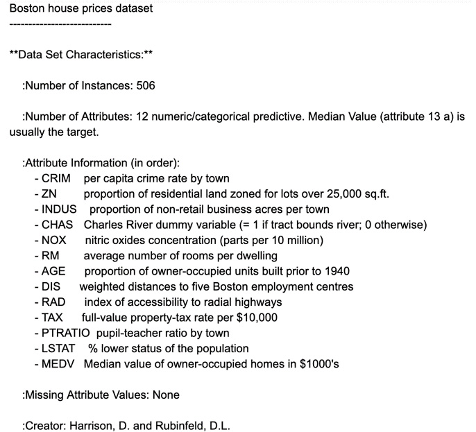
Figure 2.26: Boston housing dataset description
We will define our label as the MEDV field, which is the median value of the house in $1,000s. All of the other fields will be used as our features for our models. As this dataset does not contain any missing values, we won't have to replace missing values as we did in the previous exercises.
The following steps will help you to complete the activity:
- Open a Jupyter Notebook.
- Import the required packages and load the Boston House Prices data into a DataFrame.
- Prepare the dataset for prediction by converting the label and features into NumPy arrays and scaling the features.
- Create three different sets of features by transforming the scaled features into suitable formats for each of the polynomial regressions.
- Split the data into training and testing sets with random state = 8.
- Perform a polynomial regression of degree 1 and evaluate whether the model is overfitting.
- Perform a polynomial regression of degree 2 and evaluate whether the model is overfitting.
- Perform a polynomial regression of degree 3 and evaluate whether the model is overfitting.
- Compare the predictions of the three models against the label on the testing set.
The expected output is this:

Figure 2.27: Expected output based on the predictions
The solution to this activity is available on page 334.
Summary
In this chapter, we have learned the fundamentals of linear regression. After going through some basic mathematics, we looked at the mathematics of linear regression using one variable and multiple variables.
Then, we learned how to load external data from sources such as a CSV file, Yahoo Finance, and Quandl. After loading the data, we learned how to identify features and labels, how to scale data, and how to format data to perform regression.
We learned how to train and test a linear regression model, and how to predict the future. Our results were visualized by an easy-to-use Python graph plotting library called pyplot.
We also learned about a more complex form of linear regression: linear polynomial regression using arbitrary degrees. We learned how to define these regression problems on multiple variables and compare their performance on the Boston House Price dataset. As an alternative to polynomial regression, we also introduced SVMs as a regression model and experimented with two kernels.
In the next chapter, you will learn about classification and its models.