
Overview
This chapter will introduce you to the fundamentals of clustering, an unsupervised learning approach in contrast with the supervised learning approaches seen in the previous chapters. You will be implementing different types of clustering, including flat clustering with the k-means algorithm and hierarchical clustering with the mean shift algorithm and the agglomerative hierarchical model. You will also learn how to evaluate the performance of your clustering model using intrinsic and extrinsic approaches. By the end of this chapter, you will be able to analyze data using clustering and apply this skill to solve challenges across a variety of fields.
Introduction
In the previous chapter, you were introduced to decision trees and their applications in classification. You were also introduced to regression in Chapter 2, An Introduction to Regression. Both regression and classification are part of the supervised learning approach. However, in this chapter, we will be looking at the unsupervised learning approach; we will be dealing with datasets that don't have any labels (outputs). It is up to the machines to tell us what the labels will be based on a set of parameters that we define. In this chapter, we will be performing unsupervised learning by using clustering algorithms.
We will use clustering to analyze data to find certain patterns and create groups. Apart from that, clustering can be used for many purposes:
- Market segmentation detects the best stocks in the market you should be focusing on.
- Customer segmentation detects customer cohorts using their consumption patterns to recommend products better.
- In computer vision, image segmentation is performed using clustering. Using this, we can find different objects in an image.
- Clustering can be also be combined with classification to generate a compact representation of multiple features (inputs), which can then be fed to a classifier.
- Clustering can also filter data points by detecting outliers.
Regardless of whether we are applying clustering to genetics, videos, images, or social networks, if we analyze data using clustering, we may find similarities between data points that are worth treating uniformly.
For instance, consider a store manager, who is responsible for ensuring the profitability of their store. The products in the store are divided into different categories, and there are different customers who prefer different items. Each customer has their own preferences, but they have some similarities between them. You might have a customer who is interested in bio products, who tends to choose organic products, which are also of interest to a vegetarian customer. Even if they are different, they have similarities in their preferences or patterns as they both tend to buy organic vegetables. This can be treated as an example of clustering.
In Chapter 3, An Introduction to Classification, you learned about classification, which is a part of the supervised learning approach. In a classification problem, we use labels to train a model in order to be able to classify data points. With clustering, as we do not have labels for our features, we need to let the model figure out the clusters to which these features belong. This is usually based on the distance between each data point.
In this chapter, you will learn about the k-means algorithm, which is the most widely used algorithm for clustering, but first, we need to define what the clustering problem is.
Defining the Clustering Problem
We shall define the clustering problem so that we will be able to find similarities between our data points. For instance, suppose we have a dataset that consists of points. Clustering helps us understand this structure by describing how these points are distributed.
Let's look at an example of data points in a two-dimensional space in Figure 5.1:

Figure 5.1: Data points in a two-dimensional space
Now, have a look, at Figure 5.2. It is evident that there are three clusters:

Figure 5.2: Three clusters formed using the data points in a two-dimensional space
The three clusters were easy to detect because the points are close to one another. Here, you can see that clustering determines the data points that are close to each other. You may have also noticed that the data points M1, O1, and N1 do not belong to any cluster; these are the outlier points. The clustering algorithm you build should be prepared to treat these outlier points properly, without moving them into a cluster.
While it is easy to recognize clusters in a two-dimensional space, we normally have multidimensional data points, which is where we have more than two features. Therefore, it is important to know which data points are close to one other. Also, it is important to define the distance metrics that detect whether data points are close to each other. One well-known distance metric is Euclidean distance, which we learned about in Chapter 1, Introduction to Artificial Intelligence. In mathematics, we often use Euclidean distance to measure the distance between two points. Therefore, Euclidean distance is an intuitive choice when it comes to clustering algorithms so that we can determine the proximity of data points when locating clusters.
However, there is one drawback to most distance metrics, including Euclidean distance: the more we increase the dimensions, the more uniform these distances will become compared to each other. When we only have a few dimensions or features, it is easy to see which point is the closest to another one. However, when we add more features, the relevant features get embedded with all the other data and it becomes very hard to distinguish the relevant features from the others as they act as noise for our model. Therefore, getting rid of these noisy features may greatly increase the accuracy of our clustering model.
Note
Noise in a dataset can be irrelevant information or randomness that is unwanted.
In the next section, we will be looking at two different clustering approaches.
Clustering Approaches
There are two types of clustering:
- Flat
- Hierarchical
In flat clustering, we specify the number of clusters we would like the machine to find. One example of flat clustering is the k-means algorithm, where k specifies the number of clusters we would like the algorithm to use.
In hierarchical clustering, however, the machine learning algorithm itself finds out the number of clusters that are needed.
Hierarchical clustering also has two approaches:
- Agglomerative or bottom-up hierarchical clustering treats each point as a cluster to begin with. Then, the closest clusters are grouped together. The grouping is repeated until we reach a single cluster with every data point.
- Divisive or top-down hierarchical clustering treats data points as if they were all in one single cluster at the start. Then the cluster is divided into smaller clusters by choosing the furthest data points. The splitting is repeated until each data point becomes its own cluster.
Figure 5.3 gives you a much more accurate description of these two clustering approaches.
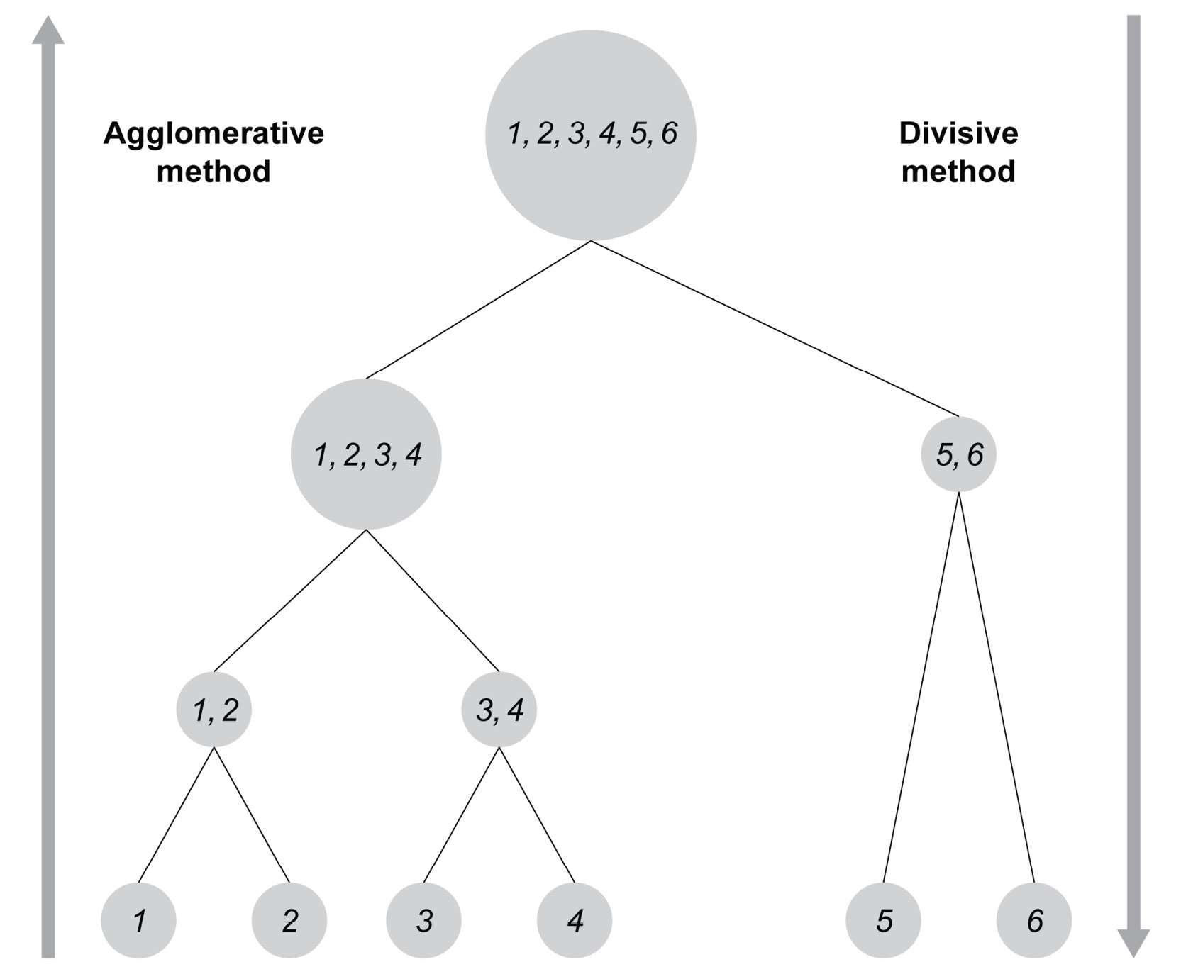
Figure 5.3: Figure showing the two approaches
Now that we are familiar with the different clustering approaches, let's take a look at the different clustering algorithms supported by scikit-learn.
Clustering Algorithms Supported by scikit-learn
In this chapter, we will learn about two clustering algorithms supported by scikit-learn:
- The k-means algorithm
- The mean shift algorithm
K-means is an example of flat clustering, where we must specify the number of clusters in advance. k-means is a general-purpose clustering algorithm that performs well if the number of clusters is not too high and the size of the clusters is uniform.
Mean shift is an example of hierarchical clustering, where the clustering algorithm determines the number of clusters. Mean shift is used when we do not know the number of clusters in advance. In contrast with k-means, mean shift supports use cases where there may be many clusters present, even if the size of the clusters greatly varies.
Scikit-learn contains many other algorithms, but we will be focusing on the k-means and mean shift algorithms in this chapter.
Note
For a complete description of clustering algorithms, including performance comparisons, visit the clustering page of scikit-learn at http://scikit-learn.org/stable/modules/clustering.html.
In the next section, we begin with the k-means algorithm.
The K-Means Algorithm
The k-means algorithm is a flat clustering algorithm, as mentioned previously. It works as follows:
- Set the value of k.
- Choose k data points from the dataset that are the initial centers of the individual clusters.
- Calculate the distance from each data point to the chosen center points and group each point in the cluster whose initial center is the closest to the data point.
- Once all the points are in one of the k clusters, calculate the center point of each cluster. This center point does not have to be an existing data point in the dataset; it is simply an average.
- Repeat this process of assigning each data point to the cluster whose center is closest to the data point. Repetition continues until the center points no longer move.
To ensure that the k-means algorithm terminates, we need the following:
- A maximum threshold value at which the algorithm will then terminate
- A maximum number of repetitions of shifting the moving points
Due to the nature of the k-means algorithm, it will have a hard time dealing with clusters that greatly vary in size.
The k-means algorithm has many use cases that are part of our everyday lives, such as:
- Market segmentation: Companies gather all sorts of data on their customers. Performing k-means clustering analysis on their customers will reveal customer segments (clusters) with defined characteristics. Customers belonging to the same segment can be seen as having similar patterns or preferences.
- Tagging of content: Any content (videos, books, documents, movies, or photos) can be assigned tags in order to group together similar content or themes. These tags are the result of clustering.
- Detection of fraud and criminal activities: Fraudsters often leave clues in the form of unusual behaviors compared to other customers. For instance, in the car insurance industry, a normal customer will make a claim for a damaged car arising from an incident, whereas fraudsters will make claims for deliberate damage. Clustering can help detect whether the damage has arisen from a real accident or from a fake accident.
In the next exercise, we will be implementing the k-means algorithm in scikit-learn.
Exercise 5.01: Implementing K-Means in scikit-learn
In this exercise, we will be plotting a dataset in a two-dimensional plane and performing clustering on it using the k-means algorithm.
The following steps will help you complete this exercise:
- Open a new Jupyter Notebook file.
- Now create an artificial dataset as a NumPy array to demonstrate the k-means algorithm. The data points are shown in the following code snippet:
import numpy as np
data_points = np.array([[1, 1], [1, 1.5], [2, 2],
[8, 1], [8, 0], [8.5, 1],
[6, 1], [1, 10], [1.5, 10],
[1.5, 9.5], [10, 10], [1.5, 8.5]])
- Now, plot these data points in the two-dimensional plane using matplotlib.pyplot, as shown in the following code snippet:
import matplotlib.pyplot as plot
plot.scatter(data_points.transpose()[0],
data_points.transpose()[1])
The expected output is this:

Figure 5.4: Graph showing the data points on a two-dimensional plane using matplotlib.pyplot
Note
We used the transpose array method to get the values of the first feature and the second feature. We could also use proper array indexing to access these columns: dataPoints[:,0], which is equivalent to dataPoints.transpose()[0].
Now that we have the data points, it is time to execute the k-means algorithm on them.
- Define k as 3 in the k-means algorithm. We expect a cluster in the bottom-left, top-left, and bottom-right corners of the graph. Add random_state = 8 in order to reproduce the same results:
from sklearn.cluster import KMeans
k_means_model = KMeans(n_clusters=3,random_state=8)
k_means_model.fit(data_points)
In the preceding code snippet, we have used the KMeans module from sklearn.cluster. As always with sklearn, we need to define a model with the parameter and then fit the model on the dataset.
The expected output is this:
KMeans(algorithm='auto', copy_x=True, init='k-means++',
max_iter=300, n_clusters=3, n_init=10, n_jobs=None,
precompute_distances='auto',
random_state=8, tol=0.0001, verbose=0)
The output shows all the parameters for our k-means models, but the important ones are:
max_iter: Represents the maximum number of times the k-means algorithm will iterate through.
n_clusters: Represents the number of clusters to be formed by the k-means algorithm.
n_init: Represents the number of times the k-means algorithm will initialize a random point.
tol: Represents the threshold for checking whether the k-means algorithm can terminate.
- Once the clustering is done, access the center point of each cluster as shown in the following code snippet:
centers = k_means_model.cluster_centers_
centers
The output of centers will be as follows:
array([[7.625 , 0.75 ],
[3.1 , 9.6 ],
[1.33333333, 1.5 ]])
This output is showing the coordinates of the center of our three clusters. If you look back at Figure 5.4, you will see that the center points of the clusters appear to be in the bottom-left, (1.3, 1.5), the top-left (3.1, 9.6), and the bottom-right (7.265, 0.75) corners of the graph. The x coordinate of the top-left cluster is 3.1, most likely because it contains our outlier data point at [10, 10].
- Next, plot the clusters with different colors and their center points. To find out which data point belongs to which cluster, we must query the labels property of the k-means classifier, as shown in the following code snippet:
labels = k_means_model.labels_
labels
The output of labels will be as follows:
array([2, 2, 2, 0, 0, 0, 0, 1, 1, 1, 1, 1])
The output array shows which data point belongs to which cluster. This is all we need to plot the data.
- Now, plot the data as shown in the following code snippet:
plot.scatter(centers[:,0], centers[:,1])
for i in range(len(data_points)):
plot.plot(data_points[i][0], data_points[i][1],
['k+','kx','k_'][k_means_model.labels_[i]])
plot.show()
In the preceding code snippets, we used the matplotlib library to plot the data points with the center of each coordinate. Each cluster has its marker (x, +, and -), and its center is represented by a filled circle.
The expected output is this:

Figure 5.5: Graph showing the center points of the three clusters
Having a look at Figure 5.5, you can see that the center points are inside their clusters, which are represented by the x, +, and - marks.
- Now, reuse the same code and choose only two clusters instead of three:
k_means_model = KMeans(n_clusters=2,random_state=8)
k_means_model.fit(data_points)
centers2 = k_means_model.cluster_centers_
labels2 = k_means_model.labels_
plot.scatter(centers2[:,0], centers2[:,1])
for i in range(len(data_points)):
plot.plot(data_points[i][0], data_points[i][1],
['k+','kx'][labels2[i]])
plot.show()
The expected output is this:

Figure 5.6: Graph showing the data points of the two clusters
This time, we only have x and + points, and we can clearly see a bottom cluster and a top cluster. Interestingly, the top cluster in the second try contains the same points as the top cluster in the first try. The bottom cluster of the second try consists of the data points joining the bottom-left and the bottom-right clusters of the first try.
- Finally, use the k-means model for prediction as shown in the following code snippet. The output will be an array containing the cluster numbers belonging to each data point:
predictions = k_means_model.predict([[5,5],[0,10]])
predictions
The output of predictions is as follows:
array([0, 1], dtype=int32)
This means that our first point belongs to the first cluster (at the bottom) and the second point belongs to the second cluster (at the top).
Note
To access the source code for this specific section, please refer to https://packt.live/2CpvMDo.
You can also run this example online at https://packt.live/2Nnv7F2. You must execute the entire Notebook in order to get the desired result.
By completing this exercise, you were able to use a simple k-means clustering model on sample data points.
The Parameterization of the K-Means Algorithm in scikit-learn
Like the classification and regression models in Chapter 2, An Introduction to Regression, Chapter 3, An Introduction to Classification, and Chapter 4, An Introduction to Decision Trees, the k-means algorithm can also be parameterized. The complete list of parameters can be found at http://scikit-learn.org/stable/modules/generated/sklearn.cluster.KMeans.html.
Some examples are as follows:
- n_clusters: The number of clusters into which the data points are separated. The default value is 8.
- max_iter: The maximum number of iterations.
- tol: The threshold for checking whether we can terminate the k-means algorithm.
We also used two attributes to retrieve the cluster center points and the clusters themselves:
- cluster_centers_: This returns the coordinates of the cluster center points.
- labels_: This returns an array of integers representing the number of clusters the data point belongs to. Numbering starts from zero.
Exercise 5.02: Retrieving the Center Points and the Labels
In this exercise, you will be able to understand the usage of cluster_centers_ and labels_.
The following steps will help you complete the exercise:
- Open a new Jupyter Notebook file.
- Next, create the same 12 data points from Exercise 5.01, Implementing K-Means in scikit-learn, but here, perform k-means clustering with four clusters, as shown in the following code snippet:
import numpy as np
import matplotlib.pyplot as plot
from sklearn.cluster import KMeans
data_points = np.array([[1, 1], [1, 1.5], [2, 2],
[8, 1], [8, 0], [8.5, 1],
[6, 1], [1, 10], [1.5, 10],
[1.5, 9.5], [10, 10], [1.5, 8.5]])
k_means_model = KMeans(n_clusters=4,random_state=8)
k_means_model.fit(data_points)
centers = k_means_model.cluster_centers_
centers
The output of centers is as follows:
array([[ 7.625 , 0.75 ],
[ 1.375 , 9.5 ],
[ 1.33333333, 1.5 ],
[10. , 10. ]])
The output of the cluster_centers_ property shows the x and y coordinates of the center points.
From the output, we can see the 4 centers, which are bottom right (7.6, 0.75), top left (1.3, 9.5), bottom left (1.3, 1.5), and top right (10, 10). We can also note that the fourth cluster (the top-right cluster) is only made of a single data point. This data point can be assumed to be an outlier.
- Now, apply labels_ property on the cluster:
labels = k_means_model.labels_
labels
The output of labels is as follows:
array([2, 2, 2, 0, 0, 0, 0, 1, 1, 1, 3, 1], dtype=int32)
The labels_ property is an array of length 12, showing the cluster of each of the 12 data points it belongs to. The first cluster is associated with the number 0, the second is associated with 1, the third is associated with 2, and so on (remember that Python indexes always start from 0 and not 1).
Note
To access the source code for this specific section, please refer to https://packt.live/3dmHsDX.
You can also run this example online at https://packt.live/2B0ebld. You must execute the entire Notebook in order to get the desired result.
By completing this exercise, you were able to retrieve the coordinates of a cluster's center. You were also able to see which label (cluster) each data point has been assigned to.
K-Means Clustering of Sales Data
In the upcoming activity, we will be looking at sales data, and we will perform k-means clustering on that sales data.
Activity 5.01: Clustering Sales Data Using K-Means
In this activity, you will work on the Sales Transaction Dataset Weekly dataset, which contains the weekly sales data of 800 products over 1 year. Our dataset won't contain any information regarding the product except sales.
Your goal will be to identify products with similar sales trends using the k-means clustering algorithm. You will have to experiment with the number of clusters in order to find the optimal number of clusters.
Note
The dataset can be found at https://archive.ics.uci.edu/ml/datasets/Sales_Transactions_Dataset_Weekly.
The dataset file can also be found in our GitHub repository: https://packt.live/3hVH42v.
Citation: Tan, S., & San Lau, J. (2014). Time series clustering: A superior alternative for market basket analysis. In Proceedings of the First International Conference on Advanced Data and Information Engineering (DaEng-2013) (pp. 241–248).
The following steps will help you complete this activity:
- Open a new Jupyter Notebook file.
- Load the dataset as a DataFrame and inspect the data.
- Create a new DataFrame without the unnecessary columns using the drop function from pandas (that is, the first 55 columns of the dataset) and use the inplace parameter, which is a part of pandas.
- Create a k-means clustering model with 8 clusters and with random_state = 8.
- Retrieve the labels from the first clustering model.
- From the first DataFrame, df, keep only the W columns and the labels as a new column.
- Perform the required aggregation using the groupby function from pandas in order to obtain the yearly average sale of each cluster.
The expected output is this:

Figure 5.7: Expected output on the Sales Transaction Data using k-means
Note
The solution to this activity is available on page 363.
Now that you have seen the k-means algorithm in detail, we will move on to another type of clustering algorithm, the mean shift algorithm.
The Mean Shift Algorithm
Mean shift is a hierarchical clustering algorithm that assigns data points to a cluster by calculating a cluster's center and moving it towards the mode at each iteration. The mode is the area with the most data points. At the first iteration, a random point will be chosen as the cluster's center and then the algorithm will calculate the mean of all nearby data points within a certain radius. The mean will be the new cluster's center. The second iteration will then begin with the calculation of the mean of all nearby data points and setting it as the new cluster's center. At each iteration, the cluster's center will move closer to where most of the data points are. The algorithm will stop when it is not possible for a new cluster's center to contain more data points. When the algorithm stops, each data point will be assigned to a cluster.
The mean shift algorithm will also determine the number of clusters needed, in contrast with the k-means algorithm. This is advantageous as we rarely know how many clusters we are looking for.
This algorithm also has many use cases. For instance, the Xbox Kinect device detects human body parts using the mean shift algorithm. Each main body part (head, arms, legs, hands, and so on) is a cluster of data points assigned by the mean shift algorithm.
In the next exercise, we will be implementing the mean shift algorithm.
Exercise 5.03: Implementing the Mean Shift Algorithm
In this exercise, we will implement clustering by using the mean shift algorithm.
We will use the scipy.spatial library in order to compute the Euclidean distance, seen in Chapter 1, Introduction to Artificial Intelligence. This library simplifies the calculation of distances (such as Euclidean or Manhattan) between a list of coordinates. More details about this library can be found at https://docs.scipy.org/doc/scipy/reference/spatial.distance.html#module-scipy.spatial.distance.
The following steps will help you complete the exercise:
- Open a new Jupyter Notebook file.
- Let's use the data points from Exercise 5.01, Implementing K-Means in scikit-learn:
import numpy as np
data_points = np.array([[1, 1], [1, 1.5], [2, 2],
[8, 1], [8, 0], [8.5, 1],
[6, 1], [1, 10], [1.5, 10],
[1.5, 9.5], [10, 10], [1.5, 8.5]])
import matplotlib.pyplot as plot
plot.scatter(data_points.transpose()[0],
data_points.transpose()[1])
Our task now is to find point P (x, y), for which the number of data points within radius R from point P is maximized. The points are distributed as follows:

Figure 5.8: Graph showing the data points from the data_points array
- Equate point P1 to the first data point, [1, 1] of our list:
P1 = [1, 1]
- Find the points that are within a distance of r = 2 from this point. We will use the scipy library, which simplifies mathematical calculations, including spatial distance:
from scipy.spatial import distance
r = 2
points1 = np.array([p0 for p0 in data_points if
distance.euclidean(p0, P1) <= r])
points1
In the preceding code snippet, we used the Euclidean distance to find all the points that fall within the r radius of point P1.
The output of points1 will be as follows:
array([[1. , 1. ],
[1. , 1.5],
[2. , 2. ]])
From the output, we can see that we found three points that fall within the radius of P1. They are the three points at the bottom left of the graph we saw earlier, in Figure 5.8 of this chapter.
- Now, calculate the mean of the data points to obtain the new coordinates of P2:
P2 = [np.mean( points1.transpose()[0] ),
np.mean(points1.transpose()[1] )]
P2
In the preceding code snippet, we have calculated the mean of the array containing the three data points in order to obtain the new coordinates of P2.
The output of P2 will be as follows:
[1.3333333333333333, 1.5]
- Now that the new P2 has been calculated, retrieve the points within the given radius again, as shown in the following code snippet:
points2 = np.array([p0 for p0 in data_points if
distance.euclidean( p0, P2) <= r])
points2
The output of points will be as follows:
array([[1. , 1. ],
[1. , 1.5],
[2. , 2. ]])
These are the same three points that we found in Step 4, so we can stop here. Three points have been found around the mean of [1.3333333333333333, 1.5]. The points around this center within a radius of 2 form a cluster.
- Since data points [1, 1.5] and [2, 2] are already in a cluster with [1,1], we can directly continue with the fourth point in our list, [8, 1]:
P3 = [8, 1]
points3 = np.array( [p0 for p0 in data_points if
distance.euclidean(p0, P3) <= r])
points3
In the preceding code snippet, we used the same code as Step 4 but with a new P3.
The output of points3 will be as follows:
array([[8. , 1. ],
[8. , 0. ],
[8.5, 1. ],
[6. , 1. ]])
This time, we found four points inside the radius r of P4.
- Now, calculate the mean, as shown in the following code snippet:
P4 = [np.mean(points3.transpose()[0]),
np.mean(points3.transpose()[1])]
P4
In the preceding code snippet, we calculated the mean of the array containing the four data points in order to obtain the new coordinates of P4, as in Step 5.
The output of P4 will be as follows:
[7.625, 0.75]
This mean will not change because in the next iteration, we will find the same data points.
- Notice that we got lucky with the selection of point [8, 1]. If we started with P = [8, 0] or P = [8.5, 1], we would only find three points instead of four. Let's try with P5 = [8, 0]:
P5 = [8, 0]
points4 = np.array([p0 for p0 in data_points if
distance.euclidean(p0, P5) <= r])
points4
In the preceding code snippet, we used the same code as in Step 4 but with a new P5.
The output of points4 will be as follows:
array([[8. , 1. ],
[8. , 0. ],
[8.5, 1. ]])
This time, we found three points inside the radius r of P5.
- Now, rerun the distance calculation with the shifted mean as shown in Step 5:
P6 = [np.mean(points4.transpose()[0]),
np.mean(points4.transpose()[1])]
P6
In the preceding code snippet, we calculated the mean of the array containing the three data points in order to obtain the new coordinates of P6.
The output of P6 will be as follows:
[8.166666666666666, 0.6666666666666666]
- Now do the same again but with P7 = [8.5, 1]:
P7 = [8.5, 1]
points5 = np.array([p0 for p0 in data_points if
distance.euclidean(p0, P7) <= r])
points5
In the preceding code snippet, we used the same code as in Step 4 but with a new P7.
The output of points5 will be as follows:
array([[8. , 1. ],
[8. , 0. ],
[8.5, 1. ]])
This time, we found the same three points again inside the radius r of P. This means that starting from [8,1], we got a larger cluster than starting from [8, 0] or [8.5, 1]. Therefore, we must take the center point that contains the maximum number of data points.
- Now, let's see what would happen if we started the discovery from the fourth data point, that is, [6, 1]:
P8 = [6, 1]
points6 = np.array([p0 for p0 in data_points if
distance.euclidean(p0, P8) <= r])
points6
In the preceding code snippet, we used the same code as in Step 4 but with a new P8.
The output of points6 will be as follows:
array([[8., 1.],
[6., 1.]])
This time, we found only two data points inside the radius r of P8. We successfully found the data point [8, 1].
- Now, shift the mean from [6, 1] to the calculated new mean:
P9 = [np.mean(points6.transpose()[0]),
np.mean(points6.transpose()[1]) ]
P9
In the preceding code snippet, we calculated the mean of the array containing the three data points in order to obtain the new coordinates of P9, as in Step 5.
The output of P9 will be as follows:
[7.0, 1.0]
- Check whether you have obtained more points with this new P9:
points7 = np.array([p0 for p0 in data_points if
distance.euclidean(p0, P9) <= r])
points7
In the preceding code snippet, we used the same code as in Step 4 but with a new P9.
The output of points7 will be as follows:
array([[8. , 1. ],
[8. , 0. ],
[8.5, 1. ],
[6. , 1. ]])
We successfully found all four points. Therefore, we have successfully defined a cluster of size 4. The mean will be the same as before: [7.625, 0.75].
Note
To access the source code for this specific section, please refer to https://packt.live/3drUZtE.
You can also run this example online at https://packt.live/2YoSu78. You must execute the entire Notebook in order to get the desired result.
This was a simple clustering example that applied the mean shift algorithm. We only illustrated what the algorithm considers when finding clusters.
However, there is still one question, and that is what will the value of the radius be?
Note that if the radius of 2 was not set, we could simply start either with a huge radius that includes all data points and then reduce the radius, or we could start with a tiny radius, making sure that each data point is in its cluster, and then increase the radius until we get the desired result.
In the next section, we will be looking at the mean shift algorithm but using scikit-learn.
The Mean Shift Algorithm in scikit-learn
Let's use the same data points we used with the k-means algorithm:
import numpy as np
data_points = np.array([[1, 1], [1, 1.5], [2, 2],
[8, 1], [8, 0], [8.5, 1],
[6, 1], [1, 10], [1.5, 10],
[1.5, 9.5], [10, 10], [1.5, 8.5]])
The syntax of the mean shift clustering algorithm is like the syntax for the k-means clustering algorithm:
from sklearn.cluster import MeanShift
mean_shift_model = MeanShift()
mean_shift_model.fit(data_points)
Once the clustering is done, we can access the center point of each cluster:
mean_shift_model.cluster_centers_
The expected output is this:
array([[ 1.375 , 9.5 ],
[ 8.16666667, 0.66666667],
[ 1.33333333, 1.5 ],
[10. , 10. ],
[ 6. , 1. ]])
The mean shift model found five clusters with the centers shown in the preceding code.
Like k-means, we can also get the labels:
mean_shift_model.labels_
The expected output is this:
array([2, 2, 2, 1, 1, 1, 4, 0, 0, 0, 3, 0], dtype=int64)
The output array shows which data point belongs to which cluster. This is all we need to plot the data:
import matplotlib.pyplot as plot
plot.scatter(mean_shift_model.cluster_centers_[:,0],
mean_shift_model.cluster_centers_[:,1])
for i in range(len(data_points)):
plot.plot(data_points[i][0], data_points[i][1],
['k+','kx','kv', 'k_', 'k1']
[mean_shift_model.labels_[i]])
plot.show()
In the preceding code snippet, we made a plot of the data points and the centers of the five clusters. Each data point belonging to the same cluster will have the same marker. The cluster centers are marked as a dot.
The expected output is this:

Figure 5.9: Graph showing the data points of the five clusters
We can see that three clusters contain more than a single dot (the top left, the bottom left, and the bottom right). The two single data points that are also their own cluster can be seen as outliers, as mentioned previously, as they are too far from the other clusters to be part of any of them.
Now that we have learned about the mean shift algorithm, we can have look at hierarchical clustering, and more specifically at agglomerative hierarchical clustering (the bottom-up approach).
Hierarchical Clustering
Hierarchical clustering algorithms fall into two categories:
- Agglomerative (or bottom-up) hierarchical clustering
- Divisive (or top-down) hierarchical clustering
We will only talk about agglomerative hierarchical clustering in this chapter, as it is the most widely used and most efficient of the two approaches.
Agglomerative hierarchical clustering treats each data point as a single cluster in the beginning and then successively merges (or agglomerates) the closest clusters together in pairs. In order to find the closest data clusters, agglomerative hierarchical clustering uses a heuristic such as the Euclidean or Manhattan distance to define the distance between data points. A linkage function will also be required to aggregate the distance between data points in clusters in order to define a unique value of the closeness of clusters.
Examples of linkage functions include single linkage (simple distance), average linkage (average distance), maximum linkage (maximum distance), and Ward linkage (square difference). The pairs of clusters with the smallest value of linkage will be grouped together. The grouping is repeated until we reach a single cluster containing every data point. In the end, this algorithm terminates when there is only a single cluster left.
In order to visually represent the hierarchy of clusters, a dendrogram can be used. A dendrogram is a tree where the leaves at the bottom represent data points. Each intersection between two leaves is the grouping of these two leaves. The root (top) represents a unique cluster that contains all the data points. Have a look at Figure 5.10, which represents a dendrogram.

Figure 5.10: Example of a dendrogram
Agglomerative Hierarchical Clustering in scikit-learn
Have a look at the following example, where we use the same data points as we used with the k-means algorithm:
import numpy as np
data_points = np.array([[1, 1], [1, 1.5], [2, 2],
[8, 1], [8, 0], [8.5, 1],
[6, 1], [1, 10], [1.5, 10],
[1.5, 9.5], [10, 10], [1.5, 8.5]])
In order to plot a dendrogram, we need to first import the scipy library:
from scipy.cluster.hierarchy import dendrogram
import scipy.cluster.hierarchy as sch
Then we can plot a dendrogram using SciPy with the ward linkage function, as it is the most commonly used linkage function:
dendrogram = sch.dendrogram(sch.linkage(data_points,
method='ward'))
The output of the dendrogram will be as follows:

Figure 5.11: Dendrogram based on random data points
With the dendrogram, we can generally guess what will be a good number of clusters by simply drawing a horizontal line as shown in Figure 5.12, in the area with the highest vertical distance, and counting the number of intersections. In this case, it should be two clusters, but we will go to the next biggest area as two is too small a number.

Figure 5.12: Division on clusters in the dendrogram
The y axis represents the measure of closeness, and the x axis represents the index of each data point. So our first three data points (0,1,2) are parts of the same cluster, then another cluster is made of the next four points (3,4,5,6), data point 10 is a cluster on its own, and the remaining data points (7,8,9,11) form the last cluster.
The syntax of the agglomerative hierarchical clustering algorithm is similar to the k-means clustering algorithm except that we need to specify the number type of affinity (here, we choose the Euclidean distance) and the linkage (here, we choose the ward linkage):
from sklearn.cluster import AgglomerativeClustering
agglomerative_model = AgglomerativeClustering(n_clusters=4,
affinity='euclidean',
linkage='ward')
agglomerative_model.fit(data_points)
The output is:
AgglomerativeClustering(affinity='euclidean',
compute_full_tree='auto',
connectivity=None,
distance_threshold=None,
linkage='ward', memory=None,
n_clusters=4, pooling_func='deprecated')
Similar to k-means, we can also get the labels as shown in the following code snippet:
agglomerative_model.labels_
The expected output is this:
array([2, 2, 2, 0, 0, 0, 0, 1, 1, 1, 3, 1], dtype=int64)
The output array shows which data point belongs to which cluster. This is all we need to plot the data:
import matplotlib.pyplot as plot
for i in range(len(data_points)):
plot.plot(data_points[i][0], data_points[i][1],
['k+','kx','kv', 'k_'][agglomerative_model.labels_[i]])
plot.show()
In the preceding code snippet, we made a plot of the data points and the four clusters' centers. Each data point belonging to the same cluster will have the same marker.
The expected output is this:

Figure 5.13: Graph showing the data points of the four clusters
We can see that, in contrast with the result from the mean shift method, agglomerative clustering was able to properly group the data point at (6,1) with the bottom-right cluster instead of having his own cluster. In situations like this one, where we have a very small amount of data, agglomerative hierarchical clustering and mean shift will work better than k-means. However, they have very expensive computational time requirements, which will make them struggle on very large datasets. However, k-means is very fast and is a better choice for very large datasets.
Now that we have learned about a few different clustering algorithms, we need to start evaluating these models and comparing them in order to choose the best model for clustering.
Clustering Performance Evaluation
Unlike supervised learning, where we always have the labels to evaluate our predictions with, unsupervised learning is a bit more complex as we do not usually have labels. In order to evaluate a clustering model, two approaches can be taken depending on whether the label data is available or not:
- The first approach is the extrinsic method, which requires the existence of label data. This means that in absence of label data, human intervention is required in order to label the data or at least a subset of it.
- The other approach is the intrinsic approach. In general, the extrinsic approach tries to assign a score to clustering, given the label data, whereas the intrinsic approach evaluates clustering by examining how well the clusters are separated and how compact they are.
Note
We will skip the mathematical explanations as they are quite complicated.
You can find more mathematical details on the sklearn website at this URL: https://scikit-learn.org/stable/modules/clustering.html#clustering-performance-evaluation
We will begin with the extrinsic approach (as it is the most widely used method) and define the following scores using sklearn on our k-means example:
- The adjusted Rand index
- The adjusted mutual information
- The homogeneity
- The completeness
- The V-Measure
- The Fowlkes-Mallows score
- The contingency matrix
Let's have a look at an example in which we first need to import the metrics module from sklearn.cluster:
from sklearn import metrics
We will be reusing the code from our k-means example in Exercise 5.01, Implementing K-Means in scikit-learn:
import numpy as np
import matplotlib.pyplot as plot
from sklearn.cluster import KMeans
data_points = np.array([[1, 1], [1, 1.5], [2, 2],
[8, 1], [8, 0], [8.5, 1],
[6, 1], [1, 10], [1.5, 10],
[1.5, 9.5], [10, 10], [1.5, 8.5]])
k_means_model = KMeans(n_clusters=3,random_state = 8)
k_means_model.fit(data_points)
k_means_model.labels_
The output of our predicted labels using k_means_model.labels_ was:
array([2, 2, 2, 0, 0, 0, 0, 1, 1, 1, 1, 1])
Finally, define the true labels of this dataset, as shown in the following code snippet:
data_labels = np.array([0, 0, 0, 2, 2, 2, 2, 1, 1, 1, 3, 1])
The Adjusted Rand Index
The adjusted Rand index is a function that measures the similarity between the cluster predictions and the labels while ignoring permutations. The adjusted Rand index works quite well when the labels are large equal-sized clusters.
The adjusted Rand index has a range between [-1.1], where negative values are not desirable. A negative score means that our model is performing worse than if we were to randomly assign labels. If we were to randomly assign them, our score would be close to 0. However, the closer we are to 1, the better our clustering model is at predicting the right label.
With sklearn, we can easily compute the adjusted Rand index by using this code:
metrics.adjusted_rand_score(data_labels, k_means_model.labels_)
The expected output is this:
0.8422939068100358
In this case, the adjusted Rand index indicates that our k-means model is not far from our true labels.
The Adjusted Mutual Information
The adjusted mutual information is a function that measures the entropy between the cluster predictions and the labels while ignoring permutations.
The adjusted mutual information has no defined range, but negative values are considered bad. The closer we are to 1, the better our clustering model is at predicting the right label.
With sklearn, we can easily compute it by using this code:
metrics.adjusted_mutual_info_score(data_labels,
k_means_model.labels_)
The expected output is this:
0.8769185235006342
In this case, the adjusted mutual information indicates that our k-means model is quite good and not far from our true labels.
The V-Measure, Homogeneity, and Completeness
The V-Measure is defined as the harmonic mean of homogeneity and completeness. The harmonic mean is a type of average (other types are the arithmetic mean and the geometric mean) using reciprocals (a reciprocal is the inverse of a number. For example the reciprocal of 2 is ![]() , and the reciprocal of 3 is
, and the reciprocal of 3 is ![]() ).
).
The formula of the harmonic mean is as follows:

Figure 5.14: The harmonic mean formula
![]() is the number of values and
is the number of values and ![]() is the value of each point.
is the value of each point.
In order to calculate the V-Measure, we first need to define homogeneity and completeness.
Perfect homogeneity refers to a situation where each cluster has data points belonging to the same label. The homogeneity score will reflect how well each of our clusters is grouping data from the same label.
Perfect completeness refers to the situation where all data points belonging to the same label are clustered into the same cluster. The homogeneity score will reflect how well, for each of our labels, its data points are all grouped inside the same cluster.
Hence, the formula of V-Measure is as follows:

Figure 5.15: The V-Measure formula
![]() has a default value of 1, but it can be changed to further emphasize either homogeneity or completeness.
has a default value of 1, but it can be changed to further emphasize either homogeneity or completeness.
These three scores have a range between [0,1], with 0 being the worst possible score and 1 being the perfect score.
With sklearn, we can easily compute these three scores by using this code:
metrics.homogeneity_score(data_labels, k_means_model.labels_)
metrics.completeness_score(data_labels, k_means_model.labels_)
metrics.v_measure_score(data_labels, k_means_model.labels_,
beta=1)
The output of homogeneity_score is as follows:
0.8378758055108827
In this case, the homogeneity score indicates that our k-means model has clusters containing different labels.
The output of completeness_score is as follows:
1.0
In this case, the completeness score indicates that our k-means model has successfully put every data point of each label inside the same cluster.
The output of v_measure_score is as follows:
0.9117871871412709
In this case, the V-Measure indicates that our k-means model, while not being perfect, has a good score in general.
The Fowlkes-Mallows Score
The Fowlkes-Mallows score is a metric measuring the similarity within a label cluster and the prediction of the cluster, and this is defined as the geometric mean of the precision and recall (you learned about this in Chapter 4, An Introduction to Decision Trees).
The formula of the Fowlkes-Mallows score is as follows:

Figure 5.16: The Fowlkes-Mallows formula
Let's break this down:
- True positive (or TP): Are all the observations where the predictions are in the same cluster as the label cluster
- False positive (or FP): Are all the observations where the predictions are in the same cluster but not the same as the label cluster
- False negative (or FN): Are all the observations where the predictions are not in the same cluster but are in the same label cluster
The Fowlkes-Mallows score has a range between [0, 1], with 0 being the worst possible score and 1 being the perfect score.
With sklearn, we can easily compute it by using this code:
metrics.fowlkes_mallows_score(data_labels, k_means_model.labels_)
The expected output is this:
0.8885233166386386
In this case, the Fowlkes-Mallows score indicates that our k-means model is quite good and not far from our true labels.
The Contingency Matrix
The contingency matrix is not a score, but it reports the intersection cardinality for every true/predicted cluster pair and the required label data. It is very similar to the Confusion Matrix seen in Chapter 4, An Introduction to Decision Trees. The matrix must be the same for the label and cluster name, so we need to be careful to give our cluster the same name as our label, which was not the case with the previously seen scores.
We will modify our labels from this:
data_labels = np.array([0, 0, 0, 2, 2, 2, 2, 1, 1, 1, 3, 1])
To this:
data_labels = np.array([2, 2, 2, 1, 1, 1, 1, 0, 0, 0, 3, 0])
Then, with sklearn, we can easily compute the contingency matrix by using this code:
from sklearn.metrics.cluster import contingency_matrix
contingency_matrix(k_means_model.labels_,data_labels)
The output of contingency_matrix is as follows:
array([[0, 4, 0, 0],
[4, 0, 0, 1],
[0, 0, 3, 0]])
The first row of the contingency_matrix output indicates that there are 4 data points whose true cluster is the first cluster (0). The second row indicates that there are also four data points whose true cluster is the second cluster (1); however, an extra 1 was incorrectly predicted in this cluster, but it belongs to the fourth cluster (3). The third row indicates that there are three data points whose true cluster is the third cluster (2).
We will now look at the intrinsic approach, which is required when we do not have the label. We will define the following scores using sklearn on our k-means example:
- The Silhouette Coefficient
- The Calinski-Harabasz index
- The Davies-Bouldin index
The Silhouette Coefficient
The Silhouette Coefficient is an example of an intrinsic evaluation. It measures the similarity between a data point and its cluster when compared to other clusters.
It comprises two scores:
- a: The average distance between a data point and all other data points in the same cluster.
- b: The average distance between a data point and all the data points in the nearest cluster.
The Silhouette Coefficient formula is:

Figure 5.17: The Silhouette Coefficient formula
The Silhouette Coefficient has a range between [-1,1], with -1 meaning an incorrect clustering. A score close to zero indicates that our clusters are overlapping. A score close to 1 indicates that all the data points are assigned to the appropriate clusters.
Then, with sklearn, we can easily compute the silhouette coefficient by using this code:
metrics.silhouette_score(data_points, k_means_model.labels_)
The output of silhouette_score is as follows:
0.6753568188872228
In this case, the Silhouette Coefficient indicates that our k-means model has some overlapping clusters, and some improvements can be made by separating some of the data points from one of the clusters.
The Calinski-Harabasz Index
The Calinski-Harabasz index measures how the data points inside each cluster are spread. It is defined as the ratio of the variance between clusters and the variance inside each cluster. The Calinski-Harabasz index doesn't have a range and starts from 0. The higher the score is, the denser our clusters are. A dense cluster is an indication of a well-defined cluster.
With sklearn, we can easily compute it by using this code:
metrics.calinski_harabasz_score(data_points, k_means_model.labels_)
The output of calinski_harabasz_score is as follows:
19.52509172315154
In this case, the Calinski-Harabasz index indicates that our k-means model clusters are quite spread out and suggests that we might have overlapping clusters.
The Davies-Bouldin Index
The Davies-Bouldin index measures the average similarity between clusters. The similarity is a ratio of the distance between a cluster and its closest cluster and the average distance between each data point of a cluster and it's cluster's center. The Davies-Bouldin index doesn't have a range and starts from 0. The closer the score is to 0 the better; it means the clusters are well separated, which is an indication of a good cluster.
With sklearn, we can easily compute the Davis-Bouldin index by using this code:
metrics.davies_bouldin_score(data_points, k_means_model.labels_)
The output of davies_bouldin_score is as follows:
0.404206621415983
In this case, the Calinski-Harabasz score indicates that our k-means model has some overlapping clusters and an improvement could be made by better separating some of the data points in one of the clusters.
Activity 5.02: Clustering Red Wine Data Using the Mean Shift Algorithm and Agglomerative Hierarchical Clustering
In this activity, you will work on the Wine Quality dataset and, more specifically, on red wine data. This dataset contains data on the quality of 1,599 red wines and the results of their chemical tests.
Your goal will be to build two clustering models (using the mean shift algorithm and agglomerative hierarchical clustering) in order to identify whether wines of similar quality also have similar physicochemical properties. You will also have to evaluate and compare the two clustering models using extrinsic and intrinsic approaches.
Note
The dataset can be found at the following URL: https://archive.ics.uci.edu/ml/datasets/Wine+Quality.
The dataset file can be found on our GitHub repository at https://packt.live/2YYsxuu.
Citation: P. Cortez, A. Cerdeira, F. Almeida, T. Matos and J. Reis. Modeling wine preferences by data mining from physicochemical properties. In Decision Support Systems, Elsevier, 47(4):547-553, 2009.
The following steps will help you complete the activity:
- Open a new Jupyter Notebook file.
- Load the dataset as a DataFrame with sep = ";" and inspect the data.
- Create a mean shift clustering model, then retrieve the model's predicted labels and the number of clusters created.
- Create an agglomerative hierarchical clustering model after creating a dendrogram and selecting the optimal number of clusters.
- Retrieve the labels from the first clustering model.
- Compute the following extrinsic approach scores for both models:
The adjusted Rand index
The adjusted mutual information
The V-Measure
The Fowlkes-Mallows score
- Compute the following intrinsic approach scores for both models:
The Silhouette Coefficient
The Calinski-Harabasz index
The Davies-Bouldin index
The expected output is this:
The values of each score for the mean shift clustering model will be as follows:
- The adjusted Rand index: 0.0006771608724007207
- The adjusted mutual information: 0.004837187596124968
- The V-Measure: 0.021907254751144124
- The Fowlkes-Mallows score: 0.5721233634622408
- The Silhouette Coefficient: 0.32769323700400077
- The Calinski-Harabasz index: 44.62091774102674
- The Davies-Bouldin index: 0.8106334674570222
The values of each score for the agglomerative hierarchical clustering will be as follows:
- The adjusted Rand index: 0.05358047852603172
- The adjusted mutual information: 0.05993098663692826
- The V-Measure: 0.07549735446050691
- The Fowlkes-Mallows score: 0.3300681478007641
- The Silhouette Coefficient: 0.1591882574407987
- The Calinski-Harabasz index: 223.5171774491095
- The Davies-Bouldin index: 1.4975443816135114
Note
The solution to this activity is available on page 368.
By completing this activity, you performed mean shift and agglomerative hierarchical clustering on multiple columns for many products. You also learned how to evaluate a clustering model with an extrinsic and intrinsic approach. Finally, you used the results of your models and their evaluation to find an answer to a real-world problem.
Summary
In this chapter, we learned the basics of how clustering works. Clustering is a form of unsupervised learning where the features are given, but not the labels. It is the goal of the clustering algorithms to find the labels based on the similarity of the data points.
We also learned that there are two types of clustering, flat and hierarchical, with the first type requiring the number of clusters to find, whereas the second type finds the optimal number of clusters itself.
The k-means algorithm is an example of flat clustering, whereas mean shift and agglomerative hierarchical clustering are examples of a hierarchical clustering algorithm.
We also learned about the numerous scores to evaluate the performance of a clustering model, with the labels in the extrinsic approach or without the labels in the intrinsic approach.
In Chapter 6, Neural Networks and Deep Learning, you will be introduced to a field that has become popular in this decade due to the explosion of computation power and cheap, scalable online server capacity. This field is the science of neural networks and deep learning.