STEP SIX
Create Visuals That Support Your Presentation
OVERVIEW
Find and use pictures to tell your story
Use PowerPoint effectively
Create interaction with annotation tools
Share applications and documents
People are primarily visual creatures—they take in most information through their eyes. This is both the good news and the bad news of presenting online: Information that’s interesting to look at and relevant to your presentation will stick with your audience. Information that’s distracting or hard to look at (or even annoying) will get in the way of your message.
The beauty of an online presentation is that it provides a richer experience than just a phone call: You can show pictures, demonstrate processes to your audience, and answer participants’ questions in real time, all while helping them retain the information and moving you both closer to your objectives.
Poor visuals that make you appear less than proficient with your media do not help at all. Put simply, good visuals
- tell the same story to the audience as your words
- reinforce your message and move the audience toward your objective
- look professional and add to your overall appearance of credibility
- are easy to work with.
POINTER
For the purposes of this book, the term visuals describes anything the audience sees while your presentation is going on. This includes the things you don’t want people to see.
When we talk about visuals in this book, we’ll discuss five primary things people see during a webinar:
- webcams
- pictures and screen shots
- PowerPoint slides
- annotation tools
- shared applications and documents.
To be used to its optimum, each item has both unique qualities that can add value to your presentation and challenges that need to be overcome.
Use Webcams
The quality of webcams and streaming video is quickly changing. Some platforms support these features well (iLinc, Netbriefings, Telenect), others use them well in their top-tier packages (Live Meeting and WebEx), and some don’t support them at all yet, but that will probably change (GoToMeeting and GoToWebinar). This will become part of your presenting arsenal, but check your computer, your web platform, and your audience’s resources before making it a permanent part of your presenting repertoire.
POINTER
Webcams are a feature that presenters both love and fear. People who are good, experienced live presenters believe that webcams will make the presentation closer to a live event because people can see them. They are pretty cool—after all, anyone who grew up with The Jetsons couldn’t wait for the day when video phones would be in every home and office and audiences could see presenters in all their glory. (Those of us who’ve been to video conferences at six in the morning quickly learn this is an overrated feature.)
Webcams have various downsides:
- They suck up a lot of bandwidth and cause screens to freeze and applications to crash (though this is improving).
- They capture everything—even things you don’t want the audience to see.
- A feature of most inexpensive webcams, including those built into today’s laptops, is a fish-eye lens, which means you really need to stay in the one place it focuses effectively and keep motion to a minimum. If you’ve ever looked through the peephole in an apartment door, you know what this looks like. Even when the face is in focus, the hands look like they belong on a sci-fi movie monster.
- Members of your audience often concentrate on the visual of you on a webcam (after all, it’s shiny, and things move) rather than your content. Unless your ego is completely out of control, you don’t want that.
- Webcams are just one more thing to worry about. When presenting online, your goal is to reduce the number of distractions, not have to stay on top of more things. You want to be able to focus on your audience and your presentation.
When does a webcam add real value to a presentation?
- Video reduces the feeling of distance between participants and presenter and builds a connection.
- It can increase audience comfort. People’s brains make decisions about buy-in and acceptance very quickly. If they see you and the impression is positive, they lower their defenses and are able to pay more attention.
- Good webcam visuals send the signal to your audience that you are technologically competent and comfortable. This technology is still new enough that many people are impressed by the wow factor of seeing the speaker on their computers. If this is important to your image, then you should find a platform that supports webcams.
Webcams become more trouble than they’re worth when they
- cause technical problems by sucking up bandwidth or overtaxing your computer
- distract the audience’s attention
- divert your attention away from the task at hand.
Follow these eight guidelines for using webcams effectively:
- Make sure participants can see you. If you plan to use a video camera, the attendees should be able to see who’s talking. Just like taking pictures with a still camera, the light source should be in front of you (natural light through a window or at least from a lamp) so that your face is lit. If light is coming in from behind you, your face will be in shadow and your audience will have difficulty seeing you clearly.
- Don’t move around too much. Most plug-in cameras aren’t designed for high resolution. Mix that with how hard your computer is already working, and you’ll find that sudden movements will cause the picture to blur or even break up. This usually solves itself when you get to the new position, but it causes a couple of seconds of useless video.
- Be aware of what you wear. Leave aside your personal fashion sense for a moment. Clothes can cause havoc with your webcam. Pure white clothing can “flare” and show up very brightly on camera, which can wash out your face. Also, checked patterns don’t read well on camera and can look blurry. Wear a solid-color shirt but preferably not bright white.
- Dress appropriately. People form opinions of a speaker based on what they see. Depending on the location of your audience, you might be presenting during nontraditional work hours or from home. Remember, though: It’s still a presentation. Dress appropriately for the audience. Here’s a hint—most webcams only show you from mid-chest up. You’d be surprised how many people wear a jacket, a dress shirt, and cargo shorts!
- Watch out behind you. Always test your camera positioning before going live. Look behind you—you don’t want your audience watching people walk past 6 your cube. Nor do you want that fern in the corner to look like it’s growing out of your head. Ensure that your surroundings look professional to your audience. In my home office, where I do most of my webinars, I have an old-fashioned bookshelf that’s crowded with books. I am told it looks very impressive and professional. Fortunately, no one’s asked if I’ve read all those books.
- Look your audience in the eye. Just as in a live presentation, eye contact is a sign of trustworthiness, competence, and confidence. The problem is that your audience isn’t in the room. As a result, remembering where to look is often a challenge. Many presenters wind up looking at either their own picture on the screen or, if they’re using two-way video, the faces of their audience. The problem is that on camera it appears that you’re looking down or to the side, which is not your intention. Most webcams have a little dot of light that tells you where the camera is—treat that as your audience’s eyes and speak in its direction.
- Be prepared for calamity. Occasionally, the webcam will just freeze up and stop working. No one will be able to tell you why, and tech support providers will shrug and say they don’t know either. That’s OK. Just be prepared. Most platforms allow you to post a still picture of yourself that will serve as a placeholder for where your webcam video would be. Make sure you’re smiling—candid shots are perfectly fine as long as you look happy and you’re not doing anything incriminating.
- Use this tool sparingly. My clients find this may be the most useful tip of all: Use the webcam to greet your audience, introduce yourself, and establish rapport. Then, when you get into the meat of the presentation, turn it off. Save bandwidth, don’t worry about what you look like while presenting, and let the audience focus on the content of your presentation. You can earn extra “brownie points” if you turn it back on for the questionand-answer session with audience members so they can see your confidence and professionalism. You can also look them in the eye as you sign off and leave them with a positive impression.
Find and Use Pictures to Tell Your Story
Human beings like pictures. More than that, people need them to help solidify ideas. They can understand the concept of a flower, but to really understand one, and to tell a rose from a tulip, people need to have that visual information in their mental repository.
The good news about web presentations (in fact their best feature) is the ease with which you can show people what you’re talking about using more than just words. If you want to convince people how easy logging in to the human resources system is, you can actually show them the system and step by step how to log in to it. If your presentation shows the difference between a correctly filled-out order form and whatever it is people have been turning in—voilà: your message in all its glory.
Here’s what you need to be aware of:
- Remove the picture once it has fulfilled its use. A picture will get the audience’s attention, but if left on the screen, it can become a distraction. Don’t put a picture on your audience’s screen until you’re ready to talk about it. Then remove it before it steals attention.
- Keep the images relevant. Be careful about putting a picture up just because it’s pretty. People try to make sense of new visual information, and putting up a picture just because you think you need one may confuse them or provide a conflicting message (such as a smiling person when you’re talking about IT problems).
- Use photographs and screen captures over cartoons. Most clip art packages contain lots of colorful artwork ranging from pictures of ringing phones to wacky cartoon- style pictures of people. In general, people find these less credible and professional than photographs.
- Make sure the people in your pictures look like your audience. To really improve your credibility and your professionalism, make sure the photographs you use are relevant to your audience. This includes obvious items like a diverse range of ethnicity, genders, and ages. Recently, a client of mine was doing a webinar for prospects in China and replaced all of the pictures of people in the company’s standard presentation with pictures of Chinese, or at least Asian, people.
- Use candid photographs over professionally staged pictures. Nobody believes that those perfectly groomed young people in the cool clothes represent you or your employees (sorry). If you can’t find the right clip art or stock photos, don’t be afraid to take digital photographs of people actually using your product or your employees in action. As long as they’re well lit and in focus, people will enjoy them.
- Stay legal. If you’re making money off the product, you have to pay for the pictures. Photographs are easily available, but the people who took them deserve to get paid. If you’re charging any money for your presentation or using it for commercial purposes, please either pay for the pictures or give credit through a Creative Commons license.
Finding Pictures and Photographs
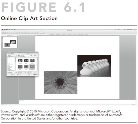
The easiest way to get pictures in a hurry is to use the online clip art gallery that comes as part of Microsoft’s PowerPoint (see Figure 6.1). (You can use other tools as well, which we’ll talk about in a moment.) If you’re in PowerPoint or online, simply click on “Insert,” “Picture,” and then “Clip Art,” and set the category to “Photographs.”
If you have the budget or don’t mind paying a couple of dollars for a great picture, you can find other photographs at sites like www.everystockphoto.com and www.istockphoto.com. The gold standard of photos, including celebrities and current events, is Getty Images or Corbis Images.
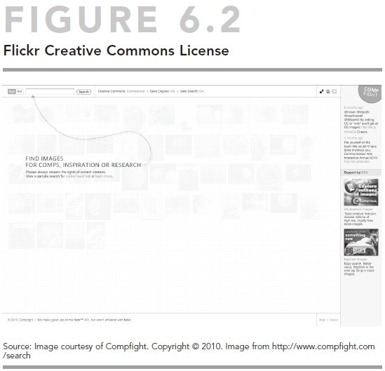
If you’re willing to give credit—which means a small line of text under the picture listing who took the photo and that you’re using it through Creative Commons license—you can find a ton of cool photos from folks who use Flickr images through the Compfight website. (See Figure 6.2 for how that looks.) Simply go to www.compfight.com; set the search to “Creative Commons,” “On,” and “Commercial;” and pick away.
POINTER
Use Powerpoint Effectively
Let’s get this out of the way early. You can use other presentation programs besides Microsoft’s PowerPoint. A couple you might be familiar with are Apple’s Keynote and OpenOffice Impress. These tools are all very similar, so while this book focuses on PowerPoint because about 90 percent of businesses use it, you can apply the information in this section to other presentation programs.
You will learn how to use the tool to build presentations that engage your audience and move you closer to your objectives. Step 7 looks further at presenting effectively with PowerPoint.
Presentation programs allow you to create and use three critical tools:
- text slides
- charts and graphs
- pictures and screen shots.
Text Slides
Text slides are the most useful—and the most widely abused— feature of these tools. They allow you to put words on a page and share them with your audience. This is good, because you want to focus your audience’s attention and give people a visual cue and reminder of your topic. However, slides can be overwhelming and open the door to too much information that your audience can’t possibly absorb and become “death by PowerPoint.”
Consider the following points to make the most of these tools. Remember, these are guidelines, not hard-and-fast rules:
- Use more slides than you would in a live presentation. Because your audience is looking for visual stimulus, the changing of slides actually reengages your online audience, and the additional information helps reinforce your message. For example, in a live presentation you might have three bullets on a single slide that remains posted for more than five minutes. Online, you want something to happen onscreen much more often, so you might show a slide with three bullets, followed by one slide per topic with more information. It will still take five minutes to cover the material, but your audience will not be looking at a static slide the whole time. Do not take this as permission to overwhelm your audience, though. Visually support your key points, and don’t give people extraneous information; they physically and mentally can’t handle it.
- Tell a story with each visual. Don’t cram too much information on a single page—it’s more than your audience can absorb. You should be able to look at each slide and say to yourself what it’s about. The next topic 6 will be another visual.
- Use bullet points instead of blocks of text. When your audience members look at the screen and see a lot of text, they will automatically stop listening and focus on the words. Give them enough information to let them know what’s coming but not so much that they lose concentration; this helps “keep them with you” and focused on where you want their attention. Many presenters use a simple rule of thumb: four bullets per page, four words per bullet. If you need more bullets, that may be fine, or it may be a sign you’re covering too much information on one visual.
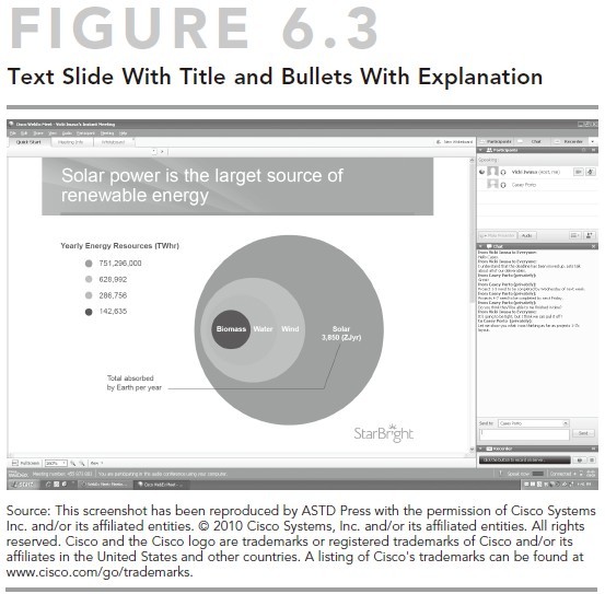
- Title each slide and then complete the sentence. One way to make sure you’re simplifying your slides effectively is to create a title for each slide as if it were the beginning of a sentence; then each bulleted piece of information completes it. For example, see Figure 6.3.
- Check your animations carefully. Many presenters like to use the animation features so that bulleted items appear one at a time. If you do that, remember two things: First, many platforms lose that capability when you upload your slides. Always check your presentation before going live to ensure you don’t get unpleasant surprises. Second, try this simple work-around: If you have three bulleted points you want to make, create three slides—one with the first bullet, another with the first bullet in regular font and the second bullet in bold, and yet another with the first two points in regular font and the third point in bold. In reality, you will be showing three different slides, but to your audience it will appear as if the bullets magically appear on command.
- Don’t use crowded backgrounds and templates. Often the presentations you make online are given to you by marketing, training, or another department, and they involve all kinds of standards. While we don’t want you to get fired over this, remember that your goal is to present the information visually to your audience with a minimum of distraction. If every slide contains a logo plus a series of photographs and visuals along the bottom, for example, it can be a bit busier than is useful. Keep distractions to a minimum.
- Don’t get too creative with fonts, styles, and colors. Most important is that the audience quickly processes and stores the information you’re sharing. You can spend a lot of time mucking around changing the defaults in your graphics package without adding any value. Most graphics packages use simple rules for creating templates: Light writing on dark backgrounds, dark writing on light backgrounds. Audiences can most easily read such sans serif fonts as Arial and Calibri, usually the default settings anyway.
- Avoid altering font size. The default fonts in most 6 PowerPoint templates are defaults for a simple reason— they work. For title and text slides, size the title in 44-point font and the body of the text in 28 or 32. If you find yourself adjusting the font size, you may be trying to cram too much information onto a single visual.
- Avoid bulleted lists for special features. Sometimes you might want a block of text. For example, when quoting someone, it makes sense to show the whole quote (with the attribution). If it’s important to show the company’s mission statement, include the whole thing. Center the block of text in the middle of your screen and set your font so that you can read it comfortably, starting with the default settings and then enlarging or shrinking it, depending on how much information you have to show. One other tip is to display the quote in large text and who said it in smaller text underneath, but that’s a matter of style.
Guidelines for Charts and Graphs
Whether delivering a sales presentation, trying to get a project passed, or explaining a decline in revenue over the past quarter, one of the strongest uses for virtual presentations is the mix of your insight and the cold, hard facts. Graphic evidence that supports your objective is very impressive to your audience. You want to help the audience members understand your data and move them to the desired action.
For that reason, the way you display evidence must be simple, on-target, and easy for your audience to digest. Even more than with text, your viewers might wander down their own trail if you don’t keep them focused on the task and information at hand.
Four Elements to a Good Piece of Visual Evidence
No matter what type of graph you use or what type of information you want to deliver, your visual should have four elements to make it easily understood:
- A simple, clear title. Show the audience what you are talking about.
- Clearly labeled axes or headings. If you’re showing sales results over time, one axis will be money (represented in currency) and the other axis will be time (in quarters, in months, or however you break it down). Your audience should be able to take one look at your graphic and understand your point.
- A clear legend or explanation of variables. If you’re comparing three sales teams, they should be distinguishable from each other, and viewers should be able to separate one piece of data from the other at a glance. For example, if you’re comparing sales results by quarter, identify each team by color and clearly indicate that on the screen (East in blue, West in red, and so on).
- One story per slide. Don’t try to cram too much information into one visual. First of all, entirely digital presentations use no paper. Second, you’ll overwhelm members of your audience and risk losing or alienating them and undermining your effectiveness.
In addition to those four elements, you may employ animation and builds to help walk your audience through your logic. One cool feature of virtual meetings and webinar platforms is that you can introduce the information piece by piece to guide your audience toward the desired conclusion. For example, try introducing an empty graph, with just the axes; then introduce the first quarter’s results, those of the second, and so on. This will keep the audience engaged and on point. (Remember, if animations don’t work in your platform, you can create multiple slides to produce the same effect.)
POINTER
Create interaction With Annotation Tools
When you give a traditional presentation, you might use a chart and colored markers, write on the board, or use color to highlight key information (see Figure 6.4). You can do the same thing in almost all virtual presentation platforms. These are called “annotation tools,” and they include features that both you and your audience can use to draw attention to key information or offer input. They include:
- “highlighting” tools in different colors
- “shape” tools that allow you to easily circle or place boxes around key information. Some also include “stamps” like check marks, stars, or Xs

- “text” tools that you can use to write on slides or your whiteboard—and allow your audience to do the same if you choose.
These tools are great for creating interaction with the audience and adding life to static visuals. Imagine being a member of the audience and having to look at an unchanged PowerPoint slide or screenshot for more than three minutes. Would your mind start to wander? Can you understand why things like email or texting become a tempting distraction? Many presenters avoid using simple interactive features because it increases the amount of work and requires multitasking skills. However, these tools are a core competence for any online presenter, and they need to be learned and integrated into your presentation. In Step 7 we’ll take a closer look at how to use these tools effectively.
Share Applications and Documents
One of the most powerful—and frequently underutilized— advantages of virtual presentations is the ability to share, in real time, anything you as a presenter want to show your audience. This means you no longer need to send PowerPoints in advance and wait for everyone to get on the right page or find where they filed them in their email. You can work with your team to create a budget and input information directly into the spreadsheet with everyone watching and contributing. If you want to show how a new software application works, you can take them right to it. You can even hand control over to a member of the audience to test how well he or she has learned the skill you’re trying to teach the group.
The trick, of course, is to understand what you can do as a presenter, and then reach a comfort level with the tools that lets you present and think at the same time (which, surprisingly, is not as easy as it sounds). You’ll learn more about the possibilities—and pitfalls to avoid—in Step 7.
Wrap-Up
The real effectiveness of a web presentation stems from how well you combine the audio and the visual to create a rich experience for your audience. With a little careful planning, you can choose the right tools for the job, present them effectively in a way that supports instead of detracts from your credibility, and move your audience toward the desired outcomes.
- Use webcams to build relationships.
- Find and use pictures to tell your story.
- Use PowerPoint effectively.
- Enlist the power of annotation tools.
- Share applications and documents.
Now that your presentation is taking shape, let’s look at how to sharpen you presentation skills.
NOTES
|