Chapter 13. Creating Titles
Because video projects benefit from both sound and picture, it may seem strange that you’ll still depend on text. Video editors and motion graphics designers frequently need to use text onscreen to quickly convey important information. The text might offer the viewer important facts about who is speaking (through a lower-third graphic) or acknowledge the creative team behind a project (through end credits). The truth is that there’s just no getting around the use of type.
Unfortunately, video professionals often lack formal training in typographic design. Making matters worse, there are often styles or presets in the titling tools that do more to distract the viewer than to enhance comprehension. With this in mind, let’s explore a foundation for typographic decisions so you can make the right choices in Adobe Premiere Pro and throughout the Adobe Creative Suite.

Video Typography Essentials
Proper use of type is crucial in designing effective graphics for video. Often, the text you create will be composited over moving footage, which can make it even more difficult to read. As you design type for video, it is necessary to balance legibility with style, fitting enough information on the screen but not crowding it. If you can combine this functional purpose with a better sense of style and control, you can improve the professional appearance of your designs.
Further Reading on Type
![]()
A great book to truly understand type is the oddly named Stop Stealing Sheep & Find Out How Type Works (Adobe Press, 2002) by Erik Spiekermann and E.M. Ginger.
Font Choice
Selecting the right font can be a tough choice (FIGURE 13.1) (of course it might already be made for you by an art director, producer, or client). Chances are your computer has hundreds if not thousands of fonts. You can easily become overwhelmed with the sheer quantity of options. To simplify the process, you need to approach this decision with a triage mentality and consider a few guiding questions:
• Readability. Is the font easy to read at the point size you are using? Are all the characters in the line readable? If you look at it quickly and then close your eyes, what do you remember about the text block?
• Style. Does the font convey the right emotion for your video? Type is like a wardrobe; picking the right font is essential to the success of the design.
• Flexibility. Does the font mix well with others? Does it come in various weights (such as bold, italic, and semibold) that make it easier to convey significance when using that font?
Figure 13.1. Although the font choice on the left certainly says American Southwest, it does not capture the same emotional sensitivity as the choice on the right. Always take the time to explore several options when choosing a font family.

How you answer the questions for each of the three guiding principles will steer you towards good design. It’s also a good idea to work with your clients, producer, or art director. Instead of scrolling through a list of fonts for hours, interview your clients about the style and mood they want to evoke. If they suggest a boring font, direct them towards an alternative that looks similar but may be better optimized for video.
Serifs
When it comes time to classify fonts, there are two major distinctions: serif or sans serif (FIGURE 13.2). Serifs are the hooks that distinguish the details of letter shape. Sans serif fonts tend to be more uniform in shape.
Figure 13.2. The small hooks on a typeface are referred to as serifs. The presence or lack of serifs is a major distinguishing property when classifying fonts.

Finding Fonts Online
![]()
Here are a few of our favorite Web sites that offer free and affordable fonts:
• Chank www.chank.com
• Fonthead www.fonthead.com
• DincType www.GirlsWhoWearGlasses.com
• Fontalicious www.fontalicious.com
• Blue Vinyl www.bvfonts.com
• Acid Fonts www.AcidFonts.com
Font Overload
![]()
If you have too many fonts loaded, it can make it difficult to find the right font. It also can lead to serious performance issues, such as an unstable operating system and slow launch times. Consider using a font manager to group fonts into sets for clients as well as activate and deactivate fonts on the fly (without having to relaunch a program).
For instant clarity, the shape of individual letters in serif fonts tends to be easier to distinguish. Many clients prefer serif fonts because they are more traditional. Often, there are more serif fonts to choose from because serif type has a long history. Serif fonts are modeled after many handwritten texts as well as the initial type used in printing presses.
A potential drawback (especially with interlaced video) is that serif fonts can shimmer because they often come to thin or small points. As an alternative, consider sans serif fonts, which can have a cleaner style and are composed of generally even-weighted lines.
Verify Fonts
![]()
Be careful when downloading fonts from the Internet. Run a virus check and validate them using a font manager.
Color Choice
Making the right text color choice can be surprisingly tricky. The truth is that typically only a few colors work well for text and remain clear to the viewer. The task is made difficult because you need to constrain color choice to meet broadcast standards and because text is often laid over a busy moving background (FIGURE 13.3).
Figure 13.3. The use of a contrasting edge makes it easier to read text when laid over moving video.

Although it may seem a little boring, the most common color for text in video is white. Not surprisingly, the second most popular color is black. If a color is used, it tends to be in very light or very dark shades. Lighter colors that work well include light blue, yellow, gray, and tan. Darker colors that hold up include navy and forest green. Remember to keep your text towards the very dark or very light range, or contrast will become an issue when the text is placed over a motion background.
Type on Pattern
![]()
When creating text for video, the text will often be placed over a background that contains a full spectrum of color. Achieving proper contrast is the key to preserving legibility. Try applying a stroke, outer glow, or tight drop shadow to get a contrasting edge. The biggest problem with type and video is that there will always be light and dark elements in your scene. It is crucial to add a contrasting edge to any type that will be keyed over a full-chroma, moving background.
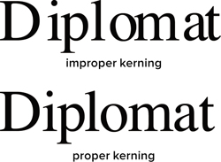
Kerning
As you work with text, you’ll often need to modify the space between letters. Adjusting the space between individual letter pairs is called kerning and is typically adjusted one pair at a time (FIGURE 13.4). Why all the fuss you ask? Well, design pros always check their kerning because kerning the space between letter pairs produces a better optical flow, which can greatly improve the appearance and readability of your text. Knowing how to kern is learned by studying examples of professionally laid out text.
Figure 13.4. The top line of text has irregular gaps between letters, which creates a challenge when reading the line.
In Adobe Premiere Pro and other Adobe applications, kerning is simple to adjust.
- Click to place your cursor or move it using the arrow keys.
- When the blinking I-bar is between the two letters you want to kern, hold down the Option (Alt) key.
- Press the left arrow key to pull the letters closer or the right arrow key to push them farther apart.
- Move to the next letter pair and adjust as needed.
Tracking
Similar to kerning is tracking, which is the overall space between all letters in a line of text (FIGURE 13.5). You can use tracking as a way to condense or expand a block of text so it better fits the onscreen space (after all, you can’t scroll a video monitor to read more). You might choose a loose track to improve readability (especially if you’re using all caps or need to apply a stroked border). Tracking is typically done in the Title Properties panel in Adobe Premiere Pro or the Character panel in other Adobe applications. Tracking, like kerning, is subjective, and you can learn best how to do it by studying professional examples and looking for inspiration and guidance.
Figure 13.5. The top line is too loosely tracked, whereas the bottom line is too tight. Be sure to experiment with tracking when you need to fill in space on the screen or to make stroke text more readable.

Avid Kerning = Tracking
![]()
If you’ve worked on many Avid editing systems, the Title tool incorrectly identifies kerning as the space between all characters on a line, but this is actually called tracking. So, this can be confusing when you switch to Adobe tools.
Leading
Another property you’ll frequently adjust is leading, to better fit your text. Pronounced led-ing as in metal, not lead-ing as in sheep, leading is the space between lines of type. The name is derived from when strips of lead were used on a printing press to space out lines of text (FIGURE 13.6).
Figure 13.6. The left image has too much leading and creates an unwanted visual break between the two lines. The right image has tighter leading, but care was taken to avoid a collision between the ascenders and descenders.

By default, the leading should be set to Auto; however, you can adjust as needed to fit text into your design. If you need to fit more text on the screen, you’ll tighten the leading to produce less space between lines of text. Be careful to avoid setting the leading too tight; otherwise, descenders from the top line will cross ascenders from the lower line. This collision will likely result in a negative impact on readability.
Alignment
When it comes to video, there are no hard and fast rules for alignment. As a general practice, however, lower-thirds tend to be left or right justified (which leaves room for a logo or bug on the opposite side). Centered or force justified text is more commonly used for titles or bumpers.
Point Text vs. Paragraph Text
![]()
When setting text in an Adobe application, you often don’t just want to click and type (called Point text). Instead you can click and drag using the Type tool to define the paragraph area first. This is called Paragraph text and offers greater control over alignment and layout.
You’ll find alignment buttons within the type interfaces of Adobe software (FIGURE 13.7). The Alignment buttons attempt to align text left, right, or centered. They also add support for justification, which forces the text to align to both margins through the adjustment of spaces between words.
Figure 13.7. The alignment controls in Adobe Premiere Pro, After Effects, and Photoshop (clockwise from top left) are all quite similar in appearance and function.

Using Adobe Premiere Pro’s Titler
Many editors are most comfortable using the built-in titler that’s included with their nonlinear editor. Two primary benefits drive this workflow: First, they never need to leave the editing application (reducing new apps to learn, which saves time). Second, they don’t want to have to track and manage referenced files, and prefer that their titles simply become part of their project file.
Restrain Yourself
![]()
The Titler features several title styles that are overdone and are in fact garish. Unless you’re cutting a slasher movie or an over-the-top infomercial, remember to take it easy on the glows, bevels, and gradient fills (these went out of style in the early 1990s).
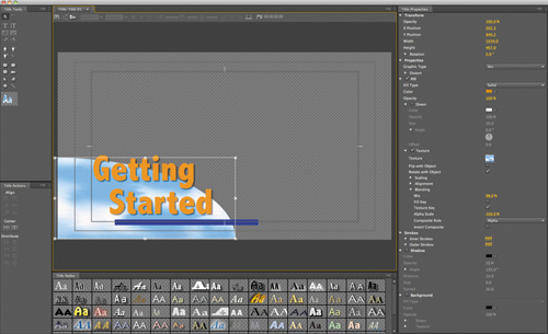
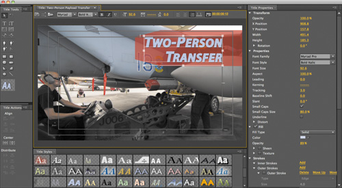
The good news is that the Titler in Adobe Premiere Pro (FIGURE 13.8) is more robust than those found in other editing applications. It offers precise control over text, layout, and style, which is to be expected given Adobe’s long history with computer typography. The even better news is that included in the Creative Suite are Adobe Photoshop, Adobe Illustrator, and Adobe After Effects, which offer even more text options.
Figure 13.8. The Titler in Adobe Premiere Pro offers advanced options like shapes, custom fills, and drawing tools. You can also align, rotate, and distribute shapes for precise alignments.
Safely Save Those Titles
![]()
If you want to capture changes to a title as you design, just save your project to save the title. Titles are automatically stored in the data of your project file.
Let’s explore how to create, format, and stylize a title.
Creating and Editing Titles
The Titler in Adobe Premiere Pro is a collection of related panels that are all associated with the tasks of creating text and basic graphical shapes (FIGURE 13.9). You can use the Titler to create static as well as animated titles. All titles you create are added to the Project panel. To keep your project clean and easy to navigate, we recommend using bins to hold and organize your titles by style and subject.
Figure 13.9. You can drag the panels in the Titler into a new position or close them if they are unwanted. You can dock a panel to another or to other parts of the interface. The purple highlight indicates where the panel will dock. By rearranging your panels, you can create a more useful workspace that matches your need and screen layout.

To create a new title, do the following:
- Choose File > New > Title or press Command+T (Ctrl+T).
Alternately, you can click the New Item button in the Project panel and choose Title. The New Title window opens.
- Confirm that the title’s width, height, timebase, and pixel aspect ratio match your needs.
By default, these settings are auto-filled with your current sequence’s settings.
- Enter a descriptive name for the title and click OK.
Titles do not need to have a unique name because no actual files are created on your drive. But sticking with a unique name is still a good idea for practical project management.
- Design your title using the Text and Shape tools.
Adobe Premiere Pro’s Titler

Learn how to create custom titles quickly as well as use good typographic design in this video tutorial.
We provide a detailed overview on using these tools in video #41.
- Close the Titler when you are finished to save the current title.
Avoid Spelling Errors

Always insist on getting an approved graphic list from the client or producer that has been proofed. Also, we strongly recommend copying and pasting the text from an email or word processor document to reduce the likelihood of spelling errors caused from rushing through data entry.
- If you need to make changes to a title after you’ve closed it, double-click it in the Project or Timeline panel. Titles automatically load in the Titler, not the Source Monitor.
Entering Text
When adding text to a title, you can use any font loaded on your system, including Type 1 (PostScript), OpenType, and TrueType fonts. Make sure the font is loaded before you launch Adobe Premiere Pro for maximum compatibility and application stability.
A Different Kind of Drag
![]()
If you drag the corner handle of a Point text object, the text scales larger or smaller. Dragging the corner of a text box reflows the text inside.
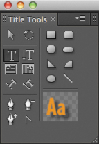
The Titler offers three styles of Type tools with a vertical and horizontal option for each (FIGURE 13.10):
• Type tool and Vertical Type tool. Use these tools to create Point text. Text emanates from the point at which you click in the window. You can choose to align the text to the left or right of the insertion point, or even center it. Typing places all characters on a single line (until you press Return [Enter]) unless you enable the Word Wrap option (Title > Word Wrap). Word Wrap moves characters to a new line when it reaches the edge of the title-safe area.
• Area Type tool and Vertical Area Type tool. Use these tools to create a text box for Paragraph text. This approach lets you define a box that controls when text automatically wraps. Area type offers more precise control over text wrapping than any other method.
• Path Type tool and Vertical Path Type tool. Use these tools when you need to create text along a curved path. Click to define where you want text to start, and then click to add additional points (you can click and drag to adjust the shape of the curve). When the shape is how you want it, start typing to add text along the path.
Figure 13.10. You can undock and resize the Title Tools panel to create a tighter grouping of the tools.
Formatting Text
The Titler offers precise controls to format text. These controls are all easy to use and interactive, so you can see your updates right in the Titler window as you make tweaks (FIGURE 13.11). Here’s where to find the essential controls:
• Titler panel. In this panel you’ll find controls for font, font style, and type alignment above the drawing area. You can also adjust tracking and leading in the bar. The bar was designed for quick access to key controls.
• Title Properties panel. All of the formatting controls in the Titler panel are repeated in this panel (along with advanced controls). You’ll also find several more controls, including style options like Fill, Stroke, and Drop Shadow.
Figure 13.11. You can use the Titler and Title Properties panels to format text inside a title.
Need More Space?
![]()
It’s possible when working with text to have more characters than room onscreen. If a text box is too small, you can resize it to reveal the hidden text. Look for a plus sign (+) on the right side of the box, which indicates the box contains hidden characters.
Safe Margins
![]()
The title-safe and action-safe margins for the drawing area of the Titler are used to designate the safe zones. These margins are enabled by default. If you’re creating video for playback on a television set, it’s a good idea to keep text inside the innermost or title-safe box. If you’re creating video for the Web, many consider the outer box (the action-safe box) an appropriate choice.
Stylizing a Title
Several options are available for stylizing your text with Adobe Premiere Pro’s Titler. In fact, the controls are quite extensive (so it’s easy to overdesign and end up with text that is hard to read). Design for the current decade and leave the thick bevels, rainbow gradients, and giant glows back in the 1990s (FIGURE 13.12).
Figure 13.12. You can use the Title Styles panel to quickly format text with presets. You can then modify the results using the Title Properties panel.

Here are some of the most useful tools for modern typographic design:
• Fill Type. You have several choices of Fill Type, but the most useful are Solid and Linear Gradient (just use a subtle gradient though).
• Color. Set the color for your text. You can click the swatch or enter numerical values in the Adobe Color Picker, or use the Eyedropper tool to sample from your video clip. Most editors favor white, gray, black, light yellow, or light blue.
What’s That Exclamation Point?
![]()
If you see an exclamation point next to the color you’ve chosen, that’s Adobe Premiere Pro’s way of warning you that a color is not broadcast-safe. Just click the exclamation point to choose the closest color that is still broadcast safe.
• Sheen. A gentle highlight can add depth to your title. Be sure to adjust the size and opacity so the effect is subtle.
Looking for More Titler Presets?
![]()
For a free collection of Titler presets, browse to www.stevengotz.com/templates. You can download these presets and then load them into the Title Styles panel.
• Stroke. You can click to add an Inner and Outer stroke. Strokes can be solid or gradients. Adjust the opacity of a gradient to create a gentle glow or soft edge. A stroke is commonly used to help keep text legible over a video or complex background.
• Shadow. The use of a drop shadow is a common addition to video text because it makes the text easier to read. Be sure to adjust the softness of the shadow. Also, be sure to keep the angle of shadows identical for all titles in a project for design consistency.
Creating a Template
Creating good-looking titles takes a bit of time as you try to find the right combination of font, color, size, and position that pleases your client. Wouldn’t it be great to store all that hard work and reuse it as many times as needed? Not a problem; you just use templates.
Reuse a Title
![]()
If you need to create a different version of a title, make sure you create a new version (otherwise, every version in use will be updated in your project). Open the title you want to use as a starting point, and then choose Title > New Title > Based on Current Title.
- With a title open, click the Templates button or press Command+J (Ctrl+J).
- Click the Templates menu button in the upper-right corner of the panel.
- Choose Import Current Title As Template.
- Enter a descriptive name for the template and click OK to store the template.
To use a template in the future, choose Title > New Title > Based on Template (FIGURE 13.13).
Figure 13.13. By storing your titles as templates, you can build future titles in your show quickly. You’ll also find several other starter templates in the Templates panel.

The Path to Consistency
![]()
If you’re working on a show with only one kind of title, make it a default. With a title open, click the Templates button and choose a template you want to use. You can then choose Set Template As Default Still from the Templates panel menu. The default template will load every time you open the Titler.
Creating Rolls and Crawls
![]()
In this video you’ll learn how to create rolling credits in Adobe Premiere Pro. You’ll also discover how to make stock market-style text crawls for the bottom of the screen.
Advanced Titling with Photoshop
Although Adobe Premiere Pro offers a capable titler, many choose to use the digital imaging and graphic design powerhouse that is Adobe Photoshop. Photoshop offers several advanced options including anti-aliasing (for smoother text), advanced formatting like scientific notation, flexible layer styles, and even a spell checker.
More Free Templates
![]()
Adobe provides Resource Central as a place to discover free and for purchase assets for your Adobe software. Choose Window > Resource Central, and then click Templates. Just click the down arrow next to a template name to download it. Once downloaded, you can drag the template from the Resource Central panel and drop it in the Project panel.
The decision to stay in Adobe Premiere Pro or to use Photoshop is really a matter of workflow. You may be faster in one application, or you may want the flexibility of bringing your Photoshop text into After Effects. We use Photoshop more often than Adobe Premiere Pro, but that’s because we frequently receive graphics that are designed by motion graphics artists.
Creating a Photoshop Document
If you’d like to make a new Photoshop title, Adobe Premiere Pro removes all of the mysteries. You don’t have to guess which size to create or even which preset to choose. Thanks to your project settings and open sequence, Adobe Premiere Pro can make some very intelligent guesses.
To create a new title from within Adobe Premiere Pro:
- Choose File > New > Photoshop File.
- Examine the New Photoshop File window. The Video Settings should be correctly set for your project (FIGURE 13.14).
Figure 13.14. The settings in the New Photoshop File panel will automatically match your active sequence.

Merged Layers
When creating a Photoshop file from within Adobe Premiere Pro, we usually leave the Add to Project (merged layers) option selected. This brings the graphic into the Project panel as a flattened source (with transparency) that will only occupy a single track in the Timeline.
- Click OK.
- Choose a location to store your PSD file and click Save.
A new title is written to disk and added to your project.
- Adobe Photoshop or Photoshop Extended opens, allowing you to edit the title.
When you’re finished in Photoshop, you can close and save the title. It will be automatically updated in the Adobe Premiere Pro project. If you’d like to return to Photoshop, just select a title in the Project panel or Timeline and choose Edit > Edit In Adobe Photoshop.
Photoshop Text Essentials
Much like Adobe Premiere Pro, Photoshop offers both a Horizontal and Vertical Text tool. Similarly, you can click to enter Point text. However, the more useful option is to click and drag with the Text tool to create a Paragraph text block.
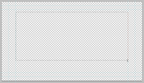
- Select the Text tool by pressing T.
- Draw a text block, and then click and draw from the left edge of the title-safe area to the right edge (FIGURE 13.15). This creates a Paragraph text block to hold the text.
Figure 13.15. By using a Paragraph text block, you can precisely control the layout of text in Photoshop.
- Enter the text you’d like to use.
- Adjust the font and point size to taste.
- Click the check mark in the Options bar to commit the text layer.
Creating 3D Text
![]()
In this video you’ll learn how to use the Repoussé effect to create 3D text designs with Photoshop Extended.
Using the Options bar
The Options bar consists of the most common type controls in an easy-to-access area (FIGURE 13.16). When you switch to the Type tool (T), the Options bar automatically displays the most frequently used commands, which can truly speed up your workflow.
Figure 13.16. The Options bar provides precise control over text and formatting.
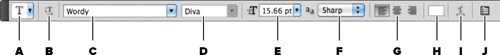
A Tool Presets Picker. Store text presets for quick access. This can include a combination of font, size, alignment, and more.
B Toggle Text Orientation. Switch between horizontal or vertical text alignment.
C Font Family. Choose the font family you want to use.
D Font Style. Choose the weight for the individual font used.
E Font Size. Change the size of the font (measured in points or pixels).
F Anti-aliasing. Set the anti-alias method to smooth the font’s appearance onscreen.
G Alignment. Choose Left, Centered, or Right alignment.
H Text Color. Opens the Adobe Color Picker for the color of the text.
I Warped Text. Allows you to access warping controls for the text.
J Character and Paragraph panels. Opens the Character and Paragraph panels (docked together) for advanced controls.
Using the Character panel
The Character panel provides you with total control over the appearance of text in your graphics. The easiest way to access it is to click the Character and Paragraph panels button in the Options bar, but you can also choose Window > Paragraph.
Don’t Anti-alias Tiny Text
![]()
Very small text (under 16 points) should not be anti-aliased. To improve anti-aliasing on small type, deselect the Fractional Width option in the Character panel menu. This will improve the spacing between letters at small sizes.
Many fields are in the Character panel (FIGURE 13.17); here are some of the less obvious and most useful choices:
Figure 13.17. The Character panel gives you complete control over the individual letters in your text block.

A Vertically and Horizontally Scale. These two fields enable you to stretch your text to force it to fit. Horizontal scaling set at 75–95% is another useful way to compress a line of text that cannot wrap to another line.
B Type Enhancement buttons. These buttons display modifications that used to be buried in menus. Avoid overusing these effects. Options like Small Caps and All Caps are popular choices to improve the readability of small text. You can also use Subscript and Superscript for scientific notation and positioning special typographic marks like the registered symbol (®).
C Language Selection menu. To harness the power of Photoshop’s spell checker, you must set the language on the selected characters. This also drives the automatic hyphenation. To invoke the spell checker, choose Edit > Check Spelling.
D Anti-alias menu. Large font sizes generally benefit from anti-aliasing because it gently blurs the edges of the type, making it appear smoothly composited with the background layers. You’ll need to experiment with anti-aliasing because it varies with the fonts chosen and the user’s taste. Generally, the None option does not work well, but the other four options can dramatically improve text appearance onscreen.
Free Transform for Manual Control
![]()
If you’d like to freely distort text to the size you need, just select its layer and choose Edit > Free Transform. You can also right-click to access specific transformations when you are in the Free Transform mode.
Better Hyphenation and Line Breaks
![]()
If you will be using paragraphs or multiple lines of text, be sure to try out the Adobe Every-line Composer option. Click the Paragraph panel submenu and choose the correct option.
Using the Paragraph panel
The Paragraph panel is generally docked with the Character panel. You can call it up individually or tear it free from the Character panel. The Paragraph panel works on a limited basis for Point text. To access full control over type, you must use Paragraph text.
Like the Character panel, many controls are in the Paragraph panel too (FIGURE 13.18); here is a quick overview:
Figure 13.18. Remember the Hyphenate option to fit a large block of text more tightly. The breaks for hyphens are determined by the dictionary chosen with the Language menu in the Character panel.

A Alignment buttons. You can specify alignment as well as justification. Left justification is the easiest alignment to read.
B Indent fields. You can specify how much to indent a particular paragraph or the first line of a paragraph. These controls enable you to have fewer text blocks by giving you better control.
C Spacing fields. You can specify how much space you want after each hard return. This enables you to space out paragraphs without needing to insert hard returns.
D Enable Hyphenation. To fill more horizontal space, words are often broken across lines at a suitable point within the word. If you want to use this option, select it. Photoshop uses the installed dictionary for the language you specify in the Character panel. This ensures that words are properly hyphenated.
In nearly all cases Adobe Premiere Pro will properly read the native transparency in an Adobe Photoshop file. With that said, it’s still a good idea to know how to create an alpha channel if you’d like precise control over transparency.
Here’s how to create a perfect alpha channel:
- Make sure all background layers are either discarded or not visible. Place the Photoshop graphic over the transparency background (shown as a light gray checkerboard pattern).
- Choose Window > Actions. The Actions panel opens. Click the submenu in the panel’s upper-right corner and choose Video Actions. Actions automate the process of repeating several commands.
- Choose Alpha Channel from Visible Layers (the first action in the set), and click the Play button. Read the dialog, and then click Continue. Photoshop creates an alpha channel for you (FIGURE 13.19).
Figure 13.19. An alpha channel is an optional step, but it ensures accurate transparency for your Photoshop graphic.

- If you want more precise control over the Save command, choose File > Save As to store your file. Target a location to store the file. You can overwrite your original file if needed.
- Choose PSD from the Format menu. Make sure the Layers and Alpha Channels check boxes are both selected, and then click OK.
Layer Styles
Photoshop has a number of ways to enhance text with both subtle and dramatic effects (FIGURE 13.20). The three primary advantages of using styles are no render times, easy editability, and portability to After Effects.
Figure 13.20. The bevel, stroke, drop shadow, and even colors were added using Photoshop’s Layer Style engine.

Warping Text
![]()
Warped text is a cool feature to reserve for special occasions like show titles. The Warped Text command allows you to distort text to a variety of shapes, including Arc, Bulge, Flag, Squeeze, and Twist. Just select a text layer and click the Create Warped Text button (a T above an arc) in the Options bar. Several styles are available in the menu, and you can adjust the options for a more precise effect.
Logos and Bugs
![]()
In this quick video you’ll learn how to place an Adobe Illustrator or EPS file into Photoshop. You can then position and save it as a logo or bug to watermark a video.
Note: Down Conversion Issues
![]()
If you’re producing in HD, your show may also be played on an SD television set. After Effects offers a robust title-safe overlay that protects for both 4:3 and 16:9 at the same time.
No Suite, No Link
![]()
If you aren’t working with a version of the Creative Suite, you won’t be able to use the Dynamic Link command. However, you can still manually create a new composition in After Effects and drop it in an Adobe Premiere Pro project for native support.
To access Layer Styles:
• Choose Window > Styles to access several presets. Even more presets can be loaded from the panel’s submenu.
• Choose Layer > Layer Style and select a particular effect. A new panel opens with precise controls over options like texture, bevel, and drop shadow, fill, and glows.
Animated Titles with Adobe After Effects
So far we’ve limited the discussion to using mostly static text in both Adobe Premiere Pro and Photoshop. We find that it’s always best to master typographic design before you add the complexity of animation. The truth is that it’s a bit too easy to get sucked into text animation presets and go overboard. Of course, that won’t stop clients from asking for text animations.
In the Adobe workflow, nothing beats Adobe After Effects for animated titles. You’ll find a very deep animation engine with 17 different animation properties ranging from Scale and Position to Blur and Skew. We find its controls to be the most exact and varied but also the most difficult to learn.
Setting Text
Fortunately, text controls in After Effects are virtually identical to Photoshop for creating text layers. You can even convert Photoshop text into After Effects text by importing a file and converting it to editable text.
Let’s create a new composition from within Adobe Premiere Pro using Adobe Dynamic Link.
- Choose File > Adobe Dynamic Link > New After Effects Comp.
- The New After Effects Comp window is automatically filled in with settings that match your project settings (FIGURE 13.21).
Figure 13.21. The settings loaded for the new After Effects composition will automatically match the current sequence.

A new After Effects composition is added to both your Timeline and Project panel.
- You are automatically switched to After Effects. Name the project and click Save.
Animating Text with After Effects

In this video you’ll learn how to set up an After Effects composition and then browse, apply, and customize text animation presets. You’ll even learn how to further modify text animations with advanced controls.
Store the project with your Adobe Premiere Pro project file so that your media path structure is easy to preserve. Any additional clips sent to After Effects from your current Adobe Premiere Pro project will automatically join this linked After Effects project.
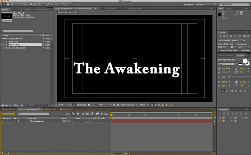
- Select the Text tool and click in the After Effects Composition panel to enter text (FIGURE 13.22).
Figure 13.22. You can click the buttons beneath the composition window to turn on a title-safe grid as well as compensate for non-square pixels. If you are unsure of what a button does, just hover your mouse over it to see a tooltip.
Browsing Presets
To speed up your workflow, After Effects offers nearly 350 built-in animation presets. Experimenting with these presets is a great way to explore what’s possible with text in After Effects. Several different options are available to refine text, but it’s not that hard to get started.
- Select a text layer in the Timeline panel.
- Select the Effects & Presets panel (if it’s not visible, you can choose it in the Window menu).
- Click the submenu in the upper-right corner of the Effects & Presets panel and choose Browse Presets (FIGURE 13.23).
Figure 13.23. To access the Browse command, click the submenu in the upper-right corner of the panel. Most panels in Adobe applications feature a submenu with advanced controls.

Need More Animation?
There are hundreds more text animation presets available for free from Adobe Exchange at www.adobe.com/cfusion/exchange.
Adobe Bridge launches with the default presets shown.
- Select the folder named Text and double-click to open it. Double-click on other subfolders to audition new animations. Click once on an FFX file to see a preview movie in the Preview pane.
- Press Command+up arrow (Ctrl+up arrow) to go to a higher folder level and browse (FIGURE 13.24).
Figure 13.24. Adobe Bridge makes it easy to browse animation options for After Effects. Be sure to download additional animation presets, which are available at http://adobe.ly/aetextpresets.
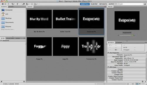
- Select a preset effect and double-click to apply it to your selected text layer. For this exercise, choose Blurs > Evaporate.
Adobe Bridge is minimized and After Effects becomes the active application.
- Click the RAM Preview button to preview the text animation.
This animation plays, but depending on where the current-time indicator was positioned, the timings might be off. This can be easily modified.
Retiming Animations
As you work with text animations, you’ll often find that they may not be the right duration or need subtle changes. Fortunately, modifying text animation presets is straightforward. You can simply adjust keyframes or make more elaborate changes to additional properties. Let’s modify the recently applied animation.
- Press U to see all your user-added keyframes (FIGURE 13.25). Then press J or K to move through keyframes in your composition.
Figure 13.25. Keyframes are used to control the timing of After Effects text animation. Spread the frames apart to slow down an animation.

This animation uses two keyframes to define its start and end.
- Select both keyframes by lassoing around them.
Drag the first keyframe to the right to approximately 0;00;04;00 to delay the start of the animation.
- Click in an empty area to deselect your keyframes, and then reselect the second keyframe and drag it to 0;00;08;00 to slow down the animation for dramatic effect (FIGURE 13.26).
Figure 13.26. Keyframes will snap to the current-time indicator when you hold the Shift key.

Animator groups include a default Range Selector. This property specifies which characters or section of a text layer are animated. Let’s randomize the effect a little more.
- Click the disclosure triangle next to the Range Selector to close it; then click it again to open it and show all the animation properties. Click the triangle next to Advanced to see all those properties as well.
A Different Random

Random isn’t really random in After Effects, because the effect will repeat the same animation each time it is used. If you want to create a different look when reusing a text animation, simply change the Random Seed number.
Working with Type in After Effects

Are you looking for a quick overview on how to control text animation in After Effects? This video will get you up and running quickly.
- Experiment with the different Advanced properties to see the results. In particular, experiment with the following properties, and click RAM Preview occasionally to view the changes:
• Randomize Order. Randomizes the order in which the property is applied to the characters affected by the Range Selector.
• Random Seed. Affects the method used to calculate randomness. Try inputting a different value to produce a varied animation.
• Shape. Affects the shape used to select characters between the start and end of the range. Choosing different options will result in subtle but significant changes. You can choose Square, Ramp Up, Ramp Down, Triangle, Round, or Smooth.
- If you’re happy with the animation as is, save your After Effects project and return to Adobe Premiere Pro (FIGURE 13.27).

Next Steps
In the next chapter we begin the process for completing a project. You’ll learn important strategies for performing a final quality check. You’ll learn how to prepare a show for broadcast by legalizing your video and audio signals. You’ll also learn how to use review and approval tools in the Adobe Creative Suite to speed up the feedback process.