Chapter 6
Just My Type
Words and Symbols on the Television Screen
On the Spot
Most of the graphics on the air will include some kind of text, whether that be a few semi-transparent words in an effect or a block of text in a full-screen graphic for a news program or commercial.
Photoshop CS allows you to work with vector text tools to create flexible type. The advantage of vector type over raster type is that it can be infinitely scaled without losing quality. Vector type sits patiently, willing to let you edit it again and again without losing any quality or disrupting any of the other layers—even if layer styles assigned to it. Photoshop’s Type tool is so powerful, many producers are using it exclusively to create titles for their programs.
Tips in this chapter will help you get the most out of the Type tool, which is a heck of a lot. We’ve also included some basic design concepts; after all, the Type tool only does what you tell it to do.
Down in Front

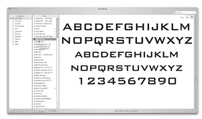
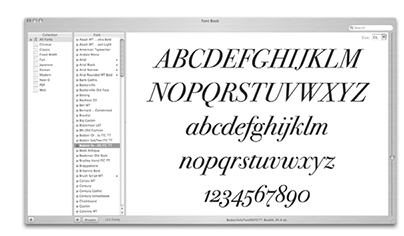
The foundation of typography is the font, the set of specifically styled characters. Most are text characters, while some, like Wingdings, look more like clip art images. Several fonts came with your computer’s operating system. You can remove and install fonts from your computer, and whatever fonts are loaded in your system will be accessible in Photoshop. Fonts can make or break a project, so it’s not uncommon for a production house to have thousands of them. However, you should have no more than 100 loaded at any time. Having too many fonts loaded can severely limit your entire system’s performance, not to mention slow Photoshop down.
Photoshop runs through the list of installed fonts each time it starts, so the more fonts you have installed, the longer you stare at the feather on the startup screen.
Types of Fonts: The Breakdown, Part 1
Fonts can be broken down into two distinct groups: the serifed and the sans serifed. A serif is the fine line finishing off the main stroke of a letter. Sans serif literally means “without serif,” and these fonts are evenly-weighted and can appear cleaner, especially when comparing small fonts. Many people prefer serifed fonts, and for print purposes they are great, but when you use them in video you’ve got to be careful. The serifs are often very thin and can cause some pulsing or shimmer on TV screens. If you can sell your client on a sans serif font, you may avoid some annoying problems.

Sans serif fonts compress text into small spaces nicely, and are easy on the eyes when broadcast. A viewer may prefer to read serifed fonts in print, but for video sans serif is the way to go.
The Breakdown, Part 2
We can break fonts down a bit further—into two more groups: traditional and modern. Traditional style fonts are what you probably read every day. They are serifed fonts with a diagonal stress, and they’re great for large bodies of printed text. Traditional are based on handwriting styles. Some examples are Times New Roman and Goudy.
Modern style fonts are probably useful for most video work. They sometimes have serifs, but not always. The have a vertical stress, which makes them more legible when compressed into small amounts of space. These fonts look great when used as large headings. Some examples of modern fonts are Verdana and Georgia.
What? All These T's Are Faux!
The line of ‘T’s under the type options is an area that many people overlook. The first two are the Faux Bold and Faux Italic buttons, which bold or italicize your text characters. If the font you’re using has a bold or italic style, you should definitely use that, but for fonts that don’t have those styles, this sometimes works pretty well.
Next you’ve got buttons for All Caps, Small Caps, Superscript, Subscript, Underline, and Strikethrough. These are not incredibly useful in broadcast video applications, but they’re there if you want to try them on your text.
- Select the Type tool.
- Click a button in the Characters Palette.
- Type some text.
- To remove or change the formatting, highlight the text and click the appropriate button.

An even easier shortcut, Ctrl+clicking (contextual-clicking) on any selected text will bring up several of these options, along with Spell Check and Find and Replace commands.
Jotting It Down

Creating and editing type in Photoshop is simple.
- Open a new image.
- Select the Type tool from the toolbox.
- Click somewhere on the image and type.
- Select the new text with the Type tool.
From here you can change the color of the text, the placement, and loads of other options. With the text selected:
- Move your mouse pointer away from the text until it becomes a Move tool. Click and drag to move the text around the document.
- Click the Text Color setting in the Options bar to open a color swatch and change the text’s color. Since the text is highlighted, it’s hard to tell if the color is what you want, so click Cmd+H (Ctrl+H) to hide the highlighting while you choose a color.
- Change the font, orientation (horizontal or vertical), size, anti-aliasing options, alignment, and style in the Options bar at the top of the screen.
- Click the Commit Current Edits button in the Options bar or press Return (Enter) when you’re finished.
- Edit the text again at any time by selecting it with the Type tool.

Give It Some Character
The Character Palette offers complete control over the look of your text. To open the Character Palette select Window>Character or click the Character Palette button in the Options bar. Leave your text selected (if it’s not selected, just choose the Type tool and Ctrl+click (contextual-click) in the document and choose Edit Type) and you can make any of the following adjustments.

- Font – Change the font of your text.
- Font style – For fonts with italic, bold, bold italic and other options.
- Font Size – Again, with the text selected, you can change this value and see the change immediately.
- Leading – pronounced “ledding,” this value indicates how much room will be between carriage-returned lines of text. Auto usually gets you close, but you can always adjust this manually to get the look you want.
- Kerning – Use this setting to increase or decrease the amount of space between two characters. Place your cursor between the two characters in the offending space or lack thereof, and use this field to change the value. A quicker way to do this is to hold Option (Alt) and use the right and left arrow keys. Avid editors may be confused by this term, as Avid uses it for tracking.
- Tracking – This setting controls the overall space between each letter, the tightness of the line of text. You can make adjustments with this field or by highlighting the entire line of text and using the Option+arrow key (Alt+arrow key) method.
- Horizontal and vertical scaling – Not all that useful, since vector text can be transformed to perfection without losing quality, but here if you need it nonetheless.
- Baseline Shift – For exponents or scientific notations. Highlight the character you need to shift and adjust the value in this field.
- Color – Another place to change the color of the text. Remember Cmd+H (Ctrl+H) hides the selection so you can see the color.
The Path to Greatness

So you want to create text that follows a custom path? Well, it’s simple. You can make your type follow any vector path.
- Create a path using a Shape tool or the Pen tool (you can also make a selection and choose Make Work Path From Selection at the bottom of the Paths Palette).
- Switch to the Type tool.
- Place your mouse pointer over the path.
- The Type icon changes to a Type on Path icon.
- Click the path and type.
- Your text follows the path.
- Delete the shape layer.

Following the Path
Once you get the text created, it’s also easy to move it around the path.
- Choose the Path Selection or Direct Selection tool.
- Move it over the type.
- Click and drag to move the text along the path.

The Horizontal and Vertical Type tools create different looks when typing on paths.
- The Horizontal Type tool creates text that runs perpendicular to the path.
- The Vertical Type tool creates text that runs parallel to the path.
Scrolling Through Fonts

Want a preview as you scroll through your fonts to find the perfect one? Sure you do. You never know exactly what font is going to look best. Try this method to see what each font looks like very quickly.
- Select the text.
- Use the keyboard shortcut Cmd+H (Ctrl+H) to hide the selection.
- Click inside the Font Family selection window.
- Use the up and down arrow keys to scroll through the fonts.
- Hit Return (Enter) to exit the Font Family selection window when you're done.
Font Efficiency
So now you know what font you want to use, but you've got multiple layers of text to change. Save some time by changing them all at once.

- Select one layer of text in the Layers Palette.
- Turn on the link icon next to the other layers in the Layers Palette or if using Photoshop CS2, Cmd+Click (Ctrl+Click) to select multiple layers.
- Select the Type tool, but do not click in the document to activate any type.
- Holding shift, select the new font family from the menu in the Options Bar.
- All layers change.
This works with all the Options Bar settings.
Text Shaped Selections

Holding the Type Tool icon down opens a menu containing both horizontal and vertical Type tools and horizontal and vertical Type Mask tools. Type Mask tools make an active selection based on the outlines of vector text. With a type selection you can stroke or fill just the selection to create a new bitmap layer, or use the type selection in another layer.
- Select the Type Mask tool (Horizontal or Vertical).
- Create a new layer. Activate the layer by clicking its name in the Layers Palette.
- Click anywhere on the document. The document is covered with a color overlay.
- Type your text.
- The text shows up white, giving you a preview of your new selection.
- Click the Move tool to deactivate the Type Mask tool.
- Your Type is now the active selection. The selection can now be moved, copied, transformed, filled, or stroked.

Copy This Down
As this chapter’s introduction noted, many producers use Photoshop instead of their NLE’s title tools. Misspelling a word is an embarrassing mistake TV producers can’t afford to make. Luckily, Photoshop offers a few ways to help avoid typos.
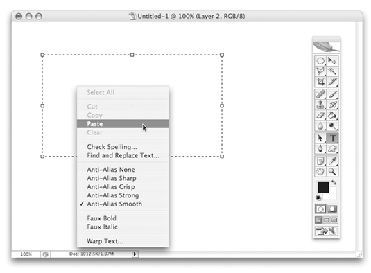
Use Photoshop's Copy and Paste Function
- Select and copy text from a document in your word processor, from a web page, etc.
- In Photoshop select the Type tool.
- Click and drag to create a selection box. Your type will auto-wrap to fill this box.
- Select Edit>Paste to paste the text into the selection box.
- If necessary, choose Select>All, then adjust font family and size values.
Use Photoshop's Built-in Spell Checker

- Ensure you have a dictionary selected in the lower portion of the Characters Palette.
- Select the text to be checked.
- Select Check Spelling. Alternately, Choose Edit>Check Spelling.
- Add or ignore words the spell checker doesn’t recognize just like you would in a word processor.
Seek and Destroy (or at Least Replace)
You may need to change a single word or number that appears in several layers of type. For example, say you’re finishing up a graphic for an event only to find out the date or location has changed. Photoshop’s Find and Replace command comes in handy in situations like this.

- Make sure all layers you want affected are shown and unlocked. If you want to protect a layer from the Find and Replace changes, hide or lock it.
- Select a non-type layer (like the background, for example).
- Choose Edit>Find and Replace Text.
- Type the what you want to replace in the Find What box.
- Type what you want to replace it with in the Change To box.
- Select Search All Layers and Whole Word Only.
- Select Change All.
If you want to change only part of a document’s text, use the Forward setting. It searches forward from an insertion point you leave active in the text. Whole Word Only will restrict Photoshop from changing text that is part of a bigger word.
Screen Safety, Part 1

Don’t forget to keep your text inside the title safe areas. Photoshop CS can automatically create guides to show you where the title safe areas are. To make a new document with title safe guides:
- Select File>New.
- From the Preset menu select the proper sized document for the project you’re working on (see your NLE’s documentation). For example, for NTSC DV projects, choose NTSC DV 720 x 480 (with guides).
- Select OK. Your document opens with an action safe area (outer box) and a title safe area (inner box).
- Temporarily hide the guides by pressing Ctrl+H selecting View>Extras.
If using Photoshop CS2, be sure to check out the new Video Actions from the submenu of the Actions Palette.
Screen Safety, Part 2

For broadcast video you’ve got to be careful with your color selections. When you want white, use an off-white color with a value no higher than 235 in the RGB color picker. Blacks should be no less than 16 on the same scale. Keep your colors safe for the screen to avoid muddy darks and burning lights.
Smooth It Out

Using an anti-aliasing method on your type is almost always a good idea. Anti-aliasing blends the edges of the text to make a smoother effect. Anti-aliased text looks clean and smooth, it’s less likely to create noise on TV screens, and it’s easy to create.
- Select the Type tool.
- Select an anti-aliasing method from the Options bar or the Characters Palette
- Change the anti-aliasing method by selecting the text and changing the setting
You’ll notice the difference between the None setting and any of the others, but the other four may produce only a subtle difference in your text. Experiment to find what you like best.
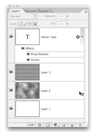
Layered Text Effects
Using the Type tool and the Layers palette you can create some pretty cool text effects. Here’s a simple example. Keep in mind type layers are vector based, so many filters require first rasterizing them, or turning them into pixels. Don’t worry, Photoshop will do this for you – with your permission, of course.

- Create a text layer by selecting the Type tool and typing “Photoshop.”
- Duplicate the layer by pressing Cmd+J (Ctrl+J). The copy appears above the original.
- With the original (lower copy) selected, choose Filter>Blur>Motion Blur.
- A dialog opens asking if you want to rasterize the type. Select OK.
- Enter a value of around 60 in the Motion Blur settings dialog and press OK.
- In the Layers Palette, drop the blurred layer’s opacity to about 70%.
- Add a small stroke to the copy layer to complete the effect.
Styles For Miles
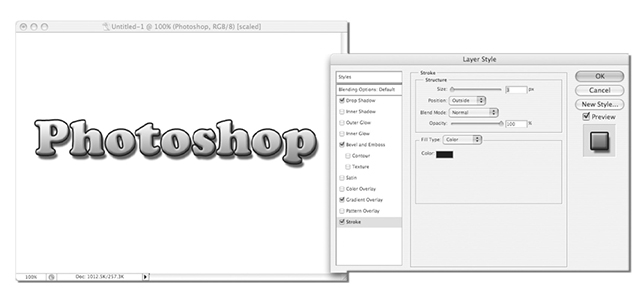
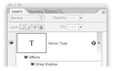
You can dramatically alter your typed characters with Layer Styles. These include drop shadows, strokes, color and pattern overlays, glows, and bevels. Layer Styles are powerful because they update with the type even after you transform size or perspective. To apply Layer Styles:
- Double click the text layer you want to apply styles to.
- A huge dialog comes up. Select which Style effects you want to add.
- Photoshop gives you a preview in the document.
- Click OK to finalize effects and exit the Layer Style dialog.
Drop That Shadow!

By default, the drop shadow you apply to each layer follows the lead of the first you set, the global light. The angle of the shadow will default to the global light angle value. When you change this in a subsequent layer, Photoshop will change the shadow’s angle on all layers. This is often to your advantage, but you can circumvent it by clicking Use Global Light in the Drop Shadow submenu.
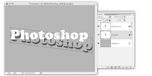
Solo Shadows
You can put an object and a copy of its drop shadow on separate layers. This is handy when you want to transform the shadow independently from the image and can produce an interesting perspective effect.
- Activate a layer.
- Click Cmd+J (Ctrl+J) to duplicate the layer.
- Double click the lower copy and add a drop shadow in the Layer Styles dialog.
- Return to the Layers Palette and drop the lower layer's fill to zero. The layer disappears but the shadow remains visible.
- Transform the object to skew the shadow.

Do It Again!
Once you apply a style to one layer, it’s easy to apply the same style to other layers in the same document.
- In the Layers Palette Ctrl+click (contextual-click) the layer with the Layer Style applied .
- Select Copy Layer Style.
- Ctrl+click (contextual-click) the layer to which you want to apply the style.
- Select Paste Layer Style—or, to apply the style to multiple layers, Ctrl+click (contextual-click) and select Paste Layer Style to Linked.
And In Closing...

We'll wrap this chapter up with some general tips about graphic design. If you're interested and have time, consider reading further into the art of graphic design. Until then, keep these basics in mind.
- Avoid setting information in all caps. It may seem like a good idea, but it makes things more difficult to read.
- You don't have to fill the entire screen with words. In fact, it's best if you don't. Leave some room for that text to breathe!
- Beginners center everything. Try some left or right justified text (left is more commonly effective). When used with the right graphic elements, this can make a big difference.
- Don't overdo it. Beginners like to use every font on the machine in one full-screen graphic. Keep it simple, but more importantly keep it consistent.
- Create repetition in your elements. Use the same image for bullet icons, elements of the same graphic for accent, etc. Make your elements look like they were designed to complement one another.