![]()
Advanced Modeling with Slicers, Filters, and Pivot Tables
So far in this book, you have seen really powerful and elaborate techniques to analyze data and present results in the dashboard format. You need to spend a significant amount of time when creating dashboards with these techniques. Continuing from the previous chapter, I’ll provide some alternatives here.
Creating an Interactive Excel Dashboard
My goal is to create informative, interactive, and beautiful dashboard…in less than 60 minutes. You are going to create a dashboard like the one shown in Figure 22-1.

Figure 22-1. Sales dashboard using Excel
You will be using the data model feature of Excel 2013, including pivot tables, slicers, and pivot charts, to create a completely interactive dashboard from scratch in very little time.
Let’s Meet the Data
Imagine you are running a set of retail stores selling various snacks. You have transaction-level data for the year 2014. There are a total of 42,684 transactions. These transactions are similar in nature to the one shown in Table 22-1. (In this chapter, you’ll be using Chapter22-AdhocDashboard.xlsx. You can download this file from the source materials.)
Table 22-1. Example Transaction: Sales Data

In this example, the details for the customer, product, and store are already available in separate tables. Take a look at the Data worksheet tab in the chapter file to see them for yourself. Figures 22-2, 22-3, and 22-4 show the values in these tables.

Figure 22-2. Customer Data table

Figure 22-3. Product Data table

Figure 22-4. Store Data table
As you know from previous chapters, creating a dashboard from this data requires some up-front development work. However, you can use the techniques from Chapter 21 to create this dashboard with less work. You can deploy the Excel relationships feature, pivot tables, and slicers and instantly get a beautiful report. Well, it may not be instant, but it should take 60 minutes (or less). Let’s go.
Steps for Creating the Dashboard
There are nine simple steps to create this dashboard. The next sections will describe them one at a time.
Step 1: Generating Missing Data
If you look at the data, you will notice that you want to show sales by day of month for any filtered month. The raw data is at the transactional level (with 42,684 transactions). Instead of adding extra columns to this transaction table to generate month and day of month values, you can create another table that lists all the dates in the data. These types of tables are called calendar tables.
For the business intelligence, reporting, and data warehousing world, I define a calendar table as follows:
A table that contains all the dates from start to end for the reporting period, one date per row. It contains dates even when you have no reported transactions on those dates.
Essentially, it’s a calendar. Since you have data only for 2014, the calendar table will have 365 rows.
There are many ways to generate this table. If you deal with data that spans multiple years, you can autogenerate this calendar table by using SQL, by using PowerQuery, or by subscribing to calendar sources available on big data services such as Windows Azure Marketplace. All of these techniques are beyond the scope of this book. So, let’s generate this data in the old-fashioned way, by typing it.
Of course, I am kidding. We all have better things to do than type 365 rows of data. You will autopopulate the calendar table using Excel’s autofill feature. Just go to an empty range in your workbook, type the first two to three dates (1-jan-2014, 2-jan-2014, and so on), and drag down. Excel will fill the remaining dates.
Once you have the dates, you can generate the rest of the columns using formulas. At the least, you need to create the following formulas for the new columns:
- Day of month: Generated using =DAY([date]) formula
- Month name: Generated using =TEXT([date],"MMMM")
Once these columns are added, you should have a table similar to Figure 22-5.

Figure 22-5. Calendar table
OTHER COLUMNS YOU COULD ADD
In addition to the columns listed previously, there are other date columns you might consider adding depending upon the nature of your data and what you’d like to report. Here are some to consider:
- Day of week: =TEXT([date],"DDDD")
- Month number: =MONTH([date])
- Quarter: Can you figure this one out?
Step 2: Creating the Relationship Between Sales and Product
Well, you don’t have to put on a robe and officiate the wedding, but you need to create the relationships between various tables. Using the instructions from Chapter 21, create the following relationships:
- sales[Customer ID] – Customers[Customer ID]
- sales[Product ID] – products[Product ID]
- sales[Store ID] – stores[Store ID]
- sales[Date] – calendar[Date]
When the relationships are created, your screen should look like Figure 22-6.

Figure 22-6. Relationships between various tables
Step 3: Creating Some Pivot Tables
Now that your relationships are in place, let’s figure out the calculation part for your dashboard. Although I started this chapter with a preview of the dashboard you are going to construct, the correct way to do this is to define the information needs of this dashboard. Here are a few plausible needs:
- Which categories of products are doing better?
- Which regions are doing better in sales and quantity sold?
- What types of customers are buying your products more?
- What is the sales and quantity trend for any given month?
- What is the performance for any given manager?
- Is there any difference in purchasing patterns of male versus female customers?
- How do the sales numbers change between various SKU sizes (small, medium, and large)?
In real life, when you are creating a dashboard, this would be the first step. You’ll interview the dashboard customers (your boss, client, chief executive officer, regulatory authority, and so on) to clearly understand what they want, prioritize needs, and make a rough sketch of the dashboard before collecting data and setting up relationships. Because this is a book, I am taking the shortcut of starting with a predefined vision of the dashboard and showing you how to make it.
For this example, you will create pivot tables for the first four questions and then add slicers on the calendar[Month], Customers[Gender], store[Manager], and product[Size] fields so that you can analyze the data for any combination. Refer to step 5 for instructions on creating slicers. Let’s create necessary pivot tables to answer the first four questions.
![]() Note Refer to Chapter 21 if you want to learn more about the process of creating pivot tables.
Note Refer to Chapter 21 if you want to learn more about the process of creating pivot tables.
- Quantity and sales breakdown by product category: see Figure 22-7.

Figure 22-7. Quantity and sales breakdown by category
- Quantity and sales breakdown by customer’s profession: see Figure 22-8.
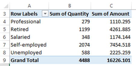
Figure 22-8. Quantity and sales breakdown by profession
- Quantity and sales breakdown by region: see Figure 22-9.

Figure 22-9. Quantity and sales breakdown by region
- Quantity and sales breakdown by day of month: see Figure 22-10.
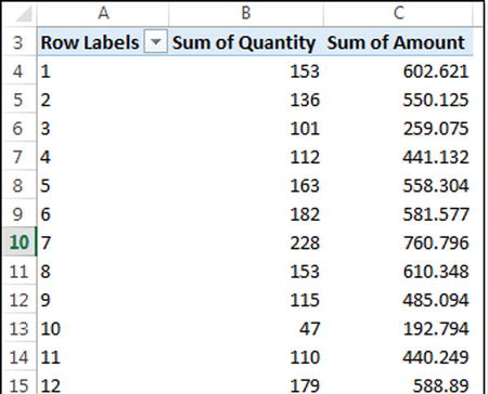
Figure 22-10. Quantity and sales breakdown by day of month
Once complete, you can move on to step 4.
Now that you have pivot tables, let’s turn them into visualizations by using pivot charts. From each pivot, insert a pivot chart. To insert a pivot chart, complete the following process. Let’s assume you want to create pivot chart for category breakdown pivot.
- Select any cell in the pivot. This activates pivot table–specific ribbon tabs.
- Go to the Analyze tab and click PivotChart (refer to Figure 22-11)

Figure 22-11. Adding a pivot chart using the Analyze tab
- Set the pivot chart type to Bar (refer to Figure 22-12)

Figure 22-12. Creating a clustered bar chart type of pivot chart
- Click OK.
- To add remaining pivot charts, refer to Table 22-2.
Table 22-2. Pivot Chart Types for Each Pivot
|
Pivot |
Pivot Chart Type |
|---|---|
|
Category breakdown |
Clustered Bar chart |
|
Profession breakdown |
Clustered Bar chart |
|
Regional breakdown |
Clustered Bar chart |
|
Daily breakdown |
Line chart |
Once the pivot charts are added, move them all to one sheet using the process that follows:
- Add a new worksheet. Call it Dashboard.
- Select the first pivot chart.
- Cut it (Ctrl+X).
- Go to the Dashboard worksheet and paste it (Ctrl +V).
- Repeat the process for the remaining pivot charts.
At this stage, your dashboard has all the necessary charts and looks like Figure 22-13. But the information displayed is for all 42,684 transactions. You wanted to analyze sales information for any given month, for a particular customer gender, for a specific store manager, and for certain product SKU sizes. In other words, you need to filter your report to a subset of the data. This is where slicers can help.

Figure 22-13. Dashboard with pivot charts for all the data
You’ll need to create slices for the following fields (refer to Chapter 21 for instruction on how to add slicers):
- Customers[Gender]
- stores[Manager]
- calendar[month name]
- products[Size]
To insert these slicers, go to Insert tab and click the Slicer option in the Filters group (Figure 22-14).

Figure 22-14. Inserting a slicer
![]() Caution Make sure you are adding the slicers to the Dashboard worksheet.
Caution Make sure you are adding the slicers to the Dashboard worksheet.
Now select the slicers indicated in Figure 22-15 from the various tables in the workbook data model.

Figure 22-15. Inserting multiple slicers by checking table column names
Step 6: Linking the Slicers to Pivots
Just by adding slicers, nothing will happen. You must link them to the pivot tables. Only then will the slicer selection trigger its filtering action on the pivot tables, thus modifying the pivot charts. To do this, go to each pivot table sheet and follow this process:
- Select any cell inside the pivot. This will activate the pivot table ribbon context menu.
- Select Analyze
 Filter Connections from the ribbon (Figure 22-16).

Figure 22-16. Filter Connections option on the Analyze tab
- Connect the pivot table to all four slicers by selecting the boxes (Figure 22-17).

Figure 22-17. Linking each pivot table to all four slicers
- Repeat the process for the remaining pivots.
Step 7: Cleaning Up the Pivot Charts
Let’s agree on one thing first. Pivot charts are not the prettiest things in any Excel workbook. Heck, they can’t even get a date with 3D pie charts. So, how can you tolerate them in a dashboard? Well, you can make them presentable. Refer to Figure 22-18 for an example default pivot chart formatted using simple guidelines.

Figure 22-18. Before and after: formatting default pivot charts (the default chart is on the left; the formatted one is on the right)
Here are a few steps you can follow to format pivot charts to your liking:
- Remove the filtering buttons in the pivot chart by toggling them using the Analyze Field Buttons option. See Figure 22-19.

Figure 22-19. Turning off field buttons from the Analyze tab
- Toggle the Field List option too (from the same Show/Hide group). This way, when you click the pivot chart, Excel won’t show the field list sidebar panel.
- Set up the colors for your pivot chart on the Format tab. Choose simple and consistent colors.
- Adjust the gap width in the bar chart by selecting the bars, pressing Ctrl+1, and using the Gap Width option. Set it to 50% or similar. Refer to Figure 22-20.

Figure 22-20. Setting the gap width to 50% allows for a better user experience. The chart on left has a gap width of 180% (default value). The one on the right is set to a gap width of 50%
- Make all pivot charts same size by selecting them all (Ctrl+click each) and using the Format tab’s Size option.
- Align the charts and adjust the spacing between them, using the alignment and spacing options in the Arrange area of the Format tab.
Now that you have your pivot charts formatted the way you want them, let’s turn to the slicers.
Step 8: Adjusting the Slicer Formatting
While you are formatting, you might as well clean up the default slicer look. You can adjust pretty much any aspect of slicers using custom styles. To create a custom slicer style, follow these steps:
- Select the slicer.
- Go to the Slicer Options tab.
- Right-click any style in the Slicer Styles panel and choose Duplicate.
- Set up the style you want by customizing color, border, font, font size, and so on.
- Apply the new style to all the slicers by selecting the slicer and clicking a style option from the Slicer Styles group in the Slicer Options tab.
![]() Note For more information about slicers, including how to format them, refer to http://chandoo.org/wp/2015/06/24/introduction-to-slicers/.
Note For more information about slicers, including how to format them, refer to http://chandoo.org/wp/2015/06/24/introduction-to-slicers/.
Step 9: Putting Everything Together
Although this step is not required to have a functioning dashboard, it adds a nice, clean look to your reports. So, you should do it anyway!
Make sure all the charts, slicer, and so on, are together and neatly aligned in the dashboard worksheet. Add titles and labels where necessary. Create a clear title and legend in the top part of your dashboard. And the final product is ready. See Figure 22-21.

Figure 22-21. The final version of the dashboard
Let’s pause and admire the powerful dashboard you constructed in just a matter of minutes.
- The slicers can cross-filter. That’s right. If you select any slicer, it filters all charts and other filters.
- Everything is interactive.
- Not a single formula was written to achieve this capability.
- All the data is scattered across multiple tables.
- When you have new data, just refresh the workbook (Alt+F5), and your dashboard will be up to date.
- This dashboard is viewable and interactive on the Web (using Office 365) or on Excel for tablets.
Imagine building all this using formulas or VBA. I sure will consume gallons of coffee before being able to figure out the formula for the daily sales breakdown of male customers buying large products in Cynthia’s stores in August 2014.
Not all is rainbows and butterflies in the land of pivot tables. In this section, I’ll talk about their drawbacks.
While there are a ton of advantages to this approach of building dashboards, it still falls short on a few fronts:
- Pivot tables can’t calculate everything: They are extremely good for aggregating and generating simple statistics (such as SUM, AVERAGE, COUNT, MAX, MIN, and so on), but they can’t calculate things such as month-to-month percentage changes, target performance, and so on. You can get some of these calculations out of a pivot table, but it takes a lot of arm twisting. Often it’s not worth the effort.
- Pivot tables and pivot charts are a pain to format: Anytime you refresh the pivot tables and pivot charts, their formatting returns to the default settings. This can be a pain when you want to maintain a consistent and well-designed look for your dashboards.
- You end up with lots and lots of pivot tables: Even a simple dashboard like the example has four pivot table (thus four separate sheets). Although you don’t have to pay a tax to Microsoft for every pivot table you create, it is still a hassle. Any changes to the pivot tables or slicers must be applied across the board, and this can quickly snowball in a moderately sized business environment.
- Compatibility: The pivot table, slicer, and data model–driven quick dashboard approach is compatible only with Excel 2013 or newer. So if you have a bunch of colleagues or clients who are still on Excel 2010 (or 2007 or, worse still, 2003), then you are out of luck. You must create your dashboard using traditional approaches discussed in the earlier chapters of this book.
That’s enough pivot table bashing. Now that you understand some of the limitations of this approach, let’s talk about how to make the best use of them.
Tips for Using Pivot Tables, Slicers, and the Data Model Effectively in Your Dashboards
Pivot table–driven dashboards are quick and easy to build. But they are a pain to format and calculate everything you want. Alternatively, the formulas and VBA-driven dashboards are comprehensive, interactive, and powerful. But they too can be difficult to build and tricky to maintain.
What if you could combine the best of both worlds and get the ease and simplicity of pivot tables, awesome interactivity of slicers, power of good old SUMPRODUCT and INDEX, and time savings of VBA automation? Now that would be awesome.
Here are few tips and guidelines to reach that level:
- Use slicers for interactivity: As much as possible, use slicers in your dashboards to build interactivity. They are compatible with web/tablet versions of Excel. They look great. They can be formatted to fit your dashboard’s color and font schemes. Please refer to http://chandoo.org/wp/2015/06/24/introduction-to-slicers/ for an explanation on how to do this.
- Use tables :Set up all (or as much as possible) of your raw data as Excel tables. Tables are compatible with Excel 2007 and newer. They allow you to use structural references, which are great for writing formulas. You can link tables to data sources. This way when data changes, all your formulas, charts, conditional formats, and pivot tables will remain good.
- Use pivot tables as the calculation engine: Pivot tables are great for calculating totals, averages, or counts; sorting data; or filtering summaries based on slicers (or report filters). So if your dashboard has any portions that need to calculate totals or sort data automatically, use pivot tables for them. You can set up pivot tables in a separate worksheets and refer to the pivot values in your dashboard tab. This way, you don’t have to deal with the formatting issues pivots present. You can format the references in the dashboard tab any way you want.
- Calculate things with PowerPivot: If your calculations are too complicated, you can rely on PowerPivot to do the number-crunching part. PowerPivot is a powerful technology and allows you to build many of the calculations needed for dashboard reporting with ease. I will discuss PowerPivot at a high level in Chapter 24.
- Create normal charts from pivot table data: Pivot charts are tricky to format, but you can create a regular Excel chart from the data inside a pivot table. This way you can enjoy all the goodness of regular charts and the power of pivot table number crunching in one place. This approach also allows you to combine pivot table numbers with values calculated using regular formulas (or VBA or PowerPivot) to create one chart.
- Use styles to format slicers: Slicers are great for interactivity, but their default look may not turn on your boss. So, you can use custom styles to alter the way they look. My good friend Mike Alexander discusses few creative ways of doing this: http://datapigtechnologies.com/blog/index.php/getting-fancy-with-your-excel-slicers/
The Last Word
As you can see, you can create truly powerful, interactive, and interlinked reports using pivot tables. Many people shun pivot tables and try to do everything with formulas or VBA. I recommend you try pivot tables and harness their true power as much as possible. They will free up valuable time for you so that you can focus on other important things.