
![]()
Introduction to PowerPivot
So far you have learned various techniques and advanced concepts when it comes to using formulas (and VBA) to build dashboards. Let me ask you one question.
What are some of the limitations of formula-driven (or VBA-driven) dashboard development?
Go ahead and think about it.
For all its glory and power, it turns out that formula-driven dashboard development suffers from a few key limitations, such as the following:
- Not scalable: As you bring more data into your dashboard world, suddenly you realize that the SUMIFS, SUMPRODUCT, and LOOKUP formulas are taking forever to calculate. Even if you are willing to compromise on speed, you will eventually reach the theoretical limit of 1 million rows at which point either you have to crunch less data or come up with some clever mechanism to work with data split into multiple ranges.
- Not easy: Although you are at the tad end of a fairly advanced Excel book, you may still be wondering how to calculate certain values using the data you got. This is because some of the most commonly asked business questions are hard to answer with simple Excel formulas. Sample these questions:
- “How many unique customers visited our store in Columbus, Ohio?”
- “What is the longest duration for which production was stopped in the month of May 2015?”
- “How many patients visited our hospital this month and last month too?”
- “What are the names of top three products by sales in our best five stores?”
Although it is possible to answer these questions with Excel formulas, these formulas tend to be long, complicated, and often tricky to modify when business requirements change.
- Disconnected: One of the key things you notice when you look at any business data is that different kinds of data are maintained in different places. Take, for example, separate tables for customer data and sales data, separate databases for CRM data and manufacturing data, and so on. This creates additional challenges for analysts, when you try to combine all this data to answer even simple questions. Occasionally you may end up weaving a complex web of formulas just to bring everything to one place even before starting the work on the dashboard.
If you seem to be nodding along while reading the previous reasons, then you are going to love PowerPivot. This new technology (well, it has been around for five years now, but you could argue that for a majority of Excel users, PowerPivot is still new) overcomes many of the limitations of Excel and can truly transform Excel into a powerful business intelligence application.
What Is PowerPivot?
PowerPivot is an Excel add-in from Microsoft. It is part of the Power BI family of tools. PowerPivot is designed to help you (data analysts, managers, report creators, data nerds, and so on) answer complex questions about your data with ease. In a nutshell, the process for using PowerPivot to go from raw data to insights is like this:
- Feed raw data to PowerPivot (you can bring data from almost anywhere, such as from text files, Excel workbooks, databases, Azure data stores, Power Query connections, workbook data models, and so on).
- Set up the data model by connecting tables with each other (just like how you connected tables in Chapter 21 using Excel 2013; in PowerPivot too you can connect tables.)
- Create measures (formulas that tell PowerPivot how to calculate numbers you want).
- Create a regular pivot table and use measures as value fields.
- Done!
A Note About How to Get PowerPivot
PowerPivot is compatible with Excel 2010 and newer for Windows.
- If you are using Excel 2010, you can download PowerPivot from the Microsoft web site.
- If you are using Excel 2013 or 2016, you can activate PowerPivot in Excel by using the COM Add-ins option.
![]() Note If you don’t see the PowerPivot add-in, that means your version of Excel 2013/2016 does not have PowerPivot. You may have to upgrade your Excel version to the Professional Plus package.
Note If you don’t see the PowerPivot add-in, that means your version of Excel 2013/2016 does not have PowerPivot. You may have to upgrade your Excel version to the Professional Plus package.
- If you are using Office 365, you may add Power BI to your subscription.
For more about PowerPivot compatibility, availability, and installation, please visit the official PowerPivot web site at http://bit.ly/1MfBdSl.
What to Expect from This Chapter
Because PowerPivot is a vast technology, it is not possible to cover it at any length in one chapter. So, in this chapter, I will limit the discussion to the following topics:
- Getting started with PowerPivot
- Loading sample data into PowerPivot
- Setting up the data model
- Creating simple measures using the PowerPivot DAX language
- Inserting a simple PowerPivot table into an Excel file
- Finding out more about PowerPivot
Getting Started with PowerPivot
First, download and install PowerPivot for your respective version of Excel. For more, refer to http://bit.ly/1MfBdSl. Once you install PowerPivot, you should see a new tab, called PowerPivot, in Excel (see Figure 24-1). This is your gateway into the world of PowerPivot.

Figure 24-1. The PowerPivot tab
You can now create PowerPivot tables (they are like regular pivot tables but can do so much more).
But first, you need to load some data into PowerPivot. After all, PowerPivot needs data to do analysis.
Loading Sample Data into PowerPivot
PowerPivot accepts various data sources. You can load data from almost any database and from text files, CSV files, Excel workbooks, SQL Server Analysis Services, tables in current workbook, and connections created in Power Query.
The process for loading data into PowerPivot will differ based on the type of connection. In this chapter, you will learn how to load data from Excel tables into PowerPivot. For other types of data, refer to the “The Last Word” section at the end of this chapter or visit http://bit.ly/1MfBdSl.
Imagine you have three tables in Excel, containing customer, product, and sales data, as shown in Figures 24-2, 24-3, and 24-4.

Figure 24-2. Customer data

Figure 24-3. Product data

Figure 24-4. Sales data
To load these tables into PowerPivot, follow these steps:
- Select one table. (You’ll load one table at a time.)
- Click Add to Data Model in the Tables group (see Figure 24-5).
This loads the table to the PowerPivot data model (more on this later) and opens the PowerPivot window.
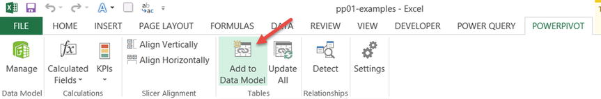
Figure 24-5. Adding tables to the data model through the PowerPivot tab
- Close the PowerPivot window to return to Excel.
- Repeat the process for the other tables of data you have.
What Is the PowerPivot Data Model?
For PowerPivot to process your data, analyze it, and calculate the numbers you want, it must construct a data model. This consists of nothing but the following:
- A collection of your data tables and connection settings
- Relationships between various tables defined as rules
- Measures and calculations you build on top of these tables
A key difference between the data model introduced in Chapter 21 and the data model used by PowerPivot is that when you use PowerPivot, the relationship-building process happens in PowerPivot. For more about the data modeling capabilities of Excel 2013, refer to Chapter 21.
Let’s Enter the World of PowerPivot
Now that you have added three tables to the workbook’s data model, let’s get into the world of PowerPivot and start exploring.
Click the Manage button on the PowerPivot tab. This opens the PowerPivot window, which looks like Figure 24-6.

Figure 24-6. The PowerPivot window, explained
The PowerPivot window offers a lot of features and functionalities. Because the aim for this chapter is to provide a brief overview of what you can do with PowerPivot, let’s skip the discussion of these features. You can review the features in detail at the URL provided earlier in the “Getting Started with PowerPivot” section.
As a first step, now that the data is in PowerPivot, let’s set up relationships between tables. Click Diagram View on the Home tab of the PowerPivot window (see Figure 24-7).

Figure 24-7. The Diagram View option in the View group on the Home tab in PowerPivot
This will open the diagram view where each table is represented by a box (with the columns of the table listed as separate items in the box), as shown in Figure 24-8.

Figure 24-8. Diagram view of tables, PowerPivot window
To set up the relationships between tables, follow these steps:
- First identify which relationships are needed. For this example, you have two relationships.
- Customers[Customer ID] related to sales[Customer ID]
- products[Product ID] related to sales[Product ID]
- Select the Customer ID field in the Customers table and drag and drop it on the Customer ID field of the sales table.
- Select the Product ID field in the products table and drag and drop it on the Product ID field of the sales table.
Done! Your relationships are now set up.
Creating Your First PowerPivot Table
Now that you have loaded some data and created the necessary relationships, let’s create a PowerPivot table so that you can see what this is all about.
To create a PowerPivot table, click PivotTable on the Home tab of the PowerPivot window (see Figure 24-9). This opens the Create PivotTable dialog box and prompts you for the location of the PowerPivot table. By default the new PowerPivot table will be inserted in a new worksheet. Click OK.
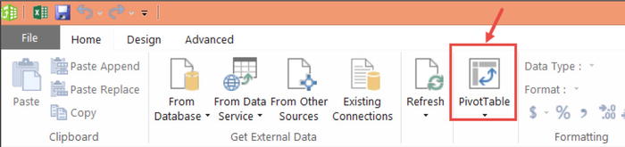
Figure 24-9. Inserting a pivot table from a PowerPivot window
At this point, the PivotTable Fields list will show all three tables (if you see only one table, switch to the ALL view from the ACTIVE view). Please refer to Figure 24-10.

Figure 24-10. The PowerPivotTable Fields list shows all the tables in your data model
You can mix and match any fields from any of the tables to create a combined pivot report. For example, see the “Quantity Breakdown PowerPivot by Product Category & Customer Gender” PowerPivot table, as shown in Figure 24-11.

Figure 24-11. Example PowerPivot table, quantity by category and gender
Since you are familiar with this process (refer to Chapter 21), let’s talk about the Power part of PowerPivot.
The Real Power of PowerPivot: DAX Formulas
When you drag a field to the values area of the pivot table, by default Excel will either sum or count that field. Using the pivot table calculation options, you can calculate a few other summaries such as average, minimum, maximum, and so on.
In other words, there are only a few ways in which you can summarize (or analyze) data with regular pivot tables.
PowerPivot gives you Data Analysis Expressions (DAX) formulas, which you can use to calculate a lot of different numbers easily. Here are a few sample numbers that can be easily calculated in PowerPivot using DAX formulas:
- “How many unique customers visited our store in Columbus, Ohio?”
- “What is the longest duration for which production was stopped in the month of May 2015?”
- “How many patients visited our hospital this month and last month too?”
- “What are the names of the top three products by sales in our best five stores?”
- “What is the growth rate in sales this month compared to last year for the same month?”
- “What is the three-month moving average trend in customer footfalls across our stores in the United States?”
Think of DAX formulas as a mix of Excel formulas, pivot tables, pixie dust, and your favorite superhero (for me it’s the Flash).
Let’s Create Your First-Ever DAX Formula Measure in PowerPivot
To truly appreciate what DAX formulas can do, you need to create a few of them and see how they work. Let’s start by calculating something that is useful for business managers but tricky to calculate with regular Excel formulas.
Finding the right combination of buttons to press on an espresso machine to get the most awesome coffee ever!
Of course, I am kidding. PowerPivot can’t tell you how to make the perfect cup of coffee. Not yet.
Instead, let’s calculate something that is truly useful for business managers: finding the distinct customer count.
Let’s say you are looking at a monthly sales report and wondering how many customers bought from you in this month. Although you had 6,000 transactions, that doesn’t mean you had 6,000 customers. Because a few customers might have made multiple purchases, the customer count could be less. But how do you calculate it?
The Process for Creating a DAX Formula to Calculate Distinct Customer Count
To create a new measure, you will be using the Calculations area of the PowerPivot tab in Excel.
- Start by inserting a new PowerPivot table. (You need to go to the PowerPivot window and click PivotTable on the Home tab.)
- Let’s say you want to find the distinct customer count for each product category and gender combination. So, add the product categories as row labels and make “Row Labels” and the two genders the column headings. At this stage, the PowerPivot table looks like Figure 24-12.
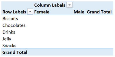
Figure 24-12. Blank pivot table with categories and genders
- Go to the PowerPivot tab and click Calculated Fields
 New Calculated Field. See Figure 24-13.

Figure 24-13. Inserting the calculated field from the PowerPivot tab
- This opens the Add Calculated Field dialog. Let’s give the calculated field a name such as Distinct Customer Count.
- In the Formula area, type the formula =DISTINCTCOUNT(Sales[Customer ID]).
- Set Format to Whole Number with a thousands separator. See Figure 24-14.

Figure 24-14. DISTINCTCOUNT() PowerPivot measure, explained
- Click OK.
At this stage, PowerPivot calculates the distinct count for each of the category and gender combinations and loads them into the pivot table. The output looks like Figure 24-15.

Figure 24-15. Distinct count of customers by category and gender, PowerPivot example report
DISTINCTCOUNT(), I LIKE THE SOUND OF IT
DISTINCTCOUNT() is one of the hundreds of formulas available in PowerPivot to calculate what you want. As the name suggests, DISTINCTCOUNT counts how many unique (or distinct) values are present in a table column. In this case, DISCINCTCOUNT is looking at the Customer ID column of the sales table and finding the count of customers.
Oh! Wait a second, I never told PowerPivot how to calculate DISTINCTCOUNT for Gender=Female, Category=Biscuits. That’s right. When you create a calculated field in PowerPivot, you just have to specify the abstract or business definition of it. Then PowerPivot will figure out how to calculate these numbers for every scenario. To facilitate this, PowerPivot uses a concept called a filter context.
Let’s take a closer look at the distinct count pivot table and narrow it down to the first number; there are 11 distinct customers where Gender=Female and Category=Biscuits (see Figure 24-16).

Figure 24-16. Understanding PowerPivot filter contexts
In that situation, the filter context is nothing but Gender=Female and Category=Biscuits. Once PowerPivot determines the filter context for each cell of the pivot table, it will calculate the measure (distinct customer count) for only that filter context.
Everything you add to a PowerPivot table will have a role in defining the filter context.
- If you add a slicer on the customer profession and select “Self-employed,” that will be added as another filter context.
- If you add a report filter on the product size and select the Large and Medium sizes, they will be added as another filter context.
The filter context helps PowerPivot narrow down to the subset of data on which it calculates the measures.
MEASURES VS. CALCULATED FIELDS
Both of these refer to the same idea. In Excel 2010 PowerPivot, they were called measures. In Excel 2013 PowerPivot, they were called calculated fields. Who knows what Microsoft will call them in Excel 2016? In this chapter, I will use both words so that you get used to them.
Let’s Create a Few More DAX Measures
Now that you are familiar with the process of creating DAX measures (or calculated fields), let’s create a few more of them for the data model.
To create these measures, use Calculated Fields ![]() New Calculated Field from the PowerPivot tab.
New Calculated Field from the PowerPivot tab.
You will create measures for calculating Total Quantity and Average Quantity per Customer using simple DAX formulas.
The total quantity is nothing but the sum of the Quantity column in the Sales table. The measure definition looks like this:
- Total Quantity = sum(sales[Quantity])
You can see this in Figure 24-17.

Figure 24-17. Adding the Total Quantity measure using the SUM DAX formula
Since you know both the total quantity and the customer count, you can calculate the average quantity per customer. This is defined as follows:
- Average Quantity per Customer = [Total Quantity] / [Distinct Customer Count]
Figure 24-18 shows the Average Quantity per Customer measure.

Figure 24-18. Adding the Average Quantity per Customer DAX measure
THAT’S RIGHT, POWERPIVOT MEASURES ARE REUSABLE
Once you create a few measures, you can use them in constructing other measures.
Think of each measure as a LEGO block. Once you have a bunch of them, you can creatively mix them to come up with a new kinds of measures.
Example PowerPivot Report: Top Five Products Based on Average Quantity per Customer
Now that you have the Quantity per Customer measure, you can use it to find the top five products based on how much customers buy them. Essentially, you are trying to create something like Figure 24-19.

Figure 24-19. Example PowerPivot report with top five products
To create this PowerPivot report, follow these steps:
- Insert a new PowerPivot table by going to the PowerPivot window and clicking the PivotTable option.
- Add the products[Name] field to the row labels area of this new pivot table.
- Add the Quantity per Customer field to the values area. At this stage, your pivot table looks like Figure 24-20.

Figure 24-20. Quantity per Customer for all products
- Right-click any Quantity per Customer value and choose Sort Largest to Smallest. See Figure 24-21.
Now that product names are sorted by Quantity per Customer, let’s filter down to the top five products alone.

Figure 24-21. Sorting the pivot table by Quantity per Customer measure
- To do that, right-click any product name and choose Filter Top 10. See Figure 24-22.

Figure 24-22. Filtering top five products using the Top 10 value filter
- Specify 5 as the number of items, as shown in Figure 24-23, and click OK.
Your pivot report with the top five products based on quantity per customer is ready.

Figure 24-23. Filter criteria for top five products
- You can use Conditional Formatting Data Bars (from Excel’s Home tab) to make these numbers stand out.
PowerPivot and Excel Dashboards
PowerPivot is like a powerful processing engine for analyzing data. Since dashboards often involve analyzing huge amounts of data, PowerPivot fits naturally into this world. Here is how you can use PowerPivot to speed up your dashboard development:
- Use PowerPivot for connecting datasets: PowerPivot allows you to bring data from multiple sources and connect them as per the business relationships between each of those datasets. This means no more lengthy VLOOKUP statements or clumsy INDEX+MATCH formulas. You can simply use PowerPivot to connect tables with each other and generate PowerPivot tables to answer business questions.
- Overcome Excel’s processing limitations: Whenever you have more than a few hundred thousand data points, regular Excel formulas (or VBA) tend to be slow. PowerPivot handles fairly large datasets (up to a few million data points) with ease on normal office computers.
- Answer tough questions with ease: Instead of coming up with complex array formulas or lengthy SUMIFS formulas, you can use PowerPivot measures to answer complex business questions. As you saw in the previous examples, PowerPivot can answer many business questions about your data in an easy, elegant, and reusable fashion.
- Let your users play with dashboards using slicers: You can add slicers to any fields in your data and bring a whole new level of interactivity and insights to the dashboards.
- Mix PowerPivot with everything else in Excel: Since the output of PowerPivot will be either pivot tables or cells, you can mix them with everything else in Excel, like conditional formatting, charts, form controls, or VBA to come up with totally impressive and detailed dashboards.
Figure 24-24 shows an example dashboard that depicts product performance based on the dataset introduced at the start of this chapter.

Figure 24-24. Example Product Performance Dashboard made with PowerPivot, explained
Explaining the construction of this dashboard is beyond the scope for this discussion on PowerPivot. If you are feeling curious, you may refer to this chapter’s workbook, Chapter24-pp01-examples.xlsx, and learn by breaking it apart.
The Last Word
I am sure you are feeling curious about PowerPivot and its possibilities. If so, please check out the following resources:
- PowerPivotPro.com by Rob Collie offers a lot of tutorials, discussion, examples, books, and material on PowerPivot.
- At Chandoo.org, I have been running an online course on PowerPivot, teaching people how to use this technology to solve real-life business problems and build awesome dashboards. Check it out at http://chandoo.org/powerpivot/.