
Chapter 13. Working with Business Intelligence
Chapter at a glance
Create
Create a PowerPivot Gallery, Understanding SharePoint BI components

Work
Work with data models, Working with data models

Publish
Publish PowerPivot dashboards, Publishing PowerPivot dashboards using Excel Web Part

Build
Build Power View visualizations, Building visualizations with Power View

IN THIS CHAPTER, YOU WILL LEARN HOW TO
Business intelligence (BI) is a set of tools and capabilities that work together to turn large amounts of data into meaningful information for better decision making. SharePoint 2013 provides a BI platform that puts power in the hand of the users with self-service capabilities delivered through Microsoft SharePoint and Microsoft Office Excel. You can use SharePoint BI capabilities for collaborative browser-based data exploration, visualization, and presentation experiences that provide better and deeper insights for making decisions.
In Chapter 12, you learned how to import lists from Excel into SharePoint. The integration between SharePoint and Excel goes even deeper with the BI functionality. With Microsoft Office Excel 2013, you can build data models and create a wide range of scorecards and dashboards that can be published to SharePoint, where you can share workbooks with others using Excel Services capabilities. Excel Services is a Microsoft SharePoint 2013 component that you can use to display all or part of an Excel workbook in a browser so that people in your organization can explore and analyze data in the workbook. You can use Microsoft PowerPivot in Excel to mashup data from multiple sources, and to build Microsoft PivotChart and Microsoft PivotTable reports for information analysis that you can publish to SharePoint. You can view, sort, filter, and interact with PivotTables and PivotCharts in the browser as you would by using the Excel client.
One of the major BI capabilities in SharePoint 2013 is Microsoft Power View, which is an ad hoc reporting tool that you can use to build highly interactive and intuitive browser-based data exploration, visualization, and presentation experiences for people in your organization. You can create a variety of interactive charts and tables, and add timeline controls, filters, and slicers so that users may drill further into the data. Power View was introduced in Microsoft SQL Server 2012, and you can use its intuitive reporting to visually explore data through interactive reports and animations.
In SharePoint 2013, the self-service BI goes beyond individual insight. All self-service BI capabilities are extended into a collaborative BI platform for sharing insights and working together to develop insights even further. In addition to Excel Services, BI in SharePoint supports Microsoft Office Visio Services and Microsoft PerformancePoint Services. However, PerformancePoint Services are not available in Microsoft Office 365 and Microsoft SharePoint Online.
Tip
Full BI capabilities are included in SharePoint 2013 Enterprise, which is installed with SQL Server 2012 Enterprise in on-premises deployments. Office 365 and SharePoint Online support many, but not all, BI capabilities. However, the gap between the online and on-premises SharePoint BI is narrowing as more SharePoint Online updates become available. For more information on the BI features supported by SharePoint Online, go to technet.microsoft.com/en-us/library/dn198235.aspx.
In this chapter, you will learn about SharePoint BI components, use Excel Services, work with data models, create and publish PowerPivot dashboards, build and explore Power View visualizations, work with Power View reports with multiple views, and display Power View reports in a Web Part.
Note
PRACTICE FILES Before you can complete the exercises in this chapter, you need to copy the book’s practice files to your computer. The practice files you’ll use in this chapter are in the Chapter13 practice file folder. A complete list of practice files is provided in Using the practice files at the beginning of this book.
Important
Remember to use your SharePoint site location in place of http://wideworldimporters in the exercises.
Understanding SharePoint BI components
There are a number of BI tools and components in SharePoint 2013 that work together so that you can explore, visualize, and share information in interactive reports, scorecards, and dashboards. They include SharePoint server-side services, as well as sites, libraries, and content types that are specifically designed for providing self-service BI functionality. In addition, the Enterprise Search Center site includes a built-in vertical search results page, named Reports, that searches the index of BI-related reports and provides previews of the search results in the hover panel for quick reference.
There are three server-side SharePoint services that provide features and functionality to support SharePoint business intelligence applications: Excel Services, PerformancePoint Services, and Visio Services.
Using Excel Services, you can view and interact with data in Excel workbooks that have been published to SharePoint sites. You can explore and analyze data in a browser in the same way that you do in the Excel client. For example, you can point to a value in a Pivot chart or table and the mouse tip will suggest ways to view additional information. Excel Services in SharePoint 2013 connect to SQL Server 2012 Analysis Services (SSAS) and SQL Server 2012 Reporting Services (SSRS) servers to provide PowerPivot and Power View capabilities.
Note
SEE ALSO For more information on deploying SQL Server 2012 BI features for SharePoint 2013, refer to technet.microsoft.com/en-us/library/jj218795.aspx. For a list of software requirements for installing BI capabilities on SharePoint 2013, refer to technet.microsoft.com/en-us/library/jj219634.aspx.
Using PerformancePoint Services, you can create centrally managed interactive dashboards that display key performance indicators (KPIs) and data visualizations in the form of scorecards, reports, and filters. PerformancePoint dashboards can be viewed and interacted with on iPad devices using the Safari web browser. PerformancePoint Services is only available in the on-premises implementations of SharePoint Server 2013.
Using Visio Services, you can share and view visual diagrams to SharePoint sites. You can create and publish diagrams that are connected to data sources and that can be configured to refresh data to display up-to-date information. The diagrams can be viewed on your local computer and on mobile devices. This allows you to view Visio documents without having the Visio client installed on your device. In addition to viewing, you can add comments to the Visio Drawing (*.vsdx) diagrams in the browser in fullpage rendering mode. Visio diagrams can also be rendered within the Microsoft Visio Web Access Web Part.
In addition to the server-side service applications, SharePoint BI components provide site and library templates that provide you with the BI self-service capabilities, including the Business Intelligence Center site, the PowerPivot site, and the PowerPivot Gallery library.
The Business Intelligence Center is an enterprise SharePoint site that has been designed to support enterprise-wide BI applications. Using Business Intelligence Center, organizations can centrally store and manage data connections, reports, scorecards, dashboards, and Web Part pages. In SharePoint 2013, Business Intelligence Center is optimized and streamlined. It provides multiple libraries, Web Parts, and content types that are optimized for BI self-service applications.

The PowerPivot site is a collaboration SharePoint site that includes Excel Services capabilities with PowerPivot and Power View features. It is similar to the Team site, but in addition to the default Documents library, it also provides a PowerPivot Gallery, which is a documents library with additional functionalities that are designed to support Excel Services BI applications. PowerPivot site is available as part of PowerPivot for SharePoint 2013.
Tip
PowerPivot for SharePoint 2013 is available as a free add-in to SQL Server 2012 Enterprise. It is also included in SQL Server 2012 SP1. It can be downloaded from www.microsoft.com/en-us/download/details.aspx?id=35577.
When PowerPivot for SharePoint 2013 is deployed on the SharePoint farm and enabled in the site collection, the PowerPivot site template becomes available in the New SharePoint Site page when you create a new site in this site collection.

The PowerPivot Gallery is deployed as a part of a PowerPivot site and is displayed on its Quick Launch. However, you can also add the PowerPivot Gallery to your existing Team site. When PowerPivot for SharePoint 2013 is deployed in a site collection, the PowerPivot Gallery app is added to the list of available apps for all sites in this site collection. You can add the PowerPivot Gallery from Your Apps page by using the Add app command.
Tip
At the time of writing, the PowerPivot site and PowerPivot Gallery are not available in Office 365 and SharePoint Online. In SharePoint Online, the Documents library in the Business Intelligence Center provides functionality that is similar to the PowerPivot Gallery.
In this exercise, you will create a PowerPivot Gallery library on your site, upload the Excel workbook in the PowerPivot Gallery, and explore the library views.
Important
You will use the SalesData.xslx practice file, located in the Chapter13 practice file folder.
Set Up
Open the SharePoint site where you would like to create a PowerPivot Gallery. This exercise will use the http://wideworldmporters site, but you can use whatever SharePoint team site you want. If prompted, type your user name and password, and then click OK.
Important
Verify that you have sufficient permissions to create a library in the site that you are using. If in doubt, see Appendix A.
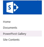
On the Quick Launch, click Site Contents, and then on the Site Contents page, click add an app to display the Your Apps page.
In the search box at the top of Your Apps page, type PowerPivot, and then click the magnifying glass at the right of the search box to locate the PowerPivot Gallery app. Alternatively, scroll down the page till you find the PowerPivot Gallery app.
Click the PowerPivot app to add a new PowerPivot Gallery on your site.
In the Adding PowerPivot Gallery dialog box, in the Name box, type the name for your new gallery, such as PowerPivot Gallery, and click Create.
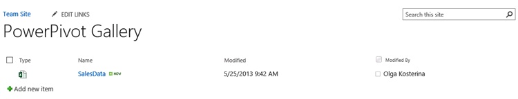
You are taken back to the Site Contents page that now shows the new PowerPivot Gallery. You will now create a permanent link to this library on the Quick Launch. On the Quick Launch, below the list of links, click EDIT LINKS.
Drag the PowerPivot Gallery link up and position it above the Recent section, where it is currently located. Click Save on the Quick Launch to save the new Quick Launch layout.
On the Quick Launch, click the PowerPivot Gallery link to open it.
The new gallery is displayed. If Silverlight is not installed on your machine, the Install Microsoft Silverlight message box appears, prompting you to install Silverlight. Click the message box to download and install Silverlight on your computer.
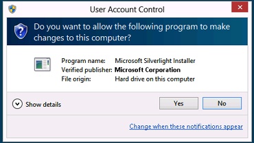
In the download confirmation bar at the bottom of the screen, click Run to start the Silverlight installation.
Click Yes in the User Account Control message box, if it appears, to confirm that you’d like to allow the installation.
The Silverlight setup wizard starts. On the Install Silverlight wizard page, click Install now.
In the Installation Successful dialog, click Close, and then press F5 on the keyboard to refresh the PowerPivot Gallery page in the browser. This is the new gallery, so the page is empty.
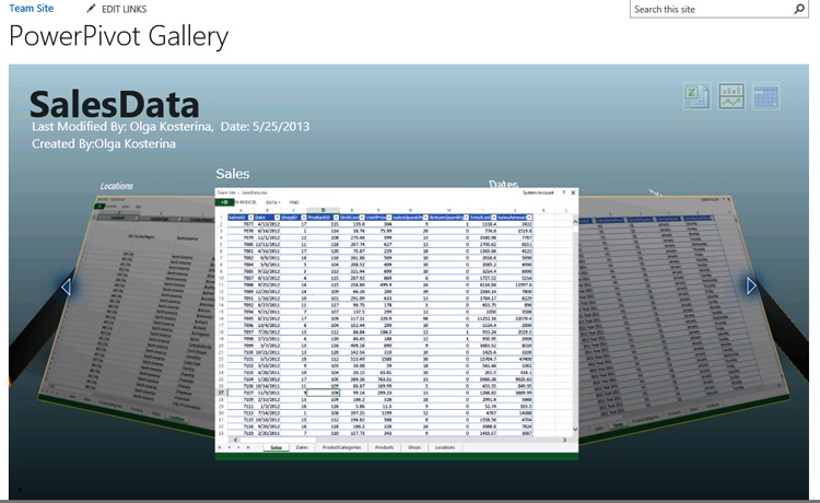
You will now upload the SalesData workbook into the PowerPivot Gallery. Click the Files tab on the top left of the page to open the ribbon, and then in the New section, click Upload Document.
In the Add a document dialog, click Browse and go to the Chapter13 practice folder, select SalesData.xslx, and click Open. Then, in the Add a document dialog, click OK to upload the workbook. In the document properties dialog Power Pivot Gallery - SalesData.xslx (if it appears), click Save.
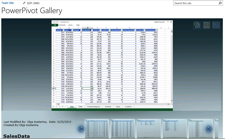
The workbook has been uploaded to the PowerPivot Gallery. It is displayed in the Gallery view that allows you to preview the worksheets within the workbook. The first worksheet is in focus and is displayed in the left pane, larger than the others. You can bring any worksheet in focus by pointing at it. You move to the worksheets that are not displayed in the screen by using the left and right navigation buttons, as well as by clicking the navigation dots, located at the bottom of the workbook view. Browse through the worksheets to familiarize yourself with the Gallery view of the workbook.
You will now explore other available PowerPivot Gallery views.
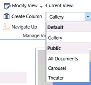
On the Library ribbon, in the Manage Views section, under Current View, open the drop-down list of views.
Select the Carousel view to switch to it. The workbook is displayed in the Carousel view, where you can browse through the worksheets using left and right arrows. The worksheet in focus is displayed in the center, whereas the worksheets to the left and to the right of it are dimmed. Use the left and right navigation buttons to go through the worksheets in the workbook.
Once again, on the Library ribbon, open the drop-down list of views, and this time select the Theater view. The worksheet in focus is displayed on top of the view, in the stage section. You can browse through the worksheets using left and right navigation buttons in the worksheets lineup under the stage, and you can bring them into focus on the stage by pointing at them.
Finally, open the drop-down list of views and switch to the All Documents view to display the library as the list of documents. This view can be useful for managing files in the library.
Switch back to the Gallery view that is the default view for all PowerPivot Galleries.


Using Excel Services
Excel Services in SharePoint 2013 is a shared service in which you can publish Excel workbooks on SharePoint to view all or parts of an Excel workbook in the browser. You can directly save the Excel workbooks and publish reports to a library on a SharePoint site. Excel Services will then process and render the data in the workbook in the browser, so that you can share the workbook with others and they can interactively explore and analyze the data it contains. Access to the published workbooks can be managed and secured on SharePoint using user access permissions and permissions levels in the same way as any other file within a library.
For example, in the previous exercise, Excel Services enabled the preview of the workbook in the PowerPivot Gallery views. Although Excel Services is available in previous versions of SharePoint, in SharePoint 2013, there is a higher level of parity between the browser and the Excel client.
Important
You can interact with Excel workbooks in a browser through Excel Services; however, the workbooks cannot be edited in the browser by using Excel Services.
In the following exercise, you will use Excel Services in the PowerPivot Gallery library to explore the SalesData workbook and to sort, filter, and search the data it contains.
Set Up
Open the SharePoint site that you used in the previous exercise, if it is not already open. If prompted, type your user name and password, and then click OK.
Important
Verify that you have sufficient permissions to view the workbook in a library on the site that you are using. If in doubt, see Appendix A.
On the Quick Launch, click PowerPivot Gallery to open the PowerPivot Gallery, if it is not already open.
In the SalesData workbook displayed in the Gallery view, click the worksheet that you’d like to view; for example, Sales. Excel Services opens the workbook in the browser and displays the worksheet that you have chosen.
Explore the workbook. It contains five tables in five worksheets: Sales, Dates, Products, ProductCategories, Shops, and Locations. The worksheet tabs are shown at the bottom of the Excel Services page, as they would be in an Excel client.
The Sales worksheet lists sales transactions in Wide World Importers stores located in cities in the United States for the years 2011 and 2012. The Products worksheet lists assorted items of furniture that were sold during this period. Each product belongs to a product category. The product categories are listed in the ProductCategories worksheet. The Stores worksheet lists the Wide World Importers stores where the products were sold, and the Locations worksheet lists the cities and the states where the stores are located. Finally, the Dates worksheet is a reference table that provides a list of dates by the year, half year, quarter, and month.
After you have browsed through all the worksheets to familiarize yourself with the data, click the Sales tab at the bottom of the screen to return to the Sales worksheet.
You will now sort a Sales table by date in descending order. In the Date column header, click the down arrow to display a menu of sort and filter options, and then select Sort Descending.
The Sales table has been sorted in descending order by date. Notice that the button in the Date header now shows a down arrow that identifies that this column is sorted in descending order.
You will now display sales transactions from a Seattle store. There are one thousand transactions in the Sales worksheet, so locating specific transactions by scrolling through the table is difficult. It would be good to filter the table by Seattle store transactions. However, in the Sales table, the stores are identified by their numeric ID in the ShopID column, so first you need to find out the ShopID for the Wide World Importers shop in Seattle.
Open the Shops tab and locate the Seattle store in the ShopName column, and then look up its ID in the ShopID column. The ID for the Wide World Importers shop is 1.
Go back to the Sales table by clicking its tab. Click the down arrow in the ShopID column header, click Number Filters, and then select Equals. In the Custom Filter dialog, type 1, and then click OK.
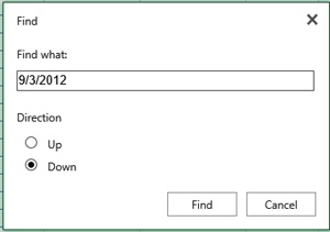
The transactions with the ShopID of 1 are displayed. You will now locate a specific transaction in the displayed list of transactions. Click Find at the top of the worksheet page. To search for a transaction that took place on September 3, 2012, go to the Find dialog, and in the Find what box, type a date of September 3, 2012, in the data format used in your setup (for example, 9/3/2012), and then click OK.
The cell that contains the search term is identified by the green box around it, and its row is brought into view.
Having explored the workbook and the data that it contains, you will now close the Excel Services page. In the top-right corner of the workbook, to the right of your user name, click X to exit Excel Services and to return to the PowerPivot Gallery page.


Working with data models
With data models in Excel Services for SharePoint 2013 and Excel 2013, you can bring data from a variety of sources into one cohesive data set, and then use it to create charts, tables, reports, and dashboards. A data model is essentially a collection of data from multiple sources with relationships between different fields, which you can create and organize by using PowerPivot for Excel. Typically, a data model includes one or more tables of data. To build a data model, you can sort and organize the data and create relationships between different tables.
After you have created a data model in Excel, you can use it as a source to create multiple charts, tables, and reports. For example, you can use Excel 2013 to create interactive PivotChart reports and PivotTable reports. Or, you can use Power View to create interactive visualizations such as pie charts, bar charts, bubble charts, line charts, and many others.
Using Excel Services in SharePoint Server 2013, you and others can view and use workbooks that have been published to SharePoint Server, including workbooks that contain data models. You collect data in a data model, and then use it as a source for reports and scorecards that you can publish and share. Excel Services retains connectivity to external data sources and refreshes the data so that the reports, scorecards, and workbooks remain up to date. You can use SharePoint permissions to control who can view and use the reports, scorecards, and workbooks that you have published.
When you create a data model in Excel, in addition to data that is native to Excel, you can also combine data from one or more external data sources. Excel Services supports a subset of the external data connections that you can create with Excel. The external data connections that are supported in Excel Services in SharePoint Server 2013 include connections to the following data sources:
SQL Server tables
SQL Server Analysis Services cubes
OLE DB and ODBC data sources
Note
SEE ALSO For more information on data sources that are supported in Excel Services in SharePoint 2013, refer to technet.microsoft.com/en-us/library/jj819452.aspx.
The following are external data sources that you can connect to from Excel, but are not supported in Excel Services in SharePoint Server 2013:
XML files
Text files
Access databases
Website content
Windows Azure Marketplace data
Tip
If you want to use data from external data sources that are not supported in Excel Services, you might be able to import the snapshot of data into Excel, and then use it in your data model as the data native to Excel.
To build a data model, use the PowerPivot add-in for Excel that is included in Excel 2013. With PowerPivot for Excel, you can import the data from external sources, if needed, and build relationships between disparate data so that you can work with the data as a whole.
By default, the PowerPivot add-in for Excel is not enabled. In the following exercise, you will enable the PowerPivot add-in for Excel 2013.
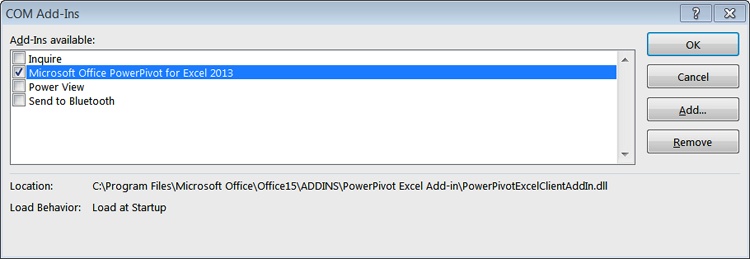
Click File, and then select Options.
In the Excel Options dialog, select Add-ins.
In the Manage drop-down list, select COM Add-ins, and then click Go.
In the COM Add-ins dialog, select Microsoft Office PowerPivot for Excel 2013 from the list of available add-ins, and then click OK.
In Excel, validate that PowerPivot has been enabled by verifying that there is now a PowerPivot tab displayed on the ribbon.
The PowerPivot add-in provides the data-modeling engine in Excel 2013 that is used to create data relationships and hierarchies to design your data model according to your business requirements.
In the following exercise, you will work with a data model using PowerPivot in Excel. You will enhance the existing data model that is based on the tables in the SalesData workbook. You will add a relationship to the model and create two hierarchies, one of which will contain a calculated column that you will add to a table. The data model that you create in this exercise will be used in the rest of the exercises in this chapter.
Important
You will use the SalesData.xslx practice file, located in the Chapter13 practice file folder.
Click File, select Open, click Computer, and then click Browse.
Go to the Chapter13 practice folder, select SalesData.xslx, and then click Open.
The SalesData workbook opens in Excel. You are already familiar with the tables in this workbook and the data they contain from the exercise in the previous section in this chapter. You will now open the data model in this workbook, and then explore and enhance it.
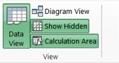
Click the PowerPivot tab on the ribbon, and then click the Manage button to open the PowerPivot window and to work with the data model.
The PowerPivot window opens in the Data View. In the View group on the ribbon, click Diagram View to display the diagram of the data model.
Explore the data model diagram that is displayed. It shows five tables in this workbook, with the names of the columns in each table and the links between the tables.
Point to an arrow that links the Sales table and the Shops table. The related columns in the linked tables are shown in blue boxes. Notice that the ShopID in the Sales table, which you had to look up in the Shops table in the previous exercise, is mapped to the ShopID in the Shops table so that the data can be retrieved without having to look it up manually.
Point to the link between the Sales table and the Dates table to see the related columns named Date. Point to the link between the Sales table and the Products table to see the related columns named ProductID. Finally, point to the link between the Products table and the ProductCategories table to see the related columns named ProductCategoryID.
You will now create a relationship between the Shops table and the Locations table using the LocationID columns, which both tables contain. Drag the LocationID column in the Shops table to the LocationID column in the Locations table. PowerPivot draws a line between the two columns, indicating that the relationship has been established.
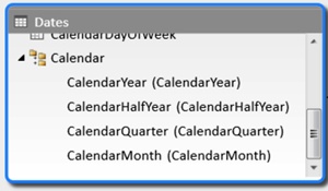
You will now create a hierarchy of columns in the Dates table. It contains the columns for date, month, quarter, half year, and year. A date is a part of a month, which, in turn, is a part of a quarter, which, in turn, is a part of half of a year, which, in turn, is a part of a year. A hierarchy will establish these relationships between the columns. In the Dates table, hold down the Ctrl key while you click the Date, CalendarMonth, CalendarQuarter, CalendarHalfYear, and CalendarYear columns to select them.
Right-click one of the selected columns to open the context menu, and then select Create Hierarchy.
A parent hierarchy level is created at the bottom of the table, and the selected columns are copied under the hierarchy as child levels. Type Calendar to name your new hierarchy. Scroll down and resize the table box to view the entire new hierarchy.
You will now create another hierarchy in the Products table with the ProductCategory as the parent node, and ProductName as the child node. However, because the ProductCategory column is not a part of the Products table but of the ProductCategories table, you will first create a related ProductCategory column in the Products table, which will be calculated and filled in by the model. You can create a calculated column using Data View in the PowerPivot window.
At the bottom of the Data View window, click the Products tab to display the Products table, and then click Add Column in the header row to the right of the table.
In the formula bar, type = RELATED(ProductCategories[ProductCategoryName]), and then press Enter on the keyboard. The RELATED function has returned values for each cell in the new column from the ProductCategoryName column in the ProductCategories related table. The new column has been populated.
To rename the new column from its default name, CalculatedColumn1, right-click the header of the new column, select Rename Column, and then type ProductCategory as the column name. Press Enter.
You will now use this column in a hierarchy in the Products table. In the View group on the ribbon, click Diagram View to display the data model diagram. Verify that the Products table now lists the ProductCategory calculated column that you have created.
In the Products table, hold down the Ctrl key while you click the ProductName and ProductCategory columns to select them, and then right-click one of the selected columns and select Create Hierarchy from the context menu.
Type Product Categories as the name of the new hierarchy.
In the top left of the PowerPivot window, click Save to save your data model. The PowerPivot window is minimized and the Excel workbook is displayed.


Creating and publishing PowerPivot dashboards
After you create a data model, you can use it to build PivotTables and PivotCharts in the Excel workbook. The workbook can then be published to a SharePoint site, where the PowerPivot server components provide server-side query processing of PowerPivot data in Excel workbooks, which you access from SharePoint sites. Excel Services in SharePoint 2013 includes data model functionality to enable interaction with a PowerPivot workbook in the browser.
Tip
The server-side processing, collaboration, and document management support for the PowerPivot workbooks that you publish to SharePoint is enabled by Microsoft SQL Server 2012 PowerPivot for SharePoint, which needs to be installed by your SharePoint server administrator.
When you publish a workbook with PowerPivot data to a PowerPivot Gallery, the preview images are created for Excel workbooks that contain embedded PowerPivot data or have a connection to PowerPivot data that is published in a different workbook in the same gallery.
In the following exercise, you will use Excel to create a PivotTable report and a PivotChart report based on the data model you created in the previous exercise. You will then publish the reports into the PowerPivot Gallery on the SharePoint site to create an interactive PowerPivot dashboard.
Set Up
In Excel, open the SalesData workbook that you used in the previous exercise, if it is not already open.
Important
Verify that you have sufficient permissions to publish a document in the PowerPivot Gallery in the site that you are using. If in doubt, see Appendix A.
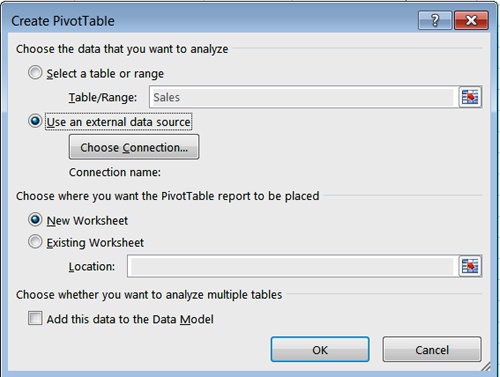
Open the Sales worksheet by clicking its tab at the bottom of the Excel window. Click the Insert tab on the ribbon, and then click the Pivot Table button.
In the Create PivotTable dialog box, under Choose the data that you want to analyze, select Use an external data source, and then click Choose Connection.
In the Existing Connections dialog box, on the Tables tab, under This Workbook Data Model, select Tables in Workbook Data Model, and then click Open.
In the Create PivotTable dialog box, under Choose where you want PivotTable report to be placed, verify that New Worksheet is selected, and then click OK.
The new worksheet opens and shows a PivotTable Fields list containing all the tables in the workbook data model. You will now create a PivotTable to analyze the SalesAmount by products and product categories and by dates and periods. You will use the Product Categories hierarchy for rows and the Calendar hierarchy for columns.
In the PivotTable Fields pane, expand the Dates table, and then drag the Calendar hierarchy into the Columns area. Expand the Products table and drag the Product Categories hierarchy into the Rows area.
Expand the Sales table, scroll down to the SalesAmount field, and drag it to the Values area. The PivotTable is built in the worksheet.
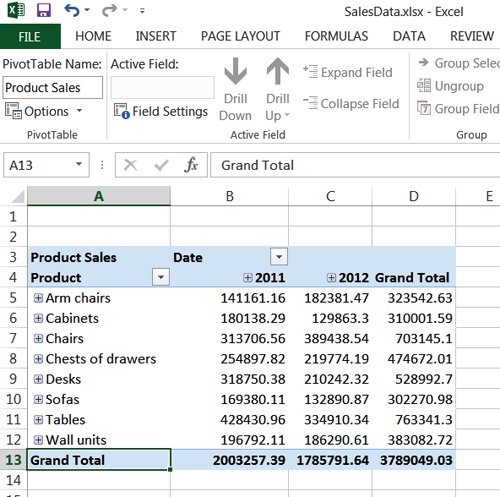
In the PivotTable, click Sum of SalesAmount in the top left of the table, and type Product Sales to change the title.
Click Row Labels and replace the text with Products. Click Column Labels and replace the text with Date.
Click anywhere within the PivotTable, and then click the Analyze tab on the ribbon. In the PivotTable Name box on the left of the ribbon, type Product Sales.
You will now add a PivotChart report. Position your cursor where you would like to create the PivotChart, click the Insert tab on the ribbon, click the PivotChart button, and then select PivotChart from the drop-down list.
In the Create PivotChart dialog box, under Choose the data that you want to analyze, select Use an external data source, and then click Choose Connection. In the Existing Connections dialog box, on the Tables tab, under This Workbook Data Model, select Tables in Workbook Data Model and click Open, and then click OK in the Create PivotChart dialog box.
In the PivotChart stencil, click the default title, Chart 1, and type Sales 2011-2012 to name the chart.
In the PivotChart Fields pane, expand the Dates table, and then drag the Calendar hierarchy into the Legend (Series) area. Expand the Products table, and then drag the Products Categories hierarchy into the Axis area. Finally, expand the Sales table, scroll down to the SalesAmount field, and then drag it to the Values area.
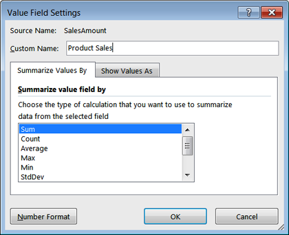
The PivotChart has been built in the worksheet. In the top left of the PivotChart, right-click the Sum of SalesAmount. Click on Value Field Settings. In the Value Field Settings dialog box, in the Custom Name box, change the name to Product Sales, and then click OK.
Click anywhere within the chart, and then click the Analyze tab on the ribbon. In the Chart Name box on the left of the ribbon, type Sales 2011-2012.
You will now prepare the workbook for publishing. Click the File tab, and then click Browser View Options to set up the parts of the workbook that will be visible on the SharePoint site.
In the Browser View Options dialog box, on the Show tab, in the drop-down list, select Items in the Workbook, and then select the Products Sales PivotTable. Select the Sales 2011-2012 chart from the list of available items, and then click OK.
Click the Save option on the menu at the left side of the screen to save your workbook, and then exit Excel.
In the browser, open the PowerPivot Gallery where you would like to publish your PowerPivot reports, if it is not already open. Click the Files tab, and then on the ribbon, click Upload Document.
In the Add a document dialog, click Browse and go to the location where you saved the SalesData workbook, such as the Chapter13 practice folder. Select SalesData.xslx, and then click Open. Then, in the Add a document dialog, click OK to upload the workbook. In the Power Pivot Gallery - SalesData.xslx document properties dialog (if it appears), click Save.
After the workbook has been uploaded, note from the preview that all worksheets are hidden from view. Only the PivotTable and the PivotChart are available, each on a separate page. Click the PivotTable preview page to open the dashboard in Excel Services.
You can analyze the data in the Products Sales table and drill down into the dates and the products using the plus and minus buttons, respectively, to expand and contract the sections. For example, expand the years 2011 and 2012 to display the sales amounts by the half-year periods. Then, expand the Chairs category to see the sales by individual products in this category, and further expand H1 2011 to display the sales of the Chairs products by month in Q2 2011.
Notice that there are options on the left of the page that allow you to save, download, or print the dashboard. You can also open the workbook in Excel for editing.
In the dashboard, you can browse between pages using their preview images in the View pane. Click on the preview image for the Sales 2011-2012 chart to display the chart page.
You will now analyze the Sales data using the chart. For example, double-click the Desks category, and then in the Query and Refresh Data confirmation message, click Yes to confirm that you would like to refresh the workbook, if it appears.
The chart is refreshed and displays the product sales in the Desks category by year.
You can choose a variety of product and date filter combinations by using the Product Categories drop-down list for the horizontal axis, and the Calendar drop-down list for the vertical axis. Try different combinations in the chart, if you want, and then exit Excel Services to return to the PowerPivot Gallery page.


Publishing PowerPivot dashboards using Excel Web Part
Having published a PivotTable and a PivotChart to the SharePoint site, you can display them in a webpage using an Excel Web Part.
Note
SEE ALSO Web Parts are server-side controls that run inside the context of SharePoint site pages and provide additional features and functionalities. For an in-depth discussion on Web Parts, refer to Chapter 4.
You can create a dashboard-style webpage by adding several Excel Web Parts to the same page, which will display different PowerPivot reports side by side. Each Web Part is independent, and filters applied in one report do not affect another. PowerPivot reports displayed in Web Parts on the same page can be from different Excel workbooks, but all workbooks must be published to SharePoint.
In the following exercise, you will create a PowerPivot dashboard. You will first create a new page in the SharePoint site, and then add two Excel Web Parts to this page, displaying the PivotTable and the PivotChart that you worked with in the previous exercises.
Set Up
Open the SharePoint site where you would like to create a PowerPivot dashboard, if it is not already open. If prompted, type your user name and password, and then click OK.
Important
Verify that you have sufficient permissions to create pages in the site that you are using. If in doubt, see Appendix A.
Click the Settings gear icon, and then select Add a page.
In the Add a page dialog, in the New page name box, type My Dashboard, and then click Create. The new page opens for editing.
To insert the Web Part into the page, position your cursor within the box outlined on the page, and on the Insert tab, in the Parts group, click Web Part to display the Parts pane.
In the Categories list on the left of the page, select the Business Data category.
In the Parts list, select the Excel Web Access Web Part.
Click Add to add the Excel Web Access Web Part to the page.
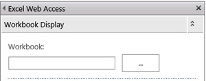
On the My Dashboard page, in the Excel Web Access Web Part, click Click here to open the tool pane.
The tool pane for the Excel Web Access Web Part opens on the right of the page. In the Excel Web Access tool pane, in the Workbook Display section, at the right of the Workbook text box, click the ellipsis button.
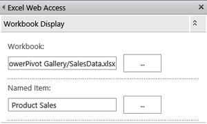
In the Select an Asset dialog, browse to SalesData.xslx in the PowerPivot Gallery library, and click to select it. Notice that the URL for your selection is displayed in the Location (URL) box at the bottom of the dialog, and then click Insert. The URL has been inserted into the Workbook text box.
In the Excel Web Access tool pane, in the Workbook Display section, in the Named Item textbox, type Product Sales.
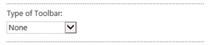
In the Toolbars and Title Bar section, in the Type of Toolbar list, select None.
Expand the Appearance section and set up the following parameters:
In the Height section, select Yes to set a fixed height, and then type 300 to set the height to 300 pixels.
In the Chrome Type list, select None.
In the Excel Web Access tool pane, click OK to confirm your settings and close the tool. The Excel Web Part displays the Product Sales table.
On the Page tab, click Save to save the webpage. After the webpage has been saved, the ribbon closes and the webpage is displayed in browse mode. If there is a delay in displaying the PivotTable report, refresh the page.
You will now insert another Excel Web Part and set it up to display the PivotChart that you created in the previous exercise.
In the Settings menu, select Edit page. Using steps 3–13 as a guide, insert the second Excel Web Part. Type Sales 2011-1012 in the Named Item box in step 10.
On the Page tab, click Save to save your new My Dashboard webpage. After the webpage has been saved, the ribbon closes and the webpage is displayed in browse mode. If there is a delay in displaying the PivotTable and PivotChart reports, refresh the page.
Verify that the interactive capabilities are available within the Web Parts. For example, in the PivotTable, expand the year 2012, and then expand the Desks product category.


Building visualizations with Power View
Power View is a browser-based Silverlight application. Using Power View, you can present and share insights with others in your organization through interactive presentations. Power View in SharePoint 2013 provides a highly interactive, browser-based data exploration, visualization, and presentation experience. With Power View, you can create interactive reports with intuitive charts, grids, and filters that provide the ability to visually explore data and easily create interactive visualizations to help define insights.
Power View is available as a stand-alone version in SharePoint and as a native feature in Excel 2013. Both versions of Power View require Silverlight to be installed on the local machine.
Tip
In SharePoint, Power View is a feature of the SQL Server 2012 Service Pack 1 Reporting Services Add-in for Microsoft SharePoint.
Power View reports provide views of data from data models based on PowerPivot workbooks published in a PowerPivot Gallery, or models deployed to SSAS instances. Each page within a Power View report is referred to as a view. In Power View, you can quickly create a variety of interactive and intuitive visualizations, including tables and matrices, as well as pie, bar, and bubble charts and sets of multiple charts.
Power View uses the metadata in the underlying data model to compute the relationships between the different tables and fields. Based on these relationships, Power View provides the ability to filter one visualization, and at the same time, highlight another visualization in a current view. In addition to the filters, you can use slicers to compare and evaluate your data from different perspectives. When you have multiple slicers in a view, the selection for one slicer filters the other slicers in the view.
Power View in SharePoint has two presentation modes: a reading mode and a full-screen mode. In the presentation modes, the ribbon and other design areas are hidden to provide more space for the reports that are still fully interactive.
Important
Power View reports on SharePoint are separate files with the .rdlx file format. In Excel, Power View sheets are part of an Excel .xlsx workbook. The .rdlx file format is not compatible with the .xlsx format. In other words, you cannot open a Power View .rdlx file in Excel. Equally, SharePoint cannot open Power View sheets in an Excel .xlsx file. The .rdlx file format is also not compatible with the .rdl files that you create in SQL Server 2012 Report Builder or SQL Server 2012 Reporting Services (SSRS). You cannot open .rdl reports in Power View, and vice versa.
In the following exercise, you will create a Power View report in SharePoint 2013 that will provide a view of the Wide World Importers stores in the United States on a map, and show their respective sales performance. You will then create a pie chart for each of the stores that will be displayed on the map and show the stores’ sales performance by a product category. Finally, you will switch to reading mode and explore the data using the visualization that you’ve built.
Important
To be able to complete this exercise, you need to be connected to the Internet, because the map capabilities are provided by the Bing search service on the Internet.
Set Up
Open the SharePoint site where you would like to create a Power View report, if it is not already open. If prompted, type your user name and password, and then click OK.
Important
Verify that you have sufficient permissions to create a report in the library on the site that you are using. If in doubt, see Appendix A.
On the Quick Launch, open the PowerPivot Gallery with the SalesData workbook, if it is not already open.
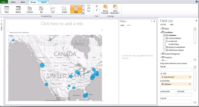
In the top-right corner of the SalesData workbook gallery view, click the Create Power View Report icon to open its data model in the Power View design environment, and then create a Power View report.
Explore the Power View design environment. The main part of the page displays the view area, which is empty for the time being. In the view area, there is a design surface to create a new view, and the Filters area, which displays the filters in the view. To the right of the page, a Fields List area shows all the tables in the data model. You can drag the tables and filters to the view, or select the fields to appear there.
Tip
In the top-left corner of the Power View page, above the ribbon, there are the Undo and Redo icons that allow you to undo or redo the last action, respectively.
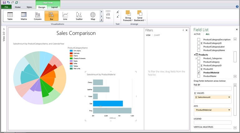
You will now create a table with the data for your visualization.
In the Fields List, open the Sales table, and then drag the SalesAmount field to the design surface in the view. Power View draws the table in the view, displaying actual data and adding a SalesAmount column heading.
In the Fields List, open the Locations table and drag the CityName field to the SalesAmount table in the view. When the table area becomes highlighted, release the mouse to add the CityName field to the table. Power View calculates the data and displays a new table with two columns: SalesAmount and CityName.
On the Design tab on the ribbon, in the Visualizations group, select Map. If a privacy warning appears in the yellow bar under the ribbon, stating that some of the data needs to be geocoded by sending it to Bing, click Enable Content to confirm that you would like to proceed.
A map visualization appears in the view. Resize the visualization area by dragging its corner so that you can see the map with the blue circles, the size of which indicates the sales performance for the individual stores.
While this visualization is already quite informative, you can bring even more insights to your map visualization with only a few clicks. You will now replace the blue circles with pie charts that will not only indicate the sales performance of a store, but will also show the sales by product categories.
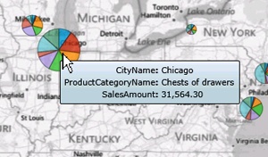
In the Field List, open the ProductCategories table and drag the ProductCategoryName field into the Color area, located at the bottom of the Field List pane.
The map is redisplayed with the pie charts for each store location. In addition, a legend appears on the top right of the map. It lists the product categories, with the colors that identify them, in the pie charts.
On top of the map, click within the title area and type Sales Performance. To make it easier to interact with your report, switch to reading mode by clicking the Home tab, and then selecting Reading Mode in the Display group.
The map visualization is displayed in reading mode. Hover over the map to display map controls in the top-right corner of the map window. The controls allow you to adjust the map view by zooming in or out and moving the map up, down, to the right, or to the left. You can also drag the map within the window to bring different areas into view.
Point to a chart on the map. The chart increases in size and the mouse tip appears, showing the location of the shop, the name of the product category you happen to point to on the chart, and the sales amount for this category.
To call out a particular product category, click this category in the legend; for example, Tables. The colors for other categories in the pie charts are dimmed, allowing the sales performance for the Tables category to stand out and to be easily identifiable for all locations.
You will now work with the filters that are displayed in the Filters area. If the Filters area is empty, click the funnel icon in the top-right corner of the chart area to display the available filters in the Filters area. Open the CityName filter and select a city; for example, Boston. The report is filtered by the city name, Boston, and only the chart for Boston store is displayed on the map, allowing you to focus on the sales performance for this particular location.
Open the CityName filter again and clear the selection for Boston to redisplay the map with the sales performance charts for all stores.
Click Edit Report to return to the design mode, and then on the File menu, click Save As to save the Power View report to the PowerPivot Gallery. In the Save As dialog box, type SalesPerformance and click Save.
Click the Back button in the top-left corner of the browser window to return to the PowerPivot Gallery. Verify that the SalesPerformance report is saved in the gallery and that the preview image of the map visualization is shown.


Creating and using Power View reports with multiple views
A Power View report in SharePoint 2013 can contain multiple views that are all based on the same data model. However, each view has its own visualizations and filters. In design mode, you can copy and paste between the views, and you can also duplicate views.
To move between the different views in a report in design mode, you can click the preview images in the View pane located on the left of the screen. In the reading and the full-screen modes, in addition to the navigation arrows on the bottom right of the screen, a view chooser icon is available on the bottom left of all views. The view chooser icon displays a row of clickable preview images on the bottom of the Power View page, providing navigation in the report.
In the following exercise, you will add a new view to the SalesPerformance report. In the new view, you will create two connected visualizations, so that when a filter is chosen in one visualization, you can filter and highlight the other one. The first visualization is a pie chart that displays the sales amount by product category for all stores, sliced by year, to complement the pie charts for individual stores in the first view. The second visualization is a bar chart that displays the sales amount by the product material, such as Oak, Pine, Cherry, Leather, and Metal. When the material filter is selected in the bar chart, the selection will filter the pie chart. The parts of the pie chart that correspond to the selected material will be highlighted, and the rest of the pie will be dimmed. You will then validate that the filters only apply within a view. In other words, visualizations and filters in the first view have no influence on the second view, and vice versa.
Set Up
Open the SharePoint site that you used in the previous exercise, if it is not already open. If prompted, type your user name and password, and then click OK.
Important
Verify that you have sufficient permissions to create a report in the library on the site that you are using. If in doubt, see Appendix A.
On the Quick Launch, open the PowerPivot Gallery with the SalesPerformance report, if it is not already open, and then click the SalesPerformance preview image to open the report in the Power View design environment.
Click Edit Report, and then on the Home tab on the ribbon, in the Insert group, click New View to add a new view page. Power View creates an empty view. Notice that the View pane on the left of the screen has expanded to show the preview images for both views. Click the small left arrow icon on the top left of the View pane to hide it, so that you have more space to work with the visualizations in the view.
To build a table that will provide a basis for your pie chart visualization, in the Fields List, open the Sales table, locate the SalesAmount field, and then drag it to the view. Power View creates a table with the SalesAmount table heading and the actual value displayed.
In the Fields List, open the ProductCategories table, locate the ProductCategoryName field, and then drag it to the SalesAmount table in the view. When the table is highlighted, release the mouse to add the field to the table. Power View calculates the data and displays a new table with two columns: SalesAmount and ProductCategotyName.
On the Design tab on the ribbon, in the Vizualizations group, open a drop-down list of available virtualizations. In the Charts section, click Pie. Power View creates a pie chart that shows the product category sales.
To slice the pie sectors by a year, in the Fields List, open the Dates table, locate the CalendarYear field, and then drag it to the Slices area on the bottom of the Field List pane.
To build a table that will provide a basis for the bar chart visualization, in the Fields List, open the Sales table, locate the SalesAmount field, and then drag it to an empty area in the view. Power View creates a table with the SalesAmount table heading and the actual value displayed.
In the Fields List, open the Products table, locate the ProductMaterial field and drag it to the SalesAmount table in the view. When the table is highlighted, drag the field. Power View calculates the data and displays a new table with two columns: SalesAmount and ProductMaterial.
On the Design tab on the ribbon, in the Visualizations group, open a drop-down list of available visualizations. In the Charts section, click Bar. Power View creates a bar chart that shows the sales amount by product material.
On the top of the view, in the title area, type Sales Comparison.
In the bar chart, click a bar for a material; for example, Oak. Other bars in the bar chart become dimmed. The pie chart displays only the parts that apply to the Oak furniture, with the other parts dimmed. You have filtered one visualization (the pie chart) based on the selection in another virtualization (the bar chart) in the same view.
Expand the View pane to see the preview images for both views, and click on the first view to display it. Verify that the visualization in the first view is unchanged and displays the pie chart diagrams for all product materials, with no highlights. In other words, the first view has not been affected by the ProductMaterial filter in the second view.
Switch to reading mode by clicking Reading Mode on the Home tab on the ribbon, and then click the view chooser icon, in the bottom-left corner of the page, to display the row of clickable preview images at the bottom of the Power View window, which provides the navigation capability in the report.
The preview images are highlighted, whereas the rest of the screen is dimmed. When you point to a preview image, it is displayed in the main page area that is dimmed. When you click the preview image, its corresponding view is displayed in the full page, which is no longer dimmed, and the row of preview images is removed from display.
Close the Filters pane to provide more space for visualizations.
Click Edit Report, and then on the File menu, click Save to save the Power View report to the PowerPivot Gallery. Alternatively, you can click the Save icon on the top left of the page. If a Confirm Save dialog appears, click Save.
Click the Back button in the top-left corner of the browser window to return to the PowerPivot Gallery. Verify that the SalesPerformance report is saved in the gallery and that the preview images of both views are shown.


Displaying a Power View report in a Web Part
Power View reports can be integrated into a SharePoint site page using Web Parts. Two generic Web Parts provided by SharePoint 2013 can be used to display the Power View reports on the webpage: the Page Viewer Web Part and the Silverlight Web Part.
The Page Viewer Web Part is a general purpose Web Part that retrieves and displays a webpage using a hyperlink. You can easily add this Web Part to new and existing pages to display Power View reports.
Important
The Page Viewer Web Part uses the HTML <IFRAME> element, and therefore cannot be used in browsers that don’t support IFrames.
In the following exercise, you will create a new page in the SharePoint site, add a Page Viewer Web Part to the page, and then configure the Web Part to display the Power View report that you worked with in the previous exercises.
Set Up
Open the SharePoint site where you would like to add a page with a Power View report displayed in the Web Part. If prompted, type your user name and password, and then click OK.
Important
Verify that you have sufficient permissions to create pages in the site that you are using. If in doubt, see Appendix A.
Click the Settings menu in the top right of your SharePoint page, and then select Add a page from the menu.
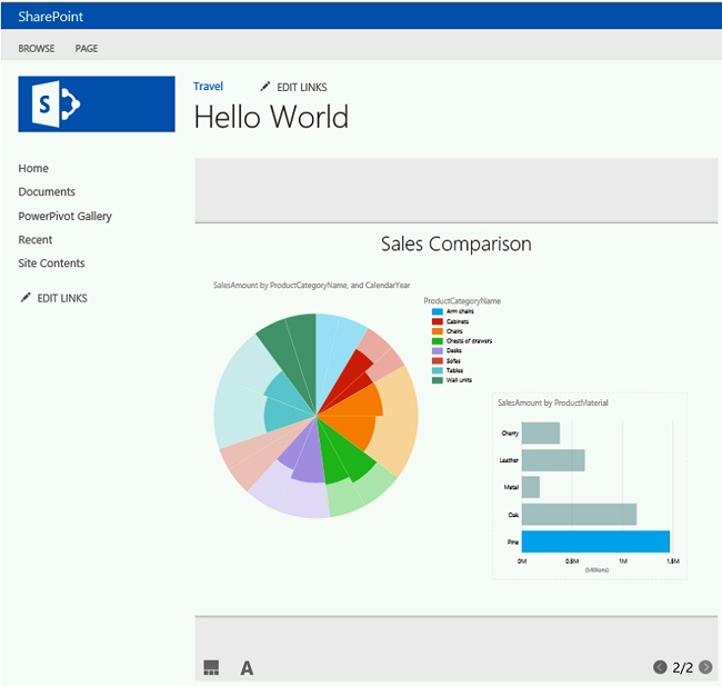
In the Add a page dialog, in the New name box, type Hello World, and then click Create.
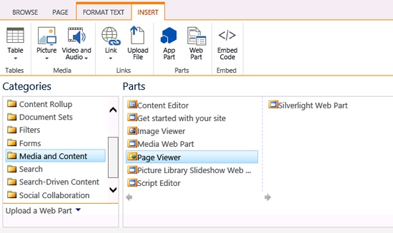
The new page opens for editing. To insert the Web Part into the page, position your cursor within the box outlined on the page, and click the Insert tab on the ribbon. Then, in the Parts group, click Web Part to display the Parts pane.
In the Categories list on the left of the page, select the Media and Content category.
In the Parts list, select the Page Viewer Web Part.
Click Add to add the Page Viewer Web Part to the page.
On the Hello World page, in the Page Viewer Web Part, click open the tool pane. If a message box appears, asking you to save your changes before continuing, click OK.
The tool pane for the Page Viewer Web Part opens on the right side of the page. The next task is to specify the URL of the Power View report in the Link box in the Page Viewer tool pane.
To identify the report URL, open a new tab or a new window in the browser, go to PowerPivot Gallery, where the Power View report is located, and click a preview image to open the Power View environment.
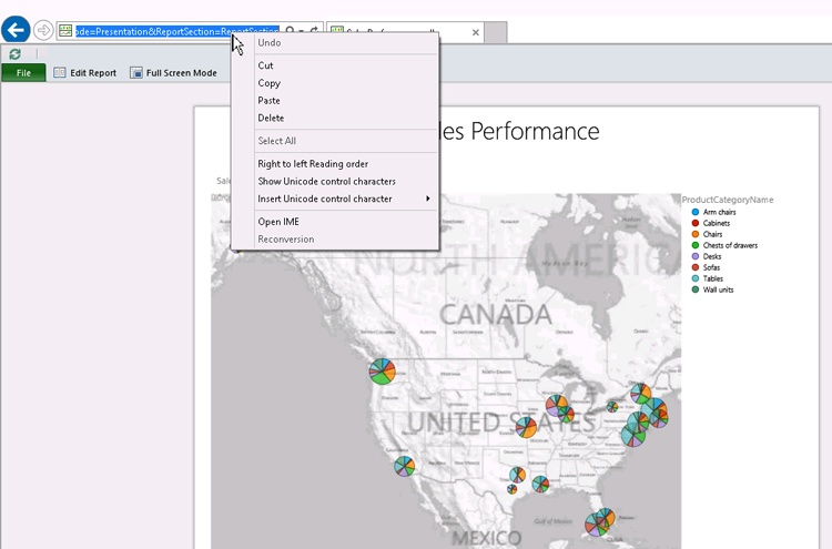
In the Power View environment, set up the view in a way that you would like it to appear in the Web Part. On the Home tab on the ribbon, click Reading Mode to switch to the presentation mode so that the ribbon and other design tools are not displayed. In the multiple page reports, display the view that you want to be displayed in the Web Part when it first appears on the page; for example, the map visualization in the SalesPerformance report. Then, in the browser address bar, highlight the URL to select it, right-click the selection, and then click Copy on the context menu.
Return to the browser that displays the Hello World page, with the Page Viewer tool pane open on the right side of the page. In the Page Viewer tool pane, on the right side of the Link text box, click the ellipsis button to open the Text Editor dialog box, in which you can edit the URL.
Clear any text in the Text Editor dialog box, and then paste the Power View report URL into the Text Editor by right-clicking in the text box and selecting Paste from the menu.
In our scenario, the URL is as follows:
In your environment, the server path part of the URL will be different from the wideworldimporters. However, the rest of the URL will be similar because it is programmatically generated by SharePoint.
You will now add a parameter to the URL that will instruct the Power View to hide the top toolbar that displays the Edit Report and the Full Screen options, as well as the File menu. Unless you want users to edit the report from within the Web Part, hiding the toolbar will provide a better user experience.
In the Text Editor window, position your cursor at the end of the URL, immediately after ReportSection parameter, and type the following string: &PreviewBar=False.
The URL looks like the following, as long as you replace wideworldimporters with your server path as before:
Click OK to insert the URL string into the Link text box in the Page Viewer tool pane, and then click Test link, located just above the Link text box. The link is tested in the new browser tab. Validate that the Power View report successfully opens. If the Power View report is not rendering, check the URL and repeat steps 9–13, if necessary.
Click the browser tab that is displaying the Hello World page, and then in the Page Viewer tool pane, in the Appearance section, set the following parameters:
In the Title box, remove the Page Viewer title to clear the box.
In the Height section, select Yes to set a fixed width, and then type 600 to set the width to 600 pixels.
In the Width section, select Yes to set a fixed height, and then type 600 to set the height to 600 pixels.
In the Chrome Type list, select None.
In the Page Viewer tool pane, click OK to confirm your settings and close the tool.
On the Format Text tab on the ribbon, in the Edit group, click Save to save your new Hello World webpage. After the webpage has been saved, the ribbon closes and the webpage is displayed in browse mode. If there is a delay in displaying the Power View report, refresh the page.
In the Power View report, verify that the interactive capabilities are available within the Web Part. For example, in the Sales Performance view, point to a pie chart and verify that the mouse tip provides information about the sales performance of a product category in the location that you are pointing at.
In the bottom left of the Power View report, click the view chooser icon. Go to the Sales Comparison view and click a bar in the bar chart to filter the pie chart by product category.


Key points
SharePoint 2013 provides intuitive, powerful, self-service BI capabilities for exploring and visualizing data to facilitate better decision making.
BI server-side components include Excel Services, Visio Services, and PerformancePoint Services. Excel Services and SQL Server 2012 provide server-side capabilities for PowerPivot and Power View support.
There are a number of sites, libraries, and content types that are optimized for providing support to BI applications, including the Business Intelligence Center site, the PowerPivot site, and the PowerPivot Gallery library.
PowerPivot in Excel 2013 provides a data-modeling engine that brings together various data from multiple data sources. PowerPivot workbooks can be published to SharePoint, where the server-side components recognize the data models and provide functionality for exploring, analyzing, and visualizing data in the browser.
You can publish interactive PowerPivot dashboards on the SharePoint site so that users can explore and analyze data, and collaborate and share insights. You can add PivotTables and PivotCharts to a webpage using the Excel Web Part.
Power View in SharePoint 2013 provides an easy-to-use environment to build data visualizations and mashups so that you can explore data from many perspectives using different filters and slicers.
A Power View report can include multiple views. Visualizations and filters apply within each view. You can create connected visualizations within a view but not between the views.
Power View reports are .rdlx files that are not compatible with either Excel .xslx or Report Builder .rdl file formats.
You can display a Power View report within a Web Part on a webpage.