

THE FUNDAMENTALS OF BRUSH LETTERING
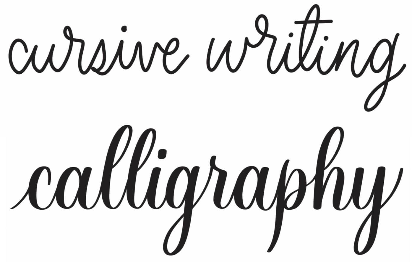
Brush lettering uses a brush pen with a flexible tip. This allows you to create thin and thick strokes by varying the pressure applied to the pen. This stroke variation is the first noticeable difference you will see when you compare calligraphy with cursive.
When you move the pen upward, you create a thin upstroke. When the pen moves downward with heavy pressure, a thick downstroke is created. Remember this as you build your muscle memory: thin up, thick down.

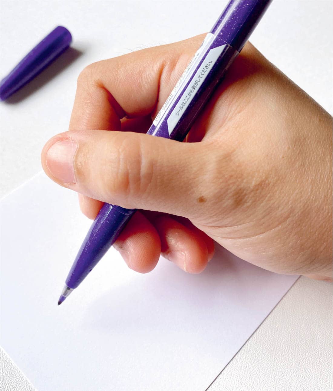
How you hold a brush pen makes a big difference when creating stroke variations in your lettering. I’ll share some simple techniques to ensure that your brush pen works with you, not against you.
HOW TO HOLD A BRUSH PEN
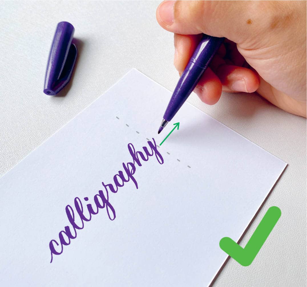
To maximize the flexibility of the brush pen’s tip, hold it at an angle. The angle of the brush pen is essential because it determines what effect you will get with your lettering.
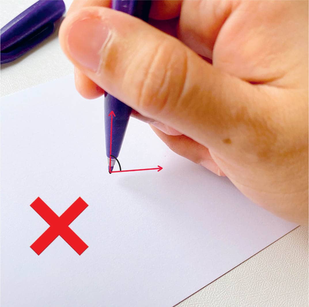
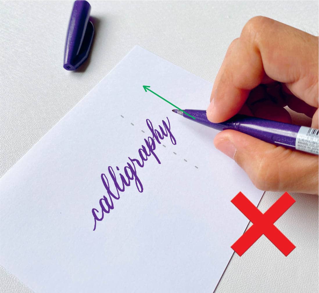
Don’t hold the pen at 90-degree angle or too upright.
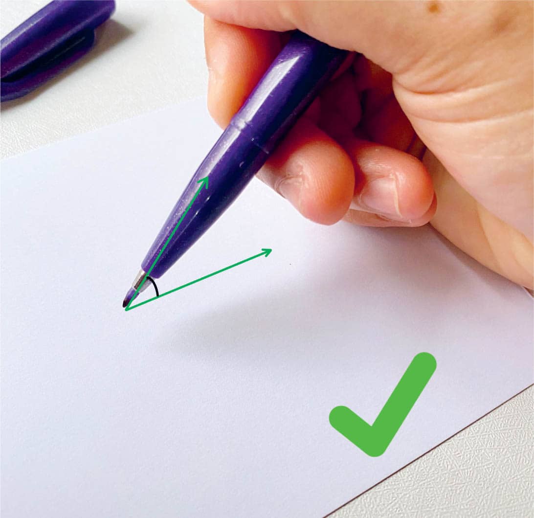
Hold the pen at an approximately 45-degree angle.
Hold your brush pen at an approximately 45-degree angle to the paper. When you hold it upright or at a 90-degree angle, you’re not only damaging the tip of the brush pen, but you also won’t get the full-pressure downstroke that a brush pen can create.
When the pen is at an angle, you will notice that the tip bends with heavy pressure. Don’t worry; this is normal, and you won’t ruin the pen if you hold it at an angle.
Pen is perpendicular to the paper or the slant you are following.
Another way to create thick strokes is to hold the pen perpendicular to the paper or the slant line that your downstroke is following.
Pen is parallel to the paper or the slant you are following.
When your pen is parallel to the paper, it is challenging to produce thick downstrokes. You want to let your pen do the work that it’s designed for.
Practice these techniques and try alternating between thin and thick strokes to familiarize yourself with brush pens.
Paper Guidelines
When you’re a beginner and looking to build consistency with your lettering, it’s helpful to practice on paper that comes with guidelines. Remember when you first started to learn how to write in grade school? You used lined paper. The concept is the same here.
BASIC STROKES
We’ve now reached the most crucial part of building a solid foundation for your calligraphy skills. When it comes to calligraphy and lettering, the basic strokes are the key to beautiful writing. It is essential to know which strokes you should be using and how they work with each letter.
For example, when written in calligraphy, the letter “m” is composed of three basic strokes— downstroke, overturn stroke, and compound curve.
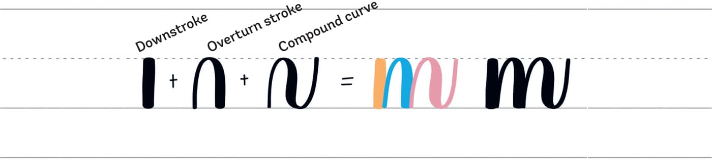
Remember that the basic strokes provide the foundation for lowercase letters in calligraphy. Do you want to make your lettering look consistent and beautiful? Make sure to practice and master the basic strokes before jumping into words.
Here are the eight basic strokes that will take your calligraphy journey to success.
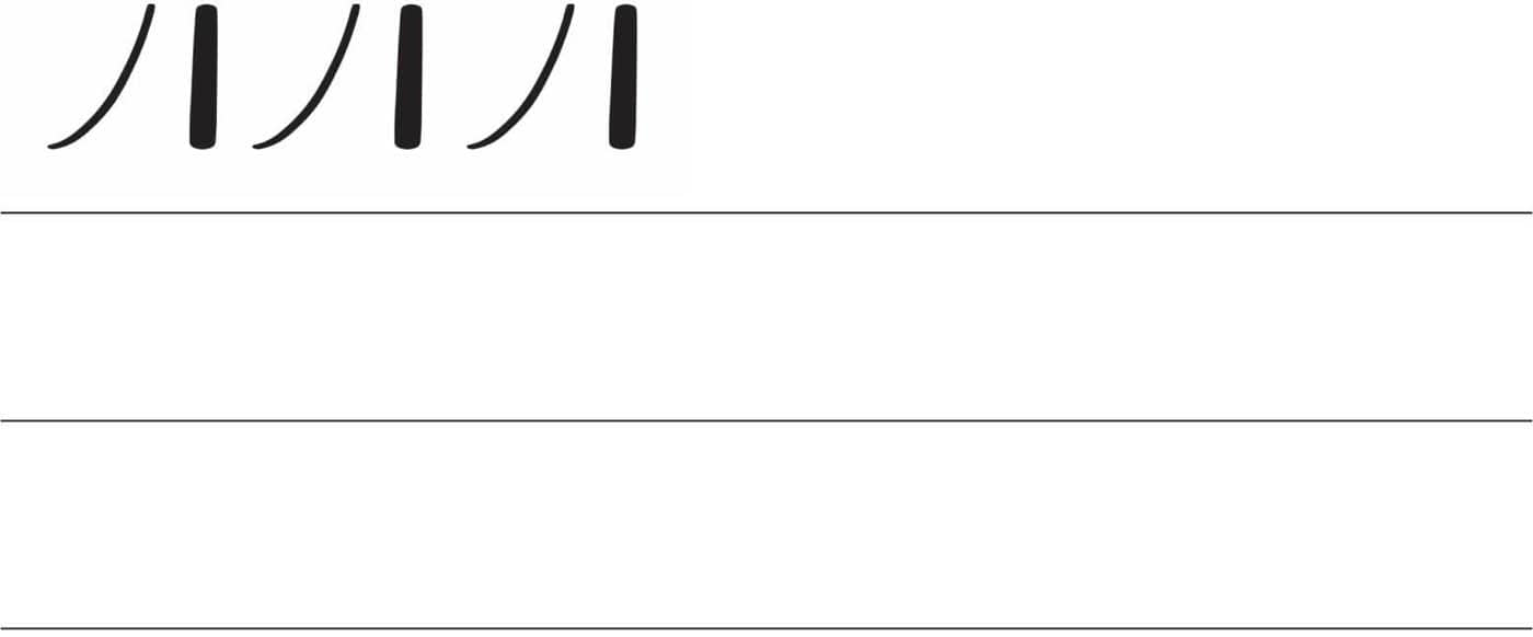
To see how to draw each stroke, start with the dot, and then follow the arrow.

The Upstroke
The upstroke is a thin stroke. Also called the “entrance stroke,” it starts from the baseline and ends at the waistline.
Tips for making the upstroke:
- Apply light pressure to the pen as you move upward.
- Shakiness is normal at the beginning, but with practice, it can be improved.
- Avoid flicking the pen at the end of the stroke.
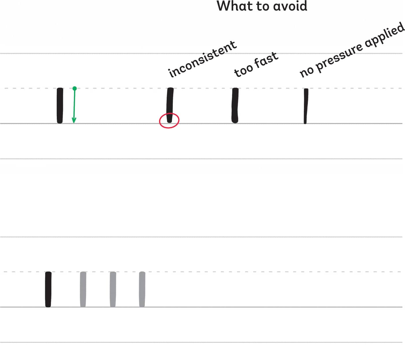
The Downstroke
The downstroke is a thick stroke that starts from the waistline and ends at the baseline.
Tips for making the downstroke:
- Apply heavy pressure to the pen as you move downward.
- Thickness will vary depending on the brush pen that you use and its flexibility.
- Don’t worry if you see the tip of your brush pen bend; it’s designed to work this way.
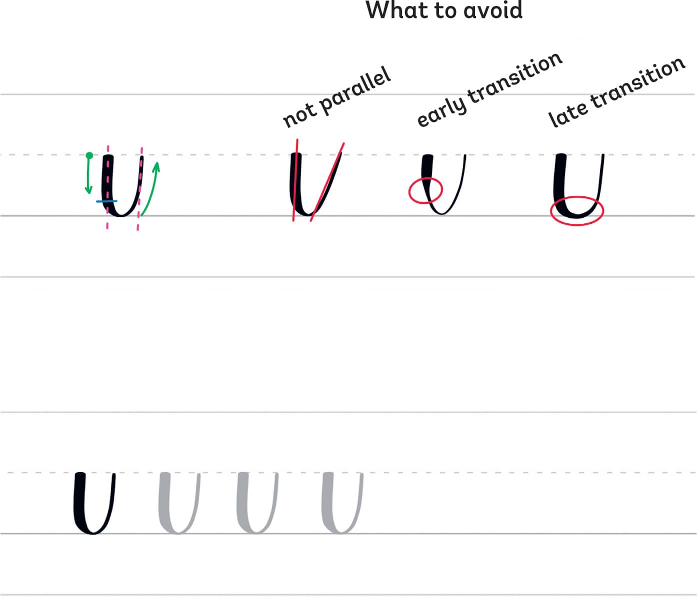
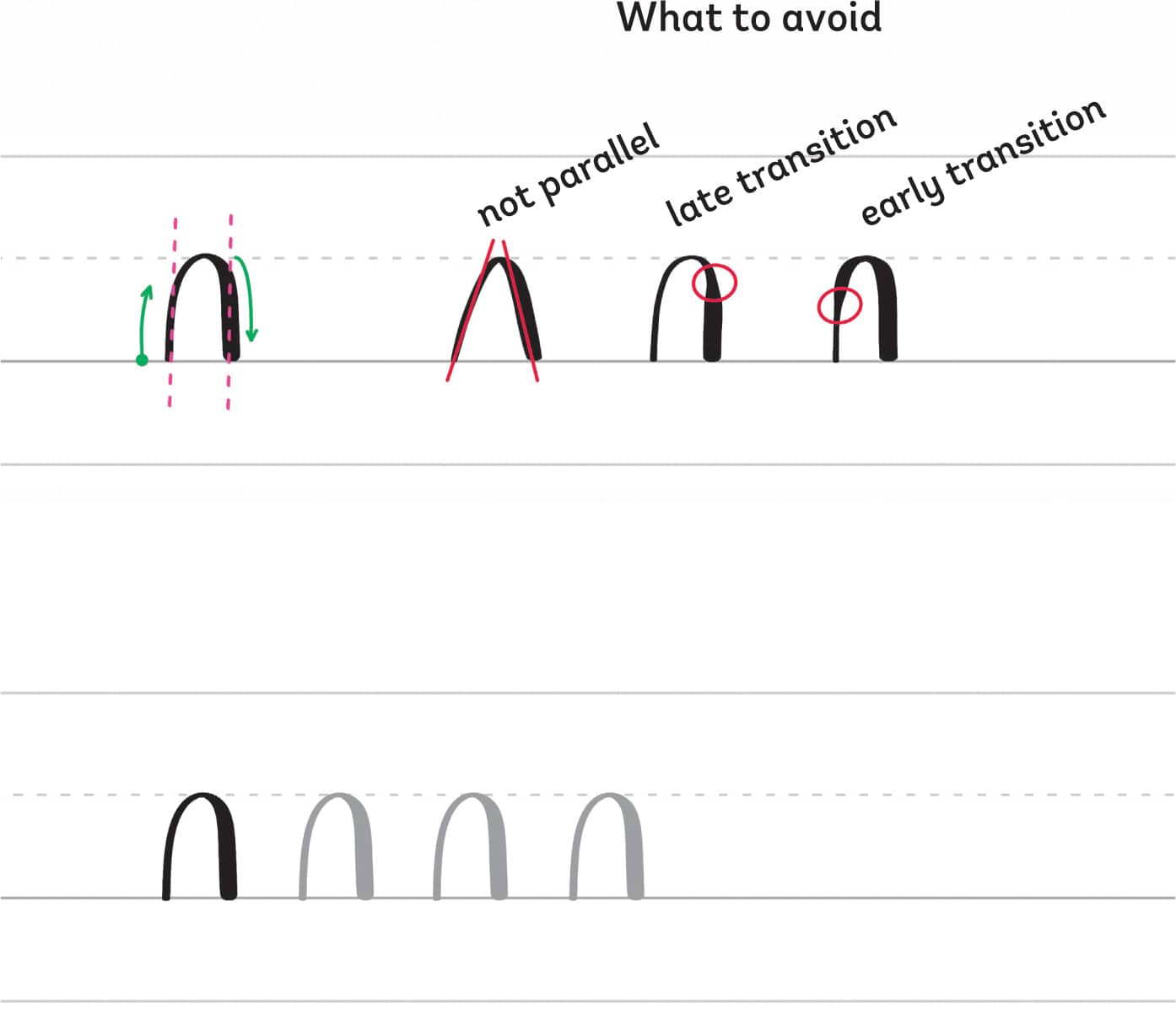
The Underturn Stroke
The underturn is u-shaped and starts from the waistline with a thick downstroke. Before reaching the baseline, as you make the turn, slowly transition to light pressure and end with a light stroke at the waistline.
Tips for making the underturn stroke:
- Make sure the lines are parallel.
- The blue line indicates where you can make the transition.
- An early transition results in an inconsistent stroke, while a late transition results in a heavy bottom.
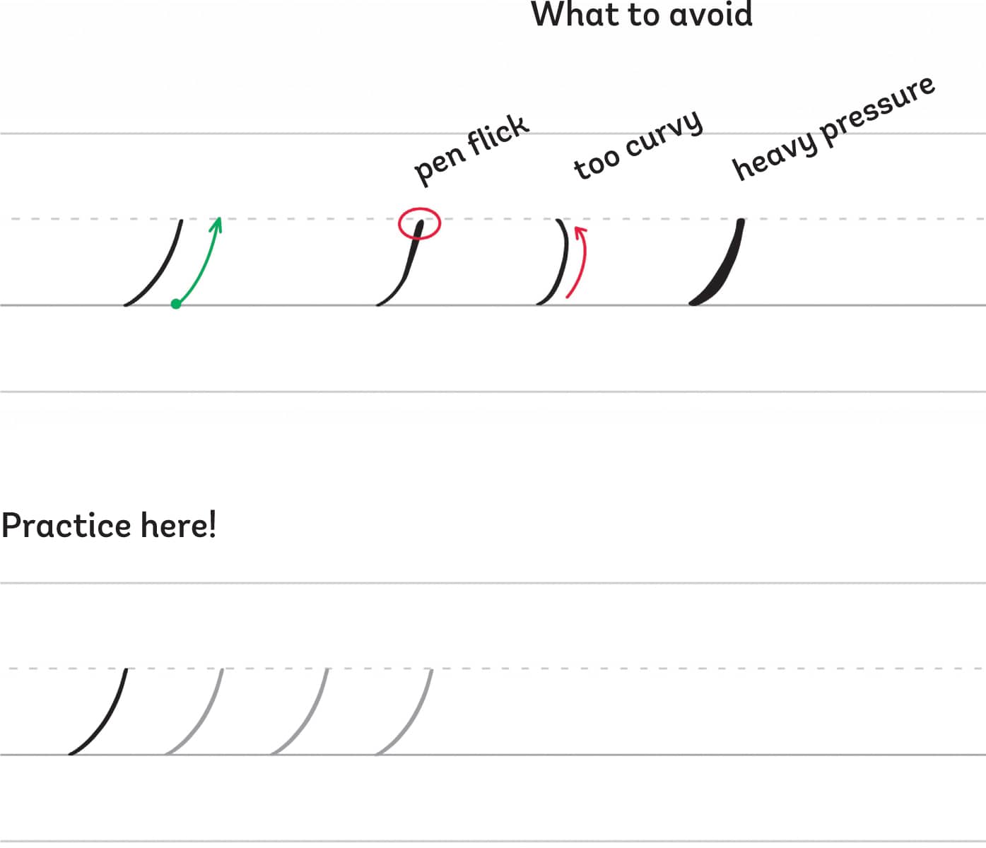
The Overturn Stroke
The overturn stroke is the opposite of the underturn. Start from the baseline with a thin upstroke, and as you reach the waistline, transition to a heavy-pressured downstroke while you make the curve to the right.
Tips for making the overturn stroke:
- Make sure the lines are parallel.
- Don’t apply heavy pressure before reaching the waistline.
- Don’t make the top part pointy.
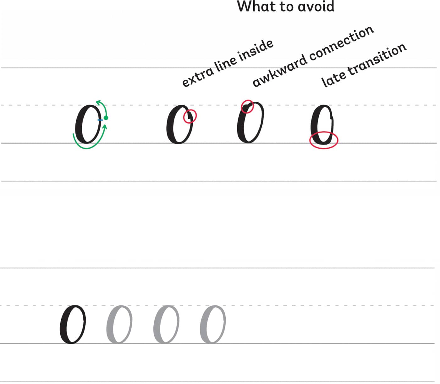
The Oval
The oval is a challenging stroke, but it will get easier with practice. Begin with a thin upstroke, and as you create the curve to the left, transition to heavy pressure to make a thick stroke. Then close the oval with a thin stroke, meeting at the starting point (the blue line).
Tips for making an oval stroke:
- Avoid an extra line inside the oval.
- Transition slowly to make a smooth oval shape.
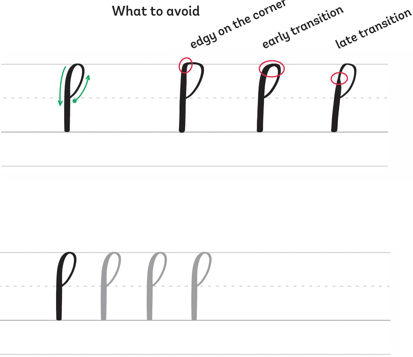
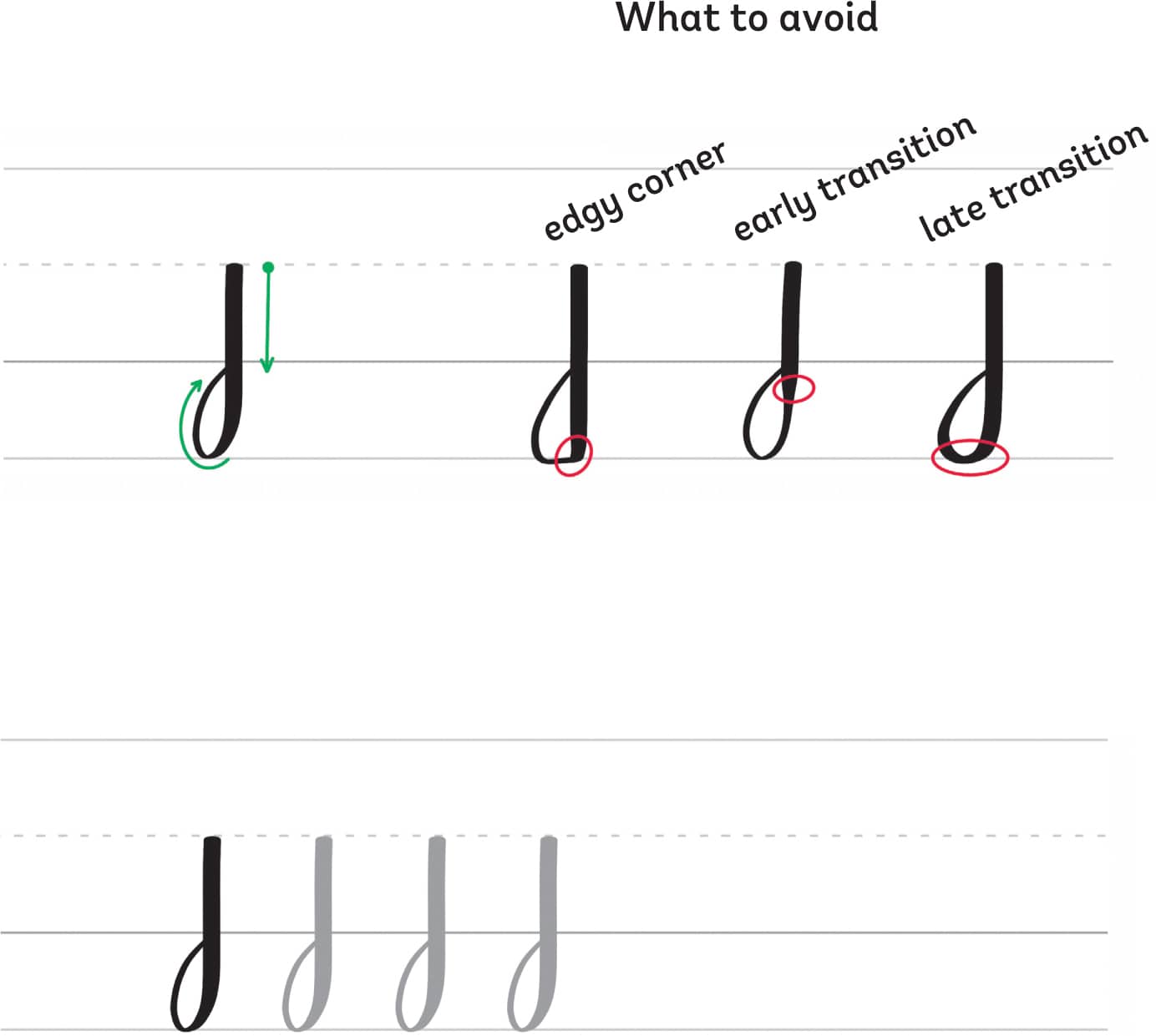
The Ascending Stem Loop
The ascending stem loop starts from the waistline with a thin upstroke. As you make a loop reaching the ascender line, transition to a full-pressure downstroke.
Tips for making the ascending stem loop:
- Avoid forming an edge at the corner of the loop.
- Make sure the transitions are done properly.
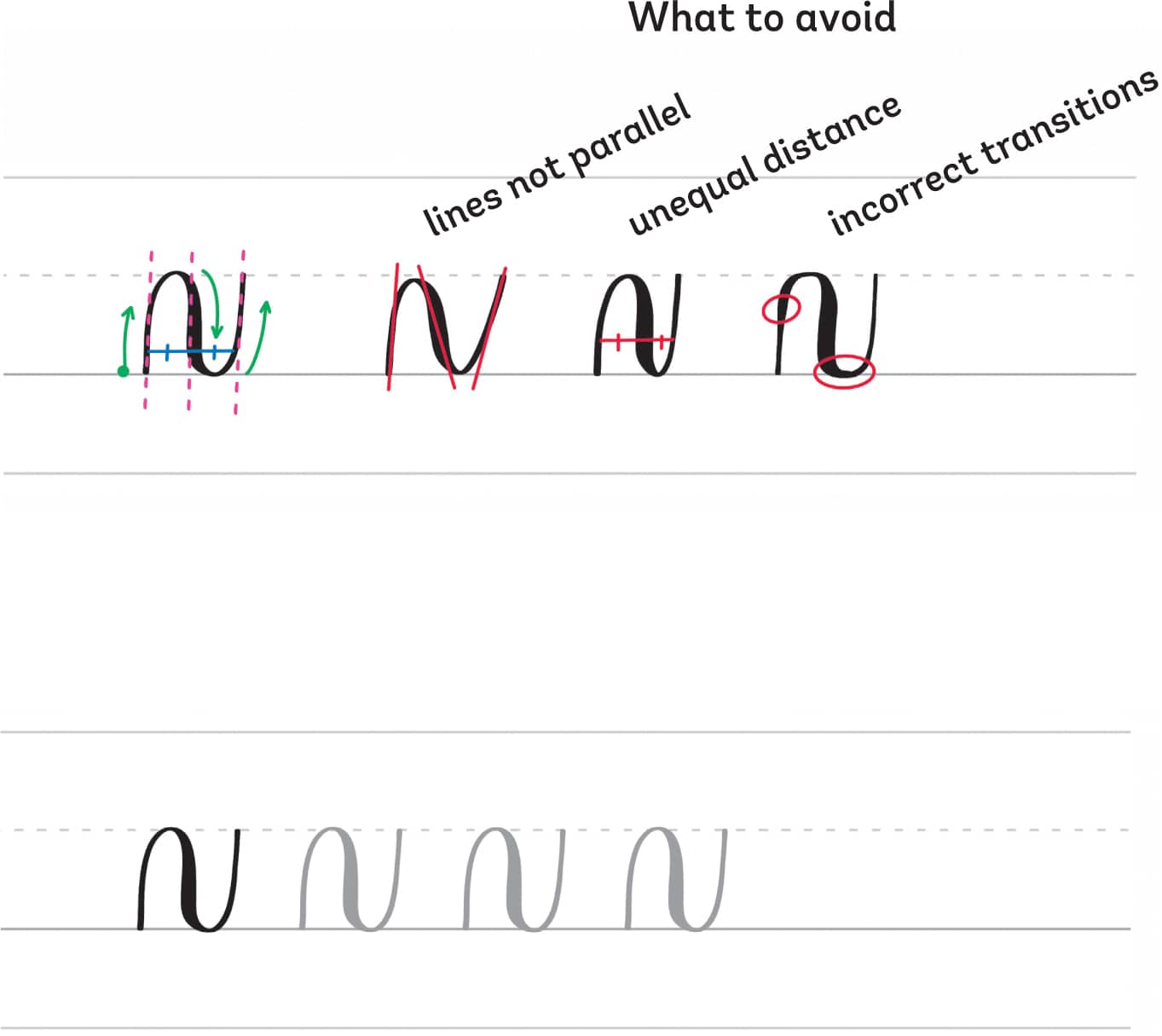
The Compound Curve
The compound curve is a combination of the overturn and underturn strokes. Start with a thin upstroke from the baseline, transition to a heavy-pressured downstroke as you make the first curve, and then end with a thin upstroke curving toward the waistline.
Tips for making the compound curve:
- Make the lines parallel.
- The distance between the two curves should be approximately equal.
- Transitions must be done slowly to create smooth strokes.
The Descending Stem Loop
The descending stem loop starts from the waistline with a heavy-pressured downstroke. Then, before reaching the descender line, transition to light pressure, create a loop, and end at the baseline.
Tips for making the descending stem loop:
- Avoid forming an edge at the corner of the loop.
- Make sure the transitions are done properly.
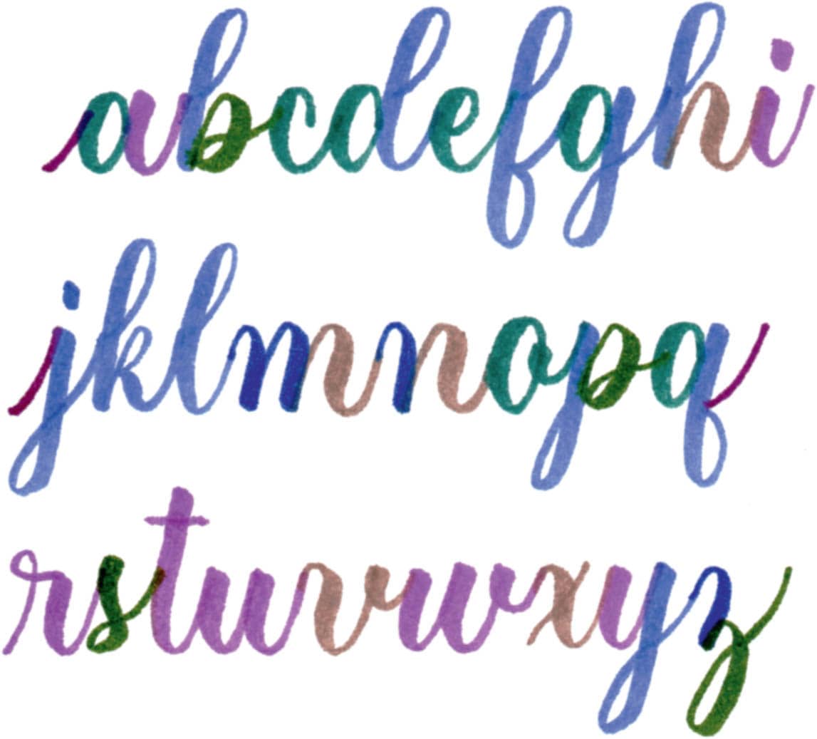
LOWERCASE LETTERS
Now that you know the basic strokes of calligraphy, it’s time to write the lowercase letters. Cursive is different from calligraphy, so I’ve included a system that will help you practice more efficiently.
In this section, we are not going to just write letters from a to z. I always teach my students the lowercase letters divided into several groups that feature a common shape.
Before you begin writing the letters, always remember to lift your pen after each stroke.
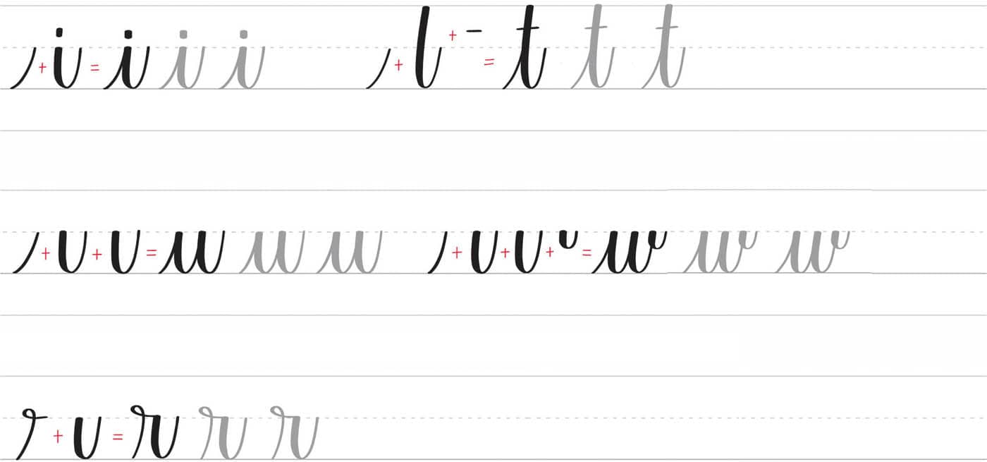
Group 1: Letters with the Underturn Stroke
This group includes the letters i, t, u, w, and r.
Group 2: Letters with the Overturn & the Compound Curve
This group includes the letters m, n, v, and x.

Group 3: Letters with the Oval
This group includes the letters a, c, e, and o.

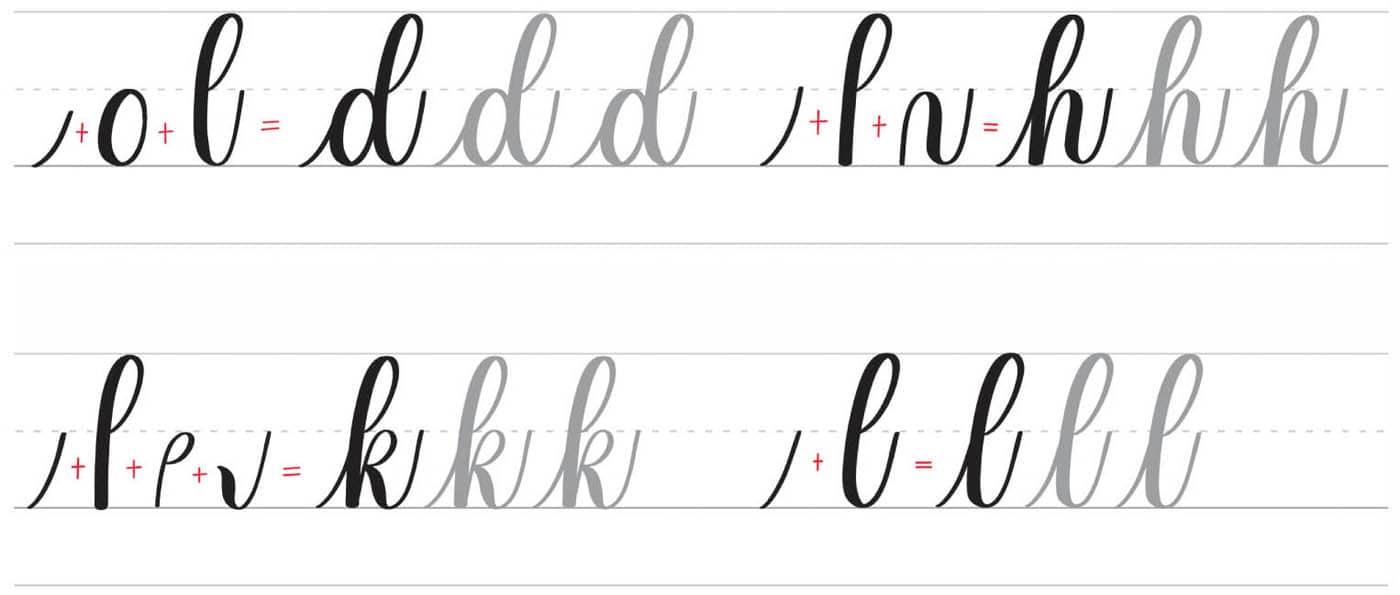
Group 4: Letters with the Ascending Stem Loop
This group includes the letters d, h, k, and l.
Group 5: Letters with the Descending Stem Loop
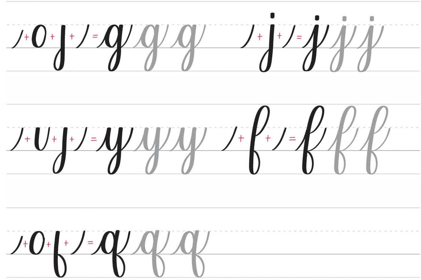
This group includes the letters g, j, y, f, and q.
Group 6: The Remaining Letters
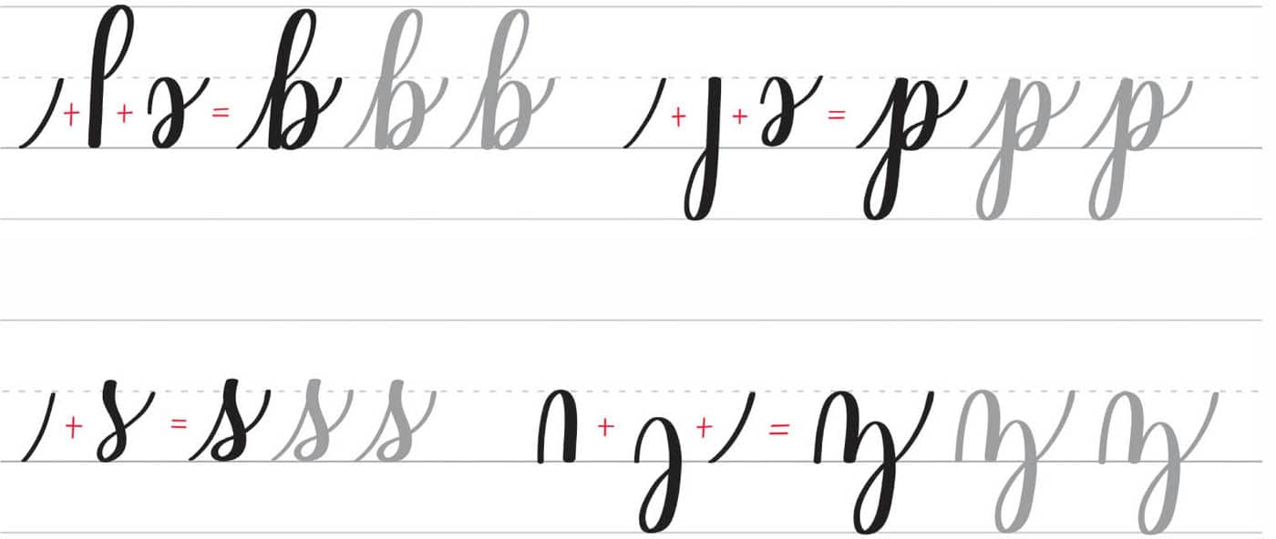
This group includes the letters b, p, s, and z.
UPPERCASE LETTERS
One of the benefits of learning calligraphy is being able to make personalized gifts that feature lettering. People love seeing their names beautifully handwritten, and you can accomplish that once you’ve learned how to confidently write uppercase letters.
When lettering capitals, I remember the rule of calligraphy: “thick down, thin up.” By applying the correct amount of pressure to create contrast in your letters, you can come up with different ways to write uppercase letters. Explore and practice until you get the style that you want.
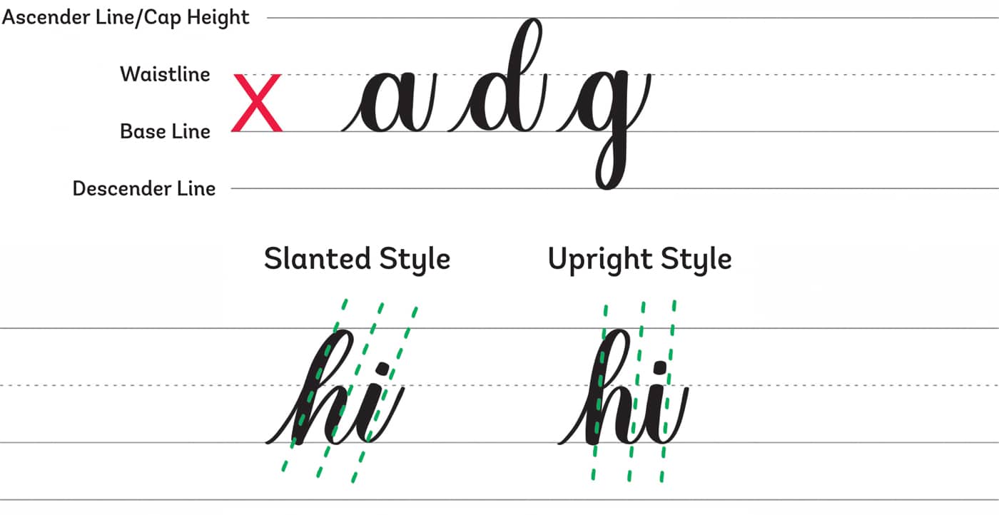
Note: In traditional calligraphy, the ascender line is different from the capital height. You can choose to make your uppercase letters taller than the ascender line. I make the ascender line the same as my cap height.

LETTER CONNECTIONS
Once you’re comfortable with the basic strokes and lowercase letters, you can start writing words. First, though, you need to learn how to connect letters.
This section of the book highlights the three simple rules used to connect any letters in the alphabet. The truth is that you will encounter tricky letter combinations as you practice, and you may wonder how to connect those letters. Before that happens, I will spill the techniques I use every time I join letters to form words.
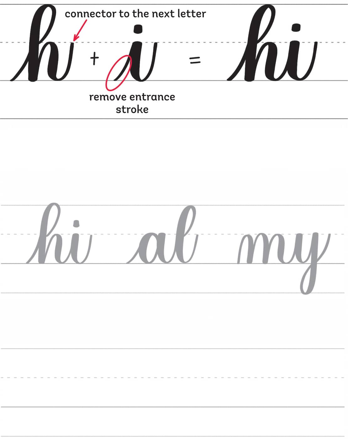
First Rule: Standard Connection
The standard connection means that the exit stroke of the first letter becomes the connector to the next letter. Most letters connect using this rule.
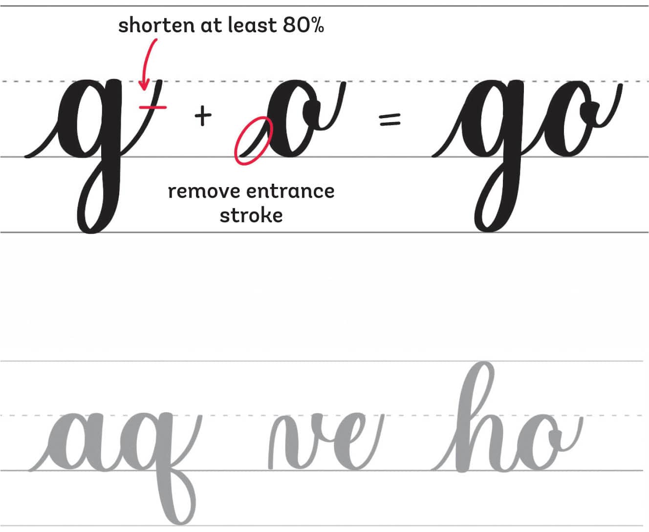
Second Rule: Oval Connection
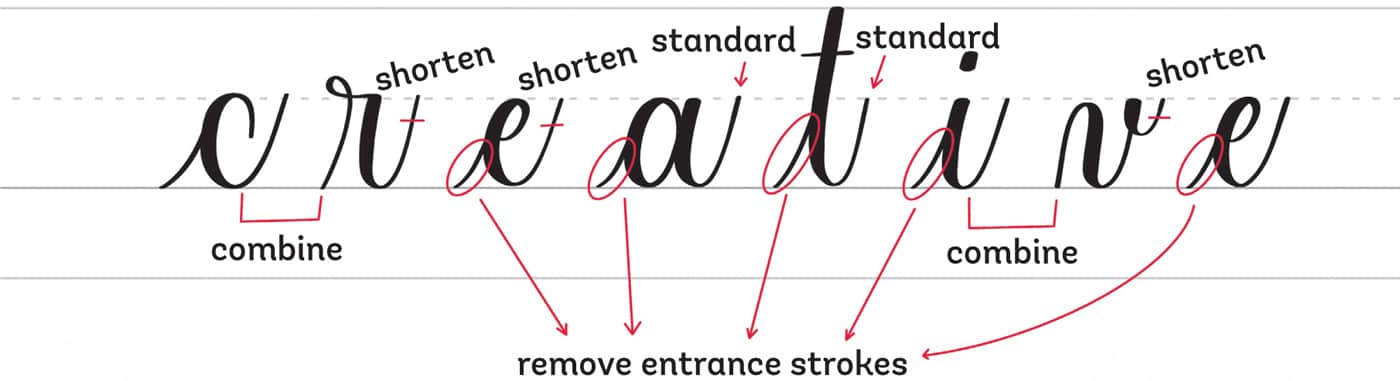
The oval connection means that you must shorten the exit stroke of the first letter when the next shape is an oval. Remember Group 3: Letters with the Oval (here)? You shorten the entrance strokes to remove the extra line on the side of an oval and make a smooth connection between each stroke.
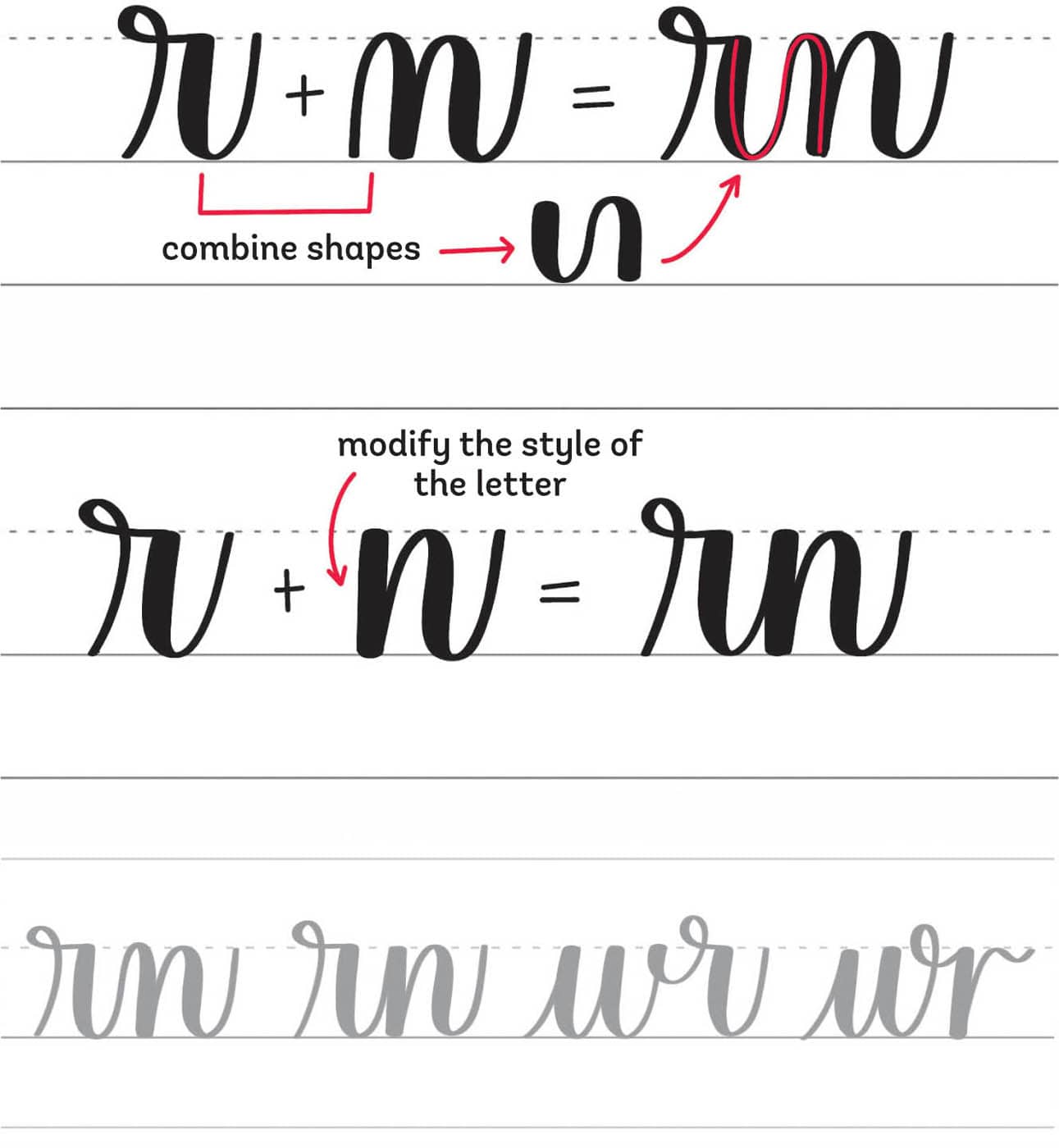
Third Rule: Tricky Connection
Now comes the challenging part: the tricky connection. When you encounter letters that are difficult to connect, you can either combine the shapes of the basic strokes or completely modify the style of the letter to make it easier.
FORMING WORDS
Now that you understand how to connect letters, it’s time to write words. Words in calligraphy are just a series of basic strokes joined together. You should always remember to go slow and lift your pen after each stroke to ensure that you’re forming the shapes properly and that the spacing is consistent.
Take a look at this example, in which I’ve separated the letters and indicated where and how the connections should go.
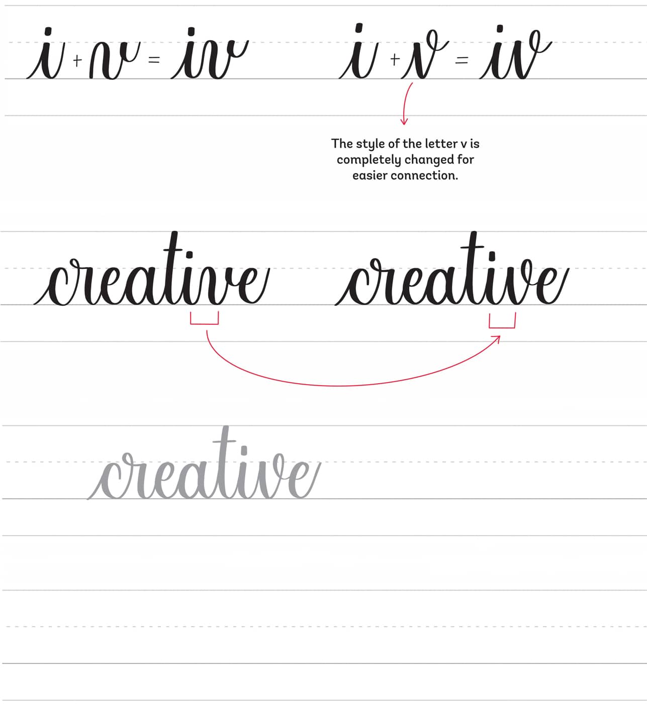
You may think that the connection of the letter i to v becomes a long stroke since you combine the underturn of the i to the compound curve of the letter v. This is another example of a tricky letter connection. If you’re struggling with long combined strokes, try to completely modify the style of the letter to make it easier.
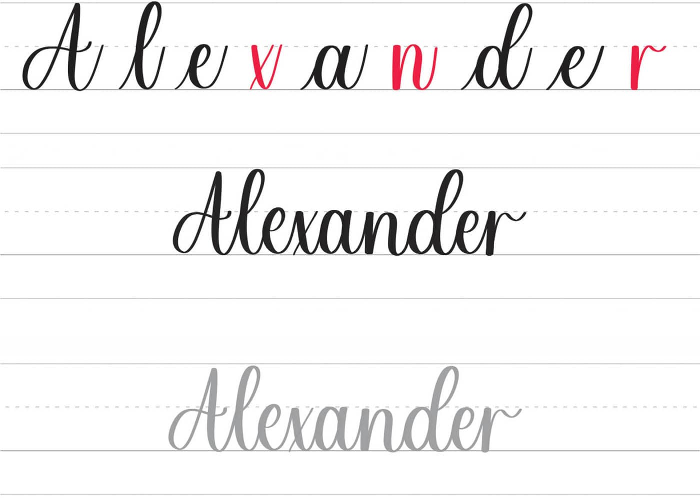
For another example, let’s write a name. The name Alexander features three tricky letter combinations: e to x, a to n, and e to r.
In this version, you combine the shapes of the basic strokes to connect tricky letters.
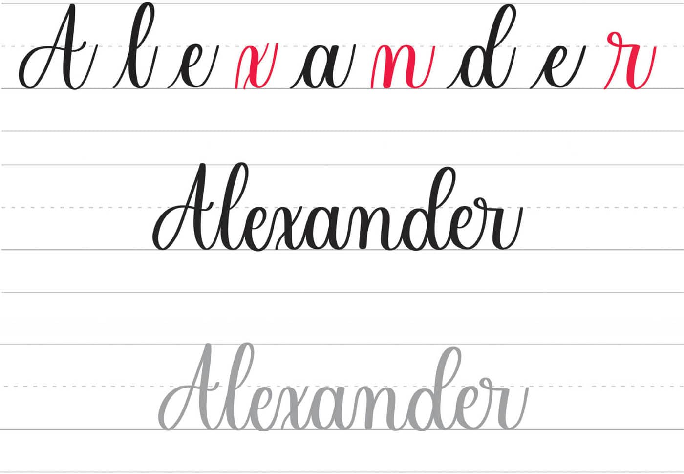
In the second example, you completely change the style of the letters x, n, and r, which simplifies the connections.
What has changed? First, the compound curve of the letter x changes to a slanted underturn stroke to easily connect it to letter e. The beginning stroke of the letter n also changes from an overturn to a downstroke to avoid combining long shapes. Lastly, modify the beginning stroke of the letter r into a downstroke.
Now, let’s talk about spacing, one of the common struggles for beginners. Here’s how you can check the proper spacing of your letters to ensure that it looks consistent throughout a word.
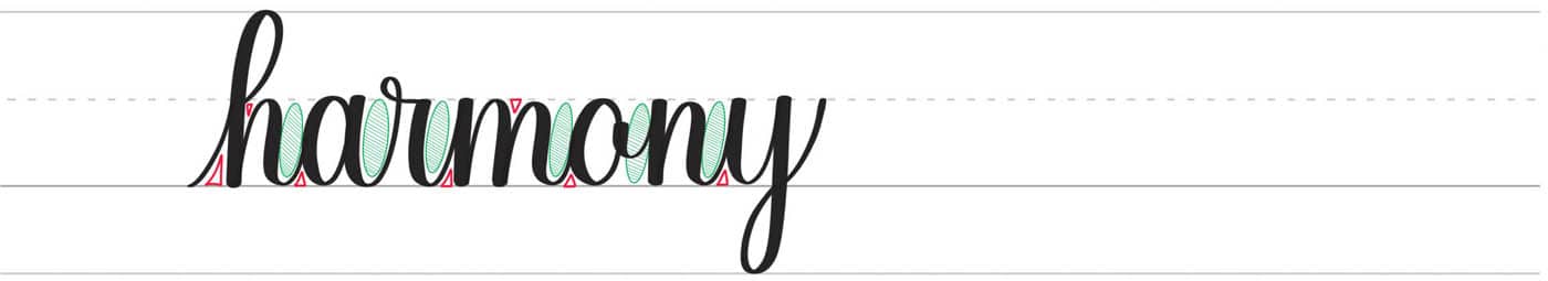
The red triangle indicates the spacing between the strokes and the letters, while the green oval with shading indicates the spacing between the letters.
In calligraphy, if you can fit a triangle between each stroke, that signifies proper connection and spacing. The same is true if you can fit uniform sizes of ovals between your letters. The spacing doesn’t have to be completely consistent, but when you look at your words, you’ll know instantly if something is odd in the spacing.
In the example below, you will notice that the spacing is not consistent.
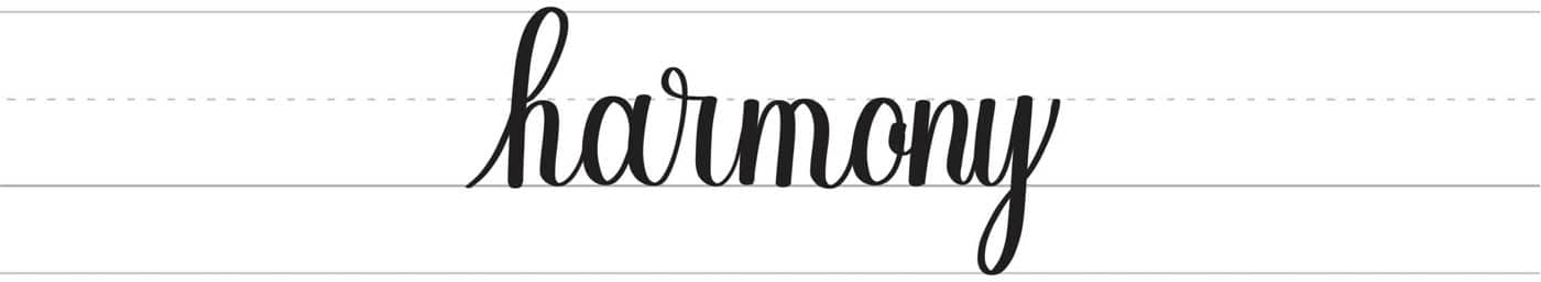
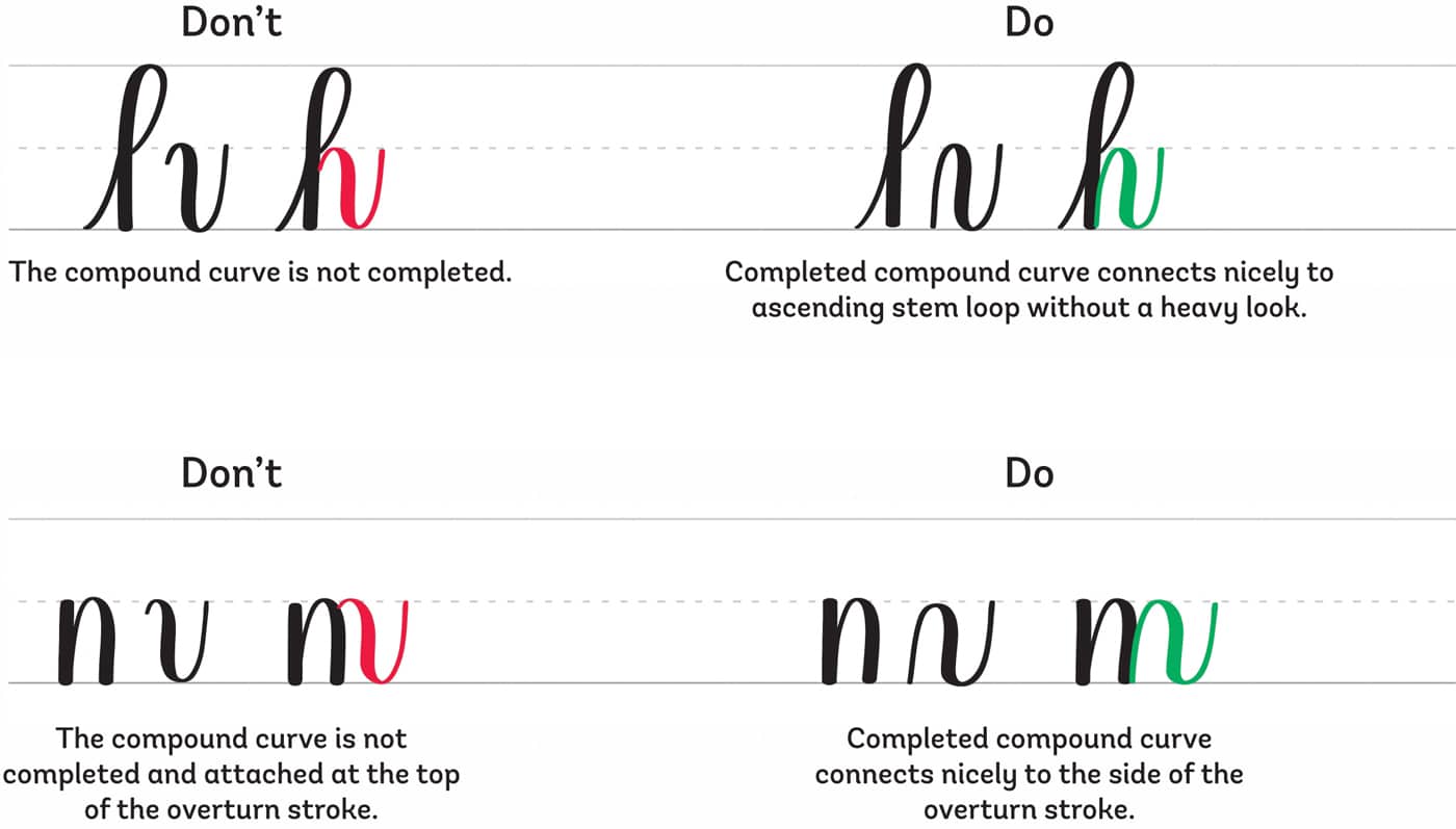
First, let’s analyze the letters h and m.

You will see that the connection between the ascending stem loop and compound curve of the letter h looks crowded. You can’t draw a triangle in that little space because the compound curve is not complete. Instead of starting from the baseline, the stroke starts below the waistline.
The letter m has the same problems. The connection of overturn stroke to the compound curve can’t fit a triangle since the later stroke has not been done properly.
To fix this, remember to draw the basic strokes as they are. Form them properly and avoid any shortcuts.
Next, let’s analyze the spaces between letters o, n, and y.
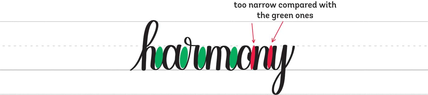
Here, the problem is the inconsistent spacing between the letters o and y. If you compare the ovals between the letters o, n, and y, you will notice that they are narrower than the ovals (in green) in the spaces of the first letters in the word “harmony.”
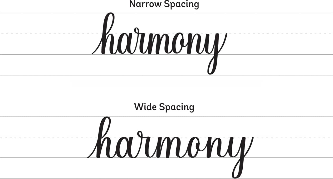
Go slow as you write, and lift the pen after each stroke. When you pause and lift your pen before attaching the next shape or letter, you’ll be more mindful when writing. Always think ahead about what stroke is coming next so you can adjust the spaces of the letter accordingly.
The spacing of the letters depends on how wide or narrow you prefer them to be. What matters most is that the spacing remains consistent throughout the words.
Lastly, let’s talk about consistency and what it really means to be consistent with your calligraphy.
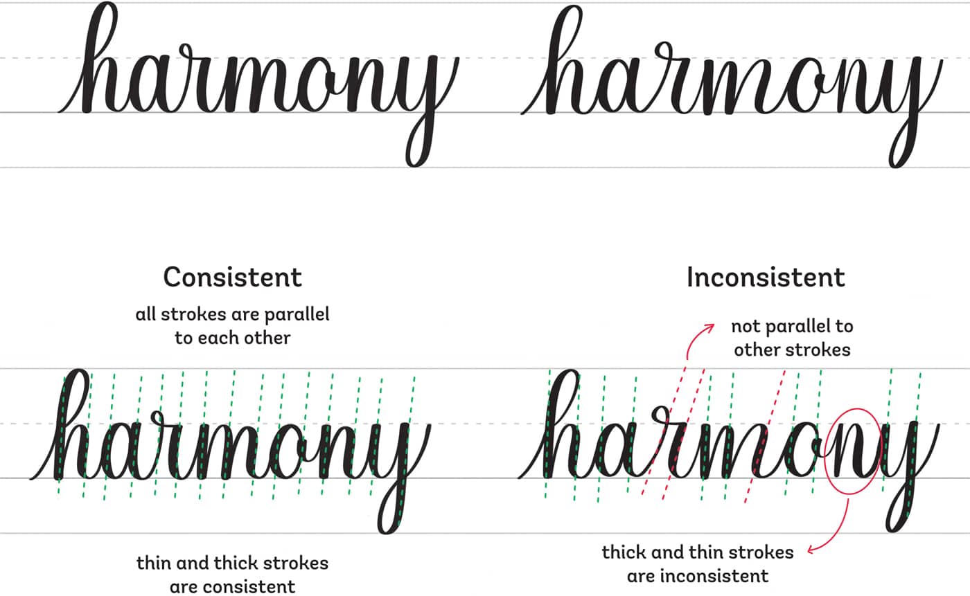
As you know by now, modern calligraphy doesn’t strictly follow a traditional 55-degree angle. It’s necessary, however, to follow a specific angle with all your strokes and letters—regardless of the angle.
If you prefer writing upright (a 90-degree angle), make sure that all your strokes follow that upright angle. If one of the strokes has a different slant, the viewer will notice that instead of the beauty of the word.
The contrast between thin and thick strokes also plays a role in ensuring that your lettering looks consistent. Therefore, it’s essential to repeat the basic strokes and build your muscle memory before jumping into forming words.