

Runaway (September 20, 1958), Norman Rockwell. Reference image from Norman Rockwell: Behind the Camera.
Printed by permission of the Norman Rockwell Family Agency. Copyright © The Norman Rockwell Family Entities.
Reference is an essential part of any artist’s workflow. Whether painting, sculpting, or working in 3D on a computer, an artist must study the world in order to replicate it. Whether an artist is sketching based on observations from a live model or painting shadows after breaking down a photographic image, reference is a tool utilized by artists of all disciplines.
How and why do we use reference? What are the consequences when we do not use reference? What are some methods of evaluating reference and translating that into a visual image? What are the best techniques for gathering and organizing reference? This chapter will explore and answer these questions.
Memory is a funny thing. The way people will think something looks can be vastly different from reality. Human beings often fabricate qualities about an object that are not actually there. Sometimes they fabricate the existence of objects altogether. Shapes, colors, and scale can all be skewed by what researchers call “false memories.”
False memory was researched in the study, “Decreased false memory for visually presented shapes and symbols among adults on the autism spectrum” by Ashleigh Hillier, Heather Campbell, Jocelyn Keillor, Nicole Phillips, and David Q. Beversdorf, published in the Journal of Clinical and Experimental Neuropsychology (2007). In that study, twenty-three young adults with no history of mental impairment were shown twenty-four sets of twelve slide projections. The slides consisted of different geometric shapes, which varied in size, position, shape, color, and number. After viewing each set of slides, the participants were shown five additional slides and asked if each of the five additional slides were in the original set. Of the additional five cards, two were from the original set, two were obviously different cards containing shapes not found in any of the originals, and the last card was called the “Lure.” The “Lure” was similar to the original set in many ways, but not identical to any of the originals.

Figure 2.1 The top twelve images represent the cards shown to the subjects of the study. The bottom five were the cards the subjects were asked to match to the original group. The “Lure” was misidentified as being in the original group 60 percent of the time.
In 80 percent of the trials, participants were able to accurately identify the images they had seen in the original. The participants were nearly perfect at picking out the two distinctly different images, with a success rate of 98 percent. The “Lure” image, however, was falsely identified in a staggering 60 percent of the trials. This was referred to by Dan Schachter at Harvard as ‘gist’ memory. People generally do not remember every detail but rather the gist of things, which makes it challenging when attempting to accurately recreate images simply from memory.
Let us test this out. Close your eyes and think about the room you are currently in. Think of the color of the ceiling. Now, lift your head toward the ceiling and open your eyes and take a look. Really look. Do not just think what the paint color is: actually look at the colors as they exist in front of you. Even if the ceiling is painted white, it may appear more gray than white if not illuminated. The lights in the room may be casting a color or there may be some colors bleeding onto the ceiling from the surrounding colored walls.
An individual would not usually be able to pick up on every detail in the room by pure memory alone. Normally, there are just too many objects and details to remember. This is where analyzing reference helps the artist correctly recall elements of the world. Human beings are much better at distinguishing specific characteristics of an object, like color and brightness, with much more accuracy when using a visual example and not simply by relying on their memory. In fact, there are times when our mind will actually fill in gaps of our memories with false, fabricated information that we believe to be true.
Research has shown that while the eye can perceive objects as thousands of different colors, the brain tries to categorize everything into about eleven different color categories. Things are blue, red, black, white, etc. People often remember tomatoes as pure red, lemons as yellow, and eggplants as purple when in reality the actual color of those objects can be much more diverse. The human mind simply distorts our memory of a given object so it more neatly falls into one of those verbal categories.
Therefore, it is vital to have an actual visual representation of an object as reference. Whether it is a photograph, sculpture, painting, or the object itself, it must be something tangible that the artist can compare against when creating. Relying solely on the mind’s eye will lead to inaccurate and ultimately less successful results.
What Happens When an Artist Does Not Use Reference?
Simply put, ignoring reference will lead to an inefficient workflow and a final image that is less successful. Reference gives the artist a visual goal and a blueprint for constructing the image. Without it, the result may look different from that intended and the artist will have no idea why. With reference one can compare the images and determine that, in fact, an area needs to be brighter or perhaps the shadow area needs a bit more color for it to be read more naturally.
Additionally, lighting artists are rarely working on projects alone. Generally there are teams of artists that work on a sequence of shots simultaneously and coordinate the look. One artist’s shots will cut with all the others and the objects in the scene must appear the same to maintain consistency. Reference is essential in these instances since it allows the team to collectively assemble their ideas and focus the goals on a specific look.
Some might think reference is unnecessary since the animated project consists of an imaginary character or world. This is absolutely not the case. Reference plays as large a role in animated projects with imaginary characters as lighting a human to be seamlessly and photorealistically inserted into a background plate. The one thing to keep in mind is that, although the characters are unique, all of their individual elements can be based on real life objects as components.
An imaginary character like Shrek is a great example of this. There are no ogres found in nature but artists often reference human characteristics so the audience can more easily form a connection with the character. In fact, some people believe the artists who designed Shrek referenced one particular human named Maurice Tillet. Tillet was a professional wrestler during the 1930s to the 1950s but was also a scholar who wrote poetry and spoke fourteen different languages. He suffered from a medical condition called Acromegaly which caused his bones to grow uncontrollably. Whether or not he was the basis for Shrek, we can begin to get an understanding of how an artist can use real world characteristics to help design fantastical characters.


Figure 2.2 Some speculate the design of Shrek was based on a French wrestler named Maurice Tillet. (left) Shrek © 2004 Dream Works Animation LLC. All rights reserved. (right) Copyright Associated Press.
All artists should be gathering reference from a variety of sources. Reference can be found in actual physical objects, photography, fine arts (such as paintings and drawings), and in films and television.
Photography
Photography is a very common source of reference and is very easy to find. The best reference photographs are not highly processed or adjusted. Using photographs, one can easily pinpoint and analyze the variations and distinctions of different lighting scenarios. The artist can view elements like color, value, contrast, and many other aspects of an image that will need to be simulated in the scenes. The artist can also get a better understanding of how the colors appear differently in the same landscape depending on both changes in the time of day and changes in the season. This is a great way of breaking down specific exterior scenes to gain a full knowledge of that environment’s characteristics.

Figure 2.3 The same environment can change drastically depending on the time of day. Photography is a great way to capture these variations in light color and quality (bottom row of images). Time of year also greatly influences the color and look of a scene and should be accounted for when lighting an animated project (top row of images).

Figure 2.4 The illumination of a man-made object like a television can be difficult to replicate in the render without good reference imagery to hit all the subtleties.

Figure 2.5 Reference also helps answer questions about light quality like “How much light escapes under and around the door of an illuminated room?” And, “What type of shadow does that lighting scenario create?”
Internal shots, like exterior shots, require just as much observation to obtain the knowledge of their unique lighting characteristics. We often overlook how light actually interacts around us, but as a lighter we need to observe these effects in order to be able to reproduce them accurately in our computer generated worlds. Using the example mentioned previously in this chapter, we need to closely observe the color of the ceiling before we can accurately reproduce it.
Another example is how interiors are lit in specific lighting circumstances. In the examples in Figures 2.4 and 2.5, we ask the question, “How does the room look when the only source of illumination is the TV?” Or, “How much light actually spills under the door while someone is lying in bed at night? What types of shadows does this light create?”
Interior lighting setups are common in everyday lives but contain subtleties that can often go overlooked. Let’s take a closer look at Figure 2.5. What observations can be made by looking at this image?
The first step is to identify where the main light source is coming from. In this instance, it is coming from behind the cracked door (marked in orange). There is a nice glow effect on the door that comes from the light within (purple). The shadows that are formed from the light create an interesting shape along the floor and the wall, something that may not have been expected if one did not see it in the reference (blue). The light from the door is reflecting on the floor and against the wall on the right side (magenta). This tells the observer something about the reflective properties of the floor and wall. Look closer and one can see that the wall’s reflection is softer than the floor’s reflection. These are just a few observations that can be pulled from this reference image.

Figure 2.6
Obtaining reference images that help hone in on the lighting details of a shot will result in more successful and believable images. The reference image does not even need to be relevant at the time. If it strikes the artist as something interesting and engaging, he or she should capture that moment and save it for later. Good reference photographs always find a way to be applicable at some point.

Figure 2.7 Albert Bierstadt’s The Trappers’ Camp is an fantastic example of lighting that is a mixture of natural light with the man-made campfire light. The Trappers’ Camp (1861), Albert Bierstadt, Yale University Art Gallery, Hartford, Connecticut.
Fine Arts
Traditional media, like sculpture or painting, often get overlooked when CG artists are searching for reference. This is a mistake because much can be learned by analyzing these more traditional forms of art. Paintings are particularly useful to lighters since the conceptual approach is much the same for both artists. Both will sculpt light into a space independent of the physics of nature. A photographer works with real world calculations and limitations while a painter is free to bend the laws of physics in order to create whatever image he or she wishes. One just needs to maintain some level of believability to the audience; 3D artists have that same flexibility.
Albert Bierstadt’s The Trappers’ Camp (Figure 2.7) is a fantastic example of a painting whose lighting can be broken down and referenced for a CG scene. Look at the mixture of natural light with the man-made campfire light. The color contrast between the two is dramatic and could definitely be something that might be referenced for the light color, light intensity, and shadow values in a 3D scene, even though it may not be scientifically accurate.
Television, Film, and Video Reference
Television, film, and video are potentially the best source of reference because they are the closest thing to an animated project’s final product. There are normally moving characters, sets, and cameras in animated shots so this animated reference is extremely beneficial. One can observe how a character looks as they travel between light and shadow or how the ground shadow changes as the wind blows the trees.
Lighting for an animated film also requires the use of lights with animated values like a flickering candle or a camera’s flash bulb that can only be referenced by television, film, or footage shot by the artist. How fast does an automobile’s headlight pass a stationary object? At what speed does a neon sign click on and off? The timing and movement of these types of lights can be difficult to replicate without the use of video reference.
Animated films often mimic looks that have been established in television and film. Aesthetics like depth of field, lens flares, vignetting, film grain and lens distortions are all looks that were born in film-based media and incorporated into the look of an animated film. These aesthetics can be observed and analyzed in order to create a believable CG image.

Figure 2.8 Out of the Past. © mptvimages.com.

Figure 2.9 Ideally, artists would always have the actual object they are referencing to take into different lighting scenarios to get the most accurate reference possible.
Actual, Physical Reference
In a perfect world, an artist would have physical models to reference in every situation. That way the object could sit next to the artist at his or her workstation and could be accessible whenever analysis was required. One could observe how the object reacts and looks in different light settings to obtain valuable information on how light reacts directly and indirectly with the object.
Figure 2.9 is an example of how an artist would use an actual physical object to simulate the character in different environments for lighting reference. Even though the character is imaginary, he has been 3D printed to scale to study exactly how he would look in certain instances. The artist would take this object into lighting scenarios that are specific to the animated project and photograph it for reference.
Unfortunately, access to physical reference is not always possible. If someone is looking for reference on how Paris looked in 1917 or how a sunset looks on Mars, physical reference is unattainable. Luckily, this is a unique time in history. Thanks to the Internet, never before has this wealth of information been as readily available as it is today. This information is not only in the form of facts and written words but in images as well. With a quick search, an artist can find images of practically anything and everything without leaving his or her seat. These images, along with ones created by the artist, will make up the bulk of the images in reference libraries.
So what is an artist looking for when evaluating a reference image? Each situation is different but the general idea is to identify the characteristics that make a specific object, light, or character unique in a lighting scenario. An artist will also look for elements of a reference image that make the object feel more robust and visually appealing. Commonly observed characteristics are light direction, light intensity, color of light, shadow, and falloff.
Light Direction
For a lighter, one of the first characteristics analyzed is light direction. Where are the main light sources in the scene situated? The main indicators the artist wants to analyze are illumination, specular highlight, and shadow direction. By looking at these three indicators, the artist is almost always able to identify the position and direction of the main light sources on an object.
Light Intensity
Light intensity incorporates both the intensity of an individual light and the value relationship between that light and others. It also takes direct light and indirect light into account. Direct light consists of the primary light rays being cast by a light source. Indirect lighting is when those primary rays hit an object and refract off, influencing the surrounding areas.
Analyzing direct vs. indirect lighting is often referred to as the key to fill ratio. The key light is the main light source of any scene. Often it is the sun or moonlight but it can certainly be any artificial or man-made light as well. The fill value, in this instance, is the amount of light that is filling in the shadow cast by the key light. This fill value is made up of things like illumination from the sky and light bouncing off a surrounding wall and spilling onto the scene. Understanding the key to fill ratio helps understand the overall contrast level of the reference itself.

Figure 2.10 One analysis an artist must look into when reading reference is the key to fill ratio. The more fill light in a scene, the less the difference between the parts of the image illuminated by the key light and the parts illuminated by only the fill. More fill light means less contrast.
Color of Light
The color of light is a very important factor when scrutinizing reference images. Understanding the color from the key light is a fairly straightforward concept. An artist can analyze the specific light source in the image by data picking the area in an image editing software to help identify the specific color of that light source. Of course, light can change in the environment so it is important that this color be used as a starting point. The artist must remain flexible to adjust the colors in the scene if the result is undesirable.
From there it is a matter of matching the intensity and constantly comparing the created image with the original reference until they become aligned. This can be a very difficult task at first, but as an artist becomes more experienced, it gets easier.
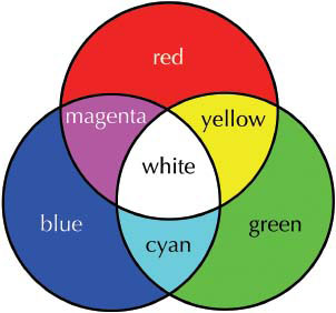
Figure 2.11a In order to fully understand the color of light, we must realize that light is an additive process that behaves differently from mixing paint. The color wheel of how red, green, and blue light colors mix together to form secondary colors.

Figure 2.11b A 3D scene with only one red, one green, and one blue light. Areas of yellow, cyan, and magenta are formed when those light colors mix.

Figure 2.12 A light source like a tungsten bulb can have a very strong, warm tone that can be sampled in reference photographs and replicated in your own light.
Analyzing the secondary and indirect lights is more difficult. They are not as obvious but their proper application is necessary for the success of the image. Secondary lights can come from a multitude of sources. A secondary light can be the sky surrounding an environment casting a cool blue into the shadows on a bright sunny day. It can be a distant lamp or light source that is only slightly illuminating the scene.
These lights can also be indirect and caused by the key light hitting an object and reflecting light rays back onto the scene. A good example of this is a white object sitting atop a colored surface. The color of that surface bounces back up onto the white object and shows some “color bleed.” This is an example of a bounce light, which is one type of secondary light. Bounce light and other secondary lights will be discussed in greater detail in Chapter 3.
For now, remember to question the influence of secondary light when analyzing reference by asking questions like,
• Does the green grass reflect the sunlight back up onto the character?
• Does the water create a caustic pattern on the underside of that bridge?

Figure 2.13 Indirect light and secondary light are when your primary, key light hits one surface and bounces off onto another. In this image, it can be seen how the bounce light color has changed depending on the color of the ground plane.

Figure 2.14 The same object photographed in different scenarios can pick up indirect, secondary light rays and absorb the color of surrounding objects.
Shadows
Shadows are an interesting trait to be investigated when looking at reference as well. Shadow color, softness, and shape are all elements that must be replicated in order for the entirety of the shot to work. By observing the shadow an artist can learn about not only the light direction, as previously stated, but also some characteristics of that light source. If it is a sharp, hard shadow, the light source is most likely relatively small in comparison to the object and/or far away, similar to a sun. If the shadow is soft, the artist knows the light source is more diffused, less direct, and possibly relatively large compared to the object being lit. In which direction are the shadows going? Are they drawn out along the ground or are they just beneath the character? This will give the artist an idea of the position at which the light source should be placed. Drawn out shadows will be the result of a light source coming from a lower angle than one that casts a shorter shadow.
Shadow color is something that is often overlooked. So often shadows are depicted as black with no variation or color, but if someone really looks at shadow references it will be observed that this is not the case. There are a multitude of variables that go into the color of a shadow. For example, does the blue sky give the shadows a tint of color? Is there light reflecting off surrounding objects and casting light into the shadows? When analyzing reference of a shadow, really look and think about what may be contributing to the color.

Figure 2.15 Shadow softness is determined by the light source. The larger the light source relative to the object being lit, the softer the shadow.

Figure 2.16 Shadow color is incredibly important when trying to match to reference. Color picking certain areas so the shadow color is accurate is essential when trying to craft your image.

Figure 2.17

Figure 2.18 In this example, the light source starts off very strong and intense, but fades quickly in the surrounding trees before almost dying completely when it reaches the buildings.
Light Decay
All light sources, no matter what they are, have a finite distance they illuminate. Flashlights have the small beam of light that shoots out of the canister and travels only a certain distance. Candlelight can often decrease very quickly and shines light only on a very small area. Even the sun’s light eventually dwindles in the vastness of space.
When lighting, it is important to also match the look of this falloff whenever it is necessary. Does an illuminated streetlight at dusk influence the lighting of a character walking at street level? Does the candle on one table affect the lighting of the characters sitting at the table next to it? Finding reference to the specific image an artist is trying to build and sticking to it will lead to the scene feeling more believable to the audience and ultimately lead to a better final product.
Reference can be used in a couple of different ways. The first is to read the reference literally. An artist can try to match the reference exactly in terms of color, contrast, brightness, etc. This is especially likely when creating imagery that is meant to be either photoreal or matching a specific traditional artistic style like a painting or drawing. In these cases, a one-to-one match with the reference is ideal.
In other cases, it can be used when the artist is trying to create a look that is completely original. In these cases the artist will use the reference as a jumping-off point. The artist can pick only a certain element from the reference that suits the specific need but modify it in a way that allows it to drift away from the reference and into an entirely new, unique experience. Perhaps the colorcast from the night sky in a particular painting has caught the artist’s eye, but the saturation could be pushed even further. The color of the sky would be referenced as the starting point and then enhanced for the final image.
The final step of gathering reference is organizing it into a library. This library will be useful to both the individual that created it and any other artists collaborating on the project. This is a commonsense idea, but is often overlooked by many artists who find the practice laborious and time consuming. Ultimately, using a reference library will save time and headaches as an individual continues to grow and develop as an artist.
Creating a functioning, useful library will ensure that the work put forth can best be used in the future. This library should be categorized and labeled with a common naming convention so a large number of images can be searched and managed simply.
There are many ways to create a reference library. One way is to create a file directory structure in a folder location, either on your computer, network, or online image database that is accessible to the necessary artists. Within the directory, create the categories and subfolders for the library. This should be done with some care as images will fall into multiple categories and either must be copied into each category, or tags of metadata must be created to enable all the other artists to search the database for that image.

Figure 2.19 Flow chart of a sample directory structure of a reference library.

Figure 2.20 An example of a character style sheet.
Another good use of reference is to create a style sheet which combines similar references on a minimal number of pages. These sheets can be easily referenced and followed by all the artists on the team. This is something an artist is highly encouraged to do when creating characters, props, or environments because it allows for ideas to be fleshed out and a better, more concrete understanding to be formed.
Reference images are just the starting point to a great image and the artist does not have to match to it perfectly. The artist is free to make aesthetic decisions and create visual styles all his or her own. But by gathering and analyzing reference, the artist is able to have a solid foundation to construct beautiful images.
|
Lighting Director of Photography :: Pixar Animation Studios. |

Q. What is your current job/role at your company?
A. I work for Pixar Animation Studios as a Lighting Director of Photography.
Q. What inspired you to become an artist on CG films?
A. I knew at a very young age that I wanted to be an artist, even before I was old enough to go to kindergarten. In particular, I was drawn to animation because naturally that is the type of entertainment I was exposed to at the time, especially whatever was playing on The Wide World of Disney on TV. Many years later, I was working as an art director in broadcast television when CG animation was in its infancy. The first time I saw a flying logo, the potential seemed infinite, and I was hooked.
Q. What are your main sources of inspiration and reference? Do you prefer to go into the real world and observe or do you look to photography or more traditional artwork?
A. I try not to limit myself; inspiration can come from anywhere at any time. I try to be open to whatever I stumble across. It is a combination of seeing the world through the interpretation of other artists combined with observing the world myself. Movies and paintings particularly resonate with me, and I enjoy looking at great photography and stage productions.
Q. We have read that you have traveled to various locations for look development reference and inspiration for your films, specifically Cars 2. What is the benefit to seeing your reference in person as opposed to just finding photographs or other images online?
A. Online photo reference is great. We use it heavily to pre-scout a research trip to know where to go and what might be interesting, and it is often useful for when visiting a location isn’t practical. But it isn’t the same thing as seeing it yourself. When Harley and I went to Paris for Ratatouille, we of course did our online research first. While there, we both took a lot of photographs that we exchanged when we returned. It was astounding to see how we each viewed that environment from a different point of view. We found many unexpected surprises that we would have never found looking online or in books. How would I know that the fountain I’m looking at has rainbow-like highlights unless I am able to walk around it and observe the light changing? How would I know how variable the weather is in October without watching it change every five minutes? How would I notice the little touches of light quality: the softness, the modulation by the tree leaves, the piles of rusty brown leaves on the cobblestones, the warmth from reflected light between buildings? By experiencing the world through physically being there, I can shoot photos from my own point of view, composing, exposing and processing them to capture the qualities that I want to remember and evoke. And perhaps more importantly, I gain an emotional connection to the environment and memories that lets me know when an image feels “right.” For Ratatouille we were trying to capture Paris, for Cars 2 we needed to find the essential truths for several countries, finding ways to contrast them to make each unique.
Q. As a painter, do you approach lighting differently in your paintings from how you would a 3D scene? Or do you take a similar approach?
A. When I am painting, especially when I’m painting on location, the process is really an exercise in close observation and working quickly enough to capture the light before it changes. I’m not thinking very much; rather, I’m reacting to what I’m seeing. I’m not trying to create a finished painting. I’m studying the effects of light and how to best represent them, with varying degrees of success because I’m often struggling with the more technical aspects of painting with oil on canvas. If I am painting in the studio, I’m trying to go deeper into that observation and trying to improve upon what I painted in the field, but usually still trying to be quite literal with it. It is an introspective process. When I’m creating lighting for a film, the process is much more complex, collaborative, dynamic and externally focused. The lighting needs to convey emotion and visual information to the viewer in a way that best serves the story. It might be highly theatrical or stylized. Certainly, there is some overlap, and each inspires and informs the other. The basic principles of good image making are relevant for each. I feel that the most significant similarity is in the effort to create a solid value structure to reduce unnecessary information, thus highlighting what is important.
Q. What non-CG artwork inspires you?
A. I particularly enjoy viewing art that is very different from what I am able to create or from how I view the world. It challenges me to rethink my point of view and to keep learning.
Q. What do you think is lighting’s largest contribution to an animated film?
A. When I am trying to explain what I do to somebody unfamiliar with CG, animation or even live-action filmmaking, I simplify my explanation to the bare essential: light creates order out of chaos. I show them an unlit image juxtaposed with a lit one and explain how we use light to direct the eye to the action; and how light, shadow, and color are used to create a mood.
Q. Where do you think the future of lighting is headed?
A. As computers have become faster, the tools have evolved to be capable of a much greater approximation of reality. It is easy to see this trend continuing and becoming more real time in interaction.
Q. If you could tell yourself one piece of advice when you were first starting out in this industry, what would it be?
A. As a first pass, I answered this question with a list, because I could write an entire book on this topic. But as I mulled it over, it became clear that there was one essential bit of advice that acts as an umbrella over all others: “Be curious.”
Q. In your opinion, what makes a good lighting artist?
A. Passion. A person who loves to light and to make beautiful images is a joy to work with.