
Chapter 5. Organizing Components
This chapter covers
- Learning the various layout systems
- Exploring the Layout class inheritance model
- Exercising programmatic management of the CardLayout
When building an application, many developers struggle with how to organize their UI and which tools to use to get the job done. In this chapter, you’ll gain the necessary experience to be able to make these decisions in a more educated manner. We’ll explore all of the numerous layout models and identify some of the best practices and common issues that you’ll encounter.
The layout management schemes are responsible for the visual organization of widgets onscreen. They include simple layout schemes such as Fit, where a single child item of a Container will be sized to fit the Container’s body, or complex layouts such as a BorderLayout, which splits a Container’s content body into five manageable slices, or regions.
When exploring some of the layouts, we’ll hit upon examples that are verbose, and thus lengthy, and can serve as a great springboard or starting point for your layout endeavors. We’ll start our journey with taking a look at the ContainerLayout, which is the nucleus of the entire layout hierarchy.
5.1. The simple ContainerLayout
As you may recall, the ContainerLayout is the default layout for any instance of Container and places items on the screen, one on top of another. I like to think of it as the Lincoln Logs of the Ext layouts.
Though the ContainerLayout doesn’t explicitly resize child items, a child’s width may conform to the Container’s content body if it isn’t constrained. It also serves as the base class for all other layouts, providing much of the base functionality for the subclass layouts. Figure 5.1 illustrates the Ext.layout class hierarchy.
Figure 5.1. The layout class hierarchy, where layouts are subclasses of the ContainerLayout

A ContainerLayout is the easiest to implement, requiring only that you add and remove child items. In order to see this, you need to set up a dynamic example, using quite a few components, as shown in the following listing.
Listing 5.1. Implementing the ContainerLayout
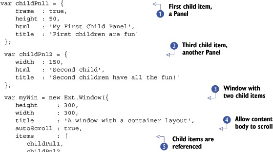

In listing 5.1, you do quite a lot to exercise the ContainerLayout because I want you to be able to see how the items stack and don’t resize.
The first thing you do is instantiate object references using XTypes for the two child items that will be managed by a Window: childPnl1  and childPnl2
  . These two child items are static.
Next, you begin your myWin  reference, which is an instance of Ext.Window. You also set the autoScroll property
  to true. This tells the Container to add the CSS attributes overflow-x and overflow-y to auto, which instructs the browser to show the scroll bars only when it needs to.
Notice that you set the child items  property to an array. The items property for any container can be an instance of an array used to list multiple children or an object reference for a single child. The Window contains a toolbar
  that has a single Button that, when clicked, adds a dynamic item to the Window. The rendered Window should look like the one in figure 5.2.
Figure 5.2. The results of our first implementation of the ContainerLayout

Although the ContainerLayout provides little to manage the size of child items, it’s not completely useless. It’s lightweight relative to its subclasses, which makes it ideal if you want to display child items that have fixed dimensions. There are times, however, when you’ll want to have the child items dynamically resize to fit the container’s content body. This is where the AnchorLayout can be useful.
5.2. The AnchorLayout
The AnchorLayout is similar to the ContainerLayout, in that it stacks child items one on top of another, except it adds dynamic sizing into the mix using an anchor parameter specified on each child. This anchor parameter is used to calculate the size of the child item relative to the parent’s content body size and is specified as a percentage, an offset, which is an integer. The anchor parameter is a string, using the following format:
anchor : "width, height" // or "width height"
In the following listing you take your first stab at implementing an anchor layout using percentages.
Listing 5.2. The AnchorLayout using percentages

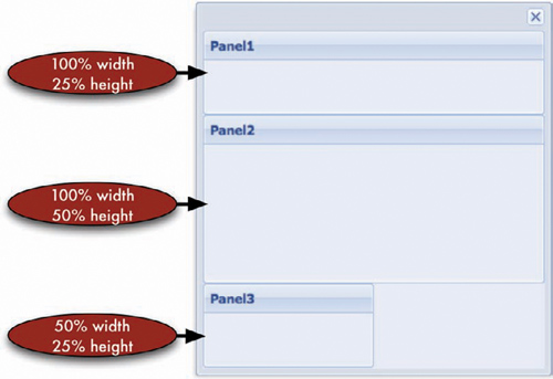
In listing 5.2, you instantiate a myWin , an instance of Ext.Window, specifying the layout as 'anchor' . The first of the child items, Panel1, has its anchor parameters specified as 100 percent of the parent’s width and 25 percent of the parent’s height. Panel2 has its anchor parameters specified a little differently, where the width parameter is 0, which is shorthand for 100 percent. You set Panel2’s height to 50 percent. Panel3’s anchor parameters are set to 50 percent relative width and 25 percent relative height. The rendered item should look like figure 5.3.
Figure 5.3. The rendered results of our first implementation of the AnchorLayout
Relative sizing with percentages is great, but you also have the option to specify an offset, which allows greater flexibility with the Anchor layout.
Offsets are calculated as the content body dimension plus the offset. In general, offsets are specified as negative numbers to keep the child item in view. Let’s put on our algebra hats on for a second and remember that adding a negative integer is exactly the same as subtracting an absolute integer. Specifying a positive offset would make the child’s dimensions greater than the content body’s, requiring a scroll bar.
We’ll explore offsets by using the previous example, modifying only the child item XTypes from listing 5.2:
items : [
 {
   title     : 'Panel1',
   anchor    : '-50, -150',
   frame     : true
 },
 {
   title     : 'Panel2',
   anchor    : '-10, -150',
   frame     : true
 }
]
The rendered Panel from the preceding layout modification should look like figure 5.4. We reduced the number of child items to two to more easily explain how offsets work and how they can cause you a lot of trouble.
It’s important to dissect what’s going on, which will require us to do a little math. Through inspecting the DOM with Firebug, I learned that the Window’s content body is 285 pixels high and 288 pixels wide. Using simple math, we can determine what the dimensions of Panel1 and Panel2 should be:
Figure 5.4. Using offsets with an AnchorLayout with sizing calculations

Panel1 Width  = 288px - 50px = 238px
Panel1 Height = 285px - 150px = 135px

Panel2 Width  = 288px - 10px = 278px
Panel2 Height = 285px - 150px = 135px
You can easily see that both child Panels fit perfectly within the Window. If you add the height of both Panels, you see that they fit, with a total of only 270 px. But what happens if you resize the Window vertically? Notice anything strange? Increasing the Window’s height by any more than 15 pixels results in Panel2 being pushed offscreen and scroll bars appearing in the windowBody.
Recall that with this layout, the child dimensions are relative to the parent’s content body minus a constant, which is the offset. To combat this problem, you can mix anchor offsets with fixed dimensions. To explore this concept, you’ll only need to modify Panel2’s anchor parameters and add a fixed height:
{
  title      : 'Panel2',
  height     : '150',
  anchor     : '-10',
  frame      : true
}
This modification makes Panel2’s height a fixed 150 pixels. The newly rendered Window can now be resized to virtually any size, and Panel1 will grow to Window content body minus 150 pixels, which leaves just enough vertical room for Panel2 to stay onscreen. One neat thing about this is that Panel2 still has the relative width.
Anchors are used for a multitude of layout tasks. A sibling of the AnchorLayout, the FormLayout, is leveraged by the Ext.form.FormPanel class by default, but it can be used by any Container or subclass that can contain other child items, such as Panel or Window.
5.3. The FormLayout
The FormLayout, shown in listing 5.3, is just like the AnchorLayout, except it wraps each child element in a div with the class x-form-item, which makes each item stack vertically like an outline. It adds a label element in front of each of the child items, using the element’s for attribute, which when clicked focuses on the child item.
Listing 5.3. The FormLayout


There is a heck of a lot that you’re doing here to achieve a fairly complex form layout. Like all of the other layouts, you
set the Window’s layout to 'form'. You set a layout-specific attribute, labelWidth , to 50 pixels. Remember the label element we discussed earlier? This attribute sets the width of that element. Next, you
specify the default XType by setting the 'defaultType' attribute to 'field', which is used for the first and second child items and which automatically creates an instance of Ext.form.Field. The third child item is an xtype definition of a static combination autocomplete and drop-down box, known as a combo box or Ext.form.ComboBox. The fourth child item is a simple xtype for a text area, whereas the last child item  is a fairly complex xtype object, specifying a Panel.
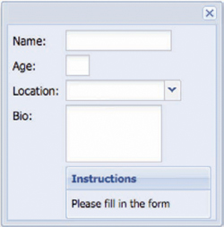
In order to keep the field label element but show no text, you must set the fieldLabel’s property to a string, containing a single space character. You also must remove the label separator character, which is a colon (:) by default, by setting it as an empty string. The rendered code should look like figure 5.5.
Figure 5.5. Using the FormLayout
Remember that it’s an ancestor to the AnchorLayout, which makes it powerful for dynamically resizing child items. Although the layout in figure 5.5 works, it’s static and could be improved. What if you wanted the Name, Location, and Bio fields to dynamically size with their parent? Remember those anchor parameters? Let’s use offsets to improve our use of the FormLayout, as shown in the following listing.
Listing 5.4. Using offsets with the FormLayout
{
    fieldLabel : 'Name',
    anchor     : '-4'
},
{
    fieldLabel : 'Age',
    width      : 25
},
{
    xtype      : 'combo',
    fieldLabel : 'Location',
    anchor     : '-4',
    store      : [ 'Here', 'There', 'Anywhere' ]
},
{
    xtype      : 'textarea',
    fieldLabel : 'Bio',
    anchor     : '-4, -134'
},
{
    xtype          : 'panel',
    fieldLabel     : ' ',
    labelSeparator : '',
    frame          : true,
    title          : 'Instructions',
    html           : 'Please fill in the form',
    anchor         : '-4'
}
In the preceding code, you add anchor parameters to the child items originally defined in listing 5.3. The rendered changes should look like figure 5.6. When you resize the example Window, you’ll see how well the child items resize and conform to their parent container.
Figure 5.6. Using offsets to create a much fuller form

Always try to remember that the FormLayout is a direct subclass of the AnchorLayout. This way you won’t forget to set proper anchor parameters for dynamically resizable forms.
There are times when you need complete control over the positioning of the widget layout. The AbsoluteLayout is perfect for this requirement.
5.4. The AbsoluteLayout
Next to the ContainerLayout, the AbsoluteLayout is by far one of the simplest to use. It fixes the position of a child by setting the CSS “position” attribute of the child’s element to 'absolute' and sets the top and left attributes to the x and y parameters that you set on the child items. Many designers place HTML elements as a position: absolute with CSS, but Ext leverages JavaScript’s DOM-manipulation mechanisms to set attributes to the elements themselves, without having to muck with CSS.
In the following listing you’ll create a Window with an AbsoluteLayout.
Listing 5.5. An AbsoluteLayout in action
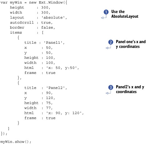
By now, most of this code should look familiar to you, except for a few new parameters. The first noticeable change should
be the Window’s layout being set to 'absolute'. You attach two children to this Window. Because you’re using the AbsoluteLayout, you need to specify the x and y coordinates.
The first child, Panel1, has its x (CSS left attribute) coordinate set to 50 pixels and y (CSS top attribute) coordinate set to 50. The second child, Panel2, has its x and y coordinates set to 90 pixels and 120 pixels. The rendered code should look like figure 5.7.
Figure 5.7. The results of our AnchorLayout implementation

One of the apparent attributes about this example is that Panel2 overlaps Panel1.Panel2 is on top because of its placement in the DOM tree. Panel2’s element is below Panel1’s element, and because Panel2’s CSS position attribute is set to 'absolute' as well, it’s going to show above Panel1. Always keep the risk of overlapping in mind when you implement this layout. Also, because the positions of the child items are fixed, the AbsoluteLayout isn’t an ideal solution for parents that resize.
If you have one child item and want it to resize with its parent, the FitLayout is the best solution.
5.5. Making components fit
The FitLayout, shown in the following listing, forces a Container’s single child to “fit” to its body element and is, by far, the simplest of the layouts to use.
Listing 5.6. The FitLayout
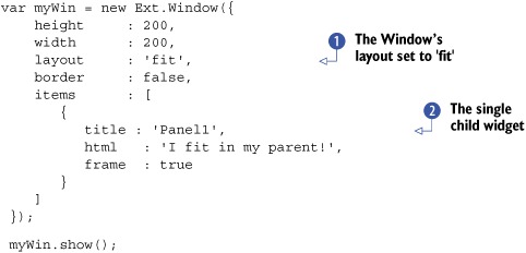
In the preceding example, you set the Window’s layout to 'fit' and instantiate a single child, an instance of Ext.Panel . The child’s XType is assumed by the Window’s defaultType attribute, which is automatically set to 'panel' by the Window’s prototype. The rendered Panels should look like figure 5.8.
The FitLayout is a great solution for a seamless look when a Container has one child. Often, however, multiple widgets are housed in a container. All other layout-management schemes are generally used to manage multiple children. One of the best-looking layouts is the AccordionLayout, which allows you to vertically stack items, which can be collapsed, showing the user one item at a time.
Figure 5.8. Using the FitLayout for the first time

5.6. The AccordionLayout
The AccordionLayout, shown in the next listing, a direct subclass of the FitLayout, is useful when you want to display multiple Panels vertically stacked, where only a single item can be expanded or contracted.
Listing 5.7. The AccordionLayout


Listing 5.7 is quite large to demonstrate the usefulness of the AccordionLayout. The first thing you do is instantiate a Window, myWin, which has its layout set to 'accordion' . A configuration option you haven’t seen thus far is layoutConfig . Some layout schemes have specific configuration options, which you can define as configuration options for a Component’s constructor.
These layoutConfig parameters can change the way a layout behaves or functions. In this case, you set the layoutConfig for the AccordionLayout, specifying animate: true, which instructs the AccordionLayout to animate the collapse and expansion of a child item. Another behavior-changing configuration option is activeOnTop, which if set to true will move the active item to the top of the stack. When working with a layout for the first time, I suggest consulting the API for all the options available to you.
Next, you start to define child items, which leverage some of the knowledge you’ve gained thus far. The first child is a FormPanel , which uses the anchor parameters you learned about earlier in this chapter. Next, you specify a Panel that has its layout set to 'fit' and contains a child TextArea. You then define the last child item as a vanilla Panel with some tools. The rendered code should look like figure 5.9.
Figure 5.9. The AccordionLayout is an excellent way to present the user with multiple items as a single visible Component.

Instead of using both the layout(String) as well as the layoutConfig (Object) configurations, you can set the layout configuration to an Object that contains both the layout type and any options for that layout. For example:
layout  : {
    type    : 'accordion',
    animate : true
}
It’s important to note that the AccordionLayout can function well only with a Panel and two of its subclasses, GridPanel and TreePanel. This is because the Panel (and the two specified subclasses) has what’s required for the AccordionLayout to function properly. If you desire anything else inside an AccordionLayout such as a TabPanel, wrap a Panel around it and add that Panel as a child of the Container that has the AccordionLayout.
Although the AccordionLayout is a good solution for having more than one Panel onscreen, it has limitations. For instance, what if you needed to have 10 Components in a particular Container? The sum of the heights of the title bars for each item would take up a lot of valuable screen space. The CardLayout is perfect for this requirement, because it allows you to show and hide child Components or flip through them.
5.7. The CardLayout
A direct subclass of the FitLayout, the CardLayout ensures that its children conform to the size of the Container. Unlike the FitLayout, however, the CardLayout can have multiple children under its control. This tool gives you the flexibility to create Components that mimic wizard interfaces.
Except for the initial active item, the CardLayout leaves all of the flipping to the end developer with its publicly exposed setActiveItem method. In order to create a wizard-like interface, you need to create a method to control the card flipping:
var handleNav = function(btn) {
   var activeItem   = myWin.layout.activeItem;
   var index        = myWin.items.indexOf(activeItem);
   var numItems     = myWin.items.getCount() - 1;
   var indicatorEl  = Ext.getCmp('indicator').el;

   if (btn.text == 'Forward' && index < numItems - 1) {
       index++;
       myWin.layout.setActiveItem(index);
       index++;
       indicatorEl.update(index + ' of ' + numItems);
   }
   else if (btn.text == 'Back' && index > 0) {
       myWin.layout.setActiveItem(index - 1);
       indicatorEl.update(index + ' of ' + numItems);
   }
}
In the preceding code, you control the card flipping by determining the active item’s index and setting the active item based on whether the Forward or Back Button is pressed. You then update the indicator text on the bottom toolbar. Next, let’s implement your CardLayout. The code example in the following listing is rather long and involved, so please stick with me.
Listing 5.8. The CardLayout in action

Listing 5.8 details the creation of a Window, which leverages the CardLayout. Although most of this should be familiar to you, I should point out a few things. The first obvious item is the layout property, which is set to 'card'. Next is the activeItem property , which the Container passes to the layout at render time. You set this to 0 (zero), which tells the layout to call the child Component’s render method when the Container renders.
Next, you define the bottom toolbar, which contains the Forward and Back Buttons, which call your previously defined handleNav method and the BoxComponent that you use to display the index of the current active item. The rendered Container should look like the one in figure 5.10.
Figure 5.10. Our first CardLayout implementation with a fully interactive navigation Toolbar

Clicking Forward or Back will invoke the handleNav method, which will take care of the card flipping and update the indicator BoxComponent. Remember that with the CardLayout, the logic of the active item switching is completely up to the end developer to create and manage.
In addition to the previously discussed layouts, Ext offers a few more schemes. The ColumnLayout is one of the favorite schemes among UI developers for organizing UI columns that can span the entire width of the parent Container.
5.8. The ColumnLayout
Organizing components into columns allows you to display multiple Components in a Container side by side. Like the AnchorLayout, the ColumnLayout allows you to set the absolute or relative width of the child Components. There are some things to look out for when using this layout. I’ll highlight these in a bit, but first let’s construct a ColumnLayout Window in the next listing.
Listing 5.9. Exploring the ColumnLayout
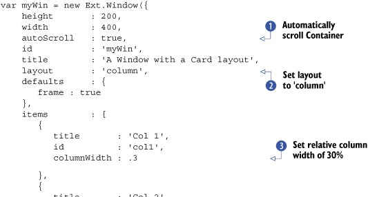
In a nutshell, the ColumnLayout is easy to use. Declare child items, and specify relative or absolute widths or a combination of both, as you do here. In
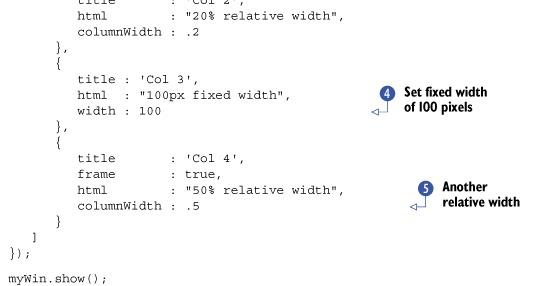
listing 5.9, you set the autoScroll property of the Container to true, which ensures that scroll bars will appear if the composite of the child Component dimensions grows beyond those of the Container. Next, you set the layout property to 'column' . You then declare four child Components, the first of which has its relative width set to 30 percent via the columnWidth attribute. Set the second child’s relative width to 20 percent. You mix things up a bit by setting an absolute width for the third child, 100 pixels . Last, you set a relative width for the last child, 50 percent. The rendered example should look like figure 5.11.
Figure 5.11. Our first ColumnLayout, which uses relative column widths with a fixed width entity

If you tally up the relative widths, you’ll see that they total up to 100 percent. How can that be? Three Components, taking 100 percent width, and a fixed-width Component? To understand how this is possible, you need to dissect how the ColumnLayout sets the sizes of all of the child Components. Put your math cap back on for a moment.
The meat of the ColumnLayout is its onLayout method, which calculates the dimensions of the Container’s body, which in this case is 388 pixels. It then goes through all of its direct children to determine the amount of available space to give to any of the children with relative widths.
To do this, it first subtracts the width of each of the absolute-width child Components from the known width of the Container’s body. In our example, we have one child with an absolute width of 100 pixels. The ColumnLayout calculates the difference between 388 and 100, which equals 288 (pixels).
Now that the ColumnLayout knows exactly how much horizontal space it has left, it can set the size of each of the child Components based on the percentage. It goes through each of the children and sizes each based on the known available horizontal width of the Container’s body. It does this by multiplying the percentage (decimal) by the available width. Once complete, the sum of the widths of relatively sized Components turns out to be about 288 pixels.
Now that you understand the width calculations for this layout, let’s change our focus to the height of the child items. Notice how the height of the child Components doesn’t equal the height of the Container body? This is because the ColumnLayout doesn’t manage the height of the child Components. This causes an issue with child items that may grow beyond the height of its Container’s body. This is precisely why you set autoScroll to true for the Window. You can exercise this theory by adding an extra-large child to the 'Col 1' Component by entering the following code inside Firebug’s JavaScript input console. Make sure you have a virgin copy of listing 5.9 running in your browser.
Ext.getCmp('col1').add({
   height : 250,
   title  : 'New Panel',
   frame  : true
});
Ext.getCmp('col1').doLayout();
You should now see a Panel embedded into the 'Col 1' panel with its height exceeding that of the Window’s body. Notice how scroll bars appear in the Window. If you didn’t set autoScroll to true, your UI would look cut off and might have its usability reduced or halted. You can scroll vertically and horizontally. The reason you can scroll vertically is that Col1’s overall height is greater than that of the Window’s body. That’s acceptable. The horizontal scrolling is the problem in this case. Recall that the ColumnLayout calculated only 288 pixels to properly size the three columns with relative widths. Because the vertical scroll bar is now visible, the physical amount of space from which the columns can be displayed is reduced by the width of the vertical scroll bar. To fix this issue, you must call doLayout on the parent Container, Ext.getCmp('myWin').doLayout(), which will force a recalculation of the available horizontal space and resize the relatively sized columns so the Container’s body need not scroll horizontally. Remembering to call the parent’s doLayout method when adding a Component to any of the direct children will help keep your UIs looking great.
As you can see, the ColumnLayout is great for organizing your child Components in columns. With this layout, however, there are two limitations. All child items are always left justified, and their heights are unmanaged by the parent Container. Ext provides us with the HBoxLayout that overcomes the limitations of the ColumnLayout and extends far beyond its capabilities.
5.9. The HBox and VBox layouts
New to version 3.0 are the HBox and VBox layouts. The HBoxLayout’s behavior is similar to the ColumnLayout, where it displays items in columns but allows for much greater flexibility. For instance, you can change the alignment of the child items both vertically and horizontally. Another great feature of this layout scheme is the ability to allow the columns or rows to stretch to their parent’s dimensions if required. Let’s dive into the HBoxLayout, shown in the following listing, where you’ll create a Container with three child Panels to manipulate.
Listing 5.10. HBoxLayout, exploring the packing configuration
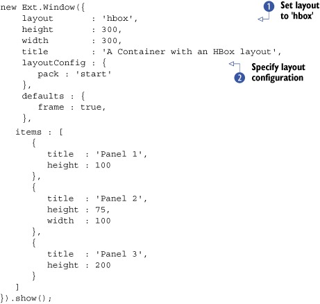
In listing 5.10, you set the layout to 'hbox' and specify the layoutConfig configuration object. You create the three child Panels with irregular shapes, allowing you to properly exercise the different layout configuration parameters for which you can
specify two, pack and align, where pack means “vertical alignment” and align means “horizontal alignment.” Being able to understand the meanings for these two parameters is important because they’re
flipped for the HBoxLayout’s cousin, the VBoxLayout. The pack parameter accepts three possible values: start, center, and end. In this context, I like to think of them as left, center, and right. Modifying that parameter in listing 5.10 will result in one of the rendered Windows in figure 5.12. The default value for the pack attribute is 'start'.
Figure 5.12. Different results with the three pack options

The align parameter accepts four possible values: 'top', 'middle', 'stretch', and 'stretchmax'. Remember that with the HBoxLayout, the align property specifies vertical alignment.
The default parameter for align is 'top'. In order to change how the child panels are vertically aligned, you need to override the default, by specifying it in the layoutConfig object for the Container. Figure 5.13 illustrates how you can change the way the children are sized and arranged based on a few different combinations.
Figure 5.13. The 'stretch' alignment will always override any height values specified by the child items.

Specifying a value of 'stretch' for the align attribute instructs the HBoxLayout to resize the child items to the height of the Container’s body, which overcomes one limitation of the ColumnLayout.
The last configuration parameter that we must explore is flex, which is similar to the columnWidth parameter for the columnLayout and gets specified on the child items. Unlike the columnWidth parameter, the flex parameter is interpreted as a weight or a priority instead of a percentage of the columns. Let’s say, for instance, you’d like each of the columns to have equal widths. Set each column’s flex to the same value, and they’ll all have equal widths. If you wanted to have two of the columns expand to a total of one half of the width of the parent’s Container and the third to expand to the other half, make sure that the flex value for each of the first two columns is exactly half that of the third column. For instance:
items : [
   {
      title  : 'Panel 1',
      flex   : 1
   },
   {
      title  : 'Panel 2',
      flex   : 1
   },
   {
      title  : 'Panel 3',
      flex   : 2
   }
]
Stacking items vertically is also possible with the VBoxLayout, which follows exactly the same syntax as the HBoxLayout. To use the VBoxLayout, modify listing 5.10, change the layout to 'vbox', and refresh the page. Next, you can apply the flex parameters described previously to make each of the Panels relative in height to the parent Container. I like to think of VBoxLayout as the ContainerLayout on steroids.
Contrasting the VBoxLayout with the HBoxLayout, there’s one parameter change. Recall that the align parameter for the HBoxLayout accepts a value of top. For the VBoxLayout, however, you specify left instead of top.
Now that you’ve mastered HBox and VBox layouts, we’ll switch gears to the TableLayout, where you can position child Components, such as a traditional HTML table.
5.10. The TableLayout
The TableLayout gives you complete control over how you visually organize your Components. Many of you are used to building HTML tables the traditional way, where you write the HTML code. Building a table of Ext Components, however, is different because you specify the content of the table cells in a single-dimension array, which can get a little confusing. I’m sure that once you’ve finished these exercises, you’ll be an expert in this layout. In the following listing you’ll create a basic 3 x 3 TableLayout.
Listing 5.11. A vanilla TableLayout


The code in listing 5.11 creates a Window Container that has nine boxes stacked in a 3 x 3 formation like in figure 5.14. By now, most of this should seem familiar to you, but I want to highlight a few items. The most obvious of these should
be the layout parameter being set to 'table'. Next, you set a layoutConfig object, which sets the number of columns. Always remember to set this property when using this layout. Last, you set the
defaults for all of the child items to 50 pixels wide by 50 pixels high.
Figure 5.14. The results of our first simple TableLayout

Often you need sections of the table to span multiple rows or multiple columns. To accomplish this, you must specify either the rowspan or colspan parameter explicitly on the child items. Let’s modify your table so the child items can span multiple rows or columns, as shown in the following listing.
Listing 5.12. Exploring rowspan and colspan
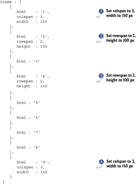
In listing 5.12, you reuse the existing Container code from listing 5.11 and replace the child items array. You set the colspan attribute for the first panel to 3 and manually set its width to fit the total known width of the table, which is 150 pixels. Remember that you have three columns
of default 50 x 50 child containers. Next, you set the rowspan of the second child item to 2 and its height to the total of two rows, which is 100 pixels. You do the same thing for panel 4 . The last change involves panel 9, which has the exact same attributes as panel 1 . The rendered change should look like figure 5.15.
Figure 5.15. When using the TableLayout, you could specify rowspan and colspan for a particular Component, which will make it occupy more than one cell in the table.

When using the TableLayout, you should remember a few things. First is to determine the total number of columns that will be used and specify it in the layoutConfig parameter. Also, if you’re going to have Components span rows and/or columns, be sure to set their dimensions accordingly; otherwise the Components laid out in the table won’t seem to be aligned correctly.
The TableLayout is extremely versatile and can be used to create any type of box-based layout that your imagination conjures up, with the main limitation being that there’s no parent-child size management.
Moving to our last stop on the Ext layout journey, we reach the ever-so-popular BorderLayout, where you can divide any container into five collapsible regions that manage their children’s size.
5.11. The BorderLayout
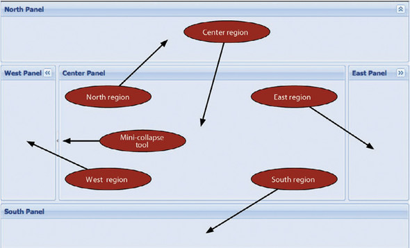
The BorderLayout made its début in 2006, back when Ext was more than a mere extension to the YUI Library and had matured into an extremely flexible and easy-to-use layout that provides full control over its subparts, or regions. These regions are aptly named by polar coordinates: North, South, East, West, and Center. Figure 5.16 illustrates a BorderLayout implementation from the Ext SDK.
Figure 5.16. The BorderLayout is what attracts many new developers to the Ext Framework and is widely used in many applications to divide the screen into task-specific functional areas.

Each region of a BorderLayout is managed by the BorderLayout.Region class, which is what provides all of the UI and programmatic controls to that specific division of the layout scheme. Depending on the configuration options provided, the region can be resized or collapsed by the user. There are also options to limit the resize of the region or prevent it from being resized altogether.
To explore the BorderLayout and the Region class, we’ll use the Viewport class because it will make it easier for us to see the final result of our exercise.
Listing 5.13. Flexing the BorderLayout


In listing 5.13, you accomplish quite a lot using the Viewport a bit in a few lines of code. You set layout to 'border' and set split to true in the default configuration object. There’s a lot going on here at once, so feel free to reference figure 5.17, which depicts what the rendered code will look like.
Figure 5.17. The BorderLayout’s versatility and ease of use make it one of the most widely used in Ext-based RIAs.
Although all regions are technically divided, the split parameter instructs the BorderLayout to render a 5-pixel high (or wide) divider between the center and the regions. This divider is used as the resize handles for the regions. In order to work this magic, the BorderLayout employs the BorderLayout.SplitRegion class, which creates an absolute-position invisible div that intercepts the click-and-drag action of the user. When the drag action occurs, a proxy div appears, which is a direct sibling of the split bar handle div, allowing users to preview exactly how wide or high they’re about to resize a region.
Next, you begin to instantiate child items, which have BorderLayout.Region-specific parameters. In order to review many of them, you’ll make each region’s behavior different from the other.
For the first child , you set the region property to 'north' to ensure that it’s at the top of the BorderLayout. You play a little game with the BoxComponent-specific parameter, height, and the region-specific parameters, minHeight and maxHeight. By specifying a height of 100, you’re instructing the region to render the Panel with an initial height of 100 pixels. The minHeight instructs the region to not allow the split bar to be dragged beyond the coordinates that would make the northern region
the minimal height of 100. The same is true for the maxHeight parameter, except it applies to expanding the region’s height. You also specify the Panel-specific parameter of collapsible as true, which instructs the region to allow it to be collapsed to a mere 30 pixels high.
Defining the South region, the viewport’s second child , you play some games to prevent it from being resized but work to keep the layout’s 5-pixel split between the regions. Setting
the split parameter to false, you instruct the region to not allow it to be resized. Doing so also instructs the region to omit the 5-pixel split bar,
which would make the layout somewhat visually incomplete. In order to achieve a façade-split bar, you specify a region-specific
margins parameter, which specifies that you want the South region to have a 5-pixel buffer between itself and anything above it.
One word of caution about this, however: although the layout now looks complete, end users may try to resize it, possibly
causing frustration on their end.
The third child is defined as the East region. This region is similarly configured to the north panel except it has sizing constraints that
are a bit more flexible. Where the northern region starts its life out at its minimum size, the eastern region starts its
life between its minWidth and maxWidth. Specifying size parameters like these allows the UI to present a region in a default or suggested size but allows the Panel to be resized beyond its original dimensions.
The West region has a special region-specific parameter, collapseMode, set to the string 'mini'. Setting this parameter that way instructs Ext to collapse a Panel to a mere 5 pixels, providing more visual space for the Center region. Figure 5.18 illustrates how small. By allowing the split parameter to stay as true (remember our defaults object) and not specifying minimum or maximum size parameters, the western region can be resized as far as the browser will
physically allow, as shown in figure 5.18.
Figure 5.18. Our BorderLayout where two of the regions, North and East, are collapsed in regular mode and the West panel is collapsed in miniature mode

The last region is the Center region, which is the only required region for the BorderLayout. Although the Center region seems a bit bare, it’s special indeed. The Center region is generally the canvas in which developers place the bulk of their RIA UI components, and its size is dependent on its sibling regions’ dimensions.
For all of its strengths, the BorderLayout has one huge disadvantage, which is that once a child in a region is defined/created, it can’t be changed. Because the BorderLayout.Region is a base class and doesn’t extend Container, it doesn’t have the power to replace a child once it’s instantiated. The fix for this is extremely simple. For each region where you wish to replace Components, specify a Container as a region. Let’s exercise this by replacing the Center region section for listing 5.13:
{
    xtype   : 'container',
    region  : 'center',
    layout  : 'fit',
    id      : 'centerRegion',
    autoEl  : {},
    items   : {
       title  : 'Center Region',
       id     : 'centerPanel',
       html   : 'I am disposable',
       frame  : true
    }
}
Remember that the Viewport can be created only once, so a refresh of the page where the example code lies is required. The refreshed Viewport should look nearly identical to figure 5.18, except the Center region now has HTML showing that it’s disposable. In the previous example, you define the Container XType with the layout of fit and an id that you can leverage with Firebug’s JavaScript console.
Recalling our prior discussion and exercises over adding and removing child Components to and from a Container, can you remember how to get a reference to a Component via its id and remove a child? If you can, excellent work! If you can’t, I’ve already worked it out for you. But be sure to review the prior sections because they’re extremely important to managing the Ext UI. Take a swipe at replacing the Center region’s child Component; see the following listing.
Listing 5.14. Replacing a Component in the Center region
var centerPanel = Ext.getCmp('centerPanel'),
var centerRegion = Ext.getCmp('centerRegion'),

centerRegion.remove(centerPanel, true);
centerRegion.add({
    xtype       : 'form',
    frame       : true,
    bodyStyle   : 'padding: 5px',
    defaultType : 'field',
    title       : 'Please enter some information',
    defaults    : {
        anchor : '-10'
    },
    items       : [
        {
            fieldLabel : 'First Name'
        },
        {
            fieldLabel : 'Last Name'
        },
        {
            xtype      : 'textarea',
            fieldLabel : 'Bio'
        }
    ]
});
centerRegion.doLayout();
Listing 5.14 leverages everything you’ve learned thus far regarding Components, Containers, and Layouts, providing you with the flexibility to replace the Center region’s child, a Panel with a FormPanel, with relative ease. You can use this pattern in any of the regions to replace items at will.
5.12. Summary
We took a lot of time to explore the many and versatile Ext layout schemes. In doing so, you learned some of the strengths, weaknesses, and pitfalls. Remember that although many layouts can do similar things, each has its place in a UI. Finding the correct layout to display Components may not be immediately apparent and will take some practice if you’re new to UI design altogether.
If you aren’t 100 percent comfortable with the material as you exit this chapter, I suggest moving forward and returning to it after some time has passed and the material has had some time to sink in.
Now that you have many of the core topics behind you, put your seatbelt on because you’re going to be in for a wild ride, where you learn more about and use Ext’s UI widgets, starting off with form Panels.