
Chapter 7. The venerable GridPanel
- Learning about the GridPanel Component
- Becoming an expert at Ext JS data Stores
- Setting up custom column renderers
- Configuring GridPanel mouse interaction event handlers
- Enabling GridPanel pagination with the PagingToolbar
- Implementing a custom context menu on the GridPanel
Since the early days of Ext JS, the GridPanel has been the centerpiece of the Ext Framework. It can display data like a table, but is much more robust. In many respects, I believe this holds true today, and the GridPanel is arguably one of its more complicated widgets, because directly depends on five directly supporting classes.
In this chapter, you’ll learn a lot about the GridPanel and the class that feeds it data, the data Store. We’ll start by constructing GridPanel that feeds from a Store that reads local in-memory array data. At each step of the process, you’ll learn more about both the data Store and the GridPanel and their supporting classes.
Once you become more familiar with the data Store and GridPanel, we’ll move on to building a remote-loading data Store that can parse JSON that will feed a paging toolbar.
7.1. Introducing GridPanel
At a first glance, the GridPanel may look like a glorified HTML table, which has been used for ages to display data. If you take a moment to look at one of the Ext JS grid examples, you’ll come to the realization that this is no ordinary HTML table. You can see one example implementation of the GridPanel that uses an array store at http://extjs.com/deploy/dev/examples/grid/array-grid.html. If you’re not online, that’s all right. I’ve included a snapshot of it in figure 7.1.
Figure 7.1. The array grid example, found in the examples folder of the downloadable SDK

In the array grid example, you can see that the features provided by this widget extend beyond those of a typical HTML table. These include column-management features such as sorting, resizing, reordering, showing, and hiding. Mouse events are also tracked, out of the box, to allow you to highlight a row by hovering over it and even select it by clicking it.
The example also demonstrates how the GridPanel’s view (known as the GridView) can be customized with what are known as custom renderers, which are applied to the Change and % Change columns. These custom renderers color the text based on negative and positive values.
This example merely skims the surface when it comes to how the GridPanel can be configured or extended. In order to fully understand the GridPanel and why it’s so extensible, you need to know more about its supporting classes.
7.1.1. Looking under the hood
The key supporting classes that drive the GridPanel are the ColumnModel, GridView, SelectionModel, and data Store. Let’s take a quick glance at an implementation of a grid panel and see how each class plays a role in making the GridPanel work (figure 7.2).
Figure 7.2. The GridPanel’s five supporting classes: data Store, GridView, ColumnModel, Column, and SelectionModel

In figure 7.2, you see a GridPanel and its five supporting classes highlighted. Starting from the beginning, the data source, you see the data Store class. Data Stores work by leveraging a reader, which is used to “map” data points from a data source and populate the data store. They can be used to read array, XML, or JSON data via the array, XML, and JSON readers. When the reader parses data, it’s organized into records, which are organized and stored inside the data Store.
This should be somewhat familiar to you, because you leveraged it when creating ComboBoxes. As you learned earlier, data Stores can get their data from either local or remote sources. Like the ComboBox, the data Store feeds a view. In this case, it’s the GridView.
The GridView class is the UI component of the GridView. It’s responsible for reading the data and controlling the painting of data onscreen. It leverages the ColumnModel to control the way the data is presented onscreen.
The ColumnModel is the UI controller for each individual column. It’s what provides the functions for columns, such as resize, sort, and so on. In order to do its job, it has to leverage one or more instances of Column.
Columns are classes that map the data fields from each individual record for placement on screen. They do this by means of a dataIndex property, which is set for each column and is responsible for displaying the data it obtains from the field it’s mapped to.
Finally, the SelectionModel is a supporting class that works with a view to allow users to select one or more items onscreen. Out of the box, Ext supports Row, Cell, and Checkbox SelectionModels.
You have a nice head start on GridPanels and their supporting classes. Before you construct your first grid, you should learn more about the data Store class, which many widgets in the framework depend on for data.
7.2. The data Store at a glance
As you learned a bit ago, the data Store is the class that provides the data for the GridPanel. The data Store feeds quite a few widgets throughout the framework wherever data is needed. To put this into plain view, figure 7.3 enumerates the classes that depend on the data Store.
Figure 7.3. The data Store and the classes it feeds data to. This illustration doesn’t depict class hierarchy.

As you can see, the data Store supports quite a few widgets, which include the DataView, ListView, ComboBox, Charts, the GridPanel, and all of its subclasses. The only exception to this pattern is the TreePanel. The reason for this is the data Store contains a list of records, whereas TreePanels require hierarchical data.
As a quick warning, this may be one of those “dry” areas that you might not think is important—but hold on one second. Remember all of those classes that the data Store feeds data to? Being proficient in this area of the framework better enables you to easily use any of those consumer widgets.
7.2.1. How data Stores work
When you got your first real exposure to the data Store, you learned how to use subclasses of the data Store, ArrayStore, and JsonStore, to read array and JSON data. These subclasses are convenience classes, or preconfigured versions of the actual data Store, which take care of things for us like attaching the correct reader for data consumption. We used these convenience methods in the earlier chapters because they make life easier for us, but there’s a lot going on under the hood that’s not immediately exposed and is important to know as well. We’ll start by looking at exactly how the data flows from a data source to the store. We’ll begin with a simple flow illustration, shown in figure 7.4.
Figure 7.4. The data flow from a data source to a data Store consumer

As you can see, the data always starts from a DataProxy. The DataProxy classes facilitate the retrieval of unformatted data objects from a multitude of sources and contain their own event model for communication for subscribed classes such as the DataReader. In the framework, there’s an abstract class aptly called DataProxy, which serves as a base class for the subclasses, which are responsible for retrieving data from specific sources, as shown in figure 7.5.
Figure 7.5. The DataProxy and its four subclasses. Each is responsible for retrieving data from a specific data source.

The most commonly used proxy is the HttpProxy, which leverages the browser’s XHR object to perform generic AJAX requests. The HttpProxy is limited, however, to the same domain because of what is known as the “same-origin policy.” This policy dictates that XHR requests via XHR can’t be performed outside of the domain from which a specific page is being loaded. This policy was meant to tighten security with XHRs but has been construed as more of an annoyance than a security measure. The Ext developers were quick to come up with a workaround for this “feature,” which is where the ScriptTagProxy (STP) comes into the picture.
The STP cleverly leverages the script tag to retrieve data from another domain and works well, but it requires that the requesting domain return JavaScript instead of generic data snippets. This is important to know because you can’t just use the STP against any third-party website to retrieve data. The STP requires the return data to be wrapped in a global method call, passing the data in as the only parameter. You’ll learn more about the STP in a bit because we’ll be using it to leverage extjsinaction.com to retrieve data from our examples.
The MemoryProxy class offers Ext the ability to load data from a memory object. Although you can load data directly to an instance of data Store via its loadData method, use of the MemoryProxy can be helpful in certain situations. One example is the task of reloading the data Store. If you use data Store.loadData, you need to pass in the reference to the data, which is to be parsed by the reader and loaded into the store. Using the MemoryProxy makes things simple, because you only need to call the data Store.reload method and let Ext take care of the dirty work.
The DirectProxy is new to Ext JS 3.0 and allows the data Store to interact with the Ext.direct remoting providers, allowing for data retrievals via remote procedure calls (RPCs). We won’t be covering usage of Direct because there’s a direct dependency on server-side language to provide the remoting methods.
Note
If you’re interested in learning more about Ext.direct, I suggest visiting http://extjs.com/products/extjs/direct.php for details on specific server-side implementations.
After a proxy fetches the raw data, a Reader then reads or parses it. A Reader is a class that takes the raw, unformatted data objects and abstracts the data points, known as dataIndexes, and arranges them into name data pairs, or generic objects. Figure 7.6 illustrates how this mapping works.
Figure 7.6. A Reader maps raw or unformatted data so that it can be inserted into Records, which then get spooled into a data Store.

As you can see, the raw and unformatted data is organized and fed into Records that the Reader then creates. These Records are then spooled into the data Store and are now ready to be consumed by a widget.
Ext provides readers for the three common data types: array, XML, and JSON. As the reader chews on Records, it creates a Record for each row of data, which is to be inserted into the data Store.
A Record is a fully Ext-managed JavaScript object. Much like Ext manages Element, the Record has getter and setter methods and a full event model for which the data Store is bound. This management of data adds usability and some cool automation to the framework.
For example, changing a value of a Record in a store that’s bound to a consumer, like the GridPanel, will result in the UI being updated when the Record is committed. You’ll learn much more about management of Records in the next chapter, when we discuss editable grids. After the Records are loaded into the data Store, the bound consumer refreshes its view and the load cycle completes.
Now that you have some fundamental knowledge of the data Store and its supporting classes, we can begin to build our first GridPanel.
7.3. Building a simple GridPanel
When implementing GridPanels, I typically start by configuring the data Store. The reason for this is that the configuration of the ColumnModel is directly related to the configuration of the data Store. This is where you’ll start too.
7.3.1. Setting up an ArrayStore
In the example shown in listing 7.1, we’ll create a complete end-to-end data Store that reads data already present in memory. This means that we’re going to instantiate instances of all of the supporting classes from the Proxy to the Store. This exercise will help you see the working parts being configured and instantiated. Afterwards, you’ll learn how to use some of the preconfigured Data Store convenience classes to make constructing certain types of stores easier with much less code.
Listing 7.1. Creating a data Store that loads local array data

In listing 7.1, you implement the full gamut of data Store configuration. You start by creating an array of arrays, which is referenced by the variable arrayData  . Please pay close attention to the format the array data is in, because this is the expected format for the ArrayReader class. The reason the data is an array of arrays is that each child array contained within the parent array is treated as
a singular Record.
. Please pay close attention to the format the array data is in, because this is the expected format for the ArrayReader class. The reason the data is an array of arrays is that each child array contained within the parent array is treated as
a singular Record.
Next, you create an instance of data.MemoryProxy, which is what will load your unformatted data from memory and is referenced by the variable memoryProxy  . You pass in the reference arrayData as the only argument.
You create an instance of data.Record  and reference it in the variable nameRecord, which will be used as the template to map your array data points to create records. You pass an array of object literals,
which are known as fields
and reference it in the variable nameRecord, which will be used as the template to map your array data points to create records. You pass an array of object literals,
which are known as fields  , to the Record.create method, and detail each field name and its mapping. Each of these object literals is a configuration object for the Ext.data.Field class, which is the smallest unit of managed data within a Record. In this case, you map the field personName to the first data point in each array record and the state field to the second data point.
Note
Notice that we’re not calling new Ext.data.Record(). This is because data.Record is a special class that’s able to create constructors by using its create method, which returns a new record constructor. Understanding how data.Record.create works is essential to performing additions to a data Store.
You then create an instance of ArrayReader  , which is what’s responsible for sorting out the data retrieved by the proxy and creating new instances of the record constructor
you just created. The ArrayReader reads each Record and creates a new instance of nameRecord, passing the parsed data to it, which is then loaded into the store.
, which is what’s responsible for sorting out the data retrieved by the proxy and creating new instances of the record constructor
you just created. The ArrayReader reads each Record and creates a new instance of nameRecord, passing the parsed data to it, which is then loaded into the store.
Last, you create your data Store, for which you pass the reader and proxy you created, which completes the creation of your ArrayStore. This completes our end-to-end example of how to create a store that reads array data. With this pattern, you can change the type of data the store is able to load. To do this, you swap out the ArrayReader with either a JsonReader or an XmlReader. Likewise, if you wanted to change the data source, you could swap out the MemoryProxy for another such as the HttpProxy, ScriptTagProxy, or DirectProxy.
Recall that I mentioned something a bit earlier about convenience classes to make our lives a little easier. If you were to re-create the Store using the ArrayStore convenience class, this is what your code would look like using the previous arrayData:
var store = new Ext.data.ArrayStore({
  data : arrayData,
  fields : ['personName', 'state']
});
As you can see in this example, you use shortcut notation for the fields to create an instance of Ext.data.ArrayStore. You achieve this by passing a reference of the data, which is your arrayData and a list of fields, which provide the mapping. Notice how the fields property is a simple list of strings? This is a completely valid configuration of field mappings because Ext is smart enough to create the name and index mapping based on the string values passed in this manner. You could have a mixture of objects and strings in a fields configuration array. For instance, the following configuration is completely valid:
fields : [ 'fullName', { name : 'state', mapping : 2} ]
Having this flexibility is something that can be really cool to leverage. Just know that having a mixture of field configurations like this can make the code a bit hard to read.
Using this convenience class saved you from having to create a proxy, record template, and reader to configure the store. Use of the JsonStore and XmlStore is equally as simple, which you’ll learn more about later. Moving forward, we’ll be using the convenience classes to save us time.
For now, we’ll move on to creating the ColumnModel, which defines the vertical slices of data that our GridPanel will display along with our GridView component.
7.3.2. Completing our first GridPanel
As we discussed before, the ColumnModel has a direct dependency on the data Store’s configuration. This dependency has to do with a direct relationship between the data field records and the column. Just as the data fields map to a specific data point in the raw inbound data, columns map to the record field names.
To finish your GridPanel construction, you need to create a ColumnModel, GridView, and SelectionModel, and then you can configure the GridPanel itself, as shown in the following listing.
Listing 7.2. Creating an ArrayStore and binding it to a GridPanel

In listing 7.2, you configure all of the supporting classes before constructing the GridPanel itself. The first thing you do is create a reference for a newly instantiated instance of a ColumnModel , for which you pass in an array of configuration objects. Each of these configuration objects is used to instantiate instances
of Ext.grid.Column (or any subclasses thereof), which is the smallest managed unit of the ColumnModel. These configuration objects detail the text that’s to be populated in the column header and which Record field the column maps to, which is specified by the dataIndex property. This is where you see the direct dependency on the configuration of the Store’s fields and the ColumnModel’s columns. Also, notice that you set sortable to true for the Full Name column and not the State column. This will enable sorting on that one column.
You then create an instance of Ext.grid.GridView , which is responsible for managing each individual row for the grid. It binds key event listeners to the data Store, which it requires to do its job. For instance, when the data Store performs a load, it fires the datachanged event. The GridView listens for that event and will perform a full refresh. Likewise, when a record is updated, the data Store fires an update event, for which the GridView will only update a single row. You’ll see the update event in action in the next chapter, when you learn how to leverage the EditableGrid.
Next, you create an instance of Ext.grid.RowSelectionModel and pass a configuration object that instructs the selection model to allow only single selection of rows to occur. There
are two things to know in this step. The first is that by default the GridPanel always instantiates an instance of RowSelectionModel and uses it as the default selection model if you don’t specify one. But you did create one because by default the RowSelectionModel allows for multiple selections. You can elect to use the CellSelectionModel in place of the RowSelectionModel. The CellSelectionModel doesn’t allow for multiple selections of items, however.
After you instantiate your selection model, you move on to configure your GridPanel . GridPanel extends Panel, so all of the Panel-specific configuration items apply. The only difference is you never pass a layout to the GridPanel because it will get ignored. After you set the Panel-specific properties, you set your GridPanel-specific properties. This includes configuring the references for the data Store, ColumnModel, GridView, and Selection Model  . Loading the page will generate a grid panel that looks like the one in figure 7.7.
Figure 7.7. Our first grid rendered onscreen demonstrating the singleselect configured RowSelectionModel and the sortable Full Name Column

You can see that the data isn’t in the order specified. This is because before I took the snapshot, I clicked the Full Name column, which invoked the click handler for that column. The click handler checks to see if this column is sortable (which it is) and invokes a data Store sort method call, passing in the data field (dataIndex), which is fullName. The sort method call then sorts all of the records in the store based on the field that was just passed. It first sorts in ascending order, then toggles to descending. A click on the State column would result in no sorting because we didn’t specify sort : true as we did for the Full Name column.
The ColumnModel has other features that you can use. You can drag and drop the columns to reorder them, resize them by dragging the resize handle, or click the column menu icon, which appears whenever the mouse hovers over a particular column.
To use the SelectionModel, select a row by clicking it. Once you’ve done that, you can use the keyboard to navigate rows by pressing the up- and down-arrow keys. To exercise the multiselect RowSelectionModel, you can modify the SelectionModel by removing the singleSelect: true property, which defaults to false. Reloading the page will allow you to select many items by using typical operating system multiselect gestures such as Shift-click or Ctrl-click.
Creating our first grid was a cinch, wasn’t it? Obviously, there’s much more to GridPanels than displaying data and sorting it. Features like pagination and setting up event handlers for gestures like right mouse clicks are used frequently. These advanced usages are exactly where we’re heading next.
7.4. Advanced GridPanel construction
In the previous section, we built a GridPanel that used static in-memory data. We instantiated every instance of the supporting classes, which helped us get some exposure to them. Like many of the Components in the framework, the GridPanel and its supporting classes have alternate configuration patterns. In building our advanced GridPanel, we’ll explore some of these alternate patterns in a couple of the supporting classes.
7.4.1. What we’re building
The GridPanel we’ll construct will leverage some advanced concepts, the first of which is using a remote data Store to query against a large data set of randomly generated data, giving us the opportunity to use a PagingToolbar. You’ll learn how to construct custom renders for two of these columns. One of these will apply color to the ID column, and the other will be more advanced, concatenating the address data into one column. After we build this GridPanel, we’re going to circle around and set up a rowdblclick handler. You’ll be introduced to context menus as you learn to use the GridPanel’s rowcontextmenu event. Put on your propeller hat if you have one; we’ll be spending the rest of this chapter on this task and will be covering a lot of material.
7.4.2. Creating the store using shortcuts
When creating your store in listing 7.3, you’ll learn some of the common shortcuts, which will save you time. If you need to customize the configuration beyond what’s covered here, you can mix and match shortcuts with longhand versions of the configuration.
Listing 7.3. Creating an ArrayStore

In this code, you’re configuring a remote JsonStore using some shortcuts. The first thing you do is create a reference, recordFields , which is an array of field configuration objects. In this array, you’re mapping a lot of data fields, some of which you’ll
specify in the column model.
If the field labels map the data point labels, and you want to further simplify the mappings, you could specify an array of string values:
var recordFields = [
    'id','firstname','lastname','street','city','state','zip','country'
];
You could also specify a mixture of objects and strings for the list of fields. When I build applications, I always configure objects instead of strings because I like to think of the code as self-documenting. Also, if the data point on the backend needs to change, all you need to modify is the mapping attribute compared to having to modify the mapping and column model if you were to use just strings.
You then move on to configure your JsonStore , which will fetch data remotely. When configuring this Store, you set the fields property to the reference of the recordFields array you just created. Ext uses this fields configuration array to automatically create the data.Record that it will use to fill the store.
Next you pass a url property, which is one of the shortcuts we’re using. Because you pass this property, the Store class will use it to instantiate a Proxy to fetch data. Also, because this is a remote URL, an instance of ScriptTagProxy will be used. Remember that the ScriptTagProxy requires that the data get passed as the first parameter to the callback method that it automatically produces. Figure 7.8 illustrates the format in which the server must respond.
Figure 7.8. The format in which a remote server must respond

In this figure, you see that the server returns a method call to stcCallback1001. The callback method name the server responds with is passed to the server in the request via a callback property during each request. The number will increment for each STP request.
The totalCount property is an optional value, which specifies how many records are available for viewing. In configuring your remote JsonStore, you specified the totalProperty configuration property as totalCount. This property will be leveraged by the PagingToolbar to calculate how many pages of data are available.
The most important property is the data root, which is the property that contains our array of data. You specified the root configuration property as records in the remote JsonStore configuration.
You then instruct the store not to automatically fetch the data from the data source. You’ll need to specially craft the first request so you don’t fetch all of the records in the database for the query that you’re performing.
You also set a static id, ourRemoteStore, for the Store, which you’ll use later to get a reference of the Store from the Ext.StoreMgr, which is to data Stores what the ComponentMgr is to Components. Each instance of Data Store can have a unique ID assigned to it or will assign one to itself and is registered to the StoreMgr singleton upon instantiation. Likewise, deregistration of the store occurs when a store is destroyed.
Note
We could configure the JsonStore using the XType jsonstore, but because we’re binding it to the GridPanel and the PagingToolbar, we must use an instance of Ext.data.Store.
Last, you enable remote sorting by specifying remoteSort as the Boolean value of true. Because you’re paging, sorting locally would cause your UI to behave abnormally because the data sorting and page count would mismatch.
Now that we have that out of the way, we can move on to configure our advanced ColumnModel.
7.4.3. Building a ColumnModel with custom renderers
The ColumnModel we constructed for our first GridPanel was pretty boring. All it did was map the column to the record data field. This new ColumnModel, however, will leverage two custom renderers, shown in the following listing, one of which will allow us to make use of the Address data fields to build composite and stylized cells.
Listing 7.4. Creating two custom renderers
var colorTextBlue = function(id) {
    return '<span style="color: #0000FF;">' + id + '</span>';
 };

 var stylizeAddress = function(street, column, record) {
    var city  = record.get('city'),
    var state = record.get('state'),
    var zip   = record.get('zip'),

    return String.format('{0}<br>{1} {2}, {3}', street, city, state, zip );
 };
In listing 7.4, you construct two custom renderers (methods) that will be used by two different columns. The first method, colorTextBlue, returns a concatenated string that consists of a span tag that wraps the id argument being passed to it. The span tag has a CSS-style property that will result in blue text.
The second custom renderer, stylizeAddress, is a much more complex method that will create a composite view of all of the address data available to us minus the country. All custom renderers are called with six arguments. You’re using the first and third in this case. The first is the field value that the column is bound to. The second is the column metadata, which you’re not using. The third is a reference to the actual data Record, which you’ll use heavily.
In this method, you create references to the city and state values of the record by using its get method, passing in the field for which you want to retrieve data. This gives you all the references you need to construct your composite data value.
The last thing you do in this method is return the result of the String.format method call, which is one of the lesser-known power tools that Ext offers. The first argument is a string that contains integers wrapped in curly braces, which get filled in by the subsequent values passed to the method. Using this method is a nice alternative to the string concatenation you performed previously.
Excellent. Your custom renderers are set and you can now proceed to construct your column configuration. This next listing is rather long because you’re configuring five columns, which requires quite a few configuration parameters. Please stick with me on this. Once you start to see the pattern, reading through this will be rather easy.
Listing 7.5. Configuring our advanced ColumnModel


Configuring this ColumnModel is much like configuring the ColumnModel for our previous grid. The biggest difference is that instead of instantiating an instance of Ext.grid.ColumnModel, you’re using the shortcut method by creating an array of objects, which will be translated to a list of Ext.grid.Columns. But you do some things differently. For instance, the ID column is hidden and bound to the colorTextBlue custom renderer.
You also set both the hideable property for the Last Name and First Name columns to false, which will prevent them from being hidden via the Columns menu. You’ll get a chance to see this in action after you render the GridPanel.
The Address column is a bit special because you disable sorting. This is because you’re binding the column to the street field
but are using the stylizeAddress custom renderer to provide cells based on a composite of other fields in the record, such as city, state, and zip. You do, however, enable sorting on each individual column. This column also has an id property set to addressCol and no width property. It’s configured this way because you’re going to configure the GridPanel to automatically expand this column so that it takes all of the available width after all of the statically sized columns are rendered.
Now that you’ve constructed the array of Column configuration objects, we can move on to piece together our paging GridPanel.
7.4.4. Configuring our advanced GridPanel
You now have just about all of the pieces required to configure our paging GridPanel. In order to do this, however, you’ll need to first configure the paging toolbar, which will be used as the bottom toolbar, or bbar, in the GridPanel, as shown in the following listing.
Listing 7.6. Configuring our advanced GridPanel
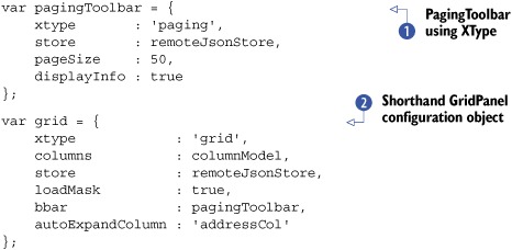
In listing 7.6, you use the XType as a shortcut to configure both the PagingToolbar and the GridPanel.
For the PagingToolbar configuration , you bind the remote JsonStore you configured earlier and set the pageSize property to 50. This will enable the PagingToolbar to bind to the data Store, allowing it to control requests. The pageSize property will be sent to the remote server as the limit property and will ensure that the data Store receives bundles of 50 (or fewer) records per request. The PagingToolbar will leverage this limit property along with the server’s returning totalCount property to calculate how many “pages” there are for the dataset. The last configuration property, displayInfo, instructs the PagingToolbar to display a small block of text, which displays the current page position and how many records (remember totalCount) are available to be flipped through. I’ll point this out when we render the GridPanel.
You then configure a GridPanel XType configuration object . In this configuration, you bind the earlier created configuration variables columnModel, remoteJsonStore, and pagingToolbar. Because you set the columns property, Ext will automatically generate an instance of Ext.grid.ColumnModel based on the array of configuration objects in the columnModel variable.
You set the loadMask property to true, which will instruct the GridPanel to create an instance of Ext.LoadMask and bind it to the bwrap (body wrap) element, which is the tag that ultimately wraps or contains all of the elements below the titlebar of a Panel. These elements include the top toolbar, content body, bottom toolbar, and fbar, which is the bottom button footer bar. The LoadMask class binds to various events that the Store publishes to show and hide itself based on the situation the Store is in. For instance, when the Store initiates a request, it will mask the bwrap element, and when the request completes, it will unmask that element.
You then set the bbar property to our pagingToolbar XType configuration object, which will render an instance of the PagingToolbar widget with that configuration data as the bottom toolbar in the GridPanel.
Last, you set the autoExpandColumn property to the string of 'addressCol', which is the ID of your Address column, ensuring that this column will be dynamically resized based on all of the available viewport width minus the other fixed-width columns.
Our GridPanel is now configured and ready to be placed in a Container and rendered. We could render this GridPanel to the document body element, but I’d like to place it as a child of an instance of Ext.Window; this way we can easily resize the GridPanel and see how features like the automatic sizing of the Address column work.
7.4.5. Configuring a Container for our GridPanel
We’ll now move on to create the Container for our advanced GridPanel, as shown in the following listing. Once we render the Container, we’ll initiate the first query for the remote data Store we created just a while ago.
Listing 7.7. Placing our GridPanel inside a Window

In listing 7.7, you perform two tasks. The first is the creation of Ext.Window , which uses the FitLayout and has our GridPanel as its only item. Instead of creating a reference to the instance of Ext.Window and then calling the reference.show method, you use chaining to call the show method directly from the result of the constructor call.
Then you use the Ext.StoreMgr.get method , passing it our remote Store ID string, and again use chaining to call the result’s load method. You pass an object, which contains a params property, which itself is an object specifying start and limit properties.
The start property is instructed by the server as to which Record or row number to begin the query. It will then read the start plus the limit to return a “page” of data. You have to call this load method because the PagingToolbar doesn’t initiate the first Store load request on its own. You have to nudge it a little to get it started.
Your rendered GridPanel should look like the one in figure 7.9. As you can see from the fruits of our labor, our GridPanel’s Address column displays a composite of the address fields in one neat column that’s dynamically sized and can’t be sorted, whereas all of the other columns start life with a fixed size and can be sorted.
Figure 7.9. The results of our advanced paging GridPanel implementation.

A quick look at the communication from the first request via Firebug will show us the parameters sent to the server. Figure 7.10 illustrates those parameters. We covered the callback, limit, and start parameters a short while ago when we discussed the paging toolbar. What you see new here are the _dc and xaction parameters.
Figure 7.10. A list of parameters sent to the remote server to request paged data

The _dc parameter is what’s known as a cache buster parameter that’s unique for every request and contains the timestamp for which the request was made in the UNIX epoch format, which is the number of seconds since the beginning of computer time, or 12 A.M. on January 1, 1970. Because the value for each request is unique, the request bypasses proxies and prevents them from intercepting the request and returning cached data.
The xaction parameter is used by Ext.direct to instruct the controller as to which action to execute, which in this case happens to be the load action. The xaction parameter is sent with every request generated by stores and can safely be ignored if needed.
I’m not sure if you’ve detected this already, but we haven’t seen our ID column in action. This is because we configured it as a hidden column. In order to enable it, we can leverage the Columns menu and check the ID column, as shown in figure 7.11.
Figure 7.11. Enabling the ID column via the Columns menu

After checking the ID column in the Columns menu, you’ll see it appear in the GridView. In this menu, you can also specify the direction in which a column is to be sorted. One thing you may notice right away by looking at the Columns menu is that the menu options for the First Name and Last Name columns are missing. This is because we set the hideable flag to false, which prevents their respective menu options from being rendered. The Columns menu is also a great way to sort a column directly by the order that you desire.
Cool; we have our GridPanel constructed. We can now configure some event handlers for the GridPanel that will allow us to interact more with it.
7.4.6. Applying event handlers for interaction
In order to create row-based user interaction, you need to bind event handlers to events that are published by the GridPanel. Here, you’ll learn how to leverage the rowdblclick event to pop up a dialog box when a double-click is detected on a row. Likewise, you’ll listen for a contextmenu (right-click) event to create and show a single-item context menu using the mouse coordinates.
You’ll begin by creating a method to format a message for the Ext alert message box and then move on to create the specific event handlers, as shown in the following listing. You can insert this code anywhere before your GridPanel configuration.
Listing 7.8. Creating event handlers for our data grid

In listing 7.8, you create three methods. The first of these, doMsgBoxAlert , is a utility method that accepts thisGrid as its only argument, which is a pointer to the GridPanel generating the event. It leverages the RowSelectionModel getSelected method to obtain a reference to the selected record and record.get method to extract the first and last name fields and uses them to display an Ext alert message box that contains a message
with those two properties.
Next, you create the first handler, doRowDblClick , which is configured to accept two of the parameters that the event publishes, the reference to the GridPanel firing the event. All this method does is execute the doMsgBoxAlert method that we discussed previously.
Most desktop applications select an item when the user right-clicks it. Because Ext JS doesn’t provide this functionality natively, you can force the selection of the item that the user is right-clicking. This will give your application more of a desktop feel.
The last method, doRowCtxMenu , is much more complicated and accepts three parameters. The first is the reference to the grid, thisGrid, and the second is the index of the row, rowIndex, for which the event occurred. The third parameter is an instance of Ext.EventObject. Knowing this is important because on some browsers such as Firefox for OS X you need to prevent the browser’s own context
menu from displaying. This is why it calls evtObj.stopEvent as the first task. Calling stopEvent stops the native browser context menu from showing.
Next, this handler uses the rowIndex parameter to force the selection of the row for which the event was generated by calling the RowSelectionModel’s selectRow method, passing in the rowIndex parameter.
You then select the record based on the rowIndex argument. Doing so will provide the necessary feedback to the user. You then test to see whether thisGrid has a rowCtxMenu property, which on the first execution of this method will be true and the interpreter will dive into this branch of code. You do this because you want to create the menu once if it doesn’t exist. Without this fork in the logic, you’d be creating menus every time the context menu is called, which would be wasteful.
You then assign the rowCtxMenu property to thisGrid as the result of a new instance of Ext.menu.Menu, which has one item, written in typical XType shorthand. The first property of the menu item is the text that will be displayed when the menu item is shown. The other
is a handler method that’s defined inline and causes doMsgBoxAlert to be called with the referenced record.
The last bit of code calls upon the newly created rowCtxMenu’s showAt method, which requires the X and Y coordinates to display the menu. You do this by directly passing the results of the evtObj.getXY() to the showAt method. The EventObject.getXY will return the exact coordinates where the event was generated.
Your event handlers are now armed and ready to be called upon. Before you can use them in the grid, you need to configure them as listeners, as shown in the following listing.
Listing 7.9. Attaching your event handlers to your grid
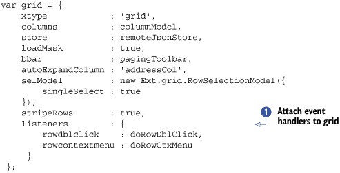
To configure the event handlers to the grid, you add a listeners configuration object, with the event to handle mapping. Because your event handlers can handle only one selected record,
you have to enforce single selection. To do this, you add a RowSelectionModel with the singleSelect option set to true.
Refresh the page and generate some double-click and right-click gestures on the grid. What happens? See figure 7.12.
Figure 7.12. The results of adding the context menu handler to our advanced grid

Now double-clicking any record will cause the Ext alert message box to appear. Likewise, right-clicking a row will cause your custom context menu to appear. If you click the View Record menu item, the Ext alert box will then appear.
Adding user interaction to a grid can be as simple as that. One key to effective development of UI interactions is not to instantiate and render widgets only once and when needed, as you did with the context menu. Although this technique works to prevent duplicate items, it falls short of cleanup. Remember the destruction portion of the Component lifecycle? You can attach a quick method to destroy the context menu when the grid panel is destroyed by adding a destroy handler method to the list of listeners:
listeners        : {
   rowdblclick    : doRowDblClick,
   rowcontextmenu : doRowCtxMenu,
   destroy        : function(thisGrid) {
       if (thisGrid.rowCtxMenu) {
           thisGrid.rowCtxMenu.destroy();
       }
   }
}
In this code snippet, you add the destroy event handler inline instead of creating a separate referenced method for it. The destroy event always passes the Component that’s publishing the event, which is labeled thisGrid. In that method, you test for the existence of the rowCtxMenu variable. If this item exists, you call its destroy method.
Context menu cleanup is one of those topics that developers often miss and can lead to lots of leftover DOM node garbage, which chews up memory and can contribute to application performance degradation over time. If you’re attaching context menus to any Component, always be sure to register a destroy event handler for that Component that destroys any existing context menus.
7.5. Summary
In this chapter, you learned quite a bit about the GridPanel and the data Store classes. You started by constructing a local data-feeding GridPanel and learned about the supporting classes for both the data Store and GridPanel.
While building your first GridPanel, you got to see how the data Store uses proxies to read data, uses a reader to parse it, and spools up Records, which are Ext-managed data objects. You also learned how the GridView knows when to render data from the Store by listening to events.
When you constructed your remote-loading GridPanel, you learned about some of the shortcuts that can be used to configure the GridPanel and many of its supporting classes. You learned more about the ColumnModel and how it can have hidden columns or columns that can’t be hidden. While doing this, you configured the JSON-reading data Store that allows for remote sorting as well.
Last, you added grid interactions to the GridPanel, where mouse double-click and right-click gestures were captured and the UI responded. In doing this, you got a quick glance at menus and learned the importance of cleaning up menu items after their parent Component is destroyed.
Many of the concepts that you learned in this chapter will carry forward when you learn how to use the EditorGridPanel and its subclass, the PropertyGrid.