
Chapter 10. Charts
- Learning the basics of Ext JS Charts
- Deconstructing the Chart class hierarchy
- Exploring the various Charts available in the framework
- Implementing each of the Charts
- Mixing a Chart series into a hybrid Chart
- Customizing the look and feel of your hybrid Chart
Many of the applications that I’ve developed in the past have required data visualization. Whether it was the amount of space used for a particular disk volume or the value of a stock over time, the problems were exactly the same and ultimately amounted to a couple of major factors: which charting package will be used, and how much is it going to cost to integrate and ultimately manage?
All of this introduces risk to the application and adds support costs, which dissatisfies customers. Thankfully, this is all now behind us. Ext JS 3.0 provides a charting package that handles the four most commonly used charts—line, bar, column, and pie—thus mitigating the risk of using and supporting a third-party charting package and reducing support costs.
In this chapter, you’ll learn all about Ext.Charts. We’ll begin by exploring the anatomy of charts and discussing the various classes that compose the chart package. We’ll also visually explore the different types of charts available to you.
Next, we’ll take an exploratory approach when talking about the different charts in the framework. You’ll begin by creating a basic LineChart and learn how to customize the colors used, create a custom ToolTip renderer method, and display legends.
Because the LineChart, ColumnChart, and BarChart are based on the same basic chart, you’ll use your newly found knowledge to convert the LineChart to a ColumnChart and a BarChart by literally flipping the x- and y-axis configurations. You’ll also learn how to create hybrid charts, such as ColumnCharts with embedded LineSeries.
In the final section, you’ll learn all about the PieChart and how it differs from the three other basic charts. You’ll also learn how to add context to the PieChart ToolTip by means of a custom tip-renderer function, making it much more useful.
10.1. Defining the four charts
Charts provide the ability to visualize statistical data in a graphic format. There are four basic types of charts: line, bar, column, and pie. LineChart, BarChart, and ColumnChart are similar because they’re based on the same Cartesian-style chart, where points of data are plotted in a two-dimensional X-Y coordinate plane system.
This is why you can mix the Bar and LineSeries in the same chart. Likewise, you can mix the LineSeries with the ColumnSeries in a Chart. But Column and BarSeries can’t exist in the same Chart.
The PieChart is kind of a black sheep of the chart classes. Because it isn’t based on the CartesianChart system, it can only leverage the PieSeries and is designed to display data representing percentages.
What makes using charts in the framework so cool is that you need not have any Flash experience to get this stuff to work for you. As you’ll see, everything will be done via JavaScript.
Let’s look at a line chart in action and analyze it; see figure 10.1.
Figure 10.1. An example LineChart with a custom tip

Extcharts are based on the YUI Charts library and are wired to consume data from a data Store, much like the GridPanel and DataView classes. Because Charts follow the same pattern as every other data Store consumer class, providing data for this widget requires no additional knowledge. This binding also provides the benefit of automatic Chart updates when data in the Store changes, which could be displayed with or without animation.
Users have the ability to interact with Charts with the mouse by means of mouseover and click gestures. A mouseover gesture can provide useful information by means of a ToolTip, which can be customized, as shown in figure 10.1.
The click gesture can provide powerful user interaction with your Charts, allowing users to click a point in the LineSeries, a bar in the BarSeries, a column in the ColumnSeries, or a slice in the PieSeries to make stuff happen in the UI, such as drilling down into that data point for a more fine-grained view of the data. This works by means of the Chart’s itemclick event, which we’ll explore and use when we start to build our first Charts.
Next, we’ll look under the hood and peek at the Components that make Charts work.
10.2. Charts deconstructed
Like everything else UI, Charts can be rendered to any div on the page or configured as a child item of any parent Container widget. This is because the Chart classes are descendants of the BoxComponent class, which, if you recall, gives any Component the ability to take part in a layout.
Figure 10.2 shows a hierarchy diagram for the Chart classes.
Figure 10.2. The Chart class hierarchy

Charts are Adobe Flash–based and require special handling when compared to generic HTML objects. For instance, if Flash is to be displayed on a page, logic needs to be in place to detect whether the browser has Flash and, if so, whether it’s the correct version. If Flash isn’t installed or if the version is less than what’s required, a link to install Flash is rendered in the area where the Flash content is to be; otherwise, the Flash widget is rendered onscreen and all is well. Managing this type of logic, in addition to the cross-browser markup differences, can be quite a hassle on your own.
Luckily, the FlashComponent takes care of this for us and serves as the base class for the Charts. The FlashComponent is a special class because it leverages the SWFObject to handle just about all Flash-specific issues and can be extended to allow Ext JS to manage any Flash-based content. It’s for this reason that the Chart class subclasses FlashComponent.
Focusing on the Chart class, which exists in the Ext.charts namespace, you can see that it has two descendants, PieChart and Car tesianChart. The Chart class is what wraps the YUI Charts and is what binds the data Store and mouse gesture events to the framework. It’s the most heavyweight class in the entire hierarchy. Most of the work is done in the YUI Chart’s compiled SWF, which is beyond the scope of this book.
Looking at the descendants of CartesianChart, you can see three major categories of charts: LineChart, BarChart, and ColumnChart. This is important to know when deciding how to implement them, because they’re the three main Cartesian chart options available.
The LineChart is used to plot dots of intersecting data on the X-Y plane, and a line is drawn connecting those dots. Figure 10.3 illustrates a LineChart implementation that contains two LineSeries.
Figure 10.3. The LineChart with two LineSeries

The BarChart displays horizontal bars of data. Multiple BarSeries can be added to the chart, where each category of data will be flush against another, as illustrated in figure 10.4.
Figure 10.4. BarChart (left) and StackedBarChart (right) examples

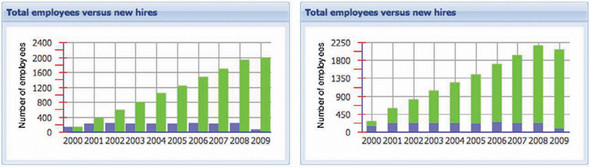
Sometimes data to be displayed is cumulative. For instance, the total number of employees for a given year can be calculated as the sum of the previously hired and newly hired for a given year. This data must be displayed in a single horizontal line but segmented with the StackedBarChart, as shown in figure 10.4 (right). The data used for both of these charts is exactly the same.
The ColumnChart is used to plot the chart data in vertical bars. The columns can be stacked via the StackedColumnChart. Just like in figure 10.4, the data for figure 10.5 is the same in both charts.
Figure 10.5. The ColumnChart (left) and StackedColumnChart (right)
In contrast to the Cartesian-style charts, the PieChart is used only to display percentages of data. Figure 10.6 is an illustration of a PieChart in action.
Figure 10.6. A PieChart
Just as with the LineChart, ColumnChart, and BarChart, the Series for the PieChart (slices) can display a ToolTip when a mouseover gesture occurs. The Series can also be clicked, which will generate the useful itemclick event.
You now have a high-level understanding of which Charts are available and how they work, which means that we can begin the code exploration of the different Charts. We’ll kick it off with the construction of a LineChart, where you’ll learn the basics of Chart creation.
10.3. Building a LineChart
Our first chart will be a single-series LineChart that plots the total number of employees for a company for the years 2000–2009. Remember that this type of Chart is based on X and Y coordinates, which means that we’ll have to configure the Chart to utilize a data Store–mapped data field for each Axis.
But before we begin writing the code for this Chart, let’s look at the data the Chart will consume. Relatively speaking, this is an easy task, because we’re dealing with only two data points: year and total employees for each year.
The server side has been crafted for us, and the JSON will look like this:
[
   {
      "newHires"  : 135,
      "year"      : 2000,
      "total"     : 136,
      "prevHired" : 1
   },
   ...
]
The JSON contains an array of objects representing records in the database. We can see the year and total attributes for each record. This means that we need to craft a JsonStore that will map these two fields. There are two other attributes per record that report the number of new hires (newHires) and previously hired (prevHired) employees, which we’ll ignore for the time being.
Before we move on to construct our first chart, we need to configure the location of the charts.swf file, which defaults to the Yahoo! URL: http://yui.yahooapis.com/2.7.0/build/charts/assets/charts.swf.
Although leaving the default location of this URL is generally okay, many would prefer not to depend on the availability of Yahoo! to host the SWF content. Not to mention that if the application you’re developing is going to be riding on HTTPS, this URL would most likely cause the browser to display a security warning, which can send the false message that your application is less secure.
Also, if your application is within a secured intranet, the client’s browser may not have access to outside web servers, thus rendering Charts completely unusable. Configuring charts to require the SWF file from the local intranet server will help mitigate this issue.
To configure Ext JS to use a particular SWF for Charts, set the CHART_URL property on the Chart class as follows:
Ext.chart.Chart.CHART_URL = '<path to extjs>/resources/charts.swf';
You want to place this line of code just after the Ext JS base libraries. This will ensure that the property is set before your code begins to get parsed by the JavaScript interpreter. This is similar to setting the BLANK_IMAGE_URL ('s.gif') configuration property earlier in this book.
With that out of the way, you can move on to create the LineChart that will plot this data onscreen, as follows.
Listing 10.1. Constructing a basic LineChart

In listing 10.1, you create the data Store that maps the year and total fields that are provided by the server-side code and the line chart that lives in a Window. As you can see, creating a basic Chart is extremely simple to do. Here’s how it works.
When creating the LineChart XType configuration object  , you set the mandatory XType property and required JSON data Store. The next two properties, xField and yField
  , are used to automatically create the x-axis and y-axis and map the data from the Store. That’s pretty much it.
To display the Chart, you create a Window with the FitLayout, which hosts the LineChart. Figure 10.7 shows what our first LineChart looks like.
Figure 10.7. Our first LineChart

As illustrated in figure 10.7, our LineChart renders inside an Ext.Window plotting the statistical data. If you hover your mouse cursor over one of the points in the line, you’ll see the two values for the point in a tip. But this presents a problem.
For this Chart, the data in the tip provides no context to the figures being presented, thus providing little value. Likewise, the x-axis and y-axis have the same dilemma. It’s obvious that the number on the x-axis represents years. But you can’t tell what the y-axis represents. This is precisely a situation where you’d want to customize the Chart.
10.3.1. Customizing the ToolTip
The first problem we’ll tackle is providing context for the ToolTip. To do this, you’ll have to add a tipRenderer to your LineChart configuration object, as follows:
tipRenderer : function(chart, record, index, series){
    var yearInfo = 'Year: ' + record.data.year;
    var empInfo  = 'Num. employees: ' + record.data.total;

    return yearInfo + '
' + empInfo ;
}
In this tipRenderer method, you create two strings, yearInfo and empInfo, which insert a meaningful label in front of the data. The method returns a concatenation of the yearInfo and empInfo with a newline character, , to introduce a line break between the two data fields. Why a newline character and not a standard <br />, you ask?
The tipRenderer function works similarly to the column renderer of the GridPanel, where the method is expected to return a string to be displayed onscreen; however, although the column renderer allows HTML, the tipRenderer doesn’t. This is because the ToolTip is rendered inside Flash and doesn’t support HTML. In order to introduce a line break between lines of data, the only way to do so is by means of the standard UNIX-style newline string ( ).
Figure 10.8 shows what the new ToolTip will render.
Figure 10.8. Our LineChart with our custom ToolTip

With the addition of the custom tipRenderer, mouseover events now provide context to the tips. Next, we’ll work on customizing the x- and y-axes to add labels.
10.3.2. Adding titles to the x- and y-axes
To add labels to a Cartesian Chart, you must manually configure and create an axis. But you must use the correct axis for the type of data you’re displaying. There are three possible axes to use: CategoryAxis, NumericAxis, and TimeAxis. Based on the LineChart we’ve created thus far, which axis would you choose for each x- and y-axis?
The values for each axis are numeric. The obvious choice is NumericAxis for both—right? Wrong. Here’s why.
If you take a good look at how the CartesianCharts process data, you can tell that the Charts display two types of values: measurements and something that’s being measured. The thing that’s being measured in each Chart is known as the category.
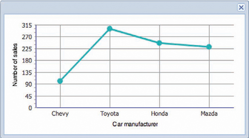
Applying this to the LineChart, you can see that the measurement for our chart is the number of employees and the category is the year. The same logic can be applied to a Chart that measures how many sales car manufacturers have made, as shown in figure 10.9.
Figure 10.9. Categories of data are clearly defined in this car sales LineChart.
With this knowledge, you can see that the CategoryAxis is logically the only choice for the x-axis. This means you’ll have to reconfigure the Chart to utilize new x- and y-axes, as shown here.
Listing 10.2. Reconfiguring the Chart to utilize new x- and y-axes
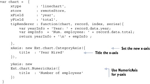
In listing 10.2, you add the xAxis and yAxis properties to the main Chart configuration object. The xAxis is set to an instance of CategoryAxis, whereas the yAxis property is set to an instance of NumericAxis. Each new axis is configured with a title parameter.
Let’s see what it looks like after adding the newly overridden axis (figure 10.10).
Figure 10.10. Adding y-axis titles without custom styling results in wasted screen space.

If you look at the y-axis label, you can see that it’s clearly wasting space. The only way to mitigate this issue this is to rotate the text, which can be done only through custom styling of this widget.
Next, you’ll learn how to stylize the Chart body. Later on, you’ll learn how to stylize the Series as well.
10.3.3. Styling the Chart body
In contrast to the rest of the framework, JavaScript is the only vehicle to stylize Charts. This means that you must configure the styles of the Charts when you instantiate them. To me, this is one of the lengthier tasks when developing Charts because it requires a lot of testing and ultimately more code.
Note
Quite a few style options are available to choose from. Because Ext JS uses YUI Charts, naturally the best source for documentation is going to be at YUI. Visit the following URL to get the most comprehensive list of styles: http://developer.yahoo.com/yui/charts/#basicstyles.
In order to rotate the title, you need to include custom style configuration in your line Chart’s configuration object. This is done by means of setting the extraStyle property like so:
extraStyle : {
      yAxis: {
          titleRotation  : -90,
     }
}
In this code snippet, you create the extraStyle configuration object, which contains another configuration object for the y-axis. Inside the yAxis configuration object, the titleRotation property is set to -90 (degrees).
Figure 10.11 shows what the newly styled Chart looks like.
Figure 10.11. The yAxis is now rotated -90 degrees, which reduces wasted space.

You can see that by adding the extraStyle configuration property and its contents to our LineChart, it renders with the y-axis title rotated, thus reducing the amount of wasted space.
Thus far, you’ve created a single LineChart and have provided some light styling to improve its readability. There are a few more measurement figures to add to the Chart. To show these on the screen, you’ll need to refactor the Store and Chart configuration completely.
10.4. Adding multiple Series
When you looked at the data being provided by the server side, you saw multiple data points that are related to the number of employees for a given year. If you peek at the data again, you can see that the other two figures are newHires and prevHired.
[
    {
       "newHires"  : 135,
       "year"      : 2000,
       "total"     : 136,
       "prevHired" : 1
    },
    ...
]
To make use of this data, you’ll need to reconfigure the data Store to map the fields. Luckily, all you have to do is add the two fields to the mappings list for the data Store.
fields   : [
    { name : 'year',      mapping : 'year'      },
    { name : 'total',     mapping : 'total'     },
    { name : 'newHires',  mapping : 'newHires'  },
    { name : 'prevHired', mapping : 'prevHired' }
]
Next comes the fun part: refactoring the Chart to add the extra Series. While you’re at it, you’ll apply custom styles to make the Chart much easier to read and more pleasing to look at. This is where you’ll see that customizing Charts requires quite a bit of code, but it’s easy once you understand it. This is why you’ll break up the refactoring effort into smaller, more digestible chunks.
You’ll begin with the configuration of the series, as follows.
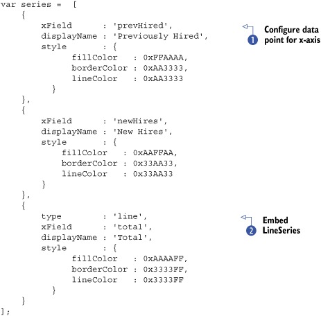
Listing 10.3. Configuring the Series for our multiseries Chart

In listing 10.3, you create an array of configuration objects that are used to configure the three different Series. Here’s what all of these properties do.
In each Series configuration object, you map the data points by means of the yField property. Setting the yField property replaces the yField property in the main chart configuration object. It may be easier to think of it as mapping the dataIndex to GridPanel columns. You also set the displayName , which is used in both the ToolTip and the legend, which you’ll learn about in a bit.
Next, you set a custom style  configuration object for each series, which sets the color for the point’s fill
  and border
  as well as the color for the lines
  . Setting these styles will clearly distinguish each Series, enhancing Chart readability.
With the Series in place, you can move on to construct a tipRenderer that’s much more flexible and create the extraStyle configuration, as shown in the following listing.
Listing 10.4. Creating a flexible tipRenderer and extraStyle

In listing 10.4, you create the custom tipRenderer, which is much more flexible than the previous one. This is because this tipRenderer leverages the Series’s displayName to create the custom label for the Series. It also uses the Series’s yField property to pull the mapped data, resulting in a truly dynamic tipRenderer.
Next, you create a configuration object to contain the custom style parameters. Along with the yAxis’s titleRotation, you add an xAxis configuration object, which contains majorGridLines . This configuration property instructs the Chart to display a vertical line for each category data point, resulting in intersecting lines across the entire grid area.
You now have all you need to configure the chart. Let’s do that next.
Listing 10.5. Refactoring the Chart
var chart = {
     xtype       : 'linechart',
     store       : remoteStore,
     xField      : 'year',
     tipRenderer : tipRenderer,
     extraStyle  : extraStyle,
     series      : series,
     xAxis       : new Ext.chart.CategoryAxis({
         title : 'Year Hired'
     }),
     yAxis : new Ext.chart.NumericAxis({
         title  : 'Number of employees'
     })
};
To refactor the Chart configuration object, you remove the yField property. Remember that this is already present in each of the Series configuration objects and aren’t needed in the Chart configuration. You also set the tipRenderer, extraStyle, and series properties to the variables that you created a bit earlier.
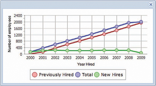
Figure 10.12 shows what the Chart now looks like rendered inside the Window you created earlier.
Figure 10.12. Our multiline Chart with much more custom styling
When looking at our multiseries LineChart you can see that each Series is colored differently and the vertical lines are now drawn at each x-axis data point. But you’re left with a problem. In order to tell what figure each line represents, you have to mouse over a point on the graph, which isn’t exactly user friendly.
The solution for this is to add a legend to the chart.
10.4.1. Adding legends
To add a legend to your Chart, you need only add the style configuration object to the extraStyles configuration object, like this:
legend : {
    display : 'bottom',
    padding : 5,
    spacing : 2,
    font    : { color : 0x000000, family : 'Arial', size : 12 },
    border  : { size : 1, color : 0x999999 }
}
When you set the legend style configuration object, the property that controls whether the legend will display or not is display. This property defaults to "none", which prevents it from displaying. In addition to "bottom", it can be set to "top", "right", or "left".
The padding property works much like the CSS padding style. The spacing property specifies how many pixels separate the Series. To configure the font and border, you have to create separate configuration properties for each. Remember that all of the possible styles are detailed in the YUI documentation.
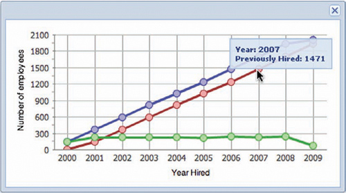
The addition of the legend is shown in figure 10.13.
Figure 10.13. The addition of the legend enhances readability for multiseries Charts.
We’ve spent a lot of time on the LineChart, and you learned how to customize it quite a bit with the inclusion of a custom tipRenderer, multiple Series, and applicable styles. What about the Column and Bar Charts? How does the construction of each differ from the LineChart?
10.5. Constructing ColumnCharts
If you’re comfortable with constructing LineCharts, then you’ll be happy to learn that the construction of a ColumnChart is nearly identical. The biggest difference is that instead of setting the xtype to 'linechart', you set it to 'columnchart'.
Here’s the LineChart refactored into a ColumnChart.
Listing 10.6. Creating a ColumnChart
var chart = {
     xtype       : 'columnchart',
     store       : remoteStore,
     xField      : 'year',
     tipRenderer : tipRenderer,
     extraStyle  : extraStyle,
     series      : series,
     xAxis       : new Ext.chart.CategoryAxis({
         title : 'Year Hired'
     }),
     yAxis : new Ext.chart.NumericAxis({
         title : 'Number of employees'
     })
};
It’s that simple. Figure 10.14 shows what the ColumnChart looks like rendered onscreen.
Figure 10.14. A multiseries ColumnChart
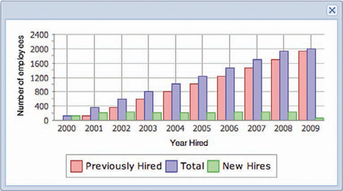
When looking at this Chart, it’s hard to see that the number of newly hired plus previously hired employees equals the total number of employees. This is where the StackedColumnChart fits in.
10.5.1. Stacking columns
You just learned that the conversion from a LineChart to a ColumnChart is relatively simple. But to make this Chart much easier to read, you’ll need to stack the columns. The conversion from a ColumnChart (or LineChart for that matter) is a bit more involved.
To make this conversion, you’ll need to refactor the series array to remove the Series representing the total number of employees, because it’s unnecessary:
var series = [
    {
       yField      : 'prevHired',
       displayName : 'Previously Hired',
       style       : {
             fillColor   : 0xFFAAAA,
             borderColor : 0xAA3333,
             lineColor   : 0xAA3333
         }
    },
    {
       yField      : 'newHires',
       displayName : 'New Hires',
       style       : {
           fillColor   : 0xAAFFAA,
           borderColor : 0x33AA33,
           lineColor   : 0x33AA33
       }
    }
];
Next you’ll need to refactor the Chart configuration object a bit:
var chart = {
    xtype       : 'stackedcolumnchart',
    store       : remoteStore,
    xField      : 'year',
    tipRenderer : tipRenderer,
    extraStyle  : extraStyle,
    series      : series,
    xAxis       : new Ext.chart.CategoryAxis({
        title : 'Year Hired'
    }),
    yAxis : new Ext.chart.NumericAxis({
        stackingEnabled : true,
        title           : 'Number of employees'
    })
};
In the newly refactored Chart configuration object, you set the xtype to 'stackedcolumnchart'. The only other change you’ll make is the addition of the stackingEnabled property to the y-axis, NumericAxis. These are the only changes necessary to construct a StackedColumnChart.
Here’s what it looks like painted onscreen (figure 10.15).
Figure 10.15. Our StackedColumnChart
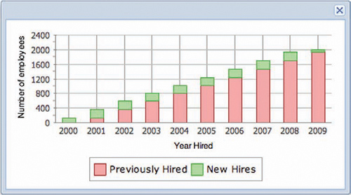
When analyzing the results of the StackedColumnChart, you can see that the previously hired and newly hired employee figures appear stacked, amounting to the total number of employees for a given year. This is exactly what we wanted to do. But we introduced a problem. How do we find the total number of employees for a given year? Let’s ponder the possibilities.
If we leave the total (StackedColumn) series in, then the sum of the columns will double, which is undesirable. Surely there has to be a way to allow the users to see the total.
One way to display the total is via the ToolTip. Although this would work, it’s always best to keep the tip within the context of the Series being hovered over. We need something to tie the totals together.
A LineSeries would work perfectly for this situation.
10.5.2. Mixing a line with columns
Thus far, we’ve exercised the ability to leverage multiple Series in a Chart, but we haven’t looked into configuring a hybrid Chart, that is, a chart with multiple types of Series. It’s much easier than you’d think.
To add a line Series, add the following LineSeries-style configuration object to the series array that you used to set up the StackedColumnChart:
{
   type        : 'line',
   yField      : 'total',
   displayName : 'Total',
   style       : {
         fillColor   : 0xAAAAFF,
         borderColor : 0x3333FF,
         lineColor   : 0x3333FF
     }
}
Notice that the configuration object for this newly added Series is almost identical to that of the total Series you removed when initially configuring the StackedBarChart. The item to key in on here is the type property, which is set to 'line'.
Setting this property causes the framework to use a specific type of Series to display in a Chart. It’s the XType equivalent for Charts and saves us time from having to directly instantiate an instance of LineSeries. To ensure that this line will render on top of the other Series, it’s important that you add this LineSeries configuration as the last object of the series configuration object’s array. How the Series are rendered onscreen is directly proportional to the order in which they’re placed in the series array. To put this in context, think about z-order with CSS, and it will all make sense. The order of the Series also affects how they appear in the legend as well.
Look at the newly configured hybrid LineChart and ColumnChart in action in figure 10.16.
Figure 10.16. Our hybrid LineChart and ColumnChart
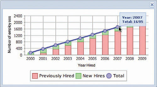
After adding the LineSeries to the StackedColumnChart, you can easily access the total figure data by hovering the mouse cursor over the points rendered by the newly added LineSeries.
We’ve explored the depths of the ColumnChart and StackedColumnChart by means of converting the previously constructed LineChart. Along the way, we customized the StackedColumnChart by adding a LineSeries.
Next, we look at creating a BarChart by converting our StackedColumnChart.
10.6. Constructing BarCharts
To construct a BarChart, you can use all of the same plumbing that you created before, with some tweaks. When thinking about BarCharts, you just have to think about swapping the LineChart or ColumnChart x-axis and y-axis. Why?
Remember that the LineChart and ColumnChart use the category data on the x-axis, whereas the measurement figures are to be on the y-axis. The BarChart expects the category data to be on the y-axis and the measurement data to be on the x-axis.
Using this logic, you can refactor the StackedColumnChart to a StackedBarChart quite easily. This means that all you need to do is refactor the Series to leverage data on the x-axis and modify the Chart configuration object slightly, as shown here.
Listing 10.7. Configuring the Series for the StackedBarChart
In this listing, the Series and styles remain the same. The difference is that instead of setting the yField property for the configuration objects, you set xField . You also keep the LineSeries configuration object intact.
In order for the custom and dynamic tipRenderer to work, you’ll need to modify it to read the xField property of the series configuration definitions:
var tipRenderer = function(chart, record, index, series){
    var yearInfo = 'Year: ' + record.get('year'),
    var empInfo  =  series.displayName + ': '+ record.get(series.xField);
    return yearInfo + '
' + empInfo ;
};
In this snippet, the tipRenderer method is nearly identical to the previous one with the replacement of series.yField with series.xField. Remember, you do this because of the series configuration changes you made.
Next, you’ll refactor the Chart configuration object, completing the transformation.
Listing 10.8. Configuring the StackedBarChart

To configure the configuration object for a StackedBarChart, you first set the xtype property to 'stackedbarchart'. The next change is setting the xAxis property to to leverage the NumericAxis, with stackingEnabled set to true . Last, you set the yAxis property to an instance of CategoryAxis , removing the previously defined stackingEnabled property.
That’s pretty much all that’s needed to convert this Chart. Figure 10.17 shows what it looks like rendered in a browser.
Figure 10.17. The StackedBarChart
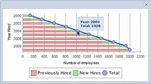
Great, everything works as expected, including the dynamic ToolTip. How would you convert this to a generic BarChart? The steps are as simple as unraveling the configuration parameters to enable bar stacking.
10.6.1. Configuring a BarChart
The steps to modify our StackedBarChart to a BarChart are short and simple. First, change the Chart configuration object xtype property to 'barchart', like this:
xtype : 'barchart',
Next, remove the stackingEnabled property from the x-axis (NumericAxis) configuration object:
xAxis : new Ext.chart.NumericAxis({
    title  : 'Number of employees'
}),
And that’s it. Figure 10.18 shows what the BarChart looks like with the integrated LineSeries.
Figure 10.18. The BarChart with an integrated LineSeries
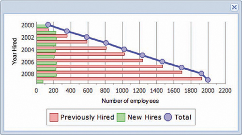
With the changes you’ve made, you can see that the newHires and prevHired columns sit side by side on the line. If you want to remove the LineSeries for the total measurement, all you need to do is remove the type attribute, and Ext JS will use that configuration object to create a BarSeries.
You’ve just seen the similarities between the LineChart, ColumnChart, and BarChart. The PieChart, however, is completely different because it’s not a descendant of the Cartesian line of Charts.
Next, we’ll explore this final Chart type, and you’ll learn how to apply some customizations.
10.7. A slice of PieChart
As with all Charts, when considering the implementation of a PieChart, you must consider the data that the Chart will consume and display. The PieChart is relatively simple, because it works with only two pieces of information: the category and related numeric data. If you think of it in simplistic terms, the category is the name for the slice of pie, and the numeric data determines how large that slice will be relative to the other slices in the data set.
For the PieChart we’re going to build, the data will look like this:
[
   {
      'total' : '42',
      'range' : '20,000s'
   }
   ...
]
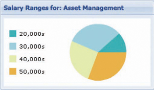
We’ll build a PieChart that will display data describing the number of employees for a particular salary range. In the JSON data, the category will be the salary range, and the data will be the total property of each record. To put this in plain English, in the example record, there are 42 employees within the 20,000s range.
With this knowledge at hand, constructing a data Store to consume this is trivial, as demonstrated here.
Listing 10.9. Creating the data Store for the PieChart
var remoteProxy = new Ext.data.ScriptTagProxy({
     url : 'http://extjsinaction.com/salaryRanges.php
 });

 var pieStore = new Ext.data.JsonStore({
     autoLoad : true,
     proxy    : remoteProxy,
     id       : 'piestore',
     root     : 'records',
     fields   : [
         { name : 'total', mapping : 'total' },
         { name : 'range', mapping : 'range' }
     ]
 });
Next, you can construct the PieChart to consume the data. You’ll do so with some custom styling to depict the ranges with varying colors from green to red, as follows.
Listing 10.10. Creating the PieChart with a legend
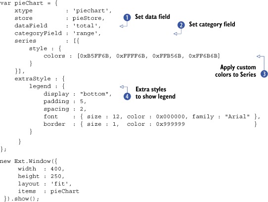
To create the PieChart configuration, you first set the xtype property to 'piechart', which Ext JS uses to configure an instance of Ext.chart.PieChart. The next two properties, dataField and categoryField , are crucial to the PieChart’s operation. These are similar to the xField and yField properties of the basic Cartesian-style Chart you created earlier.
What makes these so important is that you can’t configure a custom Series for the PieChart. Therefore, the only place to tell the Chart what Record Fields to map for the category and data is in the root configuration object for the PieChart.
You’re probably wondering what the series property is doing in the PieChart configuration object if you can’t configure the Series. It’s there because the only way you can customize the colors used in the Series is by means of a nested colors array , and it’s completely optional. If you configure a PieChart without custom colors, the framework will use its own custom palette of colors for the Series.
In the last configuration area, you reuse the extraStyle configuration object you created earlier to display a legend on the bottom of the chart . The PieChart doesn’t display labels on the series, which means that a legend is important for users to decipher the data that the PieChart presents to them.
Finally, you place the PieChart inside an Ext.Window to be rendered on a resizable canvas.
Our PieChart looks like figure 10.19 when painted onscreen. Looking at the PieChart, you can see that the legend displays with the custom palette, ranging from green to red. If you hover the mouse cursor over the different Series, you see the out-of-the-box tip display, revealing the data that’s used to draw the Chart. But just as in the other Charts, sometimes it doesn’t provide much context to the data.
Figure 10.19. The PieChart rendered onscreen with custom colors and a generic ToolTip

The only way to remedy this situation is to apply a custom tipRenderer, which is what we’ll embark on next.
10.7.1. Custom tipRenderer
When developing a custom tipRenderer for the PieChart, you’re presented only the data used to draw the Chart. When a configured tipRenderer is called, the information for the category and data fields is all that’s provided. This means that unless the percentage is provided by the web service for each record, you’ll have to code the calculation manually.
The following listing offers a quick recipe for how to do just that.
Listing 10.11. Creating the PieChart
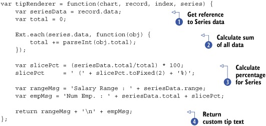
In the tipRenderer method, you first create a reference of the Series data by using the passed Record’s data object . Next, you use Ext.each to loop through the series.data array to get the sum of all of the records and calculate the percentage for the tip . Finally, you assemble the message for the ToolTip .
Next, you have to configure the PieChart to use the custom tipRenderer:
tipRenderer : tipRenderer,
With the custom tipRenderer in place, let’s see what the new ToolTip looks like on the chart (figure 10.20).
Figure 10.20. The PieChart with a custom ToolTip

As you can see, by taking some time to add a custom tipRenderer to a pieChart, you can add context to the information presented inside the ToolTip, making it more useful. One of the things to be careful of when developing custom tipRenderers is not to display too much information in that little tip balloon. Bombarding the user with too much information could reduce the usability of the ToolTip. I’d suggest using the itemclick event to display the data somewhere outside the Chart.
10.8. Summary
In this chapter, we took an in-depth look at the various charts provided by the framework, and you learned what it takes to configure the different kinds of charts. Along the way, you learned the basics of applying simple styling and a custom ToolTip.
We began by discussing the different Charts available to us in the framework. You learned that the CartesianChart is the base class for the LineChart, ColumnChart, and BarChart widgets. You also learned how the PieChart is different from the others, and we discussed the details while examining the Chart package class hierarchy.
Using an exploratory approach, we implemented each of the Charts available to us in the framework. While doing so, you saw what it takes to create a simple LineChart, customize it, and then modify it to create a ColumnChart. By flipping the x-axis and y-axis and modifying the configuration slightly, you were able to convert the ColumnChart to a BarChart. You also learned how to create hybrid Charts by adding a LineSeries to a ColumnChart and BarChart.
Finally, you learned how to create PieCharts, further noting their differences from the other CartesianChart-based Charts. Along the way, you learned how to add context and percentage data to the ToolTip, making it more useful.
In the next chapter, we’ll explore how to leverage one of the more powerful UI widgets, the TreePanel, to display hierarchical data.