
Chapter 14. Drag and drop with widgets
This chapter covers
- Learning drag and drop with Ext JS widgets
- Implementing drag and drop with the DataView
- Exercising drag and drop between GridPanels
- Creating two drag-and-drop GridPanels
- Tackling drag and drop with the TreePanel
- Applying TreePanel drag-and-drop restrictions
When developing your projects, it’s easy to produce context Menus and Buttons to perform certain actions, such as moving a Record from one grid to another. But users always crave an easier way to perform those actions. Providing drag and drop behavior to your applications will allow your users to accomplish these tasks much more effectively. The less mouse clicking users have to do, the happier they ultimately are.
In this chapter we’ll explore applying this behavior to the three widgets that drag and drop is commonly used with: DataView, GridPanel, and TreePanel. As we do that, we’ll descend farther into the DragDrop class hierarchy and touch on the DragZone and DropZone classes and their descendants.
You’ll learn about the different implementation patterns that are required to get drag and drop working with each of these widgets, and we’ll discuss some of the hidden tricks and inner workings of the drag-and-drop classes.
Because the nature of this behavior is complex, this will be a code-heavy chapter.
14.1. A quick review of the drag-and-drop classes
Before we get down to implementing drag and drop with widgets, we’ll do a quick review of the DragDrop class hierarchy, shown in figure 14.1. This will give you a good picture of the road ahead and help you understand what classes to use and why.
Figure 14.1. The DragDrop class hierarchy

In the last chapter, we covered the DD and DDProxy drag classes and the DDTarget drop class. Recall that we utilized those classes because they were designed for single-node drag-and-drop applications, which met our requirements at that time.
Each of the widgets we’ll use to employ drag and drop has selection models that allow for multiple node selections. This means that we’ll leverage the classes designed for handling that. The DragSource and DropTarget classes are technically designed to handle this type of drag-and-drop behavior. But we’re going to start with the DragZone and DropZone classes. Here’s why.
Although the DragSource has all of the necessary mechanics to handle multinode drag operations, the DragZone class goes a few steps further and adds useful features like managing the scroll bar of a container if the container is scrollable. You’ll see this in action when we employ drag and drop with DataViews in just a bit.
The DropZone class adds features to the DropTarget class, such as being able to track the nodes that the drag element is currently hovering over, which makes it easy to allow for precision drop operations of a drag node to specific indexes. You’ll get a chance to exercise this when we learn how to employ drag and drop with GridPanels a little later on.
You now know more about our starting point. Because the application of drag and drop with DataViews provides essential information for the GridPanel and TreePanel implementations, we’ll begin with it.
14.2. Drag and drop with DataViews
We’ve been tasked to develop something that will allow managers to track employees who are on staff or on vacation using simple drag-and-drop gestures. We’ll construct two DataViews, both of which are similar to the ones we constructed earlier. To use them, we’ll make some slight modifications, which will include enabling multiple-node selection. Figure 14.2 shows the two DataViews encapsulated in an instance of Ext.Window.
Figure 14.2. The outcome of our DataView construction

Now that you know what we’re going to build, let’s begin.
14.2.1. Constructing the DataViews
You’ll start by creating the CSS required to style the elements within the DataView. The drag-and-drop–related CSS will be included, so let’s get it out of the way.
Listing 14.1. Setting up the CSS for our DataViews

In the CSS in listing 14.1, you style how each employee div will look in the DataViews. An unselected employee element will have a yellow background  , similar to that of a manila folder. When the mouse hovers over the name of an employee, it will use the emplOver
  CSS class to style it blue. When selected, the employee will be colored green using the emplSelected
  CSS class.
You now have the CSS in place for your future DataViews to use. Next, you’ll configure the two stores that will be consumed by the different DataViews.
Listing 14.2. Configuring the stores for the DataViews

In listing 14.2, you create a list of fields and two configuration objects for JsonStores. The first JsonStore uses a ScriptTagProxy to fetch the list of employees, whereas the second JsonStore sits quietly, waiting for Records to be inserted upon a drop gesture.
Now that you have the data Stores configured, you can create the DataViews, as shown in the following listing.
Listing 14.3. Constructing the two DataViews

In listing 14.3, you configure and construct the two DataViews starting with a common XTemplate instance . The onStaffDV will consume the data from the onStaffStore to load the list of employees currently on staff, whereas the onVacationDV will use the unpopulated onVacationStore.
We could render the DataViews onscreen, but I think they’d look better inside a Window and standing side by side with an HBoxLayout, as in the following listing.
Listing 14.4. Placing the DataViews inside a Window

In listing 14.4 you create an instance of Ext.Window that utilizes the HBoxLayout to place two panels side by side with an equal width and their height stretched to fit the Window’s body. The panel on the left will contain the on-staff DataView , whereas the panel on the right will contain the DataView for vacationers, as shown in figure 14.3.
Figure 14.3. Our rendered DataViews inside an Ext.Window

You can see that our DataViews have rendered properly, with the on-staff employees appearing on the left and no one currently on vacation. With that, we’ve set the stage for applying drag and drop.
14.2.2. Adding drag gestures
The application of drag and drop with DataViews arguably requires the most effort when compared to the GridPanel and TreePanel. This is because, unlike those widgets, the DataView class doesn’t have its own DragZone implementation subclass for us to build upon, which means that we’ll have to craft our own implementation of DragZone. Likewise, we’ll have to develop an implementation of DropZone to manage the drop gestures.
The DragZone class uses a special proxy known as a StatusProxy, which will use icons to indicate whether a successful drop is possible. Figure 14.4 shows what they typically look like.
Figure 14.4. The StatusProxy, indicating that a drop is possible (left) or not (right)

The StatusProxy by default is extremely lightweight and efficient but somewhat boring. Although it provides useful information, it’s far from fun to use. We’ll take advantage of the ability to customize the StatusProxy look to spice up the drag gestures and make them much more enjoyable and informational. Another feature that DragZone adds is automated repair of an invalid drop scenario, which reduces the amount of code that we need to generate to get this stuff working.
We’ll begin by creating the overrides that will be applied to the instance of DragZone that we’ll create afterwards. Because the DataViews must be rendered in order to have drag and drop applied, you’ll need to insert the following code below that of listing 14.4.
Listing 14.5. Creating the DragZone overrides
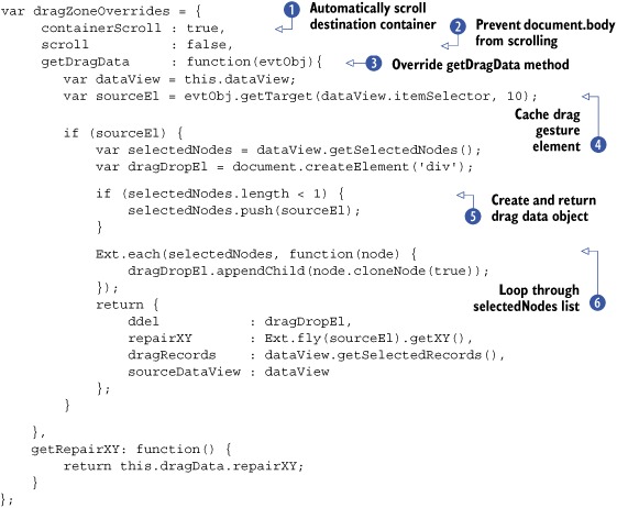
In listing 14.5, you create the override properties and methods that will be applied to the future instances of DragZone. Even though the amount of code is relatively small, there’s a lot going on that you need to be aware of. Here’s how all of this works.
Initially, you set two configuration properties that help manage scrolling when a drag operation is under way. The first is
containerScroll , which is set to true. Setting this property to true instructs the DragZone to call Ext.dd.ScrollManager.register, which will help manage the scrolling of a DataView when scrolling operations are in effect. We’ll examine this in detail when we look at the DataView after the application of DragZone.
The next property, scroll , is set to false. Setting this to false prevents the document.body element from scrolling when the drag proxy is moved out of the browser’s viewport. Keeping the browser canvas fixed during
drag-and-drop operations will increase its effectiveness.
Next, you override getDragData , which is an extremely important method to the multinode drag-and-drop application. The purpose of getDragData is to construct what’s known as the drag data object that you’ll see returned toward the end of this method. It’s important to note that the drag data object that will be generated
and returned by the getDragData method will be cached on the instance of the dropZone and can be accessed via the this.dragData reference. You’ll see this in action in the getRepairXY method later on.
In this method, you first set a reference to the element that the drag gesture was initiated with  sourceEl. You’ll use it later to update the StatusProxy if the number of selected nodes the DataView thinks it has is wrong. You also create a container element, dragDropEl, that will be used to contain copies of the selected nodes during drag, and it will be placed in the StatusProxy.
Note
The presence of sourceEl is tested in order for the rest of the method to continue. getDragData is called upon the mouse-down event of the element that’s registered with the DragZone. This means that getDragData will be called even if the DataView element itself is clicked instead of a record element, which would cause the method to fail.
Next, you interrogate the number of items the DataView thinks it has selected during the drag operation. If the number of selectedNodes  is less than 1, you append the element that the drag gesture was started with. You do this because sometimes a drag gesture
is initiated before the DataView can register an element as visually selected. This is a quick fix to this odd behavior.
is less than 1, you append the element that the drag gesture was started with. You do this because sometimes a drag gesture
is initiated before the DataView can register an element as visually selected. This is a quick fix to this odd behavior.
You then use Ext.each  to loop through the selectedNodes list, appending it to the dragDropEl. This will help customize the StatusProxy and give the appearance that the user is dragging over a copy of the selected node(s).
In the last chunk of this override, you return an object that will be used to update the StatusProxy and any drop operations. The only required property that’s to be passed in this object is ddel, which will be placed inside the StatusProxy.
For this implementation, you add a few other useful properties to the custom drag data object. First is repairXY, which is an array of the X and Y coordinates of the element that the drag gesture was initiated on. This will be used later on to help the invalid drop repair operation.
Also included is dragRecords, which contains a list of instances of Ext.data.Record for each of the nodes selected and being dragged. Last, you set sourceDataView as the reference of the DataView for which this DragZone is being used. Both dragRecords and sourceDataView properties will help the application of DropZone to remove the dropped records from the source DataView.
The last method in the list of overrides is getRepairXY, which returns the locally cached data object’s repairXY property and helps the repair operation know where to animate the StatusProxy on an invalid drop.
You’ve now set your overrides, so it’s time to instantiate instances of DragZone and apply them to the DataViews, as shown in the following code.
Listing 14.6. Applying DragZone to the DataViews

In listing 14.6, you use Ext.apply to create a custom copy of the dragZoneOverrides object for the employment of DragZone targeted at the on-staff DataView . The custom copy of the overrides will include a ddGroup property. Both DragZone implementations will share this. What makes each copy special is the dataView property, which references the DataView that’s attached to the DragZone and is used by the getDragData method you created earlier. The same pattern is used to set up the DragZone for the vacation DataView.
One thing you may notice is that unlike the implementation of DDTarget in the last chapter, you don’t apply the overrides to the instance of DragZone. This is because DragZone’s superclass, DragSource, takes care of that for you automatically, as Ext.Component does.
Refreshing your project page will allow you to exercise drag operations. You can also see your customized StatusProxy in action. Mine is shown in figure 14.5.
Figure 14.5. DragZone with a custom DragProxy

You can see that selecting and dragging one or more Records in the on-staff DataView reveals the StatusProxy with the copies of the selected nodes, which makes the drag operation nicer and much more fun to use.
You can also see the getRepairXY method in action by dropping the drag proxy anywhere on the page. The animation will make the drag proxy slide toward the X-Y coordinates of the element where the drag operation was initiated.
To exercise the ScrollMgr’s scroll-management capabilities, you’ll need to initiate a drag gesture and hover the mouse over what I like to call the autoscroll zones, as illustrated in figure 14.6.
Figure 14.6. The areas where automatic scrolling will take place

As you can see in this figure, hovering the mouse in the zones highlighted by the boxes will result in the DataView automatically scrolling until it can no longer move.
You’ve probably already noticed that when you drag the nodes above the vacation DataView, the StatusProxy shows an icon indicating that the drop won’t be successful. This is because we haven’t employed a DropZone, which is what we’ll do next.
14.2.3. Applying drop
Just like for our previous drag-and-drop applications, we must register a drop target of sorts for the drag classes to interact with. As we discussed before, we’ll use the DropZone class. Following the pattern for this, you’ll create in the following listing an overrides object, which will handle the drop gestures and is much easier to implement relative to drag gestures.
Listing 14.7. Creating the DropZone overrides

In listing 14.7, you create an override object with two methods, to enable drop gestures to successfully occur with the two DataViews. The first is onContainerOver , which is used to determine whether the drop should be allowed. In this application, no processing is needed, but you need
to at least return the this.droppedAllowed reference, which is a reference to the CSS class x-dd-drop-ok that provides the green check icon. If you wanted to use a custom icon, this is where you’d return a custom CSS class.
The next method, onContainerDrop, is where you’ll process the dropped nodes, and it will be called by the instance of DragZone when the mouseup event fires. Remember that DragZone won’t interact with the DropZone if both aren’t participating in the same drag/drop group.
In this method, you use the dragData object that you created in your DragZonegetDragData override. A local reference to the selected records (dragRecords) and the destination DataView’s Store (store) are created for later utilization.
Next, onContainerDrop searches for duplicate Records . This is useful if you’re attempting a copy instead of a move. If no duplicates are found, Ext.each is used to loop through the drag Records to remove them from the sourceDataView’s Store . The records are then added to the destination DataView’s Store and sorted by last name in ascending order.
After all of the Record management has taken place, the onContainerDrop returns the Boolean value true. By returning true, you convince the DragZone that the drop was successful , and it doesn’t initiate a repair animation. Any other value would indicate that the drop was unsuccessful, and a repair
would occur.
Now that the overrides are in place, it’s time to apply them to the DataViews, as shown in the following listing.
Listing 14.8. Creating the DropZone overrides
var onStaffDropZoneCfg = Ext.apply({}, {
    ddGroup          : 'employeeDD',
    dataView         : onStaffDV
}, dropZoneOverrides);
new Ext.dd.DropZone(onStaffDV.ownerCt.el, onStaffDropZoneCfg);

var onVacationDropZoneCfg = Ext.apply({}, {
    ddGroup          : 'employeeDD',
    dataView         : onVactionDV
}, dropZoneOverrides);
new Ext.dd.DropZone(onVactionDV.ownerCt.el, onVacationDropZoneCfg);
In listing 14.8, you create custom copies of the dropZoneOverrides object for the implementation of DropZone for each of the DataViews and follow the same pattern that you used in listing 14.6, where you created instances of DragZone.
You can now see your end-to-end drag/drop application in action. Refresh your page and attempt a drag operation from the on-staff DataView to the vacation DataView, as shown in figure 14.7.
Figure 14.7. The StatusProxy now shows that a drop gesture can occur on the drop zone.

Dragging nodes from the employee DataView to the vacation DataView produces a StatusProxy that contains a green checkmark to indicate a drop invitation. Dropping the nodes invokes the onContainerDrop method, moving the Records from left to right, as shown in figure 14.8.
Figure 14.8. We’ve successfully dragged and dropped three Records from the left DataView to the right.

There you have it, drag and drop from one DataView to another with a good-looking StatusProxy. Because each DataView has its own attached instance of DragZone and DropZone, you can drag and drop items from one to the other, and the Records will automatically be sorted by last name.
You’ve learned how to apply drag and drop to two DataViews and that you’re responsible for employing the full end-to-end code for both gestures. Next, we’ll dive into the world of drag and drop with GridPanels, where you’ll learn that the implementation pattern is different from that of the DataView.
14.3. Drag and drop with GridPanels
We’ve been approached by management to create something that will allow them to track whether departments need computer upgrades. They want to be able to somehow flag the departments that require an upgrade and change the order in which the departments will get upgraded.
To get the job done, we’ll use two GridPanels side by side, just like we did with the DataViews a short time ago. We’ll put drag and drop into practice from GridPanel to GridPanel and allow for the reordering of departments in the list.
In this exercise, you’ll learn that the application of drag and drop between two GridPanels is much simpler than for the DataView. This is mainly because GridPanels have their own DragZone subclass called GridDragZone, which takes care of half of the work for us. We’re left to apply a DropZone and attach it to a good target element within the GridPanel.
In addition to exploring how to set up a DropZone with the GridPanel, we’ll tackle one of the largest challenges that developers face, which is how to properly allow for drop gestures with the ability to select the index for the item to be dropped. This includes the ability for the GridPanel to allow for reordering self-drag-and-drop gestures.
We’ll start by constructing two GridPanels that will live in a Window. The Window will manage the GridPanel dimensions by means of the HBoxLayout and is the same paradigm as the exercise we completed a short time ago.
14.3.1. Constructing the GridPanels
By now you should be comfortable with creating GridPanels and configuring their supported classes. In order to keep things moving, we’ll pick up the pace a little. In the following listing you’ll create the first GridPanel.
Listing 14.9. Creating the first GridPanel
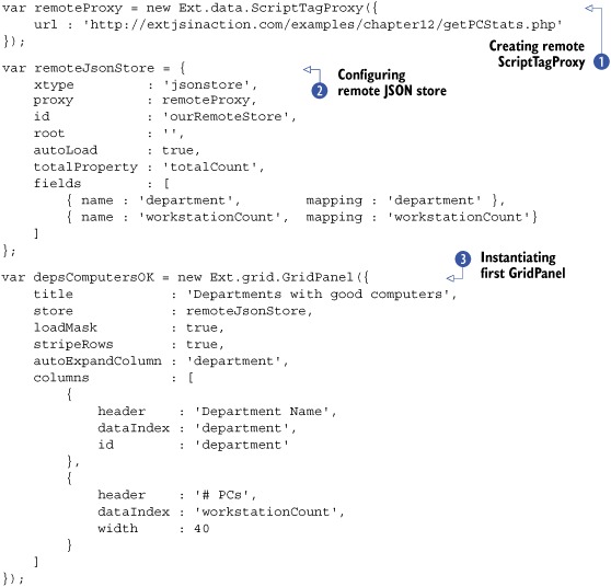
In listing 14.9, you create a remote ScriptTagProxy , which is utilized by the JsonStore and will fetch the data from extjsinaction.com. Next, you instantiate a GridPanel , which will use the previously created remoteJsonStore to display the departments.
In the next listing, you’ll create the second GridPanel, which will be used to list the departments in need of an upgrade.
Listing 14.10. Creating the second GridPanel

In listing 14.10, you use Ext.apply to create a modified copy of the remoteJsonStore, which overrides the proxy parameter and sets autoLoad to false. This allows you to create a near duplicate of the remoteJsonStore but reuse most of the same properties, such as the fields.
Then you create the second instance of GridPanel for the departments that need to be upgraded. These GridPanels need a home. Next you’ll create an Ext Window to display these in.
Listing 14.11. Giving the GridPanels a home
new Ext.Window({
    width    : 500,
    height   : 300,
    layout   : 'hbox',
    border   : false,
    defaults : {
        frame : true,
        flex  : 1
    },
    layoutConfig : {
        align : 'stretch'
    },
    items        : [
        depsComputersOK,
        needUpgradeGrid
    ]
}).show();
In listing 14.11 you create an Ext Window, which leverages the HBoxLayout to manage the two GridPanels that you configured earlier. Let’s take them out for a test drive. The results are shown in figure 14.9.
Figure 14.9. The two department GridPanels side by side

The two GridPanels render perfectly in the Window as configured. Our next task is to configure them to enable drag and drop.
14.3.2. Enabling drag
To configure a GridPanel to enable drag gestures, all we need to do is add two properties to both of the GridPanel configuration objects, as follows:
enableDragDrop : true,
ddGroup        : 'depGridDD',
We can easily enable drag gestures with GridPanel because the GridView tests for the presence of the enableDragDrop (or enableDrag) in the GridPanel when it renders its UI. If the property is set, it will create an instance of GridDragZone and use the grid’s ddGroup (drag/drop group) if present or a generic GridDD group.
When configuring drag and drop with GridPanels, I always like to specify a drag/drop group specific to the GridPanels that are to interact. If I don’t, then all GridPanels with drag enabled would interact with one another, which could cause undesired effects and possibly lead to headaches down the road.
Refresh the GridPanel and see the drag gestures in action, as shown in figure 14.10. When attempting a drag gesture with the GridPanel on the left, you can see the StatusProxy appear with the number of rows selected. This is how the GridDragZone uses the getDragData method, where it displays the number of selected rows for the ddel property of the drag data object. Sound familiar?
Figure 14.10. Drag gestures enabled in the GridPanel
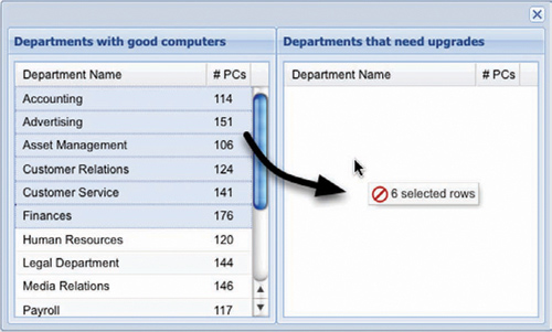
You can see that the status proxy displays an unfavorable drop icon. This is because we haven’t created a DropZone for the DragZone to interact with. Before we do that, we’ll add some CSS styles that the DropZone will use to provide a better drop invitation.
14.3.3. Better drop invitation
Although the StatusProxy provides enough information to inform the user that a successful drop is possible, it doesn’t provide feedback as to what index the drop operation will use, which is crucial to allow for the reordering of records.
We’ll need some CSS rules to help us with this. Please add the styles in the following listing to the head of the page.
Listing 14.12. Adding some CSS styles to provide better drop invitation information
<style type="text/css">
    .gridBodyNotifyOver {
        border-color: #00cc33 !important;
    }
    .gridRowInsertBottomLine {
        border-bottom:1px dashed #00cc33;
    }
    .gridRowInsertTopLine {
        border-top:1px dashed #00cc33;
    }
</style>
Adding this CSS to the head of the document will enable you to provide a much better drop invitation to the user, which will allow them to accurately pinpoint which GridPanel they’re going to be dropping on and in which row index they’ll be inserting Records.
Now that we have that out of the way, we can begin the construction of the custom DropZone for our GridPanels.
14.3.4. Adding drop
Similar to the DataView drag-and-drop application, we can only instantiate instances of DropZone for the GridPanels after they’re rendered. To simplify this process, add the code in listing 14.13 after the instantiation of Ext.Window.
You’ll start by overriding the onContainerOver method, which will handle the necessary mouse movements to track what row the dragged Records are to be inserted on. The code to get the job done is pretty intense, but the results are well worth the effort.
Listing 14.13. Creating the Overrides object

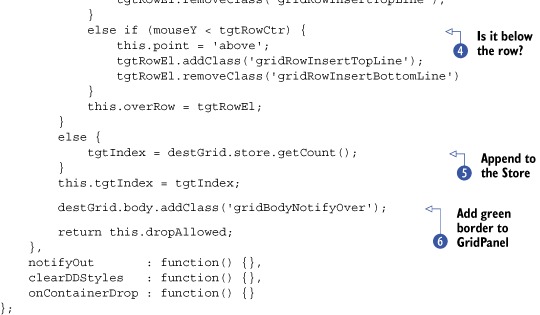
In listing 14.13, you create a dropZoneOverrides configuration object that contains the ddGroup property, onContainerOver implementation, and three stub methods that you’ll fill in later. For now, we’ll focus on the onContainerOver method. Here’s how it works.
When the DragZone detects that the drag gesture is hovering over a like-group participating DropZone, it calls the DropZone’s notifyOver method, which calls onContainerOver. This occurs for each X and Y movement of the mouse while the mouse hovers over the DropZone element, which makes it perfect for detecting whether the drop gesture will result in an append, insert, or reorder operation.
In the onContainerOver implementation, you get the element that the mouse is hovering over (tgtDiv) and ask the GridView to find its index . If findRowIndex returns a number, then you know that the mouse is hovering over a row that the GridView knows of, so the calculations to determine the insertion index can begin .
To determine the exact coordinate of the target row, you must first get a reference to the row and wrap it with Ext.Element. From there, you use the helper methods to get the height and current coordinate. Next, you determine the center of the row and compare it to the mouse’s Y position.
If the mouse’s Y position is greater than or equal to the exact center of the target row’s height, you know that the Record will be inserted after the target row . You set a local this.point property, increase the targetIndex value by one, and add the 'gridRowInsertBottomLine' CSS class to the target row, providing the proper drop invitation to the user.
If the mouse’s Y position is less than the target row’s center, you know that the drop gesture will be an insert above the row . You set the this.point property accordingly and add the 'gridRowInsertTopLine' CSS class to the row, which makes the top border green and dashed, providing the proper insertion index drop invitation.
When you drag over the DropZone element, the target index is set to the destination GridPanel’s Record count , which ensures that anything dropped is appended to the store.
Next, the target index is cached locally and the destination GridPanel’s body element has its border colored green, which assists with the drop invitation . Last, as for the DataView DropZone application, you return the this.dropAllowed reference to ensure the StatusProxy provides the correct drop invitation icon.
The last bit of this listing consists of three method stubs, notifyOut, clearDDStyles, and onContainerDrop, which will handle the clearing of the added drop invitation and handle the drop gesture. Let’s fill in those method stubs with some functionality.
Listing 14.14. Creating the Overrides object

In finalizing the dropZoneOverrides object, you add the clearing of the drop invitation that will appear on the destination GridPanel and rows (if applicable) and complete the code to move the Records from the source GridPanel to the destination. Here’s how all of this works.
The notifyOut override is extremely simplistic and calls the clearDDStyles method defined underneath it. Remember that notifyOut is called when the dragged object is pulled away from the DropZone, which means you need to remove the drop invitation.
Next is the clearDDStyles method, which is custom and not a template method that’s required to get drag and drop working. You add it because the onContainerOver method will add styles to the target row and target GridPanel body, which means you need a way to clear them, and it’s always best to move commonly reused code to a separate method. You
just saw that this method is being called by notifyOut, and it will be called by onContainerDrop as well.
The last method, onContainerDrop , works similarly to the employment of that method when you used DropZones for the DataView, where it’s responsible for moving Records from one Store to another. Before it moves the Records, it calls clearDDStyles to remove any added drop invitation CSS rules. Next, it removes the dropped Records from the source GridPanel . Finally, it inserts the dropped Records into the destination GridPanel at the predetermined target index and returns true to signal to the DragZone that the drop was successful.
Our dropZoneOverrides object is finished. In order to complete this picture, you need to employ instances of DropZone for the GridPanels, as shown in the following listing.
Listing 14.15. Employing DropZone for the GridPanels

In listing 14.15, you copy the dropZoneOverrides object , customizing it for each of the GridPanels, and then create instances of DropZone for each . If it looks familiar, that’s because you instantiated instances of DropZone for the DataViews in the same way.
Our drag-and-drop implementation with GridPanels is now properly configured and ready to rock. Refresh the page and see how the drop invitations react, per the onContainerOver code, as shown in figure 14.11.
Figure 14.11. The drop invitation with mouseover row-tracking drop index

When you drag a Record above a Record in either of the two GridPanels, you see that the mouse movements are tracked properly, and when the mouse hovers over the top half of a row, that row’s top border turns green and appears dashed.
Likewise, hovering the mouse below the bottom half of a row will make the row’s bottom border appear green and dashed, indicating that a drop of the dragged Record will insert it below the row that you’re currently hovering over, as demonstrated in figure 14.12.
Figure 14.12. The below-row drop invitation

And dropping the Record at the indicated position results in the Record being moved to that position. Likewise, dropping a Record from one grid to another results in the Record being moved as commanded, which concludes our GridPanel to GridPanel drag and drop. Notice that if a drop occurs on anything other than a row, the Record is appended to the destination Store.
You’ve learned that in order to make drag and drop between GridPanels possible, you don’t have to instantiate a DragZone but instead only need to set enableDragDrop on the GridPanel’s configuration object to true. Remember that setting that property instructs the GridView to instantiate an instance of GridDragZone when its UI renders. What you did have to implement, however, was the DropZone, and you did so with the ability to track the index of the record(s) to be dropped.
Next up is TreePanel to TreePanel drag and drop, where the implementation pattern changes somewhat again.
14.4. Drag and drop with TreePanels
Our company has purchased another company, and our management needs a way to track how to absorb employees from the purchased company’s various departments. They requested that we develop something that will allow them to track the reassignment of employees using TreePanels and drag and drop.
The most important requirement is the ability to allow associates to be relocated to a specified set of similar departments. For instance, any associate from Accounting, Finances, or Payroll can be reassigned to any of those departments. Likewise, associates from Customer Relations, Media Relations, Customer Service, or Public Relations can be reassigned to any of those. Instead of building a valid drop matrix in JavaScript, the node list returned from the server will report a list of valid departments for each node. It will be up to us to somehow use that data to make the requirement a reality.
In this section, you’ll not only learn how to enable drag and drop between trees, but you’ll also tackle one of the most common challenges, which is to constrain the dropping of nodes. We’ll begin by constructing the TreePanels and the Window that they’ll live in.
14.4.1. Constructing the TreePanels
As with the DataView and GridPanel exercises before this, we’ll configure two TreePanels, both of which will be managed by an instance of Ext.Window utilizing the HBoxLayout.
Because we’ve built a few TreePanels already, we’re going to move through this pretty fast. The following listing sets the stage.
Listing 14.16. Setting the stage for TreePanel drag and drop
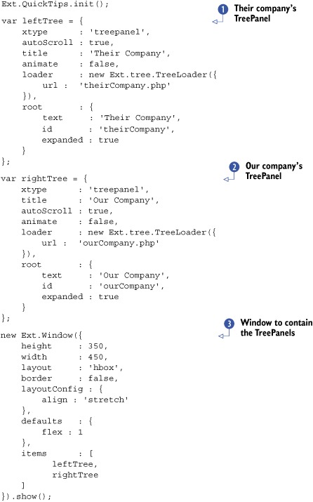
In listing 14.16, you create two TreePanels and an Ext Window, which will contain them and manage their sizes using the HBoxLayout. The left TreePanel will load a list of departments for the other company. Each department will have to be expanded to reveal the child items.
The right TreePanel will load up a list of departments for our company, which, lucky for us, aligns with the company being sold. For simplicity,
we won’t display the employees currently in our company’s departments.
Last, the Ext Window is created to manage the two TreePanels side by side. Figure 14.13 shows our TreePanels rendered onscreen.
Figure 14.13. The two TreePanels

We have the two TreePanels rendered within the Ext Window. It’s time to get the party started with drag and drop.
14.4.2. Enabling drag and drop
When exploring how to employ drag and drop with DataViews, we were required to implement both the DragZone and DropZone classes. When applying this feature to GridPanels, you learned that you were required to implement only DropZone because the GridView automatically creates GridDragZone if the GridPanel has the enableDragDrop property set.
With the TreePanel, drag and drop is much easier. All we have to do is set the following property on both of the TreePanel configuration objects:
enableDD : true
The TreePanel takes care of instantiating the TreeDragZone and TreeDropZone classes for us. To specify the drag/drop group that the TreePanel is to participate in, set the ddGroup configuration parameter as follows:
ddGroup : 'myTreeDDGroup'
Figure 14.14 shows what drag and drop with the two TreePanels looks like in action. As you can see, enabling drag and drop on TreePanels is simple to do. But wait a minute. Everything can be dragged and dropped, which can be useful for, let’s say, a filesystem management tool, but for what we need, it just won’t cut it.
Figure 14.14. Drag and drop enabled on TreePanels

Out of the proverbial box, the TreeNode class allows for some constraints to be applied to the dragging and dropping of nodes when drag and drop is applied to their owner TreePanel. The two parameters that help control these behaviors are allowDrag and allowDrop, both of which are configured on each node of the tree and default to true even if the properties don’t exist. We could have the returning JSON include these properties, but they’re rigid. With these two properties, you can either allow drag or not, or allow drop or not. Clearly this won’t help us fulfill the requirement to allow any associate from a set group of departments to be dropped on those departments. For this, we’ll need to craft something much more flexible.
We’ll tackle this intense procedure next. Are you ready?
14.4.3. Employing flexible constraints
Thus far, when implementing drag and drop, we created objects to override the required template methods, which gave us the control we desired for the drag-and-drop classes. With the TreePanel, we can apply template overrides by specifying dragConfig or dropConfig objects in the TreePanel’s configuration object.
To have better control of what nodes can be dragged around, we’ll create a dragConfig object, which overrides the onBeforeDrag template method. You’ll need to place this code before the TreePanel configurations:
var dragConfig = {
   onBeforeDrag : function(dragData, eventObj) {
       return dragData.node.attributes.leaf;
   }
};
In this snippet, we create a dragConfig object that contains the onBeforeDrag override method. All it does is return the dragged node’s leaf attribute. This will prevent all branch nodes from being dragged around the screen. To apply the drag constraint, set the dragConfig object on both TreePanels as follows:
dragConfig : dragConfig,
Refresh the page and you’ll see that the department nodes can no longer be dragged around. This completes half of the requirement. As of now, any employee nodes can be dragged to any department, which means we need to work on the code to provide better drop point constraints.
Listing 14.17 is rather large because many tests need to take place in order to ensure that the desired drop operation is completely correct. Any slipup and nodes can be dropped where they don’t belong. Please don’t be alarmed; we’ll go into an in-depth discussion about it.
As with the dragConfig object creation, you’ll need to place the following code before the TreePanel configuration.
Listing 14.17. Applying better drop constraints


In listing 14.17, you create a dropConfig object and work hard to constrain what nodes can be dropped where. You utilize the TreeDropZone.prototype.isValidDropPoint method to finish the processing when you deem that the drop point is valid. Here’s how all of this stuff works.
First, you create a reference to the TreeDropZone.prototype.isValidDropPoint. You do this because even though this isValidDropPoint method will override the targeted TreeDropZone instance, you still need the processing that’s provided by the original TreeDropZone isValidDropPoint method. You need it because it’s responsible for appending some important properties to the drag data object that the TreeDragZone creates. In order not to duplicate the code, you call it when you’re comfortable with the current mouseover situation.
Next, you create quite a few drop node–related references , such as the drop node’s parent (department) text, the drop node’s owner tree, and its id. Similarly, you gather references for the target node . These references will be the backbone to help determine whether the target node is a valid drop target.
Moving on, you reach your first test, where you determine whether the drop target is a root node by detecting the absence
of the target’s parent node. If the target node has no parent, then it’s a root node. You also try to see if the drop node’s
owner tree is the same as the target node’s. If either test case is true, then you return false .
Looking ahead, you create references for the target node’s parent (department) text and the target node text . You’ll use both to determine whether the drop node is a valid drop point based on the possible drop scenarios.
You then reach your first major test, where you look to see if the drop node’s parent text matches that of the target node
. This test is useful in the scenario where you’re dropping a node on another leaf element that exists within a similar parent.
For example, you drag “Salinas, Erin” from Accounting from their company and drop Erin on another associate node that exists
within Accounting in our company. If this condition is true, you call on the TreeDragZone’s isValidDropPoint to properly process the drop and return the results, which ultimately results in a favorable possible drop condition.
If that test fails, you then determine whether the target node is a branch node and matches any of the drop points in the
validDropPoints array . You do this by testing the return of the utility method Ext.isArray to verify that the drop node’s validDropPoints array is valid  .
.
If the test is favorable, then you get the drop point. The TreeDropZone performs similar calculations to the ones you did when determining whether the drag operation was occurring above or below
a row, except it’s concerned with nodes. Because drop nodes can be appended  to a target branch as well as dropped above or below a target node, the TreeDropZone getDropPoint method returns any one of the values just mentioned.
This is important to know because when the drag node is hovering over a branch element, the drop point could be above or below, which means that the drop node could be dropped below or above a branch node. If you allowed this to occur, you’d have associates that would be placed outside a department, which is unfavorable.
Moving on, you loop through the validDropPoints array and test to see if any of the drop points in the array match the target (department) node text. If so, then you return the value of the TreeDragZone’s isValidDropPoint call to indicate that a successful drop is possible.
If none of these tests pass, then a false value is returned, and the TreeDragZone knows to update the StatusProxy indicating that a favorable drop isn’t possible.
You’ve done a lot of work to get these constraints configured. In order to take advantage of this code, you need to reconfigure the TreePanels with the dropConfig object as follows:
dropConfig : dropConfig
Adding this configuration parameter to your TreePanels will ensure that an instance of TreeDropZone is created and bound to the TreePanels. Refresh your page and see the constraints in action; mine are shown in figure 14.15.
Figure 14.15. Testing our drop target constraint logic

You can test your constraint logic by attempting to drag a department branch node. You’ll see that it’s impossible. This tells you that the onBeforeDrag override method is working as designed.
Next, to determine where the associate can be dragged, hover over it and you’ll see a ToolTip appear with the values that are in the validDropPoints array. In hovering over Erin, we found that she can be dropped on Accounting but not Advertising. When we drag Erin over Accounting on the right-hand TreePanel, the StatusProxy displays a valid drop icon (figure 14.15). But if we hover her over Advertising, we see an invalid drop icon in the StatusProxy. As extra credit, you can try to hover Erin over Finances and Payroll, and you’ll see a valid drop icon there too.
The last test you can perform is to drop an associate or two onto a valid department. You can test the ability to drop leaf nodes above or below other leaf nodes within a valid department as well.
There you have it: drag and drop with two tree panels with a complex but somewhat flexible drop constraint system. I’m sure our managers will be pleased that we delivered what they were asking for.
14.5. Summary
We spent a lot of time in this chapter looking at different ways to implement drag and drop with the three most commonly used widgets within the framework, and you learned a lot while doing it.
We started with implementing this behavior with DataViews, where you learned that you’re responsible for configuring both the DragZone and DropZone classes. While employing this behavior, we developed a custom and more useful way to display the Records being dragged around.
Next, you learned how to employ this behavior with two GridPanels and learned that you’re mainly responsible for implementing a DropZone to handle the drops. In doing so, you tackled the hard problem of detecting the index of a node drop to allow Records to be inserted in any desired index.
Finally, we explored drag and drop with TreePanels. In this implementation, you discovered that enabling this behavior with TreePanels is the easiest task, and the application of somewhat complex constraints on the drop gestures is the most difficult task.
In the next chapter, you’ll learn about plug-ins and extensions and how they work. You’ll start to use object-oriented techniques with JavaScript and will have a lot of fun.