
Chapter 6. Ext JS takes form
This chapter covers
- Getting to know the basics of FormPanel input fields
- Creating custom ComboBox templates
- Creating a complex layout FormPanel
We just finished exploring how to organize UI widgets with the various layout managers in the Ext framework. From here, we’ll spring into learning how to instantiate and manage Ext JS form elements. After all, what’s any application without user input?
It should be no surprise to hear that developing and designing forms is a common task for web developers. Managing form validation is what JavaScript was mainly used for just a few years ago. Ext JS goes beyond typical form validation, building on the basic HTML input fields to both add features for the developer and enhance the user experience. For instance, let’s say a user is required to enter HTML into a form. Using an out-of-the-box TextArea input field, the user would have to write the HTML content by hand. This isn’t required with the Ext JS HtmlEditor, where you get a full WYSIWYG input field, allowing the user to input and manipulate richly formatted HTML easily.
In this chapter, we’ll look into the FormPanel, and you’ll learn about many of the Ext JS form input classes. You’ll also see how to leverage what you know about layouts and the Container model to build a complex form and use that implementation to submit and load the data via Ajax.
Because there are so many things to cover with input fields, this chapter will follow more of a cookbook style, where I walk you through the various input fields and discuss how to implement them. Once you get a solid grasp on the various input fields, we’ll tie things together by implementing and discussing the FormPanel class.
6.1. The TextField
The Ext TextField adds features to the existing HTML input field such as basic validations, a custom validation method, automatic resizing, and keyboard filtering. To utilize some of the more powerful features such as keyboard filters (masks) and automatic character stripping, you’ll need to know a little about regular expressions.
If you’re new to regular expressions, there’s a plethora of information on the internet. One of my favorite sites to learn about this topic is http://www.regular-expressions.info/javascript.html.
We’re going to explore quite a few features of the TextField at once. Please stay with me, because some of example code can be lengthy.
Because the TextField class is a subclass of Component, you could renderTo or applyTo an element on the page. Instead, you’ll build them as children of a FormPanel, which will provide a better presentation. To start, you’ll create the items array, which will contain the XType definitions of the different TextFields, as shown in the following listing.
Listing 6.1. Our text fields

In listing 6.1 you must work a lot of angles to demonstrate the capabilities of the simple TextField. You create four text fields in the fpItems array. One of the redundant attributes that each child has is fieldLabel  , which describes to the FormLayout (remember that the FormPanel uses the FormLayout by default) what text to place in the label element for the field element.
For the first child, you ensure that the field can’t be blank by specifying allowBlank  as false, which ensures that you use one of Ext’s basic field validations. You also set a string value for emptyText
  , which displays helper text and can be used as a default value. One important thing to be aware of is that it gets sent as
the field’s value during its form submission. Next, you set maskRe
, which displays helper text and can be used as a default value. One important thing to be aware of is that it gets sent as
the field’s value during its form submission. Next, you set maskRe  , a regular expression mask, to filter keystrokes that resolve to anything other than alpha characters. The second text field
is built so it can’t be left blank and must contain from three to seven characters to be valid. You do this by setting the
minLength
, a regular expression mask, to filter keystrokes that resolve to anything other than alpha characters. The second text field
is built so it can’t be left blank and must contain from three to seven characters to be valid. You do this by setting the
minLength  and maxLength parameters. The third text field can be blank, but it has automatic alphanumeric character stripping. You enable automatic
stripping by specifying a valid regular expression for the stripCharsRe
and maxLength parameters. The third text field can be blank, but it has automatic alphanumeric character stripping. You enable automatic
stripping by specifying a valid regular expression for the stripCharsRe  property. For the last child
  item, we’re going to veer off course for a bit to explore VTypes.
The last child item is a plain-text field that makes use of a custom VType , which we’ll build out shortly. A VType is a custom validation method that’s called automatically by the form field by a field losing focus or sometime after the
field is modified. To create your own VType, you can use a regular expression or a custom function. The anatomy of a VType is simple and can contain up to three ingredients. The validation method is the only required item; the input mask regular
expression and invalid text string are optional. The name of the VType is the validation method, whereas the mask and text properties are a concatenation of the name with “Mask” or “Text.” Let’s
create our custom VType:
var myValidFn = function(v) {
   var myRegex = /https?://([-w.]+)+(:d+)?(/([w/_.]*(?S+)?)?)?/;
   return myRegex.test(v);
};
Ext.apply(Ext.form.VTypes, {
    urlOnly     : myValidFn,
    urlOnlyText : 'Must be a valid web URL'
});
Don’t run away! The regular expression is scary, I know. It does serve a purpose, though, and you’ll see what I mean in a bit. Our validation method, myValidFn, contains our monster regular expression and returns the result of using its test method, where we pass v, which is the value of the TextField at the time the VType’s validation method is called. Next, we apply an object to the Ext.form.VTypes singleton, which contains urlOnly—the reference to our validation method. Our VType is now known to Ext.form.VTypes as urlOnly and is why we set the vtype property as such on the last TextField. We also set the urlOnlyText property for the vtype as a string with our custom error message. Okay, now that we’ve explored VTypes, let’s build the form in which our TextFields will live, as shown in the following listing.
Listing 6.2. Building the FormPanel for our TextFields

Because we’ve already gone over the FormLayout, most of the code construct in listing 6.2 should be familiar to you. But let’s review a few key items relating to the FormLayout and Component model. You override the default Component XType by setting the defaultType property to 'textfield', which, if you recall, will ensure your objects are resolved into text fields. You also set up some defaults , which ensure your error message target is to the right side of the field and your anchor property is set. Last, you reference the FormPanel’s items to the fpItems variable that you created earlier, which contains the four TextFields. The rendered FormPanel should look like figure 6.1.
Figure 6.1. The rendered results of our FormPanel, which contains four TextFields

Notice in figure 6.1 that there’s a little extra space to the right of the TextFields. This is because we wanted to ensure that validation error messages are displayed to the right of the fields. This is why we set msgTarget to 'side' for our default object in our FormPanel definition. You can invoke validation one of two ways: focus and blur (lose focus) of a field or invoke a form-wide isValid method call, fp.getForm().isValid(). Figure 6.2 shows what the fields look like after validation has occurred.
Figure 6.2. 'side' validation error messages

Each field can have its own msgTarget property, which can be any of five possible attributes:
- qtip— Displays an Ext quicktip on mouseover
- title— Shows the error in the default browser title area
- under— Positions the error message below the field
- side— Renders an exclamation icon to the right side of the field
- [element id ]— Adds the text of the error message as the innerHTML of the target element
It’s important to note that the msgTarget property affects only how the error message is displayed when the field is inside a FormLayout. If the TextField is rendered to some arbitrary element somewhere on the page (that is, using renderTo or applyTo), the msgTarget will be set only to title. I encourage you to spend some time experimenting with the different msgTarget values; that way, when it comes down to building your first real-world form, you’ll have a good understanding of the way they work. Let’s see how to create password and file upload fields using the TextField.
6.1.1. Password and file select fields
To create a password field in HTML, you set its type attribute to 'password'. Likewise, for a file input field, you set type to 'file'. In Ext, to generate these, enter the following:
var fpItems =[
   {
       fieldLabel : 'Password',
       allowBlank : false,
       inputType  : 'password'
   },
   {
       fieldLabel : 'File',
       allowBlank : false,
       inputType  : 'file'
   }
];
Figure 6.3 shows a rendered version of the password and file input fields in a FormPanel.
Figure 6.3. Our password and file upload fields with data filled in (left) and an example of the side validation error icons (right)

When using file upload fields, remember to configure the underlying form element with fileUpload : true; otherwise, your files will never get submitted. Also, in case you haven’t noticed it, the file upload field in figure 6.3 (right) doesn’t have a red bounding box around it. This is because of the browser’s security model preventing styling of the upload field.
We’ve covered a lot about the generic TextField, field validations, and the password and file upload fields. We’ll now move on to looking at other input fields.
6.1.2. Building a TextArea
The TextArea extends TextField and is a multiline input field. Constructing a TextArea is like constructing a TextField, except you have to take the Component’s height into consideration. Here’s an example TextArea with a fixed height but a relative width:
{
    xtype      : 'textarea',
    fieldLabel : 'My TextArea',
    name       : 'myTextArea',
    anchor     : '100%',
    height     : 100
}
It’s as easy as that. Let’s take a quick look at how you can leverage the NumberField, which is another subclass of TextField.
6.1.3. The convenient NumberField
Sometimes requirements dictate that you place an input field that allows only numbers to be entered. You could do this with the TextField and apply your own validation, but why reinvent the wheel? The NumberField does pretty much all of the validation for you for integers and floating numbers. Let’s create a NumberField that accepts floating-point numbers with the precision to thousandths and allows only specific values:
{
    xtype            : 'numberfield',
    fieldLabel       : 'Numbers only',
    allowBlank       : false,
    emptyText        : 'This field is empty!',
    decimalPrecision : 3,
    minValue         : 0.001,
    maxValue         : 2
}
In this example, you create your NumberField configuration object. In order to apply your requirements, you specify the decimalPrecision, minValue, and maxValue properties. This ensures that any floating number written with greater precision than 3 is rounded up. Likewise, the minValue and maxValue properties are applied to ensure that valid range is 0.001 to 2. Any number outside of this range is considered invalid and Ext will mark the field as such. The NumberField looks exactly like the TextField when rendered. There are a few more properties that can assist with the configuration of the NumberField. Please see the API documentation at http://extjs.com/docs/?class=Ext.form.NumberField for further details.
Now that we’ve looked at the TextField and two of its subclasses, the TextArea and NumberField, let’s look at its distant cousin, the ComboBox.
6.2. TypeAhead with the ComboBox
The cleverly named ComboBox input field is like a Swiss army knife of all text input fields. It’s a combination of a general text input field and a general drop-down box to give you a flexible and highly configurable combination input field. The ComboBox has the ability for automatic text completion (known as type-ahead) in the text input area, and coupled with a remote data Store, it can work with the server side to filter results. If the combo box is performing a remote request against a large dataset, you can enable result paging by setting the pageSize property. Figure 6.4 illustrates the anatomy of a remote loading and paging ComboBox.
Figure 6.4. An example UI of a remote loading and paging ComboBox with type-ahead

Before we look at how the ComboBox works, we should explore how to construct one. Because you’re familiar with how to lay out child items, I think this is an excellent opportunity to leverage your new newly gained experience. So moving forward, when we discuss items that don’t contain children, such as fields, I’ll leave it up to you to build a Container. Hint: You can use the FormPanel from listing 6.2.
6.2.1. Building a local ComboBox
Creating a TextField is simple compared to building a ComboBox. This is because the ComboBox has a direct dependency on a class called the data Store, which is the main tool to manage data in the framework. We’ll just scratch the surface of this supporting class here and will go much further into detail in chapter 7. In the following listing you’ll build your first ComboBox using an XType configuration object.
Listing 6.3. Building your first ComboBox
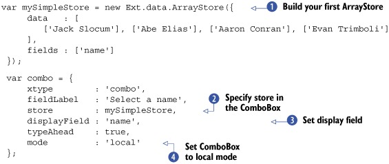
In listing 6.3, you construct a simple Store that reads array data, known as an ArrayStore (a preconfigured extension of the Ext.data.Store class, which makes it easy for you to create a store that digests array data. You populate the consumable array data and
set it as the data property for the configuration object. Next, you specify the fields property as an array of data points from which the data Store will read and organize records. Because you have only one data point per array in your array, you specify only a single point
and give it a name of 'name'. Again, we’ll go into much greater detail on the data Store later on, where you’ll learn the entire gamut from records to connection proxies.
You specify your combo as a simple POJSO (Plain Old JavaScript Object), setting the xtype property as 'combo' to ensure that its parent Container calls the correct class. You specify the reference of your previously created simple store as the store property. Remember the fields property you set for the store? Well, the displayField is directly tied to the fields of the data Store that the ComboBox is using. Because you have a single field, you’ll specify your displayField with that single field, which is 'name'. Last, you set mode to 'local', which ensures that the data Store doesn’t attempt to fetch data remotely. This attribute is extremely important to remember because the default value for mode is 'remote', which ensures that all data is fetched via remote requests. Forgetting to set it to 'local' will cause some problems. Figure 6.5 show what the ComboBox looks like rendered.
Figure 6.5. An example rendering of our ComboBox from listing 6.3 inside a Window

To exercise the filtering and type-ahead features, you can immediately start to type inside the text input field. Now your record set contains only four records, but you can begin to see how this works. Entering a simple a into the text field will filter the list and display only two names in the list box. At the same time, the ComboBox will type-ahead the rest of the first match, which will show up as 'beElias'. Likewise, entering aa will result in the store filtering out all but a single record, and the type-ahead will fill in the rest of the text, 'ronConran'. There you have it, a nice recipe for a local ComboBox.
Using a local ComboBox is great if you have a minimal amount of static data. It does have its advantages and disadvantages, however. Its main advantage is that the data doesn’t have to be fetched remotely. This, however, ends up being a major disadvantage when there’s an extreme amount of data to parse through, which would make the UI slow down, sputter, or even grind to a halt, showing that dreaded “This script is taking too long” error box. This is where the remote loading ComboBox can be called into service.
6.2.2. Implementing a remote ComboBox
Using a remote ComboBox is somewhat more complicated than a static implementation. This is because you have server-side code to manage, which will include some type of server-side store like a database. To keep your focus on the ComboBox, you’ll use the preconstructed PHP code at http://extjsinaction.com/dataQuery.php on my site, which contains randomly generated names and addresses. Let’s get on to implementing our remote ComboBox, as shown in the next listing.
Listing 6.4. Implementing a remote loading ComboBox

In listing 6.4, you change the data Store type to a JsonStore , a preconfigured extension of the Ext.data.Store class, to allow you to easily create a store that can consume JSON data. For the store, you specify a baseParams property, which ensures that base parameters are sent out with each request. For this instance, you have only one parameter,
column, which is set to 'fullName' and specifies which column in the database the PHP code is to query from. You then specify fields, which is now an array containing a single object, and you translate the inbound 'fullName' property to 'name' with the name and mapping attributes. You also create a mapping for the ID for each record, which you’ll use for submission. You could have set fields
to an array of strings, as you did in your local ArrayStore, but that makes the mapping order dependant. If you specify name and mapping, the order of the properties in each record
won’t matter, which I prefer. Finally, for the store, you specify a proxy property where you create a new instance of ScriptTagProxy, a tool that’s used to request data from across domains. You instruct the ScriptTagProxy to load data from a specific URL via the url property.
In creating your ComboBox, you specify forceSelection to true, which is useful for remote filtering (and typeAhead, for that matter), but it keeps users from entering arbitrary data. Next, you set the displayField to 'name', which shows the name data point in the TextField, and you specify the valueField as 'id', which ensures that the ID is used to send data when the combo’s data is being requested for submission. The hiddenName property is greatly overlooked but important. Because you’re displaying the name of the person but submitting the ID, you need an element in the DOM to store that value. Because you specified valueField previously, a hidden input field is being created to store the field data for the record that’s being selected. To have control over that name, you specify hiddenName as 'customerId'.
You also customize the list box’s loading text by specifying a loadingText string. The minChars property defines the minimum number of characters that need to be entered into the text field before the combo executes a
data Store load and you override the default value of 4. Last, you specify triggerAction as 'all', which instructs the combo to perform a data Store load querying for all of the data. An example of our newly constructed combo can be seen in figure 6.6.
Figure 6.6. An example rendition of our remote loading ComboBox from listing 6.4

Exercise the rendered results, and you’ll see how remote filtering can be a joy for a user to work with. Let’s look at how the data coming back from the server is formatted, as shown in figure 6.7.
Figure 6.7. An exploded view of a slice of the served-up JSON

In examining a snippet of the resulting JSON in figure 6.7, you can see the root that we specified in our remote combo’s JSON store and the fullName field we mapped to. The root contains an array of objects, which the data Store will translate and pluck out any of the properties we map as "fields". Notice how the id is the first property in the record and fullName is the second. Because we used name and mapping in our store’s fields array, our store will ignore id and all other properties in the records.
Following the format in figure 6.6 when implementing your server-side code will help ensure that your JSON is properly formatted. If you’re unsure, you can use a free online tool at http://jsonlint.com, where you can paste in your JSON and have it parsed and verified.
When exercising the example code in listing 6.4, you might notice that when you click the trigger, the UI’s spinner stops for a brief moment. This is because all of the 2,000 records in the database are being sent to the browser and parsed, and DOM manipulation is taking place to clear the list box and create a node. The transfer and parsing of the data are relatively quick for this large dataset. DOM manipulation, however, is one of the main reasons for JavaScript slowing down and is why you’d see the spinner animation stop. The amount of resources required to inject the 2000 DOM elements is intense enough for the browser to halt all animation and focus its attention on the task at hand, not to mention that bombarding the user with that many records may present a usability issue. To mitigate these issues, you should enable paging.
To do this, your server-side code needs to be aware of these changes, which is the hardest part of this conversion. Luckily, the PHP code that you’re using already has the code in place necessary to adapt to the changes you’re going to make. The first change is adding the following property to your JSON store:
totalProperty : 'totalCount'
Next, you need to enable paging in your combo box. This can be done by adding a pageSize property to your combo box:
pageSize : 20
That’s it! Ext is now ready to enable pagination to your combo box. Refresh the code in your browser, and either click the trigger or enter a few characters into the text input field, and you’ll see the results of your changes, as shown in figure 6.8.
Figure 6.8. Adding pagination to our remote ComboBox

Thus far, we’ve explored the UI of the ComboBox and implemented both local and remote versions of using both the Array and JSON stores. Although we’ve covered many aspects of the ComboBox, we’ve just been using it as an enhanced version of a drop-down box and have not discussed how to customize the resulting data’s appearance. In order to show why we’ll be changing some things, such as the template and itemSelector, we need take a quick glance at the innards of the combo.
6.2.3. The ComboBox deconstructed
At the nucleus of the ComboBox lie two helper classes. We’ve touched on the data Store, which provides the data fetching and loading, but we haven’t discussed the DataView, which is the component responsible for displaying the result data in the list box as well as providing the events necessary to allow users to select the data. DataViews work by binding to data Stores by subscribing to events such as 'beforeload', 'datachanged', and 'clear'. They leverage the XTemplate, which provides the DOM manipulation to stamp out the HTML based on the HTML template you provide. Now that we’ve taken a quick look at the Components of a ComboBox, let’s move forward in creating our custom ComboBox.
6.2.4. Customizing our ComboBox
When we enabled pagination in our ComboBox, we saw only names. But what if we wanted to see the full address along with the names that we’re searching? Our data store needs to know of the fields. In modifying listing 6.4, you’ll need to add the mappings for address, city, state, and ZIP. I’ll wait here while you finish doing that.
Ready? Okay, before you can create a Template, you must create some CSS that you’ll need:
.combo-result-item {
   padding:  2px;
   border:   1px solid #FFFFFF;
}

.combo-name {
   font-weight:      bold;
   font-size:        11px;
   background-color: #FFFF99;
}
.combo-full-address {
   font-size:  11px;
   color:      #666666;
}
In the preceding CSS, you create a class for each of the divs in our Template. Now you now need to create a new Template so your list box can display the data that you want. Enter the following code before you create your combo:
var tpl = new Ext.XTemplate(
  '<tpl for="."><div class="combo-result-item">',
     '<div class="combo-name">{name}</div>',
     '<div class="combo-full-address">{address}</div>',
     '<div class="combo-full-address">{city} {state} {zip}</div>',
  '</div></tpl>'
);
We won’t go too in depth into the XTemplate because it deserves its own section. It’s important to note that any string encapsulated in curly braces ({ }) is directly mapped to the record. Notice how we have all of our data points except for 'id', which we don’t need to show and are just using for submission. The last change you need to make is to the combo itself. You need to reference the newly created template and specify an itemSelector:
tpl          : tpl,
itemSelector : 'div.combo-result-item'
It’s worth noting that the string for the itemSelector property is part of a pseudo sublanguage called Selectors, which are patterns for which a query against the DOM can match. In this case, the Ext.DomQuery class is being used to select the div with the class 'combo-result-item' when any of its children are clicked. Your changes are now ready to be tested. If you did things correctly, your results should look similar to figure 6.9.
Figure 6.9. An example rendition of our customized ComboBox

What we did to customize our ComboBox is the tip of the iceberg! Because you have complete control of the way the list box is being rendered, you can even include images or QuickTips in the list box.
In this section, you learned how to create a local and a remote ComboBox. You also learned about the ArrayStore and JsonStore data Store classes. You had some fun adding pagination to your remote implementation, dissected the ComboBox, and customized the list box. The ComboBox has a subclass, the TimeField, which assists with creating a ComboBox to select times from specific ranges. Let’s see how to create a TimeField.
6.2.5. Finding the time
TimeField is another convenience class that allows you to easily add a time selection field to a form. To build a generic TimeField, you can create a configuration object with the xtype set to 'timefield', and you’ll get a ComboBox that has selectable items from 12:00 A.M. to 11:45 P.M. Here’s an example of how to do that:
{
    xtype      : 'timefield',
    fieldLabel : 'Please select time',
    anchor     : '100%'
}
Figure 6.10 shows an example of how this field would render.
Figure 6.10. Our rendered generic TimeField

The TimeField is configurable, however, and you can set the range of time, increments, and even the format. Let’s modify our TimeField by adding the following properties, which will allow us to use military time, set an increment of 30 minutes, and allow only from 9:00 A.M. to 6:00 P.M.:
...
   minValue  : '09:00',
   maxValue  : '18:00',
   increment : 30,
   format    : 'H:i'
In this property list, we set the minValue and maxValue properties, which set the range of time that we want our TimeField to have. We also set the increment property to 30 and format to 'H:i', or 24 hours and two-digit minutes. The format property must be valid per the Date.parseDate method. You should consult the full API documentation if you intend to use a custom format. Here’s the direct API link: http://extjs.com/docs/?class=Date&member=parseDate.
Now that you’ve seen how the ComboBox and its subclass, the TimeField, work, let’s take a look at the HtmlEditor.
6.3. WYSIWhat?
The Ext HtmlEditor is known as a WYSIWYG, or What You See Is What You Get, editor. It’s a great way to allow users to enter rich HTML-formatted text without having to push them to master HTML and CSS. It allows you to configure the Buttons on the Toolbar to prevent certain interactions by the user. Let’s move on to building our first HtmlEditor.
6.3.1. Constructing our first HtmlEditor
Just like building the TextField, constructing a generic HTML editor is simple:
var htmlEditor = {
   xtype      : 'htmleditor',
   fieldLabel : 'Enter in any text',
   anchor     : '100% 100%'
}
Our HtmlEditor rendered to a form will look like figure 6.11.
Figure 6.11. Our first HtmlEditor in an Ext Window

We discussed how the HtmlEditor’s Toolbar could be configured to prevent some items from being displayed. This is easily done by setting the enable<someTool> properties to false. For instance, if you wanted to disable the font size and selection menu items, you’d set the following properties as false:
enableFontSize : false,
enableFont     : false
And that’s all there is to it. After making the changes, refresh your page. You’ll no longer see the text drop-down menu and the icons to change font sizes. To see a full list of the available options, be sure to visit the API. The HtmlEditor is a great tool, but it, like many things, has some limitations.
6.3.2. Dealing with lack of validation
The single biggest limitation to the HtmlEditor is that it has no basic validation and no way to mark the field as invalid. When developing a form using the field, you’ll have to create your own custom validation methods. A simple validateValue method could be created as such:
var htmlEditor = {
     xtype          : 'htmleditor',
     fieldLabel     : 'Enter in any text',
     anchor         : '100% 100%',
     allowBlank     : false,
     validateValue  : function() {
         var val = this.getRawValue();
         return (this.allowBlank ||
             (val.length > 0 && val != '<br>')) ? true : false;
     }
}
Although this validateValue method will return false if the message box is empty or contains a simple line-break element, it won’t mark the field as such. We’ll talk about how to test the form for validity before form submissions a little later in this chapter. For now, we’ll switch gears and look at the date field.
6.4. Selecting a date
The DateField is a fun little form widget that’s chock full of UI goodness that allows a user to either enter a date via an input field or select one via the leveraged DatePicker widget. Let’s build out a DateField:
var dateField = {
     xtype      : 'datefield',
     fieldLabel : 'Please select a date',
     anchor     : '100%'
}
Yes, it’s that easy. Figure 6.12 shows how the DateField renders.
Figure 6.12. The DateField the DatePicker exposed (left) and the DatePicker’s month and year selection tool (right)

This widget can be configured to prevent days from being selected by setting a date property, which is an array of strings that match the format property. The format property defaults to m/d/Y, or 01/01/2001. Here are some recipes for disabling dates using the default format:
["01/16/2000", "01/31/2009"] disables these two exact dates
["01/16"] disables this date every year
["01/../2009"] disables every day in January for 2009
["^01"] disables every month of January
Now that you’re comfortable with the DateField and the rest of the TextField subclasses, let’s move on to explore the Checkbox and Radio fields and learn how you can use the CheckboxGroup and RadioGroup classes to create clusters of fields.
6.5. Checkboxes and Radios
In this section, we’re not only going to focus on instantiating Checkboxes and Radios, but we’ll also show how to stack them side by side and on top of one another. This will aid you in developing forms that allow for complex data selection.
The Ext Checkbox field wraps Ext element management around the original HTML Checkbox field, which includes layout controls as well. Like with the HTML Checkbox, you can specify the value for the Checkbox, overriding the default Boolean value. Let’s create some Checkboxes, where we use custom values, as shown in the following listing.
Listing 6.5. Building Checkboxes

The code in listing 6.5 builds out four Checkboxes, where you override the default inputValue for each node. The boxLabel property creates a field label to the right of the input field, and the inputValue overrides the default Boolean value. An example rendering of this code is shown in figure 6.13.
Figure 6.13. Our first four Checkboxes

Although this will work for many forms, for some large forms it’s a waste of screen space. In the following listing you’ll use the CheckboxGroup to automatically lay out your Checkboxes.
Listing 6.6. Using a CheckboxGroup
var checkboxes = {
    xtype      : 'checkboxgroup',
    fieldLabel : 'Which do you own',
    anchor     : '100%',
    items      : [
       {
          boxLabel   : 'Cat',
          inputValue : 'cat'
       },
       {
          boxLabel   : 'Dog',
          inputValue : 'dog'
       },
       {
          boxLabel   : 'Fish',
          inputValue : 'fish'
       },
       {
          boxLabel   : 'Bird',
          inputValue : 'bird'
       }
    ]
};
Using the CheckboxGroup in this way will lay out your check boxes in a single horizontal line, as shown in figure 6.14. Specifying the number of columns is as simple as setting the columns attribute to the number of desired columns.
Figure 6.14. Two implementations of the CheckboxGroup: single horizontal line (left) and a two-column layout (right)

Your implementation of the CheckboxGroup will depend on your requirements. Implementing the Radio and RadioGroup classes is nearly identical to using the Checkbox and CheckboxGroup classes. The biggest difference is that you can group radios by giving them the same name, which allows only one item to be selected at a time. Let’s build a group of Radios, as shown in figure 6.15.
Figure 6.15. A single column of Radios
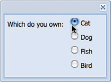
Because the RadioGroup class extends the CheckboxGroup class, the implementation is identical, so I’ll save you from going over the same material. Now that we’ve explored the Checkbox and Radio classes and their respective Group classes, we’ll begin to tie these together by taking a more in-depth look at the FormPanel, where you’ll learn to perform form-wide checks and complex form layouts.
6.6. The FormPanel
With the Ext FormPanel you can submit and load data using Ajax and provide live feedback to users if a field is deemed invalid. Because the FormPanel is a descendant of the Container class, you can easily add and remove input fields to create a truly dynamic form.
The XMLHttpRequest object in most browsers can’t submit file data. To give the appearance of an Ajax-like submission, Ext JS uses an IFRAME to submit forms that contain file input elements.
An added benefit is the FormPanel’s ability to leverage other layouts or Components, such as the TabPanel with the CardLayout, to create robust forms that take considerably less screen space than traditionally laid-out single-page forms. Because the FormPanel is a subclass of Panel, you get all of Panel’s features, which include top and bottom Toolbars and the button footer bar (fbar).
Like the other Container subclasses, the FormPanel class can leverage any layout that’s available from the framework to create exquisitely laid-out forms. To assist with the grouping fields, the FormPanel has a cousin called the Fieldset. Before we build our Components, take a sneak peak of what we’re going to achieve (figure 6.16).
Figure 6.16. A sneak peek of the complex FormPanel we’re going to build

To construct your complex form, you’ll have to construct two FieldSets: one for the name information and another for the address information. In addition to the FieldSets, you’ll set up a TabPanel that has a place for some TextFields and two HtmlEditors. In this task, you’ll leverage all of what you’ve learned thus far, which means we’ll go over quite a bit of code.
Now that you know what you’ll be constructing, let’s start by building out the FieldSet that will contain the TextFields for the name information.
Listing 6.7. Constructing our first FieldSet

In constructing your first fieldset xtype, the parameters may look like those of a Panel or Container. This is because the FieldSet class extends Panel and adds some functionality for the collapse methods to allow you to include fields in a form or not, which we don’t exercise
here. The reason you’re using the FieldSet in this instance is that it’s giving you that neat little title up top and you’re getting exposure to this Component.
You’ll skip rendering this first FieldSet because you’ll use it in a FormPanel a little later on. Let’s go on to build the second FieldSet, which will contain the address information. This listing is rather large, so please stick with me on this.
Listing 6.8. Building our second FieldSet


In listing 6.8, you leverage Ext.apply to copy many of the properties from fieldset1 and apply them to fieldset2. This utility method is commonly used to copy or override properties from one object or another. We’ll talk more about this
method when we look into Ext’s utility toolbelt. To accomplish the desired layout of having the State and ZIP code fields
side by side, you must create quite a bit of nesting. The child of your second FieldSet is a Container, which has its layout set to column. The first child of that Container is a FormLayout Container , which contains the State TextField . The second child of your ColumnLayout Container is another FormLayout Container, which contains the ZIP code TextField .
You might be wondering why there are so many nested containers and perhaps why the code to get this done is so darn long. The Container nesting is required to use different layouts within other layouts. This might not make sense to you immediately. I think the picture will be clearer to you when you render the form. For now, let’s move on to building a place for these two FieldSets to live.
In order to achieve the side-by-side look of the form, you’ll need to create a container for it that’s set up to leverage the HBoxLayout. In order to have equal widths in the HBoxLayout, you must set both of your FieldSets’ stretch properties to 1. Let’s build a home for the two FieldSets:
var fieldsetContainer = {
   xtype        : 'container',
   layout       : 'hbox',
   height       : 120,
   layoutConfig : {
       align    : 'stretch'
   },
   items  : [
      fieldset1,
      fieldset2
   ]
};
In the preceding code block, you create a Container that has a fixed height but has no width set. This is because this Container’s width will be automatically set via the VBox layout, which your future FormPanel will use.
Now that you’ve done that, you’ll build a TabPanel with three tabs, one for the phone number form elements and the other two for HtmlEditors. This will use the bottom half of the FormPanels’ available height. You’ll configure all of the tabs in one shot, so the following listing is pretty lengthy. Please bear with me on this one also.
Listing 6.9. Building a TabPanel with form items

Listing 6.9 contains a lot of code to construct an array that comprises three tabs that will serve as children to your future TabPanel. The first tab is a Container that leverages the FormLayout and has four TextFields. The second and third tabs are HtmlEditors that will be used to enter a resume and a short biography. Let’s move on to building our TabPanel:
var tabPanel = {
   xtype             : 'tabpanel',
   activeTab         : 0,
   deferredRender    : false,
   layoutOnTabChange : true,
   border            : false,
   flex              : 1,
   plain             : true,
   items             : tabs
}
In the preceding code block, you configure a TabPanel object that contains your tabs. You set deferredRender to false because you want to ensure that the tabs are built and in the DOM when you get around to loading your data. You also set layoutOnTabChange to true to ensure that the doLayout method for the tab you’re activating is called, which ensures that the tab is properly sized.
Your task in the next listing will be to construct the FormPanel itself, which is relatively trivial compared to all of its child items.
Listing 6.10. Piecing it all together
var myFormPanel  = new Ext.form.FormPanel({
    renderTo     : Ext.getBody(),
    width        : 700,
    title        : 'Our complex form',
    height       : 360,
    frame        : true,
    id           : 'myFormPanel',
    layout       : 'vbox',
    layoutConfig : {
       align     : 'stretch'
    },
    items        : [
       fieldsetContainer,
       tabPanel
    ]
});
Here, you’re finally getting to create your FormPanel. You set renderTo to ensure that the FormPanel is automatically rendered. In order to have the fieldsetContainer and the TabPanel properly sized, you use the VBoxLayout with layoutConfig’s align property set to 'stretch'. You specify only a height for the fieldsetContainer. You do this because other than the height of the fieldsetContainer you let the VBoxLayout do its job in managing the size of the child items of the FormPanel. Take a look at figure 6.17 to see what this beast of a form renders to.
Figure 6.17. The results of our first complex layout form with the different Containers used to compose the complex layouts

In the preceding figure, I highlighted the different Containers that compose the first half of the form, which include our fieldsetContainer, two FieldSets, and their child Components. In using this many Containers, you’re ensuring complete control over how the UI is laid. It’s common practice to have these long code batches to create a UI with this type of complexity. In exercising our newly built FormPanel, you can flip through the three tabs and reveal the HtmlEditors underneath.
By now you’ve seen how combining multiple Components and layouts can result in something that’s both usable and space saving. You now must focus your attention on learning to use forms for data submission and loading; otherwise, your forms will be useless.
6.7. Data submission and loading
Submitting data via the basic form-submit method is one of the areas new developers most commonly get tripped up on. This is because for so many years we were used to submitting a form and expecting a page refresh. With Ext, the form submission requires a bit of know-how. Likewise, loading a form with data can be a little confusing for some, so we’ll explore the few ways you can do that as well.
6.7.1. Submitting the good old way
As I said before, submitting your form the good old way is extremely simple, but you need to configure the FormPanel’s underlying form element with the standardSubmit property set to true. To perform the submission you call
Ext.getCmp('myFormPanel').getForm().submit();
This will call the generic DOM form submit method, which will submit the form the old-fashioned way. If you’re going to use the FormPanel in this way, I’d still suggest that you review submitting via Ajax, which will point out some of the features that you can’t use when using the older form-submission technique.
6.7.2. Submitting via Ajax
To submit a form, you must access the FormPanel’s BasicForm component. To do this, you use the accessor method getForm or FormPanel.getForm(). From there, you have access to the BasicForm’s submit method, which you’ll use to send data via Ajax. The code is shown in the following listing.
Listing 6.11. Submitting our form
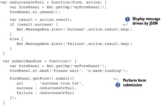
In listing 6.11, you create a success and failure handler called onSuccessOrFail, which will be called if the form-submission attempt succeeds or fails. It will display an alert MessageBox depending on the status of the returning JSON from the web server. You then create the submission handler method, submitHandler, which performs the form submission Although you specify the URL on the submit call, you could have specified it at the BasicForm or FormPanel level, but you specify it here because I wanted to point out that the target URL could be changed at runtime. Also, if you’re
providing any type of wait message, as you do here, you should have success and failure handlers.
At minimum, the returning JSON should contain a 'success' Boolean with the value of true. Your success handler is expecting a msg property as well, which should contain a string with a message to return to the user:
{success: true, msg : 'Thank you for your submission.'}
Likewise, if your server-side code deems that the submission was unsuccessful for any reason, the server should return a JSON object with the success property set to false. If you want to perform server-side validation, which can return errors, your return JSON could include an errors object as well. Here’s an example of a failure message with attached errors:
{
   success : false,
   msg     : 'This is an example error message',
   errors  : {
      firstName : 'Cannot contain "!" characters.',
      lastName  : 'Must not be blank.'
   }
}
If the returning JSON contains an errors object, the fields that are identified by that name will be marked invalid. Figure 6.18 shows the form with the JSON code served to it.
Figure 6.18. The results from our server-side errors object using the standard QuickTip error msg

In this section, you learned how to submit your form using the standard submit methods as well as the Ajax way. You also saw how to leverage the errors object to provide server-side validation with UI-level error notification. Next, we’ll look at loading data into the form using the load and setValues methods.
6.7.3. Loading data into our form
The use cycle of just about every form includes saving and loading data. With Ext, we have a few ways to load data, but we must have data to load, so we’ll dive right into creating some data to load. Let’s create some mock data and save it in a file called data.txt.
var x = {
    success : true,
    data    : {
        firstName : 'Jack',
        lastName  : 'Slocum',
        middle    : '',
        address   : '1 Ext JS Corporate Way',
        city      : 'Orlando',
        state     : 'Florida',
        zip       : '32801',
        home      : '123 346 8832',
        business  : '832 932 3828',
        mobile    : '',
        fax       : '',
        resume    : 'Skills:<br><ul><li>Java Developer</li>' +
                       '<li>Ext JS Senior Core developer</li></ul>',
        bio       : 'Jack is a stand-up kind of guy.<br>'
    }
}
Just like with form submission, the root JSON object must contain a success property with the value of true, which will trigger the setValues call. Also, the values for the form need to be in an object, whose reference property is data. Likewise, it’s great practice to keep your form element names inline with the data properties to load. This will ensure that the right fields get filled in with the correct data. For the form to load the data via Ajax, you can call the BasicForm’s load method, whose syntax is just like submit:
var formPanel = Ext.getCmp('myFormPanel'),

formPanel.el.mask('Please wait', 'x-mask-loading'),
formPanel.getForm().load({
    url     : 'data.txt',
    success : function() {
       formPanel.el.unmask();
    }
});
Executing this code will result in your form panel performing an XHR (XMLHttpRequest) and ultimately the form being filled in with the values, as illustrated in figure 6.19.
Figure 6.19. The results of loading our data via XHR

If you have the data on hand, let’s say from another component such as a DataGrid, you can set the values via myFormPanel.getForm().setValues(dataObj). Using this, dataObj would contain only the proper mapping to element names. Likewise, if you have an instance of Ext.data.Record, you could use the form’s loadRecord method to set the form’s values.
Tip
To retrieve the values from any given form, call getValues from the FormPanel’s BasicForm instance. For example, myFormPanel.getForm().getValues() would return an object containing keys representing the names of the fields and their values.
Loading data can be as simple as that. Remember that if the server side wants to deny data loading, you can set the success value to false, which will trigger the failure method as referenced in the load’s configuration object.
Congratulations! You’ve configured your first truly complex FormPanel and learned how to load and save its data.
6.8. Summary
In focusing on the FormPanel class, we covered quite a few topics, including many of the commonly used fields. You even got a chance to take an in-depth look at the ComboBox field, where you got your first exposure to its helper classes, the data Store and the DataView. Using that experience, you saw how to customize the ComboBox’s resulting list box. We also took some time to build a relatively complex layout form and used our new tool to submit and load data.
Moving forward, we’re going to take an in-depth look at the data GridPanel, where you’ll learn about its inner Components and see how to customize the look and feel of a grid. You’ll also see how to leverage the EditorGridPanel class to edit data inline. Along the way, you’ll learn more about the data Store. Be sure to get some candy; this is going to be a fun ride!