
Chapter 9. DataView and ListView
This chapter covers
- Learning about DataViews
- Customizing the DataView rendering of data
- Implementing a custom XTemplate
- Exercising multicomponent event communication
Displaying lists of data in a web application is something that we’ve all had to deliver at one time or another in our careers. Whether it’s a list of books, servers on a particular subnet, or a list of employees, the process is the same. Retrieve the data; format and display it. Although this process is simple from a high level, the burden of maintaining the under-the-hood JavaScript has prevented us from being able to focus all of our attention on getting the task done. Throw in the ability to select multiple items, and you find yourself spending more time on maintenance than further developing your application.
In this chapter, you’ll learn that with the DataView you can achieve this goal easily, saving you time and allowing you to focus on the deliverables at hand. We’ll begin by constructing a DataView and introduce a major supporting class, the XTemplate, along the way. You’ll learn what it takes to properly configure the DataView for single or multiple Record selections.
Afterward, you’ll learn how to create a ListView to display data in a tabular format, much like the GridPanel. You’ll see what it takes to bind it to your implementation of the DataView to assist with the filtering of data from the DataView.
As icing on the cake, you’ll learn how to make complex two-way bindings between the DataView and FormPanel, to allow users to update data. What you’ll learn in the final exercise will help you in binding the DataView and ListView to other widgets in the framework.
9.1. What is the DataView?
The DataView class uses the data Store and XTemplate to provide the ability to paint data on the screen easily. It has all of the necessary plumbing on its DOM structure to provide for tracking the mouse and has single- or multiple-node selection models.
Figure 9.1 illustrates a DataView in action and highlights how the data Store and XTemplate support it.
Figure 9.1. The DataView and various supporting classes

As illustrated, the DataView consumes data from the data Store by means of event bindings. Because of these bindings, it’s smart enough to know how to efficiently handle the DOM changes. For instance, if a single Record is deleted from a store, the element whose index matches the Record index is removed from the DOM. For added flexibility, pagination can also be applied to the DataView via binding a PagingToolbar to the DataView’s bound store.
Note
Unlike the GridPanel and TreePanel, DataView doesn’t extend from Panel, which means that it can’t be configured to use any of the Panel features, such as Toolbars. The good news is that the DataView does extend from BoxComponent, which means it can be used in layouts and can easily be wrapped by a Panel.
We talked about Templates earlier in this book, and you learned how you can stamp out HTML fragments easily with that tool. The DataView uses the Template’s more powerful cousin, the XTemplate, which adds the ability to have subtemplates, inline code execution, conditional processing, and much more.
Now that you know what a DataView is and does, it’s time to start building one.
9.2. Constructing a DataView
You’ve been asked to develop a full-screen mini-application to allow members of the HR team to quickly list employees in the company. They want the records to be styled and have a background similar to a manila folder. For each Record, the view needs to be able to display the employee’s full name, department, date hired, and email address. The requestor stated that this view would be part of a larger app, which you’ll learn more about once you’ve completed this view. The backend is complete and ready to serve up JSON, which means that all you need to do is write the frontend code.
To fulfill this initial requirement, you’ll have to create a DataView that will live in a ViewPort. But before you can start writing the JavaScript code, you need to construct the CSS for your HTML. This is because when implementing DataViews, as end developers you’re required to configure the CSS to style the contents of the widget. If you didn’t apply styling, the painted data would be unusable.
Figure 9.2 shows what our DataView would look like if it was not styled, versus styled.
Figure 9.2. An unstyled (left) DataView compared to a styled (right) DataView

It should be obvious that a styled DataView is better for both usability and the user’s eyes. Each implementation of the DataView has its own styles. Perhaps when you implement this widget on your projects, you can create a base CSS set of rules that all of these widgets can leverage, giving a unified look to the application.
Having seen what it needs to look like, you can configure the CSS before you begin work on the JavaScript for the widget and its supporting classes, as shown in the following listing.
Listing 9.1. Setting the DataView styles
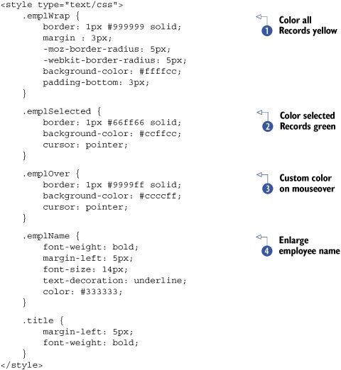
In listing 9.1, you configure all of the CSS that will be used by the DataView. The first rule, emplWrap  , will be used to style each Record with a light gray border and a yellowish background. The next rule, emplSelected
  , will be used to color a Record green when a user has selected it. The third rule, emplOver
  , will be applied to a Record when the mouse is hovering over it and will color it blue. The last two rules, emplName
  and title, are additional rules to style the inner contents of each rendered Record.
Now that you have the CSS in place, you can begin with the construction of the store that will provide the data.
9.2.1. Building the Store and XTemplate
We’re constructing the data Store first, in the following listing, because it will help you know what the mapped fields are when you configure the XTemplate for the DataView.
Listing 9.2. Implementing a remote JsonStore

You create the JsonStore for your DataView in listing 9.2, which leverages a remote ScriptTagProxy to perform the data request tasks. When creating the JsonStore XType, you set autoLoad to true, which will automatically cause the proxy to fire the request after instantiation. You also define the field mappings inline
for all of the required data points. This will help you in constructing the XTemplate.
Because the Store is a nonvisual component, there’s not much to see at this point. You’ll begin by constructing the XTemplate in the next listing, and then we’ll have a brief discussion about it because it’s important to understand how the data that will be passed to the XTemplate is applied to construct the DOM fragments.
Listing 9.3. Constructing the XTemplate

In order for a DataView to render data onscreen, it needs an Ext JS Template. This is why you instantiate an instance of Ext.XTemplate first . Although we’re not going to dive too deeply into the usage of XTemplates, I do feel that it’s important to discuss what the XTemplate is doing. This is your first exposure to this Component, and many developers commonly overlook the tpl tag and the for attribute . I want to make sure you’re not one of them.
The first (and last) tags that are specified in the XTemplate list of arguments are tpl, and they help the XTemplate organize logical branches of HTML. In the first tpl tag, there is a for attribute, which specifies which data point the XTemplate is to use to fill in for that branch. To help you understand this, we’ll quickly examine the data returned by the server and ponder how the Template would look if the data were different.
Each of the Records the XTemplate will use is constructed like the following plain JavaScript object:
{
   'id'        : '1',
   'firstname' : 'Karyn',
   'lastname'  : 'Chase',
    ...
}
By setting the for attribute of the tpl tag with a single period ".", the XTemplate knows that the branch below the tpl will use the root object to fill the data points as specified in the HTML fragment defined within.
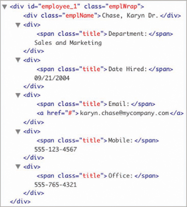
Figure 9.3 shows what that Record looks like stamped out in the DOM with the XTemplate we just defined.
Figure 9.3. A rendered HTML fragment as viewed in Firebug’s DOM inspection panel

The HTML fragment illustrated in the figure shows the Template filled out with the data for a single Record. Notice that all of the data points that are defined in the XTemplate are replaced by the actual data from the root of the Record.
Okay, but what if the requirement was for phone numbers to be displayed in a flexible fashion—to display only what’s in the record? For this, the data might be structured differently.
For instance, added to the following object is a phoneNumbers property, which is an array of objects containing the phone type and number:
{
    'id'           : '1',
    'firstname'    : 'Karyn',
    'lastname'     : 'Chase',
    ...
    'phoneNumbers' : [
        {
            'type' : 'Mobile',
            'num'  : '555-123-4567'
        },
        {
            'type' : 'Office',
            'num'  : '555-765-4321'
        }
    ]
};
In this case, the XTemplate to consume this data would look like the following:
var otherTemplate = new Ext.XTemplate(
'<tpl for=".">',
'<div class="emplWrap" id="employee_{id}">',
'<div class="emplName">{lastname}, {firstname} {title}</div>',
'<div>',
<span class="title">Department:</span>',
{department},
'</div>',
'<div>',
'<span class="title">Date Hired:</span>',
'{datehired}',
'</div>',
'<div>',
'<span class="title">Email:</span> ',
'<a href="#">{email}</a>',
'</div>',
'<tpl for="phoneNumbers">',
'<div><span class="title">{type}:</span> {num}</div>',
'</tpl>',
'</div>',
'</tpl>'
);
Notice the second tpl tag toward the end of the argument list. This denotes another branch of the HTML fragment, and the for attribute specifies that this branch is for the "phoneNumbers" property, which happens to be an array. For every object in that array, XTemplate will loop through and produce a copy of that branch of HTML. Figure 9.4 shows that HTML fragment.
Figure 9.4. The exploded HTML fragment that can be produced by the XTemplate with a for loop
Notice that there are two div elements for the phoneNumber objects, and the values for the mapped properties are populated within. You now know how to flex some of the XTemplate’s muscle, and you’re better prepared for a similar situation.
Though we won’t be touching on the XTemplate’s many capabilities, it’s important to note that the Ext JS API has well-written examples of the XTemplate on the API documentation page: http://www.extjs.com/deploy/dev/docs/?class=Ext.XTemplate.
You now have your XTemplate (employeeDvTpl) constructed and a basic understanding of what the tpl tag and for attribute arguments are and what they do. We can now move forward with constructing the DataView and placing it in a Viewport.
9.2.2. Building the DataView and Viewport
In the following listing, you’ll construct the DataView that will display all of the employees in the company.
Listing 9.4. Constructing the DataView

To construct the DataView , not much configuration has to be applied. Most of the code to create a DataView occurs in the configuration or instantiation of the supporting data Store and XTemplate. But it’s important to take a good look at the configuration options that have been supplied.
Other than the usage of the template and store, you set singleSelect to the Boolean value true. Setting this property as such will instruct the DataView to allow single or multiple (multiSelect) node selections when DataView’s element is clicked. This is important when you want a rendered Record to be selectable. We set this property to true because I have a strong feeling that the company will want to do something with this DataView in the future, such as update Records when an item is selected.
In order to help the DataView along with the selection of a node, when setting singleSelect or multiSelect properties to true you must set the itemSelector property, which must be filled in with a proper CSS selector. This property helps the DataView hone in on the element that you want to be displayed as selected. It also helps with managing the visual cues for mouseover. The selector that you set will help the DataView highlight the entire Record. In this case, you’re using the div element with the CSS class emplWrap as the selector.
Next, you set selectedClass and overClass for the CSS classes that you defined earlier, and they’ll be used to give the user visual cues as to when a Record is selected or when the mouse hovers over a Record.
In order to allow automatic scrolling of the DataView’s element, you need to manually set the CSS on the element. I elected to include it inline to help you see the CSS being applied for automatic scrolling; you can just as easily replace the style with cls, whose value is a CSS class to enable automatic scrolling.
This concludes the DataView construction. You need to give it a home. Because the client wants a full-screen view, you should place this in a Viewport, which is what you’ll do in the next listing.
Listing 9.5. Constructing the Viewport
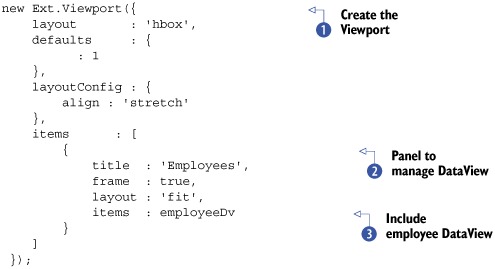
Here you instantiate an instance of Viewport to help render the DataView to take up the full browser view. You could instruct the Viewport to use the FitLayout, because there’s a single child element, but to have room for future expansion, you’ll use the HBoxLayout.
Also, notice that the first child item for the Viewport is a Panel , whose layout is 'fit' and has its frame property set to true. Wrapping the DataView in a Panel will allow you to provide a nice blue frame around it, helping users understand what they’re looking at.
This concludes the construction of the DataView. Let’s see what this thing looks like and how it behaves onscreen (figure 9.5).
Figure 9.5. The rendered DataView

Our DataView renders onscreen, giving users the ability to view all of the employees in the company. You can see that the mouseover event is properly tracked and a single rendered Record can be selected. Great!
But something isn’t right. The UI seems somewhat slow. The initial render of the data is slow, and when the browser is resized, the UI update lags significantly, as apparent in figure 9.6.
Figure 9.6. Because there are too many Records onscreen, the simple act of resizing the browser results in a visual delay of the Ext Viewport resize.

If you look at the Store, you’ll see 2,000 Records onscreen. Surely this is impacting performance. Also, users would most likely complain if we bombarded them with that many rows at a time. We need to come up with a way to increase performance. We need to take a moment to ponder the possible solutions.
A quick fix would be to add a PagingToolbar to the DataView’s parent Panel and bind it to the DataView’s Store. Surely this would assist with the performance, but it wouldn’t really make the DataView usable. Even if we split 2,000 Records into 100-Record pages, users would have to flip through 20 pages of data to get what they want. How can we increase performance and make it more usable?
What’s that you say? Display the Records by department? Yes! I love that idea. Okay, but how? We could use a ComboBox, but the list of departments wouldn’t be static. Also, it would require two clicks to select a department. I think users would want something that contained a static list of Records, allowing them to filter the list by means of a single click to select a department.
We could use another DataView, but I think it would be helpful to display the number of employees in each department, which means we need something that can easily manage the data in a column format. A GridPanel would be a nice choice, but it’s overkill. It has features such as column drag and drop, which aren’t needed and add costs to the UI. I think this is a perfect job for the ListView.
9.3. Enter the ListView
We just constructed a DataView that renders data about all of our company’s employees onscreen at one time, and its performance is less than ideal. We determined that we should use the ListView to display the departments in our company and how many employees each department contains. But what’s a ListView?
The ListView widget is a subclass of the DataView class that provides a means of displaying data in a tabular format and has a few of the features from the DataView and GridPanel. These features include resizable and sortable Columns, selectable Records, and the ability to have customized Templates.
Note
Even though the ListView presents a GridPanel-like UI, it’s not designed to be used in place of the GridPanel where GridPanel-specific features are required. For instance, the ListView doesn’t have the ability for horizontal scrolling and has no native support for editing the data inline like the EditorGridPanel. The ListView also doesn’t have the ability to drag and drop Columns, nor does it include a Column menu.
The ListView also comes prepackaged with a Template and required CSS, which makes it a cinch to implement, as you’ll see. Let’s construct the ListView that you’ll need. After all of the configuration required to use the DataView, you’ll see that constructing a ListView is much easier. This code will have to be placed before the Viewport, because it will be rendered next to the DataView.
Listing 9.6. Constructing the ListView

To construct the ListView, you begin with the creation of ScriptTagProxy to fetch and feed the data to the reader of the ListView-supporting JsonStore . The JsonStore is pulling only the department name and number of employees per Record.
Next, you create the ListView to display the departments. In addition to the previously created JsonStore, the configuration properties contain singleSelect, to enable selection. Because the ListView ships with prebuilt CSS rules and a Template, you needn’t specify the overCls, selectedCls, and itemSelector properties. But if you do want to use a custom Template for your own projects, you’ll most likely have to set those properties accordingly to match your Template.
Next, you style the ListView with a white background. By default, the ListView element contains no background styling and would appear blue when it renders in the wrapped Panel because you set the Panel’s frame property to true. Notice that you don’t have to set the scroll CSS rule. This is because the ListView sets its element to automatically scroll for you.
Finally, you set a columns property, which is an array of objects that are used to configure the Columns that will vertically organize the data. The second Column is configured to display the number of employees for the departments. Notice that the width is .20, which is to express the
percentage of the ListView width that column will take. Because there’s no horizontal scrolling with this grid-like widget, the Column-sizing rules are a bit convoluted. Knowing these rules will help you understand why we’ve configured these Columns this way and in further implementations of this widget.
The first rule is that Column widths are always expressed as a percentage of the ListView’s container. If no Column widths are configured, the ListView will automatically size each Column equally to fit the ListView’s element. This means that for any Columns that you wish to have some control over the widths, you must configure them. Otherwise, if left blank, they’ll be automatically resized.
To translate these rules to listing 9.6, because the 'Department Name' Column has no defined width property, it will be stretched to the remaining width of the ListView after 20 percent has been carved out for the '# Emp' Column. This gives the 'Department Name' Column as much room as possible and makes the '# Emp' Column small enough to display the data without being truncated.
The ListView is now set up and ready to be rendered onscreen. Let’s wrap the ListView in a Panel and place it in a Viewport to the left of the DataView. To do this, you’ll have to modify the Viewport’s items array. Here’s what the changes should look like:
items : [
     {
        title  : 'All Departments',
        frame  : true,
        layout : 'fit',
        items  : departmentLV,
        flex   : null,
        width  : 210
     },
     {
        title  : 'Employees',
        frame  : true,
        layout : 'fit',
        items  : employeeDv
     }
]
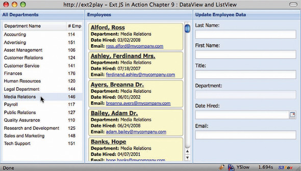
To add the ListView to the Viewport, you wrap it in a Panel. You inject it before the Employees DataView so it will be rendered to the left-most column and have a static width. Figure 9.7 shows what the ListView looks like rendered next to the DataView.
Figure 9.7. The ListView (left) rendered with the DataView (right)

Cool! The ListView renders to the left of the DataView, and department Records can be selected. There are two problems with the current implementation of these two widgets. The first should be obvious—nothing happens when you select a Record. Also, the Employees DataView is still loading the 2,000 Records. In order to finish this, you’ll need to bind the DataView to the ListView and prevent it from loading all of those Records automatically.
9.3.1. Binding the DataView to the ListView
We just solved the problem of displaying the departments and their total number of employees by implementing a ListView and rendering it to the left of the Employees DataView, but we didn’t bind them to solve the performance problem. To do this, we’ll first need to prevent the DataView’s store from automatically loading. This one is easy. Set the autoLoad property of the employeeDvStore as follows:
autoLoad : false
Next comes the fun part: configuring a click listener for the ListView to call on the DataView’s store to request the employees for the department that’s selected. To do this, you’ll need to add the following listeners configuration object to the ListView’s config properties.
listeners : {
     click : function(thisView, index) {
         var record = thisView.store.getAt(index);
         if (record) {
             Ext.StoreMgr.get('employeeDv').load({
                 params : {
                     department : record.get('department')
                 }
             });
         }
     }
}
By adding this listener to the ListView, you ensure that the DataView is loaded with the Records that represent the department desired by the users. Here’s how it works.
The click event generated by the DataView (remember, ListView is a descendant of DataView) passes the source view Component and the index of the Node that was clicked as located by the configured itemSelector. You attempt to create a reference of the Record selected to instruct the Employees DataView to load. If the Record is defined, then you use the Ext.StoreMgr.get method to obtain a reference to the Employees DataView store by its ID and call its load method. You pass in an object, which contains a params object. The params object contains the department name that was selected.
The load method call will instruct the Employees DataView store to call on the proxy to invoke a request for the employees of the selected department, as shown in figure 9.8. Let’s examine how this changes the behavior thus far.
Figure 9.8. The ListView’s (left) click event now filters the DataView (right).

Excellent. The ListView now filters the DataView as you’ve configured it to. You can see that the changes result in a much more responsive UI for the user.
I’ve sent this over to the users, and they’ve responded expressing their appreciation but have one last request. They want the ability to modify the data for the employee selected. To do this you’ll have to configure a FormPanel and add it to the Viewport. This gives you an excellent opportunity to learn how to bind a FormPanel to a DataView and observe the DataView’s ability to efficiently update data on HTML onscreen.
9.4. Bringing it all together
In order to allow users to edit the employee Records, you’ll need to create a FormPanel for them. The FormPanel needs to have a Button to allow them to commit the saved changes. In order to get all of this stuff to work together, you’ll have to create a small event model. Here’s how this stuff will work.
Figure 9.9 shows the proposed layout changes and proposed event handlers and their expected behavior.
Figure 9.9. The addition of the FormPanel and the required event model

To populate the FormPanel with the selected data, you’ll have to reconfigure the DataView with a click handler to get the job done. Also, the FormPanel’s Save Button will be required to set the various properties on the Record to update the DataView. Last, the Departments ListView will have to clear the FormPanel’s values when it’s clicked to avoid an exception. It sounds like a lot of work, but it’s not. You’ve done most of it alsready.
Let’s begin by creating the FormPanel and adding it to the Viewport. Then we’ll circle back and work on the bindings.
9.4.1. Configuring the FormPanel
The following listing is lengthy, but it’s mainly due to the number of fields that need to be in the form. The following code needs to be placed just before the instance of Viewport is created.
Listing 9.7. Constructing the FormPanel
var updateForm = {
    frame       : true,
    id          : 'updateform',
    labelWidth  : 70,
    xtype       : 'form',
    defaultType : 'textfield',
    buttonAlign : 'center',
    title       : 'Update Employee Data',
    labelAlign  : 'top',
    defaults    : {
        anchor : '-5'
    },
    items       : [
        {
            name       : 'lastname',
            fieldLabel : 'Last Name'
        },
        {
            name       : 'firstname',
            fieldLabel : 'First Name'
        },
        {
            name       : 'title',
            fieldLabel : 'Title'
        },
        {
            name       : 'department',
            fieldLabel : 'Department',
            disabled   : true
        },
        {
            xtype      : 'datefield',
            name       : 'datehired',
            fieldLabel : 'Date Hired'
        },
        {
            name       : 'email',
            fieldLabel : 'Email'
        }
    ]
};
Here you create the FormPanel with six fields. Notice that each field has a name attribute that matches the corresponding Record field name. This is important to know because if you want to load the Record, the field name must match the Record that it will be configured to consume.
The Department field is disabled because the users have indicated that they don’t want to use this tool to update departments. They want a drag-and-drop tool for that, which we’ll be tasked to build later on.
Next, you’ll place it in the Viewport. Here’s what the modified items array will look like:
items          :  [
     {
          title  : 'All Departments',
          frame  : true,
          layout : 'fit',
          items  : departmentLV,
          flex   : null,
          width  : 210
     },
     {
          title  : 'Employees',
          frame  : true,
          layout : 'fit',
          items  : employeeDv,
          flex   : 1
     },
     updateForm
]
Notice that all you’re doing is adding the updateForm reference to the end of the list, which will make it appear to the right of the Employees DataView. Figure 9.10 shows what it will look like rendered.
Figure 9.10. The ListView (left), DataView (center), and FormPanel (right)
The FormPanel renders perfectly, which means you’re ready to begin the bindings. This is where the fun begins.
9.4.2. Applying the final bindings
You’ll begin by binding the Employees DataView to the FormPanel by means of a click handler, which will retrieve the selected Record and call on the FormPanel’s BasicForm to load the Record. To assist with the task of binding the FormPanel to the DataView, you’ll set a local reference to the selected Record on the FormPanel itself.
To add the click handler to the Employees DataView, you’ll need to add the following listeners object to its configuration object:
listeners : {
    click : function(thisDv, index) {
        var record = thisDv.store.getAt(index);
        var formPanel = Ext.getCmp('updateform'),
        formPanel.selectedRecord = record;
        formPanel.getForm().loadRecord(record);
    }
}
This code snippet works just like the click handler you assigned to the ListView a bit earlier. The difference is that you’re setting the Record reference on the FormPanel and calling on its BasicForm’s loadRecord to set the values of the fields. Notice that the Record reference that’s being set is selectedRecord. This will be key when you work on the round-trip binding.
You can test this by refreshing the page, selecting a department, and then choosing an employee. The Record should load and the fields should be set with the data accordingly, as shown in figure 9.11.
Figure 9.11. Testing the DataView to FormPanel binding

Excellent! You have your one-way binding from the DataView to the FormPanel in place. In order to commit the changes, the users will need a Save Button. To do this, you’ll have to add a buttons property to the FormPanel’s configuration object with a single Button, whose text is “Save.” The handler will be responsible for leveraging the recently set FormPanel’s selectedRecord and setting its value according to the changes made on the FormPanel.
Add the following snippet to the FormPanel:
buttons : [
    {
        text    : 'Save',
        handler : function() {
            var formPanel = Ext.getCmp('updateform'),
            if (formPanel.selectedRecord) {
                var vals = formPanel.getForm().getValues();

                for (var valName in vals) {
                    formPanel.selectedRecord.set(valName, vals[valName]);
                }
                formPanel.selectedRecord.commit();
            }
        }
    }
]
When the newly configured Button is pressed, it will use Ext.getCmp to get a reference to the FormPanel. If it contains a selectedRecord property, it will loop through each value retrieved from the form and set the Record’s corresponding property accordingly. Last, the Record’s commit method is called, making the changes permanent and causing the DataView to repaint only the Node that was modified.
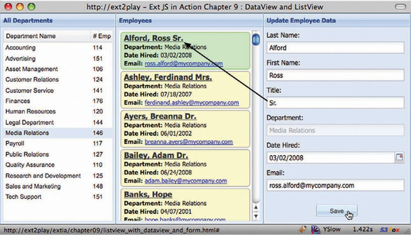
As illustrated in figure 9.12, clicking Media Relations and then Alford Ross will cause that employee’s Record to populate the FormPanel. I added “Sr.” to the Record, because the value was missing, and clicked the newly added Save Button. What you can immediately see is that the rendered Record is updated based on the data from the FormPanel, completing the two-way binding between the DataView and the FormPanel.
Figure 9.12. Testing the round-trip binding of the FormPanel to the DataView
Note
Because the exercises in this chapter leverage a remote data Store, we can’t save data via Ajax because of the same-domain policy that the XHR object enforces. This is why this example doesn’t invoke a form submission.
The last thing you need to do is code the clearing of the FormPanel when the Department ListView selection changes. This will help prevent exceptions that the user might cause if they attempt an update on a Record that might not be there because of a department selection change.
Replace the previously developed click handler with the following code:
click : function(thisView, index) {
     var record = thisView.store.getAt(index);
     if (record) {
        Ext.StoreMgr.get('employeeDv').load({
            params : {
            department : record.get('department')
        }
     });
     var formPanel = Ext.getCmp('updateform'),
     delete formPanel.selectedRecord;
     formPanel.getForm().reset();
   }
}
By studying the changes, you can see that all you had to do was add three lines to create a reference to the FormPanel, delete the selectedRecord reference, and then call the BasicForm’s reset method, clearing the data from the fields. You can observe this in action by selecting a department, an employee, and then a different department. The fields will clear, signaling that it works.
This concludes the deliverable of binding DataView, ListView, and FormPanel. When you encounter the need to implement a DataView or ListView for your application, remember that you can bind these two widgets to any other widgets by means of events. An example of this is a rowclick event of a GridPanel, which could trigger the data Store load of a DataView or ListView to provide a level of drill-down capability. Likewise, inverse binding can be applied as well.
9.5. Summary
In this chapter we explored two commonly used widgets, the DataView and its cousin the ListView. In doing so, we not only looked at how they work but also saw how to bind them together, applying advanced concepts that could be carried into any application.
We began by explaining what a DataView is and what it takes to configure one. While exploring the DataView, we took some time to discuss one of its supporting classes, the XTemplate. By an example, you saw that you’re required to create the CSS to style the painted data onscreen.
Next, you learned about the ListView class and the features it provides. We discussed the rules of the column-sizing model, and you learned how to bind the ListView to a DataView by means of a click event.
Last, you learned how to create a two-way binding between a FormPanel and a DataView to allow your users to update the data for the employees. In doing so, you got to witness the efficiency of the DataView in updating only the DOM linked to the record that was updated.
Next, we’ll tackle the use of Charts, and you’ll learn how to configure them to respond to click gestures.