
Chapter 17. The application stack
This chapter covers
- Laying out the application layer namespace
- Developing the workflow components
- Completing the application
In the last chapter, we discussed how to develop a scalable and maintainable application architecture with Ext JS by dividing the code into layers and segmenting by namespace. We examined mockups of the application, identified and created all of the reusable widgets, and placed them in the reusable layer of our application stack.
In this chapter, we’ll implement those reusable components and see the benefits of segmenting reusable components from the workflow components that we’ll soon create. We’ll begin with a quick review of the application screens, designing and laying out the application layer namespace architecture as we determine what classes to create. This will give you a holistic view of how the application stack will be constructed and guide you through the development process.
After the application analysis, we’ll develop the application in layers, screen by screen, starting each with an in-depth analysis of the desired interaction model that comes from the requirements. We’ll use this knowledge to implement our reusable classes and “wire up” and construct the workflow logic.
In the end, we’ll tie things together by developing our own custom navigation and authentication controller. This chapter will be the most challenging thus far. On the flipside, I think it’ll also be the most rewarding because you’ll get to experience firsthand how all of the work you did in the last chapter will allow you to focus on the setup of the application workflow, which is the majority of the application layer code.
If you want to take a break at any time along the way and see how all this is supposed to work, you can visit the application online at http://app.extjsinaction.com.
17.1. Developing the application namespace
To kick things off, we’ll begin with a quick review of the application screen mockups. This exercise will give you a good understanding of how to lay out the application namespace and refresh your memory.
17.1.1. Reviewing the application screens
After the user is successfully logged in, they will be greeted with the company Dashboard screen shown in figure 17.1. This screen will implement the CompanySnapshot and DepartmentBreakdown custom ChartPanel implementation classes. We’ll do a deep analysis of each screen before we begin construction. We’ll call this class Dashboard.
Figure 17.1. The Dashboard screen

Users will be able to navigate between screens by pressing the Buttons located in the top Toolbar. This Toolbar will also contain a Button to allow users to log out of the application. To visit the other two screens, they will have to press the associated Toolbar Button.
Figure 17.2 shows the Manage Departments screen.
Figure 17.2. The Manage Departments screen

This screen will allow users to perform full CRUD operations for employees as well as move (associate) employees from other departments to the department selected on the left. This class will be named DepartmentManager.
When the user wishes to create or update employee records, the system will present a Window with an embedded EmployeeForm, as shown in figure 17.3.
Figure 17.3. The Edit employee Window

When we discussed this widget in the last chapter, we decided that it would live in the application layer because of the necessary workflow logic, such as field checking. This widget will also have custom events to allow the DepartmentManager screen to know when an employee is created or updated so it can create or update Records in the EmployeeGridPanel. This class will be aptly named EmployeeEditorWindow.
The last screen, shown in figure 17.4, is designed to allow for quick CRUD operations of employees, and the class will be called EmployeeManager.
Figure 17.4. The Manage Employees screen
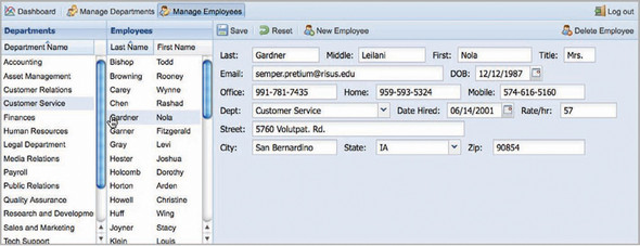
This screen implements three of our reusable widgets and has a context-sensitive left-to-right workflow, which means that we’ll have to code quite a few event listeners to make this happen. Every function that this screen provides is contained within the screen itself.
This concludes the application UI refresher. We can now move on to lay out the application namespace.
17.1.2. Designing the application namespace
The purpose of this application is to manage a company’s department and employee association and is named Company Manager by the business. I generally like to name the application namespace in accordance with the application name, so we’ll call our application namespace CompanyManager.
Using the information we gathered when reviewing the application, we can properly arrange the namespace layout, as shown in figure 17.5.
Figure 17.5. The application namespace layout

Each of the application screens is represented by a class; in addition, the workspace class manages the presentation of the three main screens, as well as navigation and authentication. Because this class is the glue that ties together the entire application, we’ll work on it last.
You now have a good idea of how we’ll organize our application namespace. We’ll begin construction of this stack with the Dashboard screen.
17.2. Building the Dashboard screen
Recall that the Dashboard screen will be presented to the user after a successful login. It’ll implement the two ChartPanel extension classes, CompanySnapshot on the left and DepartmentBreakdown on the right. Because this screen doesn’t contain anything other than these two widgets, we’ll use a Container and implement the HBoxLayout.
Per the requirements, users can click a chart series node in the CompanySnapshot and view the department statistics for the selected year. This means that we’ll have to configure an itemclick event listener to cause the DepartmentBreakdown store to load.
Now that you have an understanding of the UI and workflow requirements for the Dashboard screen, we can begin construction of the Dashboard class, shown in the following listing.
Listing 17.1. The Dashboard class

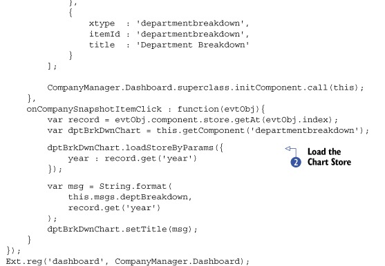
The entire Dashboard class fits inside listing 17.1. This is the first time that you can see and enjoy the benefits of a well-designed reusability layer. To create the Dashboard class, we only needed to implement the preconfigured CompanySnapshot and DepartmentBreakdown classes via XType configuration objects. In addition to the layout of these two classes, we set up the itemclick  event handler, which will cause the instance of DepartmentBreakdown to send a request
  to the server based on the year that was clicked in the CompanySnapshot panel.
That’s all there is to it. There are a few reasons why this code is so short. The first is that the ChartPanelBaseCls does most of the heavy lifting for the Charts. Another is that the CompanySnapshot and DepartmentBreakdown classes are preconfigured, so we needn’t put any of that gunk in our application layer. Last, this screen, relative to its cousins, doesn’t contain a lot of interactivity.
Note
If you want to test this screen in a browser, you can place it in an Ext.Viewport with the FitLayout.
As you’ll see with the next screen, writing the code for user interactivity can take a lot of effort, when there are a few workflows to enforce in the application. We’ll continue our application construction with the Manage Employees screen because its workflow is much smaller than that of the Manage Departments screen.
17.3. The Manage Employees screen
The Manage Employees screen is designed for easy CRUD operations for employee records for the company. Before we can begin coding, you’ll need to understand the UI workflow requirements for this screen. This will guide us in making the proper decisions for coding UI interactions, such as the context sensitivity of the different widgets.
17.3.1. Discussing the workflow
The Manage Employees screen implements a common left-to-right workflow, where the two rightmost widgets are context sensitive to the leftmost. Please look at figure 17.6, because it illustrates the selection workflow for the screen.
Figure 17.6. The Manage Employees screen context sensitivity

When this screen is shown, the DepartmentsListView (left) will load, gathering a list of the departments within the company, and the EmployeeList (middle) and EmployeeForm (right) are cleared of any loaded data. To load or create an employee Record, the user must first select a department. This sets the first context, where the selection of a department will trigger the EmployeeList class load, displaying all employees for the selected department on the left.
From here, the user can update or delete an employee by selecting an employee Record in the EmployeeList. Selecting an employee Record sets the second context, triggering the EmployeeForm to remotely fetch and load the data for the selected employee.
Along with the event model for the three widgets, we have to be concerned with capturing any successful CRUD operation made against an employee Record. For instance, when a new employee is added to a department, instead of reloading the EmployeeList, we’ll use the createAndSelectRecord utility method (defined in the ListPanelBaseCls) to create a new data.Record and set its values accordingly. This will ensure that the traffic to the server is minimized and the UI is much snappier.
The same goes for editing or deleting an employee Record. To update a Record, the user must select an employee from the EmployeeList, make changes to the form, and then click Save. If the save is successful, we’ll refresh the Record with the new data. When a user deletes an employee, the Record is removed from the data Store of the EmployeeList and the form is purged of its data.
Whenever the user makes a change that has been successfully committed by the server, we’ll prompt them with a successful change alert. This will give them ample notification that their change was successful.
Tip
Some application developers are fine with just silently making changes to the UI whenever a CRUD operation occurs, but I like to give feedback to users in the form of an alert dialog box. This ensures that they’re aware of the status of the requested change.
We’ll post a confirmation dialog box when a user decides to delete an employee. This application has no undo, so prompting the user to confirm the deletion of a Record is a good idea, because this gives the user an opportunity to verify that they’re performing a delete operation on the intended employee.
Last, the reset will cause the form to reset based on the last state the form was in. For instance, if data was loaded, pressing the reset Button should undo any changes that the user made. If the form was cleared, reset should wipe the form again, returning it to a virgin state. This all will come from the framework via the trackResetOnLoad configuration option that we set in the FormPanelBaseCls constructor extension that we configured in the last chapter.
We can now begin construction of this component.
17.3.2. Constructing EmployeeManager
This class will have quite a few methods and configurations. We’ll begin by defining and examining the template. Afterward, we’ll code clusters of methods until we’ve finished.
Listing 17.2. The EmployeeManager screen class

If you examine listing 17.2, you’ll see a msgs configuration object , in addition to the typical factory , event handler  , and utility methods
  . The purpose of the msgs object is to place reusable strings, most of which contain placeholders that can be filled in with the little-known String.format utility method. As you’ll see when implementing the CRUD operation workflows, having this type of centralized container for
messages to the user will help rid us of the dependency of having to manually concatenate strings, cleaning up our code quite
a bit.
. The purpose of the msgs object is to place reusable strings, most of which contain placeholders that can be filled in with the little-known String.format utility method. As you’ll see when implementing the CRUD operation workflows, having this type of centralized container for
messages to the user will help rid us of the dependency of having to manually concatenate strings, cleaning up our code quite
a bit.
Last, this class implements the HboxLayout with the align:'stretch' configuration. Looking forward, the following listing contains the msgs object and initComponent method.
Listing 17.3. The msgs object and initComponent method

Listing 17.3 contains our msgs object along with the initComponent method. If you examine the contents of the msgs object , you’ll see that some of the strings have so-called tokens, which String.format will use to fill in portions of the string later on.
Tip
Ext JS adds a few more utility methods to the String class that are useful for managing string format. To read about them, visit the API documentation at http://www.extjs.com/deploy/dev/docs/?class=String.
The initComponent method calls upon the three factory methods to construct the EmployeeForm, DepartmentsListView, and EmployeeListView configurations and sets them all as the local this.items array.
In the next listing, we’ll construct the three factory methods described previously.
Listing 17.4. The three factory methods

Listing 17.4 contains the three factory methods used to configure the three custom widgets implemented by this screen. They all follow the same pattern, where the component is configured and event listeners are registered.
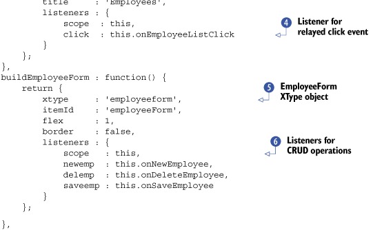
The buildDepartmentListView method will configure a DepartmentsListView XType , which will have a static width and a listener for the relayed click event . When fired, the onDepartmentListClick method will be responsible for loading the EmployeeListView and clearing the EmployeeForm.
Following the pattern above it, buildEmployeeListView will configure an EmployeeListView XType and register the relayed click event with the onEmployeeListClick handler. This method will call upon the EmployeeForm to remotely load via Ajax.
Finally, the buildEmployeeForm method will configure the EmployeeForm  and register three event listeners for each of the CRUD operations
  . onNewEmployee will clear the form of its values, whereas onSaveEmployee will submit the data contained in the form. onDeleteEmployee is somewhat of a special case, because it’ll request confirmation from the user via Ext.MessageBox.confirm. As you’ll see later, the callback method, onConfirmDeleteEmployee, will be used to perform the Ajax request if the user clicked Yes.
With our factory methods complete, we can move on to developing the 10 event handler methods. We’ll first focus on the ListView click event handlers, starting with onDepartmentListClick, shown in the following listing.
Listing 17.5. onDepartmentListClick

In listing 17.5, quite a bit of work is being done to perform the desired left-to-right workflow and handle any exceptions that may occur from the EmployeeForm load operation.
Recall that onDepartmentListClick will be called whenever the DepartmentsListView’s click event is fired and a Record is selected. We leverage the selection model from the ListView via the getSelected utility method introduced by the ListPanelBaseCls we constructed in the last chapter to set a reference to the selected department.
Once the Record reference is created, we use it to load the EmployeeListView via another utility method found in the ListPanelBaseClass named loadStoreByParams, where we pass an object with a single property, the id of the selected department. This causes the data Store of the EmployeeListView instance to request the employees for the selected department and refresh its views.
Last, this method calls the EmployeeForm’s clearForm method, which ensures any loaded data is purged. It then calls this.setDeptIdOnForm, which is a convenience method that will fill in the selected department and the current date. This allows the user to create a new user as soon as they select a department, reducing their workflow by one click.
In the next listing, we’ll focus on the EmployeeListView click workflow.
Listing 17.6. Handling the EmployeeListView click and EmployeeForm load failure

onEmployeeListClick is responsible for loading the EmployeeForm when an employee Record is clicked. It does this by obtaining a reference for the selected employee Record via the getSelected utility method. It uses this reference to dynamically format a string, which will be used to mask the entire document body,
informing the user that the form is loading. By masking the entire body, we ensure that the users can’t click anything else
in the UI, which could cause another Ajax request and possibly an exception.
When the EmployeeForm load method is called, an object is passed, which contains the typical success and failure handler references. The success method is a reference to the local this.clearMask method, which we’ll construct later. The failure method, onEmployeeLoadFailure , is more involved, providing a friendly exception to the user if the load request were to fail.
We’ve finished the ListView event handler model. Still to be created are the CRUD operation handlers, which we’ll start next. We’ll begin with create and delete in the following listing.
Listing 17.7. onNewEmployee and onDeleteEmployee

To handle the creation of an employee, the onNewEmployee method accomplishes two tasks. First, it causes the EmployeeListView to purge its selected nodes. Purging the selection will allow us to determine what mode (create or update) the EmployeeForm is in down the road, when we work on the code that’s fired after a successful save request.
The second task is clearing the form of any value and setting the departmentId and dateHired fields accordingly, which is what the yet-to-be-developed prepareFormForNew method will do. By clearing the form, we erase the ID hidden field, which tells the server-side code that this is a new Record. Setting the departmentId allows new employee Records to be associated properly to the correct department, and setting the dateHired field is a convenience for the user. Effectively, the form sits dormant in create mode until the user saves the data via the Save Button.
Recall that the onDeleteEmployee is bound to the Delete Button of the top Toolbar. It then presents a customized confirmation dialog box to the user using MessageBox.confirm . In order to capture and process the response from the user, we pass the yet-to-be-developed callback method, this.onConfirmDeleteEmployee, and the scope, this, as the second and third parameters to the MessageBox.confirm method.
Next, we’ll code the onConfirmDelete callback method and onAfterDeleteEmployee, which is the success callback for the delete employee Ajax operation request.
Listing 17.8. onConfirmDeleteEmployee and onAfterDeleteEmployee

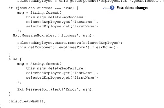
onConfirmDeleteEmployee checks to see if the passed button ID (btn) is equal to 'yes'. If so, it formats a friendly message and masks the entire page with it. It then performs an Ajax request to the server to perform the delete operation, passing the employee id as the only parameter.
The callback method reference passed to the Ajax.request method will perform a custom two-phase check to verify that the web transaction was successful, where only if the returning HTTP status code is favorable and the returning stream is valid JSON will the custom succCallback method get called, executing any after-request workflow logic. Performing this type of check can help prevent any duplicate code from performing the aforementioned verification steps during each Ajax request.
onAfterDeleteEmployee will be called after the server returns a valid JSON stream. If it returns at least {success:true} , a customized alert dialog box is displayed to inform the user that the delete operation was a success. Immediately afterward,
the employee Record is removed from the Store and the form is purged of any values using the clearForm utility method. If for some reason the server returned valid JSON data but success was equal to false, then we’d alert the user that the delete operation failed, using a friendly formatted message.
Tip
When developing the server-side code, there’s no reason why you couldn’t publish a failure code or a string explaining why it failed. For this, you can set something like a message string to the returning JSON stream and reference it via jsonData.message in the alert to the user located in the else block of onAfterDeleteEmployee.
This completes the create and delete portions of the workflow. In order to update or save a new Record, we need to develop the save portion of the workflow, which is what we’ll do in the next listing.
Listing 17.9. Handling the save workflow


Listing 17.9 has three methods that will handle the save operation of a new or existing employee Record. onSaveEmployee is called when the EmployeeForm’s saveemp event is fired. If the EmployeeForm is valid, a submission of the data is attempted. If the form isn’t valid, a friendly message is displayed to the user and no submission attempt
is made. We set both the success and failure callback methods to manage the response from the server.
onEmpFormSaveSuccess is the submission success callback method. This method is responsible for figuring out whether the employee data was for a new Record or an existing one and has two branches of logic depending on each. Here’s how it works.
This logic can determine whether the form is in edit mode or not by getting the selected Record from the EmployeeListView. Recall that to edit employees, a user must select a Record in the EmployeeListView widget, and when a new employee is created, any selections in the EmployeeListView are purged via the onNewEmployee method we created earlier.
For existing employees, all that needs to happen is an update of the Record data in the EmployeeListView to reflect any changes made for the last or first name. But for new employees, things get a little tricky and need to be
handled accordingly to prevent duplicate Records from being created if any edits to a newly created employee needed to be made immediately after the Record was created.
For new employees, we need to get the data returned from the server, which contains the ID of the newly created employee row
in the database. Instead of refreshing the EmployeeListView widget, use its createAndSelectRecord utility method, passing in the request result data. This will create the Record and select it in the view. Next, we set the values of the form using that same result data. This allows us to apply any changes
to the data that may have been made by the server, such as inappropriate word filtering.
The reason we’re rolling out our own CRUD code instead of using the framework-supplied DataWriter is that at the time of this writing, DataWriter has some undesirable behaviors such as creating a Record for a Store even if the create action failed in the backend.
The last method, onEmpFormSaveFailure, will handle any failure conditions returned by the server. This could mean anything from a bad HTTP status code for the request or a good HTTPD status code along with JSON containing {success:false}. Because our backend doesn’t currently support intelligent error messages, we show a static error message to the user if this condition is met.
The code to manage saving data is complete. We can now move on to develop the three utility methods, which will complete this screen.
Listing 17.10. Handling the full save cycle

Listing 17.10 contains two methods that will be used by various portions of the code that we developed thus far and one that will be used by the master application controller, workspace, which we’ll develop at the tail section of this chapter.
As discussed earlier, prepareFormForNew will be called by onNewEmployee and is responsible for setting the departmentId and dateHired values in preparation for a new employee. It will do this only if a selected department is detected in the DepartmentsListView widget.
The clearMask method is used to remove the mask from the document.body element and is called from various points in the workflow code above. Finally, the cleanSlate method will be called by the workspace every time this screen is displayed, because it’s responsible for refreshing the DepartmentsListView widget and clearing the EmployeeListView and EmployeeForm widgets.
Note
This behavior is put in place to fulfill requirements for the application globally, where the Manage Employees and Manage Departments screens are to be placed in a virgin state when chosen for display.
This concludes the development of the Manage Employees screen. You learned how to implement three of the classes from our reusable layer and apply asynchronous workflow bindings and constraints to them. You also saw how the use of utility methods like String.format can help keep our code clean, eliminating the need for messy string concatenation to create dynamic text strings to inform the user.
Next, we’ll tackle the most complex screen of this application, Manage Departments, where you’ll learn how to utilize the workflow bindings we implemented in the EmployeeManager class. We’ll take things a step further and show how to bind to this screen two of our custom Window widgets, one of which we created in the last chapter and another that we’ll work on after the DepartmentManager class.
17.4. The Manage Departments screen
Out of all of the screens in this application, Manage Departments contains the most workflow logic. This is because the user can perform CRUD operations for department and employee Records as well as move (associate) employees from one department to another.
With the development of Manage Employees, you became familiar with coding complex CRUD workflows. Because Manage Departments employs many of the exact same techniques, we won’t be reviewing the code but rather discussing how the workflow logic works, aided by workflow diagrams.
We’ll start by stepping through the department CRUD workflows.
17.4.1. The navigation and department CRUD workflows
To refresh your memory and as a point of reference, figure 17.7 shows the Manage Departments screen in action.
Figure 17.7. The Manage Departments screen

The navigation and create department workflows both lead to the same point, where the screen is left in a state in which users can enter or edit data for a department. The new department workflow, however, is a lot more involved, including making some changes to the UI. To make discussion easier, I’ve included the flowchart in figure 17.8, which illustrates in a simple way how the navigation and new department workflows operate.
Figure 17.8. The Manage Departments navigation and new department workflows

The navigation workflow is managed by onDepartmentListClick and is called whenever the user selects a department in the DepartmentsListView. This action causes the DepartmentForm to load, allowing the user to edit the data for the selected department.
onNewDepartment is invoked when the user clicks the New Department Button and purges the DepartmentForm of all of its data. Because the user is creating a department, the DepartmentsListView is cleared of any selections and the EmployeeEditorGrid's Toolbar Buttons are disabled.
Both of these workflows place the screen in a state that allows users to create or edit information. From here, users can elect to save their changes. Figure 17.9 shows how the save workflows operate.
Figure 17.9. The department save workflows

After the user modifies data in the DepartmentForm, they must click the Save Button to invoke the save workflow illustrated in figure 17.9. onDeptFormSave is called when the Save Button is clicked and first checks to see whether the form is valid. If it isn’t, the user is alerted and is allowed to return to edit the data in the form to correct the problem. If the form is valid, the form is submitted, registering onDeptFormSaveSuccess and onDeptFormSaveFailure as respective success/failure handlers.
onDeptFormSaveFailure has the simple job of alerting the user that the submission failed, whereas onDeptFormSaveSuccess is much more involved. The success handler is responsible for determining whether the user is editing an existing Record and performs work accordingly.
If an existing Record is being modified, the selected Record is modified accordingly. Otherwise, a DepartmentsListView Record is created and selected in addition to the EmployeeGridPanel Toolbar Buttons being enabled. Both result in the user being alerted to the successful save event.
The final workflow revolves around deleting a department and is illustrated in figure 17.10.
Figure 17.10. The delete department workflow

The delete department workflow for the DepartmentManager is identical to that of the delete employee workflow in the EmployeeManager, where only if a Record is selected will a confirmation dialog be presented when the Delete Department Button is clicked. To complete the deletion request, the user must click the Yes Button of the confirmation dialog box, which will invoke an Ajax request to perform the deletion of the department in the backend. If that request is successful, then the Record is deleted and the user is alerted of the successful transaction. Otherwise, the user is alerted of the failure and the selected Record is kept intact.
By now, you’ve started to see a pattern evolve, where confirmations in addition to status alerts coupled with UI changes make the UI interactive for the user. The employee CRUD workflows will follow similar patterns. But because creating and editing use an external editor, it’s worth having a quick overview of how it all works.
17.4.2. Employee CRUD workflows
The Manage Departments screen is designed to allow CRUD operations for employees without requiring users to switch to the Manage Employees screen. To facilitate this requirement, three Buttons at the top of the EmployeeGridPanel are embedded in the DepartmentForm, one for each CRUD operation.
The class that gives the Manage Departments screen the ability to create and update employees is called EmployeeEditorWindow, and it has create and edit workflows that are similar to those of the Manage Employees screen, but greatly reduced.
Note
In order to save you time, EmployeeEditorWindow is already developed and available in the downloadable source code.
As a visual reference, figure 17.11 shows what the EmployeeEditorWindow looks like when rendered onscreen.
Figure 17.11. The EmployeeEditorWindow widget in action

For a user to create an employee, a department must exist in the database and be selected in the DepartmentsListView. When the New Employee Button is clicked, the EmployeeEditorWindow class will display an empty EmployeeForm, asking the user for data for the new employee Record. To edit employees, users will either double-click the Record or select a Record and click the Edit Employee Button, causing the EmployeeEditorWindow to be displayed with data.
Figure 17.12 shows the workflow diagram for this user interaction model.
Figure 17.12. The create and edit employee workflows

As you can see in figure 17.12, both the create and edit employee user actions result in the display of the EmployeeEditorWindow, but each has a subtle difference. The difference is in two configuration properties set when EmployeeEditorWindow is being instantiated. EmployeeEditorWindow requires either the ID of the selected department (create) or the Record of the selected employee (edit) to know how to display the embedded form.
When the EmployeeEditorWindow is instantiated, DepartmentManager doesn’t keep a reference to it, which is what I like to call a loosely coupled component. This means that DepartmentManager relies on the EmployeeEditorWindow’s custom employeesaved event to be published so it can create or update a Record in the EmployeeGridPanel accordingly.
Because this widget is responsible for saving new or existing employee data, you should take a quick look at its internal workflows, shown in figure 17.13.
Figure 17.13. The employee save

If the form is valid when the user clicks the Save Button in the window, it will submit the data via the implemented EmployeeForm. Upon successful submission, the window will fire a custom employeesaved event, for which DepartmentManager will be listening.
When this event is fired, the EmployeeEditorWindow will automatically be dismissed, and DepartmentManager will determine whether the save operation was for a new employee so that it can create a Record or update an existing one.
Figure 17.14 is a quick workflow diagram of how this works. As illustrated in the figure, the onEmployeeWindowSaveSuccess method is a listener to the EmployeeEditorWindow employeesaved event, and when invoked, it will determine if action has been taken on an existing Record. If so, it’s updated; otherwise, a new Record is created. Either way, the user is made aware of the successful change.
Figure 17.14. The DepartmentManager employee save workflow

To delete an employee, the user can select one or more Records in the EmployeeGridPanel and click the Delete Employee Button, invoking the workflow shown in figure 17.15.
Figure 17.15. The delete employee workflow logic

The act of clicking the Delete Employees Button while having one or more employees selected will result in a confirmation dialog box. If the person clicks the Yes Button, an Ajax request is invoked to delete the employee records from the database. If the server returns favorably, the selected Records are removed from the EmployeeGrid and the user is alerted to the success of the request. If the server returns unfavorably, the user is alerted of the failure. This workflow is nearly identical to the delete department workflow, except it deals with one or more selected Records in a grid.
We’ve completed the employee CRUD workflow. Next, we’ll cover the final workflow for the Manage Departments screen, where users can associate one or more employees from one department to another.
17.4.3. Employee association workflow
The last bit of functionality that the Manage Departments screen will give to its users is the ability to associate employees from one department to another. To do this, users will have to select a department in the DepartmentsListView and click the Associate Employee(s) Record in the EmployeeGridPanel. This will display the AssociateEmployeeWindow, illustrated in figure 17.16.
Figure 17.16. The AssociateEmployeeWindow in action

When this window is rendered onscreen, it will display all of the departments via another instance of DepartmentsListView, except for the department selected in DepartmentManager. This will help prevent user requests from accidentally associating employees with a department to which they already belong.
The Window follows the same workflow as all others, where the context for the screen is set by the selection of a department. The department selection will trigger the loading of the EmployeeGridPanel in this window.
Figure 17.17 diagrams the workflow logic.
Figure 17.17. The employee association logic workflow

To associate employees, the user must select one or more Records and click the Add Button. This will cause the EmployeeAssociationWindow to fire its custom assocemployees event, for which DepartmentManager has a listener setup known as onAssociateEmployees. When this method is called, a confirmation dialog box will be displayed.
Only if the user presses the Yes Button will DepartmentManager invoke an Ajax request to the server to associate the employees with their new department. If the web server responds favorably, because the association operation is more of a move operation, the DepartmentManager will remove the Records from the EmployeeGridPanel inside the EmployeeAssociationWindow and add them to the GridPanel inside its own DepartmentForm.
Finally, it will inform the user that the operation was successful and will keep the EmployeeAssociationWindow alive so the user can associate more employees if desired. Unlike the EmployeeEditorWindow, the EmployeeAssociationWindow will never self-close; the user must click the Close Button in the window’s bottom button bar to dismiss it. It’s set up this way so users can loop through the association workflow more easily.
We’ve reached the end of our discussion of the DepartmentManager workflows. As you can see, this screen will offer a lot to the users and will require a lot of logic wiring to make it all possible. We can now move on to tie our three screens together by developing a workspace singleton controller, which will handle the global application workflow, including navigation and generic authentication. Hang in there. We’re almost finished.
17.5. Piecing it all together
All of the work we’ve done thus far has led us up to this point, the grand finale, where we combine all the pieces of our application layer and see them come together as a single, unified application. To make this happen, we’ll create a singleton that will be called upon to bootstrap the application, implement the screens we’ve created thus far, and control the navigation workflow.
Recall that a singleton is a JavaScript design pattern where a class is constructed and can be instantiated only once, and it’s referred to via a reference that can be accessed globally. Because that workspace needs to live only once per page load, this design pattern is perfect for placing all of the logic in one container, called a closure.
We’ll begin by having a quick discussion of the various workflows and then move on to developing the singleton.
17.5.1. The workspace workflows
The workspace singleton, which will be referred to as workspace from now on, will be in charge of two rather simple but important areas of our application. The first is providing a lightweight authentication mechanism. This application will be used by a limited and static set of users in the company; their usernames and passwords have already been set up in the database, so we need not create a registration page.
To ensure users log in, workspace will check for the presence of a login cookie that will be created and provided by the server. Only if the login cookie is present will workspace display the application. Otherwise, a login window will be dynamically generated to request the user’s credentials.
Once users are logged in, the login window will be destroyed and the viewport created, revealing the application dashboard as the first screen. From there, the user can refresh the page, and as long as the login cookie is still present in their browser, they’ll be greeted with the application upon page load.
Users can then click the Log Out Button at any time after a successful login. The logout handler will first request confirmation from the user. If the user confirms, the Viewport and all of its contents will be destroyed along with the login cookie, and the login window will be instantiated and displayed.
If the authentication workflow we’ve just discussed seems familiar, it’s because we’re mimicking the current authentication design pattern that’s implemented in modern UI desktops.
The navigation workflow is the other main piece of functionality that workspace provides. Instead of using a TabPanel as the main view controller, we elected to use a generic Panel with a top Toolbar with Buttons that, when clicked, reveal the screen to which they’re bound. To make this happen, we’ll implement the CardLayout.
With the workflows now covered, we can move on to create workspace.
17.5.2. Constructing the workspace singleton
Because this is the first time we’ve covered such a class, we’ll walk through the code. We’ll begin the construction of the workspace singleton in the following listing by observing the class template, and then we’ll move on to code the various factory, workflow, and utility methods.
Listing 17.11. The workspace class template

When reviewing the code in 17.11, you’ll see four variables set at the top of the singleton . These are considered private, lexically scoped variables and they’ll be used by the methods returned in the object below
them.
In that return object is the init method, which will be the bootstrap method for the entire application and is registered with Ext.onReady . Along with the init method and factory methods are the login, logout, and navigation workflow controller methods. Additionally, there are two
utility methods, one of which is onAfterAjaxReq, which is used extensively by the app tier.
We’ll look at the shorter init and buildLoginWindow methods in the next listing, and then we’ll move on, developing buildViewport, which is rather lengthy.
Listing 17.12. The workspace init method
init : function() {
     if (! cookieUtil.get('loginCookie')) {
         if (! loginWindow) {
             loginWindow = this.buildLoginWindow();
         }
         loginWindow.show();
     }
     else {
         this.buildViewport();
     }
},
buildLoginWindow : function() {
    return new TKE.window.UserLoginWindow({
        title   : 'Login to Department Manager',
        scope   : this,
        handler : this.onLogin
    });
},
The init method is responsible for bootstrapping the application. It first checks to see if a valid 'loginCookie' exists. If the cookie doesn’t exist, then a loginWindow is created and displayed. Otherwise, the buildViewport method is called, which constructs and renders the main application body onscreen.
The buildLoginWindow factory method will instantiate and return an instance of TKE.window.UserLoginWindow. This preconstructed class does something special, where it binds the Enter key from the form input fields to the pass handler (this.onLogin) method.
This is more of a convenience for the users, allowing them to press the Enter key when focused on any of the input elements to submit the contents of the form. I like to do this for login forms, but it can be implemented on any form. UserLoginWindow also binds the handler to the Login Button in the footer bar of the window.
With the login window complete, we can construct the workspace viewport. This listing is lengthy but mainly consists of configuration, so it’s an easy read.
Listing 17.13. The workspace buildViewport method
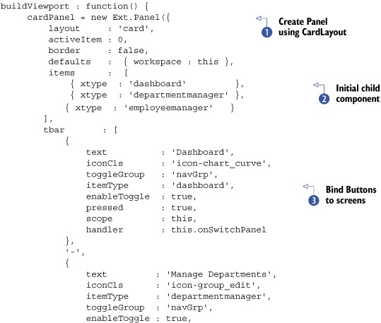

In listing 17.13, a lot of configuration is stuffed into the buildViewport factory method. It’s this way because I was trying to reduce the overall complexity of the workspace singleton. Here’s how it works.
This method first constructs the main application Panel, which is the application, cardPanel , which implements the CardLayout. This Panel will also instantiate all of the screens as the child items as well as a top Toolbar with the three navigation Buttons and the logout Button .
Note
Notice that we’re setting all the workspace property child items as this, which is workspace. This is so all of the child items can use the workspace’s onAfterAjaxReq utility method, reducing code duplication.
Because the Dashboard will be the first screen that users will see when the application renders, we need to ensure that the associated Button looks depressed (selected). To do this, we set the associated Button’s pressed configuration option to true.
All of the screen-associated Buttons are bound to the onSwitchPanel method , which will act as the main navigation logic controller. We needed a way to somehow to tell onSwitchPanel what type of class each of these Buttons should be associated with. Because xtype is a reserved option, I had to get a little creative, so I chose itemType.
This itemType property will be transposed into an xtype property in onSwitchPanel. When these screen-associated Buttons are clicked, onSwitchPanel will use the itemType to search cardPanel’s child items for an instance of the class named in the itemType property. If the class exists, the active card is switched accordingly. Otherwise, a new instance of the class described by itemType is instantiated and then set as the active card.
The final task that this factory method will complete is instantiating a Viewport , whose only child item is cardPanel. In order to stretch cardPanel to the size of the browser’s viewport, the Viewport will use the FitLayout.
That’s it for the construction and configuration of the widgets and screens for this application. In the next listing, we’ll work on the login workflow.
Listing 17.14. The workspace login workflow

The login workflow in listing 17.14 is logically segmented into three methods. First is onLogin, which is bound to both the login form fields and the containing window button. Its job is to mask the login window and submit
the login form if it’s valid. The other two methods are callback methods that will handle the response of the submission.
onLoginSuccess will unmask the window and check for the presence of the login cookie. If it’s there, then this.buildViewport is called, the login window is destroyed, and its reference is set to null. Otherwise, the this.onLoginFailure method is called. I’ve configured this callback handler this way because even if the server returns the minimal response
({"success":true}), the response may not contain the loginCookie. This method is configured this way because the presence of the cookie is the only indication that the login was truly a
success.
onLoginFailure, on the other hand, has a simple job: alert the user that the login attempt was a failure. Because the login window is already rendered, it only needs to be unmasked to allow the user to reattempt a login once the alert is dismissed.
The login workflow is now complete; we can move on to work through the logout workflow, shown in the following listing.
Listing 17.15. The workspace logout workflow

The logout workflow in listing 17.15 is relatively simple. onLogout is bound to the Logout Button and when called will request confirmation from the user . If the user clicks the Yes Button, this.doLogout is called.
doLogout is charged with masking the document body and invoking an Ajax request to the backend to clear the user’s session. The backend will return an expired cookie as well as {"success": true}, ultimately causing onAfterLogout to be invoked . afterLogout is simple; it will call this.destroy to destroy the Viewport and reinitialize the application workspace.
With the logout workflow finished, we can develop the navigation workflow methods in the following listing and then move on to code the utility methods, completing this class.
Listing 17.16. The workspace navigation workflow

Listing 17.16 contains the logic to handle the switching from one card to another. Recall that onSwitchPanel is bound to the three navigation Buttons. Because the Buttons pass themselves as references (btn) to their click handlers, we can set a reference to the xtype of the screen that’s to be displayed via the custom itemType property .
Next, we use the Container findByType utility method to search the child items MixedCollection for anything that matches the xtype for the Button pressed . If no matching child is found, then a new child is added to cardPanel using the xtype property and is set to the newPanel reference. If there is a matching child, then the newPanel reference is to it . Last, the index of the newly added or existing child item is fetched and passed on to this.switchToCard along with the reference for the child item to be displayed.
switchToCard is responsible for getting the index of the current active item and testing to see if the current active panel index (activePanelIdx) matches the desired index (newCardIndex). If this test is true, then a switch to the desired card index is made via a call to the CardLayout’s setActiveItem utility method. Last, if the screen contains a cleanSlate (method) reference, then it’s called, placing that screen in a virgin state.
That’s all there is to the navigation workflow. In the following listing, we’ll work on the two utility methods for the workspace.
Listing 17.17. The workspace utility methods

In listing 17.17, we wrap up workspace by developing the last two methods in the singleton, which are utility methods. onAfterAjaxReq is often used throughout the Manage Employees and Manage Departments screens as well as workspace’s logout workflow to perform a two-phase check on any Ajax request made within the application. Here’s how it works.
After unmasking the document body, it tests to see if the success property is equal to true . Sometimes servers will respond unfavorably, returning a non-200-ish HTTP status code. If this is the case, then no further
processing is necessary. We know something went wrong, so we’ll post an alert to the user stating that the “web transaction
failed.”
If the transaction is successful (success === true), an attempt to convert (decode) the inbound string data into a JSON object is wrapped in a try/catch block . If there’s no exception, the custom options.succCallback method is called, passing along the decoded jsonData and the options passed to the Ajax.request object. We use succCallback instead of success, because success is a reserved key for the Ajax requests.
The last method, destroy, is in charge of the cleanup of the application after the logout workflow has completed. To make this happen, it destroys
the Viewport and sets the reference to the Viewport and cardPanel to null, because they’re no longer needed. Finally, it calls the workspace’s init method, effectively bootstrapping the application again, causing the login window to display .
This concludes the workspace class and the rest of the application. Congratulations! Because you have a pluggable architecture in place, making improvements or changes should be a breeze now. For instance, to add another screen to this application, you’d follow the same pattern where you’d create the reusable components, placing them in the reusability layer. Then, you’d implement them in the application layer and finally plug them into the workspace by adding a Button with an associated custom itemType property.
17.6. Summary
In this chapter you learned how to implement the reusability layer, allowing you to focus on coding workflow logic for the application layer. We developed and implemented three screens as well as a custom navigation and authentication workspace controller.
We started by developing the Dashboard screen, where we enjoyed the benefits of having most of the hard work done by the reusability layer. Next, we developed the Manage Employees screen. This is where, after a deep analysis of the workflows, you got to see what it takes to develop navigation along with CRUD workflows. When discussing the construction of the Manage Departments screen, you saw how you could employ reusable CRUD patterns from EmployeeManager.
We tied everything together with a workspace singleton that served as both navigation and authentication controllers. While developing this class, you learned how to set up basic authentication and application bootstrapping.
There you have it, an application using Ext JS!