Chapter 5 Understanding Fundamental Statistical Concepts
This chapter focuses more on statistical concepts than on using SAS. It discusses using PROC UNIVARIATE to test for normality. It also discusses hypothesis testing, which is the foundation of many statistical analyses. The major topics are the following:
- understanding populations and samples
- understanding the normal distribution
- defining parametric and nonparametric statistical methods
- testing for normality
- building hypothesis tests
- understanding statistical and practical significance
Testing for normality is appropriate for continuous variables. The other statistical concepts in this chapter are appropriate for all types of variables.
Describing Parameters and Statistics
Parametric and Nonparametric Statistical Methods
Statistical Test for Normality
Other Methods of Checking for Normality
Statistical and Practical Significance
A population is a collection of values that has one value for every member in the group of interest. For example, consider the speeding ticket data. If you consider only the 50 states (and ignore Washington, D.C.), the data set contains the speeding ticket fine amounts for the entire group of 50 states. This collection contains one value for every member in the group of interest (the 50 states), so it is the entire population of speeding ticket fine amounts.
This definition of a population as a collection of values might be different from the definition you are more familiar with. You might think of a population as a group of people, as in the population of Detroit. In statistics, think of a population as a collection of measurements on people or things.
A sample is also a collection of values, but it does not represent the entire group of interest. For the speeding ticket data, a sample could be the collection of values for speeding ticket fine amounts for the states located in the Southeast. Notice how this sample differs from the population. Both are collections of values, but the population represents the entire group of interest (all 50 states), and the sample represents only a subgroup (states located in the Southeast).
Consider another example. Suppose you are interested in estimating the average price of new homes sold in the United States during 2008, and you have the prices for a few new homes in several cities. This is only a sample of the values. To have the entire population of values, you would need the price for every new home sold in the United States in 2008.
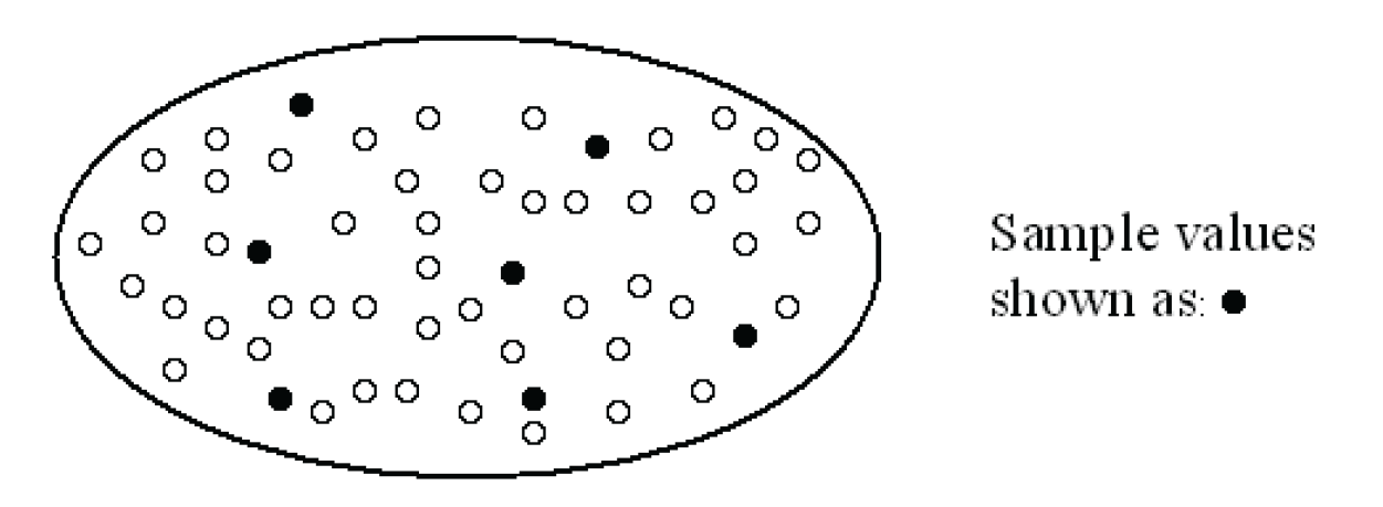
Figure 5.1 shows the relationship between a population and a sample. Each value in the population appears as a small circle. Filled-in circles are values that have been selected for a sample.
Consider a final example. Think about opinion polls. You often see the results of opinion polls in the news, yet most people have never been asked to participate in an opinion poll. Rather than ask every person in the country (collect a population of values for the group of interest), the companies that conduct these polls ask a small number of people. They collect a sample of values for the group of interest.
Most of the time, you cannot collect the entire population of values. Instead, you collect a sample. To make a valid decision about the population based on a sample, the sample must be representative of the population. This is usually accomplished by collecting a random sample.
A sample is a simple random sample if the process that is used to collect the sample ensures that any one sample is as likely to be selected as any other sample. For example, the companies that conduct opinion polls often collect random samples. Any group of people (and their associated sample values) is as likely to be selected as any other group of people. In contrast, the collection of speeding ticket fine amounts for the states located in the Southeast is not a random sample of the entire population of speeding ticket fine amounts for the 50 states. This is because the Southeastern states were deliberately chosen to be in the sample.
In many cases, the process of collecting a random sample is complicated and requires the help of a statistician. Simple random samples are only one type of sampling scheme. Other sampling schemes are often preferable. Suppose you conduct a survey to find out students’ opinions of their professors. At first, you decide to randomly sample students on campus, but you then realize that seniors might have different opinions from freshmen, sophomores from juniors, and so on. Over the years, seniors have developed opinions about what they expect in professors, while freshmen haven’t yet had the chance to do so. With a simple random sample, the results could be affected by the differences between the students in the different classes. Thus, you decide to group students according to class, and to get a random sample from each class (seniors, juniors, sophomores, and freshmen). This stratified random sample is a better representation of the students’ opinions and examines the differences between the students in the different classes. Before conducting a survey, consult a statistician to develop the best sampling scheme.
Describing Parameters and Statistics
Another difference between populations and samples is the way summary measures are described. Summary measures for a population are called parameters. Summary measures for a sample are called statistics. As an example, suppose you calculate the average for a set of data. If the data set is a population of values, the average is a parameter, which is called the population mean. If the data set is a sample of values, the average is a statistic, which is called the sample average (or the average, for short). The rest of this book uses the word “mean” to indicate the population mean, and the word “average” to indicate the sample average.
To help distinguish between summary measures for populations and samples, different statistical notation is used for each. In general, population parameters are denoted by letters of the Greek alphabet. For now, consider only three summary measures: the mean, the variance, and the standard deviation.
Recall that the mean is a measure that describes the center of a distribution of values. The variance is a measure that describes the dispersion around the mean. The standard deviation is the square root of the variance. The sample average is denoted with ![]() and is called x bar. The population mean is denoted with µ and is called Mu. The sample variance is denoted with s2 and is called s-squared. The population variance is denoted with σ2 and is called sigma-squared. Because the standard deviation is the square root of the variance, it is denoted with s for a sample and σ for a population. Table 5.1 summarizes the differences in notation.
and is called x bar. The population mean is denoted with µ and is called Mu. The sample variance is denoted with s2 and is called s-squared. The population variance is denoted with σ2 and is called sigma-squared. Because the standard deviation is the square root of the variance, it is denoted with s for a sample and σ for a population. Table 5.1 summarizes the differences in notation.

For the average or mean, the same formula applies to calculations for the population parameter and the sample statistic. This is not the case for other summary measures, such as the variance. See the box labeled “Technical Details: Sample Variance” for formulas and details. SAS automatically calculates the sample variance, not the population variance. Because you almost never have measurements on the entire population, SAS gives summary measures, such as the variance, for a sample.
Technical Details: Sample Variance
To calculate the sample variance for a variable, perform the following steps:
1. Find the average.
2. For each value, calculate the difference between the value and the average.
3. Square each difference.
4. Sum the squares.
5. Divide by n–1, where n is the number of differences.
For example, suppose your sample values are 10, 11, 12, and 15. The sample size is 4, and the average is 12. The variance is calculated as:

More generally, the formula is:

where Σ stands for sum, Xi represents each sample value, ![]() represents the sample average, and n represents the sample size.
represents the sample average, and n represents the sample size.
The difference between computing the sample variance and the population variance is in the denominator of the formula. The population variance uses n instead of n–1.
Many methods of statistical analysis assume that the data is a sample from a population with a normal distribution. The normal distribution is a theoretical distribution of values for a population. The normal distribution has a precise mathematical definition. Rather than describing the complex mathematical definition, this book describes some of the properties and characteristics of the normal distribution.
Figure 5.2 shows several normal distributions. Notice that µ (the population mean) and σ (the standard deviation of the population) are different. The two graphs with µ=100 have the same scaling on both axes, as do the three graphs with µ=30.

The list below summarizes properties of the normal distribution.
- The normal distribution is completely defined by its mean and standard deviation. For a given mean and standard deviation, there is only one normal distribution whose graph you can draw.
- The normal distribution has mean=mode=median. The mode is the most frequently occurring value, and the median is greater than half of the values, and less than half of the values. If you draw a graph of the normal distribution, and then fold the graph in half, the center of the distribution (at the fold) is the mean, the mode, and the median of the distribution.
- The normal distribution is symmetric. If you draw a graph of the normal distribution, and then fold the graph in half, each side of the distribution looks the same. A symmetric distribution has a skewness of 0, so a normal distribution has a skewness of 0. The distribution does not lean to one side or the other. It is even on both sides.
- The normal distribution is smooth. From the highest point at the center of the distribution, out to the ends of the distribution (the tails), there are no irregular bumps.
- The normal distribution has a kurtosis of 0, as calculated in SAS. (There are different formulas for kurtosis. In some formulas, a normal distribution has a kurtosis of 3.) Kurtosis describes the heaviness of the tails of a distribution. Extremely non-normal distributions can have high positive or high negative kurtosis values, while nearly normal distributions have kurtosis values close to 0. Kurtosis is positive if the tails are heavier than they are for a normal distribution, and negative if the tails are lighter than they are for a normal distribution.
Because the plots of the normal distribution are smooth and symmetric, and the normal distribution resembles the outline of a bell, the normal distribution is sometimes said to have a bell-shaped curve.
You might be wondering about the use of the word “normal.” Does it mean that data from a non-normal distribution is abnormal? The answer is no. Normal distribution is one of many distributions that can occur. For example, the time to failure for computer chips does not have a normal distribution. Experience has shown that computer chips fail more often early (often on their first use), and then the time to failure slowly decreases over the length of use. This distribution is not symmetrical.
If data is from a normal distribution, the Empirical Rule gives a quick and easy way to summarize the data. The Empirical Rule says the following:
- About 68% of the values are within one standard deviation of the mean.
- About 95% of the values are within two standard deviations of the mean.
- More than 99% of the values are within three standard deviations of the mean.
Figure 5.3 shows a normal distribution. About 68% of the values occur between µ–σ and µ+σ, corresponding to the Empirical Rule.

To better understand the Empirical Rule, consider an example. Suppose the population of the individual weights for 12-year-old girls is normally distributed with a mean of 86 pounds and a standard deviation of 10 pounds. Using the Empirical Rule, you find the following:
- About 68% of the weights are between 76 and 96 pounds.
- About 95% of the weights are between 66 and 106 pounds.
- More than 99% of the weights are between 56 and 116 pounds.
Parametric and Nonparametric Statistical Methods
Many statistical methods rely on the assumption that the data values are a sample from a normal distribution. Other statistical methods rely on an assumption of some other distribution of the data. Statistical methods that rely on assumptions about distributions are called parametric methods.
There are statistical methods that do not assume a particular distribution for the data. Statistical methods that don’t rely on assumptions about distributions are called nonparametric methods.
This distinction is important in later chapters, which explain both parametric and nonparametric methods for solving problems. Use a parametric method if your data meets the assumptions, and use a nonparametric method if it doesn’t. These later chapters provide details about the assumptions.
Recall that a normal distribution is the theoretical distribution of values for a population. Many statistical methods assume that the data values are a sample from a normal distribution. For a given sample, you need to decide whether this assumption is reasonable. Because you have only a sample, you can never be absolutely sure that the assumption is correct. What you can do is test the assumption, and, based on the results of this test, decide whether the assumption is reasonable. This testing and decision process is called testing for normality.
Statistical Test for Normality
When testing for normality, you start with the idea that the sample is from a normal distribution. Then, you verify whether the data agrees or disagrees with this idea. Using the sample, you calculate a statistic and use this statistic to try to verify the idea. Because this statistic tests the idea, it is called a test statistic. The test statistic compares the shape of the sample distribution with the shape of a normal distribution.
The result of this comparison is a number called a p-value, which describes how doubtful the idea is in terms of probability. A p-value can range from 0 to 1. A p-value close to 0 means that the idea is very doubtful, and provides evidence against the idea. If you find enough evidence to reject the idea, you decide that the data is not a sample from a normal distribution. If you cannot find enough evidence to reject the idea, you proceed with the analysis based on the assumption that the data is a sample from a normal distribution.
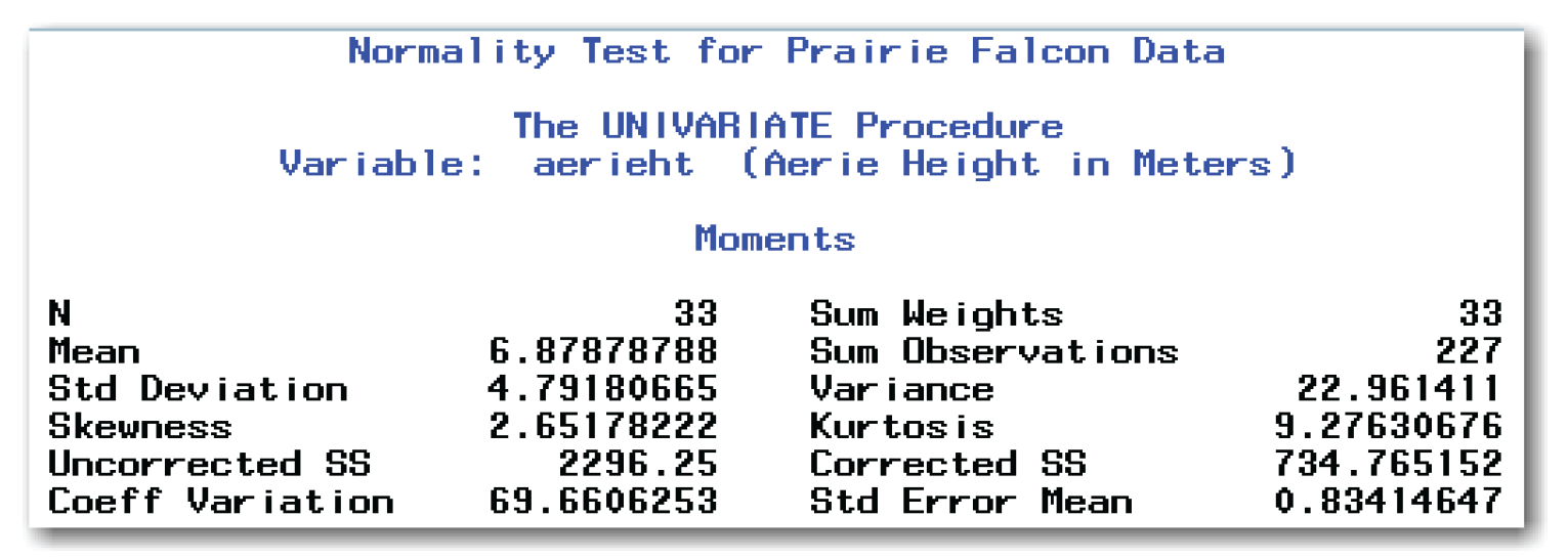
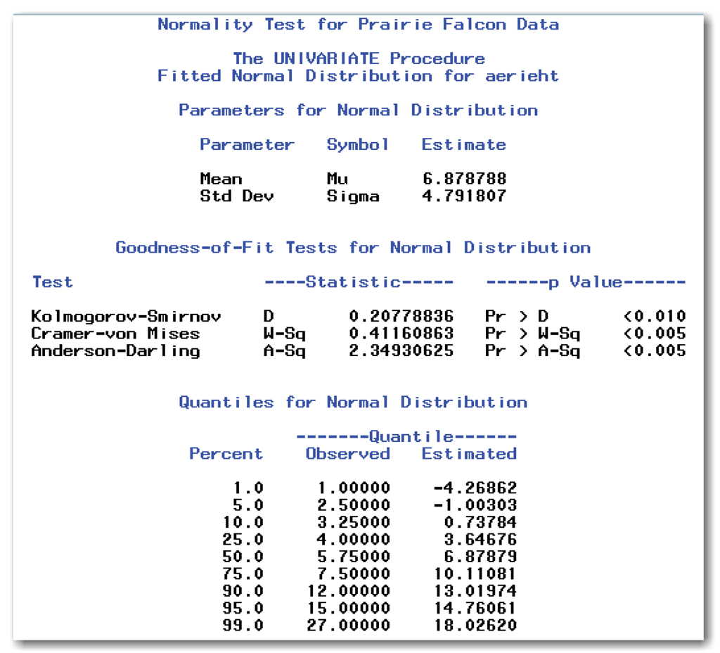
SAS provides the formal test for normality in PROC UNIVARIATE with the NORMAL option. To illustrate the test, Table 5.2 shows data values for the heights of aeries, or nests, for prairie falcons in North Dakota.[1]

This data is available in the falcons data set in the sample data for this book. To see the test for normality in SAS, use the code below:
data falcons;
input aerieht @@;
label aerieht='Aerie Height in Meters';
datalines;
15.00 3.50 3.50 7.00 1.00 7.00 5.75 27.00 15.00 8.00
4.75 7.50 4.25 6.25 5.75 5.00 8.50 9.00 6.25 5.50
4.00 7.50 8.75 6.50 4.00 5.25 3.00 12.00 3.75 4.75
6.25 3.25 2.50
;
run;
proc univariate data=falcons normal;
var aerieht;
title 'Normality Test for Prairie Falcon Data';
run;
Figure 5.4 shows the portion of the results from the NORMAL option.

In Figure 5.4, the Tests for Normality table shows the results and details of four formal tests for normality.
Test
Identifies the test. SAS provides the Shapiro-Wilk test only for sample sizes less than or equal to 2000.
Statistic
Identifies the test statistic and the value of the statistic.
p Value
Specifies the direction of the test and the p-value.
Depending on the test, values of the test statistic that are either too small or too large indicate that the data is not a sample from a normal distribution. Focus on the p-values, which describe how doubtful the idea of normality is. Probability values (p-values) can range from 0 to 1 (0≤p≤1). Values very close to 0 indicate that the data is not a sample from a normal distribution, and produce the most doubt in the idea. For the prairie falcons data, you conclude that the aerie heights are not normally distributed.
For the Shapiro-Wilk test, the test statistic, W, has values between 0 and 1 (0<W≤1). This test depends directly on the sample size, unlike the three other tests. SAS calculates this test statistic when the sample size is less than or equal to 2000.
For the other three tests, values of the test statistic that are too large indicate that the data is not a sample from a normal distribution. PROC UNIVARIATE automatically uses the sample average and sample standard deviation as estimates of the population mean and population standard deviation. In this case, PROC UNIVARIATE automatically performs all three of these tests.
In general, when the Shapiro-Wilk test appears, use the p-value to make conclusions. Otherwise, use the p-value from the Anderson-Darling test. Statisticians have different opinions about which test is best, and no single test is best in every situation. Most statisticians recommend against the Kolmogorov-Smirnov test because the other tests are better able to detect non-normal distributions. See Appendix 1, “Further Reading,” for more information. See the SAS documentation on PROC UNIVARIATE for formulas and information about each test.
The general form of the statements to test for normality is shown below:
PROC UNIVARIATE DATA=data-set-name NORMAL;
VAR variables;
data-set-name is the name of a SAS data set, and variables lists one or more variables in the data set. For valid normality tests, use only continuous variables in the VAR statement.
Other Methods of Checking for Normality
In addition to the formal test for normality, there are other methods for checking for normality. These methods improve your understanding about the distribution of sample values. These methods include checking the values of skewness and kurtosis, looking at a stem-and-leaf plot, looking at a box plot, looking at a histogram of the data, and looking at a normal probability plot. The next five topics discuss these methods.
Skewness and Kurtosis
Recall that for a normal distribution, the skewness is 0. As calculated in SAS, the kurtosis for a normal distribution is 0. PROC UNIVARIATE automatically prints these two statistics.
Figure 5.5 shows the Moments table for the prairie falcons data. This table contains the skewness and kurtosis. For the prairie falcons data, neither of these values is close to 0. This fact reinforces the results of the formal test for normality that led you to reject the idea of normality.
Stem-and-Leaf Plot
Chapter 4 discussed the stem-and-leaf plot as a way to explore data. Stem-and-leaf plots are useful for visually checking data for normality. If the data is normal, then there will be a single bell-shaped curve of data. You can create a stem-and-leaf plot for the prairie falcons data by adding the PLOT option to the PROC UNIVARIATE statement. Figure 5.6 shows the stem-and-leaf plot for the falcons data.
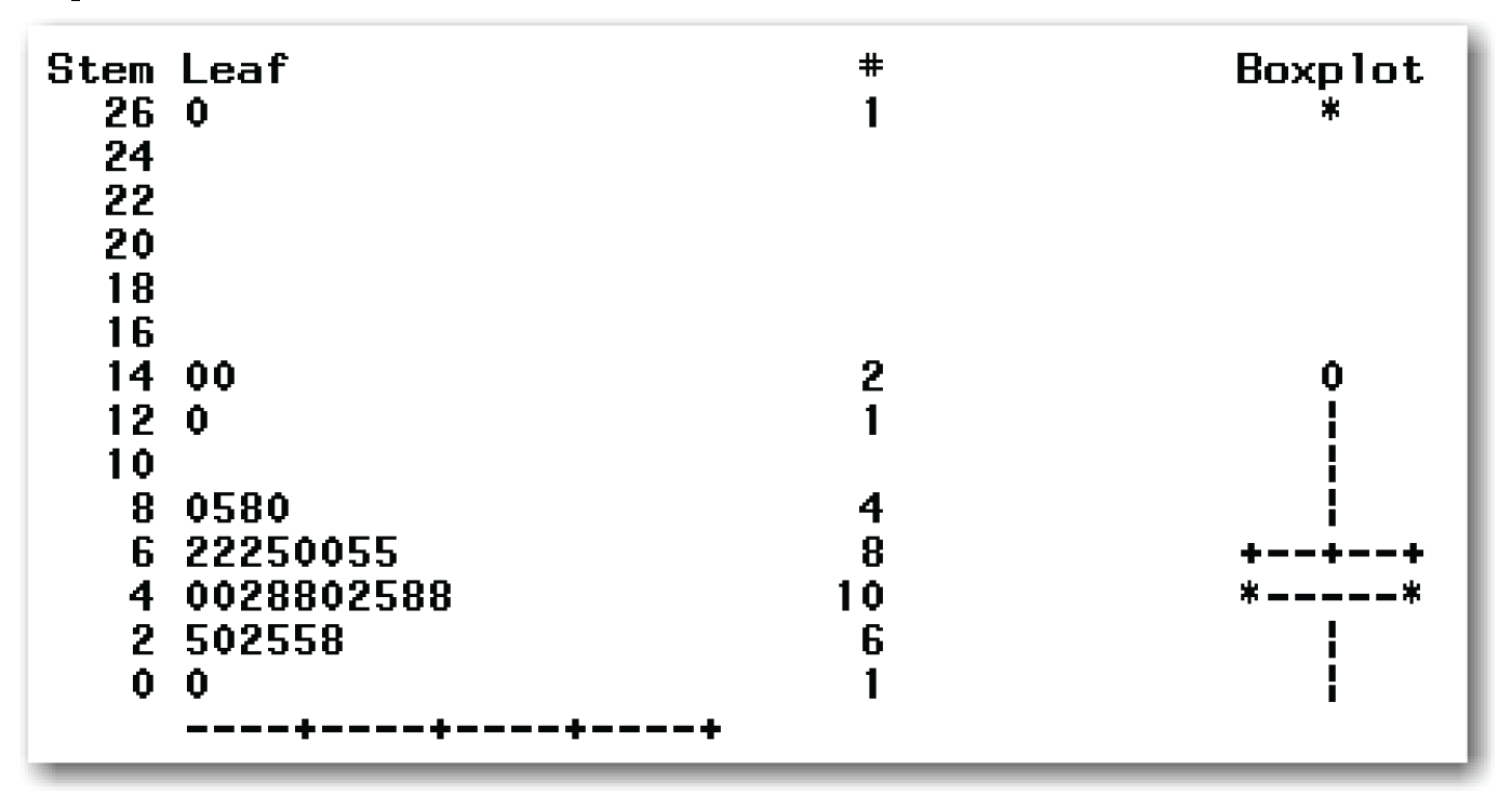
Most of the data forms a single group that is roughly bell-shaped. Depending on how you look at the data, there are three or four outlier points. These are the data points for the aerie heights of 12, 15, 15, and 27 meters. (You might see the bell shape more clearly if you rotate the output sideways.)
Box Plot
Chapter 4 discussed the box plot as a way to explore the data. Box plots are useful when checking for normality because they help identify potential outlier points. You can create a line printer box plot for the prairie falcons data by adding the PLOT option to the PROC UNIVARIATE statement. Figure 5.6 also shows the box plot for the falcons data.
This box plot highlights the potential outlier points that also appear in the stem-and-leaf plot.
Histogram
Chapter 4 discussed the histogram as a way to explore the data. Histograms are useful when checking for normality. You can create a histogram for the prairie falcons data by using the HISTOGRAM statement in PROC UNIVARIATE.[2] By adding the NORMAL option to the HISTOGRAM statement, you can add a fitted normal curve. The statements below create the results shown in Figure 5.7.
proc univariate data=falcons;
var aerieht;
histogram aerieht / normal(color=red);
title 'Normality Test for Prairie Falcon Data';
run;
Figure 5.7 shows a histogram of the aerie heights. The histogram does not have the bell shape of a normal distribution. Also, the histogram is not symmetric. The histogram shape indicates that the sample is not from a normal distribution.
As a result of the NORMAL option, SAS adds a fitted normal curve to the histogram. The curve uses the sample average and sample standard deviation from the data. The COLOR= option specifies a red curve. You can use other colors. If the data were normal, the smooth red curve would more closely match the bars of the histogram. For the prairie falcons data, the curve helps show that the sample is not from a normal distribution.
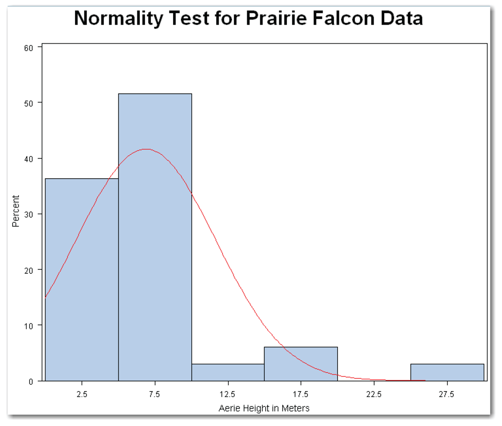
Also as a result of the NORMAL option, PROC UNIVARIATE prints three tables shown in Figure 5.8. The list below summarizes these tables.
- The Parameters for Normal Distribution table shows the estimated mean and standard deviation of the fitted normal curve. PROC UNIVARIATE automatically uses the sample mean and standard deviation. As a result, the estimates in Figure 5.8 are the same as the estimates in the Moments table. The Parameters for Normal Distribution table contains the Symbol column, which specifies the symbols used for the mean and standard deviation as Mu and Sigma. PROC UNIVARIATE can also fit many other distributions, and it identifies the symbols appropriate for each distribution.
- The Goodness-of-Fit Tests for Normal Distribution table shows the results of three of the tests for normality. PROC UNIVARIATE does not create the results for the Shapiro-Wilk test when you use the HISTOGRAM statement. Otherwise, the results shown in this table are the same as the results described earlier for Figure 5.4.
- The Quantiles for Normal Distribution table shows the observed quantiles for several percentiles, and the estimated quantiles that would occur for data from a normal distribution. For example, the observed median for the prairie falcons data is 5.75, and the estimated median for a normal distribution is about 6.88. In general, the closer the observed and estimated values are, the more likely the data is from a normal distribution.
You can suppress all three of these tables by adding the NOPRINT option to the HISTOGRAM statement.
The general form of the statements to add a histogram and a fitted normal curve is shown below:
PROC UNIVARIATE DATA=data-set-name;
VAR variables;
HISTOGRAM variables / NORMAL(COLOR=color NOPRINT);
data-set-name is the name of a SAS data set, and variables lists one or more variables in the data set. For valid normality tests, use only continuous variables in the VAR and HISTOGRAM statements. The COLOR= and NOPRINT options are not required.
Normal Probability Plot
A normal probability plot of the data shows both the sample data and a line for a normal distribution. Because of the way the plot is constructed, the normal distribution appears as a straight line, instead of as the bell-shaped curve seen in the histogram. If the sample data is from a normal distribution, then the points for the sample data are very close to the normal distribution line. The PLOT option in PROC UNIVARIATE creates a line printer normal probability plot. Figure 5.9 shows this plot for the prairie falcons data.
The normal probability plot shows both asterisks (*) and plus signs (+). The asterisks show the data values. The plus signs form a straight line that shows the normal distribution based on the sample mean and standard deviation. If the sample is from a normal distribution, the asterisks also form a straight line. Thus, they cover most of the plus signs. When using the plot, first, look to see whether the asterisks form a straight line. This indicates a normal distribution. Then, look to see whether there are few visible plus signs. Because the asterisks in the plot for the prairie falcons data don’t form a straight line or cover most of the plus signs, you, again, conclude that the data isn’t a sample from a normal distribution.

You can create a high-resolution normal probability plot for the prairie falcons data by using the PROBPLOT statement in PROC UNIVARIATE.[3] By adding the NORMAL option to this statement, you can also add a fitted normal curve. The statements below create the results shown in Figure 5.10.
proc univariate data=falcons;
var aerieht;
probplot aerieht / normal(mu=est sigma=est color=red);
title 'Normality Test for Prairie Falcon Data';
run;
This plot shows a diagonal reference line that represents the normal distribution based on the sample mean and standard deviation. The MU=EST and SIGMA=EST options create this reference line. The plot shows the data as plus signs. If the falcons data were normal, then the plus signs would be close to the red (diagonal) line. For the falcons data, the data points do not follow the straight line. Once again, this fact reinforces the conclusion that the data isn’t a sample from a normal distribution.
The normal probability plot in Figure 5.10 shows that there are three or four data points that are separated from most of the data points. As discussed in Chapter 4, points that are separated from the main group of data points should be investigated as potential outliers.

The general form of the statements to add a normal probability plot with a diagonal reference line based on the estimated mean and standard deviation is shown below:
PROC UNIVARIATE DATA=data-set-name;
VAR variables;
PROBPLOT variables / NORMAL(MU=EST SIGMA=EST);
data-set-name is the name of a SAS data set, and variables lists one or more variables in the data set. For valid normality tests, use only continuous variables in the VAR and PROBPLOT statements. You can also add the COLOR= option.
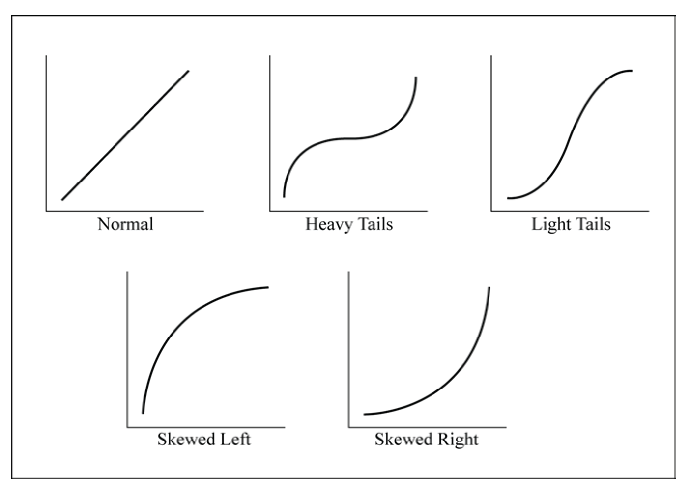
Figure 5.11 shows several patterns that can occur in normal quantile plots, and gives the interpretations for these patterns. Compare the patterns in Figure 5.11 to the normal probability plots in Figures 5.9 and 5.10. The closest match is the pattern for a distribution that is skewed to the right. (Remember that the positive skewness measure indicates that the data is skewed to the right.)
Summarizing Conclusions
The formal tests for normality led to the conclusion that the prairie falcons data set is not normally distributed. The informal methods all support this conclusion. Also, the histogram, box plot, normal quantile plot, and stem-and-leaf plot show outlier points that should be investigated. Perhaps these outlier points represent an unusual situation. For example, prairie falcons might have been using a nest built by another type of bird. If your data has outlier points, you should carefully investigate them to avoid incorrectly concluding that the data isn’t a sample from a normal distribution. Suppose during an investigation you find that the three highest points appear to be eagle nests. See “Rechecking the Falcons Data,” which shows how to recheck the data for normality.
PROC UNIVARIATE creates several tables and graphs that are useful when checking for normality. These include the formal normality tests and the informal methods. Table 5.3 identifies the tables.

The full falcons data set has four potential outlier points. Suppose you investigate and find that the three highest aerie heights are actually eagle nests that have been adopted by prairie falcons. You want to omit these three data points from the check for normality. In SAS, this involves defining a subset of the data, and then using PROC UNIVARIATE with the additional tables and plots to check for normality. In SAS, the following code checks for normality:
proc univariate data=falcons normal plot;
where aerieht<15;
var aerieht;
histogram aerieht / normal(color=red) noprint;
probplot aerieht / normal(mu=est sigma=est color=red);
title 'Normality Test for Subset of Prairie Falcon Data';
run;
The code above uses a WHERE statement to omit the outlier points. See “Understanding the WHERE Statement” for more detail.
Figure 5.12 shows selected output tables and line printer plots from the code above. Figure 5.13 shows the graphs created by the HISTOGRAM and PROBPLOT statements above.
In Figure 5.12, the Tests for Normality table shows the formal tests for normality. Reviewing the p-values, you conclude that the subset of the original falcons data is a sample from a normal distribution. The other methods of checking for normality support this conclusion.
The Moments table shows that skewness and kurtosis are both close to 0.
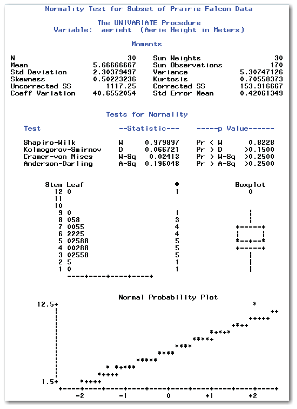
In Figure 5.12, the stem-and-leaf plot shows a single group of data that is roughly bell-shaped. The line printer box plot shows one potential outlier point for the aerie height of 12 meters. However, earlier investigation found this data point to be valid. In the line printer normal probability plot, the asterisks form a straight line and cover most of the plus signs.
Figure 5.13 PROC UNIVARIATE Graphics for Subset of Falcons Data

The histogram shows a single bell-shaped distribution, and the normal curve overlaying the histogram closely follows the bars of the histogram. The histogram is also mostly symmetric.
Figure 5.13 PROC UNIVARIATE Graphics for Subset of Falcons Data (continued)

In the normal probability plot, most of the data points are near the red (diagonal) line for the normal distribution. The plot shows one potential outlier point for the aerie height of 12 meters. However, earlier investigation found this data point to be valid.
A word of caution is important here. When working with your own data, do not assume that outlier points can be omitted from the data. If you find potential outlier points, you must investigate them. If your investigation does not find a valid reason for omitting the data points, then the outlier points must remain in the data.
Understanding the WHERE Statement
The WHERE statement is the simplest way to subset data. This statement specifies the observations to include in the analysis. SAS excludes observations that do not meet the criteria in the WHERE statement. SAS documentation provides details on using the WHERE statement with procedures. The list below gives a brief summary of the WHERE statement.
- The WHERE statement can help your programs run faster because SAS uses only the observations that meet the criteria in the WHERE statement. This advantage can be very helpful with large data sets.
- The WHERE statement uses unformatted values of variables, so you need to specify unformatted values in the statement.
- You can use the WHERE statement with any SAS procedure.
- The WHERE statement allows all of the usual arithmetic and comparison operators. For example, you can add, subtract, multiply, and divide in the statement. You can specify comparison operators like equal to, not equal to, greater than, and so on.
- The WHERE statement has special operators that are available only in the statement. Three operators that are especially useful are IS MISSING, BETWEEN-AND, and CONTAINS.
The general form of the statement to specify data to include in a procedure is shown below:
WHERE expression;
expression is a combination of variables, comparison operators, and values that specify the observations to include in the procedure. The list below shows sample expressions:
where gender='m' ;
where age >=65;
where country='US' and region='southeast' ;
where country='China' or country='India' ;
where state is missing ;
where name contains 'Smith' ;
where income between 5000 and 10000;
See Appendix 1, “Further Reading,” for papers and books about the WHERE statement. See SAS documentation for complete details.
Earlier in this chapter, you learned how to test for normality to decide whether your data is from a normal distribution. The process used for testing for normality is one example of a statistical method that is used in many types of analyses. This method is also known as performing a hypothesis test, usually abbreviated to hypothesis testing. This section describes the general method of hypothesis testing. Later chapters discuss the hypotheses that are tested, in relation to this general method.
Recall the statistical test for normality. You start with the idea that the sample is from a normal distribution. Then, you verify whether the data set agrees or disagrees with the idea. This concept is basic to hypothesis testing.
In building a hypothesis test, you work with the null hypothesis, which describes one idea about the population. The null hypothesis is contrasted with the alternative hypothesis, which describes a different idea about the population. When testing for normality, the null hypothesis is that the data set is a sample from a normal distribution. The alternative hypothesis is that the data set is not a sample from a normal distribution.
Null and alternative hypotheses can be described with words. In statistics texts and journals, they are usually described with special notation. Suppose you want to test to determine whether the population mean is equal to a certain number. You want to know whether the average price of hamburger is the same as last year’s average price of $3.29 per pound. You collect prices of hamburger from several grocery stores, and you want to use this sample to determine whether the population mean is different from $3.29. The null and alternative hypotheses are written as the following:
Ho: µ = 3.29
Ha: µ ≠ 3.29
Ho represents the null hypothesis that the population mean (µ) equals $3.29, and Ha represents the alternative hypothesis that the population mean (µ) does not equal $3.29. Combined, the null and alternative hypotheses describe all possibilities. In this example, the possibilities are equal to (=) and not equal to (≠). In other examples, the possibilities might be less than or equal to (≤) and greater than (>).
Once you have the null and alternative hypotheses, you use the data to calculate a statistic to test the null hypothesis. Then, you compare the calculated value of this test statistic to the value that could occur if the null hypothesis were true. The result of this comparison is a probability value, or p-value, which tells you if the null hypothesis should be believed. The p-value is the probability that the value of your test statistic or one more extreme could have occurred if the null hypothesis were true. Figure 5.13 shows the general process for hypothesis testing.
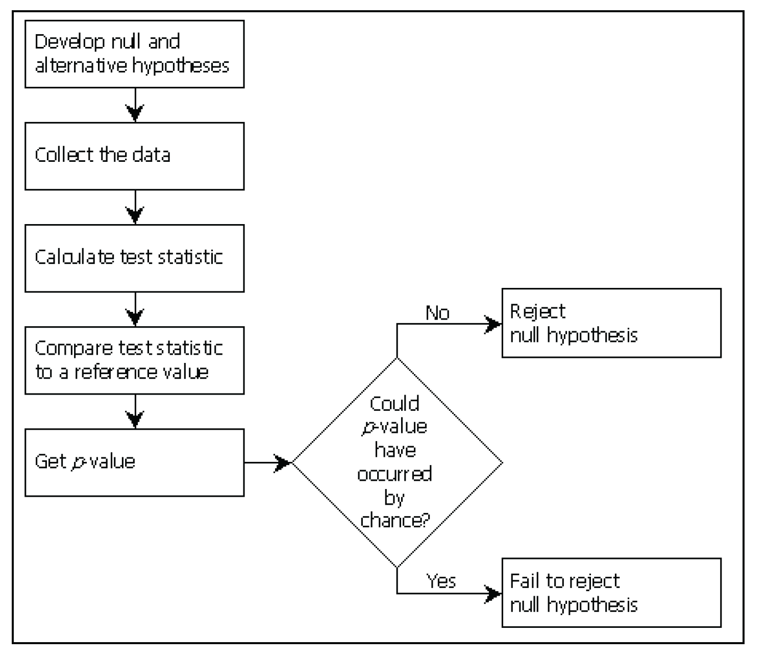
A p-value close to 0 indicates that the value of the test statistic could not reasonably have occurred by chance. You reject the null hypothesis and conclude that the null hypothesis is not true. However, if the p-value indicates that the value of the test statistic could have occurred by chance, you fail to reject the null hypothesis. You never accept the null hypothesis. Instead, you conclude that you do not have enough evidence to reject it. Unless you measure an entire population, you never have enough evidence to conclude that the population is exactly as described by the null hypothesis. For example, you could not conclude that the true mean price of hamburger is $3.29 per pound, unless you collected prices from every place that sold hamburger.
For the example of testing for normality, you test the null hypothesis that the data is from a normal distribution. You calculate a test statistic that summarizes the shape of the distribution. Then, you compare the test statistic with a reference value, and you get a p-value. Based on the p-value, you can reject the null hypothesis that the data is normally distributed. Or you can fail to reject the null hypothesis and proceed with the assumption that the data is normally distributed.
The next section explains how to decide whether a p-value indicates that a difference is larger than what would be expected by chance. It also discusses the concept of practical significance.
Statistical and Practical Significance
When you perform a statistical test and get a p-value, you usually want to know whether the result is significant. In other words, is the value of the test statistic larger than what you would expect to find by chance? To answer this question, you need to understand statistical significance and practical significance.
Statistical significance is based on p-values. Typically, you decide, in advance, what level of significance to use for the test. Choosing the significance level is a way of limiting the chance of being wrong. What chance are you willing to take that you are wrong in your conclusions?
For example, a significance level of 5% means that if you collected 100 samples and performed 100 hypothesis tests, you would make the wrong conclusion about 5 times (5/100=0.05). In the previous sentence, “wrong” means concluding that the alternative hypothesis is true when it is not. For the hamburger example, “wrong” means concluding that the population mean is different from $3.29 when it is not. Statisticians call this definition of “wrong” the Type I error. By choosing a significance level when you perform a hypothesis test, you control the probability of making a Type I error.
When you choose a significance level, you define the reference probability. For a significance level of 10%, the reference probability is 0.10, which is the significance level expressed in decimals. The reference probability is called the α-level (pronounced “alpha level”) for the statistical test.
When you perform a statistical test, if the p-value is less than the reference probability (the α-level), you conclude that the result is statistically significant. Suppose you decide to perform a statistical test at the 10% significance level, which means that the α-level is 0.10. If the p-value is less than 0.10, you conclude that the result is statistically significant at the 10% significance level. If the p-value is more than 0.10, you conclude that the result is not statistically significant at the 10% significance level.
As a more concrete example, suppose you perform a statistical test at the 10% significance level, and the p-value is 0.002. You limited the risk of making a Type I error to 10%, giving you an α-level of 0.10. Your test statistic value could occur only about 2 times in 1000 by chance if the null hypothesis were true. Because the p-value of 0.002 is less than the α-level of 0.10, you reject the null hypothesis. The test is statistically significant at the 10% level.
Choosing a Significance Level
The choice of the significance level (or α-level) depends on the risk you are willing to take of making a Type I error. Three significance levels are commonly used: 0.10, 0.05, and 0.01. These are often referred to as moderately significant, significant, and highly significant, respectively.
Your situation should help you choose a level of significance. If you are challenging an established principle, then your null hypothesis is that this established principle is true. In this case, you want to be very careful not to reject the null hypothesis if it is true. You should choose a very small α-level (for example, 0.01). If, however, you have a situation where the consequences of rejecting the null hypothesis are not so severe, then an α-level of 0.05 or 0.10 might be more appropriate.
When choosing the significance level, think about the acceptable risks. You might risk making the wrong conclusion about 5 times out of 100, or about 1 time out of 100. Typically, you would not choose an extremely small significance level such as 0.0001, which limits your risk of making a wrong decision to about 1 time in 10,000.
More on p-values
As described in this book, hypothesis testing involves rejecting or failing to reject a null hypothesis at a predetermined α-level. You make a decision about the truth of the null hypothesis. But, in some cases, you might want to use the p-value only as a summary measure that describes the evidence against the null hypothesis. This situation occurs most often when conducting basic, exploratory research. The p-value describes the evidence against the null hypothesis. The smaller a p-value is, the more you doubt the null hypothesis. A p-value of 0.003 provides strong evidence against the null hypothesis, whereas a p-value of 0.36 provides less evidence.
Another Type of Error
In addition to the Type I error, there is another type of error called the Type II error. A Type II error occurs when you fail to reject the null hypothesis when it is false. You can control this type of error when you choose the sample size for your study. The Type II error is not discussed in this book because design of experiments is not discussed. If you are planning an experiment (where you choose the sample size), consult a statistician to ensure that the Type II error is controlled.
The following table shows the relationships between the true underlying situation (which you will never know unless you measure the entire population) and your conclusions. When you conclude that there is not enough evidence to reject the null hypothesis, and this matches the unknown underlying situation, you make a correct conclusion. When you reject the null hypothesis, and this matches the unknown underlying situation, you make a correct conclusion. When you reject the null hypothesis, and this does not match the unknown underlying situation, you make a Type I error. When you fail to reject the null hypothesis, and this does not match the unknown underlying situation, you make a Type II error.

Practical significance is based on common sense. Sometimes, a p-value indicates statistical significance where the difference is not practically significant. This situation can occur with large data sets, or when there is a small amount of variation in the data.
Other times, a p-value indicates non-significant differences where the difference is important from a practical standpoint. This situation can occur with small data sets, or when there is a large amount of variation in the data.
You need to base your final conclusion on both statistical significance and common sense. Think about the size of difference that would lead you to spend time or money. Then, when looking at the statistical results, look at both the p-value and the size of the difference.
Suppose you gave a proficiency test to employees who were divided into one of two groups: those who just completed a training program (trainees), and those who have been on the job for a while (experienced employees). Possible scores on the test range from 0 to 100. You want to find out if the mean scores are different, and you want to use the result to decide whether to change the training program. You perform a hypothesis test at the 5% significance level, and you obtain a p-value of 0.025. From a statistical standpoint, you can conclude that the two groups are significantly different.
What if the average scores for the two groups are very similar? If the average score for trainees is 83.5, and the average score for experienced employees is 85.2, is the difference practically significant? Should you spend time and money to change the training program based on this small difference? Common sense says no. Finding statistical significance without practical significance is likely to occur with large sample sizes or small variances. If your sample contains several hundred employees in each group, or if the variation within each group is small, you are likely to find statistical significance without practical significance.
Continuing with this example, suppose your proficiency test has a different outcome. You obtain a p-value of 0.125, which indicates that the two groups are not significantly different from a statistical standpoint (at the 5% significance level). However, the average score for the trainees is 63.8, and the average score for the experienced employees is 78.4. Common sense says that you need to think about making some changes in the training program. Finding practical significance without statistical significance can occur with small sample sizes or large variances in each group. Your sample could contain only a few employees in each group, or there could be a lot of variability in each group. In these cases, you are likely to find practical significance without statistical significance.
The important thing to remember about practical and statistical significance is that you should not take action based on the p-value alone. Sample sizes, variability in the data, and incorrect assumptions about your data can produce p-values that indicate one action, where common sense indicates another action. To help avoid this situation, consult a statistician when you design your study. A statistician can help you plan a study so that your sample size is large enough to detect a practically significant difference, but not so large that it would detect a practically insignificant difference. In this way, you control both Type I and Type II errors.
- Populations and samples are both collections of values, but a population contains the entire group of interest, and a sample contains a subset of the population.
- A sample is a simple random sample if the process that is used to collect the sample ensures that any one sample is as likely to be selected as any other sample.
- Summary measures for a population are called parameters, and summary measures for a sample are called statistics. Different notation is used for each.
- The normal distribution is a theoretical distribution with important properties. A normal distribution has a bell-shaped curve that is smooth and symmetric. For a normal distribution, the mean=mode=median.
- The Empirical Rule gives a quick way to summarize data from a normal distribution. The Empirical Rule says the following:
- About 68% of the values are within one standard deviation of the mean.
- About 95% of the values are within two standard deviations of the mean.
- More than 99% of the values are within three standard deviations of the mean
- A formal statistical test is used to test for normality.
- Informal methods of checking for normality include the following:
- Viewing a histogram to check the shape of the data and to compare the shape with a normal curve.
- Viewing a box plot to compare the mean and median.
- Checking if skewness and kurtosis are close to 0.
- Comparing the data with a normal distribution in the normal quantile plot.
- Using a stem-and-leaf plot to check the shape of the data.
- If you find potential outlier points when checking for normality, investigate them. Do not assume that outlier points can be omitted.
- Hypothesis testing involves choosing a null hypothesis and alternative hypothesis, calculating a test statistic from the data, obtaining the p-value, and comparing the p-value to an α-level.
- By choosing the α-level for the hypothesis test, you control the probability of making a Type I error, which is the probability of rejecting the null hypothesis when it is true.
To test for normality using PROC UNIVARIATE
PROC UNIVARIATE DATA=data-set-name NORMAL PLOT;
VAR variables;
HISTOGRAM variables / NORMAL(COLOR=color NOPRINT);
PROBPLOT variables / NORMAL(MU=EST SIGMA=EST
COLOR=color);
data-set-name
is the name of a SAS data set.
variables
lists one or more variables. When testing for normality, use interval or ratio variables only. If you omit the variables from the VAR statement, the procedure uses all continuous variables. If you omit the variables from the HISTOGRAM and PROBPLOT statements, the procedure uses all variables listed in the VAR statement.
NORMAL
in the PROC UNIVARIATE statement, this option performs formal tests for normality.
PLOT
in the PROC UNIVARIATE statement, this option adds line printer stem-and-leaf plot, box plot, and normal quantile plot.
HISTOGRAM
creates a histogram of the data.
NORMAL
in the HISTOGRAM statement, this option adds a fitted normal curve to the histogram. This option also creates the Parameters for Normal Distribution table, Goodness of Fit Tests for Normal Distribution table, Histogram Bin Percents for Normal Distribution table, and Quantiles for Normal Distribution table.
COLOR=
in the HISTOGRAM statement, this option specifies the color of the fitted normal curve. This option is not required.
NOPRINT
in the HISTOGRAM statement, this option suppresses the tables that are created by the NORMAL option in this statement. This option is not required.
PROBPLOT
creates a normal probability plot of the data.
NORMAL
in the PROBPLOT statement, this option specifies a normal probability plot. This option is not required for a simple probability plot. If you want to add the reference line for the normal distribution, then this option is required.
MU=EST
in the PROBPLOT statement, this option specifies to use the estimated mean from the data for the fitted normal distribution.
SIGMA=EST
in the PROBPLOT statement, this option specifies to use the estimated standard deviation from the data for the fitted normal distribution.
COLOR=
in the PROBPLOT statement, this option specifies the color of the fitted normal distribution line. This option is not required.
To include only selected observations using a WHERE statement
WHERE expression;
expression
is a combination of variables, comparison operators, and values that identify the observations to use in the procedure. The list below shows sample expressions:
where gender='m' ;
where age >=65;
where country='US' and region='southeast' ;
where country='China' or country='India' ;
where state is missing ;
where name contains 'Smith' ;
where income between 5000 and 10000;
See the list of references in Appendix 1 for papers and books about the WHERE statement, and see the SAS documentation for complete details.
The program below produces all of the output shown in this chapter:
options nodate nonumber ls=80 ps=60;
data falcons;
input aerieht @@;
label aerieht='Aerie Height in Meters';
datalines;
15.00 3.50 3.50 7.00 1.00 7.00 5.75 27.00 15.00 8.00
4.75 7.50 4.25 6.25 5.75 5.00 8.50 9.00 6.25 5.50
4.00 7.50 8.75 6.50 4.00 5.25 3.00 12.00 3.75 4.75
6.25 3.25 2.50
;
run;
proc univariate data=falcons normal plot;
var aerieht;
histogram aerieht / normal(color=red);
probplot aerieht / normal(mu=est sigma=est color=red);
title 'Normality Test for Prairie Falcon Data';
run;
proc univariate data=falcons normal plot;
where aerieht<15;
var aerieht;
histogram aerieht / normal(color=red noprint);
probplot aerieht / normal(mu=est sigma=est color=red);
title 'Normality Test for Subset of Prairie Falcon Data';
run;
ENDNOTES