Chapter 11 Performing Basic Regression Diagnostics
How do you determine whether your regression model adequately represents your data? How do you know when more terms should be added to the model? How do you identify outlier points, where the model doesn’t fit well? These questions can be answered using regression diagnostics. This chapter discusses the following topics:
- understanding residuals plots
- using residuals plots and lack of fit tests to decide whether to add terms to the model
- using residuals plots to identify outlier points
- using residuals plots to detect a time sequence in the data
- using studentized residuals to check for possible outliers
- checking the regression assumption for normality of residuals
Chapters 10 and 11 discuss the activities of regression analysis and regression diagnostics. Fitting a regression model and performing diagnostics are intertwined. In regression, you first fit a model. Then, you perform diagnostics to assess how well the model fits. You repeat this process until you find a suitable model. Chapter 10 focused on fitting models. This chapter focuses on performing diagnostics.
Concepts in Plotting Residuals
Plotting Residuals against Predicted Values
Residuals, Predicted Values, and Outlier Points
Plotting Residuals against Independent Variables
Plotting Residuals in Time Sequence
Creating Residuals Plots for the Kilowatt Data
Residuals Plots for Straight-Line Regression
Residuals Plots for Multiple Regression
Creating Residuals Plots for the Engine Data
Residuals Plots for Straight-Line Regression
Residuals Plots for Fitting a Curve
Looking for Outliers in the Data
Data without Outliers (Kilowatt)
Checking Lack of Fit for the Kilowatt Data
Checking Lack of Fit for the Engine Data
Testing the Regression Assumption for Errors
Checking Normality of Errors for the Kilowatt Data
Checking Lack of Fit for the Engine Data
Special Topic: Creating Diagnostic Plots with Traditional Graphics and Line Printer Plots
Special Topic: Automatic ODS Graphics
Concepts in Plotting Residuals
A regression model fits an equation to an observed set of data points. Chapter 10 showed how to use the equation to get predicted values. The differences between the observed values and predicted values are residuals (residual=observed-predicted). Residuals can help show you whether your model fits the data well. The next four sections discuss plots using residuals. These plots use residuals on the y-axis. Statisticians often refer to this group of plots as residuals plots.
Plotting Residuals against Predicted Values
A plot of residuals against predicted values should look like a random scattering of points or a horizontal band. If your model needs another term, then a plot of residuals can suggest what type of term should be added to the model. Figure 11.1 shows some possible patterns in the plots.

Residuals, Predicted Values, and Outlier Points
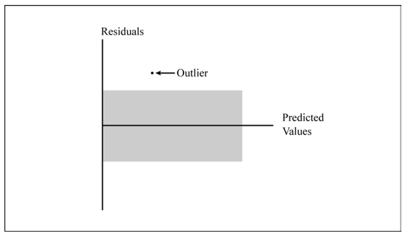
A plot of residuals against predicted values sometimes looks like a horizontal band, with the exception of one or two points. Figure 11.2 shows an example of a possible outlier point. All points except for one point fall inside the random pattern indicated by the gray horizontal band.
A large residual occurs when the predicted value is substantially different from the observed value. Here, the meaning of “large” refers to the absolute value of the residual because residuals can be either positive or negative. Observations with large residuals are possible outlier points. As with possible outlier points in the data, you need to investigate the residuals further. The possible outlier point might simply be due to chance or it might be due to a special cause.
Plotting Residuals against Independent Variables
Plotting residuals against independent variables (x variables or regressors) helps show whether the model fits the data well. For a good-fitting model, plots of residuals against regressors show a random scattering of points.
Plots that show an obvious pattern indicate that another term needs to be added to the model. A curved pattern indicates that a quadratic term needs to be added to the model. A plot with a definite increasing or decreasing trend indicates that a regressor needs to be added to the model. For multiple regression, plot the residuals against regressors in the model and against independent variables not in the model.
Plotting Residuals in Time Sequence
When data is collected all at once, a time sequence is unlikely. For example, the homebuyer collected the mortgage rates data (in Chapter 6) on a single day. Typically, data is collected over time. This is especially true for data used in regression. For the kilowatt data, the homeowner collected data over 21 days. For the engine data, the engineer measured power and speed for 24 data points. When data is collected over time, the conditions that change over time might impact the model.
For data without a measurable time trend, the plot of residuals against the time sequence in which the data was collected shows a random pattern of points. For data with a measurable time trend, the plot often shows an up-and-down or wavy pattern. Figure 11.3 shows an example.
Here, the main focus is the relationship between dependent variables and regressors. You are not focused on time as a regressor. You are checking for a possible time sequence effect. In contrast, suppose you are interested in modeling changes in the stock market over the past five years. In that case, time is a regressor, and more advanced statistical techniques are required.

Creating Residuals Plots for the Kilowatt Data
Chapter 10 discussed the straight-line and multiple regression fits for the kilowatt data. This section shows the residuals plots for the straight-line model. It then shows the residuals plots for the multiple regression model.
Both topics use ODS graphics.[1] Both topics also request specific plots with ODS graphics. For a description of the automatic plots created by ODS graphics (including some plots that this chapter does not discuss in detail), see “Special Topic: Automatic ODS Graphics” at the end of the chapter. For traditional graphics created with a PLOT statement, or for line printer plots, see “Special Topic: Creating Diagnostic Plots with Traditional Graphics and Line Printer Plots” at the end of the chapter.
Because this chapter uses PROC REG for regression diagnostics for multiple data sets and multiple regression models, the summary for the general form of the procedure appears only in the “Syntax” section at the end of the chapter. Similarly, the list of ODS tables for PROC REG appears only in the “Syntax” section.
Residuals Plots for Straight-Line Regression
Chapter 10 used PROC REG to fit a straight line to the kilowatt data, and created the results in Figure 10.12. This section repeats the same PROC REG step for convenience, but it does not show the results.
Plotting Residuals against Independent Variables
The SAS statements below plot the residuals against ac for the straight-line model:
ods graphics on;
proc reg data=kilowatt plots(only)=residuals;
model kwh=ac;
run;
quit;
ods graphics off;
The PLOTS=RESIDUALS option creates a plot of residuals against the independent variable.[2] As Chapter 10 discussed, ONLY limits the plots to plots specified after the equal sign. The program also produces the results shown in Figure 10.12 (but not shown in this chapter). Figure 11.4 shows the plot.
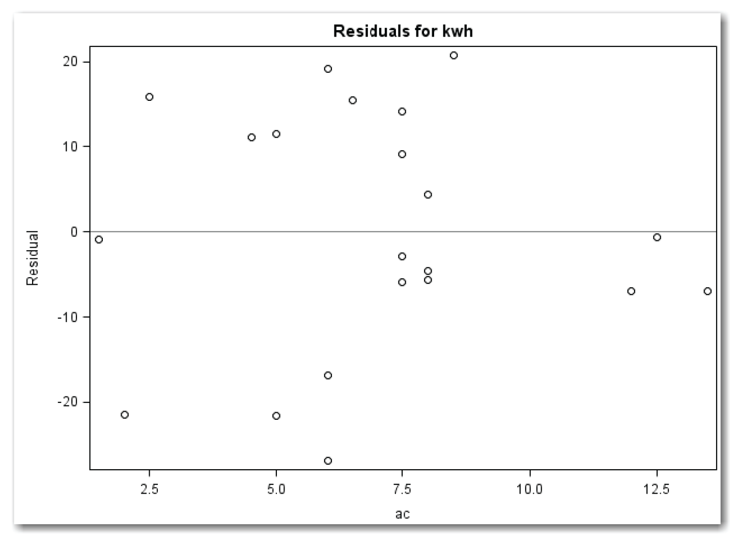
Figure 11.4 shows a random scatter of points, indicating that a quadratic term for ac is not needed.
To plot the residuals against variables not in the model, the simplest approach is to use PROC REG with a PLOT statement. In SAS,
ods graphics on;
proc reg data=kilowatt plots(only)=residuals;
var dryer;
model kwh=ac;
run;
plot r.*dryer / nostat nomodel;
run;
quit;
ods graphics off;
The VAR statement identifies variables that do not appear in the MODEL statement and will be used in other statements. The VAR statement must appear before the first RUN statement. The PLOT statement uses the R. statistics keyword, which identifies residuals. Also, the PLOT statement uses the NOSTAT option (discussed in Chapter 10), which suppresses several statistics that automatically appear to the right of the plot. NOMODEL suppresses the equation for the fitted model that automatically appears above the plot. (See Figure 10.11 for one example.) Since the model does not include dryer, NOSTAT and NOMODEL are especially appropriate.
The statements above produce the plots shown in Figures 11.4 and Figure 11.5, and produce the results in Figure 10.12.

Figure 11.5 shows a definite increase in residuals with an increase in dryer. This pattern sends a message to add dryer to the model.
Plotting Residuals against Predicted Values
The SAS statements below plot the residuals against predicted values for the straight-line model:
ods graphics on;
proc reg data=kilowatt plots(only)=residualbypredicted;
model kwh=ac;
run;
quit;
ods graphics off;
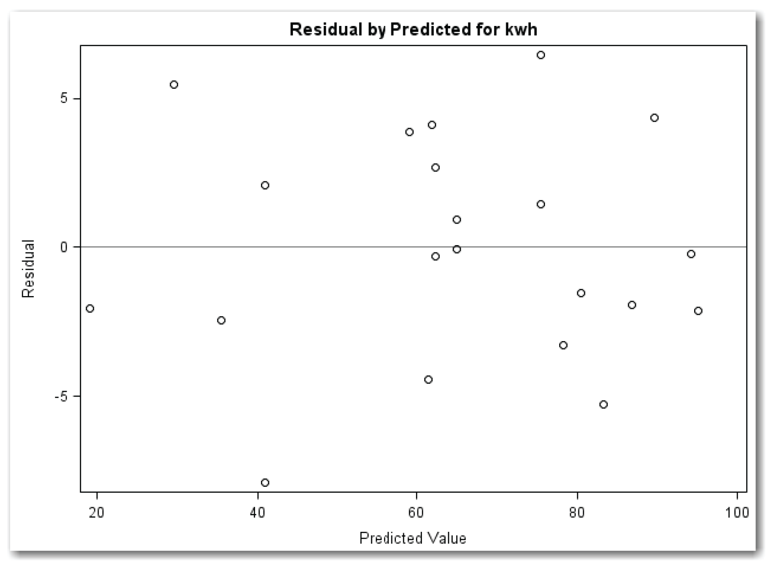
The PLOTS=RESIDUALBYPREDICTED option creates a plot of residuals against predicted values. ONLY suppresses other plots that PROC REG automatically creates.
Figure 11.6 shows the plot.
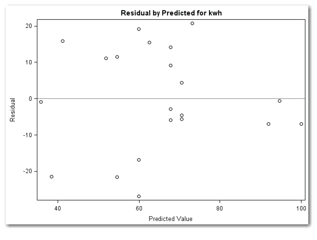
The points in Figure 11.6 appear in a horizontal band with no obvious outlier points. This plot indicates that the model fits the data reasonably well. From Figure 10.12 in Chapter 10, the results show that the model explains about 59% of the variation in the data. This shows why looking at more than one residuals plot is important. If you looked at only the plot of residuals against predicted values, you would probably miss the need to add dryer to the model.
Plotting Residuals in Time Sequence
The SAS statements below plot the residuals in time sequence for the straight-line model:
proc reg data=kilowatt;
model kwh=ac;
plot r.*obs. / nostat nomodel;
run;
quit;
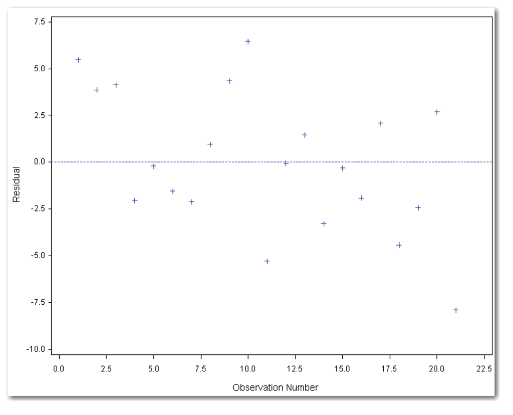
The PLOT statement uses statistical keywords for automatic variables. The R. statistical keyword identifies residuals. The OBS. statistical keyword identifies the observation number. This approach assumes that the data set is sorted in time sequence. If the data set is not sorted, then use an x-variable that defines the time sequence. NOSTAT suppresses several statistics that automatically appear to the right of the plot. NOMODEL suppresses the equation for the fitted model that automatically appears above the plot. Figure 11.7 shows the results.
The points in Figure 11.7 appear in a horizontal band. Some people see a slightly curved pattern, indicating a possible time sequence effect. Looking carefully at the data in Table 10.1, notice that the days with the lowest air conditioner use are near the beginning and end of the 21-day period. Perhaps this is due to cooler days, or the homeowner’s knowledge that data was being collected, or something else. This example shows the subjective nature of residuals plots. When the message is weak, the plots are more subjective than when the message is strong. Look at Figure 11.5 again. The message to add dryer to the model is obvious from the plot because it’s a strong message.

Summarizing Residuals Plots for the Straight-Line Model
For the straight-line model, residuals plotted against ac show that a quadratic term for ac is not needed. Plotting residuals against dryer shows a definite increasing pattern, which sends a message to add dryer to the model. Plotting residuals against predicted values shows a random pattern, indicating an adequate model. Plotting residuals in time sequence indicates no obvious pattern.
The previous SAS programs created each of the diagnostic plots separately. The statements below create all of the diagnostic plots in a single program:
ods graphics on;
proc reg data=kilowatt
plots(only)=(residuals residualbypredicted);
var dryer;
model kwh=ac;
run;
plot r.*dryer / nostat nomodel;
run;
plot r.*obs. / nostat nomodel;
quit;
ods graphics off;
Look at the PROC REG statement. When PLOTS= specifies more than one plot, enclose the plot names in parentheses. The program above creates the plots in Figures 11.4, 11.5, 11.6, and 11.7. (The program also creates the results shown in Figure 10.12.)
Residuals Plots for Multiple Regression
Chapter 10 used PROC REG for multiple regression with the kilowatt data, and created the results in Figure 10.24. To create diagnostic plots, use the same approach you used for the straight-line model. The statements below create all of the diagnostic plots discussed in this section:
ods graphics on;
proc reg data=kilowatt
plots(only)=(residuals(unpack) residualbypredicted);
model kwh=ac dryer;
run;
plot r.*obs. / nostat nomodel;
quit;
ods graphics off;
Plotting Residuals against Independent Variables
To check the fit of the model, plot the residuals against the independent variables in the model (ac and dryer). Using PLOTS=RESIDUALS creates both plots in a single window. Using PLOTS=RESIDUALS(UNPACK) creates two separate plots. Because the PROC REG statement also requests the plot of residuals by predicted values, the parentheses around the list of plots are required. Figures 11.8 and 11.9 show the plots.
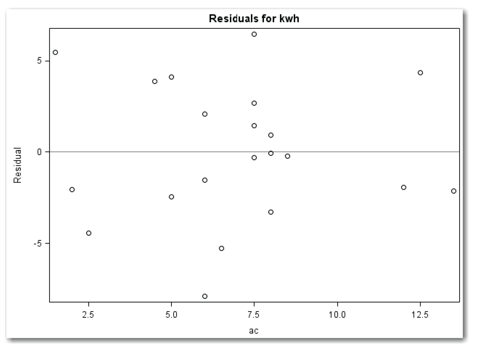
Figure 11.8 shows a random pattern. No additional term for ac (such as a quadratic term) is needed.
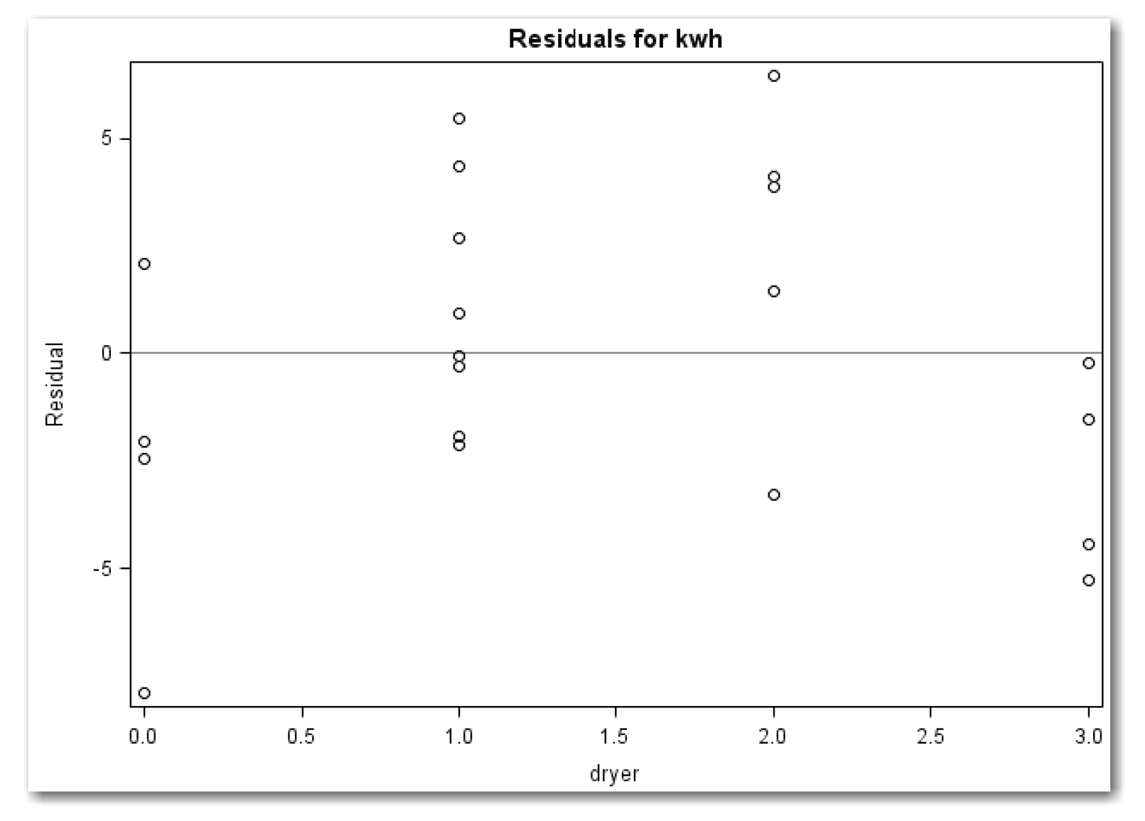
Figure 11.9 shows a curved pattern. Compare this pattern with Figure 11.1. The curvature in the plot indicates a need for a quadratic term for dryer.
These results might seem unexpected. If each use of the dryer consumes the same amount of electricity, then the response to dryer should be linear, and no quadratic term for dryer should be needed. Perhaps smaller loads of clothes were dried on days when several loads were washed, requiring less electricity per load on these days.
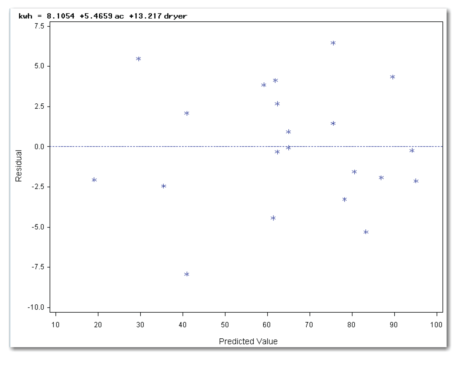
Plotting Residuals against Predicted Values
Using PLOTS=RESIDUALBYPREDICTED creates the plot of residuals by predicted values. Because the PROC REG statement also requests the plots of residuals against the independent variables, the parentheses around the list of plots are required. Figure 11.10 shows the plot.
The points in Figure 11.10 appear in a horizontal band with no obvious outlier points. This plot indicates that the model fits the data well.
Plotting Residuals in Time Sequence
The PLOT statement uses statistical keywords for automatic variables to plot the residuals in time sequence. Figure 11.11 shows the plot.
The points in Figure 11.11 appear in a horizontal band. Some people see a slightly decreasing trend. This decreasing trend indicates that the use of electricity might have decreased slightly with time. Perhaps the homeowner’s knowledge that data was being collected affected the overall use of electricity. Or, perhaps the days near the end of the experiment were cooler and the air conditioner was used less. Just as with your own data, the true answers to these questions might be unknown. Or, careful sleuthing might reveal a cause for the time sequence effect.
Summarizing Residuals Plots for Multiple Regression
For the multiple regression model, plotting residuals against ac shows a horizontal band, indicating that there is no need for a quadratic term. Plotting residuals against dryer indicates the possible need for a quadratic term for dryer.[3] Plotting residuals by predicted values shows a horizontal band with no obvious outlier points, indicating that the model fits the data well. Plotting residuals in time sequence might show a slight time sequence effect in the data. This effect might be due to either a cooling trend during the time the data was collected, or some other cause, such as the homeowner’s knowledge that the use of electricity was being monitored.
Creating Residuals Plots for the Engine Data
Chapter 10 discussed fitting a curve to the engine data. Suppose the engineer didn’t see the slight curvature in the scatter plot and fit a straight line to the data. The residuals plots would help show that the model needed more terms. The next two sections show the plots for fitting a straight line and for fitting a curve.
Residuals Plots for Straight-Line Regression
Chapter 10 did not fit a straight line to the engine data. Figure 11.12 shows the results of a straight-line regression for the engine data. To generate these results, use a MODEL statement with power as the y variable, and speed as the x variable. Figure 11.13 shows the scatter plot with the fitted line.
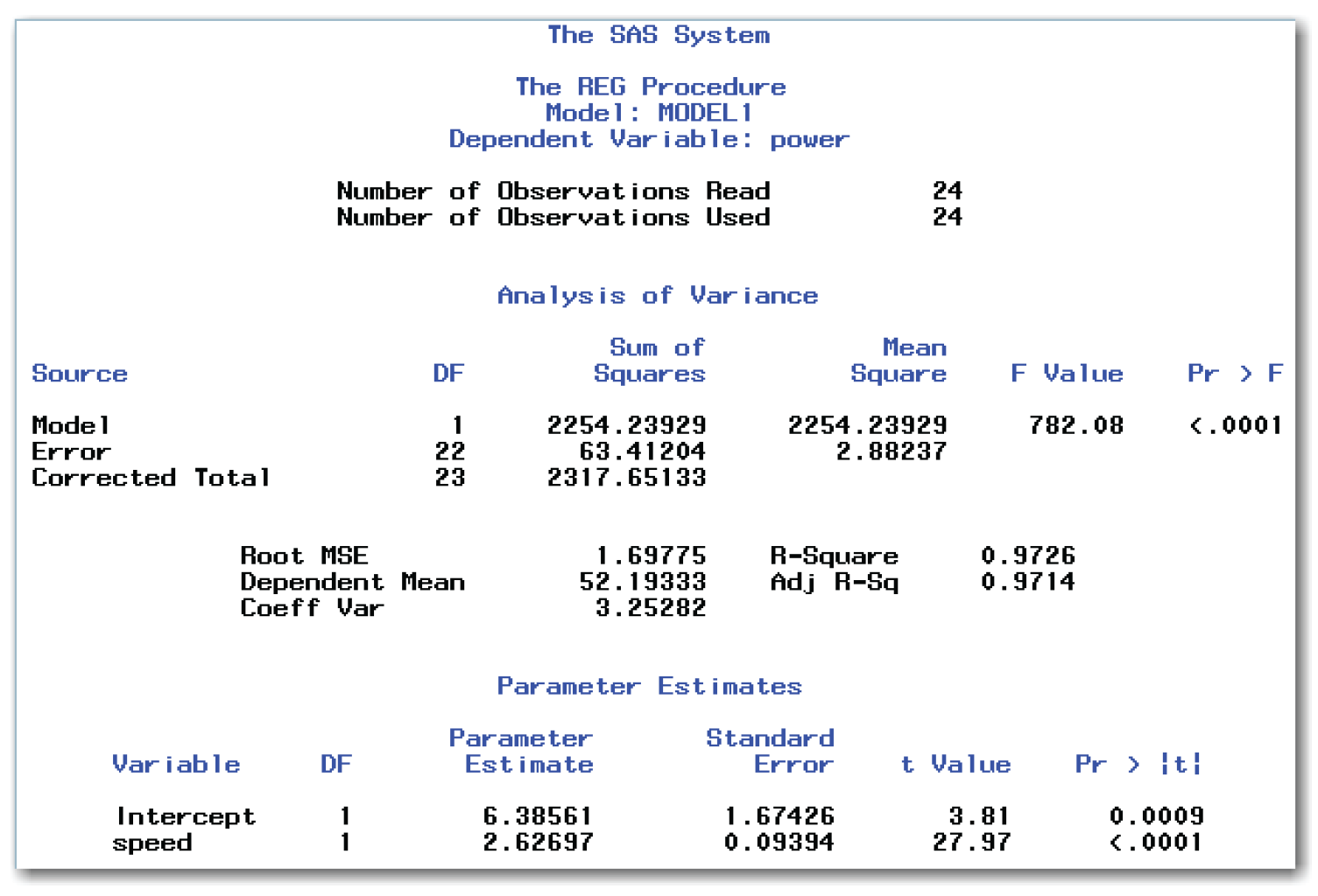
Briefly, the model is significant. Both of the intercept and slope parameters are significantly different from 0. The model fits the data well, explaining about 97% of the variation in the data.

In the scatter plot, points near both ends of the fitted line appear below the line. Points in the middle appear above the line. This subtle curvature indicates that a quadratic term needs to be added to the model. Because the amount of curvature in the data is small, the indication is subtle. However, with a more dramatic curvature, this type of plot would clearly show that a quadratic term needs to be added to the model. The residuals plots can provide a clearer picture.
The statements below create all of the diagnostic plots discussed in this section:
ods graphics on;
proc reg data=engine
plots(only)=(residuals residualbypredicted);
model power=speed;
run;
plot r.*obs. / nostat nomodel;
run;
quit;
ods graphics off;
Plotting Residuals against the Independent Variable
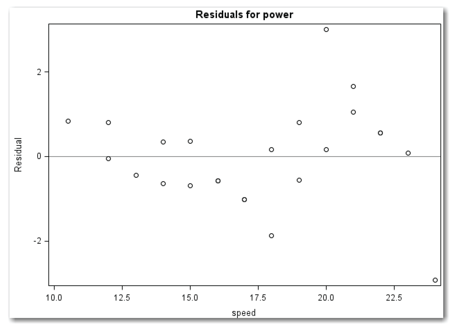
The model has only one independent variable. Using PLOTS=RESIDUALS creates the plot of residuals against speed. Because the PROC REG statement also requests the plot of residuals by predicted values, the parentheses around the list of plots are required. Figure 11.14 shows the plot.
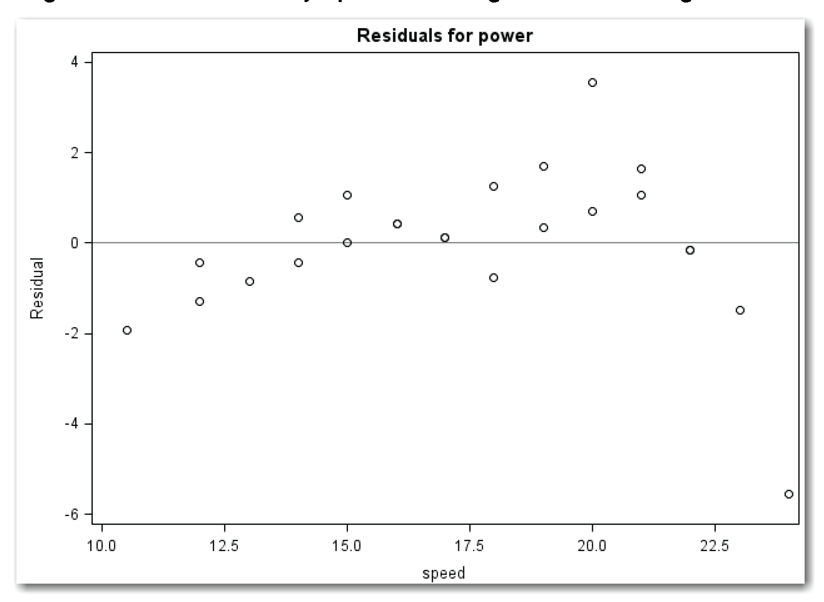
Figure 11.14 shows curvature. It starts on the left with negative values, changes to positive values, and then reverts to negative values. This pattern indicates that a quadratic term needs to be added to the model.
The statements do not plot residuals against the quadratic term (the quadratic term is not in the model). Because the quadratic term is simply a mathematical function (that is, the square) of the linear term, the plot would be the same. Compare this situation with the situation for the kilowatt data, where ac and dryer are not mathematically related. In that situation, plotting residuals against both variables makes sense.
Plotting Residuals against Predicted Values
Using PLOTS=RESIDUALBYPREDICTED creates the plot of residuals by predicted values. Because the PROC REG statement also requests the plots of residuals against the independent variable, the parentheses around the list of plots are required. Figure 11.15 shows the plot.
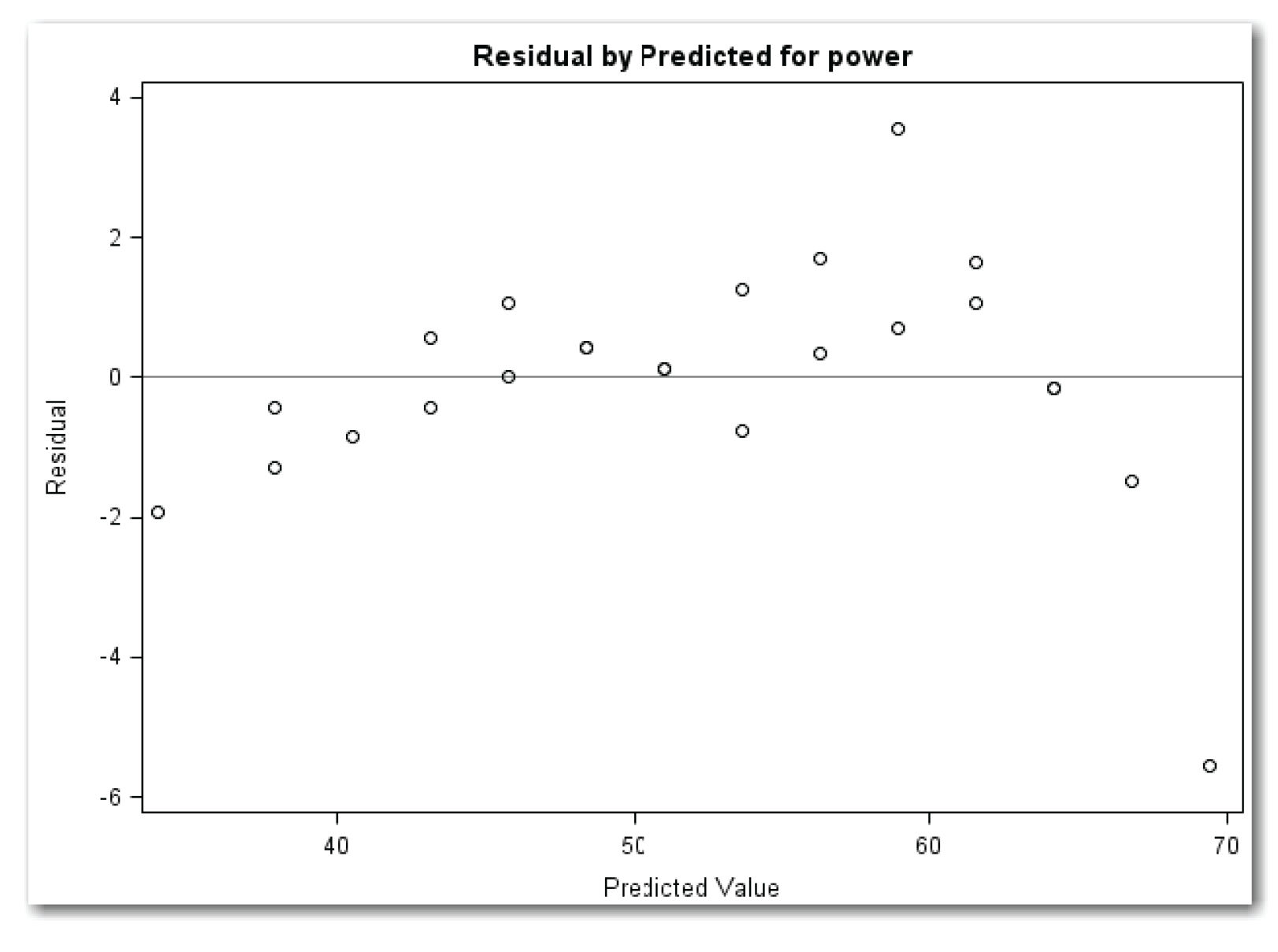
Figure 11.15 shows a much more obvious curvature than Figure 11.14. This pattern reinforces that a quadratic term for speed needs to be added to the model.
Plotting Residuals in Time Sequence
The PLOT statement uses statistical keywords for automatic variables to plot the residuals in time sequence. Figure 11.16 shows the plot.
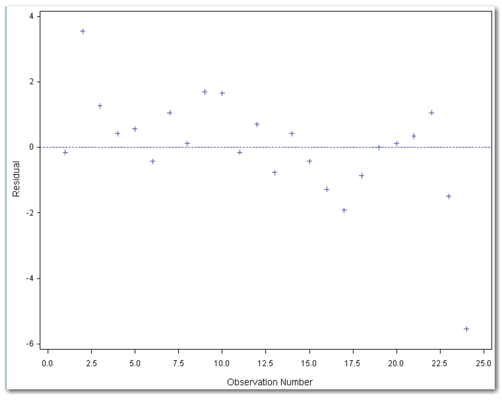
Figure 11.16 shows a wavy pattern similar to what was depicted in Figure 11.3. The wavy pattern is more obvious toward the end of the time period. This plot sends a message to add a term to the model.
Summarizing Residuals Plots for Straight-Line Fit
For the straight-line model, the scatter plot of the data with the fitted line gives a subtle signal that a quadratic term for speed needs to be added to the model. Plotting residuals against speed strengthens the signal. Plotting residuals against predicted values strengthens the signal even more. Plotting residuals in time sequence also indicates that the model needs another term.
The residuals plots all lead to the same conclusion—add a quadratic term to the model.
Residuals Plots for Fitting a Curve
Chapter 10 fit a curve to the engine data, and created the results in Figure 10.18. The statements below also produce these results, and create all of the diagnostic plots discussed in this section:
ods graphics on;
proc reg data=engine
plots(only)=(residuals(unpack) residualbypredicted);
model power=speed speedsq;
run;
plot r.*obs. / nostat nomodel;
quit;
ods graphics off;
Plotting Residuals against the Independent Variable
Using PLOTS=RESIDUALS creates the plot of residuals against speed and against speedsq. UNPACK creates two separate plots. Because the PROC REG statement also requests the plot of residuals by predicted values, the parentheses around the list of plots are required. These statements produce Figures 11.17 and 11.18.
Figure 11.17 shows a horizontal band with two possible outlier points. The plot shows a point higher than the other points at speed equal to 20. It shows a point much lower than the other points at speed equal to 24.
Figure 11.17 is the same as Figure 11.18. This situation occurs because speedsq is simply a mathematical function of speed. This example illustrates a general principle: when fitting a curve and looking at diagnostic plots, you can look at the residuals against the linear term. Looking at residuals against the quadratic term is not necessary. PROC REG produces both plots because the linear term and the quadratic term are defined by two different variables. In this situation, UNPACK is helpful because you can include only the plot for the linear term in presentations or reports.

Plotting Residuals against Predicted Values
Using PLOTS=RESIDUALBYPREDICTED creates the plot of residuals by predicted values. Because the PROC REG statement also requests the plot of residuals against independent variables, the parentheses around the list of plots are required. Figure 11.19 shows the plot.
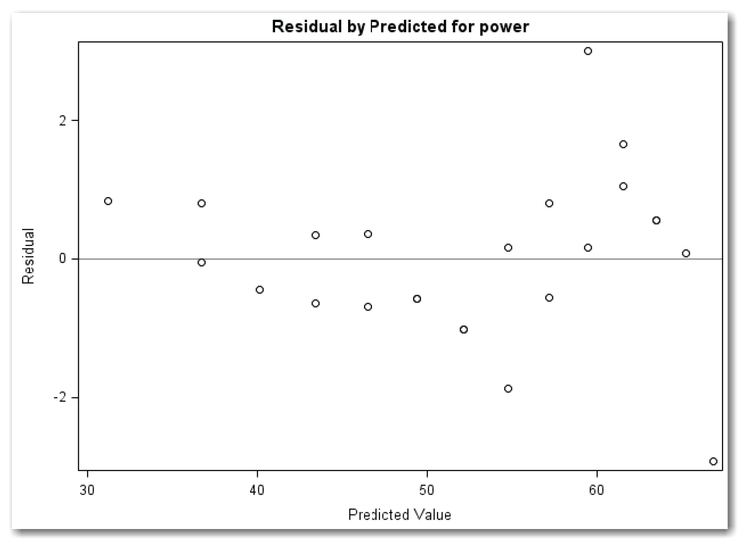
Figure 11.19 sends the same message as the Residuals by speed plot. You need to investigate the two possible outlier points.
Plotting Residuals in Time Sequence
The PLOT statement uses statistical keywords for automatic variables to plot the residuals in time sequence. Figure 11.20 shows the plot.

The points in Figure 11.20 form a rough horizontal band except for two possible outlier points. The large positive residual is the second point, and the large negative residual is the last point. This plot sends the same message as other residuals plots. You need to investigate the two possible outlier points.
Summarizing Residuals Plots for Fitting a Curve to Engine Data
For the curve model, plotting residuals against speed forms a mostly horizontal band with two possible outlier points. Plotting residuals against predicted values has the same results. Plotting residuals against a time sequence reinforces these results. The plot doesn’t show an overall time sequence effect. However, it does show that one of the outlier points occurred near the beginning of the experiment, and the other outlier point occurred at the end of the experiment. These results highlight the subjective nature of residuals plots.
Looking for Outliers in the Data
Figure 11.17 shows a plot of residuals from the quadratic model for the engine data. The residuals fall mostly in a horizontal band except for two points that are away from the other points. These points are at the speed values of 20 and 24.
To find out if these residuals are too large to have occurred reasonably by chance alone, you can use studentized residuals. Studentized residuals are obtained by dividing residuals by their standard errors. They are also called standardized residuals. PROC REG produces both a list and plot of studentized residuals. Reviewing the studentized residuals augments the residuals plots, and interpretation is less subjective.
For a model that fits the data well and has no outliers, most of the studentized residuals should be close to 0. In general, studentized residuals that are less than or equal to 2.0 in absolute value (-2.0 ≤ studentized residual ≤ 2.0) can easily occur by chance. Values between 2.0 and 3.0 in absolute value occur infrequently. Values larger than 3.0 in absolute value occur very rarely by chance alone. If the studentized residual is between 2.0 and 3.0 in absolute value, then you might consider the observation suspicious. If it is 3.0 or larger in absolute value, then you can consider the observation a probable outlier. Some statisticians use different cutoff values to decide whether an observation is an outlier.
In general, look at the printed residuals, and see whether you can find a systematic pattern in the distribution of positive and negative values.
When there is an obvious need to add variables to the model, you often observe a pattern of negative residuals, then positive residuals, and then negative residuals again.
The residuals plots from the quadratic model for the engine data appear to be a random scatter of points with a couple of exceptions. The studentized residuals can show whether these points are more likely to be a result of chance, or whether they point out special situations.
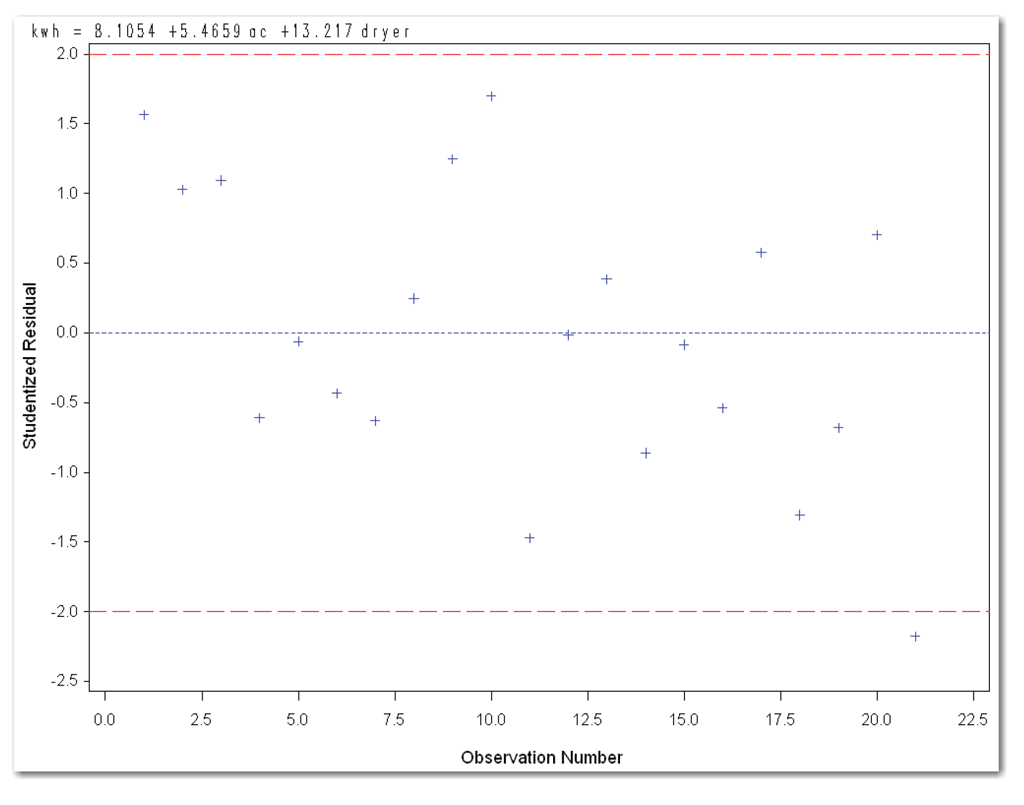
proc reg data=engine;
model power=speed speedsq / r;
plot student.*obs. / vref=-2 2 cvref=red nostat;
run;
quit;
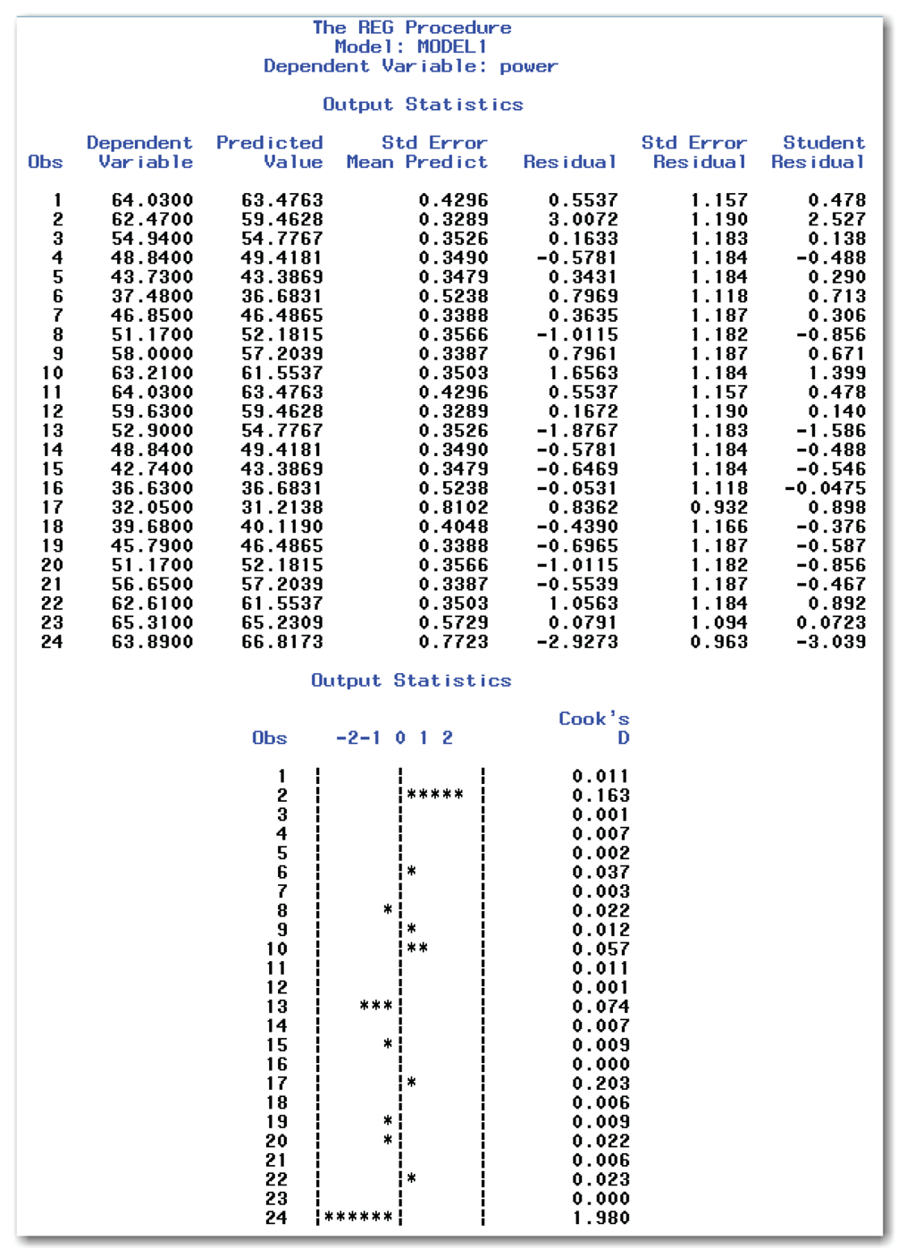
The R option (for residuals) in the MODEL statement creates the Output Statistics table and simple plot shown in Figure 11.21. Figure 11.22 shows the plot created by the PLOT statement. This program also produces the regression analysis. (See Figure 10.18.)
The PLOT statement uses the STUDENT. statistical keyword to specify studentized residuals as the y-variable for the plot. It uses the OBS. statistical keyword to specify observation numbers as the x-variable. NOSTAT suppresses several statistics that automatically appear to the right of the plot. VREF= specifies reference lines at -2 and 2, which are helpful in interpreting the plot. CVREF=RED specifies that the reference lines be red.
Figure 11.21 shows the residuals in the Residual column, and the studentized residuals in the Student Residual column.
You can look at the column of studentized residuals in Figure 11.21 and identify observations that might be outliers. However, the plot makes this easier. This plot, labeled -2 -1 -0 1 2, is a simple plot of studentized residuals. Each asterisk (*) corresponds to one half of a unit. For example, observations with four or five asterisks have studentized residuals between 2.0 and 3.0. By reviewing the plot, you can identify observations 2 and 24 as possible outliers.
Most of the remaining columns in the Output Statistics table are discussed in Chapter 10. Here are two new columns:
Std Error Residual
is the standard error of the residual, used in calculating the studentized residual. Student Residual=Residual/Std Error Residual.
Cook’s D
is Cook’s D statistic, which measures the change in predicted values when the observation is deleted from the data. Observations with large values of D are considered influential. (See “Special Topic: Automatic ODS Graphs” for more discussion.)
This plot shows the studentized residuals. It adds reference lines at -2 and 2. Points that appear outside the reference lines should be investigated as outliers. Figure 11.22 indicates two such points, which correspond to observations 2 and 24.

Data without Outliers (Kilowatt)
The residuals plots for the multiple regression model for the kilowatt data appeared to be a random scatter of points. The studentized residuals can confirm this initial conclusion, or identify possible outliers that need to be investigated.
proc reg data=kilowatt;
model kwh=ac dryer / r;
plot student.*obs. / vref=-2 2 cvref=red nostat;
run;
quit;
The statements use the same approach that was used for the engine data, and produce Figures 11.23 and 11.24. The statements also produce the regression analysis. (See Figure 10.24.)
Figure 11.21 shows the residuals and a simple plot. Figure 11.21 shows no observation with more than four asterisks. Observation 21 has a studentized residual of -2.177 and is only mildly suspicious. In a data set with 21 observations, you are likely to find one or two residuals in the suspicious range due to chance alone. This is likely to occur, even if there are no real outliers.

This plot shows the studentized residuals. It adds reference lines at -2 and 2. Figure 11.23 indicates only one possible point to investigate, which corresponds to observation 21.
This section first explains lack of fit. It then shows how to use PROC REG to create tables that analyze the fit of a model.
Chapter 10 discussed the concepts for least squares regression. It explained how regression partitions total variation in the data into variation due to variables in the model, and variation due to error.
The error variation can be separated even further. When the data contains observations with the same x value and different y values, the variation in these observations is pure error. No matter what model you fit, these data points associated with pure error will still vary.
For example, Chapter 10 introduced this issue for the kilowatt data, which has three data points with ac equal to 8. These three points have the same x value and different observed y values. The straight-line regression equation predicts the same y value for these three points.
Lack of fit tests are a statistical way of separating the error variation into pure error and lack of fit error. The null hypothesis for the lack of fit test is that the lack of fit error is 0. The alternative hypothesis is that the lack of fit error is different from 0. With a significant p-value, you conclude that the model has significant lack of fit, and other models should be considered. Statisticians usually perform lack of fit tests with a reference probability of 0.05. This gives a 5% chance of incorrectly concluding that the model has significant lack of fit when, in fact, it does not.
Checking Lack of Fit for the Kilowatt Data
Straight-Line Regression
Figure 10.12 shows the results of the straight-line regression for the kilowatt data, but it does not request a lack of fit analysis.
proc reg data=kilowatt;
model kwh=ac / lackfit;
run;
The LACKFIT option in the MODEL statement requests a lack of fit analysis.[4] SAS performs the lack of fit analysis only when the data has points with duplicate x values. If your data has unique x values for every data point, SAS cannot perform the analysis.
Figure 11.25 shows the results.

In the Analysis of Variance table, look at the row for Error. This term is further divided into a row for Lack of Fit and a row for Pure Error. Find the value for Pr > F for the Lack of Fit row. This gives the p-value for the lack of fit test. Figure 11.25 shows a p-value of 0.7281. Because this value is greater than the reference probability of 0.05, you conclude that the model does not have significant lack of fit.
In general, to perform the lack of fit test at the 5% significance level, you conclude that the lack of fit is significant if the p-value is less than 0.05.
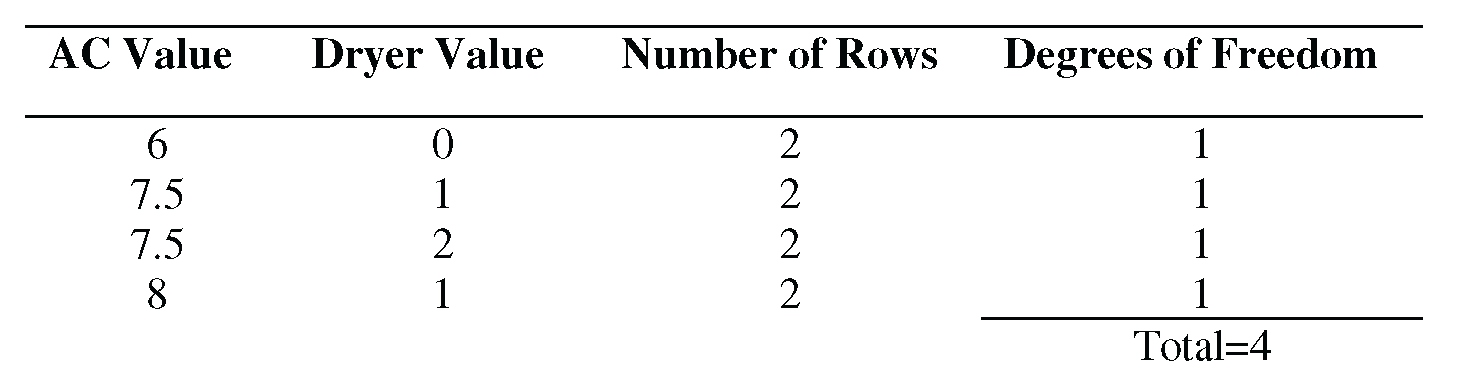
Look at the row for Pure Error. It shows 8 for the degrees of freedom (DF). Looking at the data shows how these 8 degrees of freedom are derived:

For each case with duplicate values of the x variable, the degrees of freedom are one less than the number of duplicate rows. (Table 10.1 in Chapter 10 shows the kilowatt data.)
When looking at lack of fit results, check the degrees of freedom for pure error. The lack of fit test is less useful when the data has only a few duplicate x values. With only a few duplicate x values, the estimate for pure error is not as good as for data that has many duplicate x values. The straight-line fit for the kilowatt data has enough duplicate x values.
From the lack of fit results, you conclude that the model is adequate. This example shows why multiple diagnostics are important. If you review only this report, instead of the report and the residuals plots, you miss the need to add dryer to the model.
Multiple Regression
Figure 10.24 shows the results from multiple regression for the kilowatt data, but it does not request a lack of fit analysis:
proc reg data=kilowatt;
model kwh=ac dryer / lackfit;
run;
Figure 11.26 shows the results.
Figure 11.26 shows a p-value of 0.6130 for the lack of fit test. This value leads you to conclude that the model is adequate.
Look at the row for Pure Error. It shows 4 for the degrees of freedom (DF). Looking at the data shows how these 4 degrees of freedom are derived:
This might be a case where the data does not have enough duplicate x values. If this were a designed experiment instead of an observational study, the design could be improved by adding more duplicate x values.

Checking Lack of Fit for the Engine Data
Straight-Line Regression
Figure 11.12 shows the results of the straight-line regression for the engine data, but it does not request a lack of fit analysis.
proc reg data=engine;
model power=speed / lackfit;
run;
Figure 11.27 shows the results.

Figure 11.27 shows a p-value of 0.0064 for the lack of fit test. This value leads you to conclude that the model is inadequate.
Table 10.2 shows the data. Looking at the data shows where the 10 degrees of freedom are derived. Most of the x values appear in the data table twice. The 10 degrees of freedom come from duplicate x values for the speed values of 12, 14, 15, 16, 17, 18, 19, 20, 21, and 22. This planned experiment was designed with enough duplicate x values to test for lack of fit.
Fitting a Curve
Figure 10.18 shows the results of fitting a curve to the engine data, but it does not request a lack of fit analysis.
proc reg data=engine;
model power=speed speedsq / lackfit;
run;
Figure 11.28 shows the results.
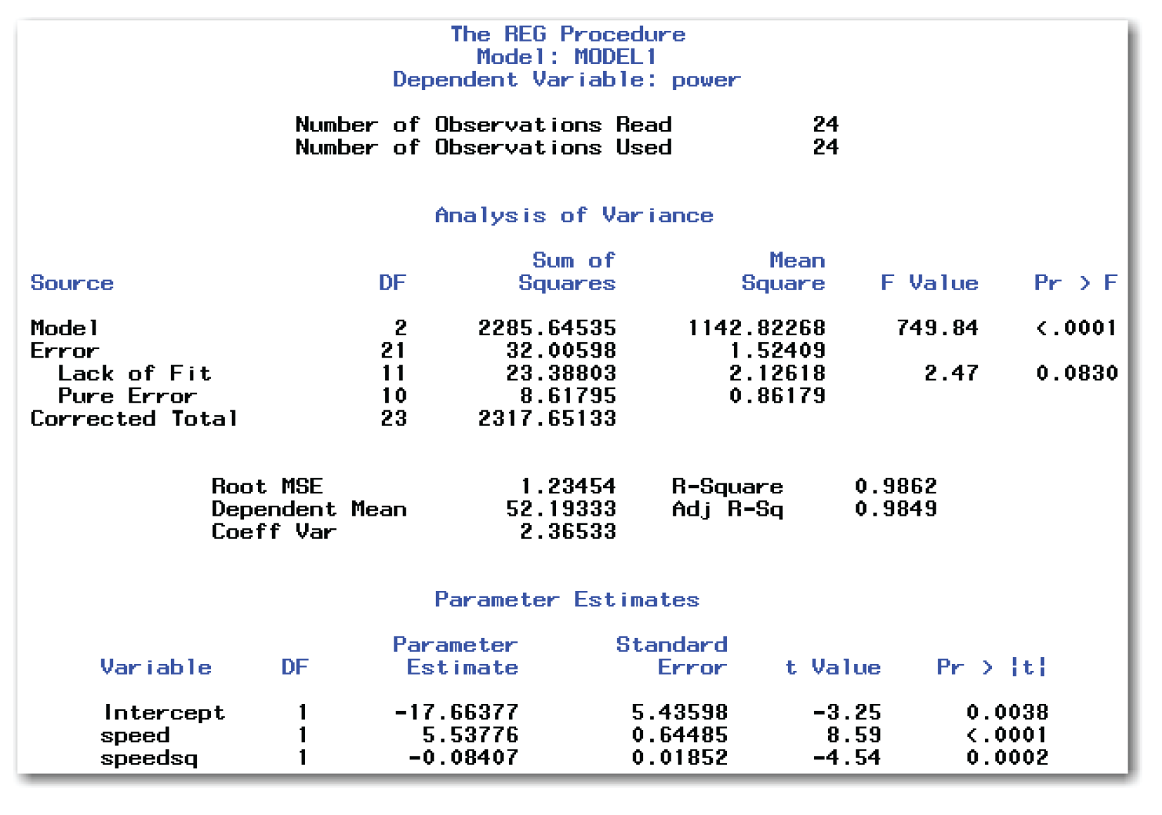
Figure 11.28 shows a p-value of 0.0830 for the lack of fit test. This value leads you to conclude that the model is adequate.
Testing the Regression Assumption for Errors
Chapter 10 defined the last assumption for regression as that the errors in the data are normally distributed with a mean of 0 and a variance of σ. Chapter 10 did not test this assumption because testing involves residuals from the regression model. Specifically, testing this assumption involves testing that residuals are normally distributed with a given mean and variance. In practice, many statisticians rely on the theory behind regression, and they often don’t test this assumption. The theory behind least squares regression ensures that the mean of the residuals is 0. The least squares regression theory also ensures that the Root MSE from the regression fit is the best estimate of the standard deviation of the residuals. As a result, most statisticians test this last assumption for regression by checking the normality of the residuals. Many statisticians simply review plots of the residuals, rather than performing a formal statistical test.
Chapter 5 discussed testing for normality, and Chapter 7 discussed testing that the mean difference is 0. Testing the errors assumption uses the same approaches used in those chapters. However, the approaches in Chapters 5 and 7 require creating an output data set that contains the residuals, and then performing the analysis on the residuals. This chapter does not use those approaches.
Instead, this chapter shows diagnostic plots available in PROC REG, which help you check the normality of the residuals. These plots are available with ODS graphics. The next two sections discuss checking the normality assumption for the final models for the kilowatt and engine data.
Checking Normality of Errors for the Kilowatt Data
Linear regression assumes that the errors are normally distributed. To create plots that help you check this assumption, submit the following:
ods graphics on;
proc reg data=kilowatt
plots(only)=(residualhistogram residualboxplot qqplot);
model kwh=ac dryer;
run;
quit;
ods graphics off;
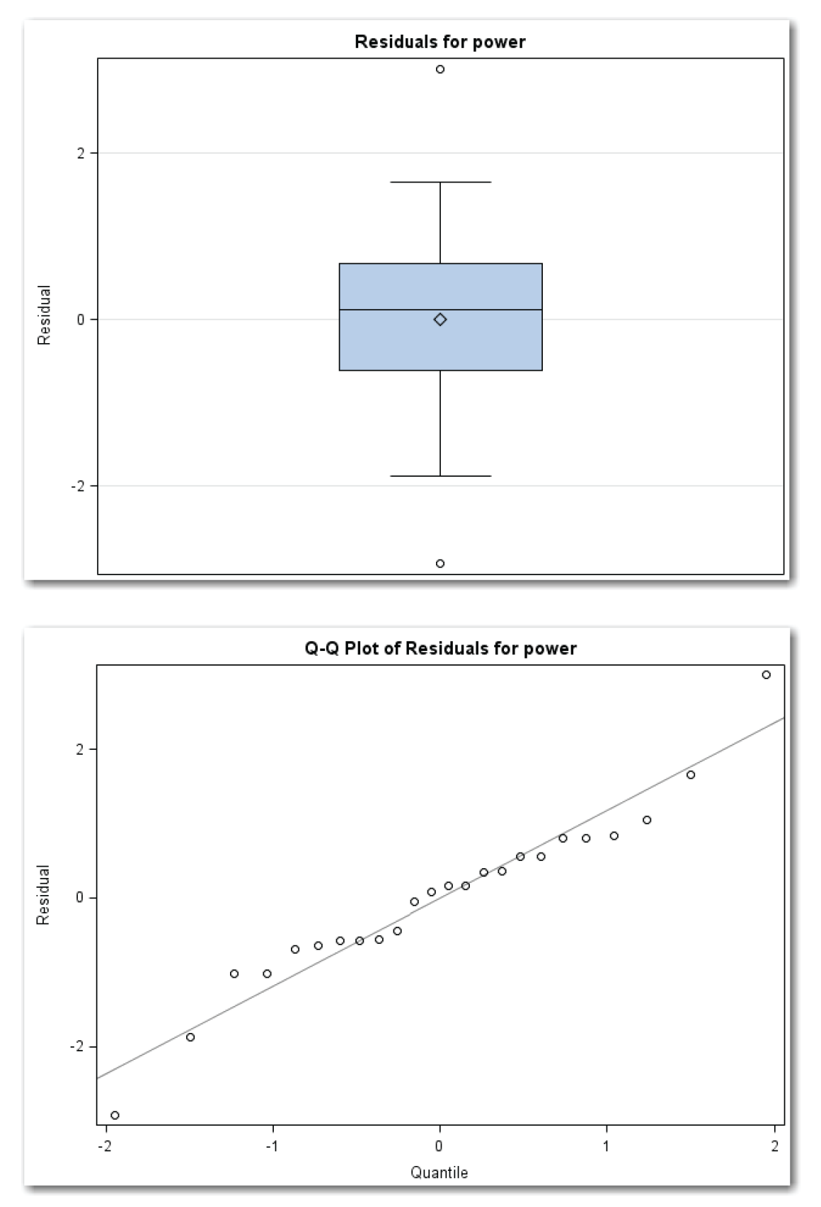
The PLOTS= option in the PROC REG statement identifies three plots. The parentheses around the three plots are required. ONLY suppresses other plots that PROC REG automatically creates. RESIDUALHISTOGRAM creates a histogram of residuals. RESIDUALBOXPLOT creates a box plot of residuals. QQPLOT creates a normal quantile plot of residuals. (Chapter 5 discussed using these three types of plots in addition to the formal test for normality. See the discussion in Chapter 5 for details about these types of plots.) Figure 11.29 shows the plots.
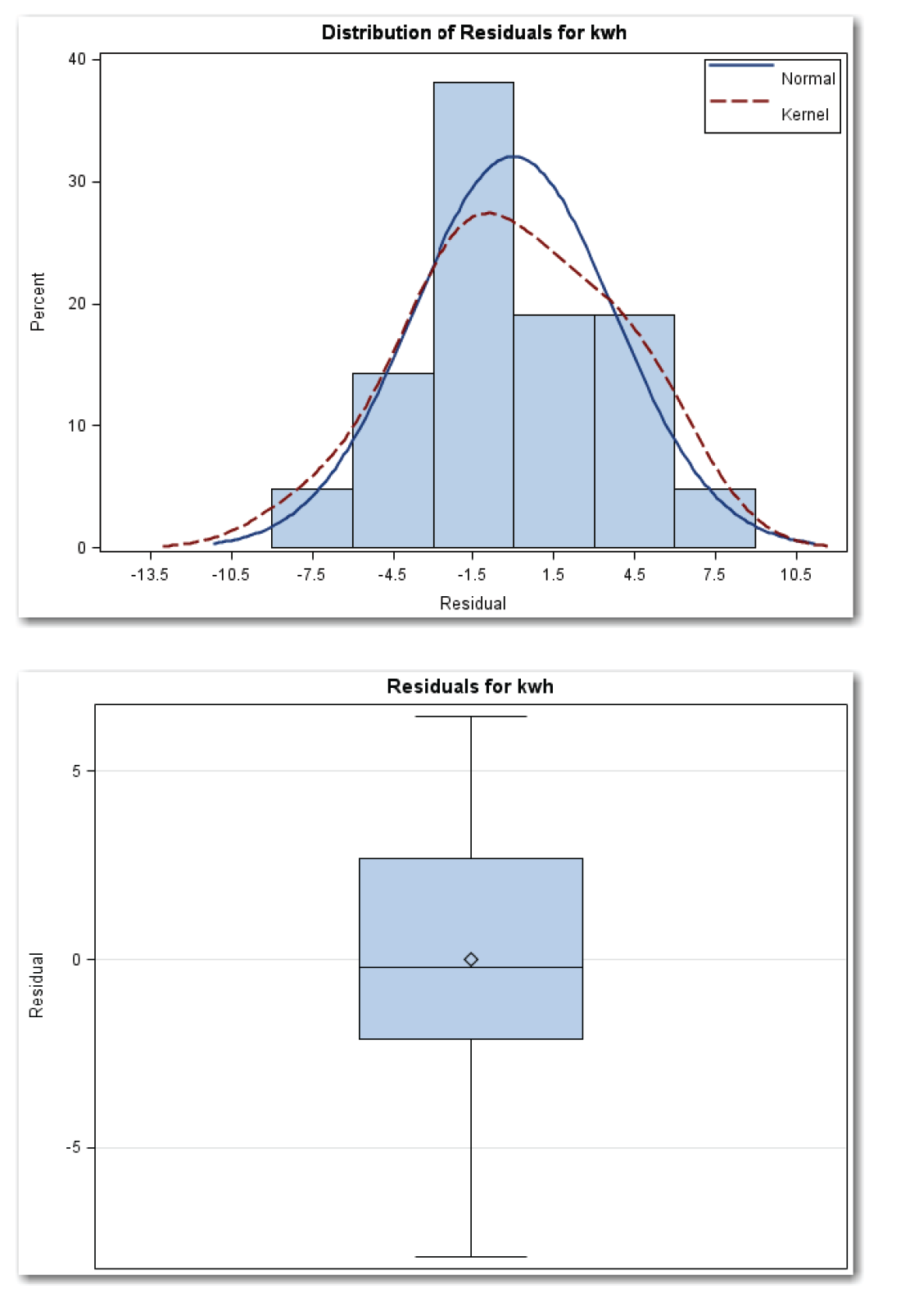
Figure 11.29 Checking for Normality of Residuals for Kilowatt Data (continued)

Figure 11.29 shows a histogram with an overlaid normal curve (solid blue line). The red dotted line is the kernel curve, which this book does not discuss. The histogram is roughly mound-shaped, and the assumption of normality seems reasonable.
Figure 11.29 also shows a box plot for the residuals. The median and mean are close together (the center line and the diamond). This matches the expected behavior for a normal distribution. The distribution appears to be slightly skewed to the left.
Figure 11.29 shows a normal quantile plot where most of the points fall close to the reference line for a normal distribution.
Combining information from the three plots, proceeding with the assumption that the residuals are normally distributed is reasonable.
Checking Normality of Errors for the Engine Data
Linear regression assumes that the errors are normally distributed. To create plots that help you check the assumption, submit the following:
ods graphics on;
proc reg data=engine
plots(only)=(residualhistogram residualboxplot qqplot);
model power=speed speedsq;
run;
quit;
ods graphics off;
The options are the same as the options used with the kilowatt data.
Figure 11.30 shows the plots.
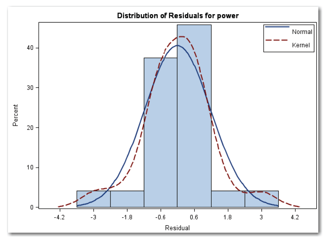
Figure 11.30 shows a histogram with an overlaid normal curve (solid blue line). The red dotted line is the kernel curve, which this book does not discuss. The histogram is mound-shaped, and the assumption of normality seems reasonable.
Figure 11.30 also shows a box plot for the residuals. (See next page.) The median and mean are close together (the center line and the diamond). This matches the expected behavior for a normal distribution. The median is very close to the center of the box, which also matches the expected behavior for a normal distribution. The box plot shows two outliers, which correspond to the measurements for observations 20 and 24. The other regression diagnostic plots identified these observations as potential outliers to investigate.
Figure 11.30 shows a normal quantile plot where most of the points fall close to the reference line for a normal distribution.
Figure 11.30 Checking for Normality of Residuals for Engine Data (continued)
Combining information from the three plots, proceeding with the assumption that the residuals are normally distributed is reasonable.
- Regression analysis is an iterative process of fitting a model, and then performing diagnostics. Residuals plots show inadequacies in models. Lack of fit tests indicate whether a different model would fit the data better.
- In general, in plots of residuals, a random scatter of points or a horizontal band indicates a good model. Definite patterns indicate different situations, depending on the plot. Stronger signals have more obvious patterns than weak signals.
- Plot residuals against independent variables in the model, and against independent variables not in the model. Curved patterns indicate that a quadratic term needs to be added to the model. Linear patterns indicate that a variable needs to be added to the model.
- Plot residuals against predicted values. A random scatter of points or a horizontal band indicates a good model. Investigate obvious outlier points to determine whether they are due to a special cause.
- Plot residuals against the time sequence in which the data was collected. An obvious pattern shows a possible time sequence effect in the data.
- Look at a list of the residuals for definite patterns. This approach is most useful for small data sets where there is a very obvious need for another variable.
- Use studentized residuals to check for outliers. For a model that fits the data well, most of the studentized residuals should be close to 0.
- Lack of fit tests separate error variation into pure error and lack of fit error. A significant p-value for a lack of fit test indicates that the model has significant lack of fit and that you need to consider a different regression model.
- Use residuals from the regression model to check the regression assumption that errors in the data are normally distributed.
This section shows the general form for PROC REG to perform regression diagnostics. See the “Syntax” section in Chapter 10 for the general form of statements to fit regression equations. This chapter uses ODS Statistical Graphics, which are available in many procedures starting with SAS 9.2. For SAS 9.1, ODS Statistical Graphics were experimental and available in fewer procedures. For releases earlier than SAS 9.1, you need to use alternative approaches like traditional graphics or line printer plots, both of which are discussed in the “Special Topic” sections. Also, to use ODS Statistical Graphics, you must have SAS/GRAPH software licensed.
To create diagnostic plots
ODS GRAPHICS ON;
PROC REG DATA=data-set-name plot-options;
VAR variables;
MODEL statement
PLOT y-variable*x-variable / options;
RUN;
QUIT;
ODS GRAPHICS OFF;
plot-options for a plot of residuals against variables in the model can be:
PLOTS(ONLY)=RESIDUALS(UNPACK);
plot-options for a plot of residuals against predicted values can be:
PLOTS(ONLY)=RESIDUALBYPREDICTED;
For all plot-options, the items in parentheses are:
ONLY
suppresses other plots that PROC REG automatically creates.
UNPACK
creates separate plots for the x-variables in the model. This is helpful for models with more than one x-variable. When fitting a straight line, UNPACK is not needed.
You can combine the plot-options and enclose the request in parentheses:
PLOTS(ONLY)=(RESIDUALS(UNPACK)
RESIDUALBYPREDICTED);
The PLOT statement for plotting residuals against x-variables that are not in the model is:
PLOT R.>/*x-variable / NOSTAT NOMODEL;
R.
is the statistical keyword for residuals.
x-variable
is a variable that is listed in the VAR statement, but it is not in the model.
The period after the statistical keyword is required. The items after the slash are:
NOSTAT
suppresses several statistics that automatically appear to the right of the plot.
NOMODEL
suppresses the equation for the fitted model that automatically appears above the plot.
The PLOT statement for plotting residuals in time sequence is:
PLOT R.*OBS. / NOSTAT NOMODEL;
OBS.
is the statistical keyword for the observation number.
The period after the statistical keyword is required. This approach assumes that the data set is sorted in time sequence. If the data set is not sorted, then use an x-variable that defines the time sequence.
Other items in italic were defined earlier in the chapter.
To print and plot studentized residuals
PROC REG DATA=data-set-name;
MODEL y-variable=x-variables / R;
PLOT STUDENT.*OBS. / VREF=-2 2 CVREF=RED NOSTAT ;
RUN;
QUIT;
R
in the MODEL statement creates the Output Statistics table that shows the studentized residuals and a simple plot.
STUDENT.
in the PLOT statement is the statistical keyword to specify studentized residuals.
The period after the statistical keyword is required. The items after the slash are not required and are:
VREF=-2 2
specifies reference lines at -2 and 2, which are helpful in interpreting the plot.
CVREF=RED
specifies that the reference lines be red.
Other items were defined earlier.
To test for lack of fit
PROC REG DATA=data-set-name;
MODEL y-variable=x-variables / LACKFIT;
RUN;
QUIT;
LACKFIT
in the MODEL statement requests a lack of fit analysis. SAS performs the lack of fit analysis only when the data has points with duplicate x values. If your data has unique x values for every data point, SAS cannot perform the analysis. The LACKFIT option is available starting with SAS 9.2.
To check normality of errors from the regression analysis
ODS GRAPHICS ON;
PROC REG DATA=data-set-name
PLOTS(ONLY)=(RESIDUALHISTOGRAM
RESIDUALBOXPLOT QQPLOT);
MODEL statement
RUN;
QUIT;
ODS GRAPHICS OFF;
The parentheses are required.
RESIDUALHISTOGRAM
creates a histogram of residuals.
RESIDUALBOXPLOT
creates a box plot of residuals.
QQPLOT
creates a normal quantile plot of residuals.
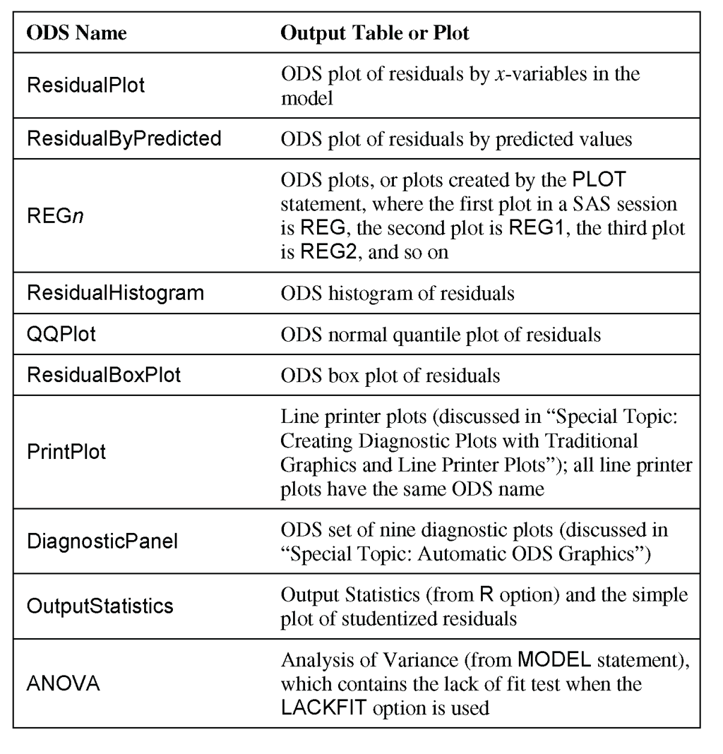
You can use the ODS statement to choose the output tables to print. Table 11.1 identifies the names of the PROC REG output tables and plots discussed in this chapter:
The program below produces the output shown in this chapter. This program includes the output in the two “Special Topic” sections. The program is designed for ease of use in following along with the book. Many of the PROC steps could be combined for efficiency.
options ps=60 ls=80 nonumber nodate;
data kilowatt;
input kwh ac dryer @@;
datalines;
35 1.5 1 63 4.5 2 66 5.0 2 17 2.0 0 94 8.5 3 79 6.0 3
93 13.5 1 66 8.0 1 94 12.5 1 82 7.5 2 78 6.5 3 65 8.0 1
77 7.5 2 75 8.0 2 62 7.5 1 85 12.0 1 43 6.0 0 57 2.5 3
33 5.0 0 65 7.5 1 33 6.0 0
;
run;
data engine;
input speed power @@;
speedsq=speed*speed;
datalines;
22.0 64.03 20.0 62.47 18.0 54.94 16.0 48.84 14.0 43.73
12.0 37.48 15.0 46.85 17.0 51.17 19.0 58.00 21.0 63.21
22.0 64.03 20.0 59.63 18.0 52.90 16.0 48.84 14.0 42.74
12.0 36.63 10.5 32.05 13.0 39.68 15.0 45.79 17.0 51.17
19.0 56.65 21.0 62.61 23.0 65.31 24.0 63.89
;
run;
ods graphics on;
proc reg data=kilowatt
plots(only)=(residuals residualbypredicted) ;
var dryer;
model kwh=ac / lackfit;
run;
plot r.*dryer / nostat nomodel;
run;
plot r.*obs. / nostat nomodel;
run;
quit;
ods graphics off;
ods graphics on;
proc reg data=kilowatt
plots(only)=(residuals(unpack) residualbypredicted) ;
model kwh=ac dryer;
run;
plot r.*obs. / nostat nomodel;
run;
quit;
ods graphics off;
ods graphics on;
proc reg data=engine
plots(only)=(residuals residualbypredicted) ;
model power=speed;
run;
plot power*speed / nostat cline=red;
run;
plot r.*obs. / nostat nomodel;
run;
quit;
ods graphics off;
ods graphics on;
proc reg data=engine
plots(only)=(residuals(unpack) residualbypredicted) ;
model power=speed speedsq;
run;
plot r.*obs. / nostat nomodel;
run;
quit;
ods graphics off;
options ps=70;
proc reg data=engine;
model power=speed speedsq / r;
plot student.*obs. / vref=-2 2 cvref=red nostat;
run;
quit;
options ps=60;
proc reg data=kilowatt;
model kwh=ac dryer / r;
plot student.*obs. / vref=-2 2 cvref=red nostat;
run;
quit;
proc reg data=kilowatt;
model kwh=ac / lackfit;
run;
quit;
proc reg data=kilowatt;
model kwh=ac dryer / lackfit;
run;
quit;
proc reg data=engine;
model power=speed / lackfit;
run;
quit;
proc reg data=engine;
model power=speed speedsq / lackfit;
run;
quit;
ods graphics on;
proc reg data=kilowatt
plots(only)=(residualhistogram residualboxplot qqplot);
model kwh=ac dryer;
run;
quit;
ods graphics off;
ods graphics on;
proc reg data=engine
plots(only)=(residualhistogram residualboxplot qqplot);
model power=speed speedsq;
run;
quit;
ods graphics off;
proc reg data=kilowatt ;
model kwh=ac dryer;
run;
symbol v=’A’;
plot r.*ac/ nostat;
run;
symbol v=’D’;
plot r.*dryer / nostat;
run;
symbol v=star;
plot r.*p. / nostat;
run;
plot r.*obs./ nostat;
run;
plot student.*obs. / vref=-2 2 cvref=red nostat;
run;
plot nqq.*obs. / nostat;
quit;
options formchar="|----|+|---+=|-/<>*";
proc reg data=kilowatt lineprinter;
model kwh=ac dryer;
run;
plot r.*ac="*" ;
run;
plot r.*dryer="+";
run;
plot r.*p.;
run;
plot r.*obs. ;
run;
plot student.*obs. ;
run;
quit;
ods graphics on;
proc reg data=kilowatt plots=diagnostics(stats=none);
model kwh=ac dryer / lackfit;
run;
quit;
ods graphics off;
ods graphics on;
proc reg data=engine plots=diagnostics(stats=none);
model power=speed speedsq / lackfit;
run;
quit;
ods graphics off;
Special Topic: Creating Diagnostic Plots with Traditional Graphics and Line Printer Plots
Chapters 10 and 11 assume that you have the ability to create high-resolution graphics. This chapter has used ODS graphics for diagnostic plots whenever possible. It has used traditional graphics (high-resolution) in other situations.[5] For all of the diagnostic plots discussed in this chapter, PROC REG also provides high-resolution graphics with the PLOT statement. Also, if you do not have SAS/GRAPH software licensed, you can create most of the diagnostic plots with line printer plots. This section provides sample syntax for creating diagnostic plots.
For plotting studentized residuals and for plotting residuals in time sequence, this chapter used the PLOT statement in PROC REG. You can also use the PLOT statement for other diagnostic plots. The statements below provide an example for multiple regression for the kilowatt data:
proc reg data=kilowatt ;
model kwh=ac dryer;
run;
symbol v='A';
plot r.*ac/ nostat;
run;
symbol v='D';
plot r.*dryer / nostat;
run;
symbol v=star;
plot r.*p. / nostat;
run;
plot r.*obs./ nostat;
run;
plot student.*obs. / vref=-2 2 cvref=red nostat;
run;
plot nqq.*obs. / nostat;
run;
quit;
The first three plots use a SYMBOL statement to specify the plotting symbol. Once you use a SYMBOL statement, SAS continues to use a symbol specification until you provide another SYMBOL statement. The last three plots use a star (asterisk) as the plotting symbol.
All of the PLOT statements use the NOSTAT option to suppress statistics that automatically appear to the right of the plot. All of the plots use statistical keywords, which are summarized in the table below. The plot of studentized residuals (not shown here) adds reference lines and colors the reference lines (at -2 and 2).
Figure ST11.1 shows the graph of residuals by predicted values as an example.
The table below identifies statistical keywords used in the PLOT statements:
R
residual
P
predicted value
OBS.
observation number
STUDENT.
studentized residual
NQQ.
normal quantiles for residuals
When you do not have SAS/GRAPH software licensed, you can create most of the diagnostic plots as line printer plots.
options formchar="|----|+|---+=|-/<>*";
proc reg data=kilowatt lineprinter;
model kwh=ac dryer;
run;
plot r.*ac="*" ;
run;
plot r.*dryer="+";
run;
plot r.*p.;
run;
plot r.*obs. ;
run;
plot student.*obs. ;
run;
quit;
The OPTIONS statement includes the FORMCHAR= option, which specifies characters that are used for various aspects of the plot. SAS documentation recommends this specific value of the FORMCHAR= option to ensure consistent output on different computers.
The LINEPRINTER option specifies line printer plots. Each PLOT statement specifies a scatter plot. The first two plots specify the appearance of the plotted points. You can specify any single character. Enclose the character in double quotation marks. For a plot where a plotting symbol is omitted, the plot shows the number of points at a given location as 1, 2, 3, and so on.
The NOSTAT, VREF=, and CVREF= options are not available for line printer plots. The SYMBOL statement is not available for line printer plots. Also, the normal quantile plot of residuals is not available for line printer plots.
Figure ST11.2 shows the graph of residuals by predicted values as an example.

Special Topic: Automatic ODS Graphics
You can use many diagnostic tools to decide whether your regression model fits the data well. This chapter concentrates on residuals plots and lack of fit tests. Where possible, this chapter used ODS graphics and created specific plots for each topic.[6] SAS provides a panel of automatic ODS graphics. Some of these graphics provide more advanced diagnostics. This section briefly discusses the panel of automatic ODS graphics. It briefly introduces the more advanced diagnostics. See SAS documentation or the references in Appendix 1, “Further Reading” for more discussion.
The statements below create the automatic ODS graphics for multiple regression for the kilowatt data:
ods graphics on;
proc reg data=kilowatt plots=diagnostics(stats=none);
model kwh=ac dryer;
run;
quit;
ods graphics off;
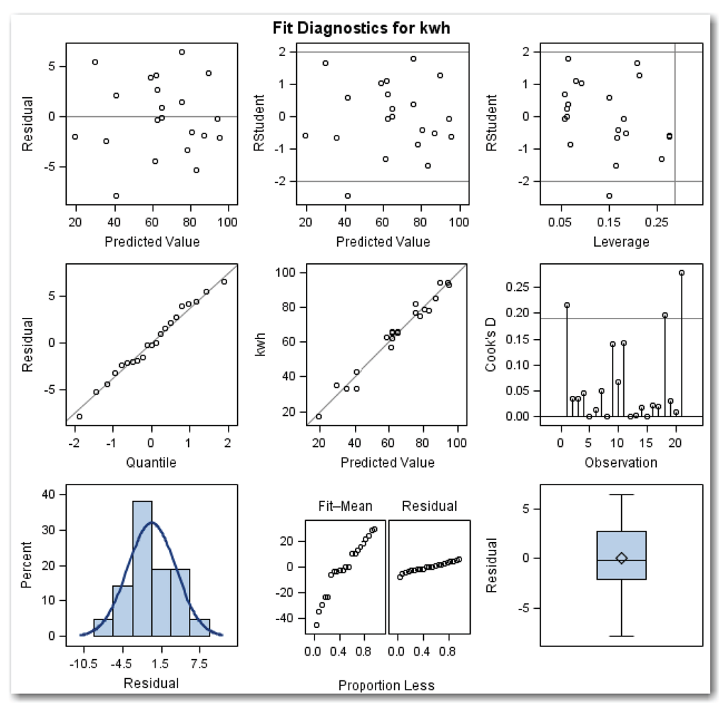
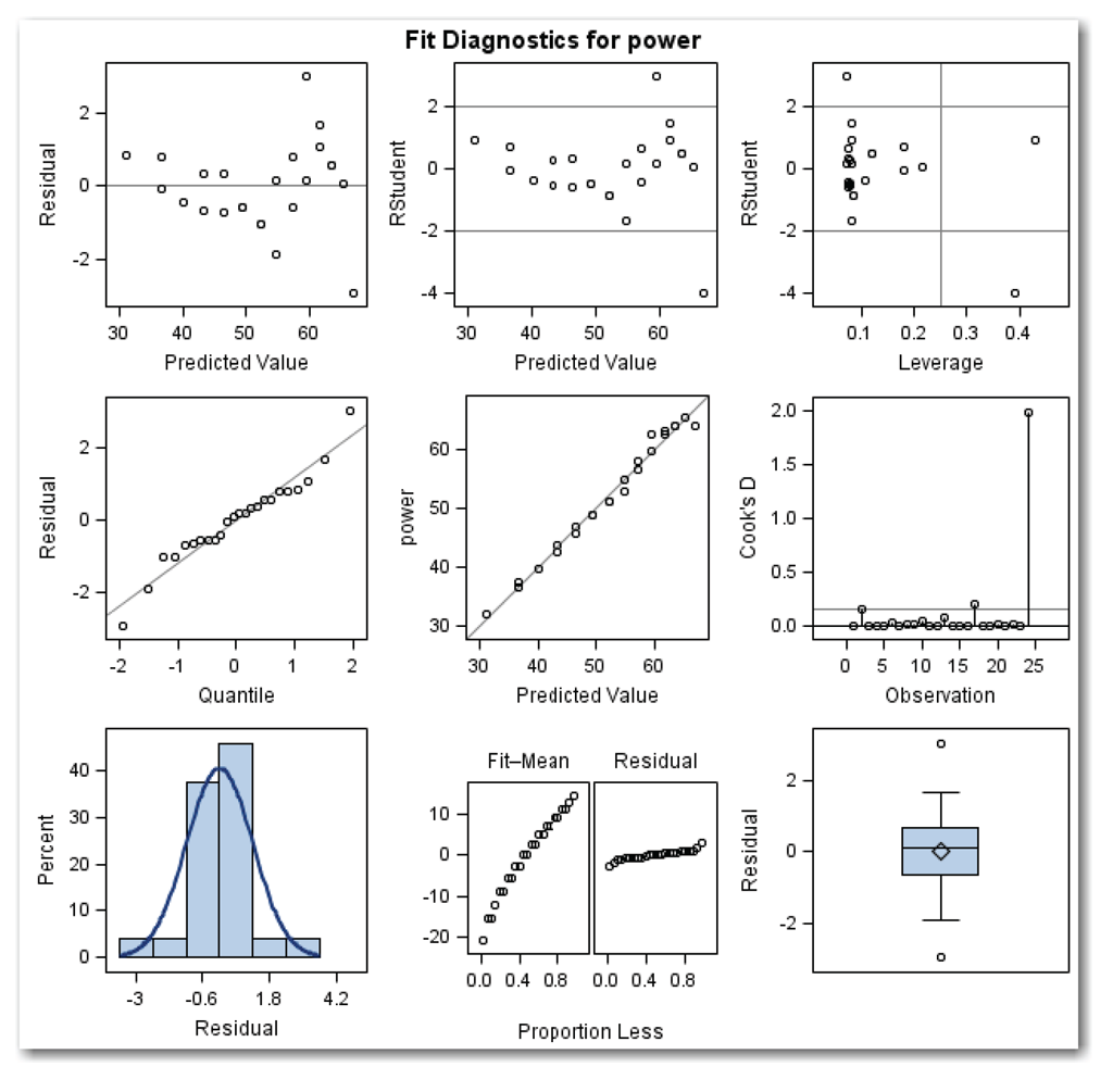
Using PLOTS=DIAGNOSTICS produces the diagnostics panel of plots. STATS=NONE suppresses a table of statistics that automatically appears on the lower right corner of the panel, and replaces the table with the box plot of residuals.
These statements produce the diagnostics panel in Figure ST11.3. The statements also produce a panel of residuals plots, with both residuals plots in a single panel. The panel combines the plots shown in Figures 11.8 and 11.9.
The diagram identifies the nine plots in the diagnostics panel:
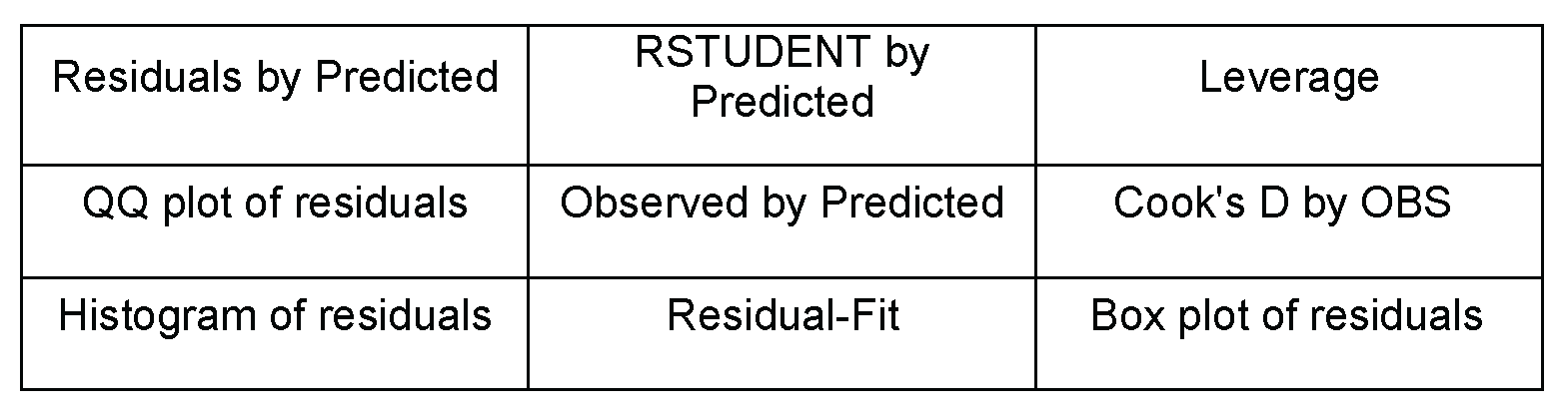
Four of these plots were discussed earlier. The histogram of residuals shows the normal curve, but not the kernel curve. Here are the five plots that haven’t been discussed:
- RSTUDENT by Predicted. This plot is similar to the plots of studentized residuals against observation numbers produced earlier in the chapter. This plot uses the RSTUDENT. statistical keyword, which is the studentized residual calculated with the current observation deleted. RSTUDENT helps to identify observations that have a large influence on the fit of the model. As a general guideline, investigate points that appear outside the reference lines at -2 and 2. For the kilowatt data, this point is the possible outlier that has been discussed (observation 21).
- Leverage. This plot shows RSTUDENT by leverage, and is another way to identify possible outliers. As with the RSTUDENT by Predicted plot, this plot shows reference lines at -2 and 2. Points that appear outside the reference lines should be investigated as potential outliers. For the kilowatt data, only one point appears as a possible outlier. This is observation 21, which is the last value in the data set.
The plot also shows a vertical reference line for the leverage. Points to the right of the reference line are defined as influential, and they have a large impact on the fitted model. For more advanced analyses, statisticians fit the regression model with all of the observations, and then they fit the model without the influential points, and then they compare the results. The vertical reference line is placed at 2p/n, where p is the number of parameters including the intercept, and n is the number of observations in the model. For multiple regression for the kilowatt data, the line is at (2*3)/21=6/21=0.2857. For the kilowatt data, no points appear to the right of the line, which indicates that there are no influential points.
- Observed by Predicted. The line on this plot represents a perfect fit of the model to the data. The circles on the plot are the data values. For a good model, the points (circles) on the plot are close to the line. Figure ST11.3 shows a good-fitting model. This result is what you would expect, given the other diagnostics and the R-Square of about 0.97.
- Cook's D by OBS. This plot shows the Cook’s D statistic by observation number, and is another way to identify possible influential points. Points that appear above the reference line are defined as influential. The line is placed at 4/n, where n is the number of observations in the model. For the kilowatt data, the line is at 4/21=0.1905. For the kilowatt data, three points appear above the line. These are the observations for days 1, 18, and 21. Point 21 has the most influence.
- Residual-Fit. This plot shows two side-by-side normal quantile plots. The left plot shows the centered fit, and the right plot shows the residuals. In theory, when the spread in the two plots is similar, then the model provides a good fit.
The statements below create the automatic ODS graphics for multiple regression for the engine data:
ods graphics on;
proc reg data=engine plots=diagnostics(stats=none);
model power=speed speedsq;
run;
quit;
ods graphics off;
Figure ST11.4 shows the results.
Four of these plots were discussed earlier. The histogram of residuals shows the normal curve, but not the kernel curve. Here are the five plots that have not been discussed:
- RSTUDENT by Predicted. This plot shows two possible outliers. These are observations 2 and 24, which were previously identified as possible outliers.
- Leverage. This plot shows two possible outliers for observations 2 and 24. The plot also shows two possible influential points, for observation 17 (which is not also a possible outlier) and 24.
- Observed by Predicted. The plot shows a good-fitting model. This result is what you would expect, given the other diagnostics and the R-Square of about 0.98.
- Cook's D by OBS. This plot shows a strongly influential point for observation 24. The plot also shows observation 17 just above the reference line.
- Residual-Fit. This plot shows that the model provides a good fit.
ENDNOTES
[1] ODS Statistical Graphics are available in many procedures starting with SAS 9.2. For SAS 9.1, ODS Statistical Graphics were experimental and available in fewer procedures. For releases earlier than SAS 9.1, you need to use alternative approaches like traditional graphics or line printer plots, both of which Chapter 11 discusses in the “Special Topic” sections. Also, to use ODS Statistical Graphics, you must have SAS/GRAPH software licensed.
[2] The PLOTS= option is available starting with SAS 9.2. For earlier releases of SAS, you can use traditional graphics to create a similar plot.
[3] If you add a quadratic term for dryer, you will find that the term is significant. However, the model already provides an excellent fit that explains about 97% of the variation in the data. And, the model has a non-significant lack of fit test (as discussed later in this chapter). For these reasons, the homeowner decided not to add a quadratic term to the model.
[4] The LACKFIT option is available starting with SAS 9.2.
[5] ODS Statistical Graphics are available in many procedures starting with SAS 9.2. For SAS 9.1, ODS Statistical Graphics were experimental and available in fewer procedures. For releases earlier than SAS 9.1, you need to use alternative approaches like traditional graphics or line printer plots, which are summarized in this section. Also, to use ODS Statistical Graphics, you must have SAS/GRAPH software licensed.
[6] ODS Statistical Graphics are available in many procedures starting with SAS 9.2. For SAS 9.1, ODS Statistical Graphics were experimental and available in fewer procedures. For releases earlier than SAS 9.1, you need to use alternative approaches like traditional graphics or line printer plots. Also, to use ODS Statistical Graphics, you must have SAS/GRAPH software licensed.