Chapter 4 Summarizing Data
After you know how to create a data set, the next step is to learn how to summarize it. This chapter explains the concepts of levels of measurement and types of response scales. Depending on the variable, appropriate methods to summarize it include the following:
- descriptive statistics, such as the average
- frequencies or counts of values for a variable
- graphs that are appropriate for the variable, such as bar charts or histograms, box plots, or stem-and-leaf plots
SAS provides several procedures for summarizing data. This chapter discusses the UNIVARIATE, MEANS, FREQ, CHART, and GCHART procedures.
This chapter uses the body fat data from Chapter 2, and the speeding ticket data from Chapter 3. This chapter introduces the dog walk data set.
Understanding Types of Variables
Relating Levels of Measurement and Response Scales
Summarizing a Continuous Variable
Reviewing the Basic Statistical Measures Table
Reviewing the Extreme Observations Table
Reviewing the Missing Values Table
Adding a Summary of Distinct Extreme Values
Using PROC MEANS for a Brief Summary
Creating Line Printer Plots for Continuous Variables
Understanding the Stem-and-Leaf Plot
Creating Histograms for Continuous Variables
Creating Frequency Tables for All Variables
Creating Bar Charts for All Variables
Simple Vertical Bar Charts with PROC GCHART
Simple Vertical Bar Charts with PROC CHART
Discrete Vertical Bar Charts with PROC GCHART
Simple Horizontal Bar Charts with PROC GCHART
Omitting Statistics in Horizontal Bar Charts
Checking for Errors in Continuous Variables
Checking for Errors in Continuous Variables
Special Topic: Using ODS to Control Output Tables
Understanding Types of Variables
Chapter 2 discussed character and numeric variables. Character variables have values containing characters or numbers, and numeric variables have values containing numbers only.
Another way to classify variables is based on the level of measurement. The level of measurement is important because some methods of summarizing or analyzing data are based on the level of measurement. Levels of measurement can be nominal, ordinal, or continuous. In addition, variables can be measured on a discrete or a continuous scale.
The list below summarizes levels of measurement:
Nominal
Values of the variable provide names. These values have no implied order. Values can be character (Male, Female) or numeric (1, 2). If the value is numeric, then an interim value does not make sense. If gender is coded as 1 and 2, then a value of 1.5 does not make sense.
When you use numbers as values of a nominal variable, the numbers have no meaning, other than to provide names.
SAS uses numeric values to order numeric nominal variables. SAS orders character nominal variables based on their sorting sequence.
Ordinal
Values of the variable provide names and also have an implied order. Examples include High-Medium-Low, Hot-Warm-Cool-Cold, and opinion scales (Strongly Disagree to Strongly Agree). Values can be character or numeric. The distance between values is not important, but their order is. High-Medium-Low could be coded as 1-2-3 or 10-20-30, with the same result.
SAS uses numeric values to order numeric ordinal variables. SAS orders character ordinal variables based on their sorting sequence. A variable with values of High-Medium-Low is sorted alphabetically as High-Low-Medium.
Continuous
Values of the variable contain numbers, where the distance between values is important. Many statistics books further classify continuous variables into interval and ratio variables. See the “Technical Details” box for an explanation.
Technical Details: Interval and Ratio
Many statistical texts refer to interval and ratio variables. Here’s a brief explanation.
Interval variables are numeric and have an inherent order. Differences between values are important. Think about temperature in degrees Fahrenheit (F). A temperature of 120ºF is 20º warmer than 100ºF. Similarly, a temperature of 170ºF is 20º warmer than 150ºF. Contrast this with an ordinal variable, where the numeric difference between values is not meaningful. For an ordinal variable, the difference between 2 and 1 does not necessarily have the same meaning as the difference between 3 and 2.
Ratio variables are numeric and have an inherent order. Differences between values are important and the value of 0 is meaningful. For example, the weight of gold is a ratio variable. The number of calories in a meal is a ratio variable. A meal with 2,000 calories has twice as many calories as a meal with 1,000 calories. Contrast this with temperature. It does not make sense to say that a temperature of 100ºF is twice as hot as 50ºF, because 0º on a Fahrenheit scale is just an arbitrary reference point.
For the analyses in this book, SAS does not consider interval and ratio variables separately. From a practical view, this makes sense. You would perform the same analyses on interval or ratio variables. The difference is how you would summarize the results in a written report. For an interval variable, it does not make sense to say that the average for one group is twice as large as the average for another group. For a ratio variable, it does.
The list below summarizes response scales:
Discrete
Variables measured on a discrete scale have a limited number of numeric values in any given range. The number of times you walk your dog each day is a variable measured on a discrete scale. You can choose not to walk your dog at all, which gives a value of 0. You can walk your dog 1, 2, or 7 times, which gives values of 1, 2, and 7, respectively. You can’t walk your dog 3.5 times in one day, however. The discrete values for this variable are the numbers 0, 1, 2, 3, and so on. Test scores are another example of a variable measured on a discrete scale. With a range of scores from 0 to 100, the possible values are 0, 1, 2, and so on.
Continuous
Variables measured on a continuous scale have conceptually an unlimited number of values. As an example, your exact body temperature is measured on a continuous scale. A thermometer doesn’t measure your exact body temperature, but measures your approximate body temperature. Body temperature conceptually can take on any value within a specific range, say 95º to 105º Fahrenheit. In this range, conceptually there are an unlimited number of values for your exact body temperature (98.6001, 98.6002, 98.60021, and so on). But, in reality, you can measure only a limited number of values (98.6, 98.7, 98.8, and so on). Contrast this with the number of times you walk your dog. Conceptually and in reality, there are a limited number of values to represent the number of times you walk your dog each day.
The important idea that underlies a continuous scale is that the variable can theoretically take on an unlimited number of values. In reality, the number of values for the variable is limited only by your ability to measure.
Relating Levels of Measurement and Response Scales
Nominal and ordinal variables are usually measured on a discrete scale. However, for ordinal variables, the discrete scale is sometimes one that separates a continuous scale into categories. For example, a person’s age is often classified according to categories (0-21, 22-45, 46-65, and over 65, for example).
Interval and ratio variables are measured on discrete and continuous scales. The number of times you walk your dog each day is a ratio measurement on a discrete scale. Conceptually, your weight is a ratio measurement on a continuous scale.
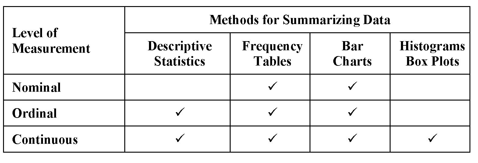
Table 4.1 shows the relationships between the levels of measurement and the summary methods in this chapter. For example, box plots are appropriate for continuous variables, but not for nominal variables.
Summarizing a Continuous Variable
This section shows two SAS procedures for summarizing a continuous variable. PROC UNIVARIATE gives an extensive summary, and PROC MEANS gives a brief summary. To get an extensive summary of the speeding ticket data, type the following:
options ps=55;
proc univariate data=tickets;
var amount;
id state;
title 'Summary of Speeding Ticket Data';
run;
The PROC UNIVARIATE statement requests a summary for the tickets data set, the VAR statement lists variables to be summarized, and the ID statement names a variable that identifies observations in one part of the output. These statements produce Figure 4.1.
The output includes five tables with headings Moments, Basic Statistical Measures, Quantiles, Extreme Observations, and Missing Values. This chapter discusses these five tables. The procedure also prints the Tests for Location table, which this book discusses in Chapter 7.

Figure 4.1 PROC UNIVARIATE Results for Tickets Data Set (continued)

From Figure 4.1, the average speeding ticket fine is $265.67. The median is $162.50 and the mode is $100. The standard deviation is $291.18. The smallest fine is $20, and the largest fine is $1000. The data set has one missing value, which is for Washington, D.C. Although Figure 4.1 shows many other statistics, these few summary statistics (mean, median, mode, standard deviation, minimum, and maximum) provide an overall summary of the distribution of speeding ticket fines.
The next five topics discuss the tables of results.
Figure 4.1 shows the Moments table that PROC UNIVARIATE prints automatically. The list below describes the items in this table.
N
Number of rows with nonmissing values for the variable. This number might not be the same as the number of rows in the data. The tickets data set has 51 rows, but N is 50 because the value for Washington, D.C. is missing.
SAS uses N in calculating other statistics, such as the mean.
Mean
Average of the data. It is calculated as the sum of values, divided by the number of nonmissing values. The mean is the most common measure used to describe the center of a distribution of values. The mean for amount is 265.67, so the average speeding ticket fine for the 50 states is $265.67.
Std Deviation
Standard deviation, which is the square root of the variance. For amount, this is about 291.18 (rounded off from the output shown).
The standard deviation is the most common measure used to describe dispersion or variability around the mean. When all values are close to the mean, the standard deviation is small. When the values are scattered widely from the mean, the standard deviation is large.
Like the variance, the standard deviation is a measure of dispersion about the mean, but it is easier to interpret because the units of measurement for the standard deviation are the same as the units of measurement for the data.
Skewness
Measure of the tendency for the distribution of values to be more spread out on one side than the other side. Positive skewness indicates that values to the right of the mean are more spread out than values to the left. Negative skewness indicates the opposite.
For amount, the skewness of about 1.714 is caused by the group of states with speeding ticket fines above $300, which pulls the distribution to the right of the mean, and spreads out the right side more than the left side.
Uncorrected SS
Uncorrected sum of squares. Chapter 9 discusses this statistic.
Coeff Variation
Coefficient of variation, sometimes abbreviated as CV. It is calculated as the standard deviation, divided by the mean, and multiplied by 100. Or, (Std Dev/Mean)*100.
Sum Weights
Sum of weights. When you don’t use a Weight column, Sum Weights is the same as N. When you do use a Weight column, Sum Weights is the sum of that column, and SAS uses Sum Weights instead of N in calculations. This book does not use a Weight column.
Sum Observations
Sum of values for all rows. It is used in calculating the average and other statistics.
Variance
Square of the standard deviation. The Variance is never less than 0, and is 0 only if all rows have the same value.
Kurtosis
Measure of the shape of the distribution of values. Think of kurtosis as measuring how peaked or flat the shape of the distribution of values is. Large values for kurtosis indicate that the distribution has heavy tails or is flat. This means that the data contains some values that are very distant from the mean, compared to most of the other values in the data.
For amount, the right tail of the distribution of values is heavy because of the group of states with speeding ticket fines above $300.
Corrected SS
Corrected sum of squares. Chapter 9 discusses this statistic.
Std Error Mean
Standard error of the mean. It is calculated as the standard deviation, divided by the square root of the sample size. It is used in calculating confidence intervals. Chapter 6 gives more detail.
Reviewing the Basic Statistical Measures Table
Figure 4.1 shows the Basic Statistical Measures table that PROC UNIVARIATE prints automatically. The Location column shows statistics that summarize the center of the distribution of data values. The Variability column shows statistics that summarize the breadth or spread of the distribution of data values. This table repeats many of the statistics in the Moments table because you can suppress the Moments table and display only these few key statistics. See “Special Topic: Using ODS to Control Output Tables” at the end of this chapter. The list below describes the items in this table.
Mean
Average of the data, as described for the Moments table.
Median
50th percentile. Half of the data values are above the median, and half are below it. The median is less sensitive than the mean to skewness, and is often used with skewed data.
Mode
Data value with the largest associated number of observations. The mode of 100 indicates that more states give speeding ticket fines of $100 than any other amount.
Sometimes the data set contains more than one mode. In that situation, SAS displays the smallest mode and prints a note below the table that explains that the printed mode is the smallest.
Std Deviation
Standard deviation, as described for the Moments table.
Variance
Square of the standard deviation, as described for the Moments table.
Range
Difference between highest and lowest data values.
Interquartile Range
Difference between the 25th percentile and the 75th percentile.
Figure 4.1 shows the Quantiles table that PROC UNIVARIATE prints automatically. This table gives more detail about the distribution of data values. The 0th percentile is the lowest value and is labeled as Min. The 100th percentile is the highest value and is labeled as Max. The difference between the highest and lowest values is the range.
The 25th percentile is the first quartile and is greater than 25% of the values. The 75th percentile is the third quartile and is greater than 75% of the values. The difference between these two percentiles is the interquartile range, which also appears in the Basic Statistical Measures table. The 50th percentile is the median, which also appears in the Basic Statistical Measures table.
SAS shows several other quantiles, which are interpreted in a similar way. For example, the 90th percentile is 875, which means that 90% of the values are less than 875.
The heading for the Quantiles table identifies the definition that SAS uses for percentiles in the table. SAS uses Definition 5 automatically. For more detail on these definitions, see the SAS documentation on the PCTLDEF= option.
Reviewing the Extreme Observations Table
Figure 4.1 shows the Extreme Observations table that PROC UNIVARIATE prints automatically. This table lists the five lowest and five highest observations, in the Lowest and Highest columns. The lowest value is the minimum, and the highest value is the maximum. For this data, the minimum is 20 and the maximum is 1000.
Figure 4.1 shows two observations with the same lowest value in this table. This table doesn’t identify the five lowest distinct values. For example, two states have an amount of 50, and two of the lowest observations show this. The five highest observations for amount are all 1000.
The Extreme Observations table shows the impact of using the ID statement. The table identifies the observations with the value of state. Without an ID statement, the procedure identifies observations with their observation numbers (Obs in this table in Figure 4.1).
Reviewing the Missing Values Table
Figure 4.1 shows the Missing Values table that PROC UNIVARIATE prints automatically.
Missing Value shows how missing values are coded, and Count gives the number of missing values. The right side of the table shows percentages. The All Obs column shows the percentage of all observations with a given missing value, and the Missing Obs column shows the percentage of missing observations with a given value. For the speeding ticket data, 1.96% of all observations are missing, and 100% of the missing values are coded with a period.
Figure 4.1 shows the Tests for Location table that PROC UNIVARIATE prints automatically. Chapter 7 discusses this table.
The general form of the statements to summarize data is shown below:
PROC UNIVARIATE DATA=data-set-name;
VAR variables;
ID variable;
data-set-name is the name of a SAS data set, and variables lists one or more variables in the data set. If you omit the variables from the VAR statement, then the procedure uses all numeric variables. The ID statement is optional. If you omit the ID statement, then SAS identifies the extreme observations using their observation numbers.
Adding a Summary of Distinct Extreme Values
The Extreme Observations table prints the five lowest and five highest observations in the data set. These might be the five lowest distinct values and the five highest distinct values. Especially with large data sets, the more likely situation is that this is not the case.
To see the lowest and highest distinct values, you can use the NEXTRVAL= option. You can suppress the Extreme Observations table with the NEXTROBS=0 option.
proc univariate data=tickets nextrval=5 nextrobs=0;
var amount;
id state;
title 'Summary of Speeding Ticket Data';
run;
These statements produce most of the tables in Figure 4.1. The Extreme Observations table does not appear. Figure 4.2 shows the Extreme Values table, printed as a result of the NEXTRVAL= option.

Compare the results in Figures 4.1 and 4.2. Figure 4.2 shows the five lowest distinct values of 20, 40, 46.5, 50, and 55. Compare these with Figure 4.1, which shows the five lowest observations and does not show the value of 55. Similarly, Figure 4.2 shows the five highest distinct values, and Figure 4.1 shows the five highest observations. The five highest observations are all 1000, but the five highest distinct values are 300, 500, 600, 750, and 1000.
For some data, the two sets of observations are the same—the five highest observations are also the five highest distinct values. Or, the five lowest observations are also the five lowest distinct values.
The general form of the statements to suppress the lowest and highest observations and to print the lowest and highest distinct values is:
PROC UNIVARIATE DATA=data-set-name
NEXTRVAL=5 NEXTROBS=0;
VAR variables;
data-set-name is the name of a SAS data set, and variables lists one or more variables in the data set.
The NEXTRVAL=5 option prints the five lowest distinct values and the five highest distinct values. This option creates the Extreme Values table. PROC UNIVARIATE automatically uses NEXTRVAL=0. You can use values from 0 to half the number of observations. For example, for the speeding ticket data, NEXTRVAL= has a maximum value of 25.
The NEXTROBS=0 option suppresses the Extreme Observations table, which shows the five lowest and five highest observations in the data. PROC UNIVARIATE automatically uses NEXTROBS=5. You can use values from 0 to half the number of observations. For example, for the speeding ticket data, NEXTROBS= has a maximum value of 25.
You can use the NEXTRVAL= and NEXTROBS= options together or separately to control the tables that you want to see in the output.
Using PROC MEANS for a Brief Summary
PROC UNIVARIATE prints detailed summaries of variables, and prints the information for each variable in a separate table. If you want a concise summary, you might want to use PROC MEANS. To get a brief summary of the speeding ticket data, type the following:
proc means data=tickets;
var amount;
title 'Brief Summary of Speeding Ticket Data';
run;
These statements create the output shown in Figure 4.3.
This summary shows the number of observations (N), average value (Mean), standard deviation (Std Dev), minimum (Minimum), and maximum (Maximum) for the amount variable. The definitions of these statistics were discussed earlier for PROC UNIVARIATE.

The PROC MEANS output is much briefer than the PROC UNIVARIATE output. If there were several variables in the tickets data set, and you wanted to get only these few descriptive statistics for each variable, PROC MEANS would produce a line of output for each variable. PROC UNIVARIATE would produce at least one page of output for each variable.
In addition, you can add many statistical keywords to the PROC MEANS statement, and create a summary that is still brief, but provides more statistics.
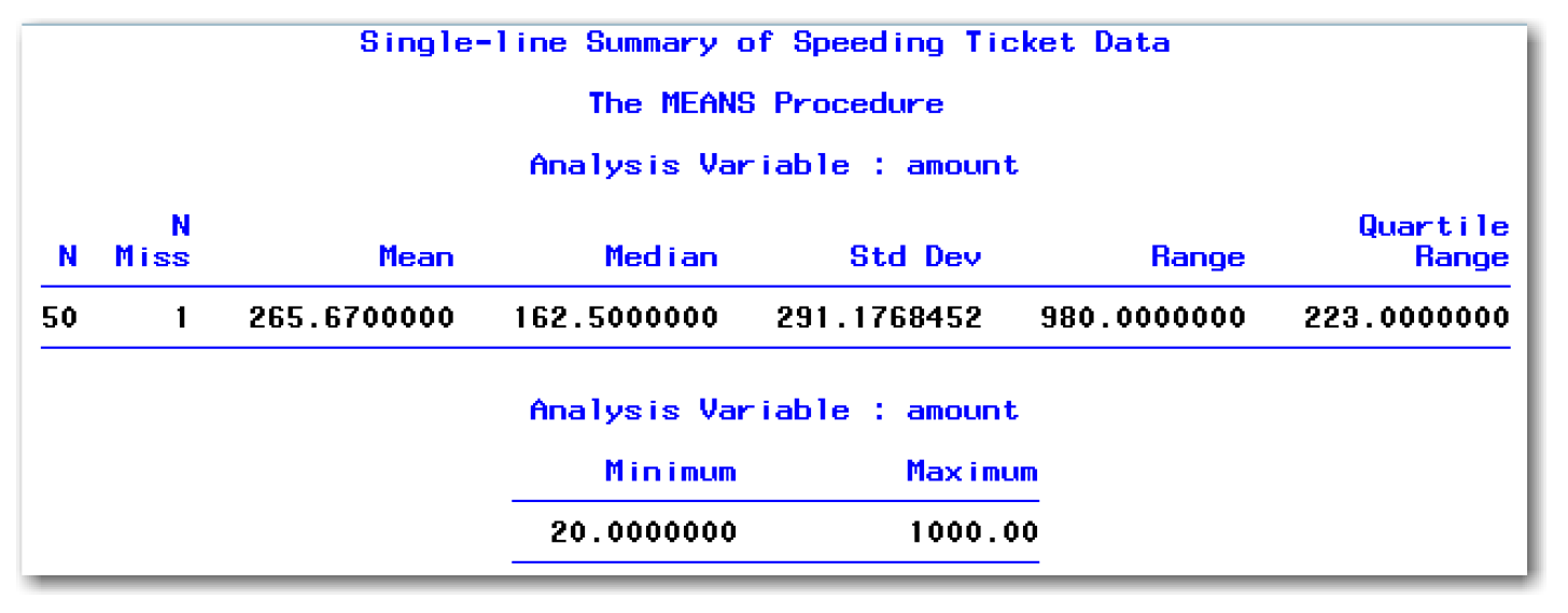
proc means data=tickets
n nmiss mean median stddev range qrange min max;
var amount;
title 'Single-line Summary of Speeding Ticket Data';
run;
These statements create the output shown in Figure 4.4.
The summary condenses information that PROC UNIVARIATE displays in multiple tables into a single table. With a LINESIZE= value greater than 80, the information appears on a single line. This approach can be very useful for data sets with many variables.
The general form for PROC MEANS is shown below:
PROC MEANS DATA=data-set-name
N NMISS MEAN MEDIAN STDDEV RANGE QRANGE MIN MAX;
VAR variables;
data-set-name is the name of a SAS data set, and variables lists one or more variables in the data set. If you omit the variables from the VAR statement, then the procedure uses all continuous variables.
All of the statistical keywords are optional, and the procedure includes other keywords that this book does not discuss. The keywords create statistics as listed below:
N
number of observations with nonmissing values
NMISS
number of missing values
MEAN
mean
MEDIAN
median
STDDEV
standard deviation
RANGE
range
QRANGE
interquartile range
MIN
minimum
MAX
maximum
The discussion for PROC UNIVARIATE earlier in this chapter defines the statistics above. (PROC UNIVARIATE shows NMISS as Count in the Missing Values table.) If you omit all of the statistical keywords, then PROC MEANS prints N, MEAN, STDDEV, MIN, and MAX.
Creating Line Printer Plots for Continuous Variables
PROC UNIVARIATE can create line printer plots and high-resolution graphs. To create the high-resolution graphs, you must have SAS/GRAPH software licensed. This section shows the line printer box plot and line printer stem-and-leaf plot. For the speeding ticket data, type the following:
proc univariate data=tickets plot;
var amount;
title 'Line Printer Plots for Speeding Ticket Data';
run;
The first part of your output is identical to the output in Figure 4.1. Figure 4.5 shows partial results from the PLOT option.
Your output will show complete results, which are three plots labeled Stem Leaf, Boxplot, and Normal Probability Plot. Chapter 5 discusses the normal probability plot. The next two topics discuss the box plot and stem-and-leaf plot.

Understanding the Stem-and-Leaf Plot
Figure 4.5 shows the stem-and-leaf plot on the left.[1] The stem-and-leaf plot shows the value of the variable for each observation.
The stem is on the left side under the Stem heading, and the leaves are on the right under the Leaf heading. The instructions at the bottom tell you how to interpret the stem-and-leaf plot. In Figure 4.5, the stems are the 100s and the leaves are 10s. Look at the lowest stem. Take 0.2 (Stem.Leaf) and multiply it by 10**+2 (=100) to get 20 (0.2*100=20). For your data, follow the instructions to determine the values of the variable.[2] SAS prints instructions except when you do not need to multiply Stem.Leaf by anything.
For the speeding ticket data, the lowest stem is for the values from 0 to 49, the second is for the values from 50 to 99, the third is for the values from 100 to 149, and so on. The plot is roughly mound shaped. The highest part of the mound is for the data values from 50 to 149, which makes sense, given the mean, median, and mode.
SAS might round data values in order to display all values in the plot. For example, SAS rounds the value of 46.5 to 50.
The plot shows a lot of skewness or sidedness. The values above 300 are more spread out than the values near 0. The data is skewed to the right—in the direction where more values trail at the end of the distribution of values. This skewness is seen in the box plot and Moments table.
The plot shows five values of 1000. You can see how much farther away these values are from the rest of the data. These extremely high values help cause the positive kurtosis of 1.83.
The column labeled with the pound sign (#) identifies how many values appear in each stem. For example, there are 2 values in the stem labeled 0.
Figure 4.5 shows the box plot on the right. This plot uses the scale from the stem-and-leaf plot on the left.
The bottom and top of the box are the 25th percentile and the 75th percentile. The length of the box is the interquartile range.
The line inside the box with an asterisk at each end is the median. The plus sign (+) inside the box indicates the mean, which might be the same as the median, but usually is not. If the median and the mean are close to each other, the plus sign (+) falls on the median line inside the box.
The dotted vertical lines that extend from the box are whiskers. Each whisker extends up to 1.5 interquartile ranges from the end of the box. Values outside the whiskers are marked with a 0 or an asterisk (*). A 0 is used if the value is between 1.5 and 3 interquartile ranges of the box, and an asterisk (*) is used if the value is farther away. Values that are far away from the rest of the data are called outliers.
The box plot for the speeding ticket data shows the median closer to the bottom of the box, which indicates skewness or sidedness to the data values. The mean and the median are different enough so that the plus sign (+) does not appear on the line for the median. The plot shows one potential outlier point at 1000. This point represents the five data values at 1000 (all of which are correct in the data set). The plot also shows one point outside the whiskers with a value of 750. This example shows how using the stem-and-leaf plot and box plot together can be helpful. With the box plot alone, you do not know that the potential outlier point at 1000 actually represents five data values.
The general form of the statements to create line printer plots is shown below:
PROC UNIVARIATE DATA=data-set-name PLOT;
VAR variables;
data-set-name is the name of a SAS data set, and variables lists one or more variables in the data set.
You can use the PLOT option with the NEXTRVAL= and NEXTROBS= options.
Creating Histograms for Continuous Variables
PROC UNIVARIATE can create histograms, which show the shape of the distribution of data values. Histograms are appropriate for continuous variables. For the speeding ticket data, type the following:
proc univariate data=tickets noprint;
var amount;
histogram amount;
title 'Histogram for Speeding Ticket Data';
run;
The NOPRINT option suppresses the printed output tables from PROC UNIVARIATE. Without this option, the statements would create the output shown in Figure 4.1. The HISTOGRAM statement creates the plot shown in Figure 4.6.
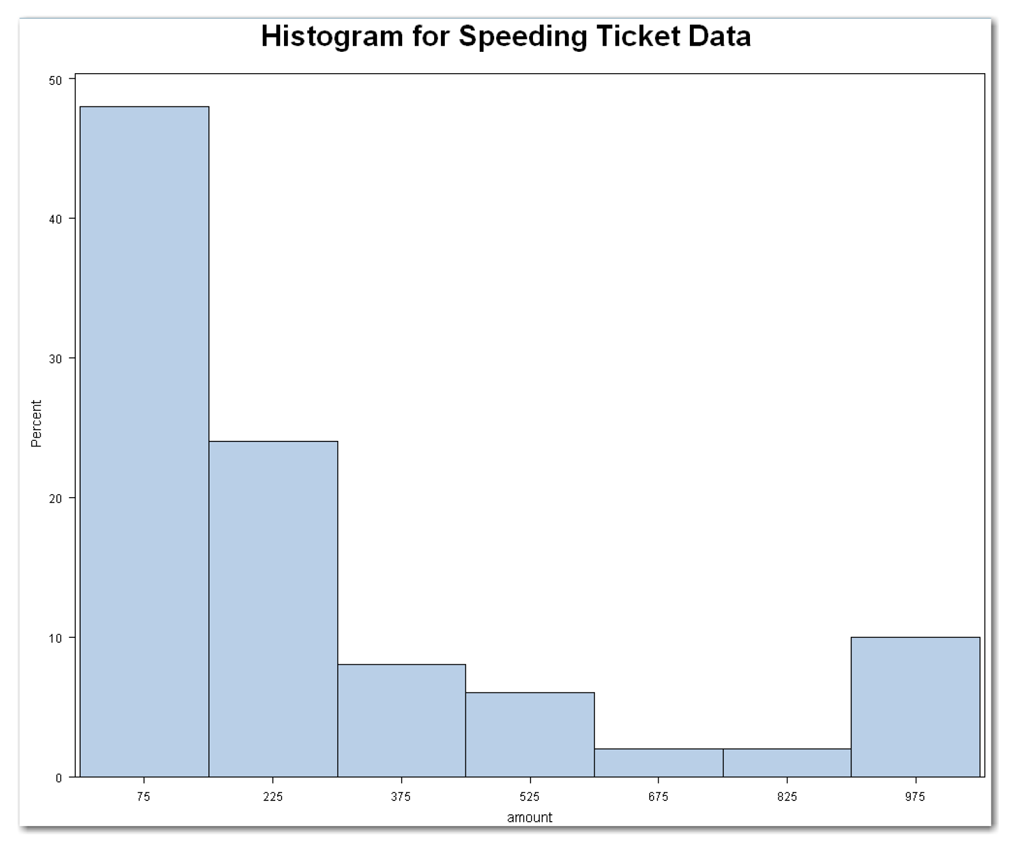
The amount variable has a somewhat mound-shaped distribution at the lower end of the values. Then, several bars appear to the right. These bars represent the speeding ticket fines above $300. The final bar represents the five states with speeding ticket fines of $1000. Like the box plot and stem-and-leaf plot, the histogram shows the skewness in the data.
SAS labels each bar with the midpoint of the range of values. The next table summarizes the midpoints and range of values for each bar in Figure 4.6.

The general form of the statements to create histograms and suppress other printed output is shown below:
PROC UNIVARIATE DATA=data-set-name NOPRINT;
VAR variables;
HISTOGRAM variables;
Items in italic were defined earlier in the chapter. If you omit the variables from the HISTOGRAM statement, then the procedure uses all numeric variables in the VAR statement. If you omit the variables from the HISTOGRAM and VAR statements, then the procedure uses all numeric variables. You cannot specify variables in the HISTOGRAM statement unless the variables are also specified in the VAR statement.
You can use the NOPRINT option with other options.
Creating Frequency Tables for All Variables
For nominal and ordinal variables, you might want to know the count for each value of the variable. Also, for continuous variables measured on a discrete scale, you might want to know the count for each value.
The data in Table 4.2 shows the number of times people in a neighborhood walk their dogs each day.
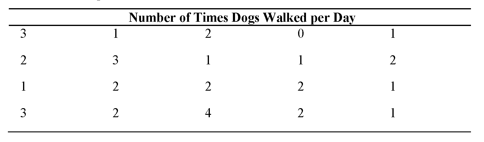
This data is available in the dogwalk data set in the sample data for this book.
The number of daily walks is a numeric variable, and you can use PROC UNIVARIATE to summarize it.
data dogwalk;
input walks @@;
label walks='Number of Daily Walks';
datalines;
3 1 2 0 1 2 3 1 1 2 1 2 2 2 1 3 2 4 2 1
;
run;
options ps=50;
proc univariate data=dogwalk freq;
var walks;
title 'Summary of Dog Walk Data';
run;
Figure 4.7 shows the PROC UNIVARIATE results.

Figure 4.7 PROC UNIVARIATE Results for Dog Walk Data (continued)

This chapter discussed most of the tables in Figure 4.7 for the speeding ticket data. The last table in Figure 4.7 is the Frequency Counts table, which is created by the FREQ option in the PROC UNIVARIATE statement. Most people in the neighborhood walk their dogs one or two times a day. One person walks the dog four times a day, and one person does not take the dog on walks. The list below gives more detail on the items in the table:
Value
Value of the variable. When the data set has missing values, the procedure prints a row that shows the missing values.
Count
Number of rows with a given value.
Cell Percent
Percentage of rows with a given value. For example, 35% of people in the neighborhood walk their dogs once each day.
Cum Percent
Cumulative percentage of the row and all rows with lower values. For example, 80% of people in the neighborhood walk their dogs two or fewer times each day.
Use caution when adding the FREQ option for numeric variables with many values. PROC UNIVARIATE creates a line in the frequency table for each value of the variable. Consequently, for a numeric variable with many values, the resulting frequency table has many rows.
The general form of the statements to create a frequency table with PROC UNIVARIATE is shown below:
PROC UNIVARIATE DATA=data-set-name FREQ;
VAR variables;
Items in italic were defined earlier in the chapter. You can use the FREQ option with other options and statements.
For the dogwalk data set, the descriptive statistics might be less useful to you than the frequency table. For example, you might be less interested in knowing the average number of times these dogs are walked is 1.8 times per day. You might be more interested in knowing the percentage of dogs walked once a day, twice a day, and so on. You can use PROC FREQ instead and create only the frequency table. (See “Special Topic: Using ODS to Control Output Tables” for another approach.)
For other data sets, you cannot use PROC UNIVARIATE to create the frequency table because your variables are character variables. With those data sets, PROC FREQ is your only choice.
The statements below create frequency tables for the dogwalk and bodyfat data sets. (The program at the end of the chapter also includes the statements to create the bodyfat data set and format the gender variable.)
proc freq data=dogwalk;
tables walks;
title 'Frequency Table for Dog Walk Data';
run;
proc freq data=bodyfat;
tables gender;
title 'Frequency Table for Body Fat Data';
run;
Figure 4.8 shows the PROC FREQ results.

The results for the dogwalk data match the results for PROC UNIVARIATE in Figure 4.7. The results for the bodyfat data summarize the counts and percentages for men and women in the fitness program. Because gender is a character variable, you cannot use PROC UNIVARIATE to create the frequency table. The list below gives more detail on the items in the table:
Variable Name
Values of the variable.
Frequency
Number of rows with a given value. The counts for each value match the Count column for PROC UNIVARIATE results. However, when the data set has missing values, the procedure does not print a row that shows the missing values. The procedure prints a note at the bottom of the table instead. See the next topic for more detail.
Percent
Percentage of rows with a given value. The value matches the Cell Percent column for PROC UNIVARIATE results.
Cumulative Frequency
Cumulative frequency of the row and all rows with lower values. For example, 16 of the neighbors walk their dogs two or fewer times each day. The PROC UNIVARIATE results do not display this information.
Cumulative Percent
Cumulative percentage of the row and all rows with lower values. The value matches the Cum Percent column for PROC UNIVARIATE results.
The general form of the statements to create a frequency table with PROC FREQ is shown below:
PROC FREQ DATA=data-set-name;
TABLES variables;
Items in italic were defined earlier in the chapter. If you omit the TABLES statement, then the procedure prints a frequency table for every variable in the data set.
PROC UNIVARIATE results show you the number of missing values. You can add this information to PROC FREQ results. Suppose that when collecting data for the dogwalk data set, three neighbors were not at home. These cases were recorded as missing values in the data set. The statements below create results that show three ways PROC FREQ handles missing values:
data dogwalk2;
input walks @@;
label walks='Number of Daily Walks';
datalines;
3 1 2 . 0 1 2 3 1 . 1 2 1 2 . 2 2 1 3 2 4 2 1
;
run;
proc freq data=dogwalk2;
tables walks;
title 'Dog Walk with Missing Values';
title2 'Automatic Results';
run;
proc freq data=dogwalk2;
tables walks / missprint;
title 'Dog Walk with Missing Values';
title2 'MISSPRINT Option';
run;
proc freq data=dogwalk2;
tables walks / missing;
title 'Dog Walk with Missing Values';
title2 'MISSING Option';
run;
Figure 4.9 shows the PROC FREQ results.
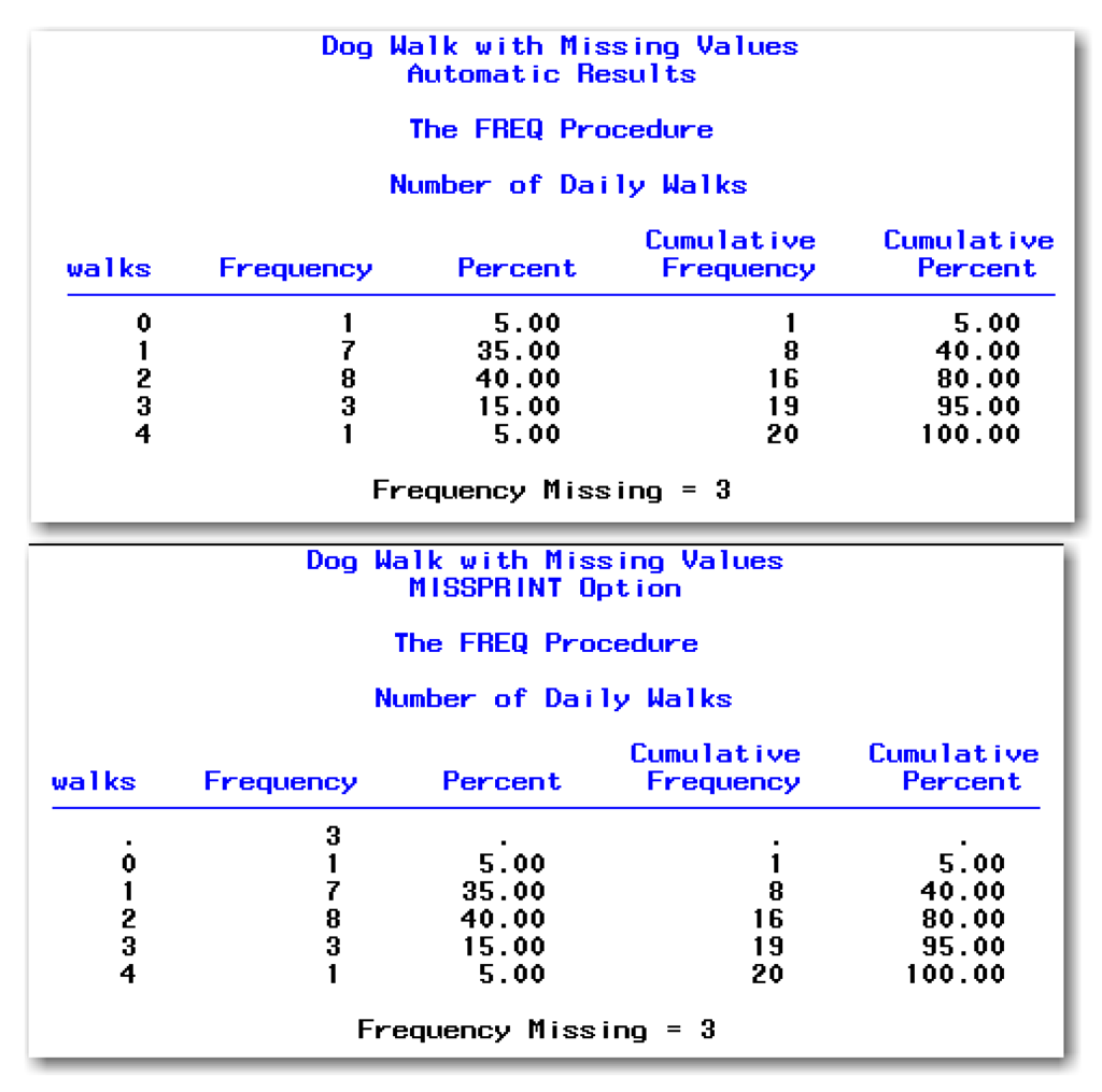
Figure 4.9 PROC FREQ and Missing Value Approaches (continued)
The first table shows how PROC FREQ automatically handles missing values. The note at the bottom of the table identifies the number of missing values.
The second table shows the effect of using the MISSPRINT option. PROC FREQ adds a row in the frequency table to show the count of missing values. However, the procedure omits the missing values from calculations for percents, cumulative frequency, and cumulative percents.
The third table shows the effect of using the MISSING option. PROC FREQ adds a row in the frequency table to show the count of missing values. The procedure includes the missing values in calculations for percents, cumulative frequency, and cumulative percents.
Depending on your situation, select the approach that best meets your needs.
The general form of the statements to handle missing values with PROC FREQ is shown below:
PROC FREQ DATA=data-set-name;
TABLES variables / MISSPRINT MISSING;
Items in italic were defined earlier in the chapter.
The MISSPRINT option prints the count of missing values in the table. The MISSING option prints the count of missing values and also uses the missing values in calculating statistics. Use either the MISSPRINT or MISSING option; do not use both options. If you use an option, the slash is required.
Creating Bar Charts for All Variables
When your data has character variables, or when you want to create a bar chart that shows each value of a variable, you can use PROC GCHART. This procedure creates high-resolution graphs and requires SAS/GRAPH software. If you do not have SAS/GRAPH, then you can use PROC CHART to create line printer bar charts.
For variables with character values, either PROC GCHART or PROC CHART creates a bar chart that has one bar for each value. For variables with numeric values, both procedures group values together, similar to a histogram. In some situations, this approach is what you want to do. Especially for numeric variables that represent nominal or ordinal data, you might want to create a bar chart with one bar for each value.
The topics below start with simple bar charts, and then discuss adding options to create bar charts that best meet your needs.
Just as you specify options for line printer results with the OPTIONS statement, you specify options for graphs with the GOPTIONS statement. For bar charts, you can control the appearance of the bars in the chart with a PATTERN statement. Both of these statements have many options. This book uses as few options as possible. Depending on your situation, you might want to look at SAS/GRAPH documentation to see whether other options would be useful.
The GOPTIONS statement sets general options for graphics output. This book uses only the option that specifies the device. All graphs in this chapter use the following:
goptions device=win;
This option identifies the graphics device as a monitor.
The PATTERN statement controls the appearance of bars in bar charts. This book specifies a simple appearance of filling the bars with solid gray shading. All bar charts in this chapter use the following:
pattern v=solid color=gray;
The programs for each graph show these statements for completeness. In your own programs, you can use the statements once in each SAS session.
Simple Vertical Bar Charts with PROC GCHART
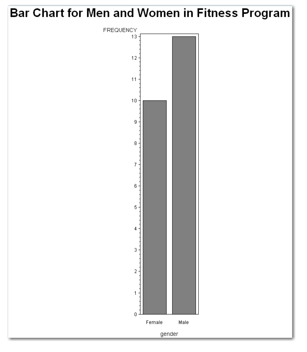
In vertical bar charts, the horizontal axis shows the values of a variable, and the vertical axis shows the frequency counts for the variable. The bars rise vertically from the horizontal axis. The statements below create a vertical bar chart to summarize the men and women in the fitness program:
goptions device=win;
pattern v=solid color=gray;
proc gchart data=bodyfat;
vbar gender;
title 'Bar Chart for Men and Women in Fitness Program';
run;
Figure 4.10 shows the bar chart.
Compare the results in Figure 4.8 and Figure 4.10. The FREQUENCY label on the vertical axis explains that the bar chart displays the frequency counts. The gender label on the horizontal axis identifies the variable.
The general form of the statements to create a simple vertical bar chart with PROC GCHART is shown below:
PROC GCHART DATA=data-set-name;
VBAR variables;
Items in italic were defined earlier in the chapter. You must use the VBAR statement to identify the variables that you want to chart.
Simple Vertical Bar Charts with PROC CHART
The syntax for PROC CHART is almost identical to PROC GCHART. The statements below create a line printer vertical bar chart to summarize the men and women in the fitness program:
options ps=50;
proc chart data=bodyfat;
vbar gender;
title 'Line Printer Bar Chart for Fitness Program';
run;
Figure 4.11 shows the bar chart.

Figures 4.10 and 4.11 display the same results. The rest of this chapter creates high-resolution bar charts, and identifies the corresponding SAS procedure for line printer charts where possible.
The general form of the statements to create a simple line printer vertical bar chart with PROC CHART is shown below:
PROC CHART DATA=data-set-name;
VBAR variables;
Items in italic were defined earlier in the chapter. You must use the VBAR statement to identify the variables that you want to chart.
Discrete Vertical Bar Charts with PROC GCHART
For character variables like gender for the fitness program data, PROC GCHART creates a bar chart that displays the unique values of the variable. This can also be useful for numeric variables, especially when the numeric variables have many values but are measured on a discrete scale. The statements below use the DISCRETE option for the dogwalk data:
goptions device=win;
pattern v=solid color=gray;
proc gchart data=dogwalk;
vbar walks / discrete;
title 'Number of Daily Dog Walks';
run;
Figure 4.12 shows the bar chart.

The chart has one bar for each numeric value for the walks variable. Because this variable has only a few values, PROC GCHART would have created the same chart without the DISCRETE option.
Use caution with the DISCRETE option. For numeric variables with many values, this option displays a bar for each value, but the bars are not proportionally spaced on the horizontal line. For example, the next statements create Figure 4.13 for the speeding ticket data:
goptions device=win;
pattern v=solid color=gray;
proc gchart data=tickets;
vbar amount / discrete;
title 'Bar Chart with DISCRETE Option';
run;
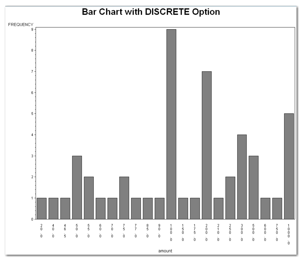
The chart has one bar for each distinct numeric value in the data set. However, the values are not proportionally spaced on the horizontal line. The bars for 750 and 1000 are as close together as the bars for 20 and 40. This spacing might cause confusion when interpreting the chart. To help identify this situation, the SAS log contains a warning message. The message informs you that the intervals on the axis are not evenly spaced.
You can use PROC CHART with the VBAR statement to create a line printer vertical bar chart. The syntax is the same as for PROC GCHART.
The general form of the statements to create a vertical bar chart with a bar for every value of a numeric variable using PROC GCHART is shown below:
PROC GCHART DATA=data-set-name;
VBAR variables / DISCRETE;
Items in italic were defined earlier in the chapter. You must use the VBAR statement to identify the variables that you want to chart.
Simple Horizontal Bar Charts with PROC GCHART
In horizontal bar charts, the vertical axis shows the values of a variable, and the horizontal axis shows the frequency counts for the variable. Sometimes, horizontal bar charts are preferred for display purposes. For example, a horizontal bar chart of gender in the bodyfat data requires much less room to display than the vertical bar chart. The statements below create a horizontal bar chart to summarize the number of dog walks each day:
goptions device=win;
pattern v=solid color=gray;
proc gchart data=dogwalk;
hbar walks;
title 'Horizontal Bar Chart for Dog Walk Data';
run;
Figure 4.14 shows the bar chart.

Figure 4.14 shows the horizontal bar chart and frequency table statistics for each bar. You can omit these statistics from the bar chart.
You can use PROC CHART with the HBAR statement to create a line printer horizontal bar chart. The syntax is the same as for PROC GCHART.
The general form of the statements to create a simple horizontal bar chart with PROC GCHART is shown below:
PROC GCHART DATA=data-set-name;
HBAR variables;
Items in italic were defined earlier in the chapter. You must use the HBAR statement to identify the variables that you want to chart. You can use the DISCRETE option with the HBAR statement.
Omitting Statistics in Horizontal Bar Charts
To suppress the frequency table statistics, use the NOSTAT option. The statements below create the horizontal bar chart in Figure 4.15:
goptions device=win;
pattern v=solid color=gray;
proc gchart data=bodyfat;
hbar gender / nostat;
run;

When you use the NOSTAT option, the scale for frequencies might be expanded from the automatic scale. Because the statistics have been omitted, there is more room on the page for the horizontal bar chart. Compare Figures 4.15 and 4.11 to understand why the horizontal bar chart might be preferred for display purposes in a report or presentation. The horizontal bar chart requires much less space.
You can use PROC CHART with the HBAR statement and the NOSTAT option. The syntax is the same as for PROC GCHART.
The general form of the statements to create a horizontal bar chart with statistics omitted with PROC GCHART is shown below:
PROC GCHART DATA=data-set-name;
HBAR variables / NOSTAT;
Items in italic were defined earlier in the chapter. You must use the HBAR statement to identify the variables that you want to chart. You can use the DISCRETE option with the NOSTAT option.
Sometimes you want a customized bar chart for presenting results, and neither a histogram nor a simple horizontal or vertical bar chart meets your needs. For example, for the speeding ticket data, suppose you want a bar chart of the speeding ticket fine amounts with each bar labeled based on the state. Also, you want the bars to be in descending order so that the highest fine amounts appear at the top, and the lowest at the bottom. You can use the NOSTAT, DESCENDING, and SUMVAR= options to create the chart you want.
goptions device=win;
pattern v=solid color=gray;
proc gchart data=tickets;
hbar state / nostat descending sumvar=amount;
run;
Figure 4.16 shows the bar chart.

The HBAR statement identifies state as the variable to chart. The SUMVAR= option identifies amount as the second variable. The length of the bars represents the sum of this second variable, instead of the frequency counts for the first variable. Without the SUMVAR= option, the bar for each state would have a length of 1 because the data set has 1 observation for each state. With SUMVAR=amount, the bar for each state has a length that corresponds to the speeding ticket fine for that state.
The DESCENDING option orders the bars on the chart from the maximum to the minimum value. Without the DESCENDING option, the bars on the chart would be ordered by state. While this chart might make it easier to find a particular state, it is not as useful when trying to compare the speeding ticket fine amounts for different states.
Using the SUMVAR= and DESCENDING options together produces an ordered chart for a variable, where the lengths of the bars give information about the numeric variable. For example, in the speeding ticket data, the bar for each state shows the value of the numeric variable for the amount of the speeding ticket fine. The NOSTAT option suppresses the summary statistics from the bar chart.
You can use PROC CHART with the HBAR statement and these options. The syntax is the same as for PROC GCHART.
The general form of the statements to create an ordered bar chart with statistics omitted with PROC GCHART is shown below:
PROC GCHART DATA=data-set-name;
HBAR variable / NOSTAT DESCENDING SUMVAR=numeric-variable;
variable is the variable whose values you want to see on the chart axis. numeric-variable is the variable whose values appear as the lengths of the bars. You must use the HBAR statement to identify the variables that you want to chart.
You can use the options independently. For your data, choose the combination of options that creates the chart you want.
As you summarize your data, you can also check it for errors.
For small data sets, you can print the data set, and then compare it with the original data source.
This process is difficult for larger data sets, where it’s easier to miss errors when checking manually. Here are some other ways to check:
- For continuous variables, look at the maximum and minimum values. Are there any values that seem odd or wrong? For example, you would not expect to see a value of 150º for a person’s temperature.
- For continuous variables, look at the descriptive statistics and see if they make sense. For example, if your data consists of scores on a test, you should have an idea of what the average should be. If it’s very different from what you expect, investigate the data for outlier points or for mistakes in data values.
- For nominal and ordinal variables, are there duplicate values that are misspellings? For example, do you have both “test” and “gest” as values for a variable? Do you have both “TRue” and “True” as values for a variable? (Because SAS is case sensitive, these two values are different.)
- For nominal and ordinal variables, are there too many values? If you have coded answers to an opinion poll with numbers 1 through 5, all of your values should be 1, 2, 3, 4, or 5. If you have a 6, you know it’s an error.
The next two topics give details on checking data for errors using SAS procedures.
Checking for Errors in Continuous Variables
You can use PROC UNIVARIATE to check for errors.
When checking your data for errors, investigate points that are separated from the main group of data—either above it or below it—and confirm that the points are valid. Use the PROC UNIVARIATE line printer plots and graphs to perform this investigation. In the histogram, investigate bars that are separated from other bars. In the box plot, investigate the outlier points. Also, use stem-and-leaf plots to identify outlier points and to check the minimum and maximum values.
Use the Extreme Observations table to check the minimum and maximum values. See these values make sense for your data. Suppose you measured the weights of dogs and you find that your Highest value is listed as 200 pounds. Although this value is potentially valid, it is unusual enough that you should check it before you use it. Perhaps the dog really weighs 20 pounds, and an extra 0 has been added. For the speeding ticket data, a minimum value of 0 is expected. For other types of data, negative values might make sense.
Use the Basic Statistical Measures table to check the data against what you expect. Does the average make sense given the scale for your data?
Look at the number of missing values in the Missing Values table. If you have many missing values, you might need to check your data for errors. For example, in clinical trials, some data (such as age) must be recorded for all patients. Missing values are not allowed. If the value of Count is higher than you expect, perhaps your INPUT statement is incorrect, so the values of the variables are wrong. For example, you might have used incorrect columns for a variable in the INPUT statement, so several values of your variable are listed as missing. For the speeding ticket data, the missing value for Washington, D.C., occurred because the researcher didn’t collect this data.
Use the plots to check for outliers. The stem-and-leaf plot and box plot both help to show potential outliers.
Checking for Errors in Nominal or Ordinal Variables
You can use the frequency tables in PROC UNIVARIATE or PROC FREQ to check for errors. You can use the bar charts from PROC CHART or PROC GCHART to check for errors.
The Frequency table lists all of the values for a variable. Use this table to check for unusual or unexpected values.
Similarly, bar charts show all of the values and are another option for checking for errors.
You can use other tables in PROC UNIVARIATE to check for errors as described above for continuous variables. These approaches require numeric variables, and you will find the following specific checks to be useful:
- Look at the maximum and minimum values and confirm that these values make sense for your data.
- Check the number of missing values to see whether you might have an error in the INPUT statement.
- The levels of measurement for variables are nominal, ordinal, and continuous. The choice of an appropriate analysis for a variable is often based on the level of measurement for the variable.
- The table below summarizes SAS procedures discussed in this chapter, and relates the procedure to the level of measurement for a variable.

- Use PROC UNIVARIATE for a complete summary of numeric variables, and PROC MEANS for a brief summary of numeric variables. Some of the statistics make sense only for continuous variables. Both procedures require numeric variables.
- Use PROC FREQ for frequency tables for any variable, and PROC UNIVARIATE for frequency tables for numeric variables. Use PROC GCHART or PROC CHART for bar charts for any variable. Either PROC GCHART or PROC CHART has several options to customize the bar chart. For a continuous variable, histograms from PROC UNIVARIATE are typically more appropriate.
- Histograms show the distribution of data values, and help you see the center, spread (dispersion or variability), and shape of your data. SAS produces histograms for numeric variables.
- Box plots show the distribution of continuous data. Like histograms, they show the center and spread of your data. Box plots highlight outlier points, and display skewness (sidedness) by showing the mean and median in relationship to the dispersion of data values. SAS provides box plots only for numeric variables.
- Stem-and-leaf plots are similar to histograms because they show the shape of your data. Stem-and-leaf plots show the individual data values in each bar, which provides more detail. SAS provides stem-and-leaf plots only for numeric variables.
- The mean (or average) is the most common measure of the center of a distribution of values for a variable. The median (or 50th percentile) is another measure. The median is less sensitive than the mean to skewness, and is often preferred for ordinal variables.
- Standard deviation is the most common measure used to describe dispersion or variability of values for a variable. Standard deviation is the square root of the variance. The interquartile range, which is the difference between the 25th percentile and the 75th percentile, is another measure. The length of the box in a box plot is the interquartile range.
- For nominal and ordinal variables, frequency counts of the values are the most common way to summarize the data.
- As you summarize your data, check it for errors. For continuous variables, look at the maximum and minimum values, and look at potential outlier points. Also, check the data against your expectations—do the values make sense? For nominal and ordinal variables, check for unusual or unexpected values. For all types of variables, confirm that the number of missing values is reasonable.
To get a brief summary of a numeric variable
PROC MEANS DATA=data-set-name
N NMISS MEAN MEDIAN STDDEV RANGE QRANGE MIN MAX;
VAR measurement-variables;
data-set-name
is the name of the data set.
measurement- variables
are the variables that you want to summarize. If you omit the variables from the VAR statement, then SAS uses all numeric variables in the data set.
statistical-keywords
are optional. The procedure includes other keywords that this book does not discuss. If you omit the statistical keywords, then PROC MEANS prints N, MEAN, STDDEV, MIN, and MAX.
To get an extensive summary of a numeric variable
PROC UNIVARIATE DATA=data-set-name
FREQ PLOT NEXTROBS=value NEXTRVAL=value NOPRINT;
VAR measurement-variables;
HISTOGRAM measurement-variables;
ID identification-variable;
data-set-name
was defined earlier.
measurement- variables
was defined earlier.
identification-variable
is the variable that you want to use to identify extreme observations.
If you omit the variables from the VAR statement, then SAS uses all numeric variables in the data set. If you omit the ID statement, then SAS identifies the extreme observations using their observation numbers. The optional HISTOGRAM statement creates a high-resolution histogram.
FREQ
creates a frequency table.
PLOT
creates three line printer plots: a box plot, a stem-and-leaf plot, and a normal probability plot. This chapter discusses the first two plots, and Chapter 5 discusses the third plot.
NEXTROBS=
defines the number of extreme observations to print. SAS automatically uses NEXTROBS=5. Use NEXTROBS=0 to suppress the Extreme Observations table. You can use values from 0 to half the number of observations in the data set.
NEXTRVAL=
defines the number of distinct extreme observations to print. SAS automatically uses NEXTRVAL=0. You can use values from 0 to half the number of observations in the data set.
NOPRINT
suppresses the printed output tables.
To create a frequency table for any variable
PROC FREQ DATA=data-set-name;
TABLES variables / MISSPRINT MISSING;
data-set-name
was defined earlier.
variables
are the variables that you want to summarize.
If you omit the TABLES statement, then the procedure prints a frequency table for every variable in the data set.
The MISSPRINT option prints the count of missing values in the table. The MISSING option prints the count of missing values and uses the missing values in calculating statistics. Use either the MISSPRINT or MISSING option; do not use both options. If you use an option, the slash is required.
To create a high-resolution vertical bar chart
PROC GCHART DATA=data-set-name;
VBAR variables / DISCRETE;
data-set-name
was defined earlier.
variables
are the variables that you want to summarize.
You must use the VBAR statement to identify the variables that you want to chart. The DISCRETE option prints a vertical bar for every value of a numeric variable. If you use the option, the slash is required.
To create a high-resolution horizontal bar chart
PROC GCHART DATA=data-set-name;
HBAR variables / DISCRETE NOSTAT;
data-set-name
was defined earlier.
variables
are the variables that you want to summarize.
You must use the HBAR statement to identify the variables that you want to chart. The DISCRETE option prints a horizontal bar for every value of a numeric variable. The NOSTAT option suppresses summary statistics. You can use the options independently. If you use an option, the slash is required.
To create a high-resolution ordered horizontal bar chart
PROC GCHART DATA=data-set-name;
HBAR variables
/ NOSTAT DESCENDING SUMVAR=numeric-variable;
data-set-name
was defined earlier.
variables
are the variables that you want to summarize.
numeric-variable
is the variable whose values appear as the lengths of the bars.
You must use the HBAR statement to identify the variables that you want to chart.
You can omit the NOSTAT option to add summary statistics to the ordered bar chart.
To create a line printer vertical bar chart
PROC CHART DATA=data-set-name;
VBAR variables;
data-set-name
was defined earlier.
variables
are the variables that you want to summarize.
You must use the VBAR statement to identify the variables that you want to chart.
You can use the DISCRETE option. You can use an HBAR statement instead to create a low-resolution horizontal bar chart. With the HBAR statement, you can use the DISCRETE option, the NOSTAT option, or both. If you use an option, the slash is required.
The program below produces all of the output shown in this chapter:
options nodate nonumber ls=80;
data tickets;
input state $ amount @@;
datalines;
AL 100 HI 200 DE 20 IL 1000 AK 300 CT 50 AR 100 IA 60 FL 250
KS 90 AZ 250 IN 500 CA 100 LA 175 GA 150 MT 70 ID 100 KY 55
CO 100 ME 50 NE 200 MA 85 MD 500 NV 1000 MO 500 MI 40 NM 100
NJ 200 MN 300 NY 300 NC 1000 MS 100 ND 55 OH 100 NH 1000 OR 600 OK 75 SC 75 RI 210 PA 46.50 TN 50 SD 200 TX 200 VT 1000 UT 750 WV 100 VA 200 WY 200 WA 77 WI 300 DC .
;
run;
options ps=55;
proc univariate data=tickets ;
var amount;
id state;
title 'Summary of Speeding Ticket Data' ;
run;
options ps=60;
proc univariate data=tickets nextrval=5 nextrobs=0;
var amount;
id state;
title 'Summary of Speeding Ticket Data' ;
run;
proc means data=tickets;
var amount;
title 'Brief Summary of Speeding Ticket Data' ;
run;
proc means data=tickets
n nmiss mean median stddev range qrange min max;
var amount;
title 'Single-line Summary of Speeding Ticket Data' ;
run;
ods select plots;
proc univariate data=tickets plot;
var amount;
id state;
title 'Line Printer Plots for Speeding Ticket Data' ;
run;
proc univariate data=tickets noprint;
var amount;
histogram amount;
title 'Histogram for Speeding Ticket Data' ;
run;
data dogwalk;
input walks @@;
label walks='Number of Daily Walks';
datalines;
3 1 2 0 1 2 3 1 1 2 1 2 2 2 1 3 2 4 2 1
;
run;
options ps=50;
proc univariate data=dogwalk freq;
var walks;
title 'Summary of Dog Walk Data' ;
run;
options ps=60;
proc freq data=dogwalk;
tables walks;
title 'Frequency Table for Dog Walk Data' ;
run;
proc format;
value $gentext 'm' = 'Male'
'f' = 'Female';
run;
data bodyfat;
input gender $ fatpct @@;
format gender $gentext.;
label fatpct='Body Fat Percentage';
datalines;
m 13.3 f 22 m 19 f 26 m 20 f 16 m 8 f 12 m 18 f 21.7
m 22 f 23.2 m 20 f 21 m 31 f 28 m 21 f 30 m 12 f 23
m 16 m 12 m 24
;
run;
proc freq data=bodyfat;
tables gender;
title 'Frequency Table for Body Fat Data' ;
run;
data dogwalk2;
input walks @@;
label walks='Number of Daily Walks' ;
datalines;
3 1 2 . 0 1 2 3 1 . 1 2 1 2 . 2 2 1 3 2 4 2 1
;
run;
proc freq data=dogwalk2;
tables walks;
title 'Dog Walk with Missing Values' ;
title2 'Automatic Results' ;
run;
proc freq data=dogwalk2;
tables walks / missprint;
title 'Dog Walk with Missing Values' ;
title2 'MISSPRINT Option' ;
run;
proc freq data=dogwalk2;
tables walks / missing;
title 'Dog Walk with Missing Values' ;
title2 'MISSING Option' ;
run;
goptions device=win; pattern v=solid color=gray;
proc gchart data=bodyfat;
vbar gender;
title 'Bar Chart for Men and Women in Fitness Program' ;
run;
options ps=50;
proc chart data=bodyfat;
vbar gender;
title 'Line Printer Bar Chart for Fitness Program' ;
run;
proc gchart data=dogwalk;
vbar walks / discrete;
title 'Number of Daily Dog Walks' ;
run;
proc gchart data=tickets;
vbar amount / discrete;
title 'Bar Chart with DISCRETE Option' ;
run;
proc gchart data=dogwalk;
hbar walks;
title 'Horizontal Bar Chart for Dog Walk Data' ;
run;
title;
proc gchart data=bodyfat;
hbar gender / nostat;
run;
proc gchart data=tickets;
hbar state / nostat descending sumvar=amount;
title;
run;
Special Topic: Using ODS to Control Output Tables
Each SAS procedure automatically produces output tables. Each procedure also includes options that produce additional output tables. Although it is not discussed in this book, most SAS procedures can also create output data sets.
With the Output Delivery System (ODS), you can control which output tables appear. ODS is a versatile and complex system that provides many features. This topic discusses the basics of using ODS to control the output tables.
The simplest way to use ODS is to continue to send SAS output to the Listing (or Output) window and select the output tables that you want to view. Here is the simplified form of the ODS statement:
ODS SELECT output-table-names;
output-table-names identifies output tables for the procedure. Use the ODS statement before the procedure. For example, the statements below print only the Moments table:
ods select moments;
proc univariate data=tickets;
var amount;
run;
This book uses the simplified ODS statement for many examples. Starting with the next chapter, the chapter identifies the ODS table names for the output that SAS automatically produces, and the output produced by the options that are discussed.
Table ST4.1 identifies the output tables for the procedures in this chapter:
Table ST4.1 ODS Table Names for Chapter 4

ODS focuses on output tables and does not apply to high-resolution graphics output.
Most of the ODS table names are very similar to the output table names. However, the ODS table names do not always exactly match the output table names. The next topic shows how to find ODS table names.
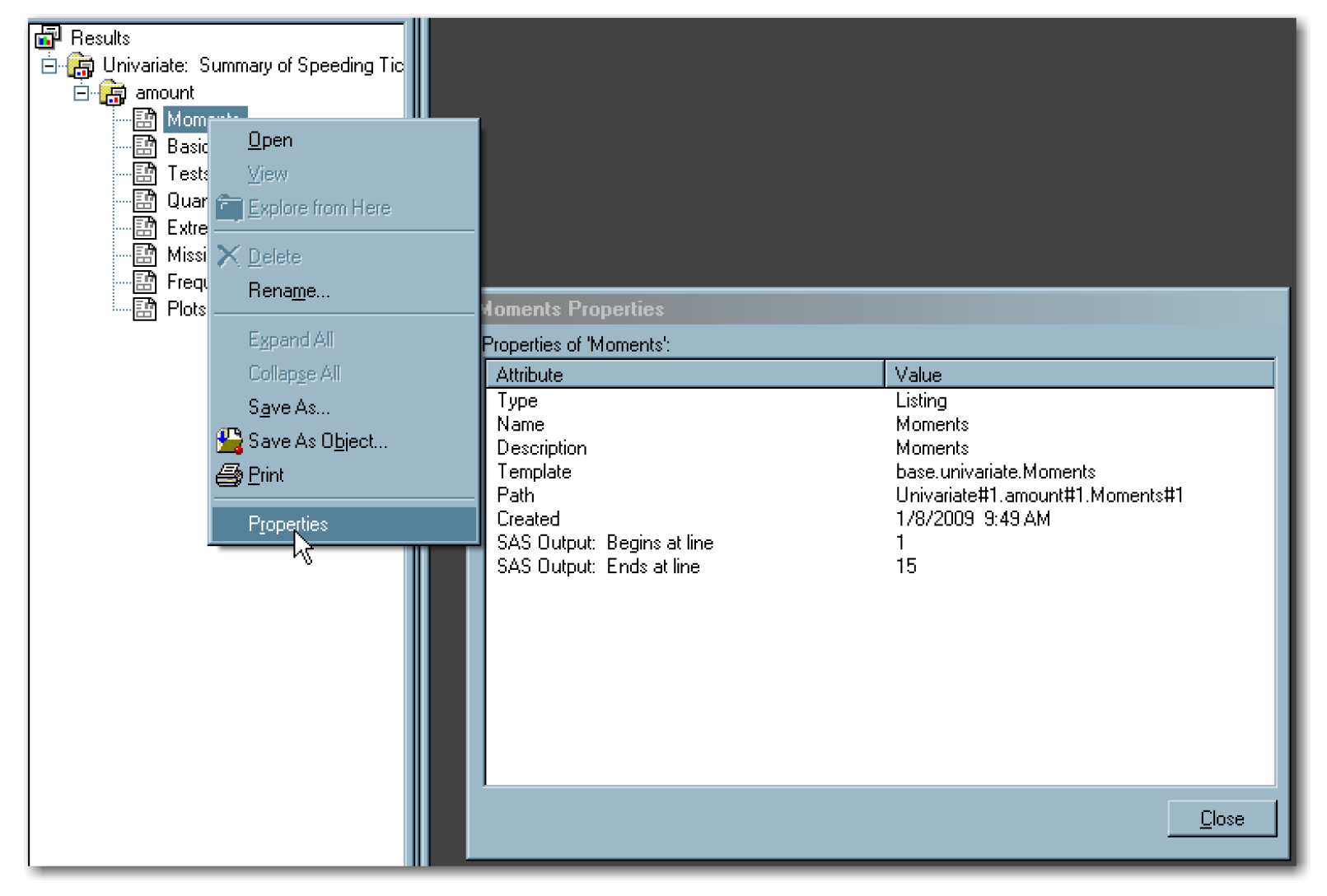
If you use SAS in the windowing environment mode, you can find ODS table names by looking at the Output window. Right-click on the item in the output, and then select Properties. Figure ST4.1 shows an example of right-clicking on the Moments table name, and then selecting Properties. The Name row in the Moments Properties dialog box identifies the output table name as Moments.
SAS documentation for each procedure also identifies ODS table names. As a third approach, you can activate the ODS TRACE function. The procedure prints details on the output tables in the SAS log. To activate the function, type the following:
ODS TRACE ON;
To deactivate the function, type the following:
ODS TRACE OFF;
ODS includes features for creating the following:
- HTML output that you can view in a Web browser
- PostScript output for high-resolution printers
- RTF output that you can view in Microsoft Word or similar programs
- Output data sets
You can use a combination of these features for any procedure. For example, you can specify that some tables be formatted in HTML, others in RTF, and others sent to the Output window. For some types of output, such as HTML and RTF, you can control the appearance of the table border, spacing, and the colors and fonts for text in the table.
For more advanced features, you can create ODS templates, which you can use repeatedly. You can create style definitions, which control the appearance of the output for all SAS procedures in your program.
For an introduction to these topics, you can type Help ODS in the SAS windowing environment mode. For full details, see Appendix 1 for references and SAS documentation.
ENDNOTES