
Chapter 8
PivotTables: Data Aggregation Without the Aggravation
PivotTables providea potent and flexible way to organize—and reorganize—the records in a database or table, by letting you break out the data into a variety of visual arrangements. And once you've done so, you can quickly transform the results into a PivotChart.
PivotTables also let you group data; for example, you can bundle test score results in groups of 10 points—that is, tally the number of students who score between 100 and 91, 90 and 81, and so on.
And starting with Excel 2010, Microsoft has introduced a new PivotTable feature called the Slicer, which gives you a clearer presentation of filtered data. I'll explain the Slicer soon, although it's similar to the filters discussed in Chapter 7.
Looking at Some PivotTables
In this section, we'll take a look at some specific examples of how PivotTables are used.
Imagine that you're planning a dinner for your organization and you need to assign the invitees to their tables. You start with a database that looks like Figure 8–1.

Figure 8–1. The A list? Dinner guests and their table assignments
Now while it's true that you could simply sort the data by table number, that approach won't tell you how many guests are seated at each table. What you really want to see is something like Figure 8–2.

Figure 8–2. Guests per table: One way you can organize data with a PivotTable
Once you've compiled the data in this way with a PivotTable, you can determine if you've over- or underassigned guests to particular tables. But you may also want to see the data displayed as in Figure 8–3.
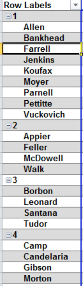
Figure 8–3. Who's where: Guests identified by their table. Note that the guest names are automatically sorted, too.
Here, you've learned exactly who's seating where.
These are the sort of things that PivotTables (technically called PivotTable reports) can do: they can organize—or again, break out—your data in all sorts of combinations and modes of presentation. They're particularly good for identifying patterns and tendencies in the data that might otherwise escape your attention, particularly when you're working with a large database.
Here's one more example, adapted from a Microsoft practice database. In this example, you have a collection of sales records, each of which cites the salesperson, country in which the sale was transacted, transaction date, and amount of each sale (see Figure 8–4).
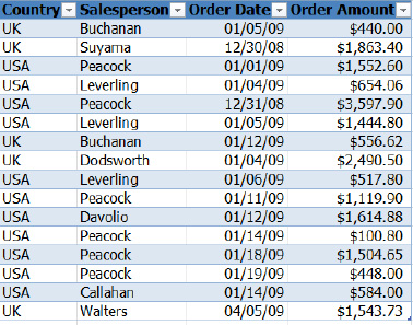
Figure 8–4. Salesperson data, ripe for pivottabling
One obvious question you might want to ask of the data is: how much money each salesperson earned? A PivotTable will tell you (see Figure 8–5).
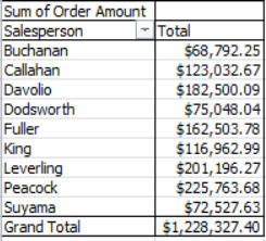
Figure 8–5. Salesperson earnings, with the grand total besides
There's your answer—or at least one answer. But with PivotTables, you can also come up with something like what's shown in Figure 8–6.

Figure 8–6. Sales data broken out, not by salesperson, but by month and year instead
Now that's a radically different take on the same sales figures—organized here by time frame, with no mention of the salespersons. But we could also do something like Figure 8–7.

Figure 8–7. Turnabout: Now the years are occupying the rows
Bet that one got your attention! What you're seeing now is precisely the same data from Figure 8–6, but it's been pivoted, or flipped on its side, as it were. Now the years run down the column, with the months streaming across. And that's what PivotTables can do: pivot the information across their rows and columns to give the user a variety of ways of presenting the information.
Pretty impressive—and as with Excel's other data management capabilities, the methods for designing PivotTables are identical for databases of 100 or 100,000 records. And once you get the hang of them, you can batch one up in a matter of seconds.
Now take another look at Figures 8–6 and 8–7, and notice that they organize the sales data by months and years, even though the original source data only records each sale on the particular day on which it was transacted. But PivotTables let you group the data into larger categories, allowing you to easily see the bigger picture.
Again, you can't really produce these kinds of results with the filters discussed previously. PivotTables afford the user a larger and more effective set of tools for analyzing data, and though some newcomers to Excel view them as mysterious, slightly scary, and perhaps user-hostile, a bit of practice and reflection will pay off—because PivotTables are definitely worth knowing about.
It's true that there's a lot to learn about PivotTables if you're interested in turning yourself into the company guru. In fact, there are two Apress books out there devoted exclusively to the subject, Beginning PivotTables in Excel 2007 and Excel 2007 PivotTable Recipes, authored by PivotTable expert Debra Dalgleish. But as with many of Excel's features, there's a set of the basics you have learn in order to make PivotTables do productive work, and I'm going to introduce them here.
NOTE: Because a PivotTable works with a copy of the original database, any mistakes you may make in the course of your PivotTable design will nevertheless leave the database intact. And you can always apply the Undo command to PivotTables, just as you can with any other Excel feature.
Creating a PivotTable
So let's try to construct some PivotTables, by working with the first 15 records of the sales data we've been looking at.
- In a blank workbook, copy the records shown in Figure 8–8, starting in cell A1.

Figure 8–8. Sales data: Working with text, date, and currency fields
- Save the workbook as PivotTables.
- To start with, we want to break out the sales figures—that is, the data in the Order Amount field—by salesperson to see how much each has earned. The first step is to click anywhere in the database, as we did with sorting and filtering. Then click the
Inserttab, and choosePivotTablefrom theTablesbutton group (click the top half of the button). You'll see the dialog shown in Figure 8–9.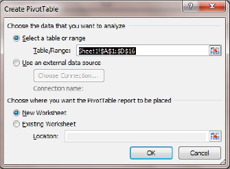
Figure 8–9. The Create PivotTable dialog box
- Note that by default Excel will manufacture a new worksheet in which to place the PivotTable. Click
OK, and you'll see Figure 8–10. We've put what could be termed the scaffolding of the PivotTable in place, but all we see so far is a curious, empty space holding down the left side of the worksheet; we obviously haven't generated any results yet. (Note also that aPivotTable Toolscontextual tab also appears at the top of your screen.) Now look at the area in the lower half of thePivotTable Field List, in the area captioned “Drag fields between areas below.” This is where you'll be doing most of the work of designing and redesigning your PivotTables.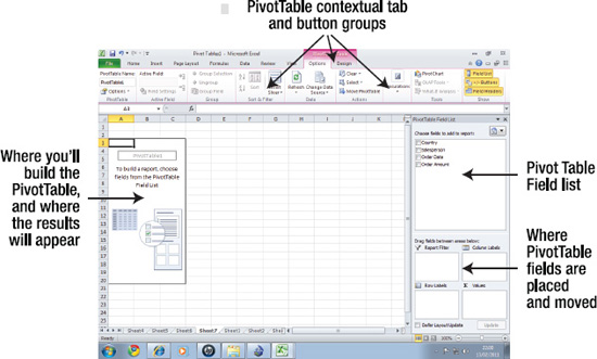
Figure 8–10. The PivotTable grid. Note the PivotTable Field List on the right.
- Next, tick the check box alongside
Salespersonin theChoose fields to add to reportarea near the top right of thePivotTable Field List. Two things will happen, as shown in Figure 8–11: the names of the salespersons will be arrayed in the Row Labels area of the PivotTable on the left, and a bar representing that field will appear in theDrag fields between areas belowsection in the lower half of thePivotTable Field List. Note also that the salespersons are each listed once, no matter how many times they're listed in the source database.
Figure 8–11. The salespersons, listed uniquely in the Row Labels area
- Then tick the check box alongside Order Amount. You'll see the data shown in Figure 8–12.

Figure 8–12. There it is—your first PivotTable
We've done it. While it may not yet be suitable for framing, the PivotTable tells us what we wanted to know—exactly how much money each salesperson has earned. Note that the data from Order Amount has been automatically shipped to the Values area of the PivotTable Field List, as shown in Figure 8–13. This was Excel's decision, a point that will be taken up shortly.
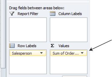
Figure 8–13. The order amount data inhabits the Values area
For now, don't worry about how to recast the values into currency format. That's coming up a bit later.
Choosing Which Data to Work On
Note again the four areas occupying the lower region of the PivotTable Field List: Report Filter, Column Labels, Row Labels, and Values. The idea is to place the information from the database's fields into these areas, with each area doing something different with the data. Since we just worked with the Row Labels and Values areas—probably the two most important areas—I'll first explain what they do.
The data from any field placed in the Row Labels area is listed uniquely. And that's exactly what happened in our PivotTable; when we ticked Salesperson, all the salespersons in our database were listed in Row Labels—and listed once. It makes no difference how often they're actually cited in the original database; place the field in Row Labels and each name appears only once.
On the other hand, the data from any field in the Values area is always subject to a mathematical operation—it's added, counted, averaged, and the like. And again, this is consistent with our previous example. The Order Amount data—individual sales in dollars—was added, and was broken out by the salesperson data in the Row Labels area.
And that in a nutshell is really what PivotTables are about. Any data in the Values area is broken out by the data in the Row Labels area. Consider the collection of PivotTable examples in Table 7-1 (which of course assume you have these kinds of data in a database).
Table 7-1. Examples of PivotTables: What Data Gets Broken Out, and What Data Does the Breaking Out
| PivotTable Example | Data in Row Labels (What Does the Breaking Out) | Data in Values (What Gets Broken Out) |
| Sales data broken out by salesperson (our PivotTable) | Salesperson | Order amount |
| Student aggregate GPAs broken out by major | Major subjects (e.g., sociology, chemistry) | Student GPAs |
| Total budget expenditures, broken out by budget category | Budget categories | Amount spent on purchases |
| Dinner seating totals, broken out by table | Table numbers | Table numbers (I'll explain this shortly) |
So the essential PivotTable question asks what information you want to see broken out, and by what variable. If you wanted to break out the sales figures by country instead of salesperson, you'd place Country in the Row Labels area, and you'd wind up with what's shown in Figure 8–14.
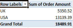
Figure 8–14. International comparison: Sales by country
Getting the Fields Where You Want Them
And how do you move, or place, the field data into either the Row Labels or Values areas? In our first PivotTable, we ticked the check boxes alongside Salesperson and Order Amount, and Excel decided by default into which areas they'd go. However, you can manually place a database field in any of the four areas in the PivotTable Field List by clicking in the field and dragging it into the desired area.
Let's say you're starting the PivotTable again from scratch. Once you've clicked through the Insert ![]()
PivotTable sequence, you can start to drag on the desired fields instead of resorting to the check boxes. If, for example, you want to lodge the Salesperson field in the Row Labels area, you can click, drag, and drop it, as in Figure 8–15.

Figure 8–15. Just click Salesperson, and drag and drop it into the Row Labels area.
And you can do the same to Order Amount. Again, the reason you want to know about this drag-and-drop technique is that it will let you move any database field to any of the four areas. To remove a field from an area, just click the field, drag it into the worksheet area (or back into the upper area of the PivotTable Field List), and release the mouse; the field will disappear from the PivotTable (but not from the source data).
TIP: You can also remove a field from the PivotTable by unchecking the box alongside the field you want to remove. Note that the box becomes checked whenever you place a field in an area, regardless of whether you do so by ticking the box or dragging the field into the area.
Pivoting the Data Sideways Using the Column Labels Area
The Column Labels area does exactly the same thing as Row Labels, except that it breaks out the data horizontally. Thus, this time if you drag Salesperson into the Column Labels area instead, and leave Order Amount in the Values area, the PivotTable will look like Figure 8–16.
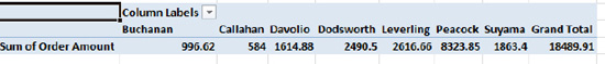
Figure 8–16. Change of direction: The sales data reading across, instead of down
Filtering Items Using the Report Filter Area
That takes us to the fourth PivotTable area: Report Filter. There's a familiar word in there, of course, and report filters work similarly to the filters you've already learned about, but you need to understand what they do in a PivotTable.
Report filters give a different look to a PivotTable. As with the Row Labels and Column Labels areas, the Report Filters area also breaks out the data in the Values area, but lets you isolate the impact of one item in the field doing the breaking out. The following short exercise will show you what that means.
- Drag and drop the
Salespersonbar into theReport Filterarea. In the PivotTable, you'll see the data shown in Figure 8–17.
Figure 8–17. The PivotTable report filter: Just click the drop-down arrow and select a salesperson
- Click the drop-down arrow and you'll be presented with a list of the salespersons, as shown in Figure 8–18.
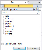
Figure 8–18. The salespersons: Just click one
- What happens next is pretty obvious: click one salesperson name, and click
OK. You'll see, for example, the data shown in Figure 8–19.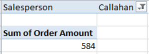
Figure 8–19. The sales data for Callahan, and only Callahan. Note the filter symbol alongside Callahan's name.
As with the standard table filters discussed in Chapter 7, we've singled out one salesperson for his or her sales totals. Want to see the totals for another salesperson? Just click the drop-down arrow again and click someone else.
You can also filter two or more salespersons at the same time:
- Click the filter drop-down arrow.
- Tick the
Select Multiple Itemscheck box. - Click the salespersons you want. Thus, if you click both Callahan and Levering, you'll filter their combined sales totals, as in Figure 8–20.

Figure 8–20. Double duty: Filtering two salespersons' data
Good to know, but you'll probably find this option slightly uninformative, because it doesn't allow you to see the name of the salespersons you're filtering. Microsoft is aware of this issue, and has supplied an alternative to this approach that you'll learn about later: using the Slicer.
Creating a Report Worksheet for Each Item in a Filter
There's another report filter feature you may want to check out, too: the Show Report Filter Pages option. Let's see what this does:
- Drag the Salesperson field into the filter area without selecting any particular salesperson, so that you see (All), as shown previously in Figure 8–17.
- Click the
PivotTables Tools Optionstab, and then click theOptionsdrop-down arrow. You'll see the options shown in Figure 8–21.
Figure 8–21. The Show Report Filter Pages… option
- Click
Show Report Filter Pages…, and then clickOKwhen you see theShow Report Filter Pagesdialog box. That click will trigger a rapid-fire production of new worksheets, each named after and bearing a filtered report for each salesperson (see Figure 8–22).
Figure 8–22. All accounted for: Each salesperson is assigned a separate worksheet, each containing a report filter for that person
- Click any worksheet tab and check it out (see Figure 8–23).

Figure 8–23. The report filter for Dodsworth
This is an impressive option, but truly you could get away with one filter, and simply click any particular salesperson when you need to. But if you need to break out each salesperson's data in separate sheets, the Report Filter Pages command is a worthwhile one.
Counting Records: A Way to Break Out Text Data
Recall our introductory PivotTable example—that hypothetical dinner in which, among other things, we wanted to tally the number of guests assigned to their tables. So how would we go about constructing a PivotTable for this? Well, we want to break out the number of guests by their table numbers, so the Table Number field will be posted in the Row Labels area. But what field is going to go into the Values area? The database in Figure 8–1 consists of exactly two fields: Guest and Table. And believe it not, even though the Guest field comprises text—that is, the names of the guests—we can still drag it into the Values area, because Excel will go ahead and perform the only mathematical operation it can on text; it will count the guests by their table numbers.
And that's how it works. If you drag a text-based field into the Values area, its contents will be counted, and broken out by whatever field populates the Row Labels area. Thus, with the dinner example, the guests will be counted by their table assignment—that is, how many have been assigned to Table 1, Table 2, and so on.
But let's try to illustrate this point with our salesperson data. Suppose we now want to determine not how much money each salesperson has earned, but how many sales each one has recorded.This exercise will demonstrate two important aspects of PivotTables: your ability to place a text-based field into the Values area, and the fact that you can apply the same field to a PivotTable twice.
First, make sure that the Salesperson field is positioned as usual in the Row Labels area. Nothing new there; but now, we're going to also drag and drop Salesperson into the Values area, demonstrating that you can use the same field twice in a PivotTable. Once you maneuver Salesperson into the Values area, you'll see the data shown in Figure 8–24.
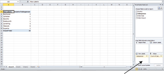
Figure 8–24. Counting, not adding, sales. Note the Salesperson bars populating both the Row Labels and Values areas.
The Salesperson bar in the Values area is recorded as Count of Salesperson, again because Excel has no choice but to count text data (it can't be added or averaged). In effect, what we've done is count the number of times each salesperson's name appears in the database—which is another way of stating how many sales each one has executed. And again, this will work the same way even if each salesperson has made hundreds or even thousands of sales.
Grouping Related Items Using Two Fields
Up to now we've traveled the basic route to designing a PivotTable, in which one field in the Row Labels area breaks out the data in a field in the Values area. But you can also place two fields in the Row Labels area, to carry out a kind of double-breakout.
The PivotTable in Figure 8–25 illustrates what that means.

Figure 8–25. National pride: Sales, broken out both by country and salesperson
Here, the sales data is broken out by two fields, first by country and then by salesperson. We can see that 4 sales were conducted in the United Kingdom and 11 in the United States. Within the United Kingdom, it's Buchanan, Dodsworth, and Suyama who've compiled the sales, while Callahan, Davolio, Leverling, and Peacock have done their sales work in the States.
This double-breakout enhances the viewer's understanding of the sales activity, by introducing Country into the analysis and indicating which salespersons worked in which country.
How is this done? Simple; you just drag and drop Country into the Row Labels area, too (see Figure 8–26).

Figure 8–26. Table for two: Two fields occupy the Row Labels area
When you drag Country into Row Labels, you need to carefully to position it above Salesperson. If you don't, and Salesperson winds up above Country, the PivotTable will look like Figure 8–27.

Figure 8–27. Another look at the same data
Here the data is broken out first by salesperson and then by country, reversing the order of the initial breakout. This view might be particularly informative if a salesperson worked in both countries, because you'd see the sales data for both UK and USA under the salesperson's name. In any case, you can easily drag one field above the other in the Row Labels area if you need to, and then just release your mouse when the fields have been properly positioned.
There's another point about breaking out the data by two fields. Note that each salesperson's total—which is a subtotal of all the sales, of course—appears alongside his or her name in bold text. If you want the subtotals to appear at the bottom of each salesperson's group instead, you can click the PivotTable ToolsDesign tab, and then click Subtotals ![]()
Show all Subtotals at Bottom of Group, as in Figure 8–28.
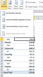
Figure 8–28. It all adds up: PivotTable subtotal options
First, let's return Country to a position above Salesperson in the Row Labels area, because subtotaling by country will illustrate the point more clearly (there's more to subtotal this way; because each salesperson works in but one country, there's nothing to subtotal if you group by Salesperson). Then click Show All Subtotals at Bottom of Group, and the PivotTable will be redesigned to take on the appearance shown in Figure 8–29.
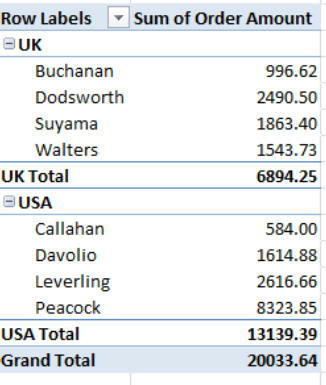
Figure 8–29. Another new look to the same data: Subtotals at the bottom of each salesperson group
Using the Row and Column Value Areas to Group Items
There's still another approach to engineering a two-field breakout of the data. If you click and drag on the Country bar and drop it into the Column Labels area, you get what's shown in Figure 8–30.

Figure 8–30. The fields, pivoted: Again, the data is exactly the same, but organized differently
We've orchestrated still another look to the data—kind of a matrix, in which the two fields intersect in the Values area. Note the field positions in the Drag field between areas below section—one in Row Labels, the other in Column Labels.
Changing the Calculation
By default, PivotTables will add, or sum, numerical fields in the Value area. But you may want the table to calculate a different kind of result—say, an average or a maximum. Changing to the kind of calculation you need is easy.
The following example will show you the amount of the average sale each salesperson has made:
- First, remove the Country field from the
Column Labelsarea if you've dragged it there. Remember, you can remove the field by clicking its bar in theDrag field between areas belowarea and dragging into the worksheet; release your mouse and the field will disappear. This will leave you with your original, basic PivotTable result, in which sales are broken out by salesperson.TIP: You can also remove a field by clicking the bar itself and clicking
Remove Fieldon the menu that appears. - Then click inside the Values area in the actual PivotTable—not the
Valuesarea in thePivotTable Field List—and if necessary click the PivotTables Tools contextual tab, and thenOptions
Summarize Values By. You'll see the options shown in Figure 8–31.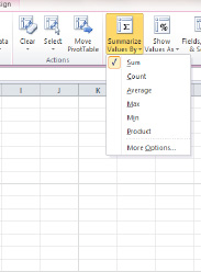
Figure 8–31. Where to change the mathematical operation for your PivotTable data
- Click
Average, and you'll see the data shown in Figure 8–32.

Figure 8–32. Average sale size, by salesperson
That's it—though you probably won't like all those nasty decimal points swelling the numbers. But that's a formatting issue, and we're going to discuss that later in the chapter.
TIP: You can select different mathematical operations by either right-clicking in the Values area in the PivotTable itself and clicking Value Field Settings on the context menu, or clicking the Options tab and then clicking Field Settings in the Active button group. Either way, you'll be brought to a Value Field Settings dialog box, from which you can choose the operation you want. You can also get to the same destination by right-clicking in that PivotTable value area and selecting Summarize Values By.
Grouping PivotTable Data: Organizing Your Time(s)
Earlier in this chapter, Figure 8–6 showed the salesperson data broken out by time—more specifically, the months in which the various sales were conducted. Yet the Salesperson database says nothing about months as a unit of time; each record only notates the precise day on which a sale was completed. But Excel lets you grouptime data into time units of your choosing, a most useful capability that can give you a big picture of financial activity over time, particularly when you're working with many records.
To illustrate, let's devise a PivotTable for the Salesperson database in which we break out sales (Order Amount) by Order Date, a field we've yet to use.
- First, remove the Salesperson field from the
Row Labelsarea. Then drag Order Date into theRow Labelsarea, and you'll see something like Figure 8–33.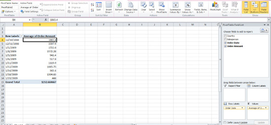
Figure 8–33. Sales data, organized by date of transaction
NOTE: Before we continue, remember that data placed in the
Row(orColumn)Labelsarea is listed uniquely. Figure 8–33 lists 11 dates even though our database has 15 records because some of the sales were carried out on the same date—and hence that date is listed only once. - In any case, say we want to break out the sales activity by month. Click anywhere among the dates, then click the
PivotTable Totals Optionstab, and then clickGroup Selectionin theGroupbutton group (see Figure 8–34).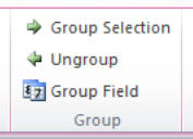
Figure 8–34. The Group Selection option
- After clicking
Group Selection, you'll see the dialog shown in Figure 8–35.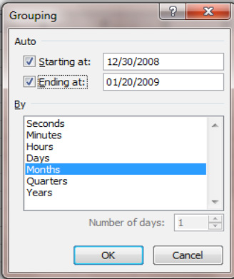
Figure 8–35. The Grouping dialog box: Organizing your date data into the units of time you want
- Then click
Years(Monthswill remain selected as well). If you don't clickYears, all the January sales figures, for example, will be totaled together—and that might include Januarys in different years (and the same would of course apply to all the other months). ClickOK, and you'll see the display shown in Figure 8–36.
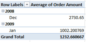
Figure 8–36. Getting it all together: The data organized by months and years
Now the sales data is grouped, and we can easily tell how sales have proceeded by month. Again, while our database is small, grouping will work with any collection of dates, no matter how large. To ungroup the data and return it to its original row label appearance, just click within the date data and click Ungroup in the Group button group.
Refreshing the PivotTable: Changing the Data
So far our PivotTables have worked with the same 15-record database throughout, but in the real world, of course, you may need to enter additional records and/or make changes to existing ones, while at the same time seeing to it that your PivotTable results reflect those changes. How does that happen?
Well, the first thing to understand is that, unlike Excel formulas, PivotTables do not perform automatic recalculation. That is, if you change data in your database, the PivotTable will not immediately incorporate the changes and update existing results. You'll have to refresh the PivotTable instead, by clicking the Refresh button on the Options tab.
To see this, click back into the Salesperson database and change Davolio's sales amount to $2,000. Then click anywhere in the PivotTable and click the Refresh button. You'll see the new data, as shown in Figure 8–37.

Figure 8–37. Davolio's sales total has now changed from the original $1614.88.
If you've modified an existing record—that is, one already in the database—all you need to do is click Refresh. But if you've added a completely new record, clicking the Refresh button won't update the PivotTable. The next section discusses what to do in this case.
Adding New Records to a PivotTable
The easiest way out of this little dilemma is to convert the database into a table. New table records are automatically processed by PivotTables, and clicking Refresh will then update your results. Let's try it.
- First, click anywhere in the database, click the
Inserttab and chooseTablefrom theTablesbutton group, and then clickOK. - Then add a new record containing the information shown in Figure 8–38.

Figure 8–38. New recruit: Walters joins the sales force
- Click
Refresh. Walters' data will be automatically incorporated into the PivotTable, as shown in Figure 8–39.

Figure 8–39. The current PivotTable. Note that Walters' record is included, and sorted, too.
NOTE: The Data Source button identifies the current range of data being processed by the PivotTable, and you can see that Table1 now appears as the source table, thus incorporating Walters' record.
Now you can enter as many new records as you like into the Salesperson database, and whenever you click Refresh those new records will appear in the PivotTable.
NOTE: If your PivotTable shows Sum of Order Amount instead of the Average Amount as shown in Figure 8–39, it doesn't matter. Adding and refreshing PivotTable data works no matter what mathematical operation you've selected.
Viewing Which Records Are Filtered: Using the Slicer
Recall that when we filtered multiple items, I noted that filtering more than two salespersons at the same time doesn't let you know exactly who's been filtered (see Figure 8–40).
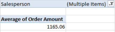
Figure 8–40. Anyone's guess: Which salespersons have been filtered?
As mentioned, Microsoft recognized this problem, and introduced the Slicer feature in Excel 2010 as a way to solve it. The Slicer is a kind of free-floating filter that enables you to see exactly which records have been selected.
For example, in Figure 8–40 I've filtered the sales data for Buchanan and Peacock. With the Slicer, you'll be able to see what's shown in Figure 8–41.
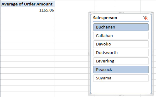
Figure 8–41. Filter, no longer out of kilter: With the Slicer you can see exactly who's been filtered
Note that the Slicer isn't exactly in the PivotTable, and if you click it the PivotTable Tools contextual tab won't appear on the screen. You can drag the Slicer anywhere on the worksheet, and even change its color and style.
How the Slicer Works
Before I demonstrate how to use the Slicer, make sure that the Order Amount data is placed in the Values area of your PivotTable, and place Salesperson in the Report Filter area (for this exercise, it doesn't matter if you've added Walters' data or not).
- Click anywhere in the PivotTable. Then click the
PivotTable Tools Optionstab, and click theInsert Slicerbutton in theSort & Filterbutton group. You'll see the options shown in Figure 8–42.
Figure 8–42. Slice of life, PivotTable style. Note that all the database fields are listed.
- Click
Salesperson, and then clickOK. The Slicer will appear, with all the salespersons listed and colored blue, as in Figure 8–43.
Figure 8–43. Don't worry if you don't have Walters listed.
- This is the equivalent of the (All) indicator shown in the report filter—that is, all the salespersons are currently selected. But if you click any one salesperson's name, only his or her data will appear in the
Valuefield. If you click one salesperson, hold down the Ctrl key, and click a second name (see Figure 8–44), the data for both will be totaled in theValuefield.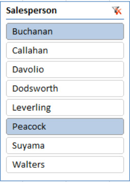
Figure 8–44. Two salespersons selected with the Slicer. Their combined sales data will appear in the Values area.
This is the Slicer solution to that report filter multiple-items problem—it allows you to clearly see which salespersons have been filtered. If you want to deselect a salesperson, hold the Ctrl down again and click that salesperson's name.
Note that our PivotTable now has the Order Amount data in the Values area, the Salesperson field in the Report Filter area, and the Slicer in place (see Figure 8–45).

Figure 8–45. The Salesperson field in two places: The Report Filter area and the Slicer
And that's a bit redundant, because now the salespersons are being filtered in two places. As a consequence, you can drag Salespersons off the PivotTable, leaving you with what's shown in Figure 8–46.

Figure 8–46. There's no need to use the Report Filter area now, because the Slicer is doing the same job.
And now you can see exactly who's being filtered.
The Clear Filter button—that funnel image accompanied by an X in the upper right of the filter—will turn off the current filter when you click it, but that doesn't mean that it will remove the filter from the PivotTable. It means that it will no longer single out or filter any particular salesperson, but rather combine all the salesperson data in the Value area (see Figure 8–47).

Figure 8–47. The Clear Filter button has been clicked, combining all the salesperson data in the Value area result.
Restyling the Slicer
You can also restyle the Slicer by clicking the Slicer title (i.e., the upper area that reads “Salesperson”—see the arrow in Figure 8–47), and calling up the Slicer Tools contextual tab. Click the Options tab, followed by the Slicer Styles drop-down arrow, and click a style (see Figure 8–48).
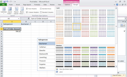
Figure 8–48. Selecting Slicer styles
To remove a Slicer, click in the Slicer title area so that the Slicer is surrounded by a gray border (see Figure 8–49). Then just press the Delete key.
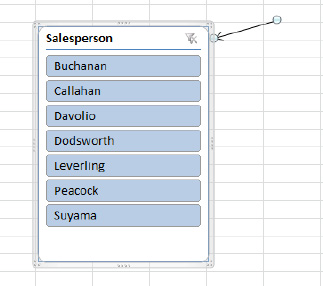
Figure 8–49. Click the Slicer area to trigger that gray border and press Delete.
NOTE: You can also resize the Slicer by clicking a dotted area on that gray border and dragging in the desired direction, just as you would resize a chart.
Formatting the PivotTable
Excel offers many options for formatting PivotTables. Perhaps most importantly, you can easily reformat the values in the Value area, which, after all, contains data you need to know. Now, about all those decimal points.
As usual with Excel, there are several ways to access the commands that will enable you to change the appearance of PivotTable values. I'll describe two.
- First, right-click anywhere in the Values area in the actual PivotTable, and click
Value Field Settingson the context menu. You'll see the dialog shown in Figure 8–50.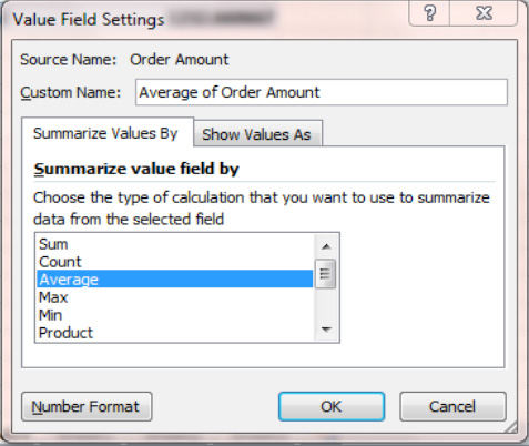
- Just click the
Number Formatbutton, and you'll be brought to a familiar dialog box (see Figure 8–51).
Figure 8–51. Déjà vu: The good old Format Cells dialog box
- You've seen this collection of options in Chapter 5. We want the values to display just two decimal points, so click
NumberinCategorylist shown in Figure 8–51, and type 2 in theDecimal Placesfield you'll see in the next dialog box (see Figure 8–52). Then clickOKtwice.

Figure 8–52. The number formatting options; you've seen it all before
NOTE: What's different about formatting PivotTable values is that, unlike a standard range, you don't select every cell in the Values area before you select the formatting options; all you do is right-click in the area and execute the commands, and all the values will be reformatted. It's an all-or-nothing procedure here.
Styling Your Report
You can also draw upon a large collection of PivotTable styles that resemble the styles available in Excel tables. To view these, just click the PivotTable Tools Design tab, select PivotTable Styles, and click the More drop-down arrow (the lowest of the arrows you'll see). You'll be presented with the options shown in Figure 8–53.

Figure 8–53. Stylish options: PivotTable styles
And as with their table cousins, these styles will display themselves in preview mode when you simply place your mouse over them before clicking. You can also introduce row and column banding in the PivotTable just as you can in Excel tables by clicking in the PivotTable Style Options button group just to the left of PivotTable Styles.
NOTE: Remember, in order to access the PivotTable button group options, you must click in the PivotTable first.
Changing PivotTable Headers
Note that Figure 8–53 sports a “Row Labels” header above the Salesperson field, and you might opt for something a bit more specific. If so, all you have to do is click in that header cell directly in the PivotTable, type whatever replacement header you wish, and press Enter. You can do the same to the Values header as well; just note that in the Values case your customized header will also appear in the Values area in the PivotTable Field List.
NOTE: Changing PivotTable field headers won't change the corresponding headers in the database source you've used to produce the PivotTable.
Layout Options
The PivotTable warehouse of design options stocks three principal layouts:
- Compact (the default, shown in Figure 8–54)
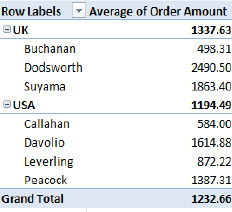
Figure 8–54. The Compact PivotTable layout option
- Outline (see Figure 8–55)
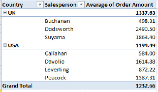
Figure 8–55. The Outline PivotTable layout option
- Tabular (see Figure 8–56)
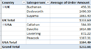
Figure 8–56. The Tabular PivotTable layout option
These can be easy to confuse, and exactly what distinguishes them becomes clearer when you break out the data by two fields. There are a few differences that separate the three layouts, however:
- The Compact layout tucks the Salespersons data beneath the Country field in the same columns, whereas the other two layouts assign Salesperson a separate column.
- The Outline and Tabular layouts title the columns with the actual names of the fields being broken out, unlike Compact, which can't do that—because it presents two fields in one column.
- The Tabular layout presents the UK and USA subtotals beneath the data, while the other two align the subtotals with the Country titles.
- You access the various layout options by clicking the
PivotTable Tools Designtab, and clicking theReport Layoutbutton in theLayoutbutton group, as shown in Figure 8–57.

Figure 8–57. PivotTable layout options
And what about those minus signs stationed to the left of the country names in all the layouts? When clicked, those buttons conceal, or collapse, the salesperson data beneath the country (see Figure 8–58).
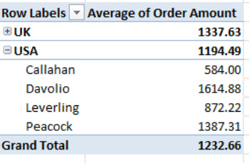
Figure 8–58. Now you see it, now you don't: UK salespersons hidden, or collapsed, beneath the UK category
Note that the minus has reverted to a plus sign alongside the UK in the figure. Click it now and the UK salesperson records return to view. This plus/minus option gives you a way to streamline the PivotTable's appearance by temporarily obscuring the detail data under a global category—in our case, Country. (Of course, you could achieve a similar effect by simply removing the Salesperson field from the PivotTable.)
In addition, you can collapse and expand the entire PivotTable by clicking the Expand Entire Field/Collapse Entire Field buttons in the Options ![]()
Active Field button group (see Figure 8–59).

Figure 8–59. The Expand and Collapse Entire Field buttons
Clicking the Collapse Entire Field button, for example, would be equivalent to clicking the minus signs alongside UK and USA simultaneously, yielding the results shown in Figure 8–60.

Figure 8–60. The entire Salesperson field has been collapsed, impacting both countries.
Clicking Expand Entire Field now would restore all the salesperson names to view.
Creating Charts from PivotTables Using PivotCharts
Just as you can summarize database data with a chart, you can chart PivotTable results too. The principles behind pivot charting are very similar, but not identical, to the techniques we've already discussed for charting database data.
Let's say we want to turn our basic PivotTable—in which sales data is broken out by salesperson totals—into a chart (see Figure 8–61).

Figure 8–61. Back where we started: Sales figures broken out by salesperson. If your data still shows averages instead of sums, it won't affect the chart-making process.
- If necessary, restore your PivotTable to the appearance shown in Figure 8–61, in which Salesperson occupies the Row Labels area and Order Amount is in the Values area.
- Then click anywhere in the PivotTable, click the
PivotTable Tools Optionstab, and choosePivotChartfrom theToolsbutton group. You'll see the familiar dialog box shown in Figure 8–62.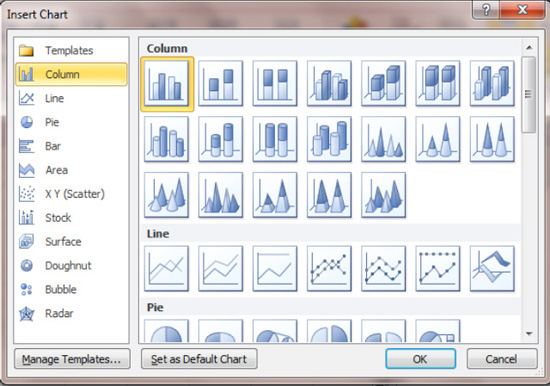
Figure 8–62. The Insert Chart dialog box, again
- Note that you've already seen this box in Chapter 6. Go ahead and click
OKto Excel's default selection, that redoubtable Column chart, and you'll see the data presented as in Figure 8–63.

Figure 8–63. A PivotChart. Note the difference from a standard Excel chart: the appearance of what are called field buttons.
It isn't a thing of beauty yet, but the chart has captured the PivotTable data. The chart takes the salesperson names (the data in the Row Label), applies them to the horizontal (category) axis, and draws its vertical (value) axis from the sales figures.
NOTE: When you click in a PivotChart, the Row Values area in the PivotTable Field List is named Axis Fields (Categories). Click back in the PivotTable, and the Row Values label is restored.
And once the PivotChart makes its appearance in the worksheet, the means for modifying and reformatting it are nearly identical to the options described in Chapter 6. When you click in the chart, a PivotChart Tools contextual tab is ushered onto the screen, offering some familiar selections (see Figure 8–64).

Figure 8–64. PivotChart options available via the PivotChart Tools contextual tab: The Design, Layout, Format, and Analyze tabs
Filtering Data in the Chart with Field Buttons
Click the PivotChart tabs and you'll recognize nearly all the button groups, because you've seen them on the Chart Tools contextual tab, too. There is, however, a fourth tab—Analyze—that contains buttons you won't see associated with standard Excel charts (see Figure 8–65).

Figure 8–65. The contents of the PivotChart Tools Analyze tab
NOTE: Clicking the Clear drop-down arrow on the Analyze tab will reveal a Clear All option, which when clicked will remove both the PivotChart and the PivotTable but leave the underlying grids for the two objects. It's a way allowing you to start all over again by selecting a new set of fields for the PivotTable, which in turn immediately generate a PivotChart. The Clear button is also available in the PivotTable Tools Action button group.
But PivotCharts themselves reveal an element that is nowhere to be found in conventional charts: field buttons. These represent the PivotTable fields that contribute the source data to the chart, and when they're clicked they enable you to make various changes to the chart.
For example, clicking the arrow on the Salesperson button on the chart triggers the menu shown in Figure 8–66.

Figure 8–66. Ticking any check box will remove that salesperson's name—and column—from the chart.
To illustrate, if you click Peacock and then OK, Peacock's column bar will be banished from the chart (see Figure 8–67).
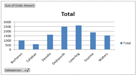
Figure 8–67. The salespersons, minus Peacock. Note the filter symbol that now appears on the Salesperson field button, indicating that a name has been filtered out of the chart.
Peacock has flown the coop, and as a result, the value axis, which had established a maximum of 10,000 in order to be able to record Peacock's high sales total, has been reset to 3,000, now that Leverling is the leading salesperson. But more importantly, take a look now at the source PivotTable (see Figure 8–68).
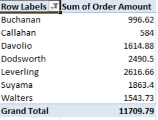
Figure 8–68. Peacock's missing here, too.
What we see is that filtering the data in the PivotChart changes the source PivotTable correspondingly. If youmake a change in the data recorded by the chart, you'll also change the PivotTable that gave rise to the chart in the same way. And, needless to say, the reverse is true, too; any data change in the PivotTable changes the PivotChart as well.
And if you don't want to see those field buttons on the chart, right-click any button and select the Hide All Field Buttons on Chart option on the resulting menu. You can also delete a particular field button by right-clicking it and selecting Remove Field (see Figure 8–69).
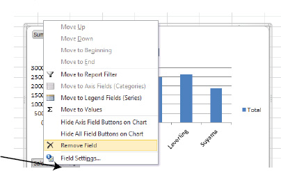
Figure 8–69. Removing just one field button from a PivotChart
NOTE:You can also remove individual PivotChart field buttons by clicking the PivotChart contextual tab, choosing Analyze, and clicking the Field Buttons arrow.
If you want to delete the PivotChart, click in its chart area so that you see that gray border surrounding the chart, and press Delete—just as you would with a standard Excel chart.
Creating a PivotTable and PivotChart Together
You can also produce a PivotTable and chart simultaneously, by clicking anywhere in the source data (meaning the original database), and then clicking Insert ![]()
Tables ![]()
PivotTable ![]()
PivotChart. You'll see what's shown in Figure 8–70.
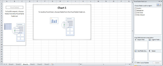
Figure 8–70. Note that the PivotChart and PivotTable areas appear at the same time.
Now if you drag Salesperson into what's now called the Axis Fields (Categories) area and drag Order Amount into the Values area, both the PivotChart and PivotTable will materialize onscreen.
Summary
PivotTables are an acquired taste, to be sure, but one worth acquiring, as they can greatly enhance your analyses of spreadsheet data. Understanding basic PivotTable principles will go a long way toward empowering you to fashion them on your own.
Next we'll direct our attention to another analytical enhancement—working with multiple worksheets and how they can work together.