
In essence, making a website accessible means ensuring that everyone can get to everything. It does not mean everyone has to have the same experience, but it does mean there should be no piece of functionality or content that is unreachable (or inaccessible) by anyone, regardless of their individual ability, devices, browsers, or environment.
Accessibility is not checking off a list of requirements or using an automated tool to verify whether our code passes certain accessibility guidelines and validation. Although your organization might be required by law to pass certain accessibility levels (different countries have different laws governing accessibility), making sure your websites are accessible to the widest range of devices and users possible should be one of your main concerns when developing for high-traffic websites. It is something you should be doing for your users, your brand, and their goodwill toward it. Not breaking the law could be seen to be a serendipitous bonus.
A lot can be (and has been) said about online accessibility, enough to fill an entire book, or even a collection. Building accessible websites is to a great extent, but not only, a byproduct of building semantic websites. It is not something that falls only within the responsibilities of developers, though. Everyone involved with the website should be part of this effort: user experience designers should make sure the websites are easy to navigate and content is easy to find; designers should create layouts that take into consideration users with disabilities, such as colorblindness or poor motor skills; product managers and copywriters should create simple messages that are clear to everyone; and developers should write code that is semantic and accessible. There are several considerations, especially with high-traffic websites. Also, there are many HTML-related and content-related actions that you can take to make your content more accessible, but as a CSS-related book, they would be out of scope here. We will give you tips on how to open up your website and (most importantly) your content to the largest number of visitors and clients possible.[36]
In this chapter, we will look at
An overview of some of the most common users' accessibility problems
Existing accessibility guidelines and how to cater for them
How to make things easier for visitors using assistive technologies
Design and layout considerations for a more accessible site
WAI-ARIA and how to use it in your projects
CSS best practices for users with device or environmental impairments
The difference between progressive enhancement and graceful degradation
How to use Yahoo!'s Graded Browser Support
What is and what is not considered impairment is a difficult thing to discuss in a politically correct manner. What some see as a disability, others see as just differences between people. When we talk about an impairment, we mean something that makes using a website potentially more difficult for that user. Some of the most common accessibility impairments are the following:
Low vision, poor eyesight, or blindness
Different kinds of colorblindness
Motor disabilities or constricted motor skills
Hearing impairments
Cognitive and intellectual disabilities
Young age, which can imply cognitive impairment
Old age, which can imply many of the problems listed here
More often than you might expect, people will have more than one condition, which makes it even more difficult to cater for every combination possible.
Those who are deafblind, for example, communicate and absorb information via different means. Those who were initially deaf and then lost their vision later in life are likely to use a modified version of a sign language they already knew, in a tactile form. Whereas those who were born blind, and then became deaf are likely to use a tactile version of their written or spoken language. Even with a single impairment such as deafness there can be tens (or even hundreds) of solutions (for example, lip-reading, sign languages, advanced sign languages, hearing aids, and so on). There are many more combinations than we could possibly go into here. A vital thing to remember is that these users have already decided how they would and do like to use their devices and have applications in place to help them achieve this.
We are not experts in catering for those with impairments, nor could we realistically expect to be, but we can do our very best to not interfere with the chosen methodology of our users. The same applies for everyone—if one user has defined keyboard shortcuts, and we override them without permission, that is frustrating for the user and presumptuous of us. If another user tries to right-click on a page, and we cancel that behavior, again, it is rude of us to do so. Allowing the browser and the device the opportunity to act as they see fit, is often the most courteous and appropriate thing for us to do.
Let's take a look at some of the more common issues people with particular impairments are likely to face. This is, obviously, not an exhaustive list. We will go into more detail for each later in the chapter.
Partially sighted (but not blind) users fall into one of two key groups. Those that find it hard to focus will benefit from clear, simple, medium-weighted fonts and large font sizes.[37] Allowing them the ability to change font sizes and fonts within your website will make their lives easier. Ensuring you use relative values for font sizes will also let them use the built-in device methods for adjusting font size, and avoiding !important declarations will help ensure that you don't override any settings they may have made themselves.
Those that have a narrow field of vision (who can only focus on small areas of the screen at a time) will benefit from the ability to turn the font size down so that paragraphs take up less space onscreen. These users are more likely to zoom the entire website out, but everyone is different. You should always ensure that you have tested the site to be certain that you can turn the font size up and down by two steps within the browser without breaking the layout.
Blind users are very likely to use screen readers (which we mention in a dedicated section later in this chapter). They also browse websites in a very different way from sighted users. They are likely to want to skip directly to sections of the website, access lists of all of the links in a page, or access an outline of the page built up out of the headings in the markup. Avoid language that points to specific physical positions on the page (for example, "click the link in the top-right corner") and use WAI-ARIA, semantics, and microformats. Newer technologies will be able to take advantage of these.
Colorblind users may use their own style sheets or turn off CSS altogether. Offering them various alternative color schemes can be a great help to them and allows your organization to maintain control of its brand and ensure that your website remains attractive. We reference some tools to simulate colorblindness and check for problems with your color schemes later in this chapter.
Degrees of motor impairment can vary dramatically. In most cases, these users are already using their own assistive technologies to enable and empower them to use their devices, but there are small things we can do to help, like making clickable areas clear and as large as possible. Whenever possible, make sure the target areas of your links don't require a great deal of precision to be clicked on.[38] These considerations also apply to users with touch interfaces such as smartphones or tablets.
In many cases (such as tabs or buttons), not making the clickable area the size of the container is a confusing user experience, anyway.
Users with partial or complete deafness are generally less challenged with accessibility issues on the Internet, other than with specific audio or video content. Most websites don't (or definitely shouldn't!) play audio,[39] and as such will work for the hearing impaired just as well as for other users. You should avoid using sound alone to indicate any kind of state or information on your page. If your site presents audio or video as part of its primary purpose, you need to consider captioning for these pieces of media.
Open captioning is captioning that is "burned in" to the media it is associated with; for example, subtitles in a film that cannot be turned off. It is called "open" because it is shown by default. Closed captioning is textual data associated with the media that is stored in text format and served alongside the video. Televisions, for example, have long been legally required to provide a closed captioning decoder. Closed captioning has the benefit of allowing several different "tracks" of text; for example, different languages or descriptions of sounds as well as conversation. It can be used with audio as lyrics for karaoke because it is time-coded. It also has the benefit of allowing us to potentially style the text with CSS (different positions to avoid important video elements, colors to represent different people, and so on).
Closed captioning sadly has poor support so far on the Web and many different solutions. HTML5 as yet does not have official support for closed captioning, but proven methods are already being implemented and standardization is sure to follow.[40]
For now, the CSS considerations for closed captioning depend very much upon your implementation, and a transcript is the only foolproof method for exposing this data. You can read more about captioning at http://webaim.org/techniques/captions/.
It is also important to be aware that those who were born deaf will likely have learned sign language as their first language. This means that English (or their local language) is akin to a second language for them, and therefore expressions, jargon, and colloquialisms may be harder for them to understand. For that reason, clear language is just as important as ever.
Cognitive impairments, such as dyslexia or autism, can make it difficult for users to process information. Typically, this kind of impairment is addressed with clear, unambiguous copy but there are other things you can do, too. Making layouts consistent and maintaining the positions of key elements like navigation will make life easier for all your users, but especially for those with cognitive impairments or learning disabilities. The same applies to not using too many different fonts (although the website should be flexible enough so that it is easy for users to specify their preferred font). Also, make sure there is enough space between lines, as this makes it easier for text to be read (a line-height value of 1.5 for normal text is a good default).
Dyslexia is a very common impairment, and although no accurate studies have been carried out, it is believed that dyslexia affects between 5 and 10 percent of the population. Dyslexics can suffer from a whole assortment of learning or cognitive impairments, which is why this particular problem is referred to so frequently when accessibility is mentioned. Some dyslexics prefer to print out pages rather than having to read the text on a screen. This is just one of various reasons why someone would print a page.
If you are not developing a website that is specifically targeted at dyslexics, it should not be necessary to proof every single detail of your website to be dyslexic-friendly, but you should remember that the most important factor in this situation is that users can customize the pages they visit to suit their very particular needs, making it easier to read and understand the content.
Young users are as likely as anyone else to suffer many of the other impairments on this list, but they can also be considered to have a kind of cognitive impairment, in that you should use simple, clear language. Sites designed for children are also some of the only valid places to use the Comic Sans font, although some dyslexics may also find it easier to read.
Older users can suffer any or many of the impairments on this list (apart from the one directly previous, of course). In particular, sight and hearing deteriorate with age. As such, if you are making sure that your websites are accessible, you have probably designed a website that is already accessible to older users. They may also be unfamiliar or unskilled with computers, so avoiding technical jargon and working with common visual associations works well.
Epileptic users specifically may react badly to flickering or flashing pages, or elements within pages. It is law in many countries to provide a warning before presenting this kind of media. Avoid animations or Flashes of Unstyled Content (FOUC).
Tip
The BBC has a fantastic resource to help people with different accessibility issues learn what they need to know to make the Internet friendlier to them. Although it is still in beta at the time of writing, you can access it at http://www.bbc.co.uk/accessibility/accessibility_beta/.
Accessibility problems don't necessarily mean a physical or psychological problem with the user. It might mean simply that the device or environment they are using to visit your website has lower capabilities than expected.
Let's look at a list of common problems that might translate into accessibility impairments that are not physiological:
Older browsers
Dial-up or slow Internet connections
Small or low-fidelity screens
Touch screens
No access to a mouse or keyboard
Slow processors or older computers
Environments where eyes, hands or ears may be occupied (for example, exercising or driving)
JavaScript, CSS, images, or cookies intentionally disabled
There are no definitive numbers that can tell us how many users might fall into any of these categories. In many cases, they will probably be temporary impairments (they might be trying to verify some information while on the go, or using someone else's or their work's computer). But if we take the first issue alone and look at some statistics of how many users are still navigating the Web with older browsers, while not significant for many low-traffic websites, on high-traffic websites even small percentage numbers can translate into tens of thousands of visitors per day. Also, IE 6 usage may have dropped to around 4 or 5 percent of all Internet traffic worldwide, but it still makes up more than 12 percent of traffic for Africa. If your website gets worldwide traffic, looking at the statistics for the world rather than breaking them down by country can be misleading.[41]
You can read more about how to help users suffering from device and environmental impairments later in this chapter.
Tip
Being aware of all the accessibility issues that a user might be facing at a determinate time does not mean we should build our websites for the lowest common denominator. It means that we should be making sure that the content—the core of our website—is available to everyone.
There are many accessibility guides and checklists. The Web Accessibility Initiative (WAI http://www.w3.org/WAI/about.html) is one of the domains of the W3C. They have several Working Groups, but the most commonly referenced and applied are the Web Content Accessibility Guidelines (WCAG http://www.w3.org/TR/WCAG10/full-checklist.html). This checklist—unlike many of the other documents to come out of the W3C—is relatively succinct and pretty easy to read. The page is designed to be printed and used as an actual checklist.
Items of consideration are grouped into Priority 1, Priority 2, or Priority 3. Priority 1 items are considered essential to an accessible website. Priority 2 items are strongly recommended, and Priority 3 items are useful. You could consider these musts, shoulds, and coulds, respectively.
In essence, to comply with Priority 1 items you must do the following:
Provide textual equivalents for every graphical element on the page
Clearly provide textual equivalents for information that is indicated via other means (for example, by color or positioning)
Ensure that pages work well with CSS, JavaScript, or images disabled
Use simple and clear language
Avoid flickering
If all else fails, link to an alternative version of the page that does follow the guidelines
There are many additional and finer points. We strongly recommend you read the page in detail and adhere to the suggestions as much as is reasonable. Some countries, such as Canada or Sweden, follow their own accessibility guidelines.[42]
Different countries have different sets of laws that regulate accessibility. Usually they tend to be not exclusively related to the Web, but acts against discrimination toward people with disabilities and promoting equality.
In the UK, there is the Disability Discrimination Act (DDA) of 1995, which also makes reference to websites. The vital text from the Code of Practice is this: "The Disability Discrimination Act makes it unlawful for a service provider to discriminate against a disabled person by refusing to provide any service which it provides to members of the public."
The Royal National Institute for the Blind (RNIB) and the Disability Rights Commission (DRC) have pushed for legal action with regard to the DDA. The RNIB has approached two large websites that made the demanded changes to avoid legal action and maintain their anonymity. The DRC investigated 1,000 sites, and found that more than 80 percent of them were in conflict with the DDA requirements. Those sites were threatened with unlimited compensation payments and legal action.
In the United States, the Americans with Disabilities Act (ADA) serves the same purpose. It applies not just to websites but also to any service covering buildings, medical care, and telephones, to name but a few.
It is not uncommon for big organizations to be sued by consumer associations for their poor accessibility standards, which lock thousands of users with disabilities out of their websites and their content. There are precedents where the plaintiff has won large sums of money with these cases. For high-traffic and high-profile websites, this is a much more real threat and something that should not be taken lightly.
It is likely that the WCAG guidelines will be used in the case of legal action. The EU recommended level of compliance is Priority 2. We recommend trying to satisfy Priority 2 as a minimum and striving to satisfy Priority 3 where possible.[43]
There are various types of assistive technologies for people with disabilities. The main objective of assistive technologies is to help people with disabilities be more autonomous in their day-to-day lives.
Some of the assistive technologies frequently applied to using computers (and consequently, the Internet) are screen readers, screen magnifiers, speech recognition software, and Braille displays and keyboards.
We will focus mainly on screen readers and keyboard-only users, as a lot of the guidelines for these cases also apply to other assistive technologies and they represent a large portion of assistive technologies used by people with disabilities.
Screen readers are not a tool exclusive to users with visual impairments. Users with other types of disabilities find in screen readers an efficient and more tolerable way of browsing the Internet (for example, when tired, finding it hard to concentrate, or busy doing something else), something that presents content in a linear fashion, without imposing on them behaviors that might make them more anxious, making it harder to understand the content. This brings the percentage of potential screen reader users up.
Like browsers, screen readers receive updates, and each update adds support for new functionalities. And, just like browsers, users don't necessarily update their screen reader software. One of the main reasons for this is cost. Screen readers are not trivial to build and are typically targeted at a niche market. As such, they are usually very expensive. The capabilities and behaviors of screen readers differ dramatically. VoiceOver (http://www.apple.com/accessibility/voiceover/) is an Apple screen reader that is free as part of OS X and is fully featured. If you are using a Mac, we recommend trying it out to introduce you to some of the issues your users will face. It is a genuinely enlightening experience. Press Command-F5 to turn VoiceOver on or off at any time. Windows has also included its basic screen reader, Windows Narrator, since Windows 2000.
Screen readers present methods of interacting with websites that are different from those used by sighted users. VoiceOver calls this the Web Item Rotor. This lets the user bring up lists of links, headings, and so on, and navigate straight to them instead of being forced to navigate through the website in a linear fashion until they find what they are looking for. This quickly surfaces many obvious accessibility problems. VoiceOver also presents visually what it speaks out loud. Figures 6-1, 6-2, and 6-3 show some examples.


Figure 6-3. McDonald's only uses images for its links, with no title attributes. It gets worse, but let's move on.
Dealing with screen readers has a few considerations the CSS author should take into account.
If your layout presents content in an order that might not make sense when read linearly, put it in the correct order in the markup and use CSS to rearrange the content as you like.
If hiding content and using the
:hoverpseudo-class to show it, do the same with the:focuspseudo-class. These users are unlikely to use pointing devices such as trackpads or mice.Make a list of "skip links" right at the top of your page to link to primary sections of the page, such as navigation, content, and so on. Position these off the page, making them visible on focus. This ensures that your primary links are first in the page and that they are useful to all users.
Give your publishers a means to hide content via CSS (see the next section) so that links that appear to say "Read more" can actually say "Read more about story XYZ" to screen reader users.
When presenting text in unusual case (for example, all capitals), make this transformation via the
text-transformCSS property, as screen readers might read uppercase HTML text in an unpredictable manner, like spelling them out or shouting them.Screen readers typically don't read out content inserted via CSS, so make sure that whatever content you add this way is purely decorative.
All these techniques will help your screen reader users, and also search engines and users of other unexpected devices in the future! To do a basic test, try turning your CSS off and verifying that the content still makes sense. However, we cannot understate the value of using your site with a screen reader yourself; some of the problems you will encounter are so easy to fix and so obvious that you will kick yourself, and your users will love you for fixing them.
The speech and (deprecated) aural media types are intended to help you target CSS at screen readers specifically. There are three reasons we suggest you avoid this technique.
These media types are not widely supported by screen readers. There is no guarantee that they will be applied. Also, these style sheets will be downloaded by non-screen reader devices, resulting in a performance hit regardless.
The extra CSS features they give us, such as changing the voice, volume, pauses, and mixing, all potentially override the user's settings. The user knows and has set exactly how they want their content to be read (the equivalent of a user style sheet). Not only do we not know this, we are certainly not qualified to make better decisions than them. The user is right, we are not; we simply shouldn't mess with it.
Even if we were experts in these techniques, the changes we made would be specific to the content. Managing and maintaining this is an unrealistic and daunting prospect.
We are far better off dealing with as much as we can in a single style sheet, except in very specific and unlikely scenarios.
Often we will hide HTML elements from the visual representation of our page, using CSS properties such as display, visibility, or text-indent. For example, if we are replacing a heading with an image, we might use something similar to the following code:
h2 {
   background: url(img/heading.png) no-repeat;
   text-indent: -9999px;
}
By doing this, the original text is moved so far from the center of the page that it is now not visible, and instead we see the intended background, which usually contains text set in a custom non-web-safe font.[44]
Another common scenario is markup such as the following:
<a href="page.html">Read more</a>.
A screen reader being used to access lists of links will simply announce "Read more" with no context, often many times on a single page. This is very frustrating for the user.[45]
Providing a class for our publishers to hook into solves this issue gracefully. Here's another example of the markup:
<a href="page.html">Read more <span class="accessible">about the exploding lemming epidemic</span></a>.
And here's the CSS we could use with it:
.accessible {
   position: absolute;
   text-indent: -9999px;
}
Now, although the page looks visually exactly as it did before, the screen reader will read out "Read more about the exploding lemming epidemic," which makes sense out of context.[46]
Even though display:none or visibility:hidden seem like valid solutions—and it is true of some screen readers that as long as the text is present in the markup, they will read it—this is not true for all screen readers. The text-indent we have suggested is currently the best solution we have for this problem. Users visiting the page with CSS disabled may see slightly more verbose text, but this is an acceptable compromise.
Some users may not have the motor skills to use a mouse, or may just not have access to one. For these users, providing a focus state for links is vital, as a keyboard-only user can easily lose track of which link is selected if there isn't a visual indication of it. It may be tempting to hide the outline for links that are focused for aesthetic reasons, but if you do this make sure you provide some kind of visual alternative. Don't rely on hover for access to content or anything important, since you cannot guarantee that users will have a hover state (for example, when using a touch screen device).
There are many other devices users can use to make the Internet more accessible:
Rollerball mice
Adaptive keyboards
Sticky keys
Eye tracking
Voice navigation
Again, these devices seek to solve problems on their own. If you follow the best practices outlined in this chapter, you will be doing the best you can to step out of their way and let them get on with it.
A lot of the CSS recommendations for creating accessible websites are a byproduct of what has been decided in the information architecture, planning, content creation, and design phases. Aspects like color palettes and layout are usually not a developer's responsibility, but rather the designer's or design team's responsibility.
This means that everyone involved in the creation and maintenance of the website(s) should have some level of accessibility training. Even though there should ideally be a constant communication stream between all parties involved, developers will ultimately be implementing whatever design has been signed off on, or constructing pages based on guidelines created by other parts of the organization.
As a developer aware of accessibility best practices and web standards, you should always make an effort to point out what might be improved in the user experience, content, or design with the goal of making the content accessible to the largest number of people possible.
Accessibility starts from the foundations that you are building upon (the HTML that marks up your content) but also goes farther up the ladder to the colors that you use on your website and even its behaviors.
Color impairments don't necessarily translate into a user with poor sight or colorblindness (to give only a couple of examples), it might be simply that the user is visiting your website using a screen that is not as well calibrated or expensive as the designer's that created the layout, the almost unnoticeably different shades of gray that you are using to convey the distinction between simple text and links might become imperceptible—for that user, your links are invisible.
As a basic guideline, you should always make sure there is enough contrast between background and foreground. Also remember that some users prefer low-contrast color schemes (and other very high-contrast color schemes such as lime or yellow text on black). While it may not be possible for you to provide all the alternatives, again, you should make it as easy as possible for your users to customize the colors of your website to the settings that are most comfortable to them.
As mentioned previously, this is a process that starts in the designer's hands, but can be checked during the implementation phase, too.
Besides differentiating links by color (with enough contrast), differentiating them from the rest of the text by shape (for example, making them bold, or underlined—which is universally recognized as the styling of a link) can help colorblind users to easily distinguish links from the rest of the text. To go a step farther, you can add bottom borders to links instead of the default text underline, which can make text harder to read since it runs across descenders (letters like j or g have descenders). You would also need a little padding to ensure that a gap exists between the text and the underline. For this, you would use the following CSS:
a {
 text-decoration: none;
 padding-bottom: 2px;
 border-bottom: 1px solid #333333;
}
In the preceding example, we only included the generic a element selector, but you should always make sure you have a different style for visited, hovered, active, and focused links.[47]
A complete default link style could be the following:
a, a:link {
 color: #333333;
 text-decoration: none;
 padding-bottom: 2px;
 border-bottom: 1px solid #333333;
}
a:visited {
 color: #6e5252;
border-bottom-color: #6e5252;
}
a:hover, a:active, a:focus {
 color: #e89121;
border-bottom-color: #e89121;
}
As we have already stressed, it is vital to ensure that your links have a visual indication of being focused, as keyboard users can easily lose track of where they are in the page.
It is also very important that the order of these selectors is correct. Let's see why. These are pseudo-class selectors; the :link (unvisited) and :visited pseudo-classes are mutually exclusive, while :hover, :active and :focus are not (they can be used with each other or even in conjunction with :link and :visited). All the selectors (bar the a selector, which has fewer) in the preceding code snippet have a specificity of 0,0,1,1 (one element selector and one pseudo-class selector—you can read Chapter 3 for more detail on specificity), and that means that any of the selectors can override all the others by coming last in the code. Knowing this, we define the :link and :visited states before the other ones—if they were defined last, we would never see the other states, as they would be overridden by either the unvisited or visited states.
There are several tools online that can help you to see your websites through the eyes of someone with visual disabilities:
Colour Contrast Check: One of the original tools, from Jonathan Snook (
http://snook.ca/technical/colour_contrast/colour.html). It may not be the most beautiful of the bunch, but it is great for testing basic color schemes and contrast levels.Color Scheme Designer: This tool lets you verify color palettes against several levels of colorblindness (
http://colorschemedesigner.com/). You can easily export the results into a variety of useful formats such as HTML and CSS or XML.Color Oracle: This colorblindness simulator works on Windows, Linux and Mac; it works by applying a filter to the screen (
http://colororacle.cartography.ch/index.html).Sim Daltonist is a Mac-only colorblindness simulator (
http://michelf.com/projects/sim-daltonism/). It works in a separate window that shows the area of the screen you are hovering over filtered by several different colorblindness types. You can have more than one window open with different filters at the same time.Contrast-A: This Flash tool checks a particular combination of background and foreground colors against the W3C's brightness and color and luminance guidelines (
http://www.dasplankton.de/ContrastA/).GrayBit: GrayBit converts a full page into its grayscale version (
http://graybit.com/).Check My Colours: This tool checks luminosity contrast ratio, brightness difference, and color difference of a website's elements' foreground and background color combinations against the W3C's guidelines (
http://www.checkmycolours.com/). It also allows you to choose new colors that pass the validation directly on the website.
Don't panic when you see a long list of errors when you test your website's color contrast, though. This does not mean that all your content is inaccessible; you may choose to leave areas that don't have enough contrast, but also don't hold content, as they are.
When comparing color contrast, the specified thresholds may be too restrictive and unrealistic for your designers to work with. Instead, aim for at least 125 brightness difference and at least 400 color difference.
While not the same as testing the accessibility of your website with a real user, and experiencing his difficulties that you might have overseen, checking for cases where there is poor color contrast using these tools will put you one step closer to catering for the widest audience possible. Imagine the frustration that a user with colorblindness would feel were he faced with a poor contrasting navigation! If he can't read the text, how will he find anything on your website?
The BBC's accessibility site (see Figure 6-4) uses a system called Barlesque to deal with user problems with color.

This page includes a small panel that allows users to change their font size (sadly, only two steps are available and both are higher than the default setting, but this can be easily set in the browser preferences) and color scheme. Aside from the default color scheme, there are options for an entirely blue color scheme (for colorblind users), a high-visibility color scheme (for users with poor eyesight), and a soft color scheme (for users with eye strain). These settings are saved and applied to the site via dynamic style sheets (read more about these in Chapter 9) and custom image paths. Although these settings once used to apply to all of the BBC's many sites using the "BBC Barlesque" template, it seems that this methodology has fallen from favor. This is a great shame since it presented a fantastic demonstration of the best way to cope with these color schemes, although managing them was difficult.
User style sheets and alternate style sheets (read about those later in this chapter) can still be used to achieve the same result.
Modern browsers have built-in page zooming, which enlarges the entire page, including fonts, images, layout elements, and so on. But this is not the silver bullet that saves us from having to deal with the eternal font zooming problem in older browsers, especially when dealing with high-traffic websites, where 5 percent of the visitors using Internet Explorer 6 might mean more than 50,000 visitors and potential clients. Zooming the page can also have negative side effects, like horizontal scrolling and less legible content (even though the opposite is the intent).
An alternative exists (and many use it): to zoom only the text. Let's look at a comparison. Figure 6-5 shows a news article on Yahoo!, which has been zoomed in by one step using the default full page zooming:
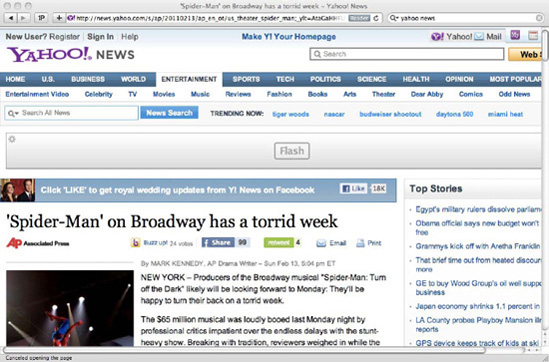
Figure 6-6 shows the same article, zoomed in one step with Zoom Text Only enabled:
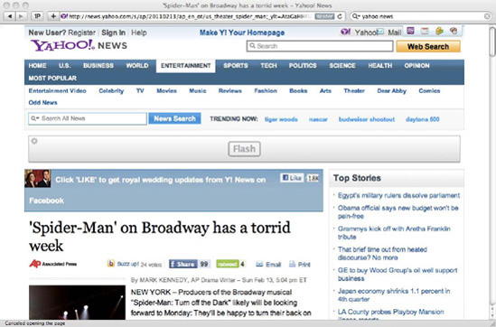
As you can see, the first method immediately introduced horizontal scrolling and began to crop content on the right side of the screen. The second method zoomed text by the same level, but maintained the layout, while also avoiding the pixelation of images. There is no problem if your users prefer to use the default method: they are used to it, and your website will likely behave exactly as everyone else's. However, if they choose to only zoom the text (or have a browser that only supports this method), you should cater for them. You can do this by making an effort to use relative font sizes.
Because an em is a unit that is dependent on font size, changing the font size on the page with Zoom Text Only will affect all the elements that are sized using ems, not just the text. When developing for IE 6, it may be tempting to size everything in ems so that IE 6 exhibits the same zooming behavior as other browsers' defaults (zooming the entire page). However, this choice would preclude users from only zooming the text and as such is an inaccessible technique.
For fixed-sized elements such as images, pixels are the most sensible option. Older browsers will fail to zoom them, and newer browsers will zoom them in proportion with the rest of the page. Either way, the images will become pixelated, but the text is usually the most important part of the content.
For liquid widths, or dimensions that depend upon the size of the viewport or their container, percentages are the most appropriate unit to use. These sizes can change dynamically as you resize the window or by other means modify the dimensions of the window or parent elements.
Users with learning disabilities such as dyslexia may find it easier to read text set in particular fonts. There is not a rule that can be followed that caters for every scenario, as some people prefer to read sans-serif fonts, others find it easier to read serif fonts, and some will even prefer specific fonts like Comic Sans. We do not recommend that you use Comic Sans across your websites, though, or even to restrict yourself to using just certain fonts that have been proved to be favored by many dyslexics. The important thing to retain here is that the more flexibly your websites are built, avoiding image replacement and trying to use plain text wherever possible (even if that sometimes means compromising the design at some levels) will make it a lot easier for users to browse your website the way they want to.
Tip
Remember that when users are visiting your website, on their computer, on their browser, on their time, your website is no longer for you—it is for them. It is running on their hardware, and they can do what they like with it.
Your website should pass the text increasing test. Increasing or reducing the text size by one or two sizes (or steps) should not be a problem for your layout.
A common issue with using font-face services (mentioned in greater detail in Chapter 5) is the Flash of Unstyled Text (FOUT) that the page suffers in some browsers from when the page hasn't yet loaded the embedded font to when it is fully loaded. For dyslexics, this behavior can render a page impossible to read as they favor consistency of layout, where the elements maintain the same position throughout all the pages of a website; sudden changes (like for example, a flashy hover behavior) make it hard for the user to follow and understand the content.
A simple way of trying to minimize this problem is to follow the recommendation mentioned in Chapter 5: make sure the fallback font that the browser will render before downloading the preferred font is as close in aspect ratio as possible to the embedded one. This will make the jump less obtrusive or (ideally) unnoticeable.
You can also use alternative style sheets (covered in the "Style Switchers" section later in this chapter) to disabled jarring animations or interaction behaviors.
User style sheets (mentioned in Chapter 3) can play an important role in aiding users with disabilities to adapt websites to their needs. Making sure your (author) style sheets lend themselves to be easily overridden (mainly by not having complicated and overly specific selectors and avoiding the !important keyword) will make these users' lives a lot easier.
Another thing you can do to make it easier for users to customize your site is to provide hooks, in the shape of body classes or IDs, that they can use on their style sheets. For example, if you add two classes to the body element of your pages (one that is site-wide and another that is page-specific), it will be a lot easier for the user to create rules that affect only your site or a specific page (or section) that they have particular problems with (or visit often).
Having a user create a user style sheet for your site does not mean you failed in making sure your website is accessible. It is impossible to cater for every possible scenario. Just make sure to have flexible enough CSS so as not to make this task harder for the user.
Alternate style sheets can be put in place with simple link tags. Three different types of style sheet exist: persistent, preferred, and alternate. Persistent style sheets simply use the link tag with a rel attribute of "stylesheet" and no title, like so:
<link rel="stylesheet" href="persistent.css" />
Persistent style sheets will not be replaced if the user selects an alternate style sheet. Preferred style sheets look the same, but with a title tag:
<link rel="stylesheet" href="preferred.css" title="Basic" />
You can group several preferred style sheets together by giving them the same title:
<link rel="stylesheet" href="preferred1.css" title="Basic" />
<link rel="stylesheet" href="preferred2.css" title="Basic" />
<link rel="stylesheet" href="preferred3.css" title="Basic" />
Alternate style sheets will entirely replace the preferred style sheets. These are included in exactly the same way as preferred style sheets, but with a rel attribute of "alternate stylesheet". Again, you can group multiple files by duplicating the title:
<link rel="alternate stylesheet" href="alternate1.css" title="Alternate" />
<link rel="alternate stylesheet" href="alternate2.css" title="Alternate" />
<link rel="alternate stylesheet" href="alternate3.css" title="Alternate" />
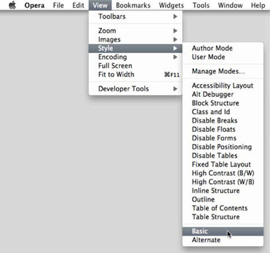
The user can then switch between style sheets in the browser (see Figures 6-7 and 6-8).

Unfortunately, there are two major caveats to this otherwise perfect technique:
Despite being around for more than ten years, browser support is still lacking for this feature. At the time of writing, Opera and Firefox were the only major browser vendors to support alternate style sheets.
Of these two browsers, neither saves the user's preference on a per-site basis; the user's choice does not persist.[48]
To offer genuine alternate style sheets' functionality and present it as part of your website's tools, allowing the user to choose, for example, a high-visibility color scheme, you need to write your own code. This entails JavaScript, but is fairly trivial to achieve.
Be aware, as always, that these style sheets will still download regardless of whether or not they are applied. As a result, apart from sites specifically targeted at users with impairments that alternate style sheets can help with, it is often better to simply ensure that it is easy for your users to override your styles via whatever means they think best.
WAI-ARIA stands for Web Accessibility Initiative-Accessible Rich Internet Applications. The goal of this specification is to make Web content and applications more accessible to users with disabilities. According to the W3C website (http://www.w3.org/WAI/intro/aria), "It especially helps with dynamic content and advanced user interface controls" that would otherwise not be available to those users. For example, with simple HTML, there is currently no consistent, reliable way to warn a user using a screen reader that an area of the page has been refreshed and its content updated.
Using ARIA, you can also mark areas of a page as sections so that users can tab between sections rather than through each different link.
ARIA adds support for the following:
Roles that describe the type of widget (for example, "
combobox") or the structure of the page (for example, "banner")Properties that describe states (for example, "
checked") or live regions that can suffer updatesKeyboard navigation for the widgets and events
A large obstacle currently between a wider implementation of ARIA is the lack of feature detection: there is no way of detecting ARIA support in the browser or assistive technologies.
Since WAI-ARIA is an HTML technology, we will not go into detail on it here. The WAI-ARIA specification is, at the time of writing, in the Candidate Recommendation stage and can be found at http://www.w3.org/TR/wai-aria/[49].
A type of impairment that is often overlooked is that of the device. The user may have a slow computer, no mouse, a slow Internet connection, a firewall that blocks certain types of content, and so on. A scenario that is more common than developers would like to assume is when users browse our websites with CSS on but images off. The main reason that this might happen is slow Internet connections. It might be a momentary problem, such as the connection being faulty before an external technician or the internal IT team resolves the problem, or the user might be accessing your website from a mobile device—a common scenario in developing countries, where Internet access tends to be slow and receiving data costly. Regardless of whether the situation is fleeting or more permanent, it happens, and visiting websites that are not ready for this, even at a basic level, is a frustrating experience.
Progressive enhancement (detailed in the next section) cures most of these problems, but is not a panacea. If you have built a website that looks good with just markup, you are most of the way there. If you then test with only CSS enabled, this will expose problems you might otherwise miss, like the lack of or inappropriate background colors under background images.[50]
In Chapter 8, we will demonstrate how you can intercept requests and modify them to, for example, emulate slow connections. Test everything as much as you can and aim for progressive enhancement, not graceful degradation. What are those? It's funny you should ask...
Progressive enhancement and graceful degradation are two ways of looking at the same problem: how to deal with browsers that don't support a feature we have made use of.
With progressive enhancement, you start from the lowest common denominator; you make the site work for everyone first. This means good semantics, sensible ordering of content, no CSS, no images, no JavaScript, and so on. Your markup should work well on its own. You then add the layers so that if for some reason one of the layers is to fail or be unsupported, the site content is still available in a sensible fashion. This is, obviously, an accessible approach—we are ensuring that we cater to the widest audience possible and leave no one out.
Graceful degradation is the opposite of this. We build all the layers at the same time, resulting in a great user experience for the majority, but not everyone. We then make sure that when it does fail, it does so in a reasonable fashion, and we still make our content accessible. This could mean building alternative versions of pages, or presenting warnings or guides on how to address any issues our users may come across. Some good examples of graceful degradation could be the alt attribute for images or noscript tags for browsers without JavaScript enabled. Graceful degradation is better than doing nothing, but implementing it means (in our opinion) that you have your priorities wrong. Often, the lower levels of potential failure are ignored, neglected, or forgotten about; and the costs of implementing them after the fact are greater. It also means we have already defined our top level—we started there and worked our way down, leaving ourselves little room to embrace newer technologies when they reach widespread acceptance.
Progressive enhancement, on the other hand, makes it impossible to leave our device-impaired users behind. Everything is built upon the lower levels, so they are key in reaching the full-featured website we hope most users will use. And since our top level is built upon a solid foundation, it is easy to bolt newer, cleverer things on at a later date and feel secure that we have not ostracized any of our existing user base.
The best example of progressive enhancement is CSS itself. It sits on top of our markup and improves upon it. We can further progressively enhance with CSS3 and experimental features, using media queries to ensure that we are not ruining the experience for everyone else. Then we can layer JavaScript on top of that, and so on.
Graceful degradation seems the fastest development option, and it is in the short term. We can quickly build the highest-level experience and work from there. However, it is adding the lower levels that soaks up time. Progressive enhancement takes more thought upfront, but makes for a more robust technical solution. However, exceptions exist. We understand that budgets are not infinite, and it may not always be in your organization's financial interests to try to serve everyone. In that instance, we suggest you do the best you can with the resources you have, using your reporting tools to target your most common user demographics. Furthermore, sites that are temporal (like a website for a short-lived promotion, or seasonal event) are unlikely to be online for long before being discarded forever. The return on investment (ROI) of progressive enhancement is likely to be low in this instance, and we do not recommend you invest too much time on something that will be thrown away. In that instance, graceful degradation (or, simply failing gracefully) might be a more viable option.
The Yahoo! Graded Browser Support (GBS) methodology (explained in more detailed in the next section of this chapter) favors progressive enhancement over graceful degradation because it "puts content at the center, and allows most browsers to receive more (and show more to the user)" as opposed to the latter, which "prioritizes presentation, and permits less widely-used browsers to receive less (and give less to the user)" (http://developer.yahoo.com/yui/articles/gbs/).
CSS3 is one the latest buzzwords in the web industry, alongside HTML5. This means many developers jump in without thinking of the potential consequences of their actions. There are some very obvious ways using CSS3 can lead to inaccessible websites:
Pseudo-elements such as
::beforeand::aftermay not be visible to assistive devices. Use them for decoration, not for important content.[51]Gradients can compound color visibility issues more than flat colors.
Using transitions, transformations, and animations for key features may make those features unavailable to users of browsers that don't support them.
The best way of dealing with these is to understand the potential issues that we have explained throughout this chapter. Remember to progressively enhance whenever possible and provide fallbacks for instances where these features may be unsupported. Be aware of the color accessibility issues some newer techniques might bring along with them, and try to provide alternate style sheets. Use transitions, transforms, and animations as decorative effects, not for vital features.
This is mainly common sense. Remember to test in older browsers, and pre-empt the problems users will have. Progressive enhancement is your friend.
In 2006, Yahoo! published its GBS methodology, developed by (at the time) Senior Front-end Engineer Nate Koechley. GBS divides browsers into three different levels (grades) of support: A-, C-, and X-grade. By support it is not meant that some browsers will be locked out of the content, but rather presented with a different experience of it, while still being able to access it fully. Let's look at what each of the different grades mean, in practical terms:
A-grade is the highest support level. Browsers within this group will be presented with the full experience—visual and functional—and are whitelisted. All A-grade browsers should be tested and any bugs are labeled as high priority. Browsers in this list include (among others): Safari 5; Chrome's latest stable release; Firefox 3.6; and IE 6 to 8.
C-grade browsers are presented with only the HTML. These are older browsers (which represent a very small portion of the users) with lesser capabilities. Style and behavior should be omitted, and only a small sample of the browsers should be tested (or using a modern browser with both CSS and JavaScript disabled), but bugs also receive high priority status. The websites in this level of support are blacklisted. This list (in draft at the time of writing) includes Internet Explorer versions lower than 6 (including Mac OS versions); Safari and Firefox versions lower than 3; Opera versions lower than 9.5; Netscape versions lower than 8. It is expected that in the first quarter of 2011, IE 6 will be downgraded to C-grade support level.
X-grade includes marginal browsers. These are rare or obscure browsers, browsers that are no longer being developed, or brand new (untested) browsers; they are to be as capable as A-grade browsers. As opposed to A-grade browsers, though, X-grade ones are not tested and bugs are not filed against them.
All browsers belong to one of the three levels of support, so there are no browsers that are "not supported" because content is available for all. The Yahoo! GBS page says that "in modern web development we must support all browsers. Choosing to exclude a segment of users is inappropriate, and, with a 'Graded Browser Support' strategy, unnecessary" (http://developer.yahoo.com/yui/articles/gbs/). It also says (and we agree) that "expecting two users using different browser software to have an identical experience fails to embrace or acknowledge the heterogeneous essence of the Web."
Tip
jQuery Mobile has its own GBS (http://jquerymobile.com/gbs/), which is a useful guide to the mobile browsers and their respective likely capabilities.
Although adopting the Yahoo! GBS verbatim is an easy and reasonable tactic for choosing which browsers you should support, it makes a lot more sense to use it as a base and refer to your reporting tools to ensure that the GBS matches well with your actual traffic. If it doesn't, amend it. When raising bugs within your organization, you should use your GBS chart to decide on the severity of your issues and thus how important it is that these bugs are fixed. Using a consistent method of raising bugs and measuring their severity will result in the most important bugs being fixed first, and each tester raising bugs in a more accurate and predictable fashion.
It is impossible to consider every single accessibility issue that your visitors might be suffering from, be it a temporary or permanent one. Because of this, you need to make your website flexible and prone to being adjusted and read by everyone—it is your website, but it is your visitor's browser, and he should have the final word.
It is important to not see this as a burden to your team. Also, you should not see this as a step in the development. Accessibility considerations should be present in your team's mind constantly and should always be a concern. By making your websites more accessible, you will be making sure that the largest number possible of people have access to your content and/or can buy your products without getting frustrated and moving on to your competitors.
These are simple techniques that will also make your website more flexible and easier to maintain (think of all the headaches using image replacement can bring, for example). As a result, you will also have websites that are more search engine-friendly.
The most vital thing to impart here is that every user, browser, or device should have access to your content and services, regardless of capability or environment.
In the next chapter, we will discuss the many devices available that can parse and render CSS. We will look at some of the restrictions and performance implications of coding for these, as well as how to target them with media types and media queries.
[36] It's not just a good, altruistic thing to do—it's also a profitable thing to do. The UK supermarket Tesco partnered with the Royal National Institute for the Blind (RNIB) to ensure that its website is accessible. This resulted in an extra £13 million a year in revenue that was simply not available before.
[37] Read what the RNIB has to say about fonts at http://www.rnib.org.uk/professionals/accessibleinformation/text/Pages/fonts.aspx.
[38] Fitts' Law (http://en.wikipedia.org/wiki/Fitts's_law) predicts that the time it takes to rapidly move to a target area and click it depends upon the distance to travel and the size of the target. Bigger targets make everyone more efficient.
[39] Websites should certainly not auto-play audio because this can be jarring and confusing to users.
[40] Web Video Text Tracks (WebVTT), previously known as WebSRT (based on the popular SRT (SubRip Text) format) is currently being implemented by several browsers, and so is currently the most likely proposal to be standardized. You can read about it at http://www.whatwg.org/specs/web-apps/currentwork/webvtt.html.
[41] For more statistics on browser usage, visit http://gs.statcounter.com/ or http://www.w3counter.com/globalstats.php.
[42] Canada has the "Common Look and Feel Standards" (http://www.tbs-sct.gc.ca/clf2-nsi2/), which must be followed by government institutions and include standards on web addresses, accessibility and usability, web page formats, and e-mail. The now extinct Swedish Administrative Development Agency published the "Swedish National Guidelines for Public Sector Websites" in 2006; the guidelines have been maintained privately and were translated into English in 2008 (http://www.eutveckling.se/sidor/english/). They cover areas such as usability, privacy issues and information architecture, as well as web standards.
[43] In 2006, the National Federation of the Blind filed a lawsuit against Target, one of the largest retail companies in the United States, for having barriers on its website that made it difficult for blind customers to use it. Target settled, in 2008, for 6 million dollars. Other examples include a blind man successfully suing the Sydney Olympics Organizing Committee in 2000, and a New York case against Ramada.com and Priceline.com.
[44] Some CSS authors will use a value like -10000em. We recommend -9999px since the screen estate is unlikely to be wider than that; ems incur calculations by the browser and thus an (admittedly tiny) performance hit, and it saves one character.
[45] And again, wasted link equity search engines would love.
[46] Although tempting to write "click here to read more...", you should avoid this kind of language since it is mouse-specific, and the user may be using a keyboard, touch interface, or other input device.
[47] Internet Explorer only supports the focus pseudo-class from version 8.
[48] There are Firefox extensions to add this functionality.
[49] You could use the attributes in WAI-ARIA for semantic styling hooks with the attribute selector. Bear in mind, though, that this is a slower selector and is not supported in all browsers.
[50] A side benefit of this is that when the images do load, it will seem less jarring to the user.
[51] Strictly speaking, these pseudo-elements were introduced in CSS2.1 as :before and :after.