
Every CSS author has his preferred way of writing code. For example, some people prefer to write each property and selector on a separate line, while others would rather have everything on one single line. Some authors never add a semicolon to the last property on a selector (because it isn't necessary); others prefer to remove the space between the colon and the value of a property. The list goes on.
These are just a few examples of how divergent CSS authoring can be from person to person—look into any CSS discussion forum and you will find endless ongoing debates on each of these topics, and many more. You will also probably come to the conclusion that no one is fully right or wrong—there are valid arguments on each side of the fence.
However, when dealing with large-scale style sheets—or style sheets that are to be applied to large-scale websites where performance and robustness are the most important factors—personal preferences usually have to be set aside to give way to a more flexible, coherent way of writing the code.
This approach will not be the most effective at the start (a newly hired developer will have to adapt to the conventions used in the organization, so he won't be able to immediately start coding without becoming familiar with them), but it will make it easier for staff to edit and update style sheets created by other developers without having to take the time to understand (sometimes the correct word would be "decipher") and become familiar with someone else's CSS writing style.
Having a set of conventions in place will also make it easier for authors to know which path to take. Even though there is always a degree of subjectivity when creating CSS solutions, if a CSS style guide is in place, many of the doubts will become non-existent since there are "rules" to be followed. It also becomes easier to detect errors, typos, and mistakes.
This chapter focuses on the most important points where CSS authoring can be made more consistent and efficient. You will learn the following:
Why you should have a CSS style guide in place
Effective ways of formatting CSS
How to use CSS comments in a useful way
Best practices on ID and class naming
Namespacing
If you are producing a CSS style guide (as we recommend) that will be known and used by all the members of the team, it can and should include a reference to how CSS is formatted. This will make reading style sheets created by others easier and it will remove part of the subjectivity that is common among CSS authors when creating or editing the files. It should also indicate how comments should be made and encourage the use of them.
Creating and implementing a CSS style guide will remove some of the inconsistency that is often related to coding CSS, where different developers have different coding styles that can sometimes be extremely difficult for other people to read and understand. This slows down the development process and promotes errors, redundancy, and code bloat. A style guide is an instrumental tool to avoid this, allowing for code reusability and efficiency through consistency, for a streamlined team environment for developing high-traffic sites.
Companies such as the BBC (see Figure 2-1) or Drupal (see Figure 2-2) have CSS style guides in place that are publicly available and act as good references for anyone who is creating one.

Figure 2-1. BBC Cascading Style Sheets Standards & Guidelines (www.bbc.co.uk/guidelines/futuremedia/technical/css.shtml)

One thing that is important to remember, however, is that a guide is exactly that, just a guide. The developers will always have to make most of the decisions for themselves, even with a guide in place. A style guide should not strive to remove subjectivity completely, as that will never happen, and should allow for a certain degree of flexibility and freedom.
In the following sections of this chapter, we will cover some of the aspects that a CSS style guide should refer to. You can find an example of a complete CSS style guide at the end of this book, in Appendix 1.
CSS is a language that (like HTML) is loosely formatted, in that whitespace is generally ignored when it is parsed so you can use as many spaces, tabs, or returns as you like in order to format it in the way you find easiest to read and write. Because of this, it lends itself to being formatted in multiple ways.
Even though there are similarities between writing styles, there are so many variations on the small details that it is hard to present a definitive solution that everyone will agree is the best.
What we can do is show you the most common options, and why some are better or more efficient than others. After all, efficiency is what we all want to achieve by reading this book, right?
If there is one CSS discussion that usually leads to no useful conclusion it is the one about different styles of CSS formatting. The fence tends to divide those who prefer to write their rules on one single line from those who prefer to declare each individual property on its own line.
This is an example of single-line CSS, where selector, properties, and values are on the same line:
div { width: 200px; height: 300px; padding: 20px; background: #efefef; }And here is a multiline version:
div {
width: 200px;
height: 300px;
padding: 20px;
background: #efefef;
}The main arguments for the multiline method are as follows:
It is easier to read, especially if you're not familiar with the file.
It is easier to make file comparisons (using Diff tools, mentioned in greater detail in Chapter 1).
There is no horizontal scrolling.
Single-line CSS also has its advantages:
Fewer lines in the document
Selectors are easier to scan
Reduced file size
For the sake of consistency, this book will use the multiline method. The reasoning behind this choice is the following:
It is easier to annotate changes and comments.
It is the easier format to read for smaller files.
We assume that CSS files will end up being minified or compressed at a later stage of development (more on CSS minifying and compression in Chapter 8).
Even though this doesn't mean we believe this to be the absolute best CSS formatting style, we agree that it is the one that provides a clearer way to read the selectors and properties. It is also easier to comment on specific properties and values, which is an important factor when dealing with CSS files that are shared between many hands, and most developers are more comfortable with multiline CSS than with its single-line version.
One of the main arguments in favor of multiline CSS is that single-line CSS makes using Diff tools more difficult because in some cases these tools indicate differences between file versions per line (see Figure 2-3). Alternatively, if they locate the actual difference, it may be toward the end of a long line, requiring horizontal scrolling.
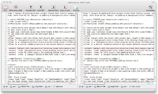
Figure 2-3. In this example, in the Changes app, although the line is highlighted we cannot see the actual difference.
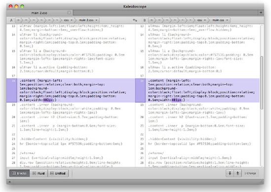
Good Diff tools will highlight differences, no matter how the file is formatted (see Figure 2-4); the formatting debate should be virtually a non-issue when it comes to file comparison. It is true that at a glance, it may be more difficult to spot these differences if they are offscreen, but this issue is not so big that you should change your practices. If it is really causing you problems, you may find a different Diff tool may help.
Indentation in CSS files can improve their legibility and also aid understanding of the structure of the HTML documents being styled.
Properties can be indented within the selector itself, making it easier to scan only the selectors on the style sheet, as in the following example:
section {
   width: 400px;
   font-size: 14px;
   float: left;
}

footer {
   border-top: 1px solid #000000;
   font-size: 12px;
   clear: both;
}
Some authors choose to indent selectors according to the document tree of the HTML file the style sheet is being applied to:
section {
   width: 800px;
}

   section article {
      border-bottom: 1px solid #999999;
      padding-bottom: 10px;
   }

      section article footer {
         font-size: 11px;
         font-style: italic;
      }
Even though the structure of the document becomes a lot clearer using this formatting method, it can easily become too complicated or subjective, and where the markup is complex, your rules may begin disappearing off the right side of the page. We recommend that if you feel this would be a nice addition to your style sheets, use it within the section where you specify the main dividing blocks of your document tree, and don't try to replicate it in other sections such as links or typography.
The tabs-versus-spaces argument is far older than CSS development, and not something likely to be resolved in this book. We can however, explain the advantages and disadvantages of each.
When indenting your code, you have the choice of using tabs or a predefined amount of spaces to act as a single level of indentation. Most text editors give you the choice of converting tabs to a certain amount of spaces when you save a document (soft tabs) or representing tabs with different widths. Some people like their indentation to be represented by two spaces, some like four, and some have even more complicated personal rules than these.
The benefits of using tabs are as follows:
A single character takes up less file space than several spaces.
It is usually possible to control the width of a single tab within your text editor (so developers can choose how it displays visually).
If you are not using a monospaced font, your code will still be indented correctly.
The benefits of using spaces include the following:
Your indentations will be the same width regardless of which editor you are using.
Spaces can be relied upon to always appear in the same place, whereas tab stops may change from editor to editor.
Spaces are consistent between environments.
The conclusions we will offer (which are highly subjective) are these:
If you and your team disagree (it seems to be a one-in-two chance that you will), this is not a problem. The goal is that every member of your team does the same thing, whether it is spaces or tabs. Consistency is always our primary concern.
In the quest for smaller file sizes, some authors choose to omit the semicolon that follows the last property in a CSS rule. So instead of this:
img {
    border: 2px solid red;
    float: left;
}
We would have this:
img {
    border: 2px solid red;
    float: left
}
In fact, if file size is a major concern, we can also omit the spaces between the selector and the braces between the colons and the values of each property, as well as the final space, right after the last property value—it would still work, albeit rendering it a lot harder to read:
img{border:2px solid red;float:left}When going to these extremes, however, we are approaching the effects of what minifying does to a CSS document.
When working on large-scale websites, performance is a constant concern; compressing and minifying your CSS so that it has the lowest file size possible should always be a step in the development process. (You can read more about minifying in Chapter 8.) What we are referring to in this section is how a CSS file is formatted while it is still being edited, when file size is not a concern, at least at the level of whether to add the last semicolon or whether to have a space after the colons.
As before, whatever you decide needs to be adhered to by your team. Assuming the files will be minified, when you are working on the files you should care primarily about their legibility and whatever works best for the team.
CSS comments are often forgotten or overlooked by authors, but they can be very useful if they are consistent and kept up to date.
Here's a quick reminder of how a simple CSS comment looks:
/* This is a CSS comment */
Note
You may notice this is the same as a block comment in JavaScript and many other languages. Unfortunately, CSS does not support single-line comments like the following:
//This is a CSS comment
But there are some options such as LESS (Leaner CSS) that can enable this for you (see Chapter 9).
A comment can be added inline to comment on a particular property for example:
.myClass {
    color: red; /* Same color as logo */
}
Or on a separate line, for example, to separate selectors into meaningful sections:
/* Table headings */

thead th {
        font-weight: bold;
}
tbody th {
        font-weight: normal;
}

/* Table rows */

.odd {
        color: red;
}
.even {
        color: blue;
}
CSS comments can span as many lines as you like. Comments tend to be the first thing to be stripped out of CSS files when they are minified (we talk about minifying in more detail in Chapter 8), but there are a number of different ways in which they can be useful during the development stage.
There have been some attempts to create CSS documenting standards. One example is CSSDOC, an adaptation of Javadoc (a documentation generator that extracts comments from Java source code into HTML).
CSSDOC uses DocBlocks, a term borrowed from the PHPDocumentor Project. A DocBlock is a human and machine readable block of data, and has the following structure:
/**
 * Short description
 *
 * Long description (this can have multiple lines and contain <p> tags
 *
 * @tags (optional)
 */
A DocBlock begins with /** and ends with a space followed by */ (like a normal CSS comment). Each line must start with a space followed by an asterisk (*), or else it will be ignored by the documentation generator. Tags start with an asterisk and then their name (with no spaces). The tags can contain information such as @author, @copyright, @todo, and so on. Their description or value should be preceded by a space, right after the tag name.
The CSSDOC standard suggests that a CSS file should include a file comment at the top of the file, which should contain metadata relevant to the whole file. This file comment should include information such as the title of the document; a description; and tags such as @project, @version, @author, @copyright, or even @colordef tags, indicating which colors are used within the file.
The file comment can be followed by zero or more section comments that divide the style sheet into relevant blocks. Hacks and bug fixes should be placed at the end of each section. Section comments include the tag @section, as such:
/**
 * Typography
 *
 * @section typography
 */
Some text editors, such as Textmate or CSSEdit, support the @group tag within normal CSS comments to divide the CSS files into sections. CSSEdit uses these groups to create the visual outline of the document; Textmate requires a bundle for this setting to work (there are a few available). The @group tag hasn't been incorporated into the CSSDOC specification, although the latest draft makes mention of it. It allows CSS authors to group selectors into meaningful sections that can be folded and expanded as needed, making it easier to scan and work with long CSS files. There are separate bundles available for Textmate to add CSSDOC functionality.[11]
There is a lot more to the CSSDOC standard (enough to fill an entire chapter), so we recommend taking a look at the official page, http://cssdoc.net, for more in-depth information.
Having a standard in place not only makes sharing code with other CSS authors simpler but also makes it easier to extract the comments from a CSS file in an automated fashion, for documentation purposes.
In this section, we will refer to and borrow some of the guidelines included in the CSSDOC documentation, mainly because they denote a view forward into the standardization of CSS comments, which would be beneficial to everyone writing CSS. We believe, however, that there are some instances where CSS metadata should live outside of the files themselves (such as versioning and authorship) and maintaining such comments can easily become a laborious task rather than an effective one. As soon as the comments become outdated, they quickly lose their value.
The most common use of CSS comments is for author information and creation and last update dates. Frequently, CSS files have a comment like this one at the beginning:
/* CSS file, created by John Doe, http://domain.com, on 12.28.2009 */
Others go to the trouble of adding more information, such as who the last person to update the file was, and when:
/* CSS file, created by John Doe, http://domain.com, on 12.28.2009
Last update by: Jane Doe, on 5.19.2010 */
Although we believe that some of this data is better stored within a version control system which generates it automatically—CSS authors will frequently forget to update it, which renders the data pointless—there is some information pertinent to the style sheet that should probably live in it and be easily reachable.
This is a good time to mention any dependencies that the file may have—for example, whether it is using a master reset file (CSS reset files are mentioned in greater depth in Chapter 4) or any other imported style sheets. It can also state for which site, subsite, or page the file was created, and whether it is overriding other style sheets. If needed, there could also be a reference to namespacing implementations relevant to that particular file.
Here is an example that contains all of these:
/*

Style sheet for: Igloo Refrigerator Parts Inc Christmas website

Created by John Doe, http://domain.com, on 12.28.2009

Importing reset file: /css/resets/master.css

Overriding: /css/base.css

Namespacing: use the "xmas" prefix for all the classes and IDs referenced in this file. For example: .xmasLatestNews or #xmasLatestNews

*/
If you were using CSSDOC type comments, the file info area (or file comment) would look something like the following (all the descriptions and tags are optional):
/**
 * Christmas theme
 *
 * CSS theme for the Christmas version of the Igloo Refrigerator Parts Inc website
 *
 * This theme has been developed by the Design Team at IRP Inc and should be used between
 * the dates of November 7th and January 7th
 *
* @project    IRP Christmas Site
 * @author     Design Team at IRP Inc
 * @copyright  2010 Igloo Refrigerator Parts Inc
 * @cssdoc     version 1.0-pre
 */
These are examples of pieces of data that would be useful for a developer to have at hand to avoid having to delve into a version control system to access them. Depending on the type of content the style sheet is being applied to, many other details could be added.
The main concern here is that this information must stay relevant and up to date—it must not be easy to neglect because that would defeat the purpose of this comment block.
Comments can be used to insert a table of contents at the beginning of a style sheet. This is useful since it will remove the need to scroll through a CSS file (which can easily have thousands of lines) to find out what it contains and where to find specific information.
A table of contents can be as simple as the following:
/* Table of contents:

1. Reusable classes
2. Structural elements
3. Colors and typography
4. Visual media
5. Widgets

*/
Or it can be as detailed as the following:
/* Table of contents:

Imports
Reusable classes
Structure
Navigation
Links
Typography
   Headings
   Body text
   Blockquotes
Lists
   Generic
   Definition lists
Forms
Images
Sidebars
Footers
Homepage

Widgets

*/
Whichever format you choose for the table of contents, it is important that it is constantly updated to always reflect the structure of the style sheet.
Some CSS editors create a visual table of contents automatically, like, for example, MacRabbit's popular CSSEdit (see Figure 2-5).

Figure 2-5. CSSEdit creates an automatic outline of the CSS file on the left (http://macrabbit.com/cssedit/)
However, if the software isn't available or the developer prefers to use some other tool, it is always helpful to include a manually updated table of contents (even if succinct) at the top of the CSS file.
A table of contents only makes sense when the style sheet is actually divided into sections.
When creating sections in a CSS file, you will probably want to make them easily recognizable among the rest of the code. Something like the following division will not be very distinctive:
.myClassA {
   font-size: 14px;
}

.myClassB {
   font-size: 18px;
}

.myClassC {
   font-size: 24px;
}

/* Colors */

.error {
   color: red;
}

.success {
   color: green;
}
If you, instead, use something like this:
.myClassA {
   font-size: 14px;
}

.myClassB {
   font-size: 18px;
}

.myClassC {
   font-size: 24px;
}

/* Colors
-------------------------------------------------------- */

.error {
   color: red;
}

.success {
   color: green;
}
the division will be a lot easier to find.
In his excellent CSS Mastery,[12] Andy Budd proposes that sections should also be easily searchable. If we name a section Headings and, in the same file, we have classes named sidebarHeadings or footerHeadings, when using the built-in software search tools we may have to go through several nonrelevant results to get to the section title we want. If instead we add a character before the section title that will not be used in the rest of the style sheet, the search process will be easier. Andy suggests the equals sign:
/* =Headings */
If you search for "=Head", the software will probably only produce one result.
If you are using CSSDOC comments, a section division could be formatted as follows:
/**
 * Typography [optional]
 *
 * Description [optional]
 *
 * @section typography
 */
Regardless of the style you choose to go with, it is important that the section titles are distinctive and, most of all, that they divide the style sheet into logical blocks. They should make it easier, not harder, to navigate through a document; therefore, the sections created should be intuitive, even if they follow an established convention within the organization.
When separating a style sheet into sections, it is also a good idea to make sure that elements that are recurrent on every page are separated from those that are page-specific.
This will make it easier when looking for redundant or unnecessary selectors—by keeping them isolated, it is easier to comment them out when testing or removing them completely (perhaps moving them to a separate style sheet).
You might also consider separating sections of CSS that are always in use and those that are interaction-dependent. For example, the main heading will always show on the page, but an error message might show only in certain situations. Making this clear makes it easier to locate obsolete legacy code at a later date.
Another useful piece of information to have at the top of a CSS document is a reference to the colors used throughout the site.
One common slip of CSS authors is to use colors that are only approximate to the ones that should be used. This might be because there isn't an established branding guide, or when there is it's not at hand, or there simply isn't enough time to consult one. Colors end up being selected using tools like Firebug, xScope, or Photoshop, which can result in mere approximations (especially if the CSS developers are provided jpegs at less than 100% quality, as often happens), leading to dozens of similar but different colors used throughout one single style sheet. Although the performance implications for getting the colors wrong are small, over time the colors can get farther and farther from their original values. Depending on the placement and use of colors, and the end user's monitor and display settings, these mistakes may become more obvious. Also, if you use consistent colors, the file size is likely to be smaller when compressed due to the repeating text patterns enabling more efficient compression.
If a color reference is added to the CSS file, these misinterpretations can be avoided. This can easily be done using a comment at the top of the style sheet:
/* Color reference:

Main text      #111111
Headings       #999999
:link          #9f0000
:visited       #720000
:hover,
:active,
:focus         #004899
...

*/
The color reference can, and should, be more detailed than the preceding example. It can contain background and border colors, more detailed typographic colors, different types of link colors, colors according to site sections, and so on.
One important thing to remember is that the description of each element or group of elements should be fundamentally immutable. If instead of "Main text" we had used "Dark grey text," the purpose of the reference table would have been lost.
This doesn't mean that such references shouldn't be specified—there is certainly a place for stating the appropriate red or pink that the website should use. But they may be seen more as a secondary element within the Color Reference rather than one of the main structural or typographical ones.
Using dynamic CSS (which is explained in greater detail in Chapter 9) can also reduce the need for constantly referring to a Color Reference table.
For example, when using LESS, you can declare variables at the top of the style sheet that can resemble something like this:
@mainText:   #111111;
@headings:   #999999;
@links:      #9f0000;
This will allow you to refer to the variable instead of the actual color value throughout the CSS file, making it also easier to change the color—you only need to do it once, where the variable is initially declared, and it will change all instances of the color like this one:
body {
   color: @mainText;
}
When using CSSDOC-type comments, the color information is added to the file comment at the top of the CSS file, using the @colordef tags:
/**
 * Christmas theme
 *
 * CSS theme for the Christmas version of the Igloo Refrigerator Parts Inc website
 *
 * This theme has been developed by the Design Team at IRP Inc and should be used between
* the dates of November 7th and January 7th * * @project IRP Christmas Site * @author Design Team at IRP Inc * @copyright 2010 Igloo Refrigerator Parts Inc * @cssdoc version 1.0-pre ** @colordef #111111; main text* @colordef #999999; headings* @colordef #9f0000; links*/
Comments can be used to explain folder paths. What does this mean exactly?
Although we recommend having a clear and practical folder structure (this book goes into more detail about folder structures in Chapter 8), there is often the need to go several levels deep—for example, to keep images better organized. When this happens, it is useful to refer to these paths within the style sheets where these files will be referenced, mainly as a way to avoid mistakes from developers who haven't initially written that particular part of the CSS.
These comments at the top of the CSS document can be as simple as the following:
/* Branding elements are located in the Assets/Branding folder at the root of the main website */
Just remember to keep them concise and up to date; otherwise, they won't be useful.
When creating complex CSS layouts, calculations are inevitable.
Let's picture a fluid layout with two columns (see Figure 2-6). The main content column should have a variable width, according to the size of the user's screen; the sidebar should be 200 pixels wide; we also want 20 pixels separating both columns vertically.

Figure 2-6. A simple two-column fluid layout: the sidebar has a fixed width; the main content area has a variable width.
Our CSS may look similar to the following:
#main {
   margin-left: 220px;
}

aside {
   width: 200px;
   float: left;
}
Someone who updates the CSS after the initial measurements have been calculated may find it hard to understand some of the values used.
Using comments, we can write a better, documented solution:
#main {
   margin-left: 220px; /* aside width + 20px of margin */
}
aside {
width: 200px;
float: left;
}Measurement comments are also useful on typographic calculations.
Imagine that you have a page with the text set to 14 pixels, with a line-height of 1.5. This means each line on the page has a height of 21 pixels: 14 × 1.5.
If the headings on this page are set to 18 pixels, to keep the vertical rhythm of the page intact, we need to grab our calculators and do some math—we need to find the adjusted line-height for the headings. This thought process is a good candidate for a CSS comment:
h2 {
   font-size: 18px;
   line-height: 1.167; /* 21 (original line-height) / 18 (h2 font-size) */
}
Even though someone not familiar with typographical concepts might not fully understand the need for this calculation, showing the steps that were taken to reach this particular value is invaluable to avoid future mistakes.[13] Using a CSS pre-processor like those described in Chapter 9, you could use variables and equations to calculate this values on your behalf.
Note
This is not a typography book, so we are not going into too much detail about how vertical spacing works or should be calculated. For a great introduction to typography on the Web, read Richard Rutter's "Elements of Typographic Style Applied to the Web", Section 2.2.2 http://webtypography.net/Rhythm_and_Proportion/Vertical_Motion/2.2.2/.
Hacks and bug fix documentation are some of the most important uses of CSS comments.
Often a CSS author will be working on a particular style sheet and come across a solution that either someone else created or wrote some time ago that doesn't seem clear or even right. Perhaps a simpler solution could have been used, a solution that wouldn't make the CSS file invalid, or maybe there wasn't a problem to begin with.
What usually happens is that even though the code is not the cleanest, it was probably the best solution that the previous developer could write, taking into account time and budget constraints, browser support, and other factors that may have influenced the decision process.
Comments come in handy in these situations. They can, for example, refer to a specific article on the Web that explains the solution taken or that documents the bug further:
aside section {
   float: left;
width: 50%; display: inline; /* display: inline; fixes the Double Float Margin bug on IE5/6. More on this bug/solution: http://www.positioniseverything.net/explorer/doubled-margin.html */ }
This type of documenting comment should explain briefly what the bug is (if it is a well-known and documented bug, using the most common name for it), the solution taken (providing a link where this is explained further, if one exists), and the consequences of editing or deleting that particular hack.
When using the CSSDOC convention, hacks and workarounds should be commented as such:
/**
 * Name of the bug
 *
 * @workaround [or @bugfix]
 * @affected   IE6
 * @valid      yes [or no]
 * @see        [include, for example, a link to an online article describing the bug]
 */
Documenting CSS hacks and bugs may seem cumbersome, especially when dealing with well-known and well-documented Internet Explorer bugs, but we must remember that even though some of us are familiar with them and their solutions, many developers are not. Taking the defensive approach toward our code is usually the best option.
Having a CSS style guide that developers can refer to is useful and advisable, but it is also recommended that they are provided with an actual bare-bones structure version of the CSS that will make it easier to understand how the file or files should be organized, and which comment conventions are being used within the organization or the team.
In this template, you should include the following:
Document information section, including file dependencies, overrides, namespacing conventions, and so on
Table of contents, containing the most common sections
Color palette, which can be prefilled with the branding colors or just include an example of how it should be populated
Sections such as "Reusable classes," "Structure," "Typography," and so on.
As mentioned previously, information such as the last person to edit the file and when should be relegated to more suitable and reliable methods, such as the version control system to automate the process and avoid duplication of effort. Developers should be encouraged to update any relevant sections as they edit these files.
Without going into too much detail about what classes and IDs are (we assume you are at least familiar with the most basic concepts of CSS), we will briefly explain the difference between the two.
Classes and IDs are methods of providing hooks into your HTML—that is, ways to isolate and reference particular elements. Take the following HTML snippet as an example:
<ul>
<li>Home</li>
<li>Contact Us</li>
<li>Search</li>
</ul>
There is no simple way to reference the Contact Us list item. We could use an nth-child selector to target the second child of the unordered list element:
ul li:nth-child(2) {
        ...
}
But that means that if we ever added any list items before that one our CSS would fail to reference it immediately (this is an example of fragile CSS, which is covered in Chapter 4). This selector also has incomplete browser support in the browsers we are likely to intend to cater for. By adding an ID, like so:
<ul>
<li>Home</li>
<li id="contactLink">Contact Us</li>
<li>Search</li>
</ul>
We can now easily target this element via CSS like this:
#contactLink {
    ...
}
An ID is a unique identifier. This means that in any one page, it can occur only once. Each page—from our HTML's perspective—is a distinct entity. So, we can reuse IDs throughout our site as much as we like. Using an ID more than once on the same page will cause unpredictable results: Only the first item may be targeted, or only the last, or all of them, or none at all. It will also render our HTML invalid (which can make debugging and parsing more difficult and affect our search engine ranking). An element can only ever have a maximum of one ID.
So what do we do if we want to target multiple items? This is exactly what classes are for. In the previous example, if we wanted to target all list items except the Home item, we could modify the HTML like so:
<ul>
<li>Home</li>
<li id="contactLink" class="nonHomeLink ">Contact Us</li>
<li class="nonHomeLink">Search</li>
</ul>
We can now easily target both of these list items:
.nonHomeLink {
    ...
}
Elements can have as many classes as you like, and if you use more than one, they should be separated with spaces. If we want to target elements with multiple classes and make each of those classes obligatory, we can chain classes together like this:
.warning.error {
    ...
}
This will target any element with a class of "warning" and a class of "error." Be aware, however, that Internet Explorer (IE) 6 and earlier versions don't understand selectors that use multiple classes. In the preceding example, IE 6 and 5 will only read the last class, "error", which is likely to cause many a headache. The easiest way to avoid problems is to steer clear from using chained classes in selectors but rather declare each class separately, making sure they complement each other. IE 6 will interpret HTML with multiple classes defined correctly, but not the multiple class selector.
Although the exact way in which you name the classes and IDs of your elements is not desperately important, there are several things that you should bear in mind:
Semantics
Accepted characters
Convention
Consistency
The way in which you name the hooks for your CSS should be semantic and descriptive of the content, not descriptive of the presentation. Here are some examples of bad ID and class names:
PurpleBold
BigHeading
top_left_box
underlined-and-green
Much more appropriate are the following:
mainNavigationItem
errorMessage
externalLink
sideContent
The W3C website has a page on this subject, where it explains that "Often people use class names like bluetext, or redborder. A much better way to name your classes is with the role a certain HTML element of that class has." You can read more about this at www.w3.org/QA/Tips/goodclassnames.
Using nonpresentational class and ID names will make them reusable and adaptable to change. For example, if your footer has a purple background color, and the container has a class name of "purple," what happens when the branding is updated and the new company logo is orange? The class name "purple" becomes obsolete and incoherent—the logo is orange!
This is why it is important to choose class and ID names that tie in with the content, so, instead of naming the sidebar as "boxLeft," it should be named "sidebar"—you don't know if next week it will be moved to the right. Or instead of naming a red warning box "red," it is wiser to call it "warning," so the name still makes sense if someday it is changed to yellow.
However, there might be instances where using presentational class names is a more flexible option than using structural ones. For example, if in more than one instance on the website a certain type of container box is used (like a container with a border), using a presentational name such as "bordered" might be the most clever solution, making it reusable and not tying that particular container style to a certain content type (creating redundancy and making the file larger).
We are not encouraging the use of presentational class and ID names everywhere on your CSS files, though—sometimes the best solution is just not the cleanest or prettiest one, and we need to shift to a more versatile frame of mind.
The W3C specifies which characters and combinations are valid for classes and IDs at www.w3.org/TR/CSS21/grammar.html#scanner. In essence, a class name or ID must start with an underscore, hyphen, or letter. The second character can be an underscore or letter, and it can be followed by any number of underscores, hyphens, letters, or numbers. You are also able to include escaped Unicode characters.
However, certain characters and combinations should be avoided when using class and ID names. Some of these include:
Underscores: At one point, underscores were legal in HTML attributes according to the HTML standards, but not according to the CSS standard. There were various methods implemented to escape underscores in some browsers with various levels of success. Some older browsers (including Netscape 4.x and Opera 3.5x) misunderstand underscores in class or ID names, so although it is very unlikely that you support these browsers, it seems good practice to avoid using these characters.
Forward or backward slashes: These are not accepted characters.
Asterisks: These are not accepted characters.
Beginning class or ID names with numeric characters: some browsers will accept these, but many will not.
Beginning class names or IDs with hyphens: some browsers will accept these, but many will not.
There are ways that these characters can be escaped; for example:
"To make ".55ft" a valid class, CSS2 requires the first digit to be escaped (".35 5ft")"
www.w3.org/TR/CSS2/grammar.html
This is nontrivial and as an edge case is likely to be interpreted incorrectly by different browsers. It is best to simply avoid these characters instead. You should also remember that ID and class names are case-sensitive.
As you can see, the support for more obscure characters varies, and bugs in newer browsers may occur if you choose to use characters or naming conventions that fall outside of the simplest rules and are less likely to have been well tested. The best rule to obey is to always use only alphanumeric characters or hyphens, and to only begin the class or ID name with an alphabetic character. You should avoid any accented or Unicode characters. You can safely use hyphens, but these seem a waste of a single character, which is significant when you are considering large enough amounts of bandwidth—although they do make for more legible values.
Even though there are no rules as to what we should name our classes and IDs, some conventions are now fairly established and it's common to find naming practices that are ubiquitous.
These are examples of some of the classes and IDs that you might see in most style sheets:
.header/#header
.footer/#footer
.sidebar/#sidebar
.nav/#nav
The ubiquity of these names made them the obvious choices (with some variations) when developing the new HTML 5 elements: header, footer, aside, nav. In fact, authors who decide not to jump onto HTML5 right now are encouraged to use the new element names as the class or ID name of more established elements instead, such as div or ul.
There are numerous class and ID names that are understood by anyone, even if not familiar with the specific style sheet at hand. Some examples are header, nav (or navigation), sidebar (or aside, secondaryContent), footer, main, wrapper, content (or main, mainContent), col (or column), submit, error, warning, post, and actions.
When possible, we recommend that these easily understandable names are used, instead of more obscure ones. This will make the code more predictable and therefore easier to understand for anyone who hasn't created the initial naming.
Within the organization, other naming conventions might be in place that aren't known outside of it. For example, when namespacing CSS selectors (more on namespacing later on in this chapter), there should be an internal convention in place, so that it doesn't fall into each CSS author's personal preference.
A combination of sensible naming and clearly defined internal guidelines should produce class and ID names that are consistent and intuitive.
Further than that, using predictable class names and IDs can aid some screen readers or parsers, and improve SEO. Microformats are a set of standardized specifications to describe things like people, calendars, product reviews and more. Using these will help search engines understand your content and present these in a more attractive fashion in search results as well as numerous other benefits. Read more about microformats at http://microformats.org/.
The result of using semantic class names/IDs and adhering to our list of accepted characters still results in a large pool of potential acceptable classes and IDs that we can use for our elements. All the following are completely valid class names:
MAIN-CONTENT
heroimage
PrimaryNavigation
The most important thing here is that we are consistent and record what we expect our developers to use as their ID or class names as reference. Where possible, it makes sense to try not to string words together for simplicity's sake. However, when this is not possible there are two popular schools of thought on which way you should name your classes and IDs.
A popular naming convention is called camel case. Camel case is the practice of always beginning a name with a lowercase character, removing all spaces and punctuation, and making every consecutive word begin with a capital letter. For example:
mainContent
heroImage
primaryNavigation
When using acronyms, you should group them together in the same case. If at the beginning of the name, make them all lowercase; otherwise, make them all uppercase as in the following examples:
pdfLink
linkToPDF
Note
JavaScript is actually internally inconsistent in how it uses camel case. A commonly used method is getElementById(), and a commonly used property is innerHTML. We would suggest the method we have used is the more legible, but as always, choose your preferred method and be consistent.
Camel case is a well-understood term in the IT industry, adds no unnecessary characters, and doesn't interfere with semantics. Most importantly, new developers are likely to already know it, and it is easy to explain succinctly. By not using any other characters, we can use those characters as clear separators for namespaces (see later in this chapter) and save the amount of characters in use.
There are pitfalls to using camel case. If the developers are not also JavaScript developers, they may not be used to this method and might find it hard to read or scan without some kind of delimiter. CSS is a hyphenated syntax (background-color, border-radius, and so on), and many feel more comfortable using just one syntax, although yet others find the visual distinction useful. Some also feel that HTML is typically a lowercase language and that in camel case it is easier to make mistakes by mismatching cases. Class and ID names are case-sensitive, so saying "mainContent" is not the same as "maincontent," and it is easier to always stick to lowercase. Hyphenated classes and IDs look like this:
main-content
hero-image
primary-navigation
This convention is easier to read and has other performance benefits too. Sticking to lowercase characters reduces your character set and is likely to increase repetitive patterns, which will make your compression algorithms more effective. However, the hyphenation adds extra characters and leaves less horizontal space when viewing the files in an editor.
The important thing to have in mind when deciding which convention to adhere to is that the most valuable outcome of having one in place is that it ensures and promotes consistency, making it easier for developers to come up with new names that will be understood by everyone else. We will use camel case for our examples within this book, but you should use whichever you feel is more appropriate.
Namespacing is one of the techniques of defensive CSS. By isolating parts of the code, we are making best endeavors to be sure that they won't affect in any way existing and future code developed by ourselves or others, or be affected by code written in the future.
Let's look at an example. Imagine that there is a sidebar widget that lists recent posts from your company's blog. This widget can be inserted in any of the company's sites or minisites, or even in external sites (you may encourage company employees to add it to personal blogs or suppliers to add it to their corporate sites). When creating the CSS for this widget, and its classes and IDs, the final result could be something like this:
<section class="blog">

   <h1>Latest posts from the company blog</h1>

   <ul>
      <li><a href="/blog/post1.html">Great news for all the shareholders</a></li>
      <li><a href="/blog/post2.html">Christmas party venue confirmed</a></li>
   </ul>

   <p class="feedLink"><a href="/blog/feed.xml">Subscribe to the RSS feed</a></p>

</section>
This all looks well and good, but what happens if the code is injected in a page where there is another class named "blog" (which doesn't sound completely unlikely)? The code is asking for trouble.
The purpose of namespacing in CSS is to avoid these class and ID conflicts. By adding prefixes to the classes and IDs, we are separating them from the rest of the existing and coming ones that could otherwise interfere with our code (or be affected by it).
In the preceding case, we could instead have the following, where the prefix "irpb-" would stand for Igloo Refrigerator Parts Blog (the name of our fictitious organization):
<section class="irpb-blog">

   <h1>Latest posts from the company blog</h1>

   <ul>
      <li><a href="/blog/post1.html">Great news for all the shareholders</a></li>
      <li><a href="/blog/post2.html">Christmas party venue confirmed</a></li>
   </ul>

   <p class="irpb-feedLink"><a href="/blog/feed.xml">Subscribe to the RSS feed</a></p>

</section>
Now this code snippet has been isolated within its own (emulated) namespace. It is very unlikely that another website will be using the same class prefix, and, if all the team members are aware of the conventions within your organization to come up with new namespaces, there also shouldn't be any conflicts with internal sites. The hyphen as a delimiter acts as a clear visual indicator that "irpb" is a namespace.
Namespacing makes the CSS more modular; it allows us to have transferable code snippets that can be inserted into various places, whether inside or outside of the range of websites the team has to work with. If your website includes third-party content in the form of widgets or advertising, namespacing can be an extra reassurance that their code will play nicely with yours.
WordPress is a good example of a company that namespaces everything. The tables in the WordPress database are called wp_users, wp_options, wp_posts, and so on. Plugin developers are recommended to use the name of their plugin as the namespace for any classes within their plugin. Here is an example:
<div class="sociable">
<div class="sociable_tagline">
<strong>Share this Article:</strong>
</div>
<ul>
        <li class="sociablefirst"><a rel="nofollow"  href="..." title="Print"><img src="..."
title="Print" alt="Print" style="..." class="sociable-hovers" /></a></li>
...
</ul>
</div>
There are some pretty awful things wrong with this code (see the following note), but ignoring them, here are the classes we can see:
The namespace is obviously "sociable," so as long as no other classes on our page begin with sociable, there will be no conflicts.
Note
Four different conventions for class names! Four! Obviously, four different developers have worked on this plugin (or one very inconsistent one).
As you've seen so far, one of the downsides of namespacing is the need for proper documentation. It usually uses class and ID prefixes that aren't immediately recognizable by someone not familiar with the code—often abbreviations or acronyms—so their meaning should be explained, either at the top of the actual CSS file or, better yet, in a company wiki.
Because namespacing is bound to be something that will be created repeatedly, it's also a good idea to define the appropriate conventions that CSS authors should follow when generating more cases.
Whereas we might have decided to use camel case for the naming of our IDs and classes, we might like to include a hyphen after the namespace we are prefixing with. This demonstrates visually that the prefix is a namespace, and makes it even less likely that these classes or IDs will conflict with anything else. Some examples are as follows:
irpb-mainContent
irpb-heroImage
irpb-primaryNavigation
This is really being as defensive as we can. It might be that we just want to treat pages in different ways depending on the page or page type. To achieve that, another frequently used namespacing technique is to give the body (or html) element its own class or ID:
<body class="homepage">
This will make it easier to style elements differently according to the page they are in, and it is something that a lot of content management systems add to the body element by default.
In this case, if we want to style the footer on the homepage differently, maybe even hide it completely, we can use the class that was given to the body:
footer {
   display: block;
}

.homepage footer {
   display: none;
}
Where you have many rules though, this can make your CSS very verbose. Remember that giving the body an ID or class will make the selectors that use that ID or class more specific (more on specificity in Chapter 3).
CSS namespacing is not actually strict namespacing, as in other languages such as XML. It is instead an emulation of it. In XML we can define groups of tags in specific namespaces, and when we include those tags, we prefix them with the namespace and a colon, something like this:
<namespace:tagname />In XML this naming convention is functional and required. In CSS, it is something we can choose to implement as a tool to help us protect and categorize our code.
Although it applies primarily to XML and less so to HTML, it is worth mentioning that the CSS3 Namespacing module is in Candidate Recommendation phase at the W3C at the time of writing (www.w3.org/TR/css3-namespace/). The @namespace declaration is currently supported by all modern browsers, and the next version of Internet Explorer, IE 9, should support it, too.
Using the @namespace rule, you can declare the namespace prefix as the following example (the prefixes are case-sensitive):
@namespace irpb "http://example.com/irpb"
In the previous example, "irpb" is the prefix (alias) used to represent the namespace, and "http://example.com/irpb" is the full representation of the namespace, which should be unique on the page (which is why URLs are often used). To call the namespace in a CSS selector, you need to use the type selector with a vertical bar (|). The part of the selector that precedes the bar is the namespace prefix. If no namespace is declared in the type selector, the rule applies to elements with no namespace; if an asterisk is used, the rule applies to elements that belong to any namespace:
irpb|div {
   ...
}
|div {
   ...
}
*|div {
   ...
}
The namespace rule must be declared after @charset and @import rules, and must precede all other at-rules and normal rules. It only applies to that specific style sheet (not to imported style sheets). We include it here for interest, and do not recommend that you use it in production code.
This chapter highlighted the importance of having a defined set of guidelines that CSS authors within a team or an organization can follow in order to create more standardized and better documented code. These guidelines should be helpful for creating a thorough CSS style guide that can be shared and updated by anyone who has any kind of input or influence in creating and using style sheets.
Although we are not claiming to have the definitive answers to CSS formatting and best practices, we believe that the recommendations laid out in this chapter are the most widely observed and accepted among both new and experienced developers, which, in turn, makes them easier to translate into a coding standard that can be welcomed and used to promote coherent and effective code within your team.
In the next chapter we will look at the fundamentals of CSS, how it works and its quirks. These will empower you and your team to use CSS in a more efficient way, by taking advantage of its features and avoiding common problems.
[11] The excellent GetBundles bundle (https://github.com/adamsalter/GetBundles.tmbundle) by Adam Salter makes it far easier to locate, update and install TextMate bundles.
[12] www.cssmastery.com/
[13] There is no standard set for rounding up or down, so browsers do not consistently round values that include decimal places.