
When working on high-traffic websites, we want to achieve the highest possible level of efficiency and maintainability. This, in terms of CSS, means our style sheets should be flexible, robust, and as small as possible.
There are tools that we can use and directives we can follow in working toward these goals. Any seasoned developer will know that starting from scratch any time he needs to build something is usually a waste of time and resources. This is truer when working in contained teams and organizations that tend to work on projects that already have (or should have) their foundations defined.
In previous chapters, we mentioned that it is important to have guidelines in place in order to homogenize your code and processes. In the next chapter, we will look at some tips to implement branding on your website(s) and what some design concepts mean when applied to CSS. We will also look at how to build a design library that you can translate into your CSS and use modularly. It all has to do with streamlining development, empowering developers to make their own choices by providing them with general rules that make sense and that they can follow. By having a defined set of guidelines, you will also be minimizing the margin for error and for personal preference (which are less important than consistency within your team and organization) to become involved.
Another step to achieve a high level of flexibility paired with efficiency and maintainable code is to have a framework in place designed for your needs. If such a framework is built properly, it should be modular and flexible enough that you can rely on it to start any project that follows the same design guidelines as other projects within your company. We look at creating a framework from scratch in the final chapter of the book, but in this chapter we will take a look at some of the existing and most popular CSS frameworks, how they work, and the pros and cons of using them.
The scale of the projects you work on will probably mean that frequently your code will not be forever isolated or only touched by responsible hands. You will eventually introduce a new hire to it, who will not be accustomed to your processes and may accidentally break something, or you may need to integrate third-party code, completely external to your team or company.
These are all eventualities and nuisances that come with working on high-traffic and high-performance websites, but are they not what makes your job fun, too? They are challenging, but there are things you can do to make your life easier.
In this chapter, you will do the following:
Take a look at some of the most popular CSS frameworks, including reset style sheets
Understand the principles behind Object Oriented CSS and how it works
See how to deal with overriding CSS files
Get some tips on how to handle third-party code
Understand the principles of defensive CSS
See how to work with metadata in CSS
Any CSS author with a little experience will know that creating flexible, robust, cross-browser CSS layouts is not an easy task. Nor is it a unique task—as much as we would like to deny it, only a certain number of grid layouts can be effective on the Web. We keep using the same elements over and over and the same number of columns—admittedly, with some variations.
This repetition isn't necessarily a bad thing; as much of a cliché as it is, there is no need to reinvent the wheel (or, for the sports enthusiasts, to change a winning team), and this is why CSS frameworks have become so popular among web designers and agencies. They provide a solid structure that we can build upon, taking away some of the repetitive and menial tasks that come with coding a CSS-based layout.
By doing this, though, frameworks have to be adaptable to any kind of layout variation that any designer chooses to go with. There is a trade-off between the flexibility necessary and keeping the code clean and simple.
Frameworks tend to suffer from divitis and classitis. While divitis is a term that qualifies layouts that overuse the div element, classitis (you guessed it) applies to style sheets that abuse the use of classes.
Not only do they suffer from these maladies but frameworks also tend to bring with them all sorts of unnecessary, verbose code—like any kind of framework. Because they cater for the highest possible number of variations, we may see things like the following snippet:
Example 4.1. Code Extract from the Blueprint CSS Framework http://www.blueprintcss.org/
input.span-1, textarea.span-1 { width: 18px; }
input.span-2, textarea.span-2 { width: 58px; }
input.span-3, textarea.span-3 { width: 98px; }
input.span-4, textarea.span-4 { width: 138px; }
input.span-5, textarea.span-5 { width: 178px; }
input.span-6, textarea.span-6 { width: 218px; }
input.span-7, textarea.span-7 { width: 258px; }
input.span-8, textarea.span-8 { width: 298px; }
input.span-9, textarea.span-9 { width: 338px; }
In the preceding example, you can see a list of classes that CSS authors can use to determine the width of form inputs. This is just a short snippet, as the framework lists 24 possible widths within 48 different classes.
When using an off-the-shelf framework, you will be left with code that you do not need. There are tools you can use in order to scan the CSS files in relation to the HTML pages that will list any rules that aren't being used by the page.
An example of one of these tools is the Firefox add-on CSS Usage (https://addons.mozilla.org/en-US/firefox/addon/css-usage/), which is also an extension of Firebug (see Figure 4-1). This add-on will add a tab to Firebug, which you can click on a page-by-page basis and that will return a list of all the CSS rules linked or embedded in the page, highlighting the ones that are not in use in red. It also shows how many occurrences of the rules that are being used are in the page.
Note
CSS Usage will not pick up on rules that affect dynamically created elements via JavaScript however. Although it is not 100 percent effective, it is a very useful tool.
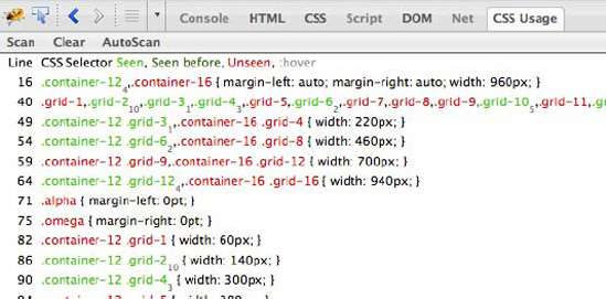
Figure 4-1. Firefox's add-on, CSS Usage, which is a Firebug extension that shows the unused selectors on a page.
These tools are not only useful for existing frameworks, but they can also be a helpful tool in determining whether your own style sheets are in need of spring cleaning.
Many CSS authors are opposed to the use of such frameworks. The main argument against them is that because of their need to be flexible, frameworks tend to use nonsemantic class naming and lend themselves to a very table-like layout approach. This happens because when coding a CSS layout using a framework, you have to visualize the layout as you would with a table, with all the nesting and spanning of cells. If you take a look at the example in Figure 4-2, which uses the same grid as in the code section in Listing 4-1, you can see an example of this table-like approach:
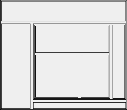
Figure 4-2. Visualization of the necessary container elements to translate a layout into a CSS website, using a framework
Note
In the "Alternative Uses" section that follows we include a quick tutorial on how to create this layout using the Blueprint CSS framework.
One large advantage of using public frameworks is that new employees are much more likely to be familiar with and comfortable with them and therefore quicker to be productive with fewer problems and mistakes in their first projects and tasks. They are also already documented and may have a community mailing list, IRC channel, and so on.
There are a variety of CSS frameworks out there. The three better-known ones are
Blueprint
960 Grid System
YUI Grids
We will not recommend one framework over another—in fact, we think that for high-traffic websites, it is a better option to create a customized framework, even if it borrows from an existing one. We will, however, take a brief look at each of the most well-known ones.
The Blueprint CSS framework was created by Olav Bjørkøy and released in August 2007 (see Figure 4-3). It is usually considered to be the most comprehensive CSS framework because it allows not only for the creation of grid-based layout but also provides a solid typographic foundation, considering aspects like vertical rhythm. It also provides a reset and print style sheet, and basic styling for forms.

The framework uses, by default, a 24-column layout (each column spans 30 pixels and has a right margin of 10 pixels), but you can create different layouts by using the compressor included in the files (you can find a tutorial for doing this in the official documentation http://jdclayton.com/blueprints_compress_a_walkthrough.html).
Using Blueprint is as easy as including a wrapper container with a class of "container", surrounding the blocks on the page. For example, depending on the width of each of the internal containers, you need to use a class of "span-24" for a div that spans across the entire width of the page or "span-8" for a block that spans across 8 columns. If the container is the last one within a particular container or column, it should also include a class of "last" (this will remove the right margin from that container because it's unnecessary). The HTML for a simple layout containing a header, sidebar, main content area, and footer would look like this:
<div class="container">
   <div class="span-24 last">
      Header
   </div>
   <div class="span-24 last">
<div class="span-8">
Sidebar
</div>
<div class="span-16">
Main content
</div>
</div>
<div class="span-24 last">
Footer
</div>
</div>One of the advantages of Blueprint is the community behind it, which is constantly creating and releasing new plugins, themes, and other tools that can be used in conjunction with the basic framework.

The core files of Blueprint (screen.css, ie.css, and print.css) add up to a total of 20 KB.
The 960 Grid System CSS framework (see Figure 4-5) was developed by Nathan Smith and was released in March 2008. This framework was developed with a strong focus on the grid; even though it provides basic typographic styles, its main purpose is to deliver a cross-browser foundation (it has full A-Grade browser support.[25] You can read more about Graded Browser Support in Chapter 6) that allows for many variations on the most common grid-based layouts.

Following the same simple layout example that we've used to demonstrate Blueprint, we're going to create a version of it using 960 Grid System. The framework works, by default, on either a 12- or 16-column grid. We need to add a container surrounding our inner blocks with a class of "container_16" (or "container_12"); the inner containers should have classes of "grid_16", "grid_14", and so on, depending on how many columns they span. Here is the final HTML markup for our simple layout:
<body>
   <div class="container_16">
      <div class="grid_16">
         Header
      </div>
      <div class="grid_4">
         Sidebar
      </div>
      <div class"grid_12">
         Main content
      </div>
<div class="grid_16">
Footer
</div>
</div>
</body>As with Blueprint, there are several tools online that allow you to configure the framework to your needs (see Figure 4-6). Fluid 960 Grid System, created by Stephen Bau, is based on the original 960 Grid System, but allows for fluid and fixed layouts, and includes basic styling for elements such as navigation, tables, forms, articles, and typography.

Figure 4-6. Home page of the Black Estate website, using the 960 Grid System framework (http://blackestate.co.nz/)
Minified, the main 960gs files (960.css and reset.css) take up 12 KB.
The YUI 3 Grids framework is part of the Yahoo! User Interface (YUI) Library (see Figure 4-7). The library includes JavaScript resources as well as CSS (YUI 3 CSS also incorporates reset and typography style sheets). It works in a similar way to the other frameworks presented in this chapter, with a difference: there is no predefined width for the main container; only predefined "units" in which a container can expand within another container.
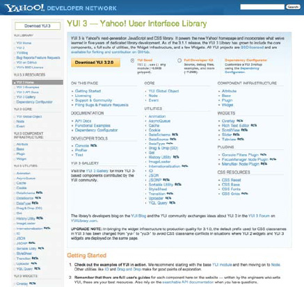
Figure 4-7. Home page of the YUI 3 Library, which includes the YUI 3 CSS (framework http://developer.yahoo.com/yui/3/)
To illustrate how YUI 3 Grids works, we will use the same example as previously. In this case, however, we need to add the desired width to the body element of our page, as such:
body {
    margin: auto;
    width: 960px;
}
The "margin: auto" property will center our content on the page. Next, as with the other frameworks, we need to include a wrapper container with the class "yui3-g." The containers within it will take class names based on the percentage of the width they should fill (or "units"). So, for example, if the sidebar takes up one-third of the total width, it should have a class of "yui3-u-1-3", and if the main content area takes up two-thirds of the total width, it should have a class of "yui3-u-2-3". YUI comes with a set of predefined unit classes (which are listed in the framework's website).
Our final example would have the following HTML:
<body>
   <div class="yui3-g">
      <div class="yui3-u-1">
         Header
      </div>
      <div class="yui3-u-1-3">
         Sidebar
      </div>
      <div class="yui3-u-2-3">
         Main content
      </div>
      <div class="yui3-u-1">
         Footer
      </div>
   </div>
</body>
The minified YUI 3 Grids file takes up 4 KB. However, this includes only the grid, not text defaults or resets. The accompanying YUI Reset (mentioned in this chapter), YUI Base, and YUI Fonts are also 4 KB each (for a total of 12 KB).
One common use of CSS frameworks is in the prototyping phase, even by those who prefer not to use them in production. Because they provide a solid, cross-browser CSS solution, it's very easy to quickly create mock-ups, wireframes, and simplified versions of websites by using an existing framework.
Prototypes (which are covered in more detail in Chapter 1) by definition are made of code that we do not intend to put into production (at least, in its current state) and are written simply to create a proof of concept. With that in mind, semantics, accessibility, excessive markup, file size, and other usually vital considerations are unimportant compared with time of delivery and use of resources. It is sometimes in fact better to somehow cripple your prototype to avoid it becoming production code because it was "good enough."
Let's take the example of the basic wireframe from Figure 4-2 and translate it into HTML using the Blueprint CSS framework. The first step is to link the required CSS file in the head of the HTML document:
<link rel="stylesheet" href="blueprint/screen.css" media="screen, projection" />
Next, we need to add a wrapper div with the class "container" in order for the container within to be targeted by the Blueprint files:
<body>
        <div class="container">
        ...
        </div>
</body>
Our layout is composed of 8 columns; the Blueprint framework works with 24 columns by default, so we will count 3 columns for each of the ones in our wireframe. With this in mind, the top block spans across 24 columns, the left column spans 6 columns, the right side (including 5 containers) spans 18 columns, and so on.
If a container is the last one in a row, it should also have the class of "last", so the right margin is removed.
The basic structure of our wireframe should look like this:
<body>
   <div class="container">

      <div class="span-24">
        ...
      </div>
      <div class="span-6">
        ...
      </div>
      <div class="span-18 last">
         <div class="span-15">
            <div class="span-15 last">
              ...
            </div>
            <div class="span-9">
               ...
            </div>
            <div class="span-6 last">
               ...
            </div>
         </div>
         <div class="span-3 last">
            ...
         </div>
         <div class="span-18 last">
            ...
         </div>
      </div>
   </div>
</body>
The next steps are to add some simple text snippets to these containers, add a new class to the containers and reference that class in our CSS that we can use it to style the main containers further (remember, this is a simple wireframe, so for our example we have embedded this simple line of CSS directly in the HTML document::
<style>
        .b { background: #d4d4d4; margin-bottom: 10px; }
</style>
In Figure 4-8, you can see the completed wireframe.

As you can see from this simple example, existing frameworks are a useful tool to create quick wireframes and mockups (it took us less than 10 minutes from reading the Getting Started guide to creating the final product).
Despite the naysayers who speak against CSS frameworks, most CSS authors have always used one of its simplest forms: a reset style sheet. Each browser has a set of default styles that differs from the others in small details such as elements' margins and padding, vertical alignment, widths and heights, or font sizes (see Figure 4-9). Most recent browsers are fairly consistent in their user agent style sheets; even Internet Explorer in its latest versions (8 and 9) is quickly catching up and moving toward a similar approach.[26] To overcome the small inconsistencies that still exist though, especially in older browsers, and start from a common blank slate, authors resort to the so-called "reset style sheet."
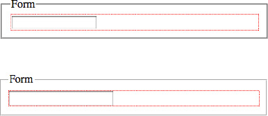
Figure 4-9. Comparison between rendering of an input element in Safari 5 (above) and Firefox 3.6 (below). Safari adds an extra margin around the element.
There are advocates for and against reset style sheets. We are of the opinion that the cons listed by most can be overcome by planning and should not be a problem to an experienced and knowledgeable CSS author.
One of the drawbacks of using off-the-shelf reset style sheets is that we are not taking advantage of the browser's defaults, which we will promptly add back later in the CSS. People tend to use reset style sheets as is, without adapting them to their needs. This usually ends up with most of the rules being overwritten later in the CSS file, by ones that are more considerate to the design at hand. The lack of planning in these situations leaves us with unnecessary rules that will only make our files longer and harder to update and debug. If you want simple lists on your websites to have the default bullet, there is no reason to add a "li { list-style: none; }" rule to your reset (or base) style sheet; you should instead only style the lists that don't need bullets, like perhaps the navigation. And if the headings of your website are mainly bold, then there is also no reason to add a rule stating that they all should have a font-weight value of normal if you are going to have to override it.
Perhaps considering a reset style sheet more like a base style sheet (which many CSS authors propose) and embracing some of the browser's own defaults while creating them may be an easier way to understand the importance of having a common starting point, especially when working within a team.
The W3C has published a CSS2 default style sheet for HTML 4 which "developers are encouraged to use." It is now outdated and incomplete, but it can serve as a reference and starting point (http://www.w3.org/TR/CSS2/sample.html).
Note
There is an unofficial (although based on the rendering section of the specification, which can be found at http://www.whatwg.org/specs/web-apps/current-work/multipage/rendering.html#the-css-user-agent-style-sheet-and-presentational-hints) HTML5 version of these defaults, created by Jonathan Neal (http://www.iecss.com/whatwg.css) and recommended by members of the W3C Working Group.
Let's look at a few of the more common reset methods and style sheets.
The universal selector reset is without a doubt the smallest of its kind. Even though it might feel like cutting off your nose to spite your face, its simplicity is irrefutable, and that benefit is paired with a saving in file size compared with other resets.
There is no simpler reset:
{
   margin: 0;
   padding: 0;
}
But can this really be considered a complete reset? After all, it only covers two properties, while there might be others that need resetting to define a consistent base cross-browser. As well as this, it will also remove margins and padding from elements that you may not want to be reset, such as form elements or tables, which you will have to override later. Consider also that the savings in file size will probably be outweighed by the fact that you will have to define margins and paddings for a lot of other elements used on your website(s) later in the file.
The universal selector is not known to impact negatively in your website's performance when used by itself (its nefarious effects occur when used in conjunction with other selectors), but it is not a refined or complete solution to overcoming browser inconsistencies.
Note
Although the inefficiencies and performance implications of using the universal selector may seem obvious, performing a pure cross-browser study on this is not possible with current tools. We suggest avoiding the selector as a matter of course, but its use here is clear and pragmatic.
Eric Meyer's reset style sheet is the most popular and the one used by most CSS authors. This style sheet was originally inspired by an older version of the Yahoo! User Interface reset.css. Its main purpose is to explicitly state which elements should be reset, rather than using a catch-all selector, as the universal selector reset does.
The style sheet is carefully commented so that CSS authors do not forget that the styles should not be used right out of the box, but the truth is that many choose to ignore these comments and simply copy and paste the CSS as is. This has led to comments from people concerned that the reset (because it is so popular among developers) was hampering accessibility due to its most controversial rule: ":focus { outline: 0; }" that, in the original version, was preceded by a comment warning authors to define focus styles (which was often forgotten), but has been removed in the latest version.
Meyer has published a few versions of this reset, the latest one having been published in his blog on January 26th, 2011 (at the time of writing) at http://meyerweb.com/eric/tools/css/reset/.
/* http://meyerweb.com/eric/tools/css/reset/
   v2.0 | 20110126
   License: none (public domain) */
html, body, div, span, applet, object, iframe,
h1, h2, h3, h4, h5, h6, p, blockquote, pre,
a, abbr, acronym, address, big, cite, code,
del, dfn, em, img, ins, kbd, q, s, samp,
small, strike, strong, sub, sup, tt, var,
b, u, i, center,
dl, dt, dd, ol, ul, li,
fieldset, form, label, legend,
table, caption, tbody, tfoot, thead, tr, th, td,
article, aside, canvas, details, embed,
figure, figcaption, footer, header, hgroup,
menu, nav, output, ruby, section, summary,
time, mark, audio, video {
   margin: 0;
   padding: 0;
   border: 0;
   font-size: 100%;
   font: inherit;
   vertical-align: baseline;
}
/* HTML5 display-role reset for older browsers */
article, aside, details, figcaption, figure,
footer, header, hgroup, menu, nav, section {
   display: block;
}
body {
   line-height: 1;
}
ol, ul {
   list-style: none;
}
blockquote, q {
   quotes: none;
}
blockquote:before, blockquote:after,
q:before, q:after {
   content: '';
   content: none;
}
table {
   border-collapse: collapse;
   border-spacing: 0;
}
This latest version of the reset, besides being more careful with the outline focus styles, also includes new HTML5 elements and removes deprecated HTML elements.
Note
In versions of Internet Explorer previous to 9 you cannot target the new HTML5 elements. To overcome this, it is necessary either to contain them within another element and target the containing element, or use a JavaScript trick known as the HTML5 Shiv to create a virtual element for each tag (without rendering it), which forces IE to notice that these tags exist. This technique was discovered by Sjoerd Visscher, made popular by John Resig and perfected by Remy Sharp at http://remysharp.com/2009/01/07/html5-enabling-script/. Both methods have disadvantages (the first creates superfluous markup, and the second creates a JavaScript dependency) so consider your audience before making a decision.
This is a fairly comprehensive reset style sheet, and one that we suggest you take inspiration from. We don't, however, recommend using it exactly as is (and neither does the author) because you may find yourself redefining some rules that you have previously reset—it will always depend on the needs of the design you are working on and which baseline styles you want your elements to have.
The original YUI reset style sheet was released along with the full library in 2006. It is very precise in which elements it chooses to style and how. For example, it only removes margin and padding from block level elements and some form elements; it addresses font inheritance problems in form elements; and it adds browser-specific hacks to fix font resizing (http://developer.yahoo.com/yui/3/cssreset/).
Here is the commented version of the latest YUI reset (at the time of writing):
/*
Copyright (c) 2010, Yahoo! Inc. All rights reserved.
Code licensed under the BSD License:
http://developer.yahoo.com/yui/license.html
version: 3.3.0
build: 3167
*/
html{
   color:#000;
   background:#FFF;
}
body,div,dl,dt,dd,ul,ol,li,h1,h2,h3,h4,h5,h6,pre,code,form,fieldset,legend,input,textarea,p,bl
ockquote,th,td {
   margin:0;
   padding:0;
}
table {
   border-collapse:collapse;
   border-spacing:0;
}
fieldset,img {
   border:0;
}
address,caption,cite,code,dfn,em,strong,th,var {
font-style:normal;
font-weight:normal;
}
li {
list-style:none;
}
caption,th {
text-align:left;
}
h1,h2,h3,h4,h5,h6 {
font-size:100%;
font-weight:normal;
}
q:before,q:after {
content:'';
}
abbr,acronym {
border:0;
font-variant:normal;
}
/* to preserve line-height and selector appearance */
sup {
vertical-align:text-top;
}
sub {
vertical-align:text-bottom;
}
input,textarea,select {
font-family:inherit;
font-size:inherit;
font-weight:inherit;
}
/*to enable resizing for IE*/
input,textarea,select {
*font-size:100%;
}
/*because legend doesn't inherit in IE */
legend {
color:#000;
}Even though this reset has been refined over many years, it might not be the perfect solution for your specific problem. As mentioned earlier, you are dealing with a particular design style, and some of the rules declared in this style sheet might have to be overridden later in your code, which is not efficient.
There are various other resets besides the ones mentioned previously, each slightly different from the other. However, they seem to have drawn inspiration from the same set of resets (mainly YUI's and Eric Meyer's) and share many of the rules and properties among them.
The Blueprint framework integrates its reset.css into the main screen.css file, but also provides a separate file in the source code folder. This is what the Blueprint reset.css looks like:
/* --------------------------------------------------------------

   reset.css
   * Resets default browser CSS.

-------------------------------------------------------------- */

html {
   margin:0;
   padding:0;
   border:0;
}

body, div, span, object, iframe,
h1, h2, h3, h4, h5, h6, p, blockquote, pre,
a, abbr, acronym, address, code,
del, dfn, em, img, q, dl, dt, dd, ol, ul, li,
fieldset, form, label, legend,
table, caption, tbody, tfoot, thead, tr, th, td,
article, aside, dialog, figure, footer, header,
hgroup, nav, section {
  margin: 0;
  padding: 0;
  border: 0;
  font-weight: inherit;
  font-style: inherit;
  font-size: 100%;
  font-family: inherit;
  vertical-align: baseline;
}

/* This helps to make newer HTML5 elements behave like DIVs in older browers */
article, aside, dialog, figure, footer, header,
hgroup, nav, section {
    display:block;
}

/* Line-height should always be unitless! */
body {
  line-height: 1.5;
  background: white;
}

/* Tables still need 'cellspacing="0"' in the markup. */
table {
   border-collapse: separate;
   border-spacing: 0;
}
/* float:none prevents the span-x classes from breaking table-cell display */
caption, th, td {
text-align: left;
font-weight: normal;
float:none !important;
}
table, th, td {
vertical-align: middle;
}
/* Remove possible quote marks (") from <q>, <blockquote>. */
blockquote:before, blockquote:after, q:before, q:after { content: ''; }
blockquote, q { quotes: "" ""; }
/* Remove annoying border on linked images. */
a img { border: none; }
/* Remember to define your own focus styles! */
:focus { outline: 0; }960 Grid System's reset also draws inspiration from the same popular style sheets. Here is a formatted version of the 960.gs reset.css file (in its original version, the file is minified):
html,body,div,span,applet,object,iframe,h1,h2,h3,h4,h5,h6,p,blockquote,pre,a,abbr,acronym,addr
ess,big,cite,code,del,dfn,em,font,img,ins,kbd,q,s,samp,small,strike,strong,sub,sup,tt,var,b,u,
i,center,dl,dt,dd,ol,ul,li,fieldset,form,label,legend,table,caption,tbody,tfoot,thead,tr,th,td
{
   margin:0;
   padding:0;
   border:0;
   outline:0;
   font-size:100%;
   vertical-align:baseline;
   background:transparent
}
body {
   line-height:1
}
ol,ul {
list-style:none
}
blockquote,q {
   quotes:none
}
blockquote:before,blockquote:after,q:before,q:after {
   content:'';
   content:none
}
:focus {
   outline:0
}
ins {
   text-decoration:none
}
del {
text-decoration:line-through
}
table {
border-collapse:collapse;
border-spacing:0
}There are dozens of different reset style sheets across the Web, some more exhaustive than others. The main idea behind a CSS reset is that it gives you a common ground across all browsers that you can build upon with confidence that inconsistencies will not come between your code and a cross-browser implementation of your designs.
When building websites that are to be visited by millions of users, it is a good idea to know that what you are creating has the right foundations and that the most unpleasant browser defaults will not creep into your less visible pages. This does not mean, however, that you should just use a reset style sheet off the shelf.
As an experienced CSS author, you should spend time thinking about which defaults you want to set for your pages; you should think about what you can use from existing style sheets and what you can learn from them, but do not forget that they exist and were created mainly for the needs of the developer who created them. Spend time customizing your base styles so that they are relevant to your websites: you want your CSS to be efficient and to avoid redundancy, so resetting everything to later add it back again is not a good idea.
Because you should always aim to minimize HTTP requests, our advice is that the reset part of your style sheets should not be treated as a separate file, but instead incorporated in your main CSS file.
Modularity is a concept that is at the core of a flexible system of CSS files and is a goal that any team working on high-traffic websites should be aiming for.
The reason why modularity is important is that it allows for the code to be reused in different sections of the same website and in subsites from the same family. If your CSS is built with that in mind, it will be possible and easier to use snippets of code to style similar elements in different pages without breaking the existing code and without the need to embed or link to larger CSS files.
By creating your own framework, you are creating a library of code that can be reused, enhancing the efficiency of the team. A framework doesn't have to be extensive, but it should encompass elements such as basic typography and layout variations; form elements; modules that are used across a multitude of sites with small variations, such as navigation items; components such as slideshows, tooltips, or tabs; and every element that is prone to be used multiple times within one or more sites. It should also include separate style sheets for print and mobile versions of the website.
The reusability aspects that having a framework (or a CSS library) in place bring are invaluable to efficiency and file size, and allow for more coherent and robust code. Different authors have different ways of coding elements such as tabs or horizontal navigation; if there is a repository containing examples or modules that can be applied to existing style sheets that show how these elements should look and be coded, a large percentage of disparate coding styles will be eliminated.
Chapter 11 includes a step-by-step guide to creating your own CSS framework.
Object Oriented CSS (OOCSS) is a concept introduced by Nicole Sullivan, a front-end performance consultant. At the core of Nicole's project is the concept that CSS (especially for high-performance websites) should be approached in a modular, flexible way.
Object Oriented Programming (OOP) is a method of programming that breaks the code into discrete blocks (objects) and allows us to reuse them or build new blocks that inherit their properties.
As an example, we might have an object called car. This object has certain properties: it has doors, an engine, keys, windows, wheels, and so on. In many ways, we can consider this object similar to a template. We might use this template to create many cars. Although we are basing the cars on our basic template, they could have more specific properties; we might define the number of doors, engine size, color, make, model, and so on.
This methodology applies equally well to CSS, and it is very likely you have already used it without thinking. For example, we might have an object on our page that we think of as a block. For the sake of example, we'll say that a block has a green border, rounded corners, and gray background color.
<div class="block">I am a discrete block</div>
<div class="block">I am another discrete block</div>
But then, we might want some blocks to have more specific properties such as positions, widths, and so on:
<div class="block information">I am a discrete block</div>
<div class="block warning">I am another discrete block</div>
Using classes in this fashion allows us to have a base object and then make more specific objects that inherit the properties of the base object. We could even override properties of the base object by making our selectors more specific.
Although the term object oriented might be misleading—and is, in fact, the subject of many parallel discussions alongside the topic—OOCSS is a valid approach to coding our CSS.
One of the main objectives of OOCSS is to encourage the reuse of snippets of code independent of the location of the element we're trying to style—the CSS should work exactly the same anywhere: "An object should behave predictably no matter where you place it on the page, which is why Object Oriented CSS avoids location dependent styles." (http://www.stubbornella.org/content/2009/02/28/object-oriented-css-grids-on-github/).
This comes in opposition to the more sandboxed approach that teams generally have when developing their style sheets—for example, by namespacing CSS selectors, which is mentioned in more detail in Chapter 2.
The same location-agnostic principle applies in reverse: changing parts of the code shouldn't mean breaking the rest. If child elements do not need to be within a specific parent container to look right, in addition, a parent container should not be dependent on its children to render correctly on the page. Nicole sums this up as separating content from container—one of the principles of OOCSS.
In the following example, the styling rules for the container and for the heading within it are separated and reusable in other elements—the parent doesn't depend on its child to look correct and vice versa:
CSS:

.module {
   margin: 10px;
}
.hd {
   padding: 5px;
   color: #333333;
}

HTML:

<div class="module">
   <h1 class="hd">Title</h1>
</div>
The other principle recommends that the rules that control the structure of the elements (or objects) should be separated from the rules that control their skin (aesthetics). Let's look at an example:
CSS:

.module {
   margin: 10px;
}
.moduleSale {
   background: #efefef;
}

HTML:

<div class="module moduleSale">
   ...
</div>
In the preceding example, we are extending a component with another class that controls its skin. Both the rule that controls the layout and the one that controls the skin can be reused independently for other components.
Abstracting repeating patterns to allow for reusability and overall modularity is a helpful approach in that you have to think about how you will structure your CSS before getting your hands dirty, based on a thorough analysis of all the elements in your designs. In OOCSS, you are encouraged to think about separate objects first and pages second; you should be able to construct any type of page using the existing modular CSS.
Not everything is an advantage when it comes to OOCSS, though. There is a compromise between having a smaller style sheet, in which redundancy is avoided at all costs, and having a bigger, class-cluttered HTML document.
Because OOCSS tries to steer clear of using element selectors—so that classes aren't limited to a particular element—it doesn't make the best use of the original markup's semantics. The cascade also isn't used to its full potential (you are, in fact, working against it) in an effort to keep away from specificity conflicts. Class-based selectors are created so that every rule has the same specificity in order to be capable of overriding (or better yet, extending) other classes.
Another weak spot of OOCSS, and the one that naysayers like to point out the most, is that its use of classes is nonsemantic.
Instead of having a class of "sidebar," taking an object-oriented approach to CSS, you would have a class of, for example, "module." This would happen because by naming it sidebar we are localizing it, and restricting it to a certain position on our pages—we may want to use the exact same styling for a div within the main content area of our site, so there needs to be flexibility in the naming. The problem is that by removing these more semantic and understandable class names, we seem to be approaching presentational classitis, which is a problem that frameworks also face, as we mentioned previously.
This problem can potentially be alleviated (to a degree) with the introduction of the new HTML5 elements, such as header, footer, and aside. By using these new elements, we are already indicating in the markup the basic semantic outline of the content we want to style. Of course, there will never be enough elements to indicate everything we could possibly want from a document. To be pragmatic, unless you are using class names that are very common or based on a standard (such as microformats), the semantics are more of a benefit to the developer than the user. We should strive for semantics where possible, but this is not the be-all and end-all of CSS.
OOCSS makes most sense when dealing with large websites that require flexible but robust code, and where coding practices consistency is a goal. Although we agree that it has valid strong arguments, and approve of many of the techniques that it recommends, we also feel that there should be a balance between having flexible CSS and flexible markup.
The balance between good semantics and reusable CSS is paramount to an efficient high-traffic website, and moving all the heavy lifting to the markup is not ideal. If your team is separate from the design team, you may find it very difficult to follow the processes implied by using this methodology. That said, there are many advocates of OOCSS, and you may find it appropriate for your needs.
If you're interested in reading more about OOCSS, head to http://oocss.org/.
The cascading nature of CSS allows us to override existing style sheets with more specific ones easily and without having to edit the original base file. This may be necessary for various reasons, such as a seasonal redesign, the need for a slightly different color scheme for each different company department, the existence of subsites that borrow from the main one, and special one-off pages that don't follow the same design patterns included in the main style sheet, to name but a few. These cases are bound to occur in large, high-traffic websites.
Usually this means that more specific CSS rules will be placed in a separate file, which will either be concatenated with the existing style sheet, placed in style tags in the head element of the particular page (causing a separation of concerns issue), or linked to the HTML document after the main style sheet, overriding it at some points (although in the last case you will be adding a costly HTTP request that will lower the performance of your website).
Overriding CSS as a complement to the main style sheet is generally the most efficient way of creating different themes and variations on a design. If your style sheets have been built in a modular and flexible fashion, they will lend themselves to being complemented by other more specific rules without the need for added redundancy to your code.
Creating new style sheets that will override the main one should, however, be avoided if the cause is a major redesign, since a big part of the CSS will be made out of excessively specific rules that are only specific because there is an older, dated style sheet that needs to be deprioritized.
When overriding CSS files, the main factor you will be dealing with is specificity. You want to be able to take advantage of what already exists, but add to it without the need for repetition. For that, it is sane to start building your main style sheets from the ground up, focusing on creating sensible defaults first, so that you don't have to repeat the same declarations for similar elements. For example, suppose that most of your unordered lists should have a particular style. The following CSS would be hard to override (we're overriding it in the final rule):
#homepage #highlights ul li {
   list-style-type: disc;
   margin: 0 0 1em;
}
#homepage #popular ul li {
   list-style-type:disc;
   margin: 0 0 1em;
}
#homepage #special ul li {
   list-style: none;
   margin: 0 0 1em;
   background: url(star.gif) no-repeat left center;
   padding-left: 24px;
}
It would be easier to do the following:
li {
   margin: 0 0 1em;
}
#special li {
   list-style: none;
   background: url(star.gif) no-repeat left center;
   padding-left: 24px;
}
If we have not changed the list-style-type value for unordered list items in our reset, now we are taking advantage of the browser defaults, which as a rule state that the list-style-type value for unordered list items is disc. We are therefore not adding that to our CSS, and since we are using the same spacing for all lists with some exceptions, it is simpler to add it as a default style for all list items and then override it as needed.
This kind of thinking and planning will produce smaller style sheets that are easier to update and to understand by developers who are not familiar with the code.
Many large websites opt for adding a class or ID to the body of the page(s) as a way of indicating which template it should be using. This is a simple and effective technique, but one that you should use carefully, since it can easily prevent you from reusing code (because you will be sandboxing parts of your code for each template, you need to make sure that what you are building for one template will not be useful for all). If taken to extremes, it can also put you on the path of repetition and of overly specific rules when a new special template or theme needs to be put in place.
For example, if your style sheet has redundant or overly specific rules, you might have to override something like this when you want to add a Christmas border to some elements of your website:
#home .template-12 #main .col-1 .post img.thumbnail {
   border: 1px dotted green;
}
...
#europe .template-8 aside#secondary ol li img {
border: 1px dotted #333333;
}If the IDs home and europe are added to the html or body element, there is probably not another way for a clean override from your embedded style sheets (let's avoid inline CSS). It would be a lot easier to override the following snippet:
img { /* You should make an effort to make this initial style as generic as possible. Maybe
you would need a class or an ID before the element selector in your case */
   border: 1px dotted black;
}
...
.post img {
   border-color: green;
}
...
#secondary img {
   border-color: #333333;
}

...

/* Christmas styles */
#christmas img,
#christmas #secondary img {
   border-color: red;
}
There will probably be overlaps and patterns on how the image borders work in your site, so what you are doing is making the most common scenario the default style and only adding more specificity when needed.
If taking an OOCSS approach (mentioned previously in this chapter), the modular nature of the CSS will mean that the new files and rules introduced to the cascade will tend to complement the existing ones rather than overriding them. This is basically very similar to what we have described so far in this section, with a difference that the OOCSS techniques take less advantage of the cascade, focusing mainly on classes, avoiding IDs and classes complementing each other. In this case, your CSS would probably look more like the following:
img {
   border: 1px dotted black;
}
...
.img-post{
   border-color: green;
}
...
.img-secondary {
   border-color: #333333;
}
...
/* Christmas styles */
#christmas img {
border-color: red;
}Because we are using classes, the christmas ID is powerful enough to override any number of classes.
Overriding your existing CSS rules is something that is unavoidable in large websites. This is not bad; it's just how things work. Why start from scratch when there are styles that you can use as a base, right?
Everything that we have been saying and recommending in this book (how to avoid redundancy, strive for a modular and more flexible style sheet, don't complicate things when there is no need for it, and so on) should give you good guidelines for how to avoid making your CSS more complex than necessary.
Often website developers find themselves incorporating code written by others that they have no control over. This code could be a widget, plugin, or other form of website block designed to be dropped straight into your pages. Since this code is intended for the lowest-common-denominator scenario, the author intends it to work regardless of the surrounding code—the code is often more verbose than it might be for any one particular situation. If the code includes JavaScript and CSS, there will frequently be duplication of code that already exists in the website in question. There are two primary ways to deal with this situation:
Rewrite the CSS yourself, and opt to not include the third-party CSS.

Build your CSS to minimize the likelihood of conflicts in your code; then test thoroughly.
The first thing you can do is try to isolate the third-party code away from yours. If the third-party code is being dropped straight into your markup, you should locate it and figure out how you can target its container. If it is adding elements via JavaScript, you can watch the DOM in your web development tools (see Chapter 10) and take note of the container's details, too. If there is no container, consider adding your own. This will give you the ability to target and fix any problems if they do occur.
You could use the considerate approach where, if there are particular areas that are likely to include third-party code, you could apply a basic CSS reset to them, targeting just those blocks. Avoid using !important (which you should be doing anyway), and where using very simple element selectors, try not to namespace those so that you have the least likelihood of affecting the third-party code with higher specificity.
You could also use the suspicious approach, in which you try to have more specific selectors to avoid affording the opportunity to vague selectors on the third party's side to affect your page.
We recommend the considerate approach, although this won't be appropriate for everyone. If code external to yours is written so badly that it affects yours, it is reasonable to expect (and demand) of them that they fix the problem. If your scenario demands you use that code no matter what, and it is that bad, rewrite it yourself or test thoroughly and create more specific rules for your markup as is required.
Going to extremes, you can include another page as an iframe to completely sandbox their code from yours. We do not recommend this for any but the most dramatic and unavoidable scenarios.
Conversely, if you are writing code to be included in other people's pages, be considerate. As much as possible you should be namespacing the container (using some kind of prefix, to make your code obviously separate from the rest) so that you can select it with a specific selector and then use that as a prefix to any selectors that apply to elements within your block. Don't target elements with just the element name. You may need to apply your own reset to your block, using the namespace and the container.
When you think your code is susceptible to being broken by either internal or external developers, you want to make sure you take all measures possible to prevent it from happening. This is especially true in large websites and within large organizations with different implementations and web teams. Defensive CSS is a practice that we recommend and provide tips for throughout this book. In this section, we will recapitulate them.
There are several things that can be done to code defensively. Bear in mind that defensive CSS is not the same as creating robust CSS. Robust and efficient CSS is what we ultimately want to achieve, and defensive CSS is one of the ways of achieve it. For example, making sure our CSS does not rely entirely on the order of selectors is not necessarily defensive CSS, but it is a characteristic of a robust style sheet.
Making sure that your style sheets are properly commented and documented, especially in their more fragile spots—such as when you resort to hacks or awkward solutions to fix a problem that others might not understand and want to fix back—is a way of being a defensive CSS author. You should state the original problem, explain why you have opted for that particular solution, provide links for a website that documents the solution (if it exists), and explain what will happen in case someone edits that bit of code (we have come across several "if you edit this code, all hell will break loose" type of comments in our observations, but we recommend something more descriptive). You can read more about commenting in Chapter 2.
Another way of taking the defensive approach is to declare properties that you do not necessarily need for that particular selector, but that will prevent other selectors from overriding it. This works particularly well when used in conjunction with namespacing. In the following example, we are declaring a namespaced rule to style headings in a sidebar widget:
#sidebar #sb-widget h2 {
   border: 1px solid #efefef;
   font-weight: bold;
padding: 5px 10px; }
If the following less specific rule were in our style sheet, the font-color property of the sidebar widget would also be changed because it isn't stated in the initial example:
h2 {
   color: #dd4814;
}
In order to prevent this from happening, you can add the initial value of the property to the more specific rule so that it stays exactly the way you want it to:
#sidebar #sb-widget h2 {
   border: 1px solid #efefef;
   font-weight: bold;
   padding: 5px 10px;
   color: #1448dd;
}
...
h2 {
   color: #dd4814;
}
Remember that this will make this rule a lot harder to override, but it is a disadvantage that you must take into account every time you decide to namespace parts of your code.
As noted earlier in this chapter, OOCSS is another way of creating defensive CSS. To reiterate, its main principles state that parents and children elements shouldn't depend on each other to look the same wherever they are positioned on the page, and also that layout should be separate from skin. So if someone makes a change on how part of the code works (for example, the headings inside widgets), that will not mean children, parent, or surrounding elements will necessarily break.
The extreme case of defensive CSS is namespacing (covered in more detail in Chapter 2). When you namespace sections of your code, you are making sure it doesn't affect nor is affected by the rest of the code. You are isolating it by increasing its specificity so that only the exact portion of the markup that you wish to style is targeted. Nothing else is affected, so nothing else can get broken in the process. This does not mean, however, that you should use namespacing as the silver bullet to secure your code. Its disadvantages are too costly: you will be left with bloated code due to repetition and an extreme lack of reusability. This is not how a team working on high-performance websites should work.
One of the most common scenarios in which you will have to take the defensive CSS approach is when dealing with content management systems that are usually utilized by nondevelopers, where copying and pasting text from Word documents is a frequent occurrence. In these situations, our recommendation is that you should provide the content editors with classes and IDs they can hook in to, and give them example blocks of code from a design library (which we mention in more detail in Chapter 5) so that as much as possible, you have done the thinking for them and they have everything they could need.
Where their needs are not satisfied, there should be a feedback loop: a process to make them request a new design library element and any changes they make themselves (inline CSS in style attributes, style tags, and so on) must be logged and replaced by them when the element is ready. Note that we never should stop content publishers from publishing something—big companies often have time-critical announcements or changes to make—but we should always provide content editors with a way to do what they want the right way rather than letting all the rubbish CSS build up or (unrealistically) stopping them from doing their work.
Clever defaults and making sure all possible elements have at least a basic styling also help to overcome some unpredictable situations when content editors are not familiar with CSS.
There needs to be a degree of trust within your team, and you should make sure to hire the best developers possible. This is not news to anyone, but that doesn't mean that you should not try to prevent mistakes from happening. This is what defensive CSS is about. It is about taking the measures at your reach so that errors are minimized.
As opposed to robust CSS (which translates into flexible style sheets that can be safely handled by many hands), fragile CSS is CSS that breaks easily. This can happen for a variety of reasons.
One common occurrence of fragile CSS is when CSS selectors have dependencies on the content of the page. Considering that our CSS is a separate, aesthetic layer, this may sound like something that should not be a concern—after all, CSS is there to style the content no matter what it may be. What we mean by this, however, is that when building dynamic websites, where the content is in constant mutation and not necessarily (or rarely) controlled by the person who created the code, there are times when we should avoid tying in the CSS with content on the page that is more likely to be changed, or rely on the order of the DOM elements, which can also change.
For example, let's say you have a list of books; each book has a title and an image of its cover:
<dl id="books">
   <dt>CSS Mastery</dt>
   <dd>by Andy Budd</dd>
   <dd><img src="book-cssmastery.jpg" /></dd>

   <dt>Designing With Web Standards</dt>
   <dd>by Jeffrey Zeldman</dd>
   <dd><img src="book-webstandards.jpg" /></dd>
</dl>
You want to target the image for the first book so it floats to the left, and then the image for the second book so it floats to the right. You could write the following CSS:
#books img[src="book-cssmastery.jpg"] {
   float: left;
}
#books img[src="book-webstandards.jpg"] {
   float: right;
}
It will have the result you are looking for, but what happens if the file names of the images are changed? Or if you replace these books with other books? This is a good example of how tying the CSS too closely to the content of the page can produce fragile CSS.
Another solution in this case is to use an nth-of-type selector to target the specific img element:
#books img:nth-of-type(1) {
   float: left;
}
#books img:nth-of-type(2) {
float: right;
}Now we are only targeting the first and second image. This is a more robust solution than the first one, but it is still somewhat fragile: the CSS now is dependent on the order of the content and the amount of books in the list.
A more straightforward solution is to add a class to each img element, like so:
<dl id="books">
   <dt>CSS Mastery</dt>
   <dd>by Andy Budd</dd>
   <dd><img class="odd" src="book-cssmastery.jpg" /></dd>
   <dt>Designing With Web Standards</dt>
   <dd>by Jeffrey Zeldman</dd>
   <dd><img class="even" src="book-webstandards.jpg" /></dd>
</dl>
Now we can just use the classes in the CSS, making it a lot simpler:
#books img.odd {
   float: left;
}
#books img.even {
   float: right;
}
This solution makes it also easier to reuse these classes somewhere else or even add more books to the collection. In this particular case, we could have also resorted to using the nth-of-type selector in a different way:
#books img:nth-of-type(odd) {
   float: left;
}
#books img:nth-of-type(even) {
   float: right;
}
Now, instead of just styling the first and second instances, we are defining a style that can scale as the list grows, and that is not dependent on the any number of items or any file names. There is a downside to this technique: older browsers will not understand this CSS3 selector.
Note
This is an issue to which the response should be clear within your team: you should have defined whether lack of support on older browsers for more advanced CSS selectors means they are to be left alone and the rendering differences accepted, or if there should be some kind of JavaScript fallback that can replicate the effect.
It is also worth mentioning that CSS3 selectors are much more complicated to parse than their simpler counterparts, and, as such, incur more of a performance hit. Although CSS performance will rarely be the bottleneck in your website, it is best to avoid them unless they are necessary.
By not tying ourselves to the content and abstracting this bit of CSS, we can go even further into what we are continuously looking for in our style sheets and create a design pattern that can be repeatedly used throughout our pages. In this case, that would be a list in which its items show alternating styles. Rather than using an ID selector to define this list, we could have created a class with a more convenient name (that allows for repetition) that could be used multiple times within a page and within the website (if we had kept the ID of "books," and we needed to style a list called "boardGames", the name would stop being semantic):
HTML:
<dl id="books" class="alt">
   <dt>CSS Mastery</dt>
   <dd>by Andy Budd</dd>
   <dd><img src="book-cssmastery.jpg" /></dd>

   <dt>Designing With Web Standards</dt>
   <dd>by Jeffrey Zeldman</dd>
   <dd><img src="book-webstandards.jpg" /></dd>
</dl>
CSS:
.alt img:nth-of-type(odd) {
   float: left;
}
.alt img:nth-of-type(even) {
   float: right;
}
Still following on from our initial example, but now illustrating another case of non-fragile CSS, rather than relying on the full name of files, we can instead create CSS that will look for a particular portion of a file's name and style it accordingly. For example, you might want to style all links to PDF and text documents with a small icon, indicating to the user what they should expect from that link. Let's use an altered version of the example markup above:
<dl id="books">
   <dt>CSS Mastery</dt>
   <dd>by Andy Budd</dd>
   <dd><a href="css-mastery-sample.pdf">Download a sample of the book</a></dd>

   <dt>Designing With Web Standards</dt>
   <dd>by Jeffrey Zeldman</dd>
   <dd><a href="designing-web-standards-sample.doc">Download a sample of the book</a></dd>
</dl>
Using attribute selectors, you can now target links whose href attribute value ends ("$") in a particular sequence of characters, as follows:
a[href$=".pdf"] {
   padding-left: 20px;
   background: url(pdf-icon.gif) no-repeat left center;
}
a[href$=".doc"],
a[href$=".txt"] {
   padding-left: 20px;
   background: url(txt-icon.gif) no-repeat left center;
}
Once again, bear in mind that these more advanced selectors will not be understood by older browsers.
There are different levels of fragile CSS, as you saw in the preceding examples. Fragile CSS does not mean only CSS that is weakly tied in with the markup, though. It also means CSS that will break within itself, for example with selectors that are added later and that override the original ones because they are later in the file or more specific. Overlooking specificity and order, and continuously adding selectors that will override the previous ones because they come later and are more specific is doing CSS the easy way, with no respect for (or insight on) how the cascade works. It adds a layer of complexity each time the code needs to be updated and debugged, and makes the code susceptible to breaking if there are any changes in the order of selectors in the future by a developer who is distracted or simply not familiar with the house of cards that he has inherited.
The solution for this should not be to sandbox everything so that things don't break when edits occur. This will create another harmful effect for high-traffic websites: redundancy. So the solutions are manifold. As we have been recommending throughout the book, plan your style sheets so that the code can be reutilized effectively, define solid base styles for all the elements you will need, make sure there are guidelines in place for dealing with legacy elements, have a well-defined design library of reusable components, and add IDs and classes only when you have to (where the DOM is likely to change, use them).
Fragile CSS tends to be complicated CSS (although not always). One frequent behavior of experienced and knowledgeable CSS authors is to write overly complicated selectors in order to target elements without the need to touch the original markup, when adding a simple class or ID would actually provide a simpler, elegant, and more efficient solution.
Classes and IDs exist exactly for that purpose—so that we can reach elements easily—they are there to be used. As the simplest selectors they are also the fastest (IDs in particular), and when used semantically they give our markup context and intent. You should not be afraid to use them when there is a place for them. Instead of trying to be too clever, consider whether the simplest solution is not the best solution first, and avoid adding an unnecessary degree of complexity to your code that will make it less efficient and more fragile.
Metadata can be described as data about data. The meta tags in HTML serve as great examples, providing extra information about the document such as author, description, the language the page it is in, and so on. Whereas comments are only for the developer's benefit, metadata can be parsed and used by JavaScript or search engines. The tags are agnostic to the type of data they provide in that the name and content of the data are stored within the structure itself, like so:
<meta name="author" content="Anna Sasin" />
Since you can have multiple meta tags, it is theoretically possible to include an infinite and unrestricted amount of information.
While HTML provides a wrapper for all of the content in the page, and our classes and IDs (hopefully) tell us something about the roles of the elements they are set against, the HTML Document Type Definition (DTD) only defines a limited number of tags and attributes. Where we have static content this is always enough information to convey everything we want to. However, where we are employing JavaScript to move things around the page or modify the Document Object Model (DOM), there is often not enough information to achieve what we need to.
For example, perhaps we have a form with a field that needs to be in a particular format. It might be an order reference code, which we know always has three alphabetical characters and then three numeric characters. Although we could use HTML5 or other methods to validate this field, we have decided (for the sake of example) that in this instance we want to use JavaScript to validate this field:
<input type="text" id="orderReference" />
With this structure, we have no understanding of how to validate this field. We need to locate this field in JavaScript and decide based upon its ID (or class) what format it should be in. What we need is the ability to add metadata to the HTML element itself. There are a few ways of achieving this. First, we can add a custom attribute to the field:
<input type="text" id="orderReference" datatype="orderReference" />
However, this immediately makes our HTML invalid because datatype is not a valid attribute for the input tag. We could use classes to hold this information:
<input type="text" id="orderReference" class="dataTypeOrderReference" />
This only gives us Boolean values (true if the class is present or false if not) though, and if we wanted more complex values they would be difficult to represent.[27]
JavaScript has a method of storing information known as JavaScript Object Notation (JSON), which makes it very easy to present lots of information in a concise and versatile fashion. For this example, it would look something like this:
{dataType:'orderCode'}If we put this information in the class, our HTML will still validate, we have the ability to represent complex data, and unless we have very obscurely named classes defined in our CSS there should never be any conflicts:
<input type="text" id="orderCode" class="{dataType:'orderCode'}" />Although it feels semantically incorrect, the benefits of this technique outweigh the downsides.
Tip
If you are using HTML5 as your doctype, you have a solution to this problem in the form of data- attributes. By prefixing an attribute with data- we can represent as many extra fields as we want, like so:
<input type="text" id="orderCode" data-datatype="orderCode" data-errortext="Please enter a
valid order code." />
However, this method considers all values to be strings (groups of characters) and would make it difficult to represent other data types, such as numbers or Boolean values.
Another issue we may have is the error we want to display. We can include this in the HTML, and use CSS to hide it:
<input type="text" id="orderCode" class="{dataType:'orderCode'}" />
<div class="error hidden">Please enter a  valid order code.</div>
Anyone with CSS disabled for some reason, or using a device that does not support CSS (text-only browsers such as Lynx (http://lynx.browser.org), older browsers, some screen readers, search engine spiders, and so on) will still see this text. It shouldn't really exist in our HTML until we want to display it. If we include this information within our JSON structure, though, the JavaScript has everything it needs to display the error:
<input type="text" id="orderCode" class="{dataType:'orderCode',errorText:'Please enter a valid
order code.'}" />
This is a powerful and genuinely extensible method of adding extra information to our tags without invalidating our code, although it creates a JavaScript dependency and you should still use server-side validation, too.
A plugin for the popular jQuery library exists to make it easier to get to the data at http://plugins.jquery.com/project/metadata. The syntax is easy. Once you have included the jQuery library and the metadata plugin—as well as the previous HTML snippet—this code will create an alert dialog box, with the text "Please enter a valid order code":
alert($("orderCode").metadata().errorText);You can read about more accessible ways to achieve the same thing in Chapter 6. You could also write your own parser to get at these values. If the user has disabled JavaScript, we can degrade gracefully and handle the error server-side, reloading the page with a visible error message.
In this chapter, we looked at how existing frameworks work, what we can learn from them, and where they fail. The flexibility and efficiency that having a framework in place provides is invaluable to any team working on a high-traffic website and should not be underestimated.
Besides frameworks, there are also other principles and coding practices that you can put in place that will not only mean your code should be less prone to errors but also less susceptible of being broken by either internal or external developers or code.
CSS, when composed carefully, can be clean but also robust and adaptable. Because it is not going to be quarantined forever, you should plan for the fact that it will interact with other code, with other developers, and even within itself.
In the next chapter, we will look at the importance of brand guidelines and how to work with them.
[25] Based on Yahoo!'s definition at http://developer.yahoo.com/yui/articles/gbs/.
[26] You can see a comparison and evolution of the user agent style sheet in the different versions of Internet Explorer at http://www.iecss.com/.
[27] You could also create a custom DTD yourself for HTML or use a specific namespace with XHTML, but both of these options are not for the faint of heart, and neither guarantees a validating document.