
Everyone knows that, online, our competition is just one click away. The average user's attention span is getting shorter quickly.[28] It is easy then to come to the conclusion that even though the typical user of your website may be slightly more engaged, you should make sure that the website has an impact and that the brand experience is translated to the Web correctly.
The brand will always affect how the website is handled: how it is designed, the tone of voice it uses—basically, how it conveys the brand message across the online medium. Making sure this is done correctly tends to be a competence attributed to marketing and design teams.
Even though web design and development teams don't usually work directly on the building of the brand, they face the challenge of implementing it on the Web. They often also face the challenge of letting marketing teams know what is and isn't possible to do online, why there are some conventions (and when they should and shouldn't be broken), and why the Web should be regarded as something organically different from print, rather than a medium that merely follows whatever it is dictated should be done by the visual identity guide for print.
Since the subject of this book is CSS, we will be covering mainly the aesthetic aspects of brand implementation. Areas such as brand culture, dealing with customer feedback, handling forms and error messages, or developing and keeping the correct tone of voice are all issues that wouldn't fall within the CSS realm (but that we would hope you are considering).
This chapter does not go into detail on how to develop a visual brand. Rather, it assumes that there is an existing brand, and branding guidelines are already in place. It focuses on how to overcome some of the difficulties in implementing these guidelines in an efficient manner. It covers
What a brand is
Working with brand style guides and design libraries
Dealing with typography on the Web
Efficient ways of working with color
Keeping layouts consistent
Handling theme variations
Brand evolution
A brand is often regarded as the most important asset of a company, product, or service—it is what distinguishes it from its competitors. But we should not confuse brand with merely the logo that identifies it. The brand can encompass attributes such as the following:
Name, logo, tagline
Colors, typography, imagery
Tone of voice
Values and mission
Customer and feedback handling
In-store experience
Etc.
Basically, it involves everything that can be related to the way that the company (be it a product, service, or organization) is perceived; the message that it conveys to the outside world and within itself, to its employees.
There are various types of brands, but the three main groups are as follows:
Umbrella brands: These brands are used across various products and services within the organization, and are used both internally and externally. For example, Amazon is the umbrella brand for Amazon Marketplace, Amazon MP3, Amazon S3, Amazon Mechanical Turk, and so on.
Sub-brands: These brands, even though promoted individually, are associated with an umbrella brand in order to inherit and build upon the umbrella brand's reputation. For example, Kit Kat, Aero, and Smarties are sub-brands of Nestlé.
Individual brands: These brands are marketed completely separately from their umbrella brands. For example, the individual brands Schweppes, Sprite, and Dr Pepper are all made by Coca Cola, but they are marketed without mention of their umbrella brand.
The reason that it's a good idea to be familiar with these terms (that fall under the discipline of Brand Architecture) is that when working with corporate brands, this organization often reflects how sub- and minisites will be designed and developed, and how the branding will be implemented across them.
There are different types of branding style guides. Some cover merely the visual aspects of the brand, like logo usage, typography, colors, etc., while others go deeper into the brand culture and talk about values, work processes, or how to handle customers in different situations, among a variety of different subjects.
Style guides are more often than would be desired developed with print media in mind. This happens mostly when the guide was not developed recently, although shockingly some guides that are produced now still fail to provide reference on how to handle the brand online.
What happens when the Web isn't catered for in a style guide is that marketing teams and managers try to enforce rules that have been developed for print media. This causes all sorts of problems.
One of the best examples is trying to force website pages to behave exactly like their print counterparts. Whereas pages designed for print are static and don't change after being printed, online pages can suffer from a variety of alterations applied either by content teams or the user. Long articles can influence the height of the page, smaller or larger screen sizes will introduce (or remove) the need for scrolling, just as user style sheets can make the text larger or smaller, also influencing the page layout and flow. Not to mention the fact that browsers render fonts differently and demonstrate different anti-aliasing behaviors. There is no way to be sure your users will see exactly what you intend them to.
This doesn't mean there isn't a degree of control when designing and coding online pages, but these are just a few examples of how visual guides that have been created exclusively for print formats will make it harder for the departments that don't deal directly with the Web (or not on a daily basis, at least) to understand how to adapt the brand to it in an organic and integrated way.
Besides having a single person in the organization whose job is to verify branding consistency (a role usually attributed to a Brand Manager), it is beneficial that all employees are educated about what the brand should convey. This shouldn't just be relegated to customer facing roles and marketing departments, since people within other areas of the organization are also faced with making daily decisions that will affect the brand recognition.
For example, if a website fails to accommodate font size changes, the whole experience will be spoiled for users who have visual impairments and need to be using larger fonts. Or if a new page needs to be added to the website and its design doesn't represent the brand properly, the visitor may feel he or she is not on the same website and become compelled to leave or lose trust and goodwill toward the site.
Developers may not always be comfortable dealing with design aspects that will influence the brand consistency. Often front-end developers and web designers are different elements on a team (or on completely separate teams—sometimes not even in the same building or country), and there are moments when the front-end developers are faced with having to make design decisions that they might not be comfortable with. Flexible and adaptable brand guidelines should be in place for situations like these, ensuring consistency across the websites and ensuring the brand is not diluted as more and more hands fiddle with the style sheets or add new elements.
A comprehensive brand guideline document for the Web should include the following:
Information about the underlying grid, its variations and how to use it
Typographical information: preferred fonts, fallbacks, and scaling information
Color palettes (translated into Web formats such as hexadecimal or RGBA) and how they should be used
Measurements in web-friendly units, such as pixels, ems, or percentages
Specifications for common and reusable elements, such as navigation, buttons, widgets, forms, notifications, and so on.
It is also useful to mention in this document what is and is not acceptable to look different in different browsers. For example, it might state that the company's logo and main calls-to-action must always look the same, regardless of whether a PNG or other format is employed, so that the necessary measures are taken to ensure that this happens.
Even the most thorough branding style guide can't anticipate everything. It is inevitable that developers will make design decisions at some stages. Although front-end developers are not usually required to have a design background, understanding the fundamental principles of how design works will make moments where design decisions fall into their hands a lot easier and more clear. For the diligent ones, we recommend Mark Boulton's A Practical Guide to Designing for the Web (http://fivesimplesteps.com/books/practical-guide-designing-for-the-web), part of the Five Simple Steps series. This book is great for those with no design background and who want practical examples and a good understanding of the basics.
Because large websites are in constant mutation and expansion, it isn't rare for new elements to be introduced, new widgets designed, new palettes created for new sections, and so on. As the design evolves and grows, the guidelines should follow in its footsteps. The main aim of a brand style guide in the first place is to ensure consistency; by adding more and more different elements to a central reference that designers and developers can refer to. In order to be sure that they are not reinventing what someone else has already defined, the guidelines need to be kept up-to-date.
If a new standard for creating tertiary navigation is implemented in one of the main websites, it should be used as a reference when the next website has it applied. The way to keep this document updated is probably more complex than actually coming up with more patterns. Even though an internal wiki is usually the simplest setup (especially for technical staff, who are familiar with using wikis), design and marketing teams might not be comfortable managing them.
Whichever the technology used for this purpose, the most important thing is to make sure that the guidelines are updated regularly (this may be weekly, monthly or even less frequent, depending on the speed with which new guidelines are being generated) and stored in a central location that can be easily accessed by everyone involved; the benefit of everyone using one system is immense. It is also important that someone (or a team) takes ownership and oversees this repository, so that there are no duplicates, and no new elements whose differences from existing ones are imperceptible—if every new element designed generates a new standard, there will be no standard.
For large websites, the process of adding new standards to guidelines will most likely (and should) result in the creation of a design library, where all the patterns are stored as snippets (images, HTML, and CSS). Adding new patterns to the library shouldn't be easy, though—as mentioned previously, most of the time it's more sensible to reuse an existing element rather than add a new design to the library. If someone feels the need to do so, they should justify it and make sure nothing that has been created so far fits the requirements. This means there is visual control of the branding and design, and everything stays consistent. It also means the CSS doesn't get out of hand, which makes everyone's life easier: fewer lines of code, less redundancy, more flexibility, and easier to maintain. However, this also means the elements that are introduced to the library need to be flexible enough that they can be injected into a variety of places in the websites and work as expected.
Imagine that in your websites you use three different styles of list boxes: simple box, double box, and tabbed box (see Figure 5-1).
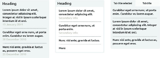
Figure 5-1. Three different list boxes in a design library: there is consistency across the designs, but they serve different purposes.
The design clearly follows a basic template, but there are three different variations depending on how prominent we need the box to be or the type of content it holds. For each of these boxes we provide the HTML, so different content or development teams can use the same code (this could even be supplied as a template file or a file that can be included so that changing the markup in one place changes it everywhere). The goal here is to make the HTML as similar as possible between the boxes (for example, clearly you will need different markup for the headings in the simple box and the tabbed box, but the double box doesn't need an extra element for the inner background color, you can use the list within the container).
The HTML for these boxes would look something like this:
<div class="box">
   <h2> Heading</h2>
   <ol>
      <li>
         <p class="content"> Lorem ipsum...</p>
         <p class="info"> 13 January 2011</p>
      </li>
      <li>
         <p class="content"> Curabitur...</p>
         <p class="info"> 28 December 2010</p>
      </li>
   </ol>
</div>
To switch between the styles of boxes, we would just add another class to the box container.[29]
The CSS for this HTML snippet does not need to be provided, since we can be sure it exists in the CSS for the site already, but image examples should show how the boxes cope with different types of content and how they behave in different positions in the pages. It would also be useful to provide Photoshop, Illustrator, or other layered artwork files that designers can copy and paste in their designs. This saves on the effort it takes to create new designs and ensures consistency between them.
It is clear that having a design library for this type of situation will save a lot of time that would be wasted in tasks such as going through existing pages of the website trying to find something that resembles the type of box we need, asking designers to come up with solutions that are already in place but aren't easily discoverable (resulting in many designs that are similar, but not exactly the same), or going through hundreds of lines of CSS to copy and adapt something that is only marginally different from another half a dozen solutions that already exist, adding redundancy and reducing flexibility.
These principles are very much in tune with what Object Oriented CSS (OOCSS) promotes: flexible CSS by the means of reusable classes, avoiding redundancy and reducing file size. This is a modular approach to CSS where each module can be placed anywhere in the markup and it will work correctly, adapting itself to its position with no dependencies on certain parents or children to obtain its characteristics. You can read more about OOCSS in Chapter 4.
Tip
Modular Web Design, by Nathan A. Curtis (http://www.amazon.com/Modular-Web-Design-Components-Documentation/dp/0321601351) is a great resource to draw upon when authoring your own design library.
Branding guidelines should provide CSS authors with the basics for consistent typography across the websites. Apart from the obvious type choice, they should state details such as font-size and line-height, font-weight, margins and padding, and color.
Without entering the domain of design, it is important that headings, body copy, lists, quotations, and so on have a clear hierarchy, and the brand guidelines should be created with this in mind.
There are legal implications in using fonts online. Fonts are licensed and not bought, and every font foundry has its own rules. The kind of license you have dictates where you can use them. Using Adobe as an example, it states that OpenType fonts can have four different categories for permission setting when embedding them in documents:
No Embedding: These fonts cannot be shared with unlicensed users under any circumstances. This is the most restrictive form of licensing.
Preview & Print: Fonts with this licensing scheme can be embedded in an electronic document in a read-only fashion, for example, in a PDF file.
Editable: Fonts licensed in this fashion can be embedded in electronic documents for viewing, printing, or editing; and any changes can be saved in the initial document. The fonts cannot be exported from the document or installed on the (unlicensed) end user's machine.
Installable: These fonts can be freely installed permanently upon users' computers.
Since using font files on the Web requires them to be (temporarily) installed on the user's computer via their local cache, the Installable type of license is the only one that is 100 percent safe to use. This precludes many fonts from being used in this fashion. Some font foundries offer fonts of this kind, but in a large organization it is likely the font used is licensed to the organization and therefore not suitable for distribution in this fashion.
Adobe provides more detail about its permissions at http://www.adobe.com/type/browser/info/embedding.html and provides a list of its fonts and licensing details at http://www.adobe.com/type/browser/legal/embeddingeula.html. If the font foundry that licenses your font does not have a similar list on its website, it is important to contact them to understand the licensing restrictions they impose. If you distribute fonts without the correct license, your company will be liable.
However, alternative methods of embedding fonts in web pages can use the Preview & Print license, as long as only a subset of the characters available is used. This is how sIFR (Scalable Inman Flash Replacement) can legally represent these images on web pages. As long as the entire character set of a font is unavailable, it's okay for fonts licensed in this way to be displayed on a web page.
On large websites that might have the need for internationalization and that suffer constant updates and additions, avoiding the use of images as a means to using custom fonts is paramount—today a lot is possible using just CSS (and we are not only referring to CSS3, but also to CSS2.1). More than that (particularly for links) text is seen by search engines to have greater value than alt attributes.
Although crucial elements like the logo, banners, or main headings may benefit from the use of the custom corporate font that your organization is using, you might want to think twice about using images for text on buttons, navigation, or normal headings.
This doesn't mean, however, that using fonts other than the typical web-safe ones (for example, Arial or Verdana) is out of the question. With the advent of font-face and the web services that it brings with it (explained further in the next section), serving custom typefaces to users across an assortment of platforms is an increasingly simple task.
The old way of replacing images is achieved with background images and a high negative text-indent value, to hide the original text off-screen. For example:
h2 {
   background: url(heading.png) no-repeat;
   text-indent: -1000px;
   height: 30px;
}
There are some disadvantages to using this method: users with CSS enabled but images disabled would see neither the text nor the background image replacement (leaving the text behind the image is not an option where the image is a transparent PNG), the image file slows the speed of the page, text is not selectable or scalable, and it is not easy to maintain.
Some variations of this technique include, for example, adding an extra element around the text, which is then hidden via CSS using display: none (or visibility: hidden). None of the techniques is perfect; each shows a combination of one or more problems such as the CSS on/images off scenario, making text invisible to screen readers or requiring superfluous HTML elements.
Another player in the image replacement field is Adobe's Scene7. It is typically used by large organizations as an automated way of creating headlines or images with custom text.
The other options for serving custom fonts are usually pared down to either Cufón or sIFR.
Cufón relies on JavaScript to work and even though it allows for text to be selected, there is no clear visual indication of it; sIFR relies on Flash to work, which makes it inappropriate for devices such as the iPhone or iPad, or in browsers that use Flash-blocking plugins. Both of these technologies also allow CSS authors to embed fonts whose distributing license doesn't permit them to be used online.
Cufón uses the HTML5 canvas tag (or VML in Internet Explorer). One of its main advantages over sIFR is its more straightforward implementation and font conversion process (you can do it directly on the project's website: http://cufon.shoqolate.com/generate/). After uploading the font to the generator and specifying the characters you require (which will result in a reduced character set), all you need to do is link to the Cufón script and to the generated JavaScript file that contains the font outline:
<script src="cufon-yui.js"> </script>
<script src="LillyRegular.js"> </script>
Then you need to call the JavaScript function for the bits of text you want to use Cufón on. For example:
<script>
        Cufon.replace('h1'),
</script>
You can also lock your generated JavaScript representation of the font to particular domains, so that it can't be easily downloaded and used by third parties. There is an option to do this in the generator.
Both of these methods are accessible because they can be read by screen readers (which makes it at the same time SEO-friendly). However, Cufón wraps every word in a span that can cause some screen readers to announce each word as if it were an entire sentence, or worse, to only announce the first word in each instance.[30]
Unfortunately, Cufón will not resize the generated text when the user changes the font size in their browser; sIFR has been able to cope with this since version 3.
sIFR's biggest disadvantage is that it uses Flash (on top of JavaScript): as mentioned previously, Flash is blocked or unavailable on some devices, so people browsing your website with them will see the next available font in your font stack. Also CSS authors in your team may not necessarily have the tools to author Flash files at hand to create new text (even though there are plugins available to make this process automated, like the jQuery sIFR plugin). Both of these methods will introduce a Flash of Unstyled Text (FOUT) as they execute. We will describe this issue later in this chapter.
Scalable Vector Graphics (SVG) can also embed fonts and are scalable (unlike regular images).[31]
All these methods can be considered to be font embedding, but the legalities vary from font to font. If the End User Licensing Agreement (EULA) for the font you want to use is unclear, we strongly recommend you contact the font foundry directly to check and see what you are allowed to do with the font. Legally, sIFR is a safer option than Cufón, as Adobe Flash is allowed to embed fonts, and many type foundries cater for this scenario on their EULAs. Cufón embeds the fonts on the website, which is in violation of many font EULAs.
Both Cufón and sIFR are supported by Internet Explorer 6. Even though you can automate the way these two technologies work, they will invariably consume resources and add dependencies to your website. Cleaner methods such as font-face (mentioned in the next section) should always be considered first as the ideal solution. Image replacement is not recommended other than for small portions of text such as headings.
When creating branding guidelines for the Web, it is important to take these factors into account. If these difficulties haven't been catered for, and the websites need to rely on image replacement for non–web-safe fonts, perhaps now is the right time to update the guidelines.
The @font-face rule was introduced in CSS3 and allows CSS authors to link to fonts that they can then refer to within the style sheet. Internet Explorer was the first browser to add support for this rule from version 4 (supporting only its proprietary format, EOT, however).
Note
Embedded OpenType (EOT) is a proprietary font format created by Microsoft for embedding fonts on the Web. The process of converting fonts into the EOT format is notoriously painful, with Microsoft's Web Embedding Fonts Tool (WEFT) being commonly described as nothing far from torture by most web designers. Luckily, these days there are other tools to achieve similar results, such as Font Squirrel's @font-face Kit Generator (mentioned later in this chapter).
At the time of writing, Internet Explorer Platform Previews have shown support for the WOFF[32] format.
Inside an @font-face rule, various descriptors can provide information like the name that will be used to refer to the font later in the file (font-family; but be aware that IE does not support names that are longer than 31 characters), where the font file is located and its format (src), or the font's style and weight (font-style and font-weight). Here is an example of an @font-face rule:
@font-face {
   font-family: "Lilly";
   src: url("fonts/lilly.eot");
   src: local("LillyRegular"), url("fonts/lilly.woff") format ("woff"), url("fonts/lilly.ttf")
format("truetype"), url(" fonts/lilly.svg#LillyRegular") format("svg");
}
@font-face {
   font-family: "LillyItalic";
   src: url("fonts/lilly-italic.eot");
   src: local("LillyItalic"), url("fonts/lilly-italic.woff") format ("woff"),
url("fonts/lilly-italic.ttf") format("truetype"), url("fonts/lilly-italic.svg#LillyItalic") format("svg");
}
The @font-face rule links to five different file locations because different browsers support different font file formats. The "local" reference is to provide the ability for the style sheet to use the local version of the font if it is installed in the user's system. Notice also that we need to declare two different @font-face rules in order to have a regular and italic version of the same font. We could have instead used the font-style descriptor to declare the italic variation, maintaining the same font-family name, but Internet Explorer and Opera (prior to version 10.5) would fail to understand it properly.
Internet Explorer has a few problems understanding some of the @font-face rule syntax. It doesn't understand the format() hint or multiple locations, and it tries to download non-EOT files even though it cannot read them. That's why we link to the EOT format in a separate declaration (followed by a local() src descriptor, which it doesn't parse).
When adding local font names, make sure to state the Postscript version (if it differs from the full name), so that Safari on OS X can understand it.
Another important factor to take into consideration is that in Firefox (Gecko), font files have to be served from the same domain as the page using them. This can be circumvented by HTTP access controls allowing cross-site HTTP requests.[33]
Firefox supports TrueType and OpenType formats (from 3.5), while version 3.6 added support for WOFF; WebKit (since version 525) and Opera (since version 10.0) support TrueType and OpenType, as well as SVG fonts; Opera 11 and above support WOFF; Chrome also supports WOFF since version 5; Internet Explorer has supported the @font-face rule since version 4, although it only accepts EOT fonts.
Tip
Font Squirrel provides an automated "@font-face Kit Generator" that makes it easier to convert font files into different formats (http://www.fontsquirrel.com/fontface/generator).
There is a known problem with font permissions and having font managers installed in your system, which can cause unexpected characters to appear when the @font-face rule tries to use local fonts. To avoid this problem, Paul Irish has proposed a revised rule, one that makes the browser ignore the local() reference, forcing it to download the linked fonts:
@font-face {
   font-family: "Lilly";
   src: url("fonts/lilly.eot");
   src: local("  "), url("fonts/lilly.woff ") format ("woff"), url("fonts/lilly.ttf") format("truetype"), url("fonts/lilly.svg#LillyRegular") format("svg");
}
"), url("fonts/lilly.woff ") format ("woff"), url("fonts/lilly.ttf") format("truetype"), url("fonts/lilly.svg#LillyRegular") format("svg");
}By using a character that is unlikely to be used as a real font name, this syntax avoids any issues that might arise from the user having software like FontExplorer X installed in their computer, but might force an unnecessary download.
Warning
Each browser has its own list of issues that need to be bypassed when working with font-face. Paul Irish has documented some of them in two posts that are frequently updated and that have had contributions from several developers at http://paulirish.com/2009/bulletproof-font-face-implementation-syntax/ and http://paulirish.com/2010/font-face-gotchas/.
While font-face allows a lot of flexibility in designing websites, font licensing needs to be considered before using just any font at all. There are also bandwidth issues that should be taken into account, as font files tend to be quite large—although this can be combated by using reduced character sets and gzipping the font files (with the exception of WOFF, which is already a compressed format), as well as the fact that fonts are very cacheable.
Warning
If you need to support many languages, font files can get big very quickly. To support all known languages, the font needs to support glyphs numbering into the tens of thousands.
A number of online services now provide designers with large font libraries and make it easy to embed them in websites (see Figure 5-2). This may be an option, but you need to remember that these services need to be continually renewed and paid for as a subscription service, and you will be relying on someone else's servers and their uptime.
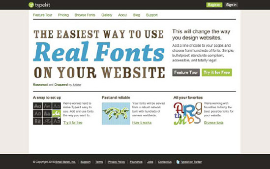
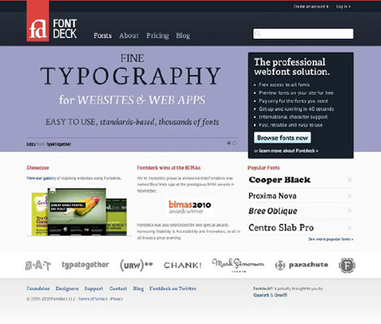
Figure 5-2. Typekit (above) and Fontdeck (below) are two online services that allow you to use font-face in your sites while providing the hosting and making sure all fonts are licensed to be used online.
Warning
To protect its fonts, TypeKit uses JavaScript, which creates a JavaScript dependency. Fontdeck uses a pure CSS solution to provide its fonts.
Free services like Font Squirrel have libraries of fonts that are free to use (see Figure 5-3). Usually you have to download the actual font files and host them yourself. Font Squirrel supplies an assortment of font formats to accommodate every browser (EOT, WOFF, SVG, and so on).

Using custom embedded fonts is better than using images, but you need to be prepared for them to fail in some browsers, and you need to be aware that the legalities may not make this a feasible option for you or your organization. It also effectively makes the font publicly available, and it is pedestrian for third parties to download and use this font in any way they see fit, which many companies who are protective of their brand are uncomfortable with.
CSS authors must anticipate that not every user will have the optimal font installed on their systems. This involves making sure that the style sheets include appropriate fallback fonts and also verifying if the layout of the website is flexible to accommodate variations in font sizes (some fonts may be larger than the optimal font and may break the layout if this isn't taken into account).
When choosing fallback fonts, one shouldn't simply pick fonts based on whether they are serif or sans serif. You should consider factors like whether or not the fallback font has an aspect ratio similar to the preferred font or not. An easy trick to determine whether a font is an appropriate substitute is to overlay words that use the different font options and check whether the height, width, and weight are similar enough to the optimal one. You can easily do this in a program like Photoshop or Fireworks (see Figure 5-4).

Figure 5-4. As you can see in the image, Chaparral Pro (dark gray) finds a better fallback in Times New Roman (right, light gray) than Georgia (left, light gray), although not perfect.
Making sure that the fallback fonts are similar to the preferred one is especially important when working with font-face related technologies, like Typekit or Fontdeck, mentioned previously. When using these, web pages will usually experience a delay in downloading and serving the correct font to the browser, showing, for a brief moment, the next available font. When this font is different in size and proportion from the one served by the font-face service, the contents on the page will jump, and the text flow will be rearranged, which can be disturbing for the users, particularly if they have a slow connection, or if they have reading and learning impairments, such as dyslexia. This is called a Flash of Unstyled Text (or FOUT), the font-specific version of the Flash of Unstyled Content (FOUC), which occurs when you can see the unstyled HTML of a website, before the CSS loads, or before JavaScript modifies the DOM.
The font-size-adjust property can minimize this, not only for when you are using font-face services and experience the jump but also when the user simply doesn't have the preferred font installed in the system or font-face is not in place. This property allows you to retain the aspect ratio of the preferred font if one of the fallback fonts is used. Let's take the following CSS:
p {
    font-family: Calibri, "Lucida Sans", Verdana, sans-serif;
    font-size-adjust: 0.47;
}
The font-size-adjust value will be divided by the original font-size value of the fallback fonts, preserving the x-height of the preferred font in the fallback ones. In the preceding example, if Lucida Sans, Verdana, or the default system sans serif font are used, in order for Calibri's aspect ratio to be preserved, their font-size will be divided by 0.47.
Tip
Some recommended font stacks can be found at http://www.awayback.com/revised-font-stack/.
Text can be set in various different unit types on the Web, and much has been said on the old pixels versus ems[34] debate. The two main advantages of setting text in pixels meet the needs of designers and developers: we have more control over the design and we don't need to perform complicated calculations to determine font sizes. The disadvantage falls completely in the user's domain: some browsers don't support font resizing on text that has been set using pixels. From this, it should be easy to deduce which are the pros and cons of using more flexible units like ems or percentages. (We go deeper into the subject of units in Chapter 6.)
While most new browsers (even Internet Explorer 7) allow the user to zoom in to (and out of) the entire page, he or she might want to zoom the text only. Some browsers (like IE 6 to 9) will ignore this user setting if the text has been set in pixels. Zooming in on the entire page may also cause the browser to display horizontal bars on wider sites, which can be rather annoying since it restricts the user's viewport in ways website designers don't consider, and might make content nonsensical if it results in its being cropped. A surprising number of people choose to zoom or adjust their font size, be it because they have some kind of visual or cognitive impairment or unusual screen size or resolution.
Whether you decide to use pixels, ems, or other unit measures in your sites, the guidelines will need to reflect that. It is the job of the designer (or team of designers) that produces the guide to determine which are the best scales and proportions to use. Guidelines should use pixels for default scenarios, like, for example BBC's Global Experience Language (GEL), where the font scale and sizes are expressed in pixels but the actual CSS of the websites use ems, as they are a more accessible choice.
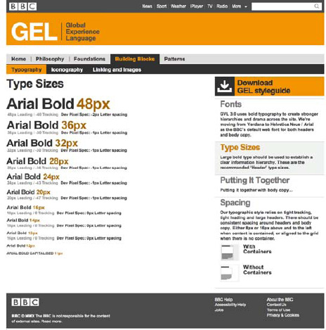
Figure 5-5. The BBC's Global Experience Language guidelines state the allowed type sizes in pixels, even though the BBC's websites use ems for font sizes.
On the BBC News home page, the h2 level heading of the top story has a font-size value of 2.461em. This number might seem odd, but if you look at the final computed value (you can use Firebug for this), you will see that it is in fact 32px (provided your browser is using the default type sizes). How have the developers come to this number? The font size of the body element is set to 62.5 percent. Since the default font size is usually 16px, this old trick makes it easier to do em calculations: 62.5 percent of 16 is 10. One em equals 10 pixels. Because the page wrapper and ancestor of the heading has "font-size: 1.3em" applied (making its computed value "13px"), we need to make the calculation of 32px/13px to know by how much we must increase the children's font-size so we get the desired 32px. Does it sound complicated? It is, and that is why, despite being a more accessible solution, so many CSS authors shy away from using ems as the type size unit in their style sheets. We recommend you take the time to do the work, and use ems where possible.
Color is a fundamental factor in how a brand is perceived. Some brands are so connected to their colors that sometimes we don't even need to see their names and can recognize them from their colors and shapes (for example, the National Geographic golden rectangle or Coca-Cola's red script font).
Because of this, every brand style guide will almost certainly include a section related to color: what color palette can be used, what the appropriate combinations and ratios are, what each color represents in the branding color landscape, and so on.
With these guidelines in place, it is important that implementation teams are aware of them, and know how to use the colors and how they translate to the Web—it is not uncommon for front-end developers to not even be aware of the fact that there are predefined colors that they are supposed to be using on the websites they are building or augmenting, let alone understand the appropriate use for those colors. This then causes frustrations to both designers and developers and dilutes the brand to the users.
It is also important for designers to understand that colors work differently in print and on the Web, starting with the fact that whereas printed material will look the same for every person, every user browses the Web with a different monitor or device, with different capabilities, calibrations and configurations. When developing the style guides, web designers (as with print designers) should be considerate of people with visual impairment or color blindness, and make sure that the colors and color combinations included in the designs provide the right amount of contrast, but these are issues that fall into the accessibility spectrum rather than in the subject of this chapter and are therefore discussed further in Chapter 6.
Whether the brand guidelines were developed with web colors in mind first and followed by their print counterparts, or the other way around is a designer's choice; as long as there is a defined and agreed palette to be used on the Web.
Some visual branding guides, however, don't make any reference to screen colors. This can happen either because the guide was produced at a time when the Internet was not a medium taken into consideration, or simply because it's incomplete. In either case, the guide should be amended to include the appropriate color references to be used on the Web, avoiding time waste and imprecise usage of colors, since each CSS author will have to convert CMYK and Pantone colors to RGBA, hexadecimal, or the preferred color format for the website,[35] and this process should be signed off by a designer or design team.
Color can be a powerful instrument in differentiating between subsites or sections of a website. For example, if you have a sub brand that is geared toward children, it will probably be designed with bolder and brighter colors, while if you have a premium brand within your organization, you might be using more classic and elegant colors.
When constructing sub-brands and their websites, rather than coming up with completely new layouts for the pages, it is easier from the point of view of both user and developer to maintain some consistency across the range of sites, while still keeping the differentiation clear—we want them to know they are still within our umbrella family of websites, but looking at a different product.
Fox is a great example of how, by using the same basic template you can have an almost unlimited range of different subsites, in this instance for each show. In Fox's case, the bold background images are relevant to the specific show, while the link color scheme follows the branding for that show. However, the layout of the page and the navigational elements' design and behavior stays the same. This is a good demonstration of how to achieve the appearance of variation while in fact keeping the design templates consistent, resorting to color (and imagery) for differentiation and avoiding a jarring and inconsistent user experience.

Figure 5-6. Fox's American Dad and Master Chef websites: two examples of how by using the same template and employing different color schemes and images you can achieve differentiation.
One thing to bear in mind is that users rarely group sections of a website by color or understand its significance (even though people within the organization and developers might do) unless the color is already associated with a brand. The cases mentioned here are examples of that; color-coding the departments of your company is something completely different, as they aren't perceived to the outside as "brands."
As well as living within visual style guides, it is useful to have a color palette reference in the CSS files themselves. In Chapter 2, we show how these can be included within the CSS comments, so that there is always a handy reference for authors. Here is an example of how you can keep a color palette at the top of your CSS file:
/* Color reference:

Main text    #333333
Background   #f7f7f7
:link,
:visited     #dd4814
:hover,
:active,
:focus       #bc522d
...

*/
You may choose to use CSSDOC comments instead; you can see a more detailed explanation of how to do this in Chapter 2. This method does require you to maintain the information in two different places, and though keeping these references within your CSS files is convenient, you may prefer a single point of reference that is more likely to be accurate.
Using dynamic CSS or compilers like LESS or Sass, colors and color updates on large websites can become more easily manageable. Using these technologies you can easily set up variables for the most commonly used colors like main text, links, backgrounds, or borders, taking out of the equation the need to constantly refer to a color guide to use the correct hexadecimal code or RGB reference. You can even generate entire color schemes based on three or four main colors, by basing other colors on these and using color calculations. We go into greater detail on this subject in Chapter 9.
Older browsers don't support the new CSS3 color formats, like RGBA or HSLA. For those browsers, you must always make sure to provide a fallback color. For example, if specifying a transparent background color on a div, you would supply older browsers with a declaration before the RGBA one (which will be ignored, as it is not supported):
div {
   background-color: #b9cf6a;
   background-color: rgba(255, 255, 255, 0.3);
}
In the previous example, we didn't specify the exact hexadecimal version of 255,255,255, as that would be solid white. Instead, using a color picker tool (like, for example, xScope http://iconfactory.com/software/xscope) you can select a color that is an approximation of the transparent color and the underlying color beneath it, to give older browsers a more accurate design. These fallback colors are unlikely to be specified in a branding guide, so it is the job of a diligent and thorough CSS author to make sure they are present and are accurately chosen. It is always better to be safe than sorry, so leaving a comment as a reminder to update the fallback color in case the original color changes is always a good idea.
When using CSS gradients, remember to always specify a fallback background color, making sure that, on browsers that don't support them, there is still enough contrast between background and foreground. The same applies to using images as background colors (to be exact, CSS gradients are in fact dynamically generated background images and not colors); always specify a background color for the container and always test the website with images turned off and CSS turned on—it can be extremely frustrating for users browsing with images disabled (on slower connections or on mobile devices) to not be able to access content because the developer forgot to define a background color and relied on the background image for contrast. Users on slow connections will also see your site with the images missing for a moment before they load anyway, and the less dramatically the screen changes, the less jarring it is for the user when it happens.
Defining the basic structure of the page is an important step when coding CSS websites and one that will influence the rest of the process. Rather than just throwing divs on to the page as the need arises, it is important that there is a solid foundation in place—a defined grid upon which each individual page can be built.
The use of grids and templates will also improve the flexibility (and adaptability) of your CSS files and designs, helping to maintain layout consistency.
Knowing how to best use grids is an essential skill for any designer, be it on the Web or outside of it.
Using grids doesn't mean creating rigid layouts, though—they are part of the foundation of the design, contributing to a solid, well-thought structure, and helping to make some of the decisions; but, as with any set of rules and constrains, they are also there to be broken.
Some of the most original layouts on the Web have been composed on top of properly defined grids. Let's look at an example (see Figure 5-7).

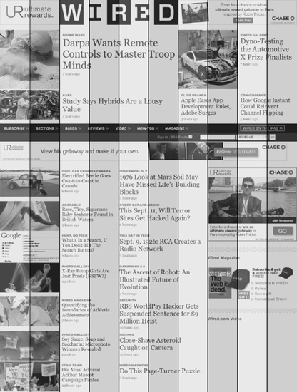
As you can see, even though it follows a grid, the design of Wired's website doesn't feel rigid. On the contrary, it feels expressive and dynamic.
A carefully considered grid is flexible, it lends itself to a multitude of layout designs, helping maintain uniformity between the different pages, and it should aid in keeping branding consistent. The designer's work is not complete when the grid is finalized, though; a good grid will be useless if its only purpose is to correctly align every element on the page.
Although correct alignment is a fundamental step in achieving balance and harmony, other aspects of the design will not be covered by it—the visual hierarchy of the elements, colors, typography and so on still need to be considered. Designing is not just positioning elements inside a grid.
One of the downsides of trying to translate a grid to HTML and CSS, is that the natural flow of the content (the outline of the document) may become neglected and be subsidiary to the grid. This happens when the layout starts to behave more like an old table-based layout.
Even though table-based sites were almost perfect when working with solid grids, one of their (many) downsides was the fact that form didn't follow content; content followed form. The visual position of the content on the page was more important than the meaning and flow of the content itself. If the HTML is basically creating boxes to be positioned, as a table would do, then we are not doing the content justice.
This is the approach that many CSS frameworks take, and it's one of the reasons why so many CSS authors prefer not to use them.
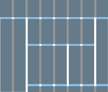
In Figure 5-8, we have a basic 8-column grid; each column is 100 pixels wide, with a right and left margin of 10 pixels each.

The first instinct when coding this layout might be to focus on the columns and create eight containers that are floated to the left:
div {
   width: 100px;
   float: left;
   margin: 0 10px;
}
But more likely is a grid that will have elements within it that span across more than one column, as shown in Figure 5-9.
This grid can be translated into HTML and CSS in many different ways, but the optimal way is always that one that takes the actual content and flow of the page into consideration and keeps the order intact. The grid is secondary, and the content shouldn't become its subordinate; it is merely an instrument to achieve layout consistency and harmony.
In our example, we could start by defining the most important content blocks and extract their widths from the underlying grid:
header {
   width: 940px; /* full width */
}
nav {
   width: 220px; /* 2*100px + 1x20px */
   float: left;
}
#highlight {
   width: 580px; /* 5*100px + 4x20px */
   float: left;
}

...

aside {
   width: 100px; /* single column = 100px */
   float: right;
}
The grid exists to provide the designer and CSS author with measurements in which he will base some of the design decisions and that will make the translation from the design phase into the coding phase less prone to subjectivity. If the person in charge of the CSS knows that an element that spans across two columns in the design is automatically 220 pixels wide, this will help the design maintain consistency and balance.
We will cover the process of working with a grid in more detail in Chapter 11, where we will create a framework from scratch.
HTML and CSS templates provide the authors with a solid base upon which they can build. Templates are a simple way of ensuring that key elements like headers, navigation, basic page structure, and typography are consistent across a range of sites and sub-sites.
There are a few differences between templates and CSS frameworks, even though their purposes intertwine. Existing CSS frameworks consist of libraries of prebuilt code that you can adapt to the project at hand. There are several existing CSS frameworks that are freely available and used by many developers and agencies (and which we cover in Chapter 4), such as 960gs or Blueprint. In some cases, teams create their own CSS framework (an approach that we highly recommend and cover in Chapter 11). Frameworks should be adaptable, flexible, and modular.
Templates can take a different approach. You may have an HTML and CSS template that includes the header, main navigation, content area, and footer of an example website, and that should be used across the family of websites within your organization. This doesn't imply, though, that this set of files permits for the modular and versatile approach that frameworks do.
Templates are basic examples of how the markup should be structured and how the CSS ties to it—they exist as a skeleton of what the page will be. The ideal scenario would be to build HTML and CSS templates based on the existing CSS framework, so that the developers can see living examples of how CSS files can be used, overridden, and adapted to the various page templates.
It is often customary for organizations to change the design and content of their websites according to relevant seasons, holidays and events, like the beginning of summer, Christmas, New Year's, or sales campaigns.
These updates are usually a good way of showing that the website isn't stagnant in time; that it is being constantly updated; and most importantly, that the company, product, or service behind it cares about the same things that their customers do—it increases engagement.
While sometimes rebranding may be related to a one time only occasion (for example, the 25th anniversary of the company), recurring events also instigate these updates (for example, yearly, like Christmas rebranding, or several times a year, like end of season sales campaigns).
One of the best examples of seasonal rebranding is Starbucks' Christmas website. Alongside the redecoration of their stores around the world to match the spirit of the season, Starbucks also presents their website visitors with a revamped design, in tune with the stores and ad campaigns, in perfect marketing choreography (see Figure 5-10).

It is the job of the designers to handle the creation of more involved re-theming of the sites in terms of design, but the changes will eventually fall into the hands of CSS authors and other developers, who will need to be able to override existing style sheets with the updates.
This can be seen as a trial of fire for CSS: the style sheets need to be flexible enough so that overriding some rules doesn't turn into a specificity nightmare.
Note
Notice how often the term specificity nightmare is mentioned in this book? This is due to the fact that we are sadly too familiar with it, as it is a frequent situation that CSS authors are faced with—the result of non-flexible and fragile style sheets.
If the CSS is using overly specific selectors, when creating a new theme you will have to create even more specific selectors. Ideally, you should be able to add a class or ID of, for example, "christmas" to the body element, and either link the seasonal style sheet after the default one in the header section of the HTML, or incorporate the new rules into the existing main file.
Threadless, for example, adds a class to the body tag so that certain elements of the site can be targeted and their CSS overridden with the changes (see Figure 5-11).
.holiday_week_2_3 .footer_wrap {
    background: url(/imgs/sale/black_friday/bg_footer.jpg) no-repeat scroll center 30px
#ffffff;
    clear: both;
    overflow: hidden;
    padding: 90px 0 0;
}

You can read more about overriding CSS files in Chapter 4.
Brands don't stay unchanged forever. Even though the most established and recognizable brands tend to avoid radical rebrandings that could harm the way they are perceived by their customers and by the general public, it is not rare to see them make smaller updates, that are almost unnoticeable externally, but that still involve some amount of work to the web implementation teams.
These small changes can include typographical improvements, color changes, updates to the imagery used throughout the sites, minor layout and navigation adjustments, and logo replacement, among others.
It is also not uncommon to see large corporations refresh their websites once every two or three years. This may happen for a variety of reasons: an overall brand redesign needs to be reflected on the website, the website looks dated (this happens especially if it was designed to follow web design trends that have quickly gone out of fashion), the company has been restructured, or the content of the website itself has been restructured, to name but a few.
Even brands that tend to stay immutable through time make small alterations to their websites, mainly because of the fast-changing nature of the medium, and also because these changes are often less costly than, for example, redecorating an entire fleet or reprinting the stationary for thousands of employees.
Because there are usually costs associated with making these changes, and speed is always something that is sought after, it is important to prepare for them by creating flexible CSS documents that can be updated as easily as possible for small or large adjustments.
This is essentially what this book is about: making the CSS of your websites adaptable, easy to handle by a large number of people, and lend itself to being updated when the need arises without breaking everything else.
When a website faces a large update or a redesign, it is important to decide sooner rather than later whether it is better to start from scratch or whether the existing CSS is flexible and easy to adapt to the changes. Usually if the underlying markup is being redone, that will also mean that the CSS will need to be restructured, as the way the markup is built tends to be directly linked to how the CSS is organized.
The most common scenarios, though (and the ones that make it essential for large websites to have dedicated web teams), are related to less apparent, ongoing updates that, even though small, continually test the robustness of both markup and CSS. This could be something like adding a new link to the main navigation, updating the color of the text to make it more accessible, realigning the grid, creating a new sidebar widget, or preparing the site for a new version in a different language—common, day-to-day tasks in any web implementation team.
These are all great examples of why it is important to keep CSS consistent and flexible, and of how up-to-date and detailed CSS and design and brand style guides make it easier to implement new elements or expand existing ones.
A large part of CSS authors' and front-end developers' jobs is to make designs come to life on the Web. User experience designers, information architects, and visual and graphic designers put their knowledge and best efforts into creating distinctive brands and products. Making sure the implementation of their work is conducted seamlessly is vital, as it will influence how your organization is seen outside (and inside) and ultimately its success. There are various aspects that professionals working on the Web need to take into consideration, and we assume they know the medium's potentials but also its limitations. Establishing clear brand and design guidelines, making sure everyone knows and understands them, and having a process in place that sets up design rules but allows for flexibility and efficiency is what every team working on large-scale websites should strive for and what this chapter should help to achieve.
In the next chapter, we will discuss accessibility and how it impacts your CSS. We will look at the impairments that can affect our users and the steps you can go to ensure they have the best possible experience.
[28] Ron Kohavi and Roger Longbotham's 2007 article "Online Experiments: Lessons Learned"—published by The IEEE Computer Society—stated that on Amazon.com every 10-millisecond increase in page load time resulted in a 1 percent decrease in sales, and a 500-millisecond increase in Google's search results display time caused a 20 percent revenue decrease.
[29] For the tabbed boxes, we would add a class (e.g. "tab") to the box container and repeat it for each tab, wrapping all the divs in a container with a class (of "tabbed," for example), and use JavaScript to rewrite the DOM later. This way our code still makes semantic sense for users with JavaScript disabled.
[30] If you set the "separate" option to "none" this problem is alleviated. However, the reason Cufón does this is so that it can wrap text onto the next line. Fixing the first problem reintroduces the second.
[31] We do not recommend SVG as a text replacement technique, since it is not supported by versions of Internet Explorer earlier than 9. You can fake it with SVGWeb (http://code.google.com/p/svgweb/), but that uses Flash, so you may as well be using sIFR.
[32] The WOFF font format was developed by the Mozilla Foundation alongside font designers Erik van Blokland and Tal Leming, and is in the process of becoming the standard recommendation by the W3C (after being submitted by Microsoft, Mozilla, and Opera). WOFF was developed with the Web in mind. It is a compressed font format that basically repackages font data; other formats like TrueType or OpenType can be converted to WOFF, and metadata such as font licensing information can be attached to the file. Many of the font foundries support WOFF, as they believe it to be more secure, so it is likely that more and more commercial fonts will be licensed to use via font-face with WOFF.
[33] Read more about this at http://openfontlibrary.org/wiki/Web_Font_linking_and_Cross-Origin_Resource_Sharing.
[34] An em is so called because it is thought to be the height of an upper case "M" character. In fact, according to typographer Robert Bringhurst, "The em is a sliding measure. One em is a distance equal to the type size. In 6 point type, an em is 6 points; in 12 point type an em is 12 points and in 60 point type an em is 60 points. Thus a one em space is proportionately the same in any size."
[35] CMYK, RGB, and Pantone colors have different color gamut (subsets of colors), and some colors in one color model are "out of gamut" (cannot be accurately reproduced) in the others. Read more about color gamut here: http://en.wikipedia.org/wiki/Gamut.