
Chapter 3: Create Your First Graph
Create a Histogram from the Graph Gallery
Change the Title and Remove the Footnote
Add a Horizontal Box Plot to the Empty Cell
Copy and Paste the Graph to Another Application
Save the Graph in the Graph Gallery
About This Example
Let’s jump right in and create a commonly used graph. This example uses many of the key features of the SAS ODS Graphics Designer (the designer). Some of these features are described in more detail later in the book. For this example, the right amount of description needed to create the graph and gain a basic understanding of the process is provided.
Let’s make a distribution plot of city gas mileage for all cars in the Sashelp.Cars data set:
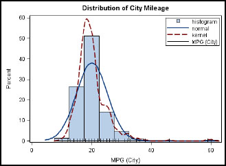
Figure 3.1 Distribution of City Gas Mileage

The graph includes the following features:
● a histogram of the MPG_CITY variable from the Sashelp.Cars data set
● overlaid normal density curve and kernel density curve
● an overlaid fringe plot showing individual observations
● an inset legend
● a separate horizontal box plot
● a common external X axis
● a graph title
Create Your Graph
The following sections walk you through the steps of creating your graph.
Create a Histogram from the Graph Gallery
The Graph Gallery is displayed in the work area as shown in Figure 3.2. For graphs that are created from the Graph Gallery, placeholder data is assigned to the graph.
Note: If the Graph Gallery is not displayed, select View ►Graph Gallery.
To create the histogram:
1. On the Basic tab of the Graph Gallery, select the Histogram icon.
2. Click OK.
You can also double-click the Histogram icon. For future steps, this book uses the double-click action when it is available.
Figure 3.2 Graph Gallery with Highlighted Histogram and Basic Tab

A graph window is displayed that includes a histogram plot. The Assign Data dialog box for the histogram appears, showing the placeholder data assignments.
Figure 3.3 Placeholder Data in the Assign Data Dialog Box

Note: Do not click OK in the Assign Data dialog box. You will change the data assignments in the next step.
The placeholder data enables the designer to show a visual draft of the type of plot that has been included in the graph. In this case, the designer uses the HEIGHT variable from the Sashelp.Class data set. Using this placeholder data, the designer creates the histogram.
The Assign Data dialog box is discussed in more detail in Chapter 4. For now, it’s sufficient to know that you use this dialog box to change the data assigned to the plot and to the analysis variable.
Assign Data to the Histogram
Assign the MPG_CITY variable from the Sashelp.Cars data set to the histogram.
1. In the Assign Data dialog box, select CARS for Data Set.
The previous variable, HEIGHT, is not available in the new Sashelp.Cars data set, so the Analysis variable setting has been cleared. Because an analysis variable is required, the settings for the histogram are not complete. As a result, the plot identifier is shown in red and the OK button is not available.

2. Select MPG_CITY for Analysis.
3. Click OK.
The designer creates the graph with a histogram and a placeholder title and footnote.
Figure 3.4 Histogram with Title and Footnote Placeholders

Note: Your graph might be a different size from the one shown here. For information about the graph sizes used in this book, see “Graph Size” in About This Book.
Change the Title and Remove the Footnote
Replace the placeholder title and remove the footnote.
1. Double-click on the placeholder title (“Type in your title”). The placeholder text is highlighted:![]()
2. In the text box, enter Distribution of City Mileage.
3. To remove the footnote, right-click on the placeholder footnote (“Type in your footnote”), and select Remove Footnote.
Your changes are reflected in the graph.
Figure 3.5 Graph with New Title

Other actions related to titles and footnotes include the following:
● To set title properties, right-click on the title, and select Title Properties. The Text Properties dialog box is displayed from which you can customize the visual properties of the title, such as font, color, and so on. You can do the same for the footnote.
● You can insert more titles and footnotes using the Insert menu.
Add Plots to the Graph
When a graph is displayed in the work area, the Elements pane is active. You can easily add a plot from the Elements pane to the graph cell, assuming the plot being added is compatible with the existing plot and its axes settings in the graph cell. Plot compatibility is discussed in more detail in Chapter 4.
For this example, let’s add a normal density curve, a kernel density curve, and a fringe plot to the graph. These plot types are compatible with the histogram and can be added to this graph.
Figure 3.6 Normal Plot in the Elements Pane
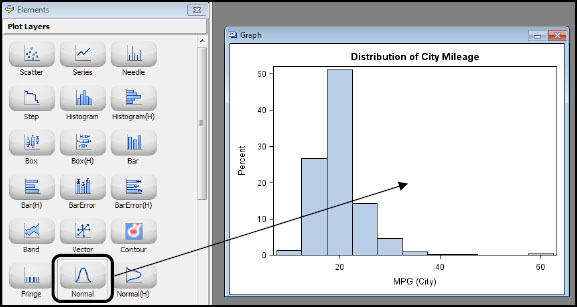
1. In the Elements pane, click the Normal icon as shown in Figure 3.6. Drag and drop the Normal icon onto the graph. The Assign Data dialog box for a normal density curve is displayed.

Note the following in the dialog box:
◦ Library and Data Set are not available. All the plots in a single cell of a graph must use data from the same data set.
◦ Fit an existing plot is selected by default. With this option, the normal density curve uses the same data settings as the histogram. There is only one plot currently in the graph—the histogram. If there were more plots, you would have a choice of which plot to use for the fit.
◦ Because Fit an existing plot is selected, Analysis is not available. The newly added plot must use the same data as the histogram. In this example, the normal density curve is fitted with the same analysis variable as the histogram.
2. Click OK. The normal density curve is added to the graph.
3. In the Elements pane, click the Kernel (kernel density curve) icon. Drag and drop the Kernel icon onto the graph.
![]()
The Assign Data dialog box for a kernel density curve is displayed.
This dialog box is similar to the dialog box for the normal density curve. Fit an existing plot is selected by default.
4. Keep the default selections and click OK. The kernel density curve is added to the graph.
5. In the Elements pane, click the Fringe icon. Drag and drop the Fringe icon onto the graph.
![]()
The Assign Data dialog box for a fringe plot is displayed.
6. Select MPG_CITY for X.

4. Click OK.
The graph is updated with the new plots.
Figure 3.7 Graph with Normal Density Curve, Kernel Density Curve, and Fringe Plot

Set Plot Properties
Figure 3.7 shows the distribution of city mileage for all cars in the Sashelp.Cars data set using a histogram, two density curves, and a fringe plot. Because the density curves have the same visual properties, it can be difficult to tell which one is normal and which one is kernel.
To make them clearer, you can modify the visual properties of the kernel density curve. Select the kernel density curve, and then change the properties.
1. In the graph, select the kernel density curve. (The kernel density curve is the taller of the two curves.)
The kernel density curve is selected and in bold. The other plots in the cell are dimmed.

2. Right-click on the curve, and then select Plot Properties. The Cell Properties dialog box is displayed with the Plots tab selected.
3. Make sure that kernel is selected as Plot. If not, select kernel.
The style element currently assigned to the kernel density curve is GraphFit, as shown in Style Element. (For more information about style elements, see “Visual Properties of a Graph” in Chapter 4.)

4. For Style Element, select GraphFit2.
When you change the style element, the plot’s attributes, such as color and pattern, are automatically changed to reflect the new style element.

5. Click OK.
The graph is updated to reflect your changes.
Figure 3.8 Modified Appearance for the Kernel Density Curve

Add and Modify a Legend
In Figure 3.8, the visual properties of the two density curves are now distinct, but it is still difficult to see which one is the normal density curve and which one is the kernel density curve. To be able to identify the curves, add a legend.
The designer provides two types of legends:
Cell legend
is placed inside the data area of a cell. It is available from the Element pane’s Insets panel. By default, this legend contains information for all the plots in that cell. It contains entries for only the plots in that cell.
Global legend
is placed outside the cells. It contains entries from all the plots in the entire graph, including multi-cell graphs. A global legend can be added to the graph by selecting Insert ►Global Legend or by clicking the global legend ![]() toolbar button.
toolbar button.
For this example, add a cell legend to the cell in the empty space in the upper right corner. Then, modify the legend to contain only the entries for the normal density curve and the kernel density curve.
1. In the Insets panel at the bottom of the Elements pane, click the Discrete Legend icon.

2. Drag and drop this icon onto the upper right corner of the cell.
A legend that contains all the plots in the cell is added to the graph. However, it is unnecessary to show all the plots in the legend because some of that information is obvious. In this example, the histogram and the fringe plot are easily identified, so remove those entries from the legend.
3. Right-click on the legend, and select Legend Contents.
The Legend Contents dialog box is displayed. Initially, check boxes for all the plots in the cell are selected.

4. Clear the check boxes for histogram and fringe.
You can customize the label that is displayed beside the chicklet in the legend. In this example, capitalize the normal density curve and kernel density curve legend labels.
5. In the Edit Legend Label column, double-click normal. Replace the lowercase n with a capital N.
6. Double-click kernel, and replace the lowercase k with a capital K. The Legend Contents dialog box should now resemble the following:

7. Click OK.
The graph is updated to reflect your changes.
Figure 3.9 Graph with a Cell Legend in the Upper Right Corner

Add a Row to the Graph
Now, let’s add a horizontal box plot to the graph in a separate cell below the histogram. To do this, first you have to add a new row to the graph.
To add a new row, right-click anywhere in the plot area, and select Add Row.
The graph area is split into two rows of equal height. You now have a graph with two rows; each row has one cell.
Tip: You can add a column by right-clicking and selecting Add Column. Cells are always added in full rows or full columns to create a regular grid. After adding the row for this example, if you then add a column, the graph will contain four cells.
The new cell is empty except for the text “drop a plot here.” You can now populate this cell with plots and insets.
Figure 3.10 Graph with Two Rows

Add a Horizontal Box Plot to the Empty Cell
1. In the Elements pane, click on the Box(H) icon, and drag and drop the icon onto the bottom cell of the graph.

2. The Assign Data dialog box for the horizontal box plot is displayed.
Library and Data Set values are based on the previous settings for the graph. You can keep those settings for the new plot. However, because this is a separate cell, you can select a different library and data set. The requirement about using the same data set applies only to plots in the same cell.

3. For Analysis, select MPG_CITY.
For a box plot, the analysis variable is required. Category can be set to create box plots by category, but this is not required.
4. Select OK.
The box plot is added to the graph.
Figure 3.11 Graph with a Box Plot in the Bottom Row

Starting with SAS 9.4, the height of the new cell is automatically reduced to fit the single box plot.
Use a Common X Axis
In Figure 3.11, each cell has its own X axis. The two axes are independent of each other, and their data ranges do not match. In this case, you want the two axes to match. Also, you don’t need two separate axes because they take up valuable space in the graph and can be misleading.
To use a common X axis for both rows, right-click on one of the X axis areas, and select Common Column Axis.
A common column axis is created for all the cells in the column (two cells in this example). It is displayed at the bottom. The axis range for the common column axis is the union of the ranges for each cell in the column. All plots in each cell in the column are drawn correctly scaled to this new common column axis.
Figure 3.12 Graph with a Common X Axis

The two rows resize to fit their contents. The bottom row is shorter than the top row.
Note: In early releases of the designer, the rows are not automatically resized. If that is the case for you, you can change the height manually.
Position the cursor between the upper and lower row of the graph. A dashed line appears between the rows, and the cursor changes to a two-headed arrow ![]() .
.
Click and drag the dashed line downward to reduce the height of the bottom row.
View the GTL Code
The designer is an excellent tool for learning the Graph Template Language (GTL). The designer generates GTL code as you create a graph.
To view the generated GTL code, select View ► Code.
The code window is displayed in the work area for the active graph.
For simplicity, the following figure shows the code window for the state of the graph when it contained only a histogram, a normal density curve, and a title.
Figure 3.13 GTL Code for the Histogram and Normal Density Curve

Figure 3.13 shows the GTL code needed to create this graph using the TEMPLATE procedure and the SGRENDER procedure. The boxed section shows the layout overlay block containing the histogram and normal density curve.
You can leave the code window displayed and view the changes to the code as you make changes to the graph.
The code window is Read-only. You can save the code as a SAS file, or you can copy and paste the code into SAS and run the program.
Copy and Paste the Graph to Another Application
At any stage, you can copy an image of the graph to the clipboard. Then, you can immediately paste it into a Word document, an email message, a PowerPoint presentation, or some other application that supports the paste feature.
1. Select Edit ► Copy. An image of the active graph is copied to the clipboard.
2. Paste the image into an application by using the application’s paste command, such as Ctrl-V.
Save the Graph to a File
Save the Graph as a SAS ODS Graphics Designer File
You can save the graph in the SAS ODS Graphics Designer (SGD) format, which is a metafile format recognized by the designer. These files include the GTL code and other relevant information so that the designer can re-open the graph later for further modification.
1. Select File ► Save As.
2. In the Save dialog box, select the SGD file type.
3. Provide a name for the file, and click Save.
You can open a previously saved SGD file by selecting File ► Open, and then selecting the file that you want to open. Any SGD files in the selected folder are represented using an icon for the graph.
Note: You use this SGD file later in the book, so be sure to complete the previous step.
Save the Graph as an Image File
You can save a copy of the graph to the file system as an image file. The designer supports multiple industry-standard image formats such as BMP, EMF, GIF, JPG, PDF, PNG, PS, SVG, and TIF. For the PNG format, you can specify a DPI to get higher resolution files.
1. Select File ► Save As.
2. In the Save dialog box, you can do the following:
◦ specify the filename and folder into which to save the file
◦ select a file type
◦ select image resolution in DPI for PNG files
Save the Graph in the Graph Gallery
After you have designed a graph, you can add it to the Graph Gallery. You can then open and reuse the graph like you would any graph in the gallery.
Although graphs cannot be saved on the first six tabs of the gallery, you can add new tabs to the gallery.
To save the graph to the gallery:
1. Select File ► Save in Graph Gallery. The Save in Graph Gallery dialog box is displayed.

2. For Group Name, select the name of the group into which you want to add the graph. Each group corresponds to a tab in the gallery.
Group Name contains the names of groups that have been created at your site. It does not contain the names of the default groups. If no groups have been created at your site, or if you want to create your own group, do the following:
a. Select the New ![]() icon.
icon.
b. In the Create New Group dialog box, specify a name for the group. For this example, specify MyGraphs, and click OK.
The new group appears in Group Name in the Save in Graph Gallery dialog box.
3. For Graph name, enter Histogram.
4. (Optional) The designer creates a default graph icon for the generated graph. If you want to replace the default icon with an icon from your file system, click Browse, and select a different icon.
5. (Optional) For Tooltip, you can provide a description that is displayed as a tooltip for your new graph.
6. Click OK.
The graph is saved in the Graph Gallery for future use. Your gallery might look something like this:
Figure 3.14 Graph Gallery with the MyGraphs Tab

Run the Graph in Batch Mode
Graphs saved as SGD files can be run in the SAS windowing environment or in a batch session by using the SGDESIGN procedure.
proc sgdesign sgd='c:histogram.sgd';
run;
In the code, replace c:histogram.sgd with the name and location of the SGD file that you saved.
The graph is run using the definition in the SGD file and the original data set used to create the graph. The libref and data set should be available in the SAS session.
SGD graphs can be run with different data as long as all the required variables exist in the new data set. You can specify different data by using the DATA= option in PROC SGDESIGN. This topic is covered in more detail in Chapter 7.