Chapter 4: Understanding Plot Types, Data Roles, and the Visual Properties of a Graph
Review of the Process for Creating Graphs
Summary of Combining Plots and Insets
Data Assignment When Adding a Plot
Data Assignment from the Pop-Up Context Menu
Custom Features of Other Assign Data Dialog Boxes
Statistics Data in the Assign Data Dialog Box
Overview of Styles and Style Elements
Properties That Affect the Entire Graph
Review of the Process for Creating Graphs
Before moving on to plot types, data roles, and visual properties, let’s review the process for creating graphs.
In Chapter 3, you created a distribution plot (shown in Figure 3.1) of city mileage for all cars in the Sashelp.Cars data set. To create this graph, you used a building-block process. You started by creating a simple histogram. Then, you added more details to the graph by layering multiple density curves on the histogram. You customized the axes and the title, and you added a legend. You split the graph into two rows of cells, and you populated the lower cell with a box plot. You used a common X axis for the graph.
This is the same process that you will use to create all graphs in the SAS ODS Graphics Designer (the designer). This process applies to a single-cell graph as shown in Figure 3.9, to a multi-cell ad hoc graph as shown in Figure 3.11, and to multi-cell panel graphs as you will see in Chapter 5.
Just like any good recipe in a cookbook, to create a graph in the designer, you need a set of ingredients and a method. Here you go:
● Typically, you start with a graph from the Graph Gallery. This gives you a graph with an overlay container that contains a plot, a placeholder title, and a placeholder footnote.
● Or, you start with a blank graph with only an overlay container.
● You add plots and assign variables in the Assign Data dialog box.
● You can customize the properties for each plot. Remember, in Chapter 3, you specified a different style element for the kernel density curve.
● You can split the graph into multiple cells, and populate each cell with plots.
● You can add and customize titles and footnotes.
● You can customize the axes or use a common axis for multi-cell graphs.
● You can add and customize the legends.
● You can customize the graph properties, and save the graph for further processing.
Although the method is always the same, the ingredients can be different each time. The ingredients include a combination of plots, legends, entries, titles, and footnotes. In this chapter, let’s look at the following:
● the behavioral aspects of the plot
● the required and optional variables in the Assign Data dialog box
● some of the graph properties that can be customized
Plots and Insets Groups
All the plots and insets that can be used to create a graph in the designer are represented as icons in the Elements pane. (See Figure 2.3 in Chapter 2.)
The icons are ordered by their frequency of use in analytical graphs. The scatter plot is the most commonly used plot.
The plots can be grouped into categories. The following sections examine each group and its compatibility with other groups.
Basic Plots
This group contains the Scatter, Series, Needle, Step, Band, and Vector plots. Starting with SAS 9.4, the designer includes Highlow and AxisTable plots in this group. An axis table is a basic plot that displays data values at specific locations along the vertical or horizontal axis. Axis tables are described in Chapter 5.
Basic plots render a visual in which each observation from the data set is represented in the graph. The plots in this group can be combined with each other and with plots from all other groups.
Here are the icons for this group:

Fit Plots
This group contains the Loess, Regression, PBSpline, and Ellipse plots.
The plots in this group can be combined with each other and with any basic plot. These plots cannot be combined with distribution or categorization plots.
Here are the icons for this group:

Distribution Plots
This group contains the Histogram, Box, Normal, and Kernel plots. All of these plots are available in either vertical or horizontal orientation.
The following combinations are allowed:
● A vertical histogram can be combined with vertical normal and kernel plots.
● A horizontal histogram can be combined with horizontal normal and kernel plots.
● Vertical and horizontal plots can be combined, but the results might be unpredictable.
● A histogram, normal, or kernel plot can be combined with any basic plot, but the results might be unpredictable.
● Box plots can be combined with fringe plots and reference lines, but not with other distribution plots. Box plots with both category and analysis variables can also be combined with basic and categorization plots.
Here are the icons for this group:

Categorization Plots
This group contains the Bar chart and BarError chart. Both charts are available in either vertical or horizontal orientation.
The following combinations are allowed:
● These charts can be combined with basic plots, reference lines, dropline plots, line plots, and fringe plots.
● These charts cannot be combined with distribution or fit plots.
● These charts can be combined with a box plot that has both category and analysis variables and the same orientation.
Here are the icons for this group:

Other Plots
This group contains the Contour, Fringe, Block, StackBlock, Ref (horizontal and vertical), DropLine, and parameterized Line plots.
The following combinations are allowed:
● The contour and fringe plots can be combined with basic plots.
● The ref, dropline, and line plots can be combined with most plots.
● The block and stackblock plots are special plots that can be added to the inner margins of some plots.
Here are the icons for this group:

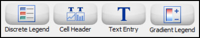
Insets
Insets are available from the Insets panel of the Elements pane.
This group contains Discrete Legend, Cell Header, Text Entry, and Gradient Legend.
The following combinations are allowed:
● A discrete legend, cell header, and text entry can be added to any cell.
● A gradient legend is used only with contour plots.
Here are the icons for this group:
Summary of Combining Plots and Insets
Within some compatibility constraints, plots and insets can be combined to create an effective graph. In Chapter 3, you combined a histogram, a normal density curve, a kernel density curve, a fringe plot, and a legend in one cell, as shown in Figure 3.1. All of these are compatible with each other.
Plots can be combined with other plots that are in the same group. Some plots from different groups can be combined as described in the previous sections. For these combinations, the data types on common axes must be compatible.
Data Assignment When Adding a Plot
When you add a plot from the Elements pane to a graph, the Assign Data dialog box is displayed. In the Assign Data dialog box, you assign data variables to various plot roles, such as X, Y, a group role, and so on. The roles that are available depend on which type of plot you are adding.
The dialog box for each plot type is customized for the features of that plot. All Assign Data dialog boxes have common features that are applicable to most plots.
Let’s look at the general structure of the Assign Data dialog box for the scatter plot. Once you understand the structure, you can easily decipher the parts that are specific to each plot.
The dialog box contains placeholder data because the scatter plot was created from the Graph Gallery.
Figure 4.1 Assign Data Dialog Box for a Scatter Plot

The following table describes parts of the dialog box:
Parts of the Dialog Box for the Scatter Plot
| Dialog Box Part | Description |
 |
Library and Data Set: All plots in a cell must use data from the same library and data set. When the first plot is added to a cell, these values are editable and can be set. For subsequent plots added to the same cell, these values are already set and cannot be changed. |
 |
Panel Variables and Plot Variables tabs: You can specify the plot variables and panel variables (for classification panels). Panels are discussed in more detail in Chapter 5. By default, the Plot Variables tab is selected. |
 |
Variables: Each plot has required and optional variables. Drop-down lists are provided for all variables. For a scatter plot, the X and Y variables are required, and placeholder variables are assigned when the plot is created from the Graph Gallery. Some frequently used optional variables can be set using drop-down lists. |
 |
More Variables: Often, the plot supports more variables than can be shown in the dialog box. If more variables can be set, More Variables is enabled. Click this button to access a second dialog box for setting these variables. For a scatter plot, you can set the X and Y error values as shown later in this table. |
 |
Group Display: For plots that support groups, Group Display is available. Based on the plot type, groups can be overlaid, stacked, or clustered. |
 |
Name: Each plot has a name. The name is used to identify the plot or to reference the plot in legends and other places in the designer. A default system-generated name is assigned, but you can change it. |
 |
Axis: Each plot can be assigned to a pair of axes. The defaults are X and Y. However, you can assign the plot to any combination of X, X2, Y, and Y2. |
 |
Advanced Options: Some plots support options that control the behavior of the plot. For example, the regression plot supports Degree. Click Advanced Options to set these options. |
 |
More Variables Dialog Box: This dialog box is displayed when you click More Variables, which is available for some plot types. This example shows the More Variables dialog box for the scatter plot. Variables vary for each plot type. |
 |
Advanced Options Dialog Box: This dialog box is displayed when you click Advanced Options, which is available for some plots. This example shows the Advanced Options dialog box for the scatter plot. Options vary for each plot type. |
Note: Depending on the release of the designer, parts of the dialog box might vary from what is shown in the previous table.
Data Assignment from the Pop-Up Menu
After creating a graph, you might want to make changes to data assignments. To open the Assign Data dialog box, right-click on the plot, and select Assign Data from the pop-up menu.
Figure 4.2 Pop-Up Menu

The Assign Data dialog box is displayed.
Figure 4.3 Assign Data Dialog Box Opened from a Pop-Up Menu

There are two key differences between the Assign Data dialog box that appears when adding a plot and the one that appears from the pop-up menu.
● Library and Data Set are always active in the pop-up Assign Data dialog box. When you change these settings, all the plots in the cell use the new settings. If errors are detected, they must be resolved before the dialog box is closed or the plot with errors will be removed.
For the Assign Data dialog box that appears when you add a plot, these values are active only for the first plot. For subsequent plots added to the same cell, these values are set to the previous settings and cannot be changed.
● The pop-up Assign Data dialog box contains a Plot list. This list contains names of the plots in the cell.
In the previous example, this list contains a scatter plot and a regression plot. Because you right-clicked on a scatter marker to open the Assign Data dialog box, the scatter plot is preselected. However, you can select another plot in the cell by using this list.
Custom Features of Other Assign Data Dialog Boxes
The overall structure of most Assign Data dialog boxes is similar to the one for the scatter plot shown in Figure 4.3. However, the dialog box for each plot type is customized to its needs.
Fit an Existing Plot
Certain plots are often used together. Fit plots (LOESS, regression, and PBSpline) are often used with scatter plots, and density plots are used with histograms. In these cases, you frequently want to use the same X and Y variables for the fit plot as you used for the scatter plot. Or, in the case of a histogram, you often want to use the same analysis variable for the density plots as you used for the histogram.
Let’s examine this feature as it relates to a scatter plot with a regression plot. The Assign Data dialog box for the regression plot is displayed.
Figure 4.4 Assign Data Dialog Box for a Regression Plot
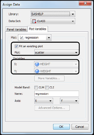
The Assign Data dialog box for fit plots and for density plots provides a check box called Fit an existing plot. There are several points to consider.
● The Fit an existing plot check box is checked by default.
● When the Fit an existing plot check box is checked, the X and Y variable lists are inactive. You cannot select these variables.
● The appropriate existing plot is preselected in the Plot list. If the cell has more than one plot, you can select the correct plot from this list.
To fit the plot to a different set of variables, clear the Fit an existing plot check box. The X and Y lists become active, and you can select different variables. Most often, when adding a fit plot or density plot, you simply accept the defaults, and click OK.
Model Band Options
Fit plots support confidence bands for the mean (CLM) and for individual (CLI) predicted values. The appropriate check boxes are displayed to enable this feature. The following figure shows these values extracted from Figure 4.4.
Figure 4.5 Model Band Options Selected
Statistics Data in the Assign Data Dialog Box
The Bar and Bar(H) plots support a Statistic list. The selections in this list depend on your settings.
● If you specify an optional variable for Response, then the designer calculates the sum or mean of the response variable. From the Statistic list, you can select Sum or Mean.
● If you do not specify a variable for Response or if you change the existing setting to none, then the designer calculates the frequency or frequency percentage for the category variable. From the Statistic list, you can select Frequency or Percent.
Figure 4.6 Assign Data Dialog Box for a Bar Chart

Visual Properties of a Graph
Graph properties enable you to control the appearance of your graph. Some properties, such as graph size and the applied style, affect all plots and cells in the graph. However, you can also control the appearance of an individual plot in a graph.
Many properties rely on style elements. Style elements enable you to customize a fill color, a line pattern, a font size, and so on, for individual graph elements.
Styles and Style Elements
Overview of Styles and Style Elements
The visual properties of a graph and its plots are derived from the style that is applied to the graph. The following definitions summarize styles and style elements:
Style
is a collection of style elements such as GraphBackground, GraphTitleText, GraphAxisLines, and so on, which affect particular objects in the graph. Style elements are used to render particular graph elements such as bars, lines, markers, text, and so on. Style elements have descriptive names to help identify which graph object they affect.
The applied style affects all aspects of a graph. There are a number of styles to choose from.
Style element
is a collection of visual attributes such as Color, LineStyle, LinePattern, MarkerSymbol, Font, and so on. For example, the style element used for box plot whiskers consists of attributes for color, line pattern (such as dotted or dashed), and line thickness.
By default, the visual attributes for each object in the graph are derived from a specific style element within the applied style.
You can customize the appearance of your graph by setting graph properties or the individual properties for a plot, axis, or some other part of the graph as follows:
● Apply a different style. Changing the applied style is the easiest way to change a graph’s appearance. All aspects of the graph are changed. You can change the applied style from the Graph Properties dialog box, which is discussed later in this chapter.
● Change the size of the graph. This is changed from the Graph Properties dialog box.
● Apply a different style element to one or more graph elements. If you want more granular control over a plot, you can change the style element applied to a particular object, such as to a kernel density curve. This is what was done in “Set Plot Properties” in Chapter 3.
● Specify hardcoded values for one or more graph elements. For example, suppose you change the style element associated with a kernel density curve. You can also change any of the attributes of the density curve, such as its line color, pattern, and thickness, effectively overriding the attributes of the style element.
Note: When you override an attribute, that attribute is no longer derived from the specified style element. If you later change the style that is applied to the graph, the overridden attribute might conflict with the new style.
Commonly Used Style Elements
Many of the visual properties of a plot are derived from the GraphDataDefault style element. This style element contains a number of attributes used to render non-grouped data items, markers, lines, and colors.
If a plot has a group variable, items in each unique group value are rendered using one of the GraphData1-N style elements. These style elements ensure that the plot elements for each unique group value are distinguished by different visual attributes.
Some commonly used style elements are described in the following table:
Commonly Used Style Elements
| Style Element | Description |
| GraphBackground | Graph background behind the entire graph |
| GraphWalls | Wall background behind the data plots inside the axes |
| GraphTitleText | Graph titles |
| GraphFootnoteText | Graph footnotes |
| GraphLabelText | Axis and legend labels |
| GraphDataText | Data and curve labels for the plots |
| GraphValueText | Tick values for the axes |
| GraphAxisLines | Axis lines |
| GraphGridLines | Grid lines |
| GraphDataDefault | For plots without a group variable |
| GraphData1-N | For plots with a group variable |
| GraphFit | For fit and density plots |
| GraphFit2 | Not used by default, but it is available for a second fit plot |
Properties That Affect the Entire Graph
Some of the visual properties of a graph affect all graph elements in the graph. For example, changing the style applied to a graph affects all plots, lines, and insets. You specify these properties in the Graph Properties dialog box.
To display the dialog box, right-click on a graph, and select Graph Properties.
Figure 4.7 A Typical Graph Properties Dialog Box

Let’s take a closer look at some of the fields and controls.
Parts of the Graph Properties Dialog Box
| Dialog Box Part | Description |
 |
General and Group Attributes tabs: You can specify general properties, which include the style, graph size, border and color of the graph's background, and other properties. When you click the Group Attributes tab, you can change the appearance of attributes for group values. This feature is described in more detail in Chapter 7. |
 |
Template: This value identifies the underlying GTL graph template that is used for the graph. The default name for the template varies depending on how the graph is created (for example, from the Graph Gallery or from a blank graph). This feature is for more advanced users. For example, you can change the name if you want to run the code in SAS using a particular template name. |
 |
Style: The style that is applied to a graph affects all aspects of the graph. In the Style list, icons for all supported styles are displayed. |
 |
Data Skin: The data skin applies a special effect for rendering the graph elements of your plots. The data skin is specified for the graph, but it can be disabled at the plot level. An example of applying a data skin is shown in Figure 4.8. A data skin of Pressed has been applied to the graph that you created in Chapter 3. |
 |
Background Color and Outline: You can change the color of the graph’s background. You can control whether the border around a graph is displayed. A color value of Auto indicates that the color is derived from the current style. When you change the applied style, the background color changes accordingly. However, if you explicitly specify the color, the color that you specify overrides any color derived from the applied style. |
 |
Size: By default, your graphs are 640px by 480px. You can change the width and height of your graph, individually. Or, to resize the graph proportionally, make sure that the Keep Aspect Ratio check box is selected. Then, change either the width or the height, and the other dimension changes proportionally.Alternatively, you can drag the side or corner of a graph to resize it. The graph size is displayed in the designer’s title bar. |
 |
Common Column or Row Axis: You can share or unshare a common column or common row axis. This feature applies only to graphs that contain more than one cell and that have the same axis type. Otherwise, the options are unavailable as shown here. Tip: A different method was used to share a common column axis in Chapter 3. As with other features, there is sometimes more than one method. |
 |
Subpixel: Select the check box to generate smooth curves and more precise bar spacing. Subpixel rendering is available for line-based plots and bar charts. |
Figure 4.8 Graph with a Data Skin Specified

Styles control the default appearance of the entire graph, including its plots. Styles are optimized to produce effective graphics without any changes to the default settings. However, you can override the default settings by changing plot properties.
Plot Properties
Plot properties determine features such as lines, fills, and markers that affect the appearance of a plot in the graph. You can customize each plot in the graph to have its own distinctive properties.
Consider the example in Chapter 3.
1. If you previously saved the graph as a SAS ODS Graphics Designer (SGD) file, you can open the graph by selecting File ► Open, and then selecting the file that you saved.
2. Right-click on the histogram, and select Plot Properties. The Cell Properties dialog box is displayed with the Plots tab selected.
Figure 4.9 Plot Properties for a Histogram

Let’s take a closer look at the fields and controls. Although the available properties differ for each plot, many common properties apply to most plots.
Parts of the Cell Properties Dialog Box for a Plot
| Dialog Box Part | Description |
 |
The selected plot is shown in Plot. If the cell contains more than one plot, you can select a different plot from this list. This list enables you to specify properties for multiple plots without closing the dialog box. Simply specify properties for a plot, select another plot, and then specify its properties. When you are finished, click OK. |
 |
Prefer Binned Axis: This property is specific to histograms. Select the check box to specify that the category axis tick marks coincide with the midpoint of each bin. |
 |
Use Data Skin: This option enables the data skin that is specified in the graph properties. The check box is selected by default, but you can clear it. |
 |
Fill: Histograms, bar charts, and other plots contain graph elements that have a fill color. When Fill is selected, you can customize the fill color. GraphDataDefault is the default style element for a histogram that does not have a group variable. You can select a different style element from Style Element. The Color list enables you to hardcode a particular color, thereby overriding the style element’s color. |
 |
Outline: Plots that have fill colors often have outlines. When this check box is selected, you can customize the outline. GraphDataDefault is the default style element for a histogram that does not have a group variable. You can select a different style element from Style Element. You can hardcode the color, pattern, and thickness of the outline by selecting the attribute from the list. When a plot has both a Fill and an Outline check box, as in the case of a histogram, then at least one check box must be selected. |
 |
Transparency: Plots can be made transparent. You can use the slider or enter a value up to 100%. A transparency of 100% makes the plot invisible. |
 |
Legend Label: You can specify the label that appears in the legend for the plot. |
Note: Although the previous example showed the plot properties for a histogram, other plots have similar properties. In general, you can specify colors, sizes, fonts, marker attributes, line attributes, and outlines and fills. The available properties change based on the specific characteristics of each plot.