
Chapter 5: Classification Panels and Multi-Cell Graphs
Create the Graph, Add a Highlow Plot, and Specify the Panel Variable
Apply a Different Style to the Graph
Apply a Different Style to the Graph
Change the Marker Symbol for the Scatter Plots
Add a Discrete Legend to the Cell
Add a Global Legend to the Graph
Add an Axis Table in a Separate Cell
Customize the Titles and Remove the Footnote
About Classification Panels
A classification panel is a data-driven layout that creates a regular grid of cells based on one or more classification (also called panel) variables. The number and arrangement of the cells are determined by the panel variables. The plot type in each cell is the same, using a subset of the data from the crossing of panel variables. Cells cannot have legends or insets.
A classification panel can be defined using a lattice or panel layout, as described in the following table:
| Layout | Description |
| Data Lattice | This panel is defined by the row variable, the column variable, or both. A regular grid of cells is created in which the number of rows equals the number of unique values of the row variable. The number of columns equals the number of unique values of the column variable. A cell is created for each crossing of the unique values of the row variable and column variable. Each cell displays only the data that is valid for the combination of the panel variable values. |
| Data Panel | This panel is defined by one or two panel variables. A regular grid of cells is created in which the number of cells equals all the crossings of the unique values of panel variables that contain data. Each cell has headers that display the values of each panel variable. If a cell does not have data, it is dropped from the grid. |
The classification panel can have multiple titles at the top of the graph above all the cells, and multiple footnotes at the bottom below all the cells. All data for the plots must come from one data set.
The Panels tab of the Graph Gallery contains graphs that you can use as the basis of your graph.
Figure 5.1 Panels Tab of the Graph Gallery

Create a Classification Panel
About This Example
This example uses a highlow plot to show stock comparisons that include the high, low, open, and close stock prices. Small tick marks indicate the open and close prices. The open tick marks are on the left side of the highlow lines, and the close tick marks are on the right side.
The panel variable determines the number of cells in the graph. In this case, there are two cells.
This example subsets the data in the Sashelp.Stocks data set. The new data set is called Work.Mystock. In the SAS session, run the code from “Code for the Classification Panel Example in Chapter 5” in the appendix.
Figure 5.2 Graph for This Example

Create the Graph, Add a Highlow Plot, and Specify the Panel Variable
To create the graph, perform the following steps:
● Create a graph from a blank graph. The Panels tab of the Graph Gallery contains several useful graphs. However, this example uses a highlow plot, so start with a blank graph.
● Assign the data for a highlow plot. This example uses the More Variables dialog box in which you can specify more variables, including the stock open and close prices.
● Specify the panel variable. Although you can specify up to two variables, resulting in multiple columns and rows, this example has only one panel variable.
Now, create the graph.
1. In the SAS session, run the code from “Code for the Classification Panel Example in Chapter 5” in the appendix.
2. Select File ► New ► Blank Graph, or click the New Blank Graph ![]() toolbar button. A graph window is displayed in the work area. This window is blank except for the prompt (drop a plot here).
toolbar button. A graph window is displayed in the work area. This window is blank except for the prompt (drop a plot here).
3. In the Elements pane, click HighlowLine, and drag and drop the icon onto the graph window.

4. In the Assign Data dialog box, complete these steps:
a. For Library, select WORK.
b. For Data Set, select MYSTOCK.
c. For X, select DATE.
d. For Low, select LOW.
e. For High, select HIGH.

f. Click More Variables. The More Variables dialog box is displayed.
5. In the More Variables dialog box, complete these steps:
a. For Open, select OPEN.
b. For Close, select CLOSE.

c. Click OK. The More Variables dialog box closes.
6. In the Assign Data dialog box, complete these steps:
a. Click the Panel Variables tab.
b. For Row, select STOCK. This specifies the panel variable used for the graph. The graph will contain a separate row for each value of the panel variable.

For this example, keep the default data lattice layout.
c. Click OK.
The designer creates the following graph in the work area:
Figure 5.3 Panel Graph with a Highlow Plot

Add Titles to the Graph
Let’s add two titles and change the style element for the second title.
1. Select Insert ► Title, or click the Title ![]() toolbar button. A new title text box is added at the top of the graph. The text is selected. Enter a new title.
toolbar button. A new title text box is added at the top of the graph. The text is selected. Enter a new title.
![]()
2. In the title text box, enter Monthly Prices by Stock Name.
3. Select Insert ► Title again.
4. Click outside of the placeholder title text to deselect it. Then, right-click on the placeholder title text, and select Title Properties. The Text Properties dialog box is displayed.
In addition to specifying the title, you want to change the style element that is applied to the text. The Text Properties dialog box enables you to do that.
5. In the Text Properties dialog box, complete these steps:
a. In Text Entry, enter Including Open and Close.
b. For Style Element, select GraphLabelText.

c. Click OK.
The graph is updated to include your titles.
Figure 5.4 Graph with Titles

Modify the Axis Properties
Let’s change the label for the Y axis and add grid lines. Remove the X axis label because it is not needed.
1. Right-click the Y axis (the axis labeled High), and select Axis Properties. The Axis Properties dialog box is displayed.
2. Select the Grid check box.
3. In Label, enter Stock Price.

4. Click OK.
5. Right-click on the column axis at the bottom of the graph, and select Axis Properties. The Axis Properties dialog box is displayed.
6. Clear the Label check box.
The graph is updated to include your axis changes.
Figure 5.5 Graph with Updated Axes

Apply a Different Style to the Graph
A graph’s style controls the default color schemes and visual attributes. You can change the overall appearance of a graph by changing the applied style.
1. Right-click on the graph, and select Graph Properties. The Graph Properties dialog box is displayed.
2. For Style, select Analysis.
When you click the down arrow of the Style list, all of the supported styles are displayed.

You might need to scroll upward to select Analysis.
3. Click OK.
The final graph is shown in Figure 5.2 and here:

About Multi-Cell Graphs
Multi-cell graphs have a regular grid of cells that are arranged in rows and columns. Each cell can have a different set of overlaid plots with legends and insets. This graph can have multiple titles at the top of the graph above all the cells and multiple footnotes at the bottom below all the cells. Each cell can have a different associated data set.
You have already created a multi-cell graph if you completed the example in Chapter 3. (See Figure 3.1.)
The Graph Gallery contains multi-cell graphs on the Analytical and Custom tabs.
Create a Multi-Cell Graph
About This Example
This example creates a survival plot, which is often used in the clinical and pharmaceutical industries. The top cell contains a step plot and scatter plots to show survival by time by stratum. The bottom cell uses an axis table to display at-risk values. Axis tables are described in more detail later in this example.
Figure 5.6 Graph for This Example

Data for the survival plot is obtained using the LIFETEST procedure. The output is saved in a data set called Work.Survivalplotdata. The code to create this data set is in “Code for the Survival Plot Example in Chapter 5” in the appendix.
Create the Graph
To design the graph, you first select a step plot from the Graph Gallery. You assign data to create the basic survival curves that show survival by time by stratum.
After you create the step plot, add two scatter plots that overlay the censored observations. The first scatter plot is included in a discrete legend. The second scatter plot with a group variable overlays the first. It displays the same markers but with group colors. The second plot is not included in the discrete legend.
1. In the SAS session, run the code from “Code for the Survival Plot Example in Chapter 5” in the appendix.
2. On the Basic tab of the Graph Gallery, double-click Step Plot. The Assign Data dialog box is displayed.

3. In the Assign Data dialog box, complete these steps:
a. For Library, select WORK.
b. For Data Set, select SURVIVALPLOTDATA.
c. For X, select TIME.
d. For Y, select SURVIVAL.
e. For Group, select STRATUM.

f. Click OK.
4. In the Elements pane, click Scatter, and drag and drop the icon onto the graph window. This scatter plot will be used for the discrete legend. For this plot, you do not assign a group variable.

The Assign Data dialog box is displayed.
5. In the Assign Data dialog box, complete these steps:
a. For X, select TIME.
b. For Y, select CENSORED.
c. In Name, enter Censored.
d. Click OK.
6. In the Elements pane, click Scatter again, and drag and drop the icon onto the graph window. This scatter plot will overlay the previous scatter plot. However, this scatter plot uses a group variable and shows group colors.
7. In the Assign Data dialog box, complete these steps:
a. For X, select TIME.
b. For Y, select CENSORED.
c. For Group, select STRATUM.
d. Click OK.
The designer displays the following graph in the work area. The second scatter plot overlays the first scatter plot. In effect, it hides the latter’s markers.
Figure 5.7 Graph with Step and Scatter Plots

Apply a Different Style to the Graph
The default style uses patterned lines to distinguish the grouped step plot. In this step, apply a style that uses solid lines, which look better with a step plot.
1. Right-click on the graph, and select Graph Properties. The Graph Properties dialog box is displayed.
2. For Style, select HTMLBlue.
3. Click OK.
The graph is updated to reflect the newly applied style.
Figure 5.8 The HTMLBlue Style is Applied to the Graph

Change the Marker Symbol for the Scatter Plots
By default, the designer uses circles for the scatter plot markers. Although this marker symbol is fine for most plots, for the survival plot, you want markers that blend well with the step plot. So, change the marker for each scatter plot.
1. Right-click on any plot, and select Plot Properties. The Cell Properties dialog box is displayed with the Plots tab selected. The plot on which you right-clicked is selected in Plot.
2. In the Cell Properties dialog box, complete these steps:
a. For Plot, select Censored if it’s not already selected. Because you renamed the plot, it is easy to select the plot that you want.
b. For Symbol, select the plus sign.

c. For Plot, select scatter.
d. For Symbol, select the plus sign again.
e. Click OK.
The markers are changed for the scatter plots.
Figure 5.9 Graph with New Marker Symbols

Add a Discrete Legend to the Cell
A discrete legend shows the marker symbol for censored observations.
1. In the Insets panel at the bottom of the Elements pane, click Discrete Legend. Drag and drop the icon onto the upper right corner of the plot area.
![]()
The legend appears. Notice that it contains all the plots in the cell, as shown in the partial image below. Change the legend to contain only the marker for the Censored scatter plot.

2. Right-click on the legend, and select Legend Contents. The Legend Contents dialog box is displayed.
3. Clear the step and scatter check boxes, so that only the Censored check box is selected.

4. Click OK.
The graph is updated to reflect your changes.
Figure 5.10 Graph with a Discrete Legend

Add a Global Legend to the Graph
A legend is needed to identify the stratum values. You could add another discrete legend, but adding a global legend enables you to position the legend outside of the cell where there is more room.
1. Select Insert ► Global Legend, or click the Global Legend ![]() toolbar button. The Global Legend dialog box is displayed. Initially, none of the check boxes for the plots is selected.
toolbar button. The Global Legend dialog box is displayed. Initially, none of the check boxes for the plots is selected.
2. In the Global Legend dialog box, select the step check box. Then, click OK.

The legend is added to the bottom of the graph.
3. Right-click on the legend, and select Legend Properties. Notice that Automatic is selected for Layout.
4. In the Legend Properties dialog box, complete these steps:
a. For Layout, select Across. This setting extends the legend across in a row. You might need to increase the wrap size for the legend to fit in the row.
b. For Wrap Size, enter or select 3.

c. Click OK.
The graph is updated to reflect your changes.
Figure 5.11 Graph with a Global Legend

Add an Axis Table in a Separate Cell
An axis table is a basic plot that displays data values in textual form at specific locations along the vertical or horizontal axis. A graph can have more than one axis table, and you can combine a horizontal and vertical axis table in the same graph.
For an axis table, you specify a variable for X (for a horizontal table) or for Y (for a vertical table). This variable identifies the locations along the axis. You also specify a variable for Value. This variable determines which values are displayed in the axis table.
Note: Axis tables are not available for classification panels.
Create a new row, and then add a horizontal axis table to the cell in that row. The axis table will display the at-risk values. Because the bottom row uses the same axis scale as the survival plot in the top row, you can remove the axis values from the bottom row.
1. Right-click on the graph area, and select Add a Row. A new row is added below the existing row. In this graph, each row contains one cell.
2. In the Elements pane, click AxisTable(H), and drag and drop the icon onto the bottom cell of the graph.

The Assign Data dialog box is displayed.
3. In the Assign Data dialog box, complete these steps:
a. For Library, select WORK.
b. For Data Set, select SURVIVALPLOTDATA.
c. For X, select TATRISK.
d. For Value, select ATRISK. The axis table will display at-risk values.
e. For Class, select STRATUM. This variable acts as a classification variable for the axis table. The value creates a separate row in the table for each unique classification value.
f. For Group, select STRATUM. This value groups the axis table. Each group value is represented by a different color.
g. For Position, select Bottom. This value positions the axis table beneath the X axis of your survival plot.
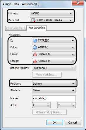
h. Click OK. The axis table is added to the bottom cell of the graph.
4. Right-click on the axis for the axis table, and select Axis Properties. The Cell Properties dialog box is displayed with the Axes tab selected.
The X axis is selected for Axis.
5. Clear the check boxes for Label, Value, and Tick. This action removes the axis from the bottom row.

6. Click OK.
The graph is updated with your axis table.
Figure 5.12 Graph with Axis Table in the Bottom Row

Customize the Titles and Remove the Footnote
1. Double-click on the placeholder title (Type in your title). The placeholder text is highlighted.
2. Enter Product-Limit Survival Estimates.
3. Select Insert ► Title, or click the Title ![]() toolbar button. A new title text box is added at the top of the graph. The placeholder text is highlighted.
toolbar button. A new title text box is added at the top of the graph. The placeholder text is highlighted.
4. Click outside of the placeholder title text to deselect it. Then, right-click the placeholder text, and select Title Properties. The Text Properties dialog box is displayed.
5. In the Text Properties dialog box, complete these steps:
a. In Text Entry, enter With Number of AML Subjects at Risk.
b. For Style Element, select GraphLabelText.

c. Click OK.
6. Right-click on the placeholder footnote (Type in your footnote), and select Remove Footnote.
The final graph is shown in Figure 5.6 and repeated here:
