
14
Lightning Experience Customization
Lightning pages are custom layouts that allow you to design pages for Lightning Experience that are mobile responsive. These pages are built using templates that divide the page into regions that adjust for visibility based on the device used to view the page. Lightning pages support standard components, custom components, and third-party components downloaded from the AppExchange.
In this chapter, we will cover the following Lightning page features in detail:
- Creating Lightning pages
- Understanding Lightning page layouts
- Using Lightning page components
- Assigning and activating Lightning pages
With the help of these topics, you will be able to configure and deploy Lightning pages in your Salesforce org.
Technical requirements
For this chapter, make sure you log in to your development org and follow along as we work through the different customizations to Lightning pages available to a system administrator.
Lightning pages overview
Lightning pages allow you to add custom items to a page with much more flexibility than the older page layouts that are used in Salesforce Classic. Lightning pages allow you to pull in the page layouts and add much more customization and flexibility. You can create three types of Lightning pages:
- An app page that you can add to the navigation bar of a Lightning app, which makes it appear when that app is viewed in both Lightning Experience and the Salesforce mobile apps
- A customized home page for Lightning Experience
- A custom record page for Lightning Experience and the Salesforce mobile app
For our example, we will create a customized record page for Lightning Experience and the Salesforce mobile app.
Business use case
You are the Salesforce admin for XYZ Widgets. The business has asked for an Account Lightning page for the Standard User profile, which would default to show the record details and have a more user-friendly look and feel.
Creating a Lightning page
Now that you have this requirement, you will build a new page that you can present to the users to test.
Let’s look at how to build a Lightning page. We will start on the Setup page.

Figure 14.1: Navigating to the Lightning App Builder from Setup
Once you’re on the Setup page:
- Click on Setup.
- Click on User Interface.
- Click on Lightning App Builder.
This will bring us to the Lightning App Builder detail page shown in Figure 14.2:
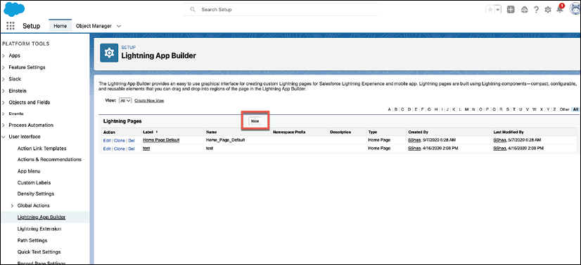
Figure 14.2: Lightning App Builder detail page
On this page, we will click on New, which will take us to the Lightning page creation screen, shown in Figure 14.3:

Figure 14.3: Lightning App Builder: Choose Lightning page type
On this page, we will take the following steps:
- Choose Record Page.
- Click Next.
This will take us to the page shown in Figure 14.4:

Figure 14.4: Lightning App Builder: Choose label and object
On this page, we will take the following steps:
- Choose a label for the Lightning page.
- Choose the object for the Lightning page. In this case, we added the Account object.
- Click Next.
This will bring us to the page shown in Figure 14.5:

Figure 14.5: Lightning App Builder: Choose a template
On this page, we will take the following steps:
- Choose the page template.
- This section shows you how the template will look on different devices.
- Click Finish.
Now that we have created the page, let’s look at the sections of the Lightning page configuration page.
Understanding the Lightning page layout
The Lightning page configuration page has three main sections, shown in Figure 14.6:

Figure 14.6: Lightning page configuration page
On this page, we see the following sections:
- This section contains all available standard, custom, and installed third-party components.
- This section is where you add components to the chosen layout.
- This is where you customize the chosen component.
Now that we have created the Lightning page, let’s finish setting up the Lightning page by adding customizations to meet our requirements.
Using Lightning page components
There are many components available to an admin. These components allow you to add sections to meet various business requirements, such as how to display the details and related items for a record. These components are dragged and dropped onto the available spaces on the template. Let’s set this page up for better usability. We will add a highlights section to the top of the page, shown in Figure 14.7:

Figure 14.7: Highlights panel
Now, we can take the following steps:
- Choose the Highlights Panel.
- Drag and drop the Highlights Panel onto the top space.
Next, let’s add the Related and Details sections. This will require a few steps, as shown in Figure 14.8:

Figure 14.8: Add tabs
The numbers in the preceding screenshot corresponds to the following information:
- Add the Tabs component to the page. This allows you to add multiple tabs to the component.
- Each tab will have a space to add the component needed for the layout.
Next, we will add the Related Lists component, as shown in Figure 14.9:

Figure 14.9: Related tab
This allows us to take the following steps:
- Click on the Related tab.
- Drag and drop the Related Lists component into the space.
- The related lists for the record will now appear on the builder.
Next, let’s add the Details component, as shown in Figure 14.10:

Figure 14.10: Details tab
We can now follow the below steps:
- Click on the Details tab.
- Drag and drop the Record Detail component into the space provided (3).
Now let’s set the Details tab as the default, as shown in Figure 14.11:

Figure 14.11: Details tab default
Here, we can do the following:
- Click on the Details tab.
- On the configuration panel, set the default tab to Details.
Next, we will add the Activities component, as shown in Figure 14.12:
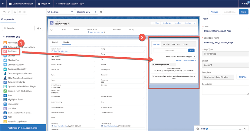
Figure 14.12: Activities component
This allows us to take the following steps:
- Choose the Activities component.
- Drag and drop the component to the right-side panel.
Now we will add another tab to include the Chatter component, as shown in Figure 14.13:

Figure 14.13: Add a new tab
Here, we will do the following:
- Click on the Details tab.
- Click Add Tab.
- Choose the tab name.
- Click Done.
Now we will add the Chatter component to the tab, as shown in Figure 14.14:
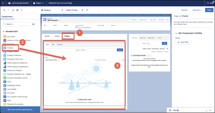
Figure 14.14: Chatter component
We will perform the following steps:
- Choose the Chatter component.
- Drag and drop the component into the empty space under the Chatter tab.
- The Chatter component now shows up in the builder.
Now that we have added all the components, let’s activate the Lightning page and assign it to the Standard User profile.
Activating and assigning Lightning pages
Now we will assign and activate this new page, as displayed in Figure 14.15:

Figure 14.15: Page activation
On this page, click on Activation, which will take us to the activation wizard shown in Figure 14.16:
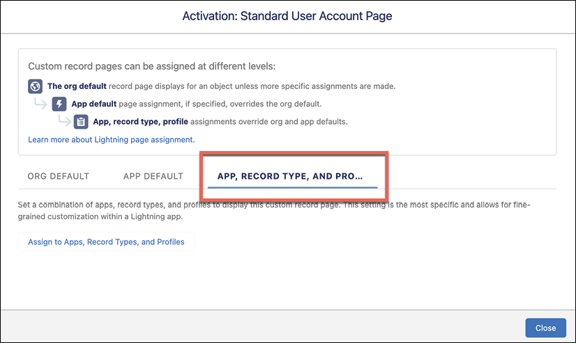
Figure 14.16: Page activation: App, Record Type, and Profiles
On this page, click on APP, RECORD TYPE, AND PROFILE, which will allow you to select apps, as displayed in Figure 14.17:

Figure 14.17: Page activation: Select Apps
On this page take the following steps:
- Choose the Sales app.
- Click Next.
This will bring us to the form factor page, shown in Figure 14.18:

Figure 14.18: Page activation: Select Form Factor
On this page, we will take the following steps:
- Choose the form factor to have this page work on Desktop and phone.
- Click Next.
This will bring us to the record types page displayed in Figure 14.19:

Figure 14.19: Page activation: Selected Record Types
Here, we will take the following steps:
- Choose the record type.
- Click Next.
This will bring us to the profiles page shown in Figure 14.20:

Figure 14.20: Page activation: Selected Profiles
On this page, we will take the following steps:
- Choose the Standard User and System Administrator profiles
- Click Next.
This brings us to the final page, shown in Figure 14.21:

Figure 14.21: Page activation: Review Assignments
On this page, we will do the following:
- Review the assignments to make sure they are correct.
- Click Save.
Now that we have assigned and activated the page layout, let’s see how it looks for a standard user, as shown in Figure 14.22:
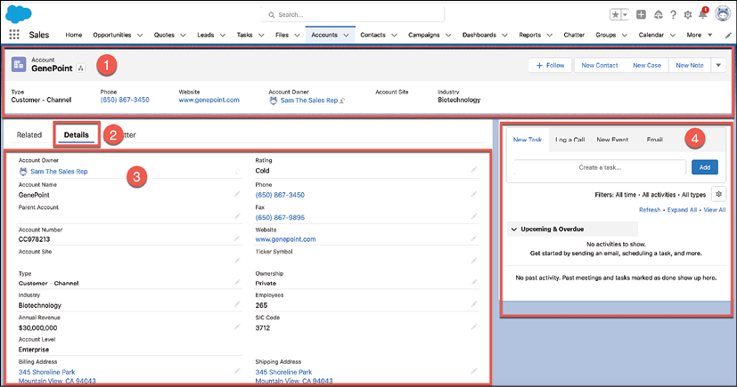
Figure 14.22: Account Lightning page
Let’s review the completed page layout:
- The Highlights component is at the top.
- The Details tab is set as the default.
- We see the Details component under the Details tab.
- The Activities component is on the right.
The new layout setup is a success!
Summary
In this chapter, we learned how to create Lightning pages. We understood the different sections that make up Lightning page layouts. We added Lightning components to the layout, and finally, we explored how to assign and activate Lightning page layouts.
In the following chapter, we will cover Approval Processes.
Questions
- What are the three types of Lightning pages you can create?
- What are the three types of Lightning components?
- How do you add components to sections of the page?
- What are the three ways you can assign layouts?
Further reading
- Lightning Pages: https://help.salesforce.com/s/articleView?id=sf.lightning_page_overview.htm&type=5
- Build a Custom Record Page for Lightning Experience and the Salesforce Mobile App: https://trailhead.salesforce.com/content/learn/modules/lightning_app_builder/lightning_app_builder_recordpage
Join our community on Discord
Join our community’s Discord space for discussions with the authors and other readers: https://packt.link/rlptF
