
ROC Curves in SAS Enterprise Miner |
|

9.3 ROC Curves from SAS Enterprise Miner for a Single Model
9.4 ROC Curves from SAS Enterprise Miner for Competing Models
9.5 ROC Curves Using PROC GPLOT with Exported Data from SAS Enterprise Miner
9.1 Introduction
SAS Enterprise Miner is a collection of data mining tools. It was introduced in 1998 and used primarily by marketing analysts, database marketers, risk analysts, fraud investigators, and other professionals who try to find patterns in large volumes of data. SAS Enterprise Miner runs on a standard SAS platform, but it uses a graphical user interface (GUI) that is different from any other interface used by SAS. In addition, although the SAS engine on which it runs is accessible, SAS Enterprise Miner is designed with the premise that users will access it through its GUI. This contrasts with Base SAS and SAS/STAT, the focus of this book so far, which are accessed primarily through the program editor and by running code segments.
SAS Enterprise Miner offers a wide variety of methods for data mining, including clustering, dimensionality reduction, link analysis, and predictive modeling. This chapter focuses on predictive modeling. In Chapter 8, we studied ROC curves for multivariable predictive models, and logistic regression was reserved to demonstrate issues that arise in multivariable models and solutions using SAS/STAT. In many ways, this chapter is an extension of Chapter 8 because it uses the capabilities of SAS Enterprise Miner to examine classification trees and neural networks.
SAS Enterprise Miner has a built-in capability to generate ROC curves as part of its model assessment. In addition, you can create a SAS data set from the table that is created (behind the scenes) to generate the ROC curve. This data set can then be used with the techniques developed in earlier chapters for enhanced plots. Finally, you can score data sets within SAS Enterprise Miner using the predictive model(s) developed for this purpose. The results of scoring can also be saved as SAS data sets, enabling you to access the modeling methods of Chapters 3 through 6 as needed. In fact, it is even possible to generate SAS code to do the scoring.
This chapter is not intended to serve as a comprehensive guide to SAS Enterprise Miner. The intricacies of model building and selection, actions central to data mining, are presented only to the extent that their discussion helps you understand the resulting data curves. Various intermediate steps that we will use here, such as missing data imputation, may not be appropriate for some other data mining exercises. For a solid background on SAS Enterprise Miner, consult Introduction to Data Mining Using SAS Enterprise Miner by Patricia Cerrito (2006).
The audience for this chapter is SAS Enterprise Miner users, especially those who have not used ROC curves with the software. It is assumed here that you are already familiar with ROC curves at the Chapter 3 level, so a cursory reading of Chapter 3 may be useful at this point.
9.2 Home Equity Loan Example
The data for the example in this chapter are from the sample data library of SAS Enterprise Miner, Sampsio.Hmeq. The library Sampsio is internally defined when SAS Enterprise Miner is loaded and includes this data set. It contains nearly 6,000 records and 13 variables, one of which is the outcome variable, or target, in the language of data mining. The data set depicts the home equity loan records of a financial services company. Approximately 20% of the past home equity credit lines have resulted in default. In an attempt to reduce the default rate, or perhaps generate applicant-tailored interest rates, the company wants to build a model that predicts the risk of default on a home equity loan. The target variable is called BAD, with a value of 1 indicating a default and a 0 indicating a serviced loan. The 12 predictor variables, along with a brief definition, are as follows:
- CLAGE: age (months) of oldest credit line
- CLNO: number of credit lines
- DEBTINC: debt-to-income ratio
- DELINQ: number of delinquent credit lines
- DEROG: number of major derogatory reports
- JOB: occupation of the debtor
- LOAN: amount of the loan
- MORTDUE: amount due on existing mortgage
- NINQ: number of recent credit inquiries
- REASON: reason for loan (debt consolidation or home improvement)
- VALUE: value of the property
- YOJ: years at present job
The goal is to find a predictive model for the BAD variable using the 12 other variables in the data set. Although we will go through the steps required to build a predictive model, the focus is on constructing ROC curves using SAS Enterprise Miner's built-in functionality, as well as exploring ways to export the predicted values to a SAS data set so that the methods and macros discussed in earlier chapters can be used to perform custom analyses.
9.3 ROC Curves from SAS Enterprise Miner for a Single Model
SAS Enterprise Miner organizes its objects in a flow diagram, which contains data, models, and results. The components of the diagram are called nodes and they can be connected to other nodes in the flow. The flow can be saved as a project, which may contain other flows as well.
Most actions in SAS Enterprise Miner can be specified by three equivalent methods: using the Menu, using the Tool Bar, or using the Project Navigator (the left segment of the window when SAS Enterprise Miner first starts). The Tool Bar and the Project Navigator contain icons that can be dragged and dropped, so they are more convenient than using the Menu. You can also customize these icons.
Follow these steps to prepare the data for predictive modeling. First, define the sources of data. This is similar to using LIBNAME statements in a SAS DATA step and then using PROC COPY to bring the desired data sets to the work area. Then, choose a specific data set to work with from the data sources. Partitioning the data into training, validation, and test data sets is customary in data mining and can be accomplished using the Data Partition node. Training and validation data are discussed in Chapter 8, where the term test data is used interchangeably with validation data. The terminology in this chapter follows that of SAS Enterprise Miner, so validation and test data here refer to two different entities. The validation data set is used for the same purpose it is in Chapter 8, but the test data set here is primarily held out for a confirmation of the findings of the validation data set. This practice is less common in areas other than data mining.
The following steps more precisely describe how to perform these tasks:
- Define data sources by right-clicking Data Sources in the Project Navigator, choosing Create Data Source, and proceeding through the menus. Make sure that the Model Role field for the variable BAD is Target and the Type is binary. All other variables should be listed as Input.
- Create a new diagram by dragging and dropping from the Tool Bar or the Project Navigator. The Diagram icon depicts a series of interconnected boxes with a yellow star above them. Alternative ways to create a new diagram include selecting File
 New Diagram or holding down the CTRL and Shift keys and pressing D.
 - Double-click Data Sources in the upper left segment of the window. Drag and drop Home Equity into the diagram workspace (the right segment of the window, which should be blank at this point).
- Add Data Partition to the diagram by dragging and dropping the icon into the diagram workspace or alternatively selecting Action Add Node Sample Data Partition.
- Connect the Home Equity and Data Partition icons with an arrow. You can draw an arrow when the cursor is shaped like a pencil.
Note that the diagram specifies the actions to be undertaken, but merely specifying them is not enough for execution. A flow, either as a whole or as a subset, needs to be run for the specified actions to be carried out. For example when the Data Partition node is run, training, validation, and test sets are created. To run a flow, right-click on a node and choose Run. All the nodes prior to and including the chosen node execute in sequence. It is possible to run each node as the diagram is specified, but it is more efficient to run the flow in big chunks.
Now we are ready to proceed with modeling. Since the target variable is binary, a reasonable starting point for modeling is logistic regression. To fit a logistic model in SAS Enterprise Miner, you need to add a node that specifies this and connect the regression node to the data sets created by the Data Partition node. The following steps describe this process:
- Add the Regression node to the diagram by dragging the icon when the Model tab is highlighted.
- Connect the Data Partition node to the Regression node with an arrow.
- Add the Model Comparison node to the diagram by dragging and dropping it from the Assess tab and connecting it to the Regression node with an arrow.
At this point, the display should roughly look like Figure 9.1.
Figure 9.1 Using Logistic Regression to Predict Defaults on Home Equity Loans

Now, right-click the Model Comparison node and choose Run. Once a node has run, the results remain available throughout the SAS Enterprise Miner session. The diagram and the results are saved by default and are available when the SAS Enterprise Miner session is restarted later.
When the Model Comparison node has run, right-click on the node and choose Results. A new window appears, with subwindows titled Fit Statistics, Output, and ROC Chart. In the ROC Chart subwindow, there are three ROC curves, one for each data set: training, validation, and test. Figure 9.2 focuses only on the ROC curve for the training set, displayed in the upper left corner. The 45-degree reference line, referred to as Baseline in the legend, is plotted by default. As you move the cursor along the curve, a pop-up text box provides details about the sensitivity and specificity at that point of the ROC curve. Figure 9.2 includes one example point where the sensitivity is 50.5% and the one minus specificity is 94.9%.
Figure 9.2 ROC Curve for the Logistic Regression Model Using Home Equity Loans Data
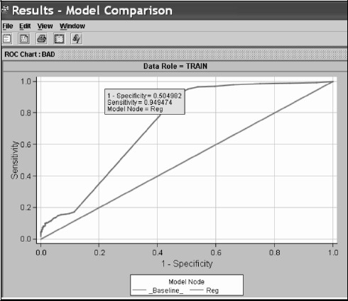
As Output 9.1 shows, the areas under the curve are readily reported in the Output window, labeled as ROC index, as 0.72385, 0.69319 and 0.67768, respectively for the training, validation, and test sets.
Output 9.1

9.4 ROC Curves from SAS Enterprise Miner for Competing Models
In addition to logistic regression, we will also use two other methods in the toolkit of SAS Enterprise Miner: decision trees and neural networks. They are not available in SAS/STAT, so a statistician who uses SAS may be unfamiliar with them. For this reason, here's a brief description of these methods.
Decision trees, also known as recursive partitioning in statistical literature, mostly consider binary splits of each variable in a hierarchical manner. For the first split, all the variables are considered one by one and the one that provides the best split (according to one of the several commonly used criteria, such as the misclassification rate or Gini index) is retained for the first step. Nodes that are not split any further are called terminal nodes or leaves. Once this variable is chosen, the same process is repeated again twice, one for each side of the binary split. SAS Enterprise Miner also considers multiple splits of one side of the node so that it is possible to have a tree where one side of the initial node is a leaf and the other side has split multiple times. Multinomial variables are grouped into two so that the resulting binary grouping gives the best split. Similarly, the continuous variables are also split into two by finding the best cutoff. The resulting decision tree for the home equity loan example appears in Figure 9.3.
Figure 9.3 Example Decision Tree for the Home Equity Loan Example
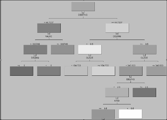
For example, the first variable used is DEBTINC, which is a continuous variable. It was split at 44.7337. For those with a debt-to-income ratio less than 44.7337, the next best split was VALUE, split at 303,749.
Decision trees are distinguished from logistic regression and neural networks in an important way: There is no statistical model. Because there is no model, there is no predictive equation. When a new observation is scored, it is “dropped” from the top of the tree and follows the route that is dictated, at each node, according to the value of the covariates until it reaches a terminal node (or leaf). This can be described as a rule, in the form of a series of IF-THEN-ELSE statements.
The binary split structure of the tree is an advantage because it is easy to interpret. It can also be a disadvantage, especially when some of the predictors are continuous. Categorization of continuous covariates may lead to inefficiency and adversely affect predictive performance. Another advantage of decision trees is that they handle missing data very effectively. This is accomplished by establishing surrogate splits at each node that can be used when the splitting variable for that node is missing.
Neural network is an umbrella term that describes methods that build models mimicking the function of the brain. Their precise mathematical description is complicated and unlikely to benefit an ROC-focused discussion. Think of neural networks as a specific yet flexible class of nonlinear regression models.
Before we run decision trees and neural networks on the same data set, there is one important issue to consider about missing data. Both logistic regression and neural networks require complete observations. If any portion of a record is missing, that record is completely ignored during model building. Decision trees are more forgiving. They consider surrogate splits in case the variable for the primary split is missing. For this reason, if we run logistic regression, neural networks, and decision trees on the same input data, the actual data that the predictive model rests on may not be identical from one method to the other. You could address this by imputing the value from a distribution derived from the normal density. An imputation node can be dragged and dropped from the Modify tab, as seen in Figure 9.4. The same figure also shows the addition of decision tree and neural network nodes, both dragged and dropped from the Model tab.
Figure 9.4 SAS Enterprise Miner Diagram Workspace for the Competing Models Example
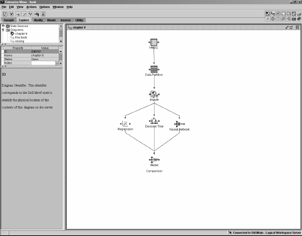
The flow in Figure 9.4 implies that the same data set will be analyzed three different ways and the results compared in the final node.
Three ROC curves, one for each method of analysis, are plotted to better assess the predictive power of the models (see Figure 9.5). Neural networks and logistic regression have very similar performance. The decision tree outperforms regression and neural networks. It has higher sensitivity than the other two for a given value of specificity for the most part, especially in the range where both sensitivity and specificity are above 0.5. The neural network method is slightly better than the regression method, although the difference between the two seems to dissipate in the validation and test sets. Output 9.2 reports the AUCs for each model and data set. The AUC for the decision tree is consistently above 85%, while the other two models' AUCs cluster around 80%.
Output 9.2

Figure 9.5 ROC Curves from SAS Enterprise Miner for Each of the Three Models and Data Sets

9.5 ROC Curves Using PROC GPLOT with Exported Data from SAS Enterprise Miner
While SAS Enterprise Miner provides a built-in capability for plotting the ROC curve, sometimes you might want to output the data set containing the ROC points so that you can use the %PLOTROC macro for custom graphics. This can be done by selecting View ![]() Table, which displays the SAS data set behind the ROC curve. At this point, selecting File
Table, which displays the SAS data set behind the ROC curve. At this point, selecting File ![]() Save As gives you the option to save the table as a permanent data set that can be accessed later using Base SAS and SAS/GRAPH.
Save As gives you the option to save the table as a permanent data set that can be accessed later using Base SAS and SAS/GRAPH.
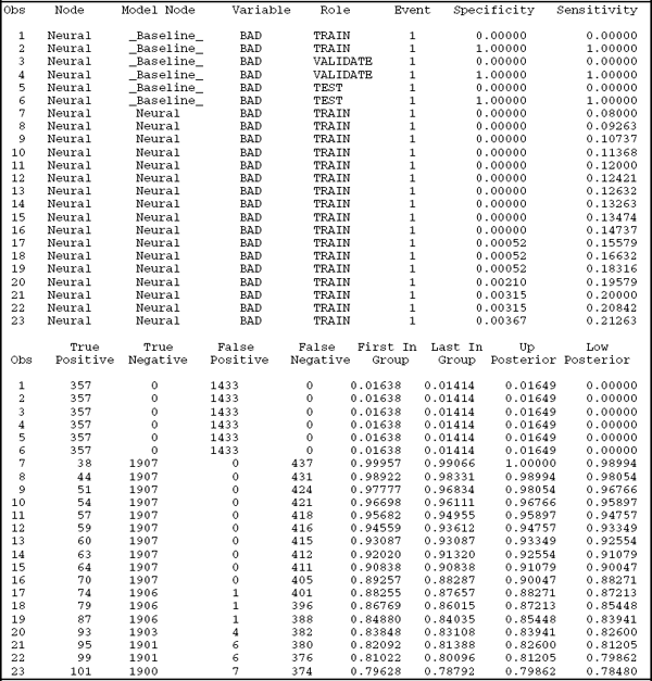
To give you some ideas, Output 9.3 lists the first 23 observations in the data set produced by SAS Enterprise Miner using the flow in Figure 9.4. The key variables are SENSITIVITY and ONEMINUSSPECIFICITY. Additional useful variables are MODELNODE and DATAROLE. The MODEL variable contains four categories: _Baseline_ (denoting the model where no covariate information is used, which results in the 45-degree line), Neural (corresponding to the Neural Network node), Reg (corresponding to the Regression node), and Tree (corresponding to the Decision Tree node). DATAROLE simply indicates whether the corresponding observation is for training, validation, or testing only. Traditionally, ROC curves are plotted only for the validation data set, but you can compare the amount of overestimation with the availability of this variable in Output 9.3.
Output 9.3
The ROC curves in Figure 9.6 are identical to the ones in the second panel of Figure 9.5 and are generated by PROC GPLOT using the following statements. You can exercise more control on the aesthetic and functional aspects of the curve with PROC GPLOT.
Figure 9.6 ROC Curves for the Validation Data Using PROC GPLOT
