
Single Continuous Predictor |
|
3.1 Dichotomizing a Continuous Predictor
3.3 Empirical ROC Curve and the Conditional Distributions of the Marker
3.5 Selecting an Optimal Threshold
3.7 Transformations to Binormality
3.8 Direct Estimation of the Binormal ROC Curve
3.9 Bootstrap Confidence Intervals for the Area under the Curve
3.1 Dichotomizing a Continuous Predictor
Now let's consider the problem that naturally leads to the use of the ROC curve. Suppose you are trying to predict a binary outcome, like the weather forecast, but instead of a binary predictor you have a continuous predictor. Most weather forecasts are produced by statistical models, which generate a probability level for the outcome. For example, most weather forecasts mention rain in their summary but if you look at the details they also report a chance of rain. How would you assess the predictive accuracy of these probabilities (or, perhaps more appropriately, the model that produced these predicted probabilities)?
Since you know how to analyze predictive accuracy for a binary predictor (using metrics such as sensitivity and specificity), you might consider transforming the predicted probability into a dichotomy by using a threshold. The results, however, would clearly depend on the choice of threshold. How about using several thresholds and reporting the results for each one? The ROC curve offers one way of doing this. The ROC curve offers one way of doing this by focusing only on sensitivity and (one minus) specificity.
Let's use an example from the field of medical diagnostics. One way to diagnose cancer is through the use of a special scan called positron emission tomography (PET). PET produces a measure called the standardized uptake value (SUV), which is a positive number that indicates the likelihood that the part of the body under consideration has cancer. After the SUV is measured, the patient undergoes a biopsy where a small piece of tissue from the suspected area is removed and examined under the microscope to evaluate whether it is cancerous or not. This process, called pathological verification, is considered the gold standard. Using the terminology introduced at Chapter 1, we will call the SUV the marker, and pathological verification the gold standard.
The data are reported by Wong et al. (2002). There are 181 patients, 67 of whom are found to have cancer by the gold standard. Because we are dealing with a continuous predictor, it is no longer possible to report the data in a tabular form. Instead you can use the following side-by-side histograms from PROC UNIVARIATE that can be obtained with the simultaneous use of CLASS and HISTOGRAM statements. For example, the following code was used to generate Figure 3.1:
Figure 3.1 Side-By-Side Histograms for SUV

When the HISTOGRAM statement is invoked in PROC UNIVARIATE with a CLASS statement, a separate histogram for each value of the class variable is produced. The KEYLEVEL= option ensures that the chosen level always appears at the top (in this case, the code displays the histogram for the gold standard negative patients first). The options used in the HISTOGRAM statement visually enhance the figure. Their use is covered in detail in the Base SAS Procedures Guide: Statistical Procedures, which is available at support.sas.com/documentation/onlinedoc/sas9doc.html.
The upper panel of the figure is the histogram of SUV for the gold standard negative patients (those without cancer) and the lower panel is for gold standard positive patients (those with cancer), as denoted by the vertical axis. Patients with cancer tend to have higher SUV values; only a few have very low SUVs. A very high SUV (say, 10 or more) almost certainly implies cancer. There is, however, some overlap between the distributions for SUVs in the middle range (roughly 4–10). So extreme values of the SUV strongly imply cancer or lack of cancer, but there is a gray area in the middle. This is in fact a very common picture for many continuous predictors. How accurate, then, is SUV for diagnosing cancer?
One crude way of approaching the problem is to compute the sensitivity and specificity for various thresholds. Figure 3.2 uses a threshold of 7. To the left (SUV≤7) are considered negative for cancer and to the right (SUV>7) are considered positive for cancer. HREF=7 option is used in the HISTOGRAM statement for drawing the reference line and FRONTREF options was used to ensure that the reference line is in front of the histogram bars.
A greater proportion of gold standard negative patients have SUV≤7 and are classified as without cancer. Similarly, a greater proportion of gold standard positive patients have SUV>7 and are classified as having cancer.
Figure 3.2 Dichotomizing at SUV=7

Dichotomization of the SUV can be accomplished using the following DATA step command:
This can produce undesirable behavior if the SUV variable contains missing values because a missing value will satisfy suv≤7, which will be recoded as 0 in this case. IF-THEN statements should be employed if the variable to be recoded contains missing values.
Using the variable SUV7, you can easily obtain the kind of 2×2 table considered in the previous chapter for the weather forecast example. For this data set, it would look like the cells in Table 3.1:
Table 3.1 Accuracy of SUV>7 in Cancer Diagnosis

The rows are classifications by the SUV>7 rule and the columns are classifications by the gold standard. Using the techniques covered in Chapter 2, you can use PROC FREQ to estimate the sensitivity and specificity as 25/67=37% and 111/114=97%. Therefore, using 7 as the SUV threshold to classify patients as having cancer or not is highly specific but of questionable sensitivity. This is not necessarily a verdict on the ability of the entire spectrum of standardized uptake values to diagnose cancer. In fact, Figure 3.2 suggests that moving the threshold to the left (i.e., using a lower threshold) will increase sensitivity at the cost of reducing specificity. Because the sensitivity using 7 as the threshold is so poor and the specificity so high, this might be a worthwhile strategy. This might help you find a better threshold, but it still falls short of determining whether the SUV is a good predictor of cancer. The next section explains how this can be done using ROC curves.
3.2 The ROC Curve
The previous analyses can be repeated for various thresholds, each of which may produce different values of sensitivity and specificity. One way to report the results of such an analysis would be in tabular form. Table 3.2 is an example, reporting on a few selected thresholds.
Table 3.2 Accuracy of SUV in Diagnosing Cancer for Various Thresholds

Table 3.2 makes clear the wide range of sensitivity and specificity that can be obtained by varying the threshold. It also identifies the inverse relationship between the two measures: As one increases, the other decreases and vice versa. This can be seen from the histogram. If you move the dashed line to the left (to 5, for example, instead of 7), more patients will be classified as positive: Some of these will be gold standard positive, hence true positives, which will increase the sensitivity. Others, however, will be gold standard negative, and hence false positives, which will decrease specificity. So the relationship observed in Table 3.2 is universal: It is not possible to vary the threshold so that both specificity and sensitivity increase.
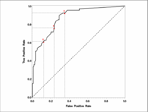
A tabular form is limited in the number of thresholds it can accommodate. You can plot sensitivity versus specificity, making it possible to accommodate all possible thresholds. Table 3.2 shows that since the two are inversely related, the plot of sensitivity against specificity will show a decreasing trend. A visually more appealing display can be obtained by plotting sensitivity against one minus specificity. This is called the receiver operating characteristic (ROC) curve. Figure 3.3 represents the ROC curve corresponding to the PET data set.
Figure 3.3 The ROC Curve for the PET Data Set

The dots are referred to as observed operating points because you can generate a binary marker that performs (or operates) at the sensitivity and specificity level of any of the dots. In this graph, the operating points are connected, leading to the so-called empirical ROC curve. The implication is that any point on the ROC curve is a feasible operating point, although you might have to interpolate between the observed marker values to find the correct threshold.
The ROC curve in Figure 3.3 is produced using the following code:
The data set produced by the OUTROC= option in PROC LOGISTIC automatically computes sensitivity and one minus specificity for each possible threshold and names these variables _SENSIT_ and _1MSPEC_, which can then be plotted using standard SAS/GRAPH procedures.
Each point on the ROC curve corresponds to a threshold, although the value of the thresholds is not evident from the graph. This is considered a strength of ROC curves because it frees the evaluation of the strength of the marker from the scale of measurement. The ROC curve for the SUV measured on a different scale would be identical to the one produced here. Nevertheless, it may be helpful to indicate the threshold values at a few selected points to improve the understanding of the ROC curve. To highlight the sensitivity and specificity afforded by these thresholds, horizontal and vertical reference lines can also be included at selected points.
Inclusion of possible thresholds is not the only visual enhancement you can make. The most common enhancement is the inclusion of a 45-degree line. This line represents the ROC curve for a noninformative test and a visual lower bound for the ROC curve of interest to exceed. Finally, it is customary to make the horizontal and vertical axes the same length, resulting in a square plot, as opposed to the default rectangular plot of SAS/GRAPH. These features are available in the %PLOTROC macro. For more information, see this book's companion Web site at support.sas.com/gonen.
Figure 3.4 shows the ROC curve for the SUV with these enhancements. It was produced by %PLOTROC macro with the following call:
The %ROCPLOT macro, available from SAS, can be useful for this purpose as well.
Figure 3.4 The ROC Curve for the PET Data Set with Enhancements
3.3 Empirical ROC Curve and the Conditional Distributions of the Marker
A convenient mathematical representation of the empirical ROC curve yields further insight into many of its properties. As Figure 3.1 shows, the distribution of the marker should be examined based on the gold standard value. Let f(t|D=0) and f(t|D=1) be the conditional density of the marker for gold standard negative and positive patients. The upper histogram is an approximation for f(t|D=0) and the lower one for f(t|D=1). Now define F and G as the survival functions (one minus the cumulative distribution) corresponding to f(t|D=0) and f(t|D=1), that is
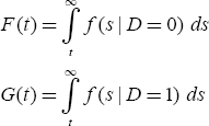
Because all patients in G(t) are, by definition, gold standard positive, G(t) describes the proportion of positive patients whose SUV exceeds t out of all positive patients. This is nothing but the sensitivity when t is used as the threshold. Similarly, 1–F(t) would be the specificity; hence, F(t) represents one minus the specificity. Therefore, an ROC curve is a plot of F(t) vs G(t) for each t.
Although this is mathematically correct, it does not completely describe the ROC curve because of its dependence on t. However, we know that F(t) is the x-coordinate of the ROC curve. Writing x=F(t) and solving for t, you get t=F–1(x). The sensitivity corresponding to t is G(t). So the sensitivity corresponding to x is given by
y=G(F-1(x))
There are several important features of this representation. First of all, it is generic. No assumptions are made about the marker or the gold standard. It also makes explicit the dependence of the ROC curve on the entire distribution function. This representation also explains why the ROC curves focus on sensitivity and specificity instead of NPV and PPV. The denominators of the positive and negative predictive values change with the threshold and do not lend themselves to notation and analyses by the use of cumulative distribution functions of the predictor variable.
This relationship can also be used to highlight a fundamental property of the empirical ROC curve that it is invariant under monotone transformations of the marker. To understand this concept, imagine using h(t) instead of t as the marker, where h(.) is a monotone function (a monotone function preserves the ranks of the data; almost all of the transformations used in statistics, such as logarithmic or power, are monotone). F and G would have the same shape for h(t) as they do for t; the only difference would be in their horizontal axes. This would only change the thresholds, not the resulting ROC curve.
3.4 Area under the ROC Curve
The ROC curve is a summary of the information about the accuracy of a continuous predictor. Nevertheless, sometimes you might want to summarize the ROC curve itself. The most commonly used summary statistic for an ROC curve is the area under the ROC curve (AUC).
In an empirical ROC curve, you can estimate the AUC by the so-called trapezoidal rule:
- Trapezoids are formed using the observed points as corners.
- Areas of these trapezoids are calculated with the coordinates of the corner points.
- These areas are added up.
This may be quite an effort for a curve like the one in Figure 3.3 with many possible thresholds. Fortunately, the AUC is connected to some well-known statistical measures, such as concordance, Somers' D, and the Mann-Whitney test statistic. This connection is associated with the invariance property discussed in Section 3.3. Invariance to monotone transformations implies that the ROC curve is a rank-based measure. The only information used from the observed marker values is their relative rank.
We will exploit these relationships not only to facilitate computation but also to gain further insight into the meaning of the area under the curve and to improve interpretation. In particular, we will see how you can estimate the concordance using PROC LOGISTIC and Somers' D using PROC FREQ. The relationship between the AUC and the Mann-Whitney statistic is as useful as the others in terms of conceptualization but not as useful from a SAS perspective. It is not explored here.
3.4.1 Concordance and Computing the AUC Using PROC LOGISTIC
Concordance probability measures how often predictions and outcomes are concordant. Continuing with the PET example, if, in a randomly selected pair of patients, the one with the higher SUV has cancer and the one with the lower SUV has no cancer, then this pair is said to be a concordant pair. A pair where the patient with the higher SUV has no cancer but the one with the lower SUV has cancer is said to be a discordant pair. Some pairs have the same SUV and they are called tied pairs. Finally, some pairs are noninformative; for example, both patients may have cancer or both may have no cancer. It is not possible to classify these pairs as concordant or discordant.
The probability of concordance is defined as the number of concordant pairs plus one-half the number of tied pairs divided by the number of all informative pairs (i.e., excluding noninformative pairs). In essence, each tied pair is counted as one-half discordant and one-half concordant. This is a fundamental concept in many rank procedures, sometimes referred to as randomly breaking the ties.
An equivalent way to express concordance is P(SUV+>SUV–), where SUV– indicates the SUV of a gold standard negative patient and SUV+ indicates the SUV of a gold standard positive patient. Figure 3.1 is helpful in visualizing this process. If one SUV is selected at random from the upper histogram and one from the lower histogram, what are the chances that the one chosen from the lower is higher than the one chosen from the upper?
The most important consequence for our purposes is that the area under the ROC curve is equal to the concordance probability that is reported by various SAS procedures. For example, PROC LOGISTIC reports concordance in its standard output under the heading “Association of Predicted Probabilities and Observed Responses.” Using the same call to PROC LOGISTIC that generates the data set for plotting the ROC curves, you can obtain the AUC from the output marked with “c”. In the PET example, this turns out to be 0.871 (or 87.1%), as seen from Output 3.1. The output also contains the elements of the computation (namely, the number of concordant, discordant, and tied pairs).
Output 3.1

The AUC is estimated from the data, so there has to be a standard error associated with this estimation. The major drawback to using PROC LOGISTIC to estimate the AUC is that the associated standard error is not available. Fortunately, PROC FREQ provides an indirect alternative for this purpose.
3.4.2 Somers' D and AUC Using PROC FREQ
PROC LOGISTIC output includes Somers' D as well. D and AUC are related to one another through the equation D=2*(AUC-0.5). Somers' D is simply a rescaled version of the AUC (or concordance) that takes values between -1 and 1, like a usual correlation coefficient, instead of 0 and 1. PROC LOGISTIC does not report the standard error for Somers' D. However, PROC FREQ reports both Somers' D and its standard error, as in the following example:
The NOPRINT option suppresses the printing of the frequency table, which could be several pages long since each unique value of the SUV will be interpreted as a row of the table. The MEASURES option ensures that various measures of association, including Somers' D, are printed. Output 3.2 shows the results from this invocation of PROC FREQ.
Output 3.2

Two Somers' statistics are reported: C|R uses the column variable as the predictor and the row variable as the gold standard, while R|C uses the row variable as the predictor and the column variable as the gold standard. The relevant statistic here is R|C, reported to be 0.7426 with a standard error of 0.0523. If the table was constructed so that the marker (the SUV) was the column variable and the gold standard was the row variable, then we would have used the Somers' D C|R statistic.
Using the relationship
![]()
you can compute the area under the curve to be 0.8713, identical to the LOGISTIC output, which was reported with three significant digits. Also using the relationship
![]()
the standard error of AUC is computed to be 0.026. One can compute a confidence interval for AUC using asymptotic normal theory
AUC + 1.96*se(AUC)
which turns out to be (0.8203, 0.9222). This is a more complete analysis than the one afforded by PROC LOGISTIC because you can judge the effects of sampling variability on the estimate of AUC.
3.4.3 The %ROC Macro
While PROC FREQ is sufficient for our purposes to compute the area under the curve and its standard error, now is a good time to introduce a SAS macro primarily used to compare the areas under several ROC curves; however, it can also handle a single ROC curve as a special case. The %ROC macro, currently in Version 1.5, is available for download at the following URL:
support.sas.com/samples_app/00/sample00520_6_roc.sas.txt
Following is the code that can be used for this example:
The macro variables used for invoking %ROC are
- Response: This is the gold standard, or the outcome. You need to create a data set variable that takes on values of 0 or 1 only; the macro can not recode the observed binary classes. This variable must be numeric; a character variable with only two distinct values (0 and 1) will pass the macro's error-checking facility but produce a PROC IML error, which is difficult to debug.
- Var specifies the marker.
- Contrast is used primarily to compare several curves, as we will see in later chapters. The value of Contrast is always 1 for a single ROC curve.
- Alpha pertains to confidence limit estimation.
- Details controls the amount of output printed.
Output 3.3 shows the results of this call. The area under the curve is 87.13%, the same as the concordance from PROC LOGISTC, and also the same as derived from Somers' D in PROC FREQ. The standard error is also the same as the standard error derived from Somers' D in PROC FREQ. Confidence intervals also match up, up to rounding error.
Output 3.3

Frequent ROC curve users should be familiar with this macro. If, on the other hand, you only occasionally need an AUC estimate and its standard error, then it may be easier to work with PROC FREQ.
3.5 Selecting an Optimal Threshold
In certain cases, although the original predictions are continuous, it is of interest to report a binary prediction. Recall the rain prediction example used at the beginning of this chapter. Suppose you have a model that provides a predicted probability of precipitation for a given day. Along with this predicted probability, you might want to display an icon that depicts rain to communicate the prediction in simpler terms. Most of us have seen such icons in television or newspaper weather forecasts. By including this icon we are essentially reporting a binary prediction (rain/no rain) based on a continuous predictor (predicted probability of rain). This is equivalent to choosing a threshold, which itself is equivalent to choosing an operating point on the ROC curve.
Sometimes external criteria may guide the choice of an operating point. In the absence of such criteria, you might choose a threshold that is optimal in some sense. There are two widely used ways of doing so:
- Choose the threshold that will make the resulting binary prediction as close to a perfect predictor as possible.
- Choose the threshold that will make the resulting binary prediction as far way from a noninformative predictor as possible.
To understand these methods better, remember that a perfect predictor has a single point on its ROC curve (namely, the upper left corner of the unit square) with 100% sensitivity and 100% specificity. In a similar vein, a noninformative marker's ROC curve lies along the diagonal of the unit square. The distance between a point on the ROC curve and these reference points is measured using the so-called Euclidean method. The Euclidean distance between points A and B with coordinates (x1, y1) and (x2, y2) is given as follows:
![]()
To make this clear, the empirical ROC curve is plotted again in Figure 3.5 with two candidate optimal operating points, A and B. R denotes the reference point for the first method of choosing an optimal threshold. Similarly, P and Q denote the reference points for the second method. According to the first definition, you need to compute the length of line segments RA and RB and prefer A over B if RA is shorter than RB. Similarly, if the second method of choosing a threshold is adapted, then the lengths of AP and BQ need to be compared, with A preferred over B if AP is longer than BQ.
Figure 3.5 Choosing the Optimal Threshold Using the Empirical ROC Curve

The OPTIMAL option of the %PLOTROC macro generates a data set called _OPTIMAL_, which computes the two distances explained here for each threshold. These two variables, called DIST_TO_PERFECT and DIST_TO_NONINF, can be used to choose an optimal operating point on the ROC curve.
The choice of method is mostly dictated by the field of application. In the context of medical diagnosis, optimal usually means close to the ideal and in engineering contexts it usually means far from random. In fact the vertical distance measure considered here is equal to Youden's index, a summary measure of accuracy that is popular in quality control, although it was first introduced in a medical context (Youden, 1950).
Unfortunately, the two criteria of optimality produce different optimal operating points. This is analytically demonstrated by Perkins and Schisterman (2006). Most of the time, the two are close enough to allay any concerns about the choice of method.
3.6 The Binormal ROC Curve
So far our focus has been on the empirical curve, the one obtained by connecting the observed (sensitivity, 1-specificity) pairs. The empirical curve is widely used because it is easy to produce and it is robust (in the sense of being rank-based) to the changes in the marker distribution. But there are occasions when you might prefer a smooth curve. The most common way of smoothing an ROC curve is by using the binormal model.
The binormal model assumes that the distributions of the marker (or a monotone transformation) within the gold standard categories are normally distributed. For the PET data set example, we can assume that the SUVs of the patients with cancer follow a normal distribution, with mean µ1 and variance σ12, and SUVs of the patients with no cancer follow a normal distribution, with mean µ0 and variance σ02. Then, using the notation from the empirical ROC curves

it follows that the threshold t can be written as a function of x as follows:
![]()
Because a threshold t corresponds to the sensitivity F(t), we can write the functional form of the ROC curve as follows:

where
![]()
These two parameters, a and b, are often referred to as binormal parameters. Sometimes they are called intercept and slope because plotting a binormal curve on normal probability paper yields a straight line with intercept a and slope b. This practice is not common anymore, but the nomenclature continues.
If the marker values are not normally distributed but can be after a monotone transformation, then the binormal ROC curve is fitted to the transformed values. Nevertheless, the binormal curve fitted to the transformed values is still considered the ROC curve for the untransformed marker as well because the true ROC curve for the marker is invariant under monotone transformations, as shown in Section 3.3. Therefore, the existence of a monotone normalizing transformation is sufficient to justify using the binormal approach.
On the one hand, this is a relatively weak requirement, suggesting that most predictors can be thought of as binormal. On the other hand, discovering the functional form of h can be quite a task by itself. Note that the same h(.) must transform the marker to normality for both gold standard positive and negative patients. This process can be challenging and is discussed in the next section.
The area under the curve for the binormal model also has a closed-form expression:

Estimation of the binormal model requires estimation of a and b, which in turn requires estimation of the mean and variances in each outcome group separately. This can simply be accomplished using PROC MEANS with a CLASS statement. But using PROC NLMIXED has many advantages, which the following example demonstrates. If you are not familiar with PROC NLMIXED, a relative newcomer to the SAS/STAT family, see the Appendix for an introduction covering its relevant capabilities.
To adopt this code for your data set, replace the variables Gold and SUV with the variable names for the gold standard and the marker. The relevant portion of the NLMIXED output from this execution appears under Additional Estimates in Output 3.4.
Output 3.4
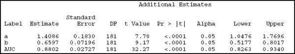
You can see that the binormal parameters a and b are estimated to be 1.4086 and 0.6597. The corresponding ROC curve is represented by Ф(1.41 + 0.66 Ф-1(x)), where x takes on values from 0 to 1. That the ROC curve is defined for all points between 0 and 1 is a feature of the model. Although not all thresholds are observed, the binormal model interpolates and makes available a value of sensitivity for all possible values of one minus specificity.
The resulting AUC is 0.8802, with a standard error of 0.02727. You can form a 95% confidence interval using standard asymptotics: AUC±1.96*se(AUC), which turns out to be (0.826, 0.934). Table 3.3 compares the results from the binormal model with those from the empirical analyses. Both the AUC estimates and the confidence intervals are very close to each other.
Table 3.3 Comparison of AUC Estimates from the Empirical and Binormal ROC Curves

From the standpoint of ROC curve analyses, the ESTIMATE statement is an important strength of PROC NLMIXED because it allows you to directly obtain estimates and, perhaps more importantly, standard errors for a, b, and AUC. Another advantage that will be apparent in subsequent chapters is that it is flexible enough to accommodate several different types of ROC curves.
The following is a graphical comparison of the empirical curve (solid line) and the binormal curve (dotted line) using the PET data set example. Early on, the binormal ROC curve is above the empirical one, suggesting that sensitivity is overestimated when compared with the empirical values. Later, the curves cross and the binormal curve starts to underestimate sensitivity. Most of the time the difference between the two curves is less than 10%. For most purposes, this would be considered a reasonable-fitting binormal ROC curve. Figure 3.6 shows a graph comparing the two different curves.
Figure 3.6 Comparison of Empirical and Binormal ROC Curves

Figure 3.6 is generated by the following SAS statements. The key idea is in the DATA step, where the data set produced by the OUTROC= option in PROC LOGISTIC (called ROCData here) generates the sensitivities from the binormal model. ROCData already contains the sensitivity and one minus specificity pairs for the empirical curve. Another variable, called _BSENSIT_ here, is added using the functional form of the binormal model along with the parameters estimated with PROC NLMIXED (described previously). Then _BSENSIT_ and _SENSIT_ are plotted against _1MSPEC_, overlaid on the same graph. The solid line is the empirical curve (_SENSIT_) and the dotted line is the binormal curve (_BSENSIT_).
3.7 Transformations to Binormality
The assumption of normality plays a crucial role in the binormal model. Statisticians who are familiar with the theory of t-tests and analysis of variance may dismiss this importance because of the widespread notion that large sample sizes overcome the effects of non-normality. This is generally true for procedures that compare the means of several groups (such as the t-test or the F-test), primarily because the sample means can be approximated by a normal distribution in large samples even if the individual observations are markedly non-normal.
In contrast, the ROC curve does not simply compare the means of diseased and non-diseased populations. In fact, as Section 3.3 shows, the ROC curve can be represented as G(F-l(x)), where x is one minus the specificity, G(.) is the cumulative density of the predictor in the diseased group, and F(.) is the cumulative density in the non-diseased group. Therefore, accurate estimation of the ROC curve requires accurate estimation of all points on F and G. The binormal model assumes F and G to be the cumulative density function of the normal distribution, and the parameters of these two normal distributions are estimated from the data. If the data are markedly non-normal, estimates of F and G can be severely inaccurate at several points. This is not easily remedied by assembling larger samples.
For this reason, using the binormal model raises the question of whether the data are indeed normal and whether departures from normality can be fixed with a monotone transformation. Based on Section 3.3, you might think that all ROC curves are invariant. This is certainly not the case. All parametric ROC curves, and the binormal model in particular, are not invariant to monotone transformations.
Normalizing transformations is of great interest in least squares regression and analysis of variance, so there is a vast amount of literature about it. One of the most popular transformation methods is the standard Box-Cox power family implemented in PROC TRANSREG.
The Box-Cox power family of transformations can be defined as
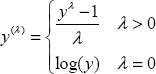
Each value of λ defines a transformation. For example, λ=1 uses the original values and λ=0 corresponds to a log-transform. This definition assumes y is non-negative to start with; if this is not the case, a constant can be added to shift the values. The idea is to choose λ based on the observed data. PROC TRANSREG uses a maximum likelihood estimate of λ along with the associated confidence interval. Because the choice of λ depends on the data, the recommendation is to round the resulting estimates to the nearest quarter so long as they are in the associated confidence interval.
This representation does not take into account the gold standard. The marker distributions that need normalization are the conditional ones (conditional on the gold standard, F and G in the foregoing notation). In contrast, the Box-Cox family attempts to normalize the marginal distribution of the marker values. You can redefine the family so that it normalizes the conditional distributions. The easiest way of doing so is recognizing that an analysis of variance model with the marker as the outcome and the gold standard as the covariate is one way of modeling the desired conditional distributions. For more information, see Sakia (1992).
In the PET example, you can estimate λ using the following call to PROC TRANSREG. The left-hand side of the model includes the marker value to be transformed and the right-hand side includes the gold standard, as explained previously, to ensure that conditional distributions are normalized. The PARAMETER= option specifies a constant to be added to all observations before λ is estimated. Because some SUVs are 0, an arbitrarily chosen small number (0.1) is added.
Output 3.5 shows the results. The primary output is the (log) likelihood values for each λ. As explained in the legend, a less-than symbol (<) points to the best λ (that is, the one that maximizes the likelihood). Observations marked with an asterisk (*) form a confidence interval, and a plus sign (+) is a convenient choice for λ. According to the criteria for being convenient, the number must be round and contained in the confidence interval. In this example, λ=0.5 is identified as the best choice, implying a square root transformation.
Output 3.5

You can create a data set containing the transformed values in PROC TRANSREG using the OUTPUT statement. These transformed values can then be used in a PROC NLMIXED call similar to the one in Section 3.6 to estimate the binormal parameters for the transformed variates. Although the steps for doing so aren't detailed here, you might want to try this exercise to gain practical skills.
3.8 Direct Estimation of the Binormal ROC Curve
Section 3.6 describes how to derive the functional form of a binormal ROC curve, starting with the basic assumption that the distribution of the marker is normal (with possibly different means and variances) in positive and negative groups. It then shows how PROC NLMIXED can be used to obtain estimates of the parameters of these two normal distributions. This method assumes that the observed data are normally distributed. However, as noted in Section 3.7, it is possible to transform the observed values to improve adherence to the normality assumption and then apply the approach outlined in Section 3.4 on the transformed values to obtain improved estimates of the ROC curve.
There is a simpler and more direct method to estimate the binormal ROC curve. Note that the binormal curve has only two parameters, a and b, and the ROC curve is given by
![]()
where y is the sensitivity and x is one minus the specificity. You can first plot the observed ROC points, as if for an empirical ROC curve, but instead of connecting them, you can fit a curve with the form above and find a and b such that the resulting fit is best. This process is further facilitated by the observation that
![]()
Therefore, if the ROC points are first transformed to the probit scale, then you only need to fit a line, which can be done, almost trivially, by using least squares. There are many SAS/STAT procedures available for this purpose, but PROC REG offers the simplest interface. Suppose ROCData is a data set created by the OUTROC= option of PROC LOGISTIC. Then you can estimate the binormal parameters by using the following code:
This method leads to estimates of 1.71 and 0.85 for the binormal parameters a and b, respectively, in the head and neck cancer data, compared with 1.31 and 0.66 when the binormal parameters were estimated by modeling the marker values directly using PROC NLMIXED. Figure 3.7 shows the two different binormal fits to the empirical curve (solid line). The dashed line is the PROC NLMIXED estimate and the dotted line is the PROC REG estimate.
Figure 3.7 Estimates of the ROC Curve Obtained from NLMIXED, REG, and LOGISTIC Procedures

Although the direct estimation of the ROC curve using least squares is attractive because of its simplicity, it is not without problems, especially the fact that the points on the ROC curve are in fact points from a cumulative distribution function and are not independent. So PROC REG standard errors are likely to be underestimates of the true standard errors. Therefore, you should not use least square estimates for inference (such as reporting confidence intervals) but as point estimates of the binormal parameters. Since the binormal curve is a function of the binormal parameters, direct estimation of the ROC curve using the least squares estimates is correct, but the resulting standard errors and p-values are incorrect.
3.9 Bootstrap Confidence Intervals for the Area under the Curve
Bootstrap is a modern method that originally started for assessing the variability in point estimates. It has since expanded to perform hypothesis tests, validation of predictive models, model selection, and many other statistical tasks.
In this book, bootstrap methods are used for
- Non-parametric confidence intervals for the area under the ROC curve
- Hypothesis tests that compare two or more ROC curves with respect to their AUCs
- Correcting for the optimism in the evaluation of multivariable prediction models, such as logistic regression, or data mining predictions, such as classification trees.
Very briefly, a bootstrap sample is obtained by sampling from the observed data with replacement. The following steps describe the process in pseudo-code:
- Create B data sets, each random samples with replacement from the original data.
- For i=1,…,B, analyze data set i exactly as the original data set would have been analyzed (for example, compute the empirical AUC). Assign the results (possibly several values) to R(i).
- R(1),…, R(B) is an approximation of the sampling distribution of R.
The approximation works better for large B. In most applications, B is between 200 and 2,000. Statistics estimated from the approximate sampling distribution serve as the desired estimates. For example, the standard deviation of the B numbers R(i) is approximately the standard error of R. Further review of the bootstrap method is beyond the scope of this book. Consult Efron and Tibshirani (1993) for more information.
The macro %BOOT1AUC, which is available from the book's companion Web site at support.sas.com/gonen, performs a bootstrap analysis for the area under the curve of a single ROC curve. An example call is as follows:
although there are two other possible inputs: BOOT specifies the number of bootstrap samples (default of 1,000) and ALPHA specifies the error level for the confidence intervals. Output 3.6 shows the results.
Output 3.6

If you want to further develop your own bootstrap applications, PROC SURVEYSELECT provides the easiest way to create a bootstrap sample with SAS:
This call to PROC SURVEYSELECT generates 100 samples (as specified with the REP= option) and each sample has 181 elements (as specified by the N= option). In general, each bootstrap sample has the same size as the original data set, so the N= option typically equals the sample size. METHOD=URS allows unrestricted random sampling and corresponds to a sampling schema that gives equal probability to each record in the data set and performs the sampling with replacement. The OUT= option specifies the data set in which the bootstrap samples are saved. Finally, the OUTHITS= option ensures that a record that was selected more than once (which is possible in sampling with replacement) appears as many times as it was selected in the output data set. The default (when the OUTHITS= option is not specified) represents that record with a single observation, along with a variable that indicates the number of hits (i.e., the number of times it was selected).
An important feature of the data set created by PROC SURVEYSELECT is that it contains a variable called Replicate that identifies the bootstrap sample. Because bootstrap samples are analyzed separately, you can use the BY processing available in most SAS/STAT procedures. For example, to compute the AUC for each bootstrap sample, you can call PROC LOGISTIC using a BY REPLICATE statement and create an output data set using the ODS OUTPUT statement. This output data set will also include the REPLICATE column along with the AUC index computed for each bootstrap sample. Therefore, developing SAS code for the bootstrap method has become substantially easier with PROC SURVEYSELECT. In addition, because BY processing is much faster than competing ways of performing the same task, such as using macro loops, this strategy leads to computationally efficient programs. This feature is critical because bootstrap methods can require intensive computer resources.