
Ok—your data are in place, your scintillating, envy-stoking formulas are doing what you want them to do, and it's all over but the formatting. What do you do next? And how?
Obviously, that depends. After all, at the end of the day workbooks aren't meant to be things of beauty, at least not for their own sake. They're instruments of analysis and presentation, and the data you compile need to be as lucid and intelligible as possible—and indeed, should ideally make sense to someone who doesn't know terribly much about Excel.
Just the same, you want your workbook to look good—and to enhance your audience's comprehension of the data, even if that audience consists exclusively of the person who's designed the workbook. And in this connection Excel showcases a slew of ways in which you can engineer that enhancement. And we're going to explore quite a few of them. Not all, mind you, but a lot.
Of course, formatting a worksheet calls for a dollop of perspective, too. One mustn't give in to the it's-there-so-let's-use-it mindset that can entice the user into designing the worksheet equivalent of a polka dot blouse atop a plaid skirt. After all, does your boss really want to see her sales data in the Chiller font? You know the answer—and you'd probably better know it.
But aesthetic judgments aside, the first—and really integral—thing you need to know about formatting is this: apart from one obscure exception, formatting data on the worksheet changes the appearance, and not the value, of those data; and while you may hold that truth to be self-evident, it needs to be kept in mind, because the mind and the eye play tricks (as we'll see).
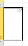
Thus if I enter the number 17 in a cell and tint it green, underline it, cast it into a boldface, enlarge it, center it in its cell, and angle it to a pitch of 48 degrees (and that's doable), that number remains exactly 17—and it remains a number, and so if I multiply it by 3 it'll still yields 51—no matter what it looks like. Formatting won't "do" anything to a number, other than change the way it looks. Coloring a negative number red or coupling it with a currency symbol may tweak the data informatively, but neither tweak will change the value that number represents. Coif your hair in dreadlocks or a Mohawk; either way, it's still you.
In the pre-2007 releases of Excel formatting options were assigned to their own, separate heading on the Menu bar, and as luck would have it, that command was called...Format. It's noteworthy, however, that that term has been banished from the Tab and Group names in 2010, although you will find a Format button in the Cells Group on the Home tab; instead, most of the standard formatting arsenal is now stockpiled in the Home tab groups, however its buttons are named. Indeed, the great majority of buttons in that tab can properly be called formatting in operation.
And as you proceed you'll also need to remind yourself that formatting in Excel 2010 avails itself of live previewing, meaning that when you rest your mouse over a formatting possibility—say, a change in font—the cells you've selected for that change will immediately display the change in preview form—before you actually click to implement the change. Decide against it? Just pull your mouse back or click elsewhere.
Bear in mind as well as that the many of these formatting buttons perform commands that are also stored in a kind of catch-all dialog box called Format Cells; and if you think back to Chapter 1 and that Dialog Launcher arrow (Figure 4-1):

you'll see that the Font, Alignment, and Number groups on the Home tab are all equipped with the arrow. Click any one of these and it'll take you to Format Cells, each one emphasizing a different one of its tabs, e g. (Figure 4-2):

But before we get to these buttons, we need to review what you'll encounter before you make any active formatting decisions.—namely, the worksheet defaults. Depending on your operating system, you will see a different default font. Windows XP brings back Arial 10-point as the default font in Excel 2010, whereas Windows 7 and Vista users will see the same Calibri 11-point font that was introduced in the 2007 version of Office. Points assay font heights, and so 72 points total an inch-high font.
So let's turn more directly to the buttons in the Font Group in the Home tab. If you want to change the operative font in a cell, a range of cells, or the entire worksheet for that matter, you need to carry out what's called the select-then-do routine, a technique that really applies to any formatting change you wish to introduce anywhere. Very simply, select-then-do means you select those cells in which you want to implement the change, and then make the change.
Thus to change the font to, say, Chiller:
Select the cells you want to change.
If necessary, click on the Home tab, and then click on the down arrow alongside the Font box in the Font group (Figure 4-3):
Click on the font you wish—in this case Chiller.

Note that the cells you've selected need not be currently populated with data. They can be blank, and so we see that formatting changes can be instituted prospectively or retroactively. You can format first, and enter data later—or vice versa.
Note in addition that after you complete your change the cells you've selected remain selected—because Excel wants you to be able to ascribe additional changes to the cell if you wish. Thus if I want to immediately follow the font change with a change in font size, I just click the down arrow alongside the Font Box, and click a size selection (Figure 4-4):
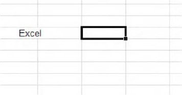
And information about these kinds of changes is cell-sensitive, meaning that the formatting characteristics of any cell you click are conveyed in the boxes and buttons in the ribbon. Thus if I click cell B7 on this worksheet I'll see (Figure 4-5):

Figure 4.5. Not a thing of beauty, but here's text in Showcard Gothic 26-point type, with boldface and italics added
I can immediately learn that the cell is set in a 26-point Showcard Gothic font, and is boldfaced and italicized besides (note the highlighted B and U). If I select a range of cells, it's the one in white—that is, the current cell—whose formatting info will appear on the ribbon.
If you're a Word user, these commands should be familiar to you—although in that application one changes fonts and font sizes of words and characters. Here the basic unit of currency is characters in cells.
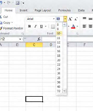
Now note that the size intervals enumerated in the above menu leave gaps—there's no 17-point option there, for example. And so if you do need 17, 23, or 29-point characters, click in the Font Size box itself (Figure 4-6):

Type the desired size, and press Enter. Your font size is thereby changed. You can even shave your sizes in half-point increments, by typing 17.5, for instance.
To the immediate right of these boxes you'll see two disparately-sized A's. Click the larger of the two and your font enlarges by the next available interval in the Font Size drop-down menu—for the cell(s) you've selected. That means, for example, that if my selected cell has data in it set at 14 points, clicking the large A lifts its character size to 16—the next size interval you'll find in the Font Size drop-down menu. And if you've selected a range of cells with different current sizes—say some cells exhibit 12 points, and others 14—then all the font-changing methods work with the cell you've actively selected—that is, the cell in white—and will modulate the size of all the other cells to exactly match the font size of just the selected cell. For example, if I've selected this range (Figure 4-7):

Figure 4.7. All these cells will match the font size of the white cell when they're changed collectively.
Clicking the large A will then treat the 23 as the starting font size, and resize all the cells as per whatever size you select for the 23. And, needless to say, clicking the smaller of the two A's does all of the above—in reverse, reducing font size with successive clicks. Thus the two A buttons really present you with a slightly swifter way of doing what the Font Size box does.
You'll also note the three formatting classics just beneath the font boxes—Bold, Italics, and Underline—B, I, and U—all of which submit to the same select-then-do technique. They also boast three classic keyboard equivalents—Ctrl-B, Ctrl-I, and Ctrl-U, respectively. Note in addition, however, the drop-down arrow accompanying the Underline button. Click it and you'll see this little drop-down menu (Figure 4-8):
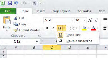
Click Underline and you'll wind up merely selecting the same single-underline option that was in force before you clicked the drop-down arrow. Select Double Underline, however, and you'll naturally inscribe a pair of lines beneath the characters in the cells you've selected (and not the entire cell width; this is the case with any underline). But this simple sequence illustrates a larger point: if you click Double Underline, you'll see this change in the Underline button (Figure 4-9):

That is, Excel remembers the last selection you made with that button—at least for the duration of your session. Close Excel and the button reverts to its default appearance—in this case, the standard single underline. This last-selection-remembered feature applies to many formatting buttons, as you'll see. Note that the B, I, and U commands are toggles—that is, they have an alternating, on-off character. Click I, and your text is italicized. Click the I again, and the text is returned to its normal angle. The same idea applies to alternating clicks of Ctrl-B, Ctrl-I, and Ctrl-U—they turn the respective effects on and off.
And if you click the Dialog Box launcher in this group, you'll wind up here (Figure 4-10):

You'll discover a couple of other underline options when you click the down arrow beneath Underline. And if you want to see what Strikethrough, Superscript, and Subscript do, just select a cell(s) with data, turn on the above dialog box, click the commands, and observe what happens in the preview pane. Strikethrough draws a line through the selected data in their cells, Superscript raises it (as per the 2 in E=MC2), and Subscript sinks the data in a cell, as with the 2 in CO2.
Continuing our sweep across the formatting buttons gathered in the Font group, we've reached a button which, if you want to be technical about it, really doesn't impact fonts directly—the border button (Figure 4-11):

But that doesn't detract from its usefulness, however. The border button draws lines, or borders, around cells, and not the characters entered in those cells. Borders are often applied around groups of numbers in order to call proper attention to them. You're viewing the default border setting above, called simply Bottom Border, and simplicity notwithstanding, a bit of explanation is required. If you select a range of cells and click the Bottom Border setting you see above, a border will be drawn only along the bottom border of the last, or bottom cell; that is, all you'll see is one horizontal border lining the very lowest cell in the range—and not the bottom border of every cell you've selected. In other words, if you select nine cells and click the bottom border button you won't see this (Figure 4-12):

Figure 4.12. Don't expect to see this when you select the Bottom Border option down a range of cells
Instead, you'll see this (Figure 4-13):

because the border options do their work by default on the outerborders of a selected range, that's all, not the internal borders of the cells (the ones inside the range). And if you click the drop-down arrow alongside the button (Figure 4-14):
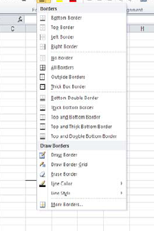
you'll discover that, with one exception, all the options subsumed under the Borders heading do their thing around a segment of the outer border of the range you've selected. The accompanying images clearly tell you what you can expect. The exception to the above: If you select All Borders, then all the borders around all the cells in a range will receive borders (Figure 4-15):

Note that the No Borders removes unwanted borders. Select a bordered range, click No Borders, and the borders disappear.
And what about the border commands shelved beneath the Draw Border heading? Here some very different options present themselves (Figure 4-16):

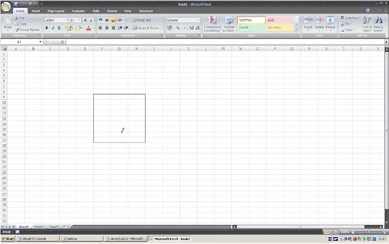
First, clicking Draw Border turns your mouse pointer into a pencil, enabling you to "draw" an outside border around any range of cells you wish (Figure 4-17):
And after you've drawn your range the pencil remains available, giving you the opportunity to draw other borders elsewhere if you wish. To turn the pencil off, just press the Esc key.
Selecting Draw Border Grid also calls up that pencil (duly sharpened) to the screen, and lets you draw lines around all the borders of any range of cells. And if you want, you can drag the pencil down only one column border, or only the lower border of cells. Thus, you can use Draw Border Grid to produce a border like this (Figure 4-18):

Erase Border will, when clicked, restyle the mouse pointer into an eraser. Once it's in view, you can click the eraser on any particular border line and the line will disappear. You can click on individual border lines or drag over a series of borders; either way, when the mouse is released the lines vanish. Again, to turn the eraser off, press Esc (Figure 4-19):
Line Color is really a subtle variation on Draw Border Grid. Click the command, select your color (Figure 4-20):

There's that pencil again (Figure 4-21):

Then, as with Draw Border Grid, drag the pencil over the desired cells. A border appears around all sides of the selected cells, in the desired color. You can apply this command to borders that currently don't display a line, or to existing, standard-blackborder lines, which means you can re-color borders.
Line Style allows you to modify the texture and weight (thickness) of the lines you draw (Figure 4-22):

so that your borders can take on a different look, e.g., see Figure 4-23

The final line option, More Borders, is, alas, the most confusing. It too allows you to draw lines around selected borders of selected cells, including diagonals running through cells. But you need to pay close attention to what the dialog box is trying to tell you. If you select just one cell on the worksheet, you'll be brought to the More Borders tab in the Format Cells dialog box, which looks like Figure 4-24 (note that here it's just titled "Border"):

Select a column of cells and you'll see this (Figure 4-25)
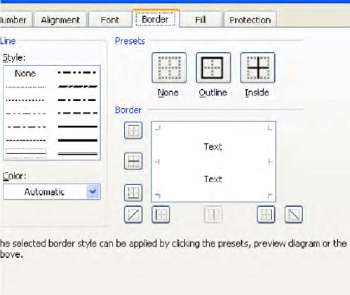
Note the word "Text" appears here twice vertically, representing the columnar selection. Select a row of cells and you'll see this (Figure 4-26)
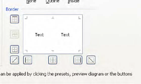
You're getting the idea. By then clicking the various line options surrounding the Text image you can border the selected cells; and while this option doesn't offer much more than what you're getting in the other border-drawing options, you do have those diagonals. If I click a diagonal, I'll see, by way of preview (Figure 4-27):

Click OK and you get this effect (Figure 4-28):

Odd but interesting, and you may be able to conjure a use for it.
The final two Font Group buttons, Fill and Font Color, respectively, are popular ones (Figure 4-29):

When clicked, the Fill button colors any cells you've selected from a set of options presented in this drop-down menu (Figure 4-30)

It's very easy. Note you can remove any fill color by selecting the cells in question and clicking No Fill. You can also fill-color empty cells, that is, cells currently containing no data. Clicking More Colors yields a beehive of additional hues (Figure 4-31):

Click the Custom Color tab and you can enter various numeric color values and add nuanced shadings to your tints. I'm still having trouble with ROYGBIV, though.
And befitting its name, Font Color serves up a nearly identical drop-down color menu, this time enabling you to change the color of the data you've entered in selected cells—not the color of the cells themselves (Figure 4-32):
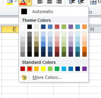
Note, however, that the above menu also offers an Automatic color option; click it and you return the data to the default black font color. A More Colors option is likewise provided here, as well as a Custom color option.
The next group in the Home tab is called Alignment, and Alignment commands are likewise considered formatting. These enable you to position, and reposition, the data you've entered in their cells (Figure 4-33):

The lower-left buttons in the group are rather simple and commonly used, and bring about left, center, and right alignments of the data in the cells you click. That is, click the left alignment button and data will be shunted to the left border of the cell. (Of course, text is left-aligned by default.) Click the center button, and any data are situated in the middle of their respective cells (Figure 4-34):

Nothing prevents you from centering numbers in their cells, and this alignment decision seems to be a popular one. Users seem to like the symmetry it affords. Still, I wouldn't recommend it, and for an obvious reason (Figure 4-35):

You see the problem. Enter numbers of varying widths in the same column, center them, and you'll thereby misalign the ones, tens, etc. But remember that alignments, no matter how ornate, won't change the quality of the data. Those numbers above are still numbers, and can be subject to exactly the same mathematical treatment as if they are right-aligned.
And while we're at it, the right-align button rams data to the right border of their cells—which is the default alignment for numbers, after all.
The upper tier of alignment buttons controls a far more exotic set of possibilities—vertical alignment in cells (Figure 4-36):

If you need your data to look like this (Figure 4-37):

click one of the buttons shown in Figure 4-36. What these do is position data along a vertical axis in the cell—at the bottom of a cell (the default, when you think about it), in the center (as above), or even at the cell's ceiling (Figure 4-38):
Just bear in mind that if you apply these formats to cells of normal heights, you won't see the above effects. That's because the default row height is too low to enable these to happen, and so you'll need to elevate the heights of the rows you want.
How do you do that? The technique is in many ways the right-angled equivalent of the column-widening methods we described in chapter 2. In order to raise a row height, click on the row's lower boundary and drag down (or up, if you want to shrink the row's height). And if I select several row boundaries at the same time by dragging along the row numbers, releasing the mouse and then dragging on any selected row boundary, I'll see something like this (Figure 4-39):
I can then modulate the height of all the selected rows at the same—and they'll all exhibit the same, new height.
So to achieve the row height you see in Figure 4-40—brought about in cell A10—I simply dragged down on the lower boundary by the 10 (Figure 4-40):

And once I've engineered the desired height I then clicked the Top Align button—and you get your top-of-the-cell number. Of course as always I can heighten the row first, click Top Align, and then enter the number. The sequence of clicks doesn't matter here.
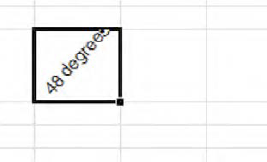
Now you'll recall my flippant aside about 48-degree text, the one I threw out on the opening page of this chapter. Well, if you need or want something like that, look here (Figure 4-41):

That's the Orientation button. Click its down arrow, and you'll see this (Figure 4-42):

That's a pretty illustrative, what-you-see-is-what-you-get drop-down. Select a cell, then click Vertical Text, for example, and you get (Figure 4-43):
And so on. Note, though, that when you call upon these Orientation options they automatically raise the heights of rows (as also happens with font size changes|) in order to accommodate their effects, unlike the vertical alignment buttons, which require the user to heighten the rows.
When you click the last Orientation button, Format Cells: Alignment, the aforementioned Format Cells dialog box appears, with the Alignment tab in view (Figure 4-44):

If you type a number in the Degrees field on the box's right side and click OK, you can achieve that 48-degree angle, or any other tilt you want, at least between −90 and 90 degrees. You can also click on the red diamond referenced by the arrow above, and drag it along that Orientation half-circle to angle your text, too. Either way, you could get the example shown in Figure 4-45
To turn this effect off—that is, to restore the data to a level orientation—return to the Degrees field and type "0."
And if you click that vertical Text field you see beneath the Orientation heading, that's what you'll get—vertical text in their cells, as per the Vertical Text options we saw in the Orientation drop-down menuin the Alignment Group.
On the left side of the Format Cells dialog are various Text alignment options. Now some of the options in those Horizontal and Vertical drop-down menus are obscure, but here goes:
General—Brings about standard data alignment defaults, e.g., text is left-aligned, numbers right-aligned. Obviously you'd only select this to restore realigned data to their original alignments.
Right and Left (Indent)—These simply push, or indent, data in their cells to the right or the left by the number of characters you type in the Indent field in the dialog box. But just remember that if you select a right indent, the text will move left, because it is the indent itself that pushes to the right. Indents can bring about some rather unusual visual results. If I select a right indent and type 10 in the indent field, I can wind up with something like this (Figure 4-46):
Don't be fooled—the text is actually "in" the cell selected by the cell pointer. This can't happen with a number, however, and for a reason we've already discussed in the chapter on data entry; Excel won't allow a number to creep into another cell. Thus, if I type 43 in the very cell you see above with the same indent settings, this is what I'll get (Figure 4-47):

Here the indent carries out what's tantamount to an Auto Fit. The number is indeed indented, but only within its own cell. Yeah—you're not likely to use this very often. The two indent buttons (Figure 4-48) found on the Alignment Group on the Home tab of the ribbon:

equate respectively with the Right and Left Indent options in the Alignment Dialog box—but look at the buttons. What I'm calling Right Indent features an arrow pointing left, and what I've called Left Indent bears an arrow pointing right. Nevertheless that's what they are. Moreover, the Alignment Group caption clinging to the first of the two buttons above (seen when you rest you mouse over it) calls it Decrease Indent, and not Right Indent; and the other button is labeled Increase Indent; and neither of these labels corresponds to what the same commands are called in the Alignment Dialog box.
A couple other qualifications to what is again, not the sort of command you're likely to call upon daily: Click the left-pointing indent button arrow in the button group and nothing happens in the cell at the outset—the data stay put. But click either left or right setting in the dialog box and type a number in the indent field and the data will indent in the desired direction.
Sorry about that.
Center—Really an equivalent of the Center alignment button. Typing a number in Indent here has no effect.
Fill—Takes any data you've written in the cell and repeats it in the cell, until the cell's width is taken up with the data. For example, if I type the word "the" in a cell and select Fill, I'll see (Figure 4-49):

And if I go on to widen the cell now, I'll get Figure 4-50

And yes, you can bring about the same effect with a number—though I can't imagine why you'd want to. That is, if I type 3 in a cell and invoke the Fill format I'll see
333333
across the width of the cell—but its actual value is still....3. Don't ask questions, but remember—this is a format, and as such, it doesn't change the number's value.
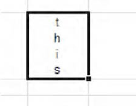
The Justify and Distributed options are similar, though not quite identical to one another. These commands represent a kind inverse of the column Auto Fit; instead of widening a column to accommodate its widest entry, Justify and Distributed treat the current column width as a fixed margin and stack the text in the cell so that it all fits. So for example, if I type (Figure 4-51):
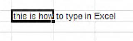
And select Justify, the text is realigned like this (Figure 4-52):
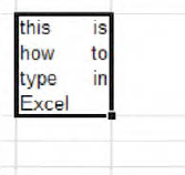
The text continues to use the existing column width, and so needs to raise its row height in order to pinch all the text within that width. The command is called Justify because it emulates a similar effect in Word, whereby text in a paragraph exhibits straight left and right margins—at least to the extent possible. Distribution differs only in that it attempts to distribute the text equally across each line in the cell, so that each line spans the current column width, including the last line—again, to the extent possible. Here's another instance of a justified cell (Figure 4-53):

And here's the same test subject to the Distributed option (Figure 4-54):

Note how the word "happen" is centered here. It's the closest Distribute could come to spanning the entire column width with that one word. Try typing the above phrase, applying the Justify and Distribute effects, and widening the column.
Center Across Selection centers a cell entry across a range of cells. That is, if I type this:
This is how to center data across a selection
in cell E28, and then select this range (Figure 4-55):

And select Center Across Selection, I'll view this (Figure 4-56):

The effect is clear. Excel treats the selected range as a single space—in essence as one big cell, even though each cell retains its own identity— and centers the data accordingly. You may want to contrast this with the Merge & Center command coming up soon.
Of the five Vertical Alignment drop-down options in our dialog box (Figure 4-57),
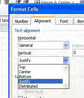
the first three—Top, Bottom and Center—are clones of the Vertical Alignment buttons we've already seen in the Alignment Group. The other two—Justify and Distributed—attempt to realize the same effects as their similarly-named Horizontal options, but to appreciate how they work you need to tinker with column widths and text length. Here are two examples (Figures 4-58 and 4-59):


The three Text control options in the Alignment dialog box are variations on themes we've previously sounded. As with Justify and Distribute, Wrap text regards a cell's current width as a margin, and wraps cell text accordingly. The difference here is that Wrap text doesn't try to flatten the right text margin, but rather lets text advance unevenly against cell's right boundary (Figure 4-60):

Wrap text allows text to wrap naturally to the next line, and doesn't try the spacing heroics of Justify or Distribute; this command is represented by the Wrap Text button in the Alignment Group.
Those options—Wrap text, Justify, and Distribute—that realign text by raising row heights instead of stretching column widths do serve a real purpose. They're usefully applied to worksheets in which you want to present data in a series of columns and maintain the same width for all of them, even as the data in the columns exhibit various widths.
Shrink to fit is a curious flip side to the workings of Wrap text and column Auto Fit. Whereas Wrap text tries to pile text into a cell without changing its width by raising its row height instead, and Auto Fit tries to widen columns to accommodate all text in one cell, Shrink to fit changes neither column width nor row height; it shrinks text in order to gather it all into existing width and height. So if you start with this (Figure 4-61):
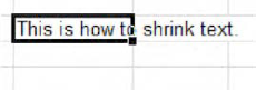
Shrink to Fit will recast the text to look like this (Figure 4-62):

Well, you get the idea.
Finally, the Merge cells option does as it says. It actually consolidates, or merges, selected contiguous cells into one mega cell. Thus if I start with this entry in cell J12 (Figure 4-63):
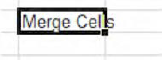
And I then select cells J12 through N12 and click the Merge cells command, I get (Figure 4-64):
And what you're looking at now is all J12; all the selected cells have been absorbed by one cell—J12—in which I typed my data. All of which raises a fairly obvious question: what does that do for me? Answer: not much.
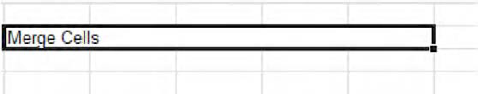
But what you really may want to do is merge these cells as we've demonstrated above, and then center the data in the new, super-sized cell. And indeed, there's an Alignment Group button—Merge & Center—which does exactly that (Figure 4-65):

By default, clicking Merge & Center on our selection of J12 through N12 brings about (Figure 4-66):

This option resolves an old spreadsheet problem—the need to center a title over a collection of columns (Figure 4-67):

In the old days, users had to resort to all manner of contortions in order to situate that title in the middle of the row above the month names, including trying to locate a "middle" column. But we're working with 12 columns here, aren't we? There is no middle column. Merge & Center will turn A1:L1 into one cell (of course that's the range you need to select), after which Monthly Sales will be precisely centered within the new super cell—which is still called A1.
The drop-down menu attaching to Merge & Center affords three additional options. Merge Across allows you to Merge & Center data in consecutive rows. Thus if you start with this (Figure 4-68):

You see that I've already selected the cells to be merged. Clicking Merge & Center: Merge Across results in this (Figure 4-69):

The respective rows are merged—but here, you see that the data in them are centered. At this point, you need to then click the standard Center button in the Alignment Group in order to center each bit of data in each new merged cell in each row. Inelegant, but it works.
Merge & Center: Merge Cells duplicates the Merge cells command we described above in the Alignment Dialog Box, and Merge & Center: Unmerge Cells returns all cells back to their original integrity.
An important additional note about the Merge Cells options: Be sure that only the leftmost of the cells you wish to merge has data in it. Thus if I want to merge cells J12 through N12, and any cells other than J12 have data in them, those data will be lost when you go ahead with the merge—though Excel will warn you about this prospect with an onscreen message.
Now that we've gotten ourselves oriented and aligned, we can push on to a group whose modest bearing belies its importance—the Number group (Figure 4-70):
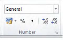
Needless to say, formatting numbers is a pretty essential Excel task, but with a couple of slightly pause-giving exceptions, the task is pretty easy. And the number formats you're most likely to need are a snap.
Let's start with the group's lower tier, moving left to right. That first button, picturing a pile of coins and a bank note of indeterminate origin, enables you to format numbers in currency mode—but unfortunately it's called, rather cryptically, Accounting Number Format, with its caption asking you to "Choose an alternate currency format for the selected cell" (of course you know that means cells, too). That term "alternate" is pretty cryptic, too—but what it means here simply is that clicking the button will impart a currency motif from one monetary system—Euro instead of Dollars, for example. (But as we'll see, there's a slightly different format out there called Currency, too—but we'll get to that.)
If you select a cell or a range of cells and click the Accounting Number Format, this is what happens by default:
The number is now embellished by your indigenous currency symbol. If you're in the States, you'll see the dollar sign, in the UK the pound sign, and so on (how Excel knows what symbol to use is tied to your system setup in Control Panel).
If the number exceeds 999, commas will punctuate where necessary, e.g., 1,234,582. (In France, the comma is replaced by a space. It's another country-specific, Control Panel thing).
The number will exhibit two decimal points. Thus 27 will appear as 27.00, 678.1 as 678.10.
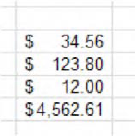
And why the term Accounting? Well, to repeat—this is a currency-specific format, but of a special type. What's special—or at least different—about it is that it lines up the currency symbol independent of the length of numbers. Consider this example: If I stack these numbers in a column (Figure 4-71):

And I click Accounting Number Format, I'll see (Figure 4-72):

Note the position of the dollar signs—all positioned in the far left of their cells, even as the actual numbers describe various widths (note also how the 12 receives those two decimal points, as does 123.8).
Of course that's all for starters—and you can stop right there if you're happy with the defaults. But if you're in the US and require a different currency, click the down arrow and some standard, alternative currency options appear, e.g., the British pound and the Euro.
But if you need something else, click More Accounting Formats (Figure 4-73):

We're back to the Format Cells dialog box, this time showing only one tab. Then click the down arrow by Symbol and click on any one of the long array of currency formats Excel makes available; your numbers will take on that denomination, and you'll note as well that you can add or diminish the number of decimal points your currency displays, either by typing a number in the Decimal places field or clicking one of those Spin Box arrows in either direction.
That's really all there is to the Accounting Number Format, but that's not all there is to currency formatting, as we'll see.
The next button in the Number lineup is Percent Style, and while it's most easy to use (no drop-down menu, either!) you need to understand what the style will do to a number. If I type:
41
and select that cell, and click Percent Style, I'll see:
4100%
And not 41%. That's because percentages really express a number's percentage of the number 1—which is, after all, 100%. Thus our number above—which is 41 times the size of 1—has to turn out to be 4100%. If you were expecting 41%, you will need to have typed .41.
But there is an alternative way to institute the Percent Style. If I type:
41%
in a cell, complete with the percent sign, I will achieve exactly that figure—41 percent.
The next button, Comma Style—symbolized, naturally enough, by the comma—imitates the Accounting Number Format, minus the currency symbol. Thus if I select a cell containing the number 3457, the comma button will make it look like this:
3,457.00
The following two buttons, Increase Decimal and Decrease Decimal, are simple, too, but a jot more thought-provoking. With each click, Increase Decimal will indeed add one decimal point to a number—and that includes numbers that have already received two such points under either of the Accounting Number Comma Style formats. Thus:
67
will appear as 67.0, 67.00, 67.000, etc., with each successive Increase Decimal click. If you write:
=4/7
your result will initially appear as:
0.571429
in a cell of default column width. If you execute an Auto Fit, you'll see:
.0571428571
a nine-digit rendition of this repeating decimal (note that the "9"—the last digit in the original six-digit version above—is replaced by 8571—adding additional precision to the number). But you can add still more decimal digits—up to 15 meaningful ones in total—to a number, after which 5 additional zeroes will then appear. But of course unless you're a currency-exchange high roller or a nuclear physicist, you're not likely to need all those extras.
Decrease Decimal works in the opposite direction, paring a decimal point with each click. And that means, for example, that if you click Decrease Decimal once on this number:
4.56
you'll see:
4.6
Click Decrease Decimal again and you'll see:
5
Now what's the numerical value of that figure? The answer: 4.56, and that's because—at the risk of repeating myself—we're formatting data, and formatting changes the appearance of the data only, not their value. And that means in turn that if I write the above number in cell A12, and write somewhere else:
=A12*2
I'll realize 9.12, not the 10 you might assume on the basis of appearances. And if you want proof of all this, type 4.56 in A12, click back in A12 and click Decrease Decimal twice, and grab a look at the Formula Bar. You'll see 4.56.
And what this could mean is that a printout of a worksheet containing the above activity would display a 5 in A12 and a calculation showing 9.12, when you multiply A12 by 2—and that could be rather misleading, to put it mildly. It's something you need to think about. (It should be added, by the way, that text entries in cells bearing any of the above number formats will be completely unaffected by any of this. It's only when you actually enter a numeric value in such cells that these changes matter.)
There's one other clarification to be made about the buttons we've examined thus far: that any one of the buttons overrules the effect of any other. Thus, if I've formatted 5457.67 to take on this appearance:
$5,457.67
and then click Comma Style, I'll see 5,457.67. If I click Percent Style, I'll see 545767%, and so on. The point is that the last format selected takes priority.
Now if you examine the broad strip—called Number Format —sitting atop all these buttons in the Number group, you'll view the default entry General (Figure 4-74):

Click the accompanying drop-down arrow and you'll see (Figure 4-75)

Each of those eleven options (you can't see that eleventh one—Text—in the screen shot, because you need to scroll down) introduces formatting variations, some of which you've already seen, others of which need to be explained. And note the More Number Format option at the base of the menu, too; that also requires a closer look. So let's move in sequence.
The default General format type is captioned No specific format—and that means General makes its own guess about what kind of data you've entered in a cell. If I type a number, General assumes that's exactly what I had in mind—an entry that possesses quantitative value. If I type a prose sentence in the cell instead, General deems it text in nature. If I type a formula, General treats it as such.
Now at this point you're probably itching to ask a rather pressing question, because I see a lot of raised hands out there. You want to know: Isn't this all completely obvious? Why do we need a format to make any decision about the data, when the nature of those data is so clear?
The answer is that the data types aren't always so clear. If I type this:
that sure looks like text, because it's missing the tell-tale = sign. But General treats the above expression as a date, namely:
05-Apr
And similarly, General treats:
4-5
the same way, as that same date. Yes—by rights, the General format could have assigned text status to these entries, but Excel assumes that users who write such expressions really want to enter dates. And dates, as we'll see, are really numbers.
In any case, the General format keeps an open mind about what it is you've written, whereas the other formats are a bit bossier, in the sense that they impose their expectations on the data to the extent they can.
Thus the Number Format option can't turn text into a number, but it can turn numerical data displaying a different format back into a garden-variety number—and it throws in two decimal points for free. Thus if a cell contains this entry:
34.5%
Clicking that cell and then clicking Number will yield:
.35
See why? Here, Number has really done two things: it's repealed the percent style, and rounded off the number to two decimal points—because that what Number does by default. But remember: the number is really .345. Check out the Formula Bar.
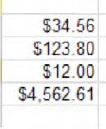
Currency is a cousin of the Accounting Number Format, and we've already alluded to it. It differs from Accounting in one respect: the currency symbol it imparts hugs each number's first digit, instead of assigning it to a fixed place in the far left of the cell. Thus our Accounting example of a few pages back looked like this (Figure 4-76):
Click Currency on the same range and you'll come away with this (Figure4-77):
And you'll be happy to know we've already discussed Accounting.
But we've yet to discuss the next two formatting alternatives—Short Date and Long Date, which do require a bit of elaboration. In order to appreciate how Excel formats dates, you need to know that at bottom, a date is a sequenced number. And the sequence starts with January 1, 1900, a date to which Excel assigns the numerical value of 1. Any post-January 1, 1900 date you enter in any cell in effect supplies a count of the number of days that have elapsed between itself and that day 1. Thus May 4, 1972 superimposes a date format over the number 26423.00—the number of days stretching in time from the baseline January 1, 1900 to May 4, 1972. Put otherwise, May 4, 1972 really is 26423.
As a way of corroborating this point, you'll note that when you click on a cell containing numerical data—say 34567—and click the Number Format down arrow, you'll see something like this (Figure 4-78):
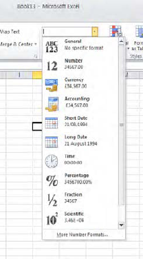
Look closely at the screen shot and you'll see that each format presents its proposed "version" of 34567, that is, how the number would look were you to select this or that format. And look in particular at Short and Long Date.
Understanding this formative concept (it probably qualifies as a have-to-know)—that dates are really numbers—helps you understand in turn that if you write April 6, 2001 in cell A1 (in any date format) and July 12, 1983 in cell A2, you can then write:
=A1-A2
and realize an answer of 6478, which signifies the number of days between the two dates you've entered—because what you've really done here is subtract 30509.00 from 36987.00.
Thus a date format—and again, that's what it is, a format—masks what's really a number in date terms. And so if I write say, 23786 in a cell, select it, and select Short Date, I'll see:
02/13/1965
That's the mode of date presentation that Excel calls Short Date. Select that same cell and click on Long Date, and I'll see:
February 13, 1965
And if write 7/8 in a cell and select Short Date, I'll see 07/08/2010. Choose Long Date, and July 08, 2010 emerges. Note in this case 7/8 omits the year; and when one does just that, Excel assumes you're referring to a date in the current year. But remember what I said earlier. If I type 7/8 under the General format—without earmarking any date format at all—I'll still see a date entry in the cell, because even the General format thinks you meant to type a date anyway. But this is what you'll see:
Jul-08
an even briefer format than Short Date. It's a really short date.
To sum up, Date formats paint a chronological veneer over what is really, when the smoke clears, just a number. And bear in mind that the inverse applies: if I type 7/8 and Jul-08, I can return to that cell, click the Number format, and see: 40367.00. But why the two decimal points?
I was afraid you'd ask that question, and in order to answer it we need to bump down to the next formatting selection—Time. To Excel, any time or clock reading in a 24-hour span can be treated as a fraction of a 24-hour denominator. What does that mean? It means this: if I type.346 in a cell, and then apply the Time format to that cell, I'll see:
08:18:14
Yeah, I also found this baffling at first—and second—sight. But think about it: the above clock time actually represents .346 of a day in hourly terms; that is, 8:18:14 is the time of day which stands for 34.6% of an entire 24-hour span. And to trot out perhaps the simplest illustration, type .5 in that cell, and format it with Time. You'll see:
12:00
Get it? That's noon—exactly half, or .5, of a day.
Thus the Date formats provide a default number with two decimal points, e.g., 32456.00, in order to enable you to format a cell with eitherdate or time readings. If you enter 31456.17 in a cell and opt for Short Date, you'll muster 02/13/1986. But if you select the Time format instead, you'll see 04:04:48, the time of day which stands for exactly .17 of an entire day. Choose a Date format, and the original number—31456.17—extracts and uses only the digits to the left of the decimal point. Choose Time and only the .17 is used.
And for putting up with all that, you get a break—because we've already discussed the next format—Percentage (even though Excel calls the equivalent button PercentageStyle).
The next option, Fraction, is a wee bit tricky. It presents any less-than-whole number in fractional terms. This:
12.5
would be formatted by Fraction as 12 1/2.
That looks pretty simple, and it is; but by default Fraction rounds off if necessary. That is, the number:
34.32
will be treated by Fraction as 34 1/3 for starters, and that's not quite exact. As you'll see a bit later, however, there are ways of adjusting this discrepancy.
The penultimate option, Scientific, performs a scientific-notational makeover on a number. Type 567 for example and Scientific gives you:
5.67E+02
Thus 0.67 becomes:
6.70E-01
Notice the plus and minus exponent references.
And finally, Text imputes a text format to whatever you write in the cell. That sounds a bit gratuitous; after all, how else could you possibly format a prose sentence? True, but Text can also format numbers as text, although you're not likely to want to do such a thing—because doing so compromises the numbers' mathematical character. However, there are times when numerical data imported from the Internet assumes textual form, and some tinkering is required in order to restore their true quantitative status.
Now you'll also note that the last entry on the Number:General Format drop-down menu is entitled More Number Formats, and clicking it delivers you to the Number tab in the ubiquitous Format Cells dialog box (Figure 4-79):

The Category column simply reiterates the options on the Number Format drop-down menu (with two exceptions—Special and Custom). Clicking any of these often—but not always—presents the user with additional formatting variations available under that category. For example, if I click Number, I'll see this (Figure 4-80):
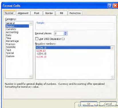
Note here I can choose the way in which I want negative numbers to appear—in red, accompanied by a minus sign (the default), or featuring both elements. The Use 1000 Separator optionsimply allows you to decide if you want your numbers to utilize a comma when it tops 999. The Date category augments the Short Date and Long Date possibilities (Figure 4-81):

(Note the discussion about asterisks, too. What it means is that only the asterisked formats are tied directly to the settings in your computer, meaning in turn that 3/14/2001 in the States would necessarily appear as 14/03/2001 in the UK. The other, asterisk-free options can be selected on any computer.)
And Time does the same—broadening the number of ways in which a time can appear in a cell (Figure 4-82):

A few words about the Fraction category may be in order. I earlier noted that when submitted to this format, the number 34.32 was rendered as 34 1/3—and that's not correct. 1/3 is .33, not .32, and that difference might matter—although again we need to remember that, because we're "only" formatting the cell, the value is really 34.32 in any case. But by default Fraction estimates the fractional equivalent of a decimal up to one digit. If we click on the cell containing 34.32 we'll see (Figure 4-83):

And note the sample captures the actual value in the cell we've selected. What's happening here is that Fraction starts by treating 34.32 as 34.3—one digit's worth of a decimal; but if we choose the next option, Up to two digits, we'll get (Figure 4-84):
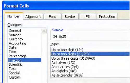
The number is now regarded as the two-digit decimal it truly is, and the sample shows 34 8/25—or, exactly 34.32.
What about Special? This category automatically formats numbers in one of four motifs (at least for users in the US): Zip Code, Zip Code, Zip Code+4, Phone Number, and Social Security Number. Special imposes what is called in Access an input mask on a value, supplying punctuation in the cell that spares the user the need to do so. Some examples: normally typing a zip code in say, New England, where the codes begin with zero, poses a problem in Excel, because typing:
04567
is rendered by Excel initially as 4567, with the leading zero eliminated. But select Zip Code from the Special option, and you get all five digits. Indeed, if you type:
4567
Zip Code will automatically supply the zero. Zip Code +4 lets the user type a nine-digit number, whereupon Excel will insert the dash between the fifth and sixth digit. As a result, typing:
123456789
yields:
12345-6789
The Phone and Social Security Number options likewise supply dashes at the appropriate points in a number, so that the user doesn't have to remember exactly where they go.
The final option, Custom, entitles the user to adjust the appearance of numbers with user-defined embellishments. This option looks rather forbidding, but let's demonstrates just one Custom possibility. We've seen that a stand-alone decimal appears this way, by default:
0.28
If you want to excise the leading zero so that you'll see .28 in the cell (or any range of cells) instead, you can turn to Custom and adjust accordingly, like this, after you've entered 0.28 in any cell:
Click Custom.
Click this option in the Type field:
0.00
The 0.00 appears as follows (Figure 4-85):
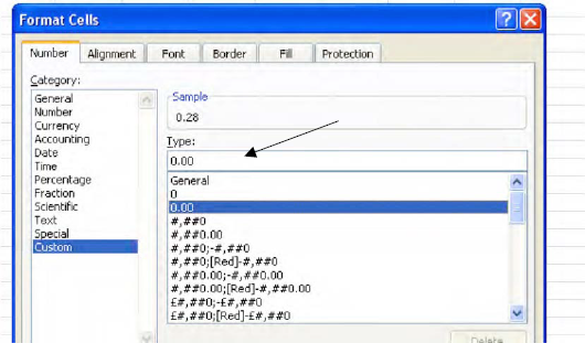
Delete the first zero, so you're seeing .00. The sample should display .28.
Click OK.
The cell is thus revised to exhibit decimals without the leading zero. Other customizations are more complex, but you get the idea.
Formatting is portable. That is, if you copy a cell or a range of cells, all their associated formatting comes along for the ride to the destination cells. But there are times when you may want to copy only the formatting of a source cell, and leave the cell's data behind. You may be so taken by the appearance of a cell that you decide you want—or need—other cells to take on that same appearance. And if that's what you need to do—copy a set of formats in one cell to other cells—there's a handy way in which to do so.
But that very objective raises a question. Why bother to copy a format from one cell to another when I can simply click on the new cells and select any and all of the formatting options we've discussed so far? Why not format these new cells directly, without copying the formatting from somewhere else?
Good question; and the answer is that you may want to copy formats from a cell that contains numerous formatting changes, and you can't be bothered to reintroduce all of them to additional cells serially. For example—suppose cell B6 contains an 18-point, Bookman Old Style font, colored green and underlined, with a Center alignment to boot. If, for reasons best known to me, I admire this pastiche of cell adornments and want to impose them on other cells, it may be too much trouble to implement each adornment separately. But with a tool called the Format Painter I can copy all of B6's formatting features to other cells in one shot.
And to see how Format Painter works, we can swing back to the Home tab's Clipboard Group, a venue we visited a few chapters earlier when we introduced the Copy and Paste buttons (Figure 4-86):
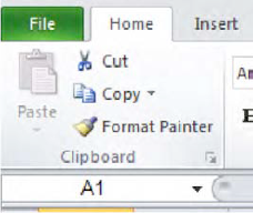
To use Format Painter:
Click the cell whose formatting you wish to copy. Then click the Format Painter button, after which you'll see (Figure 4-87):

Note
that the paintbrush icon makes its appearance onscreen, along with the marching ants buzzing around the border of the cell whose formatting you're copying (or "painting").
Then click the cell or drag over the cells to which you want to copy the source formatting. These destination cells immediately acquire the source formats, and the paintbrush and the ants disappear.
Thus if the above-mentioned B6 serves as the source cell, all its formats, but only its formats, will be exported to the destination cells, overwriting all their current formatting—while leaving their data alone. So if B6 contains the phrase "Have a Good Day," it won't be brought along for the ride; and the data residing in the destination cell(s) will now appear in the 18-point Bookman Old Style font, along with the green, underlined, centered attributes, too, all of which come from B6. Note that the Format Painter can work proactively, to copy formats to cells that are currently empty. What that means, of course, is that if you've executed a Format Painter command on a vacant cell, any data you enter from now on in the cell will display the new formats.
You also need to bear in mind that number formats are part of the deal. That is, if your source cell exhibits numbers with 2 decimal points, or displays a number as a Short Date, these elements will also be imposed on destination cells.
And if you double-click the Format Painter button, its paintbrush remains onscreen for as long as you need it. In this way you'll be able to apply the source cell formats to as many cells on your worksheet as you want, by repeatedly clicking or dragging cells across the sheet. And to eventually turn the Painter off, just press Esc.
What we're seeing here with Format Painter is a revelation of sorts: that copying and pasting can copy and paste more (or less) than just data. In fact, Excel stocks a broad array of Paste options that do a variety of things, some of which at first blush may seem bewilderingly similar.
In our initial discussion of Paste in Chapter 2 we looked at, among other pasting options, the Paste button in the Clipboard group. If you click its down arrow (you'll have to copy something first, though, in order to activate Paste), you'll see (Figure 4-88):

Bewildered? Quite a variety of Paste options indeed. But here we want to examine only those Paste buttons that carry out various formatting actions.
These two buttons (Figure 4-89):

are called Formulas & Number Formatting, and Keep Source Formatting, respectively. The first button copies only a cell's formula (there has to be one in the cell, needless to say) and its number formatting. The button won't copy any other kind of formatting, etc., from the source cell. But the second button, Keep Source Formatting, does bring over all the formatting from the source cell, along with that cell's contents—and because it does, this button appears to do precisely the same things that the standard Paste button does.
The first button in the second row is called No Borders (Figure 4-90):

and it copies all the source cell's formats, except any borders that may be drawn around any or all sides of the cell. Thus if I copy a cell like this, one which features borders around all its sides (Figure 4-91):

and paste it into another cell using No Borders, the paste will bring about this (Figure 4-92):

Note the orange fill and altered font have been copied to the destination cell; but the borders have not.
And this button (Figure 4-93):

which is called simply Formatting, is nothing but an equivalent of the Format Painter button.
And check out a new feature of the Paste button collection, debuting with Excel 2010: when you copy a source cell and select your destination cells, and then rest your mouse over any of the Paste Special buttons (without yet clicking), the destination cells exhibit that button's formatting effects in preview fashion before you click, so you know what you're going to get.
And there's still another way to copy cell formats, one which we pointed to in Chapter 2 but didn't discuss. When we execute a fill—the technique that allows us to copy a set of numbers in fixed intervals by dragging the fill handle, e.g., the interval shown in Figure 4-94
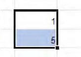
it will yield this (Figure 4-95):

If you go on to click that Smart Tag (pointed to by the arrow above), the options include (Figure 4-96):

Fill Formatting Only, which means that if the initial interval you want to drag with the fill handle looks like this (Figure 4-97):

Selecting Fill Formatting Only would generate this (Figure 4-98):

What we see here, then, is a Fill Series variation on the Format Painter. (Note: if you want to wipe cells clean of all new formatting and return them the original, default General format, select those cells and click Home
Now if you're in need of a little cell format design inspiration, you can call upon the Cell Styles options waiting behind the drop-down arrow in the Styles button group(Figure 4—99):

Select the cells you want to format and click Cell Styles, and you'll be ushered into this storehouse of pre-fab formats: (Figure 4-100):

Click any of the above formats and its style, as previewed above, will be transported to the selected cells. And note the New Cell Style option in the lower left of the dialog box. When clicked it enables you to format cells as you wish and save that format under a name, so that you can retrieve the customized style when you need it. Thus if I click on B6 and its garish, 18-point Bookman Old Style green, underlined, centered mix of formatting, and then click Cell Styles: New Cell Styles, I'll meet up with this dialog box (Figure 4-101):

Type a name for your style in the Style name field. I'll type Tacky in there. Note that the characteristics of this imminent style—the Center alignment, Bookman Old Style, etc., are recorded in the Style Includes area. Click OK and the style is saved. Then when you want to use the style, select the desired cells, click Cell Styles, and you'll see (Figure 4-102):

Click the name, and the style is brought to the cells.
The next formatting option in the Styles group—really a whole warehouse of them—is an interesting and important one: Conditional Formatting. Conditional Formatting enables the user to define a condition that a cell must meet—and if the condition is met, the cell experiences a change in its formatting.
If that sounds abstract, here are some simple for instances. I can devise conditional formats which state the following: If any number in a range of cells exceeds 50, let those cell turn green, as a way of calling attention to that cell. Or, if I select a range of test scores, let those cells containing scores in the lowest 20 percent turn red.
Is any of this starting to sound—or look—vaguely familiar? It might, because if we go all the way back to Chapter 1 and that introductory grade sheet (shown in Figure 4-103):

You'll recall that the cells containing the highest scores in each exam were colored a conspicuous red—and that effect was brought about by a conditional format.
Excel has tried to make conditional formatting easy to apply—and for the most part, it's succeeded. Once you get a handle on the basic concept, you'll see that the wide array of Conditional Formatting options available to you work in similar ways, making the process pretty painless—and valuable.
Let's try a Conditional Format and you'll see what I mean. Instead of identifying the highest scorers on an exam, say you want to determine which students have scored below 65, which may represent the passing grade. On a blank spreadsheet, let's copy the above results for the exam 1 in cells B8:C18, minus the formatting (Figure 4-104):

Next, select cells C9:C18, the range containing the test scores. Then click Conditional Formatting, revealing this sub-menu (Figure 4-105):

Then rest your mouse over the Highlight Cells Rules option, triggering this (Figure 4-106):

The route toward our objective—formatting all the sub-65 scores differently from all the other scores—should be a bit clearer now. We want to highlight those scores on the basis of a less-than-65 rule—and so we need to click the Less Than... option. And when we do we see (Figure 4-107):

And this dialog box is pretty self-evident. Type 65 in the field to the left, and click the drop-down arrow on the right in order to view a set of pre-defined formatting selections. We'll choose Yellow Fill with Dark Yellow Text. That means that all the cells in the range we selected that contain scores dipping beneath 65 will be colored light yellow, and the numbers themselves will receive a dark yellow tint. And before I click OK, the cells already exhibit the format in preview mode. Then just click OK and the deed is done—and we see that Paul and Ringo—the two students whose score meet the condition we've established (that's why it's called Conditional Formatting) experience a change in their cells.
Moreover, conditional formats remain responsive to changes in the selected cells, and they format accordingly. If I type 85 in Paul's cell, the yellow will disappear, because 85 obviously doesn't meet our less-than-65 rule. But replace Edith's 81 with a 55, and her cell turns yellow.
And had I selected the Custom Format option from that drop-down, I would have been brought here: (Figure 4-108):

to a modified Format Cells dialog box, which enables you to ascribe your own collection of formats to cells meeting your condition (note, however, that you can't change the font).
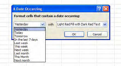
And once you understand how Less Than... works, you'll see that the Greater Than..., Between..., and Equal To... Conditional Formats work identically, with the obvious proviso that you specify a number Greater Than a particular value, or numbers between two selected values (including those two values), or a value Equal To one particular number, respectively. Text That Contains... works in a comparable way too, requiring that the user name a specific word or phrase that must appear in selected cells before the Conditional Formats kick in (and they're not case-sensitive). A Date Occurring when clicked yields this drop down (Figure 4-109):
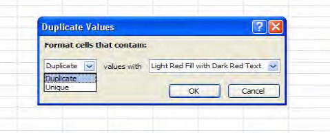
Duplicate Values is a useful option that lets you format either all the values in a range that appear more than once, or all unique values—values that appear only once (Figure 4-110):
But if you want to go ahead and remove those duplicate values once you track them down—well, no; you can't get there from here, because Conditional Formatting is, its bells and whistles notwithstanding, a formatting technique, and as such doesn't "do" anything to the data. If you really do need to winnow those duplicates, you'll have to resort to some other approach, one that actually impacts the data. (And yes—we've omitted the More Rules options—that one's coming up shortly).
The Top/Bottom Rules section (Figure 4—-):

is no less easy to master. Top 10 Items... allows you to format the top X items in your range, the choice of number vested with you (Figure 4-112):

Figure 4.112. Where to highlight the top—or bottom—tier of a range of values It goes without saying, then, that "Top 10" isn't literal; you can designate the top 20, etc.
Bottom 10 Items offers the opposite choice, enabling you to format the lowest X values in a range. The Top and Bottom 10% options ask you to format you highest/lowest values in percentage terms, e.g., the highest or lowest 15% of all test scores (Figure 4-113):

Above and Below Average mean what they say—they format all scores that rise above or fall beneath the average of the numbers in the range you've selected (Figure 4-114):

And to anticipate your next question: values that turn out to be exactly average are excluded from both Above or Below Average; that is, in neither case are average values subject to any Conditional Formatting.
The next collection of options—Data Bars—works differently (Figure 4-115):.

Data Bars offers 12 options, but they all work in the same way, distinguished only by the colors and textures they use. Each Data Bar possibility draws a mini-bar chart in the cell of each value, capturing its magnitude relative to the other values in a range. It's easy to implement: just select a range, and click on one of the Data Bar options. I've clicked on the first option, and have come up with this (Figure 4-116):

Color Scales capture relative disparities in values by characterizing them with color gradations, either in two or three basic initial colors (Figure 4-117):

By selecting the second option on the first row—called the Red-Yellow-Green Color Scale, and applying it to our range of grades, I get this (Figure 4-118):

In this color scheme, Red captures the highest values, Yellow the intermediate ones, and Green the lowest—all in shadings to reflect fine differences in values.
The final option—Icon Sets—supplies the user with a large assortment of symbols with which to format the relationship between values, and in a range of ways (Figure 4-119):

Directional Icon Sets symbolize values by their position in a percentile scale via the designated icons. Thus if I select the first such option and apply it to the grade range, the conditional format looks like this (Figure 4-120):

Here we see that the highest scores sport an up arrow, the intermediates a flat one, and the lower scores a down arrow.
Shapes represent values with a trove of shapes. If I apply the second selection in the Shapes first column on the grade range, I'll see this (Figure 4-121):

Here the red diamond captures the highest values, the green circles the intermediates, and the yellow triangles the lowest.
Ratings communicate value relationships through a potpourri of possibilities—stars, bars, pie charts, etc. Thus if I choose the pie chart option (the second selection, first column), we'll see (Figure 4-122):

You'll note, by the way, that the various icons don't portray values in precisely calibrated ways. Look at the screen shot above, and you'll see that the 82, 81, 83, and 77 all display a three-quarter-blackened pie. That's because by default Excel organizes the data by their percentage distribution. In the case of the pies above, Excel assigns a clear icon to those data that fall below 20% of the highest value in the data, the one-quarter-filled pie for data that occupy the 21-40% percents, and so on. But in addition to these initial distributions, Excel enables you to customize your own—first by clicking the Manage Rules...
Continuing with our grade book: If we leave the pie format in place, select these grades in C9:C18, and click Manage Rules..., we'll see this (Figure 4-123):

Click Edit Rule... and observe the dialog box shown in Figure 4-124

This is a wide-ranging dialog box that contains numerous options, but for now we're interested in changing the icon numbers—the score thresholds at which the pies blacken more or less. Note the defaults about which we've already spoken.
Moreover, we see that the Select a Rule Type area in the Edit Formatting Rule dialog box lets you change your rule completely; if for example I select Format only values that are above or below average, I'll be brought here (Figure 4-125):

And if I click the drop-down arrow by Format values that are (Figure 4-126):

I can select any of these choices, including values that fall within 1, 2, or 3 standard deviations from the range average. But the larger point is this: by selecting Edit Rule, you can basically replace your existing Conditional Format with any other sort of rule.
In addition, you can subject the same range to multiple rules. For example, I could compose a Conditional Format to color blue all the cells with test scores in our range that exceed 80, and to color red all cells with scores that fall below 60. That is, we could format our range with the Highlight Cells Rules Greater Than... and Less Than... options. If I went ahead with this plan, my range would take on this appearance (Figure 4-127):

And that's fine. But what if I wanted to color all the cells with scores topping 80 blue, and all the cells with scores over 85 green? Our wicket has just gotten stickier—because a score such as 90 meets both conditions. After all, 90 exceeds both 85 and 80—raising the obvious question: which format will I see in such a cell?
That's a question Excel wants you to answer—because you'll need to tell the application which of the rules will activate first. Once you execute both rules, you'll want to select the range and click Manage Rules. Note (Figure 4-128):

The two rules impacting our range are recorded—and in the proper order, because Excel will simply carry out the rule which appears first in the above dialog box—and we want Excel to consider the >85 rule before >80, for a simple reason. If >80 is listed first, then even the cell containing 90 will turn blue —and you'll never get to >85.
To allow you to arrange your rules in the proper order, you can click on any rule in the Rules Manager and then click the down arrow button (which the arrow in Figure 4-128 points to).
And if you've messed up or simply want to start over, you can purge your worksheet of all your Conditional Formats, either for particular ranges or the entire sheet, by clicking (Figure 4-129):
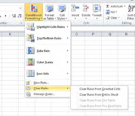
And choose the appropriate option.
While there's a large set of permutations crowded into Conditional Formatting, we've introduced the important basics, and you'll find that with experimentation many of its other features will come to light.
We can begin to wind down this rather exhaustive—and probably exhausting—résumé of formatting with a quick look at a curiously-titled button, one holed up in the Cells Group on the Home Tab. It's called, as luck would have it... Format, which doesn't tell you terribly much about what it does. But when you click its drop-down arrow, it presents a mixed-bag of commands, some of which you wouldn't be inclined to call Formatting, and some of which operate on worksheets in their entirety—and we'll reserve those for a later chapter. In fact only the upper half of its drop-down menu, shown in Figure 4-130, concerns us here, listing alternative ways to do some things you already know:
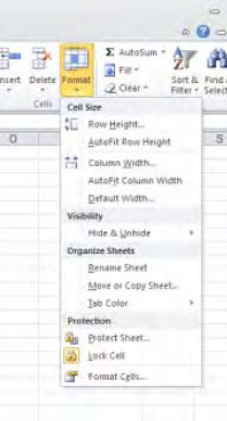
Clicking Row Height and/or Column Width allows you to modulate the height and/or width of selected rows and columns (note: unlike the techniques we described earlier, you don't have to select row or column headings in order to carry out this option here. If you click in any cell in the row or column, that will enable you to go ahead with these commands. And you can drag across a range of rows and columns if you want to change multiple row/column heights and widths. And as you see you can also execute an Auto Fit of selected columns—but here you will have to select the column headings before you proceed. Finally, the Default Column Width option doesn't necessarily do what you think it will. It doesn't restore the default width to changed columns; rather it lets you change the default column width on the worksheet. If you click the command, you'll see the dialog box shown in Figure 4-131

that lets you type a new width, which will apply to all worksheet columns—except those whose widths you've already changed. And don't ask me why the dialog box is called Standard, and not Default, Width.
And before we bring this chapter to a close, there's one slightly loose end we need to tie for neatness' sake. On the chapter's very first page, I declared that:
"...apart from one obscure exception, formatting data on the worksheet changes the appearance, and not the value, of those data.."
You've politely refrained from asking the big question, so I'll do it for you: What's the exception?
It's this: if you click the File tab, click Options, then click Advanced and scoot down to the When calculating this workbook section, you'll take note of an unchecked command called Set precision as displayed. If you check it, any number you've formatted with X decimal points will become precisely that number. That is, if you've entered 5.76 in a cell and formatted that value to one decimal point, you'll see 5.8. But with Set precision as displayed, 5.8 becomes its value, too—and this is an all-or-nothing proposition. Turning this option on impacts all the values in the workbook—that is, all its worksheets. And when you click OK, a prompt on screen reminds of just that: you'll be told, "Data will permanently lose accuracy," meaning your values will take on new, rounded-off values.
And that's precisely what happens.
Long chapter, long subject. That's because appearances matter. They can't substitute or cover for mistaken formulas, or worksheets that don't deliver the information that's been requested. You can't really fake a spreadsheet, but the ways in which data are presented, or formatted, are integral to the spreadsheet process too. Think of spreadsheet design as a kind of desktop publishing—and it is—and the issue becomes clearer. And the next chapter, on charting, picks up the baton and runs with the same theme. Charts: More than pretty pictures? You bet; just turn the page.