

Chapter 8
SAS Add-In for Microsoft Office
Mix the Functionality of Microsoft Office
with the Power of SAS Analytics
8.1 Getting Started
8.1.1 Quick Tour
8.1.2 Prerequisites
8.2 Creating your First Report in Excel
8.2.1 Importing Data from the SAS BI Server to Microsoft Excel
8.2.2 Filtering and Sorting Data
8.2.3 Building a Chart with SAS Tasks
8.2.4 Building a Report with SAS Tasks
8.2.5 Sharing Results with Other Office Applications
8.2.6 PowerPoint and Word: Using Data to Build the Chart
8.2.7 Accessing OLAP Cubes (Pivot Tables for SAS)
8.2.8 Using Microsoft Outlook with SAS Reports
8.3 Enhancing Your Report
8.3.1 Using Excel Charts with SAS Data
8.3.2 Making It Look Nice
8.4 Tips and Tricks
8.4.1 Using SAS Functions to Build Better Filters
8.4.2 Cutting and Pasting the Values
8.4.3 Copying the Modified Data to the SAS Server
8.4.4 Securing Your Information
8.5 SAS Administrator Tasks
8.5.1 Working with Roles and Responsibilities
8.5.2 Write or Create Metadata Access to the Library
8.5.3 Central Storage File System
Chapter 8
SAS Add-In for Microsoft Office
Mix the Functionality of Microsoft Office
with the Power of SAS Analytics
Microsoft Office has become a corporate standard. Nearly every organization that analyzes data has a Microsoft Excel expert who can make insightful, and even beautiful, reports that upper management loves. These users might not be SAS users but would benefit from data centrally defined within the SAS BI Server. SAS Add-In for Microsoft Office provides a bridge for these users by joining the functionality of Microsoft Office with the power of SAS analytics.
SAS Add-In for Microsoft Office extends the functionality of Microsoft Excel, Microsoft Word, and Microsoft PowerPoint by enabling you to access SAS analytics and SAS reporting functionality without any SAS programming experience. This add-in is designed for users who are familiar with these Microsoft Office applications but who might be new to SAS.
SAS Add-In for Microsoft Office is also available from Microsoft Outlook. From Outlook, you can access and share SAS Web Report Studio reports, run and review SAS Stored Process output, review dashboard indicators, and send these reports to colleagues.
In this chapter, you will learn to create reports in the various Microsoft Office applications, view the reports, and share the reports with others. Additionally there are ways to enhance your reports and some tips and tricks for improving your queries.
8.1 Getting Started
To begin learning about this tool, the following sections contain a quick review of the interface and of what you need to get started.
8.1.1 Quick Tour
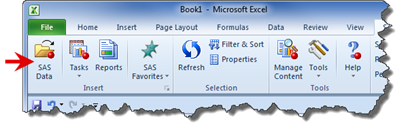
In Microsoft Office 2010 and Microsoft Office 2007, SAS Add-In for Microsoft Office is available from the SAS tab in the Ribbon. You access the add-in from the menu options on this tab. In the following figure, you can see how the Ribbon appears in Excel.
Note: SAS Add-In for Microsoft Office is also available for earlier Microsoft Office versions.

Figure 8.1-1 SAS Add-In for Microsoft Office Ribbon in Excel
Area |
Definition |
|
1 |
Insert |
Use this area to access data from the SAS Metadata Server or your computer, perform tasks, view SAS Web Report Studio reports, use a SAS Stored Process, and bookmark any frequently used tasks. |
2 |
Selection |
Use this area to refresh the data in a report, modify the steps in a task, or access extra information about a selected object. |
3 |
Tools |
Use this area to send reports or graphs to other Microsoft Office applications, change the information in the spreadsheet, and access the options for the add-in. |
4 |
Navigate |
Use this area to navigate data sets with more than 500 records. You can move forward or backward through the table based on how many records you want to see at once. This area is available only in Excel. |
5 |
External Data |
Use this area to edit and make changes to the data on the server. This area is available only in Excel. |
8.1.2 Prerequisites
Before you can use SAS Add-In for Microsoft Office, you must ensure that the following software is available and all necessary permissions are established:
- Microsoft Office 2007 or Microsoft Office 2010 installed on your desktop
- SAS Add-In for Microsoft Office installed on your desktop
If the add-in is enabled in a specific Microsoft Office application, a SAS tab appears in the Ribbon for that Microsoft Office application. - Permissions to access the SAS Metadata Server
Your SAS administrator sets these permissions and provides the name and location of the SAS Metadata Server. The same connections used in SAS Enterprise Guide are used.
8.2 Creating your First Report in Excel
SAS Add-In for Microsoft Office in Excel allows you to create reports with graphs and supporting data. These reports can be saved to your computer or sent to others. In this section, you are lead through the process for retrieving data from the SAS server, creating charts with supporting data, and then sharing the report with PowerPoint.
In this example, your supervisor, the regional sales manager, has requested a report that summarizes the quarterly shoe sales. Since you started working at Global Shoes Company, the management team has been discussing whether there are enough regional sales to continue to offer men’s and women’s shoes in all regions.
For this report, you need a bar chart that shows the sales by region for men’s and women’s shoes, along with supporting data in a summary report. Your supervisor requested that you create a report in Excel and a slide package in PowerPoint that she can use in an upcoming meeting.
Note: The data set for this report is shipped with the SAS Intelligence platform and is stored in a folder called SASHELP. Contact your SAS site administrator if you have difficulty finding this data set.
8.2.1 Importing Data from the SAS BI Server to Microsoft Excel
The first step to creating the report is accessing the data from the server.
Use the following steps to access the data from the server:
- Open Excel with a blank spreadsheet. From the SAS Ribbon, select the SAS Data icon.
- When the View SAS Data window is displayed, click Browse.
The Open Data Source window is displayed, allowing you to explore and access data on the server or your computer. As you open each folder, all available data sets are displayed. From this window, you can select data sets defined in the metadata, information maps or OLAP cubes.Navigate to different locations through
 the drop-down Look in menu, by selecting an icon from the menu on the left, or using
  SAS Folders. Navigate to the SHOES
  data set and click Open. The View SAS Data window is displayed again.
- Before importing the data to the worksheet, you can select how many records you want to view at once and name the worksheet.
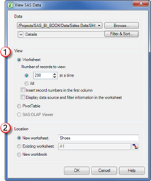
Do the following in this window to import the data:
- In the View area , click the Worksheet radio
button to have all values return to the worksheet. When data is initially
displayed in Excel, the view is limited to the first 500 records. If you wanted
to see more records, you could increase the number here.
 You can also place data directly into an Excel pivot table by selecting the PivotTable radio button in the View area.
 - In the Location area , select New Worksheet and type
Shoesin the field. The value used here is the name of your worksheet. Click OK to have the data imported to Excel.
When you return to Excel, you can see that a new tab called Shoes was created with the data. You can use this data with all SAS tasks and Excel functions.
- In the View area
If the Shoes data is updated on the server later, click the Refresh icon to renew the data in your spreadsheet.

8.2.2 Filtering and Sorting Data
The SHOES data set it is not large—it has less than 500 records. Sometimes you might be working with larger data sets that take longer to import or that might have more records than you want to use. You can filter and sort data before or after importing it into Excel.
Use the
Navigation area to control how many records you view. You can also view all
records.
While you can use Excel to filter and sort the records, you can sort only the records that you can see. So if you are viewing 500 records of a 10,000 table and you sort the Region column alphabetically, only the 500 records that are displayed are sorted. The remaining 9,500 records remain in the original order.
You should sort and filter the data on the SAS server prior to importing the data to Excel. You can further refine filtering and sorting by using the Filter & Sort button on the Ribbon.
As you continue building your report, you realize that you need regions only in the Americas and that the report is only about casual and dress shoes. In the following example, the SHOES data set is filtered to return data only from certain regions and only certain shoe types.
- Click the Filter & Sort button to display the Modify Data Source window. From this window, you can preview your data, select the variable, filter the data, and sort the data. When the window is first displayed, all variables in the data set are show in the Selected area.
- For this task, move Subsidiary, Inventory, and Returns to the Available area by clicking the name and clicking the single left arrow. In the Selected area, there should be four remaining values: Region, Product, Stores, and Sales. These are the variables you want for your report.
Click the Show Preview button to
see the data.

- Click the Filter tab at the top of the window. This tab allows you to filter the data.
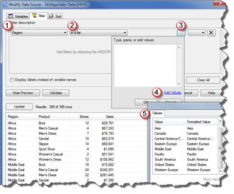
For this example, you want regions only in North America, Central America, and South America, and products specifically for men and women. Do the following to set up a filter:
- In the Filter
description area, click the first field and select Region from the drop-down list.
- In the second field, select In a list for the filter method.
- In the third field, select the … button at the end of the field to see the possible values.
- When the pop-up window is displayed, click the
 Add Values text to display the values available from the table.
 - A Values window
 is displayed, which lists all the values for Region. Press and hold the Ctrl key while selecting the following values: Canada, Central America/Caribbean, South America, and United States.
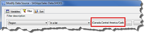
 - When you click OK, the Add Values window populates. When you click OK again, the values are added to the field, as shown in the following figure.
- In the Filter
description area, click the
- You need to select the products you want included in the report, which are men’s and women’s dress and casual shoes. There are many products
available, so a custom filter is useful to ensure that all values are captured.
- To create a custom filter, click the Advanced Edit button.
- When the Advanced
Edit button is displayed, the existing query is displayed. In
this case, the only filter is Region.
Because the products you want to use all have the substring “men” in the name, you can use a combination of SAS functions and filters to create the query. The product names uses mixed case (with some values as Men’s and others as Women’s), so use the SAS UPCASE function to change the product name to uppercase. Then the filter looks for the character string MEN, which locates these product names: MEN or WOMEN. - In the Enter a
filter area, click after the ending parenthesis and type the
following:
AND UPCASE(Product) CONTAINS ‘MEN’
 To see a list of the SAS functions available, expand the Functions heading.
 - Click the Validate button to have SAS verify that the code is correct. A pop-up window is displayed with immediate feedback. If the expression is not valid, some helpful information to resolve the issue is provided. Click Close to return to the Advanced Filter Builder window.
- You can verify that your query is going to return the data you want by clicking the Update button. A preview of the data is displayed. In the following display, you can see that Men’s and Women’s shoe types are selected for Product and that the filter returned 79 of the 395 rows in the data set.

- Click OK to return to the View SAS Data window. The data in the worksheet is refreshed and contains only the filtered data.
8.2.3 Building a Chart with SAS Tasks
SAS has several tasks that can be used to build reports, charts, and detailed analysis. You can also use the Excel functions with the data. An advantage to using the SAS tasks is that they do more of the work and can handle data of any size. If you use Excel to build a chart, you first have to use a pivot table or otherwise sum the data for the chart presentation.
For SAS
Enterprise Guide users, the tasks list might look familiar. SAS Enterprise
Guide uses a similar set of tasks.
For the first part of this report, you want a chart that shows the sales figures for each product across each region. You can build this chart quickly using the Bar Chart task.
- From the SHOES worksheet, click on the Region column to select the data set. Then from the SAS Ribbon, select Tasks > Graph > Bar Chart.

- From the Choose Data window, ensure that SAS Data in Excel is selected with the SHOES data. You are creating a new report; click the New worksheet radio button and type
Regional Sales Reportin the field. Click OK to continue.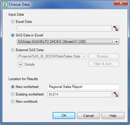
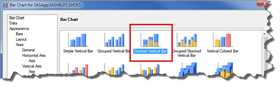
- This report shows the total sales by region. For each region, it is important to see how each product line contributed to the overall total.
You can select the bar chart type you want to build. SAS offers a variety of bar charts, and each icon provides an example of the chart. Do the following to customize a chart:Select the Stacked Vertical Bar icon.
- From the left navigation area, click Data to select how you want the variables used. Click and drag Region to Column to chart and then drag Product to Stack.
Each column shows the total sales for the region, so click and drag the Sales to Sum of area.Click the items
in the Task Roles area to see an explanation of how the data item is used.
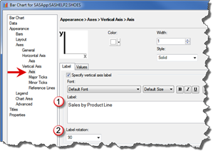
- For the Axis title, click Axis under Vertical Axis. In the Label area, type
Sales by Product Line. Then select 90 from the Label rotation drop-down list. The axis title will display up the side of the graph.
Select Legend to control the legend placement and title. Under position, select North from the drop-down list so the legend is placed at the top of the graph.
If you prefer
to not have a legend, click the Show legend check box to remove the checkmark.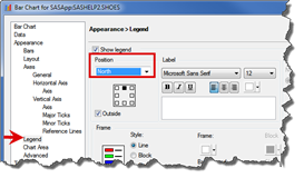
- Click Titles to change the default title and footnote. Select Graph to change the title. Click the Use default text check box to clear it. Then change the title to Product Sales by Region.

- Click the Run button to render the chart in Excel.
This is how the chart looks after it has run. Each column shows the total sales for the region broken out by the specific product types.
To make changes
to this graph, right click the graph and select Modify from the pop-up menu.
8.2.4 Building a Report with SAS Tasks
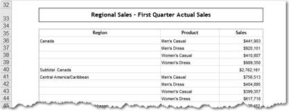
The second part of the report is a table that shows the actual sales figures. For this report, you can use the List Report wizard to show the sales by region and product, with some subtotals.
- From the Tasks icon, select Describe and then click List
Report Wizard. Ensure that SAS Data in Excel is selected and your
data is shown.
You want this table on the same sheet with the chart, so click Existing worksheet. You can type the information in the field or use the Excel controls to navigate to the cell. Type the following text exactly as shown to ensure that the report is under the chart:‘Regional Sales Report’!$B$23

- The List Report wizard starts with information about the data you are using. Click Next.
- On the Define List page, all fields are available initially. You want to display only the Region, Product, and Sales fields. Select any other fields and click the X delete button to remove those fields. When completed, your window should match the following figure.

- Click the Edit button and then click Assign Columns to display the Assign Columns window.
Click Region and select Hide repeating values in the drop-down list. Then click and drag Region to the Group by each value of area. These actions ensure that the total displays correctly. Click OK to return to the Define List page.
- Click Sales and select Statistic from the pop-up menu. You can select a variety of statistics. For this report, ensure that Show sum value (SUM) is selected.

- Because you are using only one statistic, you modify the headings to
remove the statistic type from them. Click the Edit button and select Column Headings from
the pop-up menu. This menu allows you to control the heading names. Click the Display the type of statistic in the
column heading check box so that it is empty. Click OK to continue.

- Click Next to go to step 3. Then click the Edit button to modify how the sales figures are totaled.

- From the Type of Totals window, ensure that the Grand Totals and Totals by Region check boxes are selected. Grand Totals adds the overall total for the table and the Totals by Regions choice creates the subtotal rows. Click OK to return to the main menu.

- Click Next to go to Step 4. In the title field, type
Regional
    Sales – First Quarter Actual Sales
. Click Finish to build the report.
The report is displayed in Excel with the subtotal for each region and total for all regions.
8.2.5 Sharing Results with Other Office Applications
You can easily share your reports between the Office applications using the Manage Content icon. After you have created the information, select the Manage Content icon from the Ribbon. Select the reports that you want to share with Word or PowerPoint and click the Send To button. You can choose whether you want to open a new file or use an existing file.

Figure 8.2-1 Sending reports to MS PowerPoint
Click the Allow results to be refreshed in
Microsoft Office check box to ensure that the data can be
updated when in Word or PowerPoint.
Click OK when you are finished. The selected content is displayed in the application you chose.

Figure 8.2-2 Reports in MS PowerPoint
8.2.6 PowerPoint and Word: Using Data to Build the Chart
One of the biggest advantages to using SAS Add-In for Microsoft Office is the ability to create a regular report once and then refresh it every week or month so that only the data changes. The formatting and other information remains constant, which means less work. In the last task, you learned how to build a report that could be shared with the other Microsoft Office applications. You can also build charts and reports in PowerPoint or Word.
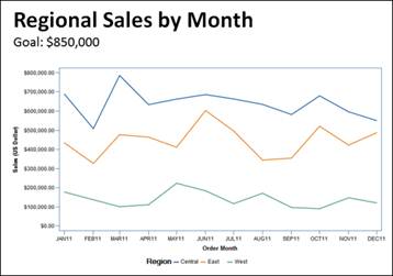
In the following exercise, you will create a chart that shows the year-over-year profit for a department store. You can build this chart in PowerPoint or Word. In this example, you will use PowerPoint.
- Open PowerPoint to a blank presentation. From the Home Ribbon, select the New Slide drop-down and click the Title and Content layout.
- From the SAS Ribbon, select Tasks > Graph > Line Plot.
- The Choose Data window is displayed. Click the Browse button and locate
the Candy Customer Summary, which is the information map you created in Chapter
6, “SAS Information Map Studio.” Click OK to continue.

- There are many chart choices available. For this example, you are going to do a regional analysis for each month so select the Multiple line plots by group column icon.
- Click Data to continue. Click and drag Order
Month to the Horizontal area, click and drag Region to the Group area, and then click and drag Sale
Amount to the Vertical area.
While Sale Amount is highlighted, click the Summarize for each distinct horizontal value check box. This check box totals the sales for each region so the data is displayed correctly. You need to select this check box only when the data is not summarized in advance.
- Click Vertical
Axis and do the following:
- In the Axis area, type
Sales (US Dollar)in the text box and then select 90 from the Label Rotation drop-down list. - In the Major
Ticks area, the scale of for the vertical axis needs to be
adjusted. Select the Specify radio button and type
0 to 1000000 by 250000in the empty field. Click Add to move the value to the text box.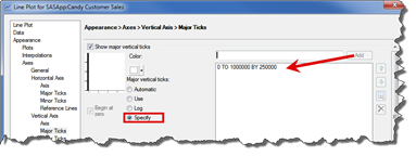
- In the Reference
Lines area, add a goal line to the chart. Click the Use Reference lines check
box to select it. Select Dots
Dashed from the Style drop-down list and select Red from the Color drop-down
list.
Click the Specify values for lines check box to enter a target value. In the text box, type825000and click Add. The value is displayed in the text box beneath the line.
You can have
more than one reference line.
- In the Axis area, type
- Click Titles and click Graph.
Clear the Use default
text check box. Then delete the text from the text box. Type
Regional Sales by Month Goal: $850,000in the text box.
- Click Run to display the chart in your presentation. If you change the way the title looks, the changes are kept even after you refresh the data. In the following figure, the title was left-justified and the goal line was changed to a smaller font.
Click the Refresh icon as new
data becomes available to update the values.
8.2.7 Accessing OLAP Cubes (Pivot Tables for SAS)
Data stored in OLAP cubes can also be accessed from Excel by using the Pivot Table wizard or through SAS OLAP Viewer. Either mechanism enables slicing, dicing, expanding, drilling, or filtering the cube structure.
The PivotTable functionality is from Microsoft; therefore, users already familiar with this interface will find viewing OLAP cubes simple. However, the new SAS OLAP Viewer provides additional capabilities, including adding bookmarks (stored to access a particular vantage point of the cube) and creating custom measures.
SAS Enterprise
Guide users will find that SAS OLAP Viewer is a similar interface to viewing
cubes from SAS Enterprise Guide.
8.2.7.1 Opening an OLAP Cube
To access a cube, click SAS Data from the SAS Ribbon. From the View SAS Data window, click Browse to navigate to the cube location. After you have selected the cube, click SAS OLAP Viewer in the View area to open the cube in the SAS OLAP Viewer. You can only open SAS OLAP cubes in SAS OLAP Viewer.

Figure 8.2-3 Open data in SAS OLAP Viewer
When you open an OLAP cube, OLAP Viewer displays a table in a Microsoft Excel worksheet. OLAP Viewer functionality is similar to Microsoft’s Pivot Table wizard. It allows you to move the information from columns to rows and instantly see the calculations. In addition, you can bookmark your favorite view instead of rebuilding the view each time.
Your data can be viewed as tables or graphs. The table and graph views display the current view of the cube and enable you to drill down into your data and expand or collapse levels – all in the same window.
Figure 8.2-4 SAS OLAP Viewer main window
The View Manager ![]() is displayed below the Ribbon in Excel. The View Manager can display the
dimensions that are being used in the columns and rows, the filters that are
applied to the views, and any conditional highlights that are applied to the
table view. You can customize the View Manager by changing the information that
is displayed in it.
is displayed below the Ribbon in Excel. The View Manager can display the
dimensions that are being used in the columns and rows, the filters that are
applied to the views, and any conditional highlights that are applied to the
table view. You can customize the View Manager by changing the information that
is displayed in it.
The Cube Manager ![]() allows you to interact with the cube. Using this area, you can create filters
and bookmarks, and control what items are displayed.
allows you to interact with the cube. Using this area, you can create filters
and bookmarks, and control what items are displayed.
In SAS Enterprise Guide, this tool is called OLAP Cube Explorer. For a more extensive discussion of the tool features and functionality, refer to Chapter 2, “SAS Enterprise Guide.”
8.2.7.2 Adding a Graph
You can add a graph to the worksheet by selecting Insert View from the SAS Ribbon. You can choose the graph type, and then you are prompted for where you want to place the chart. This view of the data is synchronized with the chart data. Any changes you make to the cube view, such as expanding, drilling, or filtering, update this view as well.
Figure 8.2-5 Auto-chart from OLAP Viewer data
Right-click the
graph and select Graph
Properties to change the chart type or appearance.
8.2.8 Using Microsoft Outlook with SAS Reports
The new Outlook integration from SAS allows you to get reports, stored processes, and dashboards within Outlook. You can review the reports or share them with others in your organization. After opening Outlook, click SAS to view the SAS Ribbon.

Figure 8.2-6 SAS Add-In for Microsoft Office Ribbon in Microsoft Outlook
8.2.8.1 Using SAS Central
When you click SAS Central, the SAS Central folder becomes the focus. You can navigate the folders to see the SAS Web Report Studio reports that are available. When you open a folder, the reports are displayed in the work area. If you have not viewed a report before, your display will look similar to the following figure. Click Run to generate the report.
You can open SAS
Web Report Studio reports from the other Office applications that use SAS Add-In
for Microsoft Office.

Figure 8.2-7 Using SAS Central in Outlook
After selecting Run, the following happens:
- A notification box appears automatically at the bottom right of the window, fading out after a few seconds.
- The report folder is shown in bold text.
- Parentheses showing the number of unread reports appear next to this bold text.

Figure 8.2-8 Viewing reports in Outlook
When you want
an update of the report, click the Refresh button. This task can be run in the background while you check your e-mail
messages or perform other tasks.
Reports can be opened in a separate view, just as with e-mail. You can also send the report to other Microsoft Office applications to include in reports or analysis.

Figure 8.2-9 Sharing reports with other Microsoft Office applications
8.2.8.2 Sharing Reports with Others
You can send the reports to others in your organization. To send the report, right-click the report name and select Forward from the pop-up menu. A new e-mail is created that contains the report and a link to the report in case the receiver has issues viewing the e-mail.

Figure 8.2-10 Sending a report in Outlook
You can add comments to the e-mail message before you send it. The e-mail includes a link to the report in case the receiver wants to get an updated copy.
If you need to
send the report to someone who does not have SAS Add-In for Microsoft Office
installed, click Save
As to create the report in PDF and HTML format.
8.2.8.3 Using the Gadget Pane
From this Gadget Pane, you can right-click a report or dashboard indicator to send an e-mail, schedule a meeting, or assign a task. A snapshot of the report item is included automatically, along with some context information. You can also refresh, copy, and modify gadgets, and view properties such as the last run time and author information.
By default, the Gadget Pane is turned off. To open the Gadget Pane, select Gadget Pane Right or Left. The Gadget Pane appears as another panel in Microsoft Outlook.
Using the Gadget Pane, you can monitor selected reports and dashboard indicators in Microsoft Outlook. To view the reports, click the Report icon. To view the dashboard indicators, click the traffic light icon.
The status bar at the bottom of each gadget displays when the report or dashboard indicator was last updated. The SAS content in the gadgets is not updated automatically. To refresh the results, click the double arrow icon.
When you refresh the results, the report results contain the current version of the data source and any values (such as format) that you specified when you first ran the report.

Figure 8.2-11 Outlook Gadget Pane
8.3 Enhancing Your Report
You can change the way your SAS data appears either using the Excel charting ability or changing the default SAS style for your report.
8.3.1 Using Excel Charts with SAS Data
You might want to use a combination of SAS data with Excel chart abilities. Excel has some extended chart rendering abilities. In this example, a SAS Task summed the number of stores and the pie chart was built using Excel. It is the best of both worlds.
The advantage to using a SAS Task is that large volumes of data can be summarized; the SAS Server can complete the task more quickly and extract only the needed data.

Figure 8.3-1 Using SAS data with Excel charts
8.3.2 Making It Look Nice
After you review the chart, you might want to change the appearance. If you right-click on the chart, a pop-up menu is displayed. Select Style to display the Style Editor. From here, you can change the color scheme, lines, text, or other graphic elements. SAS maintains your changes, even when you refresh the report to use updated data.
In the example, the Style name was changed to Plateau and Scheme was changed to Terra. These colors provide more contrast if the report is eventually printed in black and white.

Figure 8.3-2 Using the Style Editor
Because this chart is simple, you can remove the vertical axis and display the total over each bar, as shown in the following figure. This makes it a little easier for the reader to understand immediately the overall sales value.

Figure 8.3.3 Modifications to chart
When working in
PowerPoint, there is an extra step to accessing the Style menu. Right-click
the item you want to modify and then click SAS Graph v9 Object > Edit. The graph
properties and other options are available.

Figure 8.3-4 Editing a SAS Graph v9 Object
8.4 Tips and Tricks
The following section contains tips and tricks to assist when you are working with SAS Add-In for Microsoft Office.
8.4.1 Using SAS Functions to Build Better Filters
SAS has many built-in functions that make it easy to filter the data so you can get the exact results you want. Here are some examples of how you can use the filters in your reporting.
8.4.1.1 Working with Dates
If you plan to refresh the report and would like to include a predetermined interval of data such as data for the past day or monthly, set up a filter.
In this example, you want to see only records that were created today. Use the TODAY() function, which is a SAS function that equals todays date.
If you are
working with a date time value (i.e. 01JAN2012 00:00:00) then use the
DATETIME() function instead.

Figure 8.4-1 Working with Dates
Simple Date Filters
There are other date functions that help the report automatically display the time frame desired. For instance, sometimes you want the report to show only the records for the current year or current month. Use the YEAR() and MONTH() functions.
This advanced filter returns all orders in which the year of the order date variable is equal to the current year and the order date is equal to the current month.

Figure 8.4-2 Working with Date Intervals
SAS has other functions for working with dates that are helpful. If you want your report to contain only the last six months of data every time it refreshes, use the INTNX function. This function increments the date based on the given interval. The following code shows the syntax for the INTNX function.
intnx(‘interval’, date value, increments)
- interval can be day, month, year, week, or quarter. You can also use a time value, such as hour, minute, or second.
- date value is the variable that contains the date. You can also use other SAS functions such as TODAY() or DATETIME().
- increments is how many intervals you want to advance in the future or go back in the past. For instance, use -2 to go back two intervals or 2 to go forward two intervals. 0 indicates the current interval.
Here are some examples using various dates:
- Filter returns orders completed within the past six months:

Figure 8.4-3 Filter for past 6 months of sales data
- This example is for a datetime value. Notice the datetime was
added to the interval. This filter returns orders placed in the last 12 hours:
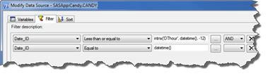
Figure 8.4-4 Filter for orders placed in last 12 hours
- Filter should return all orders closed in the current quarter:
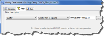
Figure 8.4-5 Filter for data from the current quarter
8.4.1.2 Working with Substrings
Sometimes when you are working with character values, you might have items that all start or end with a certain sequence. For instance, a phone number that starts with a 919 prefix or a part type that begins with X8T. The SUBSTR function allows you to isolate part of a string. The SUBSTR syntax is as follows:
substr(variable name, start position, number of characters)
Here are some examples of how to use the SUBSTR function.
Example filter |
What the filter would find |
What the filter would not find |
|---|---|---|
substr(phone_number,1,3) = ‘919’ |
919-234-5555 |
234-919-5555 |
substr(part_number,10,3) = ‘X8T’ |
ABC5-5T-YX8T |
ABC5-5T-X8TY |
substr(name,7,3) = ‘Sue’ |
Betty Sue |
Jamel Sute |
Table 8.4-1 Using the SUBSTR function
8.4.2 Cutting and Pasting the Values
Some data filters are long lists, such as specific phone numbers or product names. The list might not have an easy pattern that you can use to filter. You can cut and paste the values into the filter.
In the following example, the orders were in the spreadsheet column. As the SAS data is loaded, the filter is created and the values are pasted into the field.

Figure 8.4-6 Cutting and pasting values
8.4.3 Copying the Modified Data to the SAS Server
With proper authorization, you can create and modify data on the SAS server using Excel. In previous releases of the SAS Add-In for Microsoft Office , you had to use SAS Enterprise Guide or SAS Management Console to add and modify data.
Use this feature when you have a smaller data set that is updated infrequently. For example, suppose you are responsible for tracking the internal training hours for each staff member. This data is used within a dashboard for the Human Resources department. However, this information is not stored by an application or in an accessible database. By saving the spreadsheet data to the server and modifying it as needed, you can manage the values within the data through SAS Add-In for Microsoft Office.
To write back
to the server, you must have Write and WriteMemberMetadata permissions to the library where you are
going to save the data.
8.4.3.1 Creating a New Data Set on the Server
You might need to create the initial data set on the server. The following example shows how to save the data to a server location. In this example, the employee training spreadsheet is copied to the server, and it becomes a SAS data set.
- Modify your data and then select the variable names and values in the spreadsheet that you want to copy. In the following figure, four columns (C-F) were selected. These are the only four columns needed in the new data set.
- From the SAS Ribbon, select Tasks> Data > Copy to SAS Server to start the process.

- In the Choose Data window, ensure that the Excel Data field contains the entire range of data from the Excel worksheet that you want to use.
- After you select OK, the SAS Task initiates.
This window shows the data source, columns to be copied, and the new data set name and location. Your window should look similar to the following figure. Specify the destination in the Copy to SAS Server window. Click the Browse button to navigate to the storage area and provide the new data set name.Only the fields
in this selected range are copied to the server.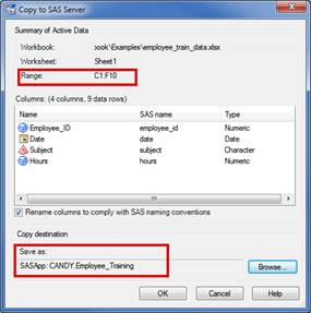 To replace an existing data set, select the data set and select OK when asked to overwrite the data. This data is permanently overwritten.
After the tasks finishes, a message is written back to the Excel datasheet. When you or a colleague want to access the data, use the SAS Data icon and navigate to the source on the SAS server.
8.4.3.2 Modifying Existing Data
If the administrator has given you access, you can modify data stored on the SAS BI Server. In this example, you want to add some training records to the Employee Training data set. Use the following steps to update the data and save the data to the server.
- Open the data set from the server.
- The SAS Ribbon has new options near the right end of the Ribbon. Click the Begin Edit button before you make any changes to the data set. If you make changes prior to clicking the icon, the changes are lost.

- You can make several changes to the data:
- To add columns, click the View Column Properties button.
- To add records, click the Create New Records button.
- To remove records, click the Delete Records button.
- After making the changes, click the Commit button on the SAS Ribbon to save the changes to the server.

- Click the End Edit button when you have completed all edits.
8.4.4 Securing Your Information
If you are responsible for distributing a file with information, there are times when you do not want your report changed. There are a few methods you can use to prevent the data from being refreshed.
- You can use the Excel security features that allow you to password protect the content. Refer to the Microsoft online help for more information.
- You can break the link to the SAS data. With this method, you or others will not be able to refresh the data at any point in the future. Use the Manage Content window to break the link.
8.5 SAS Administrator Tasks
Using SAS Management Console, the SAS administrator can set responsibilities and make system-wide changes that assist all users.
8.5.1 Working with Roles and Responsibilities
To enable the availability of specific capabilities provided by SAS Add-In for Microsoft Office, each user can be assigned to one of the predefined roles. SAS Management Console has three predefined roles for SAS Add-In for Microsoft Office.
Role |
Description |
|---|---|
Advanced |
Provides all capabilities in SAS Add-In for Microsoft Office. |
Analysis |
Provides basic data analysis, reporting, and other capabilities. |
OLAP |
Supports viewing OLAP cubes in PivotTables and provides other capabilities. |
Table 8.5-1 SAS Add-In for Microsoft Office roles and responsibilities
The capabilities that each role allows can be further refined by the SAS administrator.
8.5.1.1 Setting Up Additional Responsibilities
The following figure of the Add-In for Microsoft Office window shows the capabilities that are assigned initially to the predefined role Advanced. This window is accessed by navigating SAS Management Console to the User Manager and selecting the Capabilities tab in the Add-In for Microsoft Office: Advanced window.
A user assigned to the Advanced role has the ability to save data to the SAS server. You can set this ability under the Save or Distribute item. If your organization does not want to allow this responsibility, then remove the checkmark.
If your organization wants to extend this ability to other roles, then ensure that this check box is selected. You can control other capabilities from this window.

Figure 8.5-1 Setting responsibilities
8.5.2 Write or Create Metadata Access to the Library
By default, all libraries that are registered on the SAS Metadata Server are read-only. SAS Add-In for Microsoft Office users cannot create, add, or delete tables.
If SAS Add-In for Microsoft Office attempts to write data to a table on the SAS Metadata Server, (shown in Section 8.4.3, “Copying the Modified Data to the SAS Server”) and the structure of the updated table is different, the metadata is not updated. For this reason, it is advisable to regulate Write access to registered tables from Excel, Word, and PowerPoint. Read access, for the purposes of querying SAS OLAP cubes using Excel, requires no special consideration.
To maintain referential integrity on the SAS Metadata Server, it is advisable to inform users of the add-in about their permissions to access registered libraries.
8.5.3 Central Storage File System
Sharing reports built within SAS Add-In for Microsoft Office requires a shared network drive. Therefore, security must be established at the physical file folder location or within the file itself.
Saving reports within a shared resource location that is not secure can run the risk of damaging the file when multiple users are interacting with and saving the report. The entire report folder should be read-only for all but the report authors; when users modify the document, they can then save it to a different location.