

Chapter 9
SAS BI Dashboard
Driving Your Business from a Single Vantage Point
9.1 Getting Started
9.1.1 Quick Tour
9.1.2 Prerequisites
9.2 Understanding Dashboard Creation
9.2.1 Data Summarization
9.2.2 Organization
9.3 Creating Your First Dashboard
9.3.1 Creating Indicator Data
9.3.2 Creating a Range
9.3.3 Creating an Indicator
9.3.4 Arranging the Dashboard
9.3.5 Alert Framework
9.4 Enhancing Your Dashboard
9.4.1 Font Styles and Sizes
9.4.2 Resizing
9.4.3 Color Schemes
9.4.4 Using a SAS Stored Process as a Custom Indicator Display
9.4.5 Using a SAS Stored Process as Indicator Data
9.5 Tips and Tricks
9.5.1 Creating Drill Paths to More Detail from Indicators
9.5.2 Cascading Prompts
9.5.3 Client-Side versus Server-Side Filtering
9.5.4 Brush Interactions between Indicators
9.6 SAS Administrator Tasks
9.6.1 Roles and Responsibilities
9.6.2 Data Caching
9.6.3 Promotion Notes
Chapter 9
SAS BI Dashboard
Driving Your Business from a Single Vantage Point
Reviewing pages and pages of reports eats valuable time. Typically, your executive does not spend more than a couple of minutes doing it. Missing valuable insights from data can cost an organization time and money because business decisions made based on previous experience are not always correct. A quick display of what the data history was, whether it is currently in an acceptable range, and whether it is heading in the right direction is what many executives require to analyze and improve an organization. SAS BI Dashboard offers users the ability to quickly understand summarized data, and also allows them to further research some areas.
Quick access to summarized data has always been available to SAS users through other forms, including SAS/IntrNet software, SAS Stored Processes, the Output Delivery System (ODS), and application development. However, these options require SAS programming skills and can be extremely labor intensive. The SAS BI Dashboard interface provides report creators the ability to quickly set up indicators and ranges for conditional highlighting, and to reuse these in one or more dashboards. With the 4.3 version, programmers have the ability to include custom indicators built as SAS Stored Processes.
Before beginning the work of data summarization and creating dashboards, the customer (the dashboard user) will first need to determine what exactly is needed on the dashboard. This is imperative, as simply just putting a couple of interesting indicators out there does not guarantee usefulness. There are several ways to determine appropriate dashboard content. The first and most common is the Balanced Scorecard approach. An organization’s important measures are divided into four quadrants: Customers, Processes, Financial, and Employees. Each of these should include one or more objectives that are SMART (specific, measurable, attainable, relevant, and time-bound).
Another technique is to use the Goal-Question-Metric paradigm to develop the measurements to display on a dashboard. This methodology can work better for specific departments within an organization because dashboards are built solely on the goals that the organization has (or has been assigned). For each goal, questions are developed that define success for the goal, and then a set of measurements are created to answer each question in a measureable way.
The key items to note are that the dashboard must remain useful and relevant. If an indicator is always one color, ask if the range is sensitive enough or if the indicator really assists with continuous improvement. When building alerts, verify that there is an action required; if the same alert is sent every day or week, the users will likely stop listening.
After objectives or measures are defined, the report creators can begin the work of collecting and summarizing the data and creating the necessary components (data models, indicators, and ranges) to design the dashboard display.
9.1 Getting Started
As you begin learning about this tool, here is a review of the tool and what you need to get started.
9.1.1 Quick Tour
SAS BI Dashboard can be accessed directly from the Web application.
http://server name:port number/SASBIDashboard

Figure 9.1-1 Overview of SAS BI Dashboard
Dashboards can also be viewed from SAS Information Delivery Portal through a SAS BI Dashboard portlet.

Figure 9.1-2 Viewing a dashboard
9.1.2 Prerequisites
Within SAS Management Console, two groups are predefined for SAS BI Dashboard users: BI Dashboard Administrators and BI Dashboard Viewers. To create content within a dashboard, you need to have your user account added to the BI Dashboard Administrators group. This group then has the BI Dashboard Administration role assigned to it. The BI Dashboard Viewers can only view a dashboard created by the BI Dashboard Administrators. They are unable to modify content.
For the purposes of the following examples, the data is summarized and already defined in metadata for the administrator. Data summarization might be required on your system and will need to be completed prior to using SAS BI Dashboard. Metadata definitions can be completed by users with WriteMetadata access, but it is typically handled by the SAS administrator in SAS Management Console. Review Section 9.3.1, “Creating Indicator Data,” for other options for accessing data.
9.2 Understanding Dashboard Creation
Planning a dashboard is one of the most critical steps for success. Not only do you have to plan your data, but you also have to plan how you are going to organize the folder structure that supports the dashboard.
9.2.1 Data Summarization
Preparation of the source data is critical. In some instances, the indicator data component of the dashboard is limited to accessing only the first 1000 rows within the source table. You can decide to use only server-side filtering to get around this; however, to ensure that users have fast response times, the data should contain only the rows used in the indicator display.
 Always
check the number of records the data definitions returns. If they equal 1000
records, use SQL or a stored process to access the data source.
Always
check the number of records the data definitions returns. If they equal 1000
records, use SQL or a stored process to access the data source.
9.2.2 Organization
Folder structures used to store dashboard content within the metadata server should be planned before development begins.
Moving
elements from one folder to the next or renaming the folder requires
significant and tedious rework. We recommend designing and establishing the
final folder structure before beginning your dashboard development work.
With one indicator data element feeding multiple indicators, or one indicator displayed on multiple dashboards, the folder structure can also help you keep everything synchronized.
You can create, find, use and administer four different types of dashboard content, dashboards, indicator data, indicators, and ranges. Other objects used by dashboards include stored processes, source data, and information maps. Security, migration, and administration of all of these items must also be considered.
Migrating
dashboard content from a development server to a production server requires identical folder
structures.
Because promotion of objects requires administrators to locate additional configuration files from the entire list of items saved in that object category, naming standards should also be implemented. Administrators will need to use a separate folder structure in SAS Management Console to select the objects for migration. This groups all of the indicator data elements together into one folder. Because object names can be saved in different folders with the same name, the administrators are unable to easily choose the components that will be migrated.
The important thing is that your organization should decide and implement one mechanism before developing any content in SAS BI Dashboard.
9.2.2.1 Folder Structure Ideas
Following are some examples of different folder structures.
Organized by group, this provides a security structure for the overall organization. Security at an individual dashboard level, however, is difficult. |
All objects for a dashboard are stored together, allowing for security to be applied at a project and a dashboard level. |
Organization Name
|
Project Name
|
Table 9.2-1 Folder structure ideas
9.2.2.2 Naming Convention Ideas
In the folder structure examples above, the file objects are following a naming convention as well. This file name is viewable only by dashboard developers and the end users see only the title given to the element.
Database Number _ Object Type _ Business Name
It is recommended that dashboard developers implement a numbering scheme because it assists SAS administrators in quickly finding the objects in SAS Management Console. As shown in the following figure, an administrator can then quickly select specific dashboard elements for partial promotion from a development server to a production server.

Figure 9.2-1 Content list
Including the type of object in the name is an extremely useful method of naming the objects.
9.3 Creating Your First Dashboard
It is important to understand the relationships between the various components. There are four components that make up a dashboard within SAS BI Dashboard: data models, ranges, indicators, and dashboards.
Depending on the type of indicator, both indicator data and ranges must be defined.

Figure 9.3-1 Creating indicators
Reusing
data models and range definitions for multiple indicators is an option; however,
remember that modifications to either component affect all indicators that use
it.
Multiple indicators can reside on a dashboard.
The data model and range definition can be completed during the creation of a new indicator, but for the remainder of this topic, each component is developed independently.
To create new content, either use the file menu or use the Create New Content menu located in the center of the page.
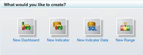
Figure 9.3-2 Creating new content using a new content page
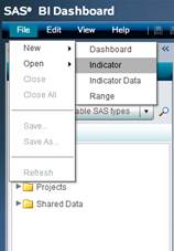
Figure 9.3-3 Creating new content with the menu
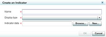
9.3.1 Creating Indicator Data
Data can be accessed directly using SQL code, retrieved from metadata definitions and information maps, or derived from stored process code.
After selecting the menu to create new indicator data, give the object a name and arrive at the interface to define the data source. The list of options is below; select the appropriate source.
Data Source Type |
Description |
|---|---|
Information map |
A map, defined in SAS Information Map Studio |
SQL query |
SQL code that accesses a data source |
Stored process |
A stored process written to generate a package result of SAS data in a specific format consumable by the dashboard |
Table |
A data table defined in metadata |
Table 9.3-1 Object names
SQL
queries include only the select program statement and can point to any library that
is defined and available to the workspace server.
For this example, select the information map Customer and Product Data (which you built in Chapter 2, “SAS Information Map Studio”) to create indicator data for use by other elements in the dashboard.
- Click Browse.
- Select the Information Map and click OK.
- Review and validate the information within the Data Mapping and Query Results tabs in the Preview Design area.

9.3.2 Creating a Range
Range definitions are used by most indicators to highlight when your results are on target. Creating ranges is technologically simple; the real work is defining values that effectively highlight issues for your organization to take appropriate action.
The following steps detail how to create a range for sales totals. In this example, the candy company has agreed that any sales total under 100 is below target, anything over 200 is above target, and everything in between is on target.
- After selecting the menu to create new range, give the object a name and arrive at the interface to define the range.
- Select the Add
Interval button.

- Type in the range value of 100.
- Do steps 2 and 3 again with the range value of 200.
- According to the initial range definition, all values are now red.

- Use the drop down menus for Code
Interval to change to: Below
Target, On
Target, and Above
Target.
Note that the colors have changed automatically to red, green, or yellow for the interval types.
- Change the yellow color by double-clicking on the yellow and choose blue.
- Now select the Save icon at the top or click File>Save from the menu and save the range with the appropriate name and folder.
9.3.3 Creating an Indicator
After developing the required indicator data and range, it is time to create an indicator. There are various display types available. When using stored process, code you have an essentially limitless toolkit of display possibilities.
Predefined indicators include the following:
| Bar Chart with Bullet Bar Chart with Reference Lines Bubble Plot Chart with Slider Prompt Clustered Bar Chart Custom Graph Dual Line Chart Dynamic Prompt Dynamic Text Forecast Chart |
Interactive Summary and Bar Chart Interactive Summary and Scatter Plot Interactive Summary and Targeted Bar Chart Key Performance Indicator (KPI) Line Chart with Reference Lines Needle Plot Pie Chart Range Map |
Scatter Histogram Scatter Plot Schedule Chart Simple Bar Chart Spark Table Stacked Bar Chart Targeted Bar Chart Tile Chart Vector Plot |
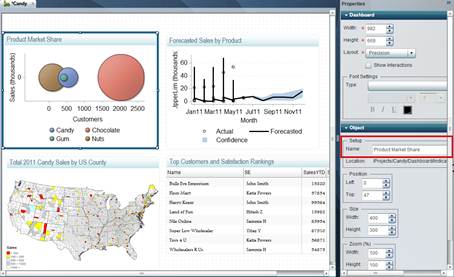
In this example, the candy company is interested in
viewing the market share of their products. To represent this, the developer
has decided on a tile chart.
- Create a new indicator.
The resulting screen shows that the tile chart display type has been chosen, as well as the indicator data you created earlier.

On the right side of the screen, the indicator properties are displayed.

- Move to the Role Mapping area to select the data elements.
- Set the following values:
- Range Value = Retail Price
- Tile by = Product
- Tile size = Retail Price
The indicator automatically refreshes to display the result.
- Now select the Save icon at the top, or click File>Save from the menu and save the indicator with the appropriate name and folder.
9.3.4 Arranging the Dashboard
Once indicators are defined, you can add the indicators into the dashboard and arrange them within the dashboard layout screen.
- Select the new dashboard.
- Drag indicators from the Library to the Dashboard.
- Update the indicator box name by clicking the indicator once and modifying the Object Name area in the Properties pane.
9.3.5 Alert Framework
Dashboards are considered pull environments, where users are tasked with reviewing and analyzing the reports on their own. However, there are times when information must be pushed to users through alerts. SAS BI Dashboard includes an alert framework to review events and send alerts to users when conditions have occurred. Alert definitions can either be defined globally for a group of users, or it can be handled by the individual dashboard users so that they can define when and what alerts to receive. However, as a dashboard creator, you need to enable personal alerts.
The following topic details how, as a dashboard developer, to enable the indicator for an alert, and what the users must do to create and manage their personal alerts.
9.3.5.1 Enabling Personal Alerts for an Indicator
At the bottom of the properties for an indicator is the User Personalization area. For dashboard users to set their own alerts, you must select the Manage Alerts check box.

Figure 9.3-4 Enabling personal alerts
9.3.5.2 Setting Up a Personal Alert
When viewing the dashboard, each indicator has a drop-down menu that includes options to write comments, print, or set personal alerts.

Figure 9.3-5 Personalize alerts using the Dashboard Indicator menu
After selecting Personalize Alerts, a pop-up window appears, which contains the window to create a new indicator alert.

Figure 9.3-6 Editing personal indicator alerts
You must update the Alert Settings section with a name, a gauge, and when to trigger the alert. Within the Delivery Method section, you can choose to display the alert within an alert portlet from SAS Information Delivery Portal or to receive an e-mail.
After entering in everything, do not forget to select the Save Alert icon at the top of the screen.

Figure 9.3-7 Saving new indicator alerts
9.3.5.3 Creating a Global Alert
When creating a new indicator, the bell icon is available at the top of the Properties pane. Select this bell to generate global alerts.

Figure 9.3-8 Create a global alert
The following display allows the dashboard developer to create multiple alerts for the indicator.

Figure 9.3-9 Create multiple alerts
Alert settings include the name, the gauge, what triggers the alert, and when the alert is sent.
The delivery method allows a choice between viewing alerts through an Alerts portlet (viewable in SAS Information Delivery Portal) or by receiving an e-mail.
Use of alert emails requires that email addresses are defined in SAS Management Console for the user receiving the alert message.
- Global alerts can be emailed to a distribution list. To set the list of alert subscribers, scroll to the right of the delivery method section of the Edit Indicator Alerts screen to see the green plus sign (+) icon. Click this icon to open the Add Users and Groups screen.

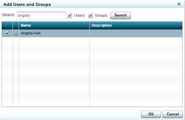
- After adding users and groups, be sure to select the Save Alert button on the top of the Edit Indicator Alerts window to save all the changes.
9.4 Enhancing Your Dashboard
SAS BI Dashboard has many features that allow you to customize it, such as changing the fonts and colors schemes. Stored processes can even be used to provide an additional, powerful layer of functionality.
9.4.1 Font Styles and Sizes
While modifying the layout of your dashboard, you can control the fonts across all indicators. This is handled at the dashboard level so the view remains consistent.
|
= |

Figure 9.4-1
You can modify the following different types of text:
Data table cells |
Graph axis tick labels (preferred) |
Data table headers |
Graph axis title labels (preferred) |
Dynamic text |
Graph data labels (preferred) |
Gauge range values |
Indicator tooltips (preferred) |
Gauge titles |
Panel titles |
Gauge values |
Prompt items (preferred) |
9.4.2 Resizing
The final dashboard view for users depends of display settings in several locations. Each indicator has a width and height setting. Gages have additional sizing settings. The dashboard and the dashboard portlet, viewed from the SAS Information Delivery Portal, also have settings.
The Properties pane lists the sizing options when they are available.

Figure 9.4-2 Dashboard properties

Figure 9.4-3 Dashboard portlet properties
Following is an example of a portal page on which the dashboard is not viewable in the entire portlet. The Sales Detail Report is running off the right side of the page, and the scroll bar is not large enough to see the last column.

Figure 9.4-4 Portlet clips dashboard content
The first step is to edit the dashboard. Immediately, you can see that when the objects were added to the dashboard, they were not properly sized. The Sales Detail Report runs off the grid lines for the dashboard size.
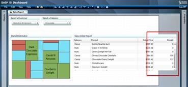
Figure 9.4-5 Dashboard object is too large
Within the dashboard edit window, the object is sized smaller and the column widths are adjusted by clicking and dragging elements.

Figure 9.4-6 Resize the dashboard object
9.4.3 Color Schemes
Colors are defined within the range definition. The following indicators use these colors. Colors change based on the measure data values.
Bar Chart with Bullet Display
Bar Chart with Reference Line Display
Combo box with Gauge Dynamic Text Display (Optional) Interactive Summary and Bar Chart Display Interactive Summary and Scatter Chart Display |
Interactive Summary and Targeted Bar Chart Display KPI Display Dynamic Gauges Line Chart with Reference Lines (only for Reference Lines) Range Map Display Scatter Plot Display |
Spark Table Display Targeted Bar Chart Display Tile Chart Display Vector Plot Display Waterfall Chart Display |
If bar colors based on categorical values need to be defined, use the stored process display to define and lay out the chart according to your color specifications.
9.4.4 Using a SAS Stored Process as a Custom Indicator Display
If the required indicator is not available in the product itself, you can code the graphical output within a SAS Stored Process. Refer to Chapter 3, “SAS Stored Processes,” for information on how to create a stored process for consumption by a dashboard.
Once the stored process is completed, generate the full URL path to execute the stored process in a Web browser. An example is:
http://server name: port number/SASStoredProcess/do?_action=execute&_program=/Projects/Candy/Dashboard/Indicator/GMAP_Indicator |
This is copied into the indicator properties and will be used by a dashboard to generate the display for the users. The machine and port information are required; therefore, administrators must be aware that the properties require modification during promotion.
- Within SAS BI Dashboard, select New Indicator and choose Custom Graph as the display type. The indicator data and range are not required.

- Within the Role Mapping area of the Properties pane, copy the stored process URL.

- The stored process executes and provides you with a preview.

- Now select the Save icon at the top or click File>Save from the menu and save the indicator with the appropriate name and folder.
9.4.5 Using a SAS Stored Process as Indicator Data
When data must be refreshed immediately or when the table does not already exist within the metadata, the stored process provides another data source for the dashboard. The stored process must use the SAS Publishing Framework to generate a package on the SAS Content Server.
Following is a sample stored process that generates the number of units sold over the past three months.
/*==================================================================== */
/*Set the metadata library location*/
libname candy meta library="Candy";

/*Create the work data table for use by the dashboard*/

proc sql;
create table result
as select distinct a.product, sum(b.units) as qtrly_total
from candy.candy_products as a
 inner join candy.candy_sales_history as b
on a.prodid = b.prodid
where b.date >= intnx('month', today(), -3)
group by a.product;
 quit;
/*Grab the location of the current session’s work folder to place the packaged data*/
%let temp_path=%sysfunc(pathname(work));
/*Output the package*/
data null;
length path $32767;
rc = 0;
pid = 0 ;
description = 0;
name = '';
call package_begin( pid, description, name, rc);
/*result = the name of the data table*/
/*”Last 3 month sales total” = the description of the package*/

call insert_dataset( pid, "WORK", "result", "Last 3 month sales total", '', rc);

/*Creates a package in c:saspackages called ThreeMonthTotal”*/

call package_publish( pid, "TO_ARCHIVE", rc, "archive_path, archive_name,
archive_fullpath","&temp_path", "ThreeMonthTotal", path );
call symput( '_ARCHIVE_FULLPATH', path)
call package_end( pid, rc);
run;

/*============================================================================ */ |
Program 9.4-1 Stored process for custom indicators
When saving the code as a stored process, the following items must be done for a dashboard to use the package.
- Do not include %STPBEGIN and %STPEND in the code. Always click No to ensure that these macros are not appended automatically.

- When defining the stored process, select Package as the result type.
- Select the SAS Stored Process Server.
Within SAS BI Dashboard, create the indicator data by selecting the stored process option for the data source. Browse to the new stored process and wait for the data set name to resolve. Click the Query Results: 16 Rows tab to view the output.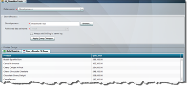
9.5 Tips and Tricks
You can easily provide more depth to your dashboard by creating drill paths that link to other reports in the system, prompts that allow the users to prefilter the data they want to see, and relationships between indicators. The following tips show how to add these features.
9.5.1 Creating Drill Paths to More Detail from Indicators
Dashboards are meant to act as a starting point for managers to use in interpreting current status. When indicators require investigation, users immediately ask for the ability to drill down into more detail.
From the Indicator Properties pane, select the link icon to set up indicator links.

Figure 9.5-1 Establish indicator links
The Set Up Link window appears, allowing you to create a connection between the current indicator and another object.

Figure 9.5-2 Using the Set Up Link window
Available link types include those in the following list. In the examples in this section, we will touch on the use of links in Web reports and stored processes because they are more commonly used.
| Dashboard External Link Indicator Portal Page |
SAS Information Map SAS Stored Process Web Report |
9.5.1.1 Linking to a SAS Web Report Studio Report
The candy organization is interested in going from a basic report of top customers and their customer satisfaction rankings to a Web report showing what sales those customers have generated over the last several years. The Web report was already built and has a prompt for the customer name, so we only need to link between the dashboard indicator and the web report.
- After opening the Set Up Link window as defined in Section 9.5.1, “Creating Drill Paths to More Detail from Link Indicators,” select Web Report as the link type.
- Click the Browse button and navigate to the Web report.
- If the Web report has a user prompt, you can link the parameter name and indicator data value by selecting the green + button.
The parameter name for Web reports is the prompt name. It must exactly equal the value of the displayed text in the SAS Web Report Studio prompt. The following figures show where you can grab this parameter.
Figure 9.5-3 Displayed text within a SAS Information Map Studio prompt
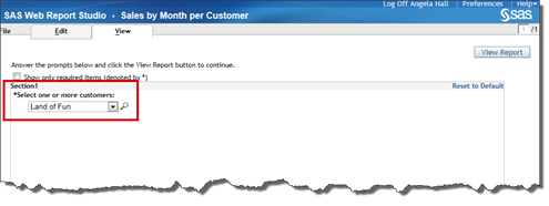
Figure 9.5-4 Prompt displayed text from SAS Web Report Studio
The same text is then typed into the Displayed Text field on the Set Up Link screen, as seen below.

Figure 9.5-5 Establishing the link from a dashboard to a prompted Web report
If
the parameter is not successfully passing from the dashboard to the Web report,
verify that there are no extra spaces, the case completely matches, and the
text is exactly the same.
9.5.1.2 Linking to a Stored Process
The candy organization has asked if they can open the stored process that creates custom-order print outs from the spark table within the sales report dashboard. You created the custom order print out in Chapter 8, “SAS Stored Processes.” The parameter was order_number.
- After opening the Set Up Link window as defined in Section 9.5.1, “Creating Drill Paths to More Detail from Link Indicators,” select SAS Stored Process as the link type.
- Click the Browse button and navigate to the stored process.
- If the stored process has a parameter prompt, you can include the parameter name and the indicator data value by selecting the green + button.
The final window then provides all the information needed to link between the two components.

9.5.2 Cascading Prompts
Developers will find that users request more and more information to be available immediately on the dashboard window. Prompting the user first for filter information and displaying related data within the indicators can provide a flexible environment to help address this.
The candy company sales team requires a sales data dashboard organized by customer and product categories to better understand which products are most popular, by customer.
Following are the steps to create a dashboard with these cascading prompts.
- Within SAS Information Map Studio, create (or update) an information map with prompted filters. The following two prompts must have default values assigned.
- Customer
- Customer and Subcategory

- Within SAS BI Dashboard: Create three separate indicator data objects.
- Unfiltered
- Customer Filtered
- Customer and Subcategory Filtered
When creating the filtered indicator data objects, ensure that the corresponding filter that you built in step 1 is added to the object. If
you have trouble adding and saving the filters in the indicator data, it is
because you have forgotten to add default values to the information map
prompts.
If
you have trouble adding and saving the filters in the indicator data, it is
because you have forgotten to add default values to the information map
prompts. - Within SAS BI Dashboard, create two dynamic prompt indicators. Select New Indicator from the menu and choose the Dynamic Prompt indicator type.
- Customer
Because this is the first prompt, you want to have all customers within the list. Therefore, select the unfiltered indicator data and set Role Mapping to use Customer. - Customer and Subcategory
This prompt will list all subcategories that exist for a particular customer. You need to use the customer filtered indicator data and select Subcategory within the Role Mapping area.
All
other indicator types can be used as the source for interactions, except
dynamic text and interactive displays. - Customer
- Add these objects to the dashboard.
- Define the interactions.
- Select the Customer Dynamic Prompt indicator. Choose all the other objects, select Server-side filter and match them with the customer and customer prompt.

- Select the Subcategory Dynamic Prompt indicator. Choose the two graphics indicators, select Server-side filter, and select subcategory for Source Parameter and subcategory prompt from Target Parameter. The Target Parameter column will list the prompts defined in the information map. Currently this is not a distinct list of values, but a full list of all prompts available in all information maps used in the dashboard.
While making Source
Parameter and Target Parameter selections, choose any one of the available values that corresponds to the correct parameter name. In the current release, the retrieved text for this prompt contains duplicates.
- Select the Customer Dynamic Prompt indicator. Choose all the other objects, select Server-side filter and match them with the customer and customer prompt.
- Save the dashboard. Test the prompts within the dashboard viewer. The following two figures show the different results depending on the prompt selections.


9.5.3 Client-Side versus Server-Side Filtering
When defining interactions between filters and indicators, both client and server-side filtering options are available. Client-side filtering is applied to the data available within the browser session. Server-side filtering is applied against the data on the server before it is rendered on the client.
Most indicators can accept the filter, based on your selection. However, the KPI and Interactive displays options cannot act as the target element when using client-side filtering. Similarly, dynamic text and interactive displays cannot act as target elements for server-side filtering.
Server-side filters can use indicator data built only from information maps or stored processes, while client-side can be run on any indicator data. Included below is more detail on what server-side and client-side filtering support.
Server-Side |
Client-Side |
|
|---|---|---|
Source Indicators |
All except dynamic text and interactive displays |
|
Target Indicators |
All except dynamic text and interactive displays |
All except KPI and Interactive displays |
Indicator Data Sources |
Only Information Maps and Stored Processes |
All |
Data Notes |
Prompted filters are required for each parameter and a default value is required. |
Do not specify a default value for the mapped parameter so that all information is available to user while interacting with indicator. |
Query Action |
Server |
Client |
Performance Notes |
All queries execute on the server, therefore response time could increase while communicating across system. |
All queries execute within the client browser window. Time to load the initial dashboard view could increase, however all subsequent interactions take place immediately. |
Table 9.5-1 Server-side and Client-side Filtering Matrix
If you decide to switch between server-side and client-side filtering, ensure that the dashboard is closed before modifying the default prompt values and saving the information map.
9.5.4 Brush Interactions between Indicators
Creating interactions between indicators provides users more information and flexibility to analyze relationships between the results. For this example, the candy company really likes the sales report dashboard. However, the product names are not displayed in all instances in the range map. They would like a detail report available next to the range map where users can click on an area in the map and view the corresponding row in the data table.
After creating a spark table using the same indicator data that the range map is built from, the interactions are defined by clicking once on the first indicator (the range map) and choosing the set up interactions icon from the dashboard menu bar (indicated in red in the following figure).

Figure 9.5-6 Set up interaction icons
In the subsequent window, select the spark table (already named Sales Detail Report), choose the Brush type, and then select the source and target parameters. The parameter values represent which content information to use to join the two indicators together. Because both indicators are built from the same indicator data, these parameters are identical. When indicators are built from different data sources, this type of prompt allows you to select different columns to match data.

Figure 9.5-7 Choose the indicator interactions
After saving and viewing the dashboard within the dashboard viewer, you can click an area of the range map ![]() , the corresponding record will then be highlighted with a different color in the spark table
, the corresponding record will then be highlighted with a different color in the spark table ![]() .
.

Figure 9.5-8 First interaction example
Included is a second example where the user has selected
Watermelon Taffy ![]() and the record in the spark table is highlighted
and the record in the spark table is highlighted ![]() .
.

Figure 9.5-9 Second interaction example
9.6 SAS Administrator Tasks
Using SAS Management Console, the SAS administrator can set responsibilities and make system-wide changes that assist all users.
9.6.1 Roles and Responsibilities
Two user groups are defined in SAS Management Console: BI Dashboard Administrators and BI Dashboard Users.

Figure 9.6-1 BI Dashboard roles
For users to have the ability to access the SAS BI Dashboard, they must be members of the BI Dashboard Users group. Developers tasked with creating and editing dashboard content must be members of the BI Dashboard Administrators group.
Assign
users to either the BI Dashboard Users group or the BI Dashboard Administrators
group. Do not assign a user to the role BI Dashboard Administrator.
The BI Dashboard Administrator role defines what capabilities the BI Dashboard Administrators group has in other products, but in a default installation no capabilities are granted.
9.6.2 Data Caching
In version 4.3 of SAS BI Dashboard, data caching is not enabled by default. Each time a user opens a dashboard, each element on the dashboard executes a query to return the result. Enabling data caching can improve dashboard performance by generating data results in advance.
All data will be queried and cached using the SAS Trusted User identity. If your information maps for the dashboard include permissions based on user identity, then caching cannot be enabled.
You can choose which data sources can be enabled for caching by selecting one or more of the DSX files described in the table below.
DSX File Name |
Related Data Source |
|---|---|
dboard_sas.dsx |
SQL query for data residing in the folder: <SAS Configuration Folder>Lev1AppDataSASBIDashboard4.3sas-datasets |
Infomap.dsx |
Information maps |
omr.dsx |
Tables |
stp.dsx |
Stored process |
Following are the steps to enable caching for a data table using the omr.dsx file.
- In SAS Management Console, open SAS Folders > System > Applications > SAS BI Dashboard > BI Dashboard 4.3 > DataSourceDefinitions.

- Right-click on the omr.dsk file and select Write Content to External File.

- Save the file on your machine using the same name. In this example, the file name is omr.dsx.
- Open the file in a text editor and remove the comments (<!-- and -->) around the DefaultTimingCacheDirective tag to enable caching and save your changes.
Remove this text: <!-- <DefaultTimingCacheDirective cacheDisplayValueForRefresh="15.0" cacheDisplayValueForStale="20.0" cacheDisplayMultiplierForRefresh="MINUTES" cacheDisplayMultiplierForStale="MINUTES"/> Remove this text: -->
- Save the changes.
- In SAS Management Console, right-click on the DataSourceDefinitions folder and select Add Content From External File(s) or Directories.

- Select the DSX file you modified and replace the previous DSX file.
Change the file type to All Files to see the omr.dsx file.
- Confirm overwriting this file by selecting Yes.

- Restart the Web Application Server to see the changes in effect.
Go to support.sas.com for more information on enabling other data cache options for JDBC data sources.
9.6.3 Promotion Notes
Promoting dashboard content from development into production requires use of the Import/Export package from SAS Management Console to move metadata information. The different object types must be exported into separate packages (.spk files) and then imported into the target environment in the correct order. Following is the list of objects in the sequence required to complete a promotion.
- Dependent objects
Objects on which dashboard content depends must be promoted prior to beginning the promotion of the dashboard. These objects can include stored processes, data tables, OLAP cubes, and information maps. - Dashboard objects
All of the developed dashboard objects will then need to be packaged and promoted. These can include the range, indicator data, indicator, and dashboard.The dashboard objects must be imported into the target system before the dashboard configuration files, otherwise some links between elements will not exist. - Dashboard configuration files
Indicator configurations are stored within SAS Folders/System/Applications/SAS BI Dashboard/BI Dashboard 4.3/IndicatorConfigs.

Figure 9.6-2 Indicator configurations within SAS Management Console
Prompt configurations are stored within SAS Folders/System/Applications/SAS BI Dashboard/BI Dashboard 4.3/PromptContents.

Figure 9.6-3 Prompt definitions found within SAS Management Console
If users are allowed to create alerts in development and would like them promoted, these are stored in their user folder: SAS Folders/Users/<user id>/Application Data/BI Dashboard 4.3/IndicatorConfigs.