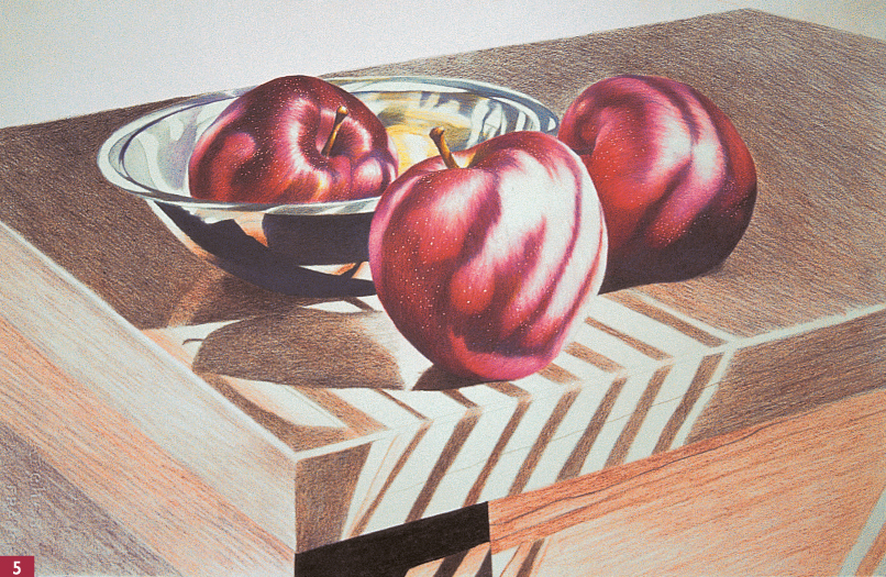
The impression of light is what brings a drawing to life, and it can be soft and subtle or strong and intense. The eye is usually drawn to contrasts between light and dark because they’re so visually interesting. And sometimes the contrast is so striking that the interaction or relationship between the two becomes the focus of (and not just a contributing element to) the drawing. For example, in this still life setup, Sylvester Hickmon manipulated the blinds to create an extreme pattern of shadows and highlights on the elements, making the subject almost subordinate to the play of light.

Lighting the Scene I photographed this setup from several different angles and at different times of day, experimenting with various lighting effects until I found the best contrast. I had to make sure that the apples weren’t too washed out or too dark and that the viewpoint emphasized the angled pattern of the shadows.

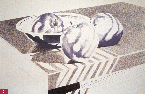
Step One With my reference photos as guides, I use a soft-lead graphite pencil to create a contour line drawing on medium-weight, hot-press (smooth) watercolor paper. This sketch establishes the overall design and the main shapes of the composition, including indications of where the highlights and shadows lie. I sketch lightly because light lines are easier to cover up, and I don’t have to erase them. When I’m satisfied with the sketch, I use a stylus to impress the outlines of highlights on the apples.
Step Two Now I begin laying in the darkest values and shadows to begin establishing the forms and creating the illusion of depth. I apply black grape for the dark areas of the apples, using the side of my pencil as I go over the impressed lines to avoid filling them in completely. Then I apply 90% gray to the bottom portion of the bowl and dark umber on the table. I don’t color any of the background at this point; I focus my attention on the apples and the patterns of light and dark.
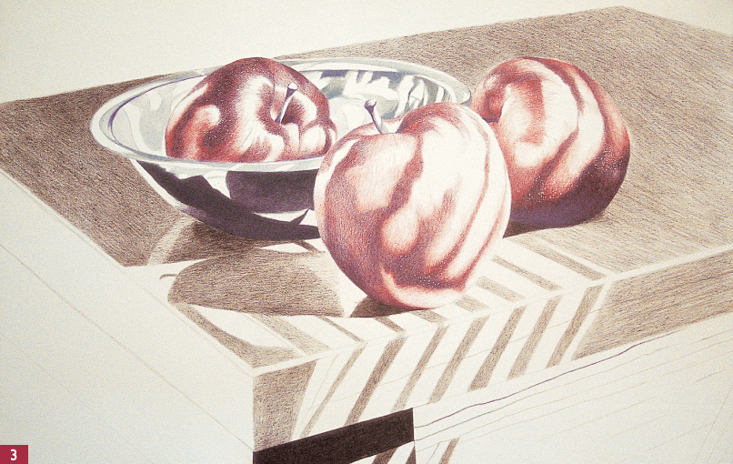
Step Three Once the darks are in place, I begin adding the midtones. First I use 70% gray and 20% gray to suggest the rim of the bowl. Next I use the side of a medium-lead Tuscan red pencil for the apples, applying more pressure for the darker areas and less for the lighter sections. Then I switch to harder-lead Tuscan red to apply more color to the apples; I often use both the medium and hard versions of the same pencils interchangeably to create softer transitions of values.
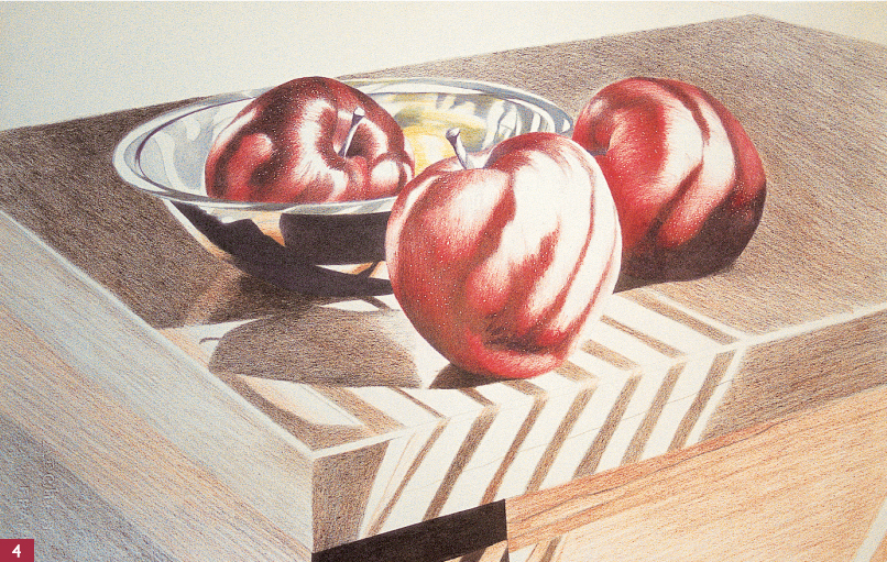
Step Four I use a utility knife to keep my pencils to a semi-sharp point, which helps control the amount of pigment I use as I build thick, opaque areas of color. Using both the point and side of a medium-lead crimson red pencil, I burnish the apples. Then I add 50% French gray to the inside of the bowl and burnish terra cotta brown on the top and lower sections of the table. I also add dark umber to the lower left-hand corner of the composition.
Step Five Now I start to add texture and detail. I use scarlet lake on the darker areas of the apples, and then I apply lavender and pink to the lightest areas to suggest strips of light. I use a colorless blending pencil to blend these colors together and to eliminate some of the impressed lines I created earlier. I also fill in the impressions by applying heavy pressure with the point of my pencil. For the stems of the apples, I use dark brown, peach, and lime peel. Then I highlight the inside of the bowl with 10% gray, goldenrod, and canary yellow. Finally I apply terra cotta to the bottom portion of the bowl to pick up the reflections from the table.
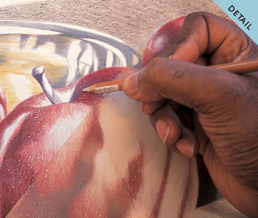
Using a Blender Instead of using a colorless blending marker, I choose a colorless blending pencil to burnish and blend the colors on the apple, creating smooth transitions of values. The blending pencil is a better choice in this example because it creates a more waxy blend—a finish that is better suited to the shiny apples and metal bowl. I also use heavy pressure with the blending pencil; the friction will help meld the layers of color. (Note that here I’m using a protective “slip sheet” under my hand so I don’t smudge my drawing.)
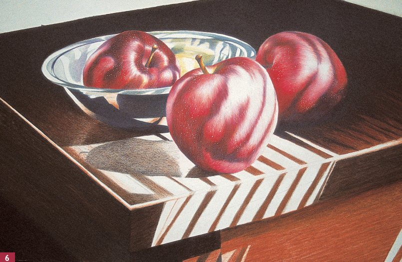
Step Six Next I burnish the inside of the bowl with white and then reapply 10% gray over the yellow. I add indigo blue and deco blue to the outer edges of the bowl and add a few vermilion highlights to the apples. Then I extend the table nearly to the top of the paper so that the objects won’t seem too close to the edge. Next I burnish the table with dark brown, terra cotta, and burnt ochre. Then I add dark umber and 90% gray at the lower left to balance the values.

Step Seven I add canary yellow, Spanish orange, and sienna brown to the light areas of the table. Then I burnish over these colors with white and reapply the harder-lead versions of the same colors. I apply a layer of Spanish orange over the cast shadow of the apple (for added warmth) and then use a soft-lead black pencil to fill in the background areas. Once I’m satisfied with the final adjustments, I buff the image and spray it with workable fixative. (See “Preserving Your Artwork” on page 63.)