Making the Best of a Limited Palette
An artist may choose a limited palette (just a few colors) for convenience, experimentation, or the desire to express a particular mood in a scene (such as using only blues and greens to depict a somber mood). Working with a limited palette can also force you to think creatively—you must carefully plan your values, blend and build up colors that you don’t have in your palette, and use special techniques to achieve the effects you want. It’s certainly simpler to depict a colorful subject with a huge selection of colors, but consider challenging yourself by working with a limited palette. In this example of a colorful parrot (and in all of her lessons in this book), Debra Yaun admirably extracts an amazing array of brilliant hues from only eight colors.
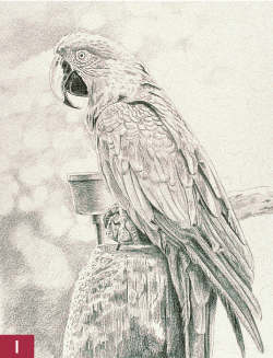
Step One I start with a sketch on practice paper, and then I transfer the drawing to my art paper. To do this, I cover the back with graphite (creating a sort of carbon paper). Then I place the drawing, graphite-side down, over my art paper and trace over the lines, effectively transferring the sketch to my drawing paper. Now I’m ready for color. I fill in the darkest areas first, using small, circular strokes of black colored pencil and smoothly applying the color to the feathers and the beak. I also use black for the shadows of the feet, the cup, and the perch, leaving some white along the edges to indicate the strong back lighting. Then I apply black in the background, forming some abstract shapes with smooth, circular strokes.

Step Two I darken the background with more black, adjusting the shapes for balance and interest but keeping them blurred so they don’t compete with the subject. Then I add a layer of cobalt blue over the black, applying the color with circular strokes to keep the layers soft and blended.
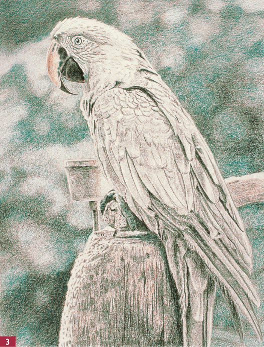
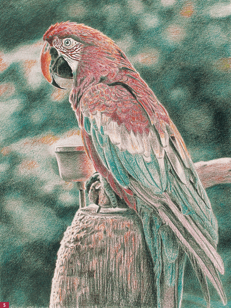
Step Three I add a little more cobalt blue to the background, to the iris of the eye, around the outside of the eye, and along the white area near the beak. I also apply blue with medium pressure over the black parts of the beak and feet and add blue to the bird’s cast shadow. Then I stroke peach on the upper beak with a smooth, circular motion, leaving the white highlight at the outer edge. I also add some peach to the black areas of the beak to create small, cracklike lines. Then I apply peach lightly and smoothly to the cup, the wood perch, and the wood support, leaving the highlights white. I darken the wood a bit more with some black, using strokes that follow the direction of the wood grain.
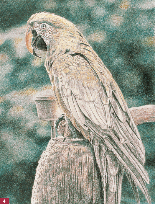
Step Four I smoothly apply canary yellow to the beak, over the peach, using medium pressure. Then I add yellow to the head, the details around the eye, the chest, the top part of the wing, and the back. I layer some cobalt blue over the more shadowed areas of the head and over the black lines in the feathers. Next I lightly apply yellow to the cup, overlapping the white area a little. I also layer yellow over all the wood and on some of the light spots in the background. Then I apply dark green to the background, pressing firmly in small, circular motions over the darker areas. I make sure to keep my pencils sharp to help work the color into the paper. Then, using a blending stump, I soften the background colors with small, circular motions.
Step Five I apply first dark umber and then canary yellow to the perch with short, vertical strokes that mimic the wood grain. I also give the cup a light layer of dark umber, but I leave the edges white to indicate reflections of the strong sunlight. Since I don’t have red in the limited palette I’m using, I must build a red hue by repeatedly layering magenta and yellow over each other. I begin with a layer of magenta to the head, using medium pressure and short strokes that follow the direction the feathers lie and allowing the yellow to show through along the top of the sunlit head. Next I apply magenta firmly to the spots on the face and under the eye, and then I go over the spots with a little more yellow to create an orange-red. I lightly add a little magenta on the beak and apply a layer of cobalt blue to a lower row of feathers, pressing firmly. Then I blend the feathers with the blending stump and add light layers of magenta and blue to the long wing and tail feathers.
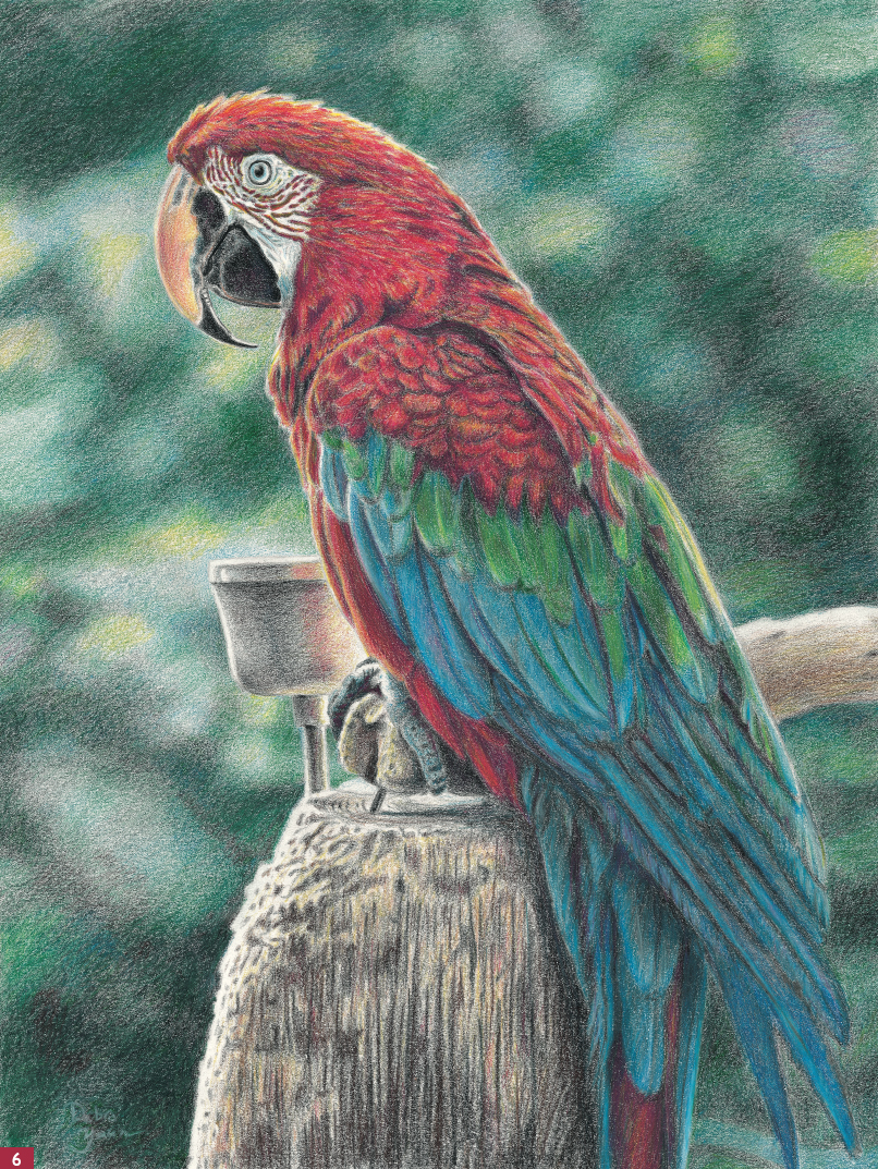
Step Six Next I apply first dark green and then canary yellow to the middle row of feathers. I layer more magenta on the head, and then I add white to a few areas to create lighter feathers on top. I add magenta to the cup to create the reflection and add a little more black to the center of the cup to give it some dimension. To balance the dark green behind the parrot’s head, I add some dark umber in a circular motion. Then I use cobalt blue to smooth and blend the colors in the background and in the feathers. I use a blending stump to work in the color, and I apply white over the blue, pressing firmly to create some shine on the feathers. I use black to emphasize the edges of the tail feathers and blend it in with a blending stump. I lightly work magenta into some of the dark areas of the blue feathers and the one red tail feather, and I darken the edges of the red feathers with dark umber and black. Finally I add highlights with touches of white over the blue tail feathers.