Nature produces amazingly beautiful scenes that call out to be captured on paper. But a good landscape drawing has more than just an interesting subject—it also has a dynamic composition. Composition refers to the relationships among the objects in a scene, and a good composition uses interesting colors, shapes, and lines to lead the viewer’s eye in and around the drawing, toward the center of interest (also referred to as the “focal point”). In this rendering of a nature preserve, Pat Averill uses a few simple guidelines (such as the careful placement of the center of interest and the horizon line) to create her composition and draw a compelling outdoor scene.
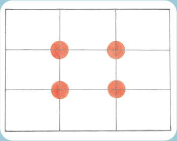
It’s rarely a good idea to place your center of interest squarely in the middle of the paper. The result is a static composition, with nowhere else for the eye to go. To place the center of interest, use the rule of thirds—a guideline artists use to divide the picture area into thirds, horizontally and vertically. Fold a piece of paper in thirds in both directions, as shown at right. This creates a grid of nine small rectangles; any of the four corners of the middle rectangle (marked with orange circles in this example) will make a good place for the center of interest.

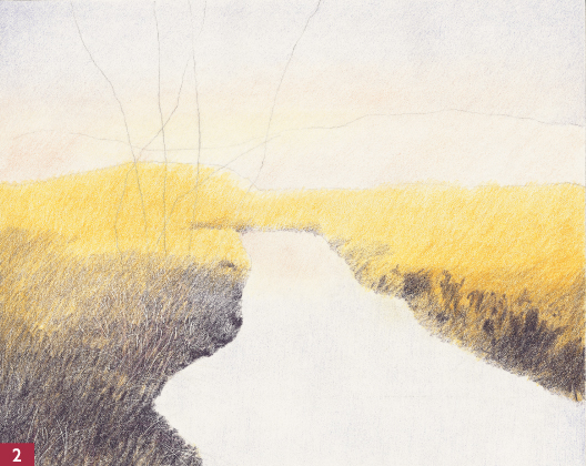
Step One I prefer to start landscapes with a few simple lines instead of a detailed drawing. On white, hot-press (smooth textured) watercolor paper, I draw a light 8" × 10" border with a graphite pencil and then divide the area into thirds. Then I put drafting tape outside of the pencil lines to keep the paper edges clean. I use the rule of thirds (see box above) to place my center of interest: the stand of trees in the upper left. I draw six simple lines for the trees, using light pressure and a semi-dull pencil to eliminate the possibility of impressing (denting) the paper. Then I draw a simple line between the sky and land (the horizon line), another line above for the distant trees, and two lines outlining the stream.
You don’t have to impress a line into the paper to get highlights—you can also remove small areas of color by scraping pigment away (called “sgraffito”). Sgraffito is considered a “negative” drawing technique, because you create form and texture by removing color instead of applying it. You can use a craft knife (as shown in this example), a razor blade, scissors, or a straight pin to scrape out varying amounts of color, but remember that sgraffito works best on heavy layers of color (so the paper is not damaged).

Illustration © Quarto Publishing plc
Step Two To create a sense of atmosphere, I apply ivory at the horizon line with hatch strokes. Then I layer light flesh over the lower half of the sky and into the top of the water. I add light violet over the rest of the sky and the water, softly blending the edges. To mark where I will “save” white for the light grasses in the foreground, I use the nib of a stylus to impress wispy, vertical lines in the paper. Next I apply ochre in the grasses with short hatch strokes. I darken the water edges and apply black grape in the same manner over the grass, gradually lessening the pressure as I go up the page to lighten the value and create the illusion of depth. Then I use a sharp ivory pencil to lighten the top edge of the yellow grass.

Step Three I use olive green and light hatch strokes to fill in the distant hills. With light pressure, I darken the top edges of the sky using light blue and short, vertical strokes. At the lower water edge, I make heavy vertical strokes with the same color, gradually lessening the pressure as I go up the page. Using a semi-dull olive green pencil, I layer over the left foreground grass with a combination of hatch and vertical strokes that simulate the way grass grows. On the right side of the water, I apply olive green with a sharp pencil to create the grass in front of the trees and along the water’s edge. For the tall trees in the background, I use olive green with light pressure and vertical strokes.

Step Four Using a sharp black grape pencil, I outline the edges of the dark distant trees and fill them in with hatch strokes and medium pressure. Then I add some branches following the original direction of the tree line. Again using medium pressure, I block in the water reflections with black grape and move down the page in a vertical path using short, horizontal strokes. (I use a transparent ruler to make sure the reflections mirror the angles of the trees.) On the land under the big trees, I layer additional black grape with heavier pressure to obtain darker values. I use a sharp clay rose pencil and medium pressure to go over the olive green in the background trees and to go over the tall trees in the background. I also use clay rose to darken the horizontal edge of the stream and to create a flat base under the yellow grassy hill.
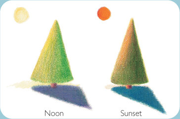
Before adding any color to a drawing, be sure to determine the direction and the strength of the light source in the scene. It’s important to remember that shadows take on different colors depending on the time of day and direction of light in the scene. For example, a green tree in bright sun (or at noon) appears to have yellow leaves, a shade of purple or red for the trunk, and a purple-gray cast shadow. In lower light (at sunset), the same tree would look much darker and would have orange highlights; its trunk would be a shade of red-orange, and it would cast a blue shadow.
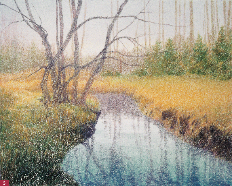
Step Five To create atmosphere, I sharpen a dark flesh pencil and layer over the trees, hills, grasses, and water reflections with light to medium pressure and vertical strokes. I apply ochre and then dark green in the trees above the grass with a sharp pencil and vertical strokes, varying pressure to give dimension to the trees. Under the big trees on the left, I use a sharp dark green pencil with medium to heavy pressure to make short, vertical strokes for the grass. I lift out some color with reusable tack (see box on page 46) to make a path to the left of the big trees—I knead the tack, pinch it into the shape I want, and then lift out color. On the right side, I lightly scribble dark green on the lower half of the grass. Under the trees on the right, I use a nearly horizontal stroke to lightly layer dark green on the grass.
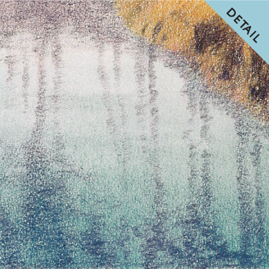
Reflection Detail To add depth to the water in the lower foreground, I add a layer of true blue with vertical strokes, gradually adjusting from heavy to light pressure as I work toward the bottom of the paper.

Step Six I adjust the tree reflections in the water with a sharp olive green pencil, light pressure, and vertical strokes. For the big trees, I apply a medium to heavy layer of black grape, outlining first and then filling in with short hatch strokes. For the foreground grasses on each side of the water, I scribble with a sharp black grape pencil to add texture. I also use black grape to darken the shadows in the stream bank, to deepen the base of the big trees and the distant hills, and to glaze over the green trees above the yellow grass. I use a sharp terra cotta pencil with medium pressure to make some short, vertical strokes on the left side in the grass and above the bend in the water, and then I scribble the same color along the right bank.

Tree Trunk Detail I lift out some color in the tree trunks with reusable tack to create more texture (see box on page 46). At this point, I decide to add a few more limbs on the trees, using a sharp black grape pencil and lessening the pressure occasionally to give the impression of light over a round limb.
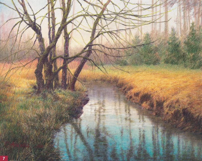
Step Seven With a sharp black grape pencil, heavy pressure, and a linear stroke, I add more limbs and dark spots in the main trees, and I make hard edges where the water and land meet on the left. Where moss covers the tree limbs, I apply chartreuse with medium pressure and a stroke that follows the direction of the limbs. Next I use a sharp ochre pencil with heavy pressure and a scribble stroke to go over the grass, leaving some areas of green grass and shadow areas to show through. With clay rose, I make a few sweeping suggestions of tree limbs in the upper-right stand of trees, using medium pressure and hatch strokes. To create more warmth in the grass near the water, I apply Tuscan red with varying pressure and scribble strokes. Next I use indigo blue to lightly correct the overly red tone in the darkest shadows, especially on the right bank. In the distant clump of grass, I apply light carmine with vertical strokes and light pressure. To make the water look glassy, I use a blending pencil, first with heavy pressure and vertical strokes and then with light pressure and horizontal strokes. Finally I add a few horizontal strokes of a dull white pencil next to the distant water’s edge. Wherever needed, I add more of the same colors over the blending pencil to revive their brilliance.