
Many times the most captivating characteristic about a subject is the feeling it evokes in the viewer. For example, the energy of a bustling street scene or the serenity of a peaceful meadow can be captivating. So how do you translate the mood of a scene to paper? With color! In general, warm colors portray a sunny, upbeat mood, whereas cool colors seem more calm or mysterious. For example, a sunlit field of bright yellow flowers seems cheerful and invigorating, whereas a quiet harbor blanketed in blue-gray fog appears serene and still. In this drawing, Pat Averill uses layers of dark, muted hues to capture the tranquil feeling of a deserted beach at dusk.

Step One First I make a simple line drawing of the scene, using dashes where I see soft edges. Then I erase any pencil marks around the setting sun and use a sharp ivory pencil with cross-hatch strokes and heavy pressure to color the brightest areas around it. In the area where the water meets the sand, I apply another layer of ivory with heavier pressure. Around the ivory color in the sky, I add light flesh, using the same strokes and medium pressure. On the left and right sides of the horizon line, I apply a second layer of light flesh. Then I layer vertical strokes of light flesh over all of the water and the wet sand, using a sharp pencil and medium pressure.

Step Two Now I add the dark values. Over the rocks and in the darkest areas of the water and sand, I apply several layers of black grape using medium-heavy pressure and hatch strokes. Next I vary the widths of the waves as I continue to layer on black grape with hatch strokes and medium-heavy pressure. I check my photo frequently to make sure I draw the angles in the waves correctly.
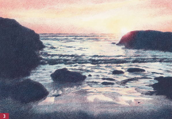
Step Three I outline the tops of the rocks with indigo blue, and then I use the same color and cross-hatch strokes to fill in the rocks and the darkest sand. Still using indigo blue, I darken the shadows of the waves and the distant water. Then I switch to rose carmine for the rest of this step. I apply it at the horizon and just below, leaving white paper for a bright reflection. Then I color over the headland, easing the pressure as I work closer to the sun. To darken the clouds and the fog, I add several layers with hatch strokes.

Step Four I darken the clouds with 30% warm gray, and then I use light blue and rose carmine to create the reflections in the wet sand. I add Tuscan red with cross-hatch strokes over the dark rocks and darkest sand. Then I add cross-hatches of canary yellow and rose carmine to the edge of the rock directly under the setting sun. Next I use hatch strokes of canary yellow around the sun and in the clouds. In the water below the sun, I add a few horizontal waves with the same color.

Step Five I lift out color with reusable tack (see below) where I want sky reflections on the white foam, and then I use a sharp light blue pencil and diagonal strokes to fill in the breaking waves. I start to develop shadows in the water patterns with black grape and indigo blue, using medium to heavy pressure. Accurately rendering light and shadow is more important than getting each wave to match the photo, so I check my progress in dim light; groupings of dark and light values are easier to see this way. I blend the dark foreground sand with a blending pencil, using heavy pressure and following the same direction as the strokes of color in the sand.
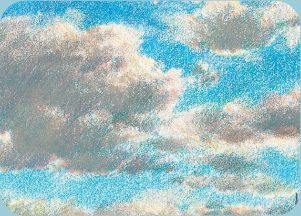
Reusable tack can be an invaluable tool for a colored pencil artist. It’s a method of lifting pigment and is a wonderful way to achieve soft edges between colors. It is also a perfect technique for creating fluffy clouds (shown below right), a pale path in a field of grass (see page 41), subtle reflections in water, or soft highlights in fur or fabric. Once the initial layer of color is in place, knead the tack into the shape you wish to lift out. Then push the tack onto the paper; when you lift it off, some of the color will come off too. If it seem as if you’ve removed too much pigment, go back and reapply a different value over the newly exposed area until you have the effect you want.


Step Six Wherever I want more color in the clouds and fog, I use a sharp clay rose pencil with medium to light pressure to apply hatch strokes. Using cross-hatch strokes and medium pressure, I apply canary yellow to the sunset reflections on the wet sand. Then I add a light glaze of canary yellow followed by dark flesh over the dark areas of the sand, leaving the blue reflections untouched. In the water directly under the sun, I draw the wave patterns with canary yellow. Then I glaze the water with dark flesh, using vertical strokes and medium pressure. To suggest shapes on the dark rocks, I lightly glaze over them with canary yellow, using cross-hatch strokes. I pull the shadow areas together in the ocean by using a sharp indigo blue pencil with light pressure and loose, almost horizontal strokes. Finally I use canary yellow to glaze over the darkest sand in the foreground.

Wet Sand Detail To give a better sense of depth and perspective to the scene, I use a dull black grape pencil to create a pattern in the wet sand that radiates out from the water, making it seem as if the waves have just rushed back into the ocean.
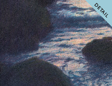
Rocks and Water Detail Whenever you add more dark values to a scene, the light values seem to fade away. But color correction is easy; here I just add another layer of indigo blue to the dark values in the rocks and water to cool the Tuscan red I applied in step four.