
JMP Analysis
Descriptive Analysis
The
case “Appointment Wait Times at Veterans Medical Centers”
presented a variety of univariate, bivariate, and multivariate visualizations
to become acquainted with the appointment backlogs and the characteristics
of each medical center (e.g., bed capacity, location). While graphs
allow us to easily discern patterns, numerical statistics offer a
more precise measure of various characteristics of the distribution
of each variable.
A number of the variables,
such as Provider ID, Hospital Name, and the address columns, are unique
identifiers associated with each veterans medical center, so a statistical
summary of these columns is not warranted. The key variables are
those relating to the appointment backlog.
Tables of numerical
statistics can be easily generated from Tabulate. Drag the columns
containing backlog data to the drop zone for rows. The Sum will appear
as a default. Drag “Sum” to the empty column heading
above the numbers. Now select N, Mean, Std Dev, Min, and Max and
drag them to the column header occupied by Sum. The result is shown
in Figure 10.1 Tabulate for Backlog Variables.
Figure 10.1 Tabulate for Backlog Variables

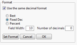
The statistics should
be rounded. Given the magnitude of the backlog values, we will round
them all to the nearest integer. At the bottom of the Tabulate dialog
click on the Change Format button and complete the dialog as shown
in Figure 10.2 Changing Tabulate Formats.
Figure 10.2 Changing Tabulate Formats
The table with rounded
values is shown in Figure 10.3 Table of Descriptive Statistics for Backlog Variables.
Figure 10.3 Table of Descriptive Statistics for Backlog Variables

Depending on the problem,
other descriptive statistics may be informative. The minimum observed
backlog difference is negative which means that at least one VMC reduced
their 31-60 day backlog. Similarly, the positive maximum value indicates
that at least one VMC’s backlog increased from 2015 to 2016.
Calculating the percentage of VMCs in the sample that are unchanged,
decreased and increased their backlogs will add insight. To find
any VMCs whose backlog has not changed, Choose Rows > Row Selection >
Select Where and complete the dialog as shown in Figure 10.4 Selecting Rows with Backlog Difference of Zero to see if
there are any VMCs that had no change in backlog.
Figure 10.4 Selecting Rows with Backlog Difference of Zero

No rows are selected,
so there are no hospital with a backlog difference of 0. Repeat the
row selection process but this time from the criteria drop-down choose
“is greater than” and click OK. Rows with Backlog Difference
greater than zero will be highlighted in the JMP data table as shown
in Figure 10.5 JMP Data Table with Backlog Difference Greater than Zero Selected.
Figure 10.5 JMP Data Table with Backlog Difference Greater than Zero Selected

At the left of the data
table we see that there are 12 rows selected out of 16. Twelve out
of 16, or 75% of the VMCs saw increases in their backlogs over a year,
while 25% reduced their backlogs. These percentages should be included
in the statistical summary of the data. Using Rows > Row Selection
> Select Where is often easier when there are precise numerical
criteria. The slider bar available in the Rows > Data Filter may
be more difficult for selecting the precise numerical value desired.
Another way to describe the backlog data is to look at
the relative change from 2015 to 2016. This can be done by creating
a new column, called Percent Backlog Change using the Formula Editor. Figure 10.6 Formula Editor to Create Percent Backlog Change Column shows the
completed Formula Editor where the percent change is rounded to one
decimal place.
Figure 10.6 Formula Editor to Create Percent Backlog Change Column

The Percent Backlog Change column is
described using the Distribution platform as shown in Figure 10.7 Data Description for Percent Backlog Change.
Figure 10.7 Data Description for Percent Backlog Change

The percent backlog
change shows that some VMCs more than doubled their backlog, while
in the best case, one VMC decreased the backlog by close to 80%.
In this section we have
showed a variety of ways to summarize the backlog data numerically.
When presenting a statistical summary, select the view of the data
that is consistent with the problem statement and will be most easily
understood by your audience.
Selecting the Hypothesis Test
The
problem statement can be addressed with a statistical test of hypothesis.
We need to choose the statistical parameter that will be used to answer
the research question. Since we are interested in the change in the
level of the backlog, the mean is an appropriate statistic.
Two backlogs at two time periods are being compared so
a t-test is the appropriate method. There are two forms of the t-test,
paired comparisons and two independent samples. Which form of the
t-test to apply depends on the nature of the test subjects (the hospitals)
and how the data was collected. Paired comparisons are applicable
when the test subjects are different in some way. For example, the
hospitals are of different sizes. Paired comparisons are also applicable
when the “treatment” can be repeated on the same subject.
This method has the advantage of reducing variation due to individual
differences in the test subjects. A two sample t-test is indicated
when the treatment destroys the test specimen, when there is no natural
pairing, or for a variety of other reasons.
Experience suggests that there are
differences between hospitals in terms of their bed capacity, facility
age, the number and type of services offered, staffing levels, and
management. Figure 10.8 Descriptive Analysis of Bed Capacity gives
a statistical summary of the bed capacity of the hospitals in the
sample obtained from the JMP Distribution platform.
Figure 10.8 Descriptive Analysis of Bed Capacity

The Summary Statistics table can be customized
by selecting Customize Summary Statistics from the drop-down menu
next to the Summary Statistics heading. The menu of options appears
as shown in Figure 10.9 Summary Statistics Options where
the mean, standard deviation, sample size (N), and median have been
chosen.
Figure 10.9 Summary Statistics Options

Figure 10.10 Customized Summary Statistics for VMC Bed Capacities shows the customized
table of summary statistics where we see that the bed capacity spans
almost an order of magnitude for this sample.
Figure 10.10 Customized Summary Statistics for VMC Bed Capacities

Default summary statistics
can be set from File > Preferences > Platforms > Distribution
Summary Statistics.
The analysis of bed
capacity confirms our intuition that the VMCs are heterogeneous.
We also see in Figure 10.3 Table of Descriptive Statistics for Backlog Variables
that the 2015 backlogs, the baseline for comparison, vary almost an
order of magnitude. There is a natural pairing between the backlogs
for 2015 and 2016 and the hospitals are heterogeneous, so a paired
comparison is the appropriate t-test to apply.
Setting Up the Hypotheses
In
a paired comparison, the difference between the 2015 and 2016 backlogs
will be analyzed. The subtraction removes the variation due to the
inherent differences in the hospitals. The column Backlog Difference
was created in the case “Appointment Wait Times at Veterans
Medical Centers” and it is the mean of this variable that we
will analyze.
The null hypothesis
assumes that there is no change on average in the backlog level, i.e.,
the mean backlog difference is equal to zero. The alternative hypothesis
could be two-sided which would detect a change in the backlog mean
in either a negative or positive direction. There are two possibilities
for a one-sided alternative, either looking for only an increase or
only a decrease in the mean backlog.
Since the VA is under
pressure to improve their performance, it would seem that a one-sided
alternative to detect a reduction in the mean backlog should be chosen.
However, if there has in fact been a significant increase in the
mean backlog, this form of the alternative hypothesis will not detect
that. A two-sided alternative will detect if there has been a significant
change, either an increase or a decrease in the mean backlog. A two-sided
alternative is consistent with the phrasing of the problem statement.
The choice of the alternative hypothesis should reflect the problem
statement.
Checking Paired t-test Assumptions
Prior to performing a hypothesis test it is good practice
to check the associated assumptions. Violation of the assumptions
can result in drawing incorrect conclusions which can lead to unwarranted
problem domain recommendations or actions. The paired t-test assumptions
are independent samples and that the differences are normally distributed.
In a paired comparison,
it is expected that the two observations are dependent. In this case,
the size of the backlog at a hospital in 2016 will depend on what
the backlog was in 2015. The independence assumption is for the relationship
between the test subjects, or in this case the hospitals. The degree
to which this assumption is satisfied will not come from a statistical
test, but rather an understanding of the problem domain. It seems
reasonable that the backlogs could be related for hospitals that are
in close geographic proximity. In these situations, patients in that
geographic region could easily travel to appointments at either hospital
and may choose between the two hospitals based on the wait time for
an appointment. In the case, “Appointment Wait Times at Veterans
Medical Centers” a map was created showing the locations, bed
capacity, and 2015 appointment backlog. This map is reproduced in Figure 10.11 Map Showing VMC Locations, Bed Capacity, and 2015 Appointment Backlog.
Figure 10.11 Map Showing VMC Locations, Bed Capacity, and 2015 Appointment
Backlog

The map shows that only
two hospitals on the West coast of Florida are within close proximity
where dependence may exist between their backlogs. Further investigation
into other aspects of these two hospitals such as similarity of services
offered can help establish if their backlogs can be reasonably considered
independent. Such information can be readily obtained from the websites
for these two VMCs.
The normality assumption
for the Backlog Difference can be assessed from the JMP Distribution
platform in two different ways. Figure 10.12 Normal Quantile Plot of Backlog Difference shows a normal
quantile plot for Backlog Difference obtained from the Backlog Difference
drop-down menu.
Figure 10.12 Normal Quantile Plot of Backlog Difference

In
the Normal quantile plot, the line corresponds to the Normal distribution
that best fits the data. The Normality assumption is satisfied to
the extent that the observations lie close to this line. The observed
backlog differences fall reasonably close to this line with the exception
of the minimum observed backlog of -2815 which corresponds to the
Fayetteville, NC VMC.
The JMP Distribution
platform also provides the Shapiro-Wilk Normality test as an option
to assess normality. From the Backlog Difference drop-down select
Continuous Fit > Normal and the Fitted Normal output will appear.
From the Fitted Normal drop-down select Goodness of Fit. Figure 10.13 Shapiro-Wilk Normality Test Output for Backlog Difference shows the corresponding
output.
Figure 10.13 Shapiro-Wilk Normality Test Output for Backlog Difference

The Shapiro-Wilk test null hypothesis
assumes the data come from a Normal distribution, with the alternative
that the data is not normally distributed. The p-value of 0.1410
is not sufficient to reject the null hypothesis at the 5% significance
level. Therefore, we can assume the backlog difference data is normally
distributed.
The assumptions for the paired t-test are reasonably
satisified and we can proceed to conduct the paired t-test. In the
case of a severe departure from normality, the Wilcoxon signed-rank
test is available as a nonparametric option from Distribution >
Test Mean.
Paired t-test
There
are two ways to perform a paired t-test in JMP. The difference between
the 2015 and 2016 backlogs can be analyzed with a one-sample t-test.
Enter Backlog Difference into the Y field in the Distribution platform
and select Test Mean from the Backlog Difference drop-down menu.
Enter 0 for the Hypothesized Mean. The JMP output is shown in Figure 10.14 JMP Test Mean Output for Backlog Difference.
Figure 10.14 JMP Test Mean Output for Backlog Difference

On average, the backlog
has increased by 843 for the Southeast United States. The t-test
will tell us if this change is statistically significant. The key
result from a hypothesis test is the p-value. JMP gives three p-values,
one associated with each of the three possible alternative hypotheses.
In this case, we are using a two-sided alternative so Prob > |t|
= 0.0373 is the corresponding p-value. The p-value is the likelihood
of obtaining the sample mean or something more extreme assuming the
null hypothesis is true. Small p-values cause a rejection of the
null hypothesis. In this case, the null hypothesis can be rejected
at the 5% level and we can conclude that there has been a change in
mean backlog from 2015 to 2016. In fact the backlog has increased,
not the desired outcome from the perspective of the Veterans’
Administration and veterans seeking improvements in appointment waiting
times.
The second way to conduct a paired t-test is from Analyze
> Specialized Modeling > Matched Pairs. It gives the same numerical
results as Distribution > Test Mean and has the advantage of providing
additional graphical output and does not require a column (and formula)
to hold the difference. The completed dialog to perform a paired
t-test from JMP’s Matched Pairs is shown in Figure 10.15 Completed Matched Pairs Dialog.
Figure 10.15 Completed Matched Pairs Dialog

From the Matched Pairs
drop-down select Plot Dif by Row. Figure 10.16 Matched Pairs Output shows the Matched
Pairs output.
Figure 10.16 Matched Pairs Output
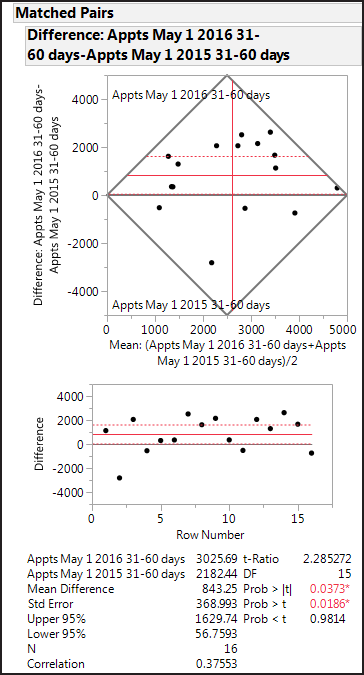
The differences plotted
by row show clearly the large reduction in the backlog for the Fayetteville,
NC VMC. For small sample sizes, outliers can have substantial influence
on the results. To assess the influence this outlier, exclude the
Fayetteville, NC observation by highlighting the corresponding row
in the JMP data table, right click and select Exclude. This will
exclude the Fayetteville backlog from the paired t-test but it will
remain in the graphs. The Hide option will prevent a highlighted
row from being displayed in JMP graphs. The estimated mean difference
is now 1087. Excluding the Fayetteville observation does not change
the hypothesis test conclusion (p-value = 0.0025).
Last updated: October 12, 2017
..................Content has been hidden....................
You can't read the all page of ebook, please click here login for view all page.