
CHAPTER 4
Learning to Become a Fierce Data Interrogator
Torture the data, and it will confess to anything.
— Ronald Coase
Now that we've discussed how to align our focus on the essential question in Chapters 1–3, it is time to move to the second pillar of Quantitative Intuition (QI)™: data contextualization. It is the stage in which we collect, clean, and scrutinize the data to uncover answers to the questions that we have so carefully posed. This is where the Q in QI will take the lead, but even in this stage, intuition, judgment, and a great deal of skepticism will be essential.
This is also the stage where you may be thinking, “analytics is not my strong suit, so I will leave it to the ‘quants’”—those with a degree in engineering, math, economics or data science, or the Excel or even Python experts. There are skills needed to scrutinize data, but being strong in math is rarely one of them. It is about having context. It is often the manager with deep understanding of the business who is in the best position to evaluate the context of the problem or decision at hand, and the manager, therefore, who is best equipped to probe the data, not necessarily from a statistical point of view, but through a series of critical questions. This kind of interrogation can determine whether you have the right data to address the essential question and assess the soundness of the results and recommendations. This interrogative mindset requires a great deal of intuition and business acumen. As is highlighted in Chapter 1, the key to become a fierce interrogator of data is to ask a series of powerful and precise questions.
The purpose of this chapter is to strengthen your aptitude to become a fierce interrogator of data and analyses without the need to be an analyst or a math whiz. At its core, interrogation is primarily about being able to ask the right questions. After all, your data is only as good as the questions you ask of it. We focus on three important dimensions of data interrogation:
- Assessing the data and its reliability.
- Putting the data in context.
- Pressure testing your analysis.
For each of these dimensions, we provide steps, tools, examples, and questions—everything you need to become a fierce data interrogator.
But before we dive into the three dimensions of data interrogation, let's be clear about how they fit within the role of the manager.
As discussed in the Prologue, one could define a data‐driven journey as a process with five steps: problem definition, data discovery, data analysis, insight development, and implementation. In our experience, managers tend to come in two types, and each type focuses on one end of this process. At one extreme, high in the realm of problem definition, we have the “30‐thousand‐feet manager.” This manager always has their eyes on the prize, is laser‐focused on the decision at hand, and hardly ever worries about the data and analyses presented to them. In fact, this type of manager often knows their course of action before even looking at the data. They have (or believe they have) very strong intuition. The problem with these managers, to quote Andrew Lang, is that they “use data as a drunken man uses a lamppost—for support rather than illumination.” They rarely interrogate the analyses; instead, they interpret the numbers to match their own agenda, even torturing the data to derive insights or conclusions they wish to push forward.
The second type of manager is the “numbers type,” whom many of us have met. You send the numbers type manager an Excel worksheet with over a thousand cells, and they spend hours investigating every single cell in the worksheet as if the goal of the organization is to produce perfect spreadsheets rather than make effective decisions. The problem with this type of manager is that they often don't see the forest for the trees. They are so deep into the numbers that they tend to forget why we started this journey in the first place and what problem we are trying to solve or decision we need to make.
A good QI decision‐maker progresses (not necessarily in a linear fashion) from scrutinizing and ensuring the validity of the data to evaluating the analysis and insights, making sure the insights are actionable while always staying focused on the business problem they are trying to solve. This requires diving into the data only when necessary to positively impact the eventual course of action. As you can see, the art and science of data interrogation is crucial through the three steps of the QI framework: Precision questioning, contextual analysis, and synthesis. Now we're ready for the first dimension of data interrogation, assessing the data.
Assessing the Data and Its Reliability
We live in a world of Big Data, and it's clear that Big Data and data science are here to stay, delivering great value. But at the same time, Big Data comes with several shortcomings. With the firehose of data pointed at us, we typically spend less time looking for available data, and more time and effort sifting through mountains of data to identify the relevant and reliable data sets. With the availability of more data, the typical presentation deck has become longer, with even more tables and figures. Rather than getting more concise with deeper insights, we often find ourselves overwhelmed with endless analyses and figures, while gleaning very few, if any, insights. This data overload—sometimes coming from unknown or dubious sources—makes it difficult to evaluate the data's integrity. It also increases the risk of data fishing, where any individual with an agenda or even a hypothesis can hook the snapshot of data that supports their story. This behavior—interpreting the data to see what we want to see, to reinforce a point of view—is often called confirmation bias, as discussed in the prologue. The firehuse of data can make confirmation bias errors easier to commit and harder to detect.
With the sheer volume of data creating so many challenges, how can a manager who is not a data analysis expert avoid biases and analysis paralysis? It is all about asking the right questions.
To guide us in assessing the data and analysis for reliability, we suggest asking the following three questions:
- What data was collected?
- What data am I not seeing?
- Can I trust the data and analyses?
What Data Was Collected?
The first question you want to ask yourself before conducting any analysis is what are the variables and metrics that are available to you? Was the data collected the data you really need? Do you have the right variables to help you make the decisions? As discussed in Chapter 3, decision‐makers sometimes prefer to be precisely wrong rather than vaguely right. They may feel more comfortable looking at available data sets that are precise but less relevant to the problem, than less accurate data that has the key metrics they need to make the decision.
Consider the case study of a new chocolate chip cookie brand. Prior to the national launch of the product, the brand followed the common practice of introducing the product in a single representative test market. The test market was used to examine the product's performance and evaluate different pricing strategies, advertising tactics, and distribution. During the test, the company collected information on sales, market share, and advertising expenditure—both their own and that of competing brands—as well as survey data. Three months into the test of the product, the hard data looks great. The brand has backed the pilot launch with strong marketing, and sales of the product are above expectations and comparable to, or even better than, previous new product launches. The product has captured substantially more than its expected market share in the category.
The decision at hand is whether the brand should stop the test market and launch the product nationally, stop the test market and not launch the product, or continue the test market for a few more months. The third option, continuing the test market, risks an opportunity cost of delaying the national launch and sparking possible competitors' reactions. The data seems to support the first option—stop the test and launch the brand nationally—but at this point, you want to ask yourself what data was collected and what are your IWIKs™. Do the pieces of evidence collected help you answer your IWIKs? Working backward from the decision, do you have the inputs needed to call the shot and make an informed and confident decision about the launch?
Thinking about the drivers of the sales data and the forward‐looking nature of a decision to introduce the product nationally, you probably want to know the breakdown of the overall sales data between trial and repeat. What are customers' repeat purchase intentions? Indeed, when we looked at the trial and repeat purchase data for the new chocolate chip cookie brand, we see that the strong marketing behind the launch led to trial sales that exceeded expectations. However, both the actual repeat purchase data and the post‐purchase survey results—which asked customers if they planned to buy the product again—were well below expectations. The excellent product trial had helped to compensate for the low repeat sales figure, leading to rosy overall sales and market share figures. However, asking the right questions and going beyond the sales and market share data revealed a different and less favorable outlook for the brand. A manager who had not thought in advance about collecting the trial and repeat data would have missed this important insight and would probably have made the wrong decision in this case.
Many famous failed decisions are attributed to the wrong data being collected. One notable example is Coca‐Cola's decision in 1985 to discontinue the Coke formula—loved by consumers for almost 100 years—and introduce New Coke. The decision came in response to their major competitor, Pepsi, showing that in blind taste tests, Pepsi the drink has been called Pepsi since 1961 was preferred to Coke. Coca‐Cola management conducted large‐scale and expensive market research. Almost 200,000 prospective customers were blindfolded and instructed to taste different iterations of a sugary concoction, some of which had been manufactured by Coca‐Cola, and some by rivals. Coca‐Cola's extensive research led to the creation of a new formula that, in blindfold taste tests, was preferred to the original Coke formula and to Pepsi. Coca‐Cola then decided to replace the original Coke formula with a New Coke flavor. That decision met strong resistance, demonstrations, and, in some cases, even riots among Coca‐Cola's loyal consumers. That furious consumer backlash caught Coca‐Cola's management by surprise and eventually led them to revert back and reintroduce Classic Coke, keeping the loved original formula. Such dramatic U‐turn decisions by companies are rare, but when they occur, they're often damaging.
What went wrong with the New Coke decision‐making process? After all, Coca‐Cola invested millions of dollars and thousands of hours in marketing research prior to making the decision. Let's ask the question of what data was collected. The primary metric or key performance indicator (KPI) used to decide on the optimal cola flavor was a measure based on blindfolded consumer taste tests of various cola formulas. Why was this the wrong KPI to make that decision? The answer seems, in retrospect, simple: Consumers don't go blindfolded to buy their soft drinks in the supermarket. The question Coca‐Cola failed to ask, considering the brand and taste that has shaped American preferences for decades, was this: Would supermarket consumers, with their eyes wide open to labels, names, and packaging, prefer a new flavor of Coke over the original? The answer to that question was, apparently, no.
How can managers ask the right questions and make sure the right KPIs are being collected? Let's examine the two preceding examples: the test market for the chocolate chip cookie brand and the introduction of New Coke. What was missed in both examples were the fundamentals: understanding and exploring the drivers of consumer behavior. Had the leaders of Coca‐Cola conducted an effective IWIK session, as discussed in Chapter 2, or a careful backward approach from the decision to the information needed to make that decision, as discussed in Chapter 3, they would have been much more likely to collect the right information and make the right decision. These tools would have helped the decision‐makers identify the right metrics to describe the customer purchase decision, like trial and repeat purchases in the test market case, or the preference—even love—for a classic brand, which couldn't be measured by blindfolded testing.
Another red flag to look for when it comes to assessing data and major KPIs are averages. Because one can almost never report all the data points, it is common to report averages across different groups. However, averages can be misleading. Consider a survey in which customers reported their preference for pulp in the orange juice they drink on a –2 to +2 point scale. Having two segments in the population, one that likes pulpy orange juice and another that dislikes the pieces of fruit in their drink may lead to an average preference for pulp of around 0. Seeing only the average preference for pulpiness, the researcher may conclude that consumers do not care about pulp. This would mask the truth, as all consumers actually care about the level of pulp in their orange juice, but half of them truly like it and the other half dislike it.
Averages may not only mask the truth, but they may also lead to an entirely wrong conclusion. Imagine you have run an advertising experiment where some of the customers were targeted with an online display ad, and another randomly selected group was not. The campaign seems to have worked. As the last row in Table 4.1 shows, 8.3% of the customers who were shown the ad ended up buying the product and only 7.8% of the customers who were not shown the ad bought the product. Because customers were randomly either shown or were not shown the ad, the analyst concluded that the campaign was successful and recommended showing the ad to all customers. Another analyst who looked at the campaign results was interested in investigating how effective the campaign was for new versus repeated customers (rows 2 and 3 in Table 4.1). To her surprise, the analyst found that whether she looked at repeat customers or new customers, showing the ad led to a lower purchase rate than not showing the ad. But how could that be? The overall results are simply the sum of the two groups? How could each group (new and repeat customers) have a higher purchase rate when they do not see the ad, but overall, the campaign showed a positive effect for showing the ad? This situation is known as the Simpson's Paradox.1 Looking across groups leads to the opposite result than looking at each of the groups separately.
What should we do? How do we know which slice the data we should look at? The analyst happened to slice the data by new versus repeat customers, but what would have happened if instead, she sliced the data by geography, age of the customer, the income of the customer, and customers who saw the ad on a Mac versus a PC? Would that lead to different results? As with the previous examples, it all comes down to what KPIs are relevant for the decision. The splits of the data that matter should be the split that you can and may want to act on.
TABLE 4.1 Simpson Paradox example
| Not shown a display ad | Shown a display ad | |
|---|---|---|
| New customers | 7.3% (1,920/26,300) | 6.9% (550/8,000) |
| Repeat customers | 9.3% (810/8,7000) | 8.7% (2,340/27,000) |
| Overall purchases | 7.8% (2,730/35,000) | 8.3% (2,890/35,000) |
Because many companies fail to understand the risk of looking at averages, such companies often create the average product that sits in the middle of consumers' preferences but may serve no one. Putting it in simple terms, if we were to serve customers the average tea that lies between the preferences of some customers for iced tea and the others for hot tea, we would have served all customers a lukewarm tea that none of our customers would want. Be aware of averages and make sure you don't serve your customers or colleagues lukewarm tea.
When considering data or analyses, managers need to be fierce interrogators. To begin with, ask yourself some key questions: Are these the KPIs I would expect to see? Are these the KPIs I need to know to be able to make the decision? What else do I wish I knew to be able to make the decision?
What Data Am I Not Seeing?
The data points you observe are almost never the entire data. There are almost always some aspects of the data that you are not seeing. Even the census data collected by the government, which, by design, is aimed at reaching every citizen, tends to miss people who have no permanent residence, like homeless people or students, or people who elect not to respond. There are two critical questions the fierce interrogator must ask: What data am I not seeing? And is the data I am missing similar to the data I do observe? It is often assumed that the unobserved data are similar to the observed data, but if this assumption is incorrect, it could lead to erroneous predictions and faulty decision‐making.
A famous example illustrating the issue of missing data dates back to World War II. U.S. Army engineers were examining the airplanes that came back from combat to assess where to add more armor for critical protection. As you can see in Figure 4.1, most of the hits and damage to the airplanes (the dots in the figure) were, as one would expect, in the large surface areas like the wings and the main body of the airplane. Based on this figure, the engineers decided to reinforce these high‐risk areas. Abraham Wald, who was a statistics professor at Columbia University at the time and was consulting to the Army, looked at the figure and recommended reinforcing the armor around the cockpit, the engines, and the gas tank surfaces. The army engineer asked whether Wald was looking at the same figures they looked at. In fact, Wald was thinking of the missing data. He made his observation realizing that the Army engineers hadn't accounted for what is known as survival bias—an error that arises when sampling is limited to people or things that have passed some sort of selection process. Tragically, the planes that were hit in the cockpit, the gas tank, or the engine, never made it back from combat.

FIGURE 4.1 Location of hits in WWII aircraft
In this example, the data observed (damage to airplanes that came back) was diametrically opposed to the unobserved data (damage to airplanes that did not make it back). Asking two questions—what data am I not observing? and are the observed data points similar to the unobserved ones?—helped Abraham Wald detect the problem with the observed data.
Two other famous cases of missing data involved incorrect predictions of many polls in the 2016 U.S. presidential election and the 2016 United Kingdom European Membership Referendum (better known as Brexit). Many people refused to answer these polls, and these people's opinions differed sharply from the opinions of those who did respond. Pollsters failed to adjust correctly for the opinions of nonrespondents. This is called nonresponse bias. It reflects a specific missing data problem that becomes a bias only if nonrespondents differ in a meaningful way from respondents. One possible solution to the missing data problem of nonresponse is to create one degree of separation between the respondent and the response. For example, in the 2016 U.S. presidential election, the few polls that did well in predicting the outcome were those that asked people to predict how their neighbor would vote. This approach helps adjust for nonresponse bias as well as biases arising from dishonest responses.
In the preceding three cases—the WWII airplanes' analysis, and the failures of the U.S. election and the Brexit polls—there was no intent on the part of the data provider to hide part of the data from the decision‐makers, and yet missing data led to erroneous predictions or conclusions. Now consider the situation common in business or public policy where data providers may be motivated to show only the part of the data that supports their agenda. Such cases might include deliberately withholding or obscuring data.
The missing data problems previously described are just a glimpse into the world of unobserved data errors. How does a fierce interrogator of data mitigate the risk of missing data? As always within the QI framework, the answer is to apply a set of questions: What are the data points I am not seeing? Does the data include nonresponse? Is the data I am not seeing similar to the data I am seeing? Who provided the data? Do they have a reason not to show me the entire data, and, if so, what are they likely to hide?
Can I Trust the Data and Analyses?
One of the most common pitfalls of data‐driven decision‐making is failing to see that the data you're basing decisions on is flawed. Assuming the data collected included the right KPIs, you should explore whether that data is accurate and reliable. It is equally important to understand the assumptions underlying the generation and analysis of the data.
There are many famous examples of wrong decisions based on inaccurate data. Consider, for example, Christopher Columbus crossing the Atlantic Ocean in 1492. Hoping to reach Asia from Portugal, Columbus based his idea of the journey's distance on the calculations of a medieval Persian geographer. Not only were those calculations erroneous, but Columbus also assumed the geographer was referring to Roman miles when, in fact, the measures were in Arabic miles. That mistake amounted to a difference of almost 5,592 miles (9,000 km) more than Columbus's estimate. Centuries later, the National Aeronautics and Space Administration (NASA) made a similar mistake with the Mars Climate Orbiter (MCO). Relying on calculations provided by Lockheed Martin Corporation, NASA assumed that the crucial acceleration figure was presented in the metric system. In fact, Lockheed Martin had used the English system of feet, inches, and pounds. This error led to the loss of the MCO, at a cost of $125 million.
Another example of the dangers of faulty data, and one that was more costly by far, is the financial crisis of 2008. The crisis has been attributed to bad and missing data about the risk inherent in subprime mortgages. In the case of the 2008 financial crisis, some of the faulty data may have arisen from ill intent on the part of those who were selling these loans who may have presented these using vanity metrics. Vanity metrics look impressive on the surface, but don't truly reflect the underlying situation and are not useful to understanding performance or informing decisions. Typical vanity metrics in business include figures like the number of social media likes or shares or sales due to promotions without accounting for the cost. Another common vanity metric is for a business with a decreasing trend of annual revenue to report the cumulative revenue, which is, by definition, always increasing.
So how do you identify such data reliability issues? The first thing you want to do when you receive data or analysis is to examine simple summary statistics like the average and the range of the values of each relevant variable in the data. This should help you quickly identify the more apparent problems in the data. If you find that the average age of the customers in the data is 150 years, or the average tenure of employees in the company is 45 years, you know these variables are faulty. Similarly, looking at the minimum or maximum values can help identify outliers. If you are looking at the survey responses to a 10‐point scale Net Promoter score survey question, and you find a minimum value of 1 and a maximum value of 34, you know there is a problem in the data. The maximum cannot be larger than 10 in a 10‐point scale.
Another way to quickly interrogate the data is to plot it in whatever way allows you to readily explore its reliability. Simple plots are a great way to reduce large or complex data to a visual. We cannot count the number of times we have identified issues with data simply by asking our analysts to report the average of each variable or to visually plotting the data. A simple plot can help you explore important patterns in the data, as in the case of Anscombe's Quartet (see “The Anscombe's Quartet” call‐out box).
Keep in mind that data can get distorted when it is imported from one software or one system to another, as in the preceding NASA example. Your analyst, being well versed in analytic methods and eager to jump straight into the analysis and deliver results, may be tempted to skip the step of looking at summary statistics of the data plotting it. Make sure they don't!
Assessing the Data—Key Learning
To examine the reliability of the data, the fierce interrogator asks a series of questions. We encourage you to use this list to guide your data interrogations.
- What is the source of the data? Data and analyses rarely arrive at your desk at random. There are often intentions (good ones, but also possibly bad ones) behind how and why the data was collected and how and why the analyses are presented to you. Depending on the source and the intention, there could be possible agendas behind the data delivered to you. A good data interrogator asks these questions: Does the data provider have a reason not to show me the entire data? If so, what are they likely to hide? For example, is it the marketing team that provides evidence about the success of the advertising campaign? Understanding the source of data, and the intent or possible agenda, can inform me about possible issues in the data that you want to pay closer attention to.
- Are the metrics provided the ones you expected to see? If not, why not? Are your data providers showing you the right KPIs? Are you being presented with vanity metrics that make the data provider look good?
- How were the metrics calculated? Many metrics have no clear definition. For example, when a company reports having 10 million customers, you want to ask yourself how customers are defined. Are customers everyone who ever visited the company's website (even if they never bought anything), people who last bought from the company five years ago, or only active customers who purchased in the past year? Depending on the agenda behind the data, the data provider may choose different metrics. Make sure that you understand the metrics, particularly those that are critical to your decision‐making.
- When and where was data collected? Are the time period, location, and context relevant to the decision at hand? Should we make decisions about mobile wallet adoption in 2022 in Hungary based on mobile adoption data in Austria in 2017? We happen to have accurate and reliable data from Austria, but no readily available good data from Hungary. Am I better off with accurate but less relevant and possibly outdated data from Austria or less precise but more current data from Hungary?
- Are the comparisons being made to relevant and comparable alternatives? Almost every company can look good if compared to the right competitor. If comparisons are made, are the metrics comparable across alternatives? Different companies may measure the same KPI (e.g., the number of customers) in different ways.
- What is missing? Are there other data points that may be relevant? Do you have this data over time so you can explore possible trends?
- Is the data I am not seeing similar to the data I am seeing? What data didn't you capture? Who was left out? Could you have fallen prey to a nonresponse or a survival bias?
- Are there outliers? Was there any data the provider could not explain (outliers) and therefore did not show? Is there a pattern in the outliers that may prove valuable?
Asking yourself these questions can help you scrutinize the data and analysis presented to you. Note that to be able to ask or answer these questions, you do not need to be a math whiz or a skilled data scientist, in fact, as the example in the Anscombe’s Quartet call‐out box demonstrates, quite the opposite. You simply need curiosity, critical thinking, and a good understanding of the context. You need to combine quantitative information with a great deal of intuition and business acumen. This is why the I in QI is a strong way to lead early in the process: good intuition is the key component of great data interrogation.
Putting the Data in Context
Let's assume that you have completed the first dimension of data interrogation, assessing the data and its reliability. In short, you have made sure that you are collecting the right information and the data is reliable. You have plotted the data and it all looks fine. Your analyst has run the analysis using the shiniest new three‐letter‐acronym analysis tool on the data and has delivered the results.
The next dimension of data interrogation is to put data in context. This is the Golden Rule whenever considering any information. We cannot emphasize this point enough. Context is king. Three questions will help you put the data in the context of your business and in context of your business environment:
- What does the data mean in the context of business operation?
- How does the data compare to historical data?
- How does the data compare to competition or other comparables?
To understand how context matters, consider the situation of Alex, a CEO of a newspaper, the Local Gazette, who is worried that the big trend of consumers moving away from traditional news consumption might affect the viability of her business. This year, Local Gazette's profits were 5% down from last year. Of course, Alex is concerned about the profitability of the newspaper, but does this figure indicate that she should change anything about her business?
Asking the first question, how does the figure relate to the company's entire operation, leads Alex to examine the decrease in profitability in context: The 5% decrease could be due to lower demand or higher costs. Either of these could be sufficiently negligible, relative to the entire operation of the business, which could indicate that Alex doesn't need to worry about changing her business overall. In fact, the increase in cost could be due to investment in new products that will generate future revenue, in which case a resultant 5% decrease in profitability is not a negative sign. Putting the absolute figure in the context of the company operation helps Alex understand whether the decrease in profitability is meaningful.
Alex's second question should interrogate the historical context: How does the 5% decrease compare to previous years' changes in profitability? If profitability has been fluctuating year after year by plus or minus 7%, then a 5% change is within bounds of what we would expect. On the other hand, if the newspaper's profitability has been increasing steadily over the last five years, with a sudden decrease this year, this year's decrease may be a much more alarming signal.
Finally, Alex should consider the third context, the competition or the comparable. Should Alex be more or less worried about the future of her business if she looks at her local competition and sees that their profitability has all been either up or stable this year? At first glance, you may think Alex should be more worried if it is only her newspaper that is down this year. However, remember that the real fear for the Local Gazette is that demand for print newspapers, as we know it, is going down. In such a case, Alex should be more worried if all newspapers are down than if only her newspaper is down. Even if the Local Gazette's decrease is within historical ranges and may be relatively negligible, if the entire industry is down, that might signal bad news for the newspaper industry as a whole. If this is the case, Alex may want to explore alternative metrics like the growth of her digital subscriptions or online readership.
Putting the data in context is crucial to understanding its significance for your business. Always triangulate the data. When you see a positive or negative figure, don't jump to conclusions; consider what the number means in the context of your business, in view of history, and in the business environment, both current and future.
Pressure Testing Your Analysis
Now that you have assessed the data and put it in context, you will need an expedient method of pressure testing the analysis and verifying the viability of the results.
In a typical scenario, a colleague sends you an Excel worksheet with projections for next year's profitability. As is often the case with these files, it is an overwhelming worksheet with over a thousand cells crowded with numbers. How do you pressure test the model without going through the gory task of examining each number?
An efficient, reliable way to pressure test any model is to use the Pareto Principle, which asserts that 80% of consequences often come from 20% of the causes. Luckily, there are two types of 80–20 Pareto rules that can make this task manageable. The first is that often only about 20% of the numbers in the spreadsheet affect the bottom line; the remaining 80% are only needed for completeness or calculations. Consider, for example, the cost of cleaning the building. This number needs to be included when calculating the cost of running the business next year, but triple it, or even multiply it by 10, and its impact on the bottom line is still likely to be minimal. You do not need to look at such low‐impact numbers, even if you believe they are absolutely wrong.
The second 80–20 rule has to do with your level of certainty about each number. Again, luckily, your level of certainty should be pretty high for the majority of the numbers, possibly because they are similar to last year's figures and because most aspects of the business didn't change much, or because you are familiar with the figures and their components (like the exchange rate from dollars to euros). You only need to focus on the minority of the numbers that make you do a double take. In fact, you should only focus on the numbers that are both uncertain and important, which, if both 80–20 rules work, should be only approximately 4% of the numbers (because 0.2 x 0.2 = .04; see Figure 4.3).
Now you may wonder, how do I know if a number has an impact on the bottom line? For many of these figures, your acumen and familiarity with the business will help. For others, you can do a sensitivity analysis. Change the number you want to investigate and examine what happens to important metrics in the model. For example, if you are not sure about the impact of the compensation of the salespeople on the firm's profitability, half or double the current compensation value and see what happened to profitability.
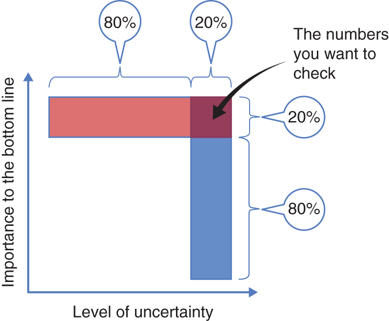
FIGURE 4.3 The two Pareto rules of data interrogation
What about the level of uncertainty? How do we develop an intuition for numbers to know if they are out of the ballpark? By experience, you already know some numbers about your business—this is the starting place of your numbers intuition. You'll need to develop your intuition further to handle numbers you're not familiar with, for example, an intuition for knowing whether the numbers are too large, too small, or about right. To develop this intuition, you can do a back‐of‐the‐envelope estimate, which we discuss in Chapter 6.
The source of the data and analysis should also affect your level of uncertainty. You should always look out for possible hidden agendas. In this regard, you probably have better intuition for some aspects of the business than other aspects. You can easily increase your intuition by involving your teams. Different members of the team are likely to have good intuition for different aspects of the business. For example, if you come from operations, you are probably quite familiar with the inventory numbers, but possibly less so with the marketing figures. Look at the marketing numbers, focus on the ones that you are particularly uncertain about, mark them, and ask your chief marketing officer or marketing director to look only at those numbers. Building diverse teams with diverse expertise helps to increase the collective intuition of the team and the understanding of which numbers are important and/or uncertain.
Another way to pressure test your analysis is to focus on the areas in the analysis where you have good intuition. You often have good intuition for what should happen at 0, 1, or infinity. For example, to pressure test a spreadsheet with projections for next year's profitability, you can take the figure of units sold and set it to zero. You already have good intuition about what should happen to the profitability of the business if it sells no products whatsoever. It should be seriously negative. A similar situation should happen if you sell only a single unit (see call‐out box “IBM Pressure Testing a Silicon Valley Startup”). What about infinity? You cannot plug in infinity in Excel, but you can set units sold to 10 times last year's figure. The revenue figure should explode, and hopefully, with it, the business profitability. By pressure testing your model in that way, you can very quickly assess almost any model or logic, no matter how complex it is without the need to dive into the specifics of the model or the analysis.
We encourage you to apply this set of questions to pressure test your analysis. Notice that these questions do not require you to be well versed in data science or analytics. In fact, stepping back from the gory details of the shiny analytics tool and using your intuition to put the information in the appropriate context, are essential to becoming a fierce interrogator of data and an effective QI leader.
Key Learnings ‐ Chapter 4
- Remember: Your data is only as good as the questions you ask of it.
- Ask yourself whether you have the right data and the right metrics to make the decision: What IWIKs cannot be answered with the data collected?
- Be aware of averages. Ask yourself what are the splits of the data that are relevant for your analyses.
- Ask yourself about missing data: What data points are you not seeing? Are they similar to the data you are seeing?
- Plot the data to get intuition: This should be your first step in data analysis. Did the plot reveal any issues? Evaluate data reliability by asking a series of questions: What data was collected? How are metrics calculated? When and where was the data collected? Are the comparisons reasonable?
- Put the data in the context by looking at it in absolute, over time, and relative to competitors and comparables.
- Pressure test the analysis by diving only into figures that are both uncertain and can have an impact on the decision. Quickly evaluate them by looking at 0, 1, and infinity. Does this reveal any issue with the analysis or the model?
Note
- 1. Wagner, Clifford H. “Simpson's Paradox in Real Life.” The American Statistician, February 1982, 36(1): 46–48.